A Prototype for Science Alerts
Abstract
Many of the science goals of the GAIA mission, especially for bursting or time-varying phenomena like supernovae or microlensing, require an early identification, analysis and release of preliminary data. The alerting on rare and unusual events is the scientific equivalent of the finding of needles in haystacks or the panning for gold-dust in rivers. In modern signal processing, such novelty detection is routinely performed with self-organising maps (SOMs), which are an unsupervised clustering algorithm invented by Kohonen. Here, we describe the application of SOMS to the classification of data provided by large-scale surveys such as GAIA and to the despatching of scientific alerts. We illustrate our ideas by processing the publically available OGLE II dataset towards the Bulge, identifying major classes of variable stars (such as novae, small amplitude red giant variables, eclipsing binaries and so on) and extracting the rare, discrepant lightcurves from which the alerts can be drawn.
keywords:
Variable Stars, Data Processing, Science Alerts, Self-Organising Maps1 Introduction
For the GAIA mission, our aim is to alert on the most interesting classes of variable objects so that follow-ups using ground-based telescopes can begin 111The web-site of the GAIA science alerts working group is at “http://www.ast.cam.ac.uk/vasily/sawg”. This includes supernovae, microlensing events, near-Earth asteroids, novae, stars undergoing rare and interesting phases of evolution (such as helium flash), and so on (see Belokurov & Evans 2002, 2003 who provide detailed simulations). Every class of object will require an individual trigger.
In the signal processing literature, the technique of self-organising maps (SOMs) is often used as a mechanism for novelty detection (e.g., Markou & Singh 2003). SOMs are an unsupervised learning or clustering algorithm invented by Kohonen in 1982. They have already found a number of applications in astronomy – although for classification rather than novelty detection purposes (see Belokurov, Evans & Feeney 2004).
figure1.gif
figure2.gif
figure3.gif
2 Ideology
SOMs are two-dimensional lattices of nodes. Roughly speaking, the number of nodes of the SOM is the number of distinct classes. This is always much smaller than the number of different examples in the dataset. The training algorithm ensures that the nodes represent the most abundant classes in the dataset. If a pattern is rare, then necessarily there will be no node allocated near to it.
As a test dataset, let us use lightcurves from the OGLE II (Optical Gravitational Lensing Experiment) photometric survey. This is searching for microlensing events and transits towards the Galactic bulge. The second phase of this experiment resulted in a catalogue of 220 000 band lightcurves of variable objects constructed using difference image analysis (Woźniak et al. 2002). Each lightcurve is replaced by a vector in a large (but finite) dimensional vector space, called the “pattern space”.
It makes sense to construct the SOMs with high-quality lightcurves. So, the first job is to select these. This is done by allocating a rough measure of signal-to-noise ratio (S/N) to each lightcurve. The three maximum flux values and three minimum flux values are used to construct 9 flux differences. In each case, the noise is computed by adding the flux errors of the individual measurements in quadrature. This gives 9 estimates of S/N, of which the minimum is selected to guard against outliers. Only lightcurves with S/N exceeding 4 and valid colour are selected to give in total. Each of these is analysed with a Lomb-Scargle periodogram. The power spectra are binned in the following way. First, we identify 6 ranges of interest (corresponding to the period intervals defined by the endpoints 0.1, 1.1, 3, 9, 30, 100, 1000 in days). Each range is split into 10 equally-spaced bins in the frequency domain. The maximum value of the power spectrum in each bin is found. This gives a crude envelope for the shape of the power spectrum, which is now scaled so that its maximum value is unity. This associates each lightcurve with a 60-dimensional vector. To this, 5 further pieces of information are added. The first is a magnitude difference. From the distribution of flux measurements, the 2nd and 98th percentiles are found and converted to a flux difference in magnitudes using the zeropoint of the difference image analysis. The second is the flux difference between the 98th percentile and the 50th (the median). This is normalised by the flux difference between the 98th and 2nd percentiles to give a number between zero and unity. This gives us a way of distinguishing between dips and bumps, and is called the “bump statistic”. The third is the colour, while the fourth is the robust kurtosis measure, as defined by Stetson (1996). The fifth and final input is the difference between the of a constant baseline fit and of a linear fit to the lightcurve, normalised to unity. So, this input is distributed between 0 (lightcurves with no apparent gradient) and 1 (linear gradient). Each lightcurve has now been replaced by a 65 dimensional vector in the pattern space.
figure4.gif
figure5.gif
The standard algorithm for creating a SOM has four steps, namely (e.g., Haykin 1994, Kohonen 2000):
[1] Values for the initial weight vectors at each node of the map are picked, It is simplest of all to pick these starting conditions randomly.
[2] A pattern is chosen from the dataset.
[3] The winning node at each iteration is chosen using a minimum Euclidean distance criterion
| (1) |
[4] The weights of all the nearby nodes are updated
| (2) |
where is the learning rate and is the neighbourhood function, which shrinks with iteration number . Now return to [2] and perform for the next pattern in the dataset. Once the whole dataset has been processed, do it again times.
Pictorially, we may imagine a lattice connected with springs. The springs may be stretched or compressed, but the linkages may not be broken. The algorithm attempts to match the nodes of the lattice with the centres of clustering of the dataset in a higher dimensional pattern space.
Each of our maps has nodes, which gives a useful trade-off between resolution and speed. For the first phase, the initial size of the neighbourhood corresponds to the size of the map. The number of iterations is and the learning rate is 10 per cent. The first phase establishes the large-scale ordering map. For the second phase, the initial size of the neighbourhood is 3, the number of iteration is and the learning rate is 5 per cent. The second-phase fine-tunes the ordering on the map.
3 Cartography
A SOM constructed using high quality lightcurves from the OGLE II dataset is shown in Fig. 1. The nodes of the lattice are the cluster centres. The ordering is topological – like maps of the London or Paris metro networks – and so the distance separating nearby nodes is not faithful. Rather, the distance is indicated by the colour coding on the upper-left panel. Neighbouring nodes that are truly close together are coloured yellow, while those truly far apart are coloured green or black. So, a grouping of yellow nodes on the map implies a tight clustering of nodes in the pattern space. Each pattern is mapped onto a node associated with the nearest weight vector (that is, the one with the smallest Euclidean distance from the pattern). This distance is referred to as quantization error. An alternative way of viewing the same map is shown in Fig. 2, in which the nodes are colour-coded according to the number of hits (or mapped lightcurves). Blue denotes a node onto which many lightcurves are mapped and so is a clustering centre. Black denotes empty and dark-red very sparsely sampled nodes.
figure6.gif
Fig. 3 shows the same SOM with again the nodes colour-coded according to distance (as in Fig. 1). Overplotted are contours of the bump statistic, with blue denoting a dip and yellow a bump. Also shown on the SOM are the locations of 2580 known eclipsing binaries found by Wyrzykowski et al. (2003) in OGLE data towards the Large Magellanic Cloud (and so distinct from the dataset towards the bulge). If an eclipsing binary is mapped to a node, then the node carries a number. Shades of grey correspond to the number of eclipsing binaries (white being many and being few). The number on the node is the percentile (from 1 to 100) of the node quantization error distribution corresponding to the median error of the eclipsing binaries. In other words, a ‘50’ or smaller number means the eclipsing binary lightcurve looks very similar to the majority of the lightcurves mapped onto a node, while a ‘100’ means it looks rather different. So, for example, large numbers of the LMC eclipsing binaries lightcurves are concentrated on nodes with map coordinates (13,10) or (14,9) or (16,12). Returning to the bulge dataset, sample lightcurves mapped onto (14,9) are shown in Fig. 7 – as expected, they are all eclipsing binaries with comparable lightcurve shapes. Reassuringly, they coincide closely with the blue contours of small bump statistic. The SOM has successfully clustered similar lightcurves and mapped them onto nearby nodes.
figure7.gif
Fig. 4 shows the same underlying SOM with contours of the bump statistic overplotted. Suppose we wish to identify the nodes corresponding to the classical and dwarf novae. Strongly peaked lightcurves have large values of the bump statistic and so are enclosed by yellow contours. There are 32 eruptive cataclysmic variables already identified toward the Galactic Bulge by Cieslinki et al. (2003). As expected, we see that they are indeed mapped to the nodes enclosed by the yellow contours.
Fig. 5 shows the same underlying SOM with contours of the amplitude overplotted. Suppose we wish to identify the nodes corresponding to the 8970 OGLE small-amplitude red giant (OSARG) variables in the Galactic bar identified by Wray, Eyer & Paczyński (2004). The authors outline two main classes of OSARG variables (type A and B) according to their amplitude and colour. Then, as the blue contours in Fig. 5 enclose the nodes on which the small amplitude variables are mapped, this is the place where the OSARGs of type A are expected. Fig. 6 shows the locations of the known OSARG variables of type B. They occupy the region located next to the cloud of type A members but prefer the nodes with larger amplitude. Again, the SOM has recognised similar patterns and successfully clustered them.
As far as the variable star classification is concerned, the visualization is an important, albeit intermediate, step in the data processing. The final goal is to assign variability class membership. To enable quantitative comparison, we develop the idea of tree diagrams, as shown in Fig. 8. We start with each node representing a class. Then the nodes are clustered by regarding the nodes within a given distance threshold as identical. As the distance threshold increases, clusters come together to form super-clusters, and so on. At each distance threshold, the tree diagram shows the branching and hence the number of distinct data clusters. In Fig. 8, the branches are colour-coded according to the number of objects, with white representing most abundant and black least. The best choice of distance threshold to identify a class is given by selecting long branches with constant colour. In Fig 9, we show a tree diagram restricted to the nodes identified with (LMC) eclipsing binaries. We see two major classes that are easily identifiable from their white/yellow colour, together with a number of well-defined minor classes.
So, SOMs carry out clustering very quickly. The SOM has enabled us to identify new candidates for classical and dwarf novae, eclipsing binaries and small-amplitude red giant variables in the OGLE-II dataset with very little work. In general, very large datasets can be processed extremely rapidly with SOMs and the broad features of the data readily extracted. As we have illustrated here, their ideal role is to conduct a “quick look” through the dataset, identifying the most prominent features.
figure8.gif
figure9.gif
4 Alerts
How do SOMs single out rare patterns for future study and follow-up work? How can they perform alerts? Events that are rare may be scattered over the SOM, as they may not be common enough to warrant allocation of a node. However, they are recognisable through their large quantization error. They are different from the most common patterns mapped to the nodes.
An unusual pattern (such as a supernova-like lightcurve) has an additional property. Not merely is it distance from the node onto which it is mapped, it is also distant from all nodes. For each data pattern, suppose the 10 closest nodes are found and sorted in the order of increasing distance. Than a linear fit of the distance (scaled by the smallest one) versus node number is produced. Let us call the slope the “pattern rate”. A rare pattern is well away from all the nodes of the lattice and so the slope is very small.
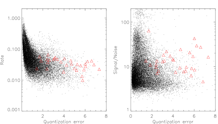
Graphs of quantization error versus pattern rate and quantization error versus signal-to-noise ratio are shown in Figs. 10. Suppose the threshold is placed at a quantization error of 2 (this is the approximate value of the quantization error where the rate changes slope). Suppose also the threshold is placed at . The combined cuts reduce the dataset to about one per cent of the total. These are the most discrepant lightcurves with highest signal-to-noise ratio. These are exactly the lightcurves from which we wish the alerts to come. As an example of this, we show overplotted on Fig. 10 red triangles which correspond to the locations of the known dwarf and classical novae in the OGLE II data. (These are a proxy for supernovae lightcurves).
Of course, further experimentation is needed to decide whether such cuts are enough on their own to issue alerts, or whether such cuts provide a drastic reduction in the data but further, more sophisticated processing is required. Even if the latter turns out to be true, the SOM has played a crucial role in eliminating almost all the common patterns, allowing us to concentrate on the discrepant few.
What needs to change for application to the GAIA dataset?
First, the input vector needs to be constructed from the GAIA photometry/spectroscopy/astrometry and may be different for different objects (supernovae, microlensing and so on). Experimentation with different pattern spaces is needed to identify the most telling combination of observables for diagnostic purposes. Second, the lightcurves in our experiments have substantial gaps (6 month periods) but comprise years data. At the beginning of the GAIA mission, the timeseries is short. As the GAIA great circle transits occur, a longer timeseries becomes available. So, objects follow tracks in the SOM, settling down to a stable winning node after a number of transits. Preliminary experimentation suggsts that the settling-down time is between 6 months and a year.
In other words, a prototype of the GAIA alert system might be as follows.
[1] Every 6 hours, a SOM is built from the GAIA datastream. The discrepant patterns are extracted with cuts on signal-to-noise and quantization error. Also extracted are the common patterns corresponding to known types of variable stars.
[2] The discrepant patterns are cross-checked against a catalogue of known stellar variables. Some of the stellar variables can be pre-loaded from existing surveys of variable stars (such as those available from the microlensing surveys). This catalogue however will be incomplete at the beginning of the mission and so will need to be up-dated every 6 hours with new variables identified by the SOM.
[3] If the discrepant patterns are not in the catalogue of variable stars, then they are candidates for alerts and need to be looked at very closely. It may be that there is already enough confidence that the object needs ground-based follow-up to issue an alert. It may be that further tests are needed for specific classes of object.
5 Conclusions
SOMS are a powerful way to take a quick-look at the data. They provide a broad brush clustering of the main types of pattern very quickly. They are ideal for Petabyte datasets (like GAIA). This is because they are fast, unsupervised and make no prior assumptions about the data. They represent the diametrically opposed viewpoint to Bayesian methods, in which the data are analysed exploiting any prior knowledge.
As an illustration of the technique, the OGLE II difference image lightcurves of sources towards the bulge have been analysed and the main classes of stellar variability identified. This gives new candidates for classical and dwarf novae, eclipsing binaries and small-amplitude red giant variables. As a way of identifying the most robust data clusters, we introduced the idea of tree diagrams, which trace the clustering as a function of distance threshold.
We have argued that SOMS are a powerful way of implementing novelty detection as well. The number of nodes is roughly the number of distinct classes and is always much smaller than the number of different patterns. The nodes represent the most abundant patterns. If a pattern is rare, then necessarily there will be no node allocated near to it. So, such patterns are identifiable through their large “quantization error”. Cuts on the quantization error and the signal-to-noise ratio can substantially reduce the amount of data. This may already be enough to identify the high-quality discrepant patterns on which we wish to alert.
Acknowledgments
This research was supported by the Particle Physics and Astronomy Research Council of the United Kingdom. We acknowledge useful conversations with Laurent Eyer and Piotr Popowski.
References
- Belokurov et al. (2002) Belokurov, V., Evans, N.W., 2002, MNRAS, 331, 649
- Belokurov et al. (2003) Belokurov, V., Evans, N.W., 2003, MNRAS, 341, 569
- Belokurov et al. (2004) Belokurov, V., Evans, N.W., Feeney, S.M., 2004, MNRAS, submitted
- Cieslinski et al. (2003) Cieslinski, D., Diaz, M.P., Mennickent, R.E., Pietrzyński, G., 2003, PASP, 115, 193
- Haykin (1994) Haykin, S. 1994, Neural Networks, (MacMillan, New York)
- Kohonen (2000) Kohonen, T. 2000, Self-Organizing Maps, (Springer-Verlag, New York)
- Markou & Singh (2003) Markou, M., Singh, S. 2003, Signal Processing, 83, 2481
- Stetson (1996) Stetson, P., 1996, PASP, 108, 851
- Wozniak et al. (2002) Woźniak, P. R., et al. 2002, Acta Astron., 52, 129
- Wyrzykowski et al. (2003) Wyrzykowski, L., et al., 2003, Acta Astron., 53, 1
- Wray et al. (2004) Wray, J.J., Eyer, L., Paczyński, B., 2004, 349, 1059