Revisiting 3D Cartesian Scatterplots
with a Novel Plotting Framework and a Survey
Abstract
3D scatter plots are a powerful visualisation method by being able to represent 3 dimensions spatially. It can also enable the representation of additional dimensions, such as by using a colour map. An important issue with the current state of plotting software is the limited use of physical properties from the real world such as shadows to improve the effectiveness of the plots. A popular example is with the use of isometric axes in combination with same-sized points, which is equivalent to removing one whole dimension (depth perception). In static snapshot images, as found in digital and hard prints, as well with discrete data, additional cues such as movement are not present to mitigate for the loss of spatial information.
In this paper we present a novel plotting framework that features a wide range of techniques to improve the information transfer from 3D scatterplots for multi-dimensional data. We evaluate the resulting plots by surveying 57 participants from an academic institution to get important insights on what makes 3D scatterplots effective in communicating data of more than two dimensions.
keywords:
scatterplots, survey, multi-dimensional data, visual cues, depth perception, JavaFXIntroduction
Effectively digesting multi-dimensional data is an important competence in a variety of fields including data mining, machine learning and statistics. Popular techniques such as clustering, dimensionality reduction and regression are becoming increasingly fundamental for generating new knowledge from large and complex datasets. These can be considered ways to summarise data, and also have applications in visualisation. With global trends and events such as pandemics [4], blockchain [14] and large-language models [11], big data analytics are already concerning a wider demographic.
At the same time, there are instances where a direct visualisation of multi-dimensional problems can give prompt answers without relying on additional pre-processing steps. When the dimensionality of the dataset is at moderate levels, or when expertise can be used to identify interesting dimensions, common visualisation techniques can lead to quicker insights.
Currently, due to the limitations of the most common graphing software, 3D scatterplots are more commonly found in specialised applications. Moreover, in scientific paper publications and technical reports, figures are by nature static and two-dimensional, and can magnify the shortcomings of existing 3D scatterplot techniques. This eliminates the options for data visualisation to two-dimensional figures. Today, those figures can include colours and raster or vector graphics, but are still static. The absence of any interaction from the reader makes it more challenging to include three-dimensional plots, and any depth information is often lost.
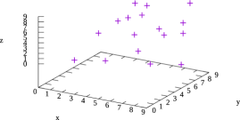
As a motivation, figure 1 shows 3D scatterplot from a popular open source plotting software (Gnuplot) that demonstrates the existing weaknesses of such plots. Although more advanced software are capable of adding more realism to 3D scatterplots, this can be considered a common counterexample for effectively plotting multi-dimensional data. This experiment uses a random dataset as a worse case (as in section 3.1), but the nature of the data is easy to correlate with existing problems. For instance, when exploring a design space in computer architecture simulations, it can be expected to fine tune two parameters or more, and see the effects on two or more variables. One such example is the effect of circuit size and parallelism on performance and resource utilisation [16].
This paper explores the use of additional visual cues to help with the readability and effectiveness of 3D scatterplots on multi-dimensional data. We illustrate our approach using a novel plotting framework, and measure the effectiveness of the plots using a survey of 57 participants from an academic community. The survey measures the time and accuracy of the measurements to identify the most beneficial visual cues.
The list of contribution of this work is as follows:
-
1.
A 3D scatterplot frameworkthat combines a series of existing and novel visual cues for efficiently representing multi-dimensional data.
-
2.
An empirical survey on visual cues to understand their effectiveness based on reading accuracy and the time to provide the readings. The figures in the questions of the survey are generated by the framework.
-
3.
A thorough analysis of the survey outcomes, providing insights for improving the performance of 3D scatterplots.
The remainder of the paper is organised using the following hierarchy. Section 1 is a brief literature review on related research works and software. Then, the novel visualisation framework is presented in section 2. Within the same section, subsection 2.2 illustrates the utility of the visualisation approach using an example use case. The survey on the effectiveness of different visual cues is introduced at section 3, after which the discussion in section 4 elaborates on the survey results, limitations and future work. The paper concludes with section 5.
1 Related work
The literature can be divided into research-focused and software. The related research is on the topics discussed in the paper such as depth perception and plot comprehension, and has influenced this study. The related software are a selection of software packages having a 3D scatterplot functionality, including with special visual cues, and can be seen as competing or alternative approaches to the features of the proposed framework.
1.1 Research
Depth perception in humans is a long studied subject for both images and figures. Burge et al. study how convexity can affect depth perception, such as by examining luminance and range images based on scenes in the physical world [3]. Ostnes et al. overview a range of models and techniques of improving depth perception in plots based on real data, such as by using colour maps or through stereoscopy [15].
Specifically relating to 3D scatterplots, Sanftmann et al. conduct a survey on an innovative approach where 2D projection snapshots are frequently introduced while navigating through the points [20]. In contrast to the proposed techniques, these are more focused on interactivity than self-contained plots, as they also use isometric axes. An older related study, showed how an interactive focusing functionality can improve the perception of data [17]. Both of those instances also heavily rely on spatial localities, such as for medical imaging applications. Sanftmann et al. have specifically targeted the weakness of 3D scatterplots to give spatial information [19]. The demonstrated technique in their work relates to the heavy use of illumination, in order gives more photorealistic results for a better comprehension of the plotted data.
Another category of related literature is survey-focused to quantify the effectiveness of certain visualisation techniques. More focusing on interactivity, there are documented use cases where university students appreciated the demonstration of simulations in STEM (science, technology, engineering, and mathematics) lectures. These include a graphical user interface for physiology teaching (biology) [10] and an computer science visualisation for teaching clustering [7]. Both of these studies have a larger corpus of results, but are less quantitative or objective than the proposed survey, since the performance metric is more indirect (satisfaction or learning efficiency). More related to 3D scatterplots, Yalong et al. have studied the navigation of 3D scatterplots within virtual reality, also relating to the field of view and zooming capabilities [23]. A research survey (on literature) also compares a series of sampling methods for the effectiveness of 2D scatterplots [24].
1.2 Software
A wide range of software supports 3D scatterplots, but with certain limitations such as isometric axes. This section overviews a selection of software with features and techniques relating to the explored ones.
With respect to the dimension assignment facility with checkboxes (elaborated in section 2.1 and figure 2) it already exist in certain applications, but not with such a high number of dimensions. “DB Browser for SQLite” is a modern open source database management system (DBMS) focusing on local databases and has a similar arrangement [13]. It also operates on tabular data, though its functionality and flexibility is limited, and it only produces two-dimensional plots. ParaView [1] is an advanced visualisation framework that also provides point-and-click functionality for the creation of plots based on the GUI. However, for more advanced figures such as point projections, a scripting language is required, and for the same reason, it is less straightforward to generate 3D scatterplots.
Point projections on the back of the view box (as in the floor of the example use case of figure 2) is also an existing approach for improving 3D plot readability. One notable example is a WebGL online 3D scatterplot viewer [9] that features point projections, as well as a form of a light path when the user hovers the mouse cursor over a point. When compared to the presented software, it is mostly a proof-of-concept, as it focuses on visual effects and animation, the labels lack an automatic heading adjustment, and the focus is on big data, as the points appear same-sized.
Other software examples of more-advanced 3D scatterplots include the research-informed ParaProf [2], which also uses Java, and pygmt.Figure.plot3d [22], but are both still simplistic when compared to the presented framework, especially by lacking most of the featured depth perception and label legibility functionality.
2 A novel plotting framework
The presented visualisation framework is able to incorporate a series of such visual cues for improved perception in three-dimensional scatterplots.
2.1 Multiple-dimensions
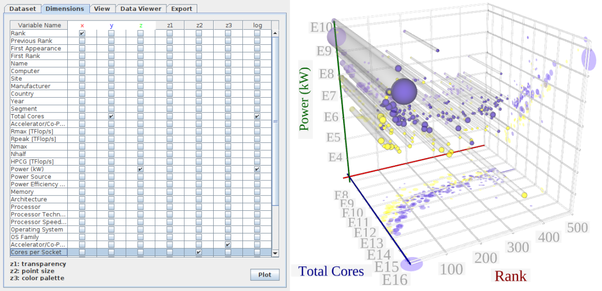
The main feature of the software is the ability to effectively represent multi-dimensional data. Figure 2 (left) shows how columns from the tabular data can be assigned to “dimensions”, to provide a multi-dimensional plot, based on a three-dimensional scatterplot. The column labels from the dataset are transposed (becoming rows) and used here as rows of checkboxes to facilitate the assignment selection by the user. The column “Variable name” contains the names of the original columns in the dataset. , and represent the corresponding axes, but are also colour-coded to ease intuitiveness. The dimensions , and are expressed on the point transparency, size and colour mapping respectively.
Last, the column is not a dimension, and enables to apply a logarithmic scale to specific series. This is done in order to enable a quick and interactive exploration of multi-dimensional datasets as the presented one, without making this a global choice.
This arrangement totals 6 dimensions, and the function of columns to dimensions is one-to-many. For instance, the colour-mapping can be applied to the same values as the -axis, which is commonly done to represent surface depth in existing designs. This may be done to emphasise a specific axis. Note that the framework also provides the functionality to directly map the point colours to distances from the camera, to improve the depth perception of the figure overall.
The dataset comes from Top500.org, which provides a list of the top 500 supercomputers in the world, alongside a comprehensive list of characteristics for each supercomputer [21]. The dataset can be downloaded from the website in an Excel format, which can easily be parsed into a .csv (comma separated value) format, and opened directly by the framework.
2.2 Example use case
Before introducing more technical details as a software package, we demonstrate an example use case using the aforementioned dataset on supercomputers. The produced plot is shown in figure 2 (right).
Based on the dimension assignment, as shown in figure 2 (left), the -axis (red) is the rank of the supercomputer entry. The -axis (blue) is the total number of CPU (central processing unit) cores in the supercomputer, and the -axis is the total power in kilowatt-hours. The latter-two have their checkbox checked for applying a logarithmic scale, due to the high variability in the orders of magnitudes for those values. The dimension is the colour and is applied to the Accelerator/Co-processor variable. This essentially means that a purple sphere denotes a CPU-only supercomputer, whereas a yellow sphere represents a supercomputer with accelerators (mainly graphics-processing units (GPUs)). Finally, the dimension is assigned to the “Cores per Socket” variable, which is an interesting attribute for the processors, and relates to the internal organisation of the “Total Cores” in packages (CPUs).
There are are many insights that can be derived by looking at the five-dimensional plot of figure 2 (right). First, if we ignore the 4th and 5th dimensions, there seems to be a high correlation between the rank and the total number of cores and power. If we consider them in pairs, we can see that this can be explained. If we take the projections on the surface (the floor), the more performant (“faster”) the supercomputer is (rank), the more likely is to have a higher number of cores. Similarly, the higher the core count, the more likely to consume more energy. Additionally, the faster the supercomputer, the more energy it consumes.
These observations are not rules, but are generally considered true in computer architecture research. Even though the number of cores inside packages CPUs grows more or less, exponentially, the single-core performance has relatively been steady the last decade. This means that the total cores is not far from describing the performance of the supercomputer (if we ignore accelerators). Similarly, although the lithography may have an influence on the efficiency of the CPU cores, it is usually the environment (i.e. heatsink, package size, TDP) that will dictate the final energy use of the supercomputer. Hence, there is the corelation between the total cores and energy.
More interestingly, if we take the colour mapping into account, we can see that the GPU-equipped supercomputers (yellow) consume less power than CPU-only supercomputers. This is expected, as the ranking of HPC facilities is based on the Flops (floating point operations per second) performance metric, which is only helpful to certain types of problems [12]. This metric favours GPUs, because it assumes highly-parallel and highly-independent workloads, and with little control complexity, which is what CPUs are most appropriate for.
At the same time, it is also illustrated that both GPU-equipped and CPU-only supercomputers coexist in the rankings in a uniform way. This is an interesting observation and it holds because those CPUs are still optimised for HPC workloads, such as by having high core-counts per socket. This essentially means that the line between CPUs and GPUs in supercomputers is fading for CPU-only entries, as with Fugaku’s A64FX processor that has 52 cores and a high-bandwidth memory (HBM2, a feature usually found in accelerators) [5].
Finally, if we consider the point-size dimension (core-counts per CPU), we can see that the GPU-equipped supercomputers feature smaller CPUs than CPU-only supercomputers. This makes perfect sense based on the latter insight that CPU-only supercomputers migrate some of the GPU functionality to the CPU sockets, such as by having a high core count (especially the higher ranking ones, which are mostly more recent). The big outlier in this figure is Sunway TaihuLight in China, the 4th supercomputer in this version of the list, whose manycore CPUs combine 260 cores in a single socket [6].
2.3 Features
Apart from the aforementioned ability to easily utilise multiple-dimensions, the features revolve around the legibility of the labels and points, as well as to increase the depth and colour perception for more effective plots. For instance, the heading and roll of the labels and their optional borders is automatically adjusted to always face the observer, while still interacting with the other cues of the 3D space including the size. The remainder of this section introduces the features that are hypothesised to increase the effectiveness of 3D scatterplots, most of which are empirically tested through section 3.
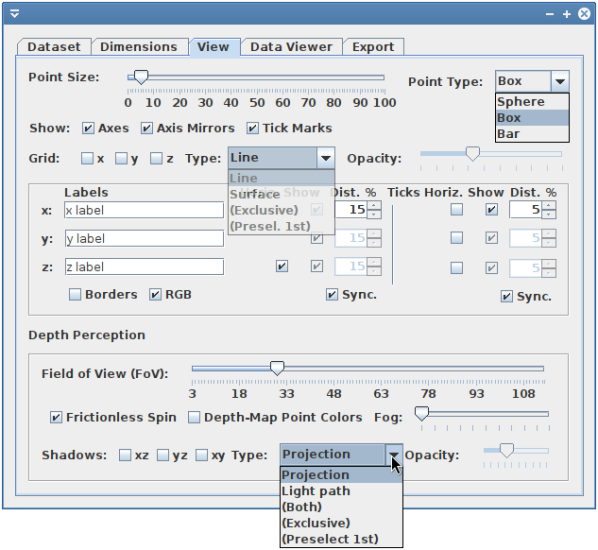
This functionality of the framework is controlled by a graphical-user interface (GUI). The main control features are introduced with the help of the “View” tab, as illustrated from the screenshot in figure 6. At a first glance, it is notable that there is emphasis on high levels of customisability, which is not always a given in GUI applications.
One of the highlights of the presented software is the focus on depth perception. At the bottom of the window in the figure, a layered pane contains all depth-perception-related visual cues:
-
a)
Field-of-View (FoV): A hypothesis in this work is that exaggerating the FoV can improve the readability of 3D scatterplots, such as by influencing the point geometry as seen by the camera (observer). The value starts from a value of 3 to avoid some JavaFX-related artifacts from overlapping surfaces. This feature can be seen in the survey questions A, B and C in figure 6.
-
b)
Frictionless spin: This checkbox, when selected, it leaves the yew rotation speed steady after a modification with the cursor. The effect is an infinite animation, and is not demonstrated in the rest of the paper or survey, due to the focus on static images.
-
c)
Depth-based colour mapping: This feature replaces the dimension (colour map) with the values from calculating the distance of each point to the camera. The colour palette is viridis, which is designed to help with visibility [18]. This feature can be seen in the survey questions E and G in figure 6.
-
d)
Projections and light paths (shadows): Projections are just two-dimensional projections on the surfaces of the view box. They inherit the colour mapping and shape of the points (e.g. circles for spheres), and there is the option to enable them in the , and panes (2-select combinations of the axes). The light paths connect the projection perimeters to the actual points, as it would happen with the umbra in shadows in real world, though here it is superficial. The opacity of those “shadows” is controlled by the opacity slider, also to help with adjusting visibility in denser datasets.
The “Type” combobox dictates the functionality of the , and checkboxes. “Projection” only enables the corresponding protections, as with “Light path” for light paths, and “Both” synchronises the appearance of both per axis. “Exclusive” falls back to “Projection”, but enables a light path where a projection is available, and “Preselect” operates as “Light path” while enabling all projections. The idea behind the exclusive is that the information of both types of shadows is redundant, but the other options exist such as when a crowded plot is a consideration. Projection and light path examples can be seen in plots E and K in figure 6.
-
e)
Fog: Similar to the “depth-based colour mapping”, fog is designed to help with depth perception in the same way fog affects weather visibility, which is also measured in distance units. A fog example can be seen in plot D of figure 6.
The next layered pane concerns the axis and tick labels. For each of the , and axes, there are corresponding options for the label text (normally pre-loaded from the column number or first row of the data), label enabling (“show”), “distance” from the axis (at 45 degrees from the view box). Alongside the label options per axis, there are also the “show” and “distance” options for the corresponding tick labels. The “horizontal” checkbox rotates the corresponding label by 90 degrees (or changes automatically to 270 degrees according to the yew based on the camera position for consistency). The “sync.” checkboxes disable most of the , options while mirroring the values of for all labels. The “border checkbox” draws a grey border around each label, while the “RGB” checkbox removes some colour in the labels to make it print-friendlier. The flexibility for the label positioning is slightly reminiscent of Gnuplot’s, but in a GUI format.
On the top of the tab, there are also controls for the following:
-
a)
Point size: A slider controls the base point size. The selected value gets propagated to all related objects such as the point projections. When the point size is used as a dimension, the selected value is multiplied internally with a normalised value for the corresponding coordinate. This is useful to adjust the granularity of the plotted information given the density of the dataset, i.e. by using finer points for datasets with a higher cardinality.
-
b)
Point type: The point shape can be a sphere, box or a bar. The pre-selected box is expected to provide a more discrete appearance than a sphere to benefit from the field-of-view hypothesis. Though the appearance of a sphere also changes based on the FoV, and other cues such as projections can overcome the potential advantage of having a edges. Bars are just a variation of the boxes, and is only provided for customisability.
-
c)
Axes options: Following are three checkboxes “Axes”, “Axis mirrors” (the other edges of the view box, appearing light grey) and “tickmarks” that remove the corresponding objects from the scene.
-
d)
Grid options: The framework supports two types of grids. First is the line, which is more traditional. Second is the surfaces, which can be seen as semi-transparent 2D equivalents of the grid lines, also following the tics. The “type” and “opacity” are similar to ones in the shadows options, with the general idea to compact most-likely useful functionality in an organised GUI window. The grid surface is illustrated in the example I of figure 6, and is also expected to help with depth perception.
2.4 Software dependencies
The presented 3D plotting framework is written in JavaFX. JavaFX is a Java-based framework that includes three dimensional graphing capabilities, such as for building video games and visualisations. JavaFX was originally released by Sun Microsystems in 2008, and was being included in the Java Development Kit (JDK) up until Oracle corporation’s version 10 in 2018. Unlike projects such as OpenSolaris that has been impacted by Oracle’s acquisition of Sun in 2009, JavaFX is actively maintained by Oracle, but released on a separate software package licenced under the GPL-2.0 open source license.
There is no strong and stand-alone reason behind the selection of JavaFX as a programming language of the software other than being a good general fit to our practices. However, it did provide a stable, mature and open platform for such a research-oriented framework working as a traditional and Unix-friendly desktop application. Rewriting it using modern alternatives could produce even more photorealistic results, with possibly varying levels of openness, maturity and ephemerality (see the future work in section 4.4).
An important dependency that has been added during the latter stages of development was FXyz3D, a “JavaFX 3D Visualization and Component Library” [8]. This was used to be able to dynamically create and manipulate vectorised text labels in the 3D space. The idea is for the axis labels and tick labels to always face the camera, giving the impression of easily-legible overlaid text, while benefiting by having three dimensional attributes (e.g. size corresponding to the field of view for tic accuracy). Otherwise, JavaFX’ Text3D labels would only produce raster labels, which even with the caching facility proved too blurry for our use case.
The current version of our visualisation framework is last tested on a Windows and Arch Linux machine with Java JDK 21 and OpenJFX 17. It uses Apache Maven for build automation, which seamlessly orchestrates the downloading and local installation of the required libraries upon trying to run the application (using mvn javafx:run). Future work includes compartmentalisation for direct distribution through open-source software repositories and app stores.
2.5 System architecture
The core functionality of the code is divided into two Java files, one for the controls form, and the one for expressing all 3D graphics related functionality. The first is mostly a Java Swing (a GUI component library that comes with JDK) piece of software utilising a comprehensive selection of 2D graphical elements for interfacing with the user as a desktop application. It still has references to JavaFX-related classes to be able to alter the functionality of the other class. The second file describes the JavaFX stage and is the window where the plots appear.
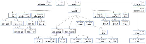
Figure 4 presents a high-level overview of the class instantiations inside the stage class. This representation is reminiscent of UML (unified modelling language) diagrams, but only focuses on a selection of objects that have a spatial connotation here. As can also be observed by the figure, the stage class is responsible for initiating a series of XForms in a hierarchy to effectively manipulate the plots, while avoiding code duplication. For instance, the tics for an axis are children of the same parent Xform in order to be able to hide and show them with a single high-level function call (setVisble(), inherited from the Node abstract class).
A high-level summary of the system architecture goes as follows. The primary stage is the window form containing the JavaFX scene, which in turn features the root node. The root node initiates the perspective camera through a series of nested Xforms for easily manipulating the point of view in the 3D space (such as for rotating, panning and zooming). The world is a child of the root node and contains all physical objects. The left cluster of objects in the diagram (figure 4) is everything related to the plotted points. There are Xforms for the point array (either boxes or spheres), projections (squares or circles, according to the point type), and similarly, light paths (boxes or cylinders). The center cluster of object relates to the axes organisation, including the axes themselves (cylinders), secondary axes (“mirrors” in the view box), and FXyz3D text meshes and label borders for both the axes and ticks. The last cluster of world children relate to grid lines and surfaces, and similar to ticks, they are organised internally into an array of Xforms, one for each axis. The array length is sometimes more than 3 to facilitate the rotation functionality. For example, if an array of grids for the axis is spun to the back of the figure, they are automatically hidden, and their mirrors appear in another edge of the view box. Finally, as with the grid surfaces, the fog is emulated using (40) semi-transparent rectangles, but they always face the camera and are only placed within the range of the data points.
3 Survey
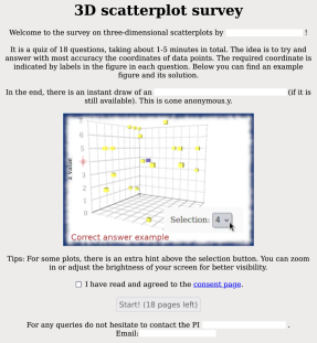
The goal of this online survey is to identify the most effective features of 3D Cartesian scatterplots by measuring the accuracy of the provided readings. The invited participant clicks on the survey link in an email to answer 6 questions of the style “what is the -coordinate of the marked data point?”. The 6 questions appear in 18 pages, 3 for every one of the axes, to simplify the narration. The plotted data follow a random uniform distribution, as we focus on discrete data. By doing so, a worst case is attempted with respect to any data localities in the dataset that may serve as visual cues. Figure 5 presents screenshot from the website’s landing page.
3.1 Question sampling
There are a total of 198 unique pages that can be displayed by the survey. This is because there are 11 possible question types (evaluating 11 feature combinations) and there are 6 random datasets applied to each question, resulting into 66 unique questions. This number is multiplied by 3, hence the 198 number, as there are separate images for each of the pages requesting the , and coordinates consecutively. Once a question is selected, its 3 pages appear consecutively to the user, so that a 3D distance is used as a performance metric. Being consistent with regards to the dataset for the same question is also useful for the user friendliness of the quiz, as the user has comparatively more time to reflect on the same dataset.
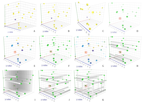
Table 1 summarises the question types in terms of visual cue combinations. Figure 6 shows an example of each question type using the same random dataset.
| Question | FoV | Fog | Colour | Projections | Surface ticks | Light path |
|---|---|---|---|---|---|---|
| A | 3 | (mark) | ||||
| B | 30 | (mark) | ||||
| C | 75 | (mark) | ||||
| D | 30 | yes | ||||
| E | 30 | depth | ||||
| F | 30 | |||||
| G | 30 | depth | ||||
| H | 30 | |||||
| I | 30 | |||||
| J | 30 | |||||
| K | 30 |
The 6 random datasets contain 10 data points with their , and coordinates being selected in random. The random values are the output of a function drawing samples from a uniform distribution of integers within the range . One of the 10 points in each dataset is randomly selected as the point in question, after which the images are marked accordingly (e.g. using a red circle) for the pages to direct the question on the selected points. The idea for the 10 possible answers per axis is to get a certain variation in the responses while still be meaningful to provide a correctness score in the end. The correctness score is not used in the study as a performance metric, but serves as a reward for the incentive from being called a quiz.
In order to keep participants engaged, this survey aims to be short, taking around 1 to 5 minutes to complete. Each user gets a random subset of the 11 question types of size 6. This totals question subset combinations. Every question appears with a unique dataset to the others, and a random permutation of the datasets increases the uniqueness of each quiz instance with respect to the dataset order. After considering the dataset permutations, we conclude that there are possible quiz combinations, with varying amounts of similarity. The most important feature here is the uniqueness of the datasets between the questions of the same test, to avoid unintentional knowledge transfer from different between questions. Finally, considering multiple datasets per question is crucial for disassociating any biases related to the difficulty of the dataset (e.g. random point being near the axes versus in the center).
3.2 Infrastructure
The survey is hosted on a virtual instance on Amazon AWS running Debian Linux. It is served as a publicly-available website using the Apache HTTP Server (even though the link is only circulated in the department). The survey is coded as a Python 2 script, which provides the required HTML code (HyperText Markup Language) in the standard output. The script is interpreted by PyPy, a high-performance implementation of Python that still supports version 2. The script is arranged to be recognised by the CGI (Common Gateway Interface) module of Apache, which executes it every time the survey link is accessed.
The survey script is written from scratch and facilitates the dynamic aspect of the survey as a website. As opposed to static websites, the CGI approach is used to be able to discretely process the information, select the questions, save the results, and announce a random winner of an Amazon voucher in the end. The output is stored locally on the server for further processing by the authors. For a larger-scale study, it would be appropriate to use a more well-rounded solution such as with a separate front-end, back-end and database infrastructure for added security and scalability.
Alongside the script, the server hosts the 198 images in a subfolder. The script injects those images into the HTML code using the base64 format. This is done in order to minimise the possibility of giving more information based on the image filename, or enabling the crawling of all the images. These images have been generated in a semi-automated way, as the current version is GUI-focused (see section 4.4). Another python script has been used to generate the 6 random datasets, and then the GUI was used (incrementally) to export the images. The marking of the random points is done using GIMP relatively quickly by opening all images in tabs at once. Finally, the images are overwritten in the .png format (Portable Network Graphics), though a separate bash script compresses them into the more modern and space-efficient .webp format (WebP). The resulting images have a resolution of 1700 by 1275, and consume up to 60 KB each, which also eases their serving through HTML injection.
3.3 Participants
The participant selection is based on a voluntary basis, since an invitation email has been circulated in certain mailing lists. The invitation email is sent to academic staff and students of the School of Computer Science and Statistics (SCSS) at Trinity College Dublin, Ireland. Although there has been no special criterion for any particular engagement with plotting methods (such as visualisation research), a certain degree of plot comprehension by an academic community is expected. The final sample size for the current study is 57, totalling 31.1 datapoints per question type on average.
3.4 Results
The first set of results is presented in figure 7. The first plot on the top of the figure is the mean distance (in the 3D space) of the predicted coordinates of the point to the actual data point. Also shown are the standard deviations of those mean values. As explained, the , and coordinates of the marked points are requested by the participant in three consecutive pages, one for every coordinate, hence the information is enough for a single distance measurement per question type per user.
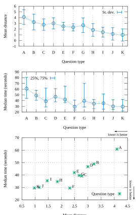
As a first observation, types J and K (2 and 3-axis lightpaths) provide the most accuracy, while the type A (FoV near 0) and B (FoV of 30 degrees) seem to be the most ineffective. J and K perform similarly, and this is expected because even with 2 light paths (J), there is direct information for every coordinate. This is because each path corresponds to a projection (“shadow”) in one of the or surfaces, and any 2-selection gives readings for all axes. With respect to A, the low performance validates the motivation of this paper, which is the flaw of common plotting software that use isometric axes for 3D plots. D (fog), however, even with an additional cue from B (FoV=30), it performs similarly to B. The latter could also be attributed to lack of training of familiarity to associating fog to measurable distance in a small space.
The middle plot of figure 7 shows the median time a user needed to answer the corresponding questions. The time corresponds to the sum of all 3 coordinate responses. Although time is a more noisy variable than the explicitly requested distance (hence the median with 25th an 75th percentiles), the is consistency and value in the findings. An interesting observation is the A, B and C timing, as the higher the FoV yields a lower time. Although C is generally better than B, there are some outliers with respect to the time, and this could be attributed to the fact that FoV=30 (B) being closer to the human eye. There are some others with time outliers, as with E and G (depth-based colour mapping), probably because they are rather unconventional and required some extra time to process. Specifically, colour mapping is more conventionally done according to a single axis rather than depth.
The bottom plot of figure 7 combines the other two for an easier correlation between the time and distance measurements by eye. As shown in the plot, the results are very conclusive, as the Pareto front is just two points; K (3 light paths and projections) and F (3 projections). Similarly, the most commonly used A is the worst performer in both distance and time by missing a whole dimension.
3.5 Result normalisation
In order to remove some biases, such as more skilled users, or a more difficult dataset (e.g. with a marked point in the back), we apply a series of normalisations. The goal is to increase the reliability of the time/distance comparison for more subtle observations. Figure 8 presents the results of this exploration, with standard deviation statistics overlaid in vertical and horizontal grey lines.
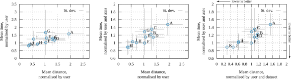
Starting from the left, the distance is now normalised by the average distance per user. In other words, for every distance measurement per user and type, it is divided by the mean distance of all distances for that user. Similarly, this is done for the time as well, though the denominator is the median instead of mean, since this is about time. Note that measuring the mean and standard deviation of medians is less meaningful as an averaging technique, but it is insightful here to quickly show how the variability varies before reaching to the final normalisation approach. Next, the center plot of figure 8 uses the median time per dimension for measuring the time of a question response. This is an attempt to remove outliers, such as the participant being distracted. Finally on the right, we also consider any variations in the difficulty of the dataset.
From the last observations, most still hold, but note how F (projections) stops being competitive, and there are more visible trade-offs in the center points (outside the Pareto front). This shows the impact of normalisations, but also verifies the well-roundness of the results with respect to the sample size and questions. A more subtle finding is about the pairs which only differ in time. In the first instance, F and G (non-coloured and depth-coloured projections respectively) perform similarly in terms of accuracy, but the colouring could have caused some delay from the unfamiliar approach. In the other instance, C and E are the respective figures without the projections, but here the colour has reduced the time required to do the reading. Overall, there are clear winners, but for points with trade-offs, the information crowding seems to be an important factor for time required to read the information.
4 Discussion
This discussion section overviews the key findings from the survey, while noting the limitations and ethics considerations. A small list of additional features for the presented software are also introduced as future work.
4.1 Key survey insights
The main observation from the survey is that the most efficient technique is the light paths with projections (types K and J, with 2 and 3 projections respectively). The number of visual cues can further be adjusted according to the cardinality/complexity of the data to avoid increasing the reading time. A potential crowing can also partly or fully hide some points, including their projections. Another important finding relates to the FoV, as the popularly-used isometric axes gave unacceptable performance, while the higher FoV value (75 degrees) gave the most promising results among the types comparing FoV values. Other novel features such as fog, depth-colour-mapping and grid surfaces have not produced favourable results over the winners, but this could also be partly attributed to lack of training.
4.2 Limitations
The survey is designed to be informative yet short, hence the 11 question types in total. Some simplifying assumptions have been made to reach to this number, such that the surface grid is only meaningful to be used on one axis, complementing a cue on the other two dimensions. For instance, in plot I of figure 6, the surface grid is on axis, while the point projections are on the pane. Additionally, the design space has been simplified by ignoring any other FoV values than 3, 30 and 75, a camera tilt and pan angles at 45 and 135 degrees respectively, and any other combination of the explored features.
A limitation in the survey is that there was no training of the participants, or a monitoring progress to ensure that they get familiar with the plot features. Another consideration is with colour blindness, which has not been explicitly explained, such as with the impact on the readings. Though, such discrepancies could be more representative for a real world scenario, including the familiarity expectations. Note that with respect to colour blindness, the winning question types (J and K) feature no colour-mapping. Even with the colour-mapping ones, the colour was mostly useful for distinguish between projections, which is still likely to be of use based on the lightness of the colour. Furthermore, the presented software uses the viridis colour palette, which is expected to help with distinguishing between colours by colour blind people [18], though not being the focus of this study.
A technical limitation with the framework is from JavaFX, which does not support transparency in a natural way. Specifically, transparency is one-dimensional in JavaFX, which means the object that is added to the world later enables seeing past objects through it, but not the other way around for pre-existing transparent objects. As a workaround, when adjusting the viewing angle inside the GIU, it sorts the visible objects according to the distance from the camera. This achieves the required result, which is to be able to see the objects behind a transparent object correctly. However, when the scene is complex enough, such as an object spanning across multiple other objects, the plot may lose some of its realism. This effect could be seen in the example of question K in figure 6, which could explain some of the additional delay of some survey participants when engaging with K over J (with fewer light paths).
4.3 Ethics
Before conducting the survey, an ethics application was approved by the research ethics committee of the School through our Research Ethics Application Management system (REAMs). The resulting dataset is completely anonymous, as is regards the coordinates of random points and the time that was needed to find them. A “user agent” string per session with browser information is temporarily kept on the server for diagnosing technical issues. Before starting each quiz session, there is a consent checkbox that needs to be selected for the “Start” button to be activated (as shown in the screenshot of figure 6). The hyper-linked consent page is also sent as a separate document inside the invitation email.
4.4 Future work
A feature that would be appropriate in the future is the increase of the number of available dimensions, such as with time. A video or animation generation approach could be developed that linearises one of the dimensions to facilitate the smooth evolution of the dataset across the time. Additionally, the amount of realism could be increased, to further improve the depth perception and visual cues for more accurate and faster readings. This can include illumination [19] and ray-tracing.
Desirable features to adopt include already existing functionality in other plotting software that extend their applicability. Such a feature is scripting language for automating the generation of plots, including from other frameworks and real-time data sources. Error bars is another example of an existing functionality that would be interesting to explore more in the 3D space.
5 Conclusions
In this paper we present a novel framework for plotting multi-dimensional 3D scatterplots. It is written in JavaFX and provides an intuitive design as a desktop application for quickly applying advanced visual cues to 3D scatterplots. Special features relate to the easy association and representation of multiple dimensions to tabular data, as well as the increase of depth perception. The framework is demonstrated with the use of the Top500 supercomputer dataset [21], where a series of insights are drawn from a single five-dimensional plot. Finally, a survey is conducted on the readability of such plots to distinguish the most effective (accurate and time-wise) visual cues for three-dimensional scatterplots.
References
- [1] J. Ahrens, B. Geveci, and C. Law. Visualization Handbook, chap. ParaView: An End-User Tool for Large Data Visualization, pp. 717–731. Elsevier Inc., Burlington, MA, USA, 2005.
- [2] R. Bell, A. D. Malony, and S. Shende. Paraprof: A portable, extensible, and scalable tool for parallel performance profile analysis. In Euro-Par 2003 Parallel Processing: 9th International Euro-Par Conference Klagenfurt, Austria, August 26-29, 2003 Proceedings 9, pp. 17–26. Springer, 2003.
- [3] J. Burge, C. C. Fowlkes, and M. S. Banks. Natural-scene statistics predict how the figure–ground cue of convexity affects human depth perception. Journal of Neuroscience, 30(21):7269–7280, 2010.
- [4] A. I. Canhoto and A. R. Brough. The pandemic-induced personal data explosion. Social Marketing Quarterly, 28(1):78–86, 2022.
- [5] J. Dongarra. Report on the fujitsu fugaku system. University of Tennessee-Knoxville Innovative Computing Laboratory, Tech. Rep. ICLUT-20-06, 2020.
- [6] H. Fu, J. Liao, J. Yang, L. Wang, Z. Song, X. Huang, C. Yang, W. Xue, F. Liu, F. Qiao, et al. The sunway taihulight supercomputer: system and applications. Science China Information Sciences, 59:1–16, 2016.
- [7] J. Fuchs, P. Isenberg, A. Bezerianos, M. Miller, and D. A. Keim. Educlust: A visualization application for teaching clustering algorithms. 2019.
- [8] F(X)yz. FXyz3D: A JavaFX 3D Visualization and Component Library. (Online) github.com/FXyz/FXyz, [Accessed 01/2024], 2013.
- [9] M. Hergott. 3d scatter plot and spatial visualization. (Online) miabellaai.net, [Accessed 02/2024], 2013.
- [10] I. Hwang, M. Tam, S. L. Lam, and P. Lam. Review of use of animation as a supplementary learning material of physiology content in four academic years. Electronic Journal of E-learning, 10(4):pp368–377, 2012.
- [11] M. Isaev, N. McDonald, and R. Vuduc. Scaling infrastructure to support multi-trillion parameter llm training. In Architecture and System Support for Transformer Models (ASSYST@ ISCA 2023), 2023.
- [12] A. Khan, H. Sim, S. S. Vazhkudai, A. R. Butt, and Y. Kim. An analysis of system balance and architectural trends based on top500 supercomputers. In The International Conference on High Performance Computing in Asia-Pacific Region, pp. 11–22, 2021.
- [13] M Piacentini et. al. DB Browser for SQLite. (Online) sqlitebrowser.org, 2024.
- [14] G. Mahalaxmi and T. A. S. Srinivas. Data analysis with blockchain technology: A review. IUP Journal of Information Technology, 18(2):7–23, 2022.
- [15] R. Ostnes, V. Abbott, and S. Lavender. Visualisation techniques: An overview-part 2. Hydrographic Journal, pp. 3–10, 2004.
- [16] P. Papaphilippou. Reconfigurable Acceleration of Big Data Analytics. PhD thesis, Imperial College London, UK, 10 2021. doi: 10 . 25560/94446
- [17] H. Piringer, R. Kosara, and H. Hauser. Interactive focus+ context visualization with linked 2d/3d scatterplots. In Proceedings. Second International Conference on Coordinated and Multiple Views in Exploratory Visualization, 2004., pp. 49–60. IEEE, 2004.
- [18] D. Rocchini, J. Nowosad, R. D’Introno, L. Chieffallo, G. Bacaro, R. C. Gatti, G. M. Foody, R. Furrer, L. Gábor, and G. L. Lovei. Scientific maps should reach everyone: a straightforward approach to let colour blind people visualise spatial patterns. 2022.
- [19] H. Sanftmann and D. Weiskopf. Illuminated 3d scatterplots. In Computer Graphics Forum, vol. 28, pp. 751–758. Wiley Online Library, 2009.
- [20] H. Sanftmann and D. Weiskopf. 3d scatterplot navigation. IEEE Transactions on Visualization and Computer Graphics, 18(11):1969–1978, 2012.
- [21] TOP500.org. June 2023 List. TOP500 61st edition, 2023.
- [22] L. Uieda, D. Tian, W. J. Leong, L. Toney, T. Newton, and P. Wessel. PyGMT: A Python interface for the Generic Mapping Tools, Nov. 2020. doi: 10 . 5281/zenodo . 4253459
- [23] Y. Yang, M. Cordeil, J. Beyer, T. Dwyer, K. Marriott, and H. Pfister. Embodied navigation in immersive abstract data visualization: Is overview+ detail or zooming better for 3d scatterplots? IEEE Transactions on Visualization and Computer Graphics, 27(2):1214–1224, 2020.
- [24] J. Yuan, S. Xiang, J. Xia, L. Yu, and S. Liu. Evaluation of sampling methods for scatterplots. IEEE Transactions on Visualization and Computer Graphics, 27(2):1720–1730, 2020.