Using R for data analysis and graphing in an introductory physics laboratory
Abstract
R is a language and computing environment that has been developed for data manipulation, statistical computing, and scientific graphing. In the paper, we demonstrate its use analyzing data collected in a few experiments taken from an introductory physics laboratory. The examples include a linear dependence, a non-linear dependence, and a histogram. The merits of R are discussed against three options often used for data analysis and graphing: manual graphing using grid paper, general purpose spreadsheet software, and specialized scientific graphing software.
pacs:
01.50.H-, 07.05.Kf, 07.05.Rm1 Introduction
An experiment is not completed when the experimental data are collected. Usually, the data require some processing, an analysis, and possibly some sort of visualization. The three most commonly encountered approaches to data analysis and graphing are
-
•
manual method using grid paper
-
•
general purpose spreadsheet software
-
•
specialized scientific graphing software
The manual method involving grid paper and a pencil often still seems to be the one favoured by the teachers. Indeed it has a certain pedagogical merit, for it does not hide anything in black boxes: the student has to work through all the steps him- or herself. It is also the preferred option in the environments where students cannot be expected to own a personal computer. However, students find the method tedious, painstaking and old-fashioned. In all honesty, their teachers do not use this method in their own research work.
General purpose spreadsheet software like Microsoft Excel or the freely available OpenOffice Calc contains most functions required for data analysis and graphing. They are commonly available and the students are generally well-versed in their use. However, spreadsheets have their drawbacks. They are difficult to debug, and they often require an educated operator in order to produce a visually satisfying graph without visual distractions.
Finally, there exists specialized software for scientific graphing such as Origin (formerly MicroCal, Inc., now OriginLab), SigmaPlot (formerly Jandel Scientific, now Aspire Software International), or Prism (GraphPad Software). This is usually the preferred option in a research laboratory, but with a price of around 1000 EUR per license, it is usually considered too expensive for a classroom or student laboratory use.
In this paper, we present what we consider a viable alternative to the three options considered above. R [1, 2] is both a language and an environment for data manipulation, statistical computing and scientific graphing. R is founded on the S language and environment [3] which was developed at Bell Laboratories (formerly AT&T, now Lucent Technologies) by John Chambers, Richard Becker and coworkers. S strove to provide an interactive environment for statistics, data manipulation and graphics. Throughout the years, S evolved into a powerful object-oriented language [4, 5]. Nowadays, two descendants exist which build on its legacy: S-Plus, a commercial package developed by Tibco Software, Inc., and the freely available GNU R.
Being part of the GNU project, R is free software, meaning it can not only be downloaded from the Internet free of charge, but also that its users are granted access to the source code and are encouraged to disseminate any derived works. Its primary source is the Comprehensive R Archive Network (CRAN), http://cran.r-project.org/. It is available both in source code or binary form for a few popular computing environments (Microsoft Windows, Linux, MacOS X).
The potential of R in a classroom environment has already been examined in various disciplines, e.g., statistics [6], econometrics [7], and computational biology [8]. In this paper, we strive to demonstrate that it meets the needs in a student physics laboratory as well. In the rest of the paper, we first present a quick tour of R, where we demonstrate its use on three problems from the laboratory course prepared for first year students of medicine, dental medicine and veterinary medicine [9], two of them involving bivariate data (illustrating a linear and a non-linear dependence) and one involving univariate data (a histogram of radioactive decay). We then discuss the positive and the negative aspects of using R, and finally present the main conclusions.
2 A quick tour of R
2.1 Starting and quitting R
R uses a command line interface. Once we run it, we find ourselves at
the > prompt. R contains extensive built-in documentation on
the available functions, which can be obtained through the
help() function or the ? shortcut, i.e.,
?help or help(help) offers help on the
help() function itself.
We quit R with the quit() command or its shorter version, q(). We have the option to save the current session:
> q()
Save workspace image? [y/n/c]:
If we reply affirmatory (“y”), two files will be saved into the current working directory: one with the definitions of objects, and another one with the command line history. The next time R is run from the same directory, all the objects from the previous session will be restored. This also means it is good practice to use separate directories for different projects.
2.2 Reading data
The data are often provided in the form of an ASCII file, with the fields either separated by white space or by commas (“comma separated values”, CSV). Both forms can be read using the read.table() function, with the file name as the mandatory argument, and several optional arguments, e.g., dec for setting the decimal sign and sep for setting field separator, which make life easier for R users in continental Europe. A somewhat more basic function for reading ASCII data is scan().
R can also read numerous other formats, e.g., XML files and Excel spreadsheets (the latter only when running in Microsoft Windows, using either the RODBC library available on CRAN, or the xlsReadWrite extension, http://sites.google.com/site/treetron/), or it can fetch data from the Web or from an SQL server.
2.3 Case 1: Linear dependence
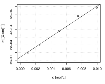
Let us start with a simple example, in which the linear dependence between the concentration and the conductivity of a dilute electrolyte is examined. At 5 different concentrations of electrolyte, the student takes measurement of the resistance of a beaker filled with electrolyte to the mark, with a pair of electrodes immersed and connected into a Wheatstone bridge. Using one known value for conductivity, the student calculates the rest of conductivities from the resistances, plots the points into a scatterplot, fits the best line through the data points, and, measuring its resistance, finally determines the unknown concentration of an additional sample. The task can be achieved with a simple script in R, shown below. The resulting graph is shown in figure 1.
1 concentration ¡- c(1.e-3, 2.5e-3, 5.e-3, 7.5e-3, 1.e-2) resistance ¡- c(5.31, 2.66, 1.40, 0.92, 0.78)
# calculate the conductivity k ¡- 1.e-4*resistance[1] conductivity ¡- k/resistance
# define the labels on x- and y-axis xlabel ¡- expression(paste(italic(c),” [mol/L]”)) ylabel ¡- expression(paste(sigma,” [(”,Omega,” cm)”^-1,”]”))
# plot the data plot(concentration, conductivity, xlab = xlabel, ylab = ylabel, xlim = c(0, 0.01), ylim = c(0, 7.e-4)) grid(col = ”darkgray”)
# find the best fit cond.fit ¡- lm(conductivity concentration, data = data.frame(concentration, conductivity))
# plot the fitted line abline(cond.fit)
The example shows a few features of R which we want to comment on:
-
•
Since we only have five data points, the data were entered directly into the program rather than being read from an external data file. The c() function is used to concatenate data into a vector.
-
•
R encourages programming with vectors. In the expression k/resistance, each element of the resulting vector is computed as a reciprocal value of the element of the original vector, multiplied by k.
-
•
Inspired by the TeX typesetting system, R offers a capable method of entering mathematical expressions into graph labels using the expression() function [10].
-
•
The plot() function is the generic function for plotting objects in R; here we used it to produce a scatterplot.
-
•
The lm() function is used to fit any of several linear models [11]; we used it to perform a simple bivariate regression. R is not overly talkative, and lm() does not produce any output on screen, it merely creates the object cond.fit, which we can later manipulate at will. In the example we used abline(cond.fit) to plot the regression line atop the data points. If we want to print the coefficients, we can use coef(cond.fit).
The complete sequence of commands can be saved into a script file, e.g., electrolyte.R, and can be executed at any later time using the source() function:
> source("electrolyte.R")
2.4 Case 2: Nonlinear dependence
Not all dependencies are linear. Sometimes, they can be linearized by an appropriate transformation (e.g., logarithmic), which reduces the task of finding the optimal fitted curve back to the linear case. With a computer at hand, however, this is not necessary. In this example, we examine the time dependence of voltage in a circuit with two capacitors (figure 2). The student first charges the capacitor and then monitors the voltage as discharges. The data, saved as in a CSV format:

"t [s]";"U [V]"
2,3;12,0
8,7;11,0
...
The voltage can be written as a sum of two exponentials:
The task is to determine the two characteristic times, and . The script below performs the task, and the resulting graph is shown in figure 3. {listing}1 C1 ¡- read.table(”capacitor.csv”, dec=”,”, sep=”;”, header = TRUE)
U ¡- C1t..s.
U.nls ¡- nls(U A*exp(-t/t1) + B*exp(-t/t2), start = list(A = 5, B = 5, t1 = 10, t2 = 100))
plot(C1, xlab = expression(paste(italic(t),” [s]”)), ylab = expression(paste(italic(U),” [V]”)))
lines(0:600, predict(U.nls, list(t = 0:600)))

A few features of R used in the example need some comment:
-
•
read.table() returns the object of a class data.frame; we may visualize it as a table. Individual columns in the table are addressed as table$column. Column names are constructed from the table header, with all illegal characters being replaced by dots. For easier manipulation, two vectors, t and U, were created from the appropriate columns of the table.
-
•
The actual nonlinear fitting is performed by the nls() function, which returns an object of the nls class. Apart from the formula, we also supplied the initial guesses for the fitting parameters. The values of the coefficients can be extracted by coef(U.nls), and summary(U.nls) produces an even more informative report.
-
•
An object of an nls class also provides methods for the predict() function, which we used to plot a piecewise linear curve, which appears as a smooth curve due to the small step used.
2.5 Case 3: Histogram
Our third example examines the statistics of radioactive decay. Using a Geiger counter, the student is required to record the number of decays detected in a period of time (in our case, 10 s), and repeat the measurement 100 times. After subtracting the base activity, the student computes the mean value , the standard deviation , and plots a histogram. The script shown below demonstrates computing and plotting the histogram. The final result is shown in figure 4.
1 # detected decays per 10 s x ¡- scan(”decay.txt”)
# subtract the base (normalized per 10 s) x ¡- x - 2.68
avg ¡- mean(x) stdev ¡- sd(x)
# draw the histogram hist(x, breaks = seq(floor(min(x)), ceiling(max(x))), main = ””, xlab = ”decays / 10 s”, ylab = ”frequency”)
# overlay the probability density function curve(length(x)*dnorm(x, mean = avg, sd = stdev), add = TRUE)

Again, a few comments.
-
•
Since the format of the input data file is very simple (one figure – the number of detected decays per 10 s – per line), we have used the scan() function instead of read.table(); x is thus a vector rather than a data frame.
-
•
The histogram is plotted using the hist() function. The breaks option is used to specify bin size and boundaries. By default, R uses Sturges’ formula for distributing samples into bins:
-
•
The normal probability distribution function dnorm() is plotted over the histogram with the curve() function and add = TRUE option.
2.6 Exporting the graph
Finally, we need to make the graph available to other programs. If we want to include it in a paper or a report, this often means exporting the graph as a PostScript file.
> postscript(file = "decay.eps", width = 5, height = 4.5)
> source("decay.R")
> dev.off()
The options width and height specify its width and height in inches. Other useful output formats include PDF (using pdf() function) and various bitmap formats (bmp(), jpeg(), png(), and tiff()).
3 Discussion
Having seen a few examples, we want to examine where R stands against its competition, i.e., manual analysis and graphing, spreadsheet software and commercial scientific graphing and/or statistical software suites.
Producing graphs manually involves some processing of data with a pocket calculator, determining the minimal and the maximal values of data in - and direction, choosing the appropriate scales on the - and -axis, plotting the data points, drawing the best-fit line and possibly using it in the subsequent analysis. In the case of histogram plotting, the student has to choose the bin size and manually arrange the samples into bins. It is instructive to perform this whole process once or possibly a few times in order to get familiar with all the steps required. Since the amount of information a physicist has to cope with often exceeds the human capacity of processing in a tabular form and requires some visualization technique, a certain degree of graphic, or visual literacy is required. Therefore, a lot of emphasis is given to teaching this skill in the course of a physics curriculum [12, 13, 14]. However, we can not overlook the fact that the processes involved in a manual production of a graph are time-consuming, error-prone, and do not contribute significantly to a better understanding of the problem studied. In this respect, we have to agree with earlier studies [15] that if the purpose of the graph is data analysis rather than acquiring the skill of plotting a graph, the time spent with manual graph plotting is better spent discussing its meaning.
By employing the “variable equals spreadsheet cell” paradigm where users can see their variables and their contents on screen, spreadsheets have been extremely successful in bringing data processing power to the profile of users who would have otherwise not embraced a traditional approach to computer programming. The usefulness spreadsheets possess for teaching physics [16, 17, 18], including laboratory courses [19, 20], has been recognized early on, and they continue to find new uses (see, e.g., [21]). However, the approach taken by spreadsheets also has its drawbacks. By placing emphasis on visualizing the data itself, the relations between data are less emphasized than in traditional computer programs, and it is generally more difficult to debug a spreadsheet than a traditional computer program of comparable complexity. The fact that the variables are referred to by their grid address rather than by some more meaningful name is an additional hindrance factor. Another sort of criticism concerns the graphical output of spreadsheet programs. While a skilled user can produce clear, precise and efficient graphs with Excel (see, e.g., [22] and the references therein), it is perceived [23] that less skilled users are easily misled into excessive use of various embellishments (dubbed as “chartjunk”, [24]) that do not add to the information content. Telling good graphs from bad ones is not merely a subject of aesthetics, there exists an extensive body of work in this area, see, e.g., [25, 26, 24, 27, 28], and [29].
While it is difficult to estimate the extent of its use in student laboratories throughout the world, we can observe that R receives an explosive growth of use in research laboratories, where one would actually expect slower adoption due to the additional competition it faces both from the commercial scientific graphing software and from the commercial statistical software suites. Thomson Reuters ISI Web of Science® shows that the R manual [2] has accumulated over 9000 citations since 1999, over 3000 of these in the year 2009 alone. Interestingly, however, fewer than 1% of this total figure comes from physics, and of these, the majority come from cross-disciplinary branches like geophysics and biophysics.
Using R brings considerable advantages. It is free; students can install a copy at home. Using R, well-designed publication-quality plots can be produced with ease. It is an object-oriented matrix language, which encourages thinking about programming problems on a more abstract level. It is an open source project; while its core is actively maintained by a 20-strong core team which includes the original author of S, over 1500 additional packages available on CRAN were contributed by hundreds of people all over the world. Last but not least, by running scripts in batch mode rather than using R interactively, reproducible research techniques [30] are encouraged. One further step in this direction is Sweave [31], which allows creating integrated script/text documents.
It also does not come without disadvantages. Students entering the laboratory course usually have no previous experience with R. With its complexity and a lack of point-and-click interface, the students can not be expected to self-learn it; a quick introduction course has been recommended even in the case of graduate students of computational biology [8]. The best synergy might be achieved when students take an introductory course in statistics before the physics laboratory course or simultaneously with it.
In many ways, the position of R in the area of data analysis and scientific graphing can be compared to the position TeX holds in typesetting texts with mathematical content. Both are free software packages, maintained by a tightly knit network of users/developers rather than a corporation. Both were designed as complete programming languages, which enabled the community to extend their usefulness with numerous add-on packages. Both, admittedly, have a relatively steep learning curve. Both found their use in their specific niches, which received a certain degree of neglect by the mainstream software industry, and seem fairly entrenched there.
4 Conclusions
The extent of utilization that R has recently experienced in various scientific disciplines signifies it is more than a marginal phenomenon. In the paper, we have demonstrated that R can be used productively for for data analysis and graphing in an introductory physics laboratory, and have illustrated its use on a few experiments taken from an actual laboratory course. The examples include a linear dependence, a non-linear dependence, and a histogram. The positive and negative aspects of R were discussed against three options often used for data analysis and graphing: manual graphing using grid paper, general purpose spreadsheet software, and specialized scientific graphing software.
References
References
- [1] Ross Ihaka and Robert Gentleman. R: A language for data analysis and graphics. J. Comput. Graph. Stat., 5:299–314, 1996.
- [2] R Development Core Team. R: A Language and Environment for Statistical Computing. R Foundation for Statistical Computing, Vienna, Austria, 2008. ISBN 3-900051-07-0.
- [3] R. A. Becker and J. M. Chambers. S: An Interactive Environment for Data Analysis and Graphics. Wadsworth & Brooks/Cole, Pacific Grove, CA, USA, 1984.
- [4] R. A. Becker, J. M. Chambers, and A. R. Wilks. The New S Language: A Programming Environment for Data Analysis and Graphics. Wadsworth & Brooks/Cole, Pacific Grove, CA, USA, 1988.
- [5] John M. Chambers. Programming with Data: A guide to the S language. Springer, New York, NY, USA, 1998.
- [6] Nicholas J. Horton, Elizabeth R. Brown, and Linjuan Qian. Use of R as a toolbox for mathematical statistics exploration. Am. Stat., 58:343–357, 2004.
- [7] Jeff Racine and Rob Hyndman. Using R to teach econometrics. J. Appl. Econ., 17:175–189, 2002.
- [8] Stephen J. Eglen. A quick guide to teaching R programming to computational biology students. PLOS Comput. Biol., 5:e1000482, 2009.
- [9] Bojan Božič, Jure Derganc, Gregor Gomišček, Vera Kralj-Iglič, Janja Majhenc, Primož Peterlin, Saša Svetina, and Boštjan Žekš. Vaje iz biofizike. Inštitut za biofiziko MF, 6th edition, 2003. In Slovenian.
- [10] Paul M. Murrell and Ross Ihaka. An approach to providing mathematical annotation in plots. J. Comput. Graph. Stat., 9:582–599, 2000.
- [11] John M. Chambers. Linear models. In John M. Chambers and Trevor J. Hastie, editors, Statistical Models in S, chapter 4. Chapman & Hall/CRC, Boca Raton, FL, USA, 1991.
- [12] Lillian C. McDermott, Mark L. Rosenquist, and Emily H. van Zee. Student difficulties in connecting graphs and physics: Examples from kinematics. Am. J. Phys., 55:503–513, 1987.
- [13] Robert J. Beichner. Testing student interpretation of kinematics graphs. Am. J. Phys., 62:750–762, 1994.
- [14] Vida Kariž Merhar, Gorazd Planinšič, and Mojca Čepič. Sketching graphs—an efficient way of probing students’ conceptions. Eur. J. Phys., 30:163–175, 2009.
- [15] Roy Barton. Why do we ask pupils to plot graphs? Phys. Educ., 33:366–367, 1998.
- [16] R. Dory. Spreadsheets for physics. Comput. Phys., 2:70–74, 1988.
- [17] Linda Webb. Spreadsheets in physics teaching. Phys. Educ., 28:77–82, 1993.
- [18] B. A. Cooke. Some ideas for using spreadsheets in physics. Phys. Educ., 32(2):80–87, 1997.
- [19] Rick Guglielmino. Using spreadsheets in an introductory physics lab. Phys. Teach., 27:175–178, 1989.
- [20] M. Krieger and J. Stith. Spreadsheets in the physics laboratory. Phys. Teach., 28:378–384, 1990.
- [21] L. Lévesque. Simple smoothing technique to reduce data scattering in physics experiments. Eur. J. Phys., 29:155–162, 2008.
- [22] Gaj Vidmar. Statistically sound distribution plots in Excel. Metodol. Zv., 4(1):83–98, 2007.
- [23] Yu-Sung Su. It’s easy to produce chartjunk using Microsoft Excel 2007 but hard to make good graphs. Comput. Stat. Data Anal., 52:4594–4601, 2008.
- [24] Edward R. Tufte. The Visual Display of Quantitative Information. Graphics Press, Cheshire, CT, USA, 2nd edition, 2001.
- [25] Paul A. Tukey. Exploratory Data Analysis. Adddison-Wesley, 1977.
- [26] John M. Chambers, William S. Cleveland, Beat Kleiner, and Paul A. Tukey. Graphical Methods for Data Analysis. Wadsworth & Brooks/Cole, Pacific Grove, CA, USA, 1983.
- [27] William S. Cleveland. Visualizing Data. Hobart Press, Summit, NJ, USA, 1993.
- [28] William S. Cleveland. The Elements of Graphing Data. Hobart Press, Summit, NJ, USA, 1994.
- [29] Leland Wilkinson. The Grammar of Graphics. Springer-Verlag, New York, NY, USA, 2nd edition, 2005.
- [30] Matthias Schwab, Martin Karrenbach, and Jon Claerbout. Making scientific computations reproducible. Comput. Sci. Eng., 2(6):61–67, 2000.
- [31] Friedrich Leisch and Anthony J. Rossini. Reproducible statistical research. Chance, 16(2):46–50, 2003.