Correlation-sharing for detection of differential gene expression
Abstract
We propose a method for detecting differential gene expression that exploits the correlation between genes. Our proposal averages the univariate scores of each feature with the scores in correlation neighborhoods. In a number of real and simulated examples, the new method often exhibits lower false discovery rates than simple t-statistic thresholding. We also provide some analysis of the asymptotic behavior of our proposal. The general idea of correlation-sharing can be applied to other prediction problems involving a large number of correlated features. We give an example in protein mass spectrometry.
1 Introduction
We consider methods for detecting differentially expressed genes in from a set of microarray experiments. Consider the simple case of genes measured across two experimental conditions. A number of authors have proposed methods for detecting differential gene expression, including ?, ? and ?. ? presents an interesting, more general approach.
One widely used approach to this problem is as follows. We compute a two-sample t-statistic for each gene, and then call a gene significant if exceeds some threshold . Various values of are tried, using permutations of the sample labels to estimate the false discovery rate (FDR) for the procedure for each . A threshold is finally chosen based on the estimates of FDR and other considerations, such as the ballpark number of significant genes that is desirable. This recipe roughly describes the strategy used, for example, in the Significance of Microarrays (SAM) procedure (?).
In this paper we propose a simple method for potentially improving on the thresholded t-statistic approach defined above. The idea is to exploit correlation among the genes. In a sense this general idea is not new, and exploratory methods based on clustering have been proposed (e.g. ?). These methods require choices like the clustering metric and linkage, and hence are somewhat subjective. The proposal presented here is much simpler, and hence it is easier to analyze and assess its performance.
We start with t-statistics computed for each gene. Then we assign to each gene a score equal to the average of all t-statistics for genes having correlation at least with that gene, choosing the best value of to maximize the average. Finally, we call a gene significant if exceeds some threshold . The idea is that differentially expressed genes are likely to co-exist in a pathway, and hence will be correlated in our data. Hence use of the score might provide a more accurate test of significance than that based on . We call this approach “correlation sharing” Note that the choice yields no sharing, giving . Hence the correlation-sharing method contains the thresholded t-statistic approach as a special case.
As a motivating example, we generated data with 1000 genes and 30 samples. The first 50 genes are generated as
| (1) |
with and , where The remaining genes were generated as . The outcome variable equaled 2 for and 1 otherwise.
Figure 1 shows the t-statistics (top panel) and correlation-shared t-statistics (bottom panel). We see that in the bottom panel the scores for the first 50 genes are magnified. This leads to improved detection of the differentially expressed genes, as we show in the next section.
The outline of this paper is a follows. Section 2 defines correlation-sharing. In section 3 we discuss the concept of residual correlation, and its impact on correlation-sharing. We apply our method to four microarray cancer datasets. The skin data is examined more closely in section 4. Some asymptotic results for correlation sharing are given in section 6. Section 5 applies the method to a different kind of data— protein mass spectra. Finally in section 7 we discuss the application of correlation sharing to other kinds of response variables, and computational issues.
2 Correlation sharing
Let be the matrix of expression values, for genes and samples. We assume that the samples fall into two groups and . We start with th standard (unpaired) t-statistic
| (2) |
Here is the mean of gene in group and pooled within group standard deviation of gene .
Let denote the row of . Define , the indices of the genes with correlation at least with gene Then we define
| (3) | |||||
| (4) |
We call this the “correlation-shared” t-statistic. The method calls significant all genes having , and estimates the false discovery rate (FDR) of the resultant gene list by permutations. We vary and examine the estimated FDR.
Figure 2 shows the results for correlation sharing applied to the simulated data from model (1) . As the threshold is varied, the number of genes called significant and the number of false positive genes and false negative genes all change. We see that correlation sharing generally yields fewer false positive and false negative genes genes than the t-statistic.
We can also think of correlation-sharing as a method for supervised clustering. Let be the maximizing correlation for gene , from definition (4). Then the set of genes with indices is an adaptively chosen cluster, selected to maximize the average “signal” around gene . Unlike with most standard clustering methods, the clusters are overlapping, rather than mutually disjoint. We examine these clusters in some examples later in this paper.
As a second example, we changed the data generation so that the first 50 genes had no correlation, before the group effect was added. Figure 3 shows that the advantage of correlation sharing has disappeared.
3 Residual correlation among non-null and null genes
The previous example suggests that a key assumption in for our proposal is that the correlation between the non-null genes is higher than that for the null genes.
We need to say precisely what we mean by “correlation”. Suppose for a set of non-null genes , the expression is units higher in group than it is in group :
| (5) | |||||
| (6) |
Let . Then even if the errors are all independent of one another, we have for . That is, the treatment effect induces an overall correlation between the genes in . However we would expect that the t-statistic would capture all of the information needed to decide if a gene is in .
Instead, we assume that there is residual correlation among the genes in :
| (7) |
where .
For the simulated data of Figure 1, the estimated residual correlation is the correlation between genes, after having removed the estimated effect of treatment. Specifically, the residual correlation is where . For the two sample case, for example, , equaling the average of for samples in group .
The average absolute residual correlation for the non-null genes (the first 50 genes) equaled 0.47, while that for the null genes was 0.15, and the correlation between the non-null and null genes was also 0.15.
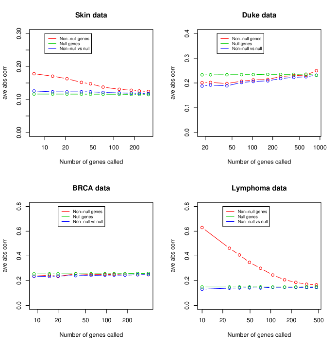
Is there residual correlation in real microarray data? Biologically, genes will be correlated if they are in the same pathway. However if that pathway is not active in the experimental conditions under study, the genes in the pathway will not show large correlation. And the same genes will tend to be null, i.e. will not differentially expressed in the experiment. The opposite should be true for differentially expressed genes.
To see if this assumption is reasonable in practice, we examine four microarray datasets: the skin data taken from ?, and Duke breast cancer data taken from (?), the BRCA data taken from ? and the non-Hodgkins lymphoma data from ?. These are summarized in Table 1.
The false discovery rates of both the t-statistic and correlation-shared statistics depend on the total number of genes input into the corresponding procedure. Hence for fairness (and computational speed) we started with the 2000 genes having largest overall variance in each case.
To examine residual correlation, we computed the two-sample t-statistics for each gene. Then we computed the average absolute residual correlation for genes satisfying , with varying from the 99th to the 75 quantiles of the values. In the lymphoma data the outcome is survival time; hence we instead computed the Cox’s partial likelihood score statistic for each gene (see section 7).
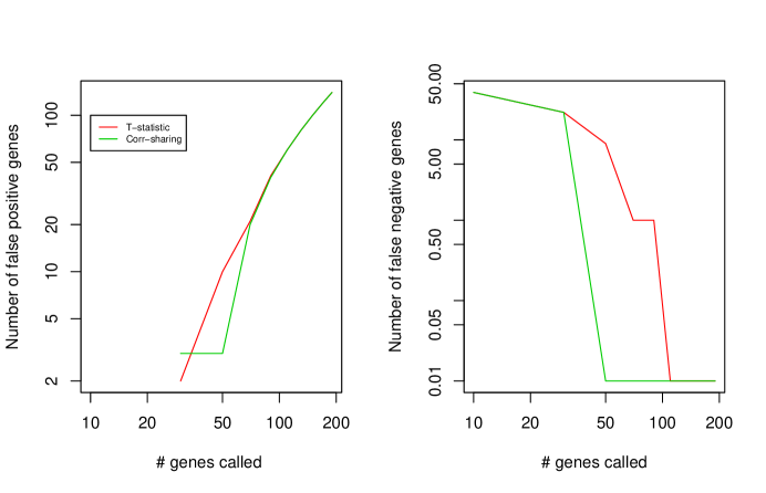
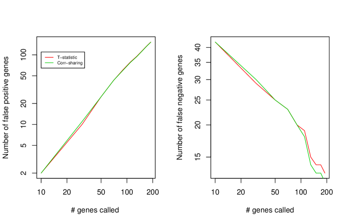
The results are shown in Figure 4. For the skin and lymphoma datasets data, the non-null genes have higher correlation with each other than they have with the null genes, and also higher than that within the null-genes. But for the Duke and BRCA2 datasets, this is not the case.
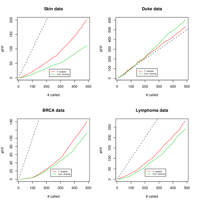
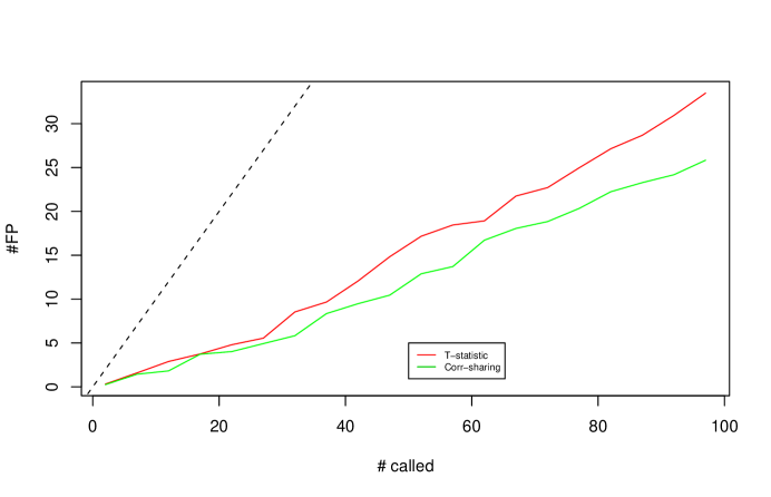
For the same four datasets, Figure 5 shows the estimated number of false positive genes is plotted against the number of genes called significant, for both the t-statistic and correlation shared t-statistic. Correlation sharing exhibits lower FDR for all datasets except the Duke data, where neither method does much as all.
4 Skin data example
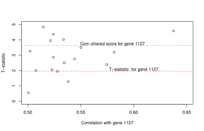
We examine more closely the results for the skin data shown in the top left panel of Figure 5. There are 12,625 genes and 58 patients: 44 normal patients and 14 with radiation sensitivity.
Figure 6 illustrates how correlation sharing can magnify the effect of a gene (#1127 chosen as an example). The figure shows all genes having correlation at least 0.5 with gene # 1127. Its raw t-statistic is about 2.0 Notice that the genes most correlated with gene # 1127 have greater scores than this gene. In particular, gene #1127 has correlation with a gene having score about 4.7. Hence our procedure averages the scores of these two genes to produce a new score of about 3.8.
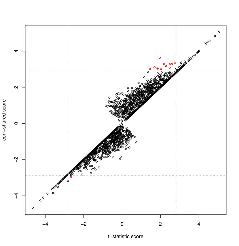
Figure 8 shows the correlation-shared score versus the t-statistic score. Setting the cutoffs so that each method yields 100 significant genes, there are 13 genes which are called by each method and not called by the other. The red points represent the genes that are called significant by correlation-sharing but not by the t-statistic. Many of these genes are highly correlated with each other, and hence they boost up each other’s score.
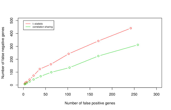
In Figure 9 we do another test of our procedure. We randomly divided the samples into equal-sized training and test sets. We computed the t-statistic and correlation sharing statistics on the training set, and also evaluated on the test set. For each trial cutpoint applied to the training set scores, we counted the number of genes with scores above or below this cutpoint in the test set. Genes above the cutpoint in the training set but below it in the test set were considered “false positives”, and conversely for false negatives. The results in Figure 9 show that correlation sharing has fewer false negatives for the same number of false positives.
5 Example: protein mass spectrometry
This example (taken from (?)) consists of the intensities of 3160 peaks on 20 patients: 10 healthy patients and 10 with Kawasaki’s disease. They were measured on a SELDI protein mass spectrometer.
Figure 10 shows that correlation sharing offers a mild improvement in the false positive rate.
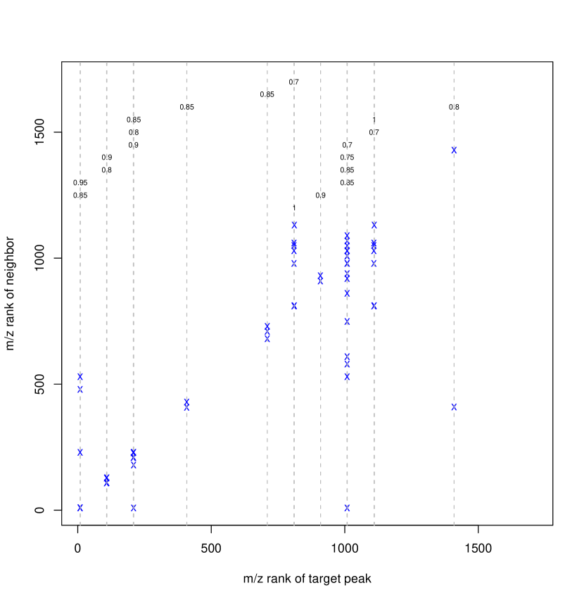
For the 50 peaks having the top scores, 19 of these peaks were given neighborhoods of more than a single feature by the correlation sharing procedure. The smallest correlation chosen for neighborhood averaging was 0.7. Now in this example, each peak has an associated (mass over charge) location: this was not used in the correlation-sharing procedure, but we can look posthoc at the these values within each averaging neighborhood. Figure 11 shows the location of the each of the 19 peaks (horizontal axis) and the chosen neighbors (vertical axis). The corresponding neighborhood correlation is indicated along the top of the plot. We see that most often, the selected neighbors are close to the target peak. But in some cases, they can be very far apart. Some biological insights might emerge from examination of these groups of peaks.
6 Asymptotic Analysis
In this section we show that, under appropriate conditions, correlation sharing improves power. More specifically, we show that for null genes, has similar behavior to , while for nonnull genes, tends to be stochastically larger than . For simplicity, we focus on a one-sample, one-sided test. We denote by the measurement for gene in sample . Let denote the test statistic for gene and assume that where for null genes and that for non-nulls. Let denote the true residual correlation between gene and gene , denote the estimated residual correlation.
The correlation-shared statistic is
| (8) | |||||
| (9) |
Throughout this section we make a small modification to the statistic which simplifies the analysis: we restrict the maximization in the definition of to be over correlation neighborhoods no larger than , where is some fixed integer.
Recall that there are genes and observations. We require both and to grow in the asymptotic analysis. Typically, is much larger than so, to keep the asymptotics realistic, we allow to grow very slowly relative to . Specifically, we assume:
| (10) |
Let denote the nonnull genes and let denote the null genes. We will also need the following:
Assumption (A2): There exist such that
| (11) |
Thus we make the strong assumption that there is positive residual correlation among the non-null genes, but no residual correlation among the null genes or between the non and non-null genes. This simplifies our analysis. Later, we will relax this assumption.
LEMMA 1. Assume that (A1) holds. Fix . Then, for all large ,
| (12) |
and
| (13) |
That is, , uniformly over , a.s. and , uniformly over , a.s.
PROOF of Lemma 1. Kalisch and Bühlmann (2005) show that,
| (14) |
for some . So,
| (16) | |||||
where
| (17) |
For sufficiently large, . The first result then follows from the Borel-Cantelli Lemma. For the second result, apply Mill’s inequality:
| (18) |
The result follows from assumption (10) and the Borel-Cantelli Lemma.
LEMMA 2. Assume (A1) and (A2). Then, for all and each ,
| (19) |
for all large . Also, for every ,
| (20) |
for all . Thus, there are no nulls in the correlation neighborhoods of a non-null gene, except possibly for small . Similarly, there are no nonnulls in the correlation neighborhoods of a null gene.
6.1 The Oracle Statistic
To understand the behavior of the correlation sharing statistic, it is helpful to first consider an oracle version of the statistic based on the true correlations. Let
| (21) | |||||
| (22) |
Let us fix some nonnull gene and without loss of generality, take . Without loss of generality, label the genes so that
| (23) |
Then,
| (24) | |||||
| (25) | |||||
| (26) |
where
| (27) |
is the Cesaro average and is a mean zero Gaussian process with covariance kernel
| (28) |
The distribution of is thus the distribution of the maximum of a noncentered, nonstationary Gaussian process.
If is strongly peaked around some value , then
| (29) |
Hence,
| (30) |
In particular, suppose that for and for . Then,
| (31) |
and so
| (32) |
where is a noncentral with noncentrality parameter
| (33) |
In contrast, has noncentrality parameter . These heuristics imply that correlation sharing improves the power if
| (34) |
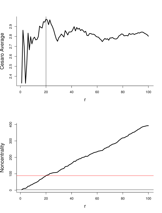
Figures 12 and 13 illustrate this analysis. The top plot in each figure is and the bottom plot is the noncentrality as a function of the size of the correlation neighborhood.
Figures 12 shows a least favorable case in which and for . (In all cases we took ). We call this least favorable since has the largest mean; any averaging can only reduce its mean. Now, and has noncentrality 50. The randomness of can lead to a correlation neighborhood larger than . If so, the noncentrality parameter can be reduced as is evident from the steep decline of the curve in the second plot.
Figure 13 shows a more realistic case. Here we used a random effects model and took . This makes a random walk. Correspondingly, behaves like a random walk for small but settles down to a constant for large . In this case, tends to be small but the noncentrality grows rapidly. The result is a dramatic gain in noncentrality. Also, the gain is robust to the choice of .
Now consider a null gene . Again take . Then, by assumption (A2), for all . Hence, for all and so the null distribution is unaffected by correlation sharing.
Let us now consider weakening (A2). Suppose we allow some small, nonzero correlation among null genes. Change the definition of to
| (35) |
Now replace (A2) with:
Assumption (A2’):
| (36) |
and
| (37) |
The analysis for nonnull genes is virtually unchanged. For null genes, condition (A2’) ensures that . An interesting extension is to estimate from the data. We leave this to future work.
6.2 Relationship Between and the Oracle
The analysis in the previous section ignores the variability of the . Now we relate to .
First, under appropriate assumptions, we will show that for nonnull genes, is at least as large as . Suppose there exists a decreasing function with , such that
| (38) |
Suppose that is a simple function, that is, takes finitely many values . The level sets can only be of the form for . Choose small. By Lemma 1, a.s. Let . For all , a.s. Then, for all large ,
| (39) | |||||
| (40) | |||||
| (41) |
so that is at least as large as .
Now we drop the assumption that is simple and instead assume it is continuous and strictly decreasing. Similarly, assume there exists a continuous, integrable function such that
| (42) |
Suppose that is maximized at some . Let and . Then, a.s. for all large ,
| (43) | |||||
| (44) | |||||
| (45) |
Hence,
| (46) |
Let . From Lemma 1 and the assumptions on , a.s. and
| (47) | |||||
| (48) | |||||
| (49) | |||||
| (50) | |||||
| (51) |
Thus, .
Now suppose that is a null gene. Fix a small . Under (A2), we eventually, have
| (52) |
and hence
| (53) |
The same holds under (A2’).
7 Other issues
Computation of the correlation shared statistic can be challenging when the number of features is large. Brute force computation is . In principle, a KD tree can be used to quickly find the neighbors of a given point with correlation at least . The building of the tree requires computations, while the nearest neighbor search takes computations. Hence the nearest neighbor search for all points requires computations. However, since the dimension of the feature space () is large n these problems (at least 50 or 100), the KD tree approach is not likely to be effective in practice (J. Friedman, personal communication).
Hence we instead do a direct brute force computation, exploiting the sparsity of the set of pairs of points with large correlation. The resulting procedure is quite fast, requiring for example 2.7s on the proteomics example ().
The proposal of this paper can be applied to outcome measures other than two-class problems. We have seen this earlier in the lymphoma example, where the outcome was survival time. Other response types that may arise include a multi-class or quantitative outcome. The modification to the correlation-sharing technique is simple: the t-statistic (2) is simply replaced by a score that is appropriate for the outcome measure. For survival data, for example, we use the partial likelihood score statistic for each gene. This was illustrated in the lymphoma data of Table 1.
Correlation-sharing provides a recipe for supervised clustering of features. Hence one might use correlation-sharing as a pre-processing step, by averaging the given features in the prescribed clusters. Then these averaged features could be used as input into a regression or classification procedure. This is a topic for future study.
Acknowledgments We would like to thank John Storey for showing us a pre-preprint of his “optimal discovery procedure” paper. We would also like to thank Jerry Friedman for helpful discussions. Tibshirani was partially supported by National Science Foundation Grant DMS-9971405 and National Institutes of Health Contract N01-HV-28183.
| Name | Description | # Samples | # Features | Source |
|---|---|---|---|---|
| Skin | Two classes | 58 | 12,625 | ? |
| Duke breast cancer | Two classes | 49 | 7097 | ? |
| BRCA | Two classes | 15 | 3226 | ? |
| Lymphoma | Survival | 240 | 7399 | ? |


.