AMS note 2005-12-01
LAPP-EXP-2005-21
AMS02 Ecal trigger performance measured at the
October 2004 CERN test beam
Pierre Brun111Laboratoire d’Annecy-le-vieux de Physique des Particules, CNRS/IN2P3/Univ. de Savoie 222brun@lapp.in2p3.fr
and
Sylvie Rosier-Lees111Laboratoire d’Annecy-le-vieux de Physique des Particules, CNRS/IN2P3/Univ. de Savoie
Abstract
-
Test beam data collected in October 2004 at CERN PS to validate the AMS 02 Ecal Intermediate Board (EIB) are analyzed. After describing the experimental setup and the event samples, results concerning noise measurement, trigger efficiency and threshold accuracy are presented. They demonstrate that the EIB fulfils the physics requirements. Therefore the analog part of the trigger is validated, and hardware choices are also made towards the final device.
1 Goals of the test beam
1.1 Introduction
This analysis concerns data taken between September and October 2004 at CERN. The test beam involved both
Tracker and Ecal subgroups, and partly aimed to combine energy measurement with the
Ecal and tracking with some silicon ladders in a magnetic field.
Once installed on the ISS, AMS02 main trigger signal will be provided by the Time Of Flight detectors, which sign the passage
of charged particles. In order to perform ray astronomy with AMS02, methods based on the conversion of photons in
the upper detector, requiring the pair rigidity measurement in the Tracker have been made up. In addition to this,
the Ecal working group developed a specific trigger only involving the calorimeter, which we call standalone trigger
([1], [2], [3]). Its signal has to be fast in order to be able to shortcut the main trigger. This
method gives a complementary detection method, providing a very good energy resolution and sensitivity in the
GeV-TeV [4]. This test beam was the opportunity to validate some parts of the trigger chain, the Ecal Intermediate
Board (EIB) prototype and to test the performance of the standalone trigger: stability, effective thresholds, noise
level and efficiency.
1.2 Ecal instrumentation
AMS02 Ecal consists of alternated planes of lead and scintillating fibers. When a particle crosses the detector, photomultiplier tubes (PMT) collect light from fibers, each PMT having 4 distinct pixels.

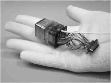
For each PMT, 9 wires provide digitized signals from front end electronics (EFE) : 2 from each pixel (low gain / high gain) and 1 dynode. In addition, the analog dynode signal which is not shaped and digitized (then faster) is amplified, compared to a threshold and used for the trigger.
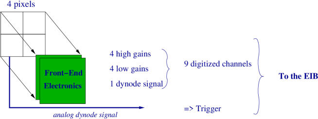
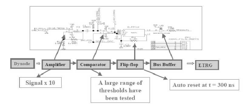
By recording data from both the EFE and the comparator response, we aim to measure the performance of this trigger system. We expect the trigger to be efficient for a 100 MeV local energy deposition, it has been previously measured [4] that it corresponds to a 2.5 mV dynode signal. With the 3 V supply used, an amplification by a factor of 10 has been chosen. 2 types of amplifiers have been tested and the final choice is to be one of this test beam results. Next section give a complete description of the methods and measurements.
2 Experimental conditions
2.1 Beam and detectors
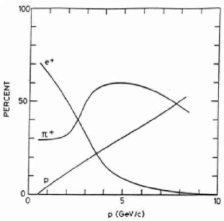
CERN’s Proton Synchrotron (PS) provided electrons, pions, kaons and muons at 3 energies (3, 5 and 7 GeV depending on the period). This test beam took place at T7 line East hall. Figure 3 show the relative T7 line beam composition versus the energy.
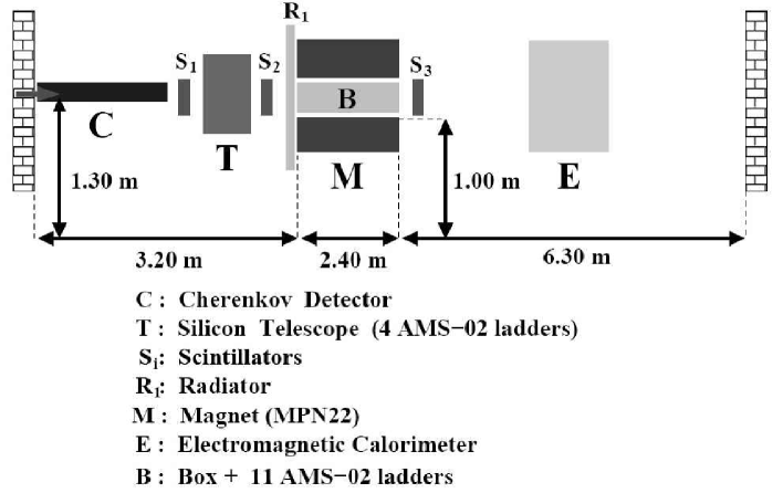
The experimental zone is represented on figure 4, it contained the Ecal (E), 2 Silicon telescopes (T and B), a magnet (M), 3 scintillators planes () and a 2 Čerenkov counter (C, one of them was outside the zone).
Two Čerenkov detectors were placed before the magnet and used for trigger purpose in complement to 3 scintillators (the trigger logic is described below). The Tracker telescope was dipped into the magnetic field provided by the magnet. The Ecal was placed outside the magnetic field at the end of the chain. An additional silicon ladder allowed to determine the beam position just before it enters the Ecal. It was possible to place a Tungsten radiator before the magnet in order to enhance bremsstrahlung from electrons, this was used by the Tracker working group and is not relevant for our study.
2.2 General triggers
A main trigger drove both Ecal and Tracker data acquisition ([5], [6]). The latter was triggered when the 3 scintillators gave signals in coincidence. Then information provided by the 2 Čerenkov detectors allowed to distinguish electrons/muons and charged pions:
-
•
Beam =
and, depending on the chosen type of particle:
-
•
Trigger =
-
or
-
•
Trigger =
It was a key issue that both Ecal and Tracker have a common event number for combined studies. So the event number was provided by the main trigger logic described on figure 5.
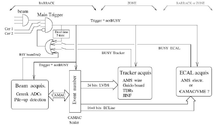
This trigger configuration was the basic one and other Ecal
acquisition logics have been tested in order to study the
trigger. The former are detailed
in next sections.
2.3 Ecal setup
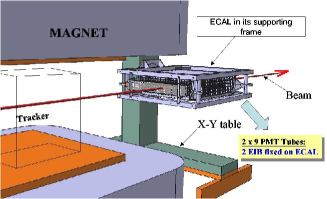
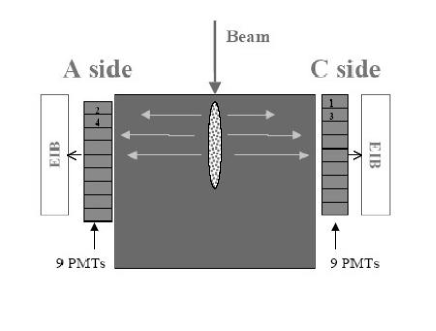
The Ecal equipment consisted in 2 EIBs and therefore 18 PMTs (9 per EIB). In order to be sensitive to most of the shower, the Ecal was placed in horizontal position, the beam entering in it by its side (see figure 6). In this configuration 80% of the energy was measured by the Ecal. An additional silicon ladder was placed on the Ecal side to give an accurate determination of the beam entering point.
2.4 Event statistics
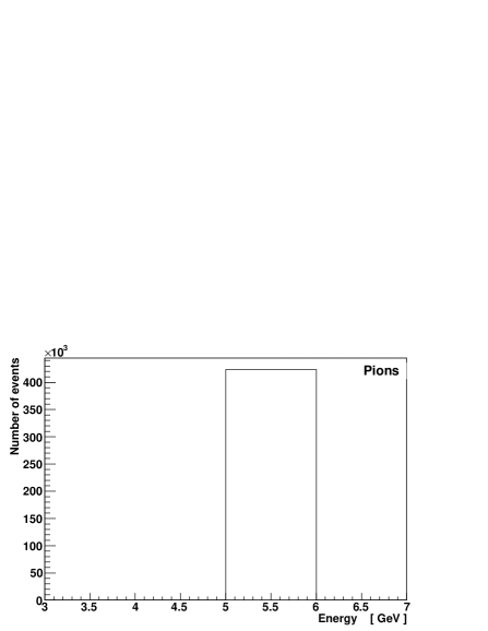
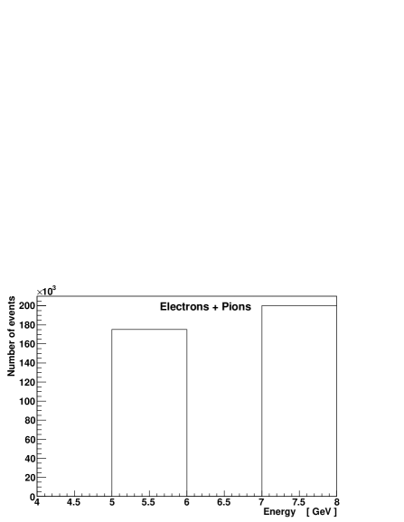
A large amount of data has been recorded, with about 700 runs and total of events. Next table shows the number of events for each type of particles, and figure 8 shows their energy repartition.
| Particle type(s) : | electrons | pions | electrons + pions | muons |
|---|---|---|---|---|
| Number of events : |


Other parameters differentiate runs, like whether the magnet or the radiators are in use or not. Nevertheless these different configurations do not have any implication for the study presented here and they will no more be mentioned.
2.5 Different analysis aspects
This test beam had two main goals from the Ecal point of view:
-
•
To validate the bus part, i.e. what concerns the data and logic command
-
•
To test and validate the analog part of the trigger
In this context, the following analysis is divided in two parts. In the first, we analyze the bus part with pedestal measurements, time stability of the electronics and we show that data acquisition do not present any problem.
3 Analysis part 1 : data and logic command
3.1 Conditions stability
As shown in the following, data taking conditions were very good, only a few problem occurred. On the C side, no coherent data were collected from PMT C-9, due to a problem on the readout board. This has very few implications on our analysis since it is the most far from the beam entering point, and therefore would have had very few signal. A more important problem occurred on the A side, since the EIB has been changed because of some connection defaults. This problem will be detailed below.
3.2 Pedestal measurement
3.2.1 Test beam measurements
During he whole test beam, pedestals have been regularly measured. It allows to have a good calibration at any time and to follow the global conditions evolution. As an illustration, figure 13 is the signal distribution for an anode channel on PMT C2 recorded during a typical pedestal run (which contain 1000 events).
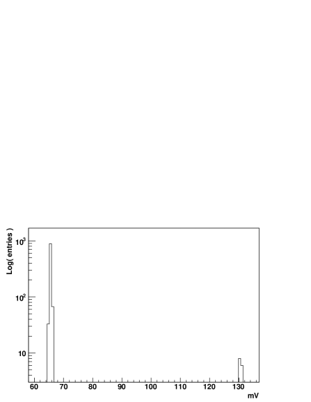

On the left plot we see that a few events are far above pedestal (which is here of about 66 mV). These are probably due to the passage of a particle in the detector during the run (the beam was not stopped during pedestal runs). On the right, we can see the same figure zoomed around the peak. In the following, each time we present a pedestal value, it comes from a gaussian fit to this kind of distribution, after removing values far above the main peak. Note that an ADC channel is 0.73 mV and the standard deviation from the fits are always much lower than one ADC channel.
3.2.2 Stability for the whole test beam duration
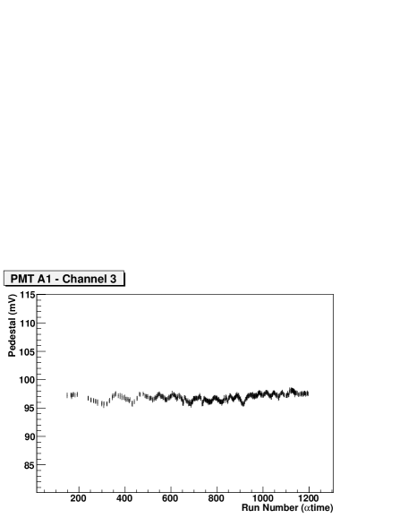
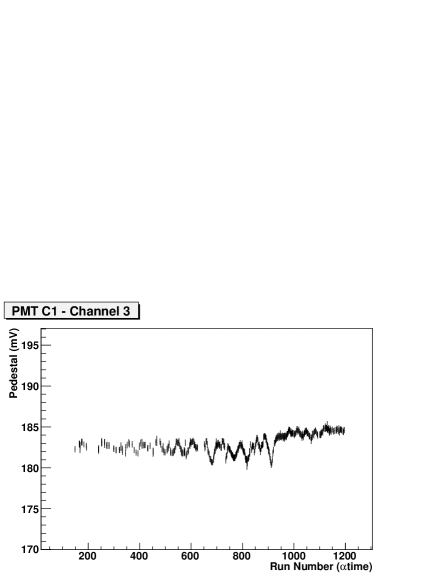
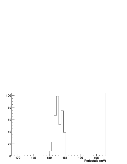
Pedestal runs have been taken all the way long, in general each time a physical run ended. The purpose of these measurements are to subtract an up-to-date pedestal value to the data during the analysis. It also permits to follow the general evolution of the electronics. For each pedestal run, a distribution similar to figure 13 is fitted. Then we obtain the behavior of the pedestal evolution versus time, as shown on figure 10 (here for one PMT channel on each side). This figure shows on the left hand side the evolution versus time, and on the right hand side the pedestal distribution for the whole test beam duration. Similar plots are obtained for each channel and each PMT. The tables of figure 11 and 12 contain a summary of all these results. For a given channel and a given PMT, the “mean” value is the mean pedestal value for the whole test beam and “rms” is the root mean square of this distribution.

| PMT A | 1 | 2 | 3 | 4 | 5 | 6 | 7 | 8 | 9 | |
| Channels | ||||||||||
| 1 | mean | 131.1 | 233.3 | 164.6 | 72.5 | 83.6 | 189.6 | 134.4 | 146.7 | 67.8 |
| rms | 0.46 | 0.90 | 0.79 | 5.62 | 0.75 | 0.67 | 1.10 | 0.78 | 0.67 | |
| 2 | mean | 103.7 | 63.42 | 194.7 | 160.4 | 124.5 | 103.3 | 115.8 | 53.32 | 69.5 |
| rms | 0.70 | 0.75 | 0.80 | 67.1 | 0.66 | 0.84 | 1.02 | 1.15 | 0.33 | |
| 3 | mean | 96.9 | 166.4 | 149.3 | 89.4 | 124.1 | 121..9 | 119.8 | 127.8 | 133.2 |
| rms | 0.57 | 0.80 | 0.71 | 5.31 | 0.69 | 0.74 | 1.02 | 0.84 | 0.32 | |
| 4 | mean | 171.4 | 218.5 | 130.6 | 73.06 | 145.4 | 114.4 | 115.7 | 127.2 | 117.4 |
| rms | 0.52 | 0.90 | 0.74 | 5.48 | 0.80 | 0.49 | 1.13 | 0.67 | 0.39 | |
| 5 | mean | 147.9 | 203.4 | 174.1 | 157.8 | 114 | 96.7 | 144.3 | 184.2 | 38.4 |
| rms | 0.74 | 0.91 | 1.12 | 68 | 0.53 | 0.61 | 1.08 | 0.55 | 0.54 | |
| 6 | mean | 174.4 | 118.6 | 58.71 | 260.7 | 125.6 | 228.7 | 164.4 | 163.8 | 141.7 |
| rms | 0.69 | 0.87 | 0.76 | 79.2 | 125.6 | 228.7 | 164.4 | 163.8 | 0.50 | |
| 7 | mean | 134.1 | 160.2 | 177.4 | 124.1 | 138.5 | 181.1 | 220.9 | 87.4 | 164.2 |
| rms | 0.58 | 0.74 | 0.66 | 5.25 | 0.50 | 0.54 | 1.10 | 0.91 | 0.38 | |
| 8 | mean | 136 | 97.9 | 178.5 | 171 | 130.3 | 205.2 | 174.7 | 172.4 | 92.18 |
| rms | 0.21 | 1.01 | 0.68 | 70.98 | 0.70 | 0.62 | 1.05 | 0.73 | 0.41 | |
| 9 | mean | 451.8 | 328.1 | 470.8 | 483.8 | 459.1 | 424.9 | 507.3 | 393.8 | 395.8 |
| rms | 3.34 | 32.6 | 9.68 | 8.97 | 5.9 | 2.89 | 7.9 | 0.46 | 10.26 | |
| 9 | mean | 326.8 | 274.6 | 332.9 | 359.3 | 343 | 314.4 | 361.9 | 325.7 | 412.6 |
| EIB 1 | rms | 0.35 | 0.42 | 0.24 | 19.02 | 0.25 | 0.34 | 0.36 | 0.47 | 0.62 |
| 9 | mean | 332.1 | 348 | 332.9 | 355.35 | 333.3 | 309.5 | 374.7 | 288.1 | 389.4 |
| EIB 2 | rms | 0.48 | 0.36 | 0.26 | 0.24 | 0.48 | 0.06 | 0.19 | 0.44 | 0.25 |
| PMT C | 1 | 2 | 3 | 4 | 5 | 6 | 7 | 8 | 9 | |
| Channels | ||||||||||
| 1 | mean | 140.1 | 65.52 | 101.3 | 76.77 | 159.2 | 92.0 | 205.6 | 143.4 | - |
| rms | 0.96 | 1.05 | 0.48 | 0.74 | 0.50 | 0.76 | 0.57 | 0.93 | - | |
| 2 | mean | 169.6 | 95.15 | 98.54 | 121.9 | 51 | 95.71 | 40.85 | 192 | - |
| rms | 0.87 | 0.80 | 0.75 | 0.60 | 0.67 | 0.50 | 1.01 | 0.58 | - | |
| 3 | mean | 183 | 91.13 | 180 | 131.7 | 90.0 | 150.1 | 131 | 188.5 | - |
| rms | 1.09 | 0.95 | 0.63 | 0.73 | 0.81 | 0.87 | 0.80 | 0.81 | - | |
| 4 | mean | 154.1 | 97.34 | 128.5 | 82.76 | 136.1 | 115.8 | 179.6 | 95.26 | - |
| rms | 1.02 | 0.79 | 0.45 | 0.82 | 0.99 | 0.72 | 0.43 | 0.63 | - | |
| 5 | mean | 172.4 | 82.14 | 232.7 | 112.6 | 56.22 | 107 | 176.2 | 92.7 | - |
| rms | 0.99 | 0.92 | 0.42 | 0.94 | 0.74 | 0.78 | 0.74 | 0.98 | - | |
| 6 | mean | 150.5 | 166.7 | 149.8 | 120.4 | 206.1 | 87.94 | 89.97 | 141.8 | - |
| rms | 1.09 | 0.74 | 0.58 | 0.62 | 0.65 | 0.86 | 0.78 | 0.84 | - | |
| 7 | mean | 121.9 | 230.6 | 77.47 | 126.9 | 157.8 | 157.3 | 98.57 | 82.54 | - |
| rms | 0.67 | 0.54 | 0.79 | 0.65 | 0.47 | 0.63 | 0.86 | 0.90 | - | |
| 8 | mean | 120.8 | 129.7 | 189 | 267.2 | 126.1 | 115.2 | 98.41 | 159.3 | - |
| rms | 0.78 | 0.88 | 0.71 | 0.66 | 0.60 | 0.79 | 1.04 | 0.96 | - | |
| 9 | mean | 573.5 | 585.9 | 584.3 | 604.7 | 598.9 | 615.4 | 574.4 | 599.8 | - |
| rms | 0.55 | 0.40 | 0.43 | 0.49 | 0.39 | 0.31 | 0.21 | 0.40 | - | |
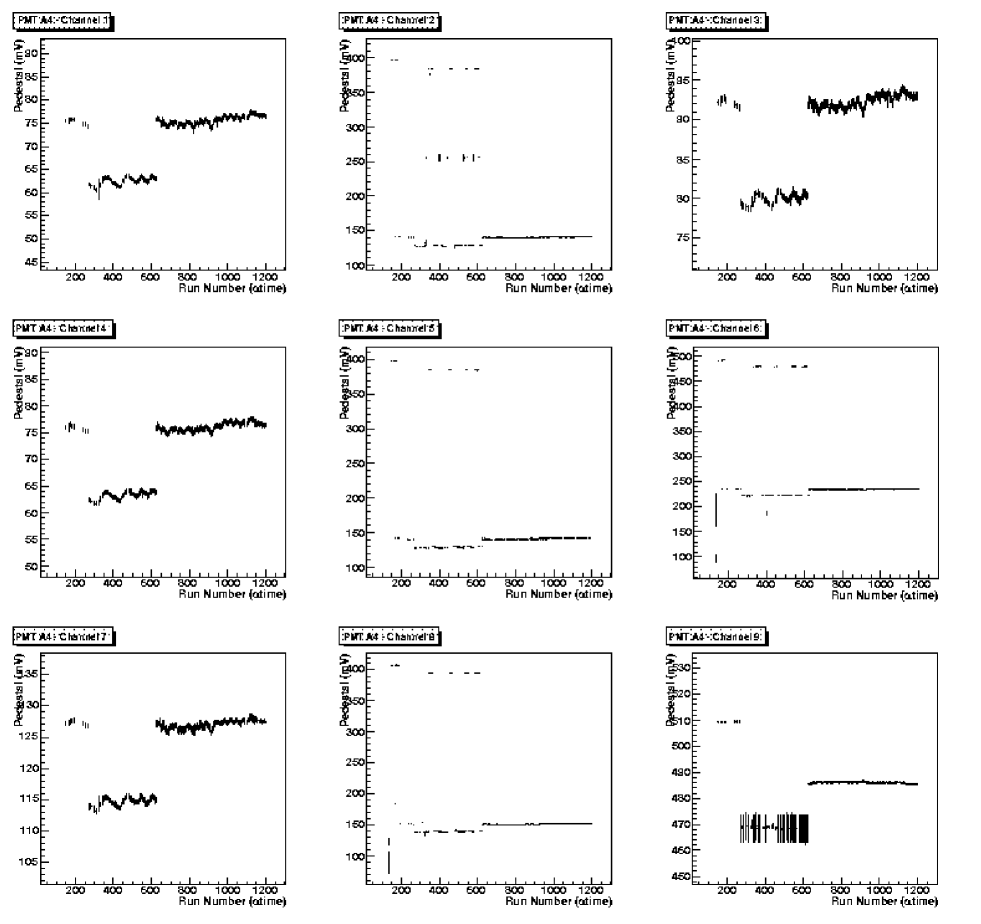
Tables from figures 11 and 12 show that C side PMTs have extremely stable pedestals, with an overall standard deviation which is often below 1 ADC channel (= 0.73 mV) and always below 1 mV. On A side the situation is the same with a few exceptions detailed below. This stability is a first good result because it ensures good data taking condition and is a first indication that the bus part of the device works correctly. Some figures on the A side appear to be quite bad, like the fluctuations of the A4 pedestal value or the variability of all the A side dynodes. These problems are related to the change of EIB on the A side. Before it was changed, some fluctuations were observed in particular on PMT A4. After the change the stability was back. Figure 40 at the end of this note shows PMT A4 pedestal evolution for all its channels. One can see clearly there that after the EIB change, their value become stable again. To illustrate this, the dynode pedestal values are written in table 11 for the first EIB and the second one separately.
3.3 Comparison with previous measurements
The 18 PMTs used in this test beam had their pedestals previously measured at LAPP on test bench. The first check we did was to see if we measured the same pedestals once installed in the experimental zone with the whole acquisition apparatus (in particular the EIB plugged on). Figure 13 shows the correlation between the anode pedestals previously measured at LAPP and during the test beam.

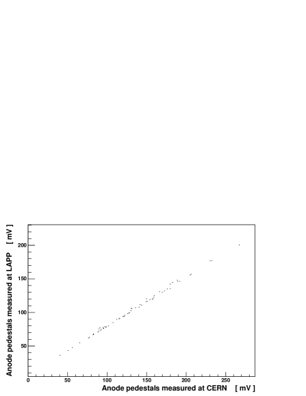
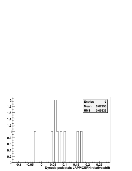
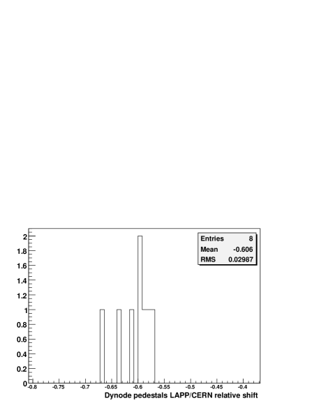
As we can see the A side pedestals are shifted, unlike the C side ones which are very correlated. Concerning the dynode, the different amplifiers have different effects on it. The amplifiers are connected to the dynode and could modify the pedestal value. The two types of amplifier have different feedback loops so we expect having a positive dynode pedestal shift on the A side and a negative one on the other side. Figure 14 shows the relative dynode pedestal shifts for all PMTs.
3.4 Pedestal fluctuations
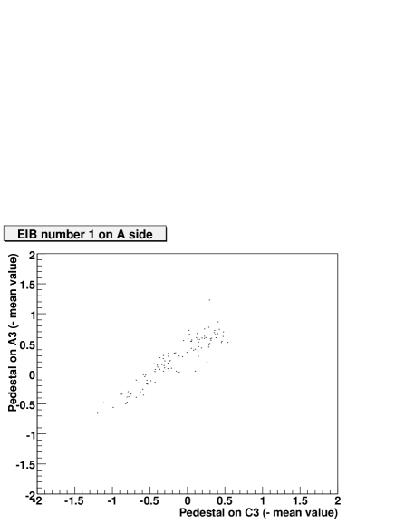
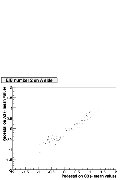
One can wonder if the low fluctuations observed arise from the electronics or has an external cause. In this part we show that these fluctuations are not intrinsic to the electronics. We can see that by looking if fluctuations from one PMT to another are correlated. The pedestal fluctuations are in fact correlated one to another, as shown on figure 15. This figure shows the fluctuation of an A side channel pedestal around its mean value versus the same thing on the C side. This tends to demonstrate that the fluctuations are due to external conditions. Pedestal fluctuation correlations are also observed between PMTs from the same side but this result is more constraining for the origin of fluctuations. In particular, A and C side fluctuation are correlated whereas they have nothing in common except the low voltage power supply and the room conditions like temperature for instance. A thermal vacuum test bench in Annecy allowed to measure these fluctuations [8]. We conclude that the pedestal fluctuations are not due to the electronics but to external factors.
3.5 Data
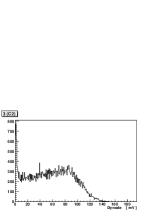
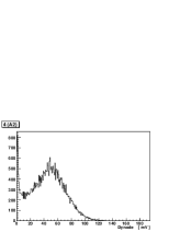
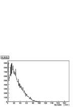
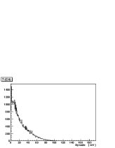
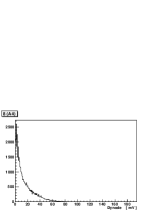
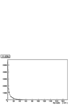
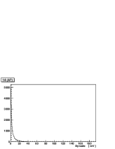
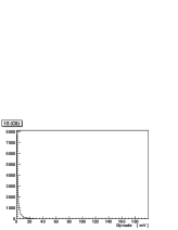
Figure 16 is an illustration to the fact that the shower is well seen by the Ecal in the present configuration. It shows the dynode signal of all PMTs during a 7 GeV electrons run. As the Ecal is horizontal, about 35 radiation lengthes are present. So the main electromagnetic energy deposition is expected to occur in the first quarter of the Ecal. Therefore, the higher signals are shared by PMTs C2, A2 and C3, as seen on figure 16.






This also shows that all the data are correctly transmitted from PMT through the EIBs to the DAQ. Another important check was the measurement of the gain between two anode channels related to the same pixel. In 2002 test beam, a non linearity had been observed [4] and it was important to know if this problem was still there. In this test beam data, we see that the gain is perfectly linear for all PMTs. Figure 17 shows this linearity for PMT A2.
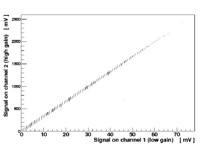
The linearity constant is here 33.28. In the following, all PMTs are assumed to have the same gain, that we take equal to 33.3, according to previous test bench measurement made at LAPP [8].
3.6 First comparison of A and C amplifiers
Apart from the study of the bus command and the trigger, this test beam results were awaited to make a decision between the two different amplifier types used on A and C side. At this point we should mention that both amplifier types had been space-qualified after this test beam, so both of them could really be used in AMS02. The study of pedestals and data taking quality tends to show that the C side amplifier is more stable. The comparison of pedestal fluctuations during stable periods does not allow to prefer one from the other (rms are always the same order of magnitude). However, the fact that the first A side EIB had to be replaced may be an indication that this type of amplifier is not very reliable. But this point has to be compared to the results of the trigger part analysis, since we want to know which amplifier type is the more accurate for being used on AMS02 board.
4 Analysis part 2 : trigger tests
4.1 Measurements principle
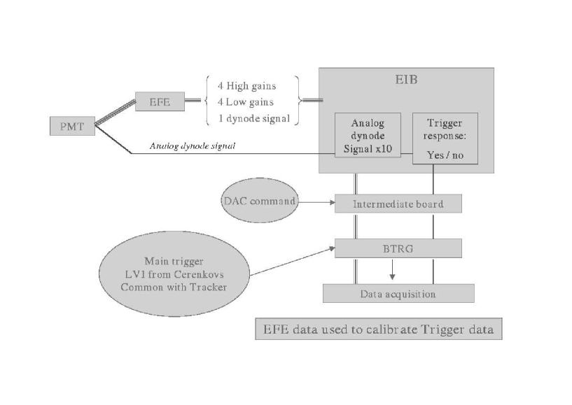
The treatment chain applied to the fast dynode signal is summarized on figure 18. First the signal is amplified (), then it is compared to a threshold and a flip-flop returns a binary signal to the EIB. The threshold was applied from DAC and a large range has been tested during this test beam (from 10 mV to 500 mV). In a first configuration, the flip-flop was automatically reset after 300 ns, we will see in next section that this has been modified.
In order to measure the trigger efficiency, its response had to be recorded whenever the trigger is 0 or 1. But the analog dynode signal is not available for a measurement since it is used for the trigger, so we use the EFE signal as a determination of the analog signal. To do so, we can use both the digitized dynode signal or the anode signals. Figure 19 shows the measurement strategy : it allows to get EFE and trigger data simultaneously.
4.2 First days adjustments
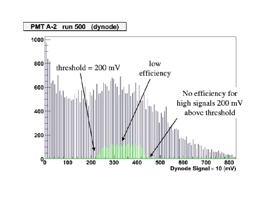
In the first days runs, after we checked that data acquisition worked correctly, some problems had been observed. We did observe that signals with a trigger 1 were present only above the applied threshold. When changing the trigger threshold on PMTs via the DAC command, the corresponding threshold evolution was observed on signals but there happened to be an inefficiency for high signals. The ratio of events with trigger at 1 over all the events above the applied threshold is a measurement of the trigger efficiency. When comparing the amount of data above threshold, it was observed that a lot of events returned a trigger bit equal to 0, whereas they should have returned 1. The efficiency was only about 20% and dropped down to 0% 200 mV above threshold. Figure 20 illustrates this situation: we expect to observe the threshold around the applied DAC value (here 200 mV), but all events above threshold should have been recorded (i.e. should have returned 1).
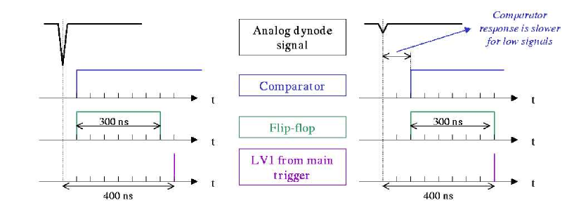
It appeared in fact that the flip-flop auto-reset was too fast, and prompt signals were erased. The acquisition waited for the main trigger, which unfortunately delivered its signal after the auto-reset has done its job. For low signals, the comparator response is slower and the probability not to be erased increases. Figure 21 gives a summary of this situation.
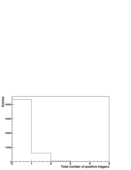
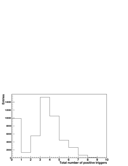
This problem being identified, the auto-reset has been set to 1 , afterward the number of PMT with a trigger bit equal to 1 largely increased, as shown on figure 22.
After the auto-reset was set to 1 , the typical aspect of plots such as the one of figure 20 is shown on figure 23 :
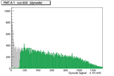
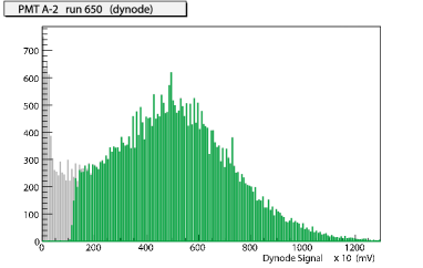
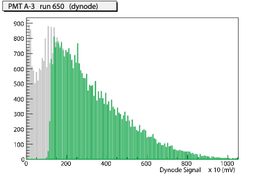
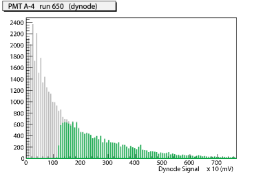
One can see that no event is taken below threshold and that above, almost 100% of them are. Here, the EFE dynode signal is multiplied by 10 in order to reproduce the amplifier effect. On figure 23, different plots are shown in order to illustrate the fact that one DAC per EIB was enough since we clearly see that the proper threshold is applied to each of the PMTs whose efficiency curves are represented. In the following sections, we will see that the effective thresholds were very homogeneous.
4.3 Efficiency measurement
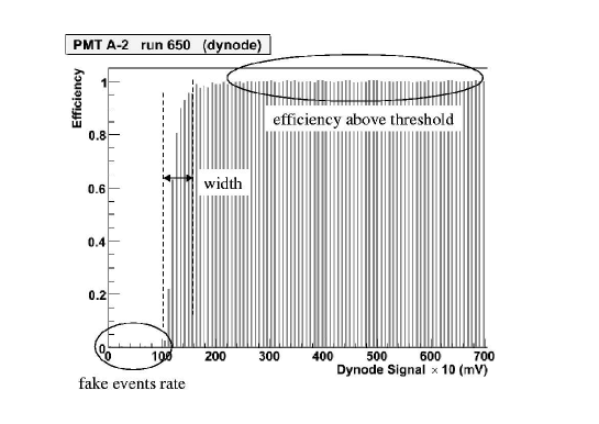
In order to quantify the trigger efficiency, the ratio of figure 23’s green and grey histograms is performed. Then the plot of figure 24 is obtained. It allows to measure :
-
•
The effective threshold, i.e. the value at which the efficiency curve goes up,
-
•
The number of fake events by counting how many events are recorded below the applied threshold,
-
•
The rise width: how many ADC channels are needed to reach the high efficiency,
-
•
The efficiency above threshold by seeing how many events are missed above the effective threshold.
In order to have more accuracy in the determination of effective thresholds, the anode signals are used instead of the EFE dynode. Those signals are related one to another by the following expressions:
As it was mentionned before, the 33.3 gain between channels is an average value for all PMTs. Finally, the estimation of the fast dynode signal from the EFE data is summarized in the following formula:
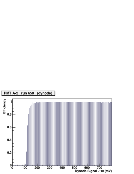
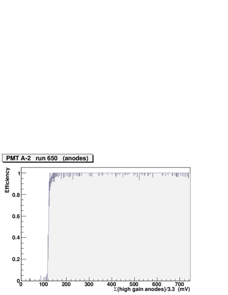
This is a key point since the ADC channel width is the same for anodes and dynode, it means that this estimation is 10 times more precise. In the following, we measure effective thresholds this way. As an illustration, figures 25 and 26 show the comparison between the dynode- and the anode-estimation of the trigger signal. One can see clearly the accuracy improvement.
It is even more important for low thresholds runs, as shown on next figure.
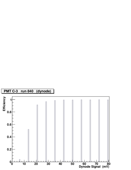
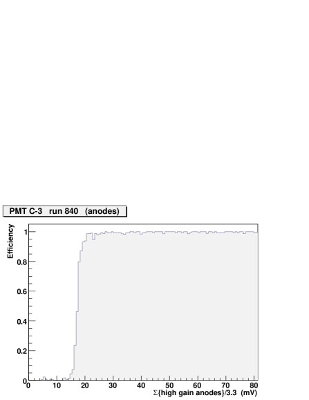
From this we can deduce the effective threshold, which corresponds to the signal value for which the efficiency goes above a given value. The ratio of triggered events below threshold over all events provides the fake event probability, and the increase width is also a quality estimator. Finally, the right part of the histograms provide an efficiency measurement.
4.4 Dataset
In this part of the analysis, we study thresholds. It is important to test the trigger behaviour on a large range of thresholds because in the final configuration, different layers of the Ecal should be applied different threshold. This is because the standalone trigger algorithm is based on the longitudinal development of the shower. So we tried to apply a lot of different thresholds. The set of data can be divided in 4 categories, each corresponding to a given period :
-
•
The starting of data taking, during this period, a few applied thresholds have been tested since all starting problems had to be fixed. The part 1 plots are from this period and the trigger study does not take these runs into account for two main reasons: the A side electronics was not stable and only 2 different thresholds have been applied.
-
•
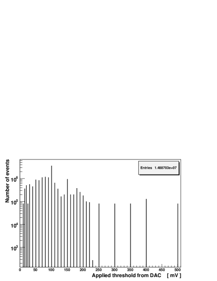
The main period, in which applied thresholds have been changed in the range from 10 mV to 500 mV. Over the events taken during this test beam, correspond to this period. Figure 27 shows the distribution of applied thresholds during this period.
-
•
A short period during which the Ecal acquisition was triggered by its own using the standalone trigger. The Ecal was then put in vertical position.
-
•
The last day, still with the Ecal in vertical position. Now the trigger is used as the main trigger and trigs also the Tracker acquisition.
Most of the events were electrons or electrons+pions. However, for each of those periods, no particular distinction is made on the particle type, in order to keep the maximum amount of data. The two last periods will be detailed in the following. In the next part, we analyze data from the main period.
4.5 Results from the main period
4.5.1 Run selections
During this period, the data is sampled in runs of 50.000 events for most of them. Sampling the data is necessary in order to
perform a study of effective thresholds. In this way we can make efficiency plots over one run and follow the evolution of
performances. Some runs present obvious bad data, and they are removed from the analysis. Most of the time, these runs
correspond to an acquisition break because of an access in the zone, or beam instabilities. However, the removed runs
represent a very low fraction of the total amount of events. As it has already been said, the C9 PMT was out of order from
the beginning and must not be taken into account in our discussions. In general, the best results come from the PMTs where
the maximum of the shower is, namely C3-C4 and A2-A3. The last PMTs have very few signal since they are placed
at approximately 35 radiation length and most of the particles were electrons.
Each run provide 18 pictures similar to those of figures 25 and 26 (one picture per PMT). The study of
those lead to the results presented in the next sections.
4.5.2 Effective thresholds
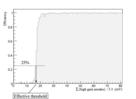
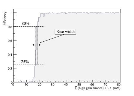
For each run and each PMT, the effective threshold is computed with the following definition : it is the EFE anodes sum value for which the efficiency goes above 25%, as it is illustrated on figure 28
Each individual run is analyzed this way. The effective threshold is computed for all PMTs. As an illustration, figure 29 shows the time evolution of 2 effective thresholds (30 mV and 100 mV). On these plots, we have the effective threshold versus the run number.

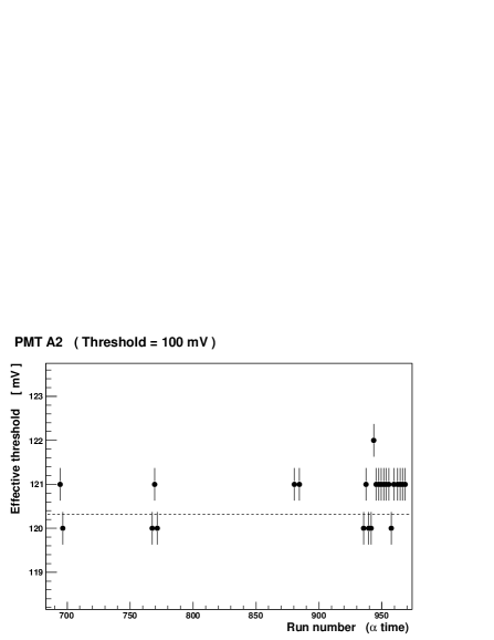
On figure 29, he dashed line is the mean value and the error bars correspond to the width of one ADC channel. They are not an indication of the rise width (this issue is developed in the next section). For each sample of data having the same applied threshold, the mean effective threshold is computed as well as the dispertion around this value. At this point we can plot the effective threshold versus the applied one from DAC. Figure 30 is an example of such a plot, obtained for PMT C4. Here the error bars, corresponding to the dispertion around the mean value are smaller than the points.
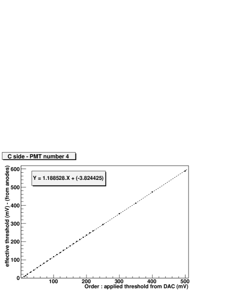
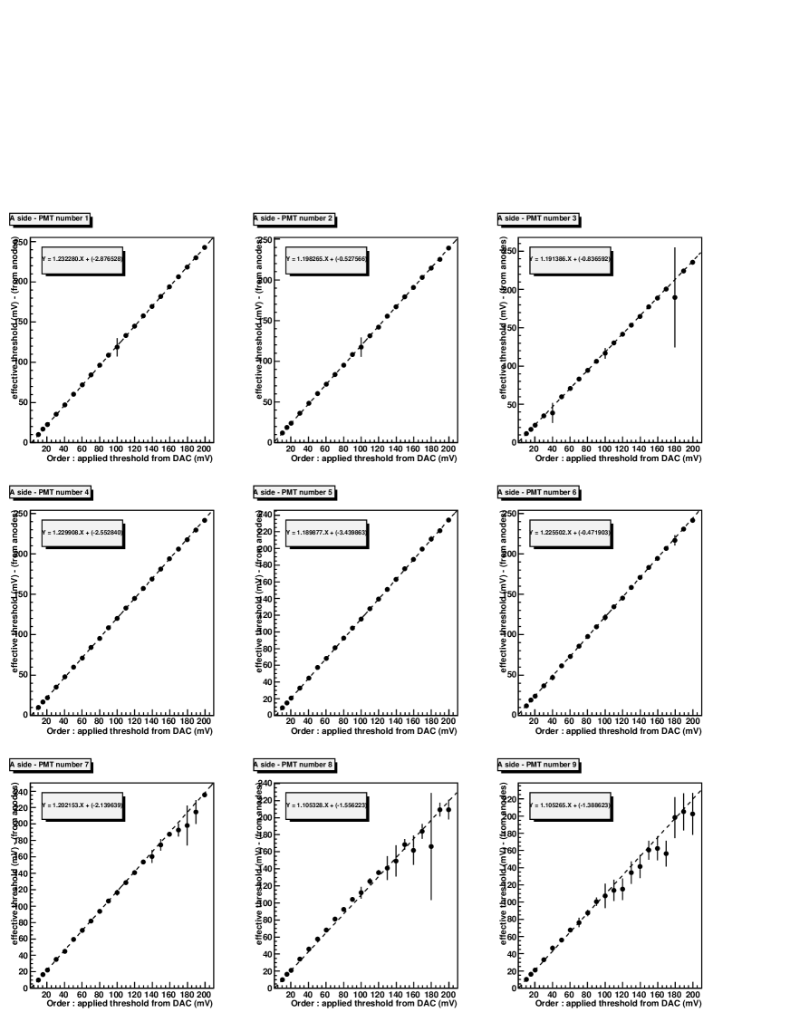
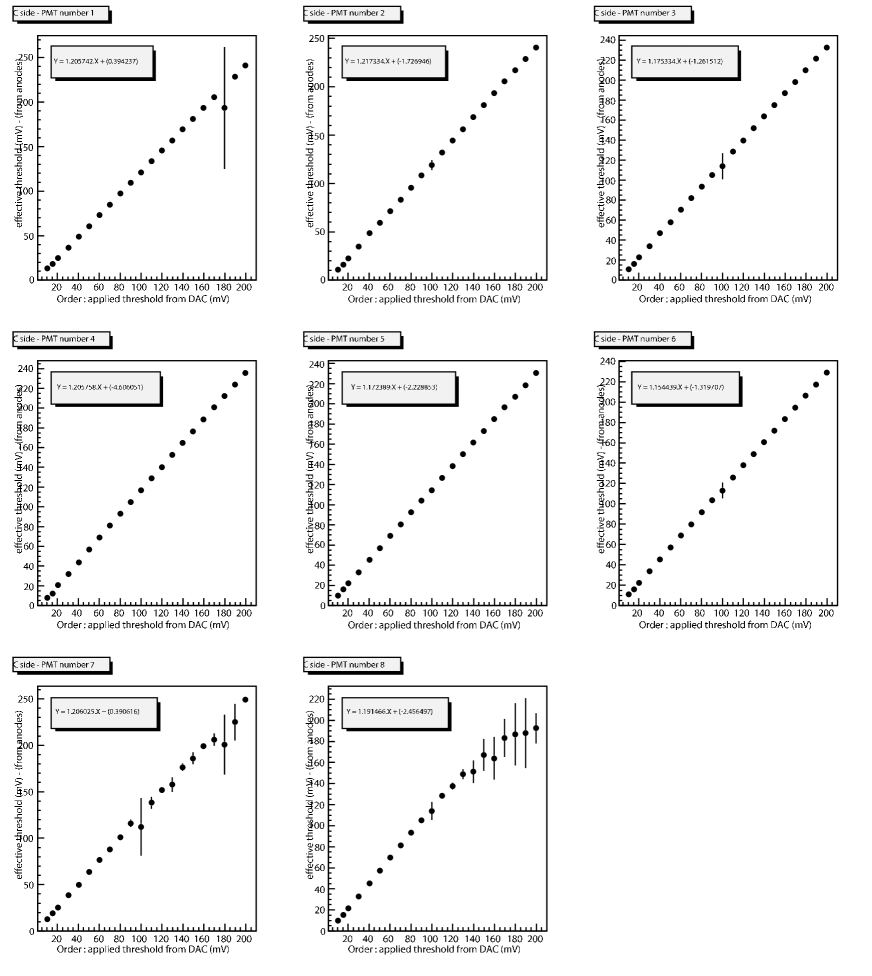
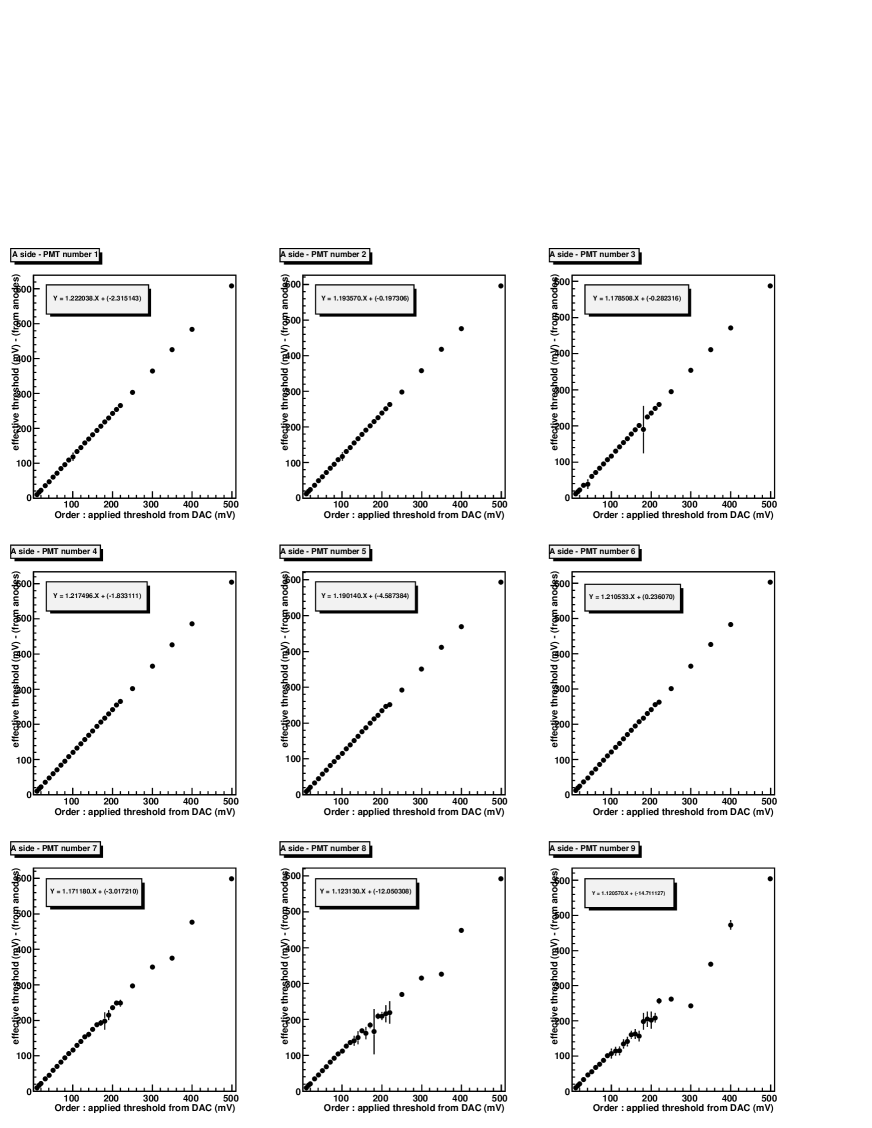
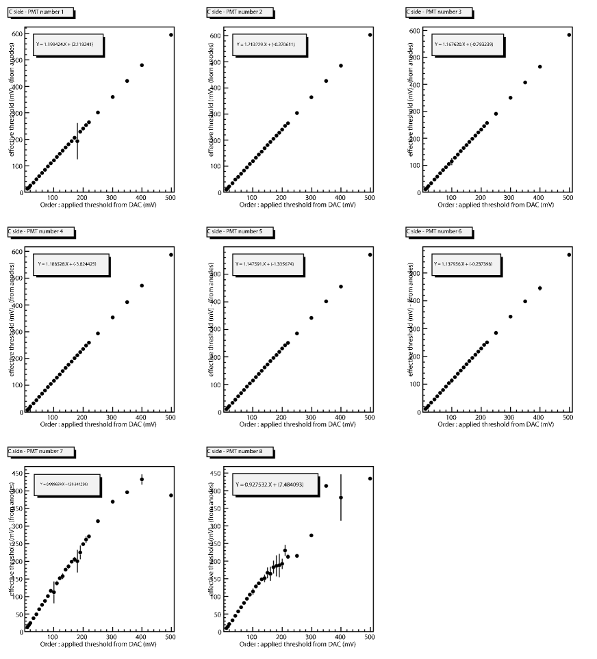
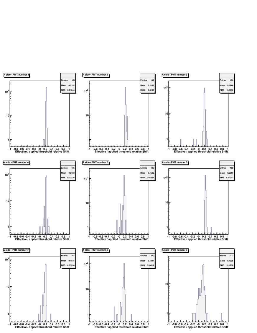
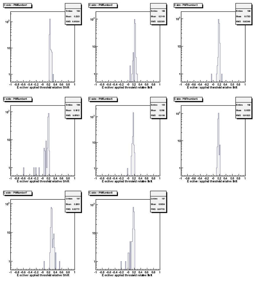
On figure 30 is shown the result of a linear fit to those points. This have been done systematically for all PMTs and the whole main period. All the results results are shown in the appendix up to a 200 mV applied threshold (figures 41 and 42) for easy reading and up to 500 mV (figures 43 and 44) for completeness. One can also present these results in terms of a relative shift distribution. As an example, figure 31 shows, for PMT C4, such a plot. For each run, the relative shift between the effective and applied threshold fills this histogram.
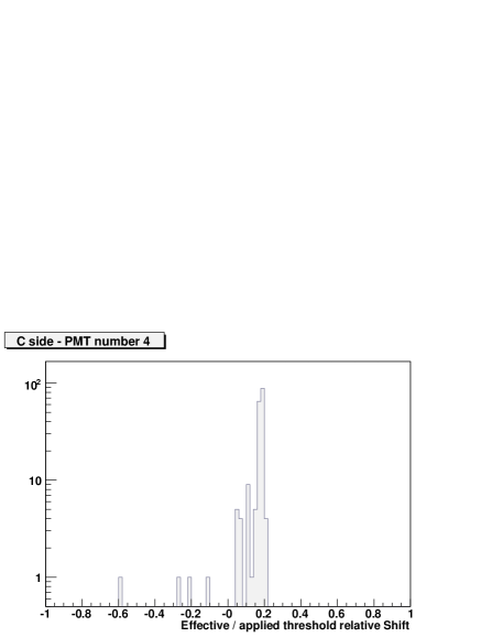
Again, all the distribution are given in the appendix (figures 45 and 46). Notice that these plots are in log scale and therefore have a very low dispertion. Next table (figure 32) summarizes these results. It gives the mean value of these shifts for each PMT over all the main period, as well as the dispertion of these distributions.
| A side | Mean relative shift | RMS |
|---|---|---|
| 1 | 0.23 | 0.012 |
| 2 | 0.22 | 0.017 |
| 3 | 0.20 | 0.069 |
| 4 | 0.22 | 0.027 |
| 5 | 0.16 | 0.040 |
| 6 | 0.24 | 0.020 |
| 7 | 0.19 | 0.036 |
| 8 | 0.15 | 0.098 |
| 9 | 0.12 | 0.123 |
| C side | Mean relative shift | RMS |
|---|---|---|
| 1 | 0.23 | 0.019 |
| 2 | 0.21 | 0.024 |
| 3 | 0.17 | 0.023 |
| 4 | 0.16 | 0.080 |
| 5 | 0.17 | 0.020 |
| 6 | 0.16 | 0.015 |
| 7 | 0.28 | 0.038 |
| 8 | 0.17 | 0.047 |
| 9 | - | - |
We emphasize the fact that the most important result here is the very low dispersion of the shifts and the fact that they are close from one PMT to another.
4.5.3 Efficiency rise Width
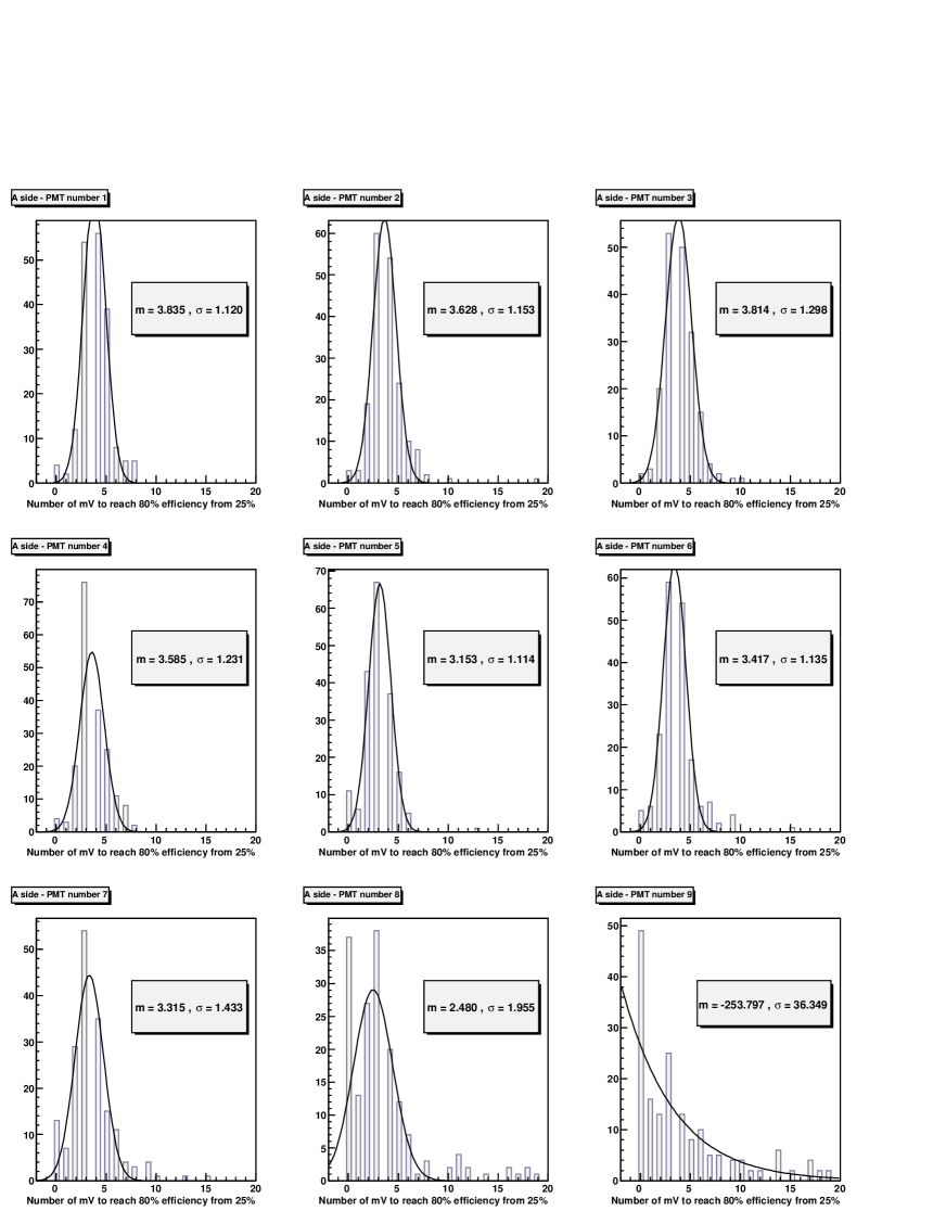
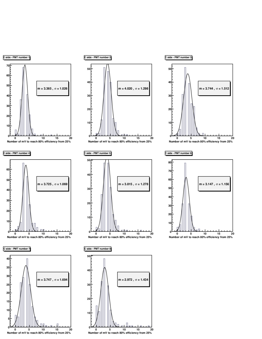
We call rise width the number of ADC channels needed to reach almost 100% efficiency from a given efficiency value. The results presented here are the number of ADC channels between 25% and 80% efficiency.
As it has previously been done for the effective thresholds determination, a systematic study involving all sets of data a has been performed. The results of this analysis appear in figure 34. We learn from figures 47 and 48 that the rise width does not vary too much from one PMT to another. This is an important result since we want an homogeneous response. The figure 34 presents the result of a gaussian fit to the sensitivity distribution (except for A8 and A9 for which a gaussian does not fit).
| A side | Mean ADC channel number | RMS |
|---|---|---|
| 1 | 3.84 | 1.12 |
| 2 | 3.62 | 1.15 |
| 3 | 3.81 | 1.30 |
| 4 | 3.59 | 1.23 |
| 5 | 3.15 | 1.11 |
| 6 | 3.42 | 1.14 |
| 7 | 3.32 | 1.43 |
| 8 | 3.45 | 3.79 |
| 9 | 4.20 | 4.81 |
| C side | Mean ADC channel number | RMS |
|---|---|---|
| 1 | 3.37 | 1.03 |
| 2 | 4.02 | 1.30 |
| 3 | 3.74 | 1.51 |
| 4 | 3.73 | 1.07 |
| 5 | 3.82 | 1.28 |
| 6 | 3.15 | 1.16 |
| 7 | 3.75 | 1.69 |
| 8 | 2.97 | 1.43 |
| 9 | - | - |
4.5.4 False event rate
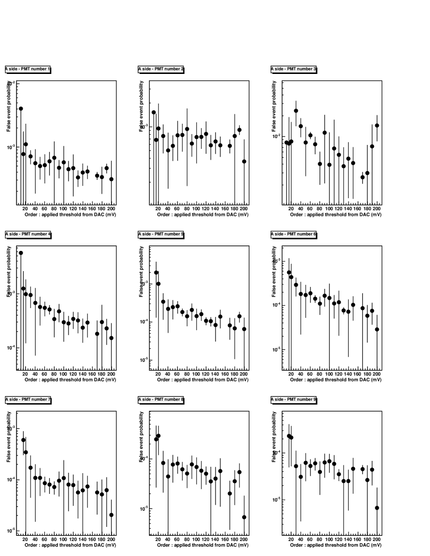
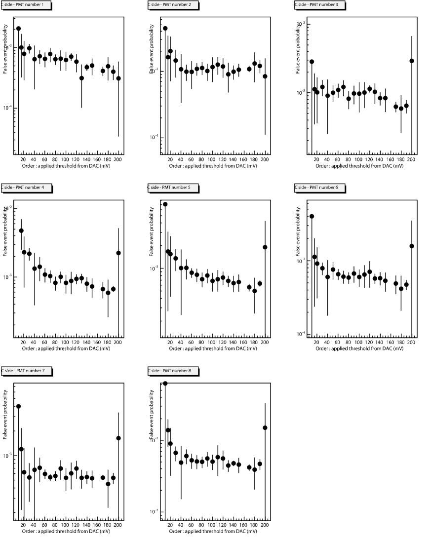
An important feature of the trigger is its noise level. It has to be checked that only a few events are triggered below the applied threshold. In order to have a determination of the probability for an event that provides a low signal (under threshold) to be triggered, we perform the ratio of triggered events over all events for signals below the applied threshold. Table of 35 presents the results of this study.
| A side (%) | C side (%) | |
|---|---|---|
| 1 | 0.057 | 0.065 |
| 2 | 0.075 | 0.120 |
| 3 | 0.330 | 0.010 |
| 4 | 0.050 | 0.110 |
| 5 | 0.032 | 0.088 |
| 6 | 0.026 | 0.068 |
| 7 | 0.026 | 0.063 |
| 8 | 0.019 | 0.060 |
| 9 | 0.021 | - |
Figures 49 and 50 show the dependance of this noise level with the applied threshold (the mean value is computed for each sample of data with the same threshold and the error bars are the RMS of the corresponding distribution). Clearly the noise level goes down as the threshold goes up and stabilizes around or less for most of the PMTs. As it was mentioned before, we are interested in low thresholds, around 20 mV, in order for AMS02 to trig on 1 GeV photons, with a local energy deposition of order 100 MeV. It seems that a 15 mV threshold gives more noise because then the trigger is more sensitive to the electronic noise. However the results for 20 mV are very good, with a false event rate almost always below and never above (except for a PMT on the A side).
4.5.5 Efficiency above threshold
In order to measure the rate of missed events, i.e. above threshold, we perform the ratio of triggered events over all of them for signals above twice the applied threshold. Then we have the probability to return a 0 for an event that should return a 1. The more far from the entry point a PMT is, the less it gets signal, for this reason the efficiency above threshold is only determined on the 5 first PMTs of each side. PMTs that are at the end of the shower have a very low probability to get a high signal, and subsequently a signal that is twice the applied threshold. Table 36 shows the results of this study.
| A side (%) | C side (%) | |
|---|---|---|
| 1 | 99.48 | 99.74 |
| 2 | 99.68 | 99.72 |
| 3 | 99.58 | 99.69 |
| 4 | 99.45 | 99.66 |
| 5 | 99.37 | 99.42 |
One can notice that the figures decrease as the PMT number goes up. It is very likely due a statistical effect, since the more far the PMTs are, the less signal they get.
4.6 Results from the standalone periods
4.6.1 Specific setup
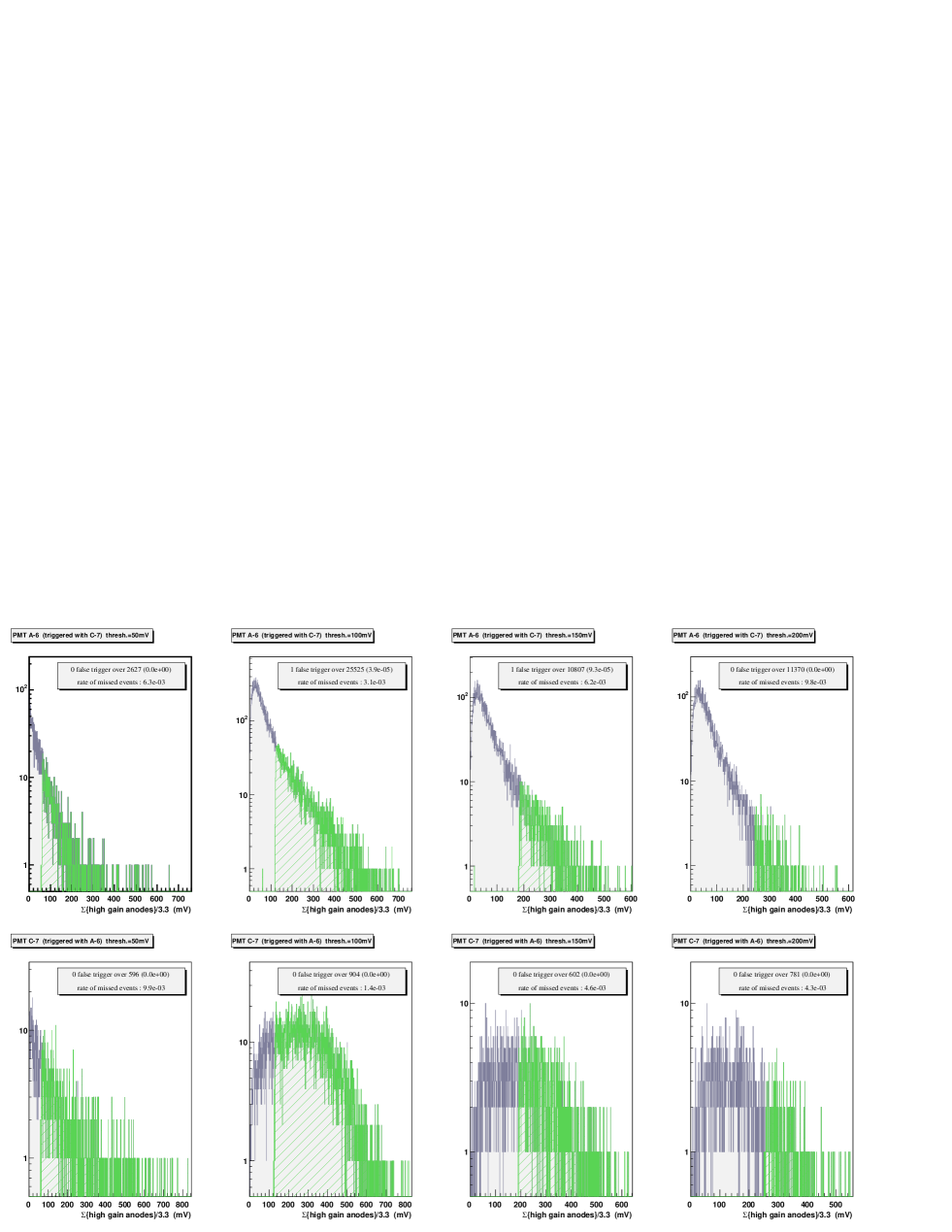
Although not originally planned, the good results presented above allowed to try another setup, in which the Ecal acquisition was ruled by its own trigger.During the two last days of data taking, the Ecal was installed in vertical position. From this moment, only a few PMTs were involved. Figure 37 is a picture of the Ecal in vertical position. One can see there that only 2 PMTs were active on each side. Depending on the exact beam spot position, the touched PMTs were A6, A7, C7, C8.
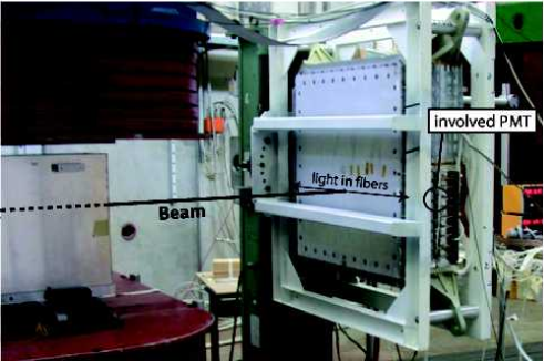
The purpose of this setup was to test the standalone trigger by actually using it to trig the data acquisition. To do so, the Ecal altitude has been tuned in order for the signal to be shared between PMTs A6 and C7. As this data taking period was not originally planned, an additional logic box was used to deliver the trigger signal. It returned a ”or” of A6 and C7 trigger signals (see figure 38).

The standalone period is divided into two subperiods, first the only Ecal was triggered with this system, and then it has been used as the main trigger for the whole apparatus, including Tracker ladders.
4.6.2 Analysis and results
During the period when the Tracker was triggered on its own, the main trigger still provided the event number. This allowed to ensure that all the proper events were recorded. The reset of the Ecal trigger was faster than the main one, so that the Ecal recorded much events than the Tracker during this first period. By counting the redundant event number, we determined that the Ecal trigger recorded about 3.5 more events than the main trigger. By this and the fact that all the recorded events are good ones, we validate the system. During this period, the performance measurements can only be determined with one PMT using the other as the external trigger. All the results of the standalone period are summarized on table 39 and on figures 51 and LABEL:standalone2. The results presented here are based on the same analysis method than what was shown before.
| PMT | Applied threshold (mV) | False event rate | Efficiency (%) | Threshold shift (%) | Rise width (ADC) |
|---|---|---|---|---|---|
| A6 | 50 | 99.37 | 16 | 1 | |
| 100 | 99.69 | 18 | 2 | ||
| 150 | 99.38 | 20.6 | 2 | ||
| 200 | 99.02 | 21.5 | 1 | ||
| C7 | 50 | 99.01 | 22 | 2 | |
| 100 | 99.86 | 22 | 2 | ||
| 150 | 99.54 | 26 | 2 | ||
| 200 | 99.57 | 22.5 | 2 |
These figures show that the apparatus then worked at the same level of performance as during the main period. It happened that not enough statistics were available to have a determination of the noise level, we therefore put an upper limit. Figure 51 shows clearly that the reason why the efficiency is sometime as low as 99.01 % is the lack of events above threshold and therefore the implied Poissonnian regime. From these figures we can also infer that the beam spot was closer to A6’s alignment than to C7 one.
Conclusion
Data analysis from this test beam demonstrate that the Ecal Intermediate Board fulfils the physics requirements. The electronic chain is validated, logic signals and data are perfectly handled. The trigger performance, for what concerns the analog part, is in good agreement with awaited specifications, with good efficiency, threshold accuracy, and low noise level. The C side amplifier has been space qualified and chosen for equipping AMS02 Ecal flight model, for its performance and reliability in comparison to the A side one. The presented analysis methods are used in the algorithms of production tests. The Ecal is currently being fully equipped and should undergo a final beam test at the end of 2006.
Additional figures mentioned in the note
Acknowledgements
We would like to thank all the members of LAPP mechanics, electronics and physics teams. We gratefully thank Divic Rapin and the whole Tracker team.
References
- [1] C. Goy, S. Rosier-Lees, AMS note 2001-06-04
- [2] S. Di Falco, , AMS note 2003-08-01
- [3] C. Adloff, D. Fougeron, R. Hermel, S. Rosier-Lees, AMS note 2003-11-01
- [4] L. Girard, PhD thesis LAPP-T-2004-04, 2004
- [5] D. Grosjean, master thesis, June 2004
- [6] D. Rapin, presentation at Tracker-Ecal meeting, CERN, June 2004
- [7] F. Cadoux, presentation at Tracker-Ecal meeting, CERN, July 2004
- [8] J.P. Vialle, Z. Li, TIM presentation, CERN, April 2005