Algorithmic Forecasting of Extreme Heat Waves††thanks: Arun Kuchibhotla provided many helpful suggestions about how to consider uncertainty estimates. Eric Tchetgen Tchetgen offered very insightful concerns about endogenous sampling.
Abstract
This paper provides forecasts of rare and extreme heat waves coupled with estimates of uncertainty. Both rest in part on gaining a better understanding of the similarities and differences between hot days under normal circumstances and rare, extreme heat waves. We analyze AIRS data from the American Pacific Northwest and AIRS data from the Phoenix, Arizona region. Forecasting accuracy is excellent for the Pacific Northwest and is replicated for Phoenix. Uncertainty is estimated with nested conformal prediction sets, provably valid even for finite samples.
Keywords: heat waves, forecasting, AIRS data, machine learning
1 Introduction
Extreme heat waves are relatively rare events. But of late, extreme heat waves seem to be increasing in frequency and intensity (Mann et al., 2018). Schmidt (2024) argues that “heat anomalies” may mean that climate science has underestimated the speed at which disastrous global warming will materialize. Many of the consequences for public health and local ecosystems are already becoming dire (Barriopedro et al., 2023). The mass media also has taken note. From the Economist, for example, “Deadly heat is increasingly the norm, not an exception to it.” (Economist, June 6, 2024).
Existing studies seeking to understand extreme heat waves have so far produced mixed results (Mann et al., 2018; McKinnon and Simpson, 2022, Fischer et al., 2023; Zhang et al., 2024; Li et al., 2024). Part of the problem is that during the warm-weather months, sequences of hot days have long been “normal.” These spells have some of the features of heat waves that some have link to climate change. But they arguably are not the rare and extreme heat waves about which there has been so much recent concern.
In this manuscript, the primary goal is to accurately forecast rare and extreme heat waves. To that end, we use novel methods in an effort to help distinguish between usual summer days and the rare, extreme heat waves, perhaps induced by climate change. AIRS Data from the June 2021 heat wave in the North American, Pacific Northwest (PNW) provide an initial forecasting target. We follow up with an effort to reproduce the results, also with AIRS data, for the July 2023 heat wave in the greater Phoenix, Arizona area. For both, comparisons constructed from “usual” summer days are taken from other months or other years for which no credible claims of extreme temperature episodes have been made. In both sites, we achieve uncertainty guarantees using nested conformal prediction sets (Kuchibhotla and Berk, 2023).
Section 2 addresses the methodological challenges raised by efforts to forecast extreme heat waves typically characterized by temperatures that likely fall in the far right tail of temperature distributions; they represent rare events that commonly cause serious data sparsity problems. Section 3 provides a grounded discussion of the AIRS grid cell data to be used and the research designs that can work well with rare events like extreme heat waves. Substantial progress is made on data sparsity and on design-based adjustments to mitigate the impact of nuisance variables. Section 4 builds on several variants of crossover designs, with grid cells as the study units, to determine how well machine learning can fit ground-level temperatures during an extreme heat wave compared to ground-level temperatures from ordinary hot summer days. We find that machine learning performance is good, and there is some evidence that the dominant predictors of heat wave temperatures differ somewhat from the dominant predictors of “normal” hot summer temperatures. Section 5 introduces a genetic algorithm to construct a synthetic population of ideal-type, extreme heat wave grid cells, and a synthetic population of ideal-type, ordinary, high temperature summer grid cells. Comparisons between the predictor values in these different populations enable a simple form of feature engineering based on variable selection. Section 6 uses the selected predictors to forecast a binary response variable capturing whether or not a grid cell will experience an extreme heat wave. Forecasting skill is superb, and nested conformal prediction sets provide provably valid estimates of uncertainty. Section 7 reports an attempt to replicate the Pacific Northwest results using an extreme heat wave in the greater Phoenix area. As one would expect, the findings differ somewhat, but the overall comparability of the broad conclusions is promising. Section 8 returns to our earlier research designs in the context of endogenous sampling. We consider the degree to which our efforts to overcome the rare event problem has introduced difficulties in the reported results. We suggest that there is promise in a reformulation from minimizing loss to minimizing risk. Section 9 offers a summary of the results and some overall conclusions.
2 Methodological Challenges
In the pages ahead, we use the term “heat wave” to denote extreme heat waves that are relatively rare and arguably enabled by climate change. We use the term “heat dome” as well to capture some instructive climate science thinking. Within this framing, there can be many definitions that differ at least in important details (Perkins, 2015). The definitions we use are provisional, constrained in part by available information in the AIRS data.
Almost regardless of how heat waves are defined, a major statistical challenge is data sparsity because extreme heat waves are relatively unusual. One consequence is that very accurate but trivial forecasts can be guaranteed. If in most remotely sensed grid cells most of the time, there is no heat wave, a forecast of no heat wave will almost always be correct without needing to bother with predictors. When predictors are available, they typically will fail to improve the fit or forecasts because both are nearly perfect already. A more subtle consequence is that the design space defined by the predictors will be empty in many regions, making it nearly impossible to estimate well many kinds of nonlinear functions. The fallback of linear statistical methods can be overmatched and miss very important heat wave characteristics. Some consequences of these and related difficulties are addressed later.
Current global climate models (GCMs) do not appear to offer much help. For the spatial scales at which global climate models function, heat waves are generally below the spatial scales that can be well resolved. Various forms of downscaling seem necessary to construct regional climate models (RCMs), but these introduce a number of new challenges (Gebrechorkos et al., 2023; Lafferty and Sriver, 2023; Schneider et al., 2023). As Gettelman and Rood (2016) write, “For these [smaller scale] processes, we often must use statistical treatments to match observations to functions that can be used to describe the behavior. Some processes can be represented by basic laws, other processes must (at the scale of a climate model) be represented by statistical relationships that are only as good as our observations.” To this we add: and only as good as the statistical models themselves (Breiman, 2001b). Moreover, capitalizing on “basic laws” depends on knowing the relevant physics in particular, complex settings, getting boundary conditions from a GCM that are approximately correct, and having access to significant computational resources. And even then, the spatial scale may be too coarse. The analyses to follow suggest that certain quasi-experimental research designs coupled with that machine learning algorithms can help.
There are also difficulties in how best to represent uncertainty. Because there is apparently no consensus model for extreme heat waves, there is no widely acceptable way to formulate a generative model for how the observations materialize. Without such a formulation, the usual uncertainty calculations risk being little more than hand waving. Gettelman and Rood (2016) explain that in climate science, uncertainty is caused by (1) model uncertainty, (2) scenario uncertainty and (3) initial condition uncertainty. In statistics and econometrics, the first is called “model misspecification” (Freedman, 2009). The second is closely related to various forms of stationarity in statistical time series analysis (Box et al., 2016). The third overlaps in statistics with the literature on errors in variables (Fuller, 1987). How these and other statistical and econometric formulations map to those in climate science is largely unresolved.
Further confusion sometimes is introduced by different meanings of the term “model” (Berk et al., 2024). In the natural sciences, a model typically is intended to facilitate explanation and, often, causal inference. The focus is on the manner in which some empirical phenomenon works, and understanding is commonly the dominant goal. Such models necessarily introduce simplifications to further understanding. There also are various other ways models systematically can be right or wrong.
In addition, there can be confusion when an algorithm is called a “model.” “An algorithm is nothing more than a very precisely specified series of instructions for performing some concrete task” (Kearns and Roth, 2019). The goal is to perform that task well without necessarily representing the underlying subject-matter mechanisms. Algorithms are neither right nor wrong; as a technical matter, there is no such thing as a misspecified algorithm. Either an algorithm performs in a satisfactory fashion or it does not. For example, a pattern recognition algorithm might be used to identify malignancies in lung X-rays and often can perform better at that task than a radiologist (Li et al., 2022). But, there is in the algorithm no necessary explanatory or causal content for how the malignant tissue originated and grew.
Statisticians often use the term “model” in yet another way (Berk et al., 2024). For statisticians, a model usually conveys how the data were generated. Frequentist uncertainty in statistics commonly begins with random variables and, therefore, the means by which the data were realized. Sometimes the data are realized through design-based approaches, as in various forms of probability sampling used estimate parameters of populations or in random assignment used to estimate causal effects in experiments. Then, a climate science narrative usually is a subject-matter overlay. Sometimes the data are assumed to be realized through processes characterized by subject-matter models as just described. Such models often build on climate science theory. Climate science examples include applications of the generalized extreme value distribution and all manner of linear regression, sometimes hand tailored for time series. All of the usual concerns about model misspecification commonly arise (Berk et al., 2019). In the pages ahead, we will try to make clear when using models, which kind of model we have in mind.
A more subtle potential problem with all models is that as a formal matter, a model should be fully determined before the data are examined. Yet, much model specification is based on model foraging, often as recommended practice. Widely cited treatments of the generalized extreme value distribution (Coles, 2001; Gilleland and Katz, 2016), for instance, provide a variety of statistical tools for empirical determination of which special case of the umbrella formulation that should be employed: the Gumbel, Fréchet or Weibull distribution (Kotz et al., 2000). The result is sanctioned cherry picking, which can invalidate all statistical inference (Leeb and Pötscher, 2005; 2006; 2008).
Post-model-selection challenges follow that if acknowledged, often can be usefully addressed (Berk et al., 2013). We illustrate a form of post-model selection inference (PoSI) later using conformal prediction sets when we deliver provably valid uncertainty assessments applying nested conformal prediction sets to data restructured within a crossover design. Consistent with recent developments in statistics, design-based uncertainty estimates often accomplish what model-based uncertainty assessments cannot (Breiman, 2001b; Rubin, 2008; Rinaldo et al., 2019). We try to capitalize on design-based approaches in the analyses to follow.
3 Data and Research Designs
3.1 Data
In this study, we use data from NASA Atmospheric Infrared Sounder (AIRS) instrument aboard the Aqua spacecraft (Aumann et al., 2003; Pagano et al., 2010). Aqua was launched into polar orbit at an altitude of 705 km on May 4, 2002. AIRS began acquiring and processing data in September of that year. Aqua crosses the equator during the ascending, or the northward daytime part of its orbit, at 1:30 pm local time. The descending, or southward, nighttime, part of its orbit crosses the equator at 1:30 am local time. Each half-orbit takes roughly 45 minutes, so local time of data acquisition is always within 22.5 minutes of equator crossing. AIRS successively scans across its 1500 km field of view taking data in 90 circular or elliptical footprints as shown in Figure 1. As the spacecraft advances, the sensor resets and obtains another scan line. 135 scans are completed in six minutes, and this 90 by 135 footprint spatial array constitutes a “granule” of data. AIRS collects 240 granules per day, 120 on the daytime, ascending portions of orbits and 120 on nighttime, descending portions.
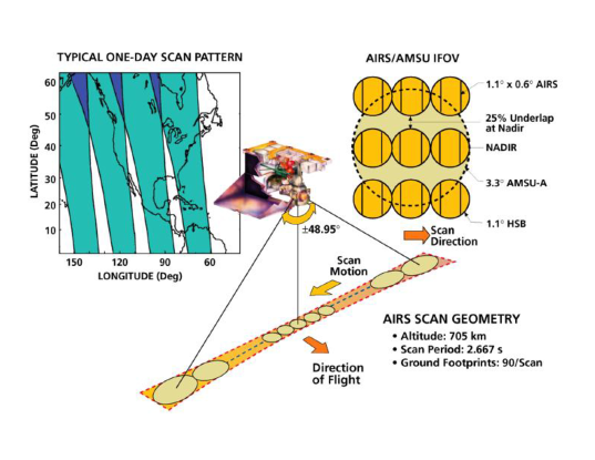
At each of the 12,150 footprints in a granule, AIRS observes Earth and its atmosphere in 2378 infrared spectral channels. Roughly speaking, the channels sense the surface and different altitudes in the atmosphere. The instrument counts photons at the different wavenumbers (inverse wavelengths). These counts are converted to brightness temperatures ranging from zero to about 340 degrees Kelvin. Such data are called Level 1 products (Aumann et al., 2020). Certain atmospheric characteristics are related to photon emission, and these characteristics can be retrieved by solving complex sets of equations. The computational implementation is called a retrieval algorithm (Susskind et al., 2020), which converts spectra of brightness temperatures into estimates of geophysical variables. For us, the potentially relevant variables are surface temperature and vertical profiles of air temperatures and water vapor mass-mixing ratios at various altitudes starting from the near-surface up to 250 mb pressure. These data are known as Level 2 products (Thrastarson, 2021).
The mission also provides a globally gridded version, summary product that averages Level 2 data on a one-degree-by-one degree daily spatial grid. These are Level 3 data products (Tian et al., 2020) intended for users who do not require the higher spatial and temporal resolution of Level 2. Typically studies of global climate processes use Level 3 because it is easier to compare with the output of climate models. Many variables are provided in the AIRS Level 3 daily product. The ones of interest to us for this study are shown in Table 1. Their variable names are “official” in that those are the names that come with the downloaded data. We shorten some names and change some names to facilitate data processing and the construction of tables and figures. But the mapping from the names in Table 1 to names used in subsequent tables and figures should be clear.111 In Table 1, the phrase “Pressure levels of temperature and water vapor profiles” means that atmospheric pressure is proxy measure for altitude for both temperature and the water vapor profile. The former is in degrees Kelvin. The latter is a lot like relative humidity at different altitudes but is the proportion of the total atmospheric profile that is water vapor at a given altitude. The total atmospheric profile is the proportional representation of different constituents of the atmosphere at a given altitude such as oxygen, carbon dioxide, nitrogen, and water vapor.
| Name | Dimensions | Description |
|---|---|---|
| Latitude | Latitude at the center if the grid cell | |
| Longitude | Longitude at the center of the grid cell | |
| LandSeaMask | 1 = land, 0 = sea | |
| Topography | Topography of the Earth in meters above the geoid | |
| StdPressureLev | Pressure levels of temperature and water vapor profiles | |
| (we use only 1 – 12). The array order is from the surface | ||
| upward. | ||
| SurfAirTemp | Temperature of the atmosphere at the Earth’s surface in | |
| degrees Kelvin | ||
| TropHeight | Height of the tropopause in meters above sea level | |
| Temperature | Temperature of the atmosphere in degrees Kelvin (we | |
| use only bottom 12) | ||
| H2O MMR | Water vapor mass-mixing ratio in grams/kilogram |
3.2 Research Designs
Any research design in service of forecasts of extreme heat waves must address the question “compared to what?” The obvious answer is compared to “non-heat waves.” But the details can be subtle. Summer months in many parts of the world can manifest several very warm days in a row that are not unusual, and when juxtaposed to recent history, may not be extreme.
We begin with the 2021 Pacific Northwest extreme heat wave affecting parts of the U.S. and Canada. During the last four days of June, the Pacific Northwest experienced what many observers called an extreme heat wave. Although there are debates over what exactly constitutes an extreme heat wave, this event seems to qualify from almost any informed perspective. With so many extant definitions (Perkins, 2015, Barriopedro et al., 2023), and nothing close to a consensus on best practices, we will provisionally operationalize an extreme heat wave as a single discrete high temperature event over several days under a slowly moving “heat dome” (Li et al., 2024). Other formulations certainly are possible, and perhaps even preferable, depending on the policy and/or research questions asked.
Media coverage of the June heat wave was by and large consistent with data from the Community Earth System Model (https:// www.cesm.ucar.edu/), which is not employed in the current analysis. The relevant June days were confirmed with the PNW AIRS data used in the analyses to follow. The same sources were used to identify the absence of extreme heat waves in manner described shortly.222 The spatial boundaries of an extreme heat wave can be difficult to determine. One complication is a heat dome responsible can cover many square kilometers and move slowly over time. Different fractions of potentially affected grid cells, nominally in the same locale, will fall under the dome from day to day. In the case of the PNW June 2021 heat wave, the four-day definition seems to be a reasonable approximation.
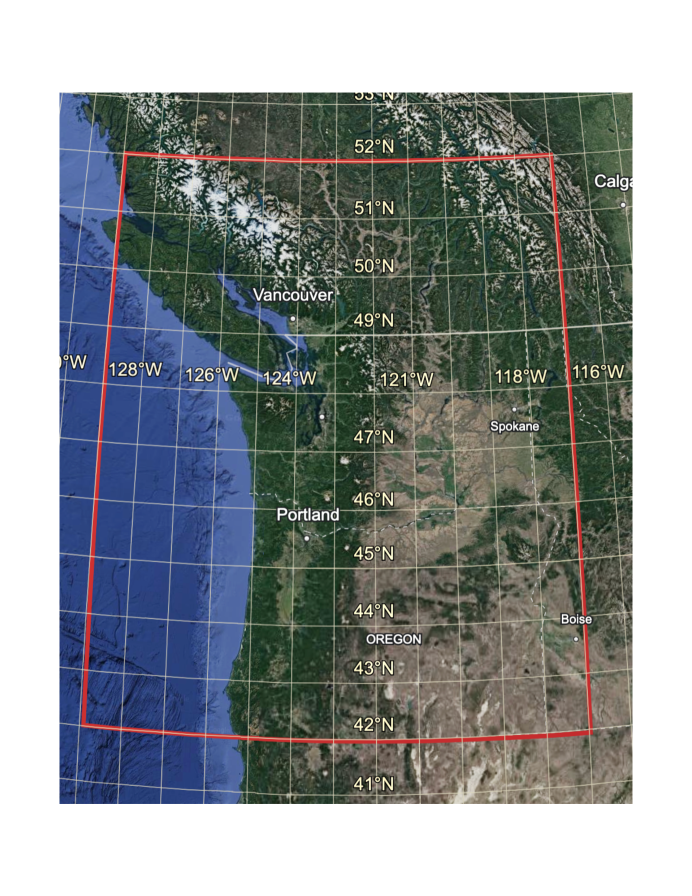
Figure 2 shows the location of our study area: a region over the northwest U.S. and southeastern Canada. For this analysis, we use daily data from these 144 grid cells, where for grid cell on day , there is the set of predictors, and a generic response located by latitude and longitude, where , with , and . The widely varying topography can be associated with very different microclimates that must be taken into account as we proceed. Clearly, surface temperatures can be quite dissimilar spatially whether or not there is an extreme heat wave.
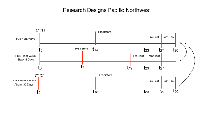
To what should the PNW 2021 heat wave been compared? Our research designs for the PNW AIRS data are shown in Figure 3: the top blue line for the true extreme heat wave, the middle blue line for comparison “Faux Heat Wave 1,” and the bottom blue line for comparison “Faux” Heat Wave 2.” Our study units are the same 144 grid cells for the true heat wave and both faux heat waves. Much of the data for a grid cell can differ depending on the day on which remote sense data were collected. (See Table 1.)
Starting with the true heat wave at the top representing the month of June, 2021, the post-test is the mean surface temperature for each grid cell over the 4 last days of the month. The pre-test is the mean surface temperature for each grid cell over the 4 sequential days immediately preceding the first post-test day. In both cases, means are used to help remove random variation in noisy measures of daily temperatures. Having a pre-test as well as a post-test confers benefits discussed in the next section of the paper. All of the predictor values are taken from 14 days before the beginning of the true heat wave. The same 144 grid cells constitute the post-test, pre-test, and lagged predictors.
Faux Heat Wave 1, shown as the middle blue line, has the same design configuration as the true heat wave, but is shifted back in time 4 days before the true heat wave began. Its post-test does not include the extreme heat wave, which provides one answer to the question “compared to what?” Faux Heat Wave 2 at the bottom of Figure 3 also has the same design configuration as the true heat wave, but is shifted forward in time one month to July, 2021 such that the extreme June heat wave also is not included in the post-test. It provides as second answer to the question “compared to what?” For both faux heat waves, the same 144 grid cells constitute the post-test, pre-test, and lagged predictors.
Faux Heat Wave 1 has the advantage of a post-test falling immediately before the true heat wave post-test so that potential weather confounders might be quite similar. The risk is that some of the true heat wave characteristics may be in part a spillover from the immediately preceding several days; a larger temporal separation might be desirable. Therefore, Faux Heat Wave 2 provides a temporal separation of a month, but risks that summers in July may on the average differ from summers in June in ways confounded with surface temperatures.333 We also considered computing the pre-test using the grid cell means for the full set of June days before the heat wave. However, this approach builds in temporal warming trends in surface temperatures gradually unfolding during the June.
3.2.1 Surface Temperature in Gain Scores of Means
We begin by trying to understand more about the correlates of surface temperatures by separately fitting the PNW extreme heat wave summer temperatures and routine PNW summer temperatures. The response variable is gain scores of means grid cell by grid cell. For each grid cell, the gain score is the post-test mean temperature minus the pre-test mean temperature. It is just a usual difference in means that is computed separately for the true heat wave and for each faux heat wave. Despite the name, gain scores can be positive or negatives and are sometimes called “change scores.”444 Gain scores do not have to be a difference in means. They are more commonly a difference in scores, one for the pre-test and one for the post-test. For example, using a single temperature value the day before a heat wave and another single temperature value the day that heat wave begins would be an example. The length of their temporal separation would depend on the application.
As a structural matter, some grid cells are routinely warmer than then others because of factors such as urban heat islands. Gain-scores can control for fixed, pre-existing differences between grid cells whose effects otherwise might be folded into extreme daily temperatures. Moreover, by removing the direct impact of stable grid cell differences, variation that might be properly characterized as a nuisance is eliminated when forecasting is undertaken. More accurate forecasts can result. These are a well known properties of gain scores. Put in causal inference terms, our use of gain scores allows each grid cell to serve as its own control (Maris, 1998, Maxwell et al., 2018) in a manner that helps reveal the possible role of transient forcings such as quasi-resonant amplification (Mann et al., 2018).
3.2.2 Distributions of Grid Cell Temperature Gain Scores
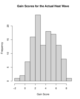
Figure 4 shows the grid cell, surface temperature gain scores of means histogram for the actual heat wave. Figure 5 shows the grid cell surface temperature gain scores of means histogram for the Faux Heat Wave 1.

Variation in both sets of gain scores over grid cells is to be expected. In the PNW region, surface temperatures are affected by many fixed factors such as altitude, land cover type, and how much of a given grid cell is over water or land. On a time scale of days, there also are many varying factors affecting surface temperatures such as cloud cover, precipitation, wind direction and intensity, and humidity. Taken together, the fixed and varying factors can impact not just the surface temperature on a given day, but the speed and size of temperature change over time.
Because both histograms are computed from gain scores, Figure 4 and Figure 5 show each distribution with the direct role of fixed grid cell differences linked to surface temperatures held constant. For example, by conditioning on mean surface temperature before the June heat wave, both figures implicitly condition on grid cell elevation and proximity to populated urban areas grid cell by grid cell related surface temperatures immediately before the heat wave. The remaining variation displayed results from dynamic processes that in principle can be used to forecast heat waves.555 Statistical interactions between dynamic processes and fixed features of a grid cell certainly can occur and are not necessarily controlled by the pre-test values. Estimating such relationships can be very challenging and is beyond the goals of this analysis necessarily constrained by what the AIRS data measures. Also, explicitly including such interactions in the forecasts to follow would greatly increase the dependence between predictors because product variables are usually required. Nevertheless, we will see some indirect evidence of fix factor and dynamic factor interactions later, although we are unable to characterize them in a useful manner.
Neither histogram has much resemblance to the canonical normal distribution. There is far too much mass toward the centers of both histograms. Nor is either distribution strongly skewed to the left or the right. There is nothing to suggest an extreme value distribution. The attempt to isolate the role of dynamic process does not lead to popular “off-the shelf” distributions in gain scores.
Superficially, one might conclude that the two histograms are much alike. However, the gain scores of means from the actual heat wave have a mean of 3.8, while the gain scores of means from faux heat wave 1 have a mean of 1.2. The temperature gain scores are on the average about three times larger during the actual heat wave. The comports well media accounts of the PNW extreme heat wave and with scientific concerns as well.
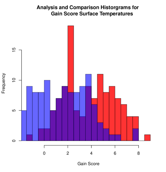
One can explore further how the two distribution compare by plotting the two histograms in the same figure. Figure 6 shows the distributional shift to the right in more detail. The red bars are taken from the histogram for the actual heat wave gain scores. The blue bars are taken from the histogram from the faux heat wave 1 gain scores. The purple bars show the overlap. Clearly, the two distributions are quite different. Perhaps most important, the entire distribution from the true extreme heat wave is offset to the right.
Far more may be going on than a simple distributional shift to the right. The distributional shapes can change, and the precursors of surface temperature can change as well. Also, there is a substantial overlap between the two distributions. Although extreme heat waves can be very consequential, a substantial fraction of the gain scores are much the same for both histograms.
This simple, exploratory analysis compared gain scores computed from the anticipated response variable alone. It suggests that the June 2021 PNW heat wave was not just another sequence of normal, hot summer days, but it does not characterize how the AIRS predictor variables might anticipate the differences. In the next section, we transition to analyses, using supervised learning, followed by a genetic algorithm, to consider how the AIRS predictor variables might help to characterize the two gain score distributions’ similarities and differences.
We have not yet reported any results for Faux Heat Wave 2. Its histogram looks much like the histogram for Faux Heat Wave 1. We make more use of Faux Heat Wave 2 later to replicate some important findings for Faux Heat Wave 1. The key point now is that the role of a 4 day lag versus a 30 day lead does not in this setting seem to make much empirical difference.
4 Fitting The Gain Scores of Means
4.1 Mitigating The Rare Events Problem
We have emphasized that extreme heat waves are statistically rare. But how rare depends on the population of which they are a part. For example, if one considers all days from 2017 through 2021 in the Pacific Northwest as a population of interest, there would be one extreme heat wave. Labeling all four of the last days in June of 2021 as heat wave days, there would be 4 heat wave days for more than 1800 days overall (i.e., ). If one never predicted an extreme heat wave over all of those days, that prediction would be correct about 99.8% of the time without using any predictors at all. It would be, therefore, almost impossible to uncover the roles of predictors because fitting and forecasting are already close to perfect. As noted earlier, one is stuck with very accurate and very trivial forecasts. Even if the data were limited all of the days in 2021, a forecast of no heat wave would be correct 98.9% of the time. The fitting and forecasting problems are nearly as catastrophic. There is far more promise using data only for the 30 days in June because is a little more 10%.
For the PNW rare extreme heat wave, we offer design-based adjustment. The data have been curated so that the same 144 grid cells are included in each of the three different scenarios: the true heat wave, Faux Heat Wave 1, and Faux Heat Wave 2. If the true heat wave scenario is compared to either of the two faux heat waves, there 144 true heat wave observations and 144 faux heat wave observations. If the true heat wave is compared to a pooled version of the two faux heat waves, there remain 144 observations in the true heat wave scenario and then, 288 observations in the combined faux heat wave scenarios. In either case, the true heat wave observations are no longer rare relative to the two faux heat waves.
We implicitly are capitalizing on a variant of crossover, quasi-experimental designs (Lui, 2016; Maxwell et al., 2017). Crossover designs are common, especially in biomedical settings. Here, all grid cells are exposed to extreme heat wave precursors at some specified time and are exposed to routine summer conditions at some other specified time. For each of the design configurations shown in Figure 3, the use of a pre-test conditions in grid cell mean temperatures immediately preceding the true heat wave or preceding each of the faux heat waves. Spillover effects of temperatures are contained. In addition, comparisons across the three design configurations conditions on all fixed differences between grid cells at a lag of 4 days or a lead of 30 days including those related to surface temperatures.666 Some of those fixed differences may be causally related to surface temperature and some are just associated with surface temperatures. Because in both cases the grid cells serve as their own controls, subsequent forecasting accuracy is likely to be improved.777 The empirical overlap in gain scores shown earlier also helps dispel concerns about distortions from rare events.
However, there is a price to pay for these design corrections to the rare events problem. Perhaps most important, we use a form endogenous sampling when the three design configurations in Figure 3 are imposed to all grid cells. It is unlikely that any study of rare extreme heat waves could be undertaken in a natural population such that one-third of the data were found in each of three different study scenarios. Forcing the data to be balanced in this manner can produce misleading statistical results (Manski and Lerman, 1977; Manski and McFadden, 1981). We will return to this problem later to consider several possible solutions. For now we continue to descriptively unpack how extreme heat wave surface temperatures can differ from faux heat wave surface temperatures.
4.2 An Application of Supervised Learning
We deploy a supervised learning algorithm that can have good forecasting skill. Just as shown in Figure 3, the response variable is grid cell gain scores of means for the true PNW heat wave and Faux Heat Wave 1. The predictor values are taken from two weeks earlier for all variables shown in Table 1 except ”SurfAirTemp”, which is used to construct the pre-test and post-test. There are 286 observations, 144 grid cells each from the true and faux heat wave less two grid cells having missing data.888 Two grid cells were deleted because of missing data.
We considered two forms of widely used and successful supervised learning: random forests (Breiman, 2001a) and stochastic gradient boosting (Friedman, 2001). Both can be seen as variants of nonparametric regression, are very easy to train, and often the default tuning parameter settings work well. A complication is that there is strong dependence between many of AIRS predictors. For example, the measured temperatures at different altitudes are often correlated at values above .95.
Random forests handles strongly correlated predictors better than stochastic gradient boosting because it is comprised of a large ensemble of regression or classification trees with the partitioning for each tree undertaken using a small random subsets of predictors. Sampling predictors (without replacement) for each split can dramatically reduce the impact of high multicollinearity.999 This is one of random forest’s several features in service of increasing the independence between trees that, in turn, improves performance when averaging is undertaken across the tree ensemble (Breiman, 2001a). The resistance to high multicollinearity is a byproduct. By sampling a small number of predictors at each split, the multicollinearity (i.e., multiple correlations between predictors) is generally reduced because relatively few predictors are being considered when each new partitioning of the data is undertaken. We settled on the implementation of random forests in R, ported by Andy Law and Matthew Wiener (Liaw and Weiner, 2002) from the original Fortran by Breiman and Cutler (Breiman, 2001a), which includes several important auxiliary algorithms that can dramatically increase algorithmic transparency.
In this highly exploratory phase of the work, we were motivated by possible differences between how the same predictors performed depending on whether the data came from the true extreme heat wave or a faux heat wave. Work on quasiresonant amplification is a provocative illustration (Petoukov et al., 2012; Mann et al., 2018; Li et al., 2024). In response, we initially applied random forests separately to the true extreme heat wave dataset and to the faux heat wave dataset structured as in faux heat wave 1. We computed 500 regression trees for each. About 75% of the gain score variance was accounted for using either the true heat wave data or the faux heat wave data. By the MSE criterion, fitting performance was promising and much the same for both.
But all else was very different. For example, the fitted values for the true heat wave histogram were farther to the right than the fitted values histogram for the faux heat wave, which follows in part from the different gain score distributions discussed earlier. Perhaps most telling, different predictors dominated the two different fits depending on whether the response variable was the gain scores for the true heat wave or the gain scores for the faux heat wave. There may be important implications for how rare extreme heat waves are forecasted, an issue to which we return after the predictor importance differences are more deeply examined. There may also be important implications for how the underlying dynamics of extreme heat wave differ from those of “merely” several hot summer days in a row.
4.2.1 Extreme Heat Wave Gain Scores
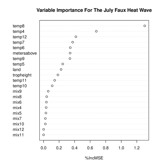
Consider first the extreme heat wave event. Figure 7 is the variable importance plot for the true heat wave. The 14 day lagged predictors are listed in the left margin. Predictor importance is greater for predictors higher in listing. The metric at the bottom is the percentage increase in the response variable Mean Squared Error (MSE) when each variable by itself is randomly shuffled such that associations with the gain scores and with the other predictors are driven toward zero. The increase in MSE measures the decrement in fitting performance.
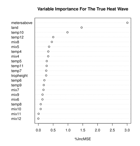
Starting at the top of variable list, when a grid cell’s topography (meters above sea level) is shuffled, the MSE increases by about 3%. If a grid cell’s land/sea indicator is shuffled, the MSE increases by about 1.5%. If two temperatures at relatively high altitudes are shuffled, MSE increases about 1.5% (i.e., 1% + .5%). If two water vapor mass-mixing ratios in the middle altitudes are shuffled, the MSE increases by about 1% (i.e., .5% +.5%). These are for the five largest increases in fitting error, but in numerical terms are quite small. A significant reason is that contributions are shared with other predictors due to predictor interaction effects that are not included in these MSE increases. With the large amount of variance accounted for, these interactions must be important too; the sum of the unique predictor contributions from Figure 7 is far smaller than for the overall MSE accounted for. It is possible to show these effects (Molnar, 2022), but the number of predictor pairs, triplets, and more that would need to be examined make this strategy computationally impractical. Interactions between predictors are included in the fitting even though we cannot separately identify and characterize them.
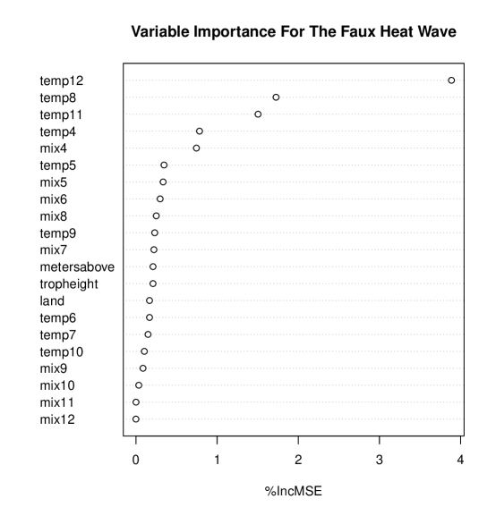
Figure 8 is the variable importance plot for the faux heat wave. All of the fixed structural predictors drop down to the middle of the pack and have very small contributions to the fit. What matters most are several measures of temperature at different altitudes 14 days earlier. Grid cells that have larger gain scores during the heat wave are warmer 14 days earlier as well. There is some form of temperature temporal dependence. But the point is that despite comparable fitting performance, the predictors that uniquely matter most for the fit appear to differ depending on whether random forests is applied to the true heat wave data or the faux heat wave data.
Both variable importance plots show which predictors are driving most the random forests’ fitted values. But from Figure 7, one might wonder about functional forms determining predictor importance. Are they monotonically positive or monotonic negative? Are they approximately linear? For that, we turn to several illustrative partial dependence plots for the true heat wave.
Figure 9 is the partial dependence plot for a grid cell’s topography variable (meters above sea level). The partial dependence plot shows the conditional mean of the fitted values for different values of a given predictor, all other predictors held constant at their values in the data(Friedman, 2001; Greenwell, 2017). These are not covariance confounder adjustments as in linear regression. For each predictor value for a variable whose plot is of interest, all other variables are fixed at their mean values in the data. They necessarily are unchanging as the selected predictor’s values change. If a variable to be held constant is categorical, its mode can be used instead of its mean. The line, provided to summarize the relationship, is essentially an interpolation of the conditional means of the fitted values. It can be smoothed, as we illustrate later.
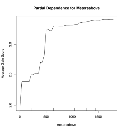
Figure 9 shows that for grid cells about 500 meters above sea level, the conditional mean of the gain scores is about 3.0, which indicates that it is about 3 degrees K warmer than the conditional mean from 4 days earlier before the heat wave arrived. It is seems that higher locations have greater conditional gain score increases up to about 750 meters after which the conditional means level off. Clearly, the relationship is quite nonlinear, and some may find the positive part of the relationship surprising. Moreover, because the predictor in Figure 9 is fixed, one is seeing an interaction effect. It is included here to show that interaction effects may be of interest even if not explicitly identifiedlater forecasting.
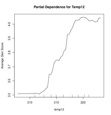
Figure 10 shows the partial dependence plot for the temperature at the highest altitude reported in the AIRS data. The relationship is again substantially positive and nonlinear with a leveling for the highest temperature values. Because temperature at different altitudes is a random variable, Figure 10 is at least in part showing A direct effect, as discussed briefly earlier.
Figure 11 shows the partial dependence plot for the mixing ratio in the middle altitudes. The overall function is again positive over much of its range, highly nonlinear, with a leveling, and perhaps even a decline for the highest mixing ratio values. The mixing ratios are also random variables, so there is no need at this point to consider interaction relationships.
A partial dependence plot for land-sea mask is not shown. With only two values, its relationship with average gain scores must be linear. And with grid cells on land coded “1” and grid cells over water coded “0”, it is no surprise that the association is positive. Still, this is another encouraging sanity check.
The take home message from the partial dependence plots is three-fold. First, they all appear to be sensible, which is striking for these exploratory analyses. For example, all of the estimated relationships reasonably smooth. Second, the estimated relationships are all highly nonlinear except for the land-sea mask. This has implications for models or algorithms to be used in forecasting. Conventional linear regression models may be off the table. So will extensions such as the Kalman Filter, suggested by some as part of the downscaling steps for global climate models (Schneider et al., 2023). Finally, although algorithms are not models, there may be useful causal hints in the functional forms shown, which tend to be positive. Working with gain scores helps because the baseline means adjust for temperature-related, fixed grid cell differences before the heat wave.
Partial dependence plots for the Faux heat wave are probably not instructive because the top four predictors are measures of temperature at different altitudes. The dependence between all of these predictors is very high. Random forests manages to fit the data well because of the way its ensemble of regression trees is grown, but the variable dependence plots are somewhat unstable over different runs of random forests.
The instability, even if relatively modest, motivates returning to faux heat wave 2. There was no PNW heat wave in July of 2021. One can apply the exact same design used for the true heat wave in June of 2021 to a faux heat wave in July of 2021 and fit random forests as before. In other words, the crossover design now separates the true and faux heat wave by 30 days instead of 4 days as in Figure 3. The risks from spillover contamination are dramatically reduced and arguably eliminated. But the large gap in time can allow for differences in the grid cells that make comparisons between the predictors of the true and faux heat waves more complicated. For example, on the average, weather conditions in June and July related to surface temperatures in may differ. There can be less rain and lower soil moisture in July, for instance. According to NOAA National Centers of Environmental Information, 1.9 inches of rain fell in Seattle in June of 2021, and 0.0 inches of rain fell in Seattle in July of 2021 (https://www.ngdc.noaa.gov/).101010 In the winter months, the rainfall in Seattle is much more substantial.
Despite such possibilities, the random forest fit for the faux heat wave in July is again quite good. About 70% of the variance in means-based gain scores was accounted for. Variable importance shown in Figure 12 indicates that the temperatures at different altitudes dominate the fit, just as for the earlier faux wave addressed in Figure 8. The top five most important predictors are temperature measured at different altitudes, which differs substantially from Figure 7 for the true heat wave. We have a replication of sorts for the two faux heat waves despite some differences in research designs. Perhaps neither the difference in pre-test to post-test separation time nor the differences in weather patterns between June and July matter for the two faux heat waves, while both show some interesting differences with the true heat wave.
In summary, random forests separately fits quite well the true heat wave gain scores of means and both faux heat waves gain scores of means. But, the random forest fitted values produce somewhat different variable importance results, depending on whether the fitted heat wave is real of fake. Perhaps the underlying physics differs somewhat as well. At the same time, one has some reason to worry about the impact of dependence between the predictors and especially between temperatures at various altitudes and between the water vapor mass-mixing ratios at different altitudes. It may be difficult to get a clear reading on which predictors matter most for a good fit. In response, we turn to another data analysis strategy.
5 Applying Genetic Algorithms To The Fitted AIRS Data
If there were such a thing as an ideal extreme heat wave and such a thing as an ideal set of warm summer days, perhaps the messiness of real weather conditions could be reduced. Recall that the June PNW faux heat wave had many gain scores similar to those of the June true heat wave. This is not surprising because surface temperatures are produced by normal weather and topographical forcings likely combined with dynamic forcings when a heat dome arrives. Ubiquitous factors such as earlier surface temperatures are still in play. Perhaps for similar reasons, many of the predictors available in the AIRS data must be highly correlated making it extremely difficult to isolate their separate effects. Might abstractions from extreme heat waves and usual summer days help?
We can borrow from the social sciences the concept of an “idea type” or a “pure type” (Garth and Mills, 1958) that abstracts the essential features of some phenomenon much like many key concepts in climate science. Then, perhaps a genetic algorithm can be employed to construct two ideal types: a synthetic population of extreme heat wave grid cells and a synthetic grid cell population of normal sequences of very warm summer days. Comparisons between the two might allow for a more definitive reading of their similarities and differences.
A random forest was trained as before using 500 regression trees for the June true heat wave. The gain score data used for training were the same as the gain score data employed in the earlier analyses. A trained and averaged ensemble of regression trees can serve as a survival function for a genetic algorithm’s construction of an ideal, synthetic population of grid cells experiencing a true heat wave.
In the same manner, a random forest was trained as before using 500 regression trees on June faux heat wave 1. The gain score data were the same as used in the earlier analyses. A trained and averaged ensemble of regression trees can serve as a different survival function for a genetic algorithm’s construction of an ideal, synthetic population of grid cells experiencing a faux heat wave.
The two survival functions were used as input to the procedure GA in R written by Luca Scrucca (2013). The standard defaults for numeric predictors worked well. For both survival functions, 5000 iterations were specified leading to 5000 synthetic populations with 100 grid cells each having increasing fitness on the average. As a first approximation, one can think of a genetic algorithm as jittering predictor values, computing new fitted values from the survival function using the jittered predictors, saving the subset of the grid cells with the larger gain scores, and repeating this process many times until there is a population that includes only very fit grid cells (i.e., having large gain scores).111111 The GA software in R has several tuning parameters, as follows, with good default values.(1) For each synthetic population of grid cells, the predictors from the five grid cells with the highest computed surface temperatures were not altered. (2) The crossover probability for each possible pair of predictors was set at 0.8. A crossover refers to a pair of “parent” grid cells combining their predictor values to form an “offspring” grid cell. (3) The mutation probability for each grid cell’s predictor was set at 0.1. (4) Because all of the predictors are treated as numeric in this application, the predictor values for an offspring grid cell are computed as the average of the corresponding predictors from a random pair of parent grid cells. (5) The mutation method used replaces the value of the existing numeric variable with a random value within a specified range drawn at random from a uniform distribution. The size of a synthetic population is not a tuning parameter but 100 grid cells seemed a good compromise between an ability to examine the output in detail and have a sufficient number of observations to arrive at sufficiently stable parameter estimates.
The grid cell mean gain score for the final synthetic population produced by the true heat wave survival function was 7.26 degrees K. The grid cell mean gain score for the final synthetic population produced by the faux heat wave 1 survival function was 5.76 degrees K. The gain scores from the ideal synthetic population of grid cells constructed from the true heat wave are on the average about 20% larger than the ideal synthetic population of grid cells constructed from the faux heat wave. Because of differences in the two survival functions, the genetic algorithm was unable to equate the two. One possible inference, already mentioned, is that the physics for the true heat wave may differ somewhat from the physics of the faux heat wave.121212 Predictor dependence was reduced substantially because of the predictor randomness the genetic algorithm introduced.
| Predictor | True Heat Wave | Faux Heat Wave |
|---|---|---|
| metersabove | 623.02 | 395.78 |
| land | 0.73 | 0.67 |
| temp4 | 274.48 | 228.16 |
| temp5 | 268.84 | 232.32 |
| temp6 | 259.13 | 224.15 |
| temp7 | 246.98 | 225.02 |
| temp8 | 233.93 | 211.24 |
| temp9 | 215.74 | 245.85 |
| temp10 | 217.13 | 260.26 |
| temp11 | 218.14 | 227.19 |
| temp12 | 220.84 | 265.94 |
| mix4 | 5.33 | 6.97 |
| mix5 | 3.44 | 1.47 |
| mix6 | 1.67 | 0.76 |
| mix7 | 0.61 | 0.16 |
| mix8 | 2.60 | 6.86 |
| mix9 | 1.31 | 5.84 |
| mix10 | 4.47 | 3.90 |
| mix11 | 7.68 | 5.73 |
| mix12 | 2.84 | 5.20 |
| tropheight | 11766.76 | 6728.78 |
Table 2 provides a bit more evidence about the ways in which an ideal true heat wave can differ from an ideal faux heat wave. Shown are the predictor values the algorithm fashioned in the final iteration that produced grid cells with superb fitness in the metric of temperature gain scores. The predictor values for the true heat wave are in the left column. The predictor values for faux heat wave 1 are in the right column. Comparisons between the two columns can be used for variable selection in a simple application of feature engineering.131313 This is an example of cherry picking that can invalidate conventional statistical inference. However, the analyses to follow are able sidestep this problem.
Compared to the faux ideal heat wave, the true ideal heat wave is characterized by substantially higher grid cell, gain score altitudes (i.e. 623 meters v. 396 meters) and higher grid cell, gain score atmospheric pressure at the tropopause (i.e. 11,767 hPa v. 6,729 hPa). The ideal faux heat wave is characterized by higher grid cell, gain score temperatures closer to the ground and lower grid cell, gain score temperatures at high altitudes. The role of the atmospheric water vapor mass mixing ratios is inconsistent. These variables may well have special explanatory and/or forecasting value for real heat waves. There is now perhaps a bit better sense of how the predictors are related a true extreme heat wave compared to a faux heat wave.
6 Forecasting True Real Waves Using a Binary Outcome
We have arrived at a pivotal research destination. If the forecasting goal is help inform policy options two weeks (or more) before an extreme heat wave arrives, one must anticipate how forecasting could undertaken in practice. To be useful, the predictors must be measured and readily available well in advance of a possible heat wave. This implies ongoing data collection on a regular basis.141414 There are also second order requirements. For example, the data collection requires continuity in naming conventions, which factors measured, the temporal and spatial scales, the measurement technology used, and data file formats. If any of these change, forecasting skill can be badly damaged. At the very least, abrupt variation in the data over time will likely be introduced. In addition, promising predictors should not be constant over time. For each grid cell, its altitude above sea level, for instance, is a constant that will not change whether or not an extreme heat wave subsequently occurs. It has no forecasting capability.
From a policy point of view, it is arguably better to resurrect the operationalization an extreme heat wave discussed earlier. An extreme heat wave is a discrete event; it is either present or not present. The task becomes forecasting a categorical binary outcome. Moreover, by earlier forecasting temperature gain scores, we were forecasting a consequence extreme heat wave precursors and perhaps the impact of a heat dome. We were not explicitly forecasting a discrete, extreme heat wave.
Returning to the design in Figure 3 for the June true extreme heat wave, we drop the pre- test and recode the post-test to equal “1.” For purposes of comparison, we use July, 2021 as the setting for a faux heat wave (i.e, faux heat wave 2). The pre-test is dropped and the post-test is recoded to equal “0.” The same 144 grid cells are used for a new extreme heat wave design and for the new faux heat wave design; the same grid cells are exposed to one climate regime in June and then another climate regime in July. The June data are then “stacked” above (or below) the July data to form a single dataset. We have an explicit crossover design but including both an extreme heat wave and a faux heat wave. The classification format is balanced, and the rare event problem seems resolved.
But the rationale goes a bit deeper. When the data are stacked, each study unit once again serves as its own control. But, there is no longer a need to compute a pre-test score. We use the last 4 days of July for the faux heat wave because the time offset between the true and fax heat wave is now 30 days. The chances of spillover effects become very small. This helps justify the absence of a pre-test. Because the earlier results for Faux Heat Wave 1 and Faux Heat Wave 2 were so similar, the different seasonal conditions between June and July probably do not matter for our classification analysis. Finally, by replacing a regression random forest with a classification random forest, we set the stage for latter of estimating forecasting uncertainty with conformal prediction sets.
Random forests was retrained as a classifier using the new data structure. All of the predictors used previously were candidates for the classification exercise. As a start, however, we selected three predictors from Table 2 that seemed promising: (1) atmospheric pressure at the tropopause, (2) atmospheric water vapor mass mixing ratio at level 8, and (3) the temperature at level 8. For each, we considered the gaps shown in Table 2 between values in the true heat wave column and values in the faux heat wave column. For the mixture and temperature variables, other proximate altitudes could have been selected instead because proximate altitudes tend to be substantially correlated. Dependence between the three predictors selected was not a serious complication.
No causal claims are being made. Our earlier analyses are consistent with the expectation that relatively few predictors can suffice for promising classification accuracy. High classification accuracy can be a precursor to high forecasting accuracy.151515 Analysts sometimes overlook that classification accuracy is not the same as forecasting accuracy. For classification, the outcomes of interest are known and included in the data. Using a statistical classifier, the goal is to correctly identify each known outcome. For forecasting, the outcomes are unknown. If they were known, there would be no need to forecast them. The goal is to correctly project what the outcomes will be. Although as a statistical matter, high classification accuracy can support high forecasting accuracy, forecasting introduces additional assumptions and uncertainties that must be properly addressed. But high classification accuracy does not necessarily imply credible causal inference.
Our random forests results are encouraging. The overall error rate is only 5.8%. In this setting, a false positive can be defined as incorrectly classifying the faux heat wave as the true heat wave. The false positive rate is about 6%. In this setting, a false negative can be defined as incorrectly classifying a true heat wave as the faux heat wave. The false negative rate is about 5%. Also, all of the predictors make impotant contributions to the fit in Figure 13. In short, the random forest classifier almost always correctly identifies the true positives and the true negatives. This can enormously benefit conformal prediction inference.
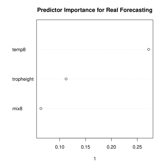
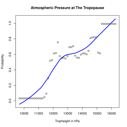
Figure 13 is the variable importance plot from random forests. The metric at the bottom of the figure is the reduction in classification accuracy when each variable in turn is randomly shuffled with the other variables fixed at their empirical existing values. For example, classification accuracy declines by more than 25 percentage points if temperature at altitude 8 (only) is shuffled. In short, Figure 13 shows all three predictors are important for classification accuracy.
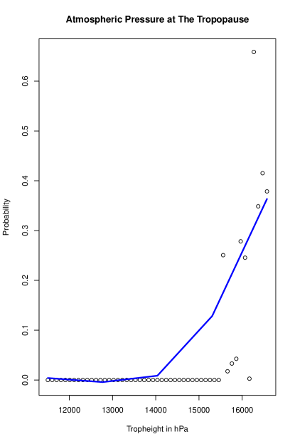
Figure 14 is the partial dependence plot for the atmospheric pressure at the tropopause. The empty circles are the fitted values, and the blue line overlaid is a loess smoother (Jacoby, 2000). With the other two variables fixed at their observed values, there is very nearly a straight line increase from a near 0.0 probability to a near 1.0 probability as atmospheric pressure rises. The higher the probability, the greater proportion of grid cells classified as having a real heat wave. The empirical relationship shown is unusually strong especially because atmospheric pressure is measured two weeks earlier.
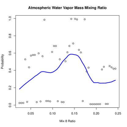
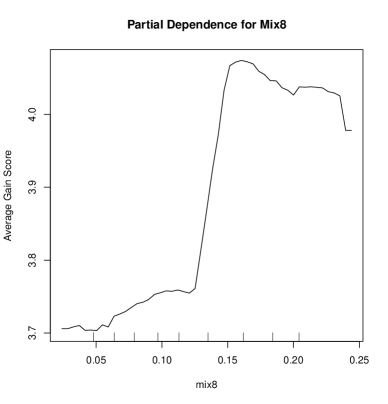
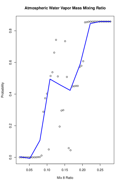
Figure 15 is the partial dependence plot for the atmospheric water vapor mass mixing ratio at altitude 8. There is at first a dramatic increase in the heat wave probability to about .60 that levels off and even starts to decline substantially at a mixing ratio of about .10. One might say that the odds of a heat wave increase to near 2 to 1 up to a ratio of about .15 and then drop to an odds of about 1 to 4. The downturn is perhaps surprising.
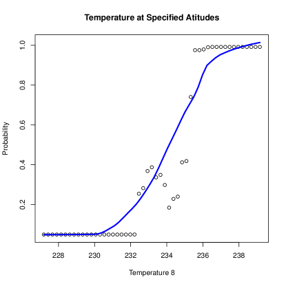
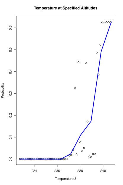
Figure 16 is the partial dependence plot for the temperature at altitude 8, which has an S-Shaped relationship with the probability of a heat wave. Overall, the relationship is positive and ranges from near 0.0 to near 1.0 as the temperature increases. This may not be surprising for heat wave forecasts except that, again, temperature is measured 2 weeks earlier.161616 The very large fitted probabilities in the three figures is in part a function of 50-50 balance built into the research design noted earlier.
6.1 Conformal Prediction Sets
Given the data available and possible peculiarities of PNW grid cells, classification accuracy is very promising. A next task is to turn classification into forecasting. We use nested conformal prediction sets. For an unlabeled grid cell, conformal prediction sets can produce an extreme heat wave and/or a no extreme heat wave forecast that is provably correct at a predetermined probability. Because the random forest classifier discussed earlier was so accurate, there is good reason to expect that such forecasts will be very accurate as well. To address uncertainty in practical manner, we proceed with nested conformal prediction sets under the popular “split sample” approach (Kuchibhotla and Berk, 2023).
The key assumption is that the dataset used is comprised of exchangeable observations. This means that the order in which the observations are realized does not matter for the joint probability distribution of the data. When forecasts are needed for new cases without labels, the new observations also are realized in an exchangeable manner from the same population as the data on hand.
Our crossover design buttresses the exchangeable assumption. It does not matter whether the data from June were realized in July and data from July were realized in June. Their joint probability distribution would be the same. Recall that because of the 30 day disparity between the June extreme heat wave and July faux heat wave, spillover effects are highly unlikely, and there is no other apparent connection in the data between the late heat wave events in June and the late faux heat wave events in July.171717 The issues can be subtle. This means that if for the data on hand the designated months were swapped, the histogram for the full dataset would be unchanged. It does not mean that grid cells measured in different months are exposed to the same climate conditions.
As the split sample approach requires, the data on hand were randomly split into two disjoint samples, one used to train a classifier, and one used to construct conformal prediction sets. Some call the second split a “test” sample. Some call it “calibration” data. One advantage of this approach is that most any classifier can be used, even methods like stepwise logistic regression, which aggressively capitalize on data snooping that can invalidate convention statistical inference (Berk et al., 2013). Such problems and others are not transported from the training data to the calibration data because the calibration dataset only gets to work with the classifier output, not the processes by which the output was produced. The calibration data distribution provides a baseline used to evaluate hypothetical forecasted outcomes for unlabeled data for which a forecast is sought.
Nested conformal prediction sets (Gupta et al., 2022) was applied to the crossover data for June and July of 2021. A predetermined coverage probability of .75 was specified. When for a given, unlabeled grid cell a claim is made that the true future outcome is included in the prediction set, it will be correct at least 75% of the time; the odds in favor of the truth of that grid cell’s forecast are at least 3 to 1.
For illustrative purposes, we used 10 grid cells from the training data as if their true outcome class was unknown. For each grid cell, there was a single member in the prediction set, which represents ideal precision. Based on the outcome classes in the calibration data, the forecasts for all 10 cases were correct. This is no surprise because the random forests classifier identified the outcome classes so well. In retrospect, a more demanding coverage probability than .75 could have used (e.g. .90) because the random forests classifier was so accurate.
7 A Replication Study in Phoenix, Arizona
There are at least three reasons to attempt a study replication in a new setting. First, the forecasting results just reported capitalize on extensive data exploration that can lead to cherry picked results; post-model-selection inference can be concern regardless of our efforts made to respond to the problem. Second, our findings acquire far more credibility and usefulness if they apply to areas in addition to the Pacific Northwest. That credibility and usefulness can affect subject-matter considerations and pressing policy concerns. Finally, other geographical areas bring not just different climate scenarios, but different data and different data problems. Especially important is to determine if our results are robust to new data flaws and research design constraints.
To address these matters of generalizability, we obtained AIRS daily data for the Phoenix area for 63 grid cells from 2019 through 2023. Data were not available for 2024. The measured variables were the very same used in the PNW analysis. However, the topography in the greater Phoenix is not just very different from the PNW, but far more homogeneous. One might wonder, for instance, if a quasiresonant explanation applies.
We began with a simple and ambitious aspiration. Using a crossover design much like before, training with random forests on the same variables used previously, and with similar algorithmic methods to that used for the PNW forecasts, could we reproduce the PNW results in Phoenix? An exact replication would be effectively impossible to produce, but could we get results properly to inform affirmative judgments about reproducibility?
There were immediate and obvious design issues. We had about half the number of grid cells for the Phoenix area than for the Pacific Northwest. There was also a substantial number of grid cells with missing data. Between the two, we anticipated a much smaller number of observations. One result could much weaker power and even more sparsity. We needed a way to increase the number of usable grid cells within in the spirit of our earlier crossover design.
The Phoenix heat dome arrived at the beginning of July 2023, not at end of June, 2021, as it had in the Pacific Northwest. For an alternative crossover design, we proceeded the much as before, but the faux heat waves A and B were for July of 2021 and July 2022 respectively, before the true Phoenix extreme heat wave. This means that the predictors lagged 14 days earlier would fall toward the middle of June for 2021, 2022 and 2023. For all three Phoenix years, we used a binary response variable coded “1” for the heat dome in July of 2023, and “0” for no heat dome in July of 2021 and July 2022.181818 We could have included a greater number of years back in time, but all would for faux July heat waves. The number of appearances each grid cell would make could be increased along with the overall number of observations. But we were concerned that the binary response variable would become badly unbalanced.
The coding is consistent with that done for the PNW forecasting analysis. All three time periods were then stacked to make single data set; each grid cell in principle was observed in three different years and in principle there would be 189 observations representing one extreme heat wave and two faux heat heat waves. The crossover design would again provide sufficient control for temporally stable features of grid cells.
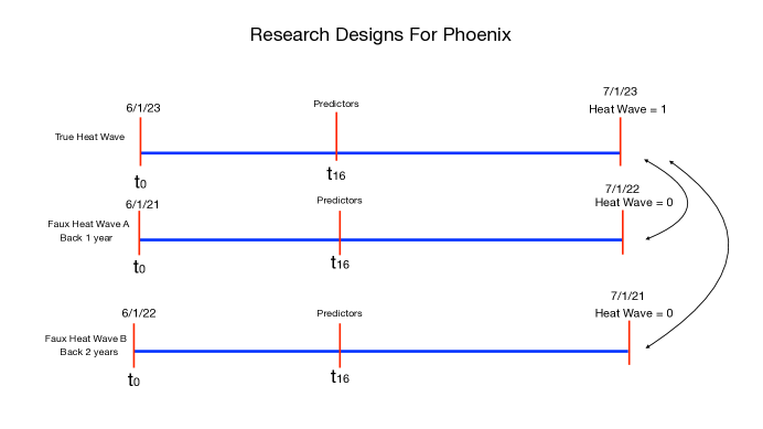
But the potential problem from missing data remained. When we removed all rows (i.e., grid cells) with any missing data, we lost 186 grid cells from the total 189. Clearly this was disastrous. Fortunately, when the included variables were limited to just those selected for the PNW forecasts, the number of grid cells fell to “only” 128. Because the data were lost through cloud cover and occasional downtime on the remote sensing satellite, one can argue that the data were missing in blocks conditionally at random, and exchangeability still holds. Nevertheless, the large amount of missing data raises concerns about the representativeness of the Phoenix data and about some instabilities that could be introduced. The design we used is shown in Figure 17.
We were pleasantly surprised. The error rate for Phoenix was a little under 5%, comparable to the error rate for the PNW. As before, all three predictors made important contributions to the fit although their rank order differed. The atmospheric water vapor mass mixing ratio was now the top ranked. In retrospect, a different importance ordering was not surprising because the topography and climate in the Phoenix area is so very different from the topography and climate in the Pacific Northwest.
Despite great differences in climate and topography, Figure 14 for Seattle and Figure 18 for Phoenix have provocative similarities. Both have positive slopes over most of their domain, start very flat and then peak around 1600 in tropheight hPa units. The difference in their maximum fitted probability results in part from the 2 to 1 split for the faux versus the true extreme heat wave in Phoenix compared to the 1 to 1 split in Seattle. With a bit more tuning, the plots might made to look even more similar. But it is difficult to smooth the Phoenix data well because of the fewer grid cells and the missing data.
Now compare Figure 15 from Seattle with Figure 19 from Phoenix. For Phoenix, the plot is again much less smooth, and the trend overall is positive with a dip around a mixing ratio of about .15. For Seattle, the there is no recovery from the same type of dip and even some evidence of a decline after a mixing ratio of about .15. As before, the difference in the largest probability obtained for the true heat wave is smaller for Phoenix.
Finally, compare Figure 16 with Figure 20. Both relationships begin flat, and then are positive over the rest of their domain. But note that the temperatures in K are somewhat warmer for Phoenix and as before, the maximum probability of a heat dome is lower in Phoenix in part because of the research design. Nevertheless, the application of nested conformal prediction sets produces results comparable to those in the Pacific Northwest because the classifier performed so well.191919 Classification accuracy remains excellent despite smaller fitted probabilities because of the common use of a threshold of .50 on those fitted probabilities. For our analyses, as long as an observation has a fitted probability greater than .50, it will be classified as an extreme heat wave. It does not matter if the fitted probability is, say, .55 or .95. A related kind of robustness is found in nested conformal prediction sets as well.
Eyeball comparisons are not meant to be the final word. But with the exception of the permanent downturn toward the middle the mixing ratio plot for Seattle, the results for both sites are qualitatively similar despite difference between the Seattle region and the Phoenix region in climate, topography, data quality and research design. Moreover, the recent paper by Li and colleagues (2024) on the Seattle 2021 extreme heat wave suggests an important role for the all three of the predictors in the Pacific Northwest we have used in the Pacific Northwest and the greater Phoenix area and for the plausibility of our two week lags between the predictors and the binary response. Finally, we must not overlook the very good forecasting skill in both regions.
At the same time, some additional tuning might be warranted. The altitude selection for the mixing ratio and for temperature are somewhat arbitrary and perhaps could be tried at higher or lower values. The altitude values chosen were a product of the feature engineering based on the genetic algorithm’s results. That process could be revisited. But in the end, more study sites is really what is needed.202020 We are not at this point intending to be drawn into the current controversy about replications in science (Editorial, 2021) But, we explored two other kinds of “reproducibility.” First, using the fitted algorithm from the Pacific Northwest, we obtained fitted values for the Phoenix area by simply using the Phoenix data as input to the PNW trained prediction function. Classification error approximately doubled primarily because of more failures to correctly classify the extreme heat wave. Second, we applied a form of transfer learning with the PNW as the “source domain” and the Phoenix area as the “target domain” (Agarwal et al., 2021). We were able to move very successfully most of the PNW results to Phoenix followed by a form of “fine tuning” for Phoenix. After fine tuning, the excellent forecasting results for the Phoenix area were reproduced. Transfer learning has promise for heat wave studies across different geographical areas when some of those sites have relatively few observations. We will have more to say about this in future work.
8 Endogenous Sampling
As noted earlier, there is a literature on problems that can result when data collection alters the prior distribution of the response variable compared to its distribution in the population of interest (Manski and Lerman, 1977; Manski and McFadden, 1981). For example, one might over-sample cancer cases that would otherwise be too small a fraction of the data for sufficient pattern recognition accuracy (Wang et al., 2021). But the price is empirical results that can lack many desirable statistical properties. There can be, for instance, badly distorted estimates of fitted probabilities. We saw earlier how the fitted probabilities can change depending on the proportion of faux heat wave grid cells in the data used in forecasting.
The problem is often called “endogenous sampling,” or in econometrics, “choice based sampling.” For discrete response variables, several remedies have been proposed (Cosslett, 1993; Waldman, 2000). An entire dataset on hand can be weighted so that the endogenous (response) variable once again can provide a consistent estimate of the response variable’s distribution in the target population. Sometimes the weighting is readily apparent. Sometimes it is buried in the statistical machinery along with performance enhancements.
Appropriate weighting is easily undertaken.212121 We take a transparent approach because we have seen no formal proofs of the more elaborate proposed remedies for random forests, gradients boosting, or nonparametric classifiers more generally when used for forecasting. For example, whether or not there is an extreme heat wave is the endogenous (response) variable in Figure 17. Suppose is the probability of an extreme heat wave in the target population. is the probability of an extreme heat wave in the data on hand. The two probabilities are different because of the manner in which the data collected and organized. There is a pair of remedial weights (Manski and Lerman, 1977; Manski and McFadden, 1981). For each grid cell that experienced an extreme heat wave, . For each grid cell that did not experience an extreme heat wave, . These weights can be incorporated easily within a weighting option commonly available in machine learning software.222222 As before, a heat wave is coded equal to “1.” The absence of a heat wave is coded equal to “0.”
There are several difficulties with such solutions. First, in many applications it is not apparent what the proper population is or even should be. An earlier example was whether the population for studying a rare extreme heat wave should be daily ARIS data for the most recent 5 years, daily AIRS data for the most recent year, or daily AIRS data for the most recent month. The choice can depend heavily how heat wave forecasting will be undertaken in practice. If essential responses to extreme heat waves are determined month to month, monthly data might be preferred. But then, a trained forecasting algorithm for each month would be needed, perhaps updated year to year. The work load could be reduced if forecasters were prepared to bet that rare extreme head waves only occur in the summer months. The forecasters would then be backing into the kinds of designs we used in the PNW and greater Phoenix area.
Second, for rare discrete events, the proper weighting proposals often recommended resurrect the very problem that the oversampling of rare events tried to remedy; it is not clear that the proposed remedies anticipated forecasting very rare events. The oversampled rare events are made empirically rare once again and preferred machine learning software may not run at all, or may run but give consequential warming messages. For example, the fitted probabilities may fall outside of the 0 to 1 range.
Third, Therneau and Atkinson (2023) have made clear that for tree-based classifiers such as classification trees, the prior distribution of the response is related to the ratio of the number of false negatives to the number of false positives (or the reciprocal). That ratio is often used to represent the relative costs of false negatives to false positive (i.e., all costs, not just monetized costs). For example, if for a binary response variable, a classifier produces 40 false positives and 20 false negatives, there are 2 false positives for every false negative. This can be interpreted to mean that false negatives are twice as costly as false positives, which may help explain why the classifier fits the data so that there are fewer of them; one false negative is “worth” two false positives.
More fundamentally, because the false negatives and false positives can have different costs, the algorithm is minimizing risk, not loss, a formulation convincingly introduced in the classic book by Luce and Raiffa (1957). It is no longer clear how endogenous sampling problems apply because the prior distribution of the response variable and differential losses for false negatives and false positives are related, and together they affect the risk. The underlying statistical machinery might be more appropriately built on asymmetric risk functions applicable to algorithmic forecasting (Ridnick et al., 2021). In fact, the entire discussion of unbalanced classification problems might be usefully reframed to make the consequences of false negatives and false positives a matter for asymmetric loss functions to address.232323 The ratio of false negatives to false positives is something about which stakeholders might care deeply. How much more (or less) costly a failure to correctly forecast an extreme heat wave (i.e., a false negative) may be compared to an extreme heat wave false alarm (i.e., a false positive) is not fundamentally a statistical decision. It is a policy decision in which subjective values and judgments are essential. Ideally, a preferred target ratio of the number of false negatives to the number of false positives is determined before the analysis begins and is then used to help formulate the data collection and key features of the forecasting algorithm. This has worked well in other settings (Berk, 2012).
The conflation of corrections for sample imbalance with the estimated misclassification cost ratio is easily illustrated. Using the expressions above for the weights, the PNW forecasting exercise was repeated. Recall that the response variable was binary, and there were the same number of grid cells that experienced a heat wave as did not experience a heat wave. Using the month of June, 2021 as the target population, for a little more than 13% of the days, the 144 grid cells experienced the extreme heat wave. For the other days, the 144 grid cells did not. In the data analyzed, for 50% of the days, the 144 grid cells experienced the extreme heat wave. A difference between 13% and 50% is the kind of disjuncture addressed by Manski and Lerman (1977). Note the substantial disparity materialized even though by choosing June, 2021, the imbalance was statistically manageable; the extreme heat wave was not disasterously rare.
Before weighting, the classification error rate was a little over 5%, and there were the same number of false negatives as false positives. The cost ratio was 1.0, conveying equal costs. When Manski-Lerman weighing was applied, the classification error rate rose to nearly 14%, and the cost ratio of false positives to false negatives increased from 1.0 to 9.67. False positives were now well over 9 times more costly than false negatives. In other words, the costs of heat wave false alarms were substantially up-weighted compared to the costs of true alarms not given. Many stakeholders might strongly prefer the reverse. Our statistical point is that changing the prior of the response variable can dramatically change the relative costs of false negatives and positives provided by a classifier. To concentrate only on corrections for unrepresentative, response variable priors is far too narrow.
We currently favor using, when feasible, data collection and curation methods that alter the prior joint distribution of the heat wave data, as we did for the PNW and greater Phoenix area. Random forests, gradient boosting and other classifiers can respond as if the costs of false negatives and false positives are asymmetric. However, the cost ratio should be determined by stakeholders as the research is being planned. We currently are not operating under those circumstances. The classification cost ratios for the forecasting reported above were about 1 to 1, which may be a useful place to start the discussion. Results for other cost ratios can be computed with weighting or by altering directly the proportion of heat wave observations in the data through selective case augmentations of, or deletions from, the study dataset. The more general approach is to employ asymmetric loss functions directly, a discussion of which would take as far afield.
9 Summary and Conclusions
There are several defining features represented in our attempt to forecast extreme heat waves. To begin, within supervised learning traditions used for forecasting, the main response variable is a binary label indicating whether an extreme heat wave has occurred or not. With so many extant definitions of heat waves, we settled on the prospect of a heat dome despite its dynamic properties. There is some evidence that extreme heat waves are more than ordinary warm summer weather (Li et al., 2024).
We rely on the AIRS remote sensing data. These data do not depend on climate simulations of any kind including downscaled global climate models. AIRS data are probably noisier than simulation data and provide fewer variables with which to work; the data have promise but offer special challenges. Despite the challenges, the data in the PNW and in the Phoenix area appear to deliver instructive results.
Although our work is informed by the climate science literature, we make no explicit use of models. Our analyses rest on quasi-experimental designs, a supervised learning algorithm well suited for forecasting and a genetic algorithm for simple feature engineering. Accurate forecasting is our primary goal. Any explanatory results are a secondary benefit.
By taking the forecasting especially seriously, forecasting uncertainty had to be taken especially seriously as well. We capitalized on recent developments in nested conformal prediction sets that can provide guarantees of valid results even in finite samples as long as the data are exchangeable. We make the case for exchangeability within a particular crossover design. The split sample approach has the added benefit of working with a wide range of classifiers even if they are less than ideal.
We forecast extremely well for the Seattle area heat dome in late June of 2021 and for the Phoenix area heat dome in early July of 2023. The same predictors do well in both regions. Although the partial dependence plots are not identical in the two locations, a case can be made that they are qualitatively similar despite important differences in local climate, topography, research designs and data quality. And both sets of partial dependence plots also tend to be highly nonlinear. Still, more study sites surely are needed.
Finally, even if our findings are robust, there are many steps between hand-tailored research procedures and production quality forecasting tools that can be routinely used to deliver accurate heat dome warnings sufficiently in advance. We do not discuss such matters in this paper. That would be premature.
References
-
Agarwal, N., Sondhi, A., and Chopra, K., and Singh, G. (2021) “Transfer Learning: Survey and Classification.” In Shailesh, T., Trivedi, M.C., Mishra, K.K., Misra, A.K., Khedo Kumar, K.K., and Suryani, S (eds). Smart Innovations in Communication and Computational Sciences, Advances in Intelligent Systems and Computing. pp. 145 – 156. Wiley
-
Angelopoulos, A.N. and Bates, S. (2023) “Conformal Prediction: A Gentle Introduction.” Foundations and Trends in Machine Learning 16(4): 494 – 591.
-
Aumann, H.H., Chahine, M.T.,Gautier, C.,Goldberg, M.D., Kalnay, E.,McMillin, L.M., Revercomb, H., Rosenkranz, P.W., Smith, W.L., Staelin, D.H., Strow, L.L., Susskind, J. (2003) “AIRS/AMSU/HSB on the Aqua Mission: Design, Science Objectives, Data Products, and Processing Systems.” Transactions on Geoscience and Remote Sensing 41(2): 253 – 264.
-
Aumann, H.H., Broberg, S., Manning, E.M., Pagano, T., and Sutin, B. (2020) AIRS Level 1C Algorithm Theoretical Basis Jet Propulsion Laboratory.
-
Barriopedro, D., Garcia-Herrera, R., Ordonez, C., Miralles, D.G., and Salcedo-Sanz, S. (2023) “Heat Waves: Physical Understanding and Scientific Challenges.” Reviews of Geophysics 61: 1 – 54.
-
Berk, R.A., (2012) Criminal Justice Forecasts of Risk: A Machine Learning Approach Springer
-
Berk, R.A., Brown, L., Buja, A., Zhang, K. and Zhao, L. (2013) “Valid Post-Selection Inference.” The Annals of Statistics 42(2): 802 – 837.
-
Berk, R.A., Buja, A., Brown, L., George, E., Kuchibhotla, A.K., Su, W. and Zhao, L. (2019) “Assumption Lean Regression.” The American Statistician 75(1); 76 – 84.
-
Berk, R.A., Kuchibhotla, A.K., and Tchetgen Tchetgen, E. (2024) “Fair Risk Algorithms.” Annual Review of Statistics and Its Applications 10: 165 – 187.
-
Box, G.E.P., Jenkins, G.M., Reinsel, G.G. and Ljung, G.M. (2016) Time Series Analysis: Forecasting and Control., Third Edition. Wiley.
-
Breiman, L. (2001a) “Random Forests.” Machine Learning 45: 5 –32.
-
Breiman, L. (2001b) “Statistical Modeling: Two Cultures.” Statistical Science 16(3): 199 – 231.
-
Burger, G., Sobie, S.R., Cannon, A.J., Werner, A.T., and Murdock, T.Q. (2013) “”Downscaling Extremes: An Intercomparison of Multiple Methods for Future Climate.” Journal of Climate 26(10): 3429 – 3449.
-
Chernozhukov, V., Wuthrich, K., and Zhu, Y. (2018) “Exact and Robust Conformal Inference Methods for Predictive Machine Learning with Dependent Data.” Proceeding of Machine Learning Research 75: 1 – 17.
-
Coles, S. (2001) An Introduction to Statistical Modeling of Extreme Values Springer.
-
Cosslett, S.R. (1993) “Estimation from Endogenously Stratified Samples.” Handbook of Statistics 11: 1 – 43. Elsevier. doi.org/10.1016/S0169-7161(05)80036-7
-
The Economist (2024) “The Rise of a Truly Cruel Summer.” June 26, 2024.
-
Fischer, E.M., Beyerle, U., Bloin-Wibe, L., Gessner, C., Humphrey, V., Lehner, F. A., Pendergrass, A.G., Sippel, S., Zeder, J., and Knutti, R. (2023) “Storylines for Unprecedented Heatwaves Based on Ensemble Boosting.” Nature Communications 14(4643): 112 – 114.
-
Fontana, M., Zeni, G., and Vantini, S. (2023) “Conformal Prediction: A Unified Review of Theory and New Challenges.” Bernoulli 29(1): 1 – 23.
-
Freedman, D.A. (2009) Statistical Models: Theory and Practice Cambridge.
-
Friedman, J.H. (2001) “Greedy Function Approximation: A Gradient Boosting Machine”, ”The Annals of Statistics.” The Annals of Statistics 29(5): 1189 – 1232.
-
Fuller, W.A. (1987) Measurement Error Models Wiley.
-
Gebrechorkos, S., Leyland, J., Slater, L., and coauthors (2023) “A High-Resolution Daily Global Dataset of Statistically Downscaled CMIP6 Models for Climate Impact Analyses.” Scientific Data 10: 611. https:// doi.org/10.1038/s41597-023-02528-x
-
Gettleman, A., and Rood, R.B. (2016) Demystifying Climate Models: A Users Guide to Earth System Models Springer.
-
Gilleland, E., and Katz, R.W.” (2016) “extRemes 2.0: An Extreme Value Analysis Package in R.” Journal of Statistical Software” 72(8) 10.18637/ jss.v072.i08.
-
Gupta, C., Kuchibhotla, A.K., and Ramdas, A.” (2022) “Nested Conformal Prediction and Quantile Out-of-bag Ensemble Methods.” Pattern Recognition 127: 108498. https://doi.org/10.1016/j.patcog.2021.108496.
-
“pdp: An R package for Constructing Partial Dependence Plots.” The R Journal 9(1): 421 – 436. Greenwell, B.M. (2017)
-
Hastie, T.J., and Tibshirani, R.J. (1990) Generalized Additive Models. Chapman and Hall.
-
Jacoby, W.G. (2000) “Loess: A Nonparametric, Graphical Tools for Depicting Relationships Between Variables.” Electoral Studies 19(4): 577 – 613.
-
Kearns, M., and Roth, A. (2019) The Ethical Algorithm: The Science of Socially Aware Algorithm Design. Oxford University Press.
-
Kotz, S., Balakrishnan, N., and Johnson, N.L. (2000) Continuous Multivariate Distributions, Volume1. Wiley.
-
Kuchibhotla, A.K. and Berk, R.A. (2023) “Nested Conformal Prediction Sets for Classification with Applications to Probation Data.” Annals of Applied Statistics 17(1): 761 – 785.
-
Lafferty, D.C. and Sriver, R.L. (2023) “Downscaling and Bias-Correction Contribute Considerable Uncertainty to Local Climate Projections in CMIP6.” npj Climate and Atmospheric Science. 6(158) https:// doi.org/10.1038/s41612-023-00486-0.
-
Leeb, H. and Pötscher, B.M. (2005) “Model Selection and Inference: Facts and Fiction.” Econometric Theory 21: 21 – 59.
-
Leeb, H. and Pötscher, B.M. (2006) “Can One Estimate the Conditional Distribution of Post-Model-Selection Estimators.” Economic Theory 24(2): 338 – 376.
-
Leeb, H. and Pötscher, B.M. (2008) “Model Selection.” In “Model Selection.” T.G. Anderson, R.A. Davis, J.-P. Kreib, and T. Mikosch The Handbook of Financial Time Series pp. 785 – 821. Springer.
-
Li, Y., Wu, X., Yang, P., Jaing, G., and Luo, Y. (2022) “Machine Learning for Lung Cancer Diagnosis, Treatment, and Prognosis.” Genomics Proteomics Bioinformatics 20(5): 850 – 866.
-
Li, X. , Mann, M.E., Wehnerb, M.F., Rahmstorf, S., Petric, S., Christiansena, S. and Carrilloa, J.” (2024) “Role of Atmospheric Resonance and Land–Atmosphere Feedbacks as a Precursor to the June 2021 Pacific Northwest Heat Dome event.” PNAS: Earth Atmospheric, and Planetary Sciences 121(4): 1 – 7.
-
Liaw, A. and Wiener, M. (2002) “Classification and Regression by randomForest.” R News 2/3: 18 – 22.
-
Luce, R.D., and Raiffa, H. (1957( Games and Decisions: Introduction & Critical Survey Wiley
-
Lui, K-J. (2016) Crossover Designs: Testing, Estimation, and Sample Size. Wiley.
-
Mann, M.E., Rahmstorf, S., Kornhuber, K., and Steinman, B.A. (2018) “Projected Changes in Persistent Extreme Summer Weather Events: The Role of Quasi-Resonant Amplification.” Science Advances 4(10) DOI: 10.1126/sciadv.aat3272.
-
Manski, C.F., and Lerman, S.R. (1977) “The Estimation of Choice Probabilities from Choise Based Samples.” Econometrica 45(8) 1977 – 1988.
-
Manski, C. and McFadden, D. (1981). “Alternative Estimators and Sample Designs for Discrete Choice Analysis,” in C. F. Manski and D. McFadden (eds.) Structural Analysis of Discrete Data with Econometric Applications. MIT Press.
-
Maris, E. (1998) “Covariance Adjustment Versus Gain Scores—Revisited.” Psychological Methods 3(3): 309 – 327.
-
Maxwell, S.E., Delaney, H.D., and Kelly, K. (2017) Designing Experiments and Analyzing Data. Routledge.
-
Ma, Y., Chen, S., Ermon, S., and Lobell, D.B. (2024) “Transfer Learning in Environmental Remote Sensing.” Remote Sensing of Environment 301: 113924.
-
McKinnon, K. and Simpson, I.R. (2022) “How Unexpected Was the 2021 Pacific Northwest Heatwave?” Geophysical Research Letters 49(18) (e2022GL100380).
-
Mearns, L.O., Bukovsky, M.S., Pryor, S.C., and Magana, V. (2014) “Downscaling of Climate Information.” In G. Ohring. Climate Change in North America. Regional Climate Studies. Springer.
-
Molnar, C. (2022) “Interpretable Machine Learning: A Guide for Making Black Box Models Explainable.” Independently published and available on Amazon.
-
Oliveira, R.I., Orenstein, P, Ramos, T., and Romano, J.V. (2022) “Split Conformal Prediction for Dependent Data.” https://arxiv.org/abs/ 2203.15885.
-
Pagano, T.S., Chahine, M.T., and Fetzer, E.J. (2010) “The Atmospheric Infrared Sounder (AIRS) on the NASA Aqua Spacecraft: A General Remote Sensing Tool for Understanding Atmospheric Structure, Dynamics, and Composition.” In R.H. Picard, K. Schäfer, A. Comeron, and M. van Weele Remote Sensing of Clouds and the Atmosphere XV, 7827. SPIE. https://doi.org/10.1117/12.865335
-
Perkins, S.E. (2015) “A Review on the Scientific Understanding of Heatwaves—Their Measurement, Driving Mechanisms, and Changes at the Global Scale. Atmospheric Researchg 164 – 165: 242 – 267.
-
Petoukhov, V., Rahmstorf, S., Petri, S., and Schellnhuber, H.J. (2013) “Quasiresonant Amplification of Planetary waves and Recent Northern Hemisphere Weather Extremes.” Proceedings of the National Academy of Sciences 110: 5336 – 5341.
-
Politis, D.N., Romano, J.P., and Wolf (1999) Subsampling Springer.
-
Qui, H., Tchetgen Tchetgen, E., and Dobriban, E. (2024) “Efficient and Multiply Robust Risk Estimation Under General Forms of Dataset Shift.” Working Paper Department of Epidmiology and Biostatistics, Michigan State University and Department of Statistics and Data Science, The Wharton School, University of Pennsylvania.
-
Ridnik, T., Ben-Baruch, E., Zamir, N., Noy, A., Friedman, I., Protter, M., and Zelnick-Manor, L. (2021) “Asymmetric Loss for Multi-Label Classification.” Proceedings of the IEEE/CVF International Conference on Computer Vision (ICCV), 2021 :82 – 91.
-
Rinaldo, A., Wasserman, L., and G’Sell, M (2019) “Bootstrapping and Sample Splitting For High-Dimensional, Assumption-Lean Inference.” The Annals of Statistics 47(6): 3438 – 3460.
-
Rockel, B. (2015) “The Regional Downscaling Approach: a Brief History and Recent Advances.” Current Climate Change Reports. 1 22 – 29.
-
Romano, Y., Patterson, E., and Candés, E.J. (2019) “Conformalized Quantile Regression.’ Proceedings of the 33rd International Conference on Neural Information Processing Systems (NeurIPS), Vancouver, Canada.
-
Rubin, D. (2008) “For Objective Causal Inference, Designs Trump Analysis.” The Annals of Statistics 2(3): 808 – 840.
-
Schmidt, G. (2024) “Why the 2023’s Heat Anomaly Is Worrying Scientists.” Nature 267(21): 467.
-
Shafter, G., and Vovk, V. (2008) “A Tutorial on Conformal Prediction.” Journal of Machine Learning Research 9: 371 – 421.
-
Schneider, T. and Behera, S. and Boccaletti, G. and co-authors (2023) “Harnessing AI and Computing to Advance Climate Modeling and Prediction.” Nature Climate Change 13: 887 – 889
-
Scrucca, L. (2013) “GA: A Package for Genetic Algorithms in R.” Journal of Statistical Software 53(40): 1 – 37.
-
Susskind, J., Blaisdell, J., Iredell, L., Lee, J., Milstein, A., Barnet, C., Fishbein, E., Manning, E., and Strow, L. (2020) “Algorithm Theoretical Basis Document: AIRS-Team Retrieval For Core Products and Geophysical Parameters: Versions 6 and 7 Level 2.” Jet Propulsion Laboratory.
-
Therneau, T.M., and Atkinson,E.J.,(2023) “An Introduction to Recursive Partitioning Using the RPART Routines.” Mayo Foundation 12/5/2023.
-
Thompson, S.K. (2002) Sampling, Second Edition, Part III. Wiley.
-
Thrastarson, H. (2021) “AIRS/AMSU/HSB Version Level 2 Product User Guide.” jet Propulsion Laboratory
-
Tian, B., Manning, E., Roman, J., Thrastarson, H., Fetzer, E., and Monarez, R. (2020) “AIRS Version 7 Level 3 Product User Guide”, Jet Propulsion Laboratory.
-
Garth, H.H. and Mills, C. (1958) From Max Weber: Essays in Sociology. Oxford University Press.
-
Waldman, D.M. (2000) “Discrete Choice Models with Choice-Based Samples.” The American Statistician 54(4): 303 – 306.
-
Wang, S., Dai, Y., Shen, Y., and Xuan J. (2021) “Research on Expansion and Classification of Imbalanced Data Based on SMOTE Algorithm.” Scientific Reports 11(24039) https://doi.org/10.1038/s41598-021-03430-5.
-
Zhang, L., Risser, M.D., Wehner, M.F., and O’Brien, T.A. (2024) “Leveraging Extremal Dependence to Better Characterize the 2021 Pacific Northwest Heatwave.” Journal of Agricultural, Biological, and Environmental Statistics. https://doi.org/10.1007/s13253-024-00636-8”,