Visualizationary: Automating Design Feedback for Visualization Designers using LLMs
Abstract
Interactive visualization editors empower people to author visualizations without writing code, but do not guide them in the art and craft of effective visual communication. In this paper, we explore the potential for using an off-the-shelf Large Language Model (LLM) to provide actionable and customized feedback to visualization designers. Our implementation, called Visualizationary, showcases how ChatGPT can be used in this manner using two components: a preamble of visualization design guidelines and a suite of perceptual filters extracting salient metrics from a visualization image. We present findings from a longitudinal user study involving 13 visualization designers—6 novices, 4 intermediate ones, and 3 experts—authoring a new visualization from scratch over the course of several days. Our results indicate that providing guidance in natural language using an LLM can aid even seasoned designers in refining their visualizations. All supplemental materials accompanying this paper are available at https://osf.io/v7hu8.
Index Terms:
Visualization, design, design critique, feedback, human-centered AI, large language models.1 Introduction
To democratize the transformative power of data in today’s information society, it is not sufficient that people get access to visualizations created by others; they must also be empowered to author their own visualizations. As a result, recent years have seen an influx of interactive tools for creating visualizations without writing code, such as iVisDesigner [54], Data Illustrator [39] and Data Animator [64], Charticulator [55], and Lyra [59] and Lyra 2 [74]. However, no matter how advanced these tools become, a fundamental barrier remains: authoring effective visualizations is a complex task requiring visual design skills, aesthetics, and experience that not all would-be designers possess.
Fortunately, visualization designers have nothing to lose but their chains. We propose Visualizationary, a tool to seize the means of visualization design by using off-the-shelf Large Language Models (LLMs) such as GPT or LLaMA. The basic idea behind Visualizationary is to investigate how an LLM can be used to aid the iterative design process of a visualization artifact in a workflow that we call analyze-clarify-guide-track (ACGT):
-
1.
Analyze the state of a visualization using automated perceptual filters, yielding a corresponding analysis report;
-
2.
Clarify the results from the filters in the report such that it is understandable to even novice visualization designers;
-
3.
Guide the designer in making changes that address identified concerns in their visualization; and
-
4.
Track the trajectory of the visualization artifact over time during its iterative design process.
We report on a web-based implementation of the Visualizationary system using the OpenAI GPT API, showcasing how a “vanilla” LLM can be utilized for this highly complex visualization design task. In particular, we translate chart images into text using a VLM (vision-language model) [37] and then generate automatic design guidance using an LLM as a template and text processor. The tool presents the guidance in an interactive report organized into a hierarchical structure that enables the designer to drill into the findings to the desired level of detail. We also present findings from a longitudinal study conducted with 6 novice, 4 intermediate, and 3 expert visualization designers over a period spanning a few days. During the study, each designer worked with Visualizationary to create a new visualization from scratch. We report on four successive revisions of their visualization as well as their quantitative and qualitative feedback. While Visualizationary and the ACGT workflow is primarily designed for novices, our findings show how the approach can be useful even for an experienced designer by summarizing feedback in an easily navigated interactive report format.
2 Background
Here we present the state of the art in three topics: design feedback, automating visualization design feedback, and LLMs.
2.1 Design Feedback
Feedback is essential in all design disciplines, and it typically comes from two sources: user and usage feedback versus peer and supervisor feedback. In academic contexts, the former, which emphasizes validation through empirical evaluation, is more prevalent. Munzner’s nested model for visual design and validation [49] primarily incorporates this type of feedback. Conversely, peer feedback holds greater prevalence in industry and design practice, particularly for designs aimed at widespread use. Nevertheless, this methodology has also permeated academic circles, notably within interaction design [5, 4].
For feedback to be effective, it must not only be understandable by the intended recipient, but it must also provide enough information so that the recipient can act upon the feedback (if necessary). What Munzner calls low-level feedback [50] is focused on fine-grained insights and improvements, and is often actionable because of its low abstraction level: e.g., “this red color is a poor choice for a color-blind person,” “this bar must be made larger,” and “this text uses a font with poor legibility.” However, higher-level design feedback in the form of critique, qualitative evaluation, and abstract metrics can be much harder to understand, let alone act upon. For example, learning that your visualization suffers from “poor contrast,” “poor color choices,” or is “not aesthetically pleasing” can be challenging to address.
2.2 Automatic Design Feedback on Visualizations
At its core, data visualization is very much a design discipline and still relies heavily on empirical methods to iteratively refine an artifact over time [50]. This has led to a significant focus on design guidelines and rules of thumb [23, 66], textbooks with a design focus [50], and numerous resources derived from real-world practice [22]. However, to personalize such design guidelines and complement personal tutoring, recent work in the research area has begun to provide various mechanisms for automating design feedback for the designer.
One feedback approach is focused on linting, a technique drawn from compiler design where source code is statically analyzed to flag poor coding practices (e.g., no indentation, poor identifier naming, and lack of variable initialization) that often cause errors. Analogously, visualization linting can detect chart construction errors [30], visualization mirages [46], and deceptively-designed line charts [21]. For example, VizLinter [13] helps rectify problems in Vega-Lite specifications.
Another method uses a form of recommendation to automatically generate charts based on the specific dataset to visualize. Mackinlay’s Ph.D. work on automatic visualization [41] was one of the first endeavors in this area, and it was later realized in production as Tableau’s Show Me feature [42]. More recent visualization recommendation methods have been proposed that generate charts using data properties [34, 71, 72], perceptual principles [71], expert feedback [40], large-scale dataset-visualization pairs [31], and design knowledge [47].
Accessibility is seeing emerging interest in the visualization field [20, 44]. Heuristic frameworks on general accessibility such as Chartability [19] could conceivably be operationalized to support automatic accessibility auditing. For color vision deficiency, Angerbauer et al. [1] present results from a large-scale crowdsourced assessment that could be similarly automated.
Finally, quantitative feedback can also help a designer improve their visualization. VisLab [16] provides a web-based system facilitating the collection of such quantitative feedback from crowdworkers that can be used to evaluate and refine a visualization in online experiments. Perceptual Pat [61] tracks the evolution of a visualization artifact over time, assembling a report consisting of several perceptual metrics for each iteration using computer vision and related methods. In comparison to this system, our work goes beyond merely displaying perceptual metrics about a visualization artifact to explaining the findings and then suggesting how the user may address shortcomings.
2.3 Large Language Models
A language model is a statistical model that predicts the likelihood of word sequences in natural language based on a large corpus of textual training data. Recent work [8, 69, 24] shows that the primary discriminator in accomplishing complex tasks using language models is their scale. In light of this trend, there has been a growing number of works on so-called “large” language models (LLMs) [8, 51, 14, 65, 2]. LLMs have trillions of model parameters, and thus, training these models is computationally demanding. It needs a large training dataset, GPU hardware acceleration, and a machine equipped with them. This means that training an LLM is expensive in time and resources.
A standard paradigm for addressing the training costs is to pre-train LLMs on a large corpus of datasets and then allow users to fine-tune these models on a set of desired tasks, e.g., question answering, language translation, and text summarization [8, 17, 53, 2, 36, 26]. In pre-training, a model is typically trained to do next-word prediction, i.e., given a prompt, the model returns a sequence of word tokens likely to complete the prompt. This process is performed by third-parties such as OpenAI, Google, or Meta, and such pre-trained models are offered to users as a form of internet service, e.g., ChatGPT [51], or as-is, e.g., open-source models such as Vicuna [14] or LLaMA [65]. In particular, services such as ChatGPT offer a personalized experience by separating sessions for each user and fine-tuning the pre-trained model based on the user’s inputs. Recent models further support multi-modality, with images and text being combined, and enable them to answer questions, e.g., in data visualizations: “How much does X outperform Y?” [37, 68]
Our work leverages both types of pre-trained LLMs to generate feedback: (1) Multi-modal LLMs that take a user’s data visualization and questions on the visualization as input and return the answers to the questions, and (2) uni-modal LLMs (or standard ones) that receive text inputs and return the corresponding outputs. We use multi-model LLMs to generate textual descriptions for a user’s visualization, and we then combine the descriptions and the queries as the input to uni-modal LLMs, asking the model answer queries as design feedback.
3 Automated Visualization Feedback
We propose an automated visualization design feedback mechanism for supporting iterative design of a visualization artifact. The designer uploads consecutive versions of a visualization artifact as they iterate on the design. The automated system then provides natural language feedback to facilitate improvement.
3.1 Target Audience
Our work in this paper primarily targets novice or intermediate designers who do not have the required experience or expertise to critique their own work with an objective eye, or the ability to make the required changes to address problems. In other words, our automated design feedback mechanism is not intended to be a replacement for a trained designer’s critical eye. However, because design critique is critical during any design process, automated design feedback can be useful even for experts [61]. Similarly, automation is no replacement for a human peer or mentor to give feedback and suggestions to the novice designer. However, mentors or peers may not always be available.
3.2 Rationale
Based on Munzner’s visualization design and nested evaluation frameworks [49, 50], interaction design critique [4], and guidelines for visualization design [23, 47, 55], we identify several benefits for automating visualization design feedback:
-
•
Efficiency: An automated mechanism can provide immediate feedback to support rapid design iterations.
-
•
Consistency: Automated feedback systems apply consistent evaluation criteria, reducing subjectivity and bias as well as human error in assessments. Human feedback, especially if collected from different sources, may be less consistent and sometimes even conflicting.
-
•
Scalability: Compared to a human evaluator, an automated design feedback mechanism can handle a large volume of evaluations simultaneously, making it feasible to assess multiple design variations.
-
•
Inexpensive: Automating feedback can reduce (but not eliminate) human evaluators, which can be costly.
-
•
Real-time: An automated visualization feedback system can provide data in real-time, enabling designers to make immediate improvements during the design process.
3.3 Analyze-Clarify-Guide-Track (ACGT) Workflow
We propose an automated visualization design workflow called analyze-clarify-guide-track (ACGT) with four components:
-
1.
Analyze: To provide written feedback to the designer, we first need to collect textual data from the visualization screenshot; i.e., we must make the transition from images to text. We do this using automated vision filters, such as color contrast, visual hierarchy, and layout consistency (see Sec. 3.4). The outcome of this analysis is a report with metrics drawn from the visualization artifact.
-
2.
Clarify: Interpreting visualization metrics on their own can be challenging [61], let alone to use as a basis for revisions. The clarify phase translates results from the perceptual filters into understandable terms, thus bridging the gap between technical analysis and practical design improvements. It breaks down complex issues identified in the analysis into layman’s terms, explaining why certain changes are needed and what needs attention.
-
3.
Guide: It is not enough to know the problem; we must also know how to fix it. Our mechanism provides such practical guidance to the designer as natural language on how to address the concerns identified during the analysis. This guidance may include recommendations, actionable insights, or best practices for improvements.
-
4.
Track: Understanding the overall trajectory of the design process is important to avoid local optima. The tracking component monitors the progress of the design over time during iterative refinement. It maintains a historical record of design iterations, changes implemented, and corresponding improvements in visualization quality. This tracking allows designers to see the evolution of their work, understand the impact of changes made based on earlier recommendations, and make informed decisions.
3.4 Visualization Filters
We use visualization filters to extract perceptual characteristics from visualizations, with the goal of providing pragmatic and actionable design feedback. These filters are a suite of computer vision and vision-language models (VLMs) that we collectively call visualization filters. Note that the list is not exhaustive.
LLMs are capable of generating human-like natural language responses under various tasks. To that end, we first extract numerical metrics from a visualization and pass it to an LLM. We also instill design knowledge in the LLM so that it can guide designers. We explain this idea in the next section.
4 The Visualizationary Tool
Visualizationary is a web-based visualization design feedback system that automates natural language critique for visualization designers. In this section, we describe its system architecture, overall workflow, and core components. We also describe the prompts we define for generating quality feedback from an LLM.
4.1 System Overview
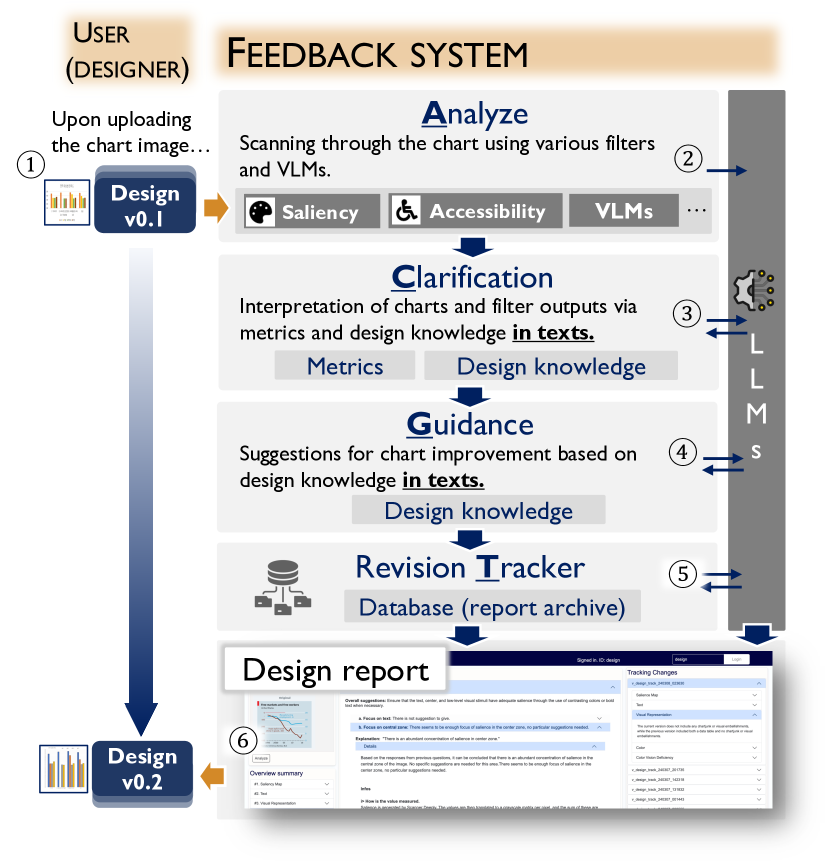
Visualizationary is a web-based client-server system that tracks a visualization artifact throughout its design process. The workflow (Fig. 2) is based on the user—a visualization designer—iteratively uploading a screenshot of the current state of their visualization artifact and receiving automated feedback from the system. The feedback then presumably helps the designer make improvements to the artifact in the next design iteration. However, unlike existing visualization design feedback tools such as Perceptual Pat [61], which merely report metrics, Visualizationary implements the ACGT workflow from Sec. 3: beyond analyzing the image, it also explains (“clarify”) the feedback using natural language, suggests ways for addressing shortcomings (“guide”), and tracks the changes to the design over multiple iterations.
This workflow is realized through five components: (1) a web-based visualization design management interface, (2) interactive design reports providing feedback at user-controlled levels of detail, (3) a revision tracker, (4) a suite of computer vision filters for extracting visualization data into symbolic form, and (5) a design guidance tool that uses an off-the-shelf Large Language Model (LLM) with a prompt preamble to explain the feedback and guide the user. The former two belong to Visualizationary’s frontend, whereas the remaining three are part of the backend. Below we describe each of these components.
4.2 Visualization Design Management Interface
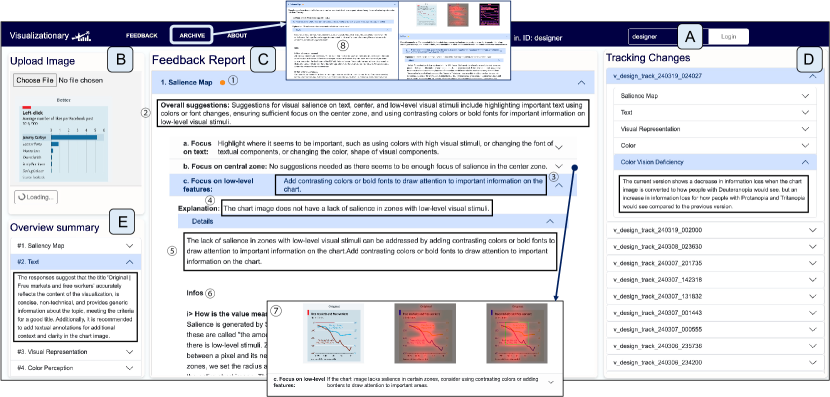
The frontend for Visualizationary is a web-based single-page application for managing the iterative design process of a visualization artifact (Fig. 3). A project is a container for a design process, including all of the visualization revisions and their corresponding design reports. The frontend has operations for creating, editing, and deleting projects associated with a user.
Viewing a project shows a timeline of the revisions and allows the user to bring up the details for each. Projects can be extended by uploading a new screenshot of the visualization artifact in .jpg or .png file (see Fig. 1) and then launching the analyze-clarify-guide-track workflow on the new revision. This process typically takes a couple of minutes to complete, after which a new design report is added to the timeline for the designer’s perusal. In this way, the Visualizationary interface is designed to manage the entire design process of a visualization artifact, from early sketches to final production.
4.3 Visualization Metrics
We present metrics to quantitatively assess the visualization image using visualization filters. To each evaluation category, we present the goal, metric used, and decisions. The decision is made based on predefined heuristics about the metric and also on the judgment of LLMs, backed by the design knowledge added as a preamble. This heuristic is described in our supplementary material. Again, note that the list is not exhaustive and can be extended.
-
\faSun
Virtual Eyetracker. We utilize the Scanner Deeply [60], a virtual eyetracker that predicts gaze on an overview task of a visualization image. We analyze the results of Scanner Deeply from three perspectives: focus of salience on text [45], center bias [9], and focus on visual attention, represented by low-level stimuli [32, 28].
-
–
Focus on text. Goal: Detect visualizations that overly focus on text. Metric used: Use OCR to box each letter and compute the rate of salience focused in all of those boxes. We measure the amount of salience focused on text. We use OCR to detect alphabetical letters. Decision: Mark as “overly salient to text” if the salience in text boxes is above the percentile of the chart saliency in the dataset by Shin et al. [60].
-
–
Focus on center. Goal: Detect charts that overly focus on the center (center bias). Metric used: Measure salience in the center. The center is defined as a rectangle in the middle of the image, with its height and width as of the chart. Decision: Mark as “overly salient in the center” if the center salience is above percentile.
-
–
Focus on visual attention. Goal: Detect visualizations that scarcely focus on visual attention. Metric used: We measure the rate of salience-covered areas of zones near (the radius is 5 pixels) where there is a difference in RGB values, which we call zones with low-level stimuli. Decision: Mark as “scarcely salient” if the salience in zones with low-level stimuli is less than percentile.
-
–
-
\faFont
Textual characters. We evaluate the existence of textual components in the visualization image [62]. Using text along with charts can help understand visualizations.
-
–
Title: Goal: If a title is detected, then provide title recommendations. Metric used: Title is detected via DePlot, a VLM that translates visualizations into tables and textual components. Decision: DePlot decides if there is a title in the image.
-
–
Textual content: Goal: Detect text in visualization image. Metric used: Texts in the image are detected using PyTesseract-OCR. Decision: If the OCR tool detects at least one letter in the text, then it contains the text.
-
–
-
\faChartBar
Visual representations. We observe how data is visually represented. Our focus is on providing chart recommendations based on data table and design preamble, as well as detecting chartjunk, or unnecessary visual embellishments [7, 6] in the design.
-
–
Optimal chart type: Goal: Given the data, suggest an optimal chart type. Metric used: The data table extracted from DePlot. Decision: ChatGPT makes suggestions based on a preamble of design knowledge (perceptual rankings of visual cues, described in Mackinlay’s APT [41]), and the data table provided by DePlot. To help the designer make an optimal decision, we provide the table as well as the design knowledge instilled in ChatGPT.
-
–
Visual embellishment (“chart junk”): Goal: Detect chartjunk in the visualization image. Metric used: A computer vision model that detects objects, such as YoloR [67]. Decision: The object detection model detects objects within the chart image.
-
–
-
\faPalette
-
–
Variability of colors: Goal: Identify all colors used in the visualization image. Metric used: A customized function created in Python. Decision: The function identifies multiple colors.
-
–
Similarity of colors: Goal: Identify similar colors in the visualization image. Metric used: A customized function created in Python. A group of similar colors are determined using differences in RGB values between detected colors. Decision: The function identifies a group of similar colors.
-
–
-
\faAccessibleIcon
Accessibility. It is also important to create visualizations that are accessible for everyone [1, 20].
-
–
Color vision deficiency: Goal: Detect visualization images that are hugely affected when simulating the image into how people with color vision deficiency (deuteranopia, protanopia, tritanopia) would see. Metric used: We measure the information loss caused in simulated visualization images, using the difference in entropy loss from its original visualization image. Decision: If the entropy loss is larger than a threshold in simulated visualization images, then, warn of the loss in information for people with color vision deficiency.
-
–
We instill these metrics along with the suggestions relevant to the decisions into ChatGPT as a prompt (see Sec. 4.6). Then, based on a series of template questions, ChatGPT provides the appropriate answer.
4.4 Visualization Design Reports
Results from the feedback backend are presented as interactive visualization design reports. A design report is an interactive document consisting of a hierarchy of expandable sections designed in a bottom-up fashion. Sections are organized based on the main categories of visualization metrics in Sec. 4.3. The contents of a section in the report include both natural language and illustrative images (such as heatmaps, extracted shapes, or gaze maps) (see Fig. 1 (C)). Each section provides a short overall summary of suggestions (Fig. 1 (C) ②) of the underlying data for that metric followed by two standardized paragraphs:
Expanding the subheadings yields additional explanations (see Fig. 1 (C) ⑤) and suggestions. Sections can be expanded down to raw visual metrics (see Fig. 1 (C) ⑥). We also provide additional information and warnings about each filter, to help the designer make decisions while reading the report. The rationale for this design is to present feedback in a summarized form that can be easily navigated. It also allows experienced designers to see high-level themes without having to drill down into low-level details.
We provide additional functionality to help navigating the report. We indicate sections that require modification using a circular visual mark, either yellow or red next to the title of each section (see Fig. 1 (C) ①). If there exist at most one issue in a section, then the corresponding circle is yellow. If there is more than one, then the circle is orange. We provide a short overview summary of responses per category in Fig. 1 (E). This aids designers in quickly identifying their topics of interest by skimming section summaries before delving into specifics.
4.5 Revision Tracker
The revision tracker gives a high-level overview of changes from one revision to another for the entire design process. This component realizes the “track” in the ACGT workflow. The intention is to give the designer a bird’s eye view of the design process, thereby seeing the improvements over time and also avoiding local optima. The natural language in the tracker is derived using the LLM with the reports to be compared as prompts; see below. For detailed tracking, Visualizationary allows designers to check all versions of their past reports by going to ‘Archives’ in the navigation bar (see Fig. 1 ⑧). The interface provides two separate screens, each displaying a report of a version, to facilitate the comparison process.
4.6 Prompt Engineering for Visualization Feedback
We use off-the-shelf LLMs, such as ChatGPT, to generate the interpretations and suggestions in the visualization design reports. However, formulating effective prompts requires careful prompt engineering [56, 69, 70, 73, 3]. Prompt engineering is typically based on empirical data specific to each model, and our approach using LLMs for visualization feedback is no different. An LLM is not deterministic, and may occasionally produce unexpected output. It also tends to be quite verbose, producing long responses to even short and well-contained queries. We thus refer to guidelines from prior work [38] in designing prompts to avoid such non-deterministic and long-winded behavior:
-
•
Use exact keywords: use concepts as reserved words;
-
•
No synonyms: varying labels yields nondeterminism;
-
•
Avoid unnecessary data: irrelevant data expands scope;
-
•
Constrain feedback length: avoid unfocused answers;
-
•
Ask specific queries: limit the scope of the query; and
-
•
Avoid open-endedness: encourage short/direct responses.
We construct two types of prompts: analyze-clarify-guide prompts and track prompts. To create those prompts, we define the following templates (full prompts are included in OSF 111https://osf.io/v7hu8):
ACG-template.
We call the analyze-clarify-guide (ACG) prompt template .
[Q] is the question we define to create interpretations and suggestions.
For instance, we use
“Analyze the visual salience on text.
Provide interpretations in 2 sentences.”
or “Provide suggestions about the result of the previous question in 2 sentences.”
We define 9–12 questions for each visualization metric.
We replace the metric name in different questions, e.g., from visualization salience to color blindness.
We call the prompt conditions [cond]:
“Please interpret exactly in the following way, as if you are an assistant to a visualization designer, explaining to novice visualization designers.
If no visual salience is detected, then just interpret it as No salience is detected in the chart image.
If (the rate of salience in the textual zone over the rate of the textual zone in chart image) from the measured result is less than 0.6, then interpret it as a lack of salience in textual elements.”
At the end of each prompt, we append [filter-suggestions], a compact representation of visualization design knowledge in natural language.
[filter-suggestions] is available in the supplementary material.
T-template.
is used for generating track (T) prompts.
We define the question [Q] for extracting differences between two different versions of data visualization as follows:
“Given the information, in one sentence, concisely, what are the changes made between the current and previous versions about visual salience?
Although the changes may seem minor, try to describe even the small, acute changes made between the current and previous versions, in terms of the visual salience.”
[{curr/prev}-output] is the collection of visualization design knowledge, expressed as natural language, calculated by the visualization filter components.
[{curr/prev}-interpretations] is the interpretations Visualizationary generated for the two visualizations.
4.7 Implementation Notes
The Visualizationary tool is implemented as a client-server web application using HTML, CSS, JavaScript, and JQuery.
We use the Python Flask web framework222https://flask.palletsprojects.com/; the analysis components were implemented server-side in Python 3.
We store data into MongoDB.333https://www.mongodb.com/
During the user study, Visualizationary was hosted on Amazon Web Services (AWS).
We use gpt-3.5-turbo as LLM.
5 User Study
We performed a user study to assess the impact of LLM-generated feedback in the visualization design pipeline using the Visualizationary tool. We opted for a qualitative study where designers of different skill were asked to use Visualizationary to support the design process of a new visualization over several days. We then let a small group of visualization experts (with more than 10 years of experience in the field) assess the design process without seeing the Visualizationary reports. We also interviewed our participants to collect their perception of the impact of Visualizationary on their design work. The study received approval from our university’s ethics review board (IRB).
| ID | Gender | Age | Education | Job Title | Years in Vis | Group |
|---|---|---|---|---|---|---|
| P1 | Male | 35 | Ph.D. | Postdoc in Visualization | 11 years | Expert |
| P2 | Male | 26 | Bachelor’s Degree. | Ph.D. student in Computer Science | 3 years | Novice |
| P3 | Male | 34 | Ph.D. | Research scientist | 5 years | Intermediate |
| P4 | Male | 29 | Master’s Degree | Software engineer | 3 years | Novice |
| P5 | Male | 28 | Master’s Degree | Ph.D. student in Computer Science | 6 years | Intermediate |
| P6 | Male | 31 | Master’s Degree | Ph.D. student in Computer Science | 6 years | Intermediate |
| P7 | Male | 30 | Bachelor’s Degree | Ph.D. student in Computer Science | 5 years | Intermediate |
| P8 | Male | 33 | Ph.D. | Assistant professor in Visualization | 10 years | Expert |
| P9 | Male | 31 | Master’s Degree | Data scientist | 9 years | Expert |
| P10 | Female | 24 | Bachelor’s Degree | Master’s student in Data Science | 3 years | Novice |
| P11 | Male | 33 | Bachelor’s Degree | Software engineer | 1 year | Novice |
| P12 | Female | 33 | Bachelor’s Degree | Primary school teacher | 1 year | Novice |
| P13 | Male | 32 | Ph.D. | Postdoc in Computer Science | 1 year | Novice |
5.1 Participants
We advertised our study through messages to the Data Visualization Society, to alumni of our institution, and to other academic institutions. Out of many applicants, we selected only those who are over the age of 18, are capable of reading and speaking English fluently, and have experience in visualization for more than three years. As a result, we were able to recruit 13 visualization designers of different seniority. Table I shows the demographics of the participants. These participants were paid a $40 Amazon gift card upon concluding the study.
While Visualizationary was originally designed for novice and intermediate visualization designers, our participants also included expert ones. We included such participants because we were interested in seeing whether our tool could benefit even an expert.
Beyond the designer participants, we also recruited three expert participants with at least five years of experience in visualization: an associate professor (or equivalent), an assistant professor, and a Ph.D. candidate (within months of graduation) within the research field. These experts only took part in the final independent design assessment step.
5.2 Task
Our study asked participants to design a new visualization over a period of 3–5 days while using the Visualizationary interface to support their design process. Participants were free to choose a dataset and to craft any type of visualization using any tool or combination of tools. We asked each participant to upload at least 5 versions (including the first and last versions) of their designs into Visualizationary. We imposed the following requirements:
-
•
They must spend at least two hours on the design process;
-
•
They should work independently on the design task;
-
•
Image size between and px;
-
•
Images in either .png or .jpg formats;
-
•
No photographs allowed; and
-
•
No confidential information or data was used.
We also secured permission to use the designs for publication.
5.3 Procedure
The study was performed exclusively online using video conferencing and consisted of four steps. We obtained participant demographic information and scheduled the dates for each step during recruitment. Here we describe the steps in detail.
Step 1: Pre-study Briefing. We started each session with an overview of our study, answered any questions from the participant, and collected informed consent using an online consent form, as per the directives of our IRB. Then the experiment administrator explained the longitudinal chart design task (Sec. 5.2). Next, the administrator showed how to operate the Visualizationary system: creating an account, logging in, uploading screenshots, and accessing design reports. The administrator answered any additional questions from the participant. The study was concluded by finding an appointment for the post-interview. On average, this briefing process took 30 minutes.
Step 2: Longitudinal Chart Design. Participants were given at least three days to design their visualization, during which time they were asked to upload at least five versions of their visualization. We imposed no restrictions on how participants allocated their time but asked that they dedicate at least a total of two hours during the period on the design and that they use the Visualizationary interface. During this period, the experiment administrator was available to answer technical questions.
Step 3: Post-study Interview. We conducted a post-interview interview with each participant at the end of the design period. We started by asking each participant to explain how their designs evolved over time. We always selected the first and last version of the visualization artifact. If more than five versions were uploaded by a participant, we asked the participant to identify the three most significant versions other than the first and last ones. We defined “significant” as versions where feedback had caused them to make radical changes to the design. Following that, we posed questions about their experiences using Visualizationary during the design process. Afterward, we asked about their concepts of an ideal feedback provider after the study. The questions we asked are shown in the next section. While we allocated 30 minutes for this session, some of the participants exceeded this time limit.
Step 4: Expert Design Assessment. In the final step, our independent expert participants (all with experience teaching data visualization and grading visualization assignments) were given all five designs for each of the designer participants. They were asked to provide their assessment of the quality of changes during the design process from the first to the final design for each participant using a 1–5 Likert scale (1 = significant decline in quality, 3 = neutral, 5 = significant quality improvement). They were also asked to motivate their assessment using 1 to 2 sentences. This meant that each expert gave 1 Likert scale rating and 1-2 assessment sentences per designer participant.
5.4 Data Collection
Interviews were video and audio recorded. We transcribed audio for further analysis. We collected demographics using online forms before the study. All uploaded chart images and design reports were collected automatically by Visualizationary.
| Version 1 | Version 2 | Version 3 | Version 4 | Version 5 | |
|---|---|---|---|---|---|
| P11 | 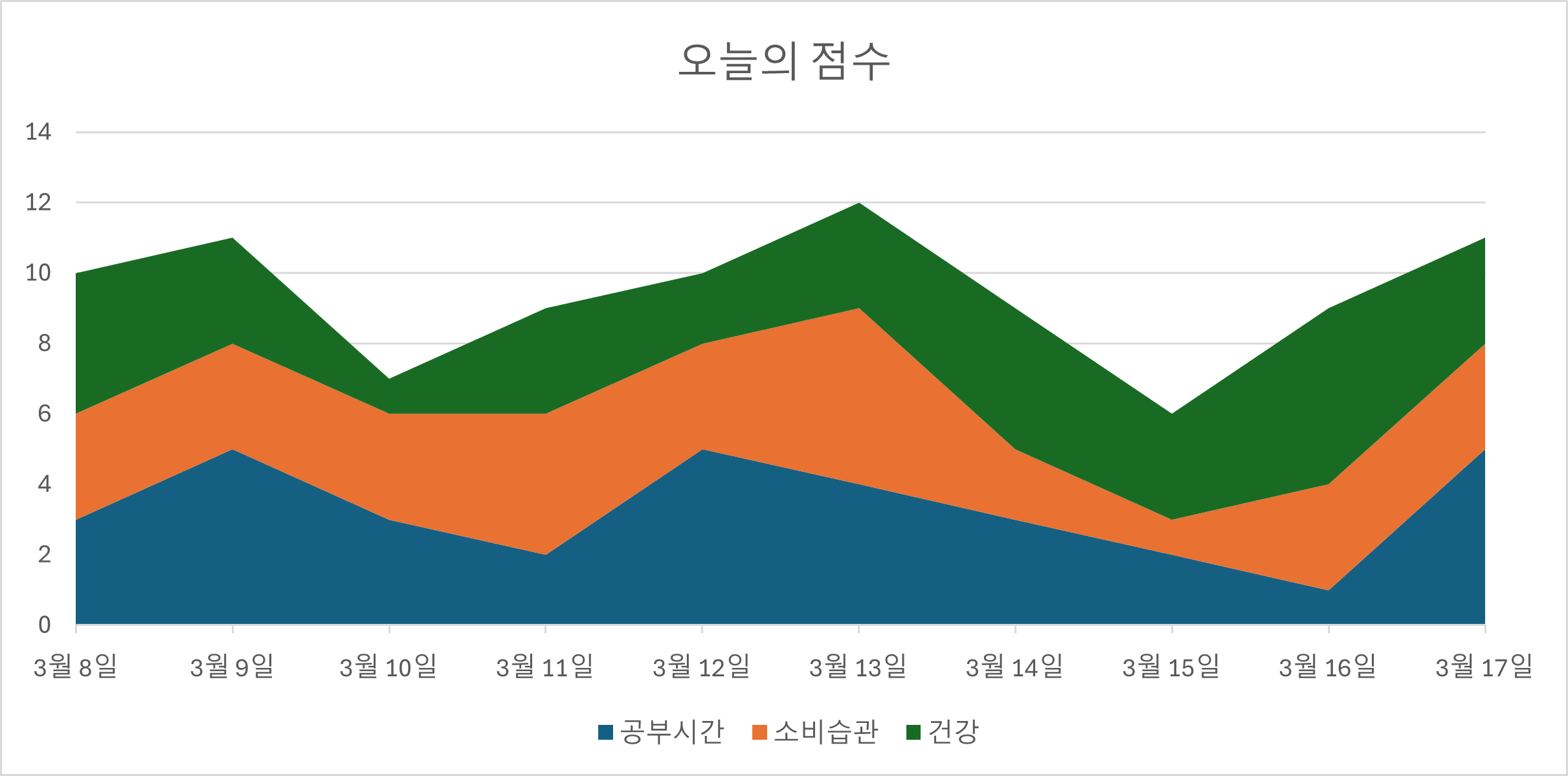 |
 |
 |
 |
|
| P3 | 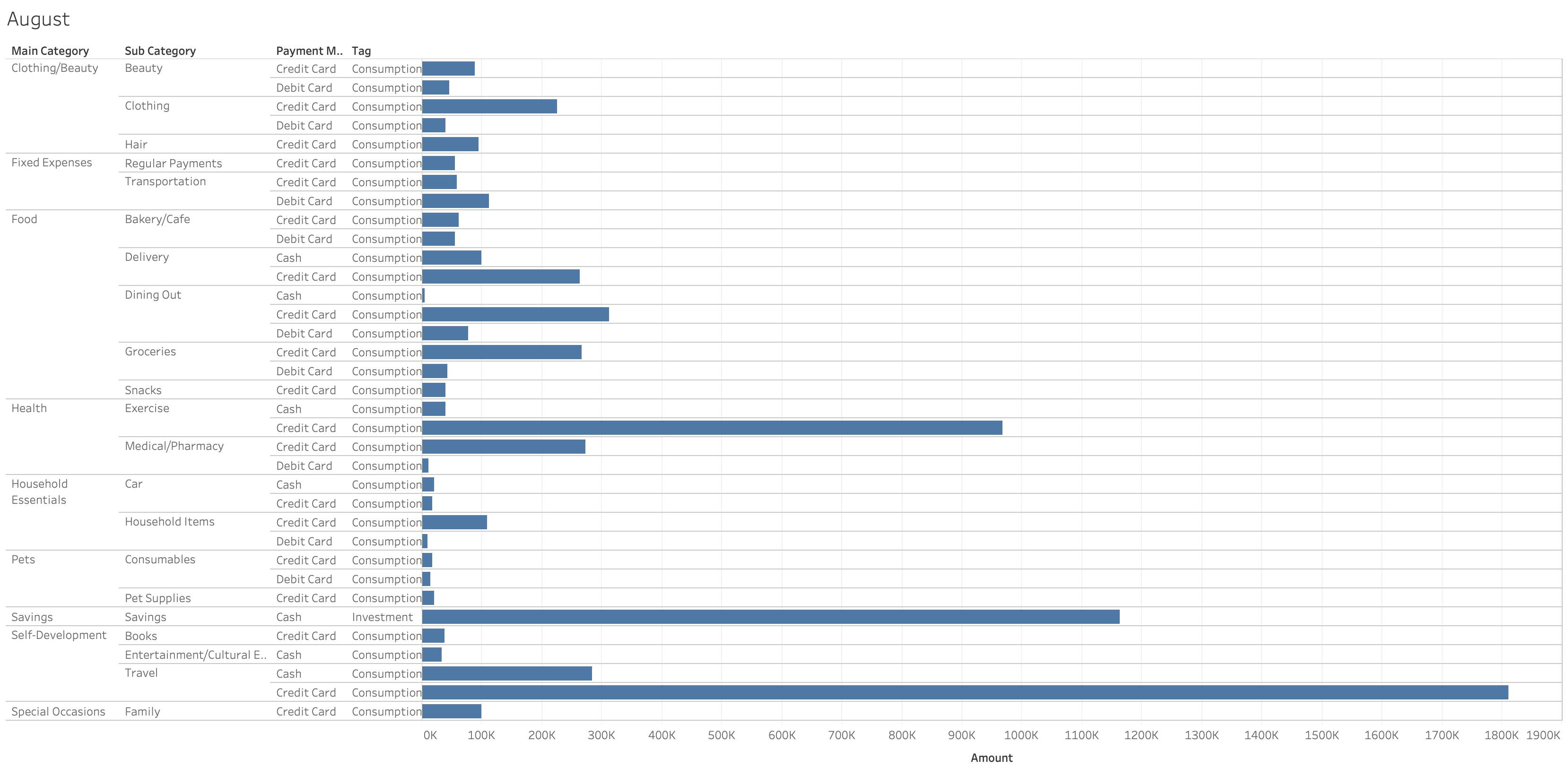 |
 |
 |
||
| P9 | 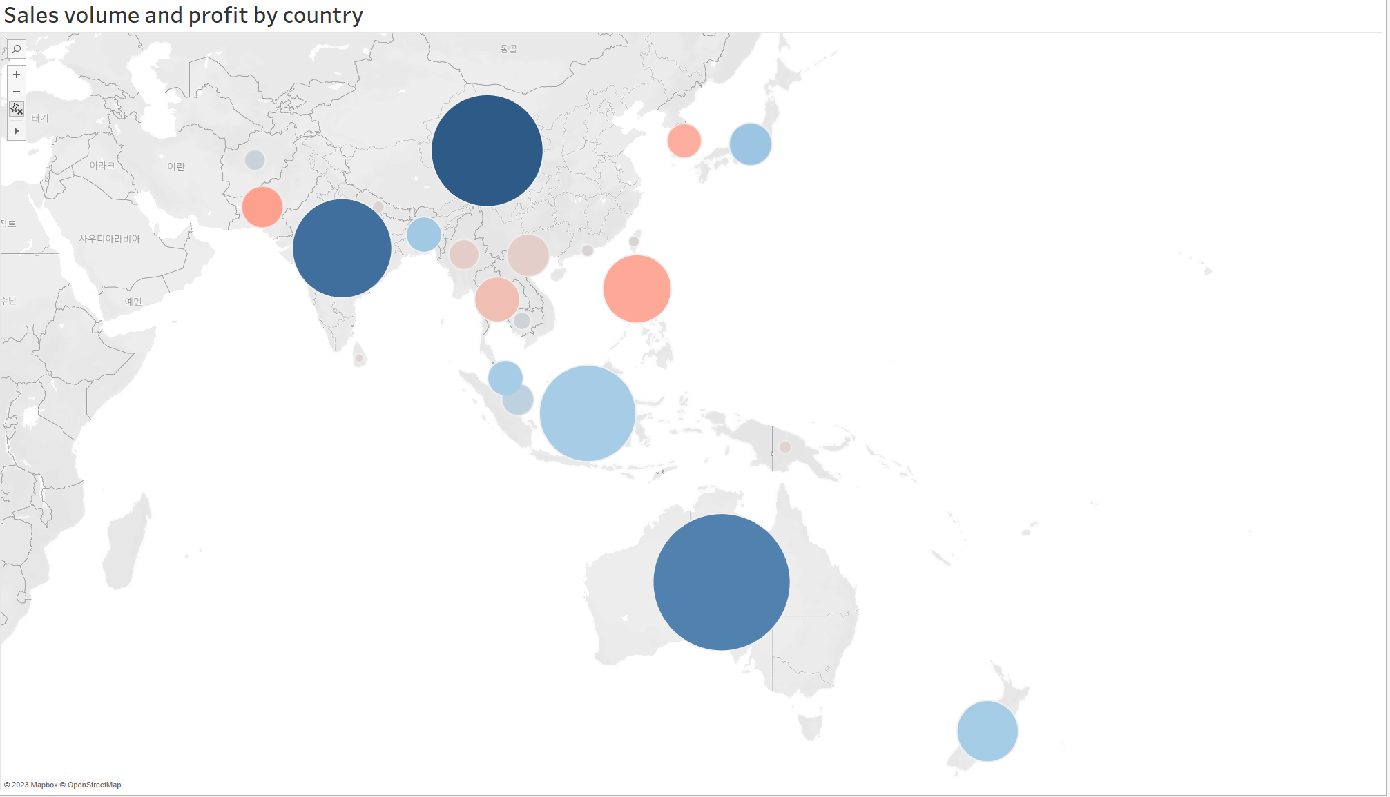 |
 |
 |
 |
 |
5.5 Apparatus
The interview and the experiment were conducted using the participants’ own computers.
Although we did not enforce strict hardware constraints, we recommended participants use a resolution of at least 19201080 and Google Chrome, as the Visualizationary interface is optimized for that setting.
When designing visualizations, the participants had the freedom to choose their favorite authoring tools, as long as they could upload a screenshot of their visualization image in .jpeg or .png format.
6 Results
We now present the results from our longitudinal study, including design iterations, subjective comments, and observations.
6.1 Design Evolution
Fig. 4 presents visualization snapshots from three representative participants: novice, intermediate, and expert groups. We only show three examples due to page limits; the complete snapshots and descriptions from all participants can be found in our supplementary material. We asked participants to explain the changes created in each iterative step during the interview and describe their intent in making changes below. Below we discuss the design evolution for each participant as follows: the visualization, authoring tool, and dataset used, a summary of each version, including the feedback from Visualizationary, the changes made, and—if given—their rationale.
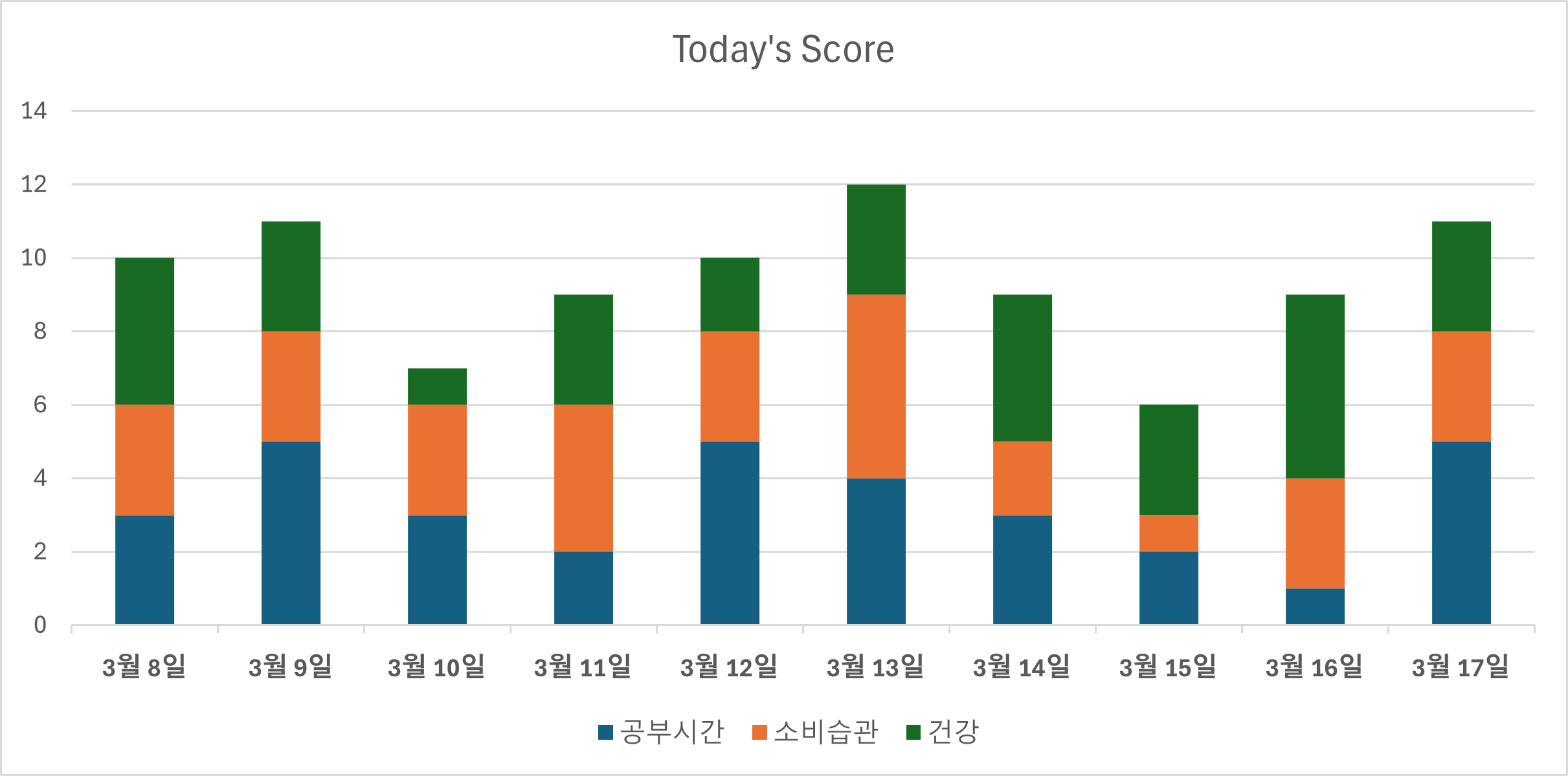
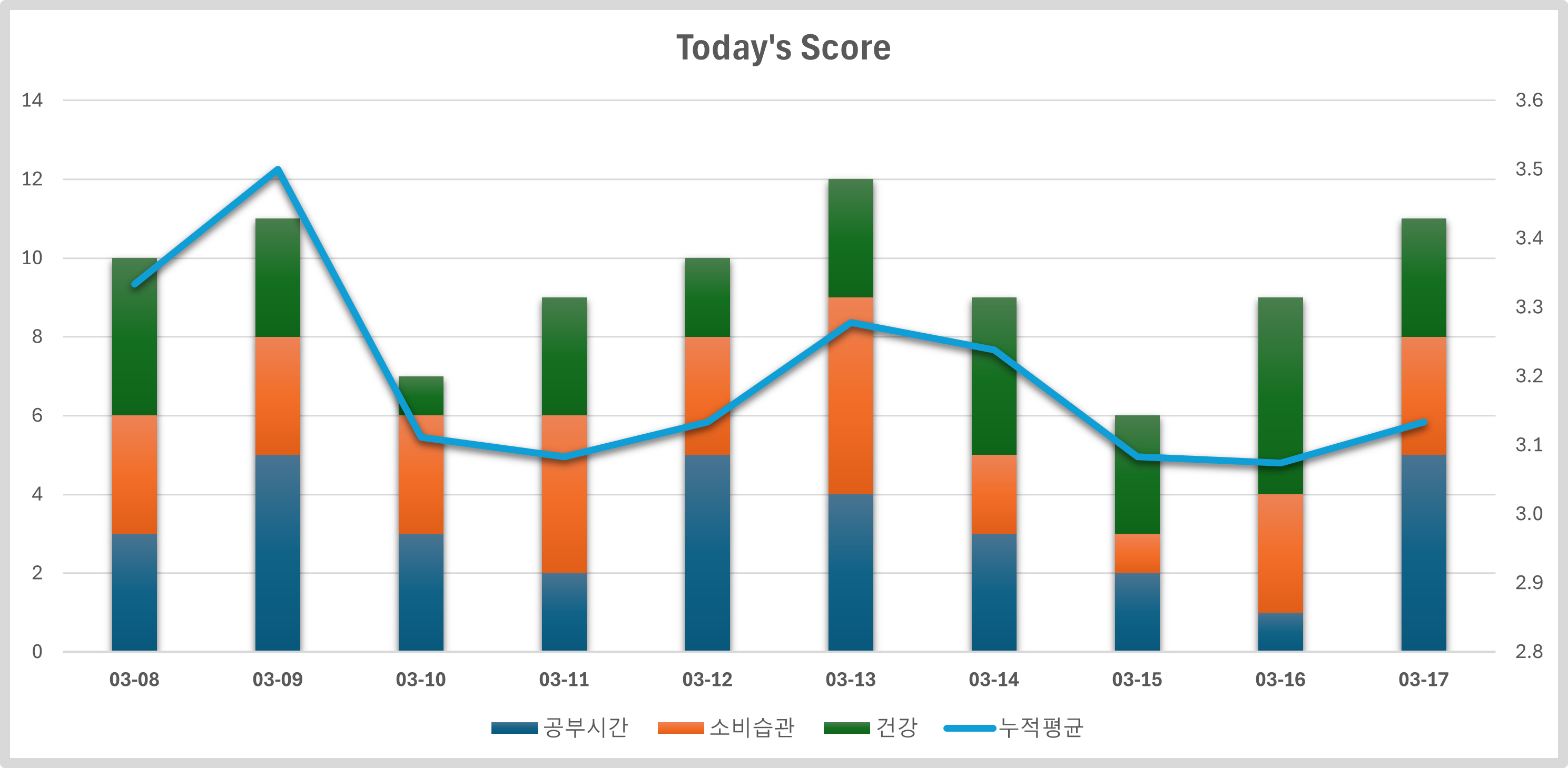
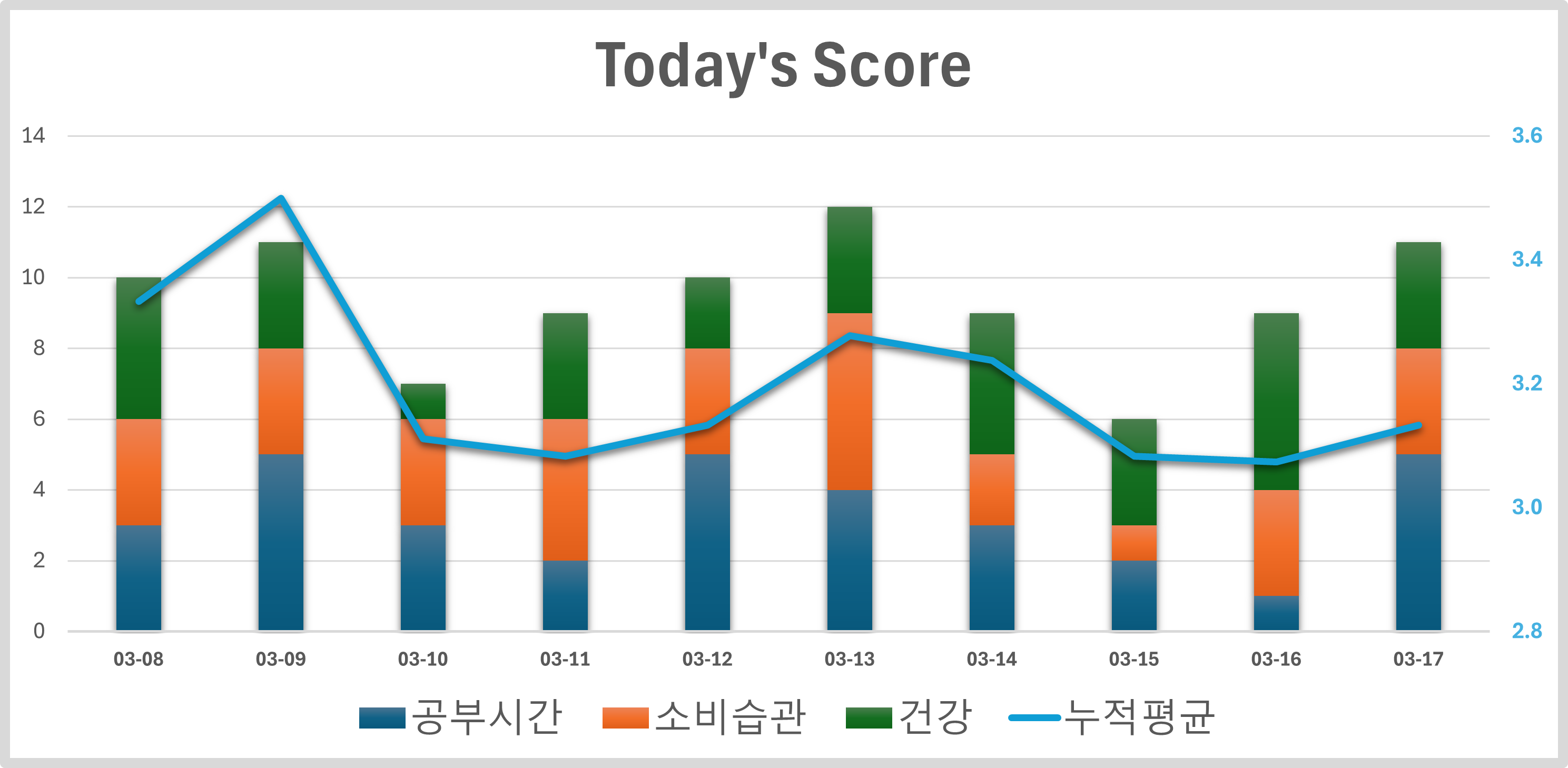
Participant 11 (novice). P11 created a stacked area chart (on Microsoft Excel’s recommendation) to visualize daily activities.
-
•
Version 12: Feedback: Visualizationary recommended bar charts to enhance value comparisons. Revision: P11 changed from stacked line chart to a stacked bar chart.
-
•
Version 23: Feedback: Visualizationary noted that there is too much focus of salience towards the center. Revision: P11 adjusted the chart’s size ratio and incorporated a new line chart, which displayed the cumulative average hours spent on a specific activity (“work”). P11 introduiced a vertical axis to represent the line value in the chart. Rationale: P11 wanted to examine influences on work.
-
•
Version 34: Feedback: Again, Visualizationary observed excessive concentration of salience in the central area. Revision: P11 re-adjusted the chart dimensions, and highlighted legend and title.
-
•
Version 45: Feedback: Saliency is overly focused on the center. Revision: P11 increased title and legend font sizes.
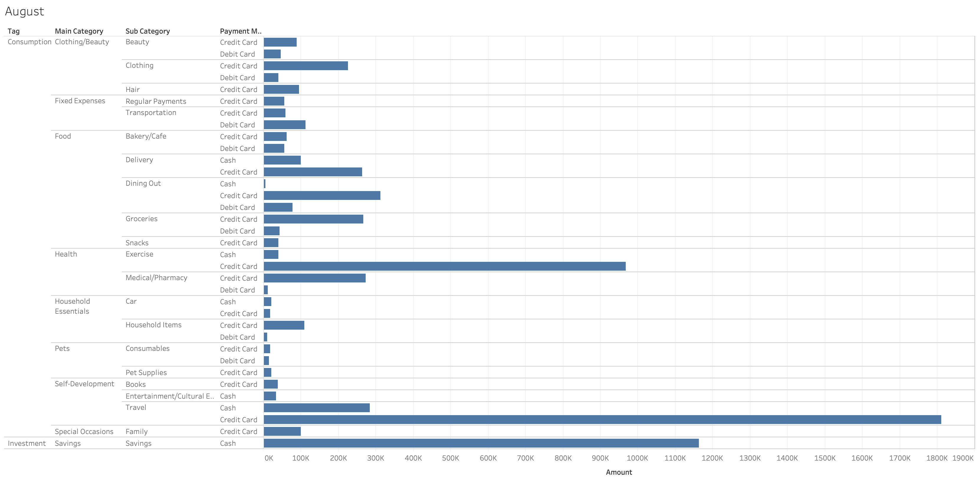
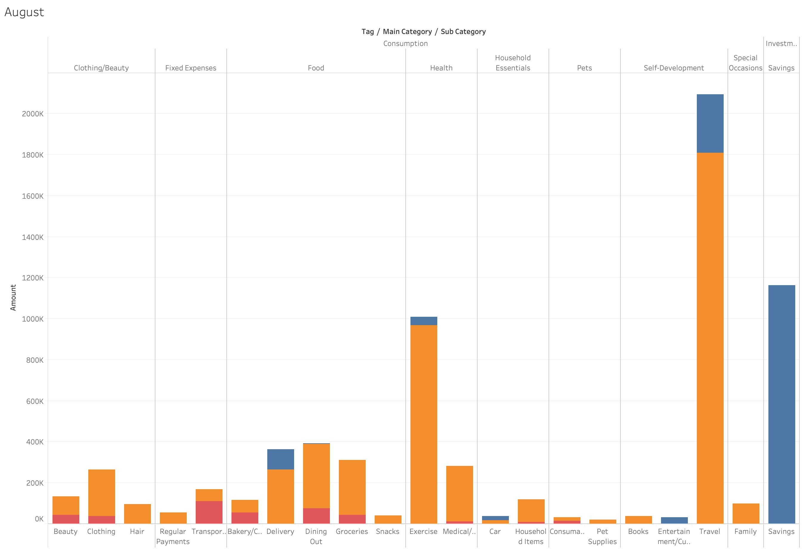
Participant 3 (intermediate). P3 wanted to analyze their monthly spending based on two factors: (1) category, and (2) payment method. They used Tableau to author the visualization.
-
•
Version 12: Feedback: Visualizationary asserted that there is too much focus on text. Revision: P3 changed the order of the hierarchy to remove repetitive labels.
-
•
Version 23: Feedback: Again, Visualizationary stated that there is too much focus on text. Revision: P3 removed the “payment method” category, consolidated its values into a stacked bar chart, and labeled each bar segment with its corresponding payment method.
-
•
Version 34: Feedback: And once again, Visualizationary said that there is still too much focus on text. Revision: P3 eliminated the text alongside the bar chart and introduced a legend instead.
-
•
Version 45: Feedback: And again, Visualizationary maintained that there is still too much text. Revision: P3 rotated the bars vertically and separated the labels for categories and subcategories.
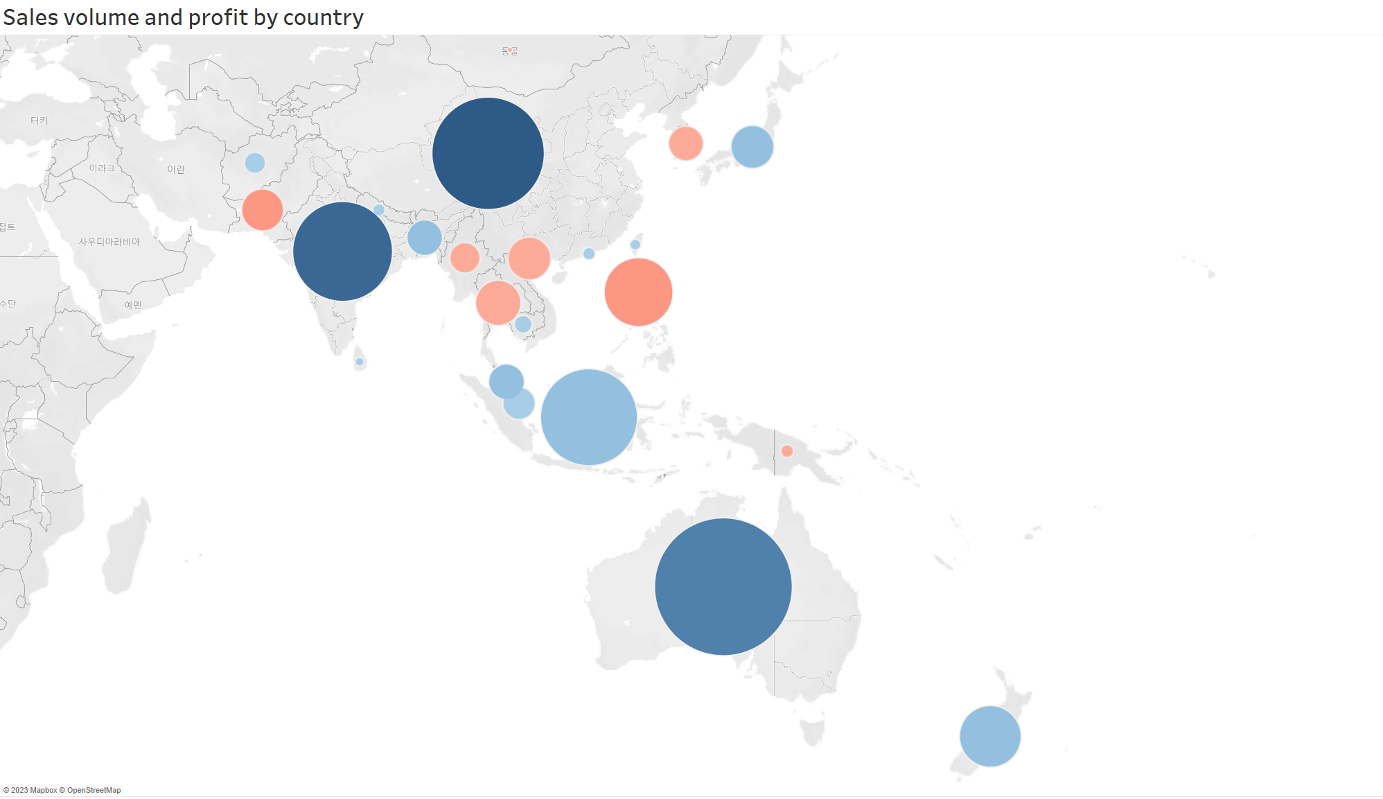
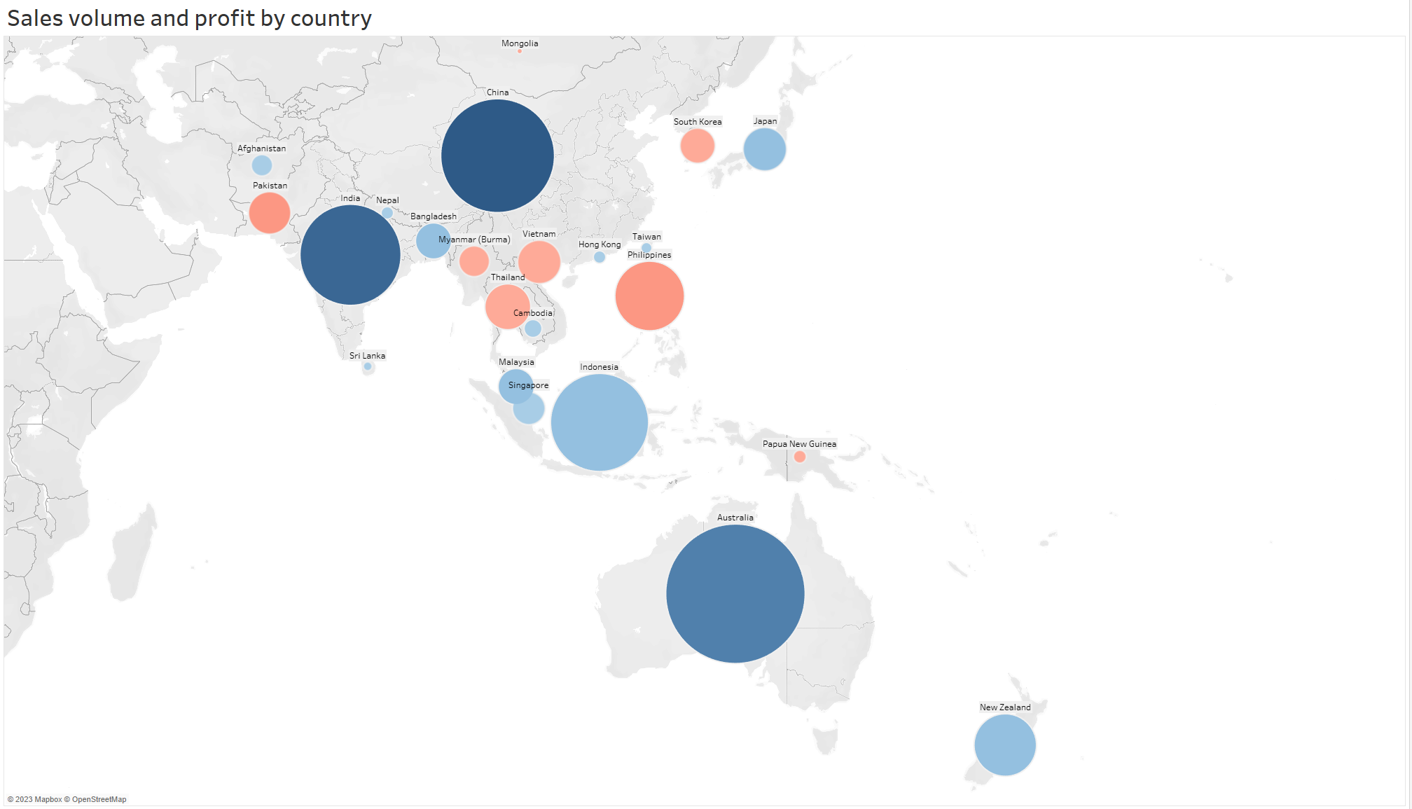
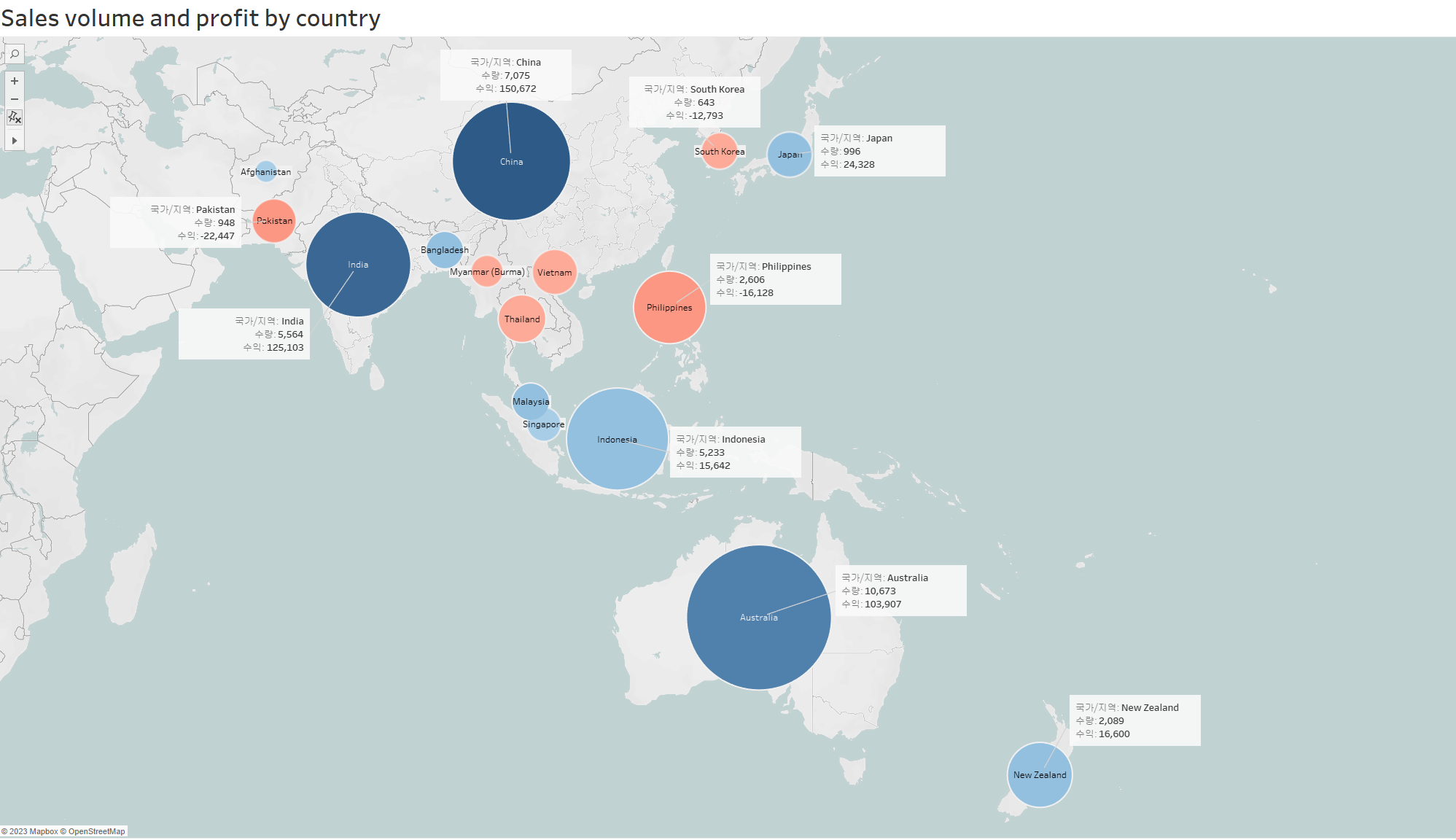
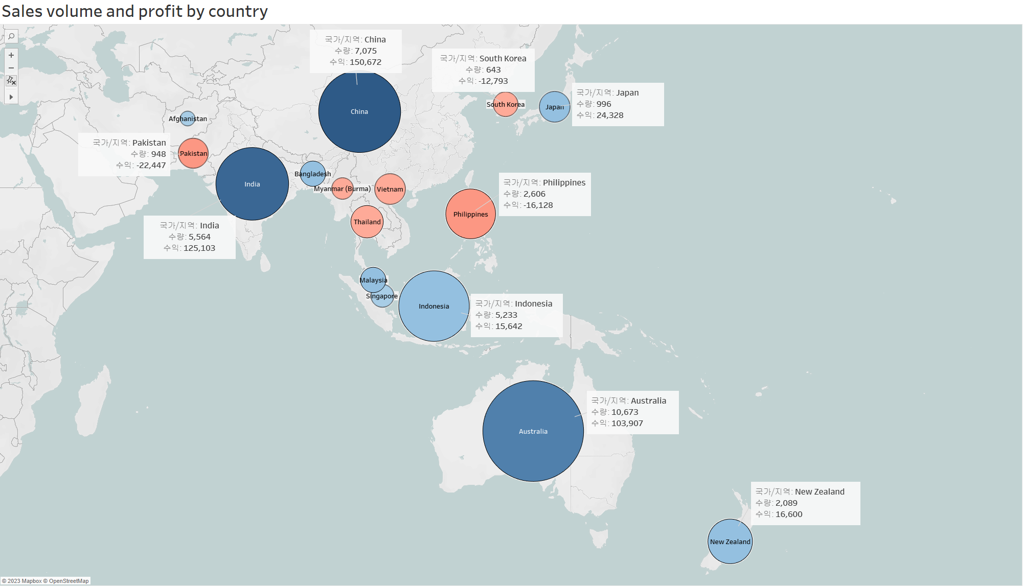
Participant 9 (expert). Using Tableau, P9 chose to display a multinational company’s profits in Asia on a geographic map.
-
•
Version 12: Feedback: From the protanopia-simulated image in the tool, several circle cues were hard to detect. Revision: The colors in each circle were made darker.
-
•
Version 23: Feedback: The salience map in Visualizationary directed attention country names, but several were unrelated to the data. Revision: Country names were added on top of each circle, and irrelevant country names originally on the map were removed.
-
•
Version 34: Feedback: Visualizationary noted that textual content would make the chart more readable. Revision: P9 relocated country names to circle centers, added explanatory boxes, and differentiated ocean colors for clarity.
-
•
Version 45: Feedback: The visual entropy filter in the tool did not detect some circles. Revision: Strokes were added to circles.
Question Type Subject Questions Role Analyze How was your chart problem detection aided by Visualizationary? Clarify How did Visualizationary assist in clarifying chart guidance or analysis? Guide How was the guidance from Visualizationary for visualization design? Track How did tracking influence your design modifications? Decision Judgment In general, when do you act on feedback or decline it? Evaluation System What are the pros/cons of Visualizationary when the LLM bases answers on established visualization design knowledge? Impression Overall, how did you like the tool?
6.2 Post-Study Interview
After the experiment, we conducted a post-interview session to examine closely the iterative improvements of the design and the role of Visualizationary in making the changes. Our initial set of questions (Table II) aimed to reacquaint the participants with the changes their designs underwent and to understand the underlying reasons behind them. For every design refinement, we asked participants to elaborate on the following: (1) the changes in the design, (2) the reasons for the changes in the design, and (3) the role of Visualizationary in the changes. We then transitioned to understand their experiences in using Visualizationary during the design process, and their perspective on design feedback mechanisms. Our goals were the following:
-
1.
Role. Understand Visualizationary’s role in ACGT.
-
2.
Decision. Identify when designers accept/reject feedback.
-
3.
Evaluation. Evaluate strengths and weaknesses.
Detailed below are the questions presented to our participants.
Part. P1 P2 P3 P4 P5 P6 P7 P8 P9 P10 P11 P12 P13 Avg Avg. 4.67 2.67 3.67 3.00 5.00 4.33 2.67 3.00 4.67 4.00 3.67 2.67 4.00 3.69 S.D. (0.58) (0.58) (0.58) (0.00) (0.00) (0.58) (0.58) (1.73) (0.58) (0.00) (0.58) (0.58) (0.00) (0.83)
Role for Analyze: Expert Analyst. Visualizationary is capable of not only detecting issues, but also in providing relevant knowledge that only experts can have. Some of the observed comments were aspects participants had not initially considered, yet were contributing to the improvement of the visualization. In other instances, the tool’s feedback was on aspects participants were familiar with or had previously encountered, but which were typically overlooked during visualization design, such as the color deficiency filters. P2 said, “[the tool] is capable of showing problems that I was not aware of, although I should have been.” Upon diagnosis, the tool supplies relevant data from visualization design knowledge, which, as P8 noted, is information that even experts might occasionally miss. Said P8, “even experts may not be aware of those specific details about visualization principles.” However, there were also times when the tool misdiagnosed the chart image, resulting in potentially out-of-context feedback.
Role for Clarify: Organizer. Because the output of this report is generated by ChatGPT, it is predominantly textual. The hierarchical layout of the design allowed participants to view the summary of each section, selectively pick the issues that they found relevant and made sense, and drill down to the details they were interested in. 10 out 13 participants felt that this capability helped them be more organized.
Role for Guide: Guidepost. Given a detectable issue, Visualizationary is capable of providing general suggestions on how to address them, but does not always deliver specific actionable feedback. This means that human intervention is still required to find a solution. Participants also noted variability in the guidance: some feedback was easy to implement whereas other feedback required a substantial amount of effort to address. Easily addressed were tasks that can easily be tested, such as editing colors, adding texts, and so on. All participants attempted to address issues raised by the tool. However, a few novice and intermediate participants found it difficult to address more complex problems, such as diverting or attracting attention in the saliency map. For example, P3 spent all their iterations to balance the salience of a chart, and P7 wanted the salience to focus on a particular area.
Role for Track: Logbook. The tracking capabilities play as a role similar to a design “logbook.” Tracking changes per design iteration allowed some participants to easily catch up to where the design was left off. A notable observation was that it also functioned as an evaluation tool that measures whether there were improvements between the current and the past version. P3, whose main goal throughout the study was to alleviate salience in textual areas, said, “I consistently checked the rate of salience in the tracking interface. The drop in numbers reassured me that I was on the right path. The positive feedback felt like a reward for the adjustments I had made.”
On the other hand, there were also a few participants who did not use tracking. They uploaded the designs one after another without much delay. P2 was an example, noting “Because I remember what needs to be changed, I did not look into the tool.”
Criteria for Accepting Feedback. As one might expect, there were no participants that accepted all the feedback given by Visualizationary for their designs. Designers clearly cannot make changes based on what they cannot understand (or disagree with). For example, P7 did not understand how to create a bar chart using the dataset that they had. Second, the designer must also agree to some extent that the feedback would enhance the design. For example, some designers disregarded feedback on color vision deficiency when the visualization was merely intended for their own use. When the designer was unsure of whether there would be improvements, if the feedback was easily actionable, then they just tried it and took the feedback when it did.
General Assessment. Participants considered the tool as an assistant that provided expert-driven feedback. Many people originally thought that it would be difficult to provide insights, but were surprised at its capability to help in visualization design. Furthermore, the use of ChatGPT created a sense of a “human” responding to the design, which made some participants less isolated during the design process.
However, some areas could be enhanced. One main comment was that despite the hierarchical presentation, several participants felt somewhat overwhelmed by the volume of text in the report. Some participants felt that with the help of visual images and text combined, this tool would generate more effective feedback.
6.3 Design Evaluation
We here present the results of the design assessment by external reviewers, which is the final step of our study procedure (see Sec. 5.3). We recruited three senior visualization researchers who all have more than 7 years of experience to evaluate the designs conducted by the participants. Table III shows the overall ratings on the improvement of visualization designs conducted by our participants. Note that these values are not on the quality of the design but on the improvement of the design. On the whole, evaluators largely believed that the participants’ designs improved from their starting point, averaging a score of 3.69 (3 is neutral). P2, P7, and P12’s designs were modestly below the neutral mark. Evaluators observed consistency in P2’s designs, with a slight decrease in color quality. For P7, while adding a title was beneficial, the chart’s readability declined. P12 enlarged the chart for improved readability, but received mixed reviews about the choice of color. We also compare the improvements per different expert levels. We find that the mean score of improvements from the novice group is , from the intermediate group is , and from the expert group is . While we observe positive signs from all groups, we see more improvements from intermediate and expert groups.
7 Discussion
The results from this study showed three things: that (1) a “vanilla” LLM, when provided with appropriate symbolic metrics and a “cheat sheet” of visualization design knowledge, can provide meaningful and actionable feedback on flaws in a visualization and how to improve them; that (2) even experienced visualization designers can benefit from this feedback; and that (3) the quality of visualization feedback is strongly dependent on the metrics extracted from the visualization. Below we discuss the potential of utilizing the system for novice designers. Then we enumerate limitations and avenues for future work.
7.1 On Visualization Design Feedback
Our main goal for Visualizationary was to help novice designers create visualizations. Our results indeed show that our tool is capable of detecting problems and providing relevant feedback according to existing design knowledge. However, it is also clear that participants with intermediate and expert knowledge used Visualizationary more effectively than novices. Based on comments from novice participants during the post-study interview, we speculate that automation and lack of fundamental design skills could be contributing factors.
By way of explanation, note that the tendency of novice users to rely on automated visualization suggestions, as offered by chart-authoring tools such as Microsoft Excel, contributes to this problem. This reliance caused some novices to lose their manual chart design skills (or never to acquire them in the first place). P12, who obtained a professional certificate for Microsoft Excel nearly a decade ago, said, “the auto-generated charts are usually of good quality, so I don’t feel the need to alter them.” P11 shared similar comments. While automated tools have simplified visualization creation, their influence may have affected our results in Table III.
Novices also have a harder time acting upon suggestions because they lack fundamental knowledge for visualization design. Many novice participants mentioned that when provided explanations and their corresponding suggestions, they still perceived it as high-level feedback; they preferred more actionable feedback where the impact of the suggested changes were clearly visible. In contrast, most participants with intermediate and expert levels understood the feedback well and used it to improve their work. P3, from the intermediate group, said, “it was a good chance to identify that what I learned in textbooks really helps.” In fact, two experts (P1 and P9) noted that the lack of specific and actionable feedback could pose challenges for novices.
On the other hand, the ineffable purpose of design is to bring novel creation forth. While Visualizationary may currently fall short in providing detailed solutions, there is also danger in hampering the designer’s creativity if suggestions become too prescriptive. The balance may need to shift depending on the experience of the designer, especially as the designer grows in experience. We leave this issue as future work.
7.2 Limitations and Future Work
While our work on Visualizationary in this paper builds on an entire stack of prior work, including the Scanner Deeply [60] virtual eye tracker and the Perceptual Pat [61] design tool, there are still weaknesses and potential shortcomings in our tool.
Hallucination. Despite their capabilities, LLMs may produce nonsensical or unfaithful content, known as hallucinations [33]. Such hallucinations can lead to feedback that contradicts the designer’s original goals or does not improve the visualizations. This behavior potentially harms Visualizationary because users build trust in the models powering our tool when most of their outputs are truthful. Recent work proposes defensive methods to address hallucinations, e.g., incorporating a user’s feedback into the model’s fine-tuning [52, 35] and characterizing self-contradiction in model-generated texts [48, 43]. We leave the incorporation of these methods for future work.
Privacy risks. If we use commercial services built on LLMs, there is a data privacy concern about the user data [27]. A company may collect data—such as visualizations (images) and queries (text)—that a user provides to our tool and uses them to fine-tune their models further to improve the quality of their services. Later on, a motivated adversary can perform a series of privacy attacks on the fine-tuned models, such as membership/property inference attacks [25, 10] or sensitive data-extraction attacks [11, 12]. However, this only happens if our tool is based on LLMs hosted by a third-party. We can mitigate this concern by using only local LLMs, e.g., by utilizing open-source models, such as Vicuna [14] and LLaMA [65].
Future Work. Visualizationary paves the way for several new directions for future work on automating feedback for visualization design. First, a direct approach is to add filters to analyze visualization design for improved representation of a virtual human visual system. “Will chartjunk in visualizations be identified as an object, or as a data representation by the viewer?” Answering such questions would help designers by providing more detailed, thorough feedback about their visualization designs. Another avenue for research might involve investigating the best methods—such as reports, conversational UIs that clarify vague suggestions textually, or tools offering visual examples—to deliver visualization feedback to various user groups.
An even more ambitious approach would be to expand the role of augmenting visualization design through feedback not just confined to iterative design process, but to every aspect of visualization design, including early design. We believe that the rapid development of text-to-image large language models could offer feedback that enhances designers’ creativity and expressiveness based on their intentions.
8 Conclusion
We have presented Visualizationary, a tool that leverages LLMs and visualization guidelines to provide design feedback for visualization designers. Visualizationary supports an automated visualization design workflow called ACGT (analyze-clarify-guide-track). We created a web-based interface to evaluate the effectiveness of Visualizationary and engaged 13 visualization designers of different seniority in a longitudinal design task. During this study, we conducted pre- and post-study interviews to further understand the designer’s experience using the tool. Finally, we asked three expert evaluators to assess their resulting designs. Overall, our results show that an off-the-shelf LLM can indeed provide high-quality and actionable feedback for novice, intermediate, and expert users alike on how to design a visualization.
Acknowledgments
This work was partly supported by grant IIS-1901485 from the U.S. National Science Foundation (Shin), a Google Faculty Research Award (Hong), and Villum Investigator grant VL-54492 by Villum Fonden (Elmqvist). Any opinions, findings, and conclusions or recommendations expressed here are those of the authors and do not necessarily reflect the views of the funding agencies.
References
- [1] K. Angerbauer, N. Rodrigues, R. Cutura, S. Öney, N. Pathmanathan, C. Morariu, D. Weiskopf, and M. Sedlmair. Accessibility for color vision deficiencies: Challenges and findings of a large scale study on paper figures. In Proceedings of the ACM Conference on Human Factors in Computing Systems, pp. 134:1–134:23. ACM, New York, NY, USA, 2022. doi: 10 . 1145/3491102 . 3502133
- [2] R. Anil, A. M. Dai, O. Firat, M. Johnson, D. Lepikhin, A. Passos, S. Shakeri, E. Taropa, P. Bailey, Z. Chen, E. Chu, J. H. Clark, L. E. Shafey, Y. Huang, K. Meier-Hellstern, G. Mishra, E. Moreira, M. Omernick, K. Robinson, S. Ruder, Y. Tay, K. Xiao, Y. Xu, Y. Zhang, G. H. Ábrego, J. Ahn, J. Austin, P. Barham, J. A. Botha, J. Bradbury, S. Brahma, K. Brooks, M. Catasta, Y. Cheng, C. Cherry, C. A. Choquette-Choo, A. Chowdhery, C. Crepy, S. Dave, M. Dehghani, S. Dev, J. Devlin, M. Díaz, N. Du, E. Dyer, V. Feinberg, F. Feng, V. Fienber, M. Freitag, X. Garcia, S. Gehrmann, L. Gonzalez, and et al. PaLM 2 technical report. CoRR, abs/2305.10403, 2023. doi: 10 . 48550/arXiv . 2305 . 10403
- [3] S. Arora, A. Narayan, M. F. Chen, L. J. Orr, N. Guha, K. Bhatia, I. Chami, F. Sala, and C. Ré. Ask me anything: A simple strategy for prompting language models. CoRR, abs/2210.02441, 2022. doi: 10 . 48550/arXiv . 2210 . 02441
- [4] J. Bardzell. Interaction criticism: An introduction to the practice. Interacting with Computers, 23(6):604–621, 2011. doi: 10 . 1016/j . intcom . 2011 . 07 . 001
- [5] J. Bardzell, J. D. Bolter, and J. Löwgren. Interaction criticism: three readings of an interaction design, and what they get us. Interactions, 17(2):32–37, 2010. doi: 10 . 1145/1699775 . 1699783
- [6] S. Bateman, R. L. Mandryk, C. Gutwin, A. Genest, D. McDine, and C. A. Brooks. Useful junk?: the effects of visual embellishment on comprehension and memorability of charts. In Proceedings of the ACM Conference on Human Factors in Computing Systems, pp. 2573–2582. ACM, New York, NY, USA, 2010. doi: 10 . 1145/1753326 . 1753716
- [7] M. A. Borkin, A. A. Vo, Z. Bylinskii, P. Isola, S. Sunkavalli, A. Oliva, and H. Pfister. What makes a visualization memorable? IEEE Transactions on Visualization and Computer Graphics, 19(12):2306–2315, 2013. doi: 10 . 1109/TVCG . 2013 . 234
- [8] T. Brown, B. Mann, N. Ryder, M. Subbiah, J. D. Kaplan, P. Dhariwal, A. Neelakantan, P. Shyam, G. Sastry, A. Askell, et al. Language models are few-shot learners. In Advances in Neural Information Processing Systems, vol. 33, pp. 1877–1901. Curran Associates, Inc., Red Hook, NY, USA, 2020.
- [9] Z. Bylinskii, T. Judd, A. Oliva, A. Torralba, and F. Durand. What do different evaluation metrics tell us about saliency models? IEEE Transactions on Pattern Analysis and Machine Intelligence, 41(3):740–757, 2019. doi: 10 . 1109/TPAMI . 2018 . 2815601
- [10] N. Carlini, S. Chien, M. Nasr, S. Song, A. Terzis, and F. Tramer. Membership inference attacks from first principles. In Proceedings of the IEEE Symposium on Security and Privacy, pp. 1897–1914. IEEE Computer Society, Los Alamitos, CA, USA, 2022. doi: 10 . 1109/SP46214 . 2022 . 9833649
- [11] N. Carlini, C. Liu, Ú. Erlingsson, J. Kos, and D. Song. The secret sharer: Evaluating and testing unintended memorization in neural networks. In Proceedings of the USENIX Security Symposium, pp. 267–284. USENIX Association, Berkeley, CA, USA, 2019.
- [12] N. Carlini, F. Tramer, E. Wallace, M. Jagielski, A. Herbert-Voss, K. Lee, A. Roberts, T. Brown, D. Song, U. Erlingsson, A. Oprea, and C. Raffel. Extracting training data from large language models. In Proceedings of the USENIX Security Symposium, pp. 2633–2650. USENIX Association, Berkeley, CA, USA, 2021.
- [13] Q. Chen, F. Sun, X. Xu, Z. Chen, J. Wang, and N. Cao. VizLinter: A linter and fixer framework for data visualization. IEEE Transactions on Visualization and Computer Graphics, 28(1):206–216, 2022. doi: 10 . 1109/TVCG . 2021 . 3114804
- [14] W.-L. Chiang, Z. Li, Z. Lin, Y. Sheng, Z. Wu, H. Zhang, L. Zheng, S. Zhuang, Y. Zhuang, J. E. Gonzalez, I. Stoica, and E. P. Xing. Vicuna: An open-source chatbot impressing GPT-4 with 90%* ChatGPT quality, March 2023.
- [15] J. Choi, S. Jung, D. G. Park, J. Choo, and N. Elmqvist. Visualizing for the non-visual: Enabling the visually impaired to use visualization. Computer Graphics Forum, 38(3):249–260, 2019. doi: 10 . 1111/cgf . 13686
- [16] J. Choi, C. Oh, Y.-S. Kim, and N. W. Kim. VisLab: Enabling visualization designers to gather empirically informed design feedback. In Proceedings of the ACM Conference on Human Factors in Computing Systems, pp. 813:1–813:18. ACM, New York, NY, USA, 2023. doi: 10 . 1145/3544548 . 3581132
- [17] A. Chowdhery, S. Narang, J. Devlin, M. Bosma, G. Mishra, A. Roberts, P. Barham, H. W. Chung, C. Sutton, S. Gehrmann, P. Schuh, K. Shi, S. Tsvyashchenko, J. Maynez, A. Rao, P. Barnes, Y. Tay, N. Shazeer, V. Prabhakaran, E. Reif, N. Du, B. Hutchinson, R. Pope, J. Bradbury, J. Austin, M. Isard, G. Gur-Ari, P. Yin, T. Duke, A. Levskaya, S. Ghemawat, S. Dev, H. Michalewski, X. Garcia, V. Misra, K. Robinson, L. Fedus, D. Zhou, D. Ippolito, D. Luan, H. Lim, B. Zoph, A. Spiridonov, R. Sepassi, D. Dohan, S. Agrawal, M. Omernick, A. M. Dai, T. S. Pillai, M. Pellat, A. Lewkowycz, E. Moreira, R. Child, O. Polozov, K. Lee, Z. Zhou, X. Wang, B. Saeta, M. Diaz, O. Firat, M. Catasta, J. Wei, K. Meier-Hellstern, D. Eck, J. Dean, S. Petrov, and N. Fiedel. PaLM: Scaling language modeling with pathways. CoRR, abs/2204.02311, 2022. doi: 10 . 48550/arXiv . 2204 . 02311
- [18] P. Chundury, B. Patnaik, Y. Reyazuddin, C. Tang, J. Lazar, and N. Elmqvist. Towards understanding sensory substitution for accessible visualization: An interview study. IEEE Transactions on Visualization and Computer Graphics, 28(1):1084–1094, 2022. doi: 10 . 1109/TVCG . 2021 . 3114829
- [19] F. Elavsky, C. L. Bennett, and D. Moritz. How accessible is my visualization? evaluating visualization accessibility with chartability. Computer Graphics Forum, 41(3):57–70, 2022. doi: 10 . 1111/cgf . 14522
- [20] N. Elmqvist. Visualization for the blind. ACM Interactions, 30(1):52–56, 2023. doi: 10 . 1145/3571737
- [21] A. Fan, Y. Ma, M. Mancenido, and R. Maciejewski. Annotating line charts for addressing deception. In Proceedings of the ACM Conference on Human Factors in Computing Systems, pp. 80:1–80:12. ACM, New York, NY, USA, 2022. doi: 10 . 1145/3491102 . 3502138
- [22] S. Few. Information Dashboard Design: The Effective Visual Communication of Data. O’Reilly Press, Sebastopol, CA, USA, 2006.
- [23] S. L. Franconeri, L. M. Padilla, P. Shah, J. M. Zacks, and J. Hullman. The science of visual data communication: What works. Psychological Science in the Public Interest, 22(3):110–161, 2021. doi: 10 . 1177/15291006211051956
- [24] D. Ganguli and et al. Predictability and surprise in large generative models. In Proceedings of the ACM Conference on Fairness, Accountability, and Transparency, pp. 1747–1764. ACM, New York, NY, USA, 2022. doi: 10 . 1145/3531146 . 3533229
- [25] K. Ganju, Q. Wang, W. Yang, C. A. Gunter, and N. Borisov. Property inference attacks on fully connected neural networks using permutation invariant representations. In Proceedings of the ACM Conference on Computer and Communications Security, pp. 619–633. ACM, New York, NY, USA, 2018. doi: 10 . 1145/3243734 . 3243834
- [26] T. Goyal, J. J. Li, and G. Durrett. News summarization and evaluation in the era of GPT-3. CoRR, abs/2209.12356, 2022. doi: 10 . 48550/arXiv . 2209 . 12356
- [27] M. Gurman. Samsung Bans Staff’s AI Use After Spotting ChatGPT Data Leak, 2023.
- [28] J. Harel, C. Koch, and P. Perona. Graph-based visual saliency. In Advances in Neural Information Processing Systems, vol. 19. Curran Associates, Inc., Red Hook, NY, USA, 2006.
- [29] C. G. Healey. Choosing effective colours for data visualization. In Proceedings of the IEEE Visualization Conference, pp. 263–270. IEEE Computer Society, Los Alamitos, CA, USA, 1996. doi: 10 . 1109/VISUAL . 1996 . 568118
- [30] A. K. Hopkins, M. Correll, and A. Satyanarayan. VisuaLint: Sketchy in situ annotations of chart construction errors. Computer Graphics Forum, 39(3):219–228, 2020. doi: 10 . 1111/cgf . 13975
- [31] K. Hu, M. A. Bakker, S. Li, T. Kraska, and C. Hidalgo. VizML: A machine learning approach to visualization recommendation. In Proceedings of the ACM Conference on Human Factors in Computing Systems, p. 128:1–128:12. ACM, New York, NY, USA, 2019. doi: 10 . 1145/3290605 . 3300358
- [32] L. Itti, C. Koch, and E. Niebur. A model of saliency-based visual attention for rapid scene analysis. IEEE Transactions on Pattern Analysis and Machine Intelligence, 20(11):1254–1259, 1998. doi: 10 . 1109/34 . 730558
- [33] Z. Ji, N. Lee, R. Frieske, T. Yu, D. Su, Y. Xu, E. Ishii, Y. J. Bang, A. Madotto, and P. Fung. Survey of hallucination in natural language generation. ACM Computing Surveys, 55(12):1–38, 2023. doi: 10 . 1145/3571730
- [34] A. Key, B. Howe, D. Perry, and C. Aragon. VizDeck: Self-organizing dashboards for visual analytics. In Proceedings of the ACM Conference on Management of Data, p. 681–684. ACM, New York, NY, USA, 2012. doi: 10 . 1145/2213836 . 2213931
- [35] N. Lee, W. Ping, P. Xu, M. Patwary, P. N. Fung, M. Shoeybi, and B. Catanzaro. Factuality enhanced language models for open-ended text generation. In Advances in Neural Information Processing Systems, vol. 35, pp. 34586–34599. Curran Associates, Inc., Red Hook, NY, USA, 2022.
- [36] P. Liang, R. Bommasani, T. Lee, D. Tsipras, D. Soylu, M. Yasunaga, Y. Zhang, D. Narayanan, Y. Wu, A. Kumar, B. Newman, B. Yuan, B. Yan, C. Zhang, C. Cosgrove, C. D. Manning, C. Ré, D. Acosta-Navas, D. A. Hudson, E. Zelikman, E. Durmus, F. Ladhak, F. Rong, H. Ren, H. Yao, J. Wang, K. Santhanam, L. J. Orr, L. Zheng, M. Yüksekgönül, M. Suzgun, N. Kim, N. Guha, N. S. Chatterji, O. Khattab, P. Henderson, Q. Huang, R. Chi, S. M. Xie, S. Santurkar, S. Ganguli, T. Hashimoto, T. Icard, T. Zhang, V. Chaudhary, W. Wang, X. Li, Y. Mai, Y. Zhang, and Y. Koreeda. Holistic evaluation of language models. CoRR, abs/2211.09110, 2022. doi: 10 . 48550/arXiv . 2211 . 09110
- [37] F. Liu, J. M. Eisenschlos, F. Piccinno, S. Krichene, C. Pang, K. Lee, M. Joshi, W. Chen, N. Collier, and Y. Altun. DePlot: One-shot visual language reasoning by plot-to-table translation. CoRR, abs/2212.10505, 2022. doi: 10 . 48550/arXiv . 2212 . 10505
- [38] V. Liu and L. B. Chilton. Design guidelines for prompt engineering text-to-image generative models. In Proceedings of the ACM Conference on Human Factors in Computing Systems, pp. 1–23. ACM, New York, NY, USA, 2022. doi: 10 . 1145/3491102 . 3501825
- [39] Z. Liu, J. Thompson, A. Wilson, M. Dontcheva, J. Delorey, S. Grigg, B. Kerr, J. Stasko, and U. Lehi. Data Illustrator: Augmenting vector design tools with lazy data binding for expressive visualization authoring. In Proceedings of the ACM Conference on Human Factors in Computing Systems, pp. 123:1–123:13. ACM, New York, NY, USA, 2018. doi: 10 . 1145/3173574 . 3173697
- [40] Y. Luo, X. Qin, N. Tang, and G. Li. DeepEye: Towards automatic data visualization. In Proceedings of the IEEE International Conference on Data Engineering, pp. 101–112. IEEE, Piscataway, NJ, USA, 2018. doi: 10 . 1109/ICDE . 2018 . 00019
- [41] J. Mackinlay. Automating the design of graphical presentations of relational information. ACM Transactions on Graphics, 5(2):110–141, 1986.
- [42] J. Mackinlay, P. Hanrahan, and C. Stolte. Show me: Automatic presentation for visual analysis. IEEE Transactions on Visualization and Computer Graphics, 13(6):1137–1144, 2007. doi: 10 . 1109/TVCG . 2007 . 70594
- [43] P. Manakul, A. Liusie, and M. J. F. Gales. SelfCheckGPT: Zero-resource black-box hallucination detection for generative large language models. CoRR, abs/2303.08896, 2023. doi: 10 . 48550/arXiv . 2303 . 08896
- [44] K. Marriott, B. Lee, M. Butler, E. Cutrell, K. Ellis, C. Goncu, M. A. Hearst, K. F. McCoy, and D. A. Szafir. Inclusive data visualization for people with disabilities: a call to action. Interactions, 28(3):47–51, 2021. doi: 10 . 1145/3457875
- [45] L. E. Matzen, M. J. Haass, K. M. Divis, and M. C. Stites. Patterns of attention: How data visualizations are read. In D. D. Schmorrow and C. M. Fidopiastis, eds., Augmented Cognition. Neurocognition and Machine Learning, pp. 176–191. Springer International Publishing, Cham, 2017.
- [46] A. McNutt, G. Kindlmann, and M. Correll. Surfacing visualization mirages. In Proceedings of the ACM Conference on Human Factors in Computing Systems, p. 1–16. ACM, New York, NY, USA, 2020. doi: 10 . 1145/3313831 . 3376420
- [47] D. Moritz, C. Wang, G. L. Nelson, H. Lin, A. M. Smith, B. Howe, and J. Heer. Formalizing visualization design knowledge as constraints: Actionable and extensible models in Draco. IEEE Transactions on Visualization and Computer Graphics, 25(1):438–448, 2019. doi: 10 . 1109/TVCG . 2018 . 2865240
- [48] N. Mündler, J. He, S. Jenko, and M. T. Vechev. Self-contradictory hallucinations of large language models: Evaluation, detection and mitigation. CoRR, abs/2305.15852, 2023. doi: 10 . 48550/arXiv . 2305 . 15852
- [49] T. Munzner. A nested model for visualization design and validation. IEEE Transactions on Visualization and Computer Graphics, 15(6):921–928, Nov. 2009. doi: 10 . 1109/TVCG . 2009 . 111
- [50] T. Munzner. Visualization Analysis and Design. CRC Press, Boca Raton, FL, USA, 2014.
- [51] OpenAI. ChatGPT, 2023.
- [52] OpenAI. GPT-4 technical report. CoRR, abs/2303.08774, 2023. doi: 10 . 48550/arXiv . 2303 . 08774
- [53] J. W. Rae, S. Borgeaud, T. Cai, K. Millican, J. Hoffmann, H. F. Song, J. Aslanides, S. Henderson, R. Ring, S. Young, E. Rutherford, T. Hennigan, J. Menick, A. Cassirer, R. Powell, G. van den Driessche, L. A. Hendricks, M. Rauh, P. Huang, A. Glaese, J. Welbl, S. Dathathri, S. Huang, J. Uesato, J. Mellor, I. Higgins, A. Creswell, N. McAleese, A. Wu, E. Elsen, S. M. Jayakumar, E. Buchatskaya, D. Budden, E. Sutherland, K. Simonyan, M. Paganini, L. Sifre, L. Martens, X. L. Li, A. Kuncoro, A. Nematzadeh, E. Gribovskaya, D. Donato, A. Lazaridou, A. Mensch, J. Lespiau, M. Tsimpoukelli, N. Grigorev, D. Fritz, T. Sottiaux, M. Pajarskas, T. Pohlen, Z. Gong, D. Toyama, C. de Masson d’Autume, Y. Li, T. Terzi, V. Mikulik, I. Babuschkin, A. Clark, D. de Las Casas, A. Guy, C. Jones, J. Bradbury, M. J. Johnson, B. A. Hechtman, L. Weidinger, I. Gabriel, W. Isaac, E. Lockhart, S. Osindero, and et al. Scaling language models: Methods, analysis & insights from training Gopher. CoRR, abs/2112.11446, 2021.
- [54] D. Ren, T. Höllerer, and X. Yuan. iVisDesigner: Expressive interactive design of information visualizations. IEEE Transactions on Visualization and Computer Graphics, 20(12):2092–2101, 2014. doi: 10 . 1109/TVCG . 2014 . 2346291
- [55] D. Ren, B. Lee, and M. Brehmer. Charticulator: Interactive construction of bespoke chart layouts. IEEE Transactions on Visualization and Computer Graphics, 25(1):789–799, 2019. doi: 10 . 1109/TVCG . 2018 . 2865158
- [56] L. Reynolds and K. McDonell. Prompt programming for large language models: Beyond the few-shot paradigm. In Proceedings of the ACM Conference Extended Abstracts on Human Factors in Computing Systems, pp. 1–7. ACM, New York, NY, USA, 2021. doi: 10 . 1145/3411763 . 3451760
- [57] T.-M. Rhyne. Applying Color Theory to Digital Media and Visualization. CRC Press, Boca Raton, FL, USA, 2016.
- [58] N. Riche, M. Duvinage, M. Mancas, B. Gosselin, and T. Dutoit. Saliency and human fixations: State-of-the-art and study of comparison metrics. In Proceedings of the IEEE International Conference on Computer Vision, pp. 1153–1160. IEEE Computer Society, Los Alamitos, CA, USA, 2013. doi: 10 . 1109/ICCV . 2013 . 147
- [59] A. Satyanarayan and J. Heer. Lyra: An interactive visualization design environment. Computer Graphics Forum, 33(3):351–360, 2014. doi: 10 . 1111/cgf . 12391
- [60] S. Shin, S. Chung, S. Hong, and N. Elmqvist. A Scanner Deeply: Predicting gaze heatmaps on visualizations using crowdsourced eye movement data. IEEE Transactions on Visualization and Computer Graphics, 29(1):396–406, 2023. doi: 10 . 1109/TVCG . 2022 . 3209472
- [61] S. Shin, S. Hong, and N. Elmqvist. Perceptual Pat: A virtual human visual system for iterative visualization design. In Proceedings of the ACM Conference on Human Factors in Computing Systems, p. 811:1–811:17. ACM, New York, NY, USA, 2023. doi: 10 . 1145/3544548 . 3580974
- [62] C. Stokes, V. Setlur, B. Cogley, A. Satyanarayan, and M. A. Hearst. Striking a balance: Reader takeaways and preferences when integrating text and charts. IEEE Transactions on Visualization and Computer Graphics, 29(1):1233–1243, Jan 2023. doi: 10 . 1109/TVCG . 2022 . 3209383
- [63] D. A. Szafir. Modeling color difference for visualization design. IEEE Transactions on Visualization and Computer Graphics, 24(1):392–401, 2018. doi: 10 . 1109/TVCG . 2017 . 2744359
- [64] J. R. Thompson, Z. Liu, and J. T. Stasko. Data animator: Authoring expressive animated data graphics. In Proceedings of the ACM Conference on Human Factors in Computing Systems, pp. 15:1–15:18. ACM, New York, NY, USA, 2021. doi: 10 . 1145/3411764 . 3445747
- [65] H. Touvron, T. Lavril, G. Izacard, X. Martinet, M. Lachaux, T. Lacroix, B. Rozière, N. Goyal, E. Hambro, F. Azhar, A. Rodriguez, A. Joulin, E. Grave, and G. Lample. LLaMA: Open and efficient foundation language models. CoRR, abs/2302.13971, 2023. doi: 10 . 48550/arXiv . 2302 . 13971
- [66] E. R. Tufte. The Visual Display of Quantitative Information. Graphics Press, Cheshire, CT, USA, 1983.
- [67] C. Wang, I. Yeh, and H. M. Liao. You only learn one representation: Unified network for multiple tasks. CoRR, abs/2105.04206, 2021.
- [68] J. Wang, A. K. Sahu, Z. Yang, G. Joshi, and S. Kar. MATCHA: speeding up decentralized SGD via matching decomposition sampling. CoRR, abs/1905.09435, 2019.
- [69] J. Wei, Y. Tay, R. Bommasani, C. Raffel, B. Zoph, S. Borgeaud, D. Yogatama, M. Bosma, D. Zhou, D. Metzler, E. H. Chi, T. Hashimoto, O. Vinyals, P. Liang, J. Dean, and W. Fedus. Emergent abilities of large language models. CoRR, abs/2206.07682, 2022. doi: 10 . 48550/arXiv . 2206 . 07682
- [70] J. Wei, X. Wang, D. Schuurmans, M. Bosma, B. Ichter, F. Xia, E. H. Chi, Q. V. Le, and D. Zhou. Chain-of-thought prompting elicits reasoning in large language models. In Advances in Neural Information Processing Systems. Curran Associates, Inc., Red Hook, NY, USA, 2022.
- [71] K. Wongsuphasawat, D. Moritz, A. Anand, J. Mackinlay, B. Howe, and J. Heer. Voyager: Exploratory analysis via faceted browsing of visualization recommendations. IEEE Transactions on Visualization and Computer Graphics, 22(1):649–658, 2016. doi: 10 . 1109/TVCG . 2015 . 2467191
- [72] K. Wongsuphasawat, Z. Qu, D. Moritz, R. Chang, F. Ouk, A. Anand, J. D. Mackinlay, B. Howe, and J. Heer. Voyager 2: Augmenting visual analysis with partial view specifications. In Proceedings of the ACM Conference on Human Factors in Computing Systems, pp. 2648–2659. ACM, New York, NY, USA, 2017. doi: 10 . 1145/3025453 . 3025768
- [73] D. Zhou, N. Schärli, L. Hou, J. Wei, N. Scales, X. Wang, D. Schuurmans, O. Bousquet, Q. Le, and E. H. Chi. Least-to-most prompting enables complex reasoning in large language models. CoRR, abs/2205.10625, 2022. doi: 10 . 48550/arXiv . 2205 . 10625
- [74] J. Zong, D. Barnwal, R. Neogy, and A. Satyanarayan. Lyra 2: Designing interactive visualizations by demonstration. IEEE Transactions on Visualization and Computer Graphics, 27(2):304–314, 2021. doi: 10 . 1109/TVCG . 2020 . 3030367
![[Uncaptioned image]](/html/2409.13109/assets/authors/sungbok.jpg) |
Sungbok Shin received the Ph.D. degree in 2024 from University of Maryland, College Park in College Park, MD, USA. He is an incoming postdoctoral researcher at INRIA Saclay in Saclay, France. His research interest is in Human-Centered AI, visualization, and HCI. |
|
|
Sanghyun Hong received the Ph.D. degree in 2021 from University of Maryland, College Park in College Park, MD, USA. He is an assistant professor in the Department of Computer Science at Oregon State University in Corvallis, OR, USA. His research interest is at the intersection of privacy, security and machine learning. He is the recipient of the Google Faculty Research Award 2023 and was also selected as a DARPA Riser 2022. |
![[Uncaptioned image]](/html/2409.13109/assets/authors/niklas.jpg) |
Niklas Elmqvist received the Ph.D. degree in 2006 from Chalmers University of Technology in Göteborg, Sweden. He is a Villum Investigator and professor in the Department of Computer Science at Aarhus University in Aarhus, Denmark. He was previously faculty at University of Maryland, College Park from 2014 to 2023, and at Purdue University from 2008 to 2014. His research interests include visualization, HCI, and human-centered AI. He is a Fellow of the IEEE and the IEEE Computer Society. |