\ul
Open Your Ears to Take a Look:
A State-of-the-Art Report on the Integration of Sonification and Visualization
Abstract
The research communities studying visualization and sonification for data display and analysis share exceptionally similar goals, essentially making data of any kind interpretable to humans. One community does so by using visual representations of data, the other community does so by employing auditory (non-speech) representations of data. While the two communities have a lot in common, they developed mostly in parallel over the course of the last few decades. With this STAR, we discuss a collection of work that bridges the borders of the two communities, hence a collection of work that aims to integrate the two techniques to one form of audiovisual display, which we argue to be “more than the sum of the two.” We introduce and motivate a classification system applicable to such audiovisual displays and categorize a corpus of 57 academic publications that appeared between 2011 and 2023 in categories such as reading level, dataset type, or evaluation system, to mention a few. The corpus also enables a meta-analysis of the field, including regularly occurring design patterns such as type of visualization and sonification techniques, or the use of visual and auditory channels, and the analysis of a co-author network of the field which shows individual teams without much interconnection. The body of work covered in this STAR also relates to three adjacent topics: audiovisual monitoring, accessibility, and audiovisual data art. These three topics are discussed individually in addition to the systematically conducted part of this research. The findings of this report may be used by researchers from both fields to understand the potentials and challenges of such integrated designs, while inspiring them for future collaboration with experts from the respective other field.
1 Introduction
Over the course of the last few decades, two research communities have developed largely in parallel: one studying data visualization and one studying sonification. While the visualization community is primarily interested in “the use of computer-supported, interactive, visual representations of abstract data to amplify cognition” [CMS99], the sonification community studies “the use of non-speech audio to convey information” [KWB∗99]. To this day, the communities seem to be largely disjunct, despite their shared goals promising fruitful collaboration. Both the theoretical cross-pollination [ERI∗23, CLR22], and the practical integration and combination of sonification and visualization offer potential for interesting research outcomes. Therefore, with this state-of-the-art report (STAR), we want to shed light on audiovisual display idioms that systematically integrate data visualization and sonification. Informed by the definition of the visual idiom by Munzner [Mun15], we think of an audiovisual display idiom as “a distinct approach to creating and manipulating audiovisual representations of data.”
In our daily lives, we perceive our surroundings in an inherently multimodal way. We see and we hear, we read books and we listen to music. We use our senses to understand and explore the world around us. Although we are multisensorial beings, the predominant data analysis idioms are uni-modal. Sight and hearing are inherently different, with different strengths and challenges, and are most probably suitable for different approaches in data representation. The visual perception can look upon a visual representation in a non-linear fashion, and the use of different types of graphs, charts, and other visual formats, can reveal patterns, correlations, and trends in data that are often not as noticeable in numerical form. Visual representations of data can also be experienced as more engaging and memorable to a user compared to tables with numbers [FPS∗21]. Sonification, on the other hand, exploits the excellent ability of the human auditory system to recognize temporal changes and patterns. It is, therefore, useful when displaying complex patterns, such as changes in time, and warnings for immediate action. In real-time environments, sonification allows a controller to perceive information without the constant monitoring of visual displays. Sonification also enables the communication of data and information for visually impaired individuals [WM10].
The visual perception has some challenges that can be supported by sonification, and similarly the auditory system has other challenges that in turn can be supported by visualization. Therefore, we believe that a well-designed audiovisual representation can be more than the mere sum of a visual and an auditory representation. To put this into practice, we want to refer to a typical real-world situation where the combination of visual and auditory inputs aid us in reaching a more informed conclusion: imagine rain falling outside of a window. It often is hard to correctly estimate the density of the rain by just looking outside of a closed window. It is also not easy to estimate the amount of rain when only listening to it with your eyes closed. It is the holistic audiovisual perspective, that perceptually integrates both of our senses, that allows us to best determine whether we should use an umbrella or even stay indoors.
Inspired by the capabilities of the human visual and auditory systems, and the possibility to integrate visualization and sonification, this STAR covers academic contributions from both the visualization and the sonification communities that blend sonification and visualization within the context of data exploration and data presentation. We hope this STAR will help both visualization and sonification researchers realize the potential of such combinations and foster future collaborations between two often disjunct communities.
1.1 Sonification Background
This STAR being published at a visualization venue calls for a brief introduction to the sonification techniques that are part of our data (for a more comprehensive description of the different techniques see the Sonification Handbook [HHN11]). Audification is a technique for representing sequences of data values that are transformed into sound. This sound is a translation of the data values into the audible domain, in terms of frequency and loudness. Audification typically represents a sequence of data as an audio waveform, that then can be processed with various signal processing techniques to further assess data features. Parameter mapping sonification involves the association of data values with auditory parameters such as pitch or loudness. The sound is dependent on the mapping function between the data and the auditory parameter and the nature of the mapping, for example being linear to linear or linear to exponential. Model-based sonification is a general term for various sonification techniques that make use of dynamic models of changes in a system over time. The sound is dependent on a sonification model based on the dynamics of a system that generates and changes the sound in relation to excitations caused by user interaction. Earcons are short distinctive sounds that are used to represent specific events or convey information. These sounds are often synthesized tones or sound patterns and can be described as designed or composed sound symbols. This presupposes an understanding and agreement about the meaning of the earcon before it can be beneficially used. Auditory icons are also short distinctive sounds but are sound snippets of real sound that are present in everyday life. This means that there is an association between the auditory icon and the event they are used to represent.
A brief history of sonification: While the discipline of visualization has a relatively long history [Fri08], the research field of sonification is younger [Fry05], essentially starting with its first International Conference on Auditory Display in 1992. The proceedings of this first conference were published in 1994 in the book Auditory Display [Kra94]. When it was published, the book was also a reflection on the potentials of the newborn field of research and the newborn International Community For Auditory Display (ICAD). Early on, Barrass [Bar97] presented a task taxonomy for auditory displays, called TaDa!, which stands for Tasks and Data. The TaDa! taxonomy is especially relevant in the context of this STAR, as it is well-aligned with taxonomies from the visualization literature [Ber83, BM13, SNHS13, Shn96, YKSJ07], and it also functions as inspiration for the classification applied later in this STAR.
The book Ecological Psychoacoustics, edited by Neuhoff in 2004 [Neu04], challenged many psychoacoustical studies (being the part of psychophysics that involves the scientific study of sound perception, traditionally conducted in controlled laboratory environments). Neuhoff promoted an ecological sound approach to sonification from a holistic perspective, which echoes the aims of the BELIV workshop series established in 2006 at the Advanced Visual Interfaces conference [BPS06]. Neuhoff’s intervention underscores the need to consider real-world contexts for transforming design principles and methodologies for auditory displays from theory to practice. This perspective emphasized integrating ecological factors in sonification to increase effectiveness and deepen the connection between auditory stimuli and real-world experiences.
The sonification design space map was introduced in 2007 by deCampo [dC07], guiding a designer’s decision-making process of selecting an appropriate sonification technique for their task. The map coves a two-dimensional space between the number of data properties a designer intends to sonify, and the number of data points that is necessary for the different sonification techniques to be employed in an adequate manner. Retrospectively, another milestone within the sonification community was the introduction of the now widely accepted definition of sonification as a scientific technique for representing data, presented by Hermann [Her08] in 2008. Before the introduction of this definition, it was less clear where to draw the border between artistic and scientific mappings from data to sound (which brings to mind the discussion that data visualization is more than just pretty pictures). As it reflects our understanding of the term sonification, we want to refer to the full definition below:
“A technique that uses data as input, and generates sound signals (eventually in response to optional additional excitation or triggering) may be called sonification, if and only if
-
•
The sound reflects objective properties or relations in the input data.
-
•
The transformation is systematic. This means that there is a precise definition provided of how the data (and optional interactions) cause the sound to change.
-
•
The sonification is reproducible: given the same data and identical interactions (or triggers) the resulting sound has to be structurally identical.
-
•
The system can intentionally be used with different data, and also be used in repetition with the same data.”
The Sonification Handbook [HHN11], published in 2011, provided the first general and overarching perspective on the field of sonification, discussing both theory and practice of sonification. The Handbook is still the most comprehensive collection of sonification work, and therefore its publication year in 2011 also marks the beginning of the time period considered in our STAR.
Through the years, various design frameworks for sonification have been proposed. The design framework proposed by Barrass [Bar12], emphasizing the fusion of aesthetics and functionality to enhance the accessibility and meaningfulness of sonifications for a broader audience. The work done by Worrall in 2019 [Wor19b] formalized sonification techniques into a framework that also highlighted challenges and advantages of these sonification techniques as well as the importance of understanding the process and the choices that influence sound representation. The sonification design canvas, introduced by Lenzi in 2021 [Len21], is a contribution to constructing a more comprehensive design framework, aiming to integrate all aspects into a cohesive design tool. Despite these efforts, developing a comprehensive protocol that systematically considers end-users at each stage of the design process has yet to be achieved.
More than 30 years after the beginning of systematic sonification research, we saw a considerable number of theoretical contributions to the field [Kra94, KWB∗99, VH06, dC07, NW08, HHN11, GH12, Sup12, Nee19, Neu19, Wor19b, Len21], nevertheless, explicit work integrating sonification and visualization theory is rare. In an attempt to find a common language and therefore build a theoretical bridge between the visualization and the sonification communities, Enge et al. [ERI∗23] introduced three theoretical constructs meant to formally describe audiovisual display idioms. They defined the “auditory mark” inspired by the visual mark, the “auditory channel” inspired by the visual channel, and the “substrate of sonification” inspired the spatial substrate that is employed in visualization theory [Ber83, CMS99]. The definition of time as the substrate of sonification allows a description of sonification designs with auditory marks being placed in time, with data encoded into their auditory appearance using auditory channels such as pitch of loudness. These definitions allow the a high level discussion and categorization of both the visual and the auditory part of an audiovisual display idiom. The theoretical constructs proved useful so that we adopted the term of auditory channels for our classification in this STAR as well.
1.2 Related Work and Surveys
In general, systematic state-of-the-art reports are less established in the sonification community. A rare exception is the “systematic review of mapping strategies for the sonification of physical quantities” by Dubus and Bresin [DB13], which, however, just covers sonification-only contributions. Much earlier, in 2001, Walker and Lane [WL01] provided a website enabling researchers to search for sonification mappings that have been used in scientifically evaluated designs. Unfortunately, the website is no longer available. Another more timely and exhaustive exploration of sonification literature emerges in Andreopoulou and Goudarzi’s 2021 publication [AG21]. The authors reviewed 456 papers from the International Conference on Auditory Display proceedings. This incisive analysis exposes compelling trends, ranging from the sonification domains to the diverse publication venues. The report reveals linguistic trends and explores the balance between research and artistic contributions. In addition, it illuminates the landscape of tools, methodologies, and evaluation practices that have led to sonification’s multifaceted evolution. Marking the beginning a sociocultural reflection within the sonification community, in 2017, Andreopoulou and Goudarzi [AG17] also studied the “representation of female researchers and artists in the conferences of the International Community for Auditory Display (ICAD)”. Their findings showed that only about of ICAD papers were co-authored by women, with stagnant numbers between the years 1994 and 2016.
With respect to combinations of visualization and sonification, Caiola et al. [CLR22] recently presented an analysis of visual and auditory channels commonly used in audiovisual display idioms. Their survey includes combined idioms that map data attributes redundantly to both a visual channel (such as position) and an auditory channel (such as pitch). Analyzed works stem from the Sonification Archive (described below) and a Google keyword search using sonification-related terms exclusively. (Sonification Archive), widely known in the sonification community, is a curated collection of sonification designs, often related to other modes of representation, such as visualization. The sonification archive holds both artistic and academic contributions, as well as designs from data journalism.
Searching through the visualization literature, we were not able to find any STAR or survey focused on the integration of sonification and visualization. We explored the survey of surveys [ML17] but could not identify any related contributions. Therefore, to the best of our knowledge, this is the first systematic STAR dedicated to academic contributions in the intersection of sonification and visualization for data exploration and presentation.
1.3 How to Use This Survey
With this STAR we intend to provide an overview of an emerging research field, as well as connect two mostly disjoint research communities. We hope to reach researchers from both communities, inspiring them for intertwining sonification and visualization in their future research. We see several ways of using this STAR:
-
•
using it as an overview, intended for researchers who seek a summary of the field.
-
•
using it to find research opportunities and existing gaps in the field.
-
•
using our supplemental material to study the existing meta-data in more detail, such as identifying authors from the respective other field for potential collaboration. Furthermore, we provide a public Zotero library, holding all relevant publication metadata, our tags, and all open access PDFs.
This STAR will be structured as follows: section 2 describes the methodology used to search and filter the literature identified as potentially relevant. In section 3 we describe our classification system and use it to discuss the survey literature. In section 4 we apply a meta perspective on the survey data, describing correlations between individual tags, as well as the co-author network of the field. In section 5 we introduce the three adjacent topics of accessibility, monitoring, and arts, which are related to our STAR, but were not systematically studied. Finally, in section 6, we offer a concluding discussion focusing on future work.
2 Method
In this section, we discuss our inclusion and exclusion criteria and the methods we used to search for the relevant literature. We used a five-stage pipeline to construct a corpus of research works that are at the intersection of visualization and sonification for data exploration and presentation.
2.1 Scope of the Surveyed Literature
Sonification and visualization share the aim of making data interpretable to their users and observers. With this shared goal, combinations of the two can be designed for numerous possible applications and contexts. Our research interest in this STAR is the combination of sonification and visualization in the context of data analysis, covering both data exploration and presentation. A work relevant for our STAR must include both, visualization and sonification of data. Therefore, a sonification with a visual interface that does not represent data is not enough to be considered relevant, neither is a visualizations with sounds that do not represent data. The work must be an academic paper, published between the years 2011 and 2023 and must be peer reviewed to be considered in our STAR.
Thinking more broadly about the combination of sonification and visualization, three additional areas of application come to mind: (1) accessibility, (2) real-time monitoring, and (3) arts. All three areas are vast, and a detailed classification of them is beyond the scope of our STAR. However, we find them relevant and inspirational for our field. Thus, we provide a brief introduction to the fields of accessibility, monitoring, and artistic contributions in section 5. In the context of accessibility, sonification can be used to support the collaboration between sighted and non-sighted individuals by mapping data to both a visual and an auditory display. In the same manner, such a design could support the collaboration between deaf individuals and individuals without hearing loss. Nevertheless, our research interest is the combination of sonification and visualization for the integrated analysis of data. Therefore, in our STAR, we consider only designs intended to be used with both the visual and the auditory senses fully available to a user. The application of real-time monitoring such as medical monitoring, monitoring of critical infrastructure, alarms, or real-time feedback of body movement, is vast and distinct from the purpose of data exploration. Especially with respect to sonification and auditory display, the field is well researched (e.g., [KIK19, SJMT19, VRGM20, WMY∗17, HRM15]), and we will not cover such designs in this STAR. Artistic contributions have the potential to be highly inspirational for our field, but require a different search method and most likely a different system of classification. Again, we decided to not systematically cover artistic contributions in this STAR, but to provide a subsection, discussing a list of representative works, that serves as a starting point for future research interests.
2.2 Search Strategy and Filtering
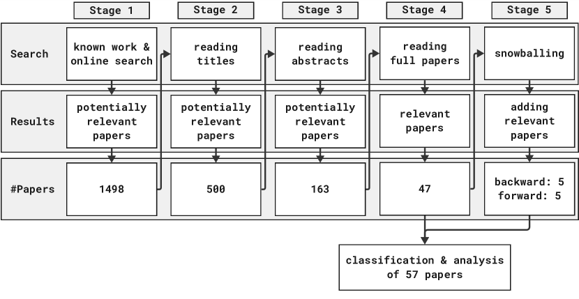
We base our corpus of literature on publications that the authors have already been aware of from their previous work in this field and by an extensive online literature search. The online search was a keyword-based search in the digital libraries of IEEE Xplore, ACM Digital Library, and Springer Link, which include work published at IEEE VIS, CHI, and other VGTC- and SIGCHI-sponsored venues. Furthermore, we searched the digital libraries of Eurographics, ICAD, ISon, Organised Sound, and the Sound and Music Computing Community. Figure 1 provides an overview of the different stages we used to systematically filter our database for relevant publications. To keep track of the progress of identifying relevant papers, we used a Google sheet document. The final database, including all papers and all tags by the authors, is provided in the supplemental material as a CSV file.
Stage 1 – The search query we used in stage 1 was the following: ("Visualization" OR "Visualisation" OR "Visual Analytics") AND ("Sonification" OR "Auditory Display") AND NOT (centrifug* OR lys* OR homogeniz*) It consists of an AND combination of a visualization term and a sonification term combined with the exclusion of specific word-beginnings. The reason to exclude papers that hold words starting with centrifug*, lys*, and homogeniz* is the fact that sonification, also called sonication, is a term used also in biology to describe a process where sound is used to agitate particles in a sample. As papers using sonification in this context are not relevant to this STAR, we identified terms, including the three mentioned above, that are often associated with this meaning of sonification. The search in the Springer Link database especially, was sensible to the exclusion of these terms. As there could be false negatives using the exclusion of the three terms, we conducted a manual review of the paper titles that were excluded due to this strategy and restored five papers that were potentially relevant. This online search, combined with papers we were already aware of from our previous work in the field, resulted in a database holding 1498 papers. To download the respective papers and to make them available to all co-authors we used the literature management software Zotero.
Stage 2 – In the second phase of our literature search, each paper title was read by two of the authors and classified into potentially relevant or irrelevant. We agreed to use an inclusive mindset for this stage, i.e., we tagged vague titles mostly as potentially relevant to not overlook too many papers at this early stage. For papers that were tagged differently by two people, the two people came to an agreement or the paper was taken to the next stage. Stage 2 resulted in a database holding 500 papers.
Stage 3 – In the third phase of our literature search, each abstract was read by two of the authors and classified into potentially relevant or irrelevant. Again, we used an inclusive mindset and tagged vague abstract as potentially relevant. For papers that were tagged differently by two people, the two people came to an agreement or the paper was taken to the next stage. Stage 3 resulted in a database holding 163 papers.
Stage 4 – In the fourth phase of our literature search, each paper was read by one of the authors and classified as relevant or irrelevant. As the authors had a solid common understanding of the inclusion and exclusion criteria by this stage, and as a person had the full paper information available to take a decision, one person decided on the relevance at this stage. The papers identified as relevant in stage 4 were classified using the tags explained in detail in Table 2. Each paper was first classified by one of the co-authors and their tags were later verified by a second co-author. Whenever two co-authors initially disagreed on a specific tag, they came to an agreement or the first author took a decision. Stage 4 resulted in a database holding 47 papers.
Stage 5 – Furthermore, we extended the corpus of relevant papers by snowballing [Woh14], checking all incoming outgoing references of the articles matching our inclusion criteria. Snowballing was done by one of the co-authors with an exclusive mindset towards the paper titles, meaning that a vague title was not considered as relevant. Stage 5 resulted in our database holding 57 papers overall, adding 10 papers to the prior stage. During the final two stages, whenever we identified an audiovisual idiom that was published in more than one paper, we retained the most extensive version in our STAR. We identified two such cases where a design was previously published in a short paper but later expanded [YH18, MAFP19b].
| Paper | Theme | Demo Link | Purpose | Redundancy | Visualization Idiom | Soni. Technique | Goal | |||||||||||
|---|---|---|---|---|---|---|---|---|---|---|---|---|---|---|---|---|---|---|
|
Exploration |
Presentation |
Both |
Redundant |
Mixed |
Complementary |
PMS |
MBS |
Audification |
Auditory Icons |
Earcons |
Education |
Data Analysis |
Research |
Public Engagement |
||||
| [EEBR21] | Astronomy | [<—>] | volume rendering | |||||||||||||||
| [Rib19] | Astronomy | [<—>] | line chart, scatter plot | |||||||||||||||
| [HTHB22] | Astronomy | [<—>] | point cloud | |||||||||||||||
| [HPDW23] | Astronomy | [<—>] | scatter plot | |||||||||||||||
| [Rib18] | Astronomy | [<—>] | volume rendering | |||||||||||||||
| [RS22] | Astronomy | [<—>] | 3D map | |||||||||||||||
| [TB23] | Astronomy | 3D scatter plot | ||||||||||||||||
| [BTB23] | Domain Agnostic Display | line chart, parallel coordinates | ||||||||||||||||
| [CWM21] | Domain Agnostic Display | [<—>] | line chart | |||||||||||||||
| [DLVDCG22] | Domain Agnostic Display | [<—>] | line chart | |||||||||||||||
| [DCM∗18] | Domain Agnostic Display | convex hull, other, bar chart | ||||||||||||||||
| [ERI∗22a] | Domain Agnostic Display | [<—>] | scatter plot | |||||||||||||||
| [FBC12] | Domain Agnostic Display | line chart | ||||||||||||||||
| [GKW21] | Domain Agnostic Display | [<—>] | network | |||||||||||||||
| [KLTW17] | Domain Agnostic Display | [<—>] | line chart | |||||||||||||||
| [LF21] | Domain Agnostic Display | [<—>] | line chart | |||||||||||||||
| [MAFP19b] | Domain Agnostic Display | [<—>]* | heatmap | |||||||||||||||
| [PCB23] | Domain Agnostic Display | [<—>] | line chart | |||||||||||||||
| [PC19] | Domain Agnostic Display | line chart | ||||||||||||||||
| [RJ16] | Domain Agnostic Display | [<—>] | scatter plot, parallel coordinates | |||||||||||||||
| [YH18] | Domain Agnostic Display | [<—>] | scatter plot | |||||||||||||||
| [Bal15] | Earth Science | heatmap | ||||||||||||||||
| [Bea11] | Earth Science | [<—>] | map | |||||||||||||||
| [BF12] | Earth Science | [<—>] | map | |||||||||||||||
| [GDAS∗18] | Earth Science | map | ||||||||||||||||
| [HK22] | Earth Science | geographic scatter plot | ||||||||||||||||
| [HCTP14] | Earth Science | heatmap | ||||||||||||||||
| [MMU16] | Earth Science | map | ||||||||||||||||
| [NRL∗12] | Earth Science | [<—>] | map | |||||||||||||||
| [PFH∗22] | Earth Science | [<—>] | dot map | |||||||||||||||
| [SAR22] | Earth Science | [<—>] | fluid-like simulation | |||||||||||||||
| [WW15] | Earth Science | [<—>] | line chart | |||||||||||||||
| [GRK∗16] | Medicine and Health | slicing, volume rendering | ||||||||||||||||
| [GR11] | Medicine and Health | slicing | ||||||||||||||||
| [LSB∗23] | Medicine and Health | [<—>] | map | |||||||||||||||
| [MNW∗18] | Medicine and Health | [<—>] | volume rendering | |||||||||||||||
| [RFM13] | Medicine and Health | slicing | ||||||||||||||||
| [TMN∗21] | Medicine and Health | [<—>] | volume rendering | |||||||||||||||
| [AJB∗18] | Molecular Science | [<—>] | 3D molecule rendering | |||||||||||||||
| [BBV16] | Molecular Science | 3D molecule rendering | ||||||||||||||||
| [BM20] | Molecular Science | volume rendering | ||||||||||||||||
| [RFK∗15] | Molecular Science | volume rendering | ||||||||||||||||
| [FN18] | Others | line chart | ||||||||||||||||
| [LLW21] | Others | [<—>] | 3D network | |||||||||||||||
| [NSC16] | Others | [<—>] | gantt chart | |||||||||||||||
| [CB17] | Others | bar chart | ||||||||||||||||
| [MMM18] | Others | [<—>] | individual circular design | |||||||||||||||
| [ASH∗12] | Others | [<—>] | volume rendering | |||||||||||||||
| [Her20] | Others | [<—>] | network | |||||||||||||||
| [PBM15] | Others | 3D network | ||||||||||||||||
| [PBV14] | Others | network | ||||||||||||||||
| [HAR16] | Others | dotted chart visualization | ||||||||||||||||
| [JMP13] | Others | 3D scatter plot | ||||||||||||||||
| [KAV21] | Others | [<—>] | 3D point cloud | |||||||||||||||
| [Rön21] | Others | [<—>] | bar chart | |||||||||||||||
| [AK11] | Others | map | ||||||||||||||||
| [BB19] | Others | point grid | ||||||||||||||||
3 Categorization and Results
In this section, we will discuss the relevant literature in detail from the perspectives of our classification. The systematic integration of sonification and visualization is a wide and diverse research field that is difficult to classify using only a handful of categories. Therefore, we decided to apply an extensive list of tags to the literature to be able to present diverse perspectives on the field, mostly concerning basic research, i.e., the basic principles that distinguishes the designs/idioms from each other.
To give readers an initial thematic overview of the field, we will start by briefly describing each of the 57 selected papers in subsection 3.1. We will do so by clustering the literature to the following topics: astronomy, medicine and health, molecular science, earth science, domain agnostic data displays, and other topics. We will then continue with a discussion on the purpose that an idiom can be designed for (subsection 3.2), followed by an analysis of idiom design possibilities (subsection 3.3). We will study several technical perspectives that were tagged individually for the sonification and the visualization aspects of each paper: the reading levels (subsection 3.4) suggested by Bertin [Ber83], the search levels (subsection 3.5) suggested by Munzner [Mun15], as well as the dataset types [Mun15] including the levels of measurement of the displayed data (subsection 3.6). We will then review different evaluation methods (subsection 3.8), different target platforms, and various possibilities of interacting with audiovisual display idioms (subsection 3.9). Finally, we study the diverse user groups and the possible goals of designers (subsection 3.10).
All the above categories and subcategories are concisely presented in two tables. Table 1 shows an overview of all papers and a subset of their most relevant tags. Table 2 provides a detailed description for each category and their respective subcategories. We also report on the total number of papers within each subcategory. The four technical categories mentioned above have distinct visualization and sonification tags which are represented in the left and right boxes in the “Num.” column, respectively. The color saturation of the boxes encodes the total number of papers in each subcategory.
3.1 Thematic Corpus Overview
Scanning our database, we identified seven astronomy related papers. Riber [Rib18] presented a prototypical virtual and interactive audio synthesizer called Planethesizer that enables users to design sonifications, especially focused on planetary data. Sonifigrapher [Rib19] is a virtual synthesizer that lets users sonify the light curves data from NASA’s exoplanet archive. Also the recently presented Sonified Hertzsprung-Russel Diagram [HPDW23] sonifies the light curves, with the diagram acting as both the visualization and the interface to choose a star to be sonified. With this design, hearing a constant pitch will inform a user about the rotation of a star. The rotation, temperature, and other parameters of planets in our solar system were also sonified by Elmquist et al. [EEBR21] in OpenSpace Sonification. Their design can be used both with conventional computer desktop environments as well as in planetarium settings, tailored towards public outreach and science communication. Public outreach is also the core of the publication Audio Universe by Harrison et al. [HTHB22]. The publication describes the design of a 35-minute audiovisual show about the the solar system integrating visualization and sonification, as well as an audiovisual animation displaying the stars in the order their appear to our eyes during dusk. Similarly, Russo and Santaguida [RS22] collaborated with NASA, celebrating the discovery of the 5000th exoplanet. Their design displays the exoplanets as they were discovered over the years. Recently, Traver presented another audiovisual installation where users can control the auditory representation of the planets using a Midi controller [TB23].
We identified six medicine and health related topics in our database, out of which three are related to brain scans [GR11, RFM13, GRK∗16], two are audiovisually displaying blow flow and aneurysm models [MNW∗18, TMN∗21], and one is concerned with Covid-19 data [LSB∗23].
Our database holds four idioms that we relate to molecular science. In an idiom presented by Rau et al. [RFK∗15], scientific visualization of a molecular simulation is enhanced using parameter mapping sonification and auditory icons. Among other things, their design guides the attention of a user towards visually occluded phenomena using sonification. Ballweg et al. [BBV16] use sonification with the intention of supporting chemists and structural biologists with drug design. For their sonification plug-in, they focused on tasks that were not well supported visually in a software for the interactive visualization of molecular structures called “UCSF Chimera.” In the context of biomolecules simulation, Arbon et al. [AJB∗18] developed a sonification displaying characteristics of the “free energy landscape,” a map used to study the properties of biomolecular systems. Their technique allows a user to visually inspect the physical configuration of a biomolecule while listening to their corresponding free energy landscape. Exploring the possibilities of 3D sound, Bouchara and Mones [BM20] suggested a work in progress immersive sonification model to study protein surfaces.
The earth science cluster in our survey data holds eleven publications covering topics that range from oceanographic data [SAR22], wildfires [HK22], hurricanes [Bal15], and climate change [Bea11], to sonophenology [NRL∗12], seismology [HCTP14, WW15, MMU16, PFH∗22], and geospatial data displays [BF12, GDAS∗18].
The category of domain agnostic data display idioms in our survey data holds 14 papers. These idioms are not designed to support users from a specific domain, but are implementations tackling problems across multiple domains. Six of the papers describe software frameworks that are intended to help people design sonifications along with visual representations of their data [PC19, PCB23, LF21, DLVDCG22, CWM21, KLTW17]. Their unifying core goal is the democratization of sonification as a technique to represent data, hence making it accessible to more people, both professionals as well as domain experts. Other publications focus on basic research combining different sonification techniques such as parameter mapping sonification or model-based sonification with basic information visualizations such as scatterplots [ERI∗22a, RJ16, YH17], parallel coordinates plots [BTB23, RJ16], or line charts [FBC12] to study the potentials of audiovisual display idioms. Groppe et al. [GKW21] studied network visualization and sonification through their design, while Malikova et al. [MAFP19b] show the potential of sonification to help users identify smallest symmetry differences in scalar fields visualizations. While most studies focus on metrics such as precision, error rates, or task completion times, the study by Du et al. [DCM∗18] explicitly investigates the sonification’s influence on user engagement.
Finally, we want to provide an overview of the remaining other 15 publications not part of the above thematic clusters. The topics related to the publications tagged as "other" are diverse, ranging from a multimodal system for analyzing business process execution data [HAR16] to an audiovisual representation of the Portuguese consumption patterns [MMM18] to a multimodal implementation of “Game of Life” using an idiom that sonifies three-dimensional cellular automata, enhancing perceived quality, patterns, and immersiveness [KAV21]. A musical sonification aimed at conveying information about running data and emotion [Rön21], an investigation into the use of timbre in sonification reveal its impact on trend identification in sonified line charts [FN18]. North et al. [NSC16] propose a hybrid version control system that employs audiovisual feedback to represent software development data such as timelines and conflicts. Alonso et al. [ASH∗12] develop an interface for product design that introduces a multisensory approach for communicating virtual objects’ geometrical data, i.e., curvature and shape. While Adhitya and Kuuskankare [AK11] propose a prototype that offers a sonification-based approach to urban design planning, several publications focus on audiovisual data representation in VR. Chabot and Braasch [CB17] present a multimodal approach to a complex stock market dataset, performed in an immersive virtual reality setting and utilizing dynamic spatialization techniques for a collaborative experience. Papachristodoulou et al. [PBM15] integrate sonification into exploring a complex neuroscience dataset using an immersive VR application, revealing the potential for improved user performance in brain region identification across different spatial resolutions. Berger and Bill[BB19] present an immersive, multisensory, and audiovisual VR application to support decision-makers and citizens about urban traffic noise issues, safety, and quality of life. An exciting approach to neuroscience through a complex dataset in immersive and interactive 3D visualization is given by Papachristodoulou et al. [PBV14], demonstrating that sonification enhances subjects’ structural understanding of the dataset, providing an additional layer of comprehension for hidden patterns in large datasets. While Joliat et al. [JMP13] combines spatialized sonification with 3D data visualization for sensor data communication, enabling data exploration with privacy protection and time-compression algorithms. Two publications focus on Explainable Artificial Intelligence (XAI). Lyu et al. [LLW21] present an interactive, audiovisual VR representation of Neural Networks, while Herrmann [Her20] designs a system that visualizes and sonifies the inner workings of a music-trained neural network, employing contrastive predictive coding. It enables the rendering of how music sounds to the artificial ear and dynamic visualization of neuron activations using a force graph layout technique.
As we have now briefly touched on all 57 papers that are part of our database, we can focus on the meta level classification in the following subsections. With these more high level descriptors, we intend to provide a number of versatile perspectives on the literature. They will help us identify research gaps and opportunities for the systematic integration of sonification and visualization for the future work of both research communities in section 6. Along the discussion of these perspectives, we will present a selection of papers that are representative examples for the respective category. By doing so, we intend to provide the reader with (1) a broad exploration of the field overall, and (2) insights into the content of the actual papers themselves.
| Category | Num. | Subcategory | Explanation |
| Purpose | 29 | Exploration | designs used for data exploration |
| 17 | Presentation | designs used for data presentation | |
| 11 | Both | designs used for both purposes above | |
| Visualization Design | Idiom | the visualization idiom, such as scatter plot or line chart | |
| Identity channels | name of the visual channel such as color hue or shape, that is used to communicate the identity of an item (i.e., "What" something is) | ||
| Magnitude channels | name of the visual channel such as position or length that is used to communicate the magnitude of an attribute (i.e., "How much" something is) | ||
| Sonification Design | Technique | the sonification technique such as parameter mapping or earcons | |
| Identity channels | the auditory channel such as timbre that is used to communicate the identity of an item (i.e., "What" something is) | ||
| Magnitude channel | the auditory channel such as pitch or duration that is used to communicate the magnitude of an attribute (i.e., "How much" something is) | ||
| Reading Level | 50 29 | Whole | designs that display all datapoints |
| 13 29 | Group | designs that display a group of datapoints | |
| 4 17 | Single | designs that display single datapoints | |
| Search Level | 2 2 | Lookup | the user knows the location and the target of the search |
| 9 6 | Browse | the user knows the location but not the target of the search | |
| 7 7 | Locate | the user doesn’t know the location but the target of the search | |
| 40 42 | Explore | the user doesn’t know the location or the target of the search | |
| 11 8 | None | none of the above | |
| Dataset Type | 29 40 | Table | data constructed from items and attributes (spreadsheets) |
| 5 3 | Network | data constructed from items (nodes), links and potentially attributes | |
| 9 7 | Field | data constructed from grids (positions) and attributes | |
| 20 9 | Geometry | data constructed from items and positions | |
| Level of Measurement | 22 13 | Nominal | data that builds categories (such as different fruits) |
| 8 8 | Ordinal | data that builds ordered categories (such as t-shirt sizes) | |
| 27 31 | Interval | data that has equal intervals, such as the time on the clock | |
| 27 34 | Ratio | data that has equal intervals and a meaningful zero point, such as length or weight | |
| Level of Redundancy | 17 | Redundant | a design mapping all displayed information to both senses redundantly |
| 14 | Complementary | a design mapping part of the information exclusively to the visualization and another part of the information exclusively to the sonification | |
| 28 | Mixed | a design mapping some information redundantly, some information complementary | |
| Evaluation System | 12 | User Performance | evaluations collecting metrics such as error rates or task completion times |
| 11 | User Experience | evaluations collecting user feedback, typically done in a usability test | |
| 2 | Algorithmic Performance | evaluations doing measurements without users such as rendering speed | |
| 17 | Qualitative Result Inspection | evaluations providing subjective arguments on the quality of the result | |
| 20 | None | no evaluation done in the paper | |
| Target Platform | 43 | Desktop Computer Display | conventional screen on desktop computer |
| 4 | XR | extended reality settings such as virtual or augmented reality glasses | |
| 10 | Physical Environments | environments that foster collaboration such as a CAVE | |
| 5 | Touch Display | interactive screen that users can interact with via touch | |
| User Interaction | 37 | Yes | designs that require user interaction other than pressing play |
| 20 | No | designs that require no user interaction | |
| Users | 25 | Domain Experts | domain experts that are not visualization or sonification researchers |
| 7 | Researchers | visualization or sonification researchers | |
| 31 | General Public | the interested general public | |
| Goals | 8 | Education | idioms designed for education |
| 35 | Data Analysis | idioms designed for data analysis (incl. data exploration) | |
| 3 | Research | idioms designed for visualization and sonification research | |
| 17 | Public Engagement | idioms designed for public engagement | |
| Demo | 29 | Yes | the paper links to a demo such as an interactive website, a video, or an audio recording |
| 23 | No | the paper doesn’t link to a demo | |
| 5 | Yes, but not online | the paper provides a link that is not online anymore |
3.2 Purpose
In this section, we will discuss two different purposes an audiovisual idiom can be designed for, inspired by the taxonomy described in [Mun15]: exploration and presentation. The purpose should be read as general design goal of a tool with broad perspective. Therefore, the term exploration also covers what is widely referred to as data analysis.
3.2.1 Exploration
A wide range of audiovisual idioms in our database support users with the exploration of data, see Table 2. We refer to the purpose of exploration in cases where a user intends to acquire new knowledge from their data by using an audiovisual display idiom.
Exploratory Data Analysis is the core aim of model-based sonification [Her02]. The Mode Explorer is an interactive audiovisual display idiom, combining a scatterplot visualization and model-based sonification to explore high-dimensional data [YH18]. To explore the data a user can “scratch” a scatter plot of dimensionality-reduced data with an interactive pen. The scratching introduces a virtual particle to the high-dimensional space which will follow a gradient descent towards the nearest mode in the data. The “kinetic energy” of this virtual particle is what a user will be able to hear. While the particle travels closer and closer to its final mode, the sound gradually turns more and more harmonic, finally resulting in a clear pitch when a mode is reached.
AIive combines visualization and sonification in a virtual reality environment [LLW21]. The idiom supports users in understanding the basic concepts of neural networks. Users can manipulate the weights of the nodes of a virtually displayed 3D neural network by dragging the nodes in 3D space. In real-time, the sonification displays the loss and accuracy of the neural network, therefore enabling a user to explore different constellations of node weights. Users are also able to add or delete nodes, hence experimenting with the complexity of the neural network. While the authors do not provide a user study in their paper, it is most plausible the exploratory character of the design can support people in understanding the basics of neural networks.
In a recent publication, Lemmon et al. presented an audiovisual map idiom that seeks to tackle some of the sociotechnical challenges associated with epidemiological mapping [LSB∗23]. Using their idiom, users can interactively explore Suffolk County’s experience with Covid-19. To do so, the black population and associated case numbers are displayed on the left audio channel, while the white population and associated case numbers are displayed on the right channel via the pitch of sine and triangle waves. A correlation between ethnicity and Covid-19 case numbers and their dependency on different regions becomes clearly apparent when listening to the sonification while brushing the map using the computer mouse.
3.2.2 Presentation
We refer to the purpose of presentation when a user intends to present prior knowledge to others, or in cases where a user is presented with information that is new to them but not to the designer.
One potential application of a presentation-only approach is in citizen science, exemplified by the communication of significant discoveries, such as NASA’s announcement of the 5000th exoplanet [RS22]. This representation is explicitly crafted for communication with the general public, primarily through social media channels. Translating data into various sensory modalities is straightforward, while significant attention is devoted to achieving a pleasing and harmonious aesthetic. The sonification, complemented by two animated videos, enhances visual comprehension, vividly portraying celestial spheres with dynamic elements representing exoplanet characteristics. NASA’s strategic dissemination on social media platforms garnered substantial engagement, with positive feedback indicating the presentation’s broad appeal.
The presentation objective appears linked to eliciting emotional engagement from end users, as evident in Rönnberg’s research [Rön21]. This representation involves assessing running statistics, weather data, and associated emotions. Presented as an animated visualization synchronized with sonification, it depicts weekly runs emphasizing evoking emotional responses rather than precise data interpretation—a practice denoted by the author as “musification” (see further discussion about sonification and music in Vickers, 2016 [Vic16]), leveraging sound’s dual capacity to illustrate data and engender a musical experience. The study assesses the representation’s efficacy through a user study, wherein participants watched a video. Results indicate that the sonification effectively conveys intended emotions but at the expense of a less accurate data representation.
Recent works delve into environmental concerns and the promotion of awareness. One such noteworthy contribution is presented in [HK22]. This publication centers around a multimodal museum installation designed to foster public engagement with wildfire forecasts in specifically chosen California and South Korea regions. The project incorporates interactive data visualization, sonification, and 3D-printed sculptures. Combining these elements conveys wildfire data, creating a comprehensive and immersive experience. The installation allows audiences to explore the representation freely through contactless interaction. Without user engagement, the wildfire data representation seamlessly loops across the screen. Notably showcased at the ARKO Art Center in Seoul, this project successfully captivated the attention of 20 users. The outcomes revealed a heightened level of interest and comprehension regarding the impact of wildfires through the effective utilization of multimodal interaction. The project emphasizes observations and prompts audience reflection without demanding immediate action, leveraging new media to enhance public climate change comprehension.
3.2.3 Exploration and Presentation
Some of the designs we identified were designed both to explore and to present data. Inclusion in this category requires the designer to put similar weight on the exploration and presentation of the data. To present a few examples, Paté et al. [PFH∗22] demonstrate their audiovisual display idiom with three seismic data sets, where the sonification methods are adapted to the specific properties of each data set. A multi-scale audification method is presented where different speed factors are used depending on the size of each dataset, and different sound designs are used to highlight specific properties of the data set. This classification can also indicate that the user can explore several presentations that have been created from the same dataset and make comparisons between them. Huppenkothen et al. [HPDW23] created an audiovisual version of the Hertzsprung-Russell Diagram where the user can listen and compare auditory representations of each type of star that is included in the diagram (see Figure 7(c)). It is also possible to filter the diagram according to certain criteria, which in turn filters which sonifications are able to be listened to. Elmquist et al. [EEBR21] created complementing sonifications of the planets in the solar system which were integrated with a visualization, where a user can explore the properties of the planets and make comparisons between them. The user is able to listen to all of the sonifications for each planet at the same time, or enable specific sonifications for each planets to compare specific properties. Du et al. [DCM∗18] conducted a study investigating the enhanced visualization of basketball player movement data during a game. The visualization is designed to convey the offensive and defensive dynamics of the team. The interface primarily enables users to specify a particular time range of interest, providing a more comprehensive view of information within that timeframe. Notably, sonification is integrated exclusively during the exploration phase.
3.3 Audiovisual Idiom Design
Designers of audiovisual idioms have a sheer endless number of possibilities to combine their visualizations and sonifications. They can choose from a vast number of established visualization idioms and sonification techniques. Having chosen two designs to integrate with each other, they are free to choose the visual and auditory channels they want to map their data to. During the classification of the surveyed literature, we used six different categories to capture the state-of-the-art of audiovisual idiom design. The categories are the visualization idiom, the sonification technique, the visual identity- and magnitude channels, as well as the auditory identity- and magnitude channels. The constructs of identity- and magnitude channels are used to distinguish between encodings that communicate “what” something is and “how much of” something there is [Mun15, ERI∗23]. Typical visual identity channels are the shape of a visual mark or its color hue. Typical visual magnitude channels are the position or the length of a visual mark. A typical auditory identity channel is the timbre of a sound, often generated using different musical instruments. Typical auditory magnitude channels are pitch and loudness [DB13, CLR22]. In the following, we will make use of these descriptions to shed light on some of the designs in our database.
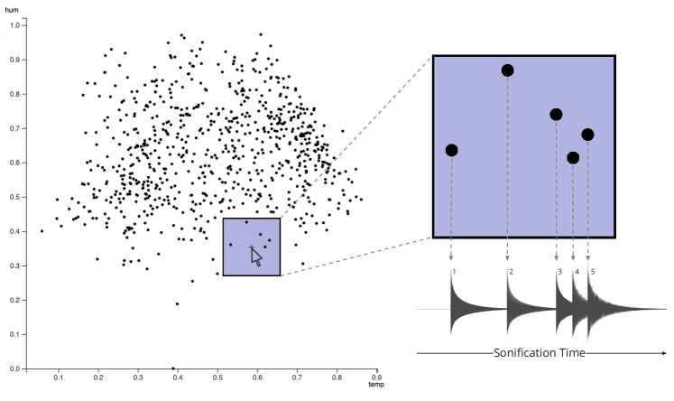
SoniScope [ERI∗22a] is an interactive audiovisual display idiom that combines a scatterplot visualization with an interactive parameter mapping sonification (compare Figure 2). Inspired by the technique of auscultation, the SoniScope acts as a stethoscope for data, providing an auditory lens to “listen into” one’s data. The exploratory character of the idiom is most apparent when the sonification displays non-visual data dimensions. To interact with the idiom, a user can brush the data using a visual lens. Clicking into the scatterplot will then trigger the sonification of a non-visual attribute of the selected data items. Regarding the used magnitude channels, we see a common combination of visual position and the pitch of the sounds, also employed in publications such as [BF12, DLVDCG22, FBC12, FN18, KLTW17].
Bearman [Bea11] studied the possibilities to display the uncertainty in future climate projections for the UK. To do so, the proposed audiovisual idiom shows a map of the UK with a heat map overlay displaying the projected temperature values. This visualization is combined with the sonification technique of interactive parameter mapping. People in a user study were asked to hover over the heat map with a mouse, triggering the sonification of the respective region. A higher pitch of a trumpet sound communicated a higher uncertainty for that region. Hence, for their design, Bearman used the spatial position as a visual identity channel and color as visual magnitude channel. This sonification did not use an identity channel (only one sound could be heard) but used pitch as magnitude channel.
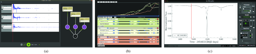
Several papers in our database describe frameworks that are explicitly developed for the design of sonifications (see examples in Figure 3), always in combination with a visualization [PC19, PCB23, LF21, DLVDCG22, Rib19, CWM21]. As a representative and flexible example we want to discuss the Highcharts Sonification Studio [CWM21], a collaboration between the company Highcharts and the Georgia Tech Sonification Lab. Regarding the design of the visualization, the environment offers line- and area charts, as well as scatter plots, bar charts, and pie charts, all with their respective standard visual channels such as position, length, angle, or color hue. The sonification is done using parameter mapping with several options for auditory magnitude channels such as pitch, spatial position in the stereo field, loudness, or harmonic range. Different attributes in the data can be distinguished using different musical instruments, hence the employed auditory identity channel is the timbre of the different sounds. The default option of the Highcharts sonification studio is set to combine a line chart with an auditory graph, which traditionally plays back the line from left to right using pitch over time.
In their paper, Winters et al. [WW15] describe the design of the visualization and the sonification of the 2011 Tohoku earthquake in Japan. The design combines four line charts of four seismographic recording stations in Japan with an audification of the same data streams. The essence of the audification is that the low frequency recordings of the earthquake are played back in a faster tempo, making them audible to the human ear. This very direct mapping between the physical (non-audible) phenomenon and the audification to the audible range results in a rich auditory impression that becomes informative in an ecologically valid manner. The paper mostly discusses the popularity of this sonification on YouTube, currently with around 90k views, explicitly mentioning the relevance of combining the sonification with visualization for its success in public outreach. The visualization uses position as both its identity and its magnitude channel. The sonification employs the spatial stereo position of the four channels to distinguish between them, hence as their identity channel. The magnitude channels are a mix of pitch and timbre, resulting from the direct mapping between the physical phenomenon and the sound.
Disscussion: From the data, we see that parameter mapping is by far the most used sonification technique for the design of audiovisual idioms – 53 out of 57 papers in the database employ some sort of parameter mapping sonification. Only a seven of them combine parameter mapping sonification with other techniques such as audification [MMU16, HPDW23], earcons [HAR16, NSC16], or auditory icons [BBV16, RFK∗15, PBM15]. The technique of audification is part of the database three times on its own [PFH∗22, HCTP14, WW15], and in combination with earcons once in a second design of a paper [PFH∗22]. Yang and Hermann are the only authors employing model-based sonification with their Mode Explorer design [YH17]. The most prominent auditory identity channel in our literature corpus is timbre (used 21 times) and the most used auditory magnitude channel is pitch (47 times), also used in combination with other channels. These findings are just in line with other meta analyses of the field of sonification [CLR22, DB13]. The visualizations in our corpus employ idioms such as line charts (10 times), scatter plots (8 times), maps (7 times), as well as networks, bar charts, slicing, heatmaps, and several other idioms. These publications use the identity channels color hue (27 times), position (11 times), as well as shape (11 times). The employed visual magnitude channels are position (33 times), color hue (15 times), size (9 times), and other channels such as opacity, tilt, or animation.
Tagging the surveyed literature made us realize that with techniques such as audification or model-based sonification using the concept of the “channel” is not trivial. With these techniques, the designer of a sonification, to some extent, loses control over the sonic outcome of a sonification. This contradicts the definition of a visual channel as “a way to control the appearance of marks” [Mun15]. Instead, thinking of the “channel” as “the quality of a mark that transports information,” also allows for the description of audifications and model-based sonifications. While these techniques typically result in highly complex sound sequences, it will often be qualities such as pitch or timbre that are informative to the listener. In general, we see a quite diverse field of different audiovisual idiom designs in our corpus.
3.4 Reading Levels
| Sonification | Visualization | ||
|---|---|---|---|
| whole | group | single | |
| whole | 27 | 3 | 1 |
| group | 24 | 12 | 1 |
| single | 14 | 4 | 3 |
The classification of designs with respect to reading levels is inspired by the taxonomy by Bertin in his seminal book Semiology of Graphics [Ber83]. The three reading levels describe the amount of data a user studies using a specific tool. The “Whole” level describes tools that enable the user to ask questions about “all” of the data under consideration. The “Group” level describes tools that enable the user to ask questions about a “subgroup” of the data under consideration, and the “Single” level describes tools that enable the user to study “single” items. For this category, we decided to assign two tags per entry in our database: One for the visualization part and one for the sonification part of the idiom. The classification using reading levels aims towards potential differences in the distribution of tasks between sonification and visualization, such as overview and detail phenomena.
Rau et al. [RFK∗15] presented an audiovisual idiom that lets users interactively explore molecular structures by using a “virtual microphone” that can be placed inside a 3D molecular visualization. The visual design provides an overview using the “Whole” level while displaying details at group level via the sonification. At the same time, the design provides a user with information about potentially visually occluded data. Hence, it makes the user aware of the existence of a phenomenon, that they could, if relevant, study in detail at a later point. The metaphor of the microphone to be used to “listen into the data” is similar to the one of the stethoscope in [ERI∗22b], where the visualization provides an overview while users can interactively choose a subset of data to display acoustically. An example of an idiom working at the sonification “whole” level and the visualization “group’ level, is the Mode Explorer [YH17]. The design sonifies a high-dimensional data space while visualizing a two-dimensional projection of that space with a scatterplot.
Discussion: Out of all possible combinations of reading levels and display type, the majority of cases (27) use the “Whole” level for both the sonification and the visualization (some of them are [EEBR21, MMM18, RS22, SAR22, WW15]). The next biggest group in our database holds 24 papers that can display data at the “Whole” level using their visualization and at the “group” level using their sonification, such as [BF12, BTB23, FBC12, GDAS∗18, RFK∗15]. Generally speaking, we can observe that the visualization parts are mostly covering the same or a higher level of reading than the sonification part of a design (compare table Table 3). This phenomenon can be directly related to the distribution of tasks on the two display types, with visualization more often providing an overview and the sonification rather displaying details. In section 6, we will argue for breaking such patterns in the future work of the community.
3.5 Search Level
| Sonification | Visualization | |||
|---|---|---|---|---|
| explore | browse | locate | lookup | |
| explore | 37 | 4 | 5 | 5 |
| browse | 3 | 2 | 2 | 2 |
| locate | 4 | 3 | 5 | 5 |
| lookup | 1 | 0 | 1 | 2 |
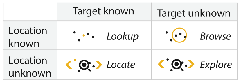
Inspired by the taxonomy suggested by Munzner [Mun15], we tagged four different search levels, again assigned individually for the sonification and the visualization parts of the idiom. The type of search a user applies depends on their prior knowledge. Users who know what they are looking for and where they can find it will do a lookup. Searching for an unknown pattern at a known location is called browsing while locating is a search without knowing the location but the pattern one is looking for. A search uninformed both with regards to the location and the type of pattern one is looking for is called exploration. Designs that combine sonification and visualization could serve each of the described search levels as well as a combination of them.
Malikova et al. [MAFP19b], for example, presented an idiom that helps users explore scalar fields using both their ears and their eyes. To do so, the regional magnitude of small areas of a scalar field is sonified using pitch. From the search level perspective, a user of this idiom does not generally know what to look or listen for at the beginning of the analysis, therefore both modalities are used for exploring the presented data. The system could, for example, reveal the existence of small symmetry differences in scalar fields. What visually seems to be a perfectly symmetrical field, could become apparent as not quite symmetric when two similar pitches result in an acoustic phenomenon called “frequency beating.” The clearly audible phenomenon makes a listener aware of the non-symmetry of the field, potentially resulting in them taking a closer look at their data.
Discussion: Generally speaking, many idioms can be used for more than one search level and it seems to be dependent on the prior knowledge of a user (both about the data and about the idiom) what search level they use it for. Nevertheless, the majority of papers in the surveyed literature offer the search level of “explore” and, in general, most papers use the same search level for both their visualization and their sonification parts (see Table 2 and Table 4). Some examples of designs employing the same search level are [CB17, DCM∗18, ERI∗22a, FBC12, Rib19, GR11, HK22], while fewer combine different search levels for the two modalities [HAR16, RFK∗15, RJ16, AK11, Bal15, CWM21].
3.6 Dataset Type and Level of Measurement
| Sonification | Visualization | |||
|---|---|---|---|---|
| table | network | field | geometry | |
| table | 23 | 1 | 4 | 12 |
| network | 0 | 2 | 0 | 0 |
| field | 0 | 0 | 7 | 1 |
| geometry | 1 | 0 | 0 | 9 |
| Sonification | Visualization | |||
|---|---|---|---|---|
| ratio | interval | ordinal | nominal | |
| ratio | 21 | 11 | 0 | 10 |
| interval | 7 | 22 | 2 | 12 |
| ordinal | 0 | 2 | 8 | 7 |
| nominal | 4 | 2 | 5 | 12 |
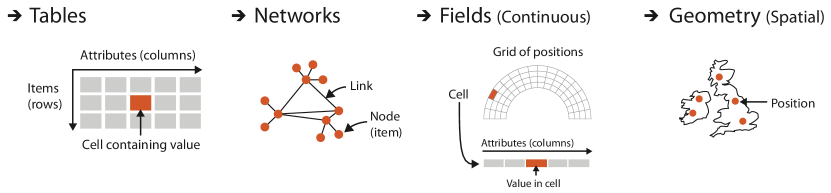
Two more categories we tagged individually for the sonification parts and the visualization parts are the dataset type (see Figure 5 and Table 2) and the level of measurement (see Table 2). We distinguish between the four dataset types of tables, networks, fields, and geometries [Mun15] and between the four levels of measurement of nominal, ordinal, interval, and ratio scale.
It is reasonable that most idioms display data from identical dataset types with both their visualization and their sonification. The most prominent dataset type is the table, used in designs such as [BTB23, DLVDCG22, DCM∗18, ERI∗22a, FBC12, HAR16, MMM18, RJ16]. Table 5 reveals a notable exception from the dominance of identical dataset types: the combination of visualized geometry in combination with a sonified tables, often related to maps and supplemented regional information [BF12, LSB∗23, MMU16, NRL∗12, RS22].
Concerning the levels of measurement of the displayed data, we observe, again, that most idioms display data from the same level (see Table 5). We list a selection of cases for ratio data [ASH∗12, DCM∗18, GRK∗16, PFH∗22, Rön21], for interval data [BB19, DLVDCG22, Rib19, Her20, MMU16], for ordinal data [AK11, LF21, PCB23], and for nominal data [GKW21, HAR16, NSC16], and now will continue with a discussion of three methods to map the data to the senses, the levels of redundancy.
3.7 Level of Redundancy
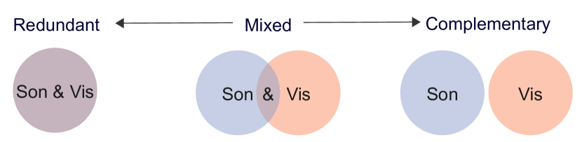
When combining sonification and visualization, designers have three options – displayed in Figure 6 – to distribute the information they want to transport to the senses. They can have the same information represented in both the sonification and the visualization (redundant mappings), they can display one part of the data exclusively visually and another exclusively auditorily (complementary mappings), or they can map some parts of the data redundantly and some complementary (mixed mappings). While this continuum seems to be an intuitive description of audiovisual display idioms, we should distinguish between “technical redundancy” and “communicative redundancy.”
Technical redundancy describes the technical mapping from the data to a visual and auditory representation. If all the displayed information is mapped to channels of both modalities, then the audiovisual display idiom employs a technically redundant mapping. An example is the auditory line graph: We see and hear identical information via spatial position (visualization) and pitch (sonification). In some cases, it is not enough to use a purely technical description of redundancy, without incorporating our way of perceiving the different displays as humans. Therefore, we introduce the term of "communicative redundancy."
Communicative redundancy describes the fact that technically redundant designs might encode the same information with different perceptual qualities. Hence, we could identify different patterns in data by listening to them, and then by looking at them. Communicative redundancy will usually be strongly related to technical redundancy, but there are exceptions such as the combination of a WAV form visualization (line chart) and an audification, such as in the Sonification of the Tohoku Earthquake in Japan in 2011, also described in [WW15]. Technically, those two are fully redundant (the same data attributes are displayed both visually and auditorily), but communicatively they complement each other.
In the following, when we speak of redundancy, we use the definition of technical redundancy. Communicative redundancy is most likely also dependent on the individual receiver, which is why we would not be able to consistently assign a tag to each case. Nevertheless, when implementing an audiovisual display idiom, a designer should consider its communicative redundancy just as well.
Rönnberg and Johannson [RJ16] present a technically redundant mapping of the density of a scatterplot or a parallel coordinates plot to auditory channels. Users would be able to hover over the plot and listen to an auditory representation of the density in the data. It is technically redundant as we are generally able to see the density of the plot by looking at it. In a communicative sense, the design is not redundant, which is why their evaluation shows that the additional sonification helps users identify especially dense areas. The eyes’ ability to assess the visual density is supported by the sound of their design.
Dedicated environments that offer the design of audiovisual display idioms often employ redundant mappings [PC19, Rib18, CWM21, DLVDCG22, KLTW17, Rib19]. One of them is the Sonifigrapher (see Figure 3(c)), presented by García [Rib19], that combines a line chart and a parameter mapping sonification of the light curves from NASA’s exoplanet archive. The vertical position of a line is mapped to the pitch of a musical sound, essentially “playing back” the line from left to right (compare Figure 7).
The work presented by Rau et al. [RFK∗15] complementarily enhances the visualization of molecular simulations by using auditory icons and parameter mapping sonification. A user can position a “virtual microphone” inside of a 3D rendered visual representation of a molecule and listen to processes that are visually occluded.
Temor et al. [TMN∗21] presented a mixed mapping approach for the audiovisual analysis of computational fluid dynamics, in their specific case tailored towards the prediction of cerebral aneurysm ruptures, hence in the medical context. Their sonification design is psychoacoustically motivated in a way that amplifies the differences between different simulations of their spatiotemporally dynamic data. The authors explicitly mention their choice to apply a mixed mapping in their design. They motivate their decision by the observation that the ”spatiotemporal fluctuations are highlighted in a way that seems to be superior to the presentation of different information to different sensory modalities, which is in line with how we make sense of spatiotemporally-dynamic stimuli in everyday scenarios”. We consider this observation as highly plausible and inspirational for potential future research and will reflect upon it in the concluding discussion of this STAR.
Maças & Martins and Machado present an audiovisual display idiom that displays consumption patterns collected from Portuguese supermarkets over the course of two years. The authors, just in line with Temor et al. [TMN∗21], also argue for the employment of a mixed design, their teams having made prior experience with complementary designs that seem to have been less effective.
Discussion: Regarding the level of mapping-redundancy, a high-level observation is the following: When designing an audiovisual display idiom, the mixed mapping seems to show a special potential. The mapping overlap between the sonification and the visualization seems to help the user with perceiving an idiom as integrated, rather than as two displays existing next to each other. There are different options to design a mixed mapping, out of which a promising one seems to be to synchronize a visual animation with a sonification [TMN∗21, MNW∗18] . In similar manner synchronizing the spatial position of the visual display with the direction a user perceived the sound from can be helpful to perceptually integrate the two stimuli [CB17].
3.8 Evaluation Approaches
The evaluation of designs is a pressing issue in both the sonification and the visualization fields. Just as well, audiovisual display idioms need to be evaluated. Rönnberg and Forsell even argue for a future standardization of questionnaires that assess the usability of audiovisual representations that could be used in combination with other measurements [RF22]. To study the current practice of evaluation of audiovisual designs, we applied four of the classes of evaluation techniques suggested by Isenberg et al. [IIC∗13]. The four classes are user performance (UP), user experience (UE), algorithmic performance (AP), and qualitative result inspection (QRI).
When evaluations objectively measure how specific features in a visualization or sonification affect user performance with a system, these approaches belong to the evaluation class UP [IIC∗13]. Controlled experiments using various time measurements and accuracy are typical example methods in this class. Rönnberg and Johansson [RJ16] explored the combination of visualization and sonification, where the users were tasked with identifying the visual area with the highest density in visual representations with and without support of sonification. The user performance was measured in accuracy and response time, and the results showed that the combination of visualization and sonification increased accuracy in comparison with visualization only but also that response times were longer when sonification was used.
The class of UE includes evaluations that focus on subjective feedback and experiences on a visualization or sonification [IIC∗13]. The use of interviews and/or various questionnaires are common evaluation methods. In the corpus of papers this was a common approach for evaluating the audiovisual representations, and often used in combination with other evaluation approaches. The paper by Ballweg, et al., [BBV16] presents a study where users answered a questionnaire about their experience of an audiovisual system for drug design on a 5-point Likert scale. By comparing responses given before and after the study it could be determined how the system could be integrated into the users’ workflow, if sonification could have a positive effect on the task, and in what way the system could be improved.
Few papers in the systematic literature review used AP as an evaluation approach. Evaluation approaches in this class should contain a quantitative study of the performance or quality of visualization and/or sonification algorithms [IIC∗13]. However, in the corpus of papers used in the classification, this approach was only found in a few cases and was employed to determine that an audiovisual algorithm could produce sufficient quality rather than determining a certain level of quality or comparing different algorithms. As an example, in the paper by Kariyado et al., [KAV21] it is stated that the objective evaluation showed that the system presented in the paper allowed for a default amount of 255 audio sources with any audio drop-outs. The assessment of the algorithm corresponding to a level of 255 was determined by the game engine Unity’s ability to produce 255 valid audio sources and not because of a systematic review of the number of audio sources.
Evaluations in the class QRI aim to draw conclusions based on qualitative discussions and assessments of audiovisual representations [IIC∗13]. In contrast to UE, these types of evaluations do not involve end users but instead, ask the user of a visualization or sonification to assess the representation for themselves. In the work of Bru, et al., [BTB23], an approach to a combined audiovisual representation based on parallel coordinates or dense line charts is presented. In the paper several different attributes and characteristics in the representations are discussed based on the researchers’ own reflections but with no formal user evaluation performed.
Discussion: As we have now demonstrated there are various approaches for evaluating audiovisual representations, and the aim of the work and the research questions asked to determine the class of evaluation chosen. In some cases, in the corpus of papers, two of these evaluation approaches have been combined to provide a better and more detailed analysis of the outcome of the study findings [BBV16, GRK∗16, PFH∗22]. Yet about a third of the studies included in the systematic review did not include an evaluation at all. The absence of evaluation might lead to a situation where promising audiovisual design ideas might be rejected as clear and convincing evidence of their usability, benefits, and function is not presented in a paper, or that less useful ideas are overrated and promoted.
3.9 Target Platforms and Interactivity
Audiovisual display idioms can be displayed on different target platforms and in different environments (see examples in Figure 7). A typical display for the combination of sonification and visualization is the computer desktop environment, as this is also the most commonly used environment for visualization-only designs. About two-thirds of the designs included in this survey are developed exclusively for a desktop environment.
The second largest category of target platforms was physical and/or multi-user environments. This includes dome theaters and planetariums, which are commonly used for audiovisual display idioms toward topics of astronomy (as previously mentioned in subsection 3.1) [HTHB22, RS22, EEBR21]. Another type of physical environment are dedicated immersive environments for collaborative data analysis, where several users can take part in the data exploration. One example of such an environment is the CRAIVE-Lab (Collaborative-Research Augmented Immersive Virtual Environment Laboratory), where a design visualized and sonified market data of 128 corporations by using the large panoramic display and the 128-channel loudspeaker array of the environment[CB17] (see Figure 7(b)).
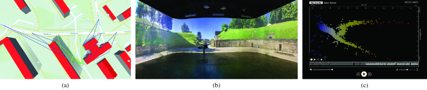
A low-cost alternative for physical environments are virtual environments, which are most commonly enabled through head-mounted displays. An approach for an audiovisual display idiom in this type of environment is to let the user navigate the dataset in a first-person perspective and use spatialized sonification which dynamically changes depending on where the user is positioned in the dataset. An example is the design of Berger & Bill (see Figure 7(a)), which facilitates an immersive exploration of urban noise standards [BB19] by creating a virtual environment of a city where the sonification allows the user to listen to the collected noise levels by navigating the environment.
The use of touch displays and other tangible interfaces for an audiovisual display idiom can allow for a unified integration of the sonification and the visualization. A recurring approach is to use the visualization as a graphical user interface which enables the sonification upon interaction. Through a touch display, the design by Ferguson et al. [FBC12] enables the user to filter a line graph with multi-touch gestures to select what data should be sonified. As a more analog approach, the system Sonophenology by Ness et al. [NRL∗12] lets the user select areas on a printed color-coded paper map through fiducial markers, which in turn selects what information should be conveyed by the sonification.
About two thirds of the papers in the database include some form of interaction. One of the most recurring objectives of the interaction was to make a selection of the dataset that would be sonified [FBC12]. This can include selecting geographic regions which the dataset is attributed to [NRL∗12]. For example, the audiovisual display idiom of Matsubara et al. [MMU16] creates an interactive sonification system for exploration of seismic data through a horizontal and vertical range slider to specify a geographic region. Other forms of interaction include simpler tasks such as browsing sonifications of individual or groups of data objects [Rib19, LSB∗23]. Huppenkothen et al. [HPDW23] created an interactive multimedia version of the Hertzsprung-Russell Diagram, where a user can select individual data entries of the diagram to listen to their sonification. On the other hand, there also exist more complex forms of interactions such as navigating a 3D environment [BB19, JMP13, MNW∗18]. Papachristodoulou et al. [PBM15] created a design for navigating complex datasets of brain networks, where the sonification conveyed information of different brain regions of the dataset. Within the sonification community, it was the introduction of model-based sonification [Her02], that made user interaction an integral part of the data analysis process. An example of a model-based sonification is the Mode Explorer by Yang and Hermann [YH18], where scratching-interactions with a pencil on a scatter plot enables the user to investigate different modes and their properties through the sonification.
Discussion: When displaying an audiovisual display idiom on a target platform other than a desktop environment, it often creates opportunities for interacting with the system in a novel manner [EEBR21, HK22, NRL∗12, PBM15]. In the context of data analysis, interaction is also a particularly relevant part of the user experience [BBV16, Bea11, EEBR21, HK22].
3.10 Users and Goals
Just as with visualization-only designs, audiovisual display idioms are often developed toward specific users and end goals. The most commonly occurring goal for the papers in the database was data analysis. This could either be to present a dataset to the user or letting the user explore one or several datasets with the idiom, as described in subsection 3.2. The benefit of using visualization and sonification in this regard is that the user can gain different perspectives of the data through the two sensory modalities. For example, Alonso-Arevalo et al. [ASH∗12] created a multimodal interface for curve shapes and curvature, where the user can evaluate the quality of a three-dimensional shape by using both the visual and auditory, and in this case even their haptic perception. The curve shape was mapped to the fundamental frequency of different carrier sounds to offer different sound designs to convey the information.
The most recurring pair of users and goals in the database was data analysis for domain experts, which most commonly would involve an audiovisual display idiom to convey data in a specific application domain in the natural sciences. Temor et al. [TMN∗21] and MacDonald et al. [MNW∗18] created an auditory complement to a scientific visualization of computational fluid dynamics, where the sonification aided in understanding the temporal changes in the visual animation. Gionfrida at al. [GRK∗16] suggest to combine the visualization of brainscans (in the context of Alzheimer’s dementia research) with a parameter mapping sonification that they call Triple-Tone Sonification. The design makes use of the fact that the human ear will perceive the sound of two or more very similar frequencies as "frequency beating," which is also employed in [MAFP19a]. For the purpose of process execution data analysis, Hildebrandt et al. [HAR16] demonstrated how incorporating sound could enhance the process of identifying anomalies or conducting root cause analysis for irregularities and errors. A design for a more general user case was created by North et al. [NSC16], which created a an idiom to convey Git version control data. The temporal nature of the data lent itself well to be sonified by sequentially going through the data, where an earcon is played when a commit occurs, and drum sounds are played whenever a conflict occurs in the data.
The second most commonly occurring pair of users and goals was public engagement for the general public, where the use of an audiovisual display idiom has the potential to enable higher engagement by conveying information through both the visual and auditory modality. This would commonly be targeted towards popular science topics such as climate change [HK22, Bal15] and astronomy [HTHB22, TB23]. As previously mentioned in subsection 3.2, the work by Russo et al. [RS22] is an example of a sonification targeted towards the general public for public engagement, where the response of the resulting videos on social media were in part used as a metric for the public engagement of the design.
Discussion: Regarding the successful design of audiovisual idioms, actually supporting their users in analyzing data, it is most relevant to include them in the design process. Both the visualization community and the sonification community have individually studied the relevance of including domain experts in their design process [SMM12, Gou17], and the same will be necessary for the integration of sonification and visualization. The co-author network shown in Figure 9 displays quite many domain experts being collaborators in the surveyed literature, which can be regarded as a promising sign in general.
4 Survey Data Analyses
So far, we have focused on the discussion of the audiovisual idiom designs themselves. In this section, we want to take an even broader perspective on the collected data. We will study existing relationships between different tags along a correlation matrix in subsection 4.1, as well as the network of co-authors and its implication for the field in subsection 4.2.
4.1 Correlation Matrix Analysis
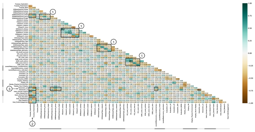
To understand potential relationships between different tags within our classification, we computed a correlation matrix, shown in Figure 8. We want to highlight some of the found correlations in the data. Note that overall most of the correlations are close to zero and are most likely not significant. Also, some of the higher correlation values that can be found in the matrix are very likely not significant, due to the low amount of data for these tags (e.g., the AP evaluation, which has been used in only two papers). Therefore, we only discuss correlations that are plausible and most relevant to the bigger picture.
Close to the main diagonal of the correlation matrix we highlighted four smaller matrices (1), showing an interesting phenomenon: Whenever the tagging of the papers was done individually for the visualization and the sonification parts, the two were mostly tagged with the same label. Hence, the visualizations and the sonification, in many cases, use the same reading levels [Ber83], the same search levels [Mun15], the same dataset types, and the same levels of measurement. This finding can motivate future research regarding the reading levels and the search levels. Studies could investigate the potentials of other distributions of the reading level onto the senses.
Marked with (2), we highlighted four phenomena concerning the purpose of an audiovisual idiom. Idioms designed to present rather than explore data are likely to also use the reading level “whole” for their sonification (). On the other hand, idioms that are designed for exploration, likely use the group reading level (). We see a correlation between the purpose of an idiom and its interactivity, with idioms for exploration more likely to be interactive (), and idioms for presentation more likely not to be interactive (). Also, domain experts use more idioms for exploration (), while the general public is more likely to be ‘just’ presented with data (), going hand in hand with their general goals of data analysis () or public engagement ().
Two more relationships with the interaction tag emerge form the correlation matrix (3). A sonification that uses the reading levels of “group” or “single,” is likely to offer user interaction ( and ), while a sonification with the reading level of “whole” usually does not offer user interaction (). Furthermore, designs that map data to the senses in a complementary way are more likely to offer interaction to their users ().
4.2 Co-Author Network and Development Over Time
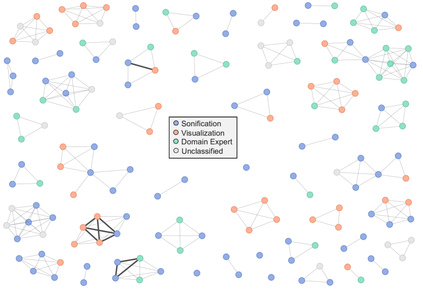
As part of our meta analyses, we studied the co-author network within our database. Each node in the co-author network represents an author with a total of 165 nodes (in 48 teams), and a link connects two nodes if the corresponding authors have collaboratively contributed to a publication. The thickness of the links is proportional to the number of publications shared between the respective authors. We assign a color to each node using the primary discipline of the author. We classify each author, to the best of our abilities, into one of four disciplines: sonification, visualization, domain, and unclassified. For each author, we consider their main publication focus particularly around the time of their contribution to the works in our database, along with their background, education, and their role and input to the relevant papers. Authors classified under “domain” are recognized as domain experts and the category “unclassified” encompasses scenarios where the author’s primary discipline does not fall into any of the other three categories, the author is in the early stages of their career without a defined research focus, or that the information about the author is not available.
The network offers several insights into the structure of the field. The majority of co-author teams are individual teams without interconnections. Only in four cases have authors collaborated with different (groups of) co-authors, usually because one person worked with different collaborators. This phenomenon differs from networks in other fields, such as the one described in a recent STAR on the use of embeddings in Visual Analytics [HWKK23], showing a network with clusters up to the size of 75 authors (note that the STAR on embeddings has 122 entries). We interpret the dominance of many disjoint groups as a sign for the rather young field and hope, with this STAR, to contribute to the future development of the field growing closer together. We identified 14 teams or individual authors contributing to the field that have only sonification experts on their team. Two of the teams consist exclusively of visualization researchers and 21 of the teams are collaborations between the communities, also including domain experts many times. The inclusion of domain experts and the quite large number of diverse groups also including domain experts can be considered a promising sign for the future development of the field.
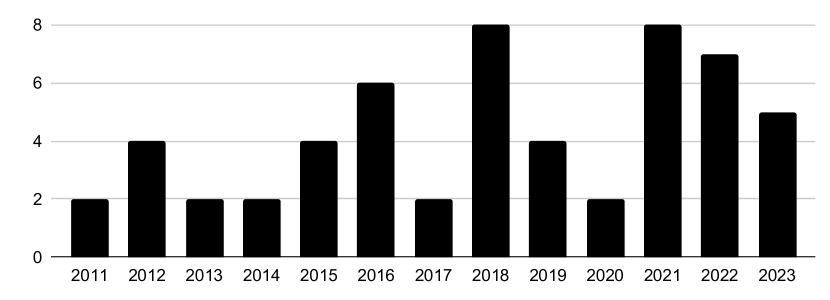
During the years 2011 and 2023, overall, 57 papers were published. Figure 10 displays the majority of papers being published in the second half of this time span, pointing towards a generally increasing trend. The drop in publications in the year 2020 is likely a phenomenon related to the COVID-19 pandemic, being dominant worldwide especially during the year 2020.
5 Adjacent Topics
As mentioned earlier, three distinct topics are adjacent to the scope of our STAR: audiovisual idioms in the context of accessibility, real-time monitoring, and arts. Although the three areas are related, they might be better served by a different classification system than the one we used. Still, they are relevant and can be inspirational for our field. The following three sections present work from those adjacent fields that have been curated by our team of co-authors. The sections do not claim completeness or the usage of a systematic approach but are indented as a general introduction for the interested reader.
5.1 Accessibility
Even though visualization is one of the most common ways of communicating data, many visualizations are inaccessible to readers with visual impairments. Some studies have suggested the use of sonification to support readers with visual impairments. During the filtering and classification of the assembled literature, a category emerged exploring sonification for accessibility of visualization. The literature that was sorted into this category focused on the design and evaluation of sonification to improve accessibility of visualizations for visually impaired people. As the literature in this category was not exploring integrated audiovisual representations for data analysis in general, but rather using sonification as a support tool, these are not included in the systematic part of our STAR.
Sonification for accessibility in this way often suggests sonification designs leaning towards auditory graphs. Auditory graphs are the auditory equivalent to visual representations, such as plots, graphs, and charts [HHN11], but instead of mapping data properties to line positions or the size of an area, they are mapped to various auditory parameters such as pitch or loudness. Auditory graphs are suggested to be useful as sensory substitution and as a means of presenting information when line of sight is not possible [SNH05], and using sound to represent data might make data analysis more accessible [WM10]. To give the reader a brief introduction to this category, here are a few recent studies that have explored sonification for accessibility in visualization.
One study explored the accessibility of data visualizations presenting data to blind and visually impaired users [FFSR∗23]. It was found that sonification might make discerning trends in the data more accessible, but also that the lack of experience in using sonification could lead to misinterpretations of the presented data. The study was conducted using screen readers, and the users often used alt-text information to support and validate what was heard through the sonification. Another study explored the use of natural sounds mapped to data visualizations, bar charts, and line charts [HEUHEB23]. The reason for using natural sounds was to support users without musical training in understanding the sonification and auditory graph, and it was found that these natural sounds could support the understanding of categorical data and were most useful for users without musical training. Infographics, the combination of visualization and text information, has been explored with an auditory-only approach [HGI∗22]. An interactive approach, infosonic, was explored to facilitate accessibility of data to blind and low-vision users, using spoken introduction and annotation, and non-speech sonification. The study shows that the sonification approach supported understanding and forming a mental image of the data. Even if only a few studies have been introduced in this text there are more studies on sonification and accessibility, and this is important for individuals who are blind or of low vision to have equitable access to data, news, and information.
Often accessibility studies tend to blend sonification, i.e., non-speech sounds, with generated speech or screen readers. This makes the interpretation of the results from these studies somewhat challenging. The findings, i.e., the experiences and the understanding of the sonification, might be due to the sonification itself, or depending on other auditory stimuli used. Also, the visual representation, the user interaction, and user-interface are likewise of importance for the study outcome. In visual data analysis interaction is essential for exploring the data [CGM19], and similarly, for sonification to be a useful tool dynamic human interaction is necessary [HH04]. Nevertheless, sonification for accessibility of visualization for the visually impaired is an interesting approach. Some of these findings might suggest interesting approaches also for readers with normal or corrected to normal visual acuity in supporting visual perception with sonification [Rön19a, Rön19b], or reducing cognitive load [ZPR16] on the visual modality by sonification (see for example [MLS95]).
5.2 Monitoring
A comprehensive overview or a systematic literature review of audiovisual process monitoring is far beyond the scope of this report. Therefore, this section is intended to provide some insights into this research field and to distinguish the various scientific communities involved.
The combination of visual and auditory displays for process monitoring purposes has been well-established in real-world applications and interfaces. The audiovisual representation of Morse code for an exchange of information serves as an early example of a multi-modal monitoring display and interface. In supervising and controlling the states of various devices and processes, audiovisual interfaces combine the advantages of both modes: volatile alerting sound signals enhance situation awareness, while visual cues provide additional information about the situation, enabling users to take action. Implementations of audiovisual interfaces are ubiquitous in both professional and day-life environments. For instance, consider the warning beep, which can be heard, when the temperature outside your car drops below 4°C, alerting you to the possibility of slippery road conditions. A quick glance at the visual display will provide you with the exact temperature and the opportunity to decide whether to take action or not.
Besides the approaches to audiovisual data analysis described in the previous sections of this report, audiovisual monitoring interfaces play an integral role in various domains, including air traffic control [EBL∗23], control rooms [SFLD22, HHG∗12], anesthesia [AQH∗21, RMS∗22], neurology [LCS∗28], dermoscopy [WRK∗19], surgery [Zie23], network monitoring [Wor19a, AHvR∗21], automotive [JDS15, XWX∗22], to name a few.
During literature search for this STAR, several publications were labeled with the tag “monitoring”. After closer investigation, which involved excluding multiple publications written by identical authors on very similar topics, as well as publications addressing topics of accessibility and artistic media installations, only a relatively small representative subset of 14 findings qualifies for audiovisual process monitoring within the search criteria of this STAR.
The reasons for this rather limited number of retrieved articles in this category are manifold. Firstly, most research on monitoring applications used for auditory feedback of human behavior in the fields of sports, therapy, or rehabilitation focuses on the design, impact, and evaluation of interfaces that utilize the non-intrusive attributes of auditory displays, enabling users to perceive information without any interfering actions, such as adjusting their head or body position to view a visual display [SJMT19, VRGM20, MNS16]. While some of these interfaces include visualizations at a low scale level, they hardly qualify as audiovisual monitoring devices in terms of providing a balanced contribution from both modalities.
In industrial and surveillance contexts, which is another reason for the limited number of results in our search, factors such as cognitive workload, perception organization, situational awareness, alarm fatigue, and deafness play crucial roles in the successful implementation of infrastructures. However, these attributes are discussed in other scientific communities, including Human Factors and Applied Ergonomics, as well as several areas of medicine and health, particularly in anesthesia, rehabilitation, sports, and cognitive psychology. In addition to performance comparisons between auditory, visual, and audiovisual modalities [AG19], particular interest is given to the dual-task paradigm, which evaluates, for instance, the ability to identify an event requiring action in a secondary domain while simultaneously performing a primary task [LWP∗13, HHRM16, TML∗15, NGJW14].
(Non-)systematic literature reviews have been published in several of the mentioned areas [WMY∗17, KIK19, SMS21, HRM15]. To the best knowledge of the authors, no comprehensive STAR covering the entire spectrum of audiovisual or related multi-modal monitoring applications and approaches has been conducted thus far. However, there are some fundamental publications treating the specific attributes and criteria for research and development in the field, such as [Ibe20, Joh04, WS07].
5.3 Arts
During the classification of the corpus, an “art” category emerged, defining projects combining visualization and sonification for artistic purposes. We understand the emergence of art practices that intertwine sonification and visualization not only as inspiring for designers and audiences alike, but also relevant to the broader discourse around data representation towards a better, more efficient, and engaging human-data relationship.
Working with the literature, we understood artistic endeavors call for a different kind of classification than idioms intended for audiovisual data analysis. We decided to not include such contributions in the systematic part of this STAR even when they complied with the requirement of being published in an academic journal and dealing with the simultaneous combination of visualization and sonification. We excluded papers where authors made their intentions of an artistic contribution explicit in the paper.
Nevertheless, to give the reader a brief introduction to the field, we present representative cases of an emerging art category that could form the basis of future research on the integration of sonification and visualization. In addition to the artistic cases that emerged from our literature search, we use four more sources to curate a collection of representative cases for artistic endeavors: The Data Sonification Archive (DSA), the Computer Music Journal, the Leonardo Music Journal, and the Ars Electronica Festival. The Data Sonification Archive is an online crowd-sourced collection of data sonification projects. Out of 455 cases currently hosted in the DSA, three of the co-authors of this report recently categorized 139 cases as “art”, i.e., as having their primary purpose in creating and delivering an artistic experience to an audience [LLC23]. A preliminary search on some of the major venues for academic artistic publications – Computer Music Journal and Leonardo Music Journal – accounts for 182 and 118 cases respectively, in line with the volume of art-related cases in the Data Sonification Archive. A search of the archive of the renowned Ars Electronica Festival on projects that translate data into an audiovisual idiom returns 32 cases, again, in line with the 23 projects currently hosted on the DSA.
Typically, data-driven artworks that use an audiovisual design address a non-expert audience and can take different forms such as live performances, multimedia installations, video productions, or web experiences where the sonification and visualization of the same dataset are combined. The DSA classification highlights recurring topics such as climate change and/or the representation of environmental data; individual and collective interaction in the urban space; internet and social media. The predominance of socially relevant topics shows that the emerging art category presents borderline characteristics with the adjacent category (in the DSA classification system, see [LLC23]) of “public engagement”. This latter category identifies projects that, although being often presented in the form of an artistic experience, have explicitly and primarily the goal of increasing awareness – even fostering activism – among the general public, on a specific phenomenon.
This is the case for projects that present data related to climate change such as Klima|Anlage—Performing climate data [GHJ∗19], one of the cases identified as artistic in our literature search. In this work, climate data from 1950 to 2100 can be chosen by the listener for twelve selected regions of the world and interactively sonified and visualized in an immersive installation environment with the goal of contributing to “the urgent need to inform the general public about climate change”.
In Too Blue [Foo15], hosted on the DSA, the author created an audiovisual experience (in the form of a video) where music generated by tracking the land loss in coastal Louisiana over 78 years due to man-made levees, drilling and dredging for oil and gas, and climate change is combined with an aerial color-coded visual map that shows the increase in the “blues” colored areas, corresponding to the sea, in the coastal land of Louisiana. In Heat and the Heartbeat of the City [Pol06], the urgency to communicate climate change to the broader audience combines with a reflection on the urban space through the simultaneous sonification and visualization of actual and projected data on increased temperature in New York City. In aqua_forensic [SŠ18] data on invisible pollutants in the Danube river’s water, and the effect on its ecosystem, are collected, sonified, and visualized ‘to present the results of this scientific research to the wide audience in a poetic and artistic way’. Other prominent social issues such as personal data collection and privacy in the age of social media are at the center of multi-awarded art projects such as Digital Violence [FE21] where sonification is explicitly used to increase the audience’s engagement with the visualized dataset on the issue of illegal government surveillance practices. From the collective to the individual experience, projects such as Orbuculum [Ylm23] and Deep Sync [KOR23] invite the public to interactively engage with personal psychological and physiological dimensions to create an immersive auditory and visual experience. In a more-than-human perspective, works such as Spider Web Sonification [SQS∗20] and Biota Beats [KGS∗20] shift the focus from humans to other species in an effort to support the public engagement with science.
Data art can stimulate an “artistic affectivization” that can contribute to building shared perspectives within a community [BMLA22]. The engagement of the audience with the phenomenon behind the data, however, also implies an information and knowledge transfer [MVC∗10] i.e. the public has not only to connect emotionally with the data, but also understand their meaning. The emergence of a category of artistic projects that combine sonification and visualization with the explicit intent to activate the audience on a socially relevant issue shows that multimodal approaches have the potential to generate impact, not only for education and awareness but also for stimulating action.
6 Concluding Discussion and Future Work
In this STAR, we have provided an overview of the field of audiovisual idiom design tailored towards data exploration and presentation. We have used a variety of perspectives to classify the existing literature. For each of these categorizations, we also provide a brief discussion or reflection. In section 5, we offered insights into three topics that are adjacent to our report and can be highly inspirational for future developments. In the following section, we take a step back, adopt a global viewpoint, and discuss the broader insights, challenges, and exciting future research opportunities.
The culture of providing supplemental material: A thriving future for the field of audiovisual idiom design also depends on the communities’ culture when providing demos for their designs as supplemental material. Out of 57 articles in our surveyed literature, only 29 provided a demo that is still available today. Five provided a demo that is no longer available, and 23 provided no demo at all. Online repositories such as Zenodo, hosted by CERN, or long-term archives such as Phaidra, hosted by the University of Vienna, allow the upload of videos and even the assignment of DOIs. While making sound available in a paper used to be an explicit challenge to the sonification field, it is not the case anymore. An additional visual representation of the sound can also be included in the paper, using a spectrogram of the sound itself or an iconic representation of it.
Evaluating audiovisual idioms: It is often challenging to conduct systematic, well-informed, and above all, properly performed and reported evaluations of audiovisual idioms. Especially, when the goal is to compare different studies. As mentioned earlier, Rönnberg and Forsell suggested the standardization of questionnaires tailored to the field in order to increase the comparability between different studies [RF22]. Establishing this comparability is particularly difficult because the two senses are used simultaneously in an audiovisual display, and the evaluation methods must adapt to this characteristic of the design. Specifically, the existing methods focus on several aspects. One is user performance, which studies quantitative metrics such as task completion times and precision of responses. Another is user experience, which focuses more on qualitative metrics such as user engagement, and memorability. From the data we collected in our STAR, we can draw high-level conclusions regarding the type of evaluations that have been used within the corpus of literature.
Most of the papers in the systematic literature review used sonification to support the perception of the data visualization, some also aimed to provide additional information via the auditory channel complementing the visualization, and an additional few aimed for public engagement or facilitating multi-user analysis of the data. Among the papers that included a user evaluation, most reported a subjectively stated benefit of sonification in perceiving and interpreting the visualization. Some subjective ratings also suggested that the use of sonification was engaging, could provide emotional content, and was experienced as interesting or pleasant. Other papers also reported objective measurements of increased user performance when sonification and visualization were used in combination compared to visualization alone. This was shown in terms of higher scores or increased accuracy when sonification was used. However, this increase in accuracy was reported to be related to increased task completion times. Similar effects have also been shown in other studies not included in this systematic review [MBKSM16, Rön19a, Rön19b]. These results indicate that there is, in general, a benefit of combining visualization and sonification for data exploration and analysis, regardless of the specific visualization and/or sonification design. This benefit can be manifested in higher user engagement, increased user performance with higher scores or accuracy, or with more information conveyed to the user via both modalities. However, improvements in accuracy might come with the cost of increased task completion times. The case might be that the use of the additional information provided by sonification that makes the increased accuracy possible takes longer time to process and assess. While traditionally increased task completion times are considered a disadvantage, in some contexts this can be seen as positive. Slowing down the user resulting in them spending more time with their data, studying it from more and from different perspectives (including the auditory perspective), might reveal structures or patterns in a dataset, that would have stayed silent and unseen if analyzed with a conventional uni-modal display [HAS11].
The potential of unconventional task distribution: The data from our STAR shows that reading levels [Ber83] are not equally distributed to the two senses: The vast majority – 50 out of 57 papers used the reading level “whole” for their visualization (see Table 2), while only about half of the papers use the same reading level for their sonification parts. This observation might be directly related to the way audiovisual idioms distribute the tasks of overview and detail to the two senses. The currently more popular distribution seems to be to use visualization to display an overview of the data while sonification is employed to provide details. While this distribution seems like an intuitive choice, future research should study the potential of switching the roles between sonification and visualization. It is our daily lives and the way we experience the world around us, that suggests to sonify an overview and to visualize details. Our auditory sense constantly screens our 360° environment while our visual sense actively focuses on details in our environment. The field of auditory process monitoring makes use of exactly this situation when alerting us of a status, regardless of our current visual focus. Nevertheless, we identified only three cases where the reading level for the sonification was “whole” and the one for the visualization was “group” [DLVDCG22, FBC12, YH18].
A second phenomenon we observe in the data is that many audiovisual display idioms employ the same search level [Mun15] (see Figure 8) and most of them employ the search level of “explore” (see Table 2). Again, it seems like a fruitful future endeavor to study the opportunities of designs that explicitly break such a pattern.
The potential of integrating sonification and scientific visualization: Most articles in our database can be regarded as related to the field of information visualization, rather than scientific visualization. Scientific visualization typically displays inherently spatial phenomena and is often used to represent data that varies over time. The inherently spatio-temporal quality of such displays constitutes their potential to be integrated with sonification, as sonification is a display technique tailored toward temporal data structures [ERI∗23]. We relate this argument back to the real-world example from our introduction where the combination of our visual and our auditory senses offer a better understanding of a phenomenon than by each sense alone: Rain falling outside of a closed window. Opening the window, to not only see but also hear the sound of the rain gives us a better estimation of the amount and intensity of the rainfall. Abstractly, in such a situation we perceive a spatio-temporal phenomenon. It is most plausible that adding sound to a time series of scientific visualization can increase its holistic interpretability in an ecologically valid manner [Neu04]. This phenomenon is shown in two publications in the database, in the work by MacDonald et al. [MNW∗18], and the work by Temor et al. [TMN∗21]. Similarly, these ideas also apply to animations in information visualization where temporal aspects of the data might be visualized and sonified.
Design frameworks: When it comes to the possibilities to design audiovisual display idioms, most researchers, as well as most domain experts, will not be able to successfully develop their own designs. Interdisciplinary knowledge bridging visualization, sonification, interactive design, and human perception is necessary to design effective, engaging, and re-usable audiovisual display idioms. Therefore, we cannot expect a domain expert to be able to quickly draft a prototype the same way they may be able to do using established visualization-only frameworks such as matplotlib [Hun07].
In our database, we identified several design frameworks tackling this challenge [PC19, PCB23, LF21, DLVDCG22, KLTW17, CWM21]. Their primary focus is the design of the sonification part of the idiom, which is why we cannot speak of truly balanced contributions to both senses. A promising endeavor to enable truly balanced designs, with both the visualization and the sonification being equally well-informed, might be to not design them using one, but two separate frameworks, each specialized for its purpose. In this regard, the recent work by Reinsch and Hermann [HR21, RH22, RH23] is promising, as it provides a sonification design framework embedded in the Python environment and is conceptually inspired by visualization design tools such as matplotlib. With both the sonification design and the visualization design happening in the same environment, in this case, for example, a Jupyter Notebook, both can be developed with the required quality to meet their individual standards. Regarding the introduction of users to a new design environment, be it for visualization, sonification, or their combination, effective “onboarding” is a pressing issue. In the visualization community, the topic has been studied in recent years [SPA23, SWG∗23], and the same will be necessary for sonification, and audiovisual display idioms. Again, when it comes to sonification as a technique to display data, the prior experience of domain experts or the general public is low. This lack of experience can, in the short term, only be met with carefully designed onboarding processes.
Adjacent topics as inspiration to the field: Our brief look into the adjacent fields of monitoring, accessibility, and arts shows a special potential for inspiration for our communities’ future work. The field of monitoring offers established evaluation methods, that could potentially be adopted to support the evaluation of audiovisual idioms tailored towards exploratory data analysis. During our unstructured investigation into the field, we also identified the potential of a systematic STAR as a future contribution to the field of monitoring.
Also, the adjacent field of accessibility can inspire future research, where understanding the analysis patterns of visually impaired individuals can inform design decisions for idioms tailored towards sighted people [WM10]. While the field of accessibility can be informative to the field of audiovisual audiovisual display idioms, the same holds true the other way around. Especially the designs from our STAR that use a redundant mapping to both the visual and the auditory sense, which can inspire designs for visually impaired users. Furthermore, such designs have the potential to foster successful collaborative data analysis involving both sighted and blind users.
The identified artistic contributions show great potential to be inspirational to the field of audiovisual idiom design as well. In the future, effort should be made by the research community to develop a specific framework for the evaluation and analysis of audiovisual idioms at the crossing of art and public engagement to explore how specific design strategies (e.g., interactivity and embodiment, as used in many of the cases presented in subsection 5.3) can be combined to support both affect and sense-making. Again, a systematic STAR dedicated to the artistic perspective would be a highly timely contribution to the community.
An audiovisual analytics community: With this state-of-the-art report, we hope to contribute to the future establishment of systematic research on audiovisual display idiom design. The current development concerning the studied co-author network and the temporal development of publication numbers in the field is promising. We hope to reach researchers from both the – today often disjunct – visualization and sonification communities, inspiring them for future interdisciplinary collaborations, and to open their ears to take a look.
Supplemental Material
As supplemental material to this STAR, we provide:
-
•
corpus.bib and corpus.rdf: publication metadata of the surveyed literature in BibTeX and Zotero RDF format.
-
•
corpus-tagging.csv: a table holding the surveyed literature and all of the used tags. Interested readers may use the table to identify articles that fall into specific combinations of classes.
-
•
authors.csv: a table holding the names of the authors in our STAR corpus and their primary discipline. Interested readers may use it to identify potential future collaborators.
-
•
corrmat.pdf: a high-resolution version of Figure 8.
-
•
authornet.ows: the Orange Data Mining workflow file, used to generate the co-author network in Figure 9 (incl. the used color scheme file authornet_colorscheme.colors).
In addition, the corpus of relevant papers with tags, publication metadata and fulltext of open accesss work is available as a Zotero library at https://www.zotero.org/groups/integrationsonificationvisualization/items.
Acknowledgments
We would like to thank PerMagnus Lindborg, School of Creative Media, City University of Hong Kong, for valuable feedback. This research was funded in part by the Austrian Science Fund (FWF): P33531-N and the Gesellschaft für Forschungsförderung Niederösterreich (GFF) SC20-006, as well as by the Knut and Alice Wallenberg Foundation (grant KAW 2019.0024).
References
- [AG17] Andreopoulou A., Goudarzi V.: Reflections on the representation of women in the International Conferences on Auditory Displays (ICAD). In Proceedings of the 23rd International Conference on Auditory Display (ICAD 2017) (Pennsylvania State University, June 2017), Georgia Institute of Technology, pp. 43–48. doi:10.21785/icad2017.031.
- [AG19] Audry E., Garcia J.: Congruent audio-visual alarms for supervision tasks. In Proceedings of the 25th International Conference on Auditory Display (ICAD 2019) (Newcastle upon Tyne, June 2019), Department of Computer and Information Sciences, Northumbria University, pp. 7–11. doi:10.21785/icad2019.022.
- [AG21] Andreopoulou A., Goudarzi V.: Sonification first: The role of icad in the advancement of sonification-related research. In Proceedings of the 26th International Conference on Auditory Display (June 2021), Georgia Institute of Technology, pp. 65–73. URL: http://hdl.handle.net/1853/66335.
- [AHvR∗21] Axon L., Happa J., van Rensburg A. J., Goldsmith M., Creese S.: Sonification to support the monitoring tasks of security operations centres. IEEE Transactions on Dependable and Secure Computing 18, 3 (2021), 1227–1244. doi:10.1109/TDSC.2019.2931557.
- [AJB∗18] Arbon R. E., Jones A. J., Bratholm L. A., Mitchell T., Glowacki D. R.: Sonifying stochastic walks on biomolecular energy landscapes. In Proc. 24th International Conference on Auditory Display (ICAD 2018) (Michigan Technological University, June 2018), Georgia Institute of Technology, pp. 232–239. doi:10.21785/icad2018.032.
- [AK11] Adhitya S., Kuuskankare M.: The sonified urban masterplan (sum) tool: Sonification for urban planning and design. In Proc. 17th International Conference on Auditory Display (ICAD-2011) (Budapest, Hungary, June 2011). http://hdl.handle.net/1853/51918.
- [AQH∗21] Andrade E., Quinlan L., Harte R., Byrne D., Fallon E., Kelly M., Casey S., Kirrane F., O’Connor P., O’Hora D., Scully M., Laffey J., Pladys P., Beuchée A., ÓLaighin G.: Augmenting critical care patient monitoring using wearable technology: Review of usability and human factors. JMIR Human Factors 8, 2 (2021), e16491. doi:10.2196/16491.
- [ASH∗12] Alonso-Arevalo M. A., Shelley S., Hermes D., Hollowood J., Pettitt M., Sharples S., Kohlrausch A.: Curve shape and curvature perception through interactive sonification. ACM Trans. Appl. Percept. 9, 4 (Oct. 2012). doi:10.1145/2355598.2355600.
- [Bal15] Ballora M.: Two examples of sonification for viewer engagement: Hurricanes and squirrel hibernation cycles. In Proc. 21st International Conference on Auditory Display (ICAD-2015) (Graz, Austria, July 2015), Georgia Institute of Technology, pp. 300–301. http://hdl.handle.net/1853/54172.
- [Bar97] Barrass S.: Auditory Information Design. PhD thesis, Australian National University, Canberra, 1997.
- [Bar12] Barrass S.: The aesthetic turn in sonification towards a social and cultural medium. AI & Society 27, 2 (May 2012), 177–181. doi:10.1007/s00146-011-0335-5.
- [BB19] Berger M., Bill R.: Combining vr visualization and sonification for immersive exploration of urban noise standards. Multimodal Technologies and Interaction 3, 2 (May 2019), 34:1–34:15. doi:10.3390/MTI3020034.
- [BBV16] Ballweg H., Bronowska A. K., Vickers P.: Interactive sonification for structural biology and structure-based drug design. In Proceedings of ISon 2016, 5th Interactive Sonification Workshop, CITEC, Bielefeld University (Bielefeld, Germany, 2016).
- [Bea11] Bearman N.: Using sound to represent uncertainty in future climate projections for the united kingdom. In Proc. 17th International Conference on Auditory Display (ICAD-2011) (Budapest, Hungary, June 2011). http://hdl.handle.net/1853/51922.
- [Ber83] Bertin J.: Semiology of Graphics: Diagrams Networks Maps. University of Wisconsin, Madison, 1983. Originally published in 1967 in French.
- [BF12] Bearman N., Fisher P. F.: Using sound to represent spatial data in arcgis. Computers & Geosciences 46 (Sept. 2012), 157–163. doi:10.1016/j.cageo.2011.12.001.
- [BM13] Brehmer M., Munzner T.: A multi-level typology of abstract visualization tasks. IEEE Trans. Visualization and Computer Graphics 19, 12 (2013), 2376–2385. doi:10.1109/TVCG.2013.124.
- [BM20] Bouchara T., Montès M.: Immersive sonification of protein surface. In 2020 IEEE Conference on Virtual Reality and 3D User Interfaces Abstracts and Workshops (VRW) (Mar. 2020), pp. 380–383. doi:10.1109/VRW50115.2020.00082.
- [BMLA22] Buening R., Maeda T., Liew K., Aramaki E.: Between fact and fabrication: How visual art might nurture environmental consciousness. Frontiers in Psychology 13 (2022). doi:10.3389/fpsyg.2022.925843.
- [BPS06] Bertini E., Plaisant C., Santucci G. (Eds.): Proceedings of the 2006 AVI workshop on BEyond time and errors: novel evaluation methods for information visualization. ACM, 2006. doi:10.1145/1168149.
- [BTB23] Bru E., Trautner T., Bruckner S.: Line Harp: Importance-driven sonification for dense line charts. In Proceedings of IEEE Visualization and Visual Analytics (VIS) 2023 – Short Papers (2023), pp. 186–190. arXiv:2307.16589, doi:10.1109/VIS54172.2023.00046.
- [CB17] Chabot S., Braasch J.: An immersive virtual environment for congruent audio-visual spatialized data sonifications. In Proc. 23rd International Conference on Auditory Display (ICAD–2017) (Pennsylvania State University, June 2017), Georgia Institute of Technology, pp. 203–210. doi:10.21785/icad2017.072.
- [CGM19] Ceneda D., Gschwandtner T., Miksch S.: A review of guidance approaches in visual data analysis: A multifocal perspective. Computer Graphics Forum 38, 3 (2019), 861–879. doi:10.1111/cgf.13730.
- [CLR22] Caiola V., Lenzi S., Riccò D.: Audiovisual sonifications: A design map for multisensory integration in data representation. In DRS2022: Bilbao (2022). doi:10.21606/drs.2022.380.
- [CMS99] Card S. K., Mackinlay J. D., Shneiderman B. (Eds.): Readings in Information Visualization: Using Vision to Think. Morgan Kaufmann, San Francisco, 1999.
- [CWM21] Cantrell S. J., Walker B. N., Moseng Ø.: Highcharts sonification studio: An online, open-source, extensible, and accessible data sonification tool. In Proc. 26th International Conference on Auditory Display (ICAD 2021) (Virtual Conference, June 2021), Georgia Institute of Technology, pp. 210–216. doi:10.21785/icad2021.005.
- [DB13] Dubus G., Bresin R.: A Systematic Review of Mapping Strategies for the Sonification of Physical Quantities. PLoS ONE 8, 12 (2013), e82491. doi:10.1371/journal.pone.0082491.
- [dC07] de Campo A.: Toward a data sonification design space map. In Proceedings of the 13th International Conference on Auditory Display (2007), pp. 342–347. URL: http://hdl.handle.net/1853/50042.
- [DCM∗18] Du M., Chou J.-K., Ma C., Chandrasegaran S., Ma K.-L.: Exploring the role of sound in augmenting visualization to enhance user engagement. In 2018 IEEE Pacific Visualization Symposium (PacificVis) (Kobe, Apr. 2018), IEEE, pp. 225–229. doi:10.1109/PacificVis.2018.00036.
- [DLVDCG22] De La Vega G., Dominguez L. M. E., Casado J., García B.: Sonouno web: An innovative user centred web interface. In HCI International 2022 – Late Breaking Posters (Cham, 2022), Stephanidis C., Antona M., Ntoa S., Salvendy G., (Eds.), Communications in Computer and Information Science, Springer Nature Switzerland, pp. 628–633. doi:10.1007/978-3-031-19679-9_79.
- [EBL∗23] Elmquist E., Bock A., Lundberg J., Ynnerman A., Rönnberg N.: SonAir: the design of a sonification of radar data for air traffic control. Journal on Multimodal User Interfaces 17, 3 (2023), 137–149. doi:10.1007/s12193-023-00404-x.
- [EEBR21] Elmquist E., Ejdbo M., Bock A., Rönnberg N.: Openspace sonification: Complementing visualization of the solar system with sound. In Proc. 26th International Conference on Auditory Display (ICAD 2021) (Virtual Conference, June 2021), International Community for Auditory Display, pp. 135–142. doi:10.21785/icad2021.018.
- [ERI∗22a] Enge K., Rind A., Iber M., Höldrich R., Aigner W.: Towards multimodal exploratory data analysis: Soniscope as a prototypical implementation. In Proc. 24th Eurographics Conference on Visualization (EuroVis 2022) - Short Papers (Rome, 2022), The Eurographics Association, pp. 67–71. doi:10.2312/evs.20221095.
- [ERI∗22b] Enge K., Rind A., Iber M., Höldrich R., Aigner W.: Towards Multimodal Exploratory Data Analysis: SoniScope as a Prototypical Implementation. In EuroVis 2022 - Short Papers (2022), Agus M., Aigner W., Hoellt T., (Eds.), The Eurographics Association, pp. 67–71. doi:10.2312/evs.20221095.
- [ERI∗23] Enge K., Rind A., Iber M., Höldrich R., Aigner W.: Towards a unified terminology for sonification and visualization. Journal on Personal and Ubiquitous Computing 27 (2023), 1949–1963. doi:10.1007/s00779-023-01720-5.
- [FBC12] Ferguson S., Beilharz K., Calò C. A.: Navigation of interactive sonifications and visualisations of time-series data using multi-touch computing. Journal on Multimodal User Interfaces 5, 3 (May 2012), 97–109. doi:10.1007/s12193-011-0075-3.
- [FE21] Forensic Architecture, Eno B.: Digital violence, 2021. Webpage: https://sonification.design/#DigitalViolence. Last accessed: Dec 21st 2023.
- [FFSR∗23] Fan D., Fay Siu A., Rao H., Kim G. S.-H., Vazquez X., Greco L., O’Modhrain S., Follmer S.: The accessibility of data visualizations on the web for screen reader users: Practices and experiences during covid-19. ACM Transactions on Accessible Computing 16, 1 (2023), 1–29.
- [FN18] Fitzpatrick J., Neff F.: Stream segregation: Utilizing harmonic variance in auditory graphs. In Proc. 15th Sound and Music Computing Conference (SMC2018) (Limassol, Cyprus, 2018), Zenodo, pp. 52–59. doi:10.5281/zenodo.1422501.
- [Foo15] Foo B.: Too Blue, 2015. Webpage: https://sonification.design/#TooBlue. Last accessed: Dec 21st 2023.
- [FPS∗21] Franconeri S. L., Padilla L. M., Shah P., Zacks J. M., Hullman J.: The science of visual data communication: What works. Psychological Science in the public interest 22, 3 (2021), 110–161.
- [Fri08] Friendly M.: A Brief History of Data Visualization. In Handbook of Data Visualization, Chen C.-h., Härdle W., Unwin A., (Eds.), Springer Handbooks Comp.Statistics. Springer, Berlin, Heidelberg, 2008, pp. 15–56. doi:10.1007/978-3-540-33037-0_2.
- [Fry05] Frysinger S. P.: A brief history of auditory data representation to the 1980s. In Proceedings of the International Conference on Auditory Display (2005). URL: http://hdl.handle.net/1853/50089.
- [GDAS∗18] Gune A., De Amicis R., Simões B., Sanchez C. A., Demirel H. O.: Graphically hearing: Enhancing understanding of geospatial data through an integrated auditory and visual experience. IEEE Computer Graphics and Applications 38, 4 (July 2018), 18–26. doi:10.1109/MCG.2018.042731655.
- [GH12] Grond F., Hermann T.: Singing function: Exploring auditory graphs with a vowel based sonification. Journal on Multimodal User Interfaces 5, 3-4 (May 2012), 87–95. doi:10.1007/s12193-011-0068-2.
- [GHJ∗19] Groß-Vogt K., Hermann T., Jury M. W., Steiner A. K., Kartadinata S.: Klima|Anlage—performing climate data. In Addressing the Challenges in Communicating Climate Change Across Various Audiences, Leal Filho W., Lackner B., McGhie H., (Eds.). Springer, Cham, 2019, pp. 339–355. doi:10.1007/978-3-319-98294-6_21.
- [GKW21] Groppe S., Klinckenberg R., Warnke B.: Sound of databases: Sonification of a semantic web database engine. Proc. VLDB Endow. 14, 12 (July 2021), 2695–2698. doi:10.14778/3476311.3476322.
- [Gou17] Goudarzi V.: Systematic Procedure to Develop Sonifications. PhD thesis, University of Music and Performing Arts Graz, 2017.
- [GR11] Gomez I., Ramirez R.: A data sonification approach to cognitive state identification. In Proc. 17th International Conference on Auditory Display (ICAD-2011) (Budapest, Hungary, June 2011). http://hdl.handle.net/1853/51569.
- [GRK∗16] Gionfrida L., Roginska A., Keary J., Mohanraj H., Friedman K. P.: The triple tone sonification method to enhance the diagnosis of alzheimer’s dementia. In Proc. 22nd International Conference on Auditory Display (ICAD–2016) (Canberra, Australia, July 2016). doi:10.21785/icad2016.023.
- [HAR16] Hildebrandt T., Amerbauer F., Rinderle-Ma S.: Combining sonification and visualization for the analysis of process execution data. In 2016 IEEE 18th Conference on Business Informatics (CBI) (Aug. 2016), vol. 02, pp. 32–37. doi:10.1109/CBI.2016.47.
- [HAS11] Hullman J., Adar E., Shah P.: Benefitting InfoVis with visual difficulties. IEEE Transactions on Visualization and Computer Graphics 17, 12 (Dec. 2011), 2213–2222. doi:10.1109/TVCG.2011.175.
- [HCTP14] Holtzman B., Candler J., Turk M., Peter D.: Seismic sound lab: Sights, sounds and perception of the earth as an acoustic space. In Sound, Music, and Motion (Cham, 2014), Aramaki M., Derrien O., Kronland-Martinet R., Ystad S., (Eds.), Lecture Notes in Computer Science, Springer International Publishing, pp. 161–174. doi:10.1007/978-3-319-12976-1_10.
- [Her02] Hermann T.: Sonification for Exploratory Data Analysis. PhD thesis, Bielefeld University, Bielefeld, Germany, 02 2002.
- [Her08] Hermann T.: Taxonomy and definitions for sonification and auditory display. In Proceedings of the 14th International Conference on Auditory Display (2008). URL: http://hdl.handle.net/1853/49960.
- [Her20] Herrmann V.: Visualizing and sonifying how an artificial ear hears music. In Proceedings of the NeurIPS 2019 Competition and Demonstration Track (Dec. 2020), Escalante H. J., Hadsell R., (Eds.), vol. 123 of Proceedings of Machine Learning Research, PMLR, pp. 192–202. https://proceedings.mlr.press/v123/herrmann20a.html.
- [HEUHEB23] Hoque M. N., Ehtesham-Ul-Haque M., Elmqvist N., Billah S. M.: Accessible data representation with natural sound. In Proceedings of the 2023 CHI Conference on Human Factors in Computing Systems (2023), pp. 826:1–826:19. doi:10.1145/3544548.3581087.
- [HGI∗22] Holloway L. M., Goncu C., Ilsar A., Butler M., Marriott K.: Infosonics: Accessible infographics for people who are blind using sonification and voice. In Proceedings of the 2022 CHI Conference on Human Factors in Computing Systems (2022), pp. 480:1–480:13. doi:10.1145/3491102.3517465.
- [HH04] Hunt A., Hermann T.: The importance of interaction in sonification. In Proc. of the 10th Meeting of the International Conference on Auditory Display (ICAD 2004) (Sydney, Australia, 2004), pp. 1–8.
- [HHG∗12] Höferlin B., Höferlin M., Goloubets B., Heidemann G., Weiskopf D.: Auditory support for situation awareness in video surveillance. In Proceedings of the 18th International Conference on Auditory Display, (Atlanta, GA, USA,, June 2012), Georgia Institute of Technology, pp. 156–163. URL: http://hdl.handle.net/1853/44426.
- [HHN11] Hermann T., Hunt A., Neuhoff J. G. (Eds.): The Sonification Handbook. Logos, Bielefeld, 2011.
- [HHRM16] Hildebrandt T., Hermann T., Rinderle-Ma S.: Continuous sonification enhances adequacy of interactions in peripheral process monitoring. International Journal of Human-Computer Studies 95 (2016), 54–65. doi:10.1016/j.ijhcs.2016.06.002.
- [HK22] Han Y. C., Khanduja A.: The future is red: Visualizing wildfire predictions using contactless interaction. In Extended Abstracts of the 2022 CHI Conference on Human Factors in Computing Systems (New York, NY, USA, 2022), CHI EA ’22, Association for Computing Machinery. doi:10.1145/3491101.3519903.
- [HPDW23] Huppenkothen D., Pampin J., Davenport J. R. A., Wenlock J.: The sonified hertzsprung-russell diagram. In Proc. 28th International Conference on Auditory Display (ICAD 2023) (Norrköping, Sweden, June 2023), Georgia Institute of Technology, pp. 272–279. doi:10.21785/icad2023.6263.
- [HR21] Hermann T., Reinsch D.: Sc3nb: A Python-SuperCollider Interface for Auditory Data Science. In Proceedings of the 16th International Audio Mostly Conference (New York, NY, USA, Oct. 2021), AM ’21, Association for Computing Machinery, pp. 208–215. doi:10.1145/3478384.3478401.
- [HRM15] Hildebrandt T., Rinderle-Ma S.: Server sounds and network noises. In Cognitive Infocommunications (CogInfoCom), 2015 6th IEEE International Conference on (2015), IEEE, pp. 45–50.
- [HTHB22] Harrison C., Trayford J., Harrison L., Bonne N.: Audio universe: Tour of the solar system. Astronomy & Geophysics 63, 2 (Apr. 2022), 2.38–2.40. doi:10.1093/astrogeo/atac027.
- [Hun07] Hunter J. D.: Matplotlib: A 2d graphics environment. Computing in Science & Engineering 9, 3 (2007), 90–95. doi:10.1109/MCSE.2007.55.
- [HWKK23] Huang Z., Witschard D., Kucher K., Kerren A.: VA + Embeddings STAR: A State-of-the-Art Report on the Use of Embeddings in Visual Analytics. Computer Graphics Forum 42, 3 (2023), 539–571. doi:10.1111/cgf.14859.
- [Ibe20] Iber M.: Auditory display in workspace environments. In Foundations in Sound Design for Embedded Media: A Multidisciplinary Approach, Filimowicz M., (Ed.). Routledge, 2020, pp. 131–154.
- [IIC∗13] Isenberg T., Isenberg P., Chen J., Sedlmair M., Möller T.: A systematic review on the practice of evaluating visualization. IEEE Trans. Visualization and Computer Graphics 19, 12 (2013), 2818–2827. doi:10.1109/TVCG.2013.126.
- [JDS15] Jakus G., Dicke C., Sodnik J.: A user study of auditory, head-up and multi-modal displays in vehicles. Applied Ergonomics 46 (2015), 184–192. doi:10.1016/j.apergo.2014.08.008.
- [JMP13] Joliat N., Mayton B., Paradiso J. A.: Spatialized anonymous audio for browsing sensor networks via virtual worlds. In Proc. 19th International Conference on Auditory Display (ICAD2013) (Lodz, Poland, July 2013), Georgia Institute of Technology, pp. 67–75. http://hdl.handle.net/1853/51643.
- [Joh04] Johannsen G.: Auditory displays in human-machine interfaces. Proceedings of the IEEE 92, 4 (2004), 742–758. doi:10.1109/JPROC.2004.825905.
- [KAV21] Kariyado Y., Arevalo C., Villegas J.: Auralization of three-dimensional cellular automata. In Artificial Intelligence in Music, Sound, Art and Design (Cham, 2021), Romero J., Martins T., Rodríguez-Fernández N., (Eds.), Lecture Notes in Computer Science, Springer International Publishing, pp. 161–170. doi:10.1007/978-3-030-72914-1_11.
- [KGS∗20] Kim C., Guo A., Salhotra G., Sprinkhuizen S., Shetty K., Kong D. S.: Sonifying data from the human microbiota: Biota beats. Computer Music Journal 44, 1 (Mar. 2020), 51–70. doi:10.1162/comj_a_00552.
- [KIK19] Kanev I. K., Iliev I. T., Krasteva V. T.: Sonification – an alternative presentation of the electrocardiogram: A systematic literature review. In 2019 IEEE XXVIII International Scientific Conference Electronics (ET) (2019), IEEE, pp. 1–4. doi:10.1109/ET.2019.8878650.
- [KLTW17] Kondak Z., Liang T. A., Tomlinson B., Walker B. N.: Web sonification sandbox - an easy-to-use web application for sonifying data and equations. In Proc. Web Audio Conference WAC-2017 (London, UK, Aug. 2017). https://qmro.qmul.ac.uk/xmlui/handle/123456789/26083.
- [KOR23] Kiesenhofer S., Oelsch A., Rammer D.: Deep sync, 2023. Webpage: https://ars.electronica.art/futurelab/en/projects-deep-sync/. Last accessed: Dec 28st 2023.
- [Kra94] Kramer G. (Ed.): Auditory Display: Sonification, Audification and Auditory Interfaces. Proceedings of the First International Conference on Auditory Display (ICAD) 1992. Addison-Wesley, Reading, Mass, 1994.
- [KWB∗99] Kramer G., Walker B., Bonebright T., Cook P., Flowers J. H., Miner N., Neuhoff J., et al.: Sonification Report: Status of the Field and Research Agenda. Report for the NSF, International Community for Auditory Display, 1999. URL: http://www.icad.org/websiteV2.0/References/nsf.html.
- [LCS∗28] Lin J.-W., Chen W., Shen C.-P., Chiu M.-J., Kao Y.-H., Lai F., Zhao Q., Cichocki A.: Visualization and sonification of long-term epilepsy electroencephalogram monitoring. Journal of Medical and Biological Engineering 38, 6 (2028), 943–952. doi:10.1007/s40846-017-0358-6.
- [Len21] Lenzi S.: The Design of Data Sonification. Design Processes, Protocols and Tools Grounded in Anomaly Detection. PhD thesis, Politecnico di Milano, 2021. https://www.politesi.polimi.it/handle/10589/177079.
- [LF21] Lindetorp H., Falkenberg K.: Sonification for everyone everywhere: Evaluating the webaudioxml sonification toolkit for browsers. In Proc. 26th International Conference on Auditory Display (ICAD 2021) (Virtual Conference, June 2021), Georgia Institute of Technology, pp. 15–21. http://hdl.handle.net/1853/66351.
- [LLC23] Lindborg P., Lenzi S., Chen M.: Climate data sonification and visualization: An analysis of topics, aesthetics, and characteristics in 32 recent projects. Frontiers in Psychology 13 (2023). doi:10.3389/fpsyg.2022.1020102.
- [LLW21] Lyu Z., Li J., Wang B.: Aiive: Interactive visualization and sonification of neural networks in virtual reality. In 2021 IEEE International Conference on Artificial Intelligence and Virtual Reality (AIVR) (Nov. 2021), pp. 251–255. doi:10.1109/AIVR52153.2021.00057.
- [LSB∗23] Lemmon E., Schedel M., Bilkhu I., Zhu H., Escobar L., Aumoithe G.: Mapping in the emergency: Designing a hyperlocal and socially conscious sonified map of covid-19 in suffolk county, new york. In Proceedings of ISon 2022, 7th Interactive Sonification Workshop, BSCC, University of Bremen (Jan. 2023), Zenodo. doi:10.5281/ZENODO.7552257.
- [LWP∗13] Lu S. A., Wickens C. D., Prinet J. C., Hutchins S. D., Sarter N., Sebok A.: Supporting interruption management and multimodal interface design: Three meta-analyses of task performance as a function of interrupting task modality. Human Factors 55, 4 (2013), 697–724. doi:10.1177/0018720813476298.
- [MAFP19a] Malikova E., Adzhiev V., Fryazinov O., Pasko A.: Visual-auditory representation and analysis of molecular scalar fields. In Proc. EUROGRAPHICS 2019 (2019), pp. 25–26. doi:10.2312/egp.20191051.
- [MAFP19b] Malikova E., Adzhiev V., Fryazinov O., Pasko A.: Visual-auditory volume rendering of scalar fields. In Proc. 25th International Conference on Auditory Display (ICAD 2019) (Northumbria University, June 2019), vol. 147–154, Georgia Institute of Technology. http://hdl.handle.net/1853/61517.
- [MBKSM16] Metatla O., Bryan-Kinns N., Stockman T., Martin F.: Sonification of reference markers for auditory graphs: Effects on non-visual point estimation tasks. PeerJ Computer Science 2 (2016), e51.
- [ML17] McNabb L., Laramee R. S.: Survey of Surveys (SoS) - Mapping The Landscape of Survey Papers in Information Visualization. Computer Graphics Forum 36, 3 (2017), 589–617. doi:10.1111/cgf.13212.
- [MLS95] Mousavi S. Y., Low R., Sweller J.: Reducing cognitive load by mixing auditory and visual presentation modes. Journal of educational psychology 87, 2 (1995), 319.
- [MMM18] Maçãs C., Martins P., Machado P.: Consumption as a rhythm: A multimodal experiment on the representation of time-series. In 2018 22nd International Conference Information Visualisation (IV) (July 2018), pp. 504–509. doi:10.1109/iV.2018.00093.
- [MMU16] Matsubara M., Morimoto Y., Uchide T.: Collaborative study of interactive seismic array sonification for data exploration and public outreach activities. In Proceedings of ISon 2016, 5th Interactive Sonification Workshop, CITEC, Bielefeld University (Bielefeld, Germany, 2016).
- [MNS16] Maculewicz J., Nilsson N. C., Serafin S.: An investigation of the effect of immersive visual and auditory feedback on rhythmic walking interaction. In Proceedings of the Audio Mostly 2016 (2016), AM ’16, Association for Computing Machinery, pp. 194–201. doi:10.1145/2986416.2986429.
- [MNW∗18] MacDonald D. E., Natarajan T., Windeyer R. C., Coppin P., Steinman D. A.: Data-driven sonification of cfd aneurysm models. In Proc. 24th International Conference on Auditory Display (ICAD 2018) (Houghton, Michigan, June 2018), The International Community for Auditory Display, pp. 28–33. doi:10.21785/icad2018.010.
- [Mun15] Munzner T.: Visualization Analysis and Design. CRC Press, Boca Raton, Jan. 2015.
- [MVC∗10] Masud L., Valsecchi F., Ciuccarelli P., Ricci D., Caviglia G.: From data to knowledge – visualizations as transformation processes within the data-information-knowledge continuum. In 2010 14th International Conference Information Visualisation (July 2010), pp. 445–449. doi:10.1109/IV.2010.68.
- [Nee19] Nees M. A.: Eight components of a design theory of sonification. In Proceedings of the 25th International Conference on Auditory Display (ICAD 2019) (2019), pp. 176–183. doi:10.21785/icad2019.048.
- [Neu04] Neuhoff J. G. (Ed.): Ecological Psychoacoustics. Elsevier Academic Press, San Diego, 2004.
- [Neu19] Neuhoff J. G.: Is sonification doomed to fail. In Proceedings of the 25th International Conference on Auditory Display (ICAD 2019) (2019), pp. 327–330.
- [NGJW14] Nees M. A., Gable T. M., Jeon M., Walker B. N.: Prototype auditory displays for a fuel efficiency driver interface. In Proceedings of the 20th International Conference on Auditory Display (New York, USA, June 2014), Georgia Institute of Technology. Publisher: Georgia Institute of Technology. URL: http://hdl.handle.net/1853/52089.
- [NRL∗12] Ness S., Reimer P., Love J., Schloss W. A., Tzanetakis G.: Sonophenology. Journal on Multimodal User Interfaces 5, 3 (May 2012), 123–129. doi:10.1007/s12193-011-0066-4.
- [NSC16] North K. J., Sarma A., Cohen M. B.: Understanding git history: A multi-sense view. In Proceedings of the 8th International Workshop on Social Software Engineering (New York, NY, USA, 2016), SSE 2016, Association for Computing Machinery, pp. 1–7. doi:10.1145/2993283.2993285.
- [NW08] Nees M. A., Walker B. N.: Encoding and representation of information in auditory graphs: Descriptive reports of listener strategies for understanding data. In Proceedings of the International Conference on Auditory Display (Paris, FR, June 2008). URL: http://hdl.handle.net/1853/49907.
- [PBM15] Papachristodoulou P., Betella A., Manzolli J.: Augmenting the navigation of complex data sets using sonification: A case study with brainx3. In 2015 IEEE 2nd VR Workshop on Sonic Interactions for Virtual Environments (SIVE) (Mar. 2015), pp. 1–6. doi:10.1109/SIVE.2015.7361284.
- [PBV14] Papachristodoulou P., Betella A., Verschure P.: Sonification of large datasets in a 3d immersive environment: A neuroscience case study. In Proc. ACHI 2014 : The Seventh International Conference on Advances in Computer-Human Interactions (Jan. 2014), IARIA, pp. 35–40.
- [PC19] Phillips S., Cabrera A.: Sonification workstation. In 25th International Conference on Auditory Display (ICAD 2019) (Northumbria University, June 2019), Georgia Institute of Technology, pp. 184–190. http://hdl.handle.net/1853/61529.
- [PCB23] Peng T., Choi H., Berger J.: Siren: Creative and extensible sonification on the web. In Proc. 28th International Conference on Auditory Display (ICAD 2023) (Norrköping, Sweden, June 2023), Georgia Institute of Technology, pp. 78–84. https://hdl.handle.net/1853/72879.
- [PFH∗22] Paté A., Farge G., Holtzman B. K., Barth A. C., Poli P., Boschi L., Karlstrom L.: Combining audio and visual displays to highlight temporal and spatial seismic patterns. Journal on Multimodal User Interfaces 16, 1 (Mar. 2022), 125–142. doi:10.1007/s12193-021-00378-8.
- [Pol06] Polli A.: Heat and the Heartbeat of the City: Sonifying Data Describing Climate Change. Leonardo Music Journal 16 (Dec. 2006), 44–45. doi:10.1162/lmj.2006.16.44.
- [RF22] Rönnberg N., Forsell C.: Questionnaires assessing usability of audio-visual representations. In Proc. AVI 2022 Workshop on Audio-Visual Analytics (Rome, 2022). doi:10.5281/zenodo.6555676.
- [RFK∗15] Rau B., Frieß F., Krone M., Muller C., Ertl T.: Enhancing visualization of molecular simulations using sonification. In 2015 IEEE 1st International Workshop on Virtual and Augmented Reality for Molecular Science (VARMS@IEEEVR) (Mar. 2015), pp. 25–30. doi:10.1109/VARMS.2015.7151725.
- [RFM13] Rogińska A., Friedman K., Mohanraj H.: Exploring sonification for augmenting brain scan data. In Proc. 19th International Conference on Auditory Display (ICAD2013) (Lodz, Poland, July 2013), Georgia Institute of Technology, pp. 95–101. http://hdl.handle.net/1853/51653.
- [RH22] Reinsch D., Hermann T.: Interacting with sonifications: The mesonic framework for interactive auditory data science. In Proceedings of the 7th Interactive Sonification Workshop (ISon) (2022), CITEC, Bielefeld University, p. 65.
- [RH23] Reinsch D., Hermann T.: Sonecules: A Python sonification architecture. In Proceedings of the 28th International Conference on Auditory Display (Norrköping, Sweden, June 2023), Georgia Institute of Technology, pp. 62–69. doi:10.21785/icad2023.5580.
- [Rib18] Riber A. G.: Planethesizer: Approaching exoplanet sonification. In Proc. 24th International Conference on AuditoryDisplay (ICAD 2018) (Michigan Technological University, June 2018), Georgia Institute of Technology, pp. 219–226. http://hdl.handle.net/1853/60073.
- [Rib19] Riber A. G.: Sonifigrapher: Sonified light curve synthesizer. In Proc. 25th International Conference on Auditory Display (ICAD 2019) (Northumbria University, June 2019), Georgia Institute of Technology, pp. 62–66. http://hdl.handle.net/1853/61497.
- [RJ16] Rönnberg N., Johansson J.: Interactive sonification for visual dense data displays. In Proc. 5th Interactive Sonification Workshop, ISon (2016), CITEC, Bielefeld University, pp. 63–67.
- [RMS∗22] Roche T. R., Maas E. J. C., Said S., Braun J., Machado C., Spahn D. R., Noethiger C. B., Tscholl D. W.: Anesthesia personnel’s visual attention regarding patient monitoring in simulated non-critical and critical situations, an eye-tracking study. BMC Anesthesiology 22, 1 (2022), 167:1–167:10. doi:10.1186/s12871-022-01705-6.
- [Rön19a] Rönnberg N.: Musical sonification supports visual discrimination of color intensity. Behaviour & Information Technology 38, 10 (2019), 1028–1037. doi:10.1080/0144929X.2019.1657952.
- [Rön19b] Rönnberg N.: Sonification supports perception of brightness contrast. Journal on Multimodal User Interfaces 13, 4 (2019), 373–381. doi:10.1007/s12193-019-00311-0.
- [Rön21] Rönnberg N.: Sonification for conveying data and emotion. In Proceedings of the 16th International Audio Mostly Conference (New York, NY, USA, 2021), AM ’21, Association for Computing Machinery, pp. 56–63. doi:10.1145/3478384.3478387.
- [RS22] Russo M., Santaguida A.: 5000 exoplanets: Listen to the sounds of discovery. In Proc. 27th International Conference on Auditory Display (ICAD 2022) (Virtual Conference, June 2022), Georgia Institute of Technology, pp. 64–68. http://hdl.handle.net/1853/67384.
- [SAR22] Svoronos-Kanavas I., Agiomyrgianakis V., Rönnberg N.: An exploratory use of audiovisual displays on oceanographic data. In Proc. AVI 2022 Workshop on Audio-Visual Analytics (WAVA22) (Frascati, Italy, 2022), Zenodo. doi:10.5281/zenodo.6555839.
- [SFLD22] Sirkka A., Fagerlönn J., Lindberg S., Delsing K.: The design of an auditory alarm concept for a paper mill control room. In Advances in Ergonomics In Design, Usability & Special Populations: Part III (2022), vol. 20, AHFE Open Acces. ISSN: 27710718 Issue: 20. doi:10.54941/ahfe1001301.
- [Shn96] Shneiderman B.: The eyes have it: A task by data type taxonomy for information visualizations. In Proceedings of the IEEE Symposium on Visual Languages, VL (1996), pp. 336–343. doi:10.1109/VL.1996.545307.
- [SJMT19] Schaffert N., Janzen T. B., Mattes K., Thaut M. H.: A review on the relationship between sound and movement in sports and rehabilitation. Frontiers in Psychology 10 (2019). doi:10.3389/fpsyg.2019.00244.
- [SMM12] Sedlmair M., Meyer M., Munzner T.: Design study methodology: Reflections from the trenches and the stacks. IEEE Trans. Visualization and Computer Graphics 18, 12 (2012), 2431–2440. doi:10.1109/TVCG.2012.213.
- [SMS21] Schlosser P. D., Matthews B., Sanderson P. M.: Head-worn displays for healthcare and industry workers: A review of applications and design. International Journal of Human-Computer Studies 154 (2021), 102628. doi:10.1016/j.ijhcs.2021.102628.
- [SNH05] Stockman T., Nickerson L. V., Hind G.: Auditory graphs: A summary of current experience and towards a research agenda. In International Conference on Auditory Display (ICAD2005), Limerick, Ireland (2005).
- [SNHS13] Schulz H.-J., Nocke T., Heitzler M., Schumann H.: A design space of visualization tasks. IEEE Trans. Visualization and Computer Graphics 19, 12 (Dec. 2013), 2366–2375. doi:10.1109/TVCG.2013.120.
- [SPA23] Stoiber C., Pohl M., Aigner W.: Design actions for the design of visualization onboarding methods. In EduVis Workshop, IEEE VIS (Melbourne, Australia, 2023). doi:10.31219/osf.io/wjp5x.
- [SQS∗20] Su I., Qin Z., Saraceno T., Bisshop A., Mühlethaler R., Ziporyn E., Buehler M. J.: Sonification of a 3-D spider web and reconstitution for musical composition using granular synthesis. Computer Music Journal 44, 4 (Dec. 2020), 43–59. doi:10.1162/comj_a_00580.
- [SŠ18] Sebjanič R., Šutić G.: Aqua_forensic, 2018. Webpage: https://ars.electronica.art/aeblog/en/2018/11/07/aquaforensic/. Last accessed: Dec 21st 2023.
- [Sup12] Supper A.: Lobbying for the Ear : The Public Fascination with and Academic Legitimacy of the Sonification of Scientific Data. Doctoral thesis, Maastricht University, 2012. doi:10.26481/dis.20120606as.
- [SWG∗23] Stoiber C., Wagner M., Grassinger F., Pohl M., Stitz H., Streit M., Potzmann B., Aigner W.: Visualization onboarding grounded in educational theories. In Visualization Psychology. Springer Nature, 2023. doi:10.1007/978-3-031-34738-2.
- [TB23] Traver P., Bergh E.: Harmonices solaris - sonification of the planets. In Proc. 28th International Conference on Auditory Display (ICAD 2023) (Norrköping, Sweden, June 2023), Georgia Institute of Technology, pp. 242–248. doi:10.21785/icad2023.204.
- [TML∗15] Tardieu J., Misdariis N., Langlois S., Gaillard P., Lemercier C.: Sonification of in-vehicle interface reduces gaze movements under dual-task condition. Applied Ergonomics 50 (2015), 41–49. doi:10.1016/j.apergo.2015.02.004.
- [TMN∗21] Temor L., MacDonald D. E., Natarajan T., Coppin P. W., Steinman D. A.: Perceptually-motivated sonification of spatiotemporally-dynamic CFD data. In Proc. 26th International Conference on Auditory Display (ICAD 2021) (Virtual Conference, June 2021), Georgia Institute of Technology, pp. 202–209. http://hdl.handle.net/1853/66343.
- [VH06] Vickers P., Hogg B.: Sonification abstraite/sonification concrète: An ’æsthetic persepctive space’ for classifying auditory displays in the ars musica domain. In Proceedings of the 12th International Conference on Auditory Display (London, UK, June 2006), Georgia Institute of Technology, pp. 210–216. URL: http://hdl.handle.net/1853/50641.
- [Vic16] Vickers P.: Sonification and music, music and sonification. In The Routledge Companion to Sounding Art, Cobussen M., Meelberg V., Truax B., (Eds.). Routledge, 2016, pp. 135–144.
- [VRGM20] Van Rheden V., Grah T., Meschtscherjakov A.: Sonification approaches in sports in the past decade: a literature review. In Proceedings of the 15th International Audio Mostly Conference (2020), ACM, pp. 199–205. doi:10.1145/3411109.3411126.
- [WL01] Walker B. N., Lane D. M.: Sonification mappings database on the web. In Proceedings of the 2001 International Conference on Auditory Display (Espoo, Finland, 2001), Georgia Institute of Technology, p. 281.
- [WM10] Walker B. N., Mauney L. M.: Universal design of auditory graphs: A comparison of sonification mappings for visually impaired and sighted listeners. ACM Transactions on Accessible Computing (TACCESS) 2, 3 (2010), 1–16.
- [WMY∗17] Wang Q., Markopoulos P., Yu B., Chen W., Timmermans A.: Interactive wearable systems for upper body rehabilitation: a systematic review. Journal of NeuroEngineering and Rehabilitation 14, 1 (2017), 20. doi:10.1186/s12984-017-0229-y.
- [Woh14] Wohlin C.: Guidelines for snowballing in systematic literature studies and a replication in software engineering. In Proceedings of the 18th International Conference on Evaluation and Assessment in Software Engineering (London England United Kingdom, May 2014), ACM, pp. 1–10. doi:10.1145/2601248.2601268.
- [Wor19a] Worrall D.: Polymedia design for network metadata monitoring. In Sonification Design: From Data to Intelligible Soundfields, Worrall D., (Ed.), Human–Computer Interaction Series. Springer International Publishing, 2019, pp. 253–273. doi:10.1007/978-3-030-01497-1_9.
- [Wor19b] Worrall D.: Sonification Design: From Data to Intelligible Soundfields. Human–Computer Interaction Series. Springer, Cham, 2019. doi:10.1007/978-3-030-01497-1.
- [WRK∗19] Walker B. N., Rehg J. M., Kalra A., Winters R. M., Drews P., Dascalu J., David E. O., Dascalu A.: Dermoscopy diagnosis of cancerous lesions utilizing dual deep learning algorithms via visual and audio (sonification) outputs: Laboratory and prospective observational studies. EBioMedicine 40 (2019), 176–183. doi:10.1016/j.ebiom.2019.01.028.
- [WS07] Watson M., Sanderson P.: Designing for attention with sound: Challenges and extensions to ecological interface design. Human Factors 49, 2 (2007), 331–346. doi:10.1518/001872007X312531.
- [WW15] Winters R. M., Weinberg G.: Sonification of the tohoku earthquake: Music, popularization & the auditory sublime. In Proc. The 21th International Conference on Auditory Display (ICAD–2015 (July 2015), Georgia Institute of Technology, pp. 273–280. http://hdl.handle.net/1853/54149.
- [XWX∗22] Xin X., Wang Y., Xiang G., Yang W., Liu W.: Effectiveness of multimodal display in navigation situation. In The Ninth International Symposium of Chinese CHI (2022), Chinese CHI 2021, Association for Computing Machinery, pp. 50–62. doi:10.1145/3490355.3490361.
- [YH17] Yang J., Hermann T.: Mode explorer: Using model-based sonification to investigate basins of attraction. In Proceedings of the 12th International Audio Mostly Conference on Augmented and Participatory Sound and Music Experiences (New York, NY, USA, 2017), AM ’17, Association for Computing Machinery. doi:10.1145/3123514.3123525.
- [YH18] Yang J., Hermann T.: Interactive mode explorer sonification enhances exploratory cluster analysis. Journal of the Audio Engineering Society 66, 9 (Sept. 2018), 703–711. doi:10.17743/jaes.2018.0042.
- [YKSJ07] Yi J. S., Kang Y. A., Stasko J. T., Jacko J. A.: Toward a deeper understanding of the role of interaction in information visualization. IEEE Trans. Visualization and Computer Graphics 13, 6 (2007), 1224–1231. doi:10.1109/TVCG.2007.70515.
- [Ylm23] Ylmaz S.: Orbuculum, 2023. Ars Electronica Festival 2023. Webpage: https://ars.electronica.art/who-owns-the-truth/de/orbuculum/. Last accessed: Dec 28th 2023.
- [Zie23] Ziemer T.: Three-dimensional sonification for image-guided surgery. In Proceedings of the 28th International Conference on Auditory Display (Norrköping, Sweden, June 2023), Georgia Institute of Technology, pp. 8–14. doi:10.21785/icad2023.2324.
- [ZPR16] Zagermann J., Pfeil U., Reiterer H.: Measuring cognitive load using eye tracking technology in visual computing. In Proceedings of the sixth workshop on beyond time and errors on novel evaluation methods for visualization (2016), ACM, pp. 78–85. doi:10.1145/2993901.2993908.