When the Body Became Data:
Historical Data Cultures and Anatomical Illustration
Abstract.
With changing attitudes around knowledge, medicine, art, and technology, the human body has become a source of information and, ultimately, shareable and analyzable data. Centuries of illustrations and visualizations of the body occur within particular historical, social, and political contexts. These contexts are enmeshed in different so-called data cultures: ways that data, knowledge, and information are conceptualized and collected, structured and shared. In this work, we explore how information about the body was collected as well as the circulation, impact, and persuasive force of the resulting images. We show how mindfulness of data cultural influences remain crucial for today’s designers, researchers, and consumers of visualizations. We conclude with a call for the field to reflect on how visualizations are not timeless and contextless mirrors on objective data, but as much a product of our time and place as the visualizations of the past.
1. Introduction
Walking along Brick Lane in London, a visitor may be surprised to stumble upon a larger-than-life mural of a human chest X-ray with a gaping, fractured black cavity in the center where the heart has been removed (Blog, 2018). Titled Stolen Heart, this piece by street artist SHOK-1 brings anatomical data typically reserved for clinicians in dark rooms into popular culture to drive a social and political commentary via the depiction of the inner body (SHOK-1, 2023). Quite a few things must be true for this piece to have its intended impact: the anatomical fact of the missing organ must be identifiable, the visual genre of X-ray imaging technology recognized and accepted, and any visceral reaction to seeing inside the body at least partially overcome. And yet, the piece functions as public art, accessible to mass audiences. This mass legibility of internal anatomy is neither universal nor inevitable. How, then, did this process of interpretability happen? How did the body become not just data, but public data? How did the erstwhile taboo and esoteric genre of anatomical visualization become recognizable and legible on a crowded street?
The human body and our interrogation of its internal structures, whether through direct means like observation and dissection or mediated through imaging technology, provide the inputs to the wide-ranging styles and techniques for the visual representation of human anatomy across history. How these anatomical visualizations are acquired, presented, and circulated is founded on particular ideas regarding the sanctity of all, or rather only some, human bodies, which serve as a lens for what can and cannot be seen. What kind of information we collect about the body, how we think about this information, and who does the collecting (and from whom) define and constrain the resulting visualizations and illustrations.
Histories of medical visualization have foregrounded several iconic examples, from Vesalius’ muscle-men to the meticulous annotations in Gray’s Anatomy. This focus on individual efforts by lone innovators has a number of negative consequences. For one, it ignores the work of a host of pioneering, hard-working practitioners who have, for historical or sociological reasons, not been placed in this select and illustrious canon (Klein, 2022; Evergreen, 2019). Another issue with this narrow narrative focus is a lack of consideration for how data visualizations are enmeshed and intertwined with cultures of knowledge and evidence, circulation and persuasion. That is, just as “the hand-mill gives you society with the feudal lord; the steam-mill, society with the industrial capitalist,” (Marx, 1920) so does the printing press give you Vesalius’ muscle-men, the graphics card interactive volumetric renders. In Aristotelian terms, while the success of a visualization is partially due to the strength of the insights it communicates (the logos of the data-driven argument), these insights are only legible, let alone transformative, given situated and serendipitous confluences of factors: the kairos of when, where, and to whom this argument appears (Aristotle, 2004).
In this paper, we review a set of historical visualization and illustration practices in medicine with an eye towards how their production is influenced by changing data cultures: our term for the interconnected epistemologies, rhetorics, and technologies associated with information and, eventually, data. Different data cultures impact how information is conceptualized and collected, structured and shared: even the notion of “data” is itself a historically recent and contingent term. We focus in this work on how data cultures around anatomy, imaging, and diagnostics have supported the creation or adaption of different visual forms of data representation with differing social impacts. With these changing data cultures, we also explore how and when the human body itself became a source of data. We perform this analysis with the goal of critiquing emerging projects in medical visualization, and visualization more broadly, that are not mindful that “our forms of attention, observation, and truth are situated, contingent, and contested and that the ways we are trained, and train ourselves, to observe, document, record, and analyze the world are deeply historical in character” (Halpern, 2015). We use snapshots of the long and global history of medical illustration to demonstrate how technological, productive, and political forces shape data visualizations. These historical shifts in data cultures occurred in parallel with changes in religious, cultural, and political life, even as the underlying “data source”—the human body— kept its shape. The preconditions for these influential data visualizations to arise, and for them to be successful at their rhetorical goals, are the existence of particular sociotechnical milieux: the right epistemologies, technologies, and even sufficiently (bio-)powerful governments. Not only do these milieux provide important preconditions for certain kinds of medical visualizations, but similar forms of medical visualizations, arising in different historical contexts, can have remarkably different impacts. Likewise, these visualizations can function as reactions against prevailing sociopolitical conditions: transitions from personal experiences to impersonal datasets (and vice versa), from experts to mass audiences, constrained by (or intentionally and iconoclastically flouting) convention and taboo.
Prior works have explored the history of visualization development with a broad perspective, seating the earliest germinations of visualization in cartography and developing through the centuries into visual depictions of statistics and other scientific disciplines in step with advancements in technology, mathematics, and observational practice (Friendly, 2006; Friendly and Wainer, 2021; Marchese, 2012, 2013). Projects and compendia such as the Milestones Project (Friendly and Denis, 2001) and History of Information Graphics (Rendgen, 2019) explore key figures and exemplars of visualization through history, again spanning numerous disciplines. Contemporary exhibitions such as the University of Toronto’s Emerging Patterns: Data Visualization Throughout History (of Toronto Thomas Fisher Rare Book Library, 2023), show a keen public interest in historic visualization, their patterns of rhetoric, and the role of technology in visualization practices. In contrast to these broad-ranging works that seat the foundations of visualization in maps of land and stars, our analysis focuses on the maps we make of the human body and our health. While others have explored the changing maps of the body, they observe these changes through the lens of artistic or medical practice (Sappol, 2004; Sappol and National Library of Health, Bethesda(2006; Reichle et al., 2009; Ghosh, 2015a; Ruiz, 2016), our lens shifts to view the connection between the resulting image and the data culture that led to this image. Rather than presenting a standalone set of pioneers or “firsts,” we also focus on the data cultures surrounding our examples instead of taking a final graphic as a given, or as part of a teleological process of increasing sophistication or forward progress through time.
1.1. Organization & Methodology
The remainder of the paper is organized into a series of historical vignettes about how we have visualized the human body as an object of study and, eventually, as data. What we mean by a “vignette” is a thematically organized collection of visual and narrative examples, with associated commentary, meant to highlight a particular theme. The vignette structure allows us to foreground our critiques without constraining ourselves to an exhaustive historical overview. We situate this approach within other commentaries on the historical and political changes of technological concepts that have similar structures: for instance, Wysocki & Johnson-Eilola’s (Wysocki and Johnson-Eilola, 1999) use of “bundles” of thematically linked examples and commentary on the subject of literacy as a universalizing metaphor for technical aptitude, or Walter Benjamin’s (Benjamin, 1999) exploration of the sociopolitical implications of Parisian architecture through interconnected prose, poetry, and commentary in his Arcades Project.
Each of our vignettes contains a collection of stories and representative imagery aligning along a central theme that ties human perspectives to technological and societal norms in the visual representation of the human body and disease. Each vignette is built around the same basic structure. We begin with some historical context of the vignette’s central theme: the spiritual, philosophical, moralistic underpinnings, state of technology, or productive forces at play. We then introduce a set of representative visual examples, and conclude with a discussion of the applicability, resonance, or remaining dangers of this theme as applied to contemporary visualization practice.
Our choice of historical examples was anchored on our previously mentioned set of ubiquitous examples from medical history (e.g., Galen, Vesalius, and Gray). In service of our goal of highlighting lesser-known examples, we expanded this corpus by consulting public archives such as the U.S. National Library of Medicine’s Historical Anatomies on the Web collection as well as the Wellcome Collections’ digital library of historical works related to health and human experience. Our contemporary examples were sourced from core visualization and HCI venues. This search was combined with field research in the context of visiting museums with medical history and visualization-focused exhibitions to collect relevant works and key figures in this space, and finally augmented with examples encountered in our sourcing and literature review of prior works around visual cultures and anatomical history.
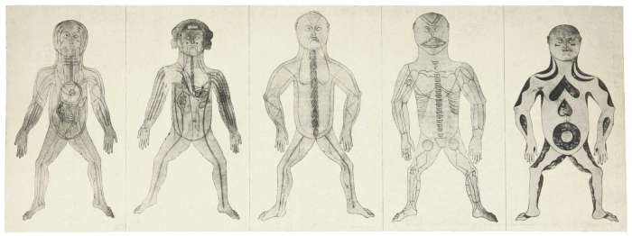
Five juxtaposed human figures each with interior lines and shapes schematically representing one of five anatomical systems.
We present our vignettes across both temporal and cultural shifts in data cultures. The first vignette deals with early attempts to visualize the body in the absence of information from human dissection: that is, under conditions of data scarcity. The second vignette deals with how philosophies and technologies of seeing influenced the resulting illustrations of bodies even once this information was more widely available. The third vignette explores how conceptions of disease likewise resulted in new genres of anatomical illustration. The fourth deals with the popularization and circulation of these images to mass audiences. Finally, the last vignette deals with the ethical and sociopolitical ramifications of the process of reducing the human body down to data.
Taken together, we use these vignettes to argue for a more expansive conception not just of medical or anatomical visualizations, but of visualizations generally. There are no “neutral” choices when it comes to representing the body: the process of turning bodies into data to be visualized is inherently subjective and political. We also call on the visualization community to revisit the assumption that the history of visualization is an inherent progression from the simple to the complex, the less accurate to the more accurate, but to consider how our forebears dealt with challenges of data access and rhetoric, complexity and uncertainty. We find that many of the visual forms and genres of the past reappear, clothed in new bodies, to solve perpetually recurring problems in visualization and information design.
The study of medical visualization can and has occupied entire books and careers, and we do not intend for this paper to provide a complete or comprehensive overview of the subject, even within the comparatively narrower lens of cultures of data and their impact on visualization practices in anatomy. For one, knowledge is situated and limited by perspectives. While we have sought out sources beyond the usual—often Western-focused—history of medicine, our coverage of these sources is comparatively limited. For another, we as co-authors are situated within HCI and computer science contexts, and so our analytical focus on our examples as technological artifacts or displays of information provides less historical context than in other treatments of these same examples. Lastly, while many of the examples in our vignettes reward deep contemplation or analysis, for reasons of space we devote relatively little time to each example to instead focus on how these examples are situated within the context of our larger arguments. We invite the reader to take time to assess the figures (or examples from their own practice) in greater depth than is afforded in this work.
2. Inferring Human Anatomy
In this first vignette, we explore how societies went from inferring human anatomy to physically engaging with human anatomy. That is, how visual approaches to the body arose under conditions of what we term “data scarcity”: limited systematized ways of structuring, collecting, or disseminating anatomical information to medical audiences. We begin with a brief overview of the attitudes and perspectives that shaped anatomical and medical visualizations of antiquity. Many early societies created rich and intricate anatomical diagrams based on sources of information or epistemological structures that are different from the structures or notions of data that we associate with modern scientific empiricism. Many of these early choices in the systematization and representation of anatomy remain relevant today.
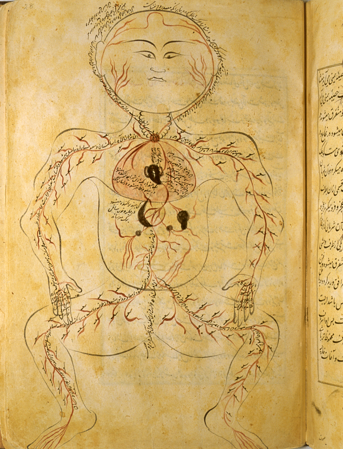
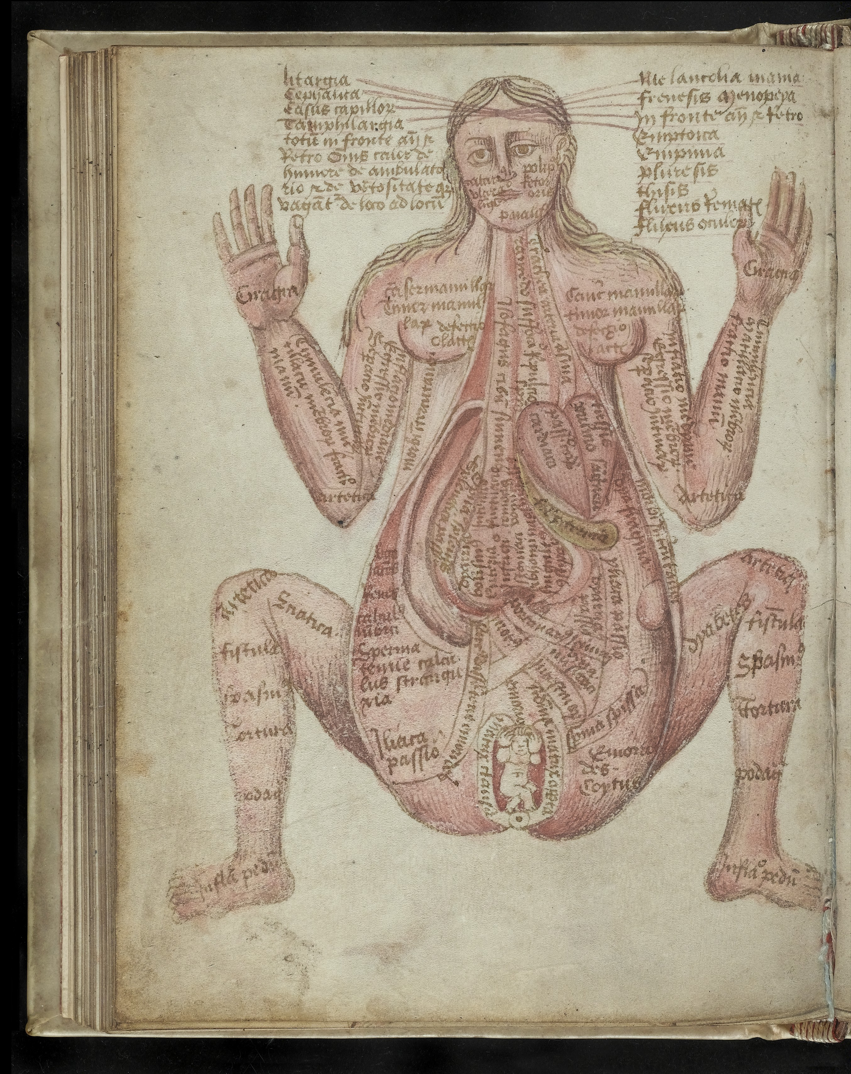
Diagram of a squatting male figure with arterial structures shown in opaque, red watercolor.
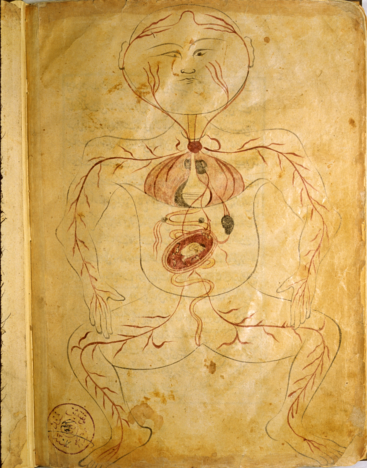
Diagram of a squatting female figure with arterial structures shown in opaque, red watercolor and a gravid uterus with the fetus in a breech (transverse) position.
Human dissection has been rife with taboos and ethical questions throughout history that provide the limits for what can and cannot be visualized through direct observation (Standring, 2016). Early societies viewed the human body through symbolic, social and religious lenses. These views were encoded into laws and customs that precluded human cadaver dissection for centuries (Von Staden, 1992; Matuk, 2006; Akkin and Dinc, 2014; Luesink, 2017), with a few rare and notable exceptions to this moratorium in the Babylonian and Persian empires (Shoja and Tubbs, 2007) and during the Ptolemaic reign in Alexandria (Ghosh, 2015b; Von Staden, 1975; Standring, 2016). These brief windows provided physicians a direct window to the body’s workings, although preservation technology of the time imposed limits on the scope and nuance of dissection. Visual reproductions of the perception of the interior body from this period survive in the Five Figure Series (Fig. 1), one of the earliest known illustrations of the human body. Here, the body is arranged in a so-called frog pose, with the human form arranged as if on a dissection table in an open, squatting posture. Each panel depicts one of the five perceived bodily systems: arterial and venous blood, nerves, bones, and muscles, respectively (Standring, 2016).
Through networks of trade, manual reproductions and variations of these symbolic figures diffused into other regions. Reaching the Islamic world, the illustrations of fourteenth-century C.E. Manṣūr ibn Ilyās, the earliest known illustrations of the human body from this region, are thought to have in part been inspired by the Five Figure Series (Shoja and Tubbs, 2007). Beautifully colored with annotated structures on several plates, e.g., Fig. 2, Manṣūr’s work is also thought to blend local religious culture with dissection traditions espoused by Galen. For over a thousand years, Galen, the overwhelmingly prolific second-century C.E. anatomist and physician, was at the center of the largely unassailable canon of Western medicine, alongside the imposing figures of Greek philosophy and medicine Aristotle and Hippocrates (Zimmer, 2005; Standring, 2016).
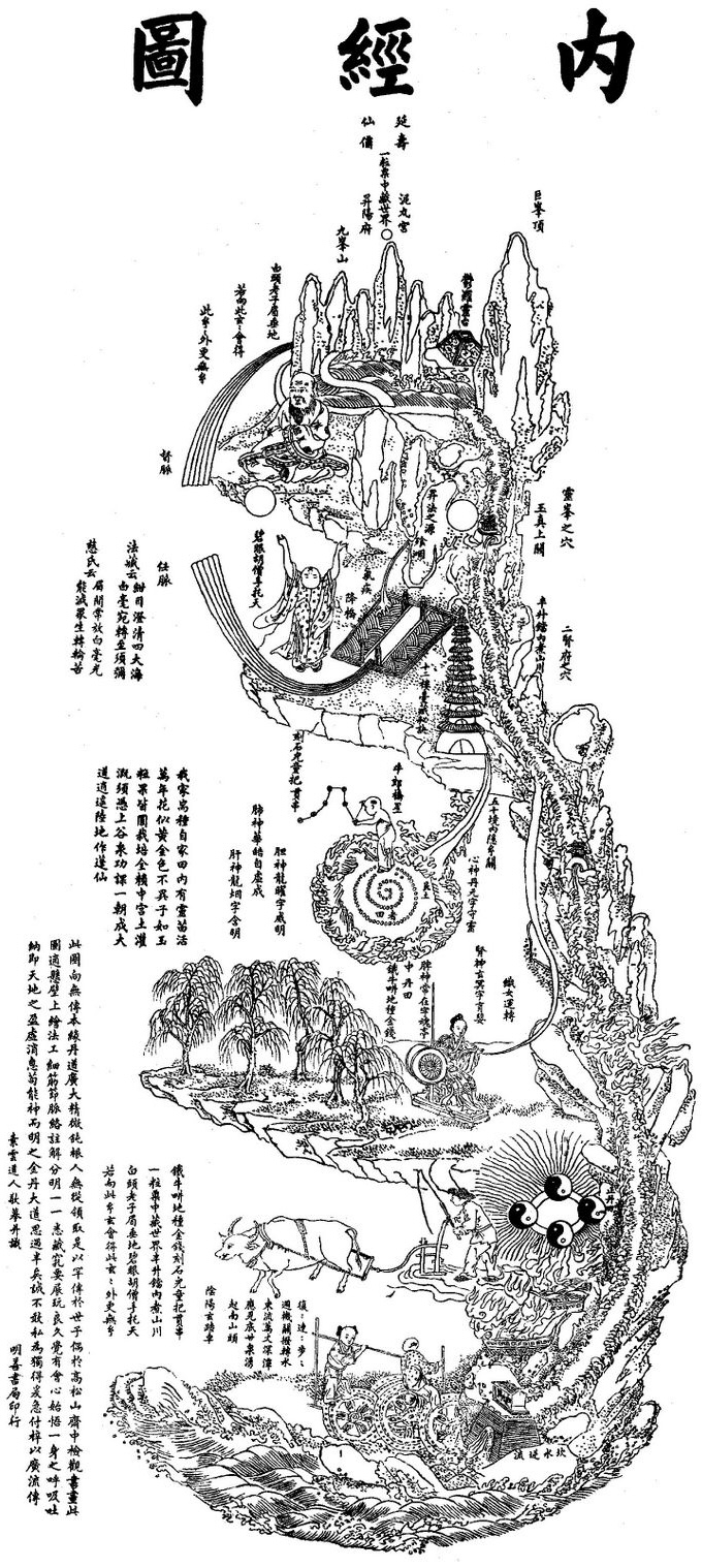
Illustration of the inner realm as forest in series of levels with different spiritual symbols throughout the image.
The focus of these Greek and Islamic anatomical charts and similar early diagrams, driven by both the conditions of data scarcity but also their associated philosophical underpinnings, was on the major connections within bodily systems and their contribution to a single whole, rather than precise anatomical structures or locations. These schematic diagrams echo the conventions and distortions of the modern-day subway map, where connections between important components are of greater importance than specific location. A similar influence of epistemology on form can be seen in Eastern anatomical diagrams as well. Zoroastrian, Taoist (Fig. 3), and Buddhist traditions saw bodies as complete inner worlds with their own metaphorical forests, stars, and beings (Matuk, 2006; Shoja and Tubbs, 2007). As with our prior examples, the visual emphasis is again on a cohesive whole, but the physical reality of the subject is abstracted away to instead focus on the metaphorical structure of the body.
Other artifacts in the visual representation of bodies were due to the use of animals as substitute sources of information, with the assumption that the structures found in other animals when they were dissected could or would be similarly represented in humans (Von Staden, 1992; Zimmer, 2005). Galen, who in his lifetime dissected many animals but likely never humans (in part due to the aforementioned taboos on human dissection), produced occasional inaccuracies that were noted by anatomists centuries after the fact. Per Singer (Singer, 1949), “Roughly speaking, we may say his anatomy is that of the soft parts of the Barbary ape, Macaca Inuus, imposed on the human skeleton.” Misconceptions about the human body (such as the diagnosis of “hysteria” as a result of a literal “wandering womb”, i.e., a displaced uterus (Faraone, 2011)), in the absence of newer or more authoritative data, therefore lingered for centuries in the Islamic and Christian worlds (Standring, 2016). For instance, Galen’s claims that the liver spread out like a hand led to anatomists mistakenly assuming that the human liver had five lobes into the 16th century (McClusky III et al., 1997). Some of these misconceptions based on animal dissections remained in later anatomical texts even after human dissection was more commonplace (Singer, 1946).
The design choices made under conditions of data scarcity remain relevant today, even in the face of the opposite problem: one of information overload. For instance, a modern-day student of anatomy or medicine has myriad data sources to choose from to understand the structure of the circulatory system: cadaveric dissection, magnetic resonance imaging (MRI), X-ray imaging, etc. Lacking sufficient prior knowledge for what to look for, they may quickly become overwhelmed and fail in their study objective. Schematic, stylized illustrations serve as maps to orient the viewer to the jumble of complex anatomy, abstracting away information deemed irrelevant for the task to focus instead on the essentials. Many anatomical atlases, e.g., Netter’s Atlas of Human Anatomy (Netter, 2022), feature schematic plates that navigate this information abundance and distill the content down to its essence, as in the circulatory system diagram depicted in Fig. 4 (left). Similar schematic, iconographic anatomical drawings surface in other contexts, e.g., the children’s game Operation, providing a playful and simplified means to explore and conduct surgery on the body (Figure 4, right).
Finally, we should note that the concept of data scarcity is not one limited to the historical past, and that societies do not inevitably or uniformly move from less data to more data. In spite of a modern-day information abundance, there remain medical phenomena that escape visualization with the data available. A migraine aura is difficult or impossible to capture via imaging data in real-time, due to the unpredictable nature of their onset and an incomplete understanding of their exact pathophysiology (Kikkeri and Nagalli, 2022). Instead, clinicians and researchers rely on patients relaying their experience of the (often) visual disturbance of an aura that manifests in, e.g., spots, flashes, zig-zags, among other possible sensory symptoms. Absent acquired data, these qualitative interviews are translated by visualization designers who infer gaps in the data to produce highly conceptual illustrations and photo-manipulated collages that fill in the information necessary to communicate the experience of a migraine aura. Thinking more broadly on absent data in modernity, Onuoha’s (Collier, 2022; Onuoha, 2016) art installations around the theme of a Library of Missing Datasets highlight examples where inequalities in race, wealth, and power leave us with very little information about matters of key importance. For instance, there is limited race-based medical information available for pregnancy risks.
Diagrammatic anatomical illustration of the circulatory system. A cross section of the heart resides in the middle of the diagram, with paired vessels (red for arteries, blue for veins) extending in each of the four cardinal directions from the heart. The top pair join in one capillary loop to show oxygen exchange in the head, while the bottom pair similarly join in two places to show oxygen exchange in the internal organs and legs, respectively. The left and right vessel pairs extend to eventually join in the left and right lungs, respectively.
Photograph of 1965 children’s game, Operation, showing a cartoon male figure with a large red clown nose and cutouts over different regions of his body for the placement of of satirical body parts, e.g., a funny bone.
3. Pedagogies of Sight
Drawing of a man with labeled lines representing the flow and meridians of qi throughout the body.
Colorful drawing of a human figure showing various important veins and arteries in the body. Figures kneeling in front and behind the figure show major organs.
Part of the process of both designing and interpreting visualizations is learning how to see: choosing which structures to highlight, what extraneous or irrelevant detail to remove, and matching the expected visual genres and conventions of one’s audience. Different ways of seeing can produce radically different representations of the same bodily forms. This process of learning to see occurs not just at the level of the individual student: new technologies create new affordances and new views and experiences of the body that need to be rhetorically and socially integrated into the prevailing data cultures. In this vignette, we explore how different data cultures produce different views of the same structures, and how new technologies or relationships to data result in new rhetorical needs to convince audiences of the utility and authority of new ways of seeing. We argue that the depiction of bodies is not a universal and objective process, but a long-running sociotechnical dialogue.
Taoist concepts of the body include the balance and flow of yin and yang, and the course of qi (the body’s vital energy) throughout (Matuk, 2006; Shoja and Tubbs, 2007). This holistic ideal of the body corresponded to visualizations steeped in spiritual metaphor to convey the complex inner world of the body (Figure 3). Other visualizations were created for practical clinical use, such as diagrammatic illustrations of pulse and acupuncture points, or the winding paths of qi (Figure 5, top panel). These works are echoed in the restraint and consideration a modern designer uses in terms of what information to show. Illustrating all acupuncture points would saturate the visual, so the designer must be selective and show only information that supports their rhetorical aims. Musculoskeletal morphology is absent from these visuals—this anatomy was not an important part of the Chinese medical canon and considered irrelevant for medical interventions like acupuncture: indeed, for centuries, physicians lacked words to describe the muscles of the body (on the Web, 2016). In the West, a corresponding lack of focus on certain systems and features—in this case on circulatory rhythms—led to a paucity of words to describe heartbeats, with even Galen forced to use highly subjective terms like “mouselike” or “ant-crawling” to describe irregular pulses (Kuriyama and Kuriyama, 1999). In later centuries, Chinese illustrations remained largely diagrammatic in a reflection of their didactic priorities. Specific organ or muscle morphology was usually irrelevant to the illustrator’s overall goals, and so was vaguely shown, if at all, as a way to manage information complexity and to clarify the learning objective (Van Alphen et al., 1995). Tibetan culture similarly relied on holistic views of the body, often connecting medicine and theology (Sabernig, 2017). 17th-century Tibetan Buddhist paintings, called thangkas, sometimes incorporated medical knowledge from India, ancient Greece, Persia, pre-Buddhist Tibet, and China. Anatomical representations integrate symbolic representations of anatomy with Tibetan life and religion through series of small figures arranged in rows in all or part of the paintings (Figure 5, bottom panel, and Figure 10), emphasizing both the spiritual and physical components of the human body (Williamson et al., 2009).
While Western medical philosophies began from similar traditions as in the East, including similar metaphors of the body as microcosm of the world (Matuk, 2006), and similar medical practices based on the flow of vital energies (Singer, 1949), divergences in the specifics of these philosophical underpinnings emphasized different parts of the body and so resulted in differing diagrams (Kuriyama and Kuriyama, 1999). For instance, early Greek society valued strength and vitality as physical traits of the divine, and so placed specific focus on musculoskeletal anatomy (Matuk, 2006). Some artists rising from later generations enmeshed in this culture went so far as to negotiate commissions with payment in human cadavers (Ebenstein et al., 2016). Leonardo da Vinci captured the value many artists placed on direct muscular observation and interaction:
A good painter must know what muscles swell for any given action, and must emphasize the bulging of those muscles only and not the rest, as some painters do who think that they are showing off their skill when they draw nudes that are knotty and graceless–mere sacks of nuts (Standring, 2016).
The seismic political, social, and religious upheavals of the Renaissance brought a culture of curiosity and observation that led anatomists from their distant chairs and tomes to the dissection table (Standring, 2016). These anatomists began dissecting cadavers themselves, previously unheard of, and describing what they saw. Illustrations of anatomy came to be instructional in their own right, with increased realism thanks to the development of linear perspective as a new way of representing three dimensions on a two-dimensional plane (Zimmer, 2005). Some visualizations were even interactive: bone- or wax figures from the tradition of religious reliquaries and effigies had removable internal parts for students to learn by disassembly and reassembly (Figure 12, right panel). “Fugitive sheets”, anatomical illustrations with paper flaps that could be lifted to reveal underlying anatomy, became wildly popular study aids. The most impressive and detailed of these were distributed by Andreas Vesalius, the Flemish surgeon and anatomist behind the landmark De Humani Corporis Fabrica, a comprehensive atlas of the human body (Ebenstein et al., 2016) that saw text accompanied by full-page didactic anatomical illustrations for the first time in modern print culture (Xiang and Venkatesan, 2023) (Figure 6). The year of its publication (1543) saw massive paradigm shifts from received wisdom to logic and empirical reasoning on several scientific fronts—Copernicus’ heliocentric theory of the solar system was published the same year. However, even Vesalius’ work was enmeshed in existing epistemic structures. For instance, the humoural theory of medicine championed by Galen and other forebears requires that organs both emit and absorb humoural fluids, and so Vesalius points to the pituitary gland as an emitter of phlegm, perforations in the interventricular septum of the heart, the existence of the rete mirabile (from Latin: the wonderful net) at the base of the brain, even though direct observation did not support such structures or functions in the human body (Singer, 1949; Lanska, 2015).
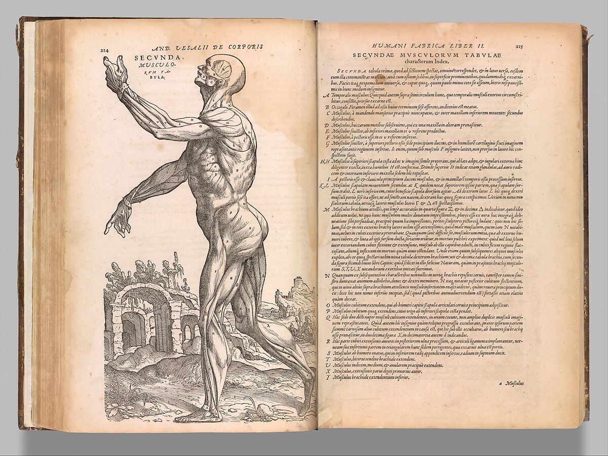
A drawing of a man with skin removed, exposing his clearly-defined muscular system. He gestures with one hand and points with the other.
The advent of new imaging methods for human anatomical data necessitated new approaches to seeing, sharing, and promoting the validity of these methods. Separated by two centuries, Robert Hooke and Santiago Ramón y Cajal created their own “pedagogies of sight” (Jack, 2009) to help themselves, their scientific colleagues, and the broader public to access the invisible worlds revealed by microscopy and to generate support for this new science (Fiorentini, 2011). The first illustrations and visualizations of microscopy images had to perform the dual jobs of not just presenting representations of what was seen, but also of convincing the audiences that the new techniques produced novel but valid insights anchored in past understanding.
This process of teaching, publicizing, and convincing also occurred with more recent imaging techniques like the X-ray and MRI. The development of these imaging techniques flipped traditional means of seeing the body, enabling an “inside-out view as opposed to outside-in perspective” (Standring, 2016). Often, weird is what sells: Wilhelm Röntgen, the accidental inventor of the X-ray, famously sent the first X-ray image of his wife’s shadowy, bony hand as the family’s Christmas card in 1895, similar to how today’s #AcademicTwitter users broadcast short gifs and stunning renderings of new imaging methods for thousands to admire (and subsequently queue up for data access). This marketing maneuver generated a hype and adoption frenzy such that, only five years later, the X-ray was firmly planted in clinical diagnostic and treatment practice (Howell, 2016). These technologies ultimately gave rise to the radiology profession, with individuals trained to see and interpret the anatomy of the living. Of note is that this initial rhetorical work may have functioned too well: per Daston & Galiston (Daston and Galison, 1992) “the very form of X-ray photography was a threat because the photographic medium fairly radiated authority, even while practitioners of the art frequently confronted its deceptiveness.” Indeed, contemporaneous sources warned against the potential of the false objectivity of this new way of seeing (White, 1900):
The routine employment of the X-ray in cases of fracture is not at present of sufficient definite advantage to justify the teaching that it should be used in every case. […] There is evidence that in competent hands plates may be made that will fail to reveal the presence of existing fractures or will appear to show a fracture that does not exist.
This alternation between representational and rhetorical, diagrammatic and photographic, continues in modern science imaging (Richards, 2003), where photographic images are juxtaposed with diagrams meant to reinforce (visual) arguments and convey scientific authority, and in public-facing comics and cartoons meant to communicate hygienic guidelines as well as the impacts of public health crises like the COVID-19 pandemic (Kearns and Kearns, 2020).
Virtual reality environment, with two avatars (left: user, right: virtual anatomy assistant) standing in what appears to be a living room around a dissection table with a human cadaver lying on the table. A digital screen is placed behind the table with a learning question.
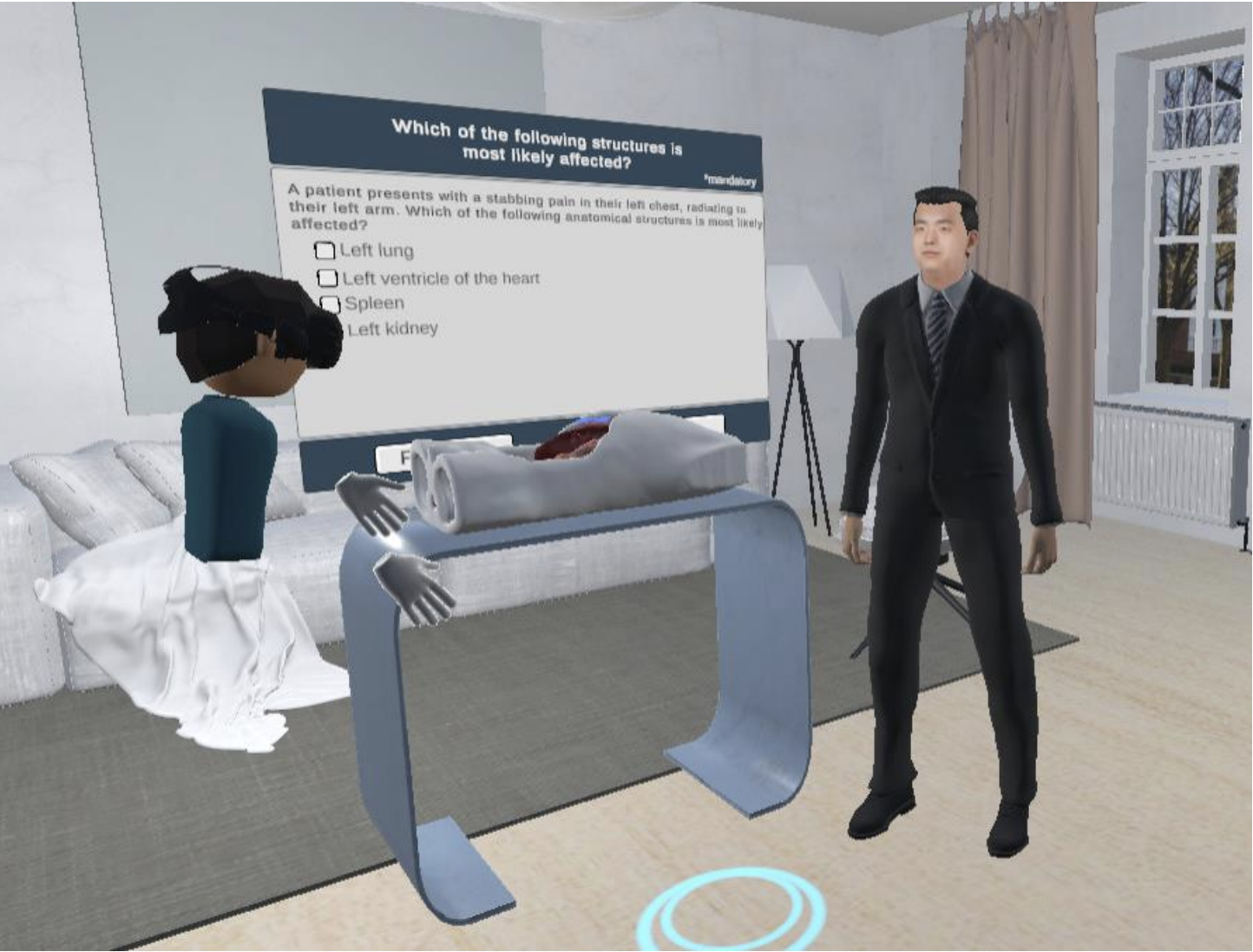
In the modern era, limited cadaver availability (Sahlgrenska Academy, 2022) as well as reforms in clinical education to espouse student-centered, integrated clinical application curricula (Ghosh, 2017) have resulted in alternative approaches to teaching anatomy beyond the cadaver lab. As a result of this shift, new generations of technology that employ immersive environments and artificial intelligence have been adapted to support medical pedagogy. These new technologies face the same parallel challenges of conveying the data and of making a case for the utility of the method that generated the visual, as did past advances like the X-ray. Chheang et al.’s (Chheang et al., 2023) generative AI assistant in a virtual reality anatomy education environment is but one recent example of a new pedagogy of sight (Figure 7). In this application, the authors need to train and convince a new user base of the validity and utility of virtual reality environments as opposed to traditional presence human cadaver dissection. They must also do the same rhetorical work for the virtual assistant, which is powered by OpenAI’s ChatGPT model, to convince users that language models can function as an interactive and adaptive approach to learning anatomy. While specific technologies and data cultures may change, the challenge of building trust in and authority of unfamiliar technology with unknown utility remains.
4. Reasoning about Disease and Dysfunction
In this vignette, we focus on how epistemologies and emerging scientific theories can shape visualizations, in particular those meant not just for contemplation but for pedagogy and practice. The use of anatomical visualization to diagnose and cure the body is inextricably linked with data cultural influences: notions of what is meant by health, what counts as evidence, and how signs and symptoms are structured and collated. Defining disease requires a conception of what a healthy body looks like, which is a normative judgment that has just as much to do with the society in which one is enmeshed as any individual observation.
Before the acceptance of the germ theory of disease, attribution of various signs and symptoms was driven by other causal theories, which in turn shaped the sort of information that was considered relevant to the physician. For instance, the attribution of diseases to imbalances in the four humours, popularized by early Greek writers like Hippocrates and Galen (but appearing even into the 20th century in the early science of psychology (Eysenck, 1964)), created an entire genre of visualizations that functioned as humoural lookup tables (Figure 8): sorting personality traits or flaws based on their humoural category, and, conversely, going from a detected sign or reported symptom to a humoural cause and then to a suggested remedy: bleeding, purging, or otherwise rebalancing the humours.
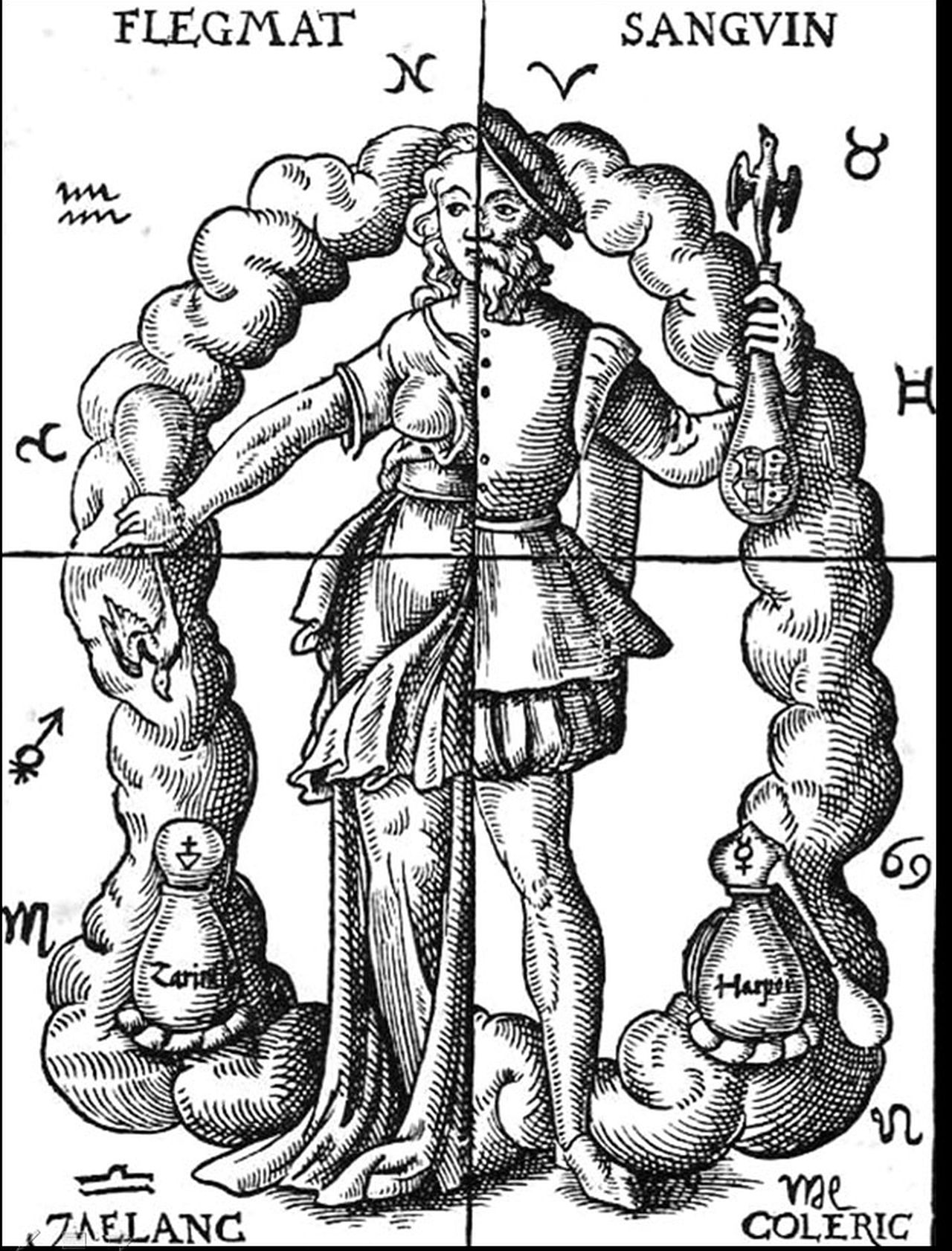
Androgynous figure in medieval clothing, divided into four quadrants to represent each of the four humors of medieval medicine.
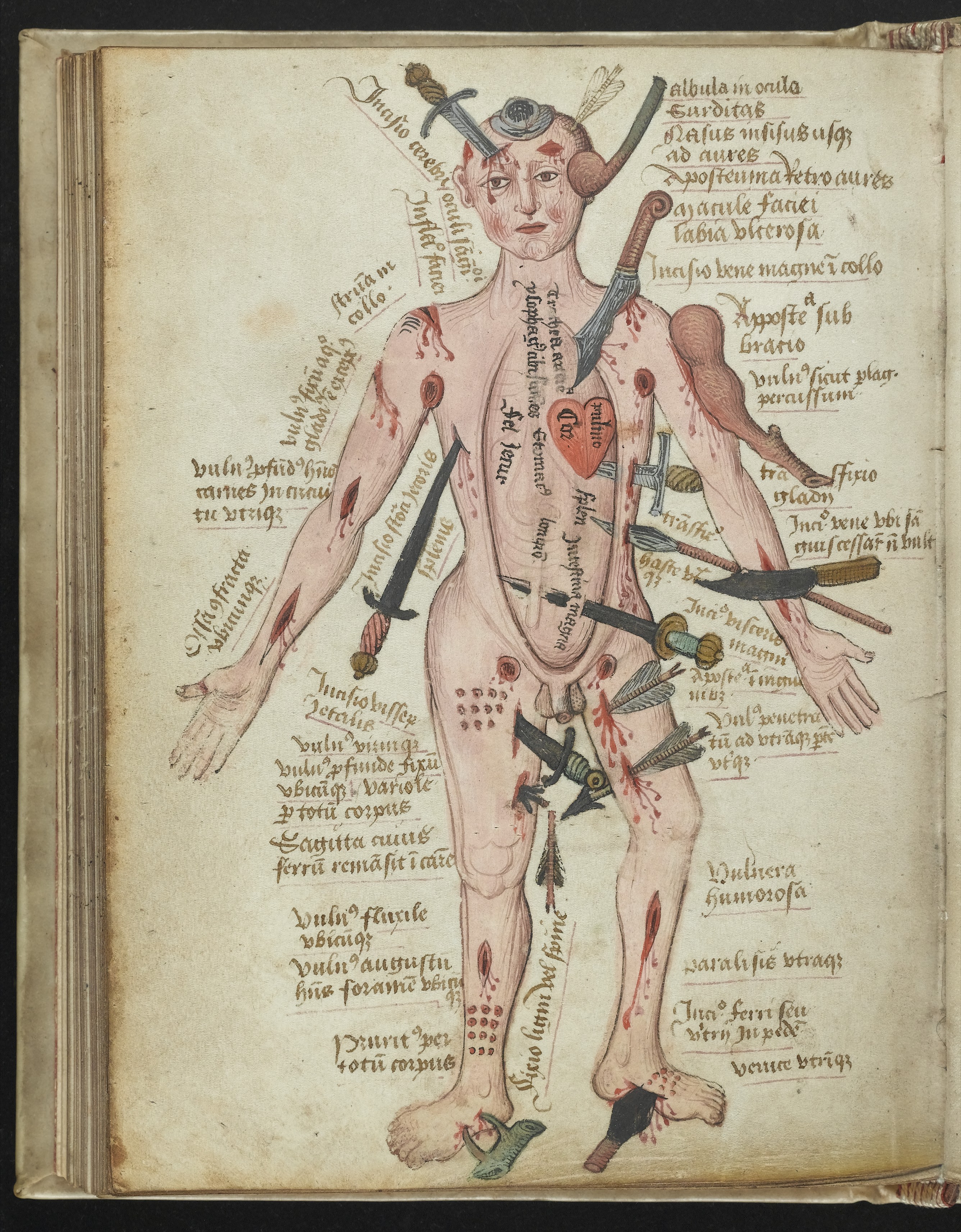
Color drawing of a man pierced by swords and other weapons, and bleeding from many simultaneous open wounds. Each wound has a textual label.
Color drawing of a woman covered with writing indicating potential illnesses. Her torso and uterus are expanded to take up the majority of the figure, with labels of illnesses related to childbirth and pregnancy.
The necessity of connecting particular illnesses with (often humoural) causes and treatment led to the creation of a specific offshoot of anatomical visualization: “human tables” (Hartnell, 2016) such as the medieval “wound man” and “disease woman” where human figures were simultaneously pierced by arrows, stabbed by swords, or otherwise displaying sets of simultaneous diseases, injuries, and disorders (Figure 9). These arresting figures are annotated with references or other pointers to the relevant parts of the medical manuscripts in which they appeared. In addition to functioning as tables of contents or taking advantage of the “flexible diagrammatic potential of the human body” (Hartnell, 2017), these diagrams could also be procedural: for instance, a “bloodletting man” associated specific diseases with specific parts of the body to be bled. Other forms of these visual human encyclopedias, such as the aforementioned thangka illustrations of medical treatments (Figure 10), functioned not just as indexes but as aids to memory, using hues and iconic symbols and other forms of “visual logic” (Dachille-Hey, 2012) to signal particular illnesses or causes (for instance, blue-colored skin can represent an imbalance in the body’s vital energies).
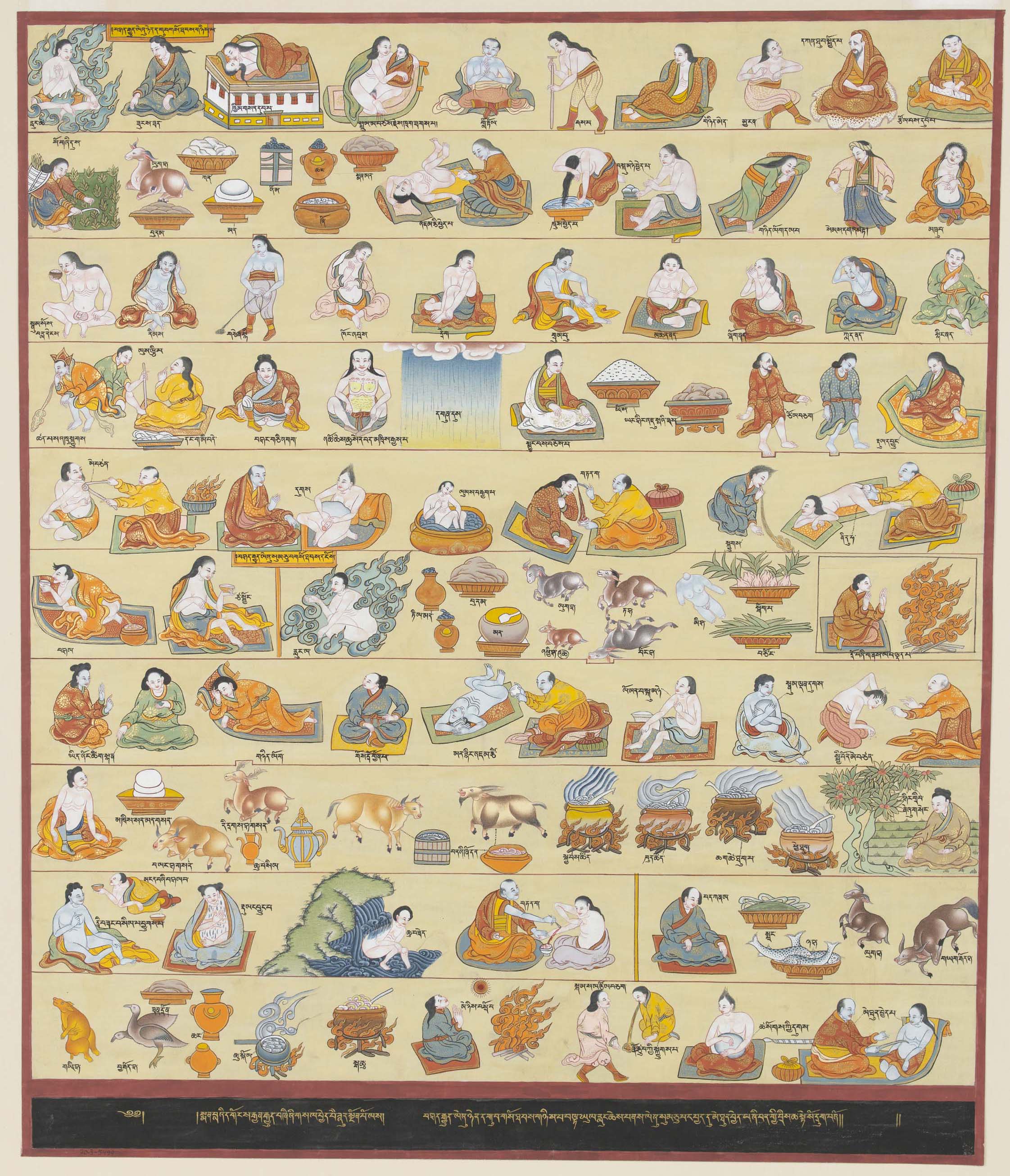
Rows of illustrated figures juxtaposed with myriad activities, ingredients, or procedures to treat illnesses.
Early cultures of information dissemination made it difficult to precisely integrate chart and text. Medieval wound men and similar diagrams would be generated as separate processes from corresponding medical texts (that would or might circulate independently or be subject to imperfect copying and transcription), producing potential errors. For instance, Hartnell (Hartnell, 2016) suggests that a stone-like lesion on the head of a wound man diagram became, through inattention, mistranslation, or error, a non-diagnostic helmet in a later copy of the same diagram.
These forms of diagrams also had sociopolitical implications. The use of a male figure as the normative or default form of the body relegated women’s health and obstetrics to other charts, figures, or manuscripts that rarely circulated in tandem with the manuscripts by (and for) men (Green, 2000). The humoural framework underlying the diagrams also had consequences (in later eras, for instance, encouraging “heroic” treatments of severe bloodletting and purging (Sullivan, 1994)). If the temperament of human beings could be governed by the humours, societies as a whole could also be modeled in similar terms, such as Ottoman schools of economic thought that saw “scholars as blood, merchants as yellow and peasants as black bile, and the statesmen or bureaucrats as the phlegm” (Özveren and Ağır, 2015). Violent and even genocidal actions have often used the resulting language of contagion or restoration of equilibrium to justify exclusion, expulsion, or destruction of particular subgroups: for instance, victims may be referred to as internal tumors or bacilli to be excised from the political “body” (Fisk, 2009).
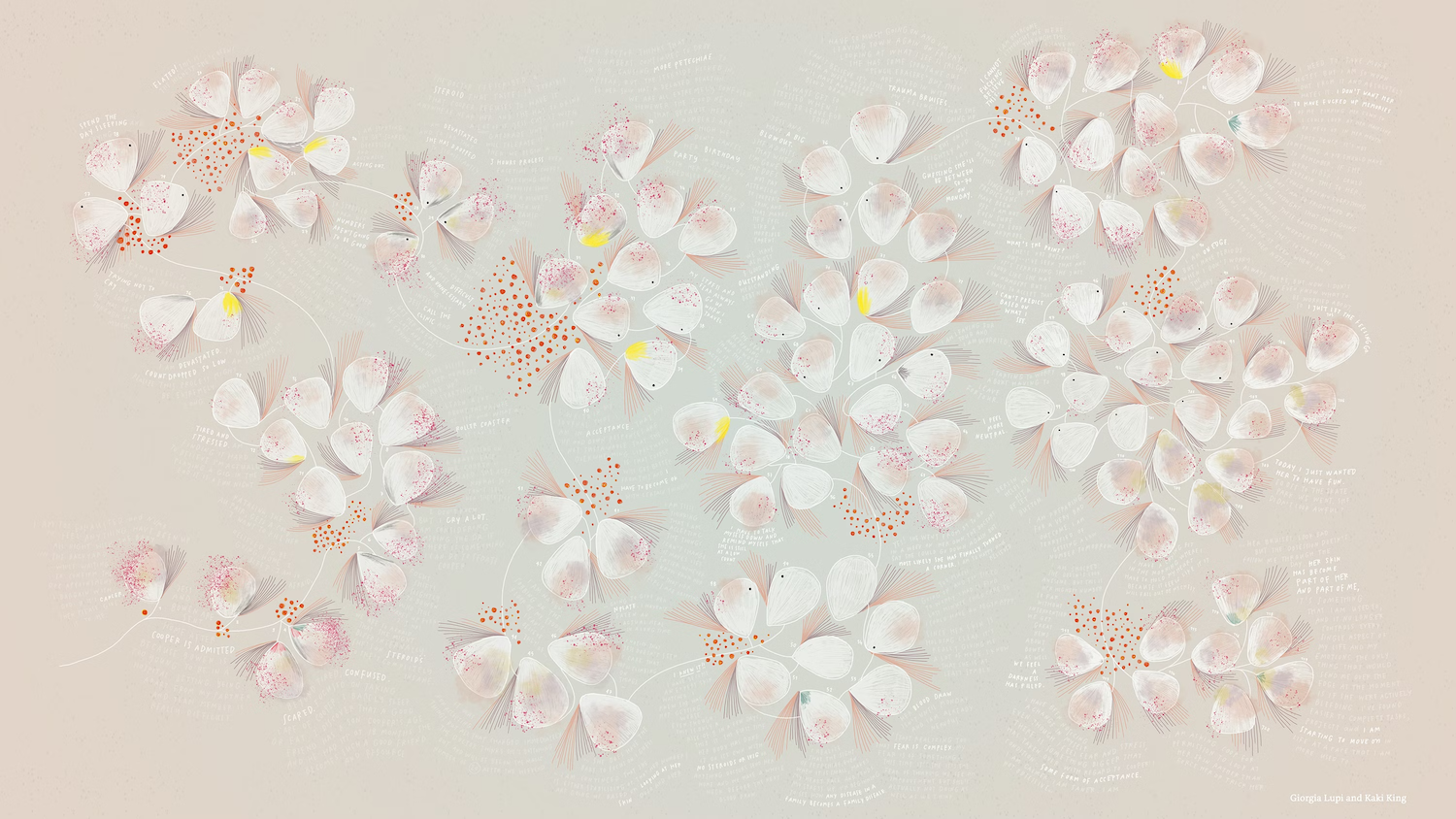
Illustration of petal-like glyphs each encoding information about the severity of symptoms, juxtaposed with text excerpts from a symptom diary.
In the modern era, the human-scale visualization of symptoms and signs can take on a different character, as a form of re-individualization or even protest against other forms of data or ways of knowing (as a single diagnosis, as just a medical record, or as just a “data point”). Slobin (Slobin, 2014), when tasked with creating a data visualization showing the variability and severity in Niemann Pick Disease Type C, eventually came to the conclusion that “the data visualization is actually people,” and relied on photographs of people with the disease rather than abstract diagrams of multidimensional data. Likewise, King & Lupi’s (Lupi and King, 2018) multimedia visualization Bruises: The Data We Don’t See, documenting the former’s daughter’s illness, was created partially due to a feeling that “clinical records alone hardly capture the impact the illness of a child has on a family” (Figure 11). The resulting artwork, drawing from photographs and images and medical records, is a multimedia experience that weaves together complex glyphs with animation and music to represent the disease not just as an abstract event but as an emotional experience.
We contrast the medieval and renaissance use of human-like figures for diagnostics as ways to “dataify” unquestioned or untested theories of medical knowledge, with the contemporary use of anthropomorphized or individualized visualizations a way to “de-dataify” or otherwise make information that has been abstracted, dispossessed, or otherwise specialized, more human-centered.
5. The Body as Spectacle
European Renaissance-era collaborations between anatomists, clinicians, and professional artists blended perspectives and leveraged technologies to produce novel visualizations of the inner human form for a broader audience. Artists trained in drafting, composition, and storytelling produced anatomical visualizations that were more than study aids. These visuals also served as marketing materials showcasing the skills and authority of the scientists and the artists, as commentary on contemporary social and cultural issues, and demonstrated a clear tension between religious and spiritual ideas with the new natural philosophy. Blending art, science, education, and popular culture, increasingly detailed and accurate anatomy of partially-dissected men, women, or even babies, appeared arranged in monstrous, noble, seductive, or comical poses against lush backgrounds of countrysides and architecture (Sappol and National Library of Health, Bethesda(2006).
Technological advancements in printing, combined with a world more connected through trade, enabled faster, more facile production and circulation of richly-illustrated anatomical atlases across Europe and beyond to regions still under a dissection moratorium (Akkin and Dinc, 2014; Standring, 2016). Vesalius’ De Humani Corporis Fabrica was in part so successful thanks to its strikingly detailed illustrations, which may have been created by artists from the famous Titian’s studio (Kemp, 1970) (Figure 6), and because the publication was so broadly circulated (and liberally plagiarized).
Visual representations of the body extended beyond two dimensions and adapted to new needs and technologies. Dissectable wax models like the 18th-century Anatomical Venus were created to nullify the need for human dissection with a beautiful, doll-like, anatomically accurate instructional model (Figure 12, right panel). Popular for teaching and for public outreach, such models produced in this period made, to the modern eye, a bizarre balance between art and science, entertainment and education, exploitation and reverence (Ebenstein et al., 2016), that are echoed in modern plastinated human body exhibits like Body Worlds (Worlds, 2023), with similarly contentious results. Per Fontana, the first director of the wax model workshop known as La Specola:
If we succeeded in reproducing in wax all the marvels of our animal machine, we would no longer need to conduct dissections, and students, physicians, surgeons, and artists would be able to find their desired models in a permanent, odour-free, and incorruptible state.
The use of the female form, inspired by the goddess Venus, shows an effort to nudge anatomy from a study of the macabre to that of beauty to appeal to a broader audience, similar to earlier color mezzotint paintings like d’Agoty’s Flayed Angel (Figure 12, left panel). The use of wax for modeling gives a life-like sense to the model, who is posed as if resting, nude apart from a pearl necklace. The model can be dissected down seven layers, with the final layer revealing a small fetus in her uterus (Ebenstein et al., 2016). Anatomical depictions of women often showed them as pregnant (Figures 9 and 2, bottom panel)—a reflection of the role that women, or rather their bodies, served in society, and of the focus in medicine for women on the (often hazardous) processes of pregnancy and birth. In a period where nudity in Europe was controlled, models like the Venus traveled widely in fairs and museum exhibits and legitimized public engagement with a naked female body, leveraging the lurid or the shocking rather than the purely clinical. Per Sappol, a medical historian:
Public discussion of sexual desire, ostensibly part of the medical technology of self-regulation, provided an opening through which the pleasure principle could be smuggled in, a fact that popular anatomists were well aware of, and manipulated to their benefit (Sappol, 2004).
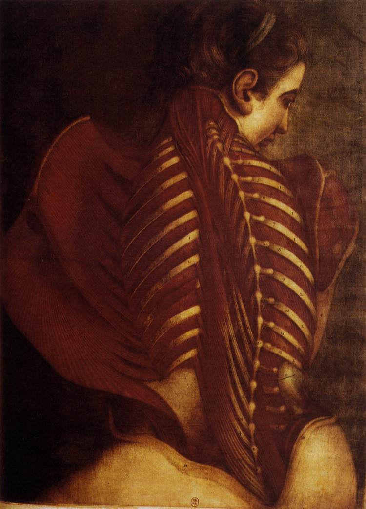
Color drawing of a woman. The skin of her back is removed, showing ribs and musculature.
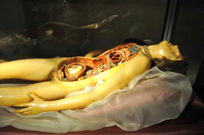
Reclining wax figure with her torso cut open, revealing wax internal organs.
As printing techniques continued to improve in quality and detail, artists continued pushing the bounds of possibility in collaboration with anatomists to connect with a broadening public audience that often came at the expense of clear communication of anatomical information, at times incorporating popular culture references, such as the 18th century anatomical illustration with Clara the rhinoceros in the background (Figure 13), who was part of a traveling zoo in Europe around at the time (Ruiz, 2016; Sappol and National Library of Health, Bethesda(2006). Per the anatomist Albinus, “We thought the rarity of the beast would render these figures of it more agreeable than any other ornament” (Daston and Galison, 1992).
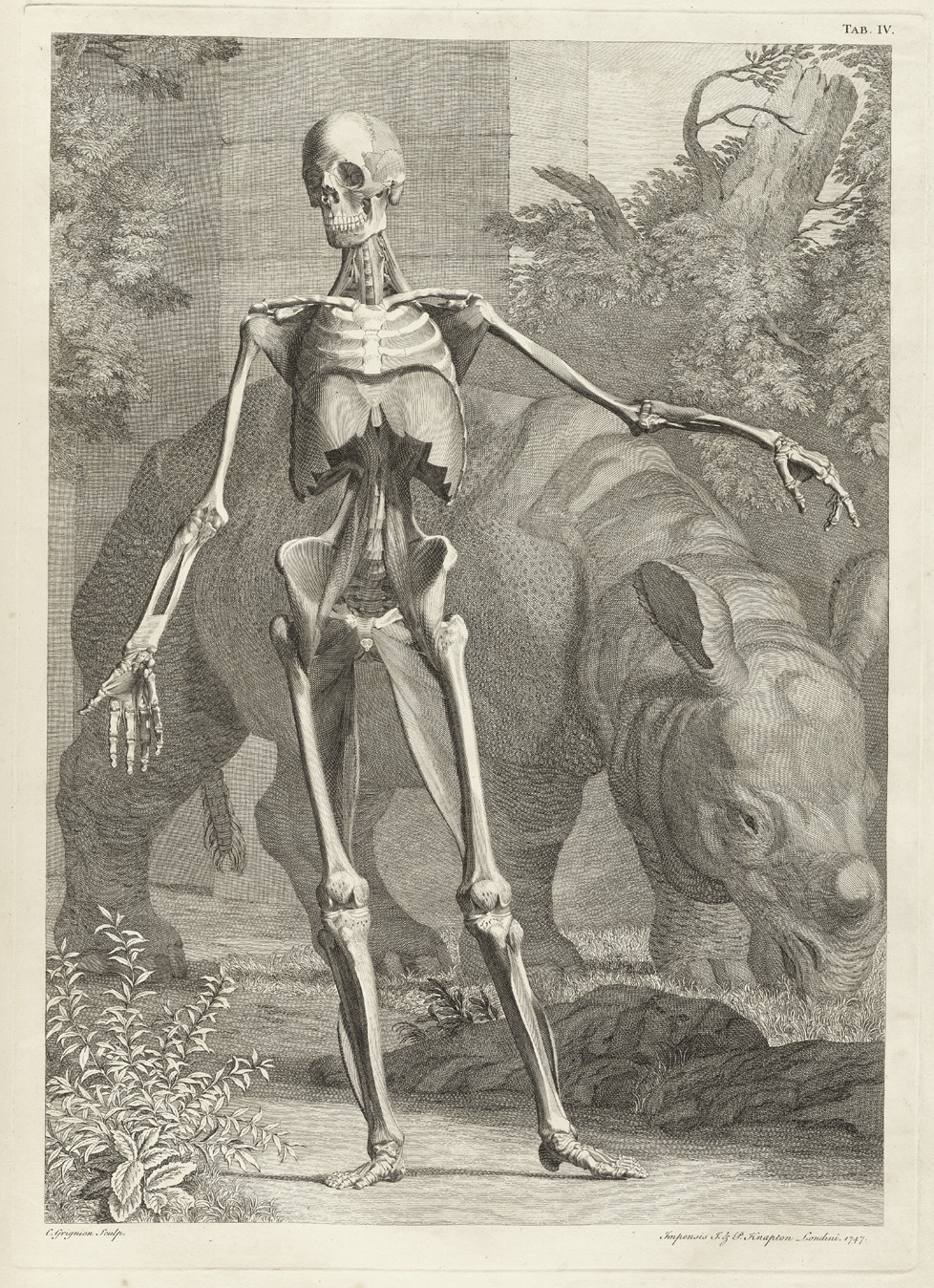
Drawing of a skeleton posing contrapposto in front of a rhinoceros.
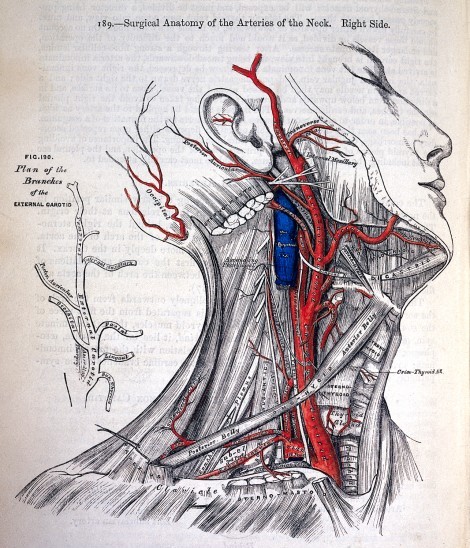
Illustration of the neck with most structures in black and white, but with the arteries in strong red, with text labels running their length.
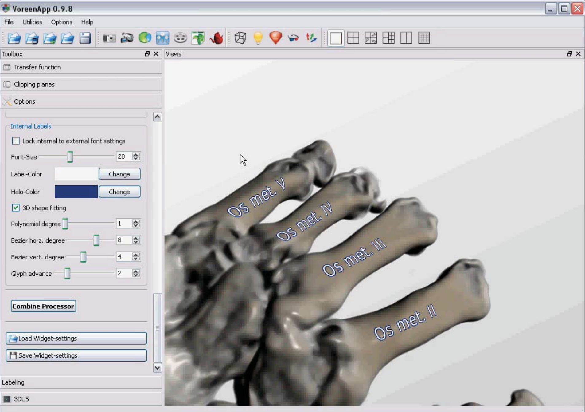
3D colored render of the hand, with major bones labeled in situ.
Increased circulation and demand with growing numbers of medical schools offering formal training in medicine created sufficient market pressures in the 19th and 20th centuries for a new profession of artists trained both in the arts and medicine to create illustrations that leveraged storytelling strategies for purely didactic, rather than social commentary, purposes (Sappol and National Library of Health, Bethesda(2006). These medical illustrators further leveraged the possibilities of color printing to selectively color structures of interest for increased visual salience, and began to integrate anatomical structure labels directly into the visualizations as in the iconic Gray’s Anatomy (Figure 14, left panel) rather than using separate legends (as in Figure 6) that required the eye to travel back and forth between pages. These storytelling approaches are the bedrock of medical illustration and visualization today, with contemporary visualization research exploring methods to stylistically automate these techniques (Figure 14, right panel) (Cipriano and Gleicher, 2008; Ropinski et al., 2007).
Modern medical visualization now features collaborations with not only anatomists, clinicians, and artists, but also computer scientists. These contemporary approaches often derive from imaging data rather than direct observation, introducing the possibility of illustrative-style visualizations customizable to individual patient anatomy (Preim and Botha, 2013), rather than a generalized or idealized anatomical perspective necessitated by traditional medical illustration (Garrison et al., 2021). Additionally, in echoes of the artistic anatomical heyday of the European Renaissance and Enlightenment, contemporary artists are exploring visual representations of the inner body to support personal, social, and political rhetorical agendas in new media: through street art, body paint, and comics (Ruiz, 2016).
6. Representation of the Marginalized
Throughout its history, medical visualization has overwhelmingly relied on the bodies of the marginalized of society, producing a disconnect between the human source and the resulting visualizations that are most often heroic, white, and male, even into today. Convicted criminals were, for centuries, the only legal possibility for anatomists and clinicians to obtain bodies for dissection (Zimmer, 2005), with supply pressures creating a black market for fresh corpses through “Resurrection Men” who trawled graves of the poor (and in the United States often Black) deceased whose families lacked the money and power to prevent these activities well into the nineteenth or even twentieth centuries (Davidson, 2007; Halperin, 2007; Hutton, 2015). The dissection of criminals and other marginalized groups unavoidably implies a certain moralistic code and reinforces societal structures of power, denying these bodies the sanctity normally bestowed on the human body while using them as a means to further scientific discovery. Threads between criminality and the acceptability of human dissection persist in contemporary society. A recent survey spanning 68 countries using cadavers in undergraduate medical curricula found that only 32% of sourced bodies are explicitly donated—the remaining are “unclaimed”, and one country notes that “the bodies of executed prisoners are given to anatomy departments” (Habicht et al., 2018). The U.S. National Library of Medicine’s Visible Human Project (Ackerman and Banvard, 2000), released in 1994, is a publicly-available, high-resolution dataset of the complete human body used in thousands of research, artistic, educational, and clinical applications. One of the cadavers in the Project is a convicted murderer, executed for his crimes and who donated his body to science. Similarly, the aforementioned Body Worlds exhibit (Worlds, 2023), which uses plastinated cadavers, has been a subject of controversy over the source of its “exhibits” (including claims that some of the bodies were from non-consenting prisoners or mental patients) and whether the artistic or pedagogical benefits of the exhibit overcomes the ethical and moral issues associated with the public display of private bodies (Burns, 2007).
As a particularly troubling modern example, the Pernkopf Atlas (1943) is recognized for its beautiful, lifelike rendering of human tissue, but the ethics surrounding the Atlas are suspect: based in Vienna during the rise of Fascism and World War II, Pernkopf and his team of illustrators were members of the Nazi Party. Circumstantial, although not definitive, evidence suggests that the bodies dissected and illustrated for the Atlas were Holocaust victims (Atlas, 2001). Debates have raged in the medical and medical-adjacent communities on the ethics of using, let alone discussing, the Atlas in light of this information (Riggs, 1998). For the anatomists conducting these early-day dissections or the modern-day student reading the Pernkopf Atlas, accessing the Visible Human, or visiting Body Worlds to study anatomy: did/do they reflect on the life and actions of the once-living body in front of them, or do they see only viscera?
Issues of consent and representation in anatomical visualizations extend to the living. Prior to the invention and broader adoption of imaging methods, clinicians’ sole possibility to examine the appearance and functionality anatomical structures of live human subjects was, essentially, through patients wounded in battle or who suffered chance accidents. The ethics surrounding clinical relationships with such patients at this time was questionable at best, based as these relationships were on “models of employment, servitude, and labor” (Green, 2010). Alexis St. Martin in 1822 received a gunshot wound that, in a strange twist of the healing process, left an open window to his stomach, what is medically termed a gastric fistula. St. Martin’s doctor, William Beaumont, seized upon this opportunity for discovery: he contracted the illiterate and now-destitute St. Martin as his servant, and for the next several years conducted a series of experiments to elucidate the properties of the stomach and digestion, taking copious notes and illustrations of the results with a degree of detachment that the reader nearly forgets that this was a live human subject (Beaumont, 1838).
As discussed earlier with the Anatomical Venus and the Flayed Angel (Figure 12), there are ethical issues around the objectification of the body (especially the female body), and the extent to which prurient or voyeuristic interests clash with the clinical or pedagogical. In 1971, the Anatomical Basis of Medical Practice, targeted to first-year medical students, went to press with suggestive commentary and photographs of women in Playboy- or “pin-up”-style poses to motivate a (presumably) lonely male student to learn surface anatomy. Its publication caused a huge and immediate backlash concerning the perceived objectification and denigration of women and was quickly pulled, but not before becoming an icon of the women’s movement and being used in debates on how to define pornography (Halperin, 2009), echoing contemporary disquiet with the use of the Lena image from Playboy in contemporary computer graphics (Munson, 1996). The selective use of attractive and suggestive women introduces another aspect of contemporary representation—an overwhelming majority of anatomical visualizations depict ultra-fit, white, male bodies that are not reflective of the diversity of shape, color, and gender of society. The result is that clinicians are not well-prepared to deal with diagnoses of, for example, skin conditions on non-white skin, and that BIPOC and non-binary patients cannot see themselves in the canon of Western medicine. Although there are growing efforts to motivate change (of Medical Illustrators, 2023), the road is still long to equal representation (Limm, 2022).
These examples surface difficult bioethical questions extending far beyond the medical domain on the use of scientific data colored by their associations. They suggest that collection of data about the body is not neutral, but is influenced by biopolitical concerns (or even “necropolitical” (Mbembé and Meintjes, 2003) concerns—the politics over how people are allowed to live or die). Can, or should, data be assessed on their own merits, excluding the biopolitical contexts in which they were acquired, or is context inextricably linked to the ultimate—in this case visual—product? By engaging with visualizations built from data with bioethically troubling origins, are we showing tacit support for racism, sexism, Nazism, and so forth, or can we see this as an opportunity to honor the dead with reflective, considered engagement with these works? We argue that context is impossible to excise from data and that, while these discussions are thorny, they are imperative to hold. Avoidance of these bioethical debates is the greatest disrespect we could show the living or the dead.
7. Discussion
The history of medical visualization is a long and fragmented story, capturing only snapshots and partial images while the majority are lost to time. These limited views, however, can provide a window into the data cultures of the period in which a medical visualization was produced, lending insight to the historical, technological, social, and political contexts that are inextricably tied to the resulting visualization and its mark on society. In this paper, we focused on these paradigm-shifting issues that produced the conditions to enable so-called groundbreaking medical visualizations such as the Vesalian muscle-men or Gray’s Anatomy. Turning now from our review of the past and present to look toward the future, we discuss select lessons learned from history and reflect on these in current and future medical visualization practice.
We first observe how visual forms and genres, rather than appearing suddenly and uniquely, instead periodically recur in new guises or for different aims, changed or recapitulated by new cultural or epistemic contexts. As Marx (Marx, 1926) famously states, people:
…make their own history, but they do not make it as they please; they do not make it under self-selected circumstances, but under circumstances existing already, given and transmitted from the past. The tradition of all dead generations weighs like a nightmare on the brains of the living.
The graph-like iconographic “subway map” forms of anatomical drawings, made of necessity in the face of taboos on dissection, appear again in the guise of modern simplified and abstract medical illustrations meant for pedagogy and dissemination: the children’s game of Operation (Figure 4, right panel) and the children’s character Slim Goodbody are not entirely dissimilar from these early diagrams, and for not entirely dissimilar reasons! The idealized forms of the body in later anatomical drawings, meant to provoke interest and elide the often messy nature of anatomy, recur again in the use of pin-ups to illustrate surface anatomy. The close integration of text and image occurs in the works of Manṣūr ibn Ilyās, Vesalius, Gray, and in modern 3D renders. What changes, then, are the material and productive forces underpinning these visual forms, the aforementioned data cultures that shape what data is counted and what data counts. Researchers and practitioners of visualizations must be mindful of these data cultures, or face potential obscurity or irrelevance. This mindfulness extends also to the ethical and political ramifications of what data we collect and how we visualize it. Questions of the ethics of dissection and how our bodies are used after our death did not end in Alexandria, or with the hangings of graverobbers like Burke and Hare, but continue in exhibits like the Visible Human Project or Body Worlds, or with the use of Henrietta Lacks’ cell lines in cancer research. The politics of who is counted (and who does the counting) is not limited to the dissection table, but is core to projects like Data Feminism (D’ignazio and Klein, 2020).
Connected to our observations of recurring visual genres is our observation of dialectical processes of “datafication” and “de-datafication” that seem to ebb and flow across cultural contexts. Taboos against dissection, and the perceived sanctity or inviolability of the human body, for a time kept anatomical information limited. Not just technological but cultural and rhetorical processes changed this status quo and made the body licit for analysis. This process involves a necessary stage of teaching people how to interpret these new sources of data, “selling” the value or utility of these new source of data, first to experts or authorities but then to mass audiences. When these data are commonplace, there are then reactions to once again re-sanctify or otherwise re-personalize them. The emerging genres of anthropographics (Morais et al., 2020) are modern examples of reactions in this space, as are works like the New York Times’ (White et al., 2022) How America Lost One Million People that switch between “close” (personal stories and anecdotes) and “distant” (histograms, thematic maps, and other statistical graphics) data presentations in an attempt to both convey at scale but also re-personalize phenomena that had become too abstract or data-like.
Our last class of observations concerns the primacy of the personal and the political in medical visualization. Haraway introduced the concept of situated knowledge (Haraway, 1988) to argue that knowledge production is partial and perspectival, taking place under specific historical, political, and situational circumstances. Contemporary visualization and HCI research recognizes the importance of situated knowledge through practices such as design study methodology (Meyer and Dykes, 2019) and co-creation workshops. In the context of medical visualization, history correspondingly shows that there are no one-size-fits-all objective design solutions when mapping the structures and diseases of the body. Just as Renaissance-era visualizations of anatomy blended theology with direct observation in a reflection of society at that time, so should current and future designers consider today’s climate of science skepticism and fake news. Pedagogies of sight developed by the likes of Vesalius, Hooke, and Ramón y Cajal in centuries past were products of their particular environments, and these pedagogies must be continually revisited and revised to instruct and convince new generations.
Personalized, precision medicine is the byline of today’s diagnostic medical practice, calling for tailored approaches and visualizations specific to the individual. For instance, our current era of digitalization and datafication combined with the COVID-19 pandemic has brought epidemiological information (and the resulting visualizations and “counter-visualizations” (Lee et al., 2021)) in unprecedented detail to anyone who may be interested. However, to what extent is this detail necessary? More broadly speaking, what kind of information does a person truly need to access, and can we share this information in a way that it resonates, is ethical, and is accessible? Recognition of knowledge as situated, and the replacement of given “data” with taken “capta” (Drucker, 2011) may help to guard against biases leading to negative health outcomes on the part of the patient and physician. Consider the treatment and management of pain: numerous clinical studies have documented differences in pain perception along ethnic and gender lines (Campbell and Edwards, 2012). Explanations for these differences are contentious, complex, and multifaceted but have revealed shocking implicit biases in the healthcare system that often result in physicians under-assessing and consequently under-treating pain in women and ethnic minority groups. This belies claims that differences in pain experiences are due to biological differences alone (Hoffman et al., 2016; Bostick et al., 2018). Designing visualizations or visual analytics applications intended to support clinical decision-making and appropriate communication requires situated knowledge to address and (attempt to) course-correct when a data culture politicizes or depersonalizes the lived experiences of individuals.
8. A Call to Action
Our observations from medical visualization lead us to suggest reforms in how we ought to operate as designers, researchers, or circulators of visualizations more broadly.
The first is to remember our history, rather than to discard historical visualizations as relics of forgotten or misguided eras. Designers of these visualizations faced many problems that remain today: dealing with uncertainty and the unknown, conveying complex information to mass publics, or convincing audiences of the utility or accuracy of new or unfamiliar sources of information. That the designers of these illustrations and visualizations came from temporally, geographically, or (even) intellectually remote places should not disqualify them as sources for inspiration or reference.
Secondly, we suggest the need for a more prominent close analysis of visualizations as rhetorical objects. Much as literary scholars can use close reading to examine the use of language and meter in poems, we believe that a similar “close reading for visualization” (Jänicke et al., 2015) could provide richer information than just a study of usability or assessment of visual clarity. We invite the reader to take time to contemplate our examples with an eye towards exploring how the visual design creates meaning, and how the final form of the graphic is or is not contingent on a particular data culture. Quantitative evaluations of many of these visualizations would, in many cases, miss the point: how effectively one could extract information about where one ought to bleed a patient to balance their humours may utterly fail to capture the utility (or non-utility) of a diagram. Assessments of the Tufte-style data ink implications of including, say, an extraneous famous rhinoceros in an anatomical drawing may fail to recognize how such decisions were efforts to popularize or regularize information, rather than simply communicate an anatomical fact.
We also call on the field to consider visualizations in context, rather than to view them as stand-alone artifacts. The visualizations we present all have the same object of inquiry: the human body. Yet they are by no means interchangeable. Many are even largely illegible without knowledge of the underlying theories (or theologies) of bodies and health that under-girded their creation. The visualizations and illustrations that we produce today are no different, and it is likely that a student of visualization in the future might view our own efforts with the same sort of amused disbelief with which we might contemplate ancient illustrations built on discredited medical theories like humourism. Visualizations are highly contingent artifacts: they depend on a host of factors that are exterior to the page or screen in which they are viewed. Designing, assessing, or comparing visualizations must take these contingencies into account.
The full context of a visualization includes a consideration of the ethical and moral components of data collection and visualization: inequalities of gender, race, class, and ability are an inescapable part of how bodies become data, and how those data are visualized. Issues of consent, representation, and equity are perhaps most graphically evident when a literal human is (or is not) depicted. However, these issues occur in other datasets as well, and our responsibilities and duties to other people apply to every visualization we create (Correll, 2019).
9. Conclusion
Changing sociocultural perspectives, epistemologies, and technologies have motivated new ways of seeing and visually representing the human body. What is surfaced in illustrations and visualizations is a product of what we are trained to see, and what is valued in our practices. Philosophies of the body vary across cultures, eras, and individuals, and influence the resulting anatomical diagrams.
Today, pregnancies are shared and celebrated by sending pictures of sonograms to group chats. Doctors will point to X-rays or biopsy results when communicating with their patients. Advertisements for diets, medication, or supplements will show rendered images of muscles and tissue, arteries and lungs. This omnipresence of anatomical visualizations is part of the superstructure of a data culture that has very specific epistemic conceptions of information and objectivity, that builds off a centuries-long empirical and technological project towards systematizing the structures of the body, and an equally long project of using persuasion and communication to convince audiences of the utility of all of this resulting data.
Much as one may like to believe that history traces a straight line of continuous novelty and innovation, our investigation into anatomical visualization found echoes of visual forms and genres across space and time, repurposed to serve new agendas. Visualizations of anatomy, imaging, or disease data reflect their contemporary sociopolitical milieux, and are only the latest in a long historical lineage of attempts at visual sense-making. These currents are unstable: the cultures of data, production, and circulation were different in Galen’s time, just as they were for Gray, and will be different for the next generation of visualization designers. Understanding a visualization, let alone authoring a successful one, requires an awareness of these sociopolitical currents.
Acknowledgements.
We would like to thank Miriah Meyer, David Grellscheid, and Laura Felley for their comments on drafts of this work. This work is supported in part by the University of Bergen and the Trond Mohn Foundation in Bergen (#813558, Visualizing Data Science for Large Scale Hypothesis Management in Imaging Biomarker Discovery (VIDI) Project).References
- (1)
- Ackerman and Banvard (2000) MJ Ackerman and RA Banvard. 2000. Imaging outcomes from the National Library of Medicine’s Visible Human Project. Computerized medical imaging and graphics: the official journal of the Computerized Medical Imaging Society 24, 3 (2000), 125–126.
- Akkin and Dinc (2014) Salih Murat Akkin and Gulten Dinc. 2014. A glimpse into the process of gaining permission for the educational dissection of human cadavers in the Ottoman Empire. Clinical Anatomy 27, 7 (2014), 964–971. https://doi.org/10.1002/ca.22421
- Aristotle (2004) Aristotle. 2004. Rhetoric. Dover.
- Atlas (2001) Michel C Atlas. 2001. Ethics and access to teaching materials in the medical library: the case of the Pernkopf atlas. Bulletin of the Medical Library Association 89, 1 (2001), 51.
- Beaumont (1838) William Beaumont. 1838. Experiments and Observations on the Gastric Juice, and the Physiology of Digestion. MacLachland & Stewart.
- Benjamin (1999) Walter Benjamin. 1999. The Arcades Project. Harvard University Press.
- Blog (2018) London Calling Blog. 2018. New Shok-1 Street Art ‘Stolen Heart’ in Brick Lane. https://londoncallingblog.net/2018/06/20/new-shok-1-street-art-stolen-heart-in-brick-lane/.
- Bostick et al. (2018) Geoff P Bostick, Bruce D Dick, Mary Wood, Barbara Luckhurst, Julie Tschofen, and Timothy W Wideman. 2018. Pain assessment recommendations for women, made by women: a mixed methods study. Pain Medicine 19, 6 (2018), 1147–1155.
- Burns (2007) Lawrence Burns. 2007. Gunther von Hagens’ BODY WORLDS: Selling beautiful education. The American Journal of Bioethics 7, 4 (2007), 12–23.
- Campbell and Edwards (2012) Claudia M Campbell and Robert R Edwards. 2012. Ethnic differences in pain and pain management. Pain management 2, 3 (2012), 219–230.
- Chheang et al. (2023) Vuthea Chheang, Rommy Marquez-Hernandez, Megha Patel, Danush Rajasekaran, Shayla Sharmin, Gavin Caulfield, Behdokht Kiafar, Jicheng Li, and Roghayeh Leila Barmaki. 2023. Towards anatomy education with generative AI-based virtual assistants in immersive virtual reality environments. arXiv preprint arXiv:2306.17278 (2023).
- Cipriano and Gleicher (2008) Gregory Cipriano and Michael Gleicher. 2008. Text scaffolds for effective surface labeling. IEEE Transactions on Visualization and Computer Graphics 14, 6 (2008), 1675–1682.
- Collier (2022) Zakiya Collier. 2022. Review: The Library of Missing Datasets. Reviews in Digital Humanities III, 4 (apr 19 2022). https://reviewsindh.pubpub.org/pub/library-of-missing-datasets.
- Correll (2019) Michael Correll. 2019. Ethical dimensions of visualization research. In Proceedings of the 2019 CHI conference on human factors in computing systems. 1–13.
- Dachille-Hey (2012) Rae Erin Dachille-Hey. 2012. The Case of the Disappearing Blue Women: Understanding how Meaning is made in Desi Sangye Gyatso’s Blue Beryl paintings. Asian Medicine 6, 2 (2012), 293–320.
- Daston and Galison (1992) Lorraine Daston and Peter Galison. 1992. The image of objectivity. Representations 40 (1992), 81–128.
- Davidson (2007) James M Davidson. 2007. “Resurrection men” in Dallas: The illegal use of black bodies as medical cadavers (1900–1907). International Journal of Historical Archaeology 11 (2007), 193–220.
- D’ignazio and Klein (2020) Catherine D’ignazio and Lauren F Klein. 2020. Data feminism. MIT press.
- Drucker (2011) Johanna Drucker. 2011. Humanities approaches to graphical display. Digital Humanities Quarterly 5, 1 (2011).
- Ebenstein et al. (2016) Joanna Ebenstein et al. 2016. The Anatomical Venus. Thames & Hudson.
- Evergreen (2019) Stephanie Evergreen. 2019. Beyond Nightingale: Being a Woman in Data Visualization. https://medium.com/nightingale/beyond-nightingale-being-a-woman-in-data-visualization-d7968d171ccf.
- Eysenck (1964) Hans J Eysenck. 1964. Principles and methods of personality description, classification and diagnosis. British journal of psychology 55, 3 (1964), 284.
- Faraone (2011) Christopher A Faraone. 2011. Magical and medical approaches to the wandering womb in the ancient Greek world. Classical Antiquity 30, 1 (2011), 1–32.
- Fiorentini (2011) Erna Fiorentini. 2011. Inducing visibilities: An attempt at Santiago Ramón y Cajal’s aesthetic epistemology. Studies in History and Philosophy of Science Part C: Studies in History and Philosophy of Biological and Biomedical Sciences 42, 4 (2011), 391–394. https://doi.org/10.1016/j.shpsc.2011.07.008
- Fisk (2009) Sarah Anne Fisk. 2009. When Words Take Lives: The Role of Language in the Dehumanization and Devastation of Jews in the Holocaust. Ph. D. Dissertation. University of Canterbury. School of Humanities.
- Fortuna (2020) Stefania Fortuna. 2020. Pseudo-Galenic Texts in the Editions of Galen (1490-1689). Medicina nei secoli: Journal of history of medicine and medical humanities 32, 1 (2020), 117–138.
- Friendly (2006) Michael Friendly. 2006. A Brief History of Data Visualization. In Handbook of Computational Statistics: Data Visualization, C. Chen, W. Härdle, and A Unwin (Eds.). Vol. III. Springer-Verlag, Heidelberg, 15–56.
- Friendly and Denis (2001) Michael Friendly and Daniel J Denis. 2001. Milestones in the history of thematic cartography, statistical graphics, and data visualization. URL http://www. datavis. ca/milestones 32 (2001), 13.
- Friendly and Wainer (2021) Michael Friendly and Howard Wainer. 2021. A history of data visualization and graphic communication. Vol. 56. Harvard University Press Cambridge, MA, EE. UU.
- Garrison et al. (2021) Laura Garrison, Monique Meuschke, Jennifer Fairman, Noeska Smit, Bernhard Preim, and Stefan Bruckner. 2021. An Exploration of Practice and Preferences for the Visual Communication of Biomedical Processes. In Proceedings of VCBM. The Eurographics Association. https://doi.org/10.2312/vcbm.20211339
- Ghosh (2015a) Sanjib Kumar Ghosh. 2015a. Evolution of illustrations in anatomy: A study from the classical period in E urope to modern times. Anatomical Sciences Education 8, 2 (2015), 175–188.
- Ghosh (2015b) Sanjib Kumar Ghosh. 2015b. Human cadaveric dissection: a historical account from ancient Greece to the modern era. Anatomy & Cell Biology 48, 3 (2015), 153–169. https://doi.org/10.5115/acb.2015.48.3.153
- Ghosh (2017) Sanjib Kumar Ghosh. 2017. Cadaveric dissection as an educational tool for anatomical sciences in the 21st century. Anatomical sciences education 10, 3 (2017), 286–299. https://doi.org/10.1002/ase.1649
- Green (2010) Alexa Green. 2010. Working ethics: William Beaumont, Alexis St. Martin, and medical research in Antebellum America. Bulletin of the History of Medicine (2010), 193–216. https://doi.org/10.1353/bhm.0.0341
- Green (2000) Monica Helen Green. 2000. From” Diseases of Women” to” Secrets of Women”: The Transformation of Gynecological Literature in the Later Middle Ages. Journal of Medieval and Early Modern Studies 30, 1 (2000), 5–39.
- Habicht et al. (2018) Juri L Habicht, Claudia Kiessling, and Andreas Winkelmann. 2018. Bodies for anatomy education in medical schools: an overview of the sources of cadavers worldwide. Academic Medicine 93, 9 (2018), 1293. https://doi.org/10.1097/ACM.0000000000002227
- Halperin (2007) Edward C Halperin. 2007. The poor, the black, and the marginalized as the source of cadavers in United States anatomical education. Clinical Anatomy: The Official Journal of the American Association of Clinical Anatomists and the British Association of Clinical Anatomists 20, 5 (2007), 489–495.
- Halperin (2009) Edward C Halperin. 2009. The pornographic anatomy book? The curious tale of the Anatomical Basis of Medical Practice. Academic Medicine 84, 2 (2009), 278–283.
- Halpern (2015) Orit Halpern. 2015. Beautiful data: A history of vision and reason since 1945. Duke University Press.
- Haraway (1988) Donna Haraway. 1988. Situated knowledges: The science question in feminism and the privilege of partial perspective. Feminist Studies 14, 3 (1988), 575–599.
- Hartnell (2016) Jack Hartnell. 2016. The Many Lives of the Medieval Wound Man. https://publicdomainreview.org/essay/the-many-lives-of-the-medieval-wound-man/
- Hartnell (2017) Jack Hartnell. 2017. Wording the Wound Man. British Art Studies 6 (2017).
- Hoffman et al. (2016) Kelly M Hoffman, Sophie Trawalter, Jordan R Axt, and M Norman Oliver. 2016. Racial bias in pain assessment and treatment recommendations, and false beliefs about biological differences between blacks and whites. Proceedings of the National Academy of Sciences 113, 16 (2016), 4296–4301.
- Howell (2016) Joel D Howell. 2016. Early clinical use of the X-ray. Transactions of the American Clinical and Climatological Association 127 (2016), 341.
- Hutton (2015) Fiona Hutton. 2015. The Study of Anatomy in Britain, 1700–1900. Routledge.
- Jack (2009) Jordynn Jack. 2009. A pedagogy of sight: Microscopic vision in Robert Hooke’s Micrographia. Quarterly Journal of Speech 95, 2 (2009), 192–209. https://doi.org/10.1080/00335630902842079
- Jänicke et al. (2015) Stefan Jänicke, Greta Franzini, Muhammad Faisal Cheema, and Gerik Scheuermann. 2015. On Close and Distant Reading in Digital Humanities: A Survey and Future Challenges. EuroVis (STARs) 2015 (2015), 83–103.
- Kearns and Kearns (2020) Ciléin Kearns and Nethmi Kearns. 2020. The role of comics in public health communication during the COVID-19 pandemic. Journal of visual communication in medicine 43, 3 (2020), 139–149.
- Kemp (1970) Martin Kemp. 1970. A drawing for the Fabrica; and some thoughts upon the Vesalius muscle-men. Medical history 14, 3 (1970), 277–288.
- Kikkeri and Nagalli (2022) Nidhi Shankar Kikkeri and Shivaraj Nagalli. 2022. Migraine with aura. In StatPearls [Internet]. StatPearls Publishing.
- Klein (2022) Lauren Klein. 2022. What Data Visualization Reveals: Elizabeth Palmer Peabody and the Work of Knowledge Production. Harvard Data Science Review 4, 2 (2022), 1–34.
- Kuriyama and Kuriyama (1999) Shigehisa Kuriyama and Shigehisa Kuriyama. 1999. The expressiveness of the body and the divergence of Greek and Chinese medicine. (1999).
- Lanska (2015) D Lanska. 2015. The evolution of Vesalius’s perspective on Galen’s anatomy. Hist Med 2, 1 (2015), 13–26.
- Lee et al. (2021) Crystal Lee, Tanya Yang, Gabrielle D Inchoco, Graham M Jones, and Arvind Satyanarayan. 2021. Viral visualizations: How coronavirus skeptics use orthodox data practices to promote unorthodox science online. In Proceedings of the 2021 CHI conference on human factors in computing systems. 1–18.
- Limm (2022) David Limm. 2022. The Creator of a Viral Black Fetus Medical Illustration Blends Art and Activism. https://healthcity.bmc.org/policy-and-industry/creator-viral-black-fetus-medical-illustration-blends-art-and-activism.
- Luesink (2017) David Luesink. 2017. Anatomy and the reconfiguration of life and death in Republican China. The Journal of Asian Studies 76, 4 (2017), 1009–1034. https://doi.org/10.1163/9789004397620_021
- Lupi and King (2018) Giorgia Lupi and Kaki King. 2018. Bruises: The data we don’t see. Hematomas: Los Datos que No Vemos] Medium: Neuroscience 31 (2018).
- Marchese (2012) Francis T Marchese. 2012. The origins and rise of medieval information visualization. In 2012 16th International Conference on Information Visualisation. IEEE, 389–395.
- Marchese (2013) Francis T Marchese. 2013. Medieval information visualization. Proceedings of the IEEE VIS Arts Program (VISAP) (2013).
- Marx (1920) Karl Marx. 1920. The Poverty of Philosophy. CH Kerr.
- Marx (1926) Karl Marx. 1926. The eighteenth brumaire of Louis Bonaparte. International Publishers.
- Matuk (2006) Camillia Matuk. 2006. Seeing the body: The divergence of ancient Chinese and western medical illustration. Journal of Biocommunication 32, 1 (2006), 1–8.
- Mbembé and Meintjes (2003) J-A Mbembé and Libby Meintjes. 2003. Necropolitics. Public culture 15, 1 (2003), 11–40.
- McClusky III et al. (1997) David A McClusky III, Lee J Skandalakis, Gene L Colborn, and John E Skandalakis. 1997. Hepatic surgery and hepatic surgical anatomy: historical partners in progress. World journal of surgery 21 (1997), 330–342.
- Meyer and Dykes (2019) Miriah Meyer and Jason Dykes. 2019. Criteria for rigor in visualization design study. IEEE transactions on visualization and computer graphics 26, 1 (2019), 87–97.
- Morais et al. (2020) Luiz Morais, Yvonne Jansen, Nazareno Andrade, and Pierre Dragicevic. 2020. Showing data about people: A design space of anthropographics. IEEE Transactions on Visualization and Computer Graphics 28, 3 (2020), 1661–1679.
- Munson (1996) David C Munson. 1996. A note on Lena. IEEE Transactions on Image Processing 5, 1 (1996), 3–3.
- Netter (2022) Frank H Netter. 2022. Netter Atlas of Human Anatomy: A Systems Approach-E-Book: paperback+ eBook. Elsevier Health Sciences.
- of Medical Illustrators (2023) Association of Medical Illustrators. 2023. AMI Diversity Scholarship. https://awards.ami.org/.
- of Toronto Thomas Fisher Rare Book Library (2023) University of Toronto Thomas Fisher Rare Book Library. 2023. Emerging Patterns: Data Visualization Throughout History. https://fisher.library.utoronto.ca/exhibition/emerging-patterns-data-visualization-throughout-history.
- on the Web (2016) NLM Historical Anatomies on the Web. 2016. Shou, Hua. Jushikei hakki (Shi si jing fa hui. Japanese & Chinese). https://www.nlm.nih.gov/exhibition/historicalanatomies/hua_bio.html.
- Onuoha (2016) Mimi Onuoha. 2016. The library of missing datasets. Library Catalog: mimionuoha. com (2016).
- Özveren and Ağır (2015) Eyüp Özveren and Seven Ağır. 2015. A Review of “A History of Ottoman Economic Thought. Developments Before the Nineteenth Century”’, by Fatih Ermiş: London and New York: Routledge, 2013, 232 pp.,£ 78.42, ISBN 978-0415540063.
- Preim and Botha (2013) Bernhard Preim and Charl P Botha. 2013. Visual computing for medicine: theory, algorithms, and applications. Newnes.
- Ramellini (2013) Pietro Ramellini. 2013. Life: Science, Philosophy, Theology. Studia Bioethica 6, 2 (2013).
- Reichle et al. (2009) Ingeborg Reichle, Robert Zwijnenberg, and Gloria Custance. 2009. Art in the age of technoscience: Genetic engineering, robotics, and artificial life in contemporary art. Springer.
- Rendgen (2019) Sandra Rendgen. 2019. History of Information Graphics. TASCHEN, Hohenzollernring 53, D–50672 Cologne.
- Richards (2003) Anne R Richards. 2003. Argument and authority in the visual representations of science. Technical Communication Quarterly 12, 2 (2003), 183–206.
- Riggs (1998) Garrett Riggs. 1998. What should we do about Eduard Pernkopf’s atlas? Academic Medicine: Journal of the Association of American Medical Colleges 73, 4 (1998), 380–386.
- Ropinski (2009) Timo Ropinski. 2009. Annotation for presentation: Integrating text in medical illustrations (IllustraVis).
- Ropinski et al. (2007) Timo Ropinski, Jörg-Stefan Praßni, Jan Roters, and Klaus H. Hinrichs. 2007. Internal Labels as Shape Cues for Medical Illustration. In 12th International Fall Workshop on Vision, Modeling, and Visualization, VMV 2007, Saarbrücken, Germany, November 7-9, 2007, Hendrik P. A. Lensch, Bodo Rosenhahn, Hans-Peter Seidel, Philipp Slusallek, and Joachim Weickert (Eds.). Aka GmbH, 203–212.
- Ruiz (2016) Vanessa Ruiz. 2016. The spellbinding art of human anatomy. TEDMED. https://www.youtube.com/watch?v=M_X0uwAG2Jc&t=679s
- Sabernig (2017) Katharina A Sabernig. 2017. Vulnerable Parts: Locating and Defining Vital Areas of the Body in Tibetan Medicine. Asian Medicine 12, 1-2 (2017), 86–118.
- Sahlgrenska Academy (2022) University of Gothenburg Sahlgrenska Academy. 2022. Surgeons need more bodies to practice on. https://www.gu.se/en/news/surgeons-need-more-bodies-to-practice-on. Accessed: 2023-12-03.
- Sappol (2004) Michael Sappol. 2004. ‘Morbid Curiosity’: The Decline and Fall of the Popular Anatomical Museum. Common-place 4, 2 (2004).
- Sappol and National Library of Health (Bethesda(2006) Michael Sappol and Md) National Library of Health (Bethesda. 2006. Dream anatomy. US Department of Health and Human Services, National Institutes of Health ….
- Shoja and Tubbs (2007) Mohammadali M Shoja and R Shane Tubbs. 2007. The history of anatomy in Persia. Journal of anatomy 210, 4 (2007), 359–378.
- SHOK-1 (2023) SHOK-1. 2023. SHOK-1 Art Retail Biography. https://store.shok1.com/pages/about-1.
- Singer (1917) Charles Singer. 1917. Project Gutenberg’s Studies in the History and Method of Science. https://www.gutenberg.org/files/46572/46572-h/46572-h.htm.
- Singer (1946) Charles Singer. 1946. Some Galenic and animal sources of Vesalius. Journal of the History of Medicine and Allied Sciences 1, 1 (1946), 6–24.
- Singer (1949) Charles Singer. 1949. Galen as a Modern. Proceedings of the Royal Society of Medicine 42, 8 (1949), 563–570.
- Slobin (2014) Sarah Slobin. 2014. What If the Data Visualization is Actually People? Source (Apr 2014). https://source.opennews.org/articles/what-if-data-visualization-actually-people/
- Standring (2016) Susan Standring. 2016. A brief history of topographical anatomy. Journal of Anatomy 229, 1 (2016), 32–62.
- Sullivan (1994) Robert B Sullivan. 1994. Sanguine practices: a historical and historiographic reconsideration of heroic therapy in the age of Rush. Bulletin of the History of Medicine 68, 2 (1994), 211–234.
- Van Alphen et al. (1995) Jan Van Alphen, Anthony Aris, and Mark De Fraeye. 1995. Oriental medicine: An illustrated guide to the Asian arts of healing. Serindia Publications, London.
- Von Staden (1975) Heinrich Von Staden. 1975. Experiment and experience in Hellenistic medicine. Bulletin of the Institute of Classical Studies 22 (1975), 178–199. https://doi.org/10.1111/j.2041-5370.1975.tb00340.x
- Von Staden (1992) Heinrich Von Staden. 1992. The discovery of the body: human dissection and its cultural contexts in ancient Greece. The Yale Journal of Biology and Medicine 65, 3 (1992), 223.
- White et al. (2022) Jeremy White, Amy Harmon, Danielle Ivory, Lauren Leatherby, Albert Sun, and Sarah Almukhtar. 2022. How America Lost One Million People. The New York Times (2022). https://www.nytimes.com/interactive/2022/05/13/us/covid-deaths-us-one-million.html
- White (1900) J William White. 1900. Report of the Committee of the American Surgical Association on the Medicolegal Relations of the X-Rays. Buffalo Medical Journal 40, 2 (1900), 121.
- Williamson et al. (2009) Laila Williamson, Serinity Young, Janet Gyatso, and Romio Shrestha. 2009. Body & Spirit: Tibetan Medical Paintings. University of Washington Press, Seattle, WA.
- Worlds (2023) Body Worlds. 2023. Fascination Body Worlds. https://bodyworlds.com/exhibitions/.
- Wysocki and Johnson-Eilola (1999) Anne Frances Wysocki and Johndan Johnson-Eilola. 1999. Blinded by the Letter:. In Passions Pedagogies and 21st Century Technologies, Gail E. Hawisher and Cynthia L. Selfe (Eds.). University Press of Colorado, 349–368. https://doi.org/10.2307/j.ctt46nrfk.22
- Xiang and Venkatesan (2023) Jinpo Xiang and Santhana Venkatesan. 2023. The role of Vesalius and his contemporaries in the transfiguration of human anatomical science. Journal of Anatomy 242, 2 (2023), 124–131.
- Zimmer (2005) Carl Zimmer. 2005. Soul Made Flesh. Simon and Schuster.
Image Sourcing and Licensing
Figure 1: Public domain, from Project Gutenberg, Studies in the History and Method of Science (Singer, 1917).
Figure 2: Both images public domain, from Islamic Medical Manuscripts collection at the U.S. National Library of Medicine collection.
Figure 3: Public domain, from Wikimedia Commons.
Figure 4, left panel: From the authors, inspired after Netter Images’ Cardiovascular System Overview.
Figure 4, right panel: Photograph by PaRappa 276, Creative Commons Attribution-Share Alike 4.0, from Wikimedia Commons.
Figure 5, top panel: Public domain, from the U.S. National Library of Medicine collection.
Figure 5, bottom panel: Public domain, from Wikimedia Commons.
Figure 6: Public domain from the U.S. National Library of Medicine collection.
Figure 8: Public domain, from Wikimedia Commons.
Figure 9, top panel: Creative Commons BY 4.0 International from the Wellcome Collection. Wellcome MS290 L0045155.
Figure 9, bottom panel: Creative Commons BY 4.0 International from the Wellcome Collection.Wellcome MS290 L0045195.
Figure 10: Public domain, via Wikimedia Commons.
Figure 11: Work by Giorgia Lupi and Kaki King, design credited to Giorgia Lupi and Pentagram, used with permission.
Figure 12, left panel: Public domain from the U.S. National Library of Medicine collection.
Figure 12, right panel: The Museum of Palazzo Poggi, specific image in this paper Creative Commons Attribution-Share Alike Generic 2.0 from Wikimedia Commons.
Figure 13: Public domain from the U.S. National Library of Medicine collection.
Figure 14, left panel: Public domain, from Wikimedia Commons.