1328 \vgtccategoryResearch \vgtcpapertypeTheoretical & Empirical \authorfooter Nicolas Kruchten and Michael J. McGuffin are with the École de technologie supérieure. E-mail: nicolas@kruchten.com and michael.mcguffin@etsmtl.ca Andrew M. McNutt is with the University of Chicago. E-mail: mcnutt@uchicago.edu.
Metrics-Based Evaluation and Comparison of Visualization Notations
Abstract
A visualization notation is a recurring pattern of symbols used to author specifications of visualizations, from data transformation to visual mapping. Programmatic notations use symbols defined by grammars or domain-specific languages (\eg ggplot2, dplyr, Vega-Lite) or libraries (\eg Matplotlib, Pandas). Designers and prospective users of grammars and libraries often evaluate visualization notations by inspecting galleries of examples. While such collections demonstrate usage and expressiveness, their construction and evaluation are usually ad hoc, making comparisons of different notations difficult. More rarely, experts analyze notations via usability heuristics, such as the Cognitive Dimensions of Notations framework. These analyses, akin to structured close readings of text, can reveal design deficiencies, but place a burden on the expert to simultaneously consider many facets of often complex systems. To alleviate these issues, we introduce a metrics-based approach to usability evaluation and comparison of notations in which metrics are computed for a gallery of examples across a suite of notations. While applicable to any visualization domain, we explore the utility of our approach via a case study considering statistical graphics that explores 40 visualizations across 9 widely used notations. We facilitate the computation of appropriate metrics and analysis via a new tool called NotaScope. We gathered feedback via interviews with authors or maintainers of prominent charting libraries (). We find that this approach is a promising way to formalize, externalize, and extend evaluations and comparisons of visualization notations.
keywords:
Notation, Usability, Evaluation, Language design, API design, Domain-specific languages.![[Uncaptioned image]](/html/2308.16353/assets/x1.png)
Evaluating or comparing a visualization notation with others is typically an entirely qualitative, ad hoc process. Our metrics-based approach provides a structured process that automatically produces quantitative data from a set of example specification-visualization pairs to formalize and inform such activities.
Introduction
A visualization notation is a recurring pattern of symbols used to author specifications of complete visualization pipelines [8], covering data transformation to visual mapping. Programmatic notations use symbols defined by grammars or domain-specific languages (\eg ggplot2 [80], dplyr [83], Vega-Lite [63]) or libraries (\eg Matplotlib [18], Pandas[34]). A grammar or library can often be used to achieve a given task in multiple ways, giving rise to multiple alternative notations111We use the term “notation” after the Cognitive Dimensions of Notations (CDN) framework [16] and to signal our focus on the syntactic form and structure of specifications rather than their semantic content.. For instance, in Python, an analyst might produce an equivalent figure using Matplotlib or by using higher-level tools such as Seaborn [79]—the difference between the two being essentially notational.
New visualization grammars or libraries inevitably prompt new usage patterns that give way to new visualization notations and conventions [6, 31, 46, 20, 26, 39]. While such innovations provide new functionality and means of expression, evaluating them is a significant challenge [52]—despite the variety of available methods. Empirical evaluations (such as those that ask novices to recreate extant charts) can measure notational usability or learnability, but their usage can be prohibitively expensive or arduous to execute effectively. Theoretical evaluation frameworks or discount usability studies [95] (such as the Cognitive Dimensions of Notations [16] or CDN) are sometimes used to guide close readings of usability [63, 6, 39]. However, these heuristic methods require considerable skill and can be inordinately subjective.
A prominent [32, 31, 46, 6, 28, 63] way to evaluate notations is through gallery-based expressiveness demonstrations. These consist of a suite of examples, where each instance is a (specification, rendered graphic) pair. These galleries are meant to demonstrate the expressivity of a notation by presenting the breadth and diversity of visualizations it can specify. However such presentations are often unsystematic in their organization, making more-than-superficial comparisons between notations difficult. Some practitioners try to facilitate inter-notation comparison through one-off blog posts [59, 44] or by developing Rosetta-stone-like galleries [17, 68] that consist of a small set of charts expressed in multiple notations. These usually provide little analysis and few affordances for multi-specification comparisons. New means of evaluating notations are of high potential value as the audience for programmatic visualization notations is large and impactful—matplotlib is downloaded 35M/month [14] and is used in 15% of arXiv papers [57].
To address these issues, we introduce a metrics-based approach to evaluating and comparing the usability of visualization notations (Sec. 2). As outlined in Fig. Metrics-Based Evaluation and Comparison of Visualization Notations, this approach involves forming a gallery of examples (such as from Fig. 1) to create a common point of comparison, computing metrics about that gallery, and then analyzing those measurements as a way to reflect on the properties of a given notation. These metrics do not carry a normative view of notation design (\eg that they should always be minimized)—rather, they support an externalized way to examine the notations in question. This approach enables what McNutt et al. [37] would refer to as a near-by reading of parallel notations for a common task: a close reading of a familiar text aided by a computational measurement (and hence distanced reading).
We introduce two supporting constructs. First, we propose multi-notation galleries that contain a set of examples for a given dataset expressed over a set of notations (Sec. 2.1). Second, we propose a notion of metrics that can be computed over these structured galleries and provide an initial set of example metrics (Sec. 3). These proposed metrics capture aspects of notational viscosity [16] (how difficult it is to change specifications), economy [19] (how many elements and rules a user must keep in mind when using the notation), and terseness (how much can be expressed in a small space), however other notationally-important properties could be metricized as well 222 We indicate attributes of notations (such as those of CDN) like viscosity and notations themselves like matplotlib. .
To demonstrate our approach and evaluate its efficacy, we conducted a case study in the context of conventional statistical graphics (Sec. 4). We constructed a gallery covering nine notations (including ggplot2, Vega-Lite, and matplotlib) across 40 visual forms and computed a variety of metrics as a way to exemplify the types of findings that our approach can yield, for instance, highlighting the tradeoff between notational remoteness and vocabulary size. While applicable to any domain that supports galleries of specification-and-output example pairs, we focus on static statistical graphics because of its familiarity and the number of similarly-purposed notations. We presented this study to (n=6) authors or maintainers of the notations studied as a way to elicit feedback on our approach via semi-structured interviews. We find that it is a promising way to formalize, externalize, and extend expert assessments of notations by providing reproducible examples and comparisons upon which to base judgments and explanations.
Our main contribution is our metrics-driven evaluation method. This is aided by two minor contributions: multi-notation galleries and metrics computable from such galleries. This work seeks to show the value and viability of our metrics-based approach, rather than to enumerate all useful metrics or to verify the utility of multi-notation galleries outside of evaluation. We seek to enrich the ways in which notation authors and users understand and evaluate families of notation designs.
1 Related Work
Our work draws upon prior studies that evaluate notations in other domains, and those that focus on visualization specifically.
1.1 Measuring Notations
Evaluating programmatic notations requires a measurement method, which may involve theoretically-minded or metric-based approaches.
A variety of different framings for evaluating notations have been developed. Most prominent among these is the Cognitive Dimensions of Notations (CDN) framework for analytically evaluating usability [16]. CDN includes 14 dimensions, among them viscosity (how easy it is to make changes to specifications), abstraction (how easy it is to extend the notation), closeness of mapping (how similar the notation is to the target domain), progressive evaluation (how easy it is to check work done to date), and hard mental operations (how demanding the notation is to working memory). Similarly, Iverson [19] laid out five characteristics of good notations, including the ease of expression (informally referred to as expressiveness), ability to hide detail (or terseness), and economy (i.e. small vocabulary). While providing a useful common language for comparison and analysis, their definitions make it difficult to employ them in concrete practice (\eg with quantitative measurement) or may leave too much open to subjective judgment (so that an inexperienced practitioner might not be able to realize their value). We draw on these framings to inform our selection of metrics, however other metrics could be formed to support dimensions not investigated.
The usability of programmatic notations has been studied through the lens of domain-specific languages (DSLs) [49] and libraries’ application programmer interfaces (APIs) [55]. Survey-style instruments have been proposed for quantifying this usability in terms of CDN [1, 9], but these are measures of expert judgments and can not be computed automatically. The API Concepts framework [64] enables automated computation of some metrics, however it is not language-agnostic and requires a machine-readable API definition as input—an issue that motivates our pragmatics-minded use of metrics over galleries approach. More generally, the field of empirical software engineering [67, 13] is replete with metrics for automatically measuring code [11]. A common type of measurement computes the size and relative complexity of a piece of code, such as cyclomatic complexity, which measures the possible number of execution paths [13]. Source-code differencing algorithms (such as Gumtree [15]) are also prominent, which compute edit distances between the abstract syntax trees represented (AST) by strings. We draw on these works in the design and selection of our metrics. Also related to our work are studies that use metrics-driven methods to help practitioners in other domains select libraries [10, 25]. However, the metrics used are typically based on metadata (such as popularity) rather than the cognitive usability of those notations.
It has been noted that automatically-computed software metrics often do not directly measure real-world quantities, such as usability or complexity [13]. Our work does not seek to overcome this issue. Instead, we use such measures to augment the close reading of notations that occurs when users interact with galleries of notations. This strategy is closely related to near-by reading [37]—a form of analysis that draws on the digital humanities notion of distant reading [42] (in which computational measurement is used to replace manual text examination) but situated as an augmentation to the practice of close reading [3].
1.2 Measuring and Evaluating Visualization Notations
Visualization notations are evaluated in various ways. Most common among these is to judge the expressive or generative power of a notation with a gallery of examples specified in that notation. Expressive power is taken to vary with gallery content size and diversity, while generative power is taken to be the presence of novel examples [32, 31, 46, 6, 28]. The size and diversity of galleries are sometimes compared directly to discuss relative expressive power [31, 56]. While such galleries are useful, they provide limited help to readers seeking to compare the properties of different notations for a given task, as gallery construction is typically informal and varies between notations. Our work provides a systematic way to construct and analyze galleries across notations.
Notations have also been analyzed with theory-based heuristics. CDN has been used to evaluate visualization notations including d3 [6], protovis [5], Lyra [61], Vega-Lite [63], and visualization domain-specific languages more generally [39]. Furthermore, Pu and Kay [50] explicitly linked viscosity to the size of the textual edit distance between specifications, an observation which we draw upon in formulating our remoteness metric. Closely related to our work, Sarma et al. [60] conducted a comparative study of notations for multiverse analysis mediated by CDN. Whereas they augment this analysis with a lab study, we explore how quantitative metrics can support such analyses. In each of these studies, the structure provided by CDN is critical as it provides a common language for this style of analysis. However, these dimensions are often applied in an ad hoc manner, leaving the authors to decide which parts are relevant and complicating comparisons across authors. Other theory-based systematic approaches to analyzing families of visualization have also been explored, such as those based on Algebraic Visualization Design [50, 35]. While valuable, these forms of analyses have little to say about usability as they can only reason about graphical-semantic properties. Satyanarayan et al. [62] introduce a critical reflections methodology to precipitate higher-level takeaways from shared experiences developing different sorts of tools—such as in Zong et al.’s [94] analysis of their animation extension to Vega-Lite. We draw on this approach to evaluate the results of our case study by consulting experts who have experience building and maintaining popular charting libraries.
Measured distances between visualization specifications have been used for various purposes. For instance, several systems use Vega-Lite specifications as the basis for complex systems of reasoning [89, 93]. GraphScape [22] models the edit-distance between two points in the Vega-Lite design space for the purposes of sequencing visualizations in the presentation of analyses. Chart Constellations [91] is a tool for navigating the design space spanned by Vega-Lite and models distance as an aggregate of GraphScape’s distance, shared data fields in the specification, and keyword tags. ChartSeer [93] measures distances through an auto-encoder [24] trained on Vega-Lite specs. GoTreeScape [29] also uses the same encoder to explore distances in the GoTree [28] notation. Comparisons between the visual manifestation of visualizations have also been explored, such as in semantic chart diffing in notebooks [78] or as the basis of a recommender for responsive visualizations [21]. Our work is related to these, but focused on analyzing the textual differences between notations as interfaces rather than on using differences to drive recommendations.
2 Measuring Multi-Notation Galleries
Our work centers on giving examiners of galleries computational tools to enrich their evaluations and thereby provide a measure of distance to their otherwise close readings of programmatic visualization notations. We aid this goal by introducing multi-notation galleries (Fig. 1), which consists of a set of example specifications (or specs) written in notations that might vary between programming languages. We can then measure aspects of these notations via metrics that take these galleries as inputs.
Computing metrics over multi-notation galleries (Fig. Metrics-Based Evaluation and Comparison of Visualization Notations) can surface revealing quantities about the notations under inspection that might not be obvious from closely examining each notation individually—as we explore in our case study Sec. 4. In semiotic terms [77], we are analyzing the representamen (the textual input), rather than the object (the system or its output), or the interpretant (the user’s understanding). While these elements are closely related, they are not identical. Thus, when we write Vega-Lite or ggplot2, we refer to the notation rather than the implementation.
These measures cannot (and are not intended to) capture the full range of the user experience of the notations under study. Instead, they are meant to provide an externalized foundation for heuristic evaluations of and critical reflection about notation design. This approach has potential utility for notation designers (such as in explaining design choices) and for notation users—who might use this approach to understand how notations relate to each other (for example, how a new notation compares to a familiar one).
2.1 Multi-notation visualization galleries
To enable systematic metrics-based comparison of notations, we extend the idea of an example gallery to include multiple notations. Whereas a typical example gallery is often built to demonstrate the expressiveness of a single notation, we define a multi-notation gallery as one in which each example is expressed in every notation. The intent of our galleries is different from the opportunistic-programming-informed [7] data exploration of the integrated galleries found in tools like GALVIS[66] or Ivy [36]. Instead it is to help examiners consider notational differences.
The set of specs should strive to span all common tasks for a given visualization task domain in the same manner that a single notation gallery might try to show all tasks that can be achieved with a given library. A gallery might be constructed around a task domain such as animation, interaction, graphs, scientific visualization, or, as we consider in our case study (Sec. 4), conventional statistical graphics. Effective examples should each address a given attribute of the domain of interes (for instance, in statistical graphics, how heat maps or histograms are produced) and should be expressed in idiomatic usage of each notation.
We add to this definition the constraint that only a single dataset be used throughout. This dataset should be typical to the task domain while also supporting as much variation as possible to allow for a maximally large set of examples. Single-notation galleries (such as those of Vega-Lite or plotly.go) tend to demonstrate various visual forms or properties of the system by including specs made with multiple (often differently-processed) datasets. These galleries display both data variation and design variation. As we are interested in the notation itself (rather than the data or the documentation value of a gallery), we instead focus on observing variation within the notation by fixing other factors.
We therefore require that each spec include appropriate data processing, as notations often interweave their functionality with those of their surroundings. For instance, Vega-Lite includes its own data transformation system (because the host language, JSON, does not include any such tools). In contrast, matplotlib does not include such elements as it can rely on Pandas for preprocessing. Including data transforms as part of the visualization notation aligns with many visualization reference models [8, 84, 38]. Further, Pu et al. [51] found that analysts who use a grammar-style [84] notation (ggplot2) do so in a way that is tightly coupled to the use of data-transformation grammars (dplyr). This underscores the need to include all relevant visualization pipeline stages as they capture typical notation usage
Finally, we note that the visualizations for a given example need not be perfectly identical at the pixel level across notations. Rather, we require a semantic isomorphism in which the mapping of attributes to properties under study is shared. Homogenizing the rich default styling that is typically present in visualization systems into a single image type does not capture important parts of how semantic properties are specified—instead it lets the implementation context leak into evaluation of the notation. For instance, how difficult it is to change the default bar color does have bearing on analyses of data transformation and visual mapping notations for statistical graphics.
2.2 Gallery Reading Guided by Metrics
We can measure properties of the notations in our multi-notation galleries by computing the metrics on the specs. Metrics allow an examiner to ask and answer questions that might be difficult to surface via single-notation galleries alone. To wit, offering structured ways to contrast with other notations—how does this notation compare to others?—as well as means to examine the notation itself—what are the outliers or unusual cases for this notation? The metrics can reveal patterns and outliers which can be investigated via close reading of specs.
We define a metric for a given notation, , as a function taking at least one spec from that notation, , and returning a number (). To be useful, should credibly correlate with some notational property of interest—such as the CDN properties as we explore in Sec. 3. The measurements can be used either individually (such as our vocabulary size, Sec. 3.2) or in aggregate (such as our median specification length, Sec. 3.1). This intentionally broad definition allow us to relate specs within a notation as well as to characterize the differences in distributions between notations.
Between notations, we can compare the distributions of metrics to contrast various design strategies. For instance, pairs of notations can be compared by plotting the aggregate measures against each other and looking for broad patterns or outliers as in Fig. 5 and Fig. 6. Patterns among outliers can be understood by looking for common notation fragments among the underlying specs, so as to draw high-level conclusions about the similarities and differences between notations. We demonstrate such analyses in our case study in Sec. 4.1.
For comparisons of more than two notations, plotting the aggregated metrics (such as vocabulary size) against each other can reveal high-level patterns. However, as many notations support the creation of a given chart in multiple equivalent ways, constructing univariate aggregates may be hallucinatory [38] as the gallery may be biased by an analyst’s coding style or preferred idioms. The effect of such biases can be identified by quantifying uncertainty latent to aggregate measures, such as by having a second analyst reconstruct part of the gallery (which would support a term that could be propagated through any aggregates) or via statistical procedures (such as bootstrapping within ’s arguments). In Fig. 2 (and our case study), we express the uncertainty in our gallery by bootstrapping the arguments for several metrics (within each notation). This allows us to explore the relationship between notations via aggregate measures without potentially self-deceiving (solely) based on our construction methods.
Within a notation, metrics that accept pairs of specs can be used to form a distance matrix, which can be used to inform subsequent analyses. For instance, we identify which specs are closest to each other in the metric space—such as highlighting the connection between pie charts and univariate stacked bar charts in grammar-style notations (\eg ggplot2). We can use the columns of this matrix as the basis for analyses, such as via dimensionality reduction (\eg MDS [40] or UMAP [33]) or agglomerative clustering (\eg dendrograms) as in Fig. 8. The study of these patterns of distance can give us insight into how the notation structures the visualization design space spanned by the gallery.
2.3 NotaScope
To facilitate this analysis process and to support our case study (Sec. 4), we developed a web-based tool called NotaScope. It provides modular and extensible support for multi-notation galleries whose notations may range across Python, R, JavaScript (JS), and JSON—with parsing and tokenizing provided by the language-agnostic Tree Sitter [72]. It processes specs and computes an extensible set of metrics. It standardizes textual representations of the galleries (to reduce the effect of coding style on computed metrics) through standard reformatters such as jq [12] for JSON, black [53] for Python, and styler [43] and formattr [90] for R. The web-based front-end supports multiple visualization modes for comparing pairs of specs, visualizing single- and multi-notation galleries, as well as the relationship between notation distance matrices. See supplement for a demo, source code, and video walk-through.
3 Notation Metrics
We now describe a set of example metrics that measure various notationally-important quantities from multi-notation galleries. We introduce metrics that measure terseness [16], economy [19], and viscosity [16]. These dimensions are of interest to us as they characterize prominent aspects of the experience of using these notations to author visualizations, and allow us to make structured comparisons between specifications and notations more generally. Crucially, these metrics do not encode normative preferences but rather provide their users with conceptual scaffolding on which to form analyses of notations. We stress that our intent is to demonstrate the feasibility and usefulness of the metrics-based approach, rather than provide a comprehensive accounting of all useful metrics.
3.1 Terseness: Specification Length
We begin by defining a measure of terseness [16] that considers the aggregate specification length. This measure enables analysis of the volume of symbols required to produce a result in different notations.
A natural first measure of any program’s source code is its length. In empirical software engineering, measures of length (such as source lines of code or SLOC) are often used as a crude measure of complexity [13] (as longer code is more complex to modify). While imperfect [69], it is able to highlight the variation in syntactic terseness. A variety of related measures—such as the cyclomatic complexity or AST-based measures (\eg breadth or depth) [13]—are readily available. Unfortunately, these do not fit our context as we study the variance between different languages. For instance, comparing Vega-Lite’s nesting JSON-style with ggplot2’s additive R-style structure will likely only reveal properties related to the conventions of their host languages, rather than the notations.
Instead, we define the specification length of a specification as the size of in bytes of UTF-8-encoded text. This circumvents common issues with SLOC [69], such as the definition of a line. Within a notation, per-specification lengths capture a measure of the relative specification verbosity in a way that is not wholly tied to the context of the host language. We use the median specification length for a notation across a gallery as a noisy-but-consistent measure of ’s terseness. As discussed in Sec. 4.2, experts reviewing our case study seemed to use size as a proxy for complexity.
3.2 Economy: Vocabulary Size
Next, we examine notational economy [19] through the lens of vocabulary size. This measure allows us to consider the tensions between adding terms and grammatical rules in a notation.
When adding new functionality to a notation, designers must either add new ways to combine existing terms or to add new terms to the vocabulary. For instance, a visualization notation might introduce low-level primitives that can combine to create particular chart types (such as in ggplot2), whereas another might introduce terms to denote those specific chart types (such as in plotly.express). Both approaches typically add new tokens, such as keywords, operators, or functions. Yet, in their limits, neither option is ideal as they would yield hard mental operations: a huge vocabulary would tax memory, and keeping track of the interactions between many similar tokens would lead to a high cognitive load. This highlights a tradeoff between terseness and the vocabulary size associated with a notation, which is akin to Iverson’s [19]’s notational economy.
To explore these issues, we define the vocabulary size of a notation as the number of unique tokens it uses to specify the examples in the gallery—analogous to Halstead’s measure of vocabulary [13]. We measure this quantity by counting the number of unique tokens across all specs in a gallery—which, in the case of our prototype, is done via the language-agnostic Tree Sitter [72]. While most galleries do not enumerate the entire breadth of a notational design space, we can assume that they capture a representative sample as they are meant to familiarize users with the scope of the available functionality. This metric captures both the effects of the design of the libraries used in the notation and those of any host language, such as Python or JSON, by counting tokens such as import and punctuation marks.
This metric has limitations: it does not directly measure the number of high-level concepts that a user must learn to use a notation (the actual cognitive burden to address in notational economy), but it is an easy-to-compute approximation of this quantity. A more complete way to measure the vocabulary size of a notation would be to identify all the individual tokens it can admit through source-code analysis of the underlying system. This can be prohibitively complicated as although some notations (\eg plotly.go and Vega-Lite) include explicit representations of their language (as JSON Schemas [47]), the majority do not have such a computationally tractable API definition—a gap which informs our use of metrics over examples. Further, notations are often cultural conventions that exist outside of the formal definition of a language, and so such attempts may not capture important aspects of usage—such as the un-required but common connection between matplotlib and Pandas.
3.3 Viscosity: Distance, Remoteness, and Sprawl
Finally, we consider notational viscosity [16], or the cost of changing one spec into another, which we define as the distance between specs. This supports measurements of how much a spec would need to change to become another and allows us to analyze the size of the notation through properties like remoteness and sprawl.
A common first choice for the distance between programs (and strings more generally) is the Levenshtein edit distance (LD), which measures the number of changes required to make two strings equal. However, LD has several drawbacks for our use case. LD is high for semantically small changes, for instance changing f(x=a, y=b) into f(y=b, x=a) yields a large edit distance for a meaningless rearrangement in Python. Furthermore, it is very sensitive to the tokenization process, as every pair of tokens is considered equally different. This fails to capture patterns that are easily recognized by humans: for example, the ggplot2 tokens geom_point and geom_line are more similar to each other than geom_point and facet_wrap. Similarly, humans’ tendency to chunk information leads us to perceive a sequence of 6 tokens such as seaborn.objects’s so.Agg("mean") as quite similar in size and complexity to the 3 tokens of plotly.express’s histfunc="mean", making cross-notation comparisons of LD values more challenging. Finally, certain notations have complex tokenization rules: Vega-Lite cannot be completely tokenized at a JSON level, as some strings are JS fragments. Related issues arise in any token or edit distance-based measures, including those that operate on ASTs [15].
To address these issues, we draw on Li et al.’s [30] “universal similarity metric” from algorithmic information theory. This metric takes into account all possible computable similarities between strings, without requiring any assumptions about the data or operations. They introduce a practical version of their idealized metric by using a standard compression algorithm (\eg gzip or lzma) to separately compress two strings, and , as well as their concatenation, , which they refer to as Compression Distance. They define it as
where is the compressed length in bytes of . While it is more challenging to interpret, CD succeeds where LD falls short by capturing intra- and inter-token regularities and requiring no tokenization (allowing it to be easily applied to any textual notation). For example, ("geom_point", "geom_line") = ("geom_point", "facet_wrap") = 1 for these single tokens. In contrast, with zlib as a compressor, ("geom_point", "geom_line") = 7 which is less than ("geom_point", "facet_wrap") = 10, as intuition would suggest. We normalize the inputs to this computation as a preprocessing step by applying standard code formatting tools (\eg code prettification and key sorting). Beyond being more expressive and less sensitive to non-meaningful aspects of the specs, CD is able to act as a drop-in replacement for LD in our case, as they were closely correlated for distances in our case study gallery (Sec. 4), with a Pearson’s R of 0.977 (). Examination of outliers led us to believe CD is a better measure of viscosity. Thus, we define the distance in notation between specs and to be .
Given this distance metric, we can describe several other notational properties. We define the sprawl of a notation across a gallery as the median distance between all pairs of specifications in . Next, we define the remoteness of a specification within a gallery as the median distance between and every other specification in the same notation. Specs with comparatively low remoteness relative to sprawl are considered central to the gallery, as they require fewer changes to become other specs. Conversely, those with relatively high remoteness are comparatively hard to get to from the others, and so may be outliers.
3.4 Further Metrics
Beyond the metrics described above, various others might usefully be considered to capture other notational qualities of interest. A useful metric might measure the distance between domain effect and textual control or closeness of mapping [16] in CDN terms. Further metricizing the rest of CDN [16] or Iverson’s heuristics [19] would complement these efforts. Metrics that are sensitive to programmatic usage context (such as extensibility or maintainability) would be useful. McNutt [39] argued for a CDN-style evaluation mechanism tuned to the specifics of visualization domain-specific language design. Such a suite of heuristics, if metricized, would be a natural point of comparison between notations. Other domain-specific metrics would also be useful (such as expressivity of elements like legends, annotations [39], or accessibility features). We note that this approach is not bound to statistical graphics and could be applied to other domains (\eg graphs, maps, or diagrams).
4 Demonstration: a Statistical Graphics Gallery
Having described our approach and practical metrics to drive it, we now present a case study to demonstrate the application of these tools to evaluate and compare popular notations used for specifying statistical graphics. We begin by describing an example multi-notation visualization gallery covering this task domain, on which we compute relevant metrics using NotaScope. We provide an example of the style of analysis in Sec. 4.1. To evaluate our analyses and approach, we interviewed authors or maintainers of the systems we considered in Sec. 4.2.
Notations. Our gallery covers nine notations: ggplot2 in R, Vega-Lite in JSON and Python (as Altair), as well as two variations each of Matplotlib (matplotlib and pandas.plot), Seaborn (seaborn.objects and seaborn), and Plotly (plotly.express and plotly.go) in Python.
We focused on these notations as they are widely used among data science practitioners [41], have differing relationships with data and graphic, and are commonly used for typical statistical statistical graphics tasks [58]. We exclude notations focused on other information visualization tasks (\eg building interactive or animated visualizations, visualizing networks, making maps or tables, or rendering three-dimensional data) as they possess idioms which are disjoint from those of basic charting—although similar analyses could be usefully conducted to identify and understand those notations using different galleries. We include the pandas.plot visualization notation as distinct from matplotlib due to the popularity of pandas and to study the effects of a minor variant of a notation. Similarly, we include the recent seaborn.objects (a new, composable alternative API within the Seaborn library) to study the differences between it the more established seaborn notation, as they share many design decisions. Beyond these criteria, we were guided by notations for which we were able to solicit expert feedback to evaluate our analyses, which we describe in Sec. 4.2. We further describe these notations and detail our inclusion criteria in the appendix.
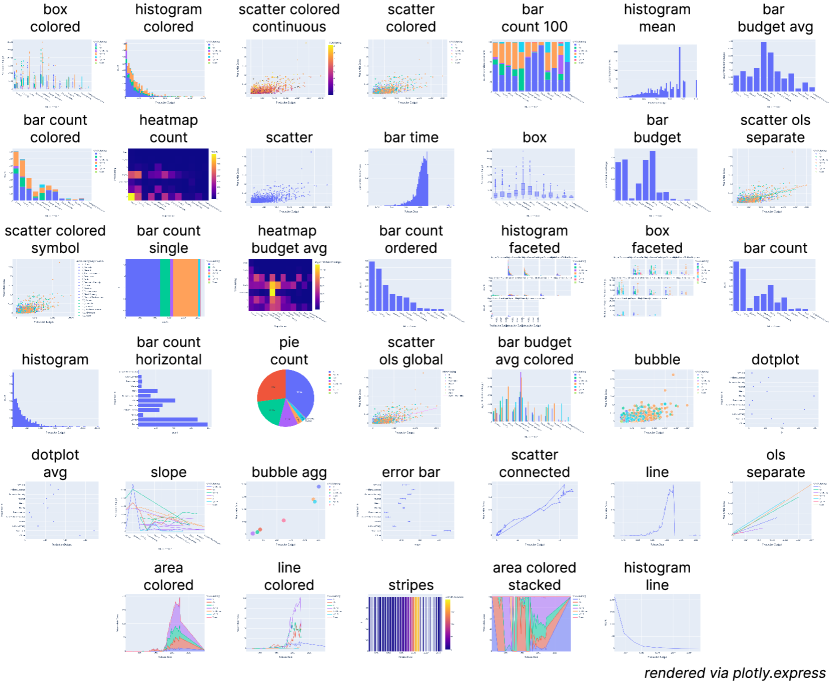
Examples and Dataset. To study these notations, we built a suite of 40 examples (Fig. 3) based on the frequently-used tidy [81] movies dataset [75]. We focused on this dataset because it has good coverage of variable types—including continuous, ordinal, and temporal variables—allowing us to create a wide variety of chart forms. These visualizations cover a variety of conventional chart types (\eg bar charts, line charts, scatter plots, and heatmaps) as well as tasks (\eg distributions of variables and the relationships between them). Moreover, they demonstrate a representative sample of statistical graphics tasks and techniques, ranging across mapping of continuous and categorical variables to spatial or color axes, the use of grouping, stacking, binning, aggregation, small multiples, regression, and error bars. A subset of expert interviewees (Sec. 4.2) iteratively reviewed and guided the curation of this list as a way to achieve ecological validity.
We strove to create idiomatic versions of each chart—such as a typical spec author might write given the constraints of a typical environment—by following the documentation wherever possible and falling back to strategies espoused in well-rated StackOverflow posts otherwise. We describe our per-notation construction process in the appendix. We further seek to limit these biases by visualizing the uncertainty in our metric values, as in Fig. 2.
4.1 Analysis
We now demonstrate a metrics-based analysis of a multi-notation gallery. We do so by exemplifying this style of analysis by considering the question what is typical for notations in this context? at a series of granularities starting from high-level relationships and zooming into a single notation. At each level of analysis, we identify patterns that we confirm and explain via spec-by-spec analysis to gain insight into these notations—thereby performing a near-by reading of the gallery.
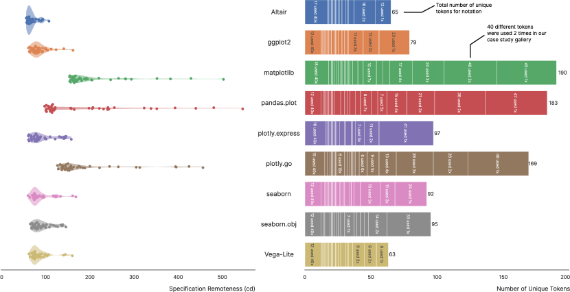
High-level observations. We begin by considering the high-level relationships among the notations revealed by the metrics. Fig. 4 highlights the presence of long tails in the remoteness distributions and the large number of tokens used only once in certain notations, suggests that any conclusions we draw may be sensitive to outliers (and hence to our selection of examples and our implementation choices). We used bootstrapping to understand the relationship between our metrics while taking into account this uncertainty: Fig. 2 shows the contours of the resulting distributions.
We relate these high-level patterns to Wongsuphasawat’s ranking of programmatic approaches [85, 86]—which span from graphics library, low-level composition, grammars, high-level composition, to chart templates (ordered by level of abstraction). Our measurements of this gallery in Fig. 2 show one major outlying cluster consisting of those with high sprawl and large vocabularies (\eg matplotlib, pandas.plot, plotly.go). These share features with the high-level composition approach, based on specifying how multiple series should be drawn. Next, those with small sprawl or vocabularies (Vega-Lite, Altair, ggplot2) resemble the grammar approach. The remaining notations (seaborn, plotly.express, and seaborn.objects) most closely resemble the low effort and expressiveness chart templates. Our results contrast with Wongsuphasawat’s ranking (which assumed decreasing effort and expressiveness with increasing abstraction) as all notations were equally-able to express our gallery. Notably, we did not observe a fundamental difference between DSL-based notations (Vega-Lite) and those based in general-purpose languages.
Based on Iverson’s arguments about economy, we expected to see an inverse relationship between sprawl and vocabulary size. However, the results complicate the picture: larger vocabularies seem associated with higher, not lower sprawls, and we see a range of median spec lengths associated with large vocabularies. Part of the increase in vocabulary size for matplotlib, pandas.plot, and plotly.go consists primarily of tokens not explicitly used for visualization but for general-purpose imperative Python tokens. The other notations leverage more declarative constructs, which appear to require fewer unique tokens. Next, these notations rely less upon inference of default values and more on explicit specification of behaviour, which requires more unique tokens. Finally, the additional tokens may permit the specification of a larger range of computations beyond visualization than the smaller set of visualization-focused tokens used in the other notations.
A more subtle challenge to the expected terseness-economy tradeoff concerns the other two clusters. The template-like notations have larger vocabularies without having lower sprawls or spec lengths, which is explained by their heavier reliance on a general-purpose data transformation library than the grammar-like ones. seaborn, seaborn.objects, and plotly.express have limited ability to express aggregations implicitly along with visual mapping and so must explicitly leverage Pandas for these operations. This same effect impacts ggplot2, which leverages dplyr for the same reason but does so less often, as dplyr appears to be less verbose than Pandas (although similar analysis of data transformation notations is important future work). This suggests that the expected terseness benefits of enumerating chart types (as plotly.express does) may well be erased by the length of the additional code required to transform data into the required shape first.
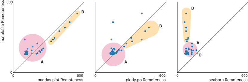
Pairwise comparisons of notations. While evaluation of these notations as an ensemble is useful, consideration of them in pairs also offers interesting insights. Figs. 5-7 show several such comparisons in which specs of similar remoteness between notations fall along the diagonal line, with patterns of diverging remoteness above or below it.
Consider the differences between pandas.plot and matplotlib shown in Fig. 5. pandas.plot leverages Pandas’ terse but incomplete statistical graphics wrapper around certain matplotlib functions. As a result, some portion of our gallery could be expressed in shorter specs with lower remoteness (to the left of the diagonal) and a smaller vocabulary. In contrast, the rest could only be expressed using matplotlib-style notation. Although identical to the specs in matplotlib, this latter set displays higher remoteness (to the right of the diagonal) in pandas.plot because they are so different from the former set. From this, we conclude that while providing "shortcuts" for common operations can increase the terseness of some parts of a notation, it can also increase its overall viscosity. seaborn’s statistical graphics functionality more thoroughly covers the set of examples in our gallery, yielding smaller remoteness (and spec length) than matplotlib across the gallery. This shows that a holistic approach to controlling terseness can also control viscosity, with or without a compositional, grammar-like design.
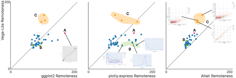
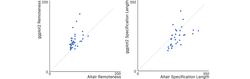
Fig. 7 supports this conclusion when comparing Altair to ggplot2. Most ggplot2 specs are smaller than their equivalent in Altair, but the Altair specs have lower remoteness. In terms of the usability of these notations as experienced by a specification author, an initial ggplot2 spec might be quicker or easier to produce than the equivalent Altair one (because both ggplot2 and dplyr are highly terse), but iteration might be easier in Altair than in ggplot2 (because Altair/Vega-Lite handle most data transformations internally and implicitly).
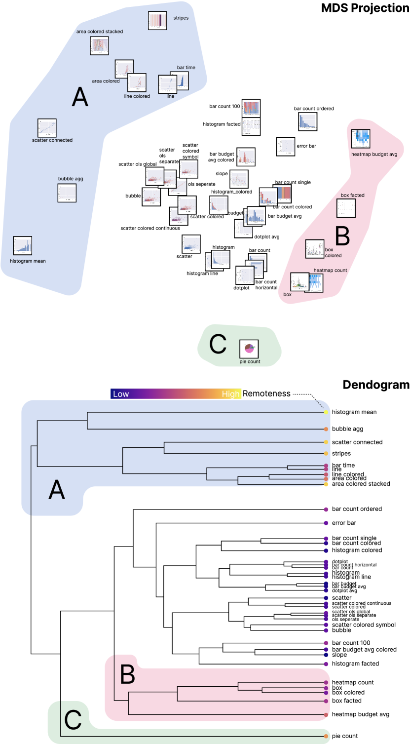
Evaluating a single notation. Finally, variation within a notation offers a useful perspective for analysis. For instance, Fig. 8 shows the design space implied by our distance function for seaborn.objects. seaborn.objects uses a new and partially-implemented grammar-oriented API within seaborn, the bounds of the new API are immediately apparent, such as how seaborn.objects must fall back to seaborn in Fig. 8B. Finer-grained structures are also visible. To wit, the examples seem to be clustered by chart type (scatterplots vs. bar charts) rather than by data column or metadata.
Such patterns can be compared against design goals for a notation, user intuitions about the design space, or observed or anticipated usages. For example, a notation designer may anticipate that authors will want to easily switch between certain visual forms during analysis, or may want to encourage such behaviour. Charts like Fig. 8 can be used to confirm that the representative specs are indeed clustered together.
4.2 Expert Interviews
We gathered feedback on our approach (and its case study instantiation) by conducting semi-structured expert interviews () with the authors or maintainers of ggplot2, Vega-Lite, Seaborn, Matplotlib, Altair, and Plotly. The interviews consisted of predefined open-ended questions that sought to elicit attitudes about notation design (see the osf for instrument), followed by a discussion of our case study. Interviews lasted about an hour. They were conducted remotely and automatically transcribed, with consent. Experts were invited to participate if it was possible to identify them as playing key roles in a prominent charting library. Participation was not compensated. Interviews were analyzed by the first author, the results of which were refined via discussion with the rest of the project team.333 Participants were randomly assigned ids (\eg EX) and are quoted “like so”.
On the Approach. All participants offered positive attitudes towards our metrics-enhanced approach to analyzing notations exemplified in Sec. 4.1. For instance, E1 expressed their enthusiasm for the approach noting that “anyone who’s designing an API wants to make it easy and this gives information about what’s easy and where exactly the deeper parts of the API have to be brought in.” Similarly, E2 noted that the types of questions surfaced by this approach are “absolutely something that I think about,” going on to observe that this approach “feels like it’s formalizing intuitions that I have.” While difficult to validate a method generally, E5 observed that “I think this captures my mental model in a quantitative way” and went on to note that “the fact that this confirms my priors gives me faith that this is actually measuring what you say it’s measuring.” E3 found the approach to be“an interesting lens to think about things,” but Fig. 2 was “not super-compelling” in that it did not challenge his expectations as it did ours, suggesting that the metrics successfully create grounds for comparing mental models among experts. Further, participants felt that the analysis captured something important about their systems and goals. For instance, E3, E2, and E4 identified the remoteness vs. vocabulary size graph (Fig. 2 lower-right) as reflecting concerns that occurred in their notational design experiences. E2 and E4 mapped their normative stance onto the metrics, with E4 noting, “Bottom-left is good, number of tokens is low, less things to learn.”
Beyond their overall reactions, participants came up with some additional ways to use our metrics-based approach. For example, E1 wanted to use the multi-notation gallery to “learn from outliers” and figure out which “things that are easier in other” notations. Others observed that these metrics could facilitate conversations within or across team boundaries or with students. “It’s a nice prompt for thinking about some of these design principles that are not even written down anywhere, don’t consciously think about them…this helps advance that conversation” (E4) and specifically around novices or new team members: “If there’s a way to get these shared assumptions into new people’s heads faster that’s great” (E5). E6 felt it “could be useful for me to motivate our students. You know, why do we pick a high level language versus a low level one? Just that separation seems really clear.” Such desired usages underscore the value of our method’s explicit surfacing of measures as a way to extend shared mental models and re-see familiar notations in new lights.
Turning to our choice of metrics, experts were similarly enthusiastic. Interviewees used a variety of spatial language to describe their reasoning about API design, noting the desirability of “being able to move to near-by plots, which clearly does imply some distance” (E3) and “exploring the neighborhood” (E4) around a chart. This suggests that measures like our sprawl (that describe the notational connectedness) are valid measures of its usability. Similarly, some experts seemed to use specification length as a proxy for complexity, therein supporting our choice of metric. For instance, E4 noted that he tried to design his notation such that “common things that seem simple should be simple and uncommon things complex.” This suggests that the family of metrics we selected aligned with participants’ concerns. That said, several participants also evoked concerns related to progressive evaluation. E3 asserted “you want to be able to navigate from one part of the space to another…in a sequence of small steps”, while E4 noted that they aspired to enable “Incremental, atomic change equals new chart.”
Participants also had reservations about our analysis method. Every expert had suggestions for additional notations to be included in the analysis, and for the inclusion of interaction, styling, or layout features in the current ones. Some participants echoed E4’s “So many other concerns to think about when choosing a language that this doesn’t capture,” such as documentation, consistency, and progressive evaluation. Further, E3 noted that this approach is “more useful at the overarching scale, not driving decisions.” and E2 observed that “This doesn’t help you find the breaking point,” i.e. the boundaries of the subspace beyond which a high-level notation no longer provides terseness beyond its lower-level constituent parts. E5 echoed this concern .
On Notation Design. Participants expressed various views about effective notation design, however these views were typically not based on formal foundations. Certain projects have made some of their principles explicit [70, 76], but most experts indicated that they relied strongly on intuition or conversation with trusted users to make decisions. Further, none of them referred to any evaluation frameworks as guiding their designs (such as CDN [16]), underscoring the potential utility of making such measurements easily usable.
Participants were cognizant of their ability to shape users’ experience of visualization and how they perform analysis. For instance, E5 noted “APIs encode a set of assumptions, be careful about the assumptions you’re making, what will you prevent.” Some experts saw their work as “an opportunity to use these languages to teach about what visualizations are”(E4) or to guide users “You definitely don’t want everything to be equidistant because you want to help guide people’s choices”(E3). In some cases, the experts evoked the notion of an exogenous design space, which the notation makes easier or harder to reach, rather than the notation imposing those distances directly. E3 argued that there should be “bits that are easier to get to and others that you have to climb up a hill” to reach.
Next, participants’ approaches to economy were generally in agreement, even if they diverged on the importance of terseness. For instance, E1 described their approach as “not being too concerned with how terse the representation is but how descriptive,” with E5 agreeing. This contrasts with E2’s observation that “I definitely aim for terseness” to support rapid iteration, echoed by E6 and E4. E3 took a position between these, observing that “You want to strive to keep the core vocabulary as small as possible” while balancing “between breadth of vocabulary and the terseness.”.He summarized his position: “If you keep adding functions, the cost is someone learning the API and if it just dissolves into 100s of special cases then you’ve lost the benefit of having a compositional API”. This key tension in visualization notation design is readily exposed by our approach and would seem to suggest its potential value for future analyses.
Finally, experts espoused concordant views around the point-in-time, work-in-progress nature of the notations defined by their systems and the importance of consistency. Every interview also touched on the importance of backward-compatibility. This was sometimes framed in terms of consistency with the existing API, even if it embodies what are now considered mistakes: “You’re going to make mistakes… Are you going to choose to be consistent with the mistake you made previously, or are you going to choose to be consistent with the underlying principle?” (E3). E1 and E3 also spoke of forward-compatibility—for instance, E1 observed that “I try to think through not just the actual feature but what are the possible extensions of the feature that might come up in the future.” Every expert expected to continue to evolve their notation, and some appreciated seeing comparisons between old and new notations, \eg seaborn and seaborn.objects. Further, this suggests that forming metrics to measure consistency would be especially useful.
5 Conclusion and Future Work
In this work, we demonstrated how metrics computed from a multi-notation gallery can provide fertile grounds on which to analyze and compare visualization notations. In doing so, we demonstrated how designers of such notations can use this style of reading to re-see the context of their work, findings which we evaluated through interviews with domain experts. We now reflect on each aspect of our work, with a focus on limitations and opportunities for future work.
Approach. Our metrics-based approach to reading visualization notations offers new tools with which to evaluate and compare visualization notations. Using this approach, authors of new notations might evaluate whether they have successfully achieved their design goals and navigated design tradeoffs, or they might point to quantitative remoteness comparisons when discussing relative notational expressiveness.
Our approach is based on a metrics-enhanced close reading [3], known as a near-by reading [37]. In line with this, we stress again that the computed metrics (like sprawl or vocabulary size) are not normative evaluation measures to be minimized at all costs. Rather our intention is that the data from which they are derived can help inform more nuanced evaluations than are common in research or practice today. We suggest that this approach enables users without a background in cognitive usability evaluation to apply those ideas by re-framing them in a more familiar data analysis-style context (as exemplified by NotaScope). The goal of this paper was to document and demonstrate our method. In future work, we intend to compare it with other methods—such as unassisted CDN [16], critical reflections [62], or algebraic analyses [35, 50].
A limitation of our work is that it treats computable metrics as proxies for usability-oriented qualities [19, 16]. Future work should consider the relationships between our metrics and such quantities empirically. For instance, the relationship between compression distance and the cognitive effort required to navigate the design space should be explored. In addition, notation usability may be impacted by factors not contained within the text of the specs. These include the intuitiveness of the terms used, which are likely guided by cultural conceptions of data [54]. It is also likely guided by sociotechnical factors [10], such as popularity, tool support, or documentation quality—which was also noted by E4. Further, analyses using our method may be biased by our choice, design, implementation of example metrics, as well as the selection and construction of gallery examples. However, such issues are also endemic to single-notation gallery-based evaluation. Our approach improves on current practice by encouraging more structured comparisons, but it does not address all issues.
Finally, there has been an explosion of interest in the visualization community [39, 52] around creating systematic descriptions of various practices through grammars or DSLs (which we capture via the more general notion of notation). While the power of such designs should not be understated, without a way to systematically examine new notations, the success of such efforts cannot be reliably evaluated [51]. This work takes steps towards providing structured means for notational comparison that does not rely on costly user studies or having substantial system-building experience [62]. Future work might explore standardized task- or domain-oriented benchmarks galleries (analogous to benchmark suites from other fields [71]), providing even more structure. In addition, future work might extend our approach by introducing an interrogatory antagonist or creating more structured prompts for reflection (à la LitVis [88]) as a companion to the metrics.
Multi-notation Galleries. We introduce the idea of task- or domain-focused multi-notation galleries (which extend single-notation galleries) as a way to make systematic comparisons of notations possible. Our metrics augment this process by helping to identify patterns and outliers, however even without metrics, multi-notation galleries can help examiners compare notations (à la close reading).
While able to answer many questions, multi-notation galleries can not bound the expressive power of a notation. That is, galleries cannot demonstrate that a given chart is impossible in a particular notation. For instance, to the surprise of its designers, an earlier version of Vega-Lite without arc marks was shown to be able express pie charts [87] through its geographic projection system. We suggest then that expressive power might be recast as an arbitrary bound on a metric like specification length or remoteness instead: what our experts referred to as the notational “breaking point.” For instance, E6 observed that he avoids showing novices certain valid specifications because they are too complex (i.e. too long) or differ too much from other semantically similar specs (i.e. too remote). Future work should explore how such extrema might be automatically exposed to the designer.
Our galleries have a number of limitations. Each notation must produce all of the examples, which causes them to be limited to the greatest common feature set among the notations, although, as noted above, this set can be quite large. However, the existence of a common problem domain (\eg charting) suggests that notations are designed to fit a set of tasks that users realistically seek to accomplish. If a notation possesses features that are so unlike others as to be incomparable, then the user may be pursuing a more nuanced task (\eg ECharts [27] streaming data). Requiring the gallery to be centered on a single dataset may bias the analyses based on the types of examples producible with that dataset, however given that data tends to flow through visualizations rather than be expressed as part of their notation, we believe this effect is limited. Our use of metrics over galleries measures notational samples rather than the notation itself. Direct measurement would be preferable, but it is impeded by most notations lacking formal definitions. Approaches like grammar-ware [23] may facilitate higher order comparison, however the lack of adoption of this style of work in the last 20 years suggests that this is unlikely. The labor intensive process of producing galleries might be reduced by employing a generative AI-based assistant [74], although that invites the tradeoffs endemic to such systems [65].
Case study. Our case study, and its evaluation, demonstrated that our metrics-based approach can produce findings that experts in statistical graphics notation design find interesting. As these experts have necessarily done the closest reading of their libraries, we suggest their finding value in our approach indicates that our metrics provide useful purchase for analysis. While not able to draw conclusions about matters like which notation is best, this study provided empirical evidence for various patterns latent to this family of notations—such as the difference between High-Level Composition and Visualization Grammar-style approaches [85]. Further, the distances and token-counts reveal other types of variation between notations, such as in their viscosity, terseness, and economy. In future work, we intend to validate our findings by replicating our study with another gallery for a different dataset.
The selection of notations considered in our case study was motivated by the twin criteria of trying to select the most widely-used libraries and those for which we could solicit evaluation by experts, the resolution of which may have biased our results. This study might be usefully extended to include other common statistical graphics notations (and experts therein) such as D3[6], base-R, Bokeh [4], Holoviz [92], AntV [2], or ECharts [27]. Other visualization domains could be usefully considered—\eg thematic mapping, interaction, or animation—as might those outside of it—\eg diagrams [68], data manipulation (SQL vs. dplyr vs. Pandas), or ML models (Torch vs. Tensorflow).
While the interviewed experts were enthusiastic about our approach and analysis, E3 and E4 felt that our case study (rooted in NotaScope) was too high-level for individual design decisions. However, the metrics-based approach could be applied on a much finer-grained level: instead of just quantifying the distance between two specifications, NotaScope could be extended to automatically enumerate and display plausible step-wise paths through the design space. The presence of multiple paths with small steps would speak to progressive evaluation, which is an important (E3, E4) design goal that can be hard for designers to reason about. Our study design limits these results, which may have yielded different findings with more users or if we had elicited structured Likert-style ratings. In future work, we intend to take such measures as we further explore our approach’s usability.
We are optimistic that, based on these lessons, we can add to our suite of metrics and continue to improve our approach and tool so that they can become useful parts of the notation designer’s toolkit.
6 Supplemental Material
Additional material related to this paper can be found at osf.io/8924y. This part of the supplemental material includes the source code for our tool (NotaScope), the study instrument, and the specifications used to form the basis of the gallery in our case study. Further supplemental material, which can be found on PCS, contains a video walk-through of our system, and an appendix with additional written materials. Finally, a demo of our tool NotaScope is available at app.notascope.io, where the case study materials can be browsed and analyzed interactively.
Acknowledgements.
We acknowledge our reviewers for their thoughtful commentary, as well as the domain experts who graciously shared for their time and perspectives with us. This work was supported by NSERC.References
- [1] D. Albuquerque, B. Cafeo, A. Garcia, S. Barbosa, S. Abrahão, and A. Ribeiro. Quantifying usability of domain-specific languages: An empirical study on software maintenance. Journal of Systems and Software, 101:245–259, 2015. doi: 10 . 1016/j . jss . 2014 . 11 . 051
- [2] AntV. Antv-spec, 2022. https://github.com/antvis/antv-spec.
- [3] A. Bares, D. F. Keefe, and F. Samsel. Close reading for visualization evaluation. IEEE CG&A, 40(4):84–95, 2020. doi: 10 . 1109/MCG . 2020 . 2993889
- [4] Bokeh. Bokeh, 2023. https://github.com/bokeh/bokeh.
- [5] M. Bostock and J. Heer. Protovis: A graphical toolkit for visualization. IEEE TVCG, 15(6):1121–1128, 2009. doi: 10 . 1109/TVCG . 2009 . 174
- [6] M. Bostock, V. Ogievetsky, and J. Heer. D3 data-driven documents. IEEE TVCG, 17(12):2301–2309, 2011. doi: 10 . 1109/TVCG . 2011 . 185
- [7] J. Brandt, P. J. Guo, J. Lewenstein, M. Dontcheva, and S. R. Klemmer. Two studies of opportunistic programming: Interleaving web foraging, learning, and writing code. In ACM CHI, pp. 1589–1598, 2009. doi: 10 . 1145/1518701 . 1518944
- [8] E. H. Chi. A taxonomy of visualization techniques using the data state reference model. In Proc. IEEE InfoVis, pp. 69–75, 2000. doi: 10 . 1109/INFVIS . 2000 . 885092
- [9] S. Clarke. Measuring API usability. Dr. Dobb’s, 2004.
- [10] F. L. de la Mora and S. Nadi. Which library should I use? a metric-based comparison of software libraries. In Proc. ICSE-NIER, pp. 37–40, 2018. doi: 10 . 1145/3183399 . 3183418
- [11] P. Devanbu, T. Zimmermann, and C. Bird. Belief & evidence in empirical software engineering. In Proc. ICSE, pp. 108–119, 2016. doi: 10 . 1145/2884781 . 2884812
- [12] S. Dolan. jq. https://jqlang.github.io/jq/.
- [13] N. Fenton and J. Bieman. Software metrics: a rigorous and practical approach. CRC press, 2014.
- [14] C. Flynn. PyPI stats: matplotlib. https://pypistats.org/packages/matplotlib accessed 2023-07-01.
- [15] V. Frick, T. Grassauer, F. Beck, and M. Pinzger. Generating accurate and compact edit scripts using tree differencing. In IEEE ICSME, pp. 264–274, 2018. doi: 10 . 1109/ICSME . 2018 . 00036
- [16] T. R. Green. Cognitive dimensions of notations. People and Computers V, pp. 443–460, 1989.
- [17] T. Hopper. Python plotting for exploratory data analysis, 2020. https://pythonplot.com/.
- [18] J. D. Hunter. Matplotlib: A 2D graphics environment. Computing in Science & Engineering, 9(3):90–95, 2007. doi: 10 . 1109/MCSE . 2007 . 55
- [19] K. E. Iverson. Notation as a tool of thought. CACM, 23(8):444–465, 1980. doi: 10 . 1145/358896 . 358899
- [20] H. Kim, R. Rossi, F. Du, E. Koh, S. Guo, J. Hullman, and J. Hoffswell. Cicero: A declarative grammar for responsive visualization. In ACM CHI, pp. 600:1–600:15, 2022. doi: 10 . 1145/3491102 . 3517455
- [21] H. Kim, R. Rossi, A. Sarma, D. Moritz, and J. Hullman. An automated approach to reasoning about task-oriented insights in responsive visualization. IEEE TVCG, 28(1):129–139, 2022. doi: 10 . 1109/TVCG . 2021 . 3114782
- [22] Y. Kim, K. Wongsuphasawat, J. Hullman, and J. Heer. GraphScape: A model for automated reasoning about visualization similarity and sequencing. In ACM CHI, pp. 2628–2638, 2017. doi: 10 . 1145/3025453 . 3025866
- [23] P. Klint, R. Lämmel, and C. Verhoef. Toward an engineering discipline for grammarware. ACM Trans. Softw. Eng. Methodol., 14(3):331–380, 2005. doi: 10 . 1145/1072997 . 1073000
- [24] M. J. Kusner, B. Paige, and J. M. Hernández-Lobato. Grammar variational autoencoder. In Proc. ICML, pp. 1945–1954. PMLR, 2017. https://proceedings.mlr.press/v70/kusner17a.html.
- [25] E. Larios Vargas, M. Aniche, C. Treude, M. Bruntink, and G. Gousios. Selecting third-party libraries: The practitioners’ perspective. In Proc. ESEC/FSE, pp. 245–256, 2020. doi: 10 . 1145/3368089 . 3409711
- [26] B. Lee, A. Satyanarayan, M. Cordeil, A. Prouzeau, B. Jenny, and T. Dwyer. Deimos: A grammar of dynamic embodied immersive visualisation morphs and transitions. In ACM CHI, pp. 810:1–810:18, 2023. doi: 10 . 1145/3544548 . 3580754
- [27] D. Li, H. Mei, Y. Shen, S. Su, W. Zhang, J. Wang, M. Zu, and W. Chen. ECharts: A declarative framework for rapid construction of web-based visualization. Visual Informatics, 2(2):136–146, 2018. doi: 10 . 1016/j . visinf . 2018 . 04 . 011
- [28] G. Li, M. Tian, Q. Xu, M. J. McGuffin, and X. Yuan. GoTree: A grammar of tree visualizations. In ACM CHI, pp. 1–13, 2020. doi: 10 . 1145/3313831 . 3376297
- [29] G. Li and X. Yuan. GoTreeScape: Navigate and explore the tree visualization design space. IEEE TVCG, pp. 1–17, 2022. doi: 10 . 1109/TVCG . 2022 . 3215070
- [30] M. Li, X. Chen, X. Li, B. Ma, and P. M. B. Vitányi. The similarity metric. IEEE Transactions on Information Theory, 50(12):3250–3264, 2004. doi: 10 . 1109/TIT . 2004 . 838101
- [31] Z. Liu, C. Chen, F. Morales, and Y. Zhao. Atlas: Grammar-based procedural generation of data visualizations. In IEEE VIS, pp. 171–175, 2021. doi: 10 . 1109/VIS49827 . 2021 . 9623315
- [32] Z. Liu, J. Thompson, A. Wilson, M. Dontcheva, J. Delorey, S. Grigg, B. Kerr, and J. Stasko. Data Illustrator: Augmenting vector design tools with lazy data binding for expressive visualization authoring. In ACM CHI, pp. 1–13, 2018. doi: 10 . 1145/3173574 . 3173697
- [33] L. McInnes, J. Healy, and J. Melville. UMAP: Uniform manifold approximation and projection for dimension reduction, 2020. doi: 10 . 48550/arXiv . 1802 . 03426
- [34] W. McKinney. Data structures for statistical computing in Python. In Proc. Python in Science Conference, pp. 56–61, 2010. doi: 10 . 25080/Majora-92bf1922-00a
- [35] A. McNutt. What are table cartograms good for anyway? An algebraic analysis. CGF, 40:61–73, 2021. doi: 10 . 1111/cgf . 14289
- [36] A. McNutt and R. Chugh. Integrated visualization editing via parameterized declarative templates. In ACM CHI, pp. 1–14, 2021.
- [37] A. McNutt, A. Kim, S. Elahi, and K. Takahashi. Supporting expert close analysis of historical scientific writings: A case study for near-by reading. In IEEE VIS4DH, pp. 1–2, 2020. doi: 10 . 1109/VIS4DH51463 . 2020 . 00005
- [38] A. McNutt, G. Kindlmann, and M. Correll. Surfacing visualization mirages. In ACM CHI, pp. 1–16, 2020. doi: 10 . 1145/3313831 . 3376420
- [39] A. M. McNutt. No grammar to rule them all: A survey of JSON-style DSLs for visualization. IEEE TVCG, 29(1):160–170, 2023. doi: 10 . 1109/TVCG . 2022 . 3209460
- [40] A. Mead. Review of the development of multidimensional scaling methods. J. Royal Stat. Soc.: Series D, 41:27–39, 1992. doi: 10 . 2307/2348634
- [41] P. Mooney. Kaggle survey 2022: Data scientists in the USA, 2022. https://www.kaggle.com/code/paultimothymooney/kaggle-survey-2022-data-scientists-in-the-usa.
- [42] F. Moretti. Distant reading. Verso Books, 2013.
- [43] K. Müller, L. Walthert, and I. Patil. styler: Non-invasive pretty printing of R code. https://cran.r-project.org/web/packages/styler/ accessed 2023.
- [44] L. Muth. One chart, twelve charting libraries, 2016. https://lisacharlottemuth.com/2016/05/17/one-chart-code/.
- [45] Pandas team. Chart visualization — pandas 1.5.3 documentation. https://pandas.pydata.org/docs/user_guide/visualization.html.
- [46] D. Park, S. M. Drucker, R. Fernandez, and N. Elmqvist. Atom: A grammar for unit visualizations. IEEE TVCG, 24(12):3032–3043, 2018. doi: 10 . 1109/TVCG . 2017 . 2785807
- [47] F. Pezoa, J. L. Reutter, F. Suarez, M. Ugarte, and D. Vrgoč. Foundations of JSON schema. In Proc. International Conference on World Wide Web, pp. 263–273, 2016. doi: 10 . 1145/2872427 . 2883029
- [48] Plotly. Low-code data apps. https://plotly.com/.
- [49] I. Poltronieri, A. C. Pedroso, A. F. Zorzo, M. Bernardino, and M. de Borba Campos. Is usability evaluation of DSL still a trending topic? In Proc. HCII, pp. 299–317, 2021. doi: 10 . 1007/978-3-030-78462-1_23
- [50] X. Pu and M. Kay. A probabilistic grammar of graphics. In ACM CHI, pp. 1–13, 2020. doi: 10 . 1145/3313831 . 3376466
- [51] X. Pu and M. Kay. How data analysts use a visualization grammar in practice. In ACM CHI, pp. 840:1–840:22, 2023. doi: 10 . 1145/3544548 . 3580837
- [52] X. Pu, M. Kay, S. M. Drucker, J. Heer, D. Moritz, and A. Satyanarayan. Special interest group on visualization grammars. In ACM CHI EA, pp. 1–3, 2021. doi: 10 . 1145/3411763 . 3450406
- [53] Python Software Foundation. Black python code formatter. https://github.com/psf/black.
- [54] N. Rakotondravony, Y. Ding, and L. Harrison. Probablement, wahrscheinlich, likely? a cross-language study of how people verbalize probabilities in icon array visualizations. IEEE TVCG, 29(1):1189–1199, 2023. doi: 10 . 1109/TVCG . 2022 . 3209367
- [55] I. Rauf, E. Troubitsyna, and I. Porres. A systematic mapping study of API usability evaluation methods. Computer Science Review, 33:49–68, 2019. doi: 10 . 1016/j . cosrev . 2019 . 05 . 001
- [56] D. Ren, B. Lee, and M. Brehmer. Charticulator: Interactive construction of bespoke chart layouts. IEEE TVCG, 25(1):789–799, 2018. doi: 10 . 1109/TVCG . 2018 . 2865158
- [57] M. Rocklin. How popular is Matplotlib?, 2022. https://www.coiled.io/blog/how-popular-is-matplotlib.
- [58] D. M. Russell. Simple is good: Observations of visualization use amongst the big data digerati. In AVI, pp. 7–12, 2016. doi: 10 . 1145/2909132 . 2933287
- [59] D. Saber. A dramatic tour through Python’s data visualization landscape (including ggplot and Altair), 2016. https://dsaber.com/2016/10/02/a-dramatic-tour-through-pythons-data-visualization-landscape-including-ggplot-and-altair/.
- [60] A. Sarma, A. Kale, M. J. Moon, N. Taback, F. Chevalier, J. Hullman, and M. Kay. multiverse: Multiplexing alternative data analyses in R notebooks. In ACM CHI, pp. 148:1–148:15, 2023. doi: 10 . 1145/3544548 . 3580726
- [61] A. Satyanarayan and J. Heer. Lyra: An interactive visualization design environment. CGF, 33:351–360, 2014. doi: 10 . 1111/cgf . 12391
- [62] A. Satyanarayan, B. Lee, D. Ren, J. Heer, J. Stasko, J. Thompson, M. Brehmer, and Z. Liu. Critical reflections on visualization authoring systems. IEEE TVCG, 26(1):461–471, 2019. doi: 10 . 1109/TVCG . 2019 . 2934281
- [63] A. Satyanarayan, D. Moritz, K. Wongsuphasawat, and J. Heer. Vega-Lite: A grammar of interactive graphics. IEEE TVCG, 23(1):341–350, 2017. doi: 10 . 1109/TVCG . 2016 . 2599030
- [64] T. Scheller and E. Kühn. Automated measurement of API usability: The API concepts framework. Information and Software Technology, 61:145–162, 2015. doi: 10 . 1016/j . infsof . 2015 . 01 . 009
- [65] V. Schetinger, S. D. Bartolomeo, M. El-Assady, A. McNutt, M. Miller, J. P. A. Passos, and J. L. Adams. Doom or deliciousness: Challenges and opportunities for visualization in the age of generative models. CGF, 42(3):423–435, 2023. doi: 10 . 1111/cgf . 14841
- [66] L. Shen, E. Shen, Z. Tai, Y. Wang, Y. Luo, and J. Wang. GALVIS: Visualization construction through example-powered declarative programming. In Proc. ACM International Conference on Information & Knowledge Management, pp. 4975–4979, 2022. doi: 10 . 1145/3511808 . 3557159
- [67] F. Shull, J. Singer, and D. I. Sjøberg. Guide to advanced empirical software engineering. Springer, 2007. doi: 10 . 1007/978-1-84800-044-5
- [68] Terrastruct. Text to diagram: Community list of comparisons between text to diagram tools, 2023. https://text-to-diagram.com/.
- [69] P. P. Texel. Measuring software development status: Do we really know where we are? In SoutheastCon, pp. 1–6. IEEE, 2015. doi: 10 . 1109/SECON . 2015 . 7132949
- [70] Tidyverse team. Tidyverse design guide. https://design.tidyverse.org/.
- [71] TPC. TPC-E, 2007. https://tpc.org/tpce/.
- [72] Treesitter. An incremental parsing system for programming tools. https://tree-sitter.github.io/.
- [73] J. VanderPlas, B. Granger, J. Heer, D. Moritz, K. Wongsuphasawat, A. Satyanarayan, E. Lees, I. Timofeev, B. Welsh, and S. Sievert. Altair: interactive statistical visualizations for python. Journal of open source software, 3(32):1057, 2018. doi: 10 . 21105/joss . 01057
- [74] A. Vaswani, N. Shazeer, N. Parmar, J. Uszkoreit, L. Jones, A. N. Gomez, L. Kaiser, and I. Polosukhin. Attention is all you need, 2017. doi: 10 . 48550/arXiv . 1706 . 03762
- [75] Vega. Vega datasets, 2023. https://github.com/vega/vega-datasets/.
- [76] Vega-Lite team. Contributing to Vega-Lite. https://github.com/vega/vega-lite/blob/main/CONTRIBUTING.md.
- [77] P. Vickers, J. Faith, and N. Rossiter. Understanding visualization: A formal approach using category theory and semiotics. IEEE TVCG, 19(6):1048–1061, 2013. doi: 10 . 1109/TVCG . 2012 . 294
- [78] A. Y. Wang, W. Epperson, R. A. DeLine, and S. M. Drucker. Diff in the loop: Supporting data comparison in exploratory data analysis. In ACM CHI, pp. 1–10, 2022. doi: 10 . 1145/3491102 . 3502123
- [79] M. L. Waskom. Seaborn: statistical data visualization. Journal of Open Source Software, 6(60):3021, 2021. doi: 10 . 21105/joss . 03021
- [80] H. Wickham. A layered grammar of graphics. Journal of Computational and Graphical Statistics, 19(1):3–28, 2010. doi: 10 . 1198/jcgs . 2009 . 07098
- [81] H. Wickham. Tidy data. Journal of Statistical Software, 59(10):1–23, 2014. doi: 10 . 18637/jss . v059 . i10
- [82] H. Wickham, M. Averick, J. Bryan, W. Chang, L. D. McGowan, R. François, G. Grolemund, A. Hayes, L. Henry, J. Hester, M. Kuhn, T. L. Pedersen, E. Miller, S. M. Bache, K. Müller, J. Ooms, D. Robinson, D. P. Seidel, V. Spinu, K. Takahashi, D. Vaughan, C. Wilke, K. Woo, and H. Yutani. Welcome to the Tidyverse. Journal of Open Source Software, 4(43):1686, Nov. 2019. doi: 10 . 21105/joss . 01686
- [83] H. Wickham, R. François, L. Henry, K. Müller, and D. Vaughan. dplyr: A grammar of data manipulation, 2023. https://dplyr.tidyverse.org.
- [84] L. Wilkinson. The Grammar of Graphics. Statistics and Computing. Springer-Verlag, 2005. doi: 10 . 1007/0-387-28695-0
- [85] K. Wongsuphasawat. Encodable: Configurable grammar for visualization components. In IEEE VIS, pp. 131–135, 2020. doi: 10 . 1109/VIS47514 . 2020 . 00033
- [86] K. Wongsuphasawat. Navigating the wide world of data visualization libraries, 2020. https://nightingaledvs.com/navigating-the-wide-world-of-data-visualization-libraries/.
- [87] J. Wood. Comment on arc mark / pie chart, 2018. https://github.com/vega/vega-lite/issues/408#issuecomment-373870307.
- [88] J. Wood, A. Kachkaev, and J. Dykes. Design exposition with literate visualization. IEEE TVCG, 25(1):759–768, 2018. doi: 10 . 1109/TVCG . 2018 . 2864836
- [89] A. Wu, W. Tong, H. Li, D. Moritz, Y. Wang, and H. Qu. ComputableViz: Mathematical operators as a formalism for visualisation processing and analysis. In ACM CHI, pp. 410:1–410:15, 2022. doi: 10 . 1145/3491102 . 3517618
- [90] Y. Xie, E. Lee, E. Ha, K. Takahashi, and P. Krivitsky. formatR: Format R code automatically. https://cran.r-project.org/web/packages/formatR/.
- [91] S. Xu, C. Bryan, J. K. Li, J. Zhao, and K.-L. Ma. Chart constellations: Effective chart summarization for collaborative and multi-user analyses. CGF, 37(3):75–86, 2018. doi: 10 . 1111/cgf . 13402
- [92] S. Yang, M. S. Madsen, and J. A. Bednar. HoloViz: Visualization and interactive dashboards in Python. In Proc. SIGKDD Conference on Knowledge Discovery and Data Mining, pp. 4846–4847, 2022. doi: 10 . 1145/3534678 . 3542621
- [93] J. Zhao, M. Fan, and M. Feng. Chartseer: Interactive steering exploratory visual analysis with machine intelligence. IEEE TVCG, 28(3):1500–1513, 2022. doi: 10 . 1109/TVCG . 2020 . 3018724
- [94] J. Zong, J. Pollock, D. Wootton, and A. Satyanarayan. Animated Vega-Lite: Unifying animation with a grammar of interactive graphics. IEEE TVCG, 29(1):149–159, 2023. doi: 10 . 1109/TVCG . 2022 . 3209369
- [95] T. Zuk, L. Schlesier, P. Neumann, M. S. Hancock, and S. Carpendale. Heuristics for information visualization evaluation. In Proc. AVI workshop on BEyond time and errors: novel evaLuation methods for Information Visualization (BELIV), pp. 1–6, 2006. doi: 10 . 1145/1168149 . 1168162
Appendix A Appendix
This appendix includes material that was unable to fit into the main body of the paper. Below we describe the notations employed in our use case. Then, in Fig. 9 we show an annotated screenshot of our tool, NotaScope. Finally, in Fig. 6 we exemplify a minimum spanning tree (enabled by NotaScope) of the space implied by our compression distance metric.
A.1 Notations
The notations used in our case study were defined as follows:
-
•
The ggplot2 notation consists of R code constrained by having only the tidyverse [82] package installed in a standard R runtime, biased towards using functions from that package rather than base R functionality wherever possible. The tidyverse package includes the ggplot2 visualization system [80] as well as the dplyr [83] data-transformation system. ggplot2 consists of a grammar based on Wilkinson’s [84].
-
•
The matplotlib notation consists of Python code constrained by having only the matplotlib [18] and pandas [34] packages installed in a standard Python runtime, biased towards using Matplotlib’s axis-level function API rather than the legacy pyplot API, as recommended in the documentation. This is an imperative API with functions to progressively mutate a figure. matplotlib does not have any data-transformation capabilities, so pandas is used wherever necessary in this notation. matplotlib is the most-downloaded Python visualization system and Pandas is the most-downloaded data-frame system used to manipulate tidy data in Python.
-
•
The pandas.plot notation is defined in the same way as the matplotlib notation, except that Pandas’ built-in .plot() API is used wherever possible. This API is a thin wrapper around Matplotlib to “easily create decent-looking plots” [45] We include this notation as distinct from matplotlib due to the popularity of Pandas and to study the effects of a minor variant of a notation on the measures we have developed.
-
•
The seaborn notation consists of Python code constrained by having only the seaborn [79] package installed in a standard Python runtime, biased towards using seaborn’s figure-level API. Seaborn is itself a wrapper around Matplotlib and also depends on Pandas. It has some data-transformation functionality built-in and pandas’ capabilities are used wherever necessary. seaborn’s figure-level API is built around just three functions, for “distributional”, “categorical” and “relational” figures. It is the most-downloaded statistical-graphics-focused library in Python.
-
•
The seaborn.objects notation is defined in the same way as the seaborn notation, except that the new, work-in-progress object-level API is used wherever possible. The object-level interface was developed to be a more consistent and extensible interface than the figure-level one. Its grammar consists of Mark, Stat, Move, and Scale objects. We include this notation to study the differences between two notations that share many design decisions.
-
•
The plotly.go notation consists of Python code constrained by having only the plotly [48] and pandas packages installed in a standard Python runtime, biased towards using Plotly’s lower-level graph_objects interface. The graph_objects interface enables Python users to generate JSON figure descriptions to be rendered by the Plotly.js library, and includes almost no data-transformation features, so pandas’ data-transformation capabilities are used. The structure of this API is oriented around the accumulation of trace objects which represent series to be drawn. Plotly is the second-most-downloaded visualization library in Python.
-
•
The plotly.express notation is defined in the same way as the plotly.go notation except that the built-in high-level Plotly Express API is used whenever possible. Plotly Express was developed to enable the creation of terser specifications than is possible with the plotly.go notation, by including some data-transformation capabilities. Wherever those capabilities are insufficient to specify an example, pandas’ are used in this notation. Plotly Express is included within the plotly package and was designed to have a similar relationship to the plotly.go notation as the seaborn’s figure-level interface does to matplotlib.
-
•
The Vega-Lite notation consists of JSON code constrained by having only the vega-lite [63] module installed in a standard NodeJS runtime. Vega-Lite is based on a highly consistent and orthogonal grammar, with built-in data-transformation capabilities.
-
•
The Altair notation is defined by having only the altair [73] and pandas packages installed in a standard Python runtime. Altair is a Python interface to Vega-Lite.