basicstyle=, breaklines=true
Notably Inaccessible – Data Driven Understanding of Data Science Notebook (In)Accessibility
Abstract.
Computational notebooks, tools that facilitate storytelling through exploration, data analysis, and information visualization, have become the widely accepted standard in the data science community. These notebooks have been widely adopted through notebook software such as Jupyter, Datalore and Google Colab, both in academia and industry. While there is extensive research to learn how data scientists use computational notebooks, identify their pain points, and enable collaborative data science practices, very little is known about the various accessibility barriers experienced by blind and visually impaired (BVI) users using these notebooks. BVI users are unable to use computational notebook interfaces due to (1) inaccessibility of the interface, (2) common ways in which data is represented in these interfaces, and (3) inability for popular libraries to provide accessible outputs. We perform a large scale systematic analysis of 100000 Jupyter notebooks to identify various accessibility challenges in published notebooks affecting the creation and consumption of these notebooks. Through our findings, we make recommendations to improve accessibility of the artifacts of a notebook, suggest authoring practices, and propose changes to infrastructure to make notebooks accesible. An accessible PDF can be obtained at https://blvi.dev/noteably-inaccessible-paper
1. Introduction
Computational notebooks such as Jupyter (Pérez et al., 2014) combine code, natural language, and rich representations of data providing a ubiquitous literate programming experience (Knuth, 1984). These notebooks are used through computational notebook systems and programming environments such as Jupyter, Google Colab, Datalore, and Noteable (among others) that abstract software setup, computational infrastructure management and access to resources. Computational notebooks are widely used by data scientists as interactive mechanisms to process, understand and express data making it easier for them to collaborate, share code, convey stories and narratives through data visualizations and text, while keeping the reproducibility of results in mind (Wang et al., 2020; Rule et al., 2018). The popularity of these computational notebooks, specifically Jupyter notebooks, as the go-to tool for data science can be seen in the rapid increase in published notebooks, 2.5 Million public notebooks hosted on GitHub in September 2018 (Rule et al., 2018), increasing by 10x since 2015 (Wang et al., 2020). As of 2020, this dataset has increased to over 10 Million and has been analyzed by JetBrains – a company building Integrated Development Environments (IDEs) (Guzharina, 2020).
Despite computational notebooks being popular tools, we know very little about the accessibility of these tools for developers and data scientists who are blind or visually impaired (BVI). What little has been written on the topic is found in non-peer reviewed sources such as Astronomy Notebooks for All (Space Telescope Science Institute, Iota School and Quansight Labs, 2023), an effort to perform accessibility auditing of the Jupyter Lab interface and contribute changes to the upstream Jupyter open source community. An early 2023 analysis of the accessibility score for Jupyter Hub graded it as a fail (F) (Jupyter, 2020). One active effort to address the inaccessibility of notebook software can be found in Microsoft’s VisualStudio Code, a popular IDE among the BVI developer community that is building a new, more accessible notebook authoring experience on top of the existing standardized format of Notebooks by adding improved keyboard navigation and audio cues. While these are much needed improvements to the Notebook IDE experience, they do not contribute to our understanding of the full variety of accessibility issues that can arise from from the different ways in which computational notebooks are authored, consumed, and published. Understanding these accessibility issues can be critical to improving the accessibility of notebooks and the infrastructure that supports their creation, consumption, and distribution.
We present a data-driven investigation of the accessibility of computational notebooks. Our investigation focuses on accessibility for BVI notebook authors and consumers (hereby referred to as BVI users or BVI notebook users). Our work answers the question of whether IDE artifacts, authoring experiences, and infrastructure to work with computational notebooks, are accessible to BVI users. We answer the following specific research questions:
-
RQ1
Data Artifacts: How accessible are key data artifacts, namely figures and tables, to blind or visually impaired users?
-
RQ2
Authoring: How do existing notebook authoring practices impact screen reader users’ ability to glance through important information and results? For example, do most notebooks make proper use of headers and other landmarks that improve navigation and glanceability?
-
RQ3
Infrastructure: How do current tools to distribute and customize notebooks impact accessibility? For example, how do different themes for coloring a notebook impact the number of accessibility errors found by automated tools assessing that notebook?
We answer these questions in the context of a large-scale, in-the-wild dataset of computational notebooks. This includes notebooks that may have been used for anything from exploratory data analysis to documents produced for public distribution . These notebooks could be written and consumed by users from a variety of disciplines including students, coders, or data scientists, and this process should be accessible to any notebook user who may be blind or visually impaired at any stage of the notebook authoring or consumption process. Thus, we chose to assess accessibility at scale without narrowing to a specific use category.
We narrow our our analysis to a subset of 100,000 notebooks selected at random from the JetBrains dataset of 10,000,000 (10 Million) of them (Guzharina, 2020). Choosing such a large, random sample helps us to understand common patterns in notebook inaccessibility. We complement this with manual verification of a smaller set of 10 notebooks. Additionally, we narrow parts of our analysis to Python, the most popular language used in notebooks, so that we can perform language-specific code analysis to gain a deeper understanding of inaccessibility caused by notebook infrastructure.
Our contributions are as follows:
-
(1)
We develop repeatable automated metrics that represent optimistic upper bounds for estimating notebook accessibility.
-
(2)
We developed a method for the first systematic large scale analysis of the current state of accessibility of computational notebooks to blind or visually impaired notebook authors / consumers. We open source our dataset and processing pipeline to enable researchers to build on this method and extend our results (Potluri et al., 2023a).
-
(3)
We present results highlighting the overall inaccessibility of notebooks with respect to three research questions which look at the accessibility of data artifacts, notebook IDEs, and infrastructure. We also describe the programming tools most commonly used by notebook authors.
-
(4)
Based on our results, we highlight opportunities such as encouraging good ALT text authoring practices, or automatically generating an accessible table alongside a chart. We make recommendations for notebook software developers, data scientists, and accessibility researchers creating computational notebooks, to make data and the corresponding story telling accessible through computational notebooks.
Our findings about accessibility of computational notebooks through this characterization can have the potential to quicken the pace of making data science accessible by identifying the right improvements to widely used tools and notebook authoring practices, reducing the need for bespoke, custom accessibility-only solutions.
2. Background
Computational notebooks have risen in popularity since the inception of Jupyter in 2014, impacting many domains within and outside of computer science such as data science, machine learning, and astronomy. This impact has been recognized by the Association of Computing Machinery (ACM) in 2017 with a prestigious software systems award (ACM, 2017).
Often, these notebooks are authored in a web-based IDE such as Jupyter Lab and Jupyter book, or through hosted and managed alternatives such as Google Colab, and Datalore. Since their invention, millions of such notebooks have been authored for data analysis and related tasks, and it is important that we analyze this phenomena (Wang et al., 2020) in the context of accessibility. Rule et al. collected and released a dataset of one million Jupyter notebooks (Rule et al., 2018). Analyses of these notebooks have shown that the majority of the notebooks do not declare dependencies, and have not been tested (Pimentel et al., 2021); and notebook users consider them to be personal and messy (Rule et al., 2018).
Although many notebooks are used primarily by their authors, some notebooks are published. Publishing a notebook leverages tools built into the notebook IDE to generate a webpage, or sometimes a PDF or LaTeX document. In the case of web pages, these tools use web semantics such as headings and tables to structure content, and allow notebooks to be themed or otherwise decorated.
To better understand what issues may be of concern, we review the literature outside of computational notebooks in three closely related areas: Programming / IDE accessibility (relevant to the accessibility of the notebook authoring experience, Section 2.1); Data analysis and visualization accessibility (relevant to both authors and consumers, Section 2.1); and Web Accessibility (relevant to consumers and authors of published notebooks Section 2.3).
2.1. Programming/IDE Accessibility
Accessibility of web-based programming has been studied in the past in the context of High-fidelity prototyping tools, which were found to have inaccessible graphical user interface (GUI) controls preventing BVI users of these tools from accessing the content in widgets and manipulating them on the prototyping canvas (Li et al., 2021).
Another useful point of comparison consider accessibility concerns raised in studies of other (non-web) programming. Mealin and Murphy-Hill published one of the first studies to understand accessibility barriers experienced by BVI developers (Mealin and Murphy-Hill, 2012). They found challenges associated with using IDEs and developing user interfaces. Other studies have found that accessibility barriers can impact navigation, debugging, and glanceability of code during the programming process (Albusays et al., 2017; Potluri et al., 2018). Accessibility can also impact other tasks related to software development such as information seeking and collaboration with sighted users (Storer et al., 2021; Pandey et al., 2021; Potluri et al., 2022a).
Solutions to these accessibility concerns include improvements to IDEs, bespoke software tools, and physical tactile interfaces to make web and user interface development accessible to BVI developers (Li et al., 2019; Potluri et al., 2019; Shetty et al., 2020; Li et al., 2022; Pandey et al., 2022). Several tools present novel, accessible representations of code by repurposing familiar navigational structures such as list views, tree views and tables to facilitate efficient screen reader navigation (Baker et al., 2015; Schanzer et al., 2019; Potluri et al., 2018; Ehtesham-Ul-Haque et al., 2022). Additionally, audio has been used as a feedback mechanism to facilitate accessible debugging of code (Stefik et al., 2009, 2007; Potluri et al., 2018). However, the impact of these tools to accessibly support data intensive programming has not been evaluated.
2.2. Accessibility of Data
A critical aspect of using computational notebooks is to create, consume, and collaborate on visual, tabular, and other representations of data. These representations are often generated as results of computations performed in a Jupyter notebook. Understanding prior work on data and accessibility will help contextualize accessibility barriers that prevent notebook users from accessing data and results of computations performed in these notebooks.
Several efforts have explored making data visualizations accessible through auditory representations combining speech with tones, and interactive through voice commands, keyboard shortcuts, and touch screen gestures (Sharif et al., 2021; Holloway et al., 2022; Sharif et al., 2022; Zong et al., 2022; Apple, 2022). Sharif et al. present a JavaScript plugin that makes two-dimensional data accessible to screen reader users (Sharif et al., 2022). The plugin supports both speech based summaries and sonifications to convey trends in the data, and can be used along with a screen reader. Zong et al. focus specifically on screen reader interactions of charts and inform that improvements to structural organization, navigation, and descriptions are necessary to improved screen readability of visualizations (Zong et al., 2022). Though not sufficient to make data visualizations accessible, they find that accompanying visualizations with tables is crucial for accessibility due to the familiarity of tables to screen reader users.
These efforts assume BVI people as non-expert consumers of data visualizations. Very few efforts have resulted in tools and interfaces for BVI people to author accessible data visualizations. As of today, the work by Cantrell et al. resulting in the development of Highcharts Sonification Studio is the only open source charting library to support accessible authoring of data sonifications (Cantrell et al., 2021). Potluri et al. developed a data sonification toolkit, centered around the needs of BVI developers’ attempts at and need for understanding sensor data and enable them to develop Internet of Things (IoT) applications (Potluri et al., 2022b). Computational notebooks, in addition to enabling consumption, have the potential to give BVI developers the means to produce data visualizations and enable data driven story telling, therefore surfacing the need for these tools to offer capabilities to provide accessible data visualizations. The very few attempts to make data representations accessible to BVI computational notebook users resulted in libraries with very limited functionality, leaving much to be discovered about their accessibility.
2.3. Accessibility of Published Information
As mentioned earlier, many notebooks are published, and one common format for this is to turn them into a web page. Additionally, many notebook software use web interfaces and leverage web semantics such as headings and HTML tables to structure content and outputs. Thus, coupling the findings from a domain specific tool leveraging web as a platform like Jupyter, with web accessibility helps us identify potential accessibility concerns that may be unique to notebooks. Studies have been conducted in the past that use web accessibility guidelines to examine and improve the accessibility of other domains. For example, Elavski et al. (Elavsky et al., 2022) extend web accessibility guidelines to make data visualizations accessible. Similarly, Li et al. use IBM’s accessibility checklist – a set of accessibility guidelines derived from web accessibility guidelines, to compensate for the lack of industry standards to examine the accessibility of high-fidelity prototyping tools (Li et al., 2021). Our findings from the web accessibility analysis of Jupyter notebooks contribute to this body of work.
Summary of concerns relating to Notebook accessibility
Our literature review highlights several areas in which accessibility problems might arise, including: Visualization and data table access, both of which come up frequently in notebooks; and navigation and glanceability during coding, which would be relevant to the notebook authoring experience. We now describe our analysis pipeline to understand accessibility concerns with notebooks in the areas highlighted in prior literature and present our results.
3. Studying Notebook Accessibility
Our background section highlighted some important areas of relevance to examine, to identify accessibility concerns that might impact the experience of notebook consumers and authors. Building on these observations, our study focuses on an at-scale assessment of the accessibility of the consumer and authoring experiences. We choose this approach because of its high ecological validity: while a user study must narrow their scope to a very small set of notebooks, possibly hand curated to be semi-accessible so that the study is not a waste of participants’ time, a large scale study can explore a much broader range of notebooks. Below we introduce our study approach and sampling strategy. We also discuss the metadata that we extract from notebooks to prepare for our analysis of results.
While there are several datasets of Jupyter notebooks available (Rule et al., 2018; Quaranta et al., 2021), with metadata about where they come from and how they are created, they do not fully capture the variety of contexts that computational notebooks could be used in. Further, accessibility issues can occur in notebooks irrespective of context, and tools should inherently support the creation, consumption, and distribution of accessible notebooks.
We begin by detailing our data processing pipeline, including our approach to sampling. We then explain our method of measuring accessibility. We defined our accessibility metrics to prioritize an optimistic upper bound (meaning metrics that have high sensitivity but low precision), because there does not currently exist a validated measure of automatically measuring true accessibility. As we will see, this approach ultimately allows us to confidently say that most in-the-wild notebooks are inaccessible (hinting at the fact that the situation is potentially even worse than we estimate). Put differently, our approach has lower construct validity than a user study might have. To complement this automated measurement and analysis of accessibility, we also conducted experiments to manually verify notebook glanceability through screen reader testing.
3.1. Data Sampling and Filtering
We start with the dataset provided by JetBrains that contains 10 million Jupyter notebooks (Guzharina, 2020). Because of the computational and time costs of analyzing a data set of this size, we began by analyzing a sample of 10000 randomly chosen notebooks from the 10 Million notebook dataset. We start with this random sample of 10000 notebooks to test our analysis pipelines, and gain an understanding of the characterization of the dataset. After establishing the required analysis pipelines, we scaled our analysis by 10x and obtained a new random subset of notebooks resulting in 100000 notebooks. We observed that the results from our analysis pipeline returned similar observations in both the 10000 and 100000 notebook analysis, giving us the confidence that 100000 was a sufficient sample size to draw conclusions from. Therefore, we stopped our analysis without further scaling the number of notebooks in our dataset. By chance, there was overlap of 87 notebooks between these two data sets, which we considered small enough to be inconsequential and retained all 87 overlapping notebooks for our analysis.
It is likely that some of these notebooks may be intended for scratch use, or exploratory data analysis which might be inaccessible compared to the presentation-ready notebooks. Since our work intends to explore accessibility for BVI authors, as well as consumers, including these notebooks in our study is intentional. Only studying notebooks that are presentation-ready assumes BVI people’s involvement only as consumers of these notebooks and limits discovery of the extent of notebook accessibility problems.
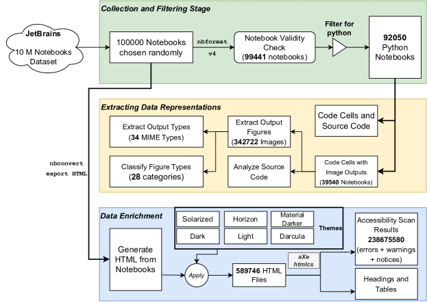
Below, we present a high level diagram of our data processing pipeline in Figure 1. We will describe the steps involved in our pipeline and provide details of the data along the way. We build our data processing pipeline to (1) collect and filter a randomized subset of the notebooks from the larger JetBrains dataset (§3.1), (2) extract the required data representations from the filtered notebooks (§3.2), and (3) enrich the notebook data through analysis of transformed representations, used in the notebook distribution process (§3.3).
 \Description
[top-to-bottom Flowchart Diagram indicating the Data Processing Pipeline.]The flowchart presents the three stages of the pipeline indicated by three large vertically aligned boxes color coded by the stage of the pipeline. Stage 1 is denoted by light green, stage 2 is denoted by pale yellow, and stage 3 is denoted by light blue. The first stage of the pipeline starts with choosing 100K notebooks randomly from the JetBrains dataset over which nbformat is run to check its validity. 99441 notebooks which pass the validity check are filtered for python resulting in 92050 python notebooks. These notebooks proceed to the next stage of the pipeline indicated by a yellow box. The source code from the code cells of the notebooks which programmatically generate images are selected. The resulting 39540 notebooks extract 342722 images which result in 34 output types, and classification into 28 categories at later stages of the pipeline. The source code from these notebooks are also further analyzed. The final data enrichment stage of the pipeline uses the 100K notebooks from the initial stage and uses nbconvert to export HTML from the notebooks. By applying six themes, we obtain 589746 HTML files over which the aXe and HTMLCS accessibility engines are run resulting in a total 238675580 errors, warnings, and notices. The same HTML files are used to extract heading and table related information.
3.1.1. Notebook Validity Check
The first step of the pipeline involves coercing the computational notebook files to the latest v4 specification of the Jupyter Notebook format using the nbformat tool to ensure validity (Team, 2020). A notebook obtained in the dataset is considered as valid if the file has correctly formatted JSON content according to the specified Jupyter notebook format. This conversion resulted in a total of 99441 notebooks filtering out 559 notebooks in the process due to conversion failures.
3.1.2. Filtering for Python Notebooks
Building on previous works on notebook analysis that have established python as the most popular language used in computational notebooks (Guzharina, 2020; Quaranta et al., 2021), we filter the validated dataset obtained from the first step for notebooks written in python. By removing notebooks which are not written in python, we obtain 94722 notebooks, of which we further removed 2672 which do not contain the language information in the metadata, resulting in a total of 92050 python based notebooks.
3.2. Extracting Required Data Representations
Computational notebooks store source code in ‘code cells’ and the outputs from the execution of the code as its children formatted as ‘output cells’. Additionally notebooks also support the usage of markdown to display text which is formatted as a ‘markdown cell’. These cells cannot contain child attributes related to outputs as per the notebook format specification. We process each notebook and extract information about (1) source code, and (2) outputs.
3.2.1. Code Cells from Notebooks
We run the next stage of our data processing pipeline to extract information about the source code present within ‘code cells’ in the 92050 python notebooks. We extract the source code, and markdown text in this process in addition to computing the number of code and markdown lines and cells in a notebook. Our analysis identifies 39540 notebooks where at least one source code cell generates a graphical output into its corresponding output cell. We removed 52509 (57.04%) notebooks that only contained source code, and no accompanying outputs for the code segments from our analysis, leaving 39540 notebooks for the next stage of the pipeline.
3.2.2. Output Figures
The Jupyter notebook format stores figures generated as a part of the code output as base64 encoded strings with the metadata information of the corresponding Multipurpose Internet Mail Extensions (MIME Types) to identify the type of media output. By default, the notebooks support five image media mime types indicated by image/bmp, image/gif, image/jpeg, image/png, and image/svg+xml. Other media output types such as PDF generated from code are immediately converted to display as PNG format in a notebook with no additional extensions installed. We parse through all the 39540 notebooks since these are the python notebooks containing at least one programmatically generated graphic in an output cell corresponding to a code cell. We convert the encoded base64 strings into image files and store them for further analysis resulting in 342722 total images.
As summarized in Figure 2(a), about 42.95% notebooks have at least 1 programmatically generated figure. For notebooks that have such images, the median number of images in them is 4.0 . 10% of the notebooks contain over 16 images per notebook, with a long tail where 1% of the notebooks contain over 77 images. The notebook with the most images contains 12858 images.
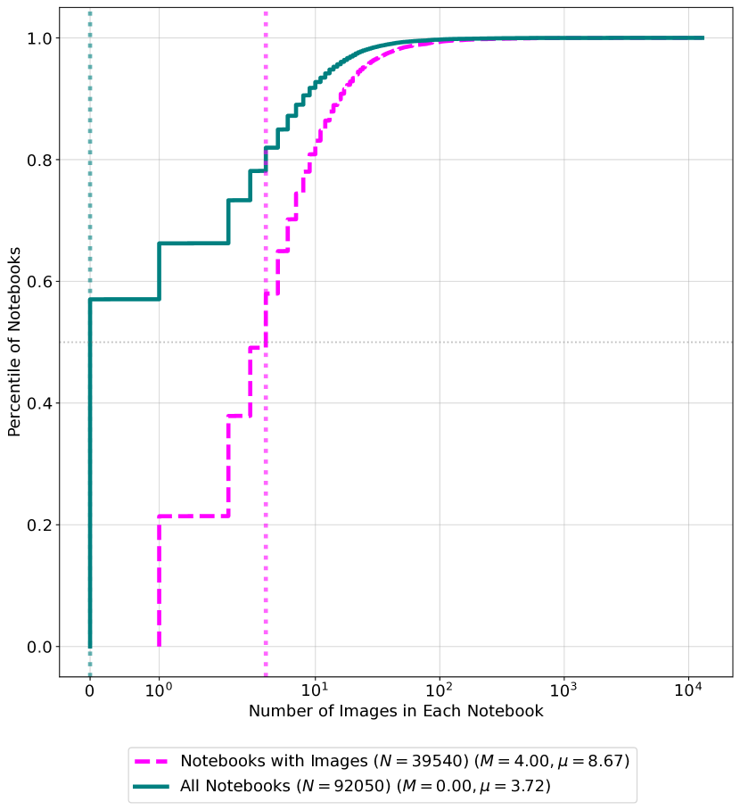
[Comparative line charts showing Distribution of number of plots in each notebook]Figure shows two lines indicating the distribution of the number of plots in each notebook. The median number of plots in 39540 notebooks containing images as 4.0 with mean of 8.67 images, and all 92050 python notebooks as 0 with a mean of 3.72 images.
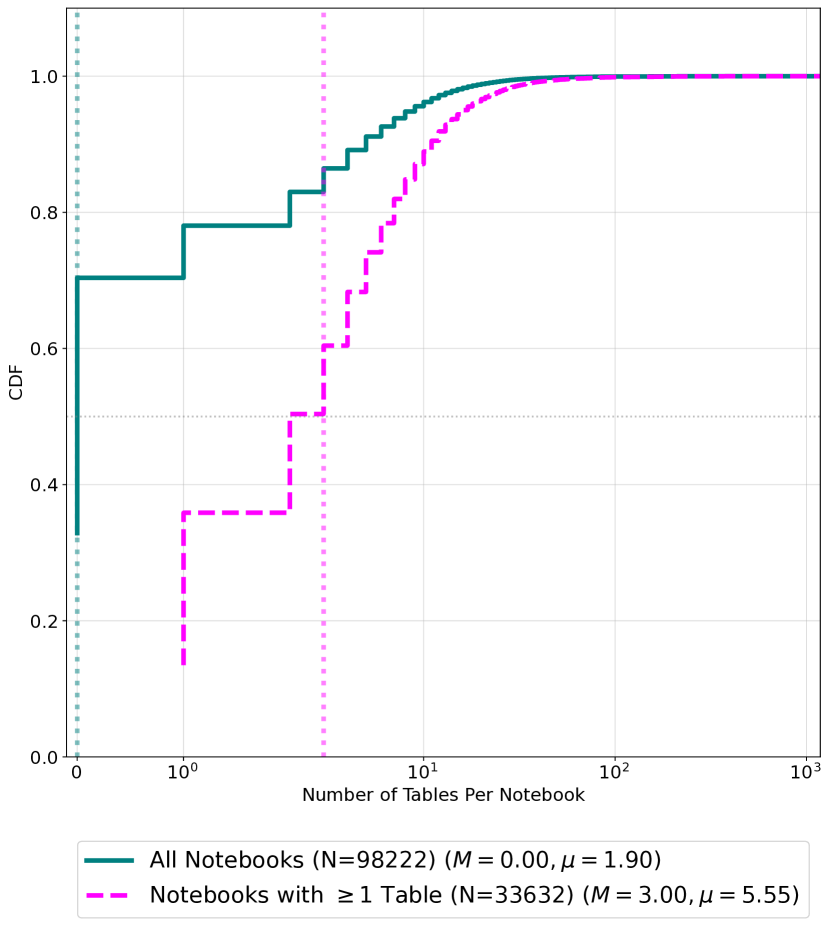
[Distribution of Number of Tables in Notebooks]Figure shows the distribution of the number of tables in notebooks. The solid teal line indicates that a notebook at the median contains no tables, with the average notebook containing 1.9 tables. However, the magenta line displaced to the right of the teal line in the figure indicates a median of 3 and a mean of 5.55 number of tables in the dataset.
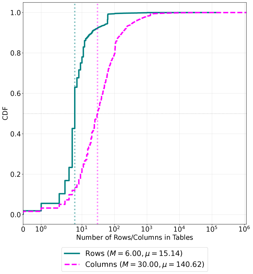
[Distribution of Number of Rows and Columns in Tables]Figure presents the distribution of the number of rows in tables using the solid teal line and the distribution of number of columns in the tables using the dashed magenta line. The median number of rows for a table is 6, with the average at 15.14, and the median number of columns for the tables are 30, with the average at 140.62.
[Notebook Characteristics in the Analysis]The overall figure presents the characteristics of the notebooks in the analysis. The plots show cumulative distribution functions and use two colors teal and magenta with the solid lines colored in teal, and the dashed lines colored in magenta. All three figures use the same consistent color scheme and contain legends below the x axis.
3.2.3. Analysis of Code Syntax
The next step in our data processing pipeline targets the contents of the source code in the 39540python notebooks that contain at least one programatically generated graphical output. We chose Python because it is the most popular language used in notebooks and is studied in other large scale notebook analyses (Choetkiertikul et al., 2023; Rule et al., 2018). This allows us to perform language specific code analysis by delving deep into the library and module ecosystem of the programming language, to understand accessibility gaps in popular tools, and make actionable recommendations to improve the accessibility of these notebooks.
We use the abstract syntax tree (ast) module in python to parse the contents of the source code in these 39540 notebooks. We extract information about modules and functions being imported by notebook authors, and the functions being invoked within various cells of the notebook. This gives us information about the different libraries, and function calls frequently used by notebook authors.
Constructing the abstract syntax trees however is not as trivial as combining the code cells in a notebooks before running a parser, and requires additional processing of the code in the notebooks. Notebook systems support Jupyter magics – a functionality provided by the kernel, that allow developers to call functions that would simplify some Jupyter operations. For example, the IPython kernel used by Jupyter, allows developers to use the %% latex command to render a cell in LaTeX and the %% bash script magic command to run a cell in bash as a subprocess. While these are valid operations in a Jupyter environment, they are not a valid part of the syntax of the python programming language and result in errors when parsing the syntax to construct an abstract syntax tree, even if the rest of the code in the cell is valid syntax. Therefore, constructing abstract syntax trees requires the source code snippets to be processed to remove any magic lines. We removed source code lines which begin with the % (percentage) special character, in addition to lines starting with ! indicating the execution of a shell command, or ending with the help ? operator. We run our parsers to construct the AST over the resulting code and extract information about the functions, and modules imported in the notebooks.
3.2.4. Output Types
The extensibility of Jupyter notebooks allows notebook authors to customize the story telling and consumption experience of the notebooks. To understand how these customizations impact accessibility, we extracted three high level categories (application, image, and text) based on MIME types used in notebooks. The top 5 output types presented in Table 1 account for 98.67% of the outputs in the notebooks. Notebooks included 24 different application types; 6 text output types (eg. HTML, LaTeX, markdown, etc..,), and 4 image output types. Portable network graphics (PNG) images are the most commonly used image output formats making up 21.45% of the outputs in the notebooks. The detailed and complete list of output types found in our dataset is presented in Table 5 in Appendix B.
| Rank | Category | Output Type | Total | Percent | Cumulative |
| 1 | Text | Plain | 977328 | 61.72 | 61.72 |
| 2 | Image | PNG | 339589 | 21.45 | 83.17 |
| 3 | Text | HTML | 208170 | 13.15 | 96.32 |
| 4 | Application | Javascript | 22842 | 1.44 | 97.76 |
| 5 | Application | Jupyter JSON Widget | 14532 | 0.91 | 98.67 |
| Total Number of Outputs | 1583255 | ||||
3.2.5. Figure Types
To understand what type of figures are created in the notebooks, we classify the figures into 28 different image type categories including Line Chart, Histogram, Box plot, Confusion matrix, Scatter plot and others (the full list can be found in 3(b)). We classify the 342722 images obtained from our figure extraction phase of the pipeline, using a Fully Connected - Convolutional Neural Network (FC-CNN) combined with a Fisher-Vector Convolutional Neural Networks (FV-CNN) (Song et al., 2017) pretrained on the DocFigure dataset (Jobin et al., 2019). We run this inference on an AWS p2.16xlarge VM running 16 NVIDIA K80 GPUs, 64 vCPUs, and 732 GB of memory.
3.3. Data Enrichment
The user experience to consume and author Jupyter notebooks often takes place through web interfaces. Developers customize their development environment experiences through themes, and many IDEs in addition to their defaults, provide a wide variety of themes – catering to developer preferences. Often these same themes are carried to published notebooks.
3.3.1. Generating HTML from notebooks
Since different themes can vary in their accessibility, we selected 6 popular themes including the defaults provided by Jupyter for publishing HTML exports. Our selections include solarized – a theme (originally written for Vim and made available now by various IDEs) (Schoonover, 2011), darcula (for ZSH originally, and used extensively by JetBrains) (JetBrains, 2013), horizon (default by VSCode) (Almogbel, 2022), the material darker theme (Mirosa, 2022), and the default dark and light theme options supported by Jupyter (Pérez et al., 2014). To assess the accessibility of notebooks in these web interfaces, we generate HTML exports of notebooks in our dataset with these six popular themes applied.
We use the open source nbconvert tool that supports converting notebooks into publishable HTML and other formats. nbconvert allows users to select themes and specify other parameters to control the generation of HTML output and is the de-facto tool integrated into computational notebooks providing various export format capabilities. Once the conversion is complete, we export the notebooks into standalone HTML files which we then serve through a web server. All 100000 notebooks were exported as HTML using nbconvert, producing 589746 HTML files, 98291 per theme.
3.3.2. Accessibility scans
HTML user interfaces are typically evaluated using accessibility testing and evaluation engines which are software programs that evaluate the content, design of the interface, and check their ability to satisfy various established accessibility guidelines. We perform accessibility scans using aXe and HTML Code Sniffer (HTMLCS) together by deploying a self hosted version of the pa11y accessibility scanning infrastructure configured to use both engines (Manning et al., 2022). pa11y is an LGPL licensed open source tool that tests web pages by executing a chromium process and providing the ability to run multiple accessibility engines via the same tool. We modified pa11y, which was last modified by the maintainers in October 2022, by building on the community’s work to make the project compatible with the latest Node.js v18. Our changes expose the ability to run multiple accessibility engines in their webservice subproject 111https://github.com/pa11y/pa11y-webservice/pull/144 and additionally involved fixing various security vulnerabilities 222https://github.com/pa11y/pa11y-webservice/pull/145, and overcoming engineering debt. We are currently working towards contributing these changes to pa11y.
For all 589746 HTML files across all themes, we extracted the type of violation (error, warning or notice), the accessibility engine that detected it (Axe or HTMLCS), the specific code corresponding to the violation provided by the engines, and the selector (HTML node where the violation was detected). We enrich our dataset by attaching this information to the name of the notebook and theme being tested. We found a total of 238675580 combined errors, warnings and notices across all notebooks.
3.3.3. Web Semantics
While accessibility scanners provide information about standardized accessibility errors, they do not provide more nuanced information such as the size of tables and the presence of headings that can be critical to understand the screen reader glanceability and navigability of notebooks. To gain this understanding, we use LXML, a library that enables efficient parsing of the HTML DOM tree, to process the HTML outputs of notebooks. We picked the light theme and used the 98291 HTML files corresponding to it for this processing. We extracted information about the type of cell, presence of images, alternative text (using the alt attribute of the <img> tags), information about tables (using the <table>, th, and td tags), presence of links (using the <a>), and various heading levels (using the <h1 - h6> tags) along with the file name, and the location of the cell in the file.
Our observations indicate that 65.9% of the notebooks do not contain any tables in their outputs. Among the remaining, a notebook contains 3.0 (median) / 5.55 (mean); however the distribution has a long tail with the maximum at 1181 tables and 1% of the notebooks containing over 37.0 tables. Among the 34.1% of notebooks in our dataset which contain tables, we extract additional metadata to identify the structural shape of the tables. The median table rendered in the output cells of the notebooks contains 6 (median) / 15 (mean) rows, and 30 (median) / 140 (mean) columns. Figure 2(c) indicates the distribution of the number of rows and columns for all tables identified in our dataset. The largest table in the notebooks in our dataset contains 162736 rows and 1139145 columns indicating a maximum of 185379900720 cell values.
3.4. Manual Screen Reader Testing
To investigate a sample of accessibility issues identified by our automated testing, and to verify if notebooks were glanceable, two research team members experienced with using a screen reader opened a selection of notebooks in screen reader and browser combinations, and verified if a screen reader user will be able to get to all headings, images, and tables present in those notebooks. As we noticed the BVI researcher’s screen reader crash several times during the exploratory phase of our research, we hypothesized size of the notebooks to play a role in causing these crashes. We identify a list of notebooks meeting different size criteria based on the percentiles of the file sizes in our dataset. While one researcher (also a BVI screen reader user) performed the tests and reported the counts in each notebook, the second researcher visually verified the reporting, noting the observations. We performed these tests with Microsoft Edge, Google Chrome, and Firefox Nightly with their accessibility cache improvements enabled (Dotzler, 2022) with JAWS and NVDA 2023 on a Windows computer running Windows 10. We performed our VoiceOver tests on a Mac with VoiceOver using both Safari, and Chrome. We did not test our notebooks with Firefox on the Mac since the accessibility cache improvements for Firefox were not yet available for the Mac OS. Similarly, we did not test using Safari on Windows since Apple ended support for it in 2015.
4. Results
Recall that the goal of our investigation is to understand the accessibility of data artifacts, authoring experiences, and infrastructure to work with computational notebooks to BVI users. Given the overall concerns about visualization and data accessibility discussed in section 2.2, we must understand how accessible these are in notebooks. Thus, we begin our analysis by exploring how accessible the data artifacts in notebooks are to BVI users. Given the importance of navigation, and information seeking/glanceability to IDE accessibility, it is critical that we assess this in notebooks as well. Thus, our analysis explores the proper use of headers and other landmarks that improve navigation and glanceability for screen reader users. Uniquely, notebooks are not just a programming tool, they are also a communication platform that can be customized and themed to generate final “documents” in various formats. If these documents are not accessible, the consumer experience will be impacted. Thus, our analysis investigates the impact of the tools used to customize and distribute notebooks on their accessibility. To answer our research questions, we developed metrics which represent optimistic upper bounds, meaning that the presence of accessibility in notebooks is likely much smaller than our findings in this paper indicate.
4.1. Accessibility of Data Artifacts
At the heart of data analysis is the data, and that is typically explored through a combination of text summaries, graphical representations, and tables. These latter two artifacts – graphics and tables, that are essential to the data story telling process used by notebook authors, may have important implications for accessibility and help us answer the first research question RQ1 we set out to answer. A truly accessible notebook should support advanced, accessible and dynamic visualization techniques (Kim et al., 2021). However there are common, basic requirements for making static images and charts accessible (Elavsky et al., 2022), which guided the development of our optimistic metrics for evaluating artifact accessibility.
- Presence of ALT text:
-
: A meaningful ALT text attribute should accompany visualizations. We measure the presence or absence of ALT text in programatically generated images and analysed the alt-texts found in images that may have been manually added by notebook authors. This is an optimistic measure because the presence of ALT text does not mean it is descriptive or helpful for accessibility – which depends heavily on the quality of the text provided. Only .19% of images in our data have ALT text whose word frequency we measure and present detailed results of in Section 4.1.1 but we do not measure ALT text quality.
- Figures followed by tables:
-
: Without ALT text, a figure can still be somewhat accessible if it is followed by a table with the equivalent data visualized in the figure. This is optimistic because such tables may not be accessible, or may not be related to the figure. We present the detailed results in Section 4.1.2.
4.1.1. ALT text for Static Images and Charts
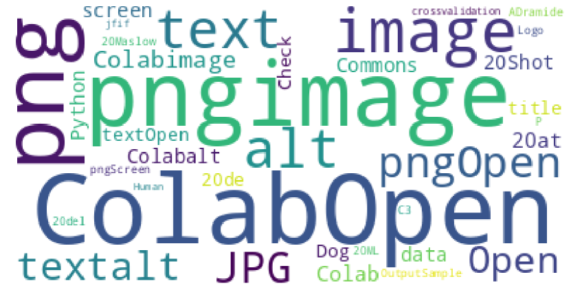
[Wordcloud of ALT text in Images found in Notebooks]Figure presents a word cloud of the alt text descriptions present in the notebooks which mostly contain words that are not helpful to screen reader users such as the word ‘image’, ‘alt’, or ‘png’. The words Colab and Open also occur at high frequencies dominating the word cloud’s central display.
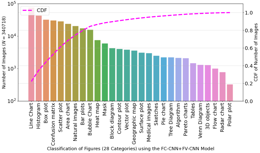
[Classification of 342722images used in 39540notebooks.]Figure 3b is a histogram whose x axis contains the categories of classification of images in the dataset after inference through the FC-CNN+FV-CNN model, and y axis represents the total counts of images over a log scale. The sum of all vertical bars indicating different categories ranked in descending order of usage popularity result in the total 340718 images. The figure contains an alternate y axis to the right side of the graph indicating the CDF of the number of images over all categories. Over 75 percentage of the images are classified into 7 types (Line chart, histogram, box plot, confusion matrix, scatter plot, area chart, and natural images).
[Types of visualizations used in notebooks] The figure contains two subfigures indicating the information extracted from the visualizations and images in the notebooks.
Static images and charts are present in 42.95% (39540) of the 92050 python based notebooks, most of which are PNG files (Table 1). Notebooks with these artifacts contain a median of 4.0 figures as shown in Figure 2(a). We consider a figure to be programmatically generated if the code cell in the notebook contains a mapped output section indicating the result of the execution of the cell and containing an image type. The vast majority of the programmatically generated images (N=342102 (99.81%)) do not have associated alternative text. Of the 609 containing the alt text information in the notebooks, only 1 image is programmatically generated from code 333We investigate the one image with alt text attribute generated programmatically in the notebook but cannot reproduce the result 36f17428463ea6a6a75d9e064713a3039f381037.ipynb, while 608 others are specified through the description attribute in markdown images included using the syntax ‘’. In Figure 3(a), we present a word cloud of the alt descriptions we found indicating that they were mostly meaningless in their current use. The most dominant words ‘Open’ and ‘Colab’ come from the markdown included interaction button for opening notebooks with Google Colab which is included by some notebook authors when publishing their notebooks. The word cloud also indicates poor usage of alt text whenever used in markdown with most descriptions lackadaisically referring to the graphic included as ‘image’, ‘png’, or ‘alt’.
Types of charts and libraries used
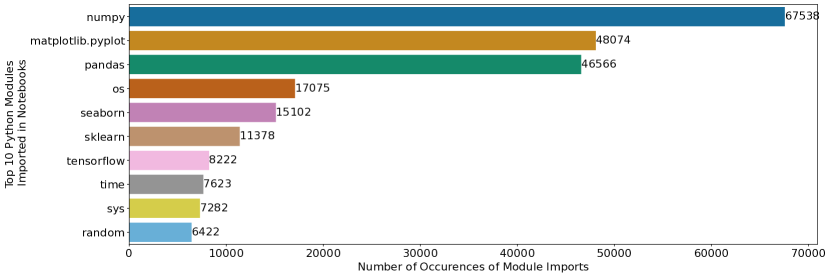
[Top 10 popular python modules imported in notebooks ranked by their usage frequency]The figure contains a horizontal bar plot with the x axis indicating the number of occurrences of module imports, and the y axis indicating the top 10 imported python modules. The horizontal bars use colors from the colorblind palette provided by seaborn and indicate numpy, matplotlib.pyplot, pandas, os, seaborn, sklearn, tensorflow, time, sys, and random with their respective counts.
| Rank |
|
Function Targets | Module | Function Call | Count | ||
|---|---|---|---|---|---|---|---|
| 1 | 4 | Visualization | matplotlib | plt.plot | 70575 | ||
| 2 | 5 | Visualization | matplotlib | plt.show | 70454 | ||
| 3 | 6 | Visualization | matplotlib | plt.title | 49998 | ||
| 4 | 8 | Data | numpy | np.array | 46360 | ||
| 5 | 9 | Visualization | matplotlib | plt.figure | 45797 | ||
| 6 | 10 | Visualization | matplotlib | plt.xlabel | 42430 | ||
| 7 | 11 | Visualization | matplotlib | plt.ylabel | 41693 | ||
| 8 | 12 | Data | pandas | pd.DataFrame | 32144 | ||
| 9 | 13 | Data | pandas | pd.read_csv | 30858 | ||
| 10 | 14 | Visualization | matplotlib | plt.legend | 23228 |
If we understand what types of charts and figures are most used by notebook authors, this can help guide and prioritize research in accessible visualization for data analysis. The usage of the pre-trained FC-CNN+FV-CNN classification model (Section 3.2.5) over the programmatically generated images found in our data (N=342722) reveals line charts as the most common type of programmatically generated visualization (22.26%), followed by histograms (12.61%), and boxplots (9.45%). Figure 3(b) contains a histogram of the most popular types of figures found in the analyzed notebooks ranked from most widely used to the least widely used. Seven types of charts make up roughly 75% of the figures in the dataset: Line chart, histogram, box plot, confusion matrix, scatter plot, area chart, and natural images. Some of these are understudied in the accessible visualization literature, which primarily focuses on bar, line, & pie charts, and scatter plots (Kim et al., 2021). Histograms, box plots, confusion matrices, and area charts represent important areas to make more accessible in future research.
We also analyzed the python import statements and function call invocations used in the 39540 notebooks with images, to identify the most popular charting library used by notebook authors (matplotlib, followed by seaborn as shown in Figure 4). The seaborn library is an enhanced wrapper over the underlying matplotlib libraries. Additionally, through code analysis and tracing the function calls we identified the most popular functions used by notebook authors and present them in Table 2. Seven of these 10 popular functions produce visualizations through the matplotlib module, while the others target data processing through modules like numpy and pandas. Given this, we investigated matplotlib’s capabilities to understand support for alt text. However, despite its importance in the python community and extensive use in computational notebooks, scientific publishing, and other media, Matplotlib does not support embedding alt text descriptions for the generated graphics. Even with static figures, it is possible to include ALT text – PNG, the most popular image format standard used by authors (Table 1), supports embedding image descriptions in metadata.
4.1.2. Comparative Ordering of Tables and Figures
Unless a chart’s summary, context, and alt text convey all relevant information contained in the chart, which our investigation of ALT text shows is clearly lacking in this data (Section 4.1.1), a data table or data summary is a necessary accompaniment to that chart (Elavsky et al., 2022). With the use of data processing libraries like pandas, it is relatively straightforward to also render a slice of the dataset represented in a chart as an HTML formatted table, or to provide a description in the surrounding code or markdown cells. To estimate the prevalence of these accessibility best practice guidelines, we look for code cells that programmatically output an image and filter those which (1) do not contain a heading immediately after the current output cell – since they typically indicate a change in the context (Choetkiertikul et al., 2023), (2) have a markdown cell before or after the current cell potentially indicating necessary context, or (3) have a cell with a table (either programmatically generated or via markdown) immediately before or after the cell with the image.
Of the 208427 code cells across all notebooks that contain images, we find that 159341 (76.44%) cells meet our criteria for possibly being related to the image. Of these, 59166 (37.13%) cells contain markdown text (indicating possible explanations of the image) and 13037 (8.18%) cells contain a table.
The 13037 cells surrounded by a data table in the neighboring cells are found in 7109 notebooks in our dataset, while the 59166 cells containing markdown text after an image are present in 19028 notebooks. The existence of markdown cells in the neighboring cells but no heading in the cell immediately after however does not immediately imply relevance to the figure generated in the current code cell since they could also contain markdown included images. The existence of both markdown content, and supporting tables indicate the most accessible representations of the image – containing both the relevant tables and a description.
Only 2566 (1.23%) cells in 1795 (4.53%) notebooks with figure outputs meet this criteria and contain both markdown and tables in their neighboring cells making those cells relatively more accessible when navigating and attempting to understand the notebook.
Simply including tables after charts is a low bar. It is also important that those tables are usable with a screen reader. Despite the inclusion of tables in the notebooks, too many rows and columns can affect screen reader navigation, resulting in users losing context or requiring too many key strokes to skip the tables or interact with elements in the table. While there is no defined threshold for the maximum number of rows or columns, screen reader users typically lose context when navigating large tables (Wang et al., 2022). The median row count (6 rows) is identical to the number of default rows printed by pandas.head() (one header row, and 5 data rows). The number of columns however grows rapidly as shown in Figure 2(c). For example, the largest table in our dataset contains 1139145 columns and 162736 rows and may be impossible to glance with a screen reader. An average table present in the notebooks in our study contains 140 columns and 15 rows resulting in over 2100 cells indicating the very high number of keyboard interactions needed by BVI users to understand and navigate the tables.
In summary, we find that images and tables – data artifacts found in notebooks – may not contain the necessary information for them to be accessible to BVI notebook users. The presence of tables and text descriptions indicate the possibility for these data artifacts to be accessible and open up avenues for future investigations. However, notebook authors following this accessible practice need to also provide descriptions and use tables with sizes considering screen reader accessibility.
4.2. Navigability and Accessibility for Authors
An understanding of the practices of notebook authors can guide our approach to making notebooks more accessible. Current understanding of code glanceability challenges for BVI people (e.g., (Potluri et al., 2018)) does not account for code representations which are interwoven with rich representations of data and web semantic structures – such as headings and tables supported by computational notebooks. Since Jupyter notebooks support markdown, a markup that is rendered using web semantics, authors have a great deal of control over how structural information is conveyed in the notebooks. For example, notebook authors control presence of semantic elements such as headings, tables, links, and figures. Screen readers typically support single key navigation among headings of different levels, links, tables, and many others (NVAccess, 2023). This can allow screen reader users to skim through a notebook, and quickly understand its structure. To explore notebook glanceability through web semantics helping answer the RQ2 we set out to explore, we define the following optimistic estimates of accessibility:
- Navigability of Notebooks::
-
One simple but important aspect of proper heading use to use a level 1 heading (H1) in the first cell of every notebook, enabling screen reader users to easily find the start of notebook content (Fast, 2023a). This is an optimistic estimate because the heading should contain text that is relevant to highlighting the topic of the notebook, and it is only one of several rules that should be followed to properly support navigability with headers. We present detailed findings in Section 4.2.1.
- Finding landmarks::
-
Tables are an important and accessible way of representing data to a screen reader user, especially given the lack of ALT text we found in visualizations. They also make it easy to quickly gain some insights about a notebook, because screen reader users can jump through tables using the single-key navigation similar to headings. Thus, a second simple and optimistic metric is whether a notebook has a table in it. Only 34.1% notebooks have data tables and we present detailed results in Section 4.2.2.
4.2.1. Navigability of Notebooks
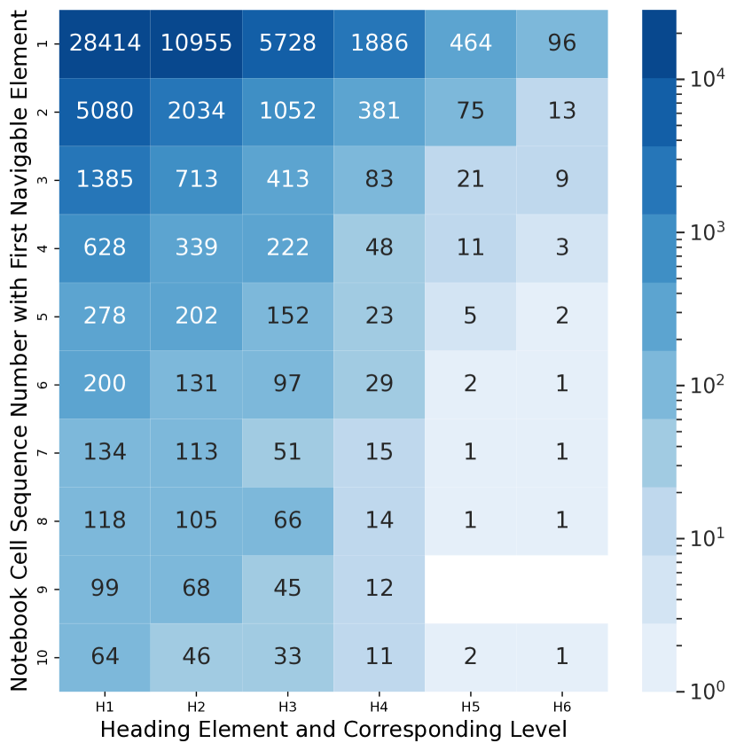
[First Navigable Heading Element]Figure represents a heatmap containing the frequency of headings existing at a cell location of the first occurrence of a heading and its corresponding level. The figure is color coded with the blues color map where the x axis indicates the 6 heading levels and the y axis indicates the numbers starting from 1 to 10 representing the first 10 cells of a notebook. The heatmap contains the highest number 28414 coded as dark blue at the top left corner and is surrounded by smaller numbers in lighter gradients of blue to its right and bottom indicating the occurrence of a heading level 2 at cell 1 being more than the occurrence of heading level 1 at cell 1. There are two holes indicating no data for H5 and H6 at cell 9.
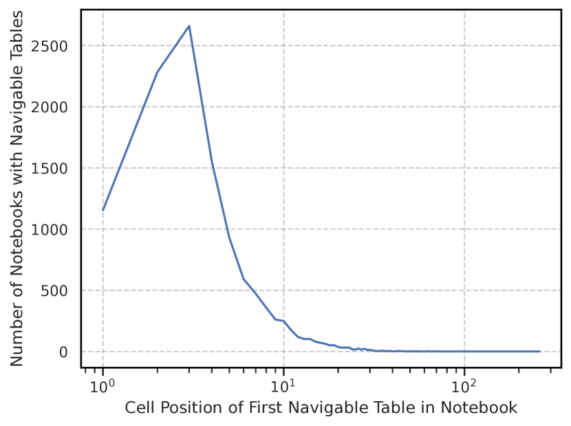
[Position of First Navigable Table]Figure represents a line chart indicating the frequency of the position of the first navigable table in a notebook. The line chart’s axis is a log scale representation of the cell position in a notebook, and the axis indicates the number of notebooks with navigable table elements. The line starts at and and rises up towards at and falls sharply until with a long almost flat tail distribution until cell .
To assess navigability, we calculate where the first heading element lies in each notebook, as well as what type of heading it is (H1 through H6). In Figure 5(a), the left most column (from top to bottom) shows the number of notebooks with an H1 in cell 1, cell 2, and so on down to cell 10. A majority (28414 (28.90%) notebooks) have a heading level 1 (H1) in the first cell. We speculate IDE integrations, JupyterLab, and Google Colab’s default behavior, which adds an H1 in the first cell automatically, may have resulted in this accessibility advantage. As the first occurrence of a heading moves further away from the first cell indicated in Figure 5(a), it is likely that screen reader users will skip a number of useful cells in the notebook. Screen reader users may also be confused by or skip cells when authors use a different heading level for a first heading in cell 1, breaking the typically expected structure of the notebook or web based interactions. In Figure 5(a), we see that 10955 (11.14%) notebooks start with an H2 (row 1, column 2), 5728 (5.82%) with H3 and so on down to H6 (.09%). 47543 (48.36%) notebooks contain a heading of any level in the first cell of the notebook and 59.67% (28414) of them correctly match our expectations to have a heading level 1 in the first cell. The high percentage of notebooks containing a heading indicate the high potential for improving accessibility of notebooks through improved navigability for screen reader users. The subsequent rows indicate the number of useful code cells potentially skipped by the screen reader navigation and show the frequency of occurrences of the first heading type in different cells of the notebooks. Figure 5(a) presents only a partial slice of the overall occurrence of heading in the notebooks, the detailed result is presented in Appendix A.
4.2.2. Finding landmarks: Tables
We found that 33517 (34.1% ) of the notebooks have tables in them. Among these, a notebook contains 5.55 tables on average, with 3.0 tables at the median, and the top 1 percentile of notebooks containing at least 37.0 tables as shown in Figure 2(b). The lack of tables in 64774 (65.9% ) of notebooks, consequently reduces the accessibility of notebooks and the possibility of glancing at data.
The first occurrence of tables is typically the third cell in the notebook as shown in Figure 5(b), perhaps because the first two cells are typically used for importing the necessary modules, and loading the required datasets for further analysis. This raises a further optimistic aspect of our metric – such tables may be primarily present to check that data loaded correctly, rather than highlighting results after analysis is complete, limiting their utility for screen reader users to understand a notebook.
4.3. Tooling Impacts on Notebook Accessibility
The accessibility of published notebooks on BVI consumers is impacted not only by authorship, but also by the tools used to export them. Jupyter notebooks allow the developers to export the notebook into various formats such as PDF, LaTeX or HTML, among many others. The HTML format is widely used by notebook authors when releasing their notebooks because of the ease of sharing contents over the web. Many popular code hosting repository tools like GitHub or GitLab use the submitted raw ipynb notebook format files and convert them by exporting them into HTML when navigating to the file using a web browser. Thus we focus our analysis on HTML renderings. We use a mix of manual testing and automated accessibility testing tools to assess this. We measure:
- Reachability of structural and graphical information::
-
As mentioned in Section 4.2, the ability to navigate to structural elements is important to accessibility. While our previous analysis looked at whether semantic information is properly included in notebooks by authors (Section 4.2.1 and Section 4.2.2), here we test the same question once notebooks have been rendered. To assess this, we performed manual screen reader testing, the only metric that we tested at small scale (only for 10 notebooks). This is an optimistic estimate because we did not test whether the landmarks were useful, only whether a screen reader user could get to them. We find significant concerns with the scalability of notebooks for screen reader users affecting navigability in 6/10 cases and present the detailed results in Section 4.3.1.
- Impact of Theme Choice on Accessibility (Section 4.3.2)::
-
This metric captures the accessibility impact due to the choice of theme when generating a notebook. Many themes are also used during authoring, so this may also impact authorship. This metric is optimistic since it may not capture all errors introduced by a theme due to the use of automated testing, which is known to be an optimistic measure of website accessibility (Mankoff et al., 2005). The best theme we tested differed from the worst by 84.95% overall; however we found that different themes performed differently on different accessibility testers and raised different types of errors within those testers.
4.3.1. Reachability of structural and graphical information
Microsoft Edge Google Chrome Firefox Nightly Apple Safari Rank Size (Bytes) NVDA JAWS NVDA JAWS VoiceOver NVDA JAWS VoiceOver N1 1 (P10) 630352 ✓ ✓ ✓ ✓ ✓ ✓ ✓ ✓ N2 2 (P25) 634340 ✓ ✓ ✓ ✓ ✓ ✓ ✓ ✓ N3 3 (P50) 721056 ✓ ✓ N4 4 (P75) 997861 ✓ ✓ N5 5 (P85) 1362512 ✓ ✓ ✓ ✓ ✓ ✓ N6 6 (P90) 1900465 ✓ ✓ N7 7 (P95) 1915381 ✓ ✓ N8 8 (P99) 10955553 ✗ ✗ ✗ ✗ ✓ ✓ N9 9 (P100) 103790428 ✓ ✓
Table 3 shows the results of manual testing of the accessibility of notebooks. We sampled notebooks of a representative range of sizes as we observed that large notebooks were crashing browsers during the exploratory phase of this research. Through the sampling based manual analysis, we identified that notebooks of large sizes can cause accessibility breakdowns, crashing screen readers and browsers on windows, indicated by in Table 3. The results suggest that at least 1% of all notebooks are fully inaccessible due to their large sizes and cause screen readers or web browser tabs to completely crash. We speculate that the difference in how JAWS and NVDA read webpages through a virtual buffer vs VoiceOver’s ability to directly interact with the browser causes the difference in accessibility breakdowns visible in the table (Zehe, 2017). Addressing these breakdowns in windows screen readers is critical due to their popularity among the BVI community.
Notebook N5 is an interesting case. Although other notebooks smaller than it fail, it passes for both NVDA and JAWS on Edge and Chrome. Firefox Nightly however was not able to find all the required headers or tables present in the notebook therefore marking its status as a functional but not fully glanceable notebook. We looked more deeply into this and found that one possible cause is that N5 did not contain any programmatically generated graphics.
Additionally, our manual accessibility checks demonstrate that for any notebook size, both JAWS and NVDA with Chrome, Edge and Firefox only detect the first programmatically generated graphic despite the existence of more than one in the subsequent cells. While navigating by graphic will jump focus to other images that are manually added to markdown cells, both JAWS and NVDA do not jump to any graphics that are encoded as base64 strings that occur in subsequent code cells, a significant accessibility problem (indicated by in Table 3). We further tested this behavior by adding synthetically generated base64 encoded images of different sizes into HTML outputs randomly chosen from our data, and to new notebooks with just two cells and observed similar behavior. It is important for screen reader users to be informed of the presence of these images and to be able to navigate to them. Current attempts at navigation using popular NVDA and JAWS screen readers completely skip images. VoiceOver on the Mac performs the best with no crashes and detects all images, headings, and tables – satisfying the requirements for notebook glanceability we set forth (denoted by ), and enables screen reader users to navigate to them using the VoiceOver rotor – a single-key navigation equivalent for VoiceOver. Though the notebooks are glanceable using VoiceOver on the Mac, it is critical that Windows based screen readers be able to do the same due to their wide adoption among BVI users (Surveys, 2021).
4.3.2. Impact of Theme Choice on Accessibility
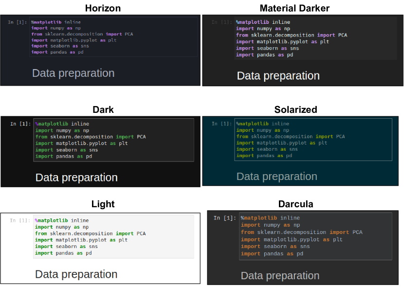
[Examples of notebooks rendered in different Themes]Figure shows a 2 x 3 grid of screenshots all containing the same code snippet from a notebook with varying themes applied. The top row contains horizon and material darker, the second row contains dark and solarized, and the last row contains light and darcula theme representations of notebook cells.
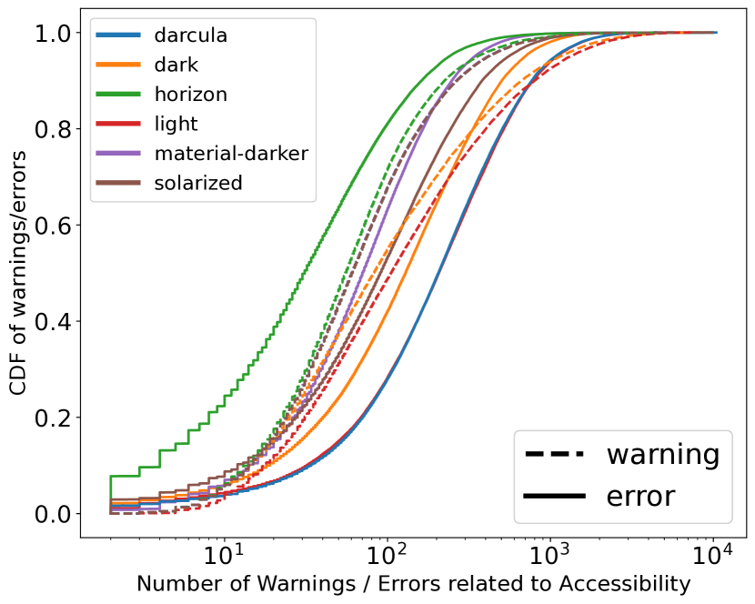
[CDF of accessibility warnings and errors based on theme]Figure indicates the CDF of the accessibility warnings and errors reported by axe and htmlcs on various themes in our experiments. The figure contains a total of 12 colored lines, using 6 distinct colors and two line styles. The solid lines represent the distribution of errors per theme, and the dashed line represents the number of warnings per theme. The solid blue and red lines indicating darcula and light are to the extreme right side of the lines in the figure indicating the most number of accessibility errors compared to other themes, the best performing theme is indicated by the green solid line representing horizon theme which indicates an 85% improvement over the darcula and light themes. Other themes in our study lie between these two lines whose medians are at 31 and 160 respectively. The x axis is represented by a log scale indicator of the number of warnings / errors related to accessibility and the y axis indicates the CDF ranging from 0-1.
To understand the impact of the choice of theme to accessibility of the notebook, we evaluate each notebooks’ accessibility using six themes, two of which are the default (light and dark), and the four others which are popular defaults used by various IDEs. The use of color schemes to modify the visual style of the editor interface is a common practice and allows developers to improve their productivity due to their ability to make code easier to visually read and understand. These visual differences are summarized for the six themes we selected in Figure 6(a). Applying color schemes such as high contrast themes on IDEs has been widely adopted by developers for both accessibility (low vision developers), and aesthetic reasons. Although Jupyter notebooks by default are exported to HTML using the light theme, notebook authors can specify a different theme to use and export the notebook into. However, as summarized in Figure 6, these themes also differ significantly by the amount of warnings and errors related to accessibility that we found when we used automated testing on them.
We found that the horizon theme, which is the default for the popular VSCode IDE, performs the best, with the fewest accessibility errors (=67.52 (=138.97) errors). It was 84.95% better than the default light theme provided by the Jupyter IDE, which had a mean of 335.40 (=393.72) errors. This difference is statistically significant according to the paired-samples t-test (t(95101)=198.05, p .001). Figure 6(b) summarizes all six themes using a CDF showing the distribution of the number of errors (solid lines) and warnings (dashed lines) reported by the aXe and HTMLCS accessibility engines on the exported HTML versions of the notebooks.
.
Axe HTMLCS WCAG 2AA Error Description Impact AXE-E1 HTMLCS-E1 1.4.3 G18 Fail Text elements must have sufficient color contrast against the background Serious AXE-E2 HTMLCS-E2 1.1.1 H37 Images must have alternate text Critical AXE-E3 HTMLCS-E7 1.4.3 F24 Links must be distinguished from surrounding text in a way that does not rely on color Serious AXE-E4 2.4.4 H77, H78, H79, H80, H81, H33 Links must have discernible text Serious AXE-E5 2.4.1 G1, G123, G124, H69 Page must have means to bypass repeated blocks Serious AXE-E6 1.2.1 G159, G166 <audio>elements must have a captions <track> Critical AXE-E7 aria-hidden elements do not contain focusable elements Serious AXE-E8 ARIA input fields must have an accessible name Serious AXE-E9 Certain ARIA roles must be contained by particular parent elements Critical AXE-E10 All page content must be contained by landmarks Moderate HTMLCS-E3 4.1.1 F77 Duplicate ID attribute value found on the web page. Minor HTMLCS-E4 1.3.1 H43, H63 Tables not using header or scope attributes Critical HTMLCS-E5 1.3.1 H43 Headers Required Table Header Required and currently not used Critical HTMLCS-E6 4.1.2 H91 A EmptyNoId Anchor Elements with no ID or link content Serious HTMLCS-E8 4.1.2.H91 A NoContent Anchor Elements with Valid Link but no link text content Serious HTMLCS-E9 4.1.2 H91 Button Name, 4.1.2 H91 [Element] Name This [Element type] does not have a name available to an accessibility API. Critical
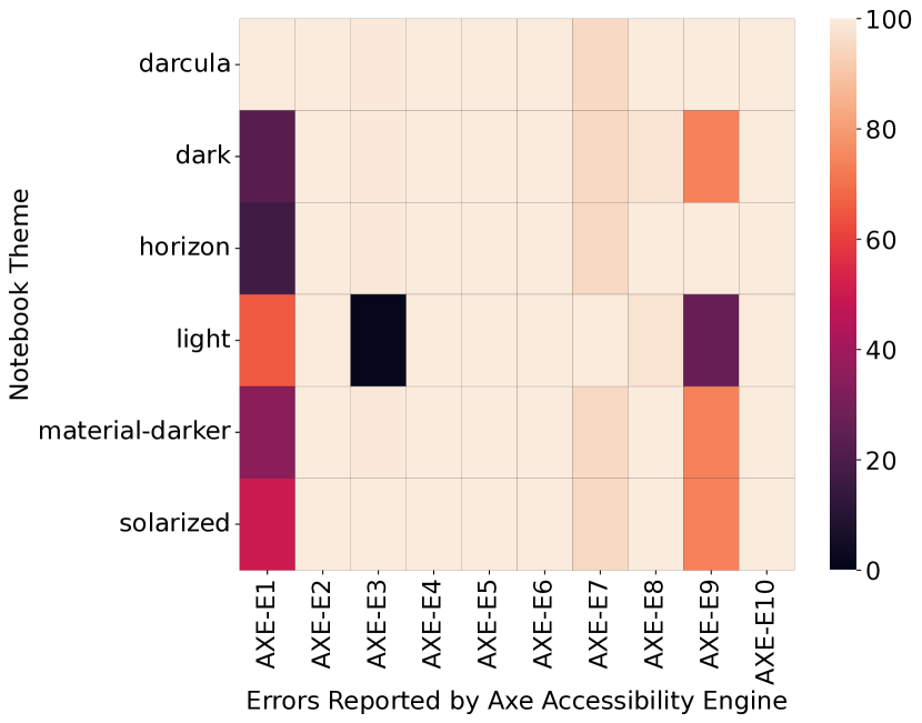
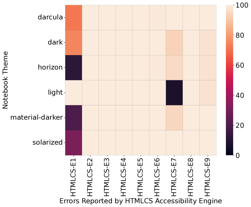
[Heatmap of Error Types]Figure contains two subfigures, both representing the relative difference in the errors found between themes by each accessibility engine. Axe is represented by the figure on the left and htmlcs is represented by the figure on the right. The heatmap of errors for axe in the left subfigure indicate the percentage of errors of different types. The type of errors are presented on the x axis and the themes along the y axis with each cell ranging between 0 and 100.0%. The corresponding legend of the color bar is to the right side of the figure. The subfigure on the right is similar to the one on the left, but contains 9 error types instead of 10 because of a different engine type. The key for the error codes along the x axis for both figures are presented in Table 4.
Looking more closely at error type can help us to explore the range of ways in which notebook exports affect accessibility. We analyze the results of our accessibility scans and identify 10 error categories reported by the aXe engine, and 9 error categories reported by the HTML Code Sniffer (HTMLCS) engine whose total occurances across all the notebooks differ based on the theme they were run on. In Figure 7(b) we present the relative heatmap of these errors by comparing the number of errors in each theme to the maximum number of errors reported for each error type. We present the details of the error code, and its impact on user accessibility enumerated through AXE-[1-10] and HTMLCS-[1-9] in Table 4.
While our results from Figure 6(b) presented in Section 4.3.2 indicate that a change in theme would significantly improve the accessibility of the notebooks, the results in Table 4 indicate some unintended consequences of theme changes and also indicate the impact of the tools chosen to test accessibility. Of the 16 unique types of errors which differ among themes, both accessibility engines agree on only three which are grouped together due to their similarity (AXE-E1HTMLCS-E1, AXE-E2HTMLCS-E2, AXE-E3HTMLCS-E7). The aXe scanner assiduously identifies seven other issues as errors, some of which are typically considered warnings or notices by other tools or in the WCAG2AA standard specification (Initiative, 2020). HTMLCS identifies six other accessibility errors which are not identified by aXe. Together, the two engines uncover 6 critical accessibility error categories, eight serious ones, and one moderate and minor error category respectively. Our findings demonstrate the value of running multiple accessibility engines while evaluating for accessibility challenges when employing automated mechanisms.
As is visible in Figure 7(b), there are some disagreements between the accessibility tools. For example, the color contrast metric result in aXe ranks the darcula theme as most inaccessible, while HTMLCS considers the light theme to be the most inaccessible (AXE-E1HTMLCS-E1). Similarly, despite being considered inaccessible due to color contrast issues with the background, the light theme performs the best when addressing the challenge of link distinguishability – as indicated by the dark black squares in the “light” row on the AXE-E3 column in Figure 7(a), and HTMLCS-E7 column in Figure 7(b). The difference in errors due to aria attributes such as aria-hidden, and aria-parents are also striking (AXE-E9). We manually inspected 5 notebooks (of the 38 notebooks which are affected) with the most AXE-E9 errors and found problems such as an out of date version of MathJax, incorrect LaTeX notations for mathematical expressions, and programmatic inclusion of stale documentation. Interestingly, these are all sources outside the computational notebook ecosystem and introduced during authoring.
5. Discussion and Recommendations
Our work is the first large scale analysis of computational notebooks done from an accessibility perspective. Our study of 100,000 notebooks provide insights not only about the current state of accessibility of notebooks, but also suggest directions for future research. We note that our analysis does not directly address the fact that web-based notebook editors are not accessible to BLV authors. We do not say more about this as it was not a focus of our data analysis, but it is an important domain for future work to address (Jupyter, 2020).
5.1. Improving Artifact Accessibility
We found that notebook images almost universally lack ALT text, and are usually created with matplotlib or a library built on top of it (seaborn). We also found a lack of accessible, tabular information associated with figures. Many of these concerns could be improved upon by providing additional options to developers using the libraries or minor changes to the tool defaults.
5.1.1. Including alternate text in images
During the programmatic creation of tables and images, there is a great deal of available knowledge that could be used to improve their accessibility. First, it is possible to check for the presence of axis labels, validate color contrast, and even generate basic ALT text that would be significantly better than what we found (Figure 3(a)), all based on information available when the chart is instantiated. For example, matplotlib during the generation of a line chart could include alt-text information indicating the type of chart, the color and number of lines, and the labels along various axis. Proprietary statistics software such as SAS/STAT include such metadata information in the graphics generated based on the context such as the function call, or the data being visualized (Center, 2023). Second, interactive support in notebooks could be designed to help users encode image descriptions according to Lungard et al.’s four-level semantic model (Lundgard and Satyanarayan, 2021). Third, it is very feasible to modify a tool such as matplotlib, the most used plotting tool as observed in our analysis (presented in Table 2), and provide programmatic methods to embed ALT text in PNG images (the most common image type it produces in our data (Table 1)). ALT text could be provided manually by the notebook authors, similar to the ability for web developers to customize the alt attribute in HTML <img> tags to describe images.
To demonstrate the feasibility of our suggestion, we updated the matplotlib backend for PNG formats, by modifying the modules’ source code (image.py, backend_(pngpdf).py), to use the standardized Exchangeable Image File Format (EXIF) and include alt text information which could be passed as image metadata by making less than 10 lines of code changes to the open source code. Such image description information can be encoded in a serialized byte format against the 0x010e (270) byte delimiter following the EXIF standards. Following the established and existing standards would allow consumers of notebook formats, such as Jupyter, VSCode, and various IDEs to embed ALT text into the figures and make it available to screen reader users. We further verified that the descriptions included using our proposed alt argument can be included by existing tools like nbconvert and included in the HTML conversions of the notebook.
Our artifacts released as a part of this work utilize these changes and include ALT metadata description in the resulting images. We leave their ability to be automatically recognized by notebook software for future open source efforts motivated by this research.
5.1.2. Leveraging Interactivity on the Web
Visualizations on web pages (using libraries like d3.js, highcharts, jQuery charts), are often generated during the page load event establishing a separation between the data and the functions responsible for creating and rendering the visualizations, enabling interactivity, and making it possible for extensions to build additional accessibility features (Sharif et al., 2022).
Future work could explore comprehensive API designs similar to those that are provided by Apple to sonify charts (Apple, 2022), to replace static base64 encoded images returned from the Jupyter python kernels’ message passing interface with a representation of only the data required offloading the visualization capabilities to the Jupyter front end. This could allow web exports of notebooks to separate the data and functions responsible for visualizations, thus making it feasible for including accessible, and interactive graphs.
5.1.3. Presenting multiple data representations
Similar innovations could be added to the tools used in notebooks to improve table prevalence and accessibility. For example, we found that tables don’t always accompany charts, despite this being a best practice (Elavsky et al., 2022). It may be possible to extend modules such as matplotlib, or seaborn to return a table representing the various data points in the image being created, or for notebook tools to perform code analysis of popular data processing libraries like pandas (Table 2) and automatically insert the intermediate data representations passed to the visualization functions as a table. For example, Notebooks with the understanding of a code cell using a pandas dataframe in a variable ‘df’ calling the lineplot(data=df, x=‘label’, y=‘data’) could create a snapshot of the data corresponding to the ‘label’ and ‘data’ columns in its metadata and present a table along with the resulting figure. Future accessibility efforts to improve this understanding could develop targeted heuristics to assess the relevance of tables and other data representations in notebooks.
5.1.4. Addressing Large Tables
Our characterization of tables used in computational notebook software shows that tables used in notebooks are typically very wide (presented in Figure 2(c)). Additionally, Wang et al. highlight table navigation challenges experienced by blind web users, finding that screen reader users have difficulty keeping track of context when navigating long tables (Wang et al., 2022). Programmatic support could be designed to ensure that the defaults for representing tabular data are as accessible as possible, though additional research is needed to understand the best way to accessibly represent tables for data sets with large numbers of columns. Extensive work has been done by a few contributors to the Notebooks4All effort to provide guidance on making table outputs accessible (Fast, 2023b).
Wang et al. (Wang et al., 2022) also find that screen reader users encounter incorrectly marked up tables. Though not significant, our accessibility scan results do indicate the presence of table related errors, possibly generated by data processing libraries such as pandas when specific constants to improve their accessibility are not set (Fast, 2023b). Code analyses extending the one described in our pipeline (Section 3.1), combined with accessibility scans of programmatically generated tables with exhaustive combinations of parameters that have an impact on table output, could help identify root causes and target accessibility improvements.
5.2. Accessible Notebook Authoring
We found that many notebooks have an H1 in their first cell, but consistent and proper use of headers is by no means universal. Further, only a third of notebooks have even one table in them. Improving these authoring practices could improve notebook accessibility.
Computational notebook tools could be updated to provide notices to the authors about incorrect usage of headings when violating the heading order or existence in the WCAG2 guidelines. Similarly, they could suggest places where authors may want to summarize what has happened so far in a table. This could be valuable for all notebook authors, regardless of disability, since tables convey valuable information about the structure of the data being processed in the subsequent cells of the notebook . These practices, along with increased figure accessibility, can improve notebook comprehensibility and glanceability. Future efforts could focus on understanding and improve notebook glanceability to further explore what glanceability means to a BVI user based on the task at hand (authoring vs consuming) and incorporate these best practices into tools such as linters for Jupyter Notebooks, to support accessible notebook authoring.
5.3. Accessible Notebook Consumption
Notebooks that are converted to HTML may be accessible to consumers if that HTML is accessible. When we used the most accessible theme (Horizon, which is not the default that most authors are likely to use), we found a mean of 68 accessibility errors, when testing notebooks with automated tools. This was significantly better than the worst theme, which had an average of 335 errors.
These results are particularly striking since they imply that changing the default theme of the notebook software during export, or enabling the ability to toggle themes in the exported notebooks, could significantly improve the overall accessibility. While changing the theme is not the remedy to all accessibility issues in notebooks, it is an important factor to consider when improving and addressing the challenges of notebook accessibility.
As a first step, the Jupyter community could explore conducting an accessibility evaluation of their theme(s), address existing accessibility issues, and provide improved accessible defaults. Future explorations could investigate the feasibility of integrating accessibility checkers such as aXe, or HTMLCS into the nbconvert process or within the notebook programming environments. Notebook authors hosting their notebooks on source code repository systems such as GitHub could also consider integrating accessibility engines to test the export of notebooks into their continuous integration and deployment pipelines (CI/CD) which could highlight and prevent accessibility issues during notebook creation (Sutton, 2023).
5.4. Reflections on Research Methodology
Large scale characterization work does not frequently occur in accessibility research. Mack et al. , in their systematic literature survey of accessibility papers, report on methodology and find that less than 6% of accessibility papers included large scale analyses (Mack et al., 2021). Our work demonstrates the use of large scale data collection and characterization to understand the (in)accessibility of computational notebooks, and the sources for these errors from data that need not involve burdening people with disabilities. In choosing our approach, we were cognizant that not all accessibility issues are captured by our approach, and thus we drilled down a few occurrences of accessibility issues to observe factors that may require targeted investigation. We hope that this methodology can be applied to other areas where accessibility breakdowns could happen without placing a burden on disabled stakeholders. To facilitate further research on accessibility of computational notebooks, we make our dataset and analysis scripts publicly available (Potluri et al., 2023b) and link to them in IncluSet (Kacorri et al., 2020) and Zenodo (Potluri et al., 2023a).
6. Conclusion
We present the first large-scale analysis of computational notebooks aimed at gaining an understanding about their accessibility. Current accessibility work to make computational notebooks accessible are focused on remediating the accessibility of the interface used to create these notebooks. While this is important, we identify that programming environments, authoring practices and distribution mechanisms chosen by authors can also have an impact on the accessibility of computational notebooks. We find that the data artifacts presented in notebooks cause inaccessibility, and tools to create these artifacts some times do not have mechanisms to make data accessible. We find that notebook interfaces can use web semantics to make data and notebooks glanceable, although they are not frequently used by authors. Finally, we observe that customizations used by authors can impact accessibility and potentially make notebook authoring and consumption more accessible. Finally, we make actionable recommendations to increase the accessibility of data artifacts, tools, and notebook infrastructures.
Acknowledgements.
We thank Richard Anderson and Kurtis Heimerl for the cloud infrastructure access and their thoughtful feedback through the course of this work. We thank Tim Althoff, Ken Gu, and Ashish Sharma from the Behavioral Data Science group for their initial feedback and comments related to this work. Executing this research would not have been possible without the gracious infrastructure support provided by the UW CSE Support team especially Stephen Spencer, and Aaron Timss. We would also like to thank Aaron Goldenthal for their initial work in improving pa11y for continued support on newer operating systems which was further extended and instrumented to perform large scale accessibility analysis. We thank the members of University of Washington’s Make4All and ICTD labs for their feedback and support through the course of this work. Venkatesh Potluri was supported by the Apple Scholars in AI/ML PhD fellowship. This work is supported by the Sponsor National Science Foundation (NSF) Eng Diversity Activities (EDA) https://www.nsf.gov/awardsearch/showAward?AWD_ID=2009977 Grant #2009977, and the Sponsor Center for Research and Education on Accessible Technology and Experiences (CREATE) https://create.uw.edu/.References
- (1)
- ACM (2017) ACM. 2017. Software system award goes to three for pioneering open source initiatives. https://awards.acm.org/software-system
- Albusays et al. (2017) Khaled Albusays, Stephanie Ludi, and Matt Huenerfauth. 2017. Interviews and observation of blind software developers at work to understand code navigation challenges. In Proceedings of the 19th International ACM SIGACCESS Conference on Computers and Accessibility (Baltimore, Maryland, USA) (ASSETS ’17). Association for Computing Machinery, New York, NY, USA, 91–100. https://doi.org/10.1145/3132525.3132550
- Almogbel (2022) Mohammad Almogbel. 2022. JupyterLab horizon theme. https://github.com/mohirio/jupyterlab-horizon-theme. (Accessed on 05/03/2023).
- Apple (2022) Apple. 2022. Apple Developer Documentation: Audio Graphs. https://developer.apple.com/documentation/accessibility/audio_graphs.
- Baker et al. (2015) Catherine M. Baker, Lauren R. Milne, and Richard E. Ladner. 2015. StructJumper: A tool to help blind programmers navigate and understand the structure of code. In Proceedings of the 33rd Annual ACM Conference on Human Factors in Computing Systems (Seoul, Republic of Korea) (CHI ’15). Association for Computing Machinery, New York, NY, USA, 3043–3052. https://doi.org/10.1145/2702123.2702589
- Cantrell et al. (2021) Stanley J Cantrell, Bruce N Walker, and Øystein Moseng. 2021. Highcharts Sonification Studio: An online, open-source, extensible, and accessible data sonification tool. In 26th International Conference on Auditory Display (ICAD’21). Georgia Institute of Technology, International Community for Auditory Display (ICAD), Virtual Online Event, 210–216.
- Center (2023) SAS Help Center. 2023. ALTDESC, NOALTDESC Graphics Options. https://documentation.sas.com/doc/en/pgmsascdc/v_034/graphref/n1gj4oarw072dxn1bl3pcqbdv644.htm. (Accessed on 05/03/2023).
- Choetkiertikul et al. (2023) Morakot Choetkiertikul, Apirak Hoonlor, Chaiyong Ragkhitwetsagul, Siripen Pongpaichet, Thanwadee Sunetnanta, Tasha Settewong, Vacharavich Jiravatvanich, and Urisayar Kaewpichai. 2023. Mining the characteristics of Jupyter notebooks in data science projects. arXiv:2304.05325 [cs.SE]
- Dotzler (2022) Asa Dotzler. 2022. Cache the World Opt In Preview - Mozilla Accessibility. https://blog.mozilla.org/accessibility/cache-the-world-opt-in-preview/. (Accessed on 05/03/2023).
- Ehtesham-Ul-Haque et al. (2022) Md Ehtesham-Ul-Haque, Syed Mostofa Monsur, and Syed Masum Billah. 2022. Grid-Coding: An accessible, efficient, and structured coding paradigm for Blind and low-vision programmers. In Proceedings of the 35th Annual ACM Symposium on User Interface Software and Technology (Bend, OR, USA) (UIST ’22). Association for Computing Machinery, New York, NY, USA, Article 44, 21 pages. https://doi.org/10.1145/3526113.3545620
- Elavsky et al. (2022) Frank Elavsky, Cynthia Bennett, and Dominik Moritz. 2022. How accessible is my visualization? Evaluating visualization accessibility with chartability. Computer Graphics Forum 41, 3 (2022), 57–70. https://doi.org/10.1111/cgf.14522 arXiv:https://onlinelibrary.wiley.com/doi/pdf/10.1111/cgf.14522
- Fast (2023a) Tony Fast. 2023a. Notebook authoring accessibility checklist. https://github.com/Iota-School/notebooks-for-all/blob/main/resources/event-hackathon/notebook-authoring-checklist.md. (Accessed on 05/03/2023).
- Fast (2023b) Tony Fast. 2023b. Rendering dataframes for screen readers with pandas. Independent. https://tonyfast.github.io/tonyfast/xxiii/2023-01-02-accessible-dataframes-basic-indexes.html
- Guzharina (2020) Alena Guzharina. 2020. We downloaded 10,000,000 Jupyter notebooks from GitHub – This is what we learned — The JetBrains Datalore blog. https://blog.jetbrains.com/datalore/2020/12/17/we-downloaded-10-000-000-jupyter-notebooks-from-github-this-is-what-we-learned/. (Accessed on 01/18/2023).
- Holloway et al. (2022) Leona M Holloway, Cagatay Goncu, Alon Ilsar, Matthew Butler, and Kim Marriott. 2022. Infosonics: Accessible infographics for people who are blind using sonification and voice. In Proceedings of the 2022 CHI Conference on Human Factors in Computing Systems (New Orleans, LA, USA) (CHI ’22). Association for Computing Machinery, New York, NY, USA, Article 480, 13 pages. https://doi.org/10.1145/3491102.3517465
- Initiative (2020) Web Accessibility Initiative. 2020. Web Content Accessibility Guidelines (WCAG) 2 Level AA Conformance — Web Accessibility Initiative (WAI) — W3C. https://www.w3.org/WAI/WCAG2AA-Conformance. (Accessed on 05/03/2023).
- JetBrains (2013) JetBrains. 2013. Platform theme colors. https://jetbrains.design/intellij/principles/platform_theme_colors/. (Accessed on 05/03/2023).
- Jobin et al. (2019) K. V. Jobin, Ajoy Mondal, and C. V. Jawahar. 2019. DocFigure: A dataset for scientific document figure classification. In 2019 International Conference on Document Analysis and Recognition Workshops (ICDARW), Vol. 1. IEEE, Sydney, Australia, 74–79. https://doi.org/10.1109/ICDARW.2019.00018
- Jupyter (2020) Man From Jupyter. 2020. Accessibility issues needing addressing for WCAG 2.1 compliance (As of Version 2.2.6) · Issue #9399 · jupyterlab/jupyterlab. https://github.com/jupyterlab/jupyterlab/issues/9399. (Accessed on 01/18/2023).
- Kacorri et al. (2020) Hernisa Kacorri, Utkarsh Dwivedi, Sravya Amancherla, Mayanka Jha, and Riya Chanduka. 2020. IncluSet: A data surfacing repository for accessibility datasets. In Proceedings of the 22nd International ACM SIGACCESS Conference on Computers and Accessibility (Virtual Event, Greece) (ASSETS ’20). Association for Computing Machinery, New York, NY, USA, Article 72, 4 pages. https://doi.org/10.1145/3373625.3418026
- Kim et al. (2021) N. W. Kim, S. C. Joyner, A. Riegelhuth, and Y. Kim. 2021. Accessible Visualization: Design space, opportunities, and challenges. Computer Graphics Forum 40, 3 (2021), 173–188. https://doi.org/10.1111/cgf.14298 arXiv:https://onlinelibrary.wiley.com/doi/pdf/10.1111/cgf.14298
- Knuth (1984) Donald Ervin Knuth. 1984. Literate programming. The computer journal 27, 2 (1984), 97–111.
- Li et al. (2019) Jingyi Li, Son Kim, Joshua A. Miele, Maneesh Agrawala, and Sean Follmer. 2019. Editing spatial layouts through tactile templates for people with visual impairments. In Proceedings of the 2019 CHI Conference on Human Factors in Computing Systems (Glasgow, Scotland Uk) (CHI ’19). ACM, New York, NY, USA, Article 206, 11 pages. https://doi.org/10.1145/3290605.3300436
- Li et al. (2021) Junchen Li, Garreth W. Tigwell, and Kristen Shinohara. 2021. Accessibility of high-fidelity prototyping tools. In CHI ’21: CHI Conference on Human Factors in Computing Systems, Virtual Event / Yokohama, Japan, May 8-13, 2021, Yoshifumi Kitamura, Aaron Quigley, Katherine Isbister, Takeo Igarashi, Pernille Bjørn, and Steven Mark Drucker (Eds.). ACM, New York, NY, USA, 493:1–493:17. https://doi.org/10.1145/3411764.3445520
- Li et al. (2022) Jiasheng Li, Zeyu Yan, Ebrima Haddy Jarjue, Ashrith Shetty, and Huaishu Peng. 2022. TangibleGrid: Tangible web layout design for Blind users. In Proceedings of the 35th Annual ACM Symposium on User Interface Software and Technology (Bend, OR, USA) (UIST ’22). Association for Computing Machinery, New York, NY, USA, Article 47, 12 pages. https://doi.org/10.1145/3526113.3545627
- Lundgard and Satyanarayan (2021) Alan Lundgard and Arvind Satyanarayan. 2021. Accessible visualization via natural language descriptions: A four-level model of semantic content. IEEE transactions on visualization and computer graphics 28, 1 (2021), 1073–1083.
- Mack et al. (2021) Kelly Mack, Emma McDonnell, Dhruv Jain, Lucy Lu Wang, Jon E. Froehlich, and Leah Findlater. 2021. What do we mean by “Accessibility Research?” A literature survey of accessibility papers in CHI and ASSETS from 1994 to 2019. In Proceedings of the SIGCHI Conference on Human Factors in Computing Systems (Yokohama, Japan) (CHI ’21). Association for Computing Machinery, New York, NY, USA, 12 pages. https://doi.org/10.1145/3411764.3445412
- Mankoff et al. (2005) Jennifer Mankoff, Holly Fait, and Tu Tran. 2005. Is your web page accessible? A comparative study of methods for assessing web page accessibility for the blind. In Proceedings of the 2005 Conference on Human Factors in Computing Systems, CHI 2005, Portland, Oregon, USA, April 2-7, 2005, Gerrit C. van der Veer and Carolyn Gale (Eds.). ACM, New York, NY, USA, 41–50. https://doi.org/10.1145/1054972.1054979
- Manning et al. (2022) Rowan Manning, Hollie Kay, Jude Robinson, Glynn Phillips, Andrew Mee, Perry Harlock, and Alex Kilgour. 2022. Pa11y–Automated accessibility testing pal. pa11y. https://pa11y.org/
- Mealin and Murphy-Hill (2012) Sean Mealin and Emerson Murphy-Hill. 2012. An exploratory study of blind software developers. In 2012 IEEE Symposium on Visual Languages and Human-Centric Computing (VL/HCC). IEEE, Innsbruck, Austria, 71–74. https://doi.org/10.1109/VLHCC.2012.6344485
- Mirosa (2022) Oriol Mirosa. 2022. ‘Material Darker’ JupyterLab extension. https://github.com/oriolmirosa/jupyterlab_materialdarker. (Accessed on 05/03/2023).
- NVAccess (2023) NVAccess. 2023. NVDA 2023.1 User Guide. https://www.nvaccess.org/files/nvda/documentation/userGuide.html. (Accessed on 05/04/2023).
- Pandey et al. (2022) Maulishree Pandey, Sharvari Bondre, Sile O’Modhrain, and Steve Oney. 2022. Accessibility of UI frameworks and libraries for programmers with visual impairments. In 2022 IEEE Symposium on Visual Languages and Human-Centric Computing (VL/HCC). IEEE, Rome, Italy, 1–10. https://doi.org/10.1109/VL/HCC53370.2022.9833098
- Pandey et al. (2021) Maulishree Pandey, Vaishnav Kameswaran, Hrishikesh V. Rao, Sile O’Modhrain, and Steve Oney. 2021. Understanding accessibility and collaboration in programming for people with visual impairments. In Proceedings of the CSCW Conference on Computer Supported Cooperative Work (Virtual) (CSCW ’21). Association for Computing Machinery, New York, NY, USA, 30 pages.
- Pimentel et al. (2021) João Felipe Pimentel, Leonardo Murta, Vanessa Braganholo, and Juliana Freire. 2021. Understanding and improving the quality and reproducibility of Jupyter notebooks. Empirical Software Engineering 26, 4 (2021), 1–55.
- Potluri et al. (2019) Venkatesh Potluri, Liang He, Christine Chen, Jon E. Froehlich, and Jennifer Mankoff. 2019. A multi-modal approach for blind and visually impaired developers to edit webpage designs. In The 21st International ACM SIGACCESS Conference on Computers and Accessibility (Pittsburgh, PA, USA) (ASSETS ’19). Association for Computing Machinery, New York, NY, USA, 612–614. https://doi.org/10.1145/3308561.3354626
- Potluri et al. (2022a) Venkatesh Potluri, Maulishree Pandey, Andrew Begel, Michael Barnett, and Scott Reitherman. 2022a. CodeWalk: Facilitating shared awareness in mixed-ability collaborative software development. In Proceedings of the 24th International ACM SIGACCESS Conference on Computers and Accessibility (Athens, Greece) (ASSETS ’22). Association for Computing Machinery, New York, NY, USA, Article 20, 16 pages. https://doi.org/10.1145/3517428.3544812
- Potluri et al. (2023a) Venkatesh Potluri, Sudheesh Singanamalla, Nussara Tieanklin, and Jennifer Mankoff. 2023a. Notably inaccessible – data driven understanding of data science notebook (in)accessibility (Dataset). Zenodo. https://doi.org/10.5281/zenodo.8185050
- Potluri et al. (2023b) Venkatesh Potluri, Sudheesh Singanamalla, Nussara Tieanklin, and Jennifer Mankoff. 2023b. Notably inaccessible – data driven understanding of data science notebook (in)accessibility (Source code). https://github.com/make4all/notebooka11y
- Potluri et al. (2022b) Venkatesh Potluri, John Thompson, James Devine, Bongshin Lee, Nora Morsi, Peli De Halleux, Steve Hodges, and Jennifer Mankoff. 2022b. PSST: Enabling Blind or visually impaired developers to author sonifications of streaming sensor data. In Proceedings of the 35th Annual ACM Symposium on User Interface Software and Technology (Bend, OR, USA) (UIST ’22). Association for Computing Machinery, New York, NY, USA, Article 46, 13 pages. https://doi.org/10.1145/3526113.3545700
- Potluri et al. (2018) Venkatesh Potluri, Priyan Vaithilingam, Suresh Iyengar, Y. Vidya, Manohar Swaminathan, and Gopal Srinivasa. 2018. CodeTalk: Improving programming environment accessibility for visually impaired developers. In Proceedings of the 2018 CHI Conference on Human Factors in Computing Systems (Montreal QC, Canada) (CHI ’18). Association for Computing Machinery, New York, NY, USA, 1–11. https://doi.org/10.1145/3173574.3174192
- Pérez et al. (2014) Fernando Pérez, Brian Granger, and Min Ragan-Kelley. 2014. Jupyter. Jupyter. https://jupyter.org/
- Quaranta et al. (2021) Luigi Quaranta, Fabio Calefato, and Filippo Lanubile. 2021. KGTorrent: A dataset of python Jupyter notebooks from Kaggle. In 2021 IEEE/ACM 18th International Conference on Mining Software Repositories (MSR). IEEE, IEEE Computer Society, Virtual (originally Madrid, Spain), 550–554.
- Rule et al. (2018) Adam Rule, Aurélien Tabard, and James D. Hollan. 2018. Exploration and explanation in computational notebooks. In Proceedings of the 2018 CHI Conference on Human Factors in Computing Systems (Montreal QC, Canada) (CHI ’18). Association for Computing Machinery, New York, NY, USA, 1–12. https://doi.org/10.1145/3173574.3173606
- Schanzer et al. (2019) Emmanuel Schanzer, Sina Bahram, and Shriram Krishnamurthi. 2019. Accessible AST-based programming for visually-impaired programmers. In Proceedings of the 50th ACM Technical Symposium on Computer Science Education (Minneapolis, MN, USA) (SIGCSE ’19). Association for Computing Machinery, New York, NY, USA, 773–779. https://doi.org/10.1145/3287324.3287499
- Schoonover (2011) Ethan Schoonover. 2011. Solarized. https://ethanschoonover.com/solarized/. (Accessed on 05/03/2023).
- Sharif et al. (2021) Ather Sharif, Sanjana Shivani Chintalapati, Jacob O. Wobbrock, and Katharina Reinecke. 2021. Understanding screen-reader users’ experiences with online data visualizations. In ASSETS ’21: The 23rd International ACM SIGACCESS Conference on Computers and Accessibility, Virtual Event, USA, October 18-22, 2021, Jonathan Lazar, Jinjuan Heidi Feng, and Faustina Hwang (Eds.). ACM, New York, NY, USA, 14:1–14:16. https://doi.org/10.1145/3441852.3471202
- Sharif et al. (2022) Ather Sharif, Olivia H. Wang, Alida T. Muongchan, Katharina Reinecke, and Jacob O. Wobbrock. 2022. VoxLens: Making online data visualizations accessible with an interactive JavaScript plug-in. In Proceedings of the 2022 CHI Conference on Human Factors in Computing Systems (New Orleans, LA, USA) (CHI ’22). Association for Computing Machinery, New York, NY, USA, Article 478, 19 pages. https://doi.org/10.1145/3491102.3517431
- Shetty et al. (2020) Ashrith Shetty, Ebrima Jarjue, and Huaishu Peng. 2020. Tangible web layout design for blind and visually impaired people: An initial investigation. In Adjunct Publication of the 33rd Annual ACM Symposium on User Interface Software and Technology (Virtual Event, USA) (UIST ’20 Adjunct). Association for Computing Machinery, New York, NY, USA, 37–39. https://doi.org/10.1145/3379350.3416178
- Song et al. (2017) Yan Song, Peiseng Wang, Xinhai Hong, and Ian McLoughlin. 2017. Fisher vector based CNN architecture for image classification. In 2017 IEEE International Conference on Image Processing (ICIP). IEEE, Beijing, China, 565–569. https://doi.org/10.1109/ICIP.2017.8296344
- Space Telescope Science Institute, Iota School and Quansight Labs (2023) Space Telescope Science Institute, Iota School and Quansight Labs. 2023. Astronomy notebooks for all. GitHub. https://github.com/Iota-School/notebooks-for-all
- Stefik et al. (2007) Andreas Stefik, Roger Alexander, Robert Patterson, and Jonathan Brown. 2007. WAD: A feasibility study using the wicked audio debugger. In Proceedings of the 15th IEEE International Conference on Program Comprehension (ICPC ’07). IEEE Computer Society, USA, 69–80. https://doi.org/10.1109/ICPC.2007.42
- Stefik et al. (2009) Andreas Stefik, Andrew Haywood, Shahzada Mansoor, Brock Dunda, and Daniel Garcia. 2009. Sodbeans. In 2009 IEEE 17th International Conference on Program Comprehension. IEEE, Vancouver, BC, Canada, 293–294.
- Storer et al. (2021) Kevin M. Storer, Harini Sampath, and M. Alice Merrick. 2021. “It’s just everything outside of the IDE that’s the problem”: Information seeking by software developers with visual impairments. In Proceedings of the SIGCHI Conference on Human Factors in Computing Systems (Yokohama, Japan) (CHI ’21). Association for Computing Machinery, New York, NY, USA, 12 pages. https://doi.org/10.1145/3411764.3445090
- Surveys (2021) WebAIM Surveys. 2021. Screen reader user survey #9 results. https://webaim.org/projects/screenreadersurvey9/. (Accessed on 05/03/2023).
- Sutton (2023) Marcy Sutton. 2023. Automating peace of mind with accessibility resting & continuous integration. Deque. https://marcysutton.github.io/a11y-and-ci/#/
- Team (2020) Jupyter Development Team. 2020. nbformat. Jupyter. https://github.com/jupyter/nbformat
- Wang et al. (2020) Jiawei Wang, Li Li, and Andreas Zeller. 2020. Better code, better sharing: On the need of analyzing Jupyter Notebooks. In Proceedings of the ACM/IEEE 42nd International Conference on Software Engineering: New Ideas and Emerging Results (Seoul, South Korea) (ICSE-NIER ’20). Association for Computing Machinery, New York, NY, USA, 53–56. https://doi.org/10.1145/3377816.3381724
- Wang et al. (2022) Yanan Wang, Ruobin Wang, Crescentia Jung, and Yea-Seul Kim. 2022. What makes web data tables accessible? Insights and a tool for rendering accessible tables for people with visual impairments. In Proceedings of the 2022 CHI Conference on Human Factors in Computing Systems (New Orleans, LA, USA) (CHI ’22). Association for Computing Machinery, New York, NY, USA, Article 595, 20 pages. https://doi.org/10.1145/3491102.3517469
- Zehe (2017) Marco Zehe. 2017. Rethinking web accessibility on windows. https://www.marcozehe.de/rethinking-web-accessibility-on-windows/. (Accessed on 05/03/2023).
- Zong et al. (2022) Jonathan Zong, Crystal Lee, Alan Lundgard, JiWoong Jang, Daniel Hajas, and Arvind Satyanarayan. 2022. Rich screen reader experiences for accessible data visualization. Computer Graphics Forum 41, 3 (2022), 13 pages. https://doi.org/10.1111/cgf.14519
Appendix A Cell Distance to First Interactive Heading Element
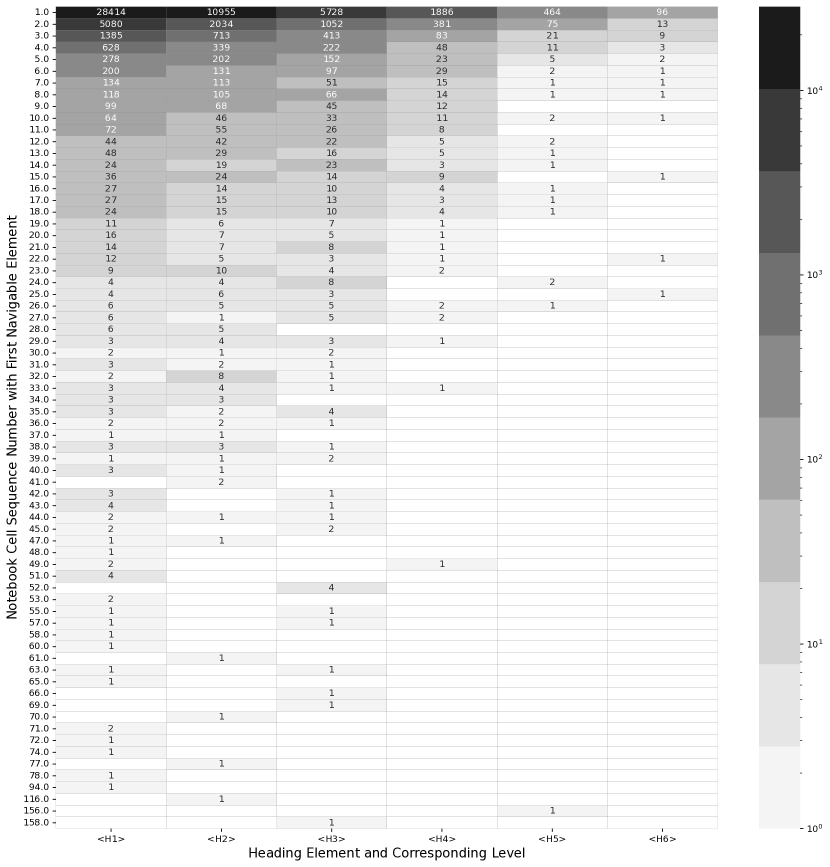
Appendix B Types of Outputs in Notebooks
Rank Category Output Type Total Percent Cumulative 1 Text Plain 977328 61.72 61.72 2 Image PNG 339589 21.45 83.17 3 Text HTML 208170 13.15 96.32 4 Application Javascript 22842 1.44 97.76 5 Application Jupyter JSON Widget 14532 0.91 98.67 6 Text Markdown 4750 0.31 98.98 7 Image SVG 3854 0.24 99.22 8 Application Plotly v1 + JSON 3385 0.21 99.45 9 Text LaTeX 2606 0.16 99.61 10 Text Plotly v1 + HTML 1623 0.10 99.71 11 Image JPEG/JPG 1326 0.08 99.79 12 Application BokehJS + JSON 902 0.06 99.85 13 Application PDF 677 0.04 99.89 14 Application VDOM.v1 + JSON 330 0.02 99.91 15 Application BokehJS + JSON 326 0.02 99.93 16 Application Papermill + JSON 300 0.01 99.94 17 Application Holoviews Load + JSON 157 0.009 99.95 18 Application Holoviews Exec + JSON 122 0.007 99.96 19 Application JSON 93 0.005 99.96 20 Application Colaboratory Intrinsic 77 0.004 99.97 21 - 36 Application (12 Others) 445 0.03 100.0 Image (1 Others - GIF) 19 Text (1 Others - GraphVIZ) 10 Total Outputs 1583255 100.0