Fairness and representation in satellite-based poverty maps:
Evidence of urban-rural disparities and their impacts on downstream policy
Abstract
Poverty maps derived from satellite imagery are increasingly used to inform high-stakes policy decisions, such as the allocation of humanitarian aid and the distribution of government resources. Such poverty maps are typically constructed by training machine learning algorithms on a relatively modest amount of “ground truth” data from surveys, and then predicting poverty levels in areas where imagery exists but surveys do not. Using survey and satellite data from ten countries, this paper investigates disparities in representation, systematic biases in prediction errors, and fairness concerns in satellite-based poverty mapping across urban and rural lines, and shows how these phenomena affect the validity of policies based on predicted maps. Our findings highlight the importance of careful error and bias analysis before using satellite-based poverty maps in real-world policy decisions.
1 Introduction
Satellite-based poverty maps are increasingly being used to inform critical policy decisions, including estimating interim subnational statistics Hofer et al. (2020), targeting humanitarian aid Aiken et al. (2022); Smythe and Blumenstock (2022), determining eligibility for social services Gentilini et al. (2022), and estimating the impacts of development programs Huang et al. (2021); Ratledge et al. (2022). These maps are constructed by applying machine learning (ML) algorithms to high-resolution imagery, based on the premise that the algorithm can learn to predict poverty from pixel data Jean et al. (2016); Yeh et al. (2020); Chi et al. (2022).
However, satellite-based poverty maps are not perfect. When poverty predictions exhibit systematic errors, their use in policy decisions can lead to disparate and unfair outcomes. For example, a program that provides resources to the regions of a country with lowest predicted wealth might disproportionately “miss” poor regions with substantial infrastructure and large, developed settlements signaling wealth from the sky. In such cases, the use of current satellite-based poverty maps – which in principle could be used to address the United Nation’s (UN) Sustainable Development Goals and other pressing social issues – might in practice conflict with goals of promoting equity (for example, as formalized in the UN’s Leave No One Behind Principle).
The potential for satellite-based poverty maps to aid public policy thus exists alongside the potential for such prediction-based policies to introduce or exacerbate inequities. In settings where policymakers may mis-perceive satellite-based maps as technocratic and therefore “objective” measures of poverty, it is imperative to document how systematic errors and biases might arise or compound in satellite-based poverty predictions and their uses in downstream policies.
This paper explores the interconnected phenomena of systematic prediction errors, representation, and unfairness in satellite-based poverty maps, focusing on disparities between urban and rural areas: are satellite-based maps as useful for distinguishing poverty levels within urban and rural areas as between them? Do satellite-based poverty maps tend to overestimate wealth in urban areas relative to rural ones (or vice versa) – and if so, what are the consequences for downstream policy decisions based on such maps? We focus our analyses on urban-rural disparities because (1) previous work has established urban build-up as as a key predictor of poverty in satellite-based machine learning models Yeh et al. (2020); Engstrom et al. (2022) and (2) many sensitive or protected characteristics – including race, age, and religion – are correlated with urbanization Ghosh and Roy (1997); Kuper (2013).
Using survey data and satellite imagery from ten countries (Table S1), our analysis produces four main results:
First, we document performance disparities across rural and urban regions and connect them to potential representational limitations of current methods. It appears that in many countries, satellite image representations can be used to somewhat accurately differentiate between wealthy and poor regions mainly because these representations capture differences between urban areas (which tend to be wealthy) and rural areas (which tend to be poorer). As a result, satellite-based poverty maps are not as effective at differentiating wealth within rural and urban parts a country as they are at estimating wealth at a national scale.
Second, we document nuanced but systematic biases in prediction errors for urban and rural areas. In countries where poverty is concentrated in rural areas, predicted wealth in urban areas is under-ranked relative to predicted wealth in rural areas. In contrast, in countries with a high degree of urban poverty, predicted wealth in urban areas is consistently over-ranked relative to predicted wealth in rural areas.
Third, we study how these phenomena interact to impact the fairness and effectiveness of downstream policies based on predicted maps. We simulate hypothetical geographically targeted aid programs which select beneficiary regions using satellite-based poverty predictions. We observe two contrasting phenomena with opposite effects on selection policies, both tied to the underlying joint distribution of urbanization and wealth. First, systematic over-ranking of rural wealth results in under-allocation of aid to rural areas (particularly when there is a strong correlation between urbanization and ground-truth wealth). Second, overreliance on weaker correlations between urbanization and wealth (arising from representational limitations in satellite imagery) may result in “missing” some of the urban poor.
Fourth, and finally, we explore options to reduce the exposed disparities in satellite-based poverty mapping. We find that simple recalibration methods can improve predictive accuracy and ameliorate prediction biases in some contexts, but rely heavily on having reliable measures of regions being urban or rural with which to recalibrate.
1.1 Related work
Satellite-based poverty maps — which have been studied in the research literature for some time Jean et al. (2016); Yeh et al. (2020); Chi et al. (2022); Rolf et al. (2021) — are now being used in real-world policy decisions, including the geographic targeting of social assistance (in Togo Aiken et al. (2022), the Democratic Republic of the Congo Gentilini et al. (2022), and Malawi Paul et al. (2021)) and policy impact evaluation (in Uganda Huang et al. (2021) and Rwanda Ratledge et al. (2022)). Broad calls to consider fairness and responsibility in satellite-based machine learning – e.g. in environmental applications McGovern et al. (2022), big data for development Blumenstock (2018), and remote sensing Burke et al. (2021) – underscore the importance of evaluating fairness and potential biases in these maps.
While the implications of algorithmic biases have been documented in settings from criminal justice Chouldechova and G’Sell (2017) and facial recognition Buolamwini and Gebru (2018) to credit scoring Liu et al. (2018) and resource allocation in healthcare Obermeyer et al. (2019), they have received relatively little attention in the domain of poverty mapping. Recent studies have highlighted specific fairness concerns for particular regions and applications: Kondmann et al. Kondmann and Zhu (2021) investigate statistical bias in estimation of poverty and electrification rates across villages in rural India, Zhang et al. Zhang et al. (2022) expose performance gaps of unsupervised transfer learning for landcover classification across rural and urban regions of China, and Smythe and Blumenstock Smythe and Blumenstock (2022) evaluate satellite-based poverty targeting in Nigeria.
However, to date there exists no systematic study of broader fairness concerns in satellite-based poverty mapping — partly because the data context of low- and middle-income countries (LMICs), where the utility of satellite-derived maps is most distinct, makes it difficult to rigorously evaluate map accuracy and fairness Jerven (2013); Bolliger et al. (2017); Burke et al. (2021); Rolf (2023). Our work builds on previous studies by concretely illustrating how errors and biases in satellite-based poverty maps can translate into disparate outcomes for downstream policy decisions.
2 Data and Methods
Our analysis relies on survey datasets from ten countries matched to featurizations of satellite images.
2.1 Survey datasets
We use survey datasets from ten countries in our paper, described in detail in Appendix A and Table S1. In short, we use the following four categories of survey data:
Demographic and Health Surveys (DHS) from Colombia, Honduras, Indonesia, Nigeria, Kenya, the Philippines, and Peru. Each survey was conducted in 2010 or later and interviewed 20,000-60,000 households in 1,000-5,000 clusters. Clusters are small geographic groups of households, sampled at random or stratified random in each country. Clusters are roughly equivalent to a neighborhood in urban areas (for which the provided cluster centroid is jittered with a 2km radius) or a village in rural areas (for which the jitter is a 5km radius). We use the DHS-constructed asset-based wealth index as the ground truth measure of poverty for each DHS survey, and calculate the average wealth index for each cluster.
The American Community Survey (ACS) from 2018, which interviewed 1.5 million randomly selected households from all 2,331 Public Use Microdata Areas (“PUMAs”) in the United States. We use household income as the ground truth poverty measure in the ACS, and calculate the average household income per PUMA.
The Mexican Intercensal Survey from 2015, which interviewed 2.8 million households in Mexico’s 2,446 municipalities. We construct an asset-based wealth index from the survey data, using a principle components analysis to project ownership of twelve assets to a unidimensional vector (Appendix A.1). Our ground truth measure of poverty in Mexico is the average asset-based wealth per municipality.
The Indian Socio Economic and Caste Census (SECC) from 2012. We use estimated average per-capita consumption at roughly the village/town level (shrid2) produced by the Socioeconomic High-resolution Rural-Urban Geographic Dataset for India (SHRUG) v2 (an updated version of Asher et al. (2021)) as our reference measure of poverty. We spatially aggregate small rural shrid2 regions together (Appendix A.2) to ensure each observation is a large enough geography and to reduce imbalance between the number of urban and rural regions. This reduces the number of rural observations from 522,344 to 59,832. There are 3,524 urban regions.
We normalize the poverty values for each country (logged in the US and India111We log poverty values in the US and India as these values represent consumption distributions, which are right-tailed. In the remaining countries, poverty is measured with asset indices and we do not use a log transform.) to zero mean and unit variance. We refer to these poverty measures as “wealth” throughout.
Categorizations of each region as either urban or rural are defined by these survey datasets. We refer to these binary labels as “urbanization” throughout.
2.2 Satellite image features
We obtain a set of tabularized features summarizing satellite tiles in each country we study from MOSAIKS Rolf et al. (2021), accessed via siml.berkeley.edu Carleton et al. (2022). The underlying satellite images are from Planet Labs in 2019.222Satellite imagery (from 2019) is not obtained from the same time period as all survey datasets, which range from 2010 to 2019. Other work suggests that the impacts of this temporal mismatch are limited Yeh et al. (2020), and we observe no clear relationship between predictive accuracy and temporal mismatch in Figure 1. Features are generated through an unsupervised machine learning approach based on random convolutional features (RCFs), which are shown to carry skill across a variety of prediction tasks Rolf et al. (2021).
RCF embedding functions are essentially a wide and shallow feed-forward convolutional neural network with random but fixed (non-optimized) weights. We use RCFs as convenient way to obtain images features with a single, fixed featurization method across countries.
The number of tiles per region varies widely between survey datasets: in the DHS, where each cluster has a 2-5km radius, each cluster is represented with 16-88 tiles. In the India, Mexico, and the United States, regions can overlap as few as six tiles or as many as tens of thousands of tiles (Table S1). For regions that intersect more than 100 tiles, we take a random subset of 100 of the intersecting tiles. We then calculate the average of each MOSAIKS feature for each region, weighted by the overlap between the tiles and the region.
2.3 Problem formulation and simulation setup
Our machine learning simulations begin by randomly assigning 75% of regions in each country to a training set and 25% to a test set.333We use uniform random assignment of regions (PUMAs in the US, municipalities in Mexico, aggregated Shrid2 units in India, and clusters in DHS surveys) to train and test sets — rather than spatial stratification — as it allows for more consistency across countries, and better reflects the “in-sample” scenarios in which satellite-based poverty maps would be deployed Wadoux et al. (2021); Rolf (2023). Following Rolf et al. Rolf et al. (2021), in each country we train a ridge regression model to predict average household wealth in training set regions from the associated satellite-derived MOSAIKS features. The objective function is mean squared error, and we tune the penalty via three-fold cross-validation on the training set. We then use the trained model to predict wealth for every region in the test set. To account for idiosyncrasies in random train-test splits, we report the mean two std. errors across 100 simulations in all results.
2.4 Fairness analysis procedures
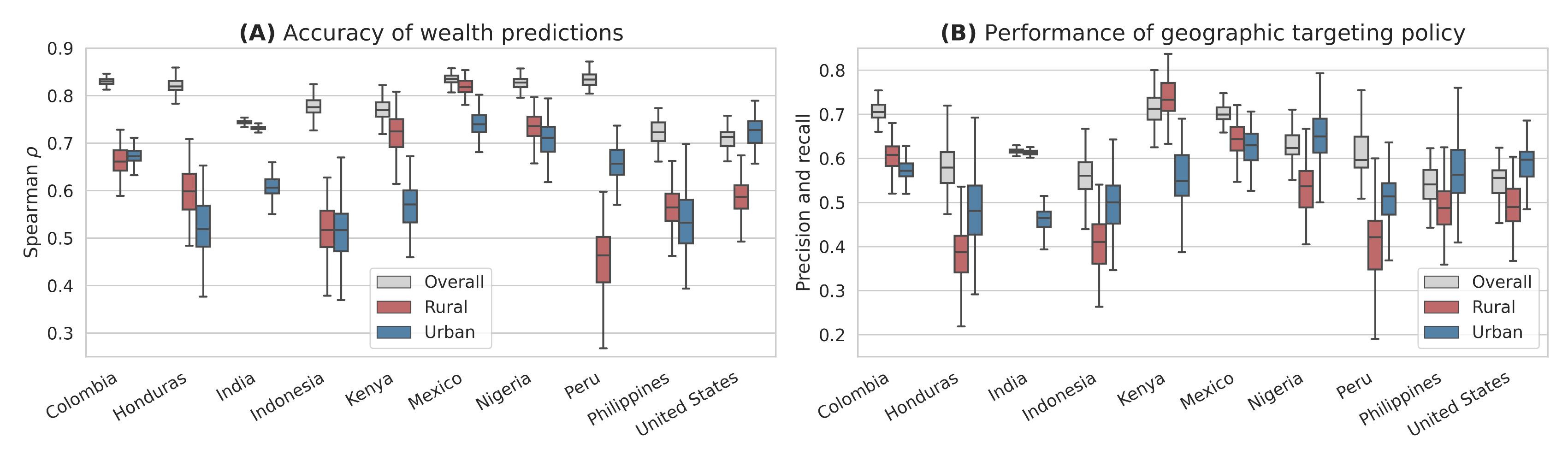
Our analysis focuses on bias and fairness in satellite-based poverty maps along urban-rural lines. First, we document performance disparities within and between urban and rural areas, by measuring predictive accuracy (measured with and Spearman’s ) in the test set overall, in just urban regions, and in just rural regions. Second, we measure systematic prediction biases between urban and rural regions when using satellite-based poverty maps, quantified as (1) the mean signed error in wealth prediction for rural and urban areas separately, and (2) the mean error in wealth ranking for rural and urban areas separately.
We then measure how performance disparities and prediction biases propagate to downstream policy decisions. We simulate hypothetical aid programs using satellite-based poverty predictions to select eligible geographies. To evaluate the implications of performance disparities on simple metrics of allocational fairness, we compare the precision and recall (equal by definition in this application Brown et al. (2018)) of hypothetical programs that target the poorest 20% of regions in each country as a whole, the poorest 20% of urban regions, and the poorest 20% of rural regions. To show how systematic prediction biases propagate to downstream policy decisions in nationwide aid programs, we measure aid allocation (measured as the number of regions selected) to rural areas and urban areas when satellite-based poverty maps are used to select geographies, and compare to allocations when ground truth measures of poverty are used.
2.5 Recalibration approaches
We explore two recalibration-based options for addressing fairness issues in satellite-based poverty prediction: mean calibration (adjusting the means of urban and rural predicted wealth distributions to match the means of the ground truth distributions), and selection threshold calibration (allocating resources to urban and rural areas according to the share of regions that are poor in each group). For both approaches, we learn the parameters of the calibration procedure on the training set, and apply this learned calibration to the test. We investigate whether access to ground-truth urbanization values affects the results our calibration approaches by also attempting calibration with predicted urbanization in test regions.
3 Results
3.1 Performance disparities and representation
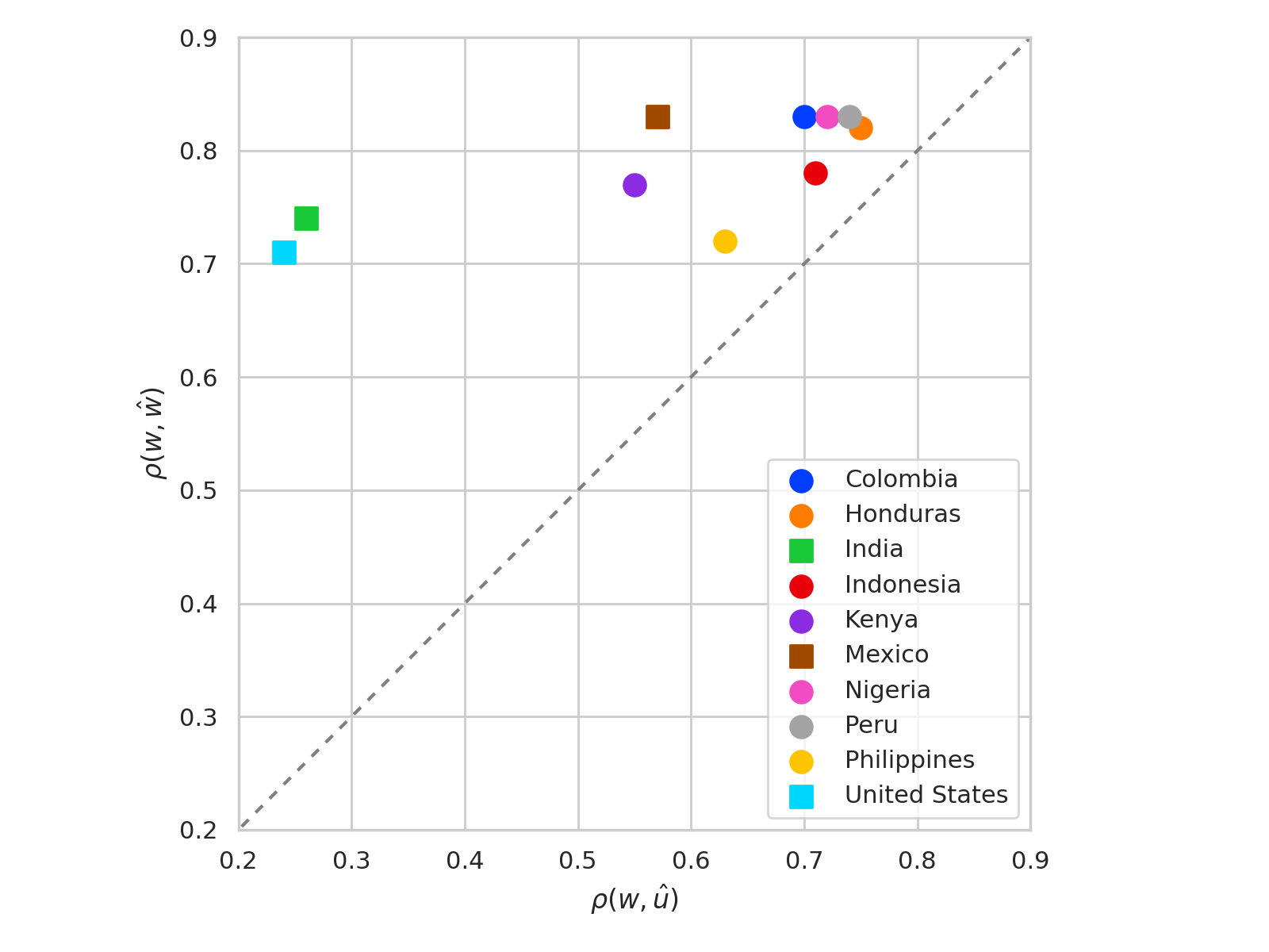
Consistent with past work Yeh et al. (2020); Engstrom et al. (2022), we find that satellite-based wealth predictions explain a significant portion of the variance in ground-truth wealth within each of the ten countries we study (mean = 0.47-0.70), and there is a strong correlation between wealth predictions and ground truth (mean Spearman’s = 0.71-0.83).
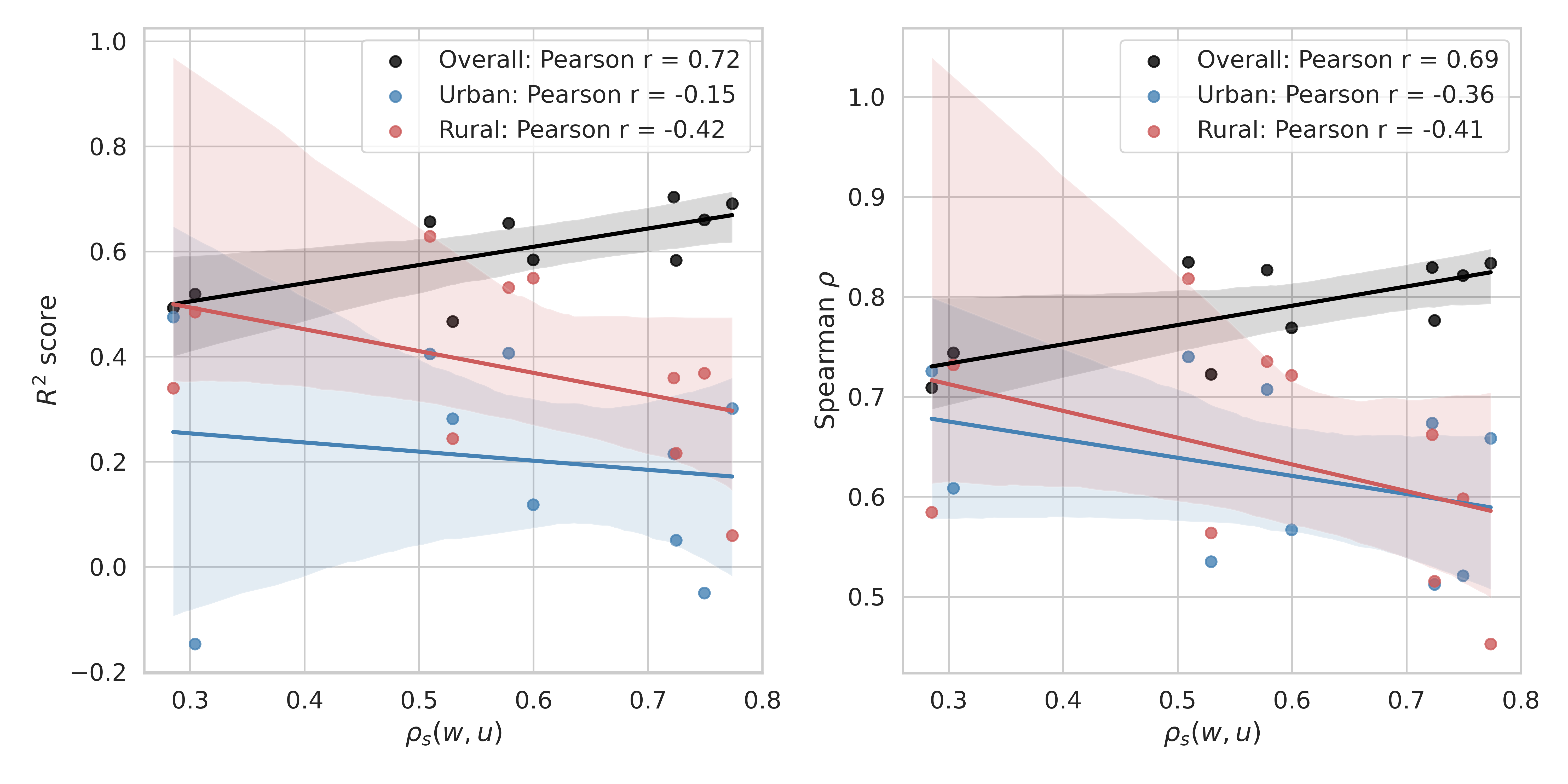
In all ten countries, the rank correlation is substantially lower when predictions are evaluated just within urban areas (mean = 0.51-0.74) or just within rural areas (mean = 0.40-0.82) (or both, Figure 1A).This systematically replicates analysis in Yeh et al. (2020) (which documents performance within-urban and within-rural areas for a pooled dataset from several African countries) for ten countries across the globe. There is heterogeneity across countries in terms of which areas are hardest to predict: in three countries (Colombia, Peru, and the United States) predictive accuracy is higher among urban areas than among rural areas, whereas in the remaining seven countries (Honduras, India, Indonesia, Kenya, Mexico, Nigeria, and the Philippines) predictive accuracy is higher among rural areas. In all countries, at least one of urban or rural areas has substantially lower predictive accuracy than the country as a whole (difference in mean , Figure 1A).
Why are satellite-based poverty maps consistently worse at differentiating poverty levels within urban or rural areas than within entire countries? Trends in the imagery and observed wealth data point to the possibility that much of the accuracy observed in country-scale satellite-based poverty maps is due to their ability to distinguish between urban and rural areas.
In each country, there is a strong correlation between the measured (“ground truth”) values of wealth and urbanization (Table S3, Spearman’s = 0.51-0.77 outside of India and the United States).444In the India and United States, = 0.28-0.30. The United States is the only high-income country of the ten we study. The relatively low correlation between wealth and urbanization in India in our data might be due in part to the definition of shrid2 regions, in which many urban regions have large spatial extent while a large majority of region instances are rural (see Appendix A.1). We also find that the overall performance of poverty predictions tends to be higher for countries where wealth and urbanization are more correlated (Figure S5).555This trend does not hold, and possibly reverses, when evaluating across only urban or rural regions (also Figure S5).
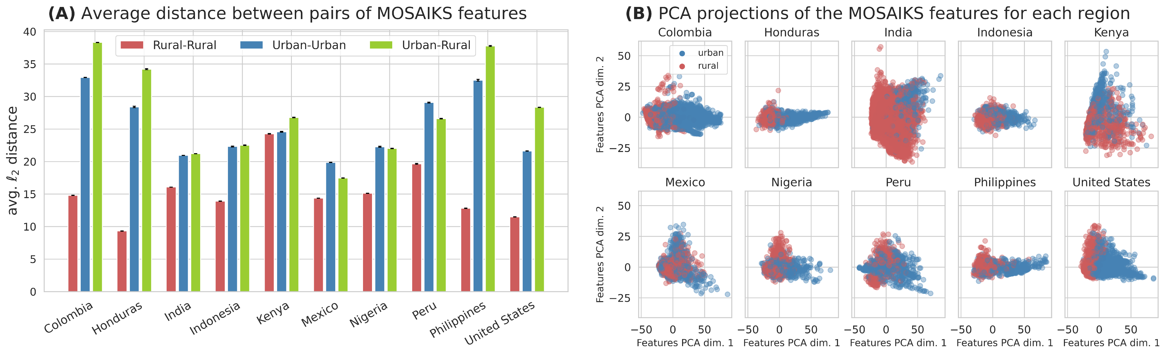
The potential influence of urbanization can also be seen in the feature representations of the raw imagery — even before fitting a predictive model —which already encode high amount of signal as to whether a region is urban or rural (Figure 2B). As shown in Figure 2A, the average distance between features of two rural regions is much lower than that between an urban and a rural region (and two urban regions). We find that a similar overall trend holds when looking at individual MOSAIKS tiles (Figure S1), and that satellite imagery is highly predictive of urbanization S3.
Finally, in countries where wealth and urbanizaton have a strong correlation, the differences between the predictive accuracy of satellite-based wealth predictions and satellite-based predictions of a region being urban are small (mean difference in Spearman’s = 0.07-0.26 outside of the United States and India, Table S3 and Figure S3). Along with the results in Figure 2, the close relationship between predicting urbanization and predicting wealth from satellite imagery hints at potential concerns about representations of poverty in satellite imagery akin to stereotype bias Abbasi et al. (2019); Boyarskaya et al. (2020), a particular type of representational harm in which the observed data on individuals in a group are more closely related than a more comprehensive characterization of those individuals would warrant.
Taken together, these results suggest that representations of poverty in satellite imagery beyond urbanization are present but often limited. As such, a concern for policy is that applications that “zoom in” on urban or rural areas (for example, calculating interim subregional poverty statistics or running an aid program in just urban or rural areas), predictive accuracy for identifying poverty from satellite imagery — and the accuracy of downstream decisions — is likely to be substantially lower than an overall accuracy estimate would suggest.
3.2 Systematic biases in prediction errors
In light of the limitations to poverty representations in satellite imagery, a further concern for satellite-based poverty mapping is possible systematic biases in prediction errors.
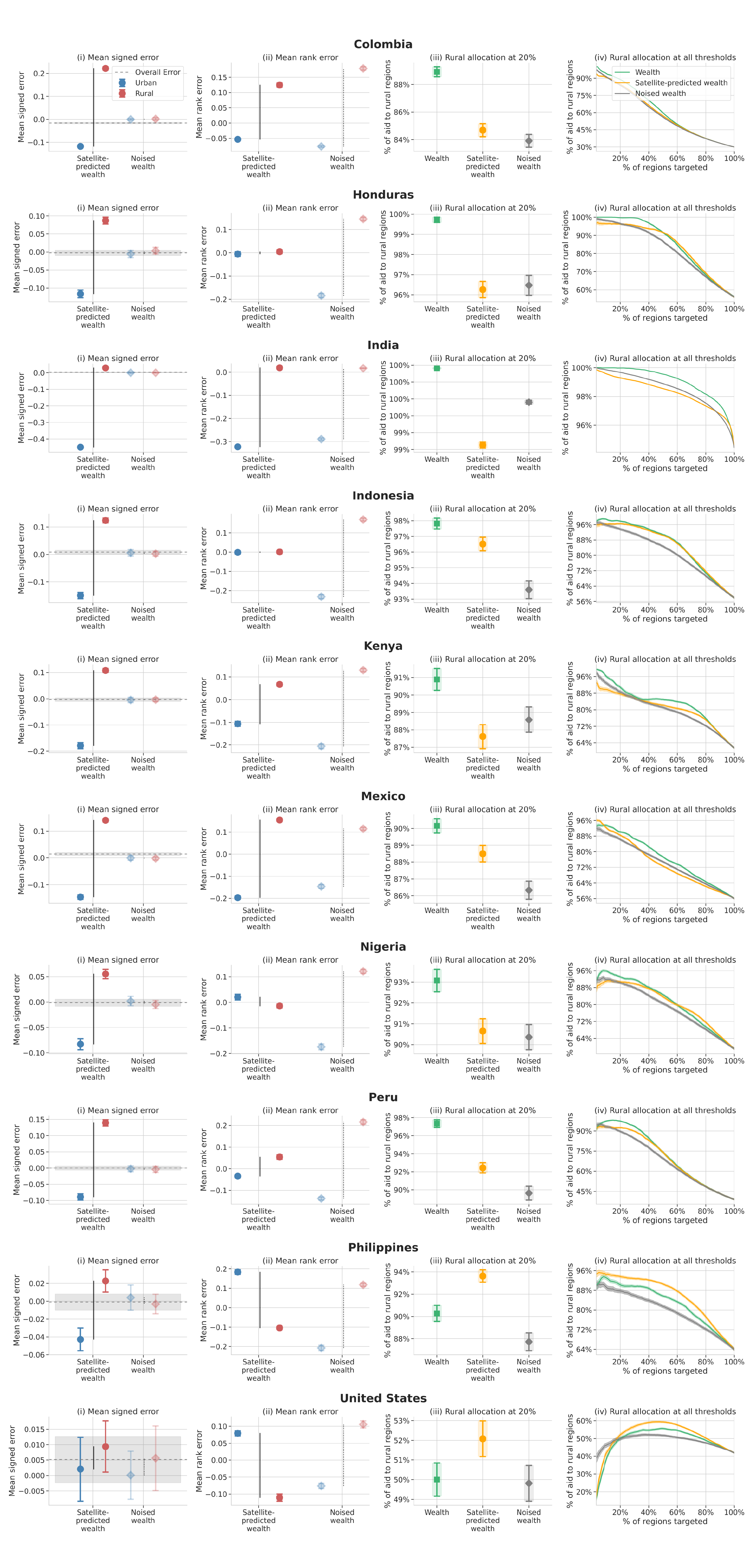
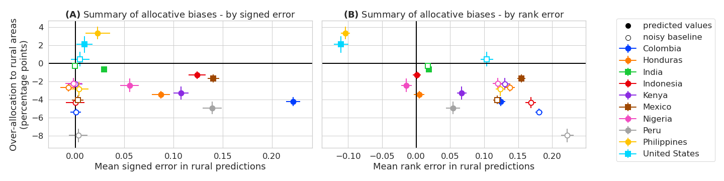
We begin by documenting mean signed errors in predictions, finding that across countries, wealth in urban areas is under-predicted and wealth in rural areas is over-predicted (Figure 3A, Figure S4). This phenomenon may simply reflect a statistical bias toward the mean prediction – in all countries urban areas are on average richer than rural areas (Table S3).
The mean error in wealth ranking across countries exhibits biased errors in both directions: in Nigeria, the Philippines, and the United States, rural areas are under-ranked by wealth predictions; in Colombia, India, Kenya, Mexico, and Peru, rural areas are over-ranked; and in Honduras and Indonesia, there is no statistically significant difference in ranking between urban and rural areas (Figure 3B).
An important question is whether these same biases could arise if simply using a lower-quality wealth label, rather than satellite-based predictions. Figures 3 and S4 therefore include noised-wealth baselines, in which we add Gaussian noise to the ground-truth wealth labels with zero mean and isotropic covariance calibrated to the mean squared error of the satellite-based predictions. This allows us to test whether prediction biases of satellite-based models are systematically different than those that would be observed under a model of independent, additive prediction noise. Since urban areas have higher average wealth than rural areas across countries in our study, we expect the noised income baseline will over-rank rural wealth and under-rank urban wealth.
Both the satellite-based poverty predictions and the noised-income baseline over-rank wealth in rural areas in most countries (horizontal axis of Figure 3B). The degree of over-ranking tends to be higher for the noised baseline than the satellite-based predictions. The notable exceptions are the United States and the Philippines, where prediction biases from satellite imagery run in the opposite direction of those from the noised wealth baseline (wealth is under-ranked in rural areas by satellite-based predictions and consistently over-ranked by the noised wealth baseline in these two countries). We explore possible drivers of these differences in Section 4.
3.3 Implications for downstream policies
To study the extent to which performance disparities and systematic prediction biases can propagate to allocative unfairness in downstream policy decisions, we simulate hypothetical geographically targeted aid programs in each country, as described in Section 2.4.
Geographic targeting effectiveness. We find that the disparities in predictive performance between urban and rural areas documented in Section 3.1 reduce the effectiveness of downstream decisions made using the satellite-based poverty predictions. A simulated social protection program aiming to select the poorest 20% of regions nationwide using satellite-based poverty maps tends to have relatively high recall and precision (54-71%), whereas programs identifying the poorest 20% of regions within urban or rural areas have lower recall and precision (38-73% in rural areas and 46-65% in urban areas, Figure 1B).
Allocative unfairness. The systematic biases in ranking of poverty by satellite-based predictions (Section 3.2) suggests a risk of allocative unfairness when using satellite-based poverty predictions to inform policy. In our simulated nationwide aid programs, in countries where the relationship between urbanization and wealth is strong (Colombia, Honduras, India, Indonesia, Kenya, Mexico, Nigeria, and Peru), aid tends to be under-allocated to rural areas (by 1-5 percentage points) compared to what would be allocated using ground truth wealth from the survey data. In countries where correlation between urbanization and wealth is weaker (the Philippines and the United States), aid tends to be over-allocated to rural areas (by 2-3 percentage points, Figure 3 and Figure S4). This latter pattern runs in the opposite direction for the noised wealth baseline (faded markers in Figure 3), indicating that error structures specific to satellite-based wealth predictions are driving allocative unfairness, rather than general degradation of wealth estimates.
4 Investigating drivers of allocative unfairness
The nuanced patterns of allocative unfairness in Section 3.3 can be at least partially explained by characterizing two phenomena driving errors in satellite-based predictions and ranking of wealth between urban and rural areas:
Reversion towards the (sample) mean. One possible driver of allocative unfairness is that predicted wealth can be biased upward for low wealth regions and downwards for high wealth regions, towards the overall mean wealth value in the training data (as described in Section 3.2). In our simulated aid program, the upward bias of wealth rankings in rural areas results in under-allocation of aid to rural areas. Colombia, Honduras, India, Indonesia, Mexico, Nigeria, and Peru are all emblematic of this pattern to varying degrees. Notably, allocative biases are less severe for many of these countries with satellite-based errors than would be expected with classical Gaussian prediction errors (simulated with the noised wealth baseline in Figure 3). One possible explanation for this pattern is that a second driver of allocative unfairness in satellite-based poverty predictions — described below — works in the opposite direction of classical prediction error.
Reliance on correlations between urbanization and wealth. A second potential driver of allocative unfairness is a limited predictive power beyond identifying built-up areas (established in Section 3.1). If variation in predicted wealth is driven by urbanization, whereas variation in true wealth is driven by more factors, satellite-based poverty prediction algorithms might “miss” populations of urban poor, having associated them with urbanized regions tending to be wealthy. The United States and the Philippines – which have the lowest and third-lowest correlation between urbanization and wealth of all the countries we study, and the lowest overall prediction performance (Table S3) – demonstrate this pattern.
While these two phenomena have different effects on the allocation rate to urban and rural areas, it is possible (and likely) for them to manifest jointly.666We discuss this issue further and propose summary statistics to help measure causes of each driver in Appendix B. Summarized in Figure 3, for most countries the first driver seems to have the dominant effect on allocation rates, excluding the United States and the Philippines, where the allocative differences appear to be driven mostly by the second phenomenon.
5 Addressing allocative unfairness
We test two approaches to addressing the issues of allocative unfairness characterized in Section 3.3.
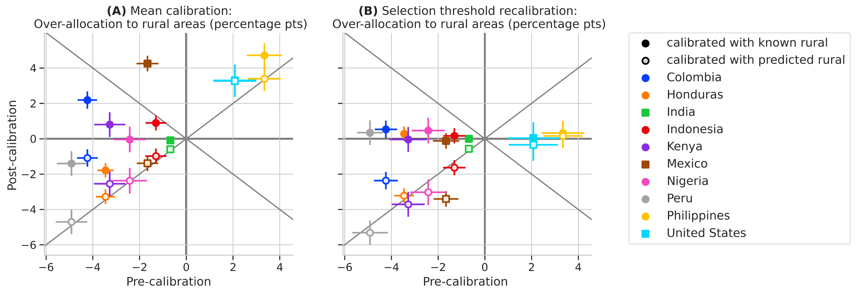
First, when we know which regions are classified as urban or rural, we can recalibrate the prediction distributions within urban and rural areas to align with the true per-group means in the training data. This addresses the “reversion to the mean” phenomenon in an application-agnostic way. We refer to this procedure as mean recalibration, and implement it by learning an additive offset for each group so that the predicted mean in each group matches the true group mean.
A second option is to directly address allocational unfairness in the context of resource allocation by setting different eligibility thresholds for urban and rural regions. We refer to this option as selection threshold calibration, and implement it by setting per-group allocation thresholds to match the fraction of allocations that would be sent to urban and rural areas using the reference wealth label values of the training set.
5.0.1 Mean calibration
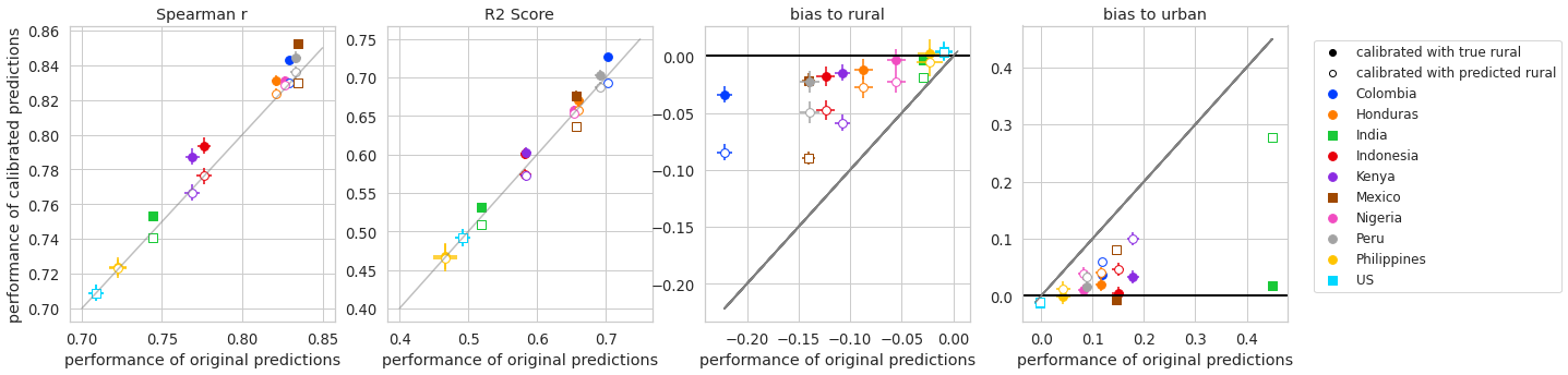
Figure 4 shows that applying mean calibration often produces downstream allocations that are closer to allocations based on ground-truth wealth measures. Mean calibration successfully reduces systematic prediction bias across urban and rural areas, and even slightly increases population level performance for some countries (increase in of 0.00 - 0.02, increase in Spearman of 0.00-0.02; Figure S6).
However, there are two important caveats to the mean calibration strategy. First, it only addresses the first driver of unfairness in Section 4 — reversion towards the mean. Across countries, mean recalibration increases the allocation to rural regions (evidenced by points above the line in Figure 4) due to the increased separation between predicted wealth of rural and urban regions. In countries where the dominant trend affecting allocation rates is missing the urban poor (the Philippines and the United States), deploying this recalibration strategy can exacerbate allocative differences. For simulations in Mexico, mean recalibration also introduces an allocative bias toward over-targeting rural regions that was not present in the original uncalibrated predictions.
Second, this simple mean recalibration strategy works only when ground truth labels for being urban or rural are known everywhere (that is, everywhere that the satellite-based poverty map will be used — not just in the training set). When we use satellite-based predictions for whether a region is urban or rural to perform mean recalibration in the test set, allocative bias is not significantly improved in most countries (non-filled-in points in Figure 4A).
5.0.2 Selection threshold calibration
When using ground truth indicators of urbanization, threshold calibration results in allocations that are close to what would be allocated with knowledge of true wealth values (confidence intervals for filled-in points in Figure 4B all overlap the line). This should be expected in our experimental setup, so long as the distributions of urban and rural wealth in the training set match those in the test set.
When satellite-based predictions for urbanization are used to perform selection threshold calibration in the test set, allocative bias is not improved — the same pattern observed in mean recalibration. It is possible that since wealth predictions and urban build-up predictions are closely related (Section 3.1), there is little additional signal in urban build-up predictions that is useful for calibration.
6 Discussion
Our work raises and investigates two main concerns relevant to researchers and policymakers interested in building and deploying satellite-based poverty maps for policymaking.
First, there are performance disparities in predictive accuracy for identifying wealth levels within urban and rural areas in comparison to between them, explained partly by somewhat limited representations of poverty in satellite imagery beyond urbanization. In particular, wealth is better differentiated between urban and rural areas than within urban or rural parts of a country (Figure 1A). Simulated aid programs that target only urban or only rural areas have lower recall than national-scale programs that can leverage the differences in urban and rural wealth (Figure 1B).
The main implication of this result for real-world deployments is that while satellite-based poverty programming at a country scale may be relatively accurate (as documented in past work Jean et al. (2016); Yeh et al. (2020); Chi et al. (2022)), effectiveness may be substantially lower if programs are deployed just for urban or rural areas (as is fairly common in anti-poverty programming Lindert et al. (2020)).
For researchers in machine learning, our results suggest that a focus on building predictive models that represent and distinguish wealth levels within urban and rural areas will be essential for making satellite-based poverty maps a useful and fair measurement tool. Other digital data sources, such as mobile phone data Blumenstock et al. (2015); Steele et al. (2017), social media data Fatehkia et al. (2020); Chi et al. (2022), or information from crowdsourced maps Tingzon et al. (2019) may be helpful for improving representation and within-urban and within-rural differentiation.
Our second main finding is that systematic prediction biases in poverty predictions between urban and rural areas can result in allocative bias in downstream policy decisions. The direction of prediction biases and downstream disparities in allocations depends on the underlying joint distribution of poverty and urbanization: satellite-based poverty maps may “miss” populations of urban poor in countries with pockets of urban poverty, whereas in countries where poverty is concentrated in rural areas, policies based on satellite-based poverty maps are likely to over-allocate aid to urban areas. The main implication of this result for policymakers is that urban-rural biases may be present even in national-scale policies using satellite-based poverty maps, and such maps should always be audited for bias before deployment.
We test two simple yet promising approaches to addressing systematic prediction biases through recalibrating predictions or selection thresholds, but both rely on having access to ground-truth labels for regions being urban or rural in all areas where the map is deployed. Imputed urban/rural values are available at an increasingly high resolution globally Rao and Molina (2015); evaluating whether such estimates are sufficient for model recalibration will be an important topic for future work. More generally, more sophisticated statistical approaches to addressing prediction bias may improve upon the ones we propose here Proctor et al. (2023).
The real-world implications of performance disparities and prediction biases for downstream analyses and policies are likely to be multi-faceted. We study in detail the implications for one downstream use of satellite-based poverty maps: the geographic targeting of humanitarian aid. A similar analysis could be applied to understand implications of disparities and biases for other uses of satellite-based predictions, such as the estimation of sub-national statistics Hofer et al. (2020); Sherman et al. (2023) and causal inference on the effects of anti-poverty programs Huang et al. (2021); Ratledge et al. (2022).
In summary, we find consistent evidence of disparities in satellite-based poverty maps across ten countries, with different social structures, time scales, and modes of ground truth data collection. An important complementary analysis, however, would seek to understand how the disparities we identify interact within a single complex sociopolitical context. For example, we studied disparities only across urban and rural areas; developing a more comprehensive set of concerns will crucially rely on local settings of model use. Such context-driven work, along with the empirical results presented here, can help policymakers realize the potential of satellite-based poverty mapping while mitigating the risk that such maps introduce bias or amplify existing inequities.
References
- Abbasi et al. [2019] Mohsen Abbasi, Sorelle A Friedler, Carlos Scheidegger, and Suresh Venkatasubramanian. Fairness in representation: Quantifying stereotyping as a representational harm. In Proceedings of the 2019 SIAM International Conference on Data Mining, pages 801–809. SIAM, 2019.
- Aiken et al. [2022] Emily Aiken, Suzanne Bellue, Dean Karlan, Chris Udry, and Joshua E Blumenstock. Machine learning and phone data can improve targeting of humanitarian aid. Nature, 603(7903):864–870, 2022.
- Asher et al. [2021] Sam Asher, Tobias Lunt, Ryu Matsuura, and Paul Novosad. Development research at high geographic resolution: An analysis of night lights, firms, and poverty in India using the SHRUG open data platform. The World Bank Economic Review, 2021.
- Bada and Fox [2022] Xóchitl Bada and Jonathan Fox. Persistent rurality in Mexico and ‘the right to stay home’. The Journal of Peasant Studies, 49(1):29–53, 2022.
- Blumenstock et al. [2015] Joshua Blumenstock, Gabriel Cadamuro, and Robert On. Predicting poverty and wealth from mobile phone metadata. Science, 350(6264):1073–1076, 2015.
- Blumenstock [2018] Joshua Blumenstock. Don’t forget people in the use of big data for development, 2018.
- Bolliger et al. [2017] Ian Bolliger, Tamma Carleton, Solomon Hsiang, Jonathan Kadish, Jonathan Proctor, Benjamin Recht, Esther Rolf, and Vaishaal Shankar. Ground control to Major Tom: The importance of field surveys in remotely sensed data analysis. arXiv preprint arXiv:1710.09342, 2017.
- Boyarskaya et al. [2020] Margarita Boyarskaya, Alexandra Olteanu, and Kate Crawford. Overcoming failures of imagination in AI infused system development and deployment. arXiv preprint arXiv:2011.13416, 2020.
- Brown et al. [2018] Caitlin Brown, Martin Ravallion, and Dominique Van de Walle. A poor means test? Econometric targeting in Africa. Journal of Development Economics, 134:109–124, 2018.
- Buolamwini and Gebru [2018] Joy Buolamwini and Timnit Gebru. Gender shades: Intersectional accuracy disparities in commercial gender classification. In Conference on fairness, accountability and transparency, pages 77–91. PMLR, 2018.
- Burke et al. [2021] Marshall Burke, Anne Driscoll, David B Lobell, and Stefano Ermon. Using satellite imagery to understand and promote sustainable development. Science, 371(6535), 2021.
- Carleton et al. [2022] Tamma Carleton, Trinetta Chong, Hannah Druckenmiller, Eugenio Noda, Jonathan Proctor, Esther Rolf, and Solomon Hsiang. Multi-Task Observation Using Satellite Imagery and Kitchen Sinks (MOSAIKS) API. https://siml.berkeley.edu, 2022.
- Chi et al. [2022] Guanghua Chi, Han Fang, Sourav Chatterjee, and Joshua E Blumenstock. Microestimates of wealth for all low-and middle-income countries. Proceedings of the National Academy of Sciences, 119(3):e2113658119, 2022.
- Chouldechova and G’Sell [2017] Alexandra Chouldechova and Max G’Sell. Fairer and more accurate, but for whom? arXiv preprint arXiv:1707.00046, 2017.
- Engstrom et al. [2022] Ryan Engstrom, Jonathan Hersh, and David Newhouse. Poverty from space: Using high resolution satellite imagery for estimating economic well-being. The World Bank Economic Review, 36(2):382–412, 2022.
- Fatehkia et al. [2020] Masoomali Fatehkia, Isabelle Tingzon, Ardie Orden, Stephanie Sy, Vedran Sekara, Manuel Garcia-Herranz, and Ingmar Weber. Mapping socioeconomic indicators using social media advertising data. EPJ Data Science, 9(1):22, 2020.
- Gentilini et al. [2022] Ugo Gentilini, Mohamed Bubaker Alsafi Almenfi, TMM Iyengar, Yuko Okamura, John Austin Downes, Pamela Dale, Michael Weber, David Locke Newhouse, Claudia P Rodriguez Alas, Mareeha Kamran, et al. Social protection and jobs responses to COVID-19. 2022.
- Ghosh and Roy [1997] Rabindra Nath Ghosh and KC Roy. The changing status of women in India: Impact of urbanization and development. International Journal of Social Economics, 24(7/8/9):902–917, 1997.
- Hofer et al. [2020] Martin Hofer, Tomas Sako, Arturo Martinez Jr, Mildred Addawe, Joseph Bulan, Ron Lester Durante, and Marymell Martillan. Applying artificial intelligence on satellite imagery to compile granular poverty statistics. Asian Development Bank Economics Working Paper Series, (629), 2020.
- Huang et al. [2021] Luna Yue Huang, Solomon M Hsiang, and Marco Gonzalez-Navarro. Using satellite imagery and deep learning to evaluate the impact of anti-poverty programs. Technical report, National Bureau of Economic Research, 2021.
- Jean et al. [2016] Neal Jean, Marshall Burke, Michael Xie, W Matthew Davis, David B Lobell, and Stefano Ermon. Combining satellite imagery and machine learning to predict poverty. Science, 353(6301):790–794, 2016.
- Jerven [2013] Morten Jerven. Poor numbers. In Poor Numbers. Cornell University Press, 2013.
- Kondmann and Zhu [2021] Lukas Kondmann and Xiao Xiang Zhu. Under the radar – auditing fairness in ML for humanitarian mapping. arXiv preprint arXiv:2108.02137, 2021.
- Kuper [2013] Leo Kuper. Religion and urbanization in Africa. Reading in Race and Ethnic Relations: The Commonwealth and International Library: Reading in Sociology, pages 129–148, 2013.
- Lindert et al. [2020] Kathy Lindert, Tina George Karippacheril, Inés Rodríguez Caillava, and Kenichi Nishikawa Chávez. Sourcebook on the foundations of social protection delivery systems. World Bank Publications, 2020.
- Liu et al. [2018] Lydia T Liu, Sarah Dean, Esther Rolf, Max Simchowitz, and Moritz Hardt. Delayed impact of fair machine learning. In International Conference on Machine Learning, pages 3150–3158. PMLR, 2018.
- McGovern et al. [2022] Amy McGovern, Imme Ebert-Uphoff, David John Gagne, and Ann Bostrom. Why we need to focus on developing ethical, responsible, and trustworthy artificial intelligence approaches for environmental science. Environmental Data Science, 1:e6, 2022.
- Murray [2022] Charles Murray. Data tools 1: Deciphering the location of respondents in the American Community Survey. 2022.
- Obermeyer et al. [2019] Ziad Obermeyer, Brian Powers, Christine Vogeli, and Sendhil Mullainathan. Dissecting racial bias in an algorithm used to manage the health of populations. Science, 366(6464):447–453, 2019.
- Paul et al. [2021] Boban Varghese Paul, Chipo Msowoya, Edward Archibald, Massimo Sichinga, Alejandra Campero Peredo, and Muhammad Abdullah Ali Malik. Malawi COVID-19 urban cash intervention process evaluation report. 2021.
- Proctor et al. [2023] Jonathan Proctor, Tamma Carleton, and Sandy Sum. Parameter recovery using remotely sensed variables. Technical report, National Bureau of Economic Research, 2023.
- Rao and Molina [2015] John NK Rao and Isabel Molina. Small area estimation. John Wiley & Sons, 2015.
- Ratledge et al. [2022] Nathan Ratledge, Gabe Cadamuro, Brandon de la Cuesta, Matthieu Stigler, and Marshall Burke. Using machine learning to assess the livelihood impact of electricity access. Nature, 611(7936):491–495, 2022.
- Rolf et al. [2021] Esther Rolf, Jonathan Proctor, Tamma Carleton, Ian Bolliger, Vaishaal Shankar, Miyabi Ishihara, Benjamin Recht, and Solomon Hsiang. A generalizable and accessible approach to machine learning with global satellite imagery. Nature communications, 12(1):1–11, 2021.
- Rolf [2023] Esther Rolf. Evaluation challenges for geospatial ml. arXiv preprint arXiv:2303.18087, 2023.
- Sherman et al. [2023] Luke Sherman, Jonathan Proctor, Hannah Druckenmiller, Heriberto Tapia, and Solomon M Hsiang. Global high-resolution estimates of the United Nations Human Development Index using satellite imagery and machine-learning. Working Paper 31044, National Bureau of Economic Research, March 2023.
- Smythe and Blumenstock [2022] Isabella S Smythe and Joshua E Blumenstock. Geographic microtargeting of social assistance with high-resolution poverty maps. Proceedings of the National Academy of Sciences, 119(32):e2120025119, 2022.
- Steele et al. [2017] Jessica E Steele, Pål Roe Sundsøy, Carla Pezzulo, Victor A Alegana, Tomas J Bird, Joshua Blumenstock, Johannes Bjelland, Kenth Engø-Monsen, Yves-Alexandre De Montjoye, Asif M Iqbal, et al. Mapping poverty using mobile phone and satellite data. Journal of The Royal Society Interface, 14(127):20160690, 2017.
- Tingzon et al. [2019] Isabelle Tingzon, Ardie Orden, KT Go, S Sy, V Sekara, Ingmar Weber, M Fatehkia, M García-Herranz, and D Kim. Mapping poverty in the Philippines using machine learning, satellite imagery, and crowd-sourced geospatial information. International Archives of the Photogrammetry, Remote Sensing & Spatial Information Sciences, 2019.
- Wadoux et al. [2021] Alexandre MJ-C Wadoux, Gerard BM Heuvelink, Sytze De Bruin, and Dick J Brus. Spatial cross-validation is not the right way to evaluate map accuracy. Ecological Modelling, 457:109692, 2021.
- Yeh et al. [2020] Christopher Yeh, Anthony Perez, Anne Driscoll, George Azzari, Zhongyi Tang, David Lobell, Stefano Ermon, and Marshall Burke. Using publicly available satellite imagery and deep learning to understand economic well-being in Africa. Nature communications, 11(1):1–11, 2020.
- Zhang et al. [2022] Miao Zhang, Harvineet Singh, Lazarus Chok, and Rumi Chunara. Segmenting across places: The need for fair transfer learning with satellite imagery. In 2022 IEEE/CVF Conference on Computer Vision and Pattern Recognition Workshops (CVPRW), pages 2915–2924, 2022.
Ethical Statement
This paper seeks to expose and quantify a potentially critical ethical issue in satellite-based poverty prediction: issues of fairness within and between urban and rural areas. However, our work here still sits squarely within computational and algorithmic aspects of fairness. By focusing on trends across ten very different countries, the analysis in this paper is largely devoid of the full social context of poverty mapping and aid allocation in the each individual country we study. Country-specific and human-centered work on local conceptions of fairness in such policies will complement the analysis in this paper.
Acknowledgments
Aiken acknowledges support from a Microsoft Research PhD Fellowship. Blumenstock acknowledges support from the National Science Foundation under CAREER Grant IIS-1942702. Rolf acknowledges support from the Harvard Data Science Initiative and the Center for Research on Computation and Society.
We thank Paul Novosad and Sam Asher for sharing with us with an early release of the SHRUG v2 dataset, and for feedback on an earlier draft of this work. We thank Gabriel Cadamuro, Tamma Carleton, Guanghua Chi, and Jonathan Proctor for helpful feedback on the paper.
Appendix A Appendix: Data details
A.1 Categorization of rural vs. urban, calculation of wealth index
Demographic and Health (DHS) surveys.
Each DHS survey uses a country-specific rule to define which areas are rural and which are urban; rural ratios range from 30% in Colombia to 64% in the Philippines (Table S1).
American Community Survey (ACS).
Categorizations of PUMAs as urban or rural are from Murray Murray [2022]; 42% of PUMAs are categorized as rural. Rural PUMAs are defined by the ACS as “an agricultural or otherwise sparsely populated PUMA a largest place of fewer than 20,000 people that is not contiguous with another place.”
Mexican Intercensal Survey.
As discussed in Section 2.1, we construct an asset-based wealth index from the Mexican Intercensal data, using a principle components analysis to project ownership of the twelve assets (electricity, landline phone, mobile phone, internet, car, hot water, air conditioning, computer, washing machine, refrigerator, TV, and radio) to a unidimensional vector. The asset index explains 34% in the variance in ownership of the underlying assets. Our ground truth measure of poverty is average asset-based wealth per municipality. Municipalities are assigned to urban or rural according to the Mexican government’s defnition of rurality (recording in the intercensal survey): rural municipalities are those where the majority of the population lives in communities of less than 2,500 people; the remaining municipalities are urban Bada and Fox [2022].
Indian Socio Economic and Caste Census (SECC) (via SHRUG).
Shrid2s are geographic units defined and used in the SHRUG database to be consistent with census region definitions over time in India. As discussed in the documentation of shrids for v1.5777https://shrug-assets-ddl.s3.amazonaws.com/static/main/assets/other/shrug-codebook.pdf, each shrid2 region (shrid units for v2 of the dataset) can thus contain multiple villages or towns. The small-area estimation method for computing per-capita consumption estimates for each shrid unit is described in Asher et al. [2021].
Rural and urban units are defined by the 2012 SECC data in the SHRUG database, which separates per capita consumption estimates by urban and rural. Of the 525,868 original shrid2 units, 126 (0.024%) have SECC values for both rural and urban consumption. We categorize these units as be urban, taking rural regions to be those only with rural consumption. For the 126 units with both urban and rural consumption, we calculate total consumption as a weighted average of urban and rural consumption in the shrid, weighting by the urban and rural population from the 2011 Indian population censuses (also aggregated to shrids as in Asher et al. [2021]).
A.2 Combining rural SHRUG regions to larger geographical extents
In the original SHRUG v2 dataset, there are 3,524 urban (or both urban and rural) shrid2 units and 522,344 rural units. Because some shrid2 regions are very small in geographic extent, we combine rural shrid2 to reduce the imbalance between the number of urban and rural observations. This also ensures that several MOSAIKS tiles overlap with each cell for most observation units. Only rural shrid2s are merged together; we do not alter the extents of urban shrid2s.
We use the following procedure to merge small rural shrids within the district administrative level (1 level finer than states). Within each district, we iteratively find the smallest remaining rural extent (by area). We merge this extent with a neighboring geometry according to the following rules: (1) only neighboring geometries currently made up of fewer than 25 regions are eligible to be merged, (2) of the candidate neighbors, the one with the highest boundary overlap with the district to be merged is chosen. If there are no feasible neighbors to merge with, the geometry will stay as is and be removed from the mergeable list. We repeat this process until there are no more mergeable geometries (“mergeable” meaning geometries of area less than 25km2) with at least one neighbor that satisfies rule (1) above).
When geometries are merged according to this process, per capita consumption estimates are computed as a weighted average of the per capita consumption estimates at shrid2 level, where weights in the average are proportional to the 2011 Indian census population counts for each shrid2.
Before this procedure, there were urban geometries (median area 13.9km2) and rural geometries (median areas 2.92km2). After aggregation, there are (median area 13.9km2) and rural geometries (median areas 40.8km2).
A.3 MOSAIKS features
As mentioned in Section 3.1, for each instance (region), the random convolutional feature (RCF) representation is an average of up to 100 MOSAIKS tiles overlapping with the geographic extent of the region. The minimum, maximum, and average number of MOSAIKS tiles per region in each country is given in Table S1.
Figure 2A plots the average Euclidean distances between image features for pairs of regions, where the pairs considered are: both rural regions, both urban regions, and one rural one urban region. In most countries we study, feature representations of urban regions tend to be more similar to features of other urban regions than they are to features of rural instances. Rural regions tend to be closer to each other in feature space than urban regions are to each other, though this could be partly due to features in rural regions being an average over more MOSAIKS tiles on average than features corresponding to urban regions. Thus, it is difficult to say how differences in average feature distances measured in 2A affect performance differnces across urban and rural regions (Figure 1). On the one hand, the smaller variation of feature representation within rural regions could contribute to lower predictive performance for rural regions. On the other hand, when this lower variation is due to averaging of MOSAIKS more tiles across the rural geographies than urban geographies, the feature representation may be in some sense more precise for rural regions, which could contribute to higher predictive performance in rural regions.
To understand the amount to which the averaging of the km tiles in the per-region MOSAIKS feature representation affects the distances plotted in 2A, in Figure S1 we plot distances between the RCF featurizations of individual tiles in each region, where one tile is sampled for each region. As in Figure 2A, the tile feature distances in Figure S1 are smaller between pairs of rural instances than between pairs of urban instances or pairs of one rural and one urban instance. For all types of pairs, the distances between tiles in Figure S1 tend to be larger than the distances between average feature representations in Figure 2A. This is expected, since averaging many tiles reduces the variation in the feature representation for each region. The averaging generally reduces the average rural-rural and urban-urban distances more than distances between urban-rural pairs. This is consistent with the observation that the average feature representations for urban and rural regions are substantially separated for many countries, reflected also in the PCA distribution plots in Figure 2B.
| Dataset | Definition of regions | Number of Regions | % Rural Regions | Tiles Per Region | |||
|---|---|---|---|---|---|---|---|
| Minimum | Mean | Maximum | |||||
| Colombia | 2010 DHS | Clusters | 4,868 | 30.1% | 16 | 52 | 88 |
| Honduras | 2011 DHS | Clusters | 1,128 | 56.2% | 16 | 58 | 86 |
| India | 2012 SECC | Aggregated shrid2s | 63,356 | 94.4% | 0 | 49 | 100 |
| Indonesia | 2017 DHS | Clusters | 1,319 | 57.8% | 16 | 58 | 87 |
| Kenya | 2014 DHS | Clusters | 1,585 | 61.2% | 16 | 60 | 86 |
| Mexico | 2015 survey | Municipalities | 2,446 | 56.1% | 6 | 89 | 100 |
| Nigeria | 2018 DHS | Clusters | 1,359 | 58.8% | 16 | 56 | 86 |
| Peru | 2012 DHS | Clusters | 1,131 | 38.8% | 16 | 47 | 85 |
| Philippines | 2017 DHS | Clusters | 1,213 | 64.0% | 16 | 62 | 88 |
| US | 2019 ACS | PUMAs | 2,331 | 41.8% | 12 | 94 | 100 |
Appendix B Appendix: Supplementary analysis, figures, and tables
B.1 Quantifying summary statistics for drivers of allocative unfairness
In Section 3, we discussed two main phenomena that could drive allocative unfairness:
-
1.
A reversion towards the sample mean, which biases predictions wealth of rural places to be higher than the true value, and predictions of wealth of urban places to be lower, on average, and
-
2.
A potential to miss the urban poor, due in part to relying on correlations between urbanization and wealth to produce poverty predictions.
To study these two drivers more rigorously, we evaluate the correlation between summary statistics representing each of the two phenomena and the difference in allocation in Figure 3 across 100 simulation runs with different random data splits. As a summary statistic for the first phenomenon – reversion to the sample mean – we use the difference in standard deviation between satellite-predicted and true wealth distributions (we will notate this summary statistic as ). As a summary statistic for the second phenomenon — reliance on correlations between urbanization and wealth — we use the Spearman’s rank correlation between wealth predictions and predictions for being urban (we will notate this summary statistic as ).
To measure differences in allocations, we experiment with two summary statistics for allocational disparities: (a) the difference in allocations (between a targeting method that uses ground truth poverty data and a targeting method that uses satellite-based predictions) to rural areas at a 20% selection threshold, as shown in Figure 3 and (b) the difference in area under the curves in Figure S4, which summarizes the difference in allocations at all possible thresholds. For both these summary statistics, we will notate the allocation to rural areas using ground truth poverty data as , the allocation to rural areas using satellite-based poverty predictions as , and the difference between the two as . We find that, across countries, in simulations where the first driver is dominant (that is, reversion to the sample mean plays a key role — as measured by a large reduction in standard deviation), aid is under-allocated to rural areas. In simulations where the second driver is dominant (that is, the correlation between predictions of wealth and predictions of urban build-up is high), aid tends to be over-allocated to rural areas (Table S2).
| Country | (A) | (B) | (C) | (D) Pearson’s | (E) Pearson’s |
|---|---|---|---|---|---|
| Panel A: Using allocations at a 20% threshold as the summary statistic for allocations | |||||
| Colombia | 84.684 | 88.918 | -4.234*** | -0.026 | 0.105 |
| Honduras | 96.263 | 99.719 | -3.456*** | -0.097 | -0.094 |
| India | 99.290 | 99.972 | -0.682*** | -0.091 | 0.115 |
| Indonesia | 96.515 | 97.818 | -1.303*** | -0.124 | -0.056 |
| Kenya | 87.612 | 90.888 | -3.275*** | -0.306 | 0.014 |
| Mexico | 88.496 | 90.154 | -1.659*** | -0.100 | 0.111 |
| Nigeria | 90.652 | 93.072 | -2.420*** | -0.047 | -0.110 |
| Peru | 92.439 | 97.351 | -4.912*** | -0.126 | 0.042 |
| Philippines | 93.623 | 90.279 | 3.344*** | -0.057 | 0.193 |
| US | 52.077 | 50.000 | 2.077*** | -0.110 | 0.469 |
| Panel B: Using area under the targeting curves (Figure S4 Panel D) as the summary statistic for allocations | |||||
| Colombia | 0.572 | 0.594 | -0.022*** | 0.063 | 0.044 |
| Honduras | 0.816 | 0.827 | -0.010*** | -0.015 | 0.107 |
| India | 0.953 | 0.961 | -0.007*** | -0.090 | -0.032 |
| Indonesia | 0.821 | 0.826 | -0.005*** | -0.046 | 0.129 |
| Kenya | 0.781 | 0.804 | -0.023*** | -0.273 | -0.012 |
| Mexico | 0.718 | 0.745 | -0.027*** | 0.124 | 0.185 |
| Nigeria | 0.783 | 0.790 | -0.007*** | -0.049 | -0.070 |
| Peru | 0.682 | 0.696 | -0.015*** | -0.159 | 0.169 |
| Philippines | 0.834 | 0.804 | 0.030*** | -0.154 | 0.187 |
| US | 0.500 | 0.476 | 0.024*** | -0.167 | 0.488 |
B.2 Additional tables and figures
| (A) Predicting poverty | (B) Predicting urban | (C) Relating poverty and urban build-up | (D) Using urban predictions to measure poverty | |||||
|---|---|---|---|---|---|---|---|---|
| Pearson’s | Spearman’s | AUC | Pearson’s | Spearman’s | Pearson’s | Spearman’s ) | ||
| Colombia | 0.70 (0.01) | 0.84 (0.01) | 0.83 (0.01) | 0.94 (0.01) | 0.77 (0.01) | 0.72 (0.01) | 0.71 (0.02) | 0.70 (0.02) |
| Honduras | 0.66 (0.04) | 0.82 (0.02) | 0.82 (0.02) | 0.95 (0.01) | 0.76 (0.03) | 0.75 (0.02) | 0.77 (0.02) | 0.75 (0.02) |
| India | 0.52 (0.01) | 0.72 (0.00) | 0.74 (0.00) | 0.84 (0.01) | 0.35 (0.01) | 0.30 (0.01) | 0.28 (0.01) | 0.26 (0.01) |
| Indonesia | 0.58 (0.03) | 0.77 (0.02) | 0.78 (0.02) | 0.93 (0.02) | 0.72 (0.02) | 0.72 (0.02) | 0.72 (0.03) | 0.71 (0.03) |
| Kenya | 0.58 (0.03) | 0.77 (0.02) | 0.77 (0.02) | 0.84 (0.02) | 0.59 (0.02) | 0.60 (0.03) | 0.58 (0.03) | 0.55 (0.04) |
| Mexico | 0.66 (0.03) | 0.82 (0.01) | 0.83 (0.01) | 0.79 (0.02) | 0.51 (0.03) | 0.51 (0.03) | 0.56 (0.04) | 0.57 (0.04) |
| Nigeria | 0.65 (0.02) | 0.81 (0.01) | 0.83 (0.01) | 0.87 (0.02) | 0.57 (0.03) | 0.58 (0.03) | 0.71 (0.02) | 0.72 (0.03) |
| Peru | 0.69 (0.03) | 0.83 (0.02) | 0.83 (0.02) | 0.96 (0.01) | 0.77 (0.02) | 0.77 (0.02) | 0.77 (0.02) | 0.74 (0.02) |
| Philippines | 0.47 (0.09) | 0.70 (0.04) | 0.72 (0.03) | 0.90 (0.02) | 0.53 (0.03) | 0.53 (0.03) | 0.62 (0.03) | 0.63 (0.03) |
| US | 0.49 (0.05) | 0.72 (0.03) | 0.71 (0.02) | 0.99 (0.00) | 0.28 (0.04) | 0.28 (0.04) | 0.28 (0.04) | 0.24 (0.05) |