0 \vgtccategoryResearch \vgtcpapertypealgorithm/technique \authorfooter R. Tinarrage and J. Poco are with the School of Applied Mathematics, Fundação Getulio Vargas, Rio de Janeiro, Brazil. E-mails: {raphael.tinarrage, jorge.poco}@fgv.br. J. Ponciano, C. Linhares, and A. Traina are with the Institute of Mathematics and Computer Sciences, University of São Paulo, São Carlos, Brazil. E-mails: {jeanponciano, claudiodgl}@usp.br, {agma}@icmc.usp.br. \shortauthortitleTinarrage et al.: TDANetVis
TDANetVis: Suggesting temporal resolutions for graph visualization using zigzag persistent homology
Abstract
Temporal graphs are commonly used to represent complex systems and track the evolution of their constituents over time. Visualizing these graphs is crucial as it allows one to quickly identify anomalies, trends, patterns, and other properties leading to better decision-making. In this context, the to-be-adopted temporal resolution is crucial in constructing and analyzing the layout visually. The choice of a resolution is critical, e.g., when dealing with temporally sparse graphs. In such cases, changing the temporal resolution by grouping events (i.e., edges) from consecutive timestamps — this technique is known as timeslicing — can aid in the analysis and reveal patterns that might not be discernible otherwise. However, choosing a suitable temporal resolution is not trivial. In this paper, we propose TDANetVis, a methodology that suggests temporal resolutions potentially relevant for analyzing a given graph, i.e., resolutions that lead to substantial topological changes in the graph structure. To achieve this goal, TDANetVis leverages zigzag persistent homology, a well-established technique from Topological Data Analysis (TDA). To enhance visual graph analysis, TDANetVis also incorporates the colored barcode, a novel timeline-based visualization built on the persistence barcodes commonly used in TDA. We demonstrate the usefulness and effectiveness of TDANetVis through a usage scenario and a user study involving 27 participants.
keywords:
temporal graphs, timeslicing, graph visualization, temporal resolution, persistent homology, persistence barcodeK.6.1Management of Computing and Information SystemsProject and People ManagementLife Cycle;
\CCScatK.7.mThe Computing ProfessionMiscellaneousEthics
\teaser
![[Uncaptioned image]](/html/2304.03828/assets/x1.png) TDANetVis system prototype, an interactive and web-based system with linked views designed to assist the analysis of temporal graphs by highlighting connected components’ structure and evolution. (A) Colored barcode highlighting the longest connected component in the graph. (B) Timestamp markers indicating the three timestamps being depicted by (C-E) the three node-link diagrams. (F) Tooltip showing extra information. (G) Users can select groups of nodes by label or by connected component.
TDANetVis system prototype, an interactive and web-based system with linked views designed to assist the analysis of temporal graphs by highlighting connected components’ structure and evolution. (A) Colored barcode highlighting the longest connected component in the graph. (B) Timestamp markers indicating the three timestamps being depicted by (C-E) the three node-link diagrams. (F) Tooltip showing extra information. (G) Users can select groups of nodes by label or by connected component.
Introduction
Temporal graphs (or temporal networks) constitute a powerful framework for modeling dynamic and complex systems from a variety of domains, including computer science, social sciences, and biology [25]. The visual representation of temporal graph data provides an intuitive and interactive way to explore complex relationships and dynamic changes over time. By using appropriate visualization techniques, researchers and practitioners are able to gain insights concerning the temporal evolution of the graph structure, to identify trends and anomalies, and to detect important events that impact the system being studied.
Many studies have proposed graph drawing methods and visualizations to enhance the analysis of real-world temporal graphs. Examples include animated and timeline-based visualizations [6] (e.g., animated node-link diagrams and the Massive Sequence View layout [44]) and methods designed to optimize node positioning [39, 27], sample edge data [50], and summarize visual representations [38, 49].
Another important type of strategy concerns methods of graph timeslicing, i.e., the choice of a timeslice length that will define the temporal granularity at which the graph will be studied (e.g., daily or weekly). Timeslicing methods are suitable for graphs with discrete rather than continuous real-valued timestamps [26]. In this context, although non-uniform timeslicing methods have been proposed in recent years [46, 34, 3], the most adopted strategy is to use uniform timeslicing, i.e., use timeslices of equal length to represent the graph over time [45, 27, 37, 50, 23, 26, 48]. In this paper, we will use the term temporal resolution, which is linked with the notion of timeslice length. As an example, the timeslice length in temporal resolution is twice the length of that in resolution .
Since different resolutions can uncover different patterns, enabling an effective analysis depends heavily on the chosen temporal resolution. This is particularly relevant when dealing with temporally sparse graphs; in these cases, global pattern identification might not be easy (or even possible) with too-fine resolutions due to the elevated number of timestamps. Choosing a suitable temporal resolution, however, is not a trivial task. In most cases, it requires exploratory analyses that lead to empirical choices or a domain expert that knows a priori which resolution(s) are suitable for the given graph.
In order to tackle the problem of choosing a proper temporal resolution, we will use tools from Topological Data Analysis (TDA), and more particularly persistent homology (PH) and zigzag persistent homology (zigzag PH). This theory aims at capturing relevant topological and geometric features from datasets, and has been already applied to a wide range of problems concerning the analysis and visualization of graphs [2]. However, its application to temporal graphs is still in its early stages. In this work, we will study the dynamics of the connectivity of temporal graphs through the lenses of PH, yielding valuable information that can be used when choosing a resolution. To the best of our knowledge, no study has applied PH in this context.
This paper introduces TDANetVis, a methodology that employs zigzag PH to suggest potentially relevant temporal resolutions for the analysis of a given graph. To enhance the visual analysis, TDANetVis also incorporates a novel timeline-based visualization inspired by the persistence barcodes of TDA. It was specifically designed to enhance the analysis of connected components’ structure and evolution.
Our main contributions are: (i) A layout-agnostic method that leverages zigzag PH to suggest potentially relevant temporal resolutions for graph visualization; (ii) A timeline-based layout that is built on the persistence barcodes commonly used in TDA and which depicts the evolutionary behavior of the graph’s connected components; (iii) The prototype of a web-based system that contains interactive linked views (including our proposed layout) to assist in the graph analysis; (iv) A usage scenario and a user study that involved 27 participants to assess effectiveness, usability, and usefulness.
1 Background and Related Work
1.1 Temporal graphs and timesclicing
Let be an integer, seen as the maximal time value. A temporal graph is a graph and a collection of pairs , where is an edge of and an integer in . In practice, the edge represents an interaction between its nodes, occurring at time . This formalism is at the basis of many models of dynamic phenomena, ranging from communication networks to biological mechanisms [25]. The value is called the initial resolution, and the integers the initial timestamps.
In the context of temporal graph analysis, we are interested in the graphical representation and analysis of temporal graphs. To this end, the usual approach (used, e.g., in [27, 37, 48]) consists in choosing an integer , regularly cutting the interval into sub-intervals , where is an integer, and building graphs , where is defined as the graph containing the edges with . In other words, we build the graphs by collecting the edges active during the corresponding intervals. The parameter is called the resolution, and the integers are the corresponding timestamps. In what follows, we will refer to this process as partition timeslicing. The first and second rows of Fig. 1 represent the collection of graphs obtained via this process for resolutions and , respectively. One observes that, for the initial resolution, there are two timestamps where the blue nodes are not present. This phenomenon disappears at resolution . In general, by increasing the resolution, the number of edges present at each timestamp may increase, as well as the number of nodes.
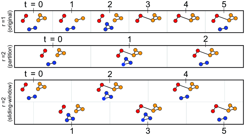
We will also consider another cutting process, called sliding-window timeslicing [45, 30]. As previously, let be a resolution parameter. For each initial timestamp , we build the graph whose edges are those with activation time contained in . In opposition to the partition timeslicing, where we separate the edges into disjoint intervals, here we allow the activation intervals to overlap (see Fig. 1). Note that the graphs obtained for an even resolution are identical to those obtained for the next odd resolution , since the activation times of the edges are integers. Therefore, in the rest of the paper, we will consider sliding-window timeslicing only for even resolution.
A characteristic shared by these two approaches is that all timeslices have the same length — the so-called uniform timeslicing. Although not as popular, the idea of non-uniform timesciling has also been considered in recent years. This type of timeslicing allows timeslices with different lengths over time. In graph visualization, we may find timeslices whose lengths depend on how many consecutive timestamps have similar graph structure [3] and how active (in terms of bursts of events) the graph is over time. As an example of this last case, while Ponciano et al. [34] use long timeslices to represent intervals with bursts of events, Wang et al. [46] adopt short timeslices to analyze such intervals.
In this paper, we focus on uniform timeslicing, the most commonly adopted approach [45, 27, 50, 23, 26, 48]. In this context, the choice of the resolution can strongly impact the analysis: a too-coarse cut erases the short-duration phenomena, and a too-fine cut breaks continuous phenomena [34]. Having in mind the potential applications of temporal graph analysis, our work aims at describing and implementing an automatic method of resolution selection.
1.2 Persistent Homology applied to Graphs
The mathematical tools used in this article are drawn from Topological Data Analysis (TDA). It is a field at the intersection of computational geometry, algebraic topology, and data analysis [11, 14]. Persistent homology (PH), one of the most popular techniques of TDA, allows to infer the singular homology groups of a submanifold, based on a finite sample of it [19, 51, 32]. It has been applied to a wide range of problems, from medicine, physics, computer vision, and machine learning, among others [33]. However, its application to the study of temporal graphs is still relatively new.
Analysis of graphs. PH is mainly used when the dataset is a point cloud, an image, a scalar function, or a graph. We refer the reader to the survey [2] for an extensive presentation of how TDA has been applied to graph analysis. However, in our context, the input data is not a single graph but a sequence of graphs, and PH cannot be used directly.
To get around this problem, a first strategy consists in applying PH to each graph of the sequence and analyzing the results, as presented in [23] in the context of temporal graph exploration. Although it allows exhibiting global properties of the temporal graph, this method does not use the full potential of PH, since persistence is computed only at the level of each graph, and not throughout the sequence.
As an alternative, one can use zigzag persistent homology (zigzag PH), which we will describe in Sec. 1.3. This variation of PH allows computing the persistence of a sequence of graphs all at once. It has been used in the context of topological bootstrapping, thresholding, and parameter selection [41]. To the best of our knowledge, only one article employs zigzag PH in the context of temporal graph analysis [30]. By computing the persistence barcode, the authors can detect periodic or chaotic patterns in networks. However, the resolution parameters are chosen heuristically, and the question of their selection is barely raised.
Visualization. TDA has also seen applications in the context of (non-temporal) graph visualization. By quantifying the strength of connections between the different nodes of the graph, it allows to improve the force-directed layouts and to interact with them [18, 39]. One may also consider the connectivity between communities, resulting in new representations, such as those presented in [36, 8].
In contrast, applications of TDA to the visualization of temporal graphs are few. To the best of our knowledge, only the articles [23, 30], already cited above, propose visual layouts. The former consists of a curve, exhibiting patterns and changes of behavior through time. However, it does not provide information concerning the topology of the graphs at each snapshot. The latter layout uses the persistence diagram given by the zigzag PH. We can read on it the topological properties of the graphs at each timestamp and how they evolve over time. However, in some contexts, focusing only on topological properties of graphs, such as their number of connected components, can be too coarse, and make analysis and visualization difficult for the user. A contribution of our work is to enhance this representation by incorporating information about the size and composition of the connected components.
1.3 Zigzag persistent homology
We now give a succinct presentation of the topological tools that will be used in this paper. We refer the reader to [24] for a thorough introduction to algebraic topology, and to [14] for PH.
Persistence modules. Zigzag persistent homology, introduced in [12], is based on the notion of simplicial homology. Given an integer , the homology functor is an operator that takes as an input a graph , and returns a vector space, denoted , which contains topological information about . In our work, we will only consider , the group of connected components. It is a vector space whose dimension is equal to the number of connected components of .
In order to define zigzag PH, one has to first build a zigzag filtration, that is, a sequence of graphs, such that for each pair of consecutive graphs, one of them is included in the other. In order to build such a filtration, consider the sequence of graphs defined in the previous section, using the partition or sliding-window timeslicing. By considering the union graph for all the pairs of consecutive graphs, one obtains a zigzag filtration
In this filtration, one is able to track the evolution of the connected components of the graph: how they merge, split, appear or disappear.
By applying the -homology functor to this filtration, the graphs are transformed into vector spaces, and the inclusion maps are transformed into linear maps.
This sequence forms a zigzag persistence module, an algebraic structure that condenses all the information concerning the evolution of the connected components.
Barcodes. To any persistence module is attached a persistence barcode, denoted . It is a collection of intervals , called bars. They are interpreted as follows. For each timestamp , the number of bars present at this time is equal to the number of connected components in the graph . Moreover, we can see how these connected components evolve: To a bar corresponds a connected component of the graph born at time (either because new points appeared in the graph, or because an existing component split in two) and died at time (either because the points that compose it disappeared, or because it merged with another component). The barcode is the main object of TDA, and can be understood as a visual representation of persistence modules.
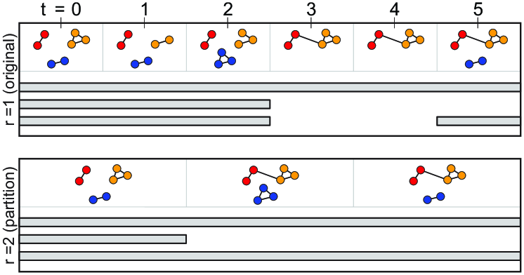
As an example, we give in Fig. 2 the persistence barcodes associated with a temporal graph at resolution and , as in Fig. 1. Let us analyze the first barcode. It contains one long bar , indicating that there is a connected component that persists all along the filtration. We may think of it as representing the nodes colored in orange, or red. Moreover, there are three smaller bars, depicting connected components that survive for a shorter time: one bar represents a component that merges with another (the red nodes with the orange nodes), another bar represents a component that disappears (the blue nodes) and reappears at forming a short bar. Besides, the second barcode of Fig. 2 contains only three bars. Indeed, in the corresponding filtration, the blue nodes are always present, resulting in a long bar in the barcode.
It should be pointed out that the barcode does not allow to identify directly which connected components the bars represent. In certain cases, in the presence of many bars for instance, this task can be difficult to perform visually. One part of our work consisted in defining an improved version of the barcode, called the colored barcode, which allows fixing this problem (see Sec. 4.1).
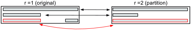
Given two persistence barcodes and , it is common to compare them using the bottleneck distance, denoted . It is defined as the infimum of the for which we can find a partial matching between the barcodes, such that two bars can be matched only if their distance is less than , and all non-matched bars have length at most [14]. In other words, two barcodes are close if the large bars of one can be matched with the large bars of the other, the short bars being forgotten. Fig. 3 shows a partial matching between the barcodes of Fig. 2. The most distant bars matched by this partial matching are the two bottom ones, and . The distance between these bars is , which is also the bottleneck distance .
In what follows, we will use the persistence barcodes in two contexts: as a mean to select the resolution parameter (in Sec. 3), and as a visualization tool to display a temporal graph (in Sec. 4.1).
2 Design Tasks and Workflow
Design tasks. Besides suggesting temporal resolutions, we are also interested in, given a temporal resolution, providing means to effectively explore the graph and identify global and local behaviors and patterns. In that sense, we designed our visual components and interaction to meet high-level tasks derived from low-level tasks and dimensions proposed in Bach et al.’s taxonomy for temporal graph exploration [4].
Specifically, we combine the three task dimensions described in this taxonomy — temporal/when (easy identification and reaching of specific time steps); topological/where (easy identification, situation, and tracking of elements with properties of interest); behavioral/what (easy understanding of the behaviors and changes that affect elements of interest) — to generate the following tasks, which should be satisfied during the analysis of the graph under any given temporal resolution.
T1: Analyze particular groups of elements (entire network, connected components, or nodes) in terms of identification, situation, and inspection at a given time of interest.
T2: Analyze the temporal evolution of particular groups of elements, identifying, e.g., the addition or deletion of elements and abrupt increases or decreases of an element property (referred to as peak or valley events in Ahn et al.’s taxonomy [1]).
T3: Identify and compare structural changes that occur at particular times of interest.
In addition to the when, where, and what dimensions from Bach et al.’s taxonomy, we further consider the why and how task descriptions from Brehmer & Munzner’s multi-level typology of visualization tasks [10]. From the why point of view, our tasks enable discoveries, which include the generation and verification of hypotheses. To achieve that, users first locate groups of elements of interest (tasks T1, T2) or particular times (task T3). Alternatively, they can freely explore the visualization to find elements/times of interest (e.g., based on global patterns or anomalies). Once these are found, users may identify, compare, and summarize elements or patterns (T1-T3). From the how perspective, our views will meet the tasks by encoding the network data and by providing manipulation methods such as selection, navigation, and filtering. They will also introduce new elements to the visualization by importing network data on demand.
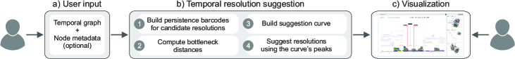
Workflow. As illustrated in Fig. 4(a), users first input a temporal graph of interest and its node categorical metadata (optional). After that, the resolution suggestion is made as follows (Fig. 4(b), details in Sec. 3): we build persistence barcodes for every candidate resolution (predefined range of values, e.g., [1,100]); we compute the bottleneck distance between pairs of barcodes and build a suggestion curve using the distances; we then suggest resolutions based on the curve’s peaks. Finally, users visualize the graph under any resolution by using our proposed layout — the colored barcode (Sec. 4.1) — and associated node-link diagrams, visualizations that compose our system prototype (Fig. 4(c), details in Sec. 4.2).
3 Temporal resolution suggestion
3.1 Description of the method
As presented previously, the choice of a resolution significantly impacts the analysis of a temporal graph. In practice, one wishes to select an “optimal” resolution. However, the problem is ill-posed. Various resolutions may be relevant, leading to different analyses. To circumvent this issue, our strategy is to select a collection of resolutions, where each reveals different behaviors of the temporal graph.
Let us consider an initial set of resolutions , considered as the resolutions to be tested, and a parameter , the number of resolutions requested. Our method consists in partitioning this set into subsets of consecutive resolutions,
| (1) |
where each subset consists of resolutions for which the temporal graphs exhibit similar behavior. We will quantify this similarity using zigzag PH, as explained in the next paragraph. As a last step, we will choose a resolution in each of these subsets — for instance, the first ones, —, therefore yielding an exhaustive sample of all possible behaviors exhibited by the temporal graph.
Our method for obtaining a partition as in Eq. (1) consists in comparing each pair of consecutive resolutions and , and in detecting abrupt changes in the corresponding temporal graphs. This detection is performed using zigzag PH, as follows. First, we perform timeslicing on the temporal graph for both resolutions, using partition or time-sliding window, as described in Sec. 1.1. Second, we compute the corresponding persistence barcodes and , as well as their bottleneck distance , as described in Sec. 1.3. Gathering all the bottleneck distances yields a sequence
which we represent as a curve, drawn in red in Fig. 5. We refer to it as the suggestion curve.
On the suggestion curve, peaks correspond to consecutive resolutions for which the associated barcodes are significantly different, which we interpret as structural topological changes in the temporal graphs. Last, we identify the peaks of this curve and use them as separators to obtain the partition of Eq. (1). We give further explanations in the next section.
3.2 Local and global changes
In the previous section, we have built the suggestion curve . In order to identify relevant peaks of this curve, we need to give some comments regarding the values it can take.
Partition timeslicing. Let us consider first that we have chosen the partition timeslicing. By going from resolution to , one alters the timestamps: a timestamp for the first resolution will be at a distance at most of a timestamp for the second one. Consequently, we expect that the bars of the persistence barcode will be displaced by a distance of at most . This interpretation prompts us to distinguish two values of bottleneck distance:
-
if , then the distance is merely caused by the modification of the timestamps, and we call it a local change,
-
if , we consider that the temporal graph has undergone a structural transformation, and call it a global change.
In order to estimate only the global changes, we must detect the values of the suggestion curve that exceed . In other words, we look for the positive values of the normalized suggestion curve, defined as
where denotes the positive part of a real number. This curve is represented in Fig. 5. In this example, we would detect the resolutions and as values provoking global changes in the temporal graph since they are the first resolutions after the peaks occuring at and .
Fig. 2 provides another example. By going from resolution to , we have seen previously that the bottleneck distance is equal to , greater than , hence we observe a global change. This distance is caused by the two blue bars merging together. If we had considered only the red and yellow bars, we would have observed a bottleneck distance of , hence a local change.
Sliding-window timescling. We now turn to the case of sliding-window timeslicing. By going from resolution to , the activation windows of the edges are only altered by a value . Consequently, we expect that the bars of the barcode will be displaced by a distance of at most . This leads us to define a local change if , and global change if . Accordingly, we define the normalized suggestion curve as
As before, we detect global changes by looking at its positive values.
In practice, the user has the choice of which timeslicing method to use before applying the resolution suggestion method. However, the results obtained for partition or sliding-window may be different. In the case of partition, a particularly inconvenient phenomenon occurs: two bars of the barcode may merge between and , provoking a global change, and then split between and , provoking again a global change. We call this phenomenon instability, and explain the situation in more detail in our supp. material (Sec. A.1.1). Consequently, we recommend that users use sliding-window timeslicing, and we make this choice in the rest of this article, except when stated otherwise.
Peak detection. In real-life examples, the normalized suggestion curve may contain many positive values. However, returning all the corresponding resolutions to the user would not be relevant. Instead, we choose to return only the most prominent peaks of the curve. In practice, prominence is computed using the package signal of scipy [21], and we return only maxima, five being an arbitrary value that we found suitable. In our supp. material (Sec. B.1.1), we give concrete outputs of our algorithm on eight temporal graphs.
4 Visualization
4.1 Colored barcode layout
Consider a temporal graph, the sequence of graphs obtained by timeslicing, and the -barcode of its zigzag filtration, as decribed in Sec. 1.3. In practice, the barcode may not contain enough information: one is not able to identify which nodes are part of which bar. Indeed, the barcode is built from the homology groups of the temporal graph, where the information about the nodes has been lost. A contribution of our work is to implement an algorithm that identifies the nodes that compose each bar.
Nodes identification. Formally, we wish to find, for each bar and each timestamp , a connected component such that
-
for each timestamp , if denotes the set of bars living at time , then the set is a partition of the set of nodes of ,
-
for each bar and each such that , we have .
The first point guarantees that we do not attribute the same node to two bars at the same timestamp, and the second point that, within a bar, we choose a sequence of connected components that are connected one to another. Such a choice of connected components is possible as a consequence of previous works, detailed in the following paragraph.
Once the nodes identification has been done, this information can be incorporated into the persistence barcode. By attributing to each node or cluster of nodes a color, we paint the bars in accordance with the nodes it contains. We also vary the height of the bars so as to indicate the number of nodes. We call this representation the colored barcode.
We give in Fig. 6 examples of colored barcodes, where the nodes are divided into three clusters: red, orange, and blue. They correspond to the (non-colored) barcodes of Fig. 2. On the first colored barcode, one reads that a connected component persists throughout the filtration, initially composed of orange nodes, and receiving later on the participation of red nodes. One can also visualize the connected component formed by the blue nodes, which disappears and reappears at .
It is worth stressing that the choice of nodes composing each bar is not unique. For instance, on the first barcode of Fig. 6, the long bar starts with only orange nodes, until , where red nodes connect. In this example, one could have chosen to start this long bar with red nodes instead. The analysis of the colored barcode, however, is independent of this choice. The user must keep in mind that, when two connected components merge together, only one of the two has been arbitrarily chosen to appear at the beginning of the corresponding bar.
Algorithm. We now turn to the concrete implementation of nodes identification, based on the work of Dey and Hou [16]. As described in the article, there exists an intermediate construction between the zigzag filtration and the persistence barcode, called the barcode graph. It is built recursively by studying how the temporal graph evolves: creating, removing, merging, or splitting connecting components. Each node of the barcode graph is associated with a connected component of at a certain time .
As a complementary approach, the authors also define recursively the barcode forest, denoted . During the construction, it is possible to deduce the bars of the persistence barcode. We refer the reader to [16, Algorithm 1] for a complete description. For the most part of the algorithm, when iterating through the filtration, the five possible events that happen are named Entrance, Departure, No-Event, Merge and Split. They respectively represent that a node entered the filtration, that a node left the filtration, that an edge entered or left without changing the topology of the graph, that an edge entered the filtration provoking two connected components to merge, or that an edge left the filtration provoking a connected component to split in two. Since we also wish to map the nodes of the graph to the barcode, we modify the algorithm to additionally perform the following:
-
During the events Entrance, Split or No-Event, we write on the new nodes of the connected component they represent.
-
During the event Departure, a bar of the barcode is created, and a path of the barcode forest is removed. We collect the connected components written on this path and add this information to the bar.
-
During the event Merge, two cases may occur. If the barcode forest is still a forest, a bar of the barcode is created, and we proceed as for the previous event. If it is not a forest anymore, then a bar of the barcode is created, and two paths of the barcode forest are glued. We associate the new bar with the connected components written on one of these paths, and keep the others in the graph.
Note that the latter choice is not unique. In practice, when choosing a path to remove, we remove the one that starts with the least number of nodes. This allows for maintaining homogeneity within the bars, that is, bars containing many nodes will continue to have many nodes.
A last detail is to be raised. Algorithm 1 of the aforementioned article takes as an input a zigzag filtration such that two consecutive graphs are obtained one from the other by adding or removing a single node or edge. However, the partition or sliding-window timeslicings may yield filtrations where several nodes or edges are added or removed at the same time. Consequently, we have to apply a pre-processing to the filtration, consisting in attributing to each event a unique time.
Design decisions. In practice, our colored barcode is a timeline visualization [6] that can be thought of as a series of stacked area charts, each referring to a connected component and its node members throughout time (Fig. TDANetVis: Suggesting temporal resolutions for graph visualization using zigzag persistent homology(A)). As mentioned before, color and height indicate label and number of nodes, respectively.
We have considered alternative design choices before proposing this layout. We decided to use a timeline visualization instead of animations to better meet analyses that rely on multiple and often distant timestamps (tasks T2, T3) [6]. We then studied the suitability of existing timeline visualizations for our context. One such option was LargeNetVis’s Global View [26], a grid-based layout where rows and columns represent network communities and timeslices (i.e., groups of timestamps), respectively. In this view, communities are encoded as circles with varying sizes, and their temporal evolution is depicted through links connecting communities from consecutive timeslices. Please refer to Fig. 7(b) to see an example of this layout. Although we could adapt this layout to encode connected components, it would still not provide immediate information about components’ node members. Member identification and tracking would also not be immediate with visualizations such as the MSV [44], PAOH [43], and TAM [26].
4.2 System prototype
We now describe the interface and interactive features that compose the prototype of our TDANetVis system (see a screenshot in Fig. TDANetVis: Suggesting temporal resolutions for graph visualization using zigzag persistent homology), a web-based visual analytics tool that incorporates all steps of our workflow and was used by our user study participants (Sec. 7).
When first loaded, the system automatically opens a menu through which it is possible to input a network and node categorical metadata (optional). The system then suggests temporal resolutions for the inputted network following the procedure described in Sec. 3. After choosing a resolution, the user can optionally filter out bars (i.e., connected components) with less than node members or with a duration less than timestamps; and being user-defined parameters.
Once the network, temporal resolution, and the other parameter values are chosen, the system exhibits its first and main view (Fig. TDANetVis: Suggesting temporal resolutions for graph visualization using zigzag persistent homology(A)), which contains the colored barcode and appears with maximized height and width, i.e., also occupying the screen space on Fig. TDANetVis: Suggesting temporal resolutions for graph visualization using zigzag persistent homology(C-E). Besides zoom in/out and pan, users can select specific connected components or bars representing nodes that share the same label (Fig. TDANetVis: Suggesting temporal resolutions for graph visualization using zigzag persistent homology(G)). This way, it is possible to analyze their behavior at particular timestamps (tasks T1, T3) and evolution throughout time (task T2). Nodes sharing the same label can be selected in the layout by hovering over the label of interest in the color legend or the bar with the color associated with that label. Likewise, a connected component can be selected by hovering over any of its bars (Fig. TDANetVis: Suggesting temporal resolutions for graph visualization using zigzag persistent homology(A)). It is also possible to persist the current selection (left click) and select multiple labels (CTRL + left click).
After finding a potentially relevant timestamp or interval for analysis, the user double-clicks near it and the system opens three node-link diagrams as presented in Fig. TDANetVis: Suggesting temporal resolutions for graph visualization using zigzag persistent homology(C-E), one showing the network structure at the timestamp of interest (referred to as , see Fig. TDANetVis: Suggesting temporal resolutions for graph visualization using zigzag persistent homology(D)) and two others, by default, for timestamps (referred to as and , see Fig. TDANetVis: Suggesting temporal resolutions for graph visualization using zigzag persistent homology(C,E)). As illustrated in Fig. TDANetVis: Suggesting temporal resolutions for graph visualization using zigzag persistent homology(B), timestamp markers are inserted in the colored barcode to highlight the three timestamps whose node-link diagrams are opened.
Users can freely change the three timestamps being analyzed — note, e.g., the values for , , and in Fig. TDANetVis: Suggesting temporal resolutions for graph visualization using zigzag persistent homology. This way, they can analyze the structure of groups of elements at different granularity levels (from the entire network to individual nodes) for any timestamp (task T1), as well as identify and compare structures and temporal behaviors by analyzing multiple node-link diagrams (tasks T2, T3). There are two manners for the user to reach a new timestamp of interest. If the user knows a priori which timestamp is relevant for analysis, they can simply type the new timestamp value in the node-link diagram area to update it; the system then re-positions the corresponding timestamp marker accordingly. On the other hand, if the user is interested in analyzing a timestamp or interval that caught their attention because of an unexpected behavior found on the colored barcode, they can drag and drop one or more timestamp markers to that timestamp or interval; the system then updates the node-link diagram(s) accordingly.
Node-link diagram. Given a selected timestamp of interest , our node-link diagram shows all nodes and edges active at using a spring-force node positioning [9]. Nodes are colored using the same color scale as in the colored barcode. Besides, the system also shows a tooltip with node id and label whenever a node is hovered over, as illustrated in Fig. TDANetVis: Suggesting temporal resolutions for graph visualization using zigzag persistent homology(F). The user can expand one or more node-link diagrams (button ![[Uncaptioned image]](/html/2304.03828/assets//figures/inline/maximize.png) ) and drag/drop their maximized versions, e.g., to put them side-by-side and optimize comparisons.
Depending on the type of selection (recall Fig. TDANetVis: Suggesting temporal resolutions for graph visualization using zigzag persistent homology(G)), a click on a node in a diagram (expanded or not) selects all nodes that contain the same label as or all nodes that belong to the same connected component as (T1).
To help users compare structures and temporal behaviors (T2, T3), all node-link diagrams (expanded and non-expanded) are coordinated with each other and with the colored barcode: groups of nodes selected in one of them are automatically selected in the others (see, e.g., the non-selected connected component in Fig. TDANetVis: Suggesting temporal resolutions for graph visualization using zigzag persistent homology(A,D), ).
) and drag/drop their maximized versions, e.g., to put them side-by-side and optimize comparisons.
Depending on the type of selection (recall Fig. TDANetVis: Suggesting temporal resolutions for graph visualization using zigzag persistent homology(G)), a click on a node in a diagram (expanded or not) selects all nodes that contain the same label as or all nodes that belong to the same connected component as (T1).
To help users compare structures and temporal behaviors (T2, T3), all node-link diagrams (expanded and non-expanded) are coordinated with each other and with the colored barcode: groups of nodes selected in one of them are automatically selected in the others (see, e.g., the non-selected connected component in Fig. TDANetVis: Suggesting temporal resolutions for graph visualization using zigzag persistent homology(A,D), ).
Design decisions. Besides the decisions made on the colored barcode (recall Sec. 4.1), we also studied alternative approaches before choosing static node-link diagrams to explore the network structure at particular times. First, we considered using animations to show the network evolution during the time interval selected through the timestamp markers. We gave up this idea because animations have limitations on tasks involving multiple and distant timestamps [6]. After opting for “static” visualizations, we considered node-link diagrams and adjacency matrix-based visualizations [7]. We chose the former as it would be easier to identify connected components using the diagram, especially when adopting spring-force node positioning. Finally, we decided to enable the analysis of three timestamps (three node-link diagrams at once) based on the intuitive notion of past, present, and future.
As already mentioned, our system prototype associates different colors to nodes (or bars) with different labels when this metadata information is available. Colorblind users can use a color-blindness-safe color scheme (see Fig. TDANetVis: Suggesting temporal resolutions for graph visualization using zigzag persistent homology). This scheme was chosen following Paul Tol’s guidelines [42] and tested on the Viz Palette [29]. Our prototype also provides a series of features that help colorblind users in their analysis, e.g., by allowing selections and by showing informative tooltips. In the user study, we validated visualizations and color scheme with two self-declared colorblind participants (details in Sec. 7.4).
Implementation details. We use a client-server architecture. The server side was implemented in Python and uses popular libraries and frameworks (e.g., NetworkX [31], Flask [22], and Dionysus2 [17]). We used the D3 library [15] in our views. A demo version of the system, which was used by our user study participants and already includes some suggested changes and features, is available at https://github.com/raphaeltinarrage/TDANetVis.
Computational complexity. The overall TDANetVis process can be divided into three steps: open the dataset (1), compute the suggestion curve (2), and compute the colored barcode for one resolution (3). Let be the number of pairs , in the temporal graph, and let be the number of resolutions tested. Step 1 consists in reorganizing these pairs in a dictionary, and creating a list of unique edges, resulting in a computational complexity of . In Step 2, we create zig-zag filtrations, compute their barcode, then compute the consecutive bottleneck distances. The respective complexities are , , and , where is the inverse Ackermann’s function (approximately constant in practice) [16]. Last, Step 3 consists of one computation of zigzag persistence, hence has computational complexity of . Overall, the complexity of the process is . We should mention, however, that our personal implementation of the persistence algorithm does not reach the complexity mentioned above, and can potentially yield longer execution times. In our supp. material (Sec. B.1.2), we give the running times observed in practice for eight temporal graphs.
5 Datasets
Our usage scenario and user study explore the first day of data from two real-world and face-to-face temporal graphs collected in educational environments, the Primary School [20] and the High School [28] networks. We have chosen these graphs as they have been extensively analyzed in the context of temporal graph visualization [48, 23, 45, 26, 34, 47, 35] and because they contain relevant node metadata information.
The first day of the Primary School network [20] contains 236 nodes (students and teachers from the first to the fifth grade, each having classes A and B) and 60,623 edges, which represent face-to-face interactions. There are 1,555 timestamps in the original resolution (), each comprising a 20-sec interval. The data was collected from 8:45am to 5:20pm. There is a lunch break from 12pm to 2pm and two smaller breaks (20-25 min), one in the morning (around 10:30am) and one in the afternoon (around 3:30pm). Each of the 10 school classes has an assigned teacher. For convenience, we will refer to each class using simple terms, for example, 1B to refer to “first grade, class B”.
The High School network [28] contains face-to-face interactions between students from nine classes related to different subjects: chemistry and physics (classes PC and PC1), mathematics and physics (classes MP, MP1, and MP2), engineering (class PSI), and biology (classes 2BIO1, 2BIO2, and 2BIO3). The first day of this graph contains 312 nodes and 28,780 edges distributed in 899 timestamps (a 20-sec interval each) when adopting the original resolution.
6 Usage Scenario
We focus on two types of analysis. First, we demonstrate the suitability of a suggested resolution for analyzing the Primary School and the usefulness of our colored barcode and system to assist in this analysis. Later, we show that patterns found using TDANetVis are comparable to those identified using LargeNetVis [26], a state-of-the-art approach. Please refer to the supp. material (Sec. B.1) to see resolution suggestions and the colored barcode applied to graphs with distinct characteristics (in terms of graph domain, size, and metadata).
6.1 Exploring the Primary School network
TDANetVis suggested resolutions , , , , and for the Primary School network (see supp. material, Sec. B.1). Fig. TDANetVis: Suggesting temporal resolutions for graph visualization using zigzag persistent homology(A) shows our colored barcode for the median resolution , empirically chosen among the suggested ones due to the interesting patterns it contains. This visualization was produced after (i) filtering out components with less than 10 nodes and 10 timestamps of duration and (ii) selecting the component with the longest duration. Disregarding the component selection (we will discuss it later on), we can already enumerate some patterns and interesting behaviors in the graph data. First, we see that most of the non-selected components (i.e., components with low opacity in Fig. TDANetVis: Suggesting temporal resolutions for graph visualization using zigzag persistent homology(A)) are composed of students from a single class, along with their teacher (tasks T1, T2). This is expected since these students were having classes in their respective classrooms.
There are also time intervals with few connected components compared to others, possibly indicating the school breaks (one in the morning, the lunch break, and another in the afternoon — see Fig. TDANetVis: Suggesting temporal resolutions for graph visualization using zigzag persistent homology(i,ii,iii), respectively) (tasks T2, T3). The first time we have a single component in the graph delineates the beginning of the lunch break (see the selected component near timestamp in Fig. TDANetVis: Suggesting temporal resolutions for graph visualization using zigzag persistent homology(A)) (task T1). As students go home for lunch [20], we observe a decrease in the number of nodes in the graph (see just after timestamp ) (tasks T2, T3). During lunch, this component is eventually decomposed into two parts, as illustrated in Fig. TDANetVis: Suggesting temporal resolutions for graph visualization using zigzag persistent homology(A,D)(), one containing students from classes 1A, 1B, 2A, 2B, 3A and the other containing a few other students from 3A and 3B, 4A, 4B, 5A, 5B (task T1). This division is explained by the location of the students that stay at the school: some children stay at the cafeteria while others stay at the courtyard [20]; these groups encounter each other when they switch places, leading to a single component again (see Fig. TDANetVis: Suggesting temporal resolutions for graph visualization using zigzag persistent homology(A,E)()). Note also the absence of teachers during the lunch break: they are present at first (see Fig. TDANetVis: Suggesting temporal resolutions for graph visualization using zigzag persistent homology(A,C,F)()), but they leave (there are no teachers in and , for example) and come back near the end of the lunch break (task T3), when we start seeing many connected components in the graph again (task T2).
6.2 Comparison with LargeNetVis
To validate the colored barcode, we performed a direct comparison with LargeNetVis [26], an established approach to visualize large temporal networks. To be coherent with the partition timeslicing used by LargeNetVis, we decided to use partition timeslicing in TDANetVis as well. For a fair comparison, we also forced the number of timeslices in LargeNetvis to be equal to the number of partitions in TDANetVis.
Using the Primary School network, Fig. 7 shows a comparison between our colored barcode and LargeNetVis’s Global View, also showing node-link diagrams that support the comparison. The first highlighted pattern refers to a single connected component on TDANetVis containing students and teachers from three classes (4A, 5A, 5B) (Fig. 7(a,I)) and the two equivalent communities from LargeNetVis (Fig. 7(b,I)). When analyzing the corresponding node-link diagrams (Fig. 7(c)), we see that these two communities form a single connected component thanks to a single edge (dotted in red) linking two teachers (task T1). Also, we see that students from class 4A interact with each other but not with the other two classes (5A and 5B); on the other hand, students from 5A interact with students from 5B and vice-versa (T1). This finding is supported by the fact that same-class students interact more often with themselves than with students from other classes and that the same goes for same-grade students. Note also that LargeNetVis only allows us to identify the school classes that are found in a community through the node-link diagram. On the other hand, this information is immediate with TDANetVis and its colored barcode.
In the case of the second pattern (Fig. 7(a-b,II)), both layouts were able to faithfully represent the continuous level of interactions involving class 2B students and their teacher (task T2). Once again, note that the colored barcode already shows us the school class involved in the interactions. Regarding the third pattern, the colored barcode highlights a component that contains students from five different classes interacting with each other during the lunch break (Fig. 7(a,III)). When analyzing the node-link diagram (Fig. 7(d)), we see several interactions between these students during that period, i.e., the component is strongly connected (task T1). In LargeNetVis, due to the nature of the community detection algorithm, this strongly connected component was divided into seven small communities, which impaired finding this strongly connected group of students (see Fig. 7(b,III) and Fig. 7(e)).
Each layout has advantages and disadvantages depending on the user task. We aimed to demonstrate that our approach can be compared to well-validated visualizations, producing equally relevant results.
7 User Study
We also conducted a user study to assess the participants’ perception regarding the visualizations under different resolutions using TDANetVis.
7.1 Experiment setup
The experiment was conducted in person in individual rooms, and the environment was controlled for temperature and internal and external noise to avoid distractions. Each session was run individually for each participant, where they had access to a high-resolution screen (27 inches, 1920 x 1080 pixels) to test the system and a smaller screen dedicated to the questionnaire and video. All participants were involved voluntarily in the experiment and had no financial benefit.
We conducted the experiment using the think-aloud protocol, a common technique to obtain a more accurate perception of the participants’ thoughts [13]. To do so, we recorded the participants’ voices for transcription purposes and their screen and mouse movement to evaluate the interactive features. All the recordings were made with the users’ consent. To avoid participants being influenced by our presence and not mentioning negative aspects, we explicitly asked them to highlight our approach’s limitations. We also conducted a pilot experiment with two participants (not included in the final analysis) to obtain an initial assessment of the response time, the general system correctness, the questionnaire understanding, and the instructional video adequacy.
7.2 Questionnaire
First, the participants were presented with a 7-minute video tutorial that introduced the concepts of graph, temporal resolution and connected components, and explained the proposed layout and system functionalities. The questionnaire was divided into four main sections: (i) background and experience; (ii) a hands-on experience with defined tasks; (iii) nine questions that address the Primary and High School networks; and (iv) Likert-scale questions to collect the participants’ feedback. This questionnaire structure was based on similar user studies evaluating layouts or systems in the visualization field [5, 40, 26].
The questions were designed to evaluate the layout perception, test the functionalities, find patterns, and freely explore the given networks. First, we assessed the comprehension of the basic functionalities through the hands-on experience, where we asked the participants to open the Primary School network using the default configuration. Then, we asked them to verbally describe the definitions of some concepts necessary to understand the experiment (e.g., connected components and temporal resolution) and to follow a set of 12 simple tasks (ST1-ST12) to check if they were familiarized with the system’s functionalities (e.g., shortcuts and interaction features). They were also asked to validate our visualization by exploring the Primary School network under resolutions (SQ1-SQ3) and (SQ4-SQ6), and the High School under (SQ7-SQ9). Due to time restriction limitations, we focused on analyzing only these three resolutions, all suggested by TDANetVis using sliding-window timeslicing. Questions SQ1-SQ9 were all open questions where we guided the participants to identify specific patterns (SQ1-SQ3 and SQ7-SQ8), asked them to compare the results from two resolutions (SQ4, SQ5), and encouraged them to explore the system freely (SQ6, SQ9). At last, we evaluated the participants’ preferences for TDANetVis under a series of Likert-Scale questions (LQ1-LQ10) and asked them to describe the positive and negative aspects of the system. The complete description of the questions and expected answers are available in the supp. material (Sec. C.1).
7.3 Participants
The experiment recruited 27 participants with ages between 18-24 (12), 25-34 (8), 35-44 (6), and 45-65 (1). We asked them to rank their knowledge degree in four areas: Information Visualization, Graph/Network Science, TDA, and Informatics in Education. According to their self-reports, we had 4 participants with advanced knowledge in graphs, 4 in visualization, 2 in TDA, and 3 in informatics in education. Most participants were pursuing their undergraduate (9), Master’s (6), or Ph.D. (7) degrees. The other participants had undergraduate degrees (2), were postdoctoral fellows (2), or were assistant professors (1). While most participants have a background in Computer Science (19), we also had participants from Applied mathematics (3), Law school (1), Data Science (1), Physics (1), Computer Engineering (1), and Mechanics (1).
7.4 Results
We carefully prepared the questions to explore different networks under different resolutions. We expected that the participants could find significant changes between the two resolutions (Primary School) and analyze different aspects of the networks. We focused only on school networks to facilitate the background and context explanation for the participants, maintaining the same intuition of what nodes and edges mean in both cases. After preliminary tests, we fixed both filters for bars in 10 (recall Sec. 4.2) to avoid receiving too many different results, which would hinder the analysis of the collected data.
On average, the participants spent 50min07s 11min41s to complete the experiment (excluding the video), with 12min40s spent on the introductory hands-on part and the rest (37min27s) spent on the questionnaire and final feedback.
Hypotheses on data analysis. All participants answered at least one of the points we expected for each open question (SQ1-SQ5, SQ7, SQ8). Also, during the experiment, we encouraged the participants to raise hypotheses that could justify specific patterns considering a school environment. For instance, in question SQ1 (Primary School), we asked them to evaluate the relationship between students and teachers from classes 4A, 5A, and 5B (which form a connected component at some point, as shown in Fig. 7(I)). All participants mentioned that class 4A was far from the others. Also, 62% of participants identified that the two subgroups (4A, 5A-5B) were linked by an edge involving a teacher; 37% noticed that this edge actually involves two teachers. Raised hypotheses for the strong interaction between 5A and 5B mentioned that since both classes belong to the fifth grade (30% remembered this information), it could be due to interdisciplinary events such as laboratory activity (22%) or group studies (14.81%).
Exploratory analyses. We proposed questions where the participants could freely explore the system and identify new patterns not covered by other questions (SQ6, SQ9). More than 85% of the participants mentioned at least one new pattern or anomaly in their exploratory analyses of the Primary School (SQ6), and 74% found new ones in the High School network (SQ9). Among the mentioned patterns and anomalies, Fig. 8 highlights the most common ones for the Primary School using : (I) merges and splits between related students; (II) peaks of interaction in a short time period; (III) a single connected component containing all students and teachers (even though the teachers leave the network at some point); and (IV) same-class students divided into two connected components. Although this question was not designed to compare patterns identified in different resolutions, most participants tried to compare patterns visible with with those from . For instance, Fig. TDANetVis: Suggesting temporal resolutions for graph visualization using zigzag persistent homology(A,D) illustrates that there are two connected components around timestamp 710 when using , which is hidden in the higher resolution (see Fig. 8(III)). About that, a participant mentioned that “you can clearly see how patterns vary according to the selected resolution when analyzing the primary school”.
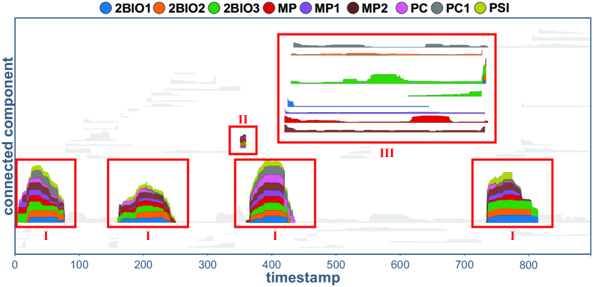
Participants identified three common patterns in the second exploratory question (SQ9, High School). The first refers to peaks of activity in the same connected component over time (Fig. 9(I)). In the high school, there are also intervals where all students merge into a single and highly connected component. The participants could see that these intervals correspond to break periods, lunch break, or group activities. The second pattern is related to a small connected component just before a large peak (Fig. 9(II)). Based on the node-link diagram, there were just a few connections between the students, which represented the beginning of a group activity or a break. Finally, the third pattern refers to connected components with varying lengths over time but composed of single classes (Fig. 9(III)). According to the participants, they allow one to see the class hours, but, contrary to the primary school, where the number of students per component is quite stable over time during classes (see Fig. TDANetVis: Suggesting temporal resolutions for graph visualization using zigzag persistent homology), this network presents classes with non-uniform activity over time.
Interactive features. We also validated the functionalities mainly used to answer representative questions. In summary, the participants preferred to move timestamp markers rather than type new timestamp values for the exploratory tasks. On average, the feature mainly used in the node-link diagrams was zoom (41.48%), which is justified by the small size of nodes and edges initially applied. Not least, the similar rate of usage involving selection by label (44.44%) and by component (41.48%) indicates that both were appreciated. Please refer to the supp. material (Sec. C.2) to see the complete analysis.
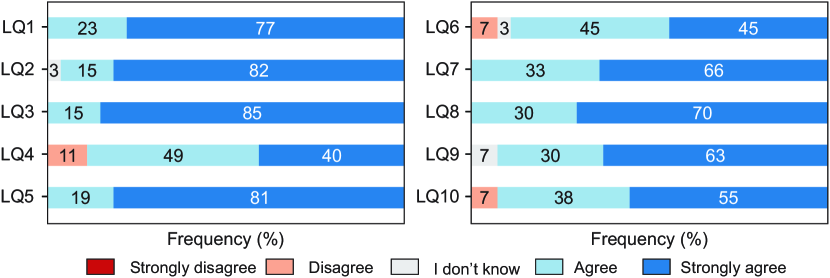
Likert-scale questions and participants’ feedback. Fig. 10 shows the participants’ assessments of the colored barcode’s (LQ1) and node-link diagrams’ (LQ2) quality and usefulness, their coordination and interaction (LQ3), and the system’s intuitiveness and ease of use (LQ4), usefulness (LQ5), and response time (LQ6). There were also questions related to specific tasks, such as understanding the temporal evolution (LQ7), comparing structure at different times (LQ8) or at node level (LQ9), and analyzing the network under different resolutions (LQ10).
First, considering the negative evaluations, three participants mentioned that the system was not intuitive (LQ4) because it lacked a “help” button summarizing the main functionalities. Regarding response time (LQ6), two users complained about loading time, although the system’s interactions worked satisfactorily. One of the experts added that “I can’t say about speed, for the tested datasets I agree but generally I don’t know, it depends on the network size”. At last, about the analysis under different resolutions (LQ10), two participants considered that the comparison was hard since it depended on the memory load of the user.
Besides the negative evaluations, TDANetVis achieved a 95% of acceptance rate for the raised criteria (LQ1-LQ10), considering the average agreement (29%) and strong agreement (66%) rates. Several participants raised the positive points of the system and colored barcode, claiming that “The proposed system is simpler and more efficient to analyze temporal networks than the other tools I know”, and “the colored barcode is great (pretty and very interesting), both for the color distinction and the subtlety of the increases and decreases of a bar over time”. Another participant mentioned that “It is the union of both views (colored barcode and node-links) that is most useful. Each alone would not allow us to understand well what is happening”. At last, one expert complemented that “the barcodes are very good for quickly visualizing long interactions, while the node-link diagrams allow you to understand to what degree these interactions are happening”.
It is worth noting that we tested the system with two colorblind participants, who validated that there were enough features (such as tooltips, different color scales, and interactive color legend) to perform all tasks without hindering the analyses. At last, some participants suggested already incorporated improvements, such as the selection of multiple labels, improvements in readability (e.g., increase in font size and better contrast in menus), and the mentioned “help” button.
8 Discussion and Limitations
Visual improvements and new features. Even though we provide some filters and interactive features that help when analyzing large networks (i.e., networks with an elevated number of timestamps or connected components), we intend to improve our visual scalability to meet this type of network better. Specifically, we plan to incorporate more sophisticated filters, e.g., based on structural properties such as the strength of the connected components or edge weights (explicit or inferred), and also adapt the representation to comport more times, e.g., by collapsing/expanding intervals based on the graph dynamics.
We have also incorporated new features into the system prototype based on the participants’ suggestions (recall Sec. 7.4). Although the participants did not test these new features, they do not directly impact the results described throughout this paper. We plan to incorporate other changes and features. Given that component positioning greatly affects pattern identification, one of the most important suggestions we intend to meet is the inclusion of more sophisticated positioning methods for the colored barcode. We also intend to include more numerical information and a visual mapping to ease the tracking of temporal events such as splits and merges of connected components, and optimize the use of the screen space in the colored barcode. The participants suggested all these features.
Resolution comparison. Some participants would also like to simultaneously compare suggested resolutions with each other and with non-suggested ones. This is a task that we are very interested in, but that is outside the scope of this work. Although one could open the system many times or open multiple instances of the system and perform a side-by-side comparison, we intend to ease this task by providing means for the user simultaneously analyze how specific regions of interest change under different resolutions. We have already made some preliminary experiments toward visually explaining where global changes occur in the graph. We intend to investigate this aspect further, and we provide additional details in our supp. material (Sec. A.2).
Zigzag persistent homology. Through the lens of homology, all connected components are treated identically, regardless of the number of nodes they contain. Consequently, in extreme cases, a global change in the temporal network can be provoked by a single node. Since this situation might not be convenient for the analysis of large networks, where relevant features are commonly understood as those involving many nodes, we intend to design and adopt a variation of the bottleneck distance that would take into account the number of nodes.
9 Conclusion
This paper presented TDANetVis, a methodology that suggests potentially relevant temporal resolutions for graph analysis using zigzag PH, a well-established technique from TDA. Our methodology can be summarized as follows. First, we build persistence barcodes for candidate resolutions. Then, we compute the bottleneck distance between pairs of barcodes and build a suggestion curve based on the distance values. Finally, we suggest resolutions based on the curve’s peaks. TDANetVis also incorporates a timeline-based visualization inspired by the persistence barcodes of TDA. Our visualization assists researchers and practitioners in exploring temporal graphs by highlighting the connected components’ structure and evolution. We validated TDANetVis and our web-based and interactive system prototype through a usage scenario and a user study with 27 participants, who assessed its usefulness and effectiveness.
Acknowledgements.
This research was supported by grants #2020/10049-0, #2020/07200-9, #2022/13190-1, and #2016/17078-0 from São Paulo Research Foundation (FAPESP), by the School of Applied Mathematics of Fundação Getulio Vargas (FGV), by Conselho Nacional de Desenvolvimento Cientifico e Tecnologico (CNPq) and by Coordenação de Aperfeiçoamento de Pessoal de Nivel Superior (CAPES).References
- [1] J.-w. Ahn, C. Plaisant, and B. Shneiderman. A task taxonomy for network evolution analysis. IEEE Transactions on Visualization and Computer Graphics, 20(3):365–376, 2014.
- [2] M. E. Aktas, E. Akbas, and A. E. Fatmaoui. Persistence homology of networks: methods and applications. Applied Network Science, 4(1):61, Aug 2019. doi: 10 . 1007/s41109-019-0179-3
- [3] B. Bach, N. Henry-Riche, T. Dwyer, T. Madhyastha, J.-D. Fekete, and T. Grabowski. Small multipiles: Piling time to explore temporal patterns in dynamic networks. Computer Graphics Forum, 34(3):31–40, 2015. doi: 10 . 1111/cgf . 12615
- [4] B. Bach, E. Pietriga, and J.-D. Fekete. Graphdiaries: Animated transitions and temporal navigation for dynamic networks. IEEE Transactions on Visualization and Computer Graphics, 20(5):740–754, 2014.
- [5] S. K. Badam, Z. Liu, and N. Elmqvist. Elastic documents: Coupling text and tables through contextual visualizations for enhanced document reading. IEEE Transactions on Visualization and Computer Graphics, 25(1):661–671, 2019. doi: 10 . 1109/TVCG . 2018 . 2865119
- [6] F. Beck, M. Burch, S. Diehl, and D. Weiskopf. A taxonomy and survey of dynamic graph visualization. Computer Graphics Forum, 36(1):133–159, 2016.
- [7] M. Behrisch, B. Bach, N. Henry Riche, T. Schreck, and J.-D. Fekete. Matrix reordering methods for table and network visualization. Comput. Graph. Forum, 35(3):693–716, 2016. doi: 10 . 1111/cgf . 12935
- [8] C. Bodnar, C. Cangea, and P. Liò. Deep graph mapper: Seeing graphs through the neural lens. Frontiers in Big Data, 4, 2021. doi: 10 . 3389/fdata . 2021 . 680535
- [9] U. Brandes. Force-Directed Graph Drawing, pp. 1–6. Springer US, Boston, MA, 2008.
- [10] M. Brehmer and T. Munzner. A multi-level typology of abstract visualization tasks. IEEE Transactions on Visualization and Computer Graphics, 19(12):2376–2385, 2013. doi: 10 . 1109/TVCG . 2013 . 124
- [11] G. Carlsson. Topology and data. Bulletin of the American Mathematical Society, 46(2):255–308, 2009.
- [12] G. Carlsson and V. De Silva. Zigzag persistence. Foundations of computational mathematics, 10(4):367–405, 2010.
- [13] S. Carpendale. Evaluating information visualizations. Information visualization: Human-centered issues and perspectives, pp. 19–45, 2008.
- [14] F. Chazal and B. Michel. An introduction to Topological Data Analysis: fundamental and practical aspects for data scientists. Frontiers in Artificial Intelligence, 4, 2021.
- [15] D3.js. D3.js - Data-Driven Documents. https://d3js.org. Accessed: 2022-03-09.
- [16] T. K. Dey and T. Hou. Computing Zigzag Persistence on Graphs in Near-Linear Time. In K. Buchin and E. Colin de Verdière, eds., 37th International Symposium on Computational Geometry (SoCG 2021), vol. 189 of Leibniz International Proceedings in Informatics (LIPIcs), pp. 30:1–30:15. Schloss Dagstuhl – Leibniz-Zentrum für Informatik, Dagstuhl, Germany, 2021. doi: 10 . 4230/LIPIcs . SoCG . 2021 . 30
- [17] Dmitriy Morozov. Dionysus 2. https://mrzv.org/software/dionysus2/. Accessed: 2023-03-16.
- [18] B. Doppalapudi, B. Wang, and P. Rosen. Untangling force-directed layouts using persistent homology. In 2022 Topological Data Analysis and Visualization (TopoInVis), pp. 81–91. IEEE, 2022.
- [19] H. Edelsbrunner, D. Letscher, and A. Zomorodian. Topological persistence and simplification. In Proceedings 41st annual symposium on foundations of computer science, pp. 454–463. IEEE, 2000.
- [20] V. Gemmetto, A. Barrat, and C. Cattuto. Mitigation of infectious disease at school: targeted class closure vs school closure. BMC infectious diseases, 14(1):695, Dec. 2014. doi: 10 . 1186/PREACCEPT-6851518521414365
- [21] R. Gommers, P. Virtanen, E. Burovski, M. Haberland, W. Weckesser, T. E. Oliphant, T. Reddy, D. Cournapeau, alexbrc, A. Nelson, P. Peterson, J. Wilson, P. Roy, endolith, I. Polat, N. Mayorov, S. van der Walt, M. Brett, D. Laxalde, E. Larson, J. Millman, A. Sakai, Lars, peterbell10, P. van Mulbregt, C. Carey, eric jones, N. McKibben, Kai, and R. Kern. scipy/scipy: Scipy 1.10.1, Feb. 2023. doi: 10 . 5281/zenodo . 7655153
- [22] M. Grinberg. Flask web development: developing web applications with Python. ”O’Reilly Media, Inc.”, 2018.
- [23] M. Hajij, B. Wang, C. Scheidegger, and P. Rosen. Visual detection of structural changes in time-varying graphs using persistent homology. In 2018 IEEE Pacific Visualization Symposium (PacificVis), pp. 125–134, 2018. doi: 10 . 1109/PacificVis . 2018 . 00024
- [24] A. Hatcher. Algebraic topology. Cambridge Univ. Press, Cambridge, 2000.
- [25] P. Holme and J. Saramäki. Temporal networks. Physics reports, 519(3):97–125, 2012.
- [26] C. D. G. Linhares, J. R. Ponciano, D. S. Pedro, L. E. C. Rocha, A. J. M. Traina, and J. Poco. LargeNetVis: Visual exploration of large temporal networks based on community taxonomies. IEEE Transactions on Visualization and Computer Graphics, pp. 1–11, 2022. doi: 10 . 1109/TVCG . 2022 . 3209477
- [27] C. D. G. Linhares, J. R. Ponciano, F. S. F. Pereira, L. E. C. Rocha, J. G. S. Paiva, and B. A. N. Travençolo. A scalable node ordering strategy based on community structure for enhanced temporal network visualization. Computers & Graphics, 84:185 – 198, 2019.
- [28] R. Mastrandrea, J. Fournet, and A. Barrat. Contact patterns in a high school: A comparison between data collected using wearable sensors, contact diaries and friendship surveys. PLOS ONE, 10(9):1–26, 09 2015. doi: 10 . 1371/journal . pone . 0136497
- [29] E. Meeks and L. Susie. Viz Palette. https://projects.susielu.com/viz-palette. Accessed: 2023-02-16.
- [30] A. Myers, D. Muñoz, F. A. Khasawneh, and E. Munch. Temporal network analysis using zigzag persistence. EPJ Data Science, 12(1):1–19, 2023.
- [31] NetworkX developers. NetworkX – network analysis in Python. https://networkx.org/. Accessed: 2022-03-09.
- [32] P. Niyogi, S. Smale, and S. Weinberger. Finding the homology of submanifolds with high confidence from random samples. Discrete & Computational Geometry, 39(1-3):419–441, 2008.
- [33] S. Y. Oudot. Persistence theory: from quiver representations to data analysis. Mathematical Surveys and Monographs, 209:218, 2015.
- [34] J. R. Ponciano, C. D. Linhares, E. R. Faria, and B. A. Travençolo. An online and nonuniform timeslicing method for network visualisation. Computers & Graphics, 97:170–182, 2021. doi: 10 . 1016/j . cag . 2021 . 04 . 006
- [35] J. R. Ponciano, C. D. G. Linhares, S. L. Melo, L. V. Lima, and B. A. N. Travençolo. Visual analysis of contact patterns in school environments. Informatics in Education, 19(3):455–472, 2020. doi: 10 . 15388/infedu . 2020 . 20
- [36] B. Rieck, U. Fugacci, J. Lukasczyk, and H. Leitte. Clique community persistence: A topological visual analysis approach for complex networks. IEEE Transactions on Visualization & Computer Graphics, 24(01):822–831, jan 2018. doi: 10 . 1109/TVCG . 2017 . 2744321
- [37] L. E. C. Rocha, N. Masuda, and P. Holme. Sampling of temporal networks: Methods and biases. Phys. Rev. E, 96:052302, Nov 2017. doi: 10 . 1103/PhysRevE . 96 . 052302
- [38] N. Stanley, R. Kwitt, M. Niethammer, and P. J. Mucha. Compressing networks with super nodes. Scientific Reports, 8(1):10892, Jul 2018.
- [39] A. Suh, M. Hajij, B. Wang, C. Scheidegger, and P. Rosen. Persistent homology guided force-directed graph layouts. IEEE Transactions on Visualization and Computer Graphics, 26(1):697–707, 2020. doi: 10 . 1109/TVCG . 2019 . 2934802
- [40] N. Sultanum, D. Singh, M. Brudno, and F. Chevalier. Doccurate: A curation-based approach for clinical text visualization. IEEE Transactions on Visualization and Computer Graphics, 25(01):142–151, jan 2019. doi: 10 . 1109/TVCG . 2018 . 2864905
- [41] A. Tausz and G. Carlsson. Applications of zigzag persistence to topological data analysis. arXiv preprint arXiv:1108.3545, 2011.
- [42] P. Tol. “Colour Schemes.” Technical note SRON/EPS/TN/09-002 3.2. SRON. https://cran.r-project.org/web/packages/khroma/vignettes/tol.html. Accessed: 2023-02-16.
- [43] P. Valdivia, P. Buono, C. Plaisant, N. Dufournaud, and J.-D. Fekete. Analyzing dynamic hypergraphs with parallel aggregated ordered hypergraph visualization. IEEE Transactions on Visualization and Computer Graphics, 27(1):1–13, 2021.
- [44] S. van den Elzen, D. Holten, J. Blaas, and J. van Wijk. Dynamic network visualization with extended massive sequence views. IEEE Transactions on Visualization and Computer Graphics, 20:1087–1099, 2014.
- [45] S. van den Elzen, D. Holten, J. Blaas, and J. J. van Wijk. Reducing snapshots to points: A visual analytics approach to dynamic network exploration. IEEE Transactions on Visualization and Computer Graphics, 22(1):1–10, 2016. doi: 10 . 1109/TVCG . 2015 . 2468078
- [46] Y. Wang, D. Archambault, H. Haleem, T. Moeller, Y. Wu, and H. Qu. Nonuniform timeslicing of dynamic graphs based on visual complexity. In 2019 IEEE Visualization Conference (VIS), pp. 1–5. IEEE, 2019.
- [47] P. Wills and F. G. Meyer. Metrics for graph comparison: A practitioner’s guide. PLOS ONE, 15(2):1–54, 02 2020. doi: 10 . 1371/journal . pone . 0228728
- [48] L. Xie, J. O’Donnell, B. Bach, and J.-D. Fekete. Interactive time-series of measures for exploring dynamic networks. In Proceedings of the International Conference on Advanced Visual Interfaces, pp. 1–9, 2020.
- [49] V. Yoghourdjian, T. Dwyer, K. Klein, K. Marriott, and M. Wybrow. Graph thumbnails: Identifying and comparing multiple graphs at a glance. IEEE Transactions on Visualization and Computer Graphics, 24(12):3081–3095, dec 2018. doi: 10 . 1109/TVCG . 2018 . 2790961
- [50] Y. Zhao, Y. She, W. Chen, Y. Lu, J. Xia, W. Chen, J. Liu, and F. Zhou. EOD edge sampling for visualizing dynamic network via massive sequence view. IEEE Access, 6:53006–53018, 2018.
- [51] A. Zomorodian and G. Carlsson. Computing persistent homology. Discrete & Computational Geometry, 33(2):249–274, 2005.