Measuring Categorical Perception in Color-Coded Scatterplots
Abstract.
Scatterplots commonly use color to encode categorical data. However, as datasets increase in size and complexity, the efficacy of these channels may vary. Designers lack insight into how robust different design choices are to variations in category numbers. This paper presents a crowdsourced experiment measuring how the number of categories and choice of color encodings used in multiclass scatterplots influences the viewers’ abilities to analyze data across classes. Participants estimated relative means in a series of scatterplots with 2 to 10 categories encoded using ten color palettes drawn from popular design tools. Our results show that the number of categories and color discriminability within a color palette notably impact people’s perception of categorical data in scatterplots and that the judgments become harder as the number of categories grows. We examine existing palette design heuristics in light of our results to help designers make robust color choices informed by the parameters of their data.
1. Introduction
Scatterplots enable people to conduct a wide variety of statistical tasks (Quadri and Rosen, 2021b), such as finding outliers (Saket et al., 2018; Li et al., 2010), estimating mean values (Gleicher et al., 2013; Hong et al., 2021; Kim and Heer, 2018), and assessing correlation (Yang et al., 2018; Rensink and Baldridge, 2010). Multiclass scatterplots leverage people’s abilities to attend to different subsets of information in order to compare patterns across different categories of data. When the number of categories increases, people’s abilities to analyze patterns across categories may degrade (Blasius and Greenacre, 1998). However, certain scatterplot designs may be more robust to larger numbers of categories than others. Determining robustness is challenging as the perception of multiclass scatterplots requires first identifying points from relevant categories and then estimating values from those points across various visual encodings (Gleicher et al., 2013).
Existing studies provide guidance for supporting a range of tasks in general scatterplots (Quadri and Rosen, 2021b), such as cluster estimation (Sedlmair et al., 2012; Quadri and Rosen, 2021a; Quadri et al., 2022), or for tuning across channels such as color differences (Szafir, 2018) and point size (Hong et al., 2021; Li et al., 2010). However, little attention has been paid to design choices for rendering complex multiclass scatterplots and how such design choices may change as the number of categories increases. Color palettes (Munzner, 2014; Stone et al., 2014) and shapes (Burlinson et al., 2017) are commonly used to delineate categories in scatterplots, but available design guidance for effectively supporting categorical tasks is largely heuristic rather than empirical, which raises questions as to the robustness and precision of this guidance across a range of scenarios.
Gleicher et al. (Gleicher et al., 2013) and Burlinson et al. (Burlinson et al., 2017) offer preliminary experimental insight into the robustness of different visual channels on mean estimation in multiclass scatterplots. However, these studies focus on scatterplots with two to three classes, where as we measure the effect of 2–10 categories across different color palettes. The number of categories heavily impacts people’s abilities to reason across categories (Haroz and Whitney, 2012), especially for color, which remains the default channel for encoding categorical data in many popular commercial applications (Shmueli et al., 2011; Mackinlay et al., 2007). Existing studies (Healey, 1996; Gramazio et al., 2016; Wang et al., 2018) highlight both the importance and complexity of selecting proper color palettes for categorical visualizations. Despite the popularity of using color palettes in categorical visualizations, we lack insight into how robust these palettes are to the number of presented categories and as to whether that robustness varies across different parameters of a palette. Such information is critical for effectively communicating data, especially as the size and complexity of data continue to grow.
We conducted a crowdsourced study to measure how robust different palette designs are to increasing numbers of categories. Participants estimated mean values in a series of multiclass scatterplots with varying numbers of categories (2–10), dataset sizes (10–20 points per category), and color palettes drawn from popular visualization tools. We found that both the number of categories and choices of color palettes significantly impact people’s abilities to estimate category means. We deconstructed our results with respect to common parameters of color encodings to find potential cues for robust palette design and find preliminary evidence that subitizing may impact categorical estimates (Phillips and Christie, 1977; Haroz and Whitney, 2012; Nothelfer et al., 2017; Nothelfer and Franconeri, 2019).
Contribution: The primary contribution of our paper is evaluating mean estimation in multiclass scatterplots with varying color palettes. Our results characterize the effect of the numbers of categories and color palette in perceptions of multiclass scatterplots. Our findings challenge current guidelines on multiclass scatterplot design (Gleicher et al., 2013), and we present an exploratory analysis of key factors for effective color palette design.
2. Related Work
Visual encodings in multiclass scatterplots significantly affect people’s ability to interpret categorical data correctly. However, we still do not understand the perceptual impact of encoding choices across varying numbers of categories. We briefly review the topics of graphical perception in scatterplots, color palette design, and tasks in scatterplots to ground our work.
2.1. Graphical Perception in Scatterplots
Understanding categorical perception is a fundamental task in both cognitive science (Harnad, 2003) and visualization (Munzner, 2014). Past work has introduced a range of techniques for eliciting patterns in categorical data, such as Flexible Linked Axes (Kosara et al., 2006), Parallel Sets (Lex et al., 2010), and Matchmaker (Claessen and Van Wijk, 2011). However, these techniques leverage specialized approaches with high learning costs, making them difficult for lay audiences to work with. Scatterplots, alternatively, are more familiar for many audiences and commonly encode categorical data (Sarikaya and Gleicher, 2018). Consequently, understanding how to best design scatterplots for categorical datasets is essential for effective data communication.
Graphical perception studies investigate how effectively people can estimate different properties from visualized data (see Quadri & Rosen (Quadri and Rosen, 2021b) for a survey). Scatterplots are commonly used in graphical perception experiments as they are sufficiently complex to reflect real-world challenges and simultaneously sufficiently simple to control (Rensink, 2014; Rensink and Baldridge, 2010; Harrison et al., 2014; Kay and Heer, 2016). Existing studies have analyzed how scatterplots can support a variety of perceptual tasks across a range of channels. For example, Kim & Heer use scatterplots as a means to assess how different visual channels support various tasks (Kim and Heer, 2018). Hong et al. (Hong et al., 2021) found that varying point size and lightness can lead to perceptual bias in mean judgments in scatterplots. Scatterplot studies commonly investigate how design influences people’s abilities to estimate aggregate statistics, such as correlation (Harrison et al., 2014; Rensink and Baldridge, 2010; Kay and Heer, 2016), clustering (Quadri et al., 2022; Sedlmair et al., 2012; Quadri and Rosen, 2021a), and means (Hong et al., 2021; Gleicher et al., 2013; Wei et al., 2019; Whitlock et al., 2020). Other studies model the influence of different channels on scatterplot design, such as opacity (Micallef et al., 2017), color (Szafir, 2018), and shape (Burlinson et al., 2017).
Most graphical perception studies focus on statistical relationships within a single category of scatterplots. However, studies of multiclass scatterplots often characterize people’s abilities to separate classes by measuring just-noticeable differences in categorical encodings (Smart and Szafir, 2019; Burlinson et al., 2017). Alternatively, Gleicher et al. (Gleicher et al., 2013) studied how different categorical encodings influenced people’s abilities to compare the means of different classes with varying numbers of points and differences in means, colors, and shapes. They found that scatterplots can effectively reveal interclass differences and that the design of a scatterplot influenced people’s abilities to compare classes, with color being the strongest categorical cue. However, in contrast to other work on categorical visualization (Haroz and Whitney, 2012), they found that increasing the number of classes from two to three did not decrease performance. We build on these observations to explore how robust people’s estimates are in scatterplots with between 2 and 10 classes with varying hardness levels, color palettes, and numbers of points, (see Section 3) to more deeply understand factors involved in effective multiclass scatterplot design.
2.2. Color Palette Design
Gleicher et al.’s findings about the effectiveness of color in multiclass scatterplots echo existing design guidance and results from other studies of categorical data encodings (Gleicher et al., 2013; Haroz and Whitney, 2012; Trumbo, 1981; Munzner, 2014). Choosing a proper categorical color palette111We define a color palette as a set of colors specifically designed for categorical data. for visualizing categorical data is a crucial task (Trumbo, 1981; Zhou and Hansen, 2015). Designers employ a combination of color models and heuristics to generate palettes (see Zhou & Hansen (Zhou and Hansen, 2015), Kovesi (Kovesi, 2015), Bujack et al. (Bujack et al., 2017), and Nardini et al. (Nardini et al., 2019) for surveys). A range of studies has explicitly examined color perception for continuous data, such as characterizing limitations of rainbow colormaps (Ware, 1988; Reda and Szafir, 2020; Borland and Ii, 2007; Quinan et al., 2019), comparing the task-based effectiveness of continuous colormap designs (Padilla et al., 2016; Reda et al., 2018; Liu and Heer, 2018), modeling color discrimination (Ware et al., 2018), examining color semantics (Anderson and Robinson, 2021), quantifying the impact of size and shape on encoding perception (Smart and Szafir, 2019; Szafir, 2018) and examining perceptual biases (Schloss et al., 2018). However, significantly fewer studies have characterized color use for categorical data encoding.
Several principles and metrics of effective color palette design have been proposed (Brewer, 1994; Harrower and Brewer, 2003; Stone, 2006; Gramazio et al., 2016). Past work recommends that color palettes optimize the mapping between data semantics and color semantics (Lin et al., 2013; Schloss et al., 2020; Setlur and Stone, 2016); select colors that emphasize color harmonies (Stone, 2006; Zeileis et al., 2009), affect (Bartram et al., 2017), or pair preference (Schloss and Palmer, 2011); and maximize perceptual and categorical separability between colors (Healey, 1996) (see Silva et al. (Silva et al., 2011) for a survey). Designers can use predefined metrics to describe aesthetic (e.g., pair preference (Schloss and Palmer, 2011)), perceptual (e.g., CIEDE 2000 (Sharma et al., 2005)), and categorical (e.g., color name difference or uniqueness (Heer and Stone, 2012)) attributes of color to implement these guidelines and constrain effective palette design. While these metrics underlie many palette design guidelines, implementing these guidelines effectively takes significant expertise.
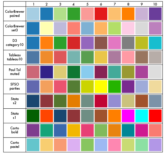
Several methods for creating effective color palettes have been introduced. For example, Healey (Healey, 1996) considers linear separability, color difference, and color categorization to design discriminable color palettes. Harrower and Brewer (Harrower and Brewer, 2003) introduced ColorBrewer for providing designer-crafted distinguishable color palettes for cartography. Gramazio et al. (Gramazio et al., 2016) developed Colorgorical, which can generate categorical palettes by optimizing several perceptual and aesthetic metrics. Recent efforts have also explored how palettes might be extracted from images (Zheng et al., 2022) or colors from a given palette optimally assigned to a visualization (Lee et al., 2012; Lin et al., 2013; Wang et al., 2018). Tools such as Colorgorical (Gramazio et al., 2016) and ColorBrewer (Harrower and Brewer, 2003) enable people to generate or choose from a range of palette designs (see Zhou & Hansen (Zhou and Hansen, 2015) for a survey). In this study, we compare preconstructed palettes from a range of sources, including ColorBrewer (Harrower and Brewer, 2003), Tableau (Tableau, 2022), D3 (Bostock et al., 2011), Stata Graphics (Statgraphics Technologies, 2022), and Carto (Carto, 2022) (see Figure 1 for the details of our selected color palettes). Following the model for comparing the effectiveness of continuous color ramps in Liu & Heer (Liu and Heer, 2018), we leverage these palettes to understand how effectively common best-practice color palettes encode data over a range of data parameters.
3. Methodology
We analyzed how the number of categories, number of points, and color palettes used to distinguish various categories impact people’s abilities to reason with multiclass scatterplots. We performed a crowdsourced study measuring how well people were able to compare category means over varying category numbers and color palette designs. This study allowed us to characterize the effect of category number in multiclass scatterplots as well as how robust different color palette designs are across varying numbers of categories. We hypothesized that:
-
H1:
Performance will decrease as the number of categories increases.
As visual information becomes more complex, perception and cognition degrades (Liberman et al., 1957; Regier and Kay, 2009). Haroz & Whitney (Haroz and Whitney, 2012) found that these findings generalized to categorical visualizations: increasing the number of categories degrades visual search performance. However, Gleicher et al.’s findings contradicted this observation, instead finding no performance difference between two or three category visualizations (Gleicher et al., 2013). We expect that for larger numbers of categories, this robustness will likely falter, even with designer-crafted palettes. Existing heuristics recommend that visualizations should not use more than seven colors for reliable data interpretation (Munzner, 2014). This guidance suggests that we should see drastic performance reductions for seven or more categories.
-
H2:
The choices of the color palette will affect people’s abilities to effectively compare means.
Perceptual studies demonstrate that color is a strong cue in both visualization (Szafir, 2018) and categorical perception (Goldstone, 1995). Past work has shown that, even in unitless data, the choice of color palettes can affect visualization interpretation (Gramazio et al., 2016; Healey, 1996). We likewise anticipate that color palette design may differently support varying numbers of categories: some palettes may more robustly distinguish a range of classes than others, especially as the complexity of the palette increases with larger numbers of colors.
The anonymized data, results, and infrastructure for our study can be found on OSF.222https://osf.io/wz8eb/?view_only=03db060f94ee42f29f453ed3013e3405
3.1. Task
Scatterplots have been studied across a range of tasks (see Sarikaya & Gleicher (Sarikaya and Gleicher, 2018) for a survey). We employed a relative mean judgment task as applied in previous studies (Gleicher et al., 2013; Hong et al., 2021; Kramer et al., 2017). As in Gleicher et al. (Gleicher et al., 2013), we asked participants to estimate the category with the highest average y-value. We used this task as it required participants to first find data points of different categories and then estimate statistical values over all points in that category. This task is sensitive to both overinclusion (i.e., including points that are not in a given class) and underinclusion (i.e., failing to include points in a given category), meaning that confusion between points of different categories should be reflected in participants’ responses. It also represents a basic statistical quantity that most lay participants are able to compute.
3.2. Stimuli Generation
![[Uncaptioned image]](/html/2303.15583/assets/x3.png)
Participants estimated means for a series of scatterplots. We generated each scatterplot as a 400x400 pixel graph using D3 (Bostock et al., 2011). Each scatterplot was rendered to white background and two orthogonal black axes with 13 unlabeled ticks. For every point, we rendered a filled circle mark with a three pixel radius. We selected three pixel points based on internal piloting to ensure that points were distinguishable between classes while also minimizing the need to address overdraw and reflecting design parameters commonly seen in real-world visualizations.
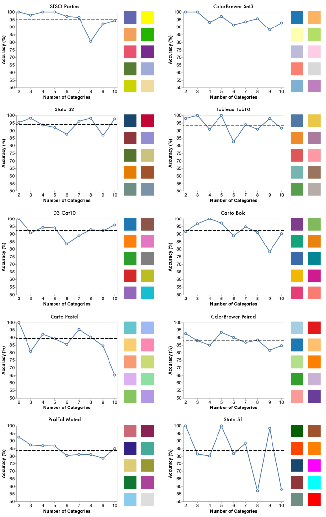
As shown in Figure 1, we selected 10 qualitative color palettes: ColorBrewer/Paired (Harrower and Brewer, 2003), ColorBrewer/Set3 (Harrower and Brewer, 2003), D3/Category10 (Bostock et al., 2011), Tableau/Tab10 (Tableau, 2022), Paul Tol/Muted (Tol, 2012), SFSO/Parties (Office, 2022),
Stata/S1 (Statgraphics Technologies, 2022), Stata/S2 (Statgraphics Technologies, 2022), Carto/Bold (Carto, 2022) and Carto/Patel (Carto, 2022). These color palettes were chosen from popular visualization tools that provide
at least 10 categorical colors in a single palette. If there were more than 10 colors in a certain palette, we used the first
10 as the palette’s colors.
In each scatterplot, colors were randomly selected from the target palette and
mapped to corresponding categories. While some tools prescribe a fixed order to the selection of colors from a palette, this is not a universal design practice.
Randomization helps avoids potential bias from differences beyond color selection as not all palettes may have been intentionally ordered, but future work should investigate differences in the ordered application of palettes.
We tuned our dataset parameters in a series of three extensive pilot studies, measuring performance for varying numbers of categories, points, and hardness levels (see Appendix for details). As in Gleicher et al. (Gleicher et al., 2013), we controlled task hardness using the distance between classes. The hardness level is denoted by and is calculated by the distance between y-means of classes in multiclass scatterplots. To generate positional data with the given mean and covariance, we used a function from Numpy (Oliphant, 2006) that randomly samples from a multivariate normal distribution. We denoted our data points as . First, we randomly sample the mean in the range [5, 9] for the category that possesses the highest mean, then set the mean as the second highest mean based on y-values. To prevent subsequent means from drifting too far apart and artificially simplifying the task, we constrained the mean of the rest of the categories to . Finally, we determined the covariance for each category that has y-mean with where . We used this variance to tune the datasets such that selecting the category with the highest point did not reliably produce the correct answer, with variance tuned in piloting.
Each scatterplot contained between 10 and 20 points per category. To prevent overlapping points, we applied jittering methods which add random noise to any data points that would otherwise overlap each other. We generated 450 datasets in total.
3.3. Procedure
Our experiment consisted of three phases: (1) informed consent and color-blindness screening, (2) task description and tutorial, and (3) formal study. At the beginning of the study, participants were provided with informed consent in accordance with our IRB protocol. They were then asked to complete an Ishihara test for color-blindness screening (Hardy et al., 1945). After completing the screening successfully, participants were led to a description page for the mean judgment task. They were required to successfully complete an easy tutorial question to minimize possible ambiguities in their understanding of the task.
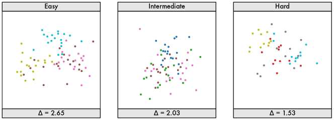
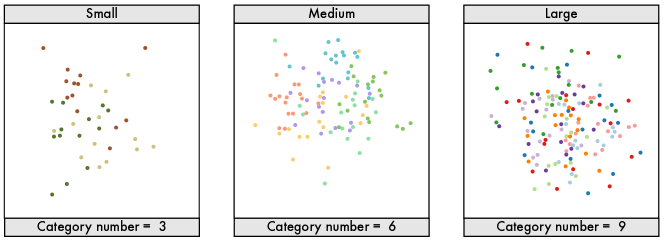
During our formal study, each participant completed our target task (Identify the class with the highest average y-value) for 45 stimuli presented sequentially using a single color palette (42 formal trials and three engagement checks). We used stratified random sampling to balance number of categories and difficulty levels that each participant saw. To ensure participants saw a range of category numbers, we grouped category numbers into three classes: small, medium, and large, which corresponded to 2-4, 5-7, and 8-10 categories, as shown in Figure 4. We also grouped stimuli into three difficulty levels: easy, intermediate, and hard, as shown in Figure 3. Each person saw 14 stimuli from each category and difficulty group, with combinations of category and difficulty assigned at random.
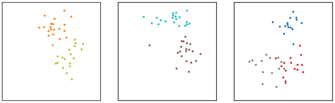
We randomly placed three engagement checks within 42 formal trials to assess if participants were inattentive during the test. These engagement checks presented three classes with large differences in their means (c.f., Figure 2). We randomly ordered the sequence of the formal questions and the engagement checks to avoid learning or fatigue effects.
3.4. Participants
We recruited 95 participants from the US and Canada with at least a 95% approval rating on Amazon Mechanical Turk (MTurk). We excluded four participants who failed more than one engagement check. We analyzed data from the remaining 91 participants (46 male, 45 female; 24–65 years of age). All participants reported normal or corrected to normal vision. Our experiment took about 15 minutes on average, and each of the participants was compensated $3.00 for their time.
3.5. Analysis
We measured performance as both accuracy and time spent on task. We analyzed the resulting data using a 10 (color palette) x 9 (number of categories) mixed-factors ANCOVA, with the number of points, interparticipant variation, trial order, and hardness levels as random covariates. During our post-hoc analysis, we employed the Tukey’s honestly significant difference test (Tukey’s HSD) with = 0.05 and Bonferroni correction.
4. Results
We discuss significant results and statistical analysis based on the independent factors considered in this paper (see Appendix) using both traditional inferential measures and 95% bootstrapped confidence intervals ( 95% CI) for fair statistical communication (Dragicevic, 2016). Table 2 summarizes our ANCOVA results. Additional results, charts, and details of the analysis can be found on Appendix.
4.1. Number of Categories
Our results support H1: we found that performance decreased as the number of categories increased.
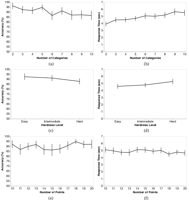
Our analysis reveals a significant effect of category number on judgment performance (): people were both less accurate and slower with higher numbers of categories. Figure 5 (a) shows that accuracy rate decreases based on the number of categories from 96.4% to 86.6%, with an overall descending trend as the number of categories increases. Figure 5 (b) presents the average spent time broken down by category number, suggesting that participants were slower for scatterplots with more categories.
We also found anomalies in the accuracy rate for between five and six categories (Figure 5 (a)). While we initially assumed this anomaly to be noise, the pattern was repeated across almost all palettes. This category number correlates with past findings of subitizing—the ability to instantly recognize how many objects are present without counting—in categorical data from Haroz & Whitney (Haroz and Whitney, 2012). While we do not confirm this hypothesis in this study, our results do raise questions about the role of subitizing or a related mechanism in categorical reasoning with visualizations.
![[Uncaptioned image]](/html/2303.15583/assets/x7.png)
4.2. Color Palettes
Our results also support H2: color palettes significantly affect accuracy (, see Table 2). We found a significant interaction effect between color palettes and the number of categories for both time and accuracy. In other words, as the number of categories increases, the accuracy ranks between color palettes might be different. Different palettes are more or less robust to increasing the number of categories. This finding indicates that there is no best palette for multiclass scatterplots. Instead, our results provide guidance for designers to select effective palettes based on the number of categories in their data.
Figure 6 shows the accuracy rate and category number per color palette. These charts reveal that:
-
(1)
SFSO Parties and ColorBrewer Set3 achieved the highest average accuracy rate in all data, whereas PaulTol Muted and Stata S1 exhibited the worst overall performance (an 11.3% accuracy difference on average between SFSO Parties and Stata S1),
-
(2)
lower performing palettes tend to be less robust to increasing the number of categories, and
-
(3)
most palettes show an overall descending trend as the number of categories increases, though some palettes remained relatively robust (e.g., Stata S2, D3 Cat10).
![[Uncaptioned image]](/html/2303.15583/assets/x9.png)
4.3. Exploratory Analysis
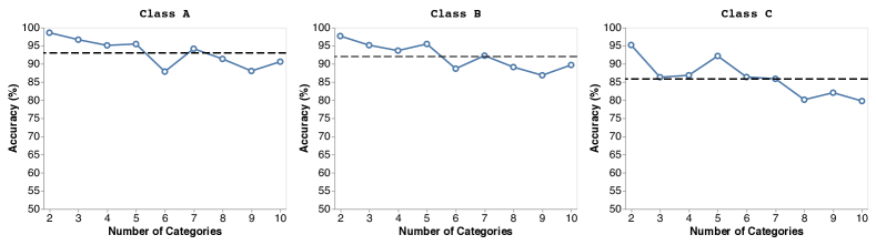
To better analyze the impact of specific color palettes, we performed a Tukey’s HSD with Bonferroni correction to identify significant performance differences between palettes. The test revealed three classes of color palettes with comparable performance, shown in Table 3. Figure 7 illustrates the combined accuracy rate of the three classes, in which Class A refers to the best performance, Class B is slightly lower, and Class C is the worst overall. All three classes of palettes showed a steady downward trend that is consistent with H1. We use the clusters created by these performance classes to scaffold an exploratory analysis of potential metrics associated with the observed performance differences.
We analyzed these classes using eight color metrics associated with palette design to explore the relationship between performance and common design parameters: perceptual distance (Sharma et al., 2005), name difference (Heer and Stone, 2012), and name uniqueness (Heer and Stone, 2012) as employed by Colorgorical (Gramazio et al., 2016) and the magnitude and variances of different dimensions in CIELCh (Zeileis et al., 2009) (, , and ). The computations for those metrics can be found in our supplemental materials. Since we randomly sampled colors in a palette for plots with less than 10 categories (see Section 3.2), for each target color palette, we compute those metrics based on the actual colors used in each individual stimulus sampled from the target palette to explore the distribution of these features with respect to performance.
We conducted an ANOVA using these nine measures to assess the impact of each parameter on accuracy (Table 4). We found significant effects () of variance, magnitude, and all-pairs perceptual distance (Sharma et al., 2005) and marginal effects () of variance and variance.
![[Uncaptioned image]](/html/2303.15583/assets/x11.png)
To assess the direction of the effects, we performed an OLS linear regression of each metric and average accuracy. Since the value of -ratio (in ) of regression differs from the data range of source metrics, we show its directionality in the right-most column in Table 4, where a plus sign refers to an increasing trend and minus sign means decreasing trend. We found that larger magnitude (lighter colors) and larger perceptual distance both lead to better judgment accuracy, whereas palettes with less lightness variance had better performance.
Our findings suggest that palettes leveraging lighter colors, larger perceptual distances, and lower luminance differences led to better performance whereas factors like hue variance or name uniqueness that are conventionally associated with palette design may be less important when considered in isolation. The use of lightness in palettes has a tenuous history: some advocate for minimizing lightness variation to avoid biasing attention (Munzner, 2014; Kindlmann et al., 2002), whereas other guidelines suggest that designers leverage higher contrasts introduced by lightness variations to take advantage of our sensitivity to lightness variations (Rogowitz and Kalvin, 2001). Our results provide further support for privileging more isoluminant palettes to avoid directing too much attention to given classes (Braithwaite et al., 2010). However, future work should more systematically explore this hypothesis.
5. Discussion
We measured the impact of the number of categories and choice of color palettes on people’s perceptions of multiclass scatterplots. We find that people are less accurate at assessing category means as the number of categories increases. However, certain palettes may be more robust to variations in category number. Our results provide new perspectives on prior findings and offer both actionable design guidance and opportunities for future research.
5.1. Reflections on Prior Findings
Our study indicates that increasing numbers of categories would lead to descending performance in relative mean estimation (see Section 4.1). However, this finding is inconsistent with the proposed guidelines of Gleicher et al. (Gleicher et al., 2013), which found little impact of adding additional distractor classes. We anticipate that this contradiction is a result of the number of classes evaluated. For smaller numbers of classes, performance tended to be more robust across palettes. However, as the number of classes increased, performance started to degrade. This finding likely stems from a correlation between performance and color discriminability indicated in our exploratory analysis. As the number of colors increases, it becomes more difficult to ensure colors are spaced apart, especially if maximizing for metrics like pair preference (Schloss and Palmer, 2011) or otherwise minimizing the number of large hue variations to preserve harmonies (Stone, 2006). Certain palettes may differently balance this aesthetic and performance trade-off. However, our results indicate that this trade-off is sensitive to the number of categories present in the data.
Contrary to past heuristics, we found that performance remained relatively high even for more than seven categories. We hypothesize that people may simply be better at this task than they expect: while the task may feel significantly more difficult as the number of categories increases, our visual system may be more robust than expected in working with complex categorical data. Feedback from pilot participants indicated that the tasks felt challenging as the number of categories exceeded four, but these participants, like those in the formal study, still performed well at such seemingly difficult tasks. While the tested palettes reflect best practices, our findings challenge existing heuristics around the scalability and utility of color in visualization. A more thorough and rigorous empirical examination of the robustness of categorical perception in visualization generally would benefit a wide range of applications.
Our results demonstrate a high overall accuracy (more than 85%) compared to Gleicher et al. (Gleicher et al., 2013) ( 75%) even though we tested a larger number of categories. Gleicher et al. chose to generate uniformly sparsely distributed classes. However, such distributions might not be widely applicable; in real-world use cases, people more commonly build insight from densely distributed classes (Van der Maaten and Hinton, 2008). As shown in Figure 4, we generated more randomly and densely distributed classes to privilege ecological validity. Consequently, our stimuli are more likely to perform similarly to what people usually see in their daily life, but the clustering structure may have affected task accuracy by, for example, making it slightly easier to group points within categories. While we tuned our stimulus difficulty in piloting and our results were consistent across different performance thresholds, providing evidence of their generalizability, these differences raise important future questions as to the impact of different data distributions on categorical palette design.
Part of the difference in results between our findings and Gleicher et al. may stem from differences in perceptual mechanisms present when processing different numbers of categories. Our study reveals a significant ”dip” in accuracy when the number of categories increased to five or six (see Section 4.1). These bumps correlate with a key number of objects for subitizing (Kaufman et al., 1949): below roughly six objects, we can instantly and precisely detect the quantity of objects present, whereas we have to actively count larger numbers. While subitizing tends to focus on individual objects rather than collections of objects, the dip in accuracy directly correlates with this subitizing threshold and echoes similar findings in past work in categorical visualization (Haroz and Whitney, 2012). Our study is not designed to probe subitizing or other specific perceptual mechanisms that may explain these results. However, this correlation offers opportunities for further understanding the relationship between categorical perception, subitizing, cluster detection, and other related perceptual phenomena in visualization.
We also found a significant overall difference between color palettes. These differences echo the findings of Liu & Heer (Liu and Heer, 2018) for continuous colormaps: even if a palette satisfies the basic constraints of good palette design (e.g., discriminable colors), it may not perform optimally. Like Liu & Heer, we also find that characterizing the source of these performance differences is challenging: palette effectiveness arises from a complex combination of factors. Future work should seek to further deconstruct these factors to derive more robust design guidelines.
5.2. Design Guidelines for Multiclass Scatterplots
The data and design of multiclass scatterplots significantly influence our abilities to reason across classes. Compared to Gleicher et al.’s guidelines (Gleicher et al., 2013), our results emphasize the influences of category number and color palette, which are the two essential elements in visualizing categorical data. Additionally, in contrast of some existing guidelines for color palettes (Ware, 1988; Rogowitz and Kalvin, 2001), our results indicate maximizing luminance variation may hinder analysis. While designers can use our results to directly choose the optimal palette from our tested set of palettes given the number of categories in their data, our results also provide preliminary guidance for palette selection more broadly:
Simplifying category structure may improve performance. Our study suggests that people can reason across multiple classes encoded using color. However, as shown in Section 4.1, designers should be aware that performance tends to degrade as the number of categories increases: people are slower and less accurate, especially when working with six or more categories. We recommend designers consider how the number of categories influences performance on key tasks and consider collapsing relevant categories hierarchically if necessary.
As a caveat, people were relatively good at completing this task, even with larger numbers of categories than conventional heuristics recommend. Our results indicate that people can reliably distinguish colors in large palettes even though informal pilot participants indicated that the task felt quite difficult for higher numbers of categories. This contrast between perceived and objective performance suggests that even well-established design heuristics can benefit from experimental validation and refinement.
When designing new palettes, consider fewer lightness differences, larger perceptual distances, and lighter colors. As shown in Section 4.2, our results reveal that color palettes significantly impact the accuracy of human judgment. Our exploratory analysis confirms the benefits of maximizing the pairwise difference between colors and provides further evidence of minimizing lightness variation. However, we also find that palettes using lighter colors tend to also enhance accuracy. We anticipate that this bias may be in part due to the use of a white background enhancing contrast within categories while minimizing undesirable “loud” colors that have too high of a luminance contrast with the background. However, the tested palettes are all handcrafted to select harmonious and aesthetically pleasing colors. Future work should investigate these results on other background colors. We also found little evidence of the benefits of hue or color name variation when considered in isolation. This points to the need for the systematic interrogation of designer practices to improve existing heuristics for palette design (Smart et al., 2019).
Choose your palettes to fit your data. When the number of categories changes, the performance rank of different color palettes may also change. Different palettes are differently robust to changes in category number. We recommend designers select color palettes based on the parameters of their specific data. For example, a designer might use SFSO Parties or ColorBrewer Set3 for multiclass scatterplot with less than seven categories and D3 Cat10 for larger numbers of categories (see Figure 6).
5.3. Limitations and Future Work
We studied the impact of the number of categories and color palettes on multiclass scatterplots. However, scatterplots offer a wide variety of design choices for representing categorical data that may provide different trade-offs in perception (Sarikaya and Gleicher, 2018). Future work should explore the robustness of different channels to varying numbers of categories. Further, scatterplots often encode larger numbers of variables, such as multiple categorical dimensions or combining categorical and continuous dimensions (Smart and Szafir, 2019). Future work should investigate the interplay between different design factors in higher dimensional multiclass scatterplots. Both our study and Gleicher et.al.’s work (Gleicher et al., 2013) focused on comparing y values. However, scatterplots are two-dimensional visualizations. Future work should consider the impact of palettes on crossdimensional tasks.
We evaluated 10 pre-defined qualitative color palettes on qualitative data. We employed a random color sampling strategy from selected palettes for data with less than ten categories to simplify the stimulus generation to avoid potential bias from sources outside of color selection. Future work should extend our results to consider sequential strategies in comparing preconstructed palettes. Additionally, categorical data can also be encoded using other types of palettes, such as sequential and diverging encodings (Liu and Heer, 2018), whose robustness to varying numbers of samples is not well understood. Considering additional properties of color selection, such as accessible palettes for people with color vision deficiencies (Jefferson and Harvey, 2006; Pugliesi and Decanini, 2011), is also important future work.
We sampled from predefined palettes at a fixed mark size. Varying mark size can influence mark discriminability (Szafir, 2018). As mark size was held constant for all palettes and all palettes had large distances between all color pairs, we do not anticipate that this choice biased our results. However, future work should explore a larger range of mark sizes and mark types. It should also seek to more systematically evaluate the robustness of our exploratory results. Such variation is challenging due to a large number of potential perceptual factors; however, our results may provide preliminary support for identifying the most promising factors.
We elected to use Mechanical Turk to reflect the range of viewing conditions and participants common to web-based visualizations and to recruit larger numbers of participants. However, variations in viewing conditions can influence color perception. While past studies of color perception in visualization validate the predictive ability of crowdsourced studies for color perception studies in HCI (Szafir et al., 2014; Reinecke et al., 2016), the variability introduced by the range of viewing conditions on MTurk limits the generalizability of our results and our ability to make precise claims about fine-grained mechanistic perceptual phenomena. However, given the large differences between colors in our palettes, we anticipate the affect of viewing variation to be relatively minimal (Moroney, 2003) and followed best practices in our experimental design to minimize the impact of viewing variation. Future work seeking to quantify more precise causal mechanisms underlying our findings may wish to replicate our study under more constrained conditions.
Additionally, data-centric statistical factors that may be related to the performance of multiclass scatterplots are not considered in our study. For example, we did not explore the impact of correlation or strength of clusters. Extending our experiments to consider a wider range of data properties as well as statistical tasks could help us further understand categorical data visualization for complex datasets and usage scenarios and offer broader guidance for categorical visualization generally.
6. Conclusion
We measure how different color palettes impact people’s ability to distinguish classes and assess mean values on multiclass scatterplots. Our results suggest that both the number of categories and the discriminability of color palettes heavily impact people’s abilities to use multiclass scatterplots. We found that increasing the number of categories decreases how well people can distinguish different classes. Furthermore, we found preliminary evidence that even using designer-crafter palettes, a more discriminable color palette (such as SFSO Parties who achieves 95% average accuracy) can perform nearly 12% better than a less discriminable one (such as Stata S1 with only 83% average accuracy). Based on the experimental results, we critically reflect on past findings and derive a set of design guidelines for palette selection in multiclass scatterplots. We believe that our findings have the potential to support a variety of other visualization types and low-level tasks that combine continuous and categorical data. We hope our work will inform future studies to construct more general guidelines for the understanding of categorical perception in information visualization.
Acknowledgements.
This work was supported by NSF IIS #2046725 and by NSF CNS #2127309 to the Computing Research Association for the CIFellows Project.References
- (1)
- Anderson and Robinson (2021) Cary L Anderson and Anthony C Robinson. 2021. Affective congruence in visualization design: Influences on reading categorical maps. IEEE Transactions on Visualization and Computer Graphics (2021).
- Bartram et al. (2017) Lyn Bartram, Abhisekh Patra, and Maureen Stone. 2017. Affective color in visualization. In Proceedings of the 2017 CHI Conference on Human Factors in Computing Systems. 1364–1374.
- Blasius and Greenacre (1998) Jörg Blasius and Michael Greenacre. 1998. Visualization of categorical data. Academic Press.
- Borland and Ii (2007) David Borland and Russell M Taylor Ii. 2007. Rainbow color map (still) considered harmful. IEEE Computer Graphics and Applications 27, 2 (2007), 14–17.
- Bostock et al. (2011) Michael Bostock, Vadim Ogievetsky, and Jeffrey Heer. 2011. D³ Data-Driven Documents. IEEE Transactions on Visualization and Computer Graphics 17, 12 (2011), 2301–2309. https://doi.org/10.1109/TVCG.2011.185
- Braithwaite et al. (2010) Jason J Braithwaite, Derrick G Watson, Lucy Andrews, and Glyn W Humphreys. 2010. Visual search at isoluminance: Evidence for enhanced color weighting in standard sub-set and preview-based visual search. Vision Research 50, 14 (2010), 1414–1425.
- Brewer (1994) Cynthia A Brewer. 1994. Guidelines for use of the perceptual dimensions of color for mapping and visualization. In Color hard copy and graphic arts III, Vol. 2171. SPIE, 54–63.
- Bujack et al. (2017) Roxana Bujack, Terece L Turton, Francesca Samsel, Colin Ware, David H Rogers, and James Ahrens. 2017. The good, the bad, and the ugly: A theoretical framework for the assessment of continuous colormaps. IEEE transactions on visualization and computer graphics 24, 1 (2017), 923–933.
- Burlinson et al. (2017) David Burlinson, Kalpathi Subramanian, and Paula Goolkasian. 2017. Open vs. closed shapes: New perceptual categories? IEEE Transactions on Visualization and Computer Graphics 24, 1 (2017), 574–583.
- Carto (2022) Carto. 2022. Location Intelligence & GIS for cloud natives. https://carto.com/
- Claessen and Van Wijk (2011) Jarry HT Claessen and Jarke J Van Wijk. 2011. Flexible linked axes for multivariate data visualization. IEEE Transactions on Visualization and Computer Graphics 17, 12 (2011), 2310–2316.
- Dragicevic (2016) Pierre Dragicevic. 2016. Fair statistical communication in HCI. In Modern statistical methods for HCI. Springer, 291–330.
- Gleicher et al. (2013) Michael Gleicher, Michael Correll, Christine Nothelfer, and Steven Franconeri. 2013. Perception of average value in multiclass scatterplots. IEEE Trans. on Visualization and Computer Graphics 19 (2013). https://doi.org/10.1109/TVCG.2013.183
- Goldstone (1995) Robert L Goldstone. 1995. Effects of categorization on color perception. Psychological Science 6, 5 (1995), 298–304.
- Gramazio et al. (2016) Connor C Gramazio, David H Laidlaw, and Karen B Schloss. 2016. Colorgorical: Creating discriminable and preferable color palettes for information visualization. IEEE transactions on visualization and computer graphics 23, 1 (2016), 521–530.
- Hardy et al. (1945) LeGrand H Hardy, Gertrude Rand, and M Catherine Rittler. 1945. Tests for the detection and analysis of color-blindness. I. The Ishihara test: An evaluation. JOSA 35, 4 (1945), 268–275.
- Harnad (2003) Stevan Harnad. 2003. Categorical perception. (2003).
- Haroz and Whitney (2012) Steve Haroz and David Whitney. 2012. How capacity limits of attention influence information visualization effectiveness. IEEE Trans. on Visualization and Computer Graphics 18, 12 (2012). https://doi.org/10.1109/TVCG.2012.233
- Harrison et al. (2014) Lane Harrison, Fumeng Yang, Steven Franconeri, and Remco Chang. 2014. Ranking Visualizations of Correlation Using Weber’s Law. IEEE Trans. on Visualization and Computer Graphics 20 (2014). https://doi.org/10.1109/TVCG.2014.2346979
- Harrower and Brewer (2003) Mark Harrower and Cynthia A Brewer. 2003. ColorBrewer. org: an online tool for selecting colour schemes for maps. The Cartographic Journal 40, 1 (2003), 27–37.
- Healey (1996) Christopher G Healey. 1996. Choosing effective colours for data visualization. In Proceedings of Seventh Annual IEEE Visualization’96. IEEE, 263–270.
- Heer and Stone (2012) Jeffrey Heer and Maureen Stone. 2012. Color naming models for color selection, image editing and palette design. In Proceedings of the SIGCHI Conference on Human Factors in Computing Systems. 1007–1016.
- Hong et al. (2021) Matt-Heun Hong, Jessica K Witt, and Danielle Albers Szafir. 2021. The Weighted Average Illusion: Biases in Perceived Mean Position in Scatterplots. IEEE Transactions on Visualization and Computer Graphics 28, 1 (2021), 987–997.
- Jefferson and Harvey (2006) Luke Jefferson and Richard Harvey. 2006. Accommodating color blind computer users. In Proceedings of the 8th international ACM SIGACCESS conference on Computers and accessibility. 40–47.
- Kaufman et al. (1949) Edna L Kaufman, Miles W Lord, Thomas Whelan Reese, and John Volkmann. 1949. The discrimination of visual number. The American Journal of Psychology 62, 4 (1949), 498–525.
- Kay and Heer (2016) Matthew Kay and Jeffrey Heer. 2016. Beyond weber’s law: A second look at ranking visualizations of correlation. IEEE Trans. on Visualization and Computer Graphics 22 (2016). https://doi.org/10.1109/TVCG.2015.2467671
- Kim and Heer (2018) Younghoon Kim and Jeffrey Heer. 2018. Assessing effects of task and data distribution on the effectiveness of visual encodings. In Computer Graphics Forum, Vol. 37. Wiley Online Library, 157–167.
- Kindlmann et al. (2002) Gordon Kindlmann, Erik Reinhard, and Sarah Creem. 2002. Face-based luminance matching for perceptual colormap generation. In IEEE Visualization, 2002. VIS 2002. IEEE, 299–306.
- Kosara et al. (2006) Robert Kosara, Fabian Bendix, and Helwig Hauser. 2006. Parallel sets: Interactive exploration and visual analysis of categorical data. IEEE Transactions on Visualization and Computer Graphics 12, 4 (2006), 558–568.
- Kovesi (2015) Peter Kovesi. 2015. Good colour maps: How to design them. arXiv preprint arXiv:1509.03700 (2015).
- Kramer et al. (2017) Robin SS Kramer, Caitlin GR Telfer, and Alice Towler. 2017. Visual comparison of two data sets: do people use the means and the variability? Journal of Numerical Cognition 3, 1 (2017).
- Lee et al. (2012) Sungkil Lee, Mike Sips, and Hans-Peter Seidel. 2012. Perceptually driven visibility optimization for categorical data visualization. IEEE Transactions on Visualization and Computer Graphics 19, 10 (2012), 1746–1757.
- Lex et al. (2010) Alexander Lex, Marc Streit, Christian Partl, Karl Kashofer, and Dieter Schmalstieg. 2010. Comparative analysis of multidimensional, quantitative data. IEEE Transactions on Visualization and Computer Graphics 16, 6 (2010), 1027–1035.
- Li et al. (2010) Jing Li, Jean-Bernard Martens, and Jarke van Wijk. 2010. A model of symbol size discrimination in scatterplots. In ACM SIGCHI Conf. on Human Factors in Comp. Systems. 2553–2562. https://doi.org/10.1145/1753326.1753714
- Liberman et al. (1957) Alvin M Liberman, Katherine Safford Harris, Howard S Hoffman, and Belver C Griffith. 1957. The discrimination of speech sounds within and across phoneme boundaries. Journal of Experimental Psychology 54, 5 (1957), 358.
- Lin et al. (2013) Sharon Lin, Julie Fortuna, Chinmay Kulkarni, Maureen Stone, and Jeffrey Heer. 2013. Selecting semantically-resonant colors for data visualization. In Computer Graphics Forum, Vol. 32. Wiley Online Library, 401–410.
- Liu and Heer (2018) Yang Liu and Jeffrey Heer. 2018. Somewhere over the rainbow: An empirical assessment of quantitative colormaps. In Proceedings of the 2018 CHI Conference on Human Factors in Computing Systems. 1–12.
- Mackinlay et al. (2007) Jock Mackinlay, Pat Hanrahan, and Chris Stolte. 2007. Show me: Automatic presentation for visual analysis. IEEE Transactions on Visualization and Computer Graphics 13, 6 (2007), 1137–1144.
- Micallef et al. (2017) Luana Micallef, Gregorio Palmas, Antti Oulasvirta, and Tino Weinkauf. 2017. Towards perceptual optimization of the visual design of scatterplots. IEEE Trans. on Visualization and Computer Graphics 23, 6 (2017), 1588–1599. https://doi.org/10.1109/TVCG.2017.2674978
- Moroney (2003) Nathan Moroney. 2003. Unconstrained web-based color naming experiment. In Color imaging VIII: Processing, hardcopy, and applications, Vol. 5008. SPIE, 36–46.
- Munzner (2014) Tamara Munzner. 2014. Visualization analysis and design. CRC press.
- Nardini et al. (2019) Pascal Nardini, Min Chen, Francesca Samsel, Roxana Bujack, Michael Böttinger, and Gerik Scheuermann. 2019. The making of continuous colormaps. IEEE Transactions on Visualization and Computer Graphics 27, 6 (2019), 3048–3063.
- Nothelfer and Franconeri (2019) Christine Nothelfer and Steven Franconeri. 2019. Measures of the benefit of direct encoding of data deltas for data pair relation perception. IEEE Trans. on Visualization and Computer Graphics 26, 1 (2019), 311–320. https://doi.org/10.1109/TVCG.2019.2934801
- Nothelfer et al. (2017) Christine Nothelfer, Michael Gleicher, and Steven Franconeri. 2017. Redundant encoding strengthens segmentation and grouping in visual displays of data. Journal of Experimental Psychology: Human Perception and Performance 43, 9 (2017), 1667.
- Office (2022) Swiss Federal Statistical Office. 2022. Swiss Federal Statistical Office. https://www.bfs.admin.ch/bfs/en/home.html
- Oliphant (2006) Travis E Oliphant. 2006. A guide to NumPy. Vol. 1. Trelgol Publishing USA.
- Padilla et al. (2016) Lace Padilla, P Samuel Quinan, Miriah Meyer, and Sarah H Creem-Regehr. 2016. Evaluating the impact of binning 2d scalar fields. IEEE Transactions on Visualization and Computer Graphics 23, 1 (2016), 431–440.
- Phillips and Christie (1977) WA Phillips and DFM Christie. 1977. Components of visual memory. The Quarterly Journal of Experimental Psychology 29, 1 (1977), 117–133.
- Pugliesi and Decanini (2011) Edmur A Pugliesi and Mônica MS Decanini. 2011. Cartographic design of in-car route guidance for color-blind users. In International Cartographic Conference.
- Quadri et al. (2022) Ghulam Jilani Quadri, Jennifer Adorno Nieves, Brenton M Wiernik, and Paul Rosen. 2022. Automatic Scatterplot Design Optimization for Clustering Identification. IEEE Transactions on Visualization and Computer Graphics (2022).
- Quadri and Rosen (2021a) Ghulam Jilani Quadri and Paul Rosen. 2021a. Modeling the Influence of Visual Density on Cluster Perception in Scatterplots Using Topology. IEEE Trans. on Visualization and Computer Graphics (2021).
- Quadri and Rosen (2021b) Ghulam Jilani Quadri and Paul Rosen. 2021b. A survey of perception-based visualization studies by task. IEEE Transactions on Visualization and Computer Graphics (2021).
- Quinan et al. (2019) P Samuel Quinan, LM Padilla, Sarah H Creem-Regehr, and Miriah Meyer. 2019. Examining implicit discretization in spectral schemes. In Computer Graphics Forum, Vol. 38. Wiley Online Library, 363–374.
- Reda et al. (2018) Khairi Reda, Pratik Nalawade, and Kate Ansah-Koi. 2018. Graphical perception of continuous quantitative maps: the effects of spatial frequency and colormap design. In Proceedings of the 2018 CHI Conference on Human Factors in Computing Systems. 1–12.
- Reda and Szafir (2020) Khairi Reda and Danielle Albers Szafir. 2020. Rainbows revisited: modeling effective colormap design for graphical inference. IEEE Transactions on Visualization and Computer Graphics 27, 2 (2020), 1032–1042.
- Regier and Kay (2009) Terry Regier and Paul Kay. 2009. Language, thought, and color: Whorf was half right. Trends in cognitive sciences 13, 10 (2009), 439–446.
- Reinecke et al. (2016) Katharina Reinecke, David R Flatla, and Christopher Brooks. 2016. Enabling designers to foresee which colors users cannot see. In Proceedings of the 2016 CHI Conference on Human Factors in Computing Systems. 2693–2704.
- Rensink and Baldridge (2010) Ronald Rensink and Gideon Baldridge. 2010. The perception of correlation in scatterplots. Computer Graphics Forum 29, 3 (2010), 1203–1210. https://doi.org/10.1111/j.1467-8659.2009.01694.x
- Rensink (2014) Ronald A Rensink. 2014. On the prospects for a science of visualization. In Handbook of human centric visualization. Springer, 147–175.
- Rogowitz and Kalvin (2001) Bernice E Rogowitz and Alan D Kalvin. 2001. The” which blair project”: A quick visual method for evaluating perceptual color maps. In Proceedings Visualization, 2001. VIS’01. IEEE, 183–556.
- Saket et al. (2018) Bahador Saket, Alex Endert, and Cagatay Demiralp. 2018. Task-Based Effectiveness of Basic Visualizations. IEEE Trans. on Visualization and Computer Graphics (2018). https://doi.org/10.1109/TVCG.2018.2829750
- Sarikaya and Gleicher (2018) Alper Sarikaya and Michael Gleicher. 2018. Scatterplots: Tasks, data, and designs. IEEE Trans. on Visualization and Computer Graphics 1 (2018), 402–412. https://doi.org/10.1109/TVCG.2017.2744184
- Schloss et al. (2018) Karen B Schloss, Connor C Gramazio, Allison T Silverman, Madeline L Parker, and Audrey S Wang. 2018. Mapping color to meaning in colormap data visualizations. IEEE Transactions on Visualization and Computer Graphics 25, 1 (2018), 810–819.
- Schloss et al. (2020) Karen B Schloss, Zachary Leggon, and Laurent Lessard. 2020. Semantic discriminability for visual communication. Ieee transactions on visualization and computer graphics 27, 2 (2020), 1022–1031.
- Schloss and Palmer (2011) Karen B Schloss and Stephen E Palmer. 2011. Aesthetic response to color combinations: preference, harmony, and similarity. Attention, Perception, & Psychophysics 73, 2 (2011), 551–571.
- Sedlmair et al. (2012) Michael Sedlmair, Andrada Tatu, Tamara Munzner, and Melanie Tory. 2012. A taxonomy of visual cluster separation factors. Computer Graphics Forum 31, 3pt4 (2012), 1335–1344. https://doi.org/10.1111/j.1467-8659.2012.03125.x
- Setlur and Stone (2016) Vidya Setlur and Maureen Stone. 2016. A linguistic approach to categorical color assignment for data visualization. IEEE Trans. on Visualization and Computer Graphics 22 (2016). https://doi.org/10.1109/TVCG.2015.2467471
- Sharma et al. (2005) Gaurav Sharma, Wencheng Wu, and Edul N Dalal. 2005. The CIEDE2000 color-difference formula: Implementation notes, supplementary test data, and mathematical observations. Color Research & Application: Endorsed by Inter-Society Color Council, The Colour Group (Great Britain), Canadian Society for Color, Color Science Association of Japan, Dutch Society for the Study of Color, The Swedish Colour Centre Foundation, Colour Society of Australia, Centre Français de la Couleur 30, 1 (2005), 21–30.
- Shmueli et al. (2011) Galit Shmueli, Nitin R Patel, and Peter C Bruce. 2011. Data mining for business intelligence: Concepts, techniques, and applications in Microsoft Office Excel with XLMiner. John Wiley and Sons.
- Silva et al. (2011) Samuel Silva, Beatriz Sousa Santos, and Joaquim Madeira. 2011. Using color in visualization: A survey. Computers & Graphics 35, 2 (2011), 320–333.
- Smart and Szafir (2019) Stephen Smart and Danielle Albers Szafir. 2019. Measuring the Separability of Shape, Size, and Color in Scatterplots. In ACM SIGCHI Conf. on Human Factors in Comp. Systems. 669. https://doi.org/10.1145/3290605.3300899
- Smart et al. (2019) Stephen Smart, Keke Wu, and Danielle Albers Szafir. 2019. Color Crafting: Automating the Construction of Designer Quality Color Ramps. IEEE Trans. on Visualization and Computer Graphics (2019). https://doi.org/10.1109/TVCG.2019.2934284
- Statgraphics Technologies (2022) Inc. Statgraphics Technologies. 2022. Statgraphics19. https://www.statgraphics.com/
- Stone (2006) Maureen Stone. 2006. Choosing colors for data visualization. Business Intelligence Network 2 (2006).
- Stone et al. (2014) Maureen Stone, Danielle Albers Szafir, and Vidya Setlur. 2014. An engineering model for color difference as a function of size. In Color and Imaging Conference, Vol. 2014. Society for Imaging Science and Technology, 253–258.
- Szafir (2018) Danielle Albers Szafir. 2018. Modeling color difference for visualization design. IEEE Trans. on Visualization and Computer Graphics 24, 1 (2018), 392–401. https://doi.org/10.1109/TVCG.2017.2744359
- Szafir et al. (2014) Danielle Albers Szafir, Maureen Stone, and Michael Gleicher. 2014. Adapting color difference for design. In Color and Imaging Conference, Vol. 2014. Society for Imaging Science and Technology, 228–233.
- Tableau (2022) Tableau. 2022. Tableau. https://www.tableau.com/
- Tol (2012) Paul Tol. 2012. Colour schemes. SRON Technical Note 2.2 (2012), SRON–EPS.
- Trumbo (1981) Bruce E Trumbo. 1981. A theory for coloring bivariate statistical maps. The American Statistician 35, 4 (1981), 220–226.
- Van der Maaten and Hinton (2008) Laurens Van der Maaten and Geoffrey Hinton. 2008. Visualizing data using t-SNE. Journal of machine learning research 9, 11 (2008).
- Wang et al. (2018) Yunhai Wang, Xin Chen, Tong Ge, Chen Bao, Michael Sedlmair, Chi-Wing Fu, Oliver Deussen, and Baoquan Chen. 2018. Optimizing Color Assignment for Perception of Class Separability in Multiclass Scatterplots. IEEE Trans. on Visualization and Computer Graphics (2018). https://doi.org/10.1109/TVCG.2018.2864912
- Ware (1988) Colin Ware. 1988. Color sequences for univariate maps: Theory, experiments and principles. IEEE Computer Graphics and Applications 8, 5 (1988), 41–49.
- Ware et al. (2018) Colin Ware, Terece L Turton, Roxana Bujack, Francesca Samsel, Piyush Shrivastava, and David H Rogers. 2018. Measuring and modeling the feature detection threshold functions of colormaps. IEEE Transactions on Visualization and Computer Graphics 25, 9 (2018), 2777–2790.
- Wei et al. (2019) Yating Wei, Honghui Mei, Ying Zhao, Shuyue Zhou, Bingru Lin, Haojing Jiang, and Wei Chen. 2019. Evaluating perceptual bias during geometric scaling of scatterplots. IEEE Transactions on Visualization and Computer Graphics 26, 1 (2019), 321–331.
- Whitlock et al. (2020) Matt Whitlock, Stephen Smart, and Danielle Albers Szafir. 2020. Graphical perception for immersive analytics. In 2020 IEEE Conference on Virtual Reality and 3D User Interfaces (VR). IEEE, 616–625.
- Yang et al. (2018) Fumeng Yang, Lane Harrison, Ronald Rensink, Steven Franconeri, and Remco Chang. 2018. Correlation Judgment and Visualization Features: A Comparative Study. IEEE Trans. on Vis. and Computer Graphics (2018). https://doi.org/10.1109/TVCG.2018.2810918
- Zeileis et al. (2009) Achim Zeileis, Kurt Hornik, and Paul Murrell. 2009. Escaping RGBland: selecting colors for statistical graphics. Computational Statistics & Data Analysis 53, 9 (2009), 3259–3270.
- Zheng et al. (2022) Qian Zheng, Min Lu, Sicong Wu, Ruizhen Hu, Joel Lanir, and Hui Huang. 2022. Image-guided color mapping for categorical data visualization. Computational Visual Media (2022), 1–17.
- Zhou and Hansen (2015) Liang Zhou and Charles D Hansen. 2015. A survey of colormaps in visualization. IEEE Transactions on Visualization and Computer Graphics 22, 8 (2015), 2051–2069.
Appendix A Appendix: Pilot Study
Our study aims to understand the robustness of color palettes on the perception of multiclass scatterplots. To tune the parameters of our study, we first conducted three pilot studies to identify people’s abilities to recognize data about different visual factors in multiclass scatterplots and to decide the proper parameters for scatterplots in stimuli generation.
A.1. Factors
We first describe the independent visual factors we considered for generating multiclass scatterplots in both pilot and formal studies.
Number of categories. The total category count in a scatterplot, varies from 2-10 in our experiments.
Level of difficulty. We described the distance of means between the categories that have the highest mean and the second highest mean to be . We considered the task to be easier as the is larger, and more difficult as the is smaller.
Point distribution. The pre-generated x-y data of points. Points from each category were randomly sampled from the Gaussian distribution.
Number of points. The number of points in one category. Each category in the same scatterplot shared the same number of points, varying from 10-20.
Color palettes. 10 color palettes in total were used in our experiments, with 10 colors in each palette. A certain number of colors were randomly picked to display in each scatterplot depending on the number of categories.
A.2. Procedure
We followed the same procedure in the three pilot studies. Participants were required to carefully read the task description first and then completed a tutorial check to ensure their understanding. Afterward, for each study, all participants viewed scatterplots from the corresponding dataset to make it a fair comparison. They were required to pick the class with the highest average y-value.
![[Uncaptioned image]](/html/2303.15583/assets/x12.png)
A.3. Pilot Study 1: Hardness Level () of Stimulus
Participants. We recruited 106 participants for this study. Participants are all college students, other demographic information was not recorded. They all participated voluntarily and no compensation was provided.
Generation factors: Number of categories: {2}; Level of difficulty: ; Point distribution: Poisson distribution with data points (x,y) denoted as ; Number of points: {15}; Color palettes: D3 Cat10.
Results. The overall accuracy of this study is 76.88%. The results suggested that the accuracy rate will increase with the rises. To avoid showing tasks that are too easy or too difficult for participants, we selected from 1.5 to 3.0 in the final study. In the formal study, we mark the in range 1.5 - 2.0 as hard level, 2.0 - 2.5 as intermediate, and 2.5 - 3.0 as easy (c.f., Figure 3). Details of the result and figures are available in our supplemental material.
A.4. Pilot Study 2: Number of Categories
Participants. We conducted the second study with 25 participants from the UNC campus. Other demographic information was not recorded. They all participated voluntarily and no compensation was provided.
Generation factors: Number of categories: [2, 9]; Level of difficulty: Point distribution: Poisson distribution with data points (x,y) denoted as ; Number of points: {5, 10, 15}; Color palettes: D3 Cat10.
Results. The overall accuracy of this study was 98.30%. The result revealed that participants can identify mean judgment across a lot of categories and colors. Likewise, we decided to use 2 to 10 categories in the final study, see Figure 4 for examples. The extremely high accuracy rate encouraged us to think about whether the results are impacted by our choice of distribution. We conducted a third study to check if the Poisson distribution is too naïve for this task. Details of the result and figures are available in our supplemental material.
A.5. Pilot Study 3: Point Distribution
Participants. 81 participants joined the third study in total. All the participants were recruited from Amazon Mechanical Turk (MTurk), aged between 24 to 65, with an average of 37 with a standard deviation of 10.7. There are 51 males and 30 females, and 69 of them are wearing corrected glasses.
Generation factors: Number of categories: [2, 10]; Level of difficulty: Point distribution: Gaussian distribution with data points (x,y) denoted as ; Number of points: [10, 20]; Color palettes: All 10 color palettes, see Figure 6.
Results. The overall accuracy of this study was 80.10%. The result suggested that there might be a cue between category number and human judgment accuracy. Compared to the Poisson distribution in Pilot Study 2, the accuracy rate did not suggest a risk of ceiling effects. As a result, we decided to use Gaussian distribution to generate scatterplots in our final study. Details of the result and figures are available in our supplemental material.