Visualizing Deep Neural Networks with Topographic Activation Maps
Abstract
Machine Learning with Deep Neural Networks (DNNs) has become a successful tool in solving tasks across various fields of application. However, the complexity of DNNs makes it difficult to understand how they solve their learned task. To improve the explainability of DNNs, we adapt methods from neuroscience that analyze complex and opaque systems. Here, we draw inspiration from how neuroscience uses topographic maps to visualize brain activity. To also visualize activations of neurons in DNNs as topographic maps, we research techniques to layout the neurons in a two-dimensional space such that neurons of similar activity are in the vicinity of each other. In this work, we introduce and compare methods to obtain a topographic layout of neurons in a DNN layer. Moreover, we demonstrate how to use topographic activation maps to identify errors or encoded biases and to visualize training processes. Our novel visualization technique improves the transparency of DNN-based decision-making systems and is interpretable without expert knowledge in Machine Learning.
keywords:
neural networks \sepdeep learning \sepmodel evaluation \sepexplainable AI \sepinterpretable AI \septopographic activation maps, , and
1 Introduction
Machine Learning with Deep Neural Networks is a popular tool and highly successful in solving tasks in many fields of application [1]. However, their complexity complicates the understanding of how they solve their learned task [2]. To improve the explainability of DNNs, we transfer methods from the field of neuroscience, which has been studying the brain over decades. In this work, we focus on adapting how brain activity recorded through Electroencephalography (EEG) measurements [3] is represented as a top view of the head with a superimposed topographic map of neural activity [4]. We adapt this intuitive visualization of neural activity to use it for DNNs which do not inherently have a topographic layout. To this end, we research techniques to layout the neurons in a two-dimensional space in which neurons of similar activity are in the vicinity of each other. Self-Organizing Maps [5] follow a similar motivation and constrain the neurons to form a topographic layout during training. However, most DNNs that are used in practice are trained without such neuron layout. Our aim is to create a topographic layout visualization for any model, particularly those that are already trained and potentially deployed in the real world.
In this work, we introduce and compare different methods to obtain a topographic layout of neurons in a layer of a DNN. Moreover, we demonstrate use cases of the resulting visualization. This includes identifying potential reasons for erroneous predictions and encoded biases of pre-trained models as well as visualizing training processes. Our novel visualization technique improves the transparency of DNNs and is interpretable without expert knowledge in Machine Learning. In this work, we particularly focus on the visualization of representations. Improving models or mitigating biases is out of the scope of this work, but our technique can facilitate applying existing model improvement strategies in a more targeted manner.
2 Related Work
Getting insight into the internal structures and processes of trained DNNs is crucial because such models work as black-boxes [2]. Consequently, researchers proposed various methods for visualizing and analyzing them.
Feature Visualization
Feature visualization aims to explain the internal structures of a trained Deep Learning (DL) model. To investigate which pattern is detected by a convolutional filter, an artificial input which maximally activates this filter can be created [2, 6, 7]. Using a data example or random values as initial input, its values are updated to maximize the activation values of the feature map of interest. If inputs are optimized without constraints, they can appear unrealistic to a human. Therefore, the optimization is typically performed with regularization techniques that penalize unnatural inputs [7], which, however, can decrease the faithfulness of the obtained pattern.
Saliency Maps
To explain the output of a DNN for an individual input example, attribution techniques quantify the relevance of each input value for the output [8, 9, 10, 11]. The relevance values are visualized as a heat map on the input, commonly known as a saliency map [12]. Various attribution techniques have been suggested that, for example, compute gradients [6], combine gradient information with activations [13] or decompose the output [14]. Saliency maps are most suitable for visually interpretable data, for example, images or audio data as spectrograms [15, 16, 17]. However, saliency maps only explain individual examples and some attribution techniques can be misleading because their relevance computation is not strongly enough related to the output [18, 19, 20].
Data Representation Analysis
To investigate how the DNN processes the input data in general, the model-internal representations of the data can be analyzed. For example, training linear models to classify the representations in a hidden layer indicates how well particular properties are encoded in this layer [21, 22]. The similarity of representations can be used to compare groups of related examples, for example, with Principal Component Analysis (PCA) [23], Canonical Correlation Analysis (CCA) [24] or clustering techniques [25, 26]. Further, there are graphical interfaces to investigate representations and learned features [27, 28, 29, 30]. Moreover, the development of representations during training can be studied [31]. Our introduced technique aims to analyze representations, as well. In contrast to common existing approaches, it allows to compare high-dimensional representations by visual inspection.
3 Methods
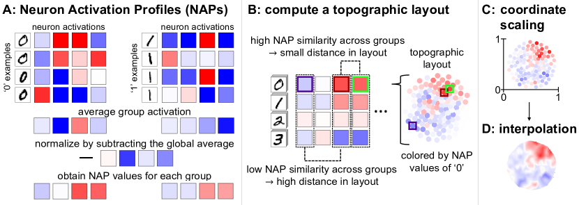
In this section, we describe our proposed pipeline to compute the topographic activation maps. This includes obtaining hidden layer representations of groups of examples, computing the layout of the topographic maps and visualizing activations according to the layout. A visual abstract of the pipeline is shown in Figure 1. The implementation is publicly available on https://github.com/valeriekrug/ANN-topomaps.
3.1 Hidden Layer Representations
We characterize the DNN activity with an averaging approach from our previous work [26]. First, we select groups of interest to compare between, which can be the classes or any other set of groups of examples. For each group, we compute the average activations in the layer of interest and normalize the result by subtracting the average activation over all groups (Figure 1A).
For the layout computation, we stack the obtained values (Figure 1B) as a matrix, where and denote the number of groups and neurons. We refer to the resulting matrix as the Neuron Activation Profile (NAP) of the layer.
In Convolutional Neural Networks, we characterize the feature map activations instead of each individual neuron. Therefore, we compute normalized group-averages of the feature maps. We flatten each to a -dimensional vector and concatenate the vectors of all groups (). Finally, we obtain the NAP of the layer by stacking these vectors for all feature maps, resulting in a matrix.
3.2 Topographic Map Layout
To compute the layout of the topographic maps, we distribute the neurons of a hidden layer in a two-dimensional space. In general, we aim to compute a layout in which neurons of similar activity are in the vicinity of each other (Figure 1B). In this section, we describe different approaches to obtain such layout.
3.2.1 Self-Organizing Map (SOM)
We investigate SOMs because they are neural networks in which the neurons are arranged in a two-dimensional layout and trained such that neighbors are similar to each other [5]. Here, we train a SOM on the NAP values of the neurons of our investigated model to map them to the topographic layout of the SOM. We use the MiniSom111https://github.com/JustGlowing/minisom package to compute a SOM layout of the neurons. For a layer of neurons, we compute a square SOM with shape with such that there can potentially be one neuron per SOM position. We train the SOM for 10 epochs and default parameters with the NAPs as training data. Then, we assign each neuron the coordinate (integer values) of the SOM position whose weights have the smallest Euclidean distance to its NAP values. To distinguish neurons that are assigned the same coordinate, we distribute them uniformly on a circle (radius of ) centered at their shared coordinate.
3.2.2 Co-Activation Graph
Further, we use a layouting method that considers the most similar pairs of neurons but not their exact similarity values. To this end, we first compute the pairwise Cosine similarity of neurons according to their NAP values. We then create a graph with nodes representing the neurons. For the most similar pairs of neurons (threshold empirically chosen), we draw an edge between the corresponding nodes. We further ensure that the entire graph is connected. To this end, we identify all connected components and link each smaller connected component to the largest via their most similar pair of neurons. Finally, we layout the connected graph with the Fruchterman Reingold algorithm [32] from the NetworkX package [33] and use the node coordinates as the topographic layout of the neurons. For brevity, we refer to this technique as the “graph” method.
3.2.3 Dimensionality Reduction
We test the popular dimensionality reduction methods Principal Component Analysis (PCA) [34, 35, 36], t-Distributed Stochastic Neighbor Embedding (tSNE) [37] and Uniform Manifold Approximation and Projection (UMAP) [38] to project the NAP values into a two-dimensional space. We perform PCA using the decomposition module of Scikit-learn (sklearn) [39], taking the first and second principal components as coordinates. To compute tSNE, we use the sklearn manifold module, initializing the embedding with PCA. For UMAP projection, we use the python module umap-learn222https://github.com/lmcinnes/umap.
3.2.4 Particle Swarm Optimization (PSO)
PSO [40, 41, 42] is a biologically inspired algorithm to search for optimal solutions. For our approach, we use particles in a two-dimensional solution space, where each particle corresponds to a neuron. Different than the aforementioned approaches, with Particle Swarm Optimization (PSO) we aim to simultaneously optimize A: clustering of similarly active neurons and B: consistent neuron density.
To achieve activation similarity of neighboring particles, we introduce a global force which is computed based on the NAPs. The global force encourages particles of similar neurons to attract each other while repelling dissimilar neurons.
| (1) |
In Equation 1, = global force, = global attraction, = global repulsion, = Cosine distance matrix of the NAPs, with .
To obtain a well-distributed layout, we use a local force that only depends on the particle coordinates. Like the global force, it consists of an attraction and a repulsion term. In the local force, attraction closes gaps in the layout by penalizing large distances between pairs of particles and repulsion avoids that two particles occupy the same position.
| (2) |
In Equation 2, = local force, = local attraction, = local repulsion, = pairwise Euclidean distances between particles, with .
We optimize the PSO for steps by updating the coordinates according to a weighted average of global and local force (Equation 3). In early steps , we use a high global force weight to encourage the activation similarity of neighboring particles and then gradually increase the local force weight to better distribute the particles.
| (3) |
3.2.5 PSO with Non-Random Initialization
The PSO method with random initialization needs careful balancing of the weight parameters of global and local attraction and repulsion. To require less fine-tuning of parameters, we investigate a variant of the PSO. We compute an initial similarity-based layout with another layouting method and only use the local force (setting ) to further optimize the resulting layout with PSO. This way, the PSO is only used to equally distribute the neurons in the two-dimensional space. We call the hybrid methods UMAP_PSO, TSNE_PSO, graph_PSO, SOM_PSO and PCA_PSO.
3.3 Visualization
Finally, we use the NAP values (Section 3.1) and the layout coordinates (Section 3.2) to create topographic map images. To be able to compare different layouts, we first scale the layout coordinates to in both dimensions (Figure 1C). Then, we create a mapping from NAP values to a symmetric continuous color scale, where blue represents , white 0 and red . We use this mapping to assign colors to the layout coordinates according to the NAP values of the respective group. Then, we linearly interpolate the colors with a resolution of px (Figure 1D). Equal colors in topographic maps of different groups represent the same NAP value, but the colors can correspond to different values in each experiment or layer. For CNNs, we color the feature maps by their average NAP value.
4 Experimental Setup
This section describes the experiments to evaluate the quality of the topographic maps obtained with the proposed layouting methods. To select the technique with the best quality, we use a simple data set and a shallow model. In Section 6, we demonstrate that the selected method is also applicable to more complex models and data sets.
4.1 Data and Models
We first test our method with MNIST [43], a common benchmark data set for Machine Learning. We train a simple Multi-Layer Perceptron (MLP) and CNN on the MNIST data set. The MLP has one fully-connected hidden layer of 128 neurons and uses Rectified Linear Unit (ReLU) [44] activation. The input images are flattened before providing them to the model. The CNN has two 2D-convolutional layers with kernel size 3 3, stride 2 and 128 filters, both using ReLU activation. The fully-connected classification layer takes the flattened feature maps of the second convolutional layer as input. During training, we use dropout for fully-connected and spatial dropout for convolutional layers, with a dropout rate of 0.5. Both models are trained using TensorFlow [45]. We used a batch size of 32 and trained for 20 epochs using the Adam optimizer [46] with default parameters and categorical cross-entropy as the loss function.
4.2 Evaluation Measures
Qualitative Criteria
Our technique aims to provide a comparative visual overview of the representations of groups in a DNN. They shall be perceived as visually similar to topographic maps in neuroscience that have a round shape, contain no empty regions and show continuous sub-regions of similar activity in all groups. We evaluate these expectations by manual inspection.
Quantitative Evaluation Metrics
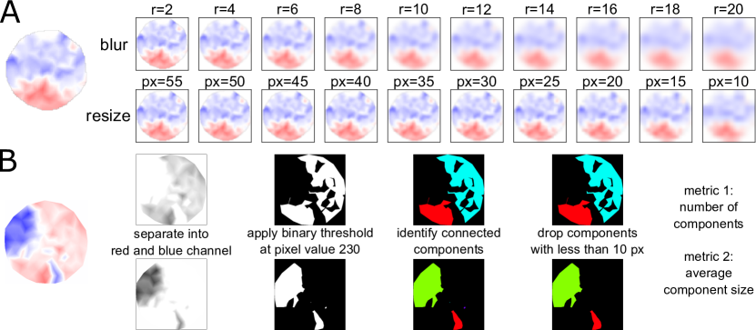
In addition, we quantify the quality of the topographic maps. To test local activation similarity, we compute the Mean Squared Error (MSE) between a perturbed version of the image and the original topographic map. As perturbations, we use Gaussian blur and down- and upscaling with bicubic interpolation. We use Gaussian blur with radii 2 px to 20 px in steps of 2 px and investigate downscaling sizes to px to px in steps of px (see Figure 2A). Finally, we aggregate the results for the different parameters with an estimated AUC value (trapezoidal rule).
We further use two metrics that quantify topographic map quality based on connected components in the images. The procedure can be followed in Figure 2B. First, we separate the image of the topographic map into the red and blue channel. For both channels, we apply a binary threshold at pixel value of 230 to separate blue or red regions from the background. In the binarized images, we detect connected components using OpenCV333https://github.com/opencv/opencv-python. We omit components smaller than 10 px area because they are not perceived as distinct regions. Finally, we compute the number of components and their average size. Generally, few large components are considered as high quality. However, a single large component is uninformative because there are no discriminable regions.
As the quality differs between groups, we report the average quality over the groups. Further, we investigate the robustness of the quality of the topographic maps. To this end, we repeat each topographic map computation 100 times given the same input.
4.3 Experimental Plan
For our simplest data set and model, MNIST and MLP, we compute NAPs in the first fully-connected layer, using the 10 classes as grouping. We then use the resulting NAPs to compute topographic maps with each of our 11 proposed layouting methods.
First, we pre-select techniques that satisfy the qualitative expectations of the visualization described in Section 4.2. For an exemplary coloring of the layout for the class “0”, we compare the methods with respect to the formation of regions of similar activations and the visual similarity to a topographic map in neuroscience. Next, for the pre-selected methods, we compare the quality of the topographic maps according to the quantitative measures described in Section 4.2. For CNNs, we use NAPs of the feature maps to compute the topographic map layouts but average the activation values per feature map to obtain the colors.
5 Results and Discussion
5.1 Pre-selecting Layouting Methods
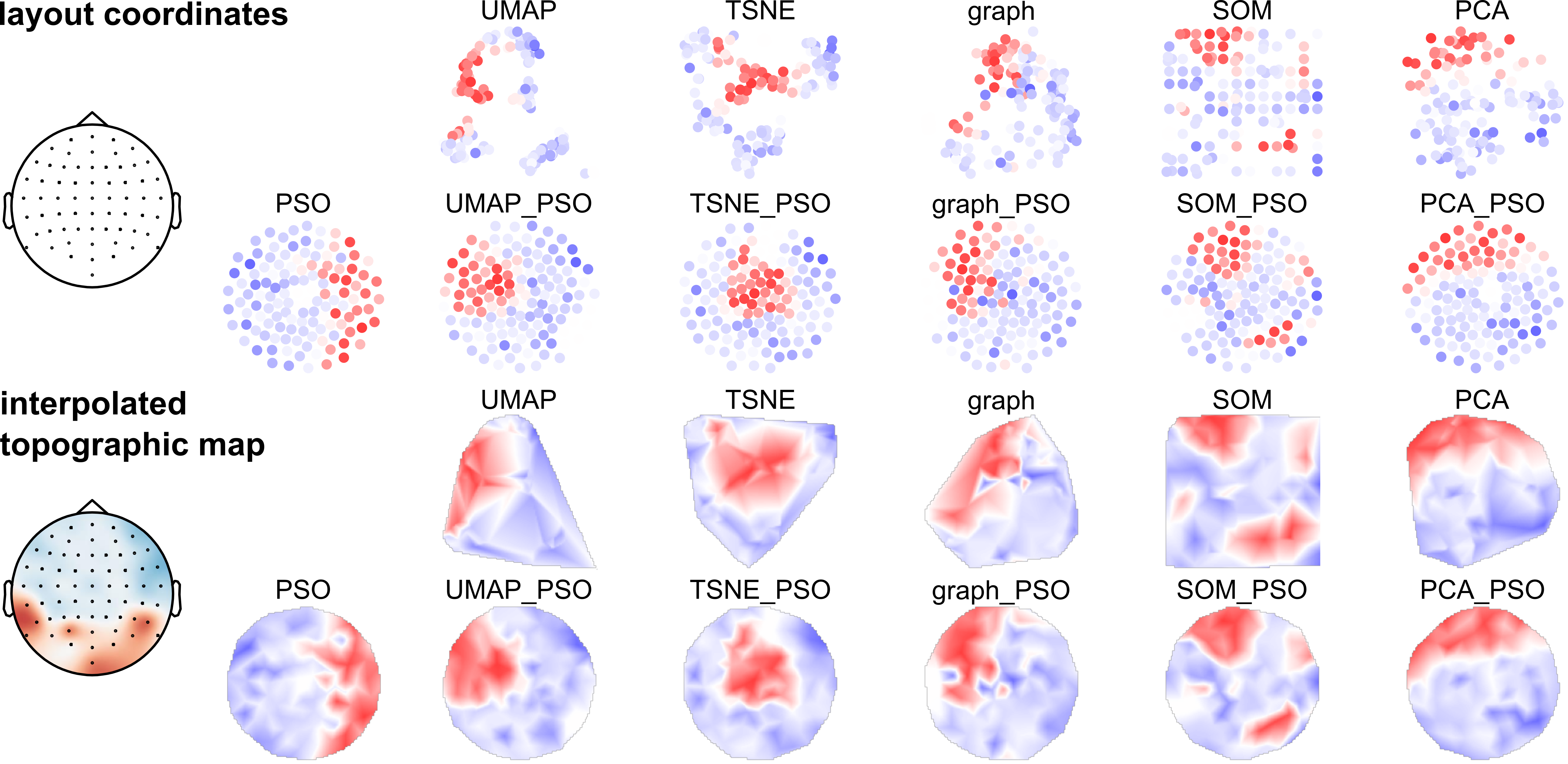
We first pre-select layouting methods that produce topographic maps which satisfy the qualitative criteria of Section 4.2. Topographic maps generated for the MNIST MLP and colored by the exemplary class “0” are shown in Figure 3. All methods distribute the neurons to form regions of similar activations. Only the SOM technique splits up sets of co-activated neurons into multiple regions in the layout due to not penalizing similarity of distant coordinates. Another criterion is that the neurons are well-distributed in the two-dimensional space. This is crucial because a layout with varying neuron density leads to disproportionate regions in the interpolated topographic maps. For example, in the interpolated TSNE topographic map, the gaps cause the red region to be enlarged, which wrongly suggests that the highly active neurons are in the majority. As expected, the best distribution is achieved with the PSO methods due to their local force component. Further, we favor topographic maps of round shape. This property is best achieved with the PSO methods due to the local force. This supports our idea of first layouting the neurons by activation similarity and then distributing the neurons with a PSO using the local force only. Therefore, we conclude that the PSO methods are the most promising techniques and use them for the quantitative evaluation. As a baseline, we include a PSO that only uses local force, initialized with random uniform coordinates.
5.2 Quantitative Evaluation
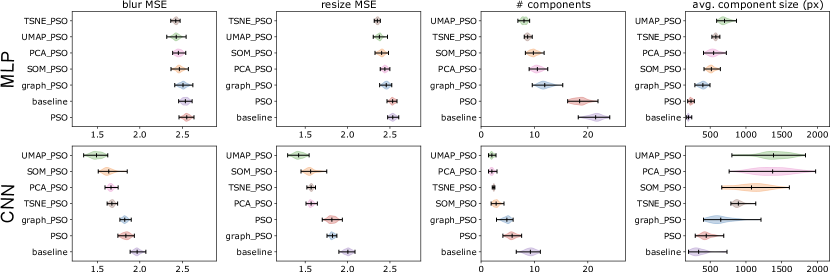
For the pre-selected methods, we quantify the topographic map quality. Generally, we consider low MSE values and few components of large size as high quality. However, a topographic map that only shows a single large component is uninformative because there are no discriminable regions.
The results for the first fully-connected layer of the MLP and the first convolutional layer of the CNN trained on MNIST are shown in Figure 4. In the MLP (Figure 4 top), the lowest quality is shared by the baseline and the PSO layout. graph_PSO, SOM_PSO and PCA_PSO are in the medium quality range, while graph_PSO shows the lowest quality among the three methods. UMAP_PSO and TSNE_PSO obtain the highest quality results for the MLP according to all metrics. TSNE_PSO shows smaller MSE values than UMAP_PSO, but not significantly. Regarding the component metrics, UMAP_PSO has a clearly higher quality than TSNE_PSO. The high quality of the two methods also comes with longer computation time. This is negligible for computing one layout but accumulates when visualizing several layers in a deep network.
In the CNN (Figure 4 bottom), UMAP_PSO shows the best rank according to all quality metrics. Different to our findings for MLPs, TSNE_PSO is not as high-quality as UMAP_PSO anymore and is lower-quality than SOM_PSO or PCA_PSO in many cases. PSO with random initialization leads to low-quality topographic maps like in the MLP, but graph_PSO yields better results than the default PSO . We conclude that UMAP_PSO produces highest-quality topographic maps for both MLP and CNN and use it in the following applications.
6 Exemplary Applications
6.1 Detecting Systematic Annotation Errors in Data Sets
Topographic map visualizations can be used to identify whether classification errors are caused by wrong annotations that can can occur in training data or test data. We demonstrate how to use our visualization technique for two toy examples, where we introduce annotation errors in either the training or test data.
Toy Examples Design
For the first toy example, we use the Fashion MNIST data set [47]. In the test data, we introduce a systematic error by changing the target class of 90% of the examples of class “T-shirt/Top” to class “trouser”. Using this altered data, we create topographic maps for a MLP model, trained on the original training data.
In the second toy example, we use the MNIST data set and change 90% of the class “0” examples to class “1”, train a MLP model on this altered training data set and create topographic maps for the original MNIST test data.
Both toy examples use the shallow MLP architecture as described in Section 4.1. The 20 groups of interest are the test data labels separated into whether they are correctly predicted. We create topographic maps for the first fully-connected layer of the respective MLP model using NAP values computed for 200 random examples per group.
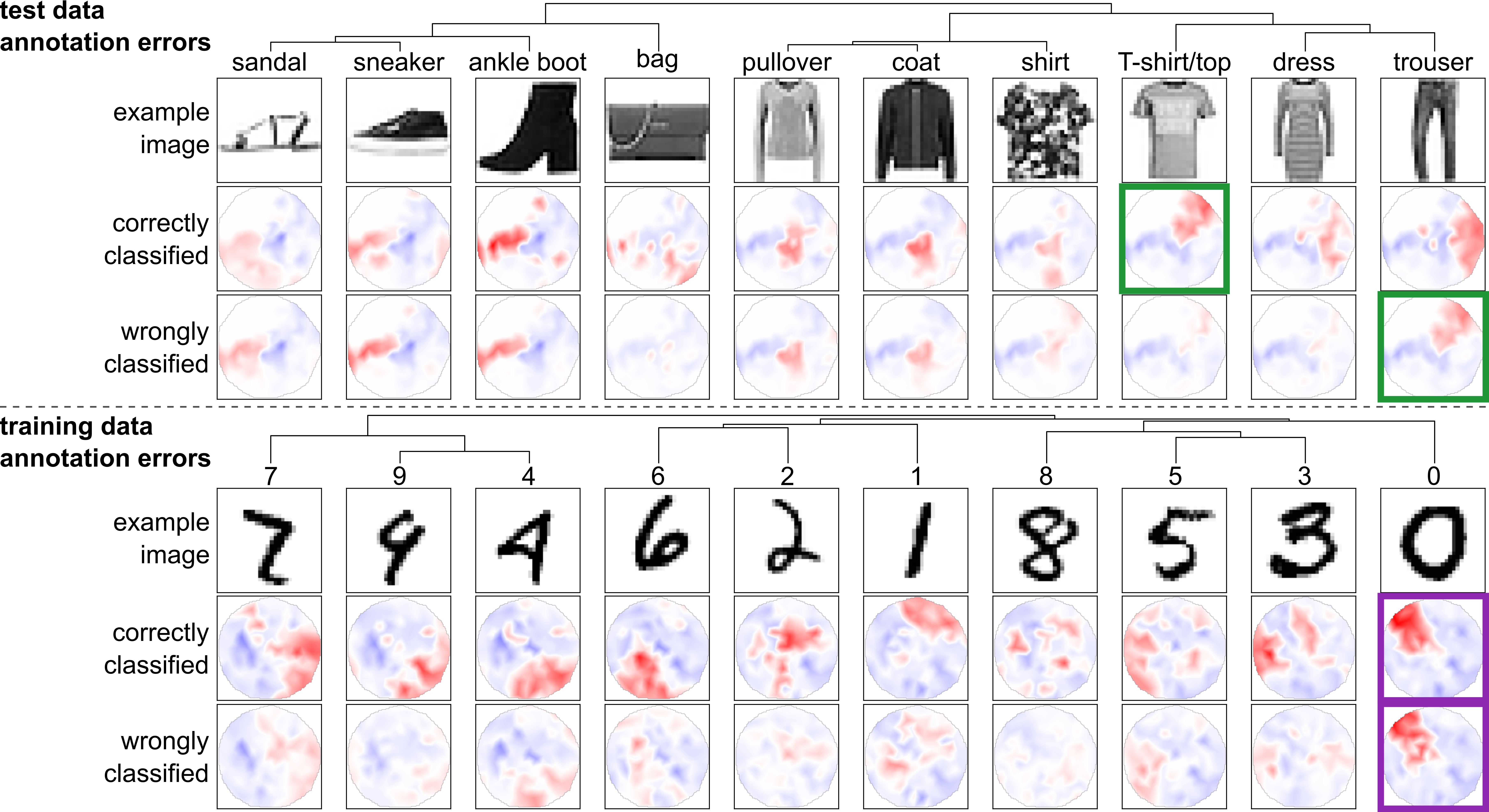
Annotation Errors in the Test Data
Figure 5 (top) shows the topographic maps of all Fashion MNIST classes. In the shown example, there is a high activation difference between correctly and wrongly classified examples for several classes, for example, “bag” and “trouser”. In realistic models, such dissimilarity indicates a distribution difference between training and test data for these classes. Here, for the wrongly classified “trouser” group, we further observe a high similarity to the activation of correctly classified “T-shirt/top” images (highlighted in green), indicating the annotation error we introduced.
Notably, in the upper left of the topographic maps, we observe a white region in all groups. Such region corresponds to a subset of neurons whose activity does not differ between groups. This indicates that the model does not use its full capacity because it is overcomplex or due to training problems like ReLUs that never activate [48].
Annotation Errors in the Training Data
To investigate training data annotation errors, we use a model trained on an erroneous MNIST data set. The resulting topographic maps using the original MNIST data set are shown in Figure 5 (bottom). Annotation errors in the training data lead to highly similar activations for wrongly and correctly classified examples of the same group. We observe this pattern for class “0” (purple highlight), which again matches our injected annotation error of changing 90% of the “0” labels.
This pattern also occurs if the model cannot discriminate between two or more classes properly, for example, in the classes “sneaker” and “ankle boot” of Figure 5 (top).
6.2 Visualization of Bias in Representations
In this section, we demonstrate how to detect racial bias with our technique. Different to common approaches that investigate bias in the model output [49, 50], we focus on bias in the representations of a DNN. Here, we inspect VGG16 [51], which can be used as feature extractor for downstream tasks like image recognition. As test data, we use FairFace [50], a balanced data set of images of people from different age groups, races and binary genders. We choose the “race” variable as grouping to compute the topographic maps. As random baseline, we add groups of random examples. We obtained VGG16 from TensorFlow Keras applications444https://github.com/keras-team/keras, using the second maxpooling layer as an example.
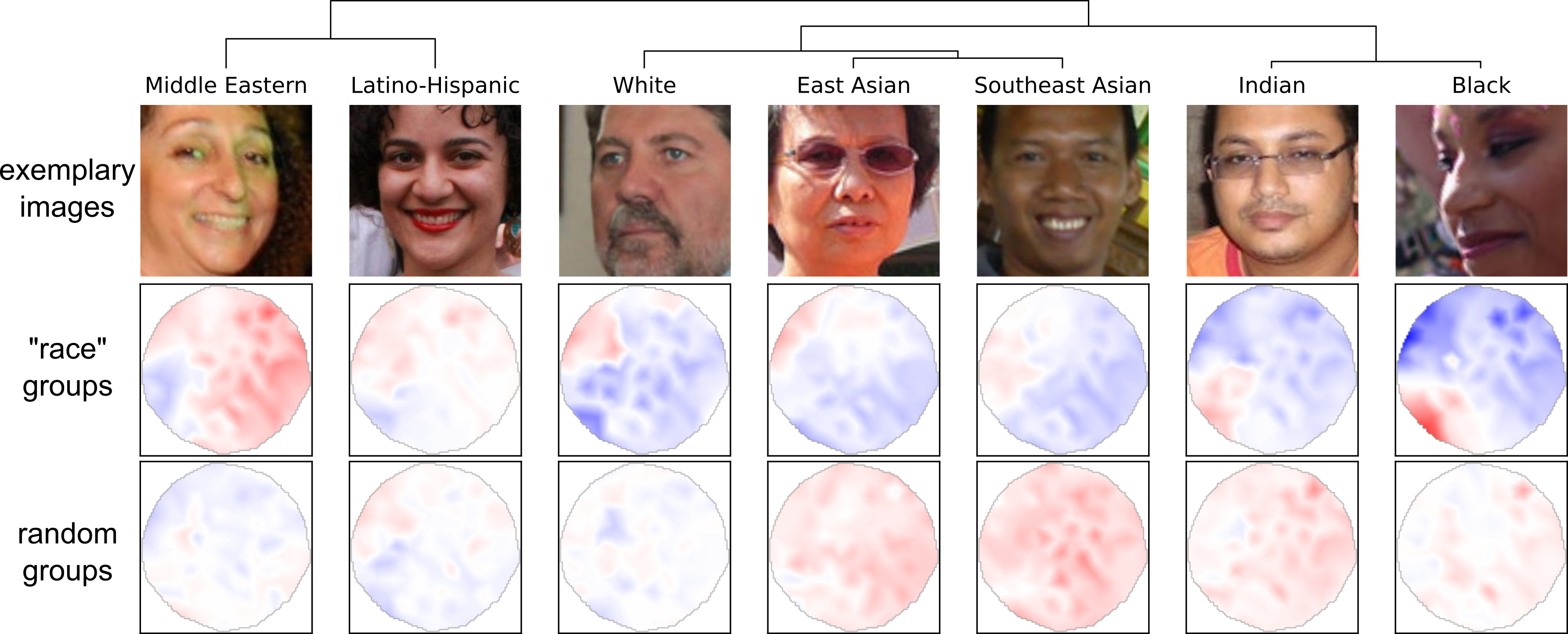
By comparing the topographic maps between the values of the sensitive variables from FairFace, we investigate whether it is possible to visually discriminate the group representations of the VGG16 model. Figure 6 shows topographic maps for the seven “race” categories of the FairFace data set and of seven random groups in the second maxpooling layer of the VGG16 model. First, we observe that it is clearly easier to discriminate the “race” categories than the random groups, indicating a racial bias. Only the “Latino-Hispanic” topographic map can be confused with a random group. We further observe that “Indian” and “Black” are perceived as particularly similar by the model. “East Asian“ and “Southeast Asian“ are similar to each other and to the “White” category. “Middle Eastern” and “Latino-Hispanic” are dissimilar to the other groups.
Observing visually discriminable representations indicates that downstream applications which use the pre-trained model can reproduce the bias. For example, a classifier can easily learn different decisions for the “White” and “Black” categories. We emphasize that this observation does not imply that a downstream application must include a racial bias. Instead, we suggest to use the findings to formulate hypotheses about which bias to look for. This allows to test for likely biases in a targeted way.
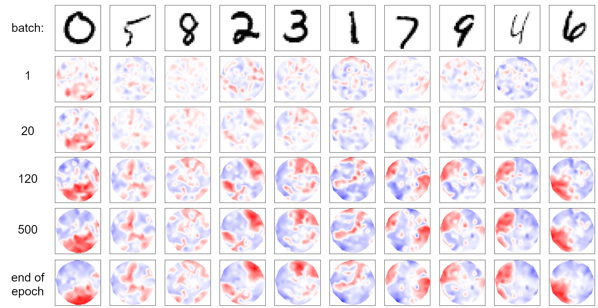
6.3 Visualizing Training Processes
In the third exemplary application, we show how the topographic maps can reveal information about the training process of a DNN. For this, we train a simple MLP model on MNIST for one epoch and saved the model after each batch resulting in a total of 1875 model states. For the last state, that is, the fully-trained model, we compute a topographic map layout using UMAP_PSO and use it for all other points in training. This way, the layout stays the same and we observe the development of activations during the training.
Figure 7 shows a training process as topographic maps at exemplary time steps. We observe, that the change of DNN activations is particularly large in the first 100 batches and gradually changes less as training continues. Correspondingly, we show a smaller batch difference early in training than towards the end of training. We observe that initial shapes begin to emerge after approximately 20 batches. These shapes become more sophisticated after around 120 batches and continue to become clearer over time. After around 500 batches, we only observe minimal changes. Further, we observe that the topographic maps of some classes stabilize earlier than others, which indicates that they are easier to learn for the model. For example, classes “1” and “4” change little from batch 500 to the end of the epoch, while some active regions disappear for classes “0” and “6”. Li et al. [31] found different classes to be learned early and late by their used CNN model, indicating that these learning dynamics are model-dependent. Topographic maps provide a unique perspective on the training process and help to better understand the dynamics of the neural network training. However, due to saving and processing many model states, the analysis of training processes requires more computation and storage resources than for a trained model only.
7 Conclusion
Topographic activation maps are a promising tool to get insight into the internal representations of DNNs. Our technique simplifies hidden layer activations as a two-dimensional visualization to provide a comparative overview of representations of groups of inputs. It is capable of showing activations of each neuron in MLPs but CNN feature maps need to be aggregated such that large feature maps might not be represented optimally.
Our technique alone does not provide explanations of the model representations or decisions. It still requires a human to interpret the results or to perform further downstream analyses to explain what the regions are responsible for. While topographic maps are easy to interpret by visual inspection, relating the visualization to useful insight into the model requires practice, especially for highly-complex models that are used in practical applications. We therefore recommend to first get familiar with the technique by using toy examples before applying it to real-world models.
In future research, we will investigate how to generate explanations of the regions in our topographic map visualization. For example, we will automatically detect group-responsive regions and perform feature visualization for the corresponding filters of the model to understand which patterns it uses to detect the group. Moreover, we will extend our technique to create multi-layer topographic maps.
References
- [1] Szegedy C, Liu W, Jia Y, Sermanet P, Reed S, Anguelov D, et al. Going deeper with convolutions. In: IEEE Conference on Computer Vision and Pattern Recognition (CVPR); 2015. p. 1-9.
- [2] Yosinski J, Clune J, Nguyen A, Fuchs T, Lipson H. Understanding Neural Networks Through Deep Visualization. arXiv preprint arXiv:150606579. 2015.
- [3] Makeig S, Onton J, et al. ERP features and EEG dynamics: an ICA perspective. In: Oxford handbook of event-related potential components. Oxford; 2009. p. 51-87.
- [4] Maurer K, Dierks T. Atlas of Brain Mapping: Topographic Mapping of EEG and Evoked Potentials. Springer Science & Business Media; 2012.
- [5] Kohonen T. In: Self-Organizing Feature Maps. Berlin, Heidelberg: Springer Berlin Heidelberg; 1988. p. 119-57.
- [6] Erhan D, Bengio Y, Courville A, Vincent P. Visualizing higher-layer features of a deep network. University of Montreal. 2009;1341(3):1.
- [7] Mordvintsev A, Olah C, Tyka M. Inceptionism: Going deeper into neural networks. Google Research Blog Retrieved June. 2015;20(14):5.
- [8] Zeiler MD, Fergus R. Visualizing and Understanding Convolutional Networks. In: European Conference on Computer Vision (ECCV). Springer; 2014. p. 818-33.
- [9] Springenberg JT, Dosovitskiy A, Brox T, Riedmiller M. Striving for simplicity: The all convolutional net. arXiv preprint arXiv:14126806. 2014.
- [10] Kindermans PJ, Schütt KT, Alber M, Müller KR, Erhan D, Kim B, et al. Learning how to explain neural networks: PatternNet and PatternAttribution. International Conference on Learning Representations (ICLR). 2018.
- [11] Schulz K, Sixt L, Tombari F, Landgraf T. Restricting the Flow: Information Bottlenecks for Attribution. International Conference on Learning Representations (ICLR). 2019.
- [12] Simonyan K, Vedaldi A, Zisserman A. Deep inside convolutional networks: Visualising image classification models and saliency maps. arXiv preprint arXiv:13126034. 2013.
- [13] Selvaraju RR, Cogswell M, Das A, Vedantam R, Parikh D, Batra D. Grad-CAM: Visual Explanations From Deep Networks via Gradient-Based Localization. In: IEEE International Conference on Computer Vision (ICCV); 2017. p. 618-26.
- [14] Bach S, Binder A, Montavon G, Klauschen F, Müller KR, Samek W. On pixel-wise explanations for non-linear classifier decisions by layer-wise relevance propagation. PloS one. 2015;10(7):e0130140.
- [15] Becker S, Ackermann M, Lapuschkin S, Müller KR, Samek W. Interpreting and explaining deep neural networks for classification of audio signals. arXiv preprint arXiv:180703418. 2018.
- [16] Thuillier E, Gamper H, Tashev IJ. Spatial audio feature discovery with convolutional neural networks. In: IEEE International Conference on Acoustics, Speech and Signal Processing (ICASSP); 2018. p. 6797-801.
- [17] Perotin L, Serizel R, Vincent E, Guérin A. CRNN-based multiple DoA estimation using acoustic intensity features for Ambisonics recordings. IEEE Journal of Selected Topics in Signal Processing. 2019;13(1):22-33.
- [18] Adebayo J, Gilmer J, Muelly M, Goodfellow I, Hardt M, Kim B. Sanity checks for saliency maps. In: Advances in Neural Information Processing Systems; 2018. p. 9525-36.
- [19] Nie W, Zhang Y, Patel A. A theoretical explanation for perplexing behaviors of backpropagation-based visualizations. In: International Conference on Machine Learning (ICML); 2018. p. 3809-18.
- [20] Sixt L, Granz M, Landgraf T. When Explanations Lie: Why Many Modified BP Attributions Fail. In: International Conference on Machine Learning (ICML); 2020. p. 9046-57.
- [21] Alain G, Bengio Y. Understanding intermediate layers using linear classifier probes. International Conference on Learning Representations (ICLR), Workshop Track Proceedings. 2017.
- [22] Kim B, Wattenberg M, Gilmer J, Cai C, Wexler J, Viegas F, et al. Interpretability Beyond Feature Attribution: Quantitative Testing with Concept Activation Vectors (TCAV). In: International Conference on Machine Learning (ICML); 2018. p. 2668-77.
- [23] Fiacco J, Choudhary S, Rose C. Deep neural model inspection and comparison via functional neuron pathways. In: Annual Meeting of the Association for Computational Linguistics (ACL); 2019. p. 5754-64.
- [24] Morcos AS, Raghu M, Bengio S. Insights on representational similarity in neural networks with canonical correlation. arXiv preprint arXiv:180605759. 2018.
- [25] Nagamine T, Seltzer ML, Mesgarani N. Exploring how deep neural networks form phonemic categories. Sixteenth Annual Conference of the International Speech Communication Association. 2015.
- [26] Krug A, Ebrahimzadeh M, Alemann J, Johannsmeier J, Stober S. Analyzing and Visualizing Deep Neural Networks for Speech Recognition with Saliency-Adjusted Neuron Activation Profiles. MDPI Electronics. 2021;10(11):1350.
- [27] Carter S, Armstrong Z, Schubert L, Johnson I, Olah C. Activation atlas. Distill. 2019;4(3):e15.
- [28] Hohman F, Park H, Robinson C, Chau DHP. S ummit: Scaling deep learning interpretability by visualizing activation and attribution summarizations. IEEE transactions on visualization and computer graphics. 2019;26(1):1096-106.
- [29] Park H, Das N, Duggal R, Wright AP, Shaikh O, Hohman F, et al. Neurocartography: Scalable automatic visual summarization of concepts in deep neural networks. IEEE Transactions on Visualization and Computer Graphics. 2021;28(1):813-23.
- [30] Wexler J, Pushkarna M, Bolukbasi T, Wattenberg M, Viégas F, Wilson J. The what-if tool: Interactive probing of machine learning models. IEEE transactions on visualization and computer graphics. 2019;26(1):56-65.
- [31] Li M, Zhao Z, Scheidegger C. Visualizing neural networks with the grand tour. Distill. 2020;5(3):e25.
- [32] Fruchterman TM, Reingold EM. Graph Drawing by Force-Directed Placement. Software: Practice and experience. 1991;21:1129-64.
- [33] Schult DA; Citeseer. Exploring network structure, dynamics, and function using NetworkX. In Proceedings of the 7th Python in Science Conference (SciPy). 2008.
- [34] S KPFR. On lines and planes of closest fit to systems of points in space. The London, Edinburgh, and Dublin Philosophical Magazine and Journal of Science. 1901;2(11):559-72.
- [35] Hotelling H. Analysis of a Complex of Statistical Variables into Principal Components. Journal of Educational Psychology. 1933;24:498-520.
- [36] Jolliffe I. Principal Component Analysis. New York: Springer Verlag; 2002.
- [37] van der Maaten L, Hinton G. Visualizing Data using t-SNE. Journal of Machine Learning Research. 2008;9(86):2579-605.
- [38] McInnes L, Healy J, Melville J. UMAP: Uniform Manifold Approximation and Projection for Dimension Reduction. arXiv preprint arXiv:180203426. 2020.
- [39] Pedregosa F, Varoquaux G, Gramfort A, Michel V, Thirion B, Grisel O, et al. Scikit-learn: Machine learning in Python. The Journal of Machine Learning Research. 2011;12:2825-30.
- [40] Kennedy J, Eberhart R. Particle Swarm Optimization. In: Proceedings of International Conference on Neural Networks (ICCN). vol. 4; 1995. p. 1942-8 vol.4.
- [41] Shi Y, Eberhart R. A Modified Particle Swarm Optimizer. In: IEEE International Conference on Evolutionary Computation Proceedings.; 1998. p. 69-73.
- [42] Eberhart RC, Shi Y. Comparing Inertia Weights and Constriction Factors in Particle Swarm Optimization. In: Proceedings of the Congress on Evolutionary Computation.. vol. 1; 2000. p. 84-8 vol.1.
- [43] LeCun Y, Cortes C. MNIST handwritten digit database; 2010. http://yann.lecun.com/exdb/mnist/.
- [44] Nair V, Hinton GE. Rectified Linear Units Improve Restricted Boltzmann Machines. In: International Conference on Machine Learning (ICML); 2010. p. 807-14.
- [45] Abadi M, Agarwal A, Barham P, Brevdo E, Chen Z, Citro C, et al.. TensorFlow: Large-Scale Machine Learning on Heterogeneous Systems; 2015. Software available from tensorflow.org. Available from: https://www.tensorflow.org/.
- [46] Kingma DP, Ba J. Adam: A method for stochastic optimization. arXiv preprint arXiv:14126980. 2014.
- [47] Xiao H, Rasul K, Vollgraf R. Fashion-MNIST: a novel image dataset for benchmarking machine learning algorithms. arXiv preprint arXiv:170807747. 2017.
- [48] Maas AL, Hannun AY, Ng AY, et al. Rectifier Nonlinearities Improve Neural Network Acoustic Models. In: International Conference on Machine Learning (ICML). vol. 30. Citeseer; 2013. p. 3.
- [49] Buolamwini J, Gebru T. Gender Shades: Intersectional Accuracy Disparities in Commercial Gender Classification. In: Friedler SA, Wilson C, editors. Proceedings of the 1st Conference on Fairness, Accountability and Transparency. vol. 81. PMLR; 2018. p. 77-91.
- [50] Karkkainen K, Joo J. FairFace: Face Attribute Dataset for Balanced Race, Gender, and Age for Bias Measurement and Mitigation. In: Proceedings of the IEEE/CVF Winter Conference on Applications of Computer Vision; 2021. p. 1548-58.
- [51] Simonyan K, Zisserman A. Very deep convolutional networks for large-scale image recognition. arXiv preprint arXiv:14091556. 2014.