Using Genetic Data to Build Intuition about Population History
Abstract
Genetic data are now routinely used to study the history of population size, subdivision, and gene flow. A variety of formal statistical methods is available for testing hypotheses and fitting models to data. Yet it is often unclear which hypotheses are worth testing, which models worth fitting. There is a need for less formal methods that can be used in exploratory analysis of genetic data. One approach to this problem uses nucleotide site patterns, which provide a simple summary of the pattern in genetic data. This article shows how to use them in exploratory data analysis.
1 Nucleotide site patterns
Nucleotide site patterns are often used in computer programs designed to infer population history from genetic data [11, 9, 13, 10]. This article however is not concerned with computer programs. The goal here is to see what can be learned about population history simply by looking at the data. This introductory section will introduce site patterns and explain how they relate to history.
The left panel of Fig. 1 shows the relationship between three populations. I use capital letters to refer to populations: is African, is Eurasian, and is Neanderthal. Later on we will encounter , which refers to Denisovans, an archaic population related to Neanderthals [8]. Combinations of letters refer to ancestral populations: XY is ancestral to and , XYN is ancestral to XY and , and so on. The right panel of Fig. 1 shows the gene genealogy of a tiny sample consisting of three random nucleotides, one from , one from , and one from . All three are drawn from the same position within the genome. In practice we work with larger samples, involving multiple individuals and millions of nucleotide sites, but this tiny sample makes the principles easier to explain. I will call such samples “haploid,” because the sample from each population consists of a single nucleotide.
\beginpicture\headingtoplotskip=\setcoordinatesystemunits ¡0.35cm, 0.35cm¿ \setplotareax from 1 to 11, y from 1 to 13 \axisbottom invisible ticks length ¡0pt¿ withvalues / at 2 6 10 / / \setplotsymbol(.) \plot1 1 5 9 5 13 / \plot3 1 4 3 5 1 / \plot7 1 5 5 6 7 8.75 1.5 / \plot10.75 1.5 7 9 7 13 /
Haploid samples also provide a real advantage. When we trace larger samples backwards into the past, it occasionally happens that two lineages coalesce at their common ancestor to form a single ancestral lineage. This happens faster in small populations than in large ones, so the process is sensitive to population size. With a haploid sample, no coalescent events are possible until we reach an ancestral population that contains the ancestors of two or more of our modern samples. Consequently, recent changes in population size have no effect, and we need not incorporate them into our model. This makes it easier to study the distant past.
Figure 1 shows the gene genealogy of one hypothetical haploid sample, which is represented by the red and the gray lines. For this sample, the lineages from and coalesce in population . Suppose that a mutation occurred somewhere on the red segment of the genealogy. A mutation generates a new allelic state, which we will call derived or mutant to distinguish it from the ancestral state that came before. If a mutation occurred on the red segment, we would observe the derived allele in the samples from and and the ancestral allele in that from . I will call this outcome the “xy site pattern,” using lower case to distinguish site patterns from populations.
\beginpicture\headingtoplotskip=\setcoordinatesystemunits ¡0.5cm, 0.5cm¿ point at 7 0 \setplotareax from 0 to 6, y from 0 to 7 \axisbottom invisible ticks length ¡0pt¿ withvalues Allelic state: C C T T / at -1 0 2 4 6 / /
Before we can recognize site patterns in the data, we must first determine which allele is ancestral and which is derived. Figure 2 shows how this is done.
2 Data
Figure 3 shows site pattern frequencies of two modern human populations (, Africa, and , Europe), and two archaic ones (, Neanderthal, and , Denisovan). In these data, the horizontal axis shows the relative frequency of each site pattern among the nucleotide sites in the genome, after excluding sites that fail quality control criteria, or for which the ancestral and derived alleles cannot be identified. The frequencies are plotted as open circles. Within each circle, the thing that looks like a dot is actually a horizontal line representing the 95% confidence interval. These intervals are very narrow, because these frequencies are estimated with high precision. This precision is possible because there is so much data in the nuclear genome.
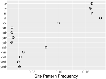
Some of the pattern in these data is obvious. There are a lot of singletons (, , , and ), and two of the doubletons (xy and nd) are more common than the others. Of the two common doubletons, xy is more common than nd. Other parts of the pattern are subtle: the less-common doubletons are similar in frequency, but yn is a little more common, and this difference is larger than the (barely-perceptible) confidence intervals.
To interpret these patterns, the trick is to reason as we did in Fig. 1 above. There, a mutation anywhere on the red segment of the gene genealogy would generate the xy site pattern. Anything that tended to lengthen this segment would inflate the frequency of this site pattern, because mutations are more likely to occur on long segments than on short ones. In the section that follows, we reason from population history to gene genealogies in order to understand the frequencies of site patterns.
3 Relating population history to site pattern frequencies
3.1 When the gene genealogy agrees with the population tree
It is useful to start with a model that lacks gene flow. Such models often shed light on large-scale patterns, even if they miss the subtleties. Figure 4 shows two versions of such a model, each of which assumes that the two modern human populations ( and ) are closely related, and so are the two archaic ones ( and ). Because there is no gene flow in these models, the network of populations has the shape of a tree. Within each population tree, I have drawn a gene genealogy, and in each genealogy the branching order is the same as that of the population tree. As we will see below, other branching orders also occur. However, this one is likely to be common, and if so it will explain the major features in the data.
\beginpicture\headingtoplotskip=\setcoordinatesystemunits ¡4mm, 3mm¿ point at 13 0
\setplotareax from 0 to 13, y from 0 to 16
\axisbottom invisible ticks length ¡0pt¿
withvalues / at 1 5 8 12 / /
\plotheadingEarly - split
\setplotsymbol(.)
\plot0 0 2 6 / \plot2 6 5.5 13 / \plot2 0 3 3 / \plot4 0 3 3 / \plot6 0 4 5 / \plot4 5 6.5 10.5 / \plot7 0 8 6 9 8 / \plot9 0 10 6 / \plot11 0 10 6 / \plot13 0 12 6 10.5 10 / \plot9 8 6.5 10.5 / \plot10.5 10 7.5 13 / \plot5.5 13 5.5 16 / \plot7.5 13 7.5 16 / \setplotsymbol(.)
\plot1 0 2.5 5 3.33 6 / \plot5 0 3.5 4 3.33 6 / \setplotsymbol(.)
\plot3.33 6 6 12 6.5 15 / \setplotsymbol(.)
\plot8 0 9 6 9.4 8.4 9 9.75 / \plot12 0 11 6 10 9.3 9 9.75 / \setplotsymbol(.)
\plot9 9.75 7 11.75 6.5 15 / \setplotsymbol(.)
\plot6.5 15 6.5 16 / \setcoordinatesystemunits ¡4mm, 3mm¿ point at -1 0
\setplotareax from 0 to 13, y from 0 to 16
\axisbottom invisible ticks length ¡0pt¿
withvalues / at 1 5 8 12 / /
\plotheadingLarge ND
\setplotsymbol(.)
\plot0 0 2 6 / \plot2 6 5.5 13 / \plot2 0 3 3 / \plot4 0 3 3 / \plot6 0 4 5 / \plot4 5 6 9 / \plot7 0 8.5 4 / \plot9 0 10 3 / \plot11 0 10 3 / \plot13 0 11 6 / \plot8.5 4 6 9 / \plot11 6 7.5 13 / \plot5.5 13 5.5 16 / \plot7.5 13 7.5 16 / \setplotsymbol(.)
\plot1 0 2.5 5 3.33 6 / \plot5 0 3.5 4 3.33 6 / \setplotsymbol(.)
\plot3.33 6 6 12 6.5 15 / \setplotsymbol(.)
\plot8 0 9.5 4 7 10.5 / \plot12 0 10.5 5 7 10.5 / \setplotsymbol(.)
\plot7 10.5 6.5 15 / \setplotsymbol(.)
\plot6.5 15 6.5 16 /
In both sides of Fig. 4, a mutation on the blue segment would generate site pattern xy, whereas a mutation on the red segment would generate nd. These are the two common doubletons in Fig. 3. It makes sense that these patterns should be common, because (Africa) and (Europe) are close relatives, as are (Neanderthal) and (Denisovan). Close relatives tend to share ancestors, and mutations in these shared ancestors inflate the frequencies of xy and nd. This is the verbal intuition behind the graphs in Fig. 4. The data imply that the two modern populations are close relatives as are the two archaic ones.
But why is xy more common than nd? In Fig. 4, site pattern xy will arise only if a mutation occurs on the blue branch. This is more likely to happen if the blue branch is long than if it is short. Thus, the excess of xy over nd implies that, on average across the genome, the blue branch is longer than the red one. Why should these branches tend to differ in length?
The left and right panels of Fig. 4 illustrate two possible reasons. In the left panel, the separation between and is more recent than that between and . For this reason, and share a longer history of common ancestry than do and . Consequently, the blue branch is longer than the red one, and site pattern xy is more common than nd, just as we see in the data.
This is reassuring and probably also correct, but I have smuggled in a hidden assumption. As we trace the lineages from and from backwards in time, they eventually arrive in population XY. Similarly, the lineages from and arrive in population ND, which is ancestral to and . In either case, as we trace the two lineages farther back in time, they eventually coalesce into a single parental lineage. In the previous paragraph, I assumed that this process takes the same length of time within populations XY and ND. This is not necessarily so.
Gene genealogies tend to be deeper in large populations than in small ones. Why? Because two random individuals are more likely to be close relatives in a small population. Close relatives are connected by short genealogies and distant relatives by deep ones. In the right panel of Fig. 4, population ND is much larger than XY, and it takes a long time for the and lineages to coalesce after they arrive in ND. In other words, they are connected by a deep genealogy. For this reason, the red branch is much shorter than the blue one. This is a second hypothesis that might explain the excess of xy over nd in the data.
It is not easy to choose between these alternatives, and this difficulty plagues formal statistical methods as well as the exploratory ones discussed here. In spite of this difficulty, we do have estimates, and these indicate that Neanderthals and Denisovans separated much earlier than did Africans and Europeans [8]. Furthermore, my colleagues and I have estimated that the population ancestral to Neanderthals and Denisovans was very small [11, 13]. Thus, neither of the assumptions made in the right panel of Fig. 4 is likely to be correct. The excess of xy over nd probably reflects a recent separation of and rather than large size in population ND.
3.2 When the gene genealogy disagrees
Having explained several large-scale features in the data, let us focus now on a finer scale. It will be useful for a little longer to ignore the effect of gene flow. This will provide a base line against which effects of gene flow will become visible.
In this section, we concentrate on counterintuitive sites patterns—ones in which the derived allele is shared not by samples from closely-related populations, but by distant relatives. Consider for example the two histories shown in Fig. 5. In these examples, the lineages sampled in and happen—just by chance—not to coalesce in population . They persist (going backwards in time) as distinct lineages throughout this segment of population history until they reach population XYN and are joined by the lineage sampled from . At this point, we have three lineages within the larger population. I will assume that this population is not geographically subdivided. In this case, the three lineages are equally likely to coalesce in any order: either , , or . The two counterintuitive orders, which are illustrated in Fig. 5, generate site patterns xn and yn. The process that leads to these counterintuitive patterns is called incomplete lineage sorting [5].
\beginpicture\headingtoplotskip=\setcoordinatesystemunits ¡0.4cm, 0.4cm¿ point at 12 1
\setplotareax from 1 to 11, y from 1 to 13
\axisbottom invisible ticks length ¡0pt¿
withvalues / at 2 6 10 / /
\axisbottom invisible shiftedto y=-0.3 ticks length ¡0pt¿
withvalues 1 0 1 / at 2 6 10 / /
\plotheadingPattern xn
\setplotsymbol(.)
\plot1 1 5 9 5 13 /
\plot3 1 4 3 5 1 /
\plot7 1 5 5 6 7 9 1 /
\plot11 1 7 9 7 13 /
\setplotsymbol(.)
\plot2 1 6 9 /
\plot6 12 6 13 / \plot6 1 4.5 3.5 4.5 5 6.5 9 6 12 / \setplotsymbol(.)
\plot6 9 6 12 / \setplotsymbol(.)
\plot10 1 6 9 / \setcoordinatesystemunits ¡0.4cm, 0.4cm¿ point at 0 1
\setplotareax from 1 to 11, y from 1 to 13
\axisbottom invisible ticks length ¡0pt¿
withvalues / at 2 6 10 / /
\axisbottom invisible shiftedto y=-0.3 ticks length ¡0pt¿
withvalues 0 1 1 / at 2 6 10 / /
\plotheadingPattern yn
\setplotsymbol(.)
\plot1 1 5 9 5 13 /
\plot3 1 4 3 5 1 /
\plot7 1 5 5 6 7 9 1 /
\plot11 1 7 9 7 13 /
\setplotsymbol(.)
\plot2 1 6 9 6 13 /
\plot6 1 4.5 3.5 4.5 5 6.5 9 / \setplotsymbol(.)
\plot6.5 9 6 12 / \setplotsymbol(.)
\plot10 1 6.5 8 6.5 9 /
Incomplete lineage sorting generates site patterns xy, xn, and yn with equal frequency. However, xy is also generated by coalescent events within population XY, as illustrated in Fig. 1. Thus, in the absence of admixture, we expect xn and yn to be equally common, but neither of these should be as common as xy.
Returning now to the data in Fig. 3, note that xd is about equal in frequency to yd. These are counterintuitive site patterns in which the derived allele is shared by samples from distantly-related populations. If these site patterns were produced by incomplete lineage sorting, they should be equal in frequency, as indeed they seem to be.
On the other hand, the frequencies of yn and xn are not equal. Although the difference is not large in absolute terms, it is (as noted above) much larger than the confidence intervals. To understand what this might mean, we need to discuss the effect of gene flow between populations.
3.3 The effect of gene flow
Figure 6 shows the result of gene flow from the Neanderthal population () into the Eurasian one (). This form of gene flow inflates the frequencies of the x and yn site patterns. In the figure, the blue branch is longer on the right than on the left, and this increases the frequency of . The red branch on the right provides a mechanism (in addition to incomplete lineage sorting) that can generate yn. Both patterns can arise without gene flow, but they are more common when Neanderthals contribute DNA to Europeans.
\beginpicture\headingtoplotskip=\setcoordinatesystemunits ¡0.35cm, 0.35cm¿ point at 12 1
\setplotareax from 1 to 11, y from 1 to 13
\axisbottom invisible ticks length ¡0pt¿
withvalues / at 2 6 10 / /
\axisbottom invisible shiftedto y=-0.3 ticks length ¡0pt¿
withvalues 1 0 0 / at 2 6 10 / /
\plotheadingWithout admixture
\setplotsymbol(.)
\plot1 1 5 9 5 13 /
\plot3 1 4 3 5 1 /
\plot7 1 5 5 6 7 9 1 /
\plot11 1 7 9 7 13 /
\setplotsymbol(.)
\plot4 5 5 7 5.75 10 6 11 6 13 / \plot6 1 4 5 / \setplotsymbol(.)
\plot2 1 4 5 / \setplotsymbol(.)
\plot8.5 4 6.5 8 6 11 / \setplotsymbol(.)
\plot10 1 8.5 4 / \setplotsymbol(.)
\setcoordinatesystemunits ¡0.35cm, 0.35cm¿ point at -1 1
\setplotareax from 1 to 11, y from 1 to 13
\axisbottom invisible ticks length ¡0pt¿
withvalues / at 2 6 10 / /
\axisbottom invisible shiftedto y=-0.3 ticks length ¡0pt¿
withvalues 1 0 0 / at 2 6 10 / /
\axisbottom invisible shiftedto y=-1.3 ticks length ¡0pt¿
withvalues 0 1 1 / at 2 6 10 / /
\plotheadingWith admixture
\setplotsymbol(.)
\plot1 1 5 9 5 13 /
\plot3 1 4 3 5 1 /
\plot7 1 5 5 6 7 9 1 /
\plot11 1 7 9 7 13 /
\setplotsymbol(.)
\plot2 1 5 7 5.75 10 6 11 6 13 / \plot6 1 5.5 2 9 2 8.5 4 / \setplotsymbol(.)
\plot2 1 5 7 5.75 10 6 11 / \setplotsymbol(.)
\plot8.5 4 6.5 8 6 11 /
\setplotsymbol(.)
\plot10.5 1 8.5 4 / \setplotsymbol(.)
\arrow¡10pt¿ [.2,.67] from 8.5 2 to 6.5 2
These effects are not likely to be large. If only a small fraction of the lineages in derive via gene flow from , then the histories of most nucleotide sites will be as described in Figs. 1, 4, and 5. In a complete genome from , only a small fraction of the nucleotide sites will derive from . Consequently, the frequencies of site patterns yn and x will be inflated only slightly.
This is exactly the pattern seen in Fig. 3: yn is more common than xn, and is more common than . Although neither effect is large, both are larger than the confidence intervals. This pattern is the signature of Neanderthal gene flow into Europeans [1].
Finally, note that the site pattern is substantially more common than the other singletons. This suggests that the Denisovan fossil is younger than the Altai Neanderthal. However, a detailed analysis of this hypothesis [12] led to the absurd conclusion that the Denisovan fossil was only 4000 years old—a date that is tens of thousands of years too young. Something was clearly missing from our model. Several authors had suggested that Denisovans received gene flow from a “superarchaic” population, which was distantly related to all other humans, archaic as well as modern [15, 14, 7, 6, 2]. If this hypothesis were correct, what effect might this have on site pattern frequencies?
Figure 7 provides an answer. Mutations on the red branch in this figure would inflate the frequency of site pattern . Mutations on the blue branch would inflate xyn. Refer back to Fig. 3 and you will see that not only is more common than the other singletons, xyn is more common than the other tripletons. This is the signature of superarchaic admixture into Denisovans [13].
\beginpicture\headingtoplotskip=\setcoordinatesystemunits ¡3.4mm, 3mm¿ \setplotareax from -2 to 17.5, y from 0 to 20 \axisbottom invisible ticks length ¡0pt¿ withvalues / at 1 6 9 13 17 / / \axisbottom invisible shiftedto y=-1.3 ticks length ¡0pt¿ withvalues : 0 0 0 1 / at 0 1 6 9 13 / / \axisbottom invisible shiftedto y=-2.6 ticks length ¡0pt¿ withvalues : 1 1 1 0 / at 0 1 6 9 13 / / \setplotsymbol(.) \plot0 0 6 12 6 20 / \plot2 0 3.5 3 5 0 / \plot7 0 4.5 5 7.12486206354179 10.249724127083585 / \plot8.17572 0 9.1757 5 10.036 6.7206 / \plot10 0 11 5 / \plot12 0 11 5 / \plot8 16 14.21226360816738 8.468963009740001 15.684 0 / \plot8 20 8 18.8112 15.8936 9.24189 17.4997 0 / \plot13.684 0 12.8151 5 11.3389 7.9523 8 12 8 16 / \plot7.12486206354179 10.249724127083585 10.036 6.7206 / \arrow¡10pt¿ [.2,.67] from 8.57571931984138 2 to 6 2
4 Conclusions
This article has tested no hypotheses. Neither has it used any formal method to fit models to data. Yet we have learned a lot simply by looking at the data—by using it to build intuition about what models to fit and what hypotheses to test. Our exploratory analysis suggests that (a) modern Europeans and Africans are closely related, (b) so were Neanderthals and Denisovans, (c) the separation between Europeans and Africans was more recent than that between Neanderthals and Denisovans, (d) Neanderthals contributed DNA to Europeans, and (d) superarchaics contributed DNA to Denisovans. None of these findings are new, but it is useful to see that they can all be inferred simply by looking at the data.
Acknowledgements
I am grateful for comments from Elizabeth Cashdan, Touhid Islam, Jan Koči, and Daniel Tabin. This work was supported by NSF grant BCS 1945782.
References
- Green et al. [2010] Richard E. Green, Johannes Krause, Adrian W. Briggs, Tomislav Maricic, Udo Stenzel, Martin Kircher, Nick Patterson, Heng Li, Weiwei Zhai, Markus Hsi-Yang Fritz, Nancy F. Hansen, Eric Y. Durand, Anna-Sapfo Malaspinas, Jeffrey D. Jensen, Tomas Marques-Bonet, Can Alkan, Kay Prüfer, Matthias Meyer, Hernán A. Burbano, Jeffrey M. Good, Rigo Schultz, Ayinuer Aximu-Petri, Anne Butthof, Barbara Höber, Barbara Höffner, Madlen Siegemund, Antje Weihmann, Chad Nusbaum, Eric S. Lander, Carsten Russ, Nathaniel Novod, Jason Affourtit, Michael Egholm, Christine Verna, Pavao Rudan, Dejana Brajkovic, Željko Kucan, Ivan Gušic, Vladimir B. Doronichev, Liubov V. Golovanova, Carles Lalueza-Fox, Marco de la Rasilla, Javier Fortea, Antonio Rosas, Ralf W. Schmitz, Philip L. F. Johnson, Evan E. Eichler, Daniel Falush, Ewan Birney, James C. Mullikin, Montgomery Slatkin, Rasmus Nielsen, Janet Kelso, Michael Lachmann, David Reich, and Svante Pääbo. A draft sequence of the Neandertal genome. Science, 328(5979):710–722, 2010.
- Kuhlwilm et al. [2016] Martin Kuhlwilm, Ilan Gronau, Melissa J. Hubisz, Cesare de Filippo, Javier Prado-Martinez, Martin Kircher, Qiaomei Fu, Hernán A. Burbano, Carles Lalueza-Fox, Marco de la Rasilla, Antonio Rosas, Pavao Rudan, Dejana Brajkovic, Željko Kucan, Ivan Gušic, Tomas Marques-Bonet, Aida M. Andrés, Bence Viola, Svante Pääbo, Matthias Meyer, Adam Siepel, and Sergi Castellano. Ancient gene flow from early modern humans into Eastern Neanderthals. Nature, 530(7591):429–433, Feb 2016. ISSN 1476-4687.
- Liu and Singh [1992] Regina Y. Liu and Kesar Singh. Moving blocks jacknife and bootstrap capture weak dependence. In Raoul LePage and Lynne Billard, editors, Exploring the “Limits” of the Bootstrap, pages 225–248. Wiley, New York, 1992.
- Mallick et al. [2016] Swapan Mallick, Heng Li, Mark Lipson, Iain Mathieson, Melissa Gymrek, Fernando Racimo, Mengyao Zhao, Niru Chennagiri, Susanne Nordenfelt, Arti Tandon, Pontus Skoglund, Iosif Lazaridis, Sriram Sankararaman, Qiaomei Fu, Nadin Rohland, Gabriel Renaud, Yaniv Erlich, Thomas Willems, Carla Gallo, Jeffrey P. Spence, Yun S. Song, Giovanni Poletti, Francois Balloux, George van Driem, Peter de Knijff, Irene Gallego Romero, Aashish R. Jha, Doron M. Behar, Claudio M. Bravi, Cristian Capelli, Tor Hervig, Andres Moreno-Estrada, Olga L. Posukh, Elena Balanovska, Oleg Balanovsky, Sena Karachanak-Yankova, Hovhannes Sahakyan, Draga Toncheva, Levon Yepiskoposyan, Chris Tyler-Smith, Yali Xue, M. Syafiq Abdullah, Andres Ruiz-Linares, Cynthia M. Beall, Anna Di Rienzo, Choongwon Jeong, Elena B. Starikovskaya, Ene Metspalu, Jüri Parik, Richard Villems, Brenna M. Henn, Ugur Hodoglugil, Robert Mahley, Antti Sajantila, George Stamatoyannopoulos, Joseph T. S. Wee, Rita Khusainova, Elza Khusnutdinova, Sergey Litvinov, George Ayodo, David Comas, Michael F. Hammer, Toomas Kivisild, William Klitz, Cheryl A. Winkler, Damian Labuda, Michael Bamshad, Lynn B. Jorde, Sarah A. Tishkoff, W. Scott Watkins, Mait Metspalu, Stanislav Dryomov, Rem Sukernik, Lalji Singh, Kumarasamy Thangaraj, Svante Pääbo, Janet Kelso, Nick Patterson, and David Reich. The Simons Genome Diversity Project: 300 genomes from 142 diverse populations. Nature, 538:201–206, 2016. ISSN 1476-4687.
- Pamilo and Nei [1988] Pekka Pamilo and Masatoshi Nei. Relationships between gene trees and species trees. Molecular Biology and Evolution, 5(5):568–583, 1988.
- Prüfer et al. [2017] Kay Prüfer, Cesare de Filippo, Steffi Grote, Fabrizio Mafessoni, Petra Korlević, Mateja Hajdinjak, Benjamin Vernot, Laurits Skov, Pinghsun Hsieh, Stéphane Peyrégne, David Reher, Charlotte Hopfe, Sarah Nagel, Tomislav Maricic, Qiaomei Fu, Christoph Theunert, Rebekah Rogers, Pontus Skoglund, Manjusha Chintalapati, Michael Dannemann, Bradley J. Nelson, Felix M. Key, Pavao Rudan, Željko Kućan, Ivan Gušić, Liubov V. Golovanova, Vladimir B. Doronichev, Nick Patterson, David Reich, Evan E. Eichler, Montgomery Slatkin, Mikkel H. Schierup, Aida Andrés, Janet Kelso, Matthias Meyer, and Svante Pääbo. A high-coverage Neandertal genome from Vindija Cave in Croatia. Science, 358(6363):655–658, 2017.
- Prüfer et al. [2014] Kay Prüfer, Fernando Racimo, Nick Patterson, Flora Jay, Sriram Sankararaman, Susanna Sawyer, Anja Heinze, Gabriel Renaud, Peter H Sudmant, Cesare de Filippo, Heng Li, Swapan Mallick, Michael Dannemann, Qiaomei Fu, Martin Kircher, Martin Kuhlwilm, Michael Lachmann, Matthias Meyer, Matthias Ongyerth, Michael Siebauer, Christoph Theunert, Arti Tandon, Priya Moorjani, Joseph Pickrell, James C. Mullikin, Samuel H. Vohr, Richard E. Green, Ines Hellmann, Philip L. F. Johnson, Hélène Blanche, Howard Cann, Jacob O. Kitzman, Jay Shendure, Evan E. Eichler, Ed S. Lein, Trygve E. Bakken, Liubov V. Golovanova, Vladimir B. Doronichev, Michael V. Shunkov, Anatoli P. Derevianko, Bence Viola, Montgomery Slatkin, David Reich, Janet Kelso, and Svante Pääbo. The complete genome sequence of a Neanderthal from the Altai Mountains. Nature, 505(7481):43–49, 2014.
- Reich et al. [2010] D. Reich, R. E. Green, M. Kircher, J. Krause, N. Patterson, E. Y. Durand, B. Viola, A. W. Briggs, U. Stenzel, P. L. F. Johnson, et al. Genetic history of an archaic hominin group from Denisova Cave in Siberia. Nature, 468(7327):1053–1060, 2010.
- Rogers [2019] Alan R. Rogers. Legofit: Estimating population history from genetic data. BMC Bioinformatics, 20:526, 2019.
- Rogers [2021] Alan R. Rogers. An efficient algorithm for estimating population history from genetic data. bioRxiv, 427922, 2021. Version 5 of this preprint has been peer-reviewed and recommended by Peer Community In Mathematical and Computational Biology (https://doi.org/10.24072/pci.mcb.100003).
- Rogers et al. [2017a] Alan R. Rogers, Ryan J. Bohlender, and Chad D. Huff. Early history of Neanderthals and Denisovans. Proceedings of the National Academy of Sciences, USA, 114(37):9859–9863, 2017a.
- Rogers et al. [2017b] Alan R. Rogers, Ryan J. Bohlender, and Chad D. Huff. Reply to Mafessoni and Prüfer: Inferences with and without singleton site patterns. Proceedings of the National Academy of Sciences, USA, 114(48):E10258–E10260, 2017b.
- Rogers et al. [2020] Alan R. Rogers, Nathan S. Harris, and Alan A. Achenbach. Neanderthal-Denisovan ancestors interbred with a distantly-related hominin. Science Advances, 6(8):eaay5483, 2020.
- Waddell [2013] P. J. Waddell. Happy New Year Homo erectus? More Evidence for Interbreeding with Archaics Predating the Modern Human/Neanderthal Split. ArXiv, 1312.7749, December 2013.
- Waddell et al. [2011] Peter J Waddell, Jorge Ramos, and Xi Tan. Homo denisova, correspondence spectral analysis, finite sites reticulate hierarchical coalescent models and the Ron Jeremy hypothesis. ArXiv, 1112.6424, 2011.