0
\vgtccategoryResearch
\teaser
![[Uncaptioned image]](/html/2108.06023/assets/figures/Teaser_Final.png) We study the complexity of alluvial diagrams with the following workflow: (1) We generate a publicly-available testing dataset of alluvial diagrams that vary complexity based on a combination of features. (2) We conduct two crowdsourced user studies to measure the task performance and perceived complexity of the charts. (3) Applying a combination of factor and regression analysis to weight feature contributions, (4) we model the complexity of alluvial diagrams.
We study the complexity of alluvial diagrams with the following workflow: (1) We generate a publicly-available testing dataset of alluvial diagrams that vary complexity based on a combination of features. (2) We conduct two crowdsourced user studies to measure the task performance and perceived complexity of the charts. (3) Applying a combination of factor and regression analysis to weight feature contributions, (4) we model the complexity of alluvial diagrams.
Bayesian Modelling of Alluvial Diagram Complexity
Abstract
Alluvial diagrams are a popular technique for visualizing flow and relational data. However, successfully reading and interpreting the data shown in an alluvial diagram is likely influenced by factors such as data volume, complexity, and chart layout. To understand how alluvial diagram consumption is impacted by its visual features, we conduct two crowdsourced user studies with a set of alluvial diagrams of varying complexity, and examine (i) participant performance on analysis tasks, and (ii) the perceived complexity of the charts. Using the study results, we employ Bayesian modelling to predict participant classification of diagram complexity. We find that, while multiple visual features are important in contributing to alluvial diagram complexity, interestingly the importance of features seems to depend on the type of complexity being modeled, i.e. task complexity vs. perceived complexity.
Human-centered computingVisualizationVisualization techniquesEmpirical studies in visualization;
1 Introduction
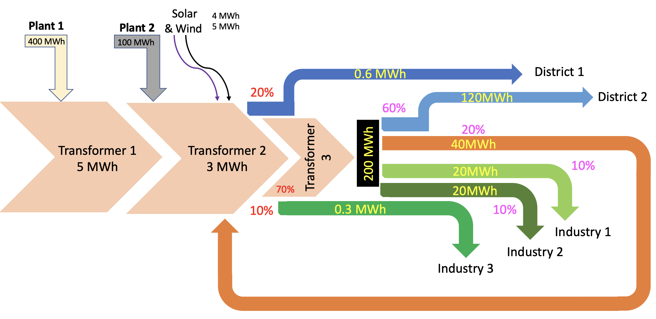
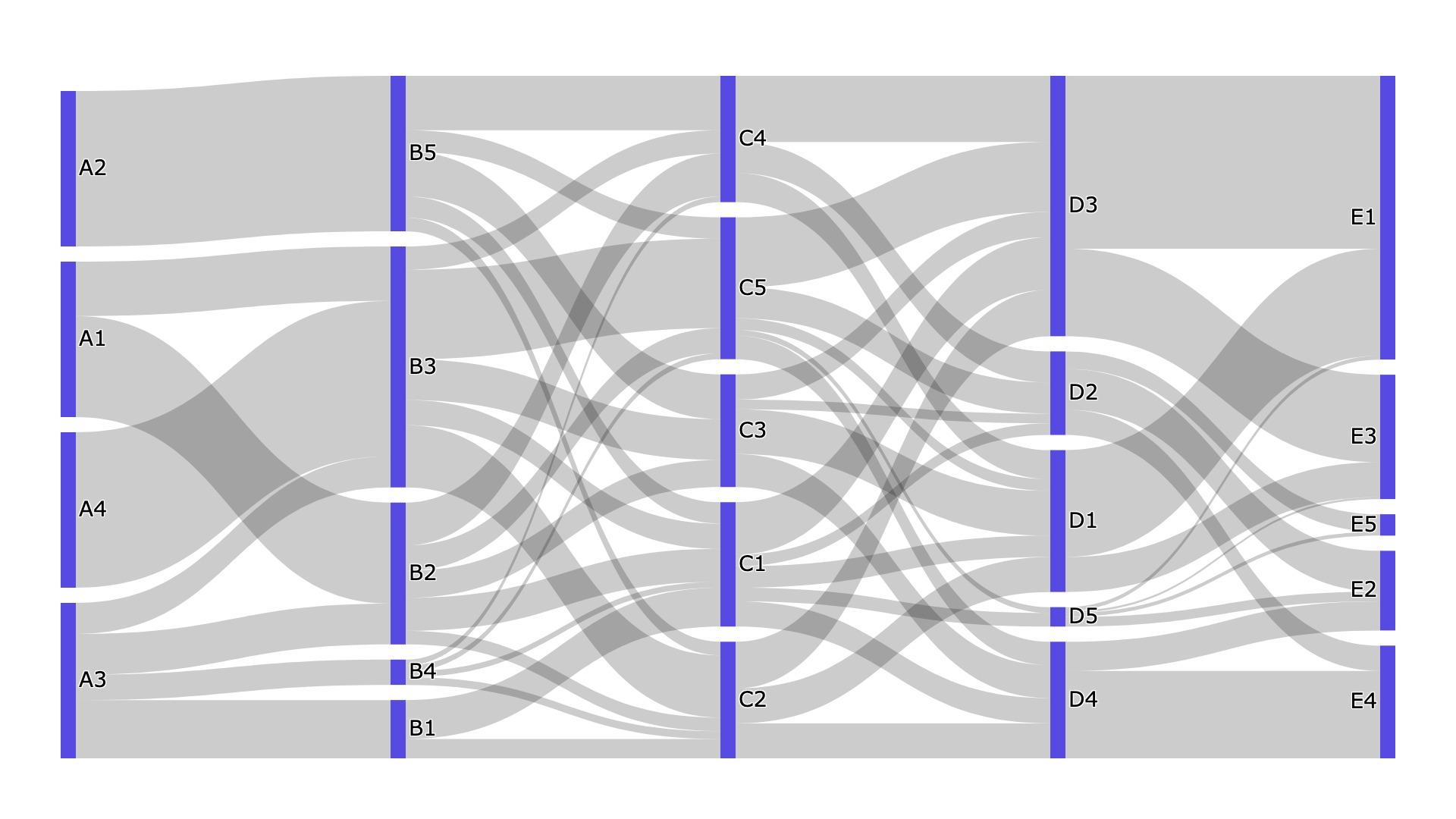
Alluvial diagrams are a type of Sankey diagram that visualize information flow between entity groups. In contrast to the general definition of Sankey diagrams (see Figure 1), which permit flow to go in any direction, alluvial diagrams group related entities into columns which are aligned along a common axis (e.g., going left-to-right), with the constraint that flow data can only belong to one entity in each group/column. As the height of the flow between entities shows data quantity, alluvial diagrams are a popular technique for visualizing time-varying network data, flow-based data, and relationships across multidimensional data, and have been applied in domains that include market/timeline analysis, network monitoring, and energy and power flows [26, 27, 29].
Unfortunately, interpreting an alluvial diagram can become a difficult task as the chart scales in size, complexity, and amount of information shown. Additionally, prior research has shown that more complex (and less familiar) visualizations, such as flow diagrams [3], are less readable and therefore harder to interpret [6, 5].
To better understand what makes alluvial diagrams “complex”, we conduct and analyze two crowdsourced user studies. Figure Bayesian Modelling of Alluvial Diagram Complexity shows the steps. (1) We create a synthetic dataset of alluvial diagrams with varying estimated complexity (a value called ) by statistically controlling the underlying dataset properties for each chart. (2) We conduct two crowdsourced user studies. In Study #1, participants perform four analysis tasks on the diagrams. In Study #2, participants compare pairs of diagrams to rate their relative, perceived complexities. (3) Using the collected study data, we perform regression and factor analysis to weight the impact of visual features in determining complexity, (4) and use these as Bayesian priors to classify alluvial diagrams for task performance and perceived complexity (i.e., label alluvial diagrams as having easy, medium, or hard complexity). While we find that all of the considered visual features significantly contribute towards modelling complexity, we interestingly find that the most important factor changes depending on the type of complexity (i.e., task complexity vs. perceived complexity) being modeled.
To our knowledge, this is the first research that empirically assesses, quantifies, and models the complexity of alluvial diagrams. Our modelling approach is also replicable for other types of visualization techniques. We additionally include a robust set of supplemental materials for use by the research community, including dataset generation scripts, chart datasets and rendered image files, and collected study data, publicly available at https://tinyurl.com/386adhwf.
2 Related Work
Optimizing Alluvial Diagrams. As mentioned in the Introduction, alluvial diagrams are a specific type of Sankey diagram with additional constraints for showing flow and relational data. Similar to how node-link diagrams optimize the placement of nodes and edges for readability (such as via force-directed layouts), algorithms for creating alluvial diagrams also try to optimize the placement of entities/nodes [2, 33]. For both techniques, a poor organization of entities/nodes can lead to increased edge/flow crossings, lowering the chart’s readability. However, in contrast to node-link diagrams (and Sankey diagrams) which can freely place nodes anywhere, alluvial diagrams only allow (i) an entity to be moved within its column, and (ii) if the dataset is not time-based, columns may be swapped. Similar to minimizing edge crossings in node-link diagrams, minimizing flow crossings for alluvial diagrams is an NP-hard problem [7]. Recent optimization efforts for Sankey/alluvial diagrams have utilized linear programming [33, 2]. The alluvial diagrams in our dataset are created using the Plotly library,111https://plotly.com/python/ which uses the d3-sankey package222https://github.com/d3/d3-sankey for computing layout.
Visualization Readability and Effectiveness. Broadly, the topic of graphical perception is concerned with how visualizations are perceived and interpreted [4]. Perception and readability depends on many factors, including the visual encodings being used (i.e., the marks and channels), the number of data dimensions being encoded [16, 24, 25], the amount of data shown [19], how the chart is styled [20], what rhetorical elements are present [15], and even the current cognitive focus of the person viewing the chart [13].
Bayesian statistics have been found to reliably model human cognition, and further allow for the principled incorporation of ‘irrational’ behavior [11, 23, 22]. Bayesian modelling has been used to measure the change of people’s beliefs on visualization viewing [8, 21], and has also been extrapolated to define a signal-detection approach to reason about visualization-based inference [14]. Such approaches can be extrapolated to predict what users find ‘interesting’ in a visualization, and further to formalize the effectiveness of visualization messaging.
Accurate prior elicitation is a challenge in using Bayesian methods; to circumvent this, we directly set priors based on the visual features used as complexity control factors. Previous work has shown that frequency format based representation of information helps participants better contextualize priors [9, 32]. We accordingly familiarize participants with the visual features of alluvial diagrams and how their counts are associated with diagram complexity during training.
Accuracy, task-driven evaluation, and perception of visual properties (such as color, shape, and size) in visualizations [34, 18, 1, 30, 28] have also been used to inform effective visualization design. The framing of effectiveness in past work is closely related with our framing of complexity; however, to the best of our knowledge, there has been no definition of a mathematical formula for complexity for a given visualization type.
3 Studies
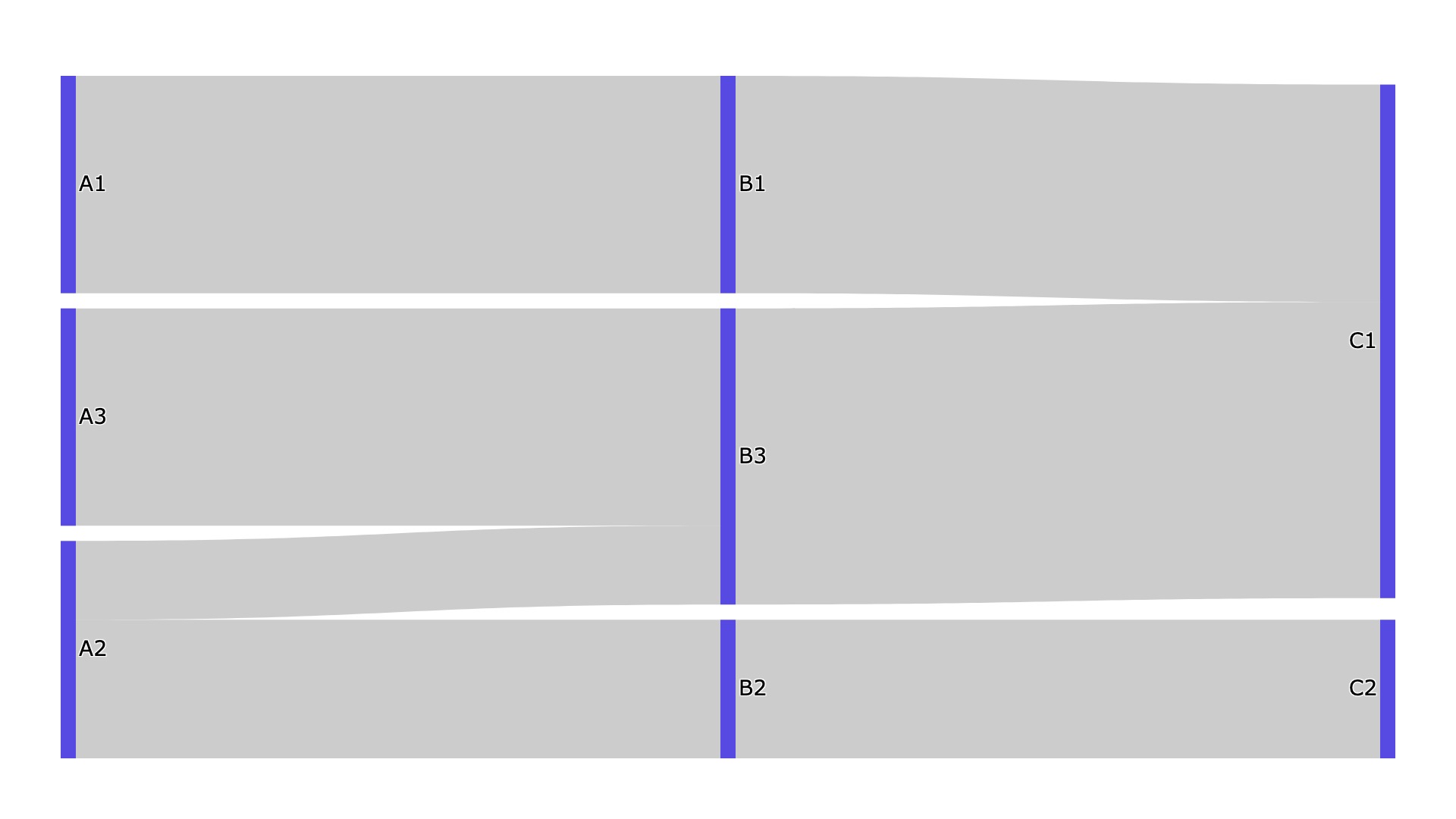
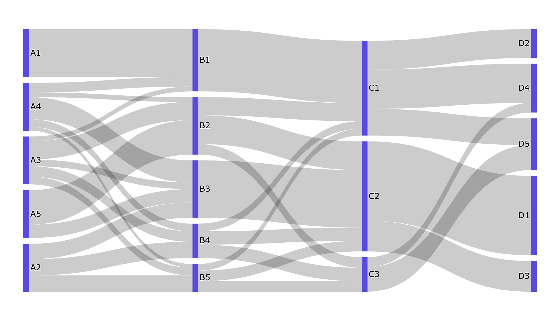
Dataset. To conduct our studies, we first created a dataset of synthetic alluvial diagrams. Each diagram is rendered as a PNG image with a uniform styling of grey flow arcs, blue entity rectangles, and flow going left-to-right.
A Python script created the underlying data for each chart by controlling the following four factors: (1) The number of timesteps, , was randomly selected between 3–6. (2) The number of entities for each timestep was randomly selected between 2–5. (3) The total flow was either 30, 50, or 80 units, and was based on the amount of selected timesteps and entities. (4) Finally, the flow size for each flow arc was between 25–50% of an entity’s total flow, with the constraint that the largest flow going into an entity was at least 5% larger than the next largest flow for that entity. All bounds were set to ensure that flows in the generated diagrams were at least 10px thick, to make them sufficiently distinguishable for the purpose of study tasks. The resultant datasets were rendered using the Plotly Python library. For each created chart, we also record the number of flow crossings, where two flow arcs cross over each other.
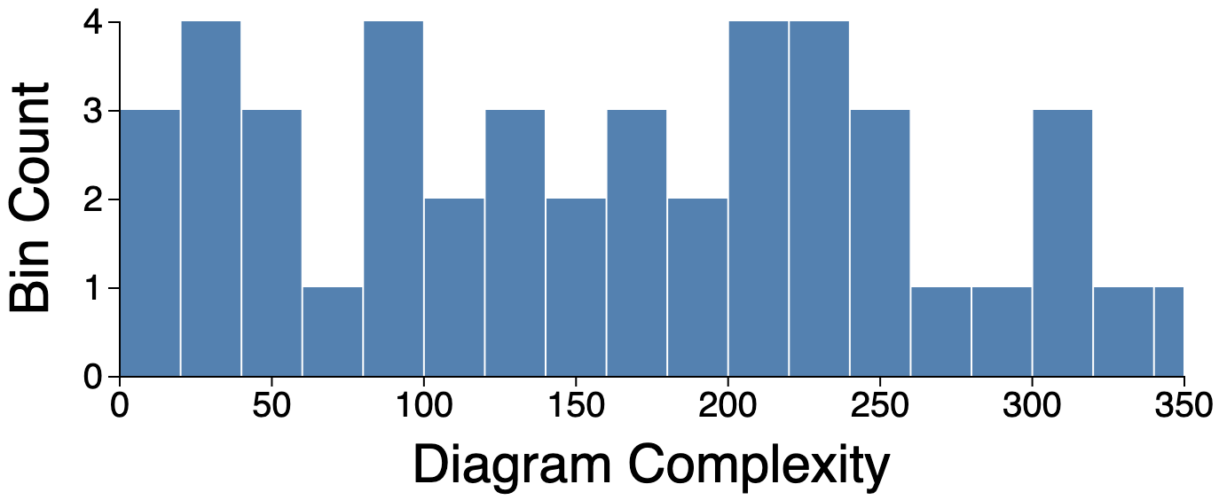
In total, we created charts, using Equation 1 to provide an estimated complexity score for a given chart as the sum of its timesteps , entities , flow arcs , and flow crossings .333Total flow is not considered in Equation 1 as chart sizes were normalized to fit the PNG filesize.
| (1) |
Figure 2 shows the distribution of the 48 charts based on their values, and Figure 3 shows three examples of created charts. The full set of chart images and datasets (along with the Python script) is available in the supplementary materials.
Study #1 Design. Participants were shown a sequence of alluvial diagrams (one per trial) and asked to perform one of four tasks for each chart: (T1) Between which two timesteps are the most number of flows? (T2) Which entity in the diagram is the largest? (T3) Which flow arc in the diagram is the largest? (T4) Which entity has the most total flow activity (number of arcs entering and exiting)?
Each task requires a participant to examine the entire alluvial diagram to answer, entering their response into an input box. Of the 48 charts, 3 were reserved for training (each task was performed twice in training, for 8 total training trials). The remaining 45 charts were used for the main study. Each participant completed 19 trials during a session. For each trial, one chart and task were randomly selected and shown to the participant (no chart appeared twice during a session). An attention check appeared after the 10th question. Before running the main study, a pilot study was conducted with 3 participants to validate the design.
Study #1 Participants. We recruited 100 participants on Prolific444https://www.prolific.co using the following user filters: (i) self-reported normal or corrected-to-normal vision, (ii) a first language of English, (iii) located in a U.S. college pursuing an undergraduate degree or higher, (iv) at least 100 previously completed Prolific surveys, and (v) an approval rate of 90% or more.
Participants were paid 2.50 for participation. Study #1 duration averaged just over 18.5 minutes (median 15:09), resulting in an average hourly pay of 8.10 (median 9.90). Qualtrics [10] was used to display the study and store participant responses. Nine participants were excluded as their answers did not meet the expected format, or their performance indicated they did not understand the study questions during/after training.
Study #2 Design. For each trial in Study #2, participants were shown a pair of alluvial diagrams displayed side-by-side and asked to rate which chart was more complex (or if the charts were of approximately equal complexity). Each participant completed 31 trials, where each trial randomly selected two of the 45 charts for comparison (990 total pairs possible). An attention check appeared after the 15th question. Three training trials were performed before beginning the main study. Similar to Study #1, a pilot study was first conducted to validate the design with 3 users.
Study #2 Participants. We recruited 150 participants on Prolific with the same filter settings as Study #1, again using Qualtrics to display trials and record responses. Participants were paid 1.25 for participation. Study #2 duration was just over 7.5 minutes on average (median 6:06), resulting in an average hourly pay of 10.00 (median 12.29). No participants were excluded from this study, and each chart pair was rated either 4 or 5 times.
| Task | Accuracy (and SD) |
|---|---|
| T1: Most Active Timestep | |
| T2: Largest Entity | |
| T3: Largest Flow | |
| T4: Most Active Entity |
4 Results
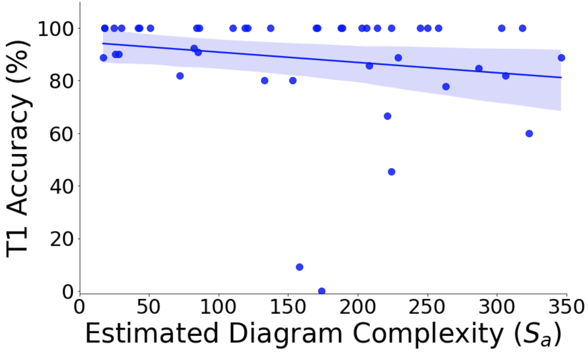
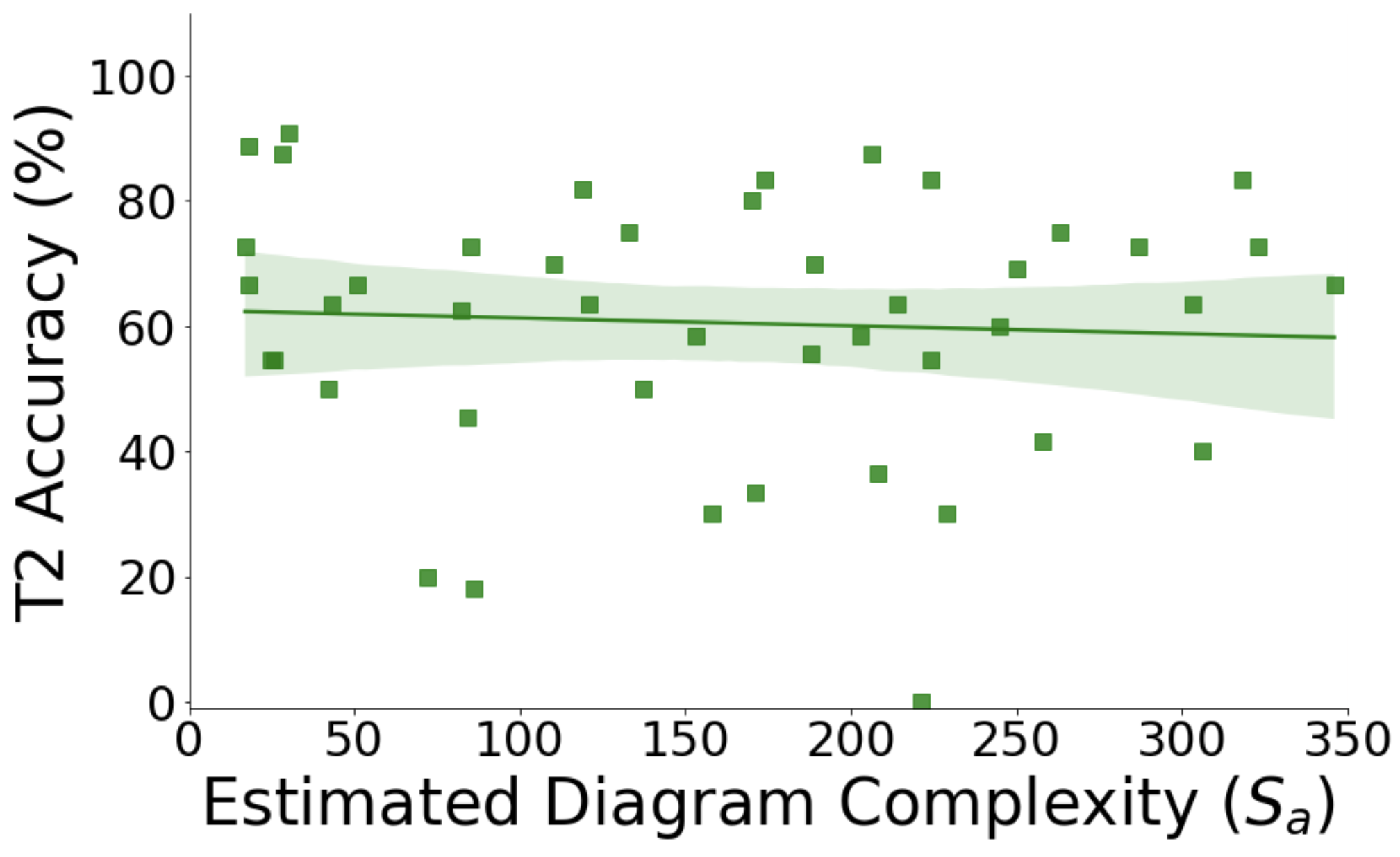
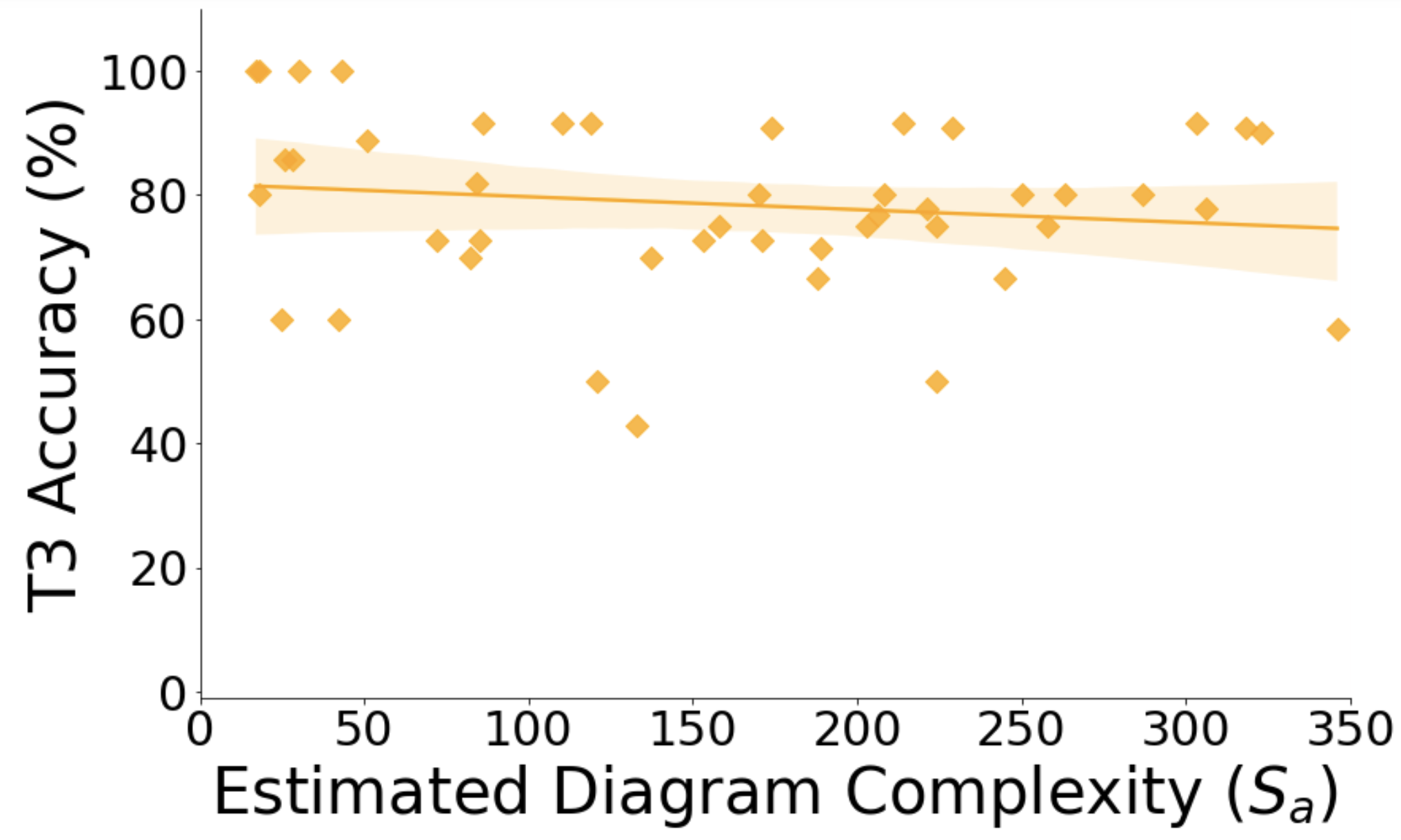
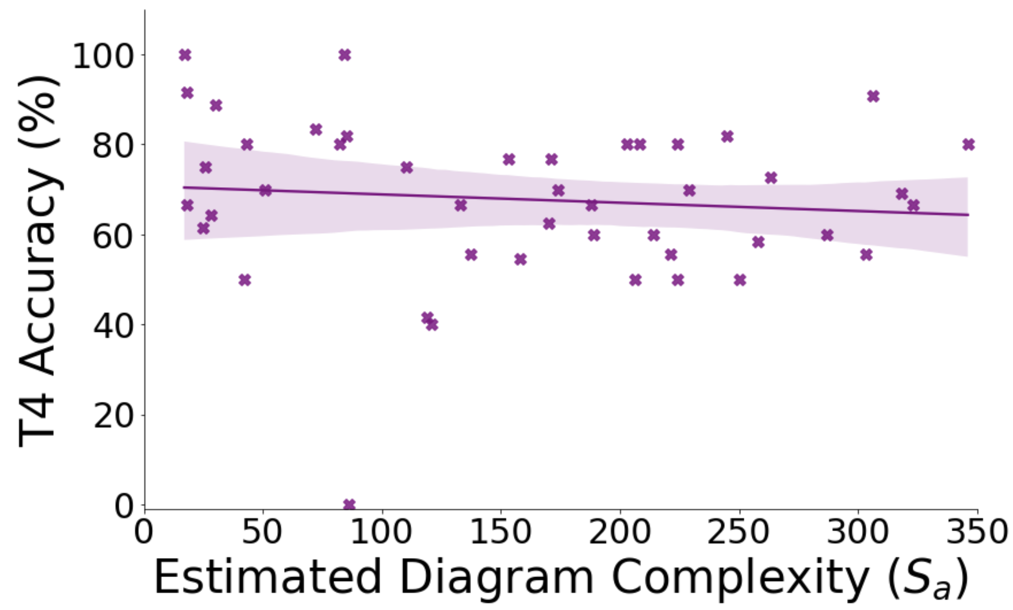
Study 1 Results. Table #1 summarizes the task performance for T1–T4 (i.e., the percent of responses that were correct). T1 had (by far) the highest performance, and T2 the lowest. These results are reflected in Figure 4, which plots, for each task, chart performance against its value. While the performance scores for individual chart-task pairs can vary, each of the four fitted regression lines indicates a similar trend: as a chart’s value increases, its task performance decreases.
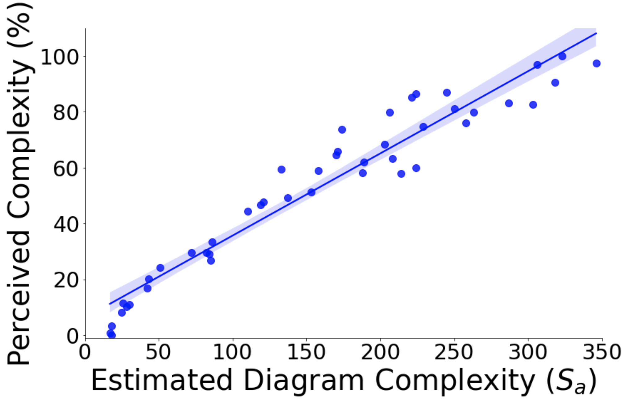
Study 2 Results. For each trial in Study #2, participants compared a pair of charts with relative complexity ratings. We transform these relative ratings into an overall list of complexity rankings with the following process: Each diagram starts with a score of 0, and 10 points are added based whether it is rated more/less complex in a trial. No points are added if two charts are rated equally complex in a trial. Summing the scores from all the trials determines a chart’s overall perceived complexity. Figure 5 shows these overall perceived complexity values plotted against values. Like Study #1, we fit a regression line which indicates a high correlation between a chart’s perceived complexity and its value.
5 Bayesian Complexity Model
Bayesian modelling has been used to measure the effectiveness of visualizations [14]. Additionally, the visual features analyzed are frequency-based, and can therefore better inform participants of the significance of the prior, in line with previous work [32]. We hence aim to mimic our study user’s assessment of alluvial diagram complexity, except we bin the diagrams into discrete categories of easy, medium, and hard complexity, given the occurrence of considered visual features.
For each study, we analyze the effects of four independent variables, the visual features number of timesteps, number of flows, number of entities, and number of flow crossings, on the measured complexity data obtained from both studies (for Study #1, the performance for each task, and for Study #2, the perceived complexity scores). To fine-tune our estimated complexity score, we perform iterations of factor (PCA/Unrotated/Varimax) and linear/multiple regression analyses [12, 17] to determine the effect strength of each factor (i.e., each visual feature); this is done with the aim of preserving statistical power during analyses.555Detailed statistics are fully reported in the supplementary material
Study 1 Modelling. As a first step, we ran regressions of each visual feature against each task individually, to examine the nature and extent of their relationships5. For each task, each of the four independent variables had a significant positive correlation (all p0.001), though for all four tasks number of entities had the highest value (T1=0.66, T2=0.641, T3=0.720, T4=0.682), which indicates it had the most impact on performance.
We next perform a factor analysis on the tasks, to verify if they are suitable for constructing summative dependent variables. We find that T2, T3, and T4 load onto a single factor, where T2 is strongly significant (-0.51), T3 (-0.37) and T4(-0.31) are weakly significant, and T1 (-0.22) fails to load. Accordingly, we develop a , a summated dependent variable comprised of T2, T3, and T4; we also construct an alternate dependent variable, , summated over all four tasks, to examine how ’s inclusion impacts the importance of the four visual features. We perform feature-wise regression against and ; number of entities again serves as the strongest predictor ( is 0.704 for , 0.712 for ).
On performing factor analysis over the four independent variables, we find all four features load onto a single component, and are all strongly significant (number of timesteps=0.9, number of flows=0.939, number of flow crossings=0.86, number of entities=0.930), where number of flows has the highest significance. We construct an independent summated feature () variable, and run it against all the dependent variables (i.e., task performance); number of entities remains the highest predictor throughout.
Next, we perform k-fold cross validation (k=5) to update Equation 1 based on the standardized regression coefficients obtained for multiple regression of features against and respectively. We retain all individual features as though they all load onto a single factor, each feature is also found to have a statistically significant impact on the performance variables in isolation (i.e., p0.001). Number of entities and number of flows exceed and perform on par with respectively; additionally, the overall standard deviation in over all features and is 0.04 for both summated dependent variables. This allows us to weight each feature as an individual contributor, as follows:
| (2) | |||
| (3) | |||
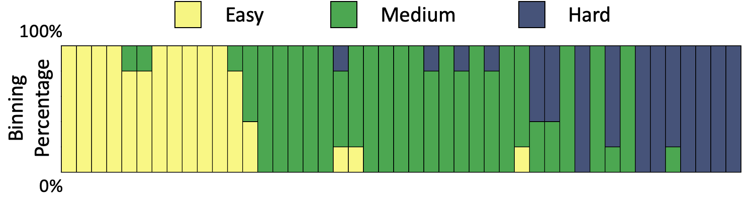
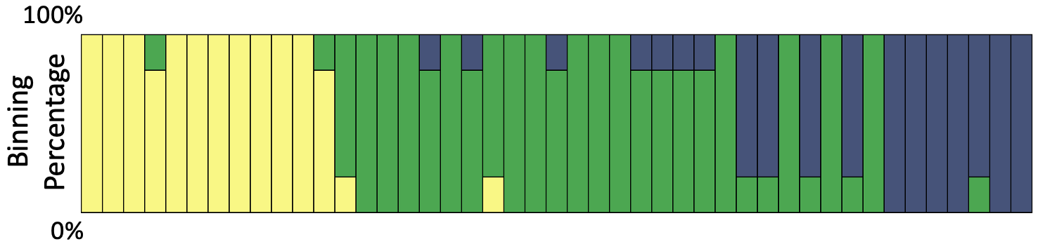
We use these equations to construct two Bayesian priors, and train two Bayesian models (, ) to predict the performance accuracy class of the held-out test-set (20%), as easy/medium/hard based on chart complexity falling in the lowest, middle, or highest-third bins of the dataset. Prediction trends for and are summarized in Figure 6(a)-(b), with repeated k-fold cross validation (k=5, n=10), such that each chart is classified at least 5 times. We analyze this chart after the Study #2 model () is introduced shortly.
Study 2 Modelling. An initial regression on perceived complexity (%) shows that number of entities again serves as the best fitting model (=0.637); all independent variables are positively correlated with perceived complexity, with p0.001 for all regressions. We also run a regression of against the perceived complexity, and find that number of entities still serves as the best predictor. Overall, the features contribute in a more balanced manner compared to the regression results against summated performances in Study #1, with relatively closer values ().
We again update Equation 1, only now for Study #2 we model perceived visual complexity ():
| (4) | |||
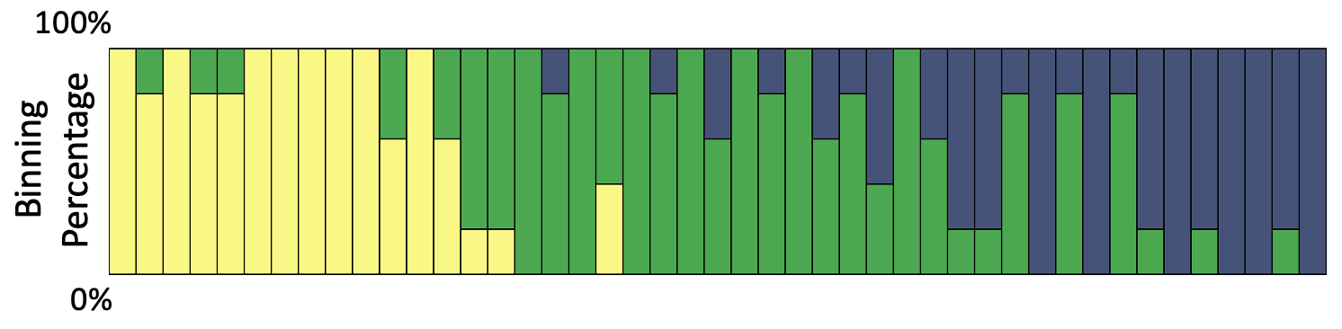
In contrast to Equations 2 and 3, number of flows is now the highest weighted factor, despite number of groups being the best predictor. We use Equation 4 to construct a Bayesian prior and train a Bayesian model () to similarly predict the complexity class of the alluvial diagrams in the test set as easy/medium/hard in Figure 6(c). Compared to and , we find that most closely fits complexity classification patterns, and tends to consistently bin diagrams. and display greater discrepancies during the classification of medium and hard complexity diagrams. displays the highest classification variability over epochs; this is expected as task T1 behaves as an outlier, which is taken into account when modelling based on summated accuracy over all tasks ().
6 Discussion
Based on Equations 2–4, we see that the four considered visual features have similar weights in modelling the complexity of an alluvial diagram. Interestingly, we find that when excluding the “easy task” T1 in Equation 2, number of entities becomes the most important factor, though when T1 is included, number of flow crossings has the highest weight (Equation 3). When considering perceived complexity (Equation 4), number of flows is the most important variable. In one sense, the high dependencies between variables makes sense: the number of entities in a dataset should highly correlate with the number of flows and number of flow crossings. However, it is interesting that, depending on how you model complexity, different features seem to emerge as most influential, though this requires further experiments to confirm. It is possible that, as flow arcs are the visual feature in alluvial diagrams that take up the most pixel space (thus leading to higher data-ink ratio [31]), the number of flows has a higher influence on how a person perceives a chart’s complexity, albeit only slightly. This also provides a possible reason that number of flows is considered the most important feature for the summative variable in the factor analysis conducted in Section 5.
Our approach for modelling complexity (or effectiveness, as defined in Section 2) is extensible to other types of visualizations, including similar techniques like Sankey diagrams, node-link diagrams, and even parallel coordinate plots. However, since Sankey diagrams and node-link diagrams have flows/edges that can go in any direction, more nuanced visual features should be considered, such as flow/edge length and direction. Moreover, any visualization technique (even if dissimilar to alluvial diagrams) can be modelled by selecting an appropriate set of visual features. For example, a bar chart’s features could include bar height, bar width, number of bars, the distance between bars, etc.
We also note some limitations in our studies. For example, Study #1 only considers four types of tasks and only measures performance using accuracy. This could be, for example, why T1 had higher performance relative to T2–T4, and therefore did not significantly load during factor analysis. Including results from other metrics such as response time may align T1 more with T2–T4 when modelling complexity. Additionally, generating more diverse alluvial diagrams (i.e., more dataset variation between charts), or considering other visual features (such as entities/flows with varying color hues) will likely affect the resultant models.
7 Conclusion
For alluvial diagrams, our research indicates that complexity is, in part, contingent on the user’s current task, and that different visual features contribute to complexity differently depending on the current task. However, further experiments are necessary to better understand how alluvial diagram complexity is due to the combined effects of its visual features. Additionally, we believe that our analysis and modelling approach can be employed in evaluating complexity across more diverse visualization techniques, which we plan to study in future experiments.
Acknowledgements.
This research was supported by the U.S. National Science Foundation through grant OAC-1934766.References
- [1] D. Albers, M. Correll, and M. Gleicher. Task-driven evaluation of aggregation in time series visualization. In Proceedings of the SIGCHI Conference on Human Factors in Computing Systems, pp. 551–560, 2014.
- [2] H. Alemasoom, F. Samavati, J. Brosz, and D. Layzell. Energyviz: an interactive system for visualization of energy systems. The Visual Computer, 32(3):403–413, 2016.
- [3] A. Brambilla, R. Carnecky, R. Peikert, I. Viola, and H. Hauser. Illustrative flow visualization: State of the art, trends and challenges. Visibility-oriented Visualization Design for Flow Illustration, 2012.
- [4] W. S. Cleveland and R. McGill. Graphical perception: The visual decoding of quantitative information on graphical displays of data. Journal of the Royal Statistical Society: Series A (General), 150(3):192–210, 1987.
- [5] A. Dasgupta. Towards understanding familiarity related cognitive biases in visualization design and usage. In DECISIVe: Workshop on Dealing with Cognitive Biases in Visualizations. IEEE VIS, 2017.
- [6] E. Dimara, S. Franconeri, C. Plaisant, A. Bezerianos, and P. Dragicevic. A task-based taxonomy of cognitive biases for information visualization. IEEE transactions on visualization and computer graphics, 26(2):1413–1432, 2018.
- [7] M. R. Garey and D. S. Johnson. Crossing number is np-complete. SIAM Journal on Algebraic Discrete Methods, 4(3):312–316, 1983.
- [8] A. Gelman. Exploratory data analysis for complex models. Journal of Computational and Graphical Statistics, 13(4):755–779, 2004.
- [9] G. Gigerenzer and U. Hoffrage. How to improve bayesian reasoning without instruction: frequency formats. Psychological review, 102(4):684, 1995.
- [10] J. Ginn. qualtrics: retrieve survey data using the qualtrics api. Journal of Open Source Software, 3(24):690, 2018.
- [11] T. L. Griffiths, N. Chater, C. Kemp, A. Perfors, and J. B. Tenenbaum. Probabilistic models of cognition: Exploring representations and inductive biases. Trends in cognitive sciences, 14(8):357–364, 2010.
- [12] J. F. Hair. Multivariate data analysis. 2009.
- [13] C. Healey and J. Enns. Attention and visual memory in visualization and computer graphics. IEEE transactions on visualization and computer graphics, 18(7):1170–1188, 2012.
- [14] J. Hullman. Why authors don’t visualize uncertainty. IEEE transactions on visualization and computer graphics, 26(1):130–139, 2019.
- [15] J. Hullman and N. Diakopoulos. Visualization rhetoric: Framing effects in narrative visualization. Visualization and Computer Graphics, IEEE Transactions on, 17(12):2231–2240, 2011.
- [16] N. Iliinsky and J. Steele. Designing data visualizations: Representing informational Relationships. ” O’Reilly Media, Inc.”, 2011.
- [17] H. Kefi. Using a systems thinking perspective to construct and apply an evaluation approach of technology-based information systems. In Emerging Systems Approaches in Information Technologies: Concepts, Theories, and Applications, pp. 294–309. IGI Global, 2010.
- [18] D. Keim, J. Kohlhammer, G. Ellis, and F. Mansmann. Mastering the information age: solving problems with visual analytics. 2010.
- [19] D. Keim, H. Qu, and K.-L. Ma. Big-data visualization. IEEE Computer Graphics and Applications, 33(4):20–21, 2013.
- [20] N. W. Kim, E. Schweickart, Z. Liu, M. Dontcheva, W. Li, J. Popovic, and H. Pfister. Data-driven guides: Supporting expressive design for information graphics. IEEE transactions on visualization and computer graphics, 23(1):491–500, 2016.
- [21] Y.-S. Kim, L. A. Walls, P. Krafft, and J. Hullman. A bayesian cognition approach to improve data visualization. In Proceedings of the 2019 CHI Conference on Human Factors in Computing Systems, pp. 1–14, 2019.
- [22] F. Lieder, T. L. Griffiths, Q. J. Huys, and N. D. Goodman. Empirical evidence for resource-rational anchoring and adjustment. Psychonomic Bulletin & Review, 25(2):775–784, 2018.
- [23] Z. Liu, N. Nersessian, and J. Stasko. Distributed cognition as a theoretical framework for information visualization. IEEE transactions on visualization and computer graphics, 14(6):1173–1180, 2008.
- [24] T. Munzner. Visualization analysis and design. CRC press, 2014.
- [25] L. M. Padilla, S. H. Creem-Regehr, and W. Thompson. The powerful influence of marks: Visual and knowledge-driven processing in hurricane track displays. Journal of experimental psychology: applied, 26(1):1, 2020.
- [26] P. Riehmann, M. Hanfler, and B. Froehlich. Interactive sankey diagrams. In IEEE Symposium on Information Visualization, 2005. INFOVIS 2005., pp. 233–240, 2005. doi: 10 . 1109/INFVIS . 2005 . 1532152
- [27] W. Ruan, H. Hou, and Z. Hu. Detecting dynamics of hot topics with alluvial diagrams: A timeline visualization. Journal of Data and Information Science, 2(3):37, 2017.
- [28] S. Smart and D. A. Szafir. Measuring the separability of shape, size, and color in scatterplots. In Proceedings of the 2019 CHI Conference on Human Factors in Computing Systems, pp. 1–14, 2019.
- [29] V. Subramanyam, D. Paramshivan, A. Kumar, and M. A. H. Mondal. Using sankey diagrams to map energy flow from primary fuel to end use. Energy Conversion and Management, 91:342–352, 2015.
- [30] D. A. Szafir. Modeling color difference for visualization design. IEEE transactions on visualization and computer graphics, 24(1):392–401, 2017.
- [31] E. Tufte. The visual display of quantitative information, 2001.
- [32] Y. Wu, L. Xu, R. Chang, and E. Wu. Towards a bayesian model of data visualization cognition. In IEEE Visualization Workshop on Dealing with Cognitive Biases in Visualisations (DECISIVe), 2017.
- [33] D. C. Zarate, P. L. Bodic, T. Dwyer, G. Gange, and P. Stuckey. Optimal sankey diagrams via integer programming. In 2018 IEEE Pacific Visualization Symposium (PacificVis), pp. 135–139, 2018. doi: 10 . 1109/PacificVis . 2018 . 00025
- [34] Y. Zhu. Measuring effective data visualization. In International Symposium on Visual Computing, pp. 652–661. Springer, 2007.