![[Uncaptioned image]](/html/2101.02847/assets/x1.png)
Color Contrast Enhanced Rendering for Optical See-through Head-mounted Displays
Abstract
Most commercially available optical see-through head-mounted displays (OST-HMDs) utilize optical combiners to simultaneously deliver the physical background and virtual objects to users. Given that the displayed images perceived by users are a blend of rendered pixels and background colors, high fidelity color perception in mixed reality (MR) scenarios using OST-HMDs is a challenge. We propose a real-time rendering scheme to specifically enhance the color contrast between virtual objects and the surrounding background for OST-HMDs. Inspired by the discovery of color perception in psychophysics, we first formulate the color contrast enhancement as a constrained optimization problem. We then design an end-to-end algorithm to search the optimal complementary shift in both chromaticity and luminance of the displayed color. This aims at enhancing the contrast between virtual objects and real background as well as keeping the consistency with the original color. We assess the performance of our approach in a simulated environment and with a commercially available OST-HMD. Experimental results from objective evaluations and subjective user studies demonstrate that the proposed method makes rendered virtual objects more distinguishable from the surrounding background, thus bringing better visual experience.
Index Terms:
simultaneous color induction, color perception, human visual system, mixed reality, post-processing effect, real-time rendering.1 Introduction
In recent years, innovations in optical see-through head-mounted displays (OST-HMDs) have led to the rapid development of mixed reality (MR) technologies. In contrast to virtual reality (VR) HMDs or video see-through HMDs, OST-HMDs mainly enable users to perceive the real, non-rendered environment through the optics, as well as the virtual content through displays. This design scheme dramatically relieves the discomfort when wearing common video-based see-through HMDs. However, the optical combiner blends the rendered pixels with the physical background so that the virtual objects are unable to be presented independently. This essential property of combiners causes a color-blending problem, which hinders the ability of clearly observing the virtual content in MR scenarios, especially when the virtual and real scenes show low color contrast.
Existing solutions to the color-blending problem can be divided into two categories, namely, hardware- and software-based solutions. Hardware-based solutions physically adjust each pixel’s transparency on displays to avoid the color blending of rendered images and the background [1, 2]. Although certain solutions exert every effort for miniaturization [3, 4], their scalability and flexibility are very limited on account of additional hardware. Software-based methods focus on color correction, seeking to modify the colors of rendered pixels to minimize the color blending of the virtual content and the background [5]. These approaches attempt to mitigate the color-blending effect via the subtraction compensation. Researchers have developed high-precision, pixel-precise color correction algorithms [6, 7] and accurate colorimetric background estimation [8]. However, for commercial OST-HMDs, such as Google Glass111https://www.google.com/glass/, Microsoft HoloLens222https://www.microsoft.com/en-us/hololens/, and Magic Leap333https://www.magicleap.com/, using the subtraction compensation may decrease the brightness of the virtual content, resulting in low visual distinctions between rendered images and the physical environment.
In certain MR scenarios, we note that the color correctness may not be the only purpose of displaying virtual objects. Instead, the color contrast of virtual objects to the real background should be sometimes pursued to allow users to better distinguish the perceived virtual objects from the background. To this point, intuitively increasing the brightness of the virtual objects may lead to a decreased contrast within their surfaces [9]. Therefore, this work proposes a novel real-time color contrast enhancement for OST-HMDs, aiming to improve the distinction between the rendered image and the real background, as well as to consider the consistency of enhanced colors to the original displayed colors. In particular, our work builds on the characteristic of the human visual system (HVS) that the color of one region induces the complementary color of the neighboring region in perception [10]. We perform a constrained color optimization in the CIEL∗a∗b∗ color space to search the optimal complementary color under constraints regarding the perception in chromaticity and luminance. Results show that the proposed method can enhance the perceived distinction between the virtual content and the surrounding background in typical environments.
Particularly, our contributions are as follows:
-
•
We exploit a novel insight of color-blending problem that enhances color contrast to improve users’ visual experience;
-
•
We develop an end-to-end, real-time rendering algorithm to find optimal colors, improving the distinction between displayed images and physical environments on OST-HMDs;
-
•
We demonstrate the effectiveness of our approach in a simulated environment and on a commercial OST-HMD.
2 Related Work
MR devices and corresponding algorithms are becoming prolific research areas. Numerous studies explored how to better present colors of virtual scenes, such as harmonization [11], defocus correction [12, 13], color reproduction [14, 15], color balancing [16], light filtering [17, 18, 19], color correction [7, 6], and visibility improvement [9, 20], etc. In this section, we introduce the most relevant research topics, color correction and visibility improvement, in more detail, and then describe a highly relevant work that the perceived color contrast in the HVS.
Color Correction. Solutions to color blending are commonly categorized into hardware- or software-based approaches. Hardware-based approaches commonly refer to occlusion support, which can avoid color blending physically by cutting rays off between background light and the user’s eyes at the pixel level [2]. Spatial-light modulators (SLM) provide the possibility to achieve this goal [1, 3, 21]. By creating a mask pattern of transparency, OST-HMDs generate a black background in the mask area, blocking environment light and providing the occlusion effect. Certain methods use a high-speed switcher to frequently alternate between the virtual content and the real scene, achieving full or partial occlusion [22, 23, 24]. Their approaches, however, usually make the entire solutions impractical for daily use. An effort at compactness was made recently [4], but its flexibility is often restricted owing to additional optical components.
By contrast, software-based methods attempt to mitigate color blending by changing the color of display pixels. Typical methods are known as color correction or compensation, which start from capturing the background and then accurately mapping the background image to the corresponding virtual content. Thereafter, the background color is subtracted from the rendered color of the virtual scene [5]. Certain research pays more attention to colorimetric estimation [25, 8] or radiometric measurement [7] of the background to obtain background information with higher accuracy.
However, the aforementioned methods of subtraction compensation result in a decrease in the brightness of displayed images, thereby reducing the visibility of virtual content in the daily environment. One work manages to increase visibility with high contrast [6] but is demonstrated mainly for the textual content. In general, our goal in the current work is to improve the distinctions between virtual objects and physical backgrounds rather than just keep the perceived image consistent with the input, which is the primary difference between our method and color correction.
Visibility Improvement. Complementary to color correction, few recent works focus on improving the visibility of the virtual content. Fukiage et al. [9] proposed an adaptive blending method on the basis of a subjective metric of visibility. However, on common OST-HMDs, this method increases the brightness but reduces the contrast of virtual objects, leading to a washed-out effect of the texture details. Lee and Kim [20] used tone mapping to enhance the visibility of low gray-level regions under ambient light, but they only demonstrated on grayscale images. The main problem of these two approaches is that they only consider the luminance of rendered images, limiting their effectiveness for virtual objects with colorful, intricate textures.
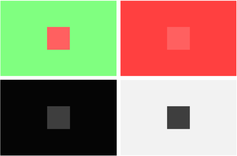
Color Contrast. Color contrast is the perceptual difference between one region and its adjacent region in color. In the HVS, this difference is influenced by the chromaticity and luminance of a test stimulus and its surrounding area when presented simultaneously [30, 31, 32]. This effect is called simultaneous color induction. For example, a red patch looks redder on a green background than on a red background (see Figure 2). Many studies verify the color induction and related phenomenon through various experiments [31, 26]. Some researchers systematically quantify the effects of simultaneous color induction along the dimension of hue [27, 29].
It is generally accepted that two contents with different colors displayed simultaneously induce a complementary color shift to each other (the complementarity law). In other words, changes in the color appearance of the induced stimulus are directed away from the appearance of inducing surrounds. Recently, some hypotheses, such as the direction law [33, 28, 34], challenge the traditional complementarity law, showing that the mechanism of simultaneous color induction is still not understood completely. Additionally, verifying these hypotheses is beyond the scope of this work. Nevertheless, these valuable advances provide a theoretical and experimental foundation for our approach, prompting us to stand on a novel perspective for color blending.
3 Problem Statement
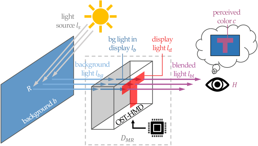
In this section, we describe the color-blending problem illustrated in Figure 3. We formulate our method, color contrast enhancement, as a constrained optimization of color blending. According to the definition of color blending on OST-HMDs by Gabbard et al. [35], the blending procedure can be formulated as follows:
| (1a) | |||
| (1b) | |||
| (1c) | |||
where represents the perceived color, and is the operation of the HVS for the blended light that reaches the user’s eyes. is an abstract of the entire OST-HMDs system, which contains multiple parameters, such as lens opacity and display brightness. denotes the display light and refers to the background light that enters the front of the OST-HMDs. Reflectance function depicts how the light source in the background interacts with the object surface and finally enters the OST-HMDs. Previous software-based color correction methods devote to accurately measuring and estimating and parameters of (e.g., lens opacity), allowing them to subtract the background light in displays () from the display light (). As a result, these methods remove the background color from the display pixels to mitigate the color blending effect. Unlike color correction approaches, we are not seeking to handle the distortions [6] or measure hardware parameters of OST-HMDs [7]. Instead, we focus on the HVS’s operation and the perceived color . Therefore, function can be approximated as :
| (2) |
On the basis of the opponent-colors theory proposed by Jameson and Hurvich [30], the perceived color of a test stimulus can be expressed as follows:
| , | (3) |
where is a function of the sums. , , and are responses of three paired and opponent neural systems of the test stimulus. , , and denote the responses of corresponding systems from the surrounding area induced by the simultaneous color induction. It is vice versa that this induction also affects the perceived color of the surrounding area.
The color difference defined in the CIEL∗a∗b∗ color space (abbreviated as the LAB color space) between color and color can be calculated as follows:
| (4) | ||||
where , , and are three orthonormal bases of the LAB color space used to describe the luminance and chromaticity of colors.
The key of our approach is to shift for increasing the color difference in (4). In addition, shifting leads to an increase in the corresponding responses , , and in (3), which further enhances the perceived color difference between and surrounding . In this manner, we improve the distinction between the virtual content and surrounding background. We’ve also tested enhancing and find that usually has a large luminance component but a relatively small chromaticity component. Applying our color contrast enhancement for such a color usually produces brighter colors than that produced from , but decreases the contrast within surfaces of virtual objects. Therefore, we choose to enhance instead of .
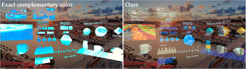
When the background light in displays and the display light exhibit the most significant color difference, that is, and are complementary colors, the HVS perceives a maximum color contrast. However, considering only the color contrast may lead to an unintended color altering of displayed objects. Figure 4 shows an example of such a case. It is clear that the virtual objects at the bottom left lack texture details and can hardly be recognized. This most straightforward optimization rule can almost only be used for textual content. Therefore, we introduce several constraints in the optimization of optimal displayed color to maintain the color consistency between the enhanced color and the original color as:
| (5) |
3.1 Constraints of the Optimization
Given the aforementioned issue, the color difference between and cannot be unlimited. One should keep the color consistency of the original color of virtual objects. On this basis, we introduce the first constraint, named the Color Difference Constraint, to restrict the range of :
| (6) |
where represents a non-negative color difference threshold. As such, the optimal displayed color and the original displayed color should be kept within a certain range in color.
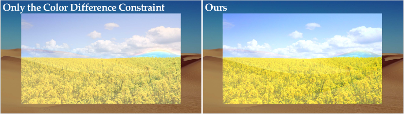
Further, if the hues of the background color and the display color are similar, the optimized would shift along the complementary direction of , resulting in a decrease in chroma of (see Figure 5 for a specific example). We introduce the second constraint to tackle the chroma reduction, named the Chroma Constraint:
| (7) |
where and represent the chroma of and , respectively. Note that although we have restricted the reduction in chroma, there is no boundary to the increment existing with this constraint.
However, in addition to the constraint added on chroma, the luminance can benefit from adding a corresponding constraint. For example, if is a bright, whitish color, such as a wall or clear sky, the complementary color of is close to a dark grey. In this case, the optimized color moves toward the direction of ’s complementary color, resulting in a decrease in luminance (see Figure 6 for an example). Reducing the luminance of displayed color on common OST-HMDs often leads to increased transparency. Therefore, displaying with no constraint on luminance reduces the visibility of virtual objects. Moreover, the experimental results of Fukiage et al. [9] showed that if the visibility of virtual objects in OST-HMDs is enhanced by unconstrainedly increasing the luminance of , then the perceptual contrast within surfaces of these objects decreases. These situations lead to the third constraint, which we call the Luminance Constraint:
| (8) |
where is the luminance difference, and denotes a non-negative luminance threshold. This constraint alleviates reduced visibility of the displayed content caused by the bright background, as well as the contrast reduction of virtual objects in a dim environment.
Finally, we introduce an evident constraint between and , named the Just Noticeable Difference Constraint:
| (9) |
where represents the just noticeable difference (JND). This constraint indicates that the optimal color and the background color require a minimum color difference that the HVS can distinguish. Note that this constraint is generally satisfied automatically on account of the objective of our optimization. However, for certain extreme cases where users exhibiting an above-average JND, applying this constraint is mandatory.
4 Algorithm
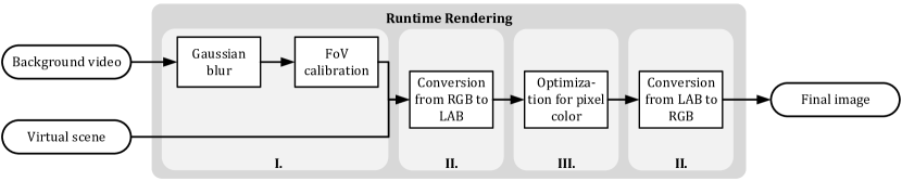
Given these four constraints of color contrast enhancement, the next step is to solve the optimization problem, as shown in (5). Accordingly, we design a real-time algorithm to enable color contrast enhancement in a variety of real environments. Figure 7 shows an overview of the proposed method, which mainly includes three procedures:
-
I.
Preprocessing: We perform a Gaussian blur and field of view (FoV, see Subsection 4.1) calibration for the streaming video of the background.
-
II.
Conversion: We convert the display and background colors from RGB to the LAB color space and vice verse.
-
III.
Optimization: Utilizing the aforementioned four constraints, we optimize the displayed colors on the basis of the background colors.
4.1 Preprocessing
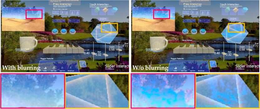
It is generally believed that multiple individual pattern analyzers contribute to the contrast sensitivity of humans [36]. These pattern analyzers are often called spatial-frequency channels, which filter the perceived image into spatially localized receptive fields with a limited range of spatial frequencies. That is, different analyzers are tuned to various types of information. For example, the low-spatial-frequency channels receive the color and outlines of objects, whereas the high-spatial-frequency channels perceive details. Considering the low-pass nature of color vision [37] and the blurring characteristic of the non-focal field in the HVS, our method does not need a pixel-precise camera-to-display calibration. Instead, we use a Gaussian blur to extract the spatial color information and filter out details of the background video as , where and are the horizontal and vertical distances from a pixel to its center pixel, respectively, and is the standard deviation of the normal distribution. Such a blurring simulates the non-focal effect of the HVS. In this manner, the displayed color obtains the weighted average of multiple background colors in the corresponding region. This filter also reduces the flicker in optimized colors caused by the high-spatial-frequency details in the background (see Figure 8 for examples).
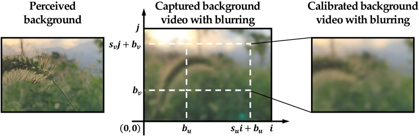
Given the low-frequency characteristics of the blurred background video and the difference of FoV between captured videos and OST-HMDs, we subsequently use a screen-space coordinate mapping called FoV calibration between the background video and the frame buffer of rendering system, in order to approximate pixel-precise calibration (such as homography). On this basis, we apply the following coordinate mapping to map the background video to the frame buffer:
| (10) |
where and represent the 2D texture coordinates of the frame buffer and the background video, respectively. denotes the scale factor in the horizontal and vertical directions of the background video coordinates, and is corresponding offsets. Figure 9 shows the illustration. We assume that the FoV of captured videos is greater than that of OST-HMDs. Using this calibration, the low-frequency information of background videos and that of real scenes seen through displays of OST-HMDs is as similar as possible.
4.2 Conversion
After preprocessing, the displayed color can be paired with an average background color of the corresponding area. These colors are all stored and represented in the RGB color space. However, the widely used RGB color space is not perceptually uniform that the same amount of numerical change does not correspond to the same amount of color difference in visual perception.
In order to achieve better optimization, we convert the background color and the displayed color from RGB to the LAB color space, to take full advantage of its perceptual uniformity and independence of luminance and chromaticity. After performing the color contrast enhancement, we transform LAB colors back to RGB to display appropriately on OST-HMDs.
Additionally, the gamut of the LAB color space is more extensive than displays and even the HVS, indicating that many of the coordinates in the LAB color space, especially those located in the edge area, cannot be reproduced on typical displays. For simplicity, we scale the range of the original LAB color space to and take the inscribed sphere as the solution space of our method.
4.3 Optimization
Given a blurred background color and an original displayed color in the scaled LAB color space, the objective of our optimization is to find the optimal displayed color .
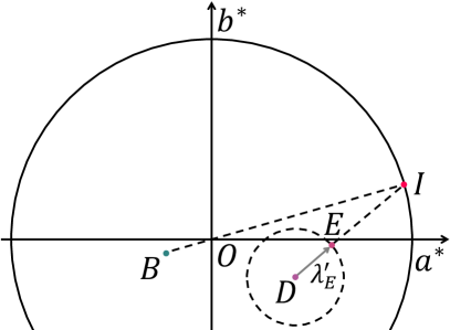
In this work, we denote points by capital italic letters. First, we calculate the coordinates of the ideally optimal displayed color corresponding to the blurred background color without considering any constraint:
| (11a) | ||||
| (11b) | ||||
where represents the coordinates of the blurred background color . denotes the distance between and the center of the unit sphere. This formula can also be rewritten to the latter form, where means to normalize the vector . That is, the farthest point from in the unit sphere is the intersection of the extension line of and the sphere (Figure 10a).
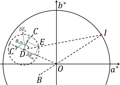
Given the ideally optimal displayed color , we then consider the aforementioned four constraints: Color Difference Constraint, Chroma Constraint, Luminance Constraint, and Just Noticeable Difference Constraint, into color optimization in (5). First, we calculate the coordinates of initially optimal display color by applying the Color Difference Constraint to :
| (12) |
where is the ideal change vector starting from the coordinates of original displayed color , and is the scaled color difference threshold specified by users. Now, we have the change vector of the displayed color constrained by the color difference. Figure 10a presents a two-dimensional illustration of this step.
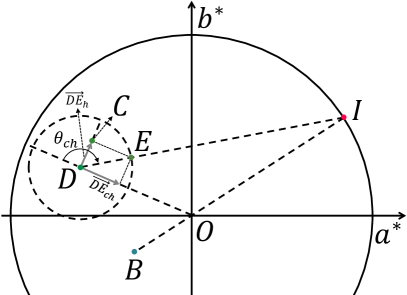
Let be the projection of vector v onto the plane of the LAB color space. Thus, the change in chroma of the vector can be obtained by calculating the projection of onto the vector (see Figure 10b for a two-dimensional example). For the Chroma Constraint, we discard the chroma reduction of as:
| (13a) | ||||
| (13b) | ||||
Here , which refers to the component of perpendicular to . represents the angle (–) from to vector . This angle describes the deviation in hue and chroma between the optimal displayed color and the original displayed color. In this manner, the adaptive parameter provides a smooth visual effect when hue and chroma change.
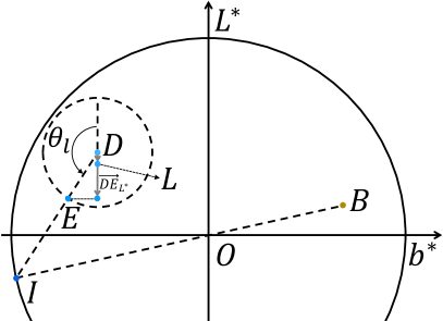
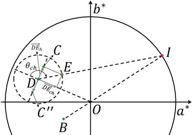
As for the Luminance Constraint, we also use an adaptive parameter to scale the alterations in luminance:
| (14) |
where refers to ’s component on the axis of the LAB color space. represents the angle (–) from the positive axis to the vector (see Figure 10c for a two-dimensional example). Correspondingly, this angle indicates the difference in luminance between the optimal displayed color and the original displayed color. Once again, this adaptive coefficient smoothes the results and makes it redundant to specify the luminance threshold by users.
According to the above steps, the coordinates of optimal displayed color can be obtained by:
| (15) |
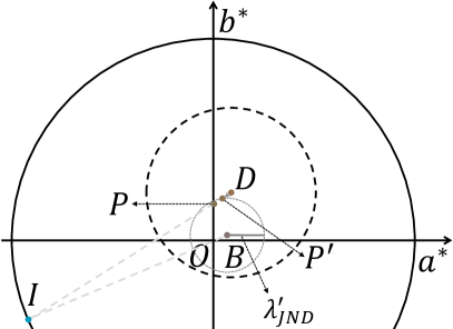
In contrast to the other three constraints, the Just Noticeable Difference Constraint is only applied to some extreme cases (Figure 10d), wherein we reduce the length of vector so that the distance from the coordinates of new optimal displayed color to the coordinates of the blurred background color is equal to a scaled JND in the unit sphere. Such extreme cases are found in users who have an above-average JND, leading to a larger radius (i.e., ) of circle in Figure 10d. Algorithm 1 gives the pseudocode of the entire optimization process above, where Vector3(0, ) generates a three-dimensional vector whose first component is , and the last two components are and .
5 Implementation
We implemented our algorithm as a full-screen post-processing effect using the Unity 2019666https://unity.com/ rendering engine and validated it on a software-simulated environment and a commercially available OST-HMD. The simulated environment is based on the Unity Editor with a resolution of , using a series of still images as the simulated backgrounds. We used the color difference in (4) for objective evaluation in the simulated environment. For the real environment, we used the first generation of Microsoft HoloLens MR headset [38] to evaluate the performance and quality of our algorithm. Both environments take the modified Hand Interaction Examples scene as the virtual content, which includes text, photographs, user interfaces, and 3D models with plain or intricate materials. We attenuated the luminance of background images in the simulated environment and streaming videos in the HoloLens by to simulate the real background perceived through the translucent lens in the HoloLens. It is a tweakable parameter for other types of OST-HMDs with different transparency. In both environments, the kernel size and of our Gaussian filter are and , respectively. These values are used for all participants in our user studies (Subsection 6.2 and 6.3). We captured streaming videos at frames per second (FPS) by a built-in RGB camera located in the center of the HoloLens in real-time. The screen brightness of the HoloLens was fixed at .
The data of our FoV calibration (Subsection 4.1) was determined by manual calibration. Specifically, , and .
6 Results
In our context, we take the scaled color difference () to regulate our color contrast enhancement, where means no effect of our algorithm. To demonstrate the effectiveness of our method, we performed a series of experiments in simulated and real environments, including objective evaluations, algorithm comparisons, performance analysis, and subjective user studies. All experiments on the HoloLens were conducted in indoor scenes. In real environments, we found that physical environmental conditions (such as scene illuminance) have no significant impact on our experimental results, on account of the auto exposure and the auto white balance of the built-in RGB camera of the HoloLens.
6.1 Evaluation
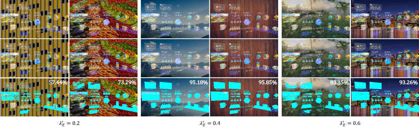
We used different types of images as the background of the simulated environment to evaluate our method in various practical scenarios. Figure 11 shows some of the results. Virtual objects and dimmed background are blended directly as (2) instead of mixed by alpha blending to simulate the optical properties of OST-HMDs. Pixels that meet the following condition are marked as cyan in the last row of Figure 11, meaning that these pixels have an increased color difference from the corresponding background in perception:
| (16) |
Here, is about in the LAB color space [39]. Note that not all virtual content can gain perceptual color contrast enhancement. Given the constraints mentioned above, the color difference between certain optimal colors and their original displayed colors is less than JND. Moreover, some display colors are initially the complementary colors of the background colors and do not require further enhancement. To better demonstrate the effectiveness of our approach, we validated it with varying with the same background, as shown in Figure 12. Generally, larger color difference leads to an increase of the enhanced pixels in quantities and makes the displayed color more complementary to the background color.
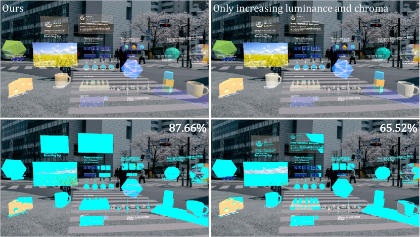
To evaluate the enhancement contributed by hues, we compared results (Figure 13) produced by our approach and just increasing luminance and chroma, with the same of . Figure 15a shows a two-dimensional illustration of this enhancement. The changes in color difference of each pixel between the two enhancements are identical. Pixels that have an increased perceptual color difference are marked as cyan like Figure 11. In most cases, approach considering hues produces more enhancement than increasing luminance and chroma only. Some virtual objects like the coffee cup in Figure 13 are indeed more visible by applying the latter approach, but texture details like shadows are distorted.
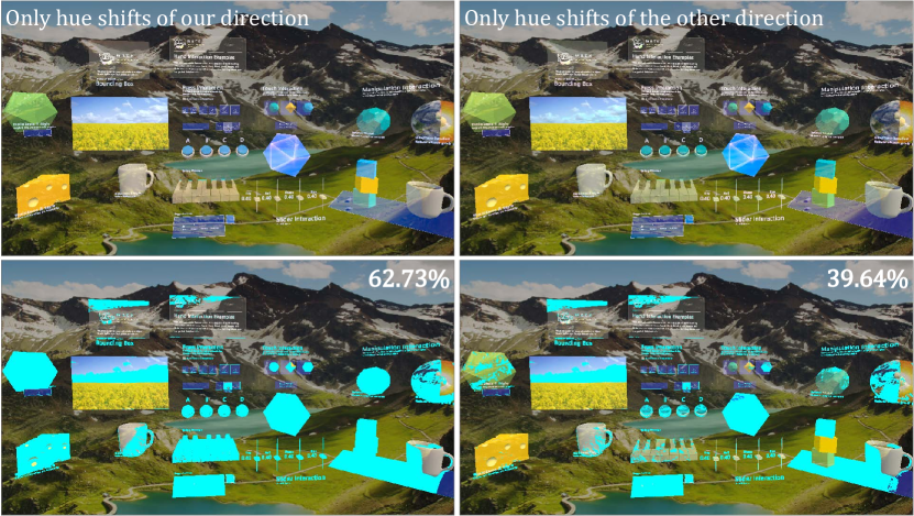
The effects of color contrast enhancement produced by two directions of the hue shift were also evaluated. Figure 14 shows a comparison result, where was both set to . Figure 15b presents an illustration of the two directions. The first direction is based on our method, and the other direction has the same control conditions. The optimized colors of the two enhancements are the same as the original colors in luminance. The changes in chroma and color difference between the two enhancements are also identical. In fact, there is only one other direction () that is iso-color-difference, iso-luminance, and iso-chroma compared to . Pixels have an increased perceptual color difference are marked as cyan. Normally, A considerable degree of color contrast can be enhanced by hue shifts only. Moreover, the enhancement along the hue shift direction we proposed is better than that along the other hue shift direction under the same conditions.
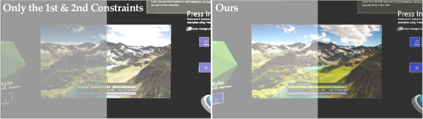
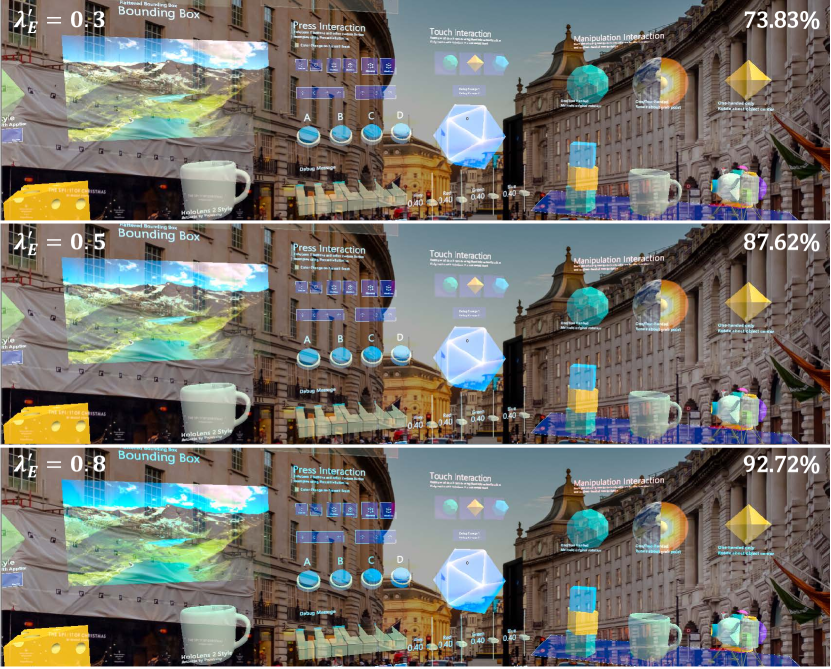
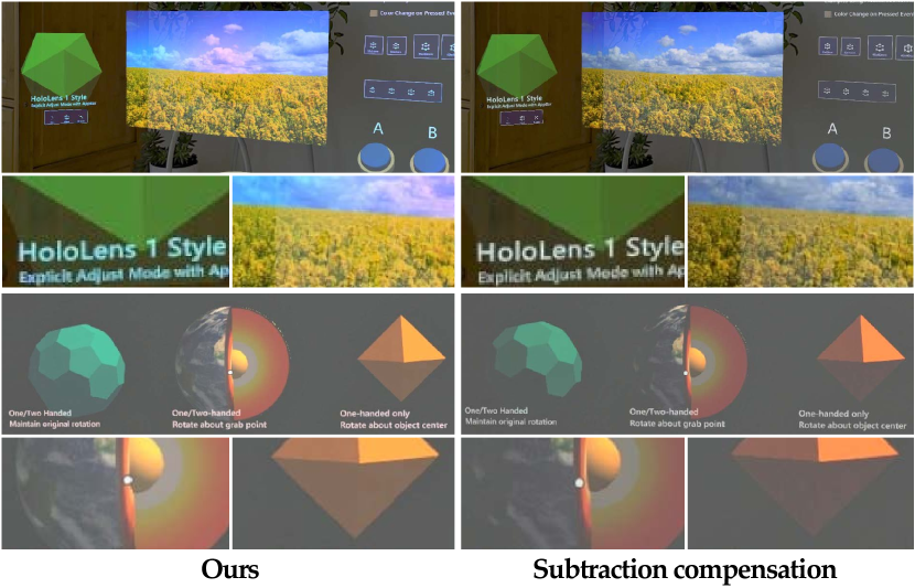
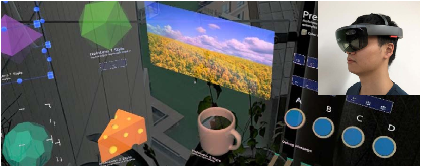
We also evaluated our algorithm on the HoloLens. Figure 1 shows one of the experimental results, where the scaled color difference threshold we used was . In front of a yellow background, our method shifts the displayed color to the complementary direction (blue) of the background color, to enhance the color difference for better visual distinctions. For example, the sky and the ground of the landscape photograph look bluish, as well as the text in the scene. However, subject to the aforementioned constraints (Subsection 3.1), the chroma of yellow cheese and mantle does not decrease. Overall, our method is able to keep the consistency from the original displayed color.
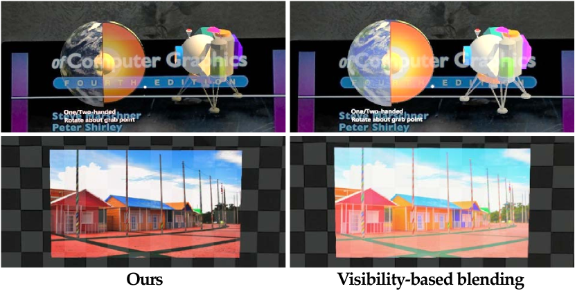
Although our goal is to improve the distinctions between virtual contents and surrounding backgrounds rather than correcting colors, we compared our color contrast enhancement with a typical compensation method [5]. Figure 16 presents the experimental results. Note that this result of our enhancement shows the maximum color contrast under a given . If one needs less contrast, but with more consistency with the original color, the threshold is tweakable. As noted previously, subtraction compensation reduces the luminance of rendered pixels, leading to low visual distinctions between virtual objects and the physical environment. Additionally, we compared our method with the visibility-based blending approach [9], as shown in Figure 17. This blending method increases the brightness at the expense of contrast within surfaces, resulting in a washed-out visual effect of the virtual content.
6.2 User Study I: Threshold Preference
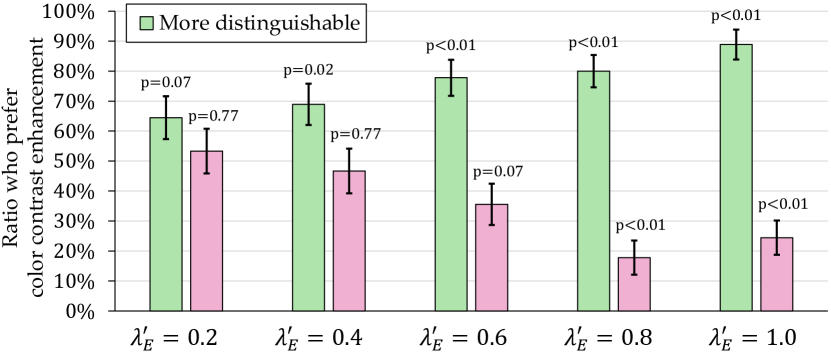
We conducted three user studies to evaluate our color contrast enhanced rendering subjectively. We first performed a two-alternative forced choice (2AFC) subjective experiment, wherein the participants were asked to compare the results of color-contrast-enhanced rendering based on our approach and original rendering. We provided five levels of , ranging from –, with a step of . During the experiment, participants wore the HoloLens and explored the modified Hand Interaction Examples scene freely in various environments (see Figure 18 for an example). In this scene, dozens of virtual objects were placed surrounding the user. Owing to the small FoV of the HoloLens, participants needed to rotate their head (change the camera viewport) to see different virtual objects with different backgrounds. Then, participants performed full comparisons by freely toggling between the two results shown in the HoloLens, and then were asked two questions. First, which one of the results is more distinguishable from surrounding backgrounds. Second, which result looks more natural. We asked each participant to look at three randomly picked objects, where each object is with one camera viewport. Thus, each participant compared results in three random camera viewports under five color differences and gave a total of choices for each question.
A total of 15 participants, 12 males and 3 females, with a mean age of years (range –), took part in the experiments. All participants had normal or corrected-to-normal vision without any form of color blindness. Participants gave informed consent to take part in this study. Before beginning the study, we required each participant to perform an eye-to-display calibration through a built-in calibration application of the HoloLens. Finally, we received choices of each question under each color difference (). The results show that our method is more distinguishable from surrounding backgrounds in of comparisons when (, Binom. test). In addition, when , the original rendering images are statistically more natural ( of , , Binom. test).
Figure 19 shows the preferences of the participants. For all color differences tested on the HoloLens, our method is preferred more often than original rendering in distinction. On the other hand, the naturalness of color-contrast-enhanced images significantly decreases as increases when . These results show that the value of is positively correlated with the distinction but negatively correlated with the naturalness, which means that there is a trade-off between contrast and consistency. However, when , the optimized virtual content is more distinguishable from the background ( of , , Binom. test), whereas the difference of naturalness between the optimized and the original virtual content is not statistically significant ( of , , Binom. test). We believe that our approach has successfully found a trade-off between contrast and consistency.
6.3 User Study II: Hue Evaluation
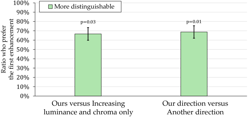
To subjectively evaluate the effect of hues, we performed another 2AFC experiment. Participants were asked to make two comparisons between results of 1) our color contrast enhancement and enhancing color contrast by increasing luminance and chroma only; 2) two different directions of hue shift (see Section 6.1). Participants wore the HoloLens and freely explored the same scene as User Study I in various environments. For each comparison, participants freely toggled between the two rendering results and then were asked one question that which of the results is more distinguishable from the surrounding background. Each participant compared the results of three random viewports and gave a choice for each viewport of each comparison. We fixed to .
Sixteen participants, including 4 females and 12 males with an average age of years old (range –), volunteered. All participants had normal or corrected-to-normal vision without any form of color blindness. Seven of them participated in the previous study. Participants gave informed consent to take part in this study. Before starting, we required each participant to perform the eye-to-display calibration.
For each comparison, a total of 48 choices was reported from participants. Figure 20 shows the preference of the participants. For both comparisons, the first enhancement was preferred more often than the second one. Specifically, our color contrast enhancement is more distinguishable than increasing luminance and chroma only ( of , , Binom. test). Also, the hue shift direction we proposed is more distinguishable than that along the other hue shift direction under the same conditions ( of , , Binom. test). These results indicate that hue shifts in an appropriate direction can further improve the visual distinctions between rendered images and the surrounding environment.
6.4 User Study III: Method Comparison
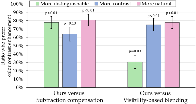
We conducted another 2AFC experiment in which the participants were asked to compare the results of our color contrast enhanced rendering with those of 1) subtraction compensation [5]; 2) visibility-enhanced blending [9]. Similar to the previous user studies, participants wore the HoloLens and freely perceived virtual objects taken from the same scene, and then fully compared the rendered images of the two methods by freely toggling between them. For each related method, participants were asked three questions. First, which of the results is more distinguishable from surrounding backgrounds. Second, which result has higher contrast. Third, which result looks more natural. Each participant compared rendered images of three random viewports and gave six choices for each question. We fixed the of our method to .
A total of 12 participants consisting of 5 females and 7 males volunteered, ages – (mean ). None of the participants exhibited signs of any form of color blindness. All participants had normal or corrected-to-normal vision. No participant took part in User Study I and II. Participants gave informed consent to participate in this study. We required each participant to perform the eye-to-display calibration before starting the study. To further ensure the accuracy of the camera-to-display calibration, we also required the participants to be at least cm away from surrounding environments.
Finally, we collected 36 choices for every question of each compared method. Figure 21 shows the preferences of the participants. For the first question, participants preferred our method more often than subtraction compensation ( of , , Binom. test). However, our algorithm is less preferred than visibility-enhanced blending ( of , , Binom. test). For the second question, our results are considered to have higher contrast compared with visibility-enhanced blending ( of , , Binom. test). For the third question, the rendering images generated by our algorithm are statistically more natural than the other two methods ( of , , Binom. test). These results mean that, in most cases, our approach is regarded as more distinguishable and natural than subtraction compensation, whereas the contrast and naturalness of rendered images are significantly higher than visibility-enhanced blending.
We’ve compared with the subtraction compensation approach [5]. We note that more sophisticated methods based on subtraction compensation (e.g., [7, 25]) also fail to keep the original visibility of virtual content on common OST-HMDs. In addition, results show that participants regarded the visibility-enhanced blending [9] as more distinguishable than our approach. This is because their method increases the luminance of virtual contents extensively. For applications that pay more attention to texture details, it may not be an optimal solution.
6.5 Performance
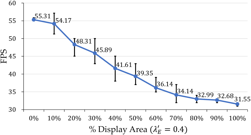
Our method does not rely on any precomputation. Therefore, it supports real-time rendering under various scenarios with dynamic camera viewports. Parameters such as color difference can be tuned in real-time. We measured the runtime performance on the HoloLens, which has a display area of pixels for each eye. We rendered displayed contents at different viewports in the Hand Interaction Examples scene, covering percentages of the display area that ranges from –, with a step of . Different surrounding backgrounds are also used in our measurement. For each percentage, we sampled ten times and calculated the average FPS. Generally, reported FPS from the HoloLens varies from –, depending on the number of rendered pixels, as shown in Figure 22.
7 Limitation
Our approach, though not free from limitations, constitutes a promising avenue to future work. Although the experimental results indicate that our color contrast enhanced rendering for OST-HMDs works well in a proper threshold of color difference, finding an adaptive threshold corresponding to the current physical environment remains an unexplored valuable topic.
There are several aspects in our implementation requiring elaboration. First, our method currently does not consider achromaticity. Although uncommon, it is reasonable to assume that the physical environment is completely achromatic (see bottom of Figure 16 and 17). One possibility to incorporate this achromaticity situation into our optimization would be to increase the chroma of displayed colors. Second, the luminance of some optimal colors may be higher than the original displayed colors, resulting in a potential increase regarding power consumption of displays. In battery-powered OST-HMDs, battery life is one of the critical factors. Appropriate solutions that take the display brightness into account are worth exploring in future work. Note that for those applications weighting more about the geometry over color and texture, the scope of current work does not fit well. We consider this as an orthogonal problem and save it for future work.
8 Conclusion
On the basis of a novel insight for color blending, we present an end-to-end, real-time color contrast enhancement algorithm for OST-HMDs that takes both chromaticity and luminance of displayed colors into account. Existing methods focus solely on changing the luminance of displays or environments to improve the distinction between virtual objects and real background, or compensating displayed colors to approximate the color originally intended. In this work, we further consider the impact of chromaticity to improve the color perception of rendered images from the perspective of color contrast. Specifically, we use the complementary color of the background as the search direction in the LAB color space to determine the optimal color of the display pixel under various constraints.
To summarize, we strive to inspire future studies on color contrast enhanced rendering. Our current implementation achieves several key technical characteristics. First, it adaptively enhances the visibility of virtual objects. Second, it is real-time. Third, there is no need for any hardware change. Our algorithm is implemented on the GPU using pixel shaders, allowing users to tweak the parameters, such as the color difference, in real-time. We present results in simulated and real environments. In addition, both the objective evaluation and user study confirm that our approach can improve the perceptual contrast between displayed content and physical background in OST-HMDs, making the virtual objects more distinguishable from surrounding backgrounds whereas achieving the maximum level of consistency with the original displayed color.
References
- [1] O. Cakmakci, Y. Ha, and J. P. Rolland, “A compact optical see-through head-worn display with occlusion support,” in Proceedings of the 3rd IEEE/ACM International Symposium on Mixed and Augmented Reality, ser. ISMAR ’04. Washington, DC, USA: IEEE Computer Society, 2004, pp. 16–25.
- [2] K. Kiyokawa, Y. Kurata, and H. Ohno, “An optical see-through display for mutual occlusion of real and virtual environments,” in Proceedings IEEE and ACM International Symposium on Augmented Reality (ISAR), Oct 2000, pp. 60–67.
- [3] C. Gao, Y. Lin, and H. Hua, “Occlusion capable optical see-through head-mounted display using freeform optics,” in 2012 IEEE International Symposium on Mixed and Augmented Reality (ISMAR), Nov 2012, pp. 281–282.
- [4] A. Wilson and H. Hua, “Design and prototype of an augmented reality display with per-pixel mutual occlusion capability,” Opt. Express, vol. 25, no. 24, pp. 30 539–30 549, 2017.
- [5] C. Weiland, A.-K. Braun, and W. Heiden, “Colorimetric and photometric compensation for optical see-through displays,” in Universal Access in Human-Computer Interaction. Intelligent and Ubiquitous Interaction Environments, C. Stephanidis, Ed. Berlin, Heidelberg: Springer Berlin Heidelberg, 2009, pp. 603–612.
- [6] J. D. Hincapié-Ramos, L. Ivanchuk, S. K. Sridharan, and P. P. Irani, “SmartColor: Real-time color and contrast correction for optical see-through head-mounted displays,” IEEE Transactions on Visualization and Computer Graphics, vol. 21, no. 12, pp. 1336–1348, 2015.
- [7] T. Langlotz, M. Cook, and H. Regenbrecht, “Real-time radiometric compensation for optical see-through head-mounted displays,” IEEE Transactions on Visualization and Computer Graphics, vol. 22, no. 11, pp. 2385–2394, 2016.
- [8] J. Kim, J. Ryu, S. Ryu, K. Lee, and J. Kim, “[POSTER] Optimizing background subtraction for OST-HMD,” in 2017 IEEE International Symposium on Mixed and Augmented Reality (ISMAR-Adjunct), Oct 2017, pp. 95–96.
- [9] T. Fukiage, T. Oishi, and K. Ikeuchi, “Visibility-based blending for real-time applications,” in 2014 IEEE International Symposium on Mixed and Augmented Reality (ISMAR), Sep 2014, pp. 63–72.
- [10] J. M. Wolfe, K. R. Kluender, D. M. Levi, L. M. Bartoshuk, R. S. Herz, R. L. Klatzky, S. J. Lederman, and D. M. Merfeld, Sensation and perception, 4th ed. Wolfe, Jeremy M.: jwolfe@partners.org: Sinauer Associates, 2015.
- [11] L. Gruber, D. Kalkofen, and D. Schmalstieg, “Color harmonization for augmented reality,” in 2010 IEEE International Symposium on Mixed and Augmented Reality, Oct 2010, pp. 227–228.
- [12] Y. Itoh and G. Klinker, “Vision enhancement: Defocus correction via optical see-through head-mounted displays,” in Proceedings of the 6th Augmented Human International Conference, ser. AH ’15. New York, NY, USA: ACM, 2015, pp. 1–8.
- [13] K. Oshima, K. R. Moser, D. C. Rompapas, J. E. Swan, S. Ikeda, G. Yamamoto, T. Taketomi, C. Sandor, and H. Kato, “SharpView: Improved clarity of defocussed content on optical see-through head-mounted displays,” in 2016 IEEE Virtual Reality (VR), Mar 2016, pp. 253–254.
- [14] C. Menk and R. Koch, “Truthful color reproduction in spatial augmented reality applications,” IEEE Transactions on Visualization and Computer Graphics, vol. 19, no. 2, pp. 236–248, 2013.
- [15] Y. Itoh, M. Dzitsiuk, T. Amano, and G. Klinker, “Semi-parametric color reproduction method for optical see-through head-mounted displays,” IEEE Transactions on Visualization and Computer Graphics, vol. 21, no. 11, pp. 1269–1278, 2015.
- [16] T. Oskam, A. Hornung, R. W. Sumner, and M. Gross, “Fast and stable color balancing for images and augmented reality,” in 2012 Second International Conference on 3D Imaging, Modeling, Processing, Visualization Transmission, Oct 2012, pp. 49–56.
- [17] G. Wetzstein, W. Heidrich, and D. Luebke, “Optical image processing using light modulation displays,” Computer Graphics Forum, vol. 29, no. 6, pp. 1934–1944, 2010.
- [18] S. Mori, S. Ikeda, A. Plopski, and C. Sandor, “BrightView: Increasing perceived brightness of optical see-through head-mounted displays through unnoticeable incident light reduction,” 25th IEEE Conference on Virtual Reality and 3D User Interfaces, VR 2018 - Proceedings, pp. 251–258, 2018.
- [19] Y. Itoh, T. Langlotz, D. Iwai, K. Kiyokawa, and T. Amano, “Light attenuation display: Subtractive see-through near-eye display via spatial color filtering,” IEEE Transactions on Visualization and Computer Graphics, vol. 25, no. 5, pp. 1951–1960, 2019.
- [20] K.-H. Lee and J.-O. Kim, “Visibility enhancement via optimal two-piece gamma tone mapping for optical see-through displays under ambient light,” Optical Engineering, vol. 57, no. 12, pp. 1 – 13, 2018.
- [21] K. Rathinavel, G. Wetzstein, and H. Fuchs, “Varifocal occlusion-capable optical see-through augmented reality display based on focus-tunable optics,” IEEE Transactions on Visualization and Computer Graphics, vol. 25, no. 11, pp. 3125–3134, 2019.
- [22] A. Maimone and H. Fuchs, “Computational augmented reality eyeglasses,” in 2013 IEEE International Symposium on Mixed and Augmented Reality (ISMAR), Oct 2013, pp. 29–38.
- [23] Q. Y. J. Smithwick, D. Reetz, and L. Smoot, “LCD masks for spatial augmented reality,” in Stereoscopic Displays and Applications XXV, A. J. Woods, N. S. Holliman, and G. E. Favalora, Eds., vol. 9011, no. March 2014, Mar 2014, p. 90110O.
- [24] T. Rhodes, G. Miller, Q. Sun, D. Ito, and L.-Y. Wei, “A transparent display with per-pixel color and opacity control,” in ACM SIGGRAPH 2019 Emerging Technologies, ser. SIGGRAPH ’19. New York, NY, USA: ACM, 2019, pp. 5:1–5:2.
- [25] J. Ryu, J. Kim, K. Lee, and J. Kim, “Colorimetric background estimation for color blending reduction of OST-HMD,” in 2016 Asia-Pacific Signal and Information Processing Association Annual Summit and Conference (APSIPA), Dec 2016, pp. 1–4.
- [26] R. O. Brown and D. I. MacLeod, “Color appearance depends on the variance of surround colors,” Current Biology, vol. 7, no. 11, pp. 844–849, Nov 1997.
- [27] M. A. Webster, G. Malkoc, A. C. Bilson, and S. M. Webster, “Color contrast and contextual influences on color appearance,” Journal of Vision, vol. 2, no. 6, pp. 7–7, 11 2002.
- [28] V. Ekroll and F. Faul, “Transparency perception: the key to understanding simultaneous color contrast,” J. Opt. Soc. Am. A, vol. 30, no. 3, pp. 342–352, Mar 2013.
- [29] S. Klauke and T. Wachtler, ““Tilt” in color space: Hue changes induced by chromatic surrounds,” Journal of Vision, vol. 15, no. 13, pp. 17–17, 09 2015.
- [30] D. Jameson and L. M. Hurvich, “Perceived color and its dependence on focal, surrounding, and preceding stimulus variables,” J. Opt. Soc. Am., vol. 49, no. 9, pp. 890–898, Sep 1959.
- [31] J. Krauskopf, Q. Zaidi, and M. B. Mandlert, “Mechanisms of simultaneous color induction,” J. Opt. Soc. Am. A, vol. 3, no. 10, pp. 1752–1757, Oct 1986.
- [32] D. Jameson and L. M. Hurvich, “Opponent chromatic induction: Experimental evaluation and theoretical account,” J. Opt. Soc. Am., vol. 51, no. 1, pp. 46–53, Jan 1961.
- [33] V. Ekroll and F. Faul, “New laws of simultaneous contrast?” Seeing and Perceiving, vol. 25, no. 2, pp. 107 – 141, 01 Jan. 2012.
- [34] S. Ratnasingam and B. L. Anderson, “What predicts the strength of simultaneous color contrast?” Journal of Vision, vol. 17, no. 2, pp. 13–13, 02 2017.
- [35] J. L. Gabbard, J. E. Swan, J. Zedlitz, and W. W. Winchester, “More than meets the eye: An engineering study to empirically examine the blending of real and virtual color spaces,” in 2010 IEEE Virtual Reality Conference (VR), Mar 2010, pp. 79–86.
- [36] F. W. Campbell and J. G. Robson, “Application of fourier analysis to the visibility of gratings,” The Journal of Physiology, vol. 197, no. 3, pp. 551–566, Aug 1968.
- [37] S. J. Anderson, K. T. Mullen, and R. F. Hess, “Human peripheral spatial resolution for achromatic and chromatic stimuli: limits imposed by optical and retinal factors.” The Journal of Physiology, vol. 442, no. 1, pp. 47–64, 1991.
- [38] B. C. Kress and W. J. Cummings, “11-1: Invited Paper: Towards the ultimate mixed reality experience: HoloLens display architecture choices,” SID Symposium Digest of Technical Papers, vol. 48, no. 1, pp. 127–131, 2017.
- [39] M. Mahy, L. Van Eycken, and A. Oosterlinck, “Evaluation of uniform color spaces developed after the adoption of CIELAB and CIELUV,” Color Research & Application, vol. 19, no. 2, pp. 105–121, 1994.