0 \vgtccategoryResearch \vgtcinsertpkg
Visualizing a Large Spatiotemporal Collection of Historic Photography with a Generous Interface
Abstract
Museums, libraries, and other cultural institutions continue to prioritize and build web-based visualization systems that increase access and discovery to digitized archives. Prominent examples exist that illustrate impressive visualizations of a particular feature of a collection. For example, interactive maps showing geographic spread or timelines capturing the temporal aspects of collections. By way of a case study, this paper presents a new web-based visualization system that allows users to simultaneously explore a large collection of images along several different dimensions—spatial, temporal, visual, textual, and through additional metadata fields including the photographer name—guided by the concept of generous interfaces. The case study is a complete redesign of a previously released digital, public humanities project called Photogrammar (2014). The paper highlights the redesign’s interactive visualizations that are now possible by the affordances of newly available software. All of the code is open-source in order to allow for re-use of the codebase to other collections with a similar structure.
Human-centered computingVisualizationInformation visualization; \CCScatTwelveHuman-centered computingVisualizationGeographic visualization
Introduction
Over the past few decades, cultural institutions have made extensive commitments to digitizing and making their collections available over the web. While some collections are only able to provide limited access to metadata or through an institutional login screen for legal reasons, many archives have been able to open up digitized materials to the public at large. Prominent examples of institutions that have made large collections digitally available include the Rijksmuseum, the British Library, the Library of Congress, the Metropolitan Museum of Art, and the Smithsonian [15, 2]. Making materials digitally available is an exciting step in improving access and discovery. However, additional contextual framing and digital tools are often needed to guide users through the material in order to engage with a broad public audience.
In response to the increase in access to digital collections, experts across various fields including digital humanities and data science have begun to think of collections as data [26]. Many tools focus on a specific mode of analysis in order to explore collections from a specific point of view. For example, the Knight Lab’s Timeline.js provides a library for building custom visualizations of data distributed over time. Tools created by companies such as ArcGIS and Carto provide similar options for spatial data. Textual data can be visualized through the use of keywords (e.g., Voyant) or topic models (e.g., jsLDA). General metadata fields can be visualized with libraries such as d3 and cube.js. While not specifically designed for web-base usage, Gephi provides a range of options for showing and exploring network relationships. The WebGL-based library PixPlot [16] provides an impressive framework for exploring large photographic collections using state-of-the-art neural network models. In most of these cases, data must be loaded into a series of tools to visualize the data from different angles and for different purposes.
Significantly less attention has been paid to approaches for visualizing many unstructured components of a collection at the same time. Digital storytelling applications, such as the knight lab’s StoryMap.js, have shown the power of putting together images, text, and other metadata within a specific narrative structure. However, web-based tools for the open exploration of such collections are limited. Exploring the many dimensions of multimodal collections generally requires the use of programming software, which has a significantly higher barrier to entry that limits its audience. This hampers the ability of cultural institutions to allow digital visitors of their collections to understand the subtle interplay of an archive’s components.
In this paper, we present a web-based visualization system designed with the concept of generous interfaces for a collection of over 170,000 historic photographs through a case study. Photogrammar, a digital public humanities project and our case study, builds off of our previous work with the collection to allow users to explore spatial, temporal, textual, visual, and structured components of the collection within a single interactive generous interface. This significantly increases the kinds of analysis available to users directly within the site while visually communicating the interconnectedness of data and metadata.
The remainder of the article is organized as follows. We start with a brief history of the archive we are working with and describing our original digital website (published in 2014) along with its strengths and challenges. We then present the integrated design of the new site and illustrate the new analyses afforded by the redesign. Particular attention is given to the use of newly available image analysis algorithms and how they have changed the possibilities for visualizing and therefore accessing and interpreting material. A concluding section discusses open challenges and our proposed path for developing a general-purpose visualization library from our specific case study.

1 Background: FSA-OWI and Photogrammar
The FSA-OWI photographic archive is the result of a commission by the United States Farm Security Administration and Office of War Information (FSA-OWI) to document American life during the Great Depression and World War II [8]. Physically housed in the Library of Congress (LoC), the archive serves as an important visual record for scholars across the academy and the public-at-large. The collection includes many iconic photographs, include Dorothea Lange’s Migrant Mother, Gordon Parks’ American Gothic, and Arthur Rothstein’s photos of the American Dust Bowl. The collection’s 170,000 monochrome and color photographs resides entirely within the public domain and offers a unique snapshot of the nation in the 1930s and 1940s [37].
From 2012 to 2016, Arnold and Tilton, in collaboration with Laura Wexler, constructed an interactive website called Photogrammar as a new approach to accessing and visualizing the FSA-OWI photographic collection. The full team came to include Trip Kirkpatrick, Peter Leonard, Stacey Maples, and Ken Panko. The project began as a response to the challenges of navigating the digital and physical archive at the LoC. Users either had to search through the LoC’s filing cabinets of over 88,000 prints or LoC’s online site, which allows for limited exploration. Through collaboration with the collection’s curator to harness the collection’s rich metadata, the project developed creative and innovative new approaches to the collection using digital and public humanities methods. By cleaning and transforming the metadata, standardized the fields and geotagged the collection, the site allows users to map photographs, run faceted searches, and see historic cataloging systems used to organize the physical collection[5].
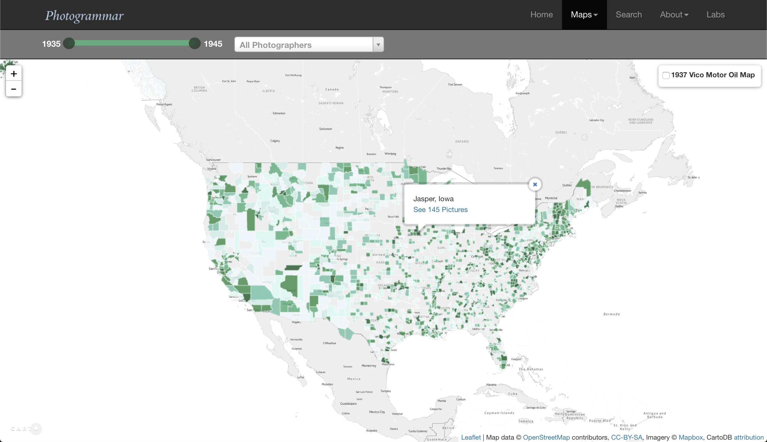
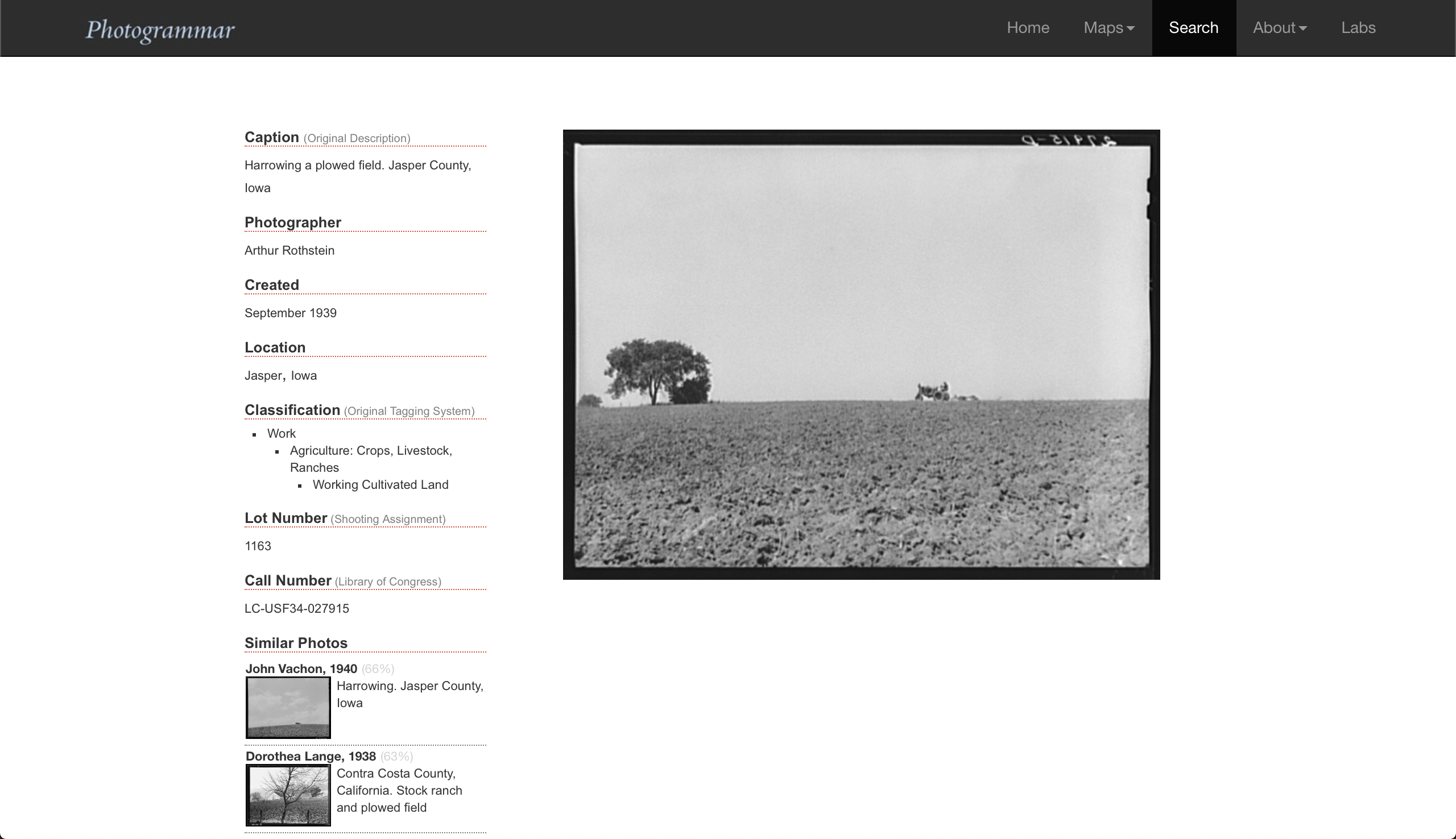
The original incarnation of the Photogrammar project can be seen in Figures 1 through 3. The core of the site was implemented as a MySQL database containing records for every photograph in the collection. One page implemented an advanced faceted search, Figure 2, which would produce a sorted list of results on a new webpage. Clicking on a result opened a new dynamically produced record page, Figure 3, displaying a large version of the image and associated metadata. This interface offered a similar search experience to the existing site at the Library of Congress, while providing more control over the search parameters and improved cleaning of the available metadata [4]. Most users, however, entered the collection through one of the available interactive visualizations on the site. These include an interactive map, Figure 1, a crosstab metadata explorer, and a hierarchical description of an historic classification system used by the Library of Congress. These visualization provided different aggregate views of the 170,000 photographs. They are coded using individual JavaScript libraries; access to the individual photographs was provided by pre-filled links to the advanced search interface.
The original version of the Photogrammar website provided many different ways of viewing the collection, opening up the FSA-OWI collection to interactive exploration to a wide public audience. In our redesign, described in the remainder of this article, our goal was to build on new technology stacks to address several design issues in the original site, with a particular focus on integrating the various search and exploration pages into a single integrated web-based visualization of the archive.
2 Generous Interfaces and the Digital Public Humanities
The concept of a ‘generous interface’ was introduced by Mitchell Whitelaw in 2015 [40]. Focused on the collections held by cultural heritage institutions, he called for a conceptual shift from the singular, narrow interaction of the keyword search (usually in the form of a blank box such as Google Search) to interfaces that communicate the scale, scope, and richness of a collection. Visualizations are a key component and a strategy. Centering exploration, interactivity, and scalability, generous interfaces are an ethos, praxis, and outcome.
Generous interfaces can also be understood as a strategy for the digital, public humanities (DPH). The rapidly expanding set of projects online that identify as DPH—projects that seek to engage, and often co-create, with a set of publics beyond the academy and commonly are built to expand access and interpretation using methods from the digital humanities—has brought questions about how to engage with audiences and users to the fore. As Sheila Brennan argues, “It is important to recognize that projects and research may be available online, but that status does not inherently make the work digital public humanities or public digital humanities” [9]. As Jordana Cox and Lauren Tilton have argued, DPH can “forefront visual, nonlinear, and interactive argumentation in oder to engage publics in generative humanistic inquiry” [14]. One way is projects designed with generous interfaces that further generative and generous humanistic inquiry.
Through a more detailed explanation of the redesign of Photogrammar, we demonstrate how generous interfaces and DPH are theoretical frameworks and methods for accessing and interpreting cultural heritage data through interactive visualizations. The new version of Photogrammar forges an integrated approach to generous interfaces. Rather than treat each interactive visualization as a discrete task, we demonstrate how we can connect different types of visualizations with concepts from information retrieval such as search, browse, and recommender systems. What is considered data and metadata shifts based on the community and their interests; therefore, we show how toggling between and integrating ‘data’ and ‘metadata’ offers a strategy for creating generous interfaces built around integrated visualizations that further access and interpretation of collections.
3 A More Generous Redesign
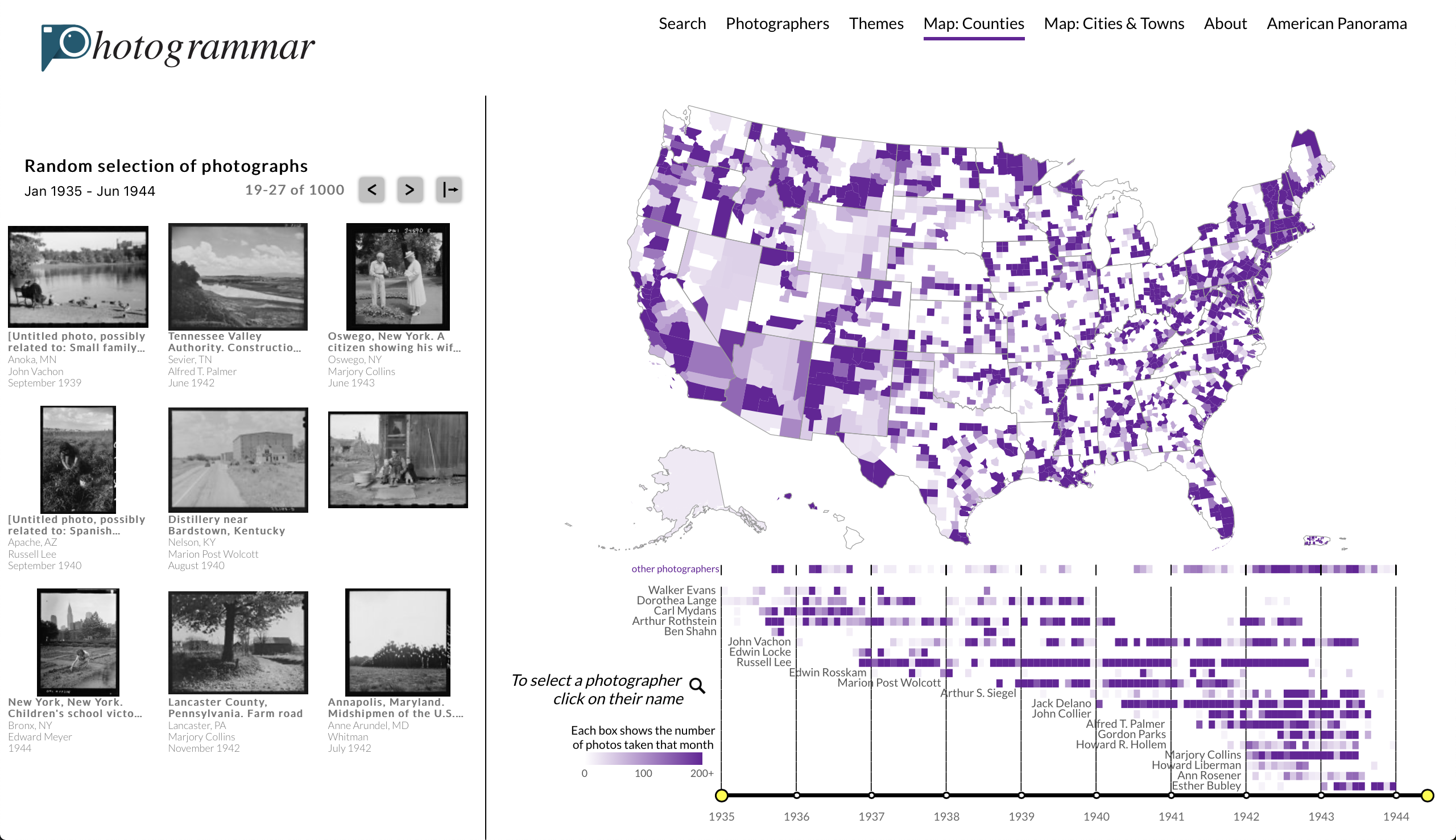
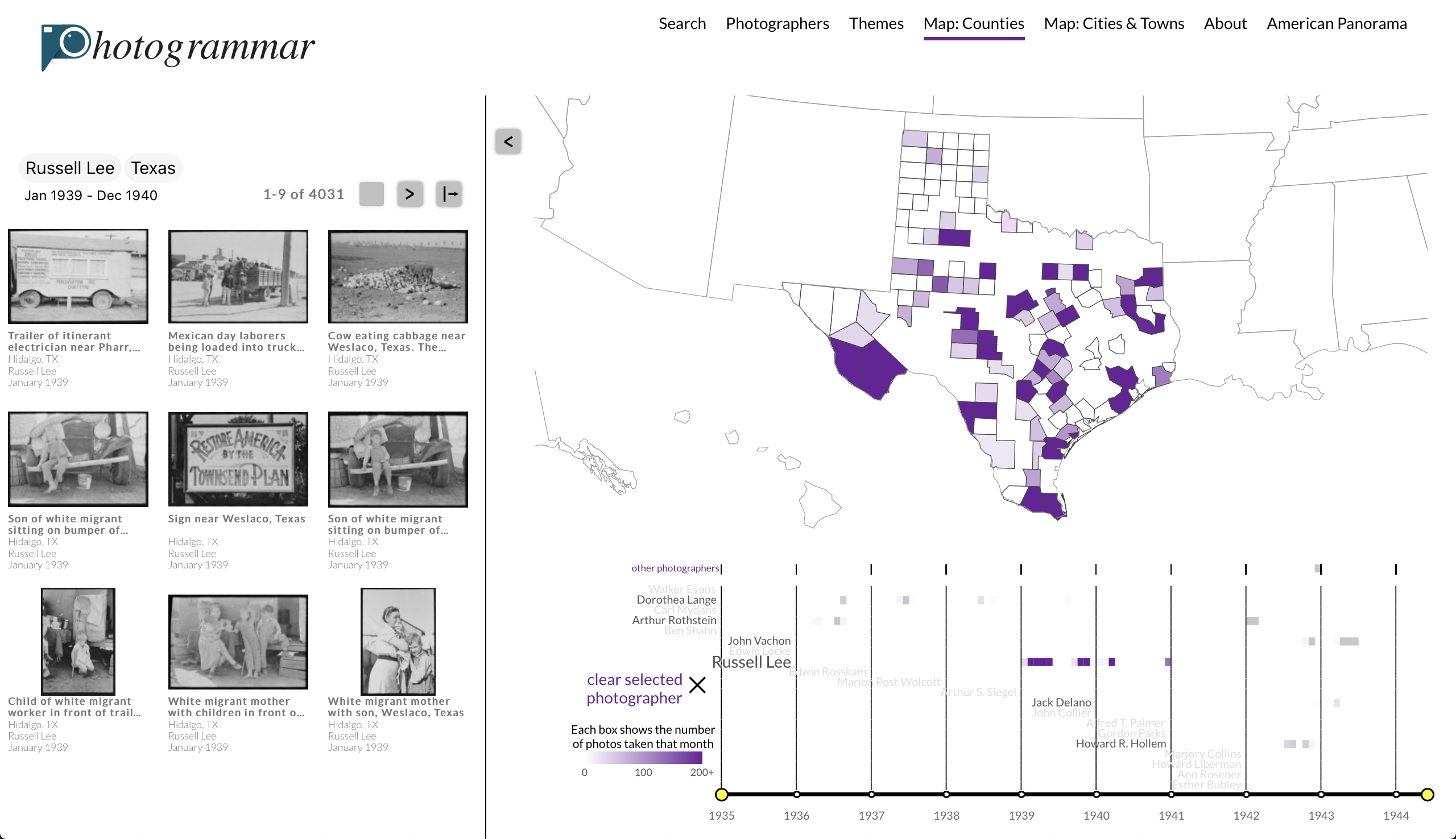
The new version of Photogrammar provides a complete redesign of the web-based visualization system, which offers a more integrated user experience through a generous interface built on a modern technology stack. Figure 4 shows the new landing page for the site, featuring a selection of photographic thumbnails (left), an interactive map (top right), and interactive timeline split by photographer (bottom right). The entire page is now implemented as a React.js app, allowing all of the elements of the page to be linked together. Clicking on the state of Texas on the map, for example, zooms to the state of Texas. At the same time, the photographs on the left and timeline at the bottom are updated simultaneously. Further clicking on a photographer at the bottom updates the map and photos further. The result of clicking on the state of Texas and photographer Russell Lee is given in Figure 5. Linking these elements together helps to center the photographs themselves, the main attraction for most users, by putting them on the landing page and updating them dynamically rather than through a secondary page. It also allows for transdisclinary analyses at the intersection of space, time, photographer, and themes that were not available through the original site.
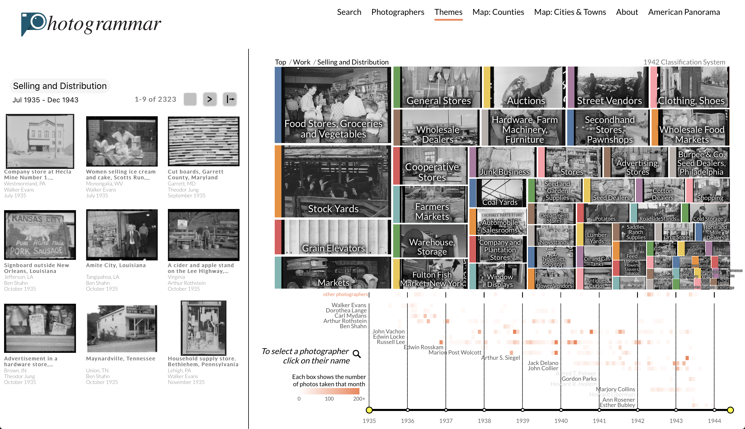
A major limiting factor in offering many coupled visualizations is the available screen area available for multiple visualizations. Significant effort has been put into compressing the amount of space needed for the default visualizations. For example, the dynamic slippy maptile approach of the original site has been replaced with a fixed zoom level map served by a GeoJSON file [18]. To compress space and improve the visibility of the entire collection, Hawaii, Alaska, Puerto Rico, and the U.S. Virgin Islands have been repositioned into the main map. For the timeline of photographers, only the most prolific photographers are included in the default visualization. Additional photographers may still be selected, however, by clicking the ‘other photographers’ button.
Even with these space saving efforts, it is not possible to include all of the visualizations in a single window that is still visible on most standard computer monitors. In order to access other visualizations, the default interactive map can be replaced with a different visualization by selecting one of the options at the top of the page. These include a more granular points-based map and a theme visualization (Figure 6). As with the original map, all of these visualizations are coupled with the timeline and search results on the side bar.
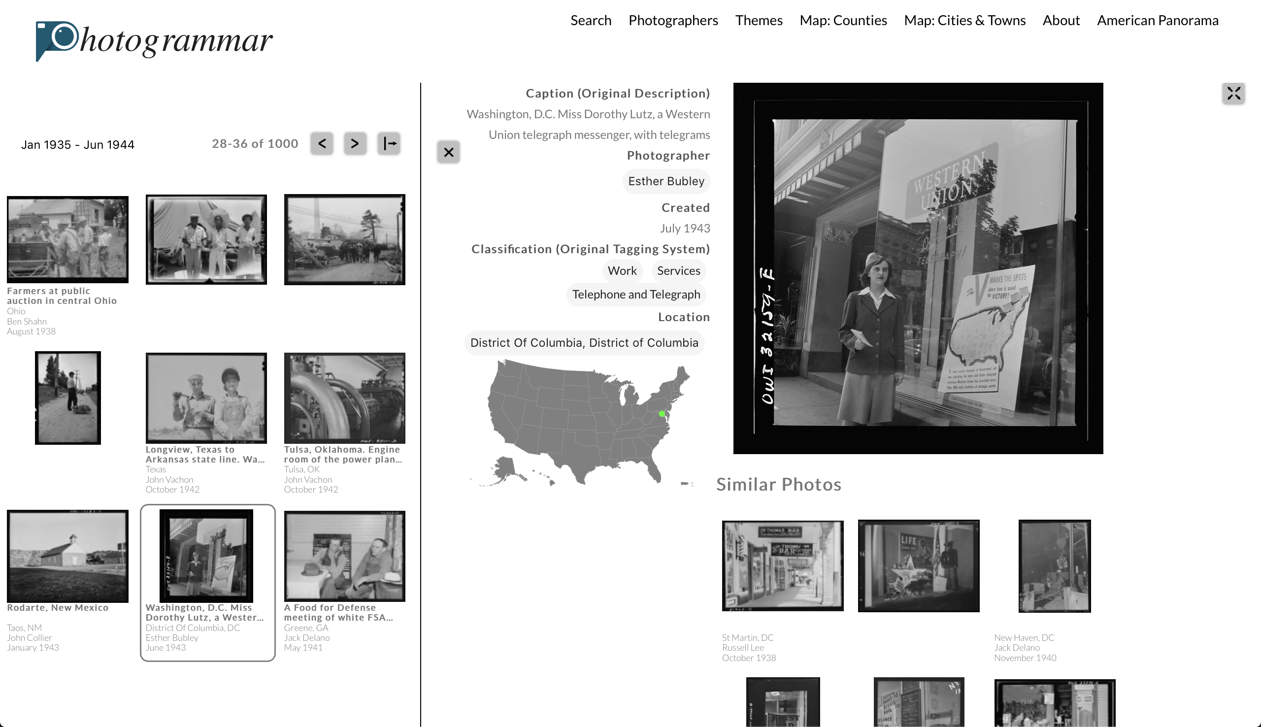
The search results interactively within the page as the maps, timelines, and themes are selected provide a way of making visible the images themselves from the beginning. The search results on the side bar contain some minimal metadata, and a small thumbnail of the image. Pages of the results can be scrolled through to see all of the relevant images. It is still needed, however, to use more screen space to see a larger version of the image and all of the associated metadata. In order to not lose the search results, and to visually emphasis that all of the elements (i.e. metadata and photos) are connected, this graphic is overlaid over the map and timeline on the right-hand side of the page. An example is shown in Figure 7. In order to continue to stress the connection to the spatial visualization, a small in-lay map of the United States is shown within the photograph page. By aggregating and connecting different type of visualizations, the system creates a generous interface that amplifies digital public humanities inquiry into a collection.
4 Recommendation Systems
The interactive maps, timeline, and theme treeplot are all designed to allow users of the website to explicitly select subsets of the FSA-OWI collection that they are interested in viewing. Typical behavior involves selection a region of the map that a user is most familiar with—such as their current location or a hometown—or selecting one of the better known photographers. Opening familiar lines of search for users has many benefits: it creates a personal connection between the (meta)data and the user, it allows users to bring their own knowledge into their interpretation of the collection, and it increases the level of user engagement. The downside of this way into the archive, however, is that it risks getting users stuck in a small subset of the larger collection. In order to overcome this limitation, Photogrammar also incorporates a set of recommendations that cut across the fixed metadata fields that drives the initial discovery step of exploring each collection.
A recommendation system is an algorithm for predicting what records in a collection a user may be interested in [27]. These systems feature prominently in commercial services. For example, product pages on Amazon features other ‘similar products’, Netflix recommends new releases of interest, and Spotify creates artifically constructed playlists based on prior listening behavior. In the context of a digital archive, recommendation systems are most commonly used to recommend records that are most similar to the particular record that a user is currently looking at. It is possible to determine the most similar records based on the search behavior of other users. This method for building a recommendation system, a process called collaborative filtering, requires a large amount of data, creates privacy concerns, and necessitates constantly updating models based on changing behaviors [12]. An alternative method, content filtering, bases recommendations entirely on the content of the records themselves [36]. We utilize content filtering in our generous interface of the FSA-OWI archive.
The initial version of the Photogrammar website utilized a recommendation system that recommended similar records on the individual photograph pages. The interface is shown at the bottom of Figure 3. These similarities are based on using the text in the captions of the photographs. Specifically, we compute term frequency-inverse document frequency (TF-IDF) scores and identify captions that are the most similar to the caption of interest. Pervious work has discussed the various iterations that this system has gone through. For example, a process of named entity recognition (NER) was used to remove geographic names from the captions [4]. A word-embedding model was used to to find similar captions that use slightly different words, such as ‘apple orchard’ and ‘pear trees’ [6]. This caption-based system helps find connections that would otherwise be hidden through other interfaces. However, it does have some limitations. Less than half of the images have captions, and many of these are too short to be useful for recommendation purposes. Furthermore, the captions only describe one main object of study and rarely mention elements of style and composition. In order to capture these elements, a different approach is needed.
The new Photogrammar website implements a content filtering recommendation system based on visual similarity. Every image in the collection was projected into the penultimate layer of a large convolutional neural network in order to obtain an embedding of the entire collection into a high-dimensional space [33]. Each record is then associated with other photographs that have the most similar set of embedding values [7]. This method tends to create connections between images that contain similar objects, events, or share similar forms of composition [16]. While the neural network used is trained entirely on color images, the implicit connections created by the embedding produce surprisingly consistent and meaningful results on the predominantly black-and-white images in the FSA-OWI collection [29]. The new recommendation system is shown in the bottom of Figure 7. The visual search method overcomes many of the difficulties of the entirely text-based method, such as being able to produce recommendations for all images in the corpus and finding links between elements of the images not explicitly mentioned in each caption. The new recommender system also responds to consistent feedback from users who asked about visual search.
Computing embedding-based visual similarities for each image is a computationally intensive task. Rather than running this each time a user requests a particular image, the graph of similar images has instead been precomputed and stored as static files on the website. In addition to the benefit of reducing the computational load of the site, this approach also provides a simple path forward for further iterations of the recommendation system, such as integrating joint text-image embeddings [3, 31]. A new recommendation system can be pushed into the site by simply updating the static files describing the most similar photographs.
5 Conclusions and Future Work
The new, completely redesigned version of the Photogrammar web-based visualization and search interface offers numerous improvements over the already successful original version of the site. In line with the goals of the digital public humanities and generous design, the new site allows for a more integrated user-experience with a number of tightly connected elements that all interactively update with one another. Additional modifications built into the new maps, timeline, and recommendation system further improve the ability of users to explore and connect with the photographs from the FSA-OWI archive. As a result, the visualizations come together, harnessing the relationships between and across the metadata, to realize a generous interface for the photographs. At the same time, the visualizations allows the user to toggle between and across different objects of study. Metadata fields, as classified by the Library of Congress and through the structure of the database serving Photogrammar, can become the object of study, such as interest in the work of a specific photographer such as Marion Post Wolcott or a state such as as Texas, and therefore the ‘data’. Generous interfaces, therefore, provide a theoretical and methodological frame for designing systems that disrupt classifications of data and metadata in the way that humanistic inquiry often demands.
In our redesign of the site, a key concern was building maintainable and reusable components. Future work on the project will focus on decoupling the elements specific to this collection (such as the theme visualizer) and turning the codebase into a documented framework that can be used by other archival projects in the digital public humanities that feature rich, multimodal data.
References
- [1] H. Abdollahpouri, R. Burke, and B. Mobasher. Managing popularity bias in recommender systems with personalized re-ranking. In The Thirty-Second International Flairs Conference, 2019.
- [2] V. Alexiev. Museum linked open data: Ontologies, datasets, projects. Digital Presentation and Preservation of Cultural and Scientific Heritage, (VIII):19–50, 2018.
- [3] M. Alikhani, S. Nag Chowdhury, G. de Melo, and M. Stone. CITE: A corpus of image-text discourse relations. In Proceedings of the 2019 Conference of the North American Chapter of the Association for Computational Linguistics: Human Language Technologies, Volume 1 (Long and Short Papers), pp. 570–575. Association for Computational Linguistics, Minneapolis, Minnesota, June 2019. doi: 10 . 18653/v1/N19-1056
- [4] T. Arnold, P. Leonard, and L. Tilton. Knowledge creation through recommender systems. Digital Scholarship in the Humanities, 32(3):151–157, 2017.
- [5] T. Arnold, S. Maples, L. Tilton, and L. Wexler. Uncovering latent metadata in the FSA-OWI photographic archive. DHQ: Digital Humanities Quarterly, 11(2), 2017.
- [6] T. Arnold and L. Tilton. Cross-discourse and multilingual exploration of textual corpora with the DualNeighbors algorithm. pp. 50–59, 2018.
- [7] T. Arnold and L. Tilton. Distant viewing: Analyzing large visual corpora. Digital Scholarship in the Humanities, 34(1):i3–i16, 2019.
- [8] S. Baldwin. Poverty and politics; the rise and decline of the farm security administration. 1968.
- [9] S. A. Brennan. Public, first. In M. Gold and L. Klein, eds., Debates in the Digital Humanities. University of Minnesota Press, 2016.
- [10] J. Buolamwini and T. Gebru. Gender shades: Intersectional accuracy disparities in commercial gender classification. In Conference on fairness, accountability and transparency, pp. 77–91, 2018.
- [11] H. Caesar, J. Uijlings, and V. Ferrari. COCO-stuff: Thing and stuff classes in context. In Proceedings of the IEEE Conference on Computer Vision and Pattern Recognition, pp. 1209–1218, 2018.
- [12] J. A. Calandrino, A. Kilzer, A. Narayanan, E. W. Felten, and V. Shmatikov. You might also like: Privacy risks of collaborative filtering. In 2011 IEEE symposium on security and privacy, pp. 231–246. IEEE, 2011.
- [13] C. Concordia, S. Gradmann, and S. Siebinga. Not (just) a repository, nor (just) a digital library, nor (just) a portal: A portrait of Europeana as an API. In World Library and Information Congress: 75th IFLA General Conference and Council, 2009.
- [14] J. Cox and L. Tilton. The digital public humanities: Giving new arguments and new ways to argue. vol. 19, pp. 127–146. 2016.
- [15] C. Dijkshoorn, L. Jongma, L. Aroyo, J. Van Ossenbruggen, G. Schreiber, W. Ter Weele, and J. Wielemaker. The Rijksmuseum collection as linked data. Semantic Web, 9(2):221–230, 2018.
- [16] D. Duhaime. PixPlot: Visualize large image collections with WebGL. https://github.com/YaleDHLab/pix-plot, 2019.
- [17] R. V. Guha, D. Brickley, and S. Macbeth. Schema.org: evolution of structured data on the web. Communications of the ACM, 59(2):44–51, 2016.
- [18] T. Horbiński and D. Lorek. The use of Leaflet and GeoJSON files for creating the interactive web map of the preindustrial state of the natural environment. Journal of Spatial Science, pp. 1–17, 2020.
- [19] M. W. Khaw, L. Stevens, and M. Woodford. Individual differences in the perception of probability. Available at SSRN 3446790, 2019.
- [20] A. Kirillov, K. He, R. Girshick, C. Rother, and P. Dollár. Panoptic segmentation. In Proceedings of the IEEE conference on computer vision and pattern recognition, pp. 9404–9413, 2019.
- [21] A. Kumar and R. K. Singh. Comparative analysis of Angular.js and React.js. International Journal of Latest Trends in Engineering and Technology, 7(4):225–227, 2016.
- [22] T.-Y. Lin, A. RoyChowdhury, and S. Maji. Bilinear CNN models for fine-grained visual recognition. In Proceedings of the IEEE international conference on computer vision, pp. 1449–1457, 2015.
- [23] J. McAuley, C. Targett, Q. Shi, and A. Van Den Hengel. Image-based recommendations on styles and substitutes. In Proceedings of the 38th International ACM SIGIR Conference on Research and Development in Information Retrieval, pp. 43–52, 2015.
- [24] T. Mensink and J. Van Gemert. The Rijksmuseum challenge: Museum-centered visual recognition. In Proceedings of International Conference on Multimedia Retrieval, pp. 451–454, 2014.
- [25] G. Miyakita, S. Arima, M. Yasui, and K. Okawa. Exploring digital cultural heritage beyond moocs: Design, use, and efficiency of generous interfaces. In 2019 IEEE Learning With MOOCS, LWMOOCS 2019, pp. 42–46. Institute of Electrical and Electronics Engineers Inc., 2019.
- [26] T. G. Padilla. Collections as data: Implications for enclosure. College and Research Libraries News, 79(6):296, 2018.
- [27] D. H. Park, H. K. Kim, I. Y. Choi, and J. K. Kim. A literature review and classification of recommender systems research. Expert systems with applications, 39(11):10059–10072, 2012.
- [28] J. C. Platt. Using analytic QP and sparseness to speed training of support vector machines. In Advances in neural information processing systems, pp. 557–563, 1999.
- [29] O. Russakovsky, J. Deng, H. Su, J. Krause, S. Satheesh, S. Ma, Z. Huang, A. Karpathy, A. Khosla, M. Bernstein, et al. ImageNet large scale visual recognition challenge. International journal of computer vision, 115(3):211–252, 2015.
- [30] O. Seitsonen. Crowdsourcing cultural heritage: public participation and conflict legacy in Finland. Journal of Community Archaeology & Heritage, 4(2):115–130, 2017.
- [31] K. Singhal, K. Raman, and B. ten Cate. Learning multilingual word embeddings using image-text data. In Proceedings of the Second Workshop on Shortcomings in Vision and Language, pp. 68–77. Association for Computational Linguistics, Minneapolis, Minnesota, June 2019. doi: 10 . 18653/v1/W19-1807
- [32] R. Speakman, M. M. Hall, and D. Walsh. User engagement with generous interfaces for digital cultural heritage. In International Conference on Theory and Practice of Digital Libraries, pp. 186–191. Springer, 2018.
- [33] C. Szegedy, W. Liu, Y. Jia, P. Sermanet, S. Reed, D. Anguelov, D. Erhan, V. Vanhoucke, and A. Rabinovich. Going deeper with convolutions. In Proceedings of the IEEE conference on computer vision and pattern recognition, pp. 1–9, 2015.
- [34] J. Tagg. The disciplinary frame: Photographic truths and the capture of meaning. U of Minnesota Press, 2009.
- [35] L. Thompson and D. Mimno. Computational cut-ups: The influence of Dada. The Journal of Modern Periodical Studies, 8(2):179–195, 2017.
- [36] P. B. Thorat, R. Goudar, and S. Barve. Survey on collaborative filtering, content-based filtering and hybrid recommendation system. International Journal of Computer Applications, 110(4):31–36, 2015.
- [37] A. Trachtenberg. Reading American Photographs: Images as History-Mathew Brady to Walker Evans. Macmillan, London, England, 1990.
- [38] O. Vinyals, A. Toshev, S. Bengio, and D. Erhan. Show and tell: Lessons learned from the 2015 MS COCO image captioning challenge. IEEE transactions on pattern analysis and machine intelligence, 39(4):652–663, 2016.
- [39] M. Wevers and T. Smits. The visual digital turn: Using neural networks to study historical images. Digital Scholarship in the Humanities, 2019.
- [40] M. Whitelaw. Generous interfaces for digital cultural collections. Digital Humanities Quarterly, 9(1), 2015.
- [41] Y. Wu, A. Kirillov, F. Massa, W.-Y. Lo, and R. Girshick. Detectron2. https://github.com/facebookresearch/detectron2, 2019.
- [42] M. Zimmer. The Twitter archive at the library of congress: Challenges for information practice and information policy. First Monday, 20(7), 2015.