covid19.analytics: An R Package to Obtain, Analyze and Visualize Data from the Coronavirus Disease Pandemic
Abstract
With the emergence of a new pandemic worldwide, a novel strategy to approach it has emerged. Several initiatives under the umbrella of “open science” are contributing to tackle this unprecedented situation. In particular, the “R Language and Environment for Statistical Computing” [1, 2] offers an excellent tool and ecosystem for approaches focusing on open science and reproducible results. Hence it is not surprising that with the onset of the pandemic, a large number of R packages and resources were made available for researches working in the pandemic. In this paper, we present an R package that allows users to access and analyze worldwide data from resources publicly available. We will introduce the covid19.analytics package [3], focusing in its capabilities and presenting a particular study case where we describe how to deploy the COVID19.ANALYTICS Dashboard Explorer.
keywords:
CoViD19 , R package , …footnote
1 Introduction
In 2019 a novel type of Corona Virus was first reported, originally in the province of Hubei, China. In a time frame of months this new virus was capable of producing a global pandemic of the Corona Virus Disease (CoViD19), which can end up in a Severe Acute Respiratory Syndrome (SARS-COV-2). The origin of the virus is still unclear [4, 5, 6], although some studies based on genetic evidence, suggest that it is quite unlikely that this virus was human made in a laboratory, but instead points towards cross-species transmission [7, 8]. Although this is not the first time in the human history when humanity faces a pandemic, this pandemic has unique characteristics. For starting the virus is “peculiar” as not all the infected individuals experience the same symptoms. Some individuals display symptoms that are similar to the ones of a common cold or flu while other individuals experience serious symptoms that can cause death or hospitalization with different levels of severity, including staying in intensive-care units (ICU) for several weeks or even months. A recent medical survey shows that the disease can transcend pulmonary manifestations affecting several other organs [9]. Studies also suggest that the level of severity of the disease can be linked to previous conditions [10], gender [11], or even blood type [12] but the fundamental and underlying reasons still remain unclear. Some infected individuals are completely asymptomatic, which makes them ideal vectors for disseminating the virus. This also makes very difficult to precisely determine the transmission rate of the disease, and it is argued that in part due to the peculiar characteristics of the virus, that some initial estimates were underdetermining the actual value [13]. Elderly are the most vulnerable to the disease and reported mortality rates vary from 5 to 15% depending on the geographical location. In addition to this, the high connectivity of our modern societies, make possible for a virus like this to widely spread around the world in a relatively short period of time. Moreover the actual way of transmission is still uncertain, being the most likely explanations to be droplets or airborne [14].
What is also unprecedented is the pace at which the scientific community has engaged in fighting this pandemic in different fronts [15]. Technology and scientific knowledge are and will continue playing a fundamental role in how humanity is facing this pandemic and helping to reduce the risk of individuals to be exposed or suffer serious illness. Techniques such as DNA/RNA sequencing, computer simulations, models generations and predictions, are nowadays widely accessible and can help in a great manner to evaluate and design the best course of action in a situation like this [16]. Public health organizations are relying on mathematical and data-driven models (e.g. [17]), to draw policies and protocols in order to try to mitigate the impact on societies by not suffocating their health institutions and resources [18]. Specifically, mathematical models of the evolution of the virus spread, have been used to establish strategies, like social distancing, quarantines, self-isolation and staying at home, to reduce the chances of transmission among individuals. Usually, vaccination is also another approach that emerges as a possible contention strategy, however this is still not a viable possibility in the case of CoViD19, as there is not vaccine developed yet [19, 20].
Simulations of the spread of virus have also shown that among the most
efficient ways to reduce the spread of the virus are [21]:
increasing social distancing, which refers to staying apart
from individuals so that the virus can not so easily disperse among
individuals;
improving hygiene routines, such as proper hand washing, use of
hand sanitizer, etc. which would eventually reduce the chances of the virus
to remain effective;
quarantine or self-isolation, again to reduce
unnecessary exposure to other potentially infected individuals.
Of course these recommendations based on simulations and models can be as
accurate and useful as the simulations are, which ultimately depend on the
value of the parameters used to set up the initial conditions of the models.
Moreover these parameters strongly depend on the actual data which can be also
sensitive to many other factors, such as data collection or reporting
protocols among others [22].
Hence counting with accurate, reliable and up-to-date data is critical when
trying to understand the conditions for spreading the virus but also for
predicting possible outcomes of the epidemic, as well as, designing
proper containment measurements.
Similarly, being able to access and process the huge amount of genetic
information associated with the virus has proben to shred light into
the disease’s path [23, 24].
Encompassing these unprecedented times, another interesting phenomenon has also occurred, in part related to a contemporaneous trend in how science can be done by emphasizing transparency, reproducibility and robustness: an open approach to the methods and the data; usually refer as open science. In particular, this approach has been part for quite sometime of the software developer community in the so-called open source projects or codes. This way of developing software, offers a lot of advantages in comparison to the more traditional and closed, proprietary approaches. For starting, it allows that any interested party can look at the actual implementation of the code, criticize, complement or even contribute to the project. It improves transparency, and at the same time, guarantees higher standards due to the public scrutiny; which at the end results in benefiting every one: the developers by increasing their reputation, reach and consolidating a widely validated product and the users by allowing direct access to the sources and details of the implementation. It also helps with reproducibility of results and bugs reports and fixes. Several approaches and initiatives are taking the openness concepts and implementing in their platforms. Specific examples of this have drown the Internet, e.g. the surge of open source powered dashboards [25], open data repositories, etc.
Another example of this is for instance the number of scientific papers related to CoViD19 published since the beginning of the pandemic [26], the amount of data and tools developed to track the evolution of pandemic, etc. [27]. As a matter of fact, scientists are now drowning in publications related to the CoViD19 [28, 29], and some collaborative and community initiatives are trying to use machine learning techniques to facilitate identify and digest the most relevant sources for a given topic [30, 31, 32].
The “R Language and Environment for Statistical Computing” [1, 2] is not exception here. Moreover, promoting and based on the open source and open community principles, R has empowered scientists and researchers since its inception. Not surprisingly then, the R community has contributed to the official CRAN [33] repository already with more than a dozen of packages related to the CoViD19 pandemic since the beginning of the crisis. In particular, in this paper we will introduce and discuss the covid19.analytics R package [3], which is mainly designed and focus in an open and modular approach to provide researchers quick access to the latest reported worldwide data of the CoViD19 cases, as well as, analytical and visualization tools to process this data.
This paper is organized as follow: in Sec. 2 we describe the covid19.analytics , in Sec. 3 we present some examples of data analysis and visualization, in Sec. 4 we describe in detail how to deploy a web dashboard employing the capabilities of the covid19.analytics package providing full details on the implementation so that this procedure can be repeated and followed by interested users in developing their own dashboards. Finally we summarize some conclusions in Sec. 5.
2 The covid19.analytics R Package
The covid19.analytics R package [3] allows users to obtain live111The data usually is accessible from the repositories with a 24 hours delay. worldwide data from the novel CoViD19. It does this by accessing and retrieving the data publicly available and published by several sources:
The package also provides basic analysis and visualization tools and functions to investigate these datasets and other ones structured in a similar fashion.
The covid19.analytics package is an open source tool, which its main implementation and API is the R package [3]. In addition to this, the package has a few more adds-on:
-
1.
a central GitHUB repository, https://github.com/mponce0/covid19.analytics where the latest development version and source code of the package are available. Users can also submit tickets for bugs, suggestions or comments using the "issues" tab.
-
2.
a rendered version with live examples and documentation also hosted at GitHUB pages, https://mponce0.github.io/covid19.analytics/;
-
3.
a dashboard for interactive usage of the package with extended capabilities for users without any coding expertise, https://covid19analytics.scinet.utoronto.ca. We will discuss the details of the implementation in Sec. 4.
-
4.
a “backup” data repository hosted at GitHUB, https://github.com/mponce0/covid19analytics.datasets – where replicas of the live datasets are stored for redundancy and robust accesibility sake (see Fig. 1).
2.1 Data Accessibility
One of the main objectives of the covid19.analytics package is to make the latest data from the reported cases of the current CoViD19 pandemic promptly available to researchers and the scientific community In what follows we describe the main functionalities from the package regarding data accessibility.
The covid19.data function allows users to obtain realtime data about the CoViD19 reported cases from the JHU’s CCSE repository, in the following modalities:
-
1.
aggregated data for the latest day, with a great ’granularity’ of geographical regions (ie. cities, provinces, states, countries)
-
2.
time series data for larger accumulated geographical regions (provinces/countries)
-
3.
deprecated: we also include the original data style in which these datasets were reported initially.
The datasets also include information about the different categories (status) "confirmed"/"deaths"/"recovered" of the cases reported daily per country/region/city.
This data-acquisition function, will first attempt to retrieve the data directly from the JHU repository with the latest updates. If for what ever reason this fails (eg. problems with the connection) the package will load a preserved “image” of the data which is not the latest one but it will still allow the user to explore this older dataset. In this way, the package offers a more robust and resilient approach to the quite dynamical situation with respect to data availability and integrity.
The package also provides access to historical pandemics records, as well, as historical time lines for vacination developments and current vaccination records for CoViD-19. Historical pandemic and timeline vaccine development records are obtained from “Visualizing the History of Pandemics” & “The Race to Save Lives: Comparing Vaccine Development Timelines” infographics [38], while up-to-date current vaccination records are obtained from “Our World In Data” CoViD19 data repository [39].
In addition to the data of the reported cases of CoViD19, the covid19.analytics package also provides access to genomics data of the virus. The data is obtained from the National Center for Biotechnology Information (NCBI) databases [40, 41].
2.1.1 Data retrieval options
Table 1 shows the functions available in the covid19.analytics package for accessing the reported cases of the CoViD19 pandemic. The functions can be divided in different categories, depending on what data they provide access to. For instance, they are distinguished between agreggated and time series data sets. They are also grouped by specific geographical locations, i.e. worldwide, United States of America (US) and the City of Toronto (Ontario, Canada) data.
| argument | description |
| aggregated | latest number of cases aggregated by country |
| Time Series data | |
| ts-confirmed | time series data of confirmed cases |
| ts-deaths | time series data of fatal cases |
| ts-recovered | time series data of recovered cases |
| ts-ALL | all time series data combined |
| Deprecated data formats | |
| ts-dep-confirmed | time series data of confirmed cases as originally reported (deprecated) |
| ts-dep-deaths | time series data of deaths as originally reported (deprecated) |
| ts-dep-recovered | time series data of recovered cases as originally reported (deprecated) |
| Combined | |
| ALL | all of the above |
| Time Series data for specific locations | |
| ts-Toronto | time series data of confirmed cases for the city of Toronto, ON - Canada |
| ts-confirmed-US | time series data of confirmed cases for the US detailed per state |
| ts-deaths-US | time series data of fatal cases for the US detailed per state |
2.1.2 Data Structure
The Time Series data is structured in an specific manner with a given set of fields or columns, which resembles the following format:
"Province.State" | "Country.Region" | "Lat" | "Long" | ... sequence of dates ...
One of the modular features this package offers is that if an user has data structured in a data.frame organized as described above, then most of the functions provided by the covid19.analytics package for analyzing Time Series data will just work with the user’s defined data. In this way it is possible to add new data sets to the ones that can be loaded using the repositories predefined in this package and extend the analysis capabilities to these new datasets.
Sec. 3.5 presents an example of how external or synthetic data has to be structured so that can use the function from the covid19.analytics package. It is also recommended to check the compatibility of these datasets using the Data Integrity and Consistency Checks functions described in the following section.
2.1.3 Data Integrity and Consistency
Due to the ongoing and rapid changing situation with the CoViD-19 pandemic, sometimes the reported data has been detected to change its internal format or even show some anomalies or inconsistencies222See https://github.com/CSSEGISandData/COVID-19/issues/..
For instance, in some cumulative quantities reported in time series datasets, it has been observed that these quantities instead of continuously increase sometimes they decrease their values which is something that should not happen333See for instance, https://github.com/CSSEGISandData/COVID-19/issues/2165.. We refer to this as an inconsistency of “type II”.
Some negative values have been reported as well in the data, which also is not possible or valid; we call this inconsistency of “type I”.
When this occurs, it happens at the level of the origin of the dataset, in our case, the one obtained from the JHU/CCESGIS repository [34]. In order to make the user aware of this, we implemented two consistency and integrity checking functions:
-
1.
consistency.check: this function attempts to determine whether there are consistency issues within the data, such as, negative reported value (inconsistency of “type I”) or anomalies in the cumulative quantities of the data (inconsistency of “type II”)
-
2.
integrity.check: this determines whether there are integrity issues within the datasets or changes to the structure of the data
Alternatively we provide a data.checks function that will execute the previous described functions on an specified dataset.
Data Integrity
It is highly unlikely that the user would face a situation where the internal structure of the data or its actual integrity may be compromised. However if there are any suspicious about this, it is possible to use the integrity.check function in order to verify this. If anything like this is detected we urge users to contact us about it, e.g. https://github.com/mponce0/covid19.analytics/issues.
Data Consistency
Data consistency issues and/or anomalies in the data have been reported several times444See https://github.com/CSSEGISandData/COVID-19/issues/. These are claimed, in most of the cases, to be missreported data and usually are just an insignificant number of the total cases. Having said that, we believe that the user should be aware of these situations and we recommend using the consistency.check function to verify the dataset you will be working with.
Nullifying Spurious Data
In order to deal with the different scenarios arising from incomplete, inconsistent or missreported data, we provide the nullify.data function, which will remove any potential entry in the data that can be suspected of these incongruencies. In addition ot that, the function accepts an optional argument stringent=TRUE, which will also prune any incomplete cases (e.g. with NAs present).
2.1.4 CoViD19 Genomic Data
Similarly to the rapid developments and updates in the reported cases of the disease, the sequencing of the virus is moving almost at equal pace. That’s why the covid19.analytics package provides access to good number of the genomics data currently available.
The covid19.genomic.data function allows users to obtain the CoViD19’s genomics data from NCBI’s databases [41]. The type of genomics data accessible from the package is described in Table 2.
| type | description | source |
|---|---|---|
| genomic | a composite list containing different indicators and elements of the SARS-CoV-2 genomic information | https://www.ncbi.nlm.nih.gov/sars-cov-2/ |
| genome | genetic composition of the reference sequence of the SARS-CoV-2 from GenBank | https://www.ncbi.nlm.nih.gov/nuccore/NC_045512 |
| fasta | genetic composition of the reference sequence of the SARS-CoV-2 from a fasta file | https://www.ncbi.nlm.nih.gov/nuccore/NC_045512.2?report=fasta |
| ptree | phylogenetic tree as produced by NCBI data servers | {https://www.ncbi.nlm.nih.gov/labs/virus/vssi/#/precomptree} |
| nucleotide protein | list and composition of nucleotides/proteins from the SARS-CoV-2 virus | NCBI Virus DataHub |
| nucleotide-fasta protein-fasta | FASTA sequences files for nucleotides, proteins and coding regions |
Although the package attempts to provide the latest available genomic data, there are a few important details and differences with respect to the reported cases data. For starting, the amount of genomic information available is way larger than the data reporting the number of cases which adds some additional constraints when retrieving this data. In addition to that, the hosting servers for the genomic databases impose certain limits on the rate and amounts of downloads.
In order to mitigate these factors, the covid19.analytics package employs a couple of different strategies as summarized below:
-
1.
most of the data will be attempted to be retrieved live from NCBI databases – same as using src=’livedata’.
-
2.
if that is not possible, the package keeps a local version of some of the largest datasets (i.e. genomes, nucleotides and proteins) which might not be up-to-date – same as using src=’repo’.
-
3.
the package will attempt to obtain the data from a mirror server with the datasets updated on a regular basis but not necessarily with the latest updates – same as using src=’local’.
These sequence of steps are implemented in the package using tryCath() exceptions in combination with recursivity, i.e. the retrieving data function calling itself with different variations indicating which data source to use.
2.1.5 Data Repositories
As the covid19.analytics package will try present the user with the latest data sets possible, different strategies (as described above) may be in place to achieve this. One way to improve the realiability of the access to and avialability of the data is to use a series of replicas of the datasets which are hosted in different locations. Fig. 1 summarizes the different data sources and point of access that the package employs in order to retrieve the data and keeps the latest datasets available.
Genomic data as mentioned before is accessed from NCBI databases. This is implemented in the covid19.genomic.data function employing the ape [42] and rentrez [43] packages. In particular the proteins datasets, with more than 100K entries, is quite challenging to obtain “live”. As a matter of fact, the covid19.genomic.data function accepts an argument to specify whether this should be the case or not. If the src argument is set to ’livedata’ then the function will attempt to download the proteins list directly from NCBI databases. If this fail, we recommend using the argument src=’local’ which will provide an stagered copy of this dataset at the moment in which the package was submitted to the CRAN repository, meaning that is quite likely this dataset won’t be complete and most likely outdated. Additionaly, we offer a second replica of the datasets, located at https://github.com/mponce0/covid19analytics.datasets where all datasets are updated periodically, this can be accessed using the argument src=’repo’.
2.2 Analytical & Graphical Indicators Functions
In addition to the access and retrieval of the data, the covid19.analytics package includes several functions to perform basic analysis and visualizations. Table LABEL:table:covid19Fns shows the list of the main functions in the package.
| Function | Description | Main Type of Output |
| Data Acquisition | ||
| CoViD-19 Cases | ||
| covid19.data | obtain live* worldwide data for covid19 cases, from the JHU’s CCSE repository [34] | return dataframes/list with the collected data |
| covid19.Canada.data | obtain live* Canada specific data for covid19 cases, from the Health Canada data [35] | return dataframe with the collected data |
| covid19.Toronto.data | obtain live* data for covid19 cases in the city of Toronto, ON Canada, from the City of Toronto reports [36] or Open Data Toronto [37] | return dataframe/list with the collected data |
| covid19.US.data | obtain live* US specific data for covid19 cases, from the JHU’s CCSE repository [34] | return dataframe with the collected data |
| Vaccination & Testing | ||
| covid19.vaccination | obtain up-to-date CoViD-19 vaccination records from “Our World In Data” CoViD19 data repository [39] | depending on the type of query, it can be a dataframe or list with the collected data |
| covid19.testing.data | obtain up-to-date CoViD-19 testing records from “Our World In Data” CoViD19 data repository [39] | return dataframe with the testing data or testing data details |
| Genomics | ||
| covid19.genomic.data c19.refGenome.data c19.fasta.data c19.ptree.data c19.NPs.data c19.NP_fasta.data | obtain genomic data from NCBI databases – see Table 2 for details | depending on the type of query, it can be a list or another type of composed object |
| Pandemics | ||
| pandemics.data | obtain pandemics and pandemics vaccination historical records from [38] | return dataframe with the collected data |
| Data Quality Assessment | ||
| data.checks | run integrity and consistency checks on a given dataset | diagnostics about the dataset integrity and consistency |
| consistency.check | run consistency checks on a given dataset | diagnostics about the dataset consistency |
| integrity.check | run integrity checks on a given dataset | diagnostics about the dataset integrity |
| nullify.data | remove inconsistent/incomplete entries in the original datasets | original dataset (dataframe) without “suspicious” entries |
| Analysis | ||
| report.summary | summarize the current situation, will download the latest data and summarize different quantities | on screen table and static plots (pie and bar plots) with reported information, can also output the tables into a text file |
| tots.per.location | compute totals per region and plot time series for that specific region/country | static plots: data + models (exp/linear, Poisson, Gamma), mosaic and histograms when more than one location are selected |
| growth.rate | compute changes and growth rates per region and plot time series for that specific region/country | static plots: data + models (linear,Poisson,Exp), mosaic and histograms when more than one location are selected |
| interactive figures: heatmap and 3d-surface representation | ||
| single.trend mtrends | visualize different indicators of the “trends” in daily changes for a single or multiple locations | compose of static plots: total number of cases vs time, daily changes vs total changes in different representations |
| estimateRRs | compute estimates for fatality and recovery rates on a rolling-window interval | list with values for the estimates (mean and sd) of reported cases and recovery and fatality rates |
| Graphics and Visualization | ||
| total.plts | plots in a static and interactive plot total number of cases per day, the user can specify multiple locations or global totals | static and interactive plot |
| itrends | generates an interactive plot of daily changes vs total changes in a log-log plot, for the indicated regions | interactive plot |
| live.map | generates an interactive map displaying cases around the world | static and interactive plot |
| Modelling | ||
| generate.SIR.model | generates a Susceptible-Infected-Recovered (SIR) model | list containing the fits for the SIR model |
| plt.SIR.model | plot the results from the SIR model | static and interactive plots |
| sweep.SIR.models | generate multiple SIR models by varying parameters used to select the actual data | list containing the values parameters, and |
| Data Exploration | ||
| covid19Explorer | launches a dashboard interface to explore the datasets provided by covid19.analytics package | interactive web-based dashboard |
| Auxiliary Functions | ||
| geographicalRegions | determines which countries compose a given continent | list of countries |
2.2.1 Details and Specifications of the Analytical & Visualization Functions
Geographical Locations
An important element in the recorded data as shown in Sec. 2.1.2 is the indication of the corresponding geographical location. In the reported data, this is mostly given by the Province/City and/or Country/Region. In order to facilitate the processing of locations that are located geo-politically close, the covid19.analytics package provides a way to identify regions by indicating the corresponding continent’s name where they are located. I.e. "South America", "North America", "Central America", "America", "Europe", "Asia" and "Oceania" can be used to process all the countries within each of these regions.
The geographicalRegions function is the one in charge of determining which countries are part of what continent and will display them when executing geographicalRegions().
In this way, it is possible to specify a particular continent and all the countries in this continent will be processed without needing to explicitly specifying all of them.
Reports
As the amount of data available for the recorded cases of CoViD19 can be overwhelming, and in order to get a quick insight on the main statistical indicators, the covid19.analytics package includes the report.summary function, which will generate an overall report summarizing the main statistical estimators for the different datasets. It can summarize the "Time Series" data (when indicating cases.to.process="TS"), the "aggregated" data (cases.to.process="AGG") or both (cases.to.process="ALL"). The default will display the top 10 entries in each category, or the number indicated in the Nentries argument, for displaying all the records just set Nentries=0.
The function can also target specific geographical location(s) using the geo.loc argument. When a geographical location is indicated, the report will include an additional "Rel.Perc" column for the confirmed cases indicating the relative percentage among the locations indicated. Similarly the totals displayed at the end of the report will be for the selected locations.
In each case ("TS" or/and "AGG") will present tables ordered by the different cases included, i.e. confirmed infected, deaths, recovered and active cases.
The dates when the report is generated and the date of the recorded data will be included at the beginning of each table.
It will also compute the totals, averages or mean values, standard deviations and percentages of various quantities, i.e.
-
1.
it will determine the number of unique locations processed within the dataset
-
2.
it will compute the total number of cases per case type
-
3.
Percentages – which are computed as follow:
-
(a)
for the "Confirmed" cases, as the ratio between the corresponding number of cases and the total number of cases, i.e. a sort of "global percentage" indicating the percentage of infected cases with respect to the rest of the world
-
(b)
for "Confirmed" cases, when geographical locations are specified, a "Relative percentage" is given as the ratio of the confirmed cases over the total of the selected locations
-
(c)
for the other categories, "Deaths"/"Recovered"/"Active", the percentage of a given category is computed as the ratio between the number of cases in the corresponding category divided by the "Confirmed" number of cases, i.e. a relative percentage with respect to the number of confirmed infected cases in the given region
-
(a)
-
4.
For "Time Series" data:
-
(a)
it will show the delta (change or variation) in the last day, daily changes day before that (), three days ago (), a week ago (), two weeks ago () and a month ago ()
-
(b)
when possible, it will also display the percentage of "Recovered" and "Deaths" with respect to the "Confirmed" number of cases
-
(c)
the column "GlobalPerc" is computed as the ratio between the number of cases for a given country over the total of cases reported
-
(d)
The "Global Perc. Average (SD: standard deviation)" is computed as the average (standard deviation) of the number of cases among all the records in the data
-
(e)
The "Global Perc. Average (SD: standard deviation) in top " is computed as the average (standard deviation) of the number of cases among the top records
-
(a)
Totals per Location & Growth Rate
It is possible to dive deeper into a particular location by using the tots.per.location and growth.rate functions. These functions are capable of processing different types of data, as far as these are "Time Series" data. It can either focus in one category (eg. "TS-confirmed", "TS-recovered", "TS-deaths",) or all ("TS-all"). When these functions detect different types of categories, each category will be processed separately. Similarly the functions can take multiple locations, ie. just one, several ones or even "all" the locations within the data. The locations can either be countries, regions, provinces or cities. If an specified location includes multiple entries, eg. a country that has several cities reported, the functions will group them and process all these regions as the location requested.
Totals per Location
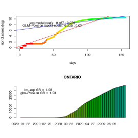
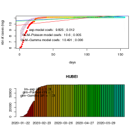
The tots.per.location function will plot the number of cases as a function of time for the given locations and type of categories, in two plots: a log-scale scatter one a linear scale bar plot one.
When the function is run with multiple locations or all the locations, the figures will be adjusted to display multiple plots in one figure in a mosaic type layout.
Additionally, the function will attempt to generate different fits to match the data:
-
1.
an exponential model using a Linear Regression method
-
2.
a Poisson model using a General Linear Regression method
-
3.
a Gamma model using a General Linear Regression method
The function will plot and add the values of the coefficients for the models to the plots and display a summary of the results in the console. It is also possible to instruct the function to draw a "confidence band" based on a moving average, so that the trend is also displayed including a region of higher confidence based on the mean value and standard deviation computed considering a time interval set to equally dividing the total range of time over 10 equally spaced intervals.
The function will return a list combining the results for the totals for the different locations as a function of time.
Growth Rate
The growth.rate function allows to compute daily changes and the growth rate defined as the ratio of the daily changes between two consecutive dates.
The growth.rate function shares all the features of the tots.per.location function as described above, i.e. can process the different types of cases and multiple locations.
The graphical output will display two plots per location:
-
1.
a scatter plot with the number of changes between consecutive dates as a function of time, both in linear scale (left vertical axis) and log-scale (right vertical axis) combined
-
2.
a bar plot displaying the growth rate for the particular region as a function of time.
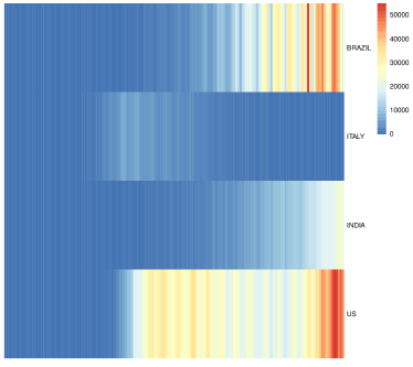
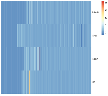
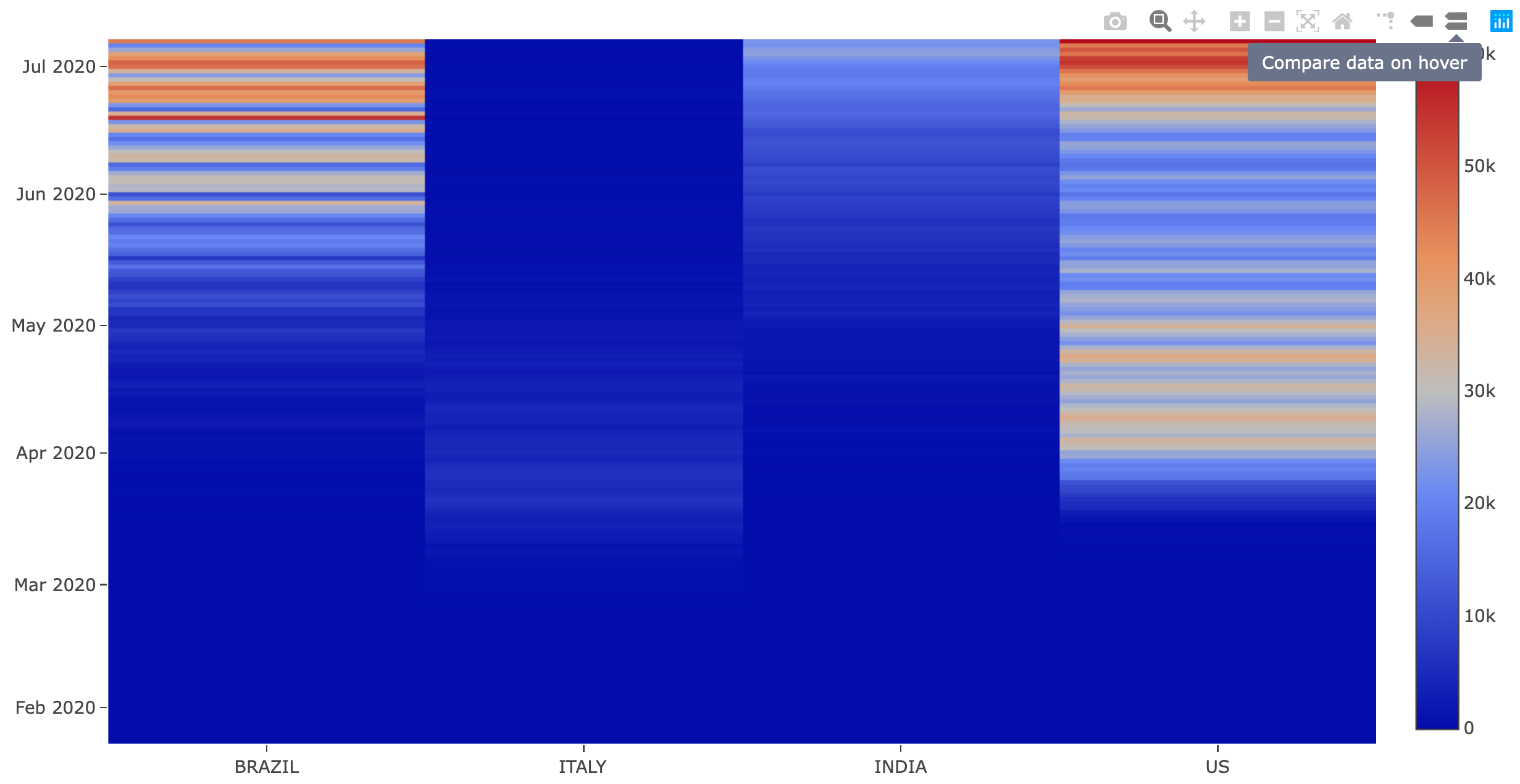
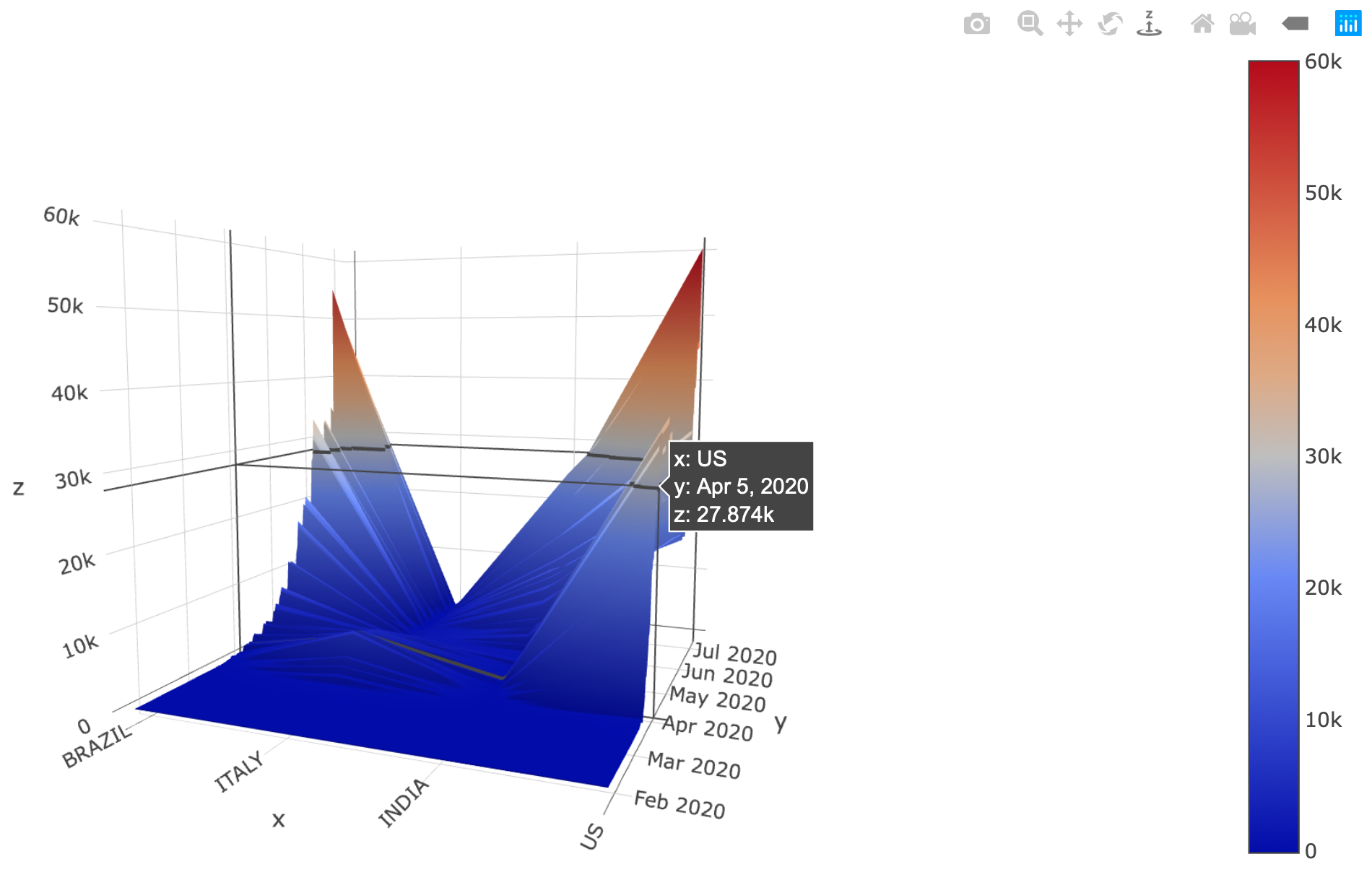
When the function is run with multiple locations or all the locations, the figures will be adjusted to display multiple plots in one figure in a mosaic type layout. In addition to that, when there is more than one location the function will also generate two different styles of heatmaps comparing the changes per day and growth rate among the different locations (vertical axis) and time (horizontal axis). Furthermore, if the interactiveFig=TRUE argument is used, then interactive heatmaps and 3d-surface representations will be generated too.
Some of the arguments in this function, as well as in many of the other functions that generate both static and interactive visualizations, can be used to indicate the type of output to be generated. Table 4 lists some of these arguments. In particular, the arguments controlling the interactive figures –interactiveFig and interactive.display– can be used in combination to compose an interactive figure to be captured and used in another application. For instance, when interactive.display is turned off but interactiveFig=TRUE, the function will return the interactive figure, so that it can be captured and used for later purposes. This is the technique employed when capturing the resulting plots in the covid19.analytics Dashboard Explorer as presented in Sec. 4.2.
| argument | effect | default value |
|---|---|---|
| staticPlt | when active, enables static plots to be displayed in screen | TRUE |
| interactiveFig | when active, enables interactive visualizations features | FALSE |
| interactive.display | when active, pushes the interactive figures into a browser | TRUE |
| When is turned off, but interactiveFig=TRUE, the function will return the interactive figure, so that it can be captured and used for later purposes. |
Finally, the growth.rate function when not returning an interactive figure, will return a list combining the results for the "changes per day" and the "growth rate" as a function of time, i.e. when interactiveFig is not specified or set to FALSE (which its default value) or when interactive.display=TRUE.
Trends in Daily Changes
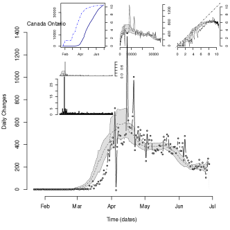
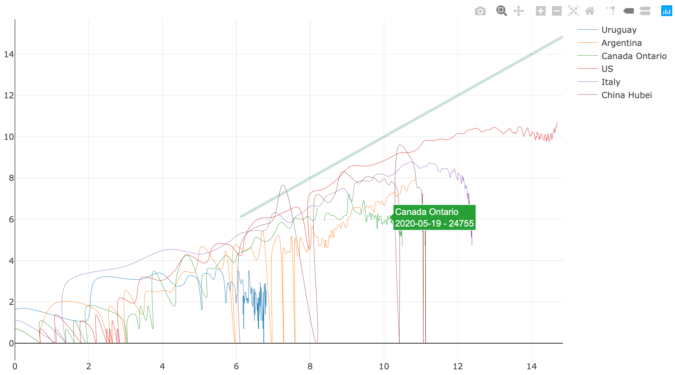
The covid19.analytics package provides three different functions to visualize the trends in daily changes of reported cases from time series data.
-
1.
single.trend, allows to inspect one single location, this could be used with the worldwide data sliced by the corresponding location, the Toronto data or the user’s own data formatted as "Time Series" data.
-
2.
mtrends, is very similar to the single.trend function, but accepts multiple or single locations generating one plot per location requested; it can also process multiple cases for a given location.
-
3.
itrends function to generate an interactive plot of the trend in daily changes representing changes in number of cases vs total number of cases in log-scale using splines techniques to smooth the abrupt variations in the data
The first two functions will generate "static" plots in a compose with different insets:
-
1.
the main plot represents daily changes as a function of time
-
2.
the inset figures in the top, from left to right:
-
(a)
total number of cases (in linear and semi-log scales),
-
(b)
changes in number of cases vs total number of cases
-
(c)
changes in number of cases vs total number of cases in log-scale
-
(a)
-
3.
the second row of insets, represent the "growth rate" (as defined above) and the normalized growth rate defined as the growth rate divided by the maximum growth rate reported for this location
Plotting Totals
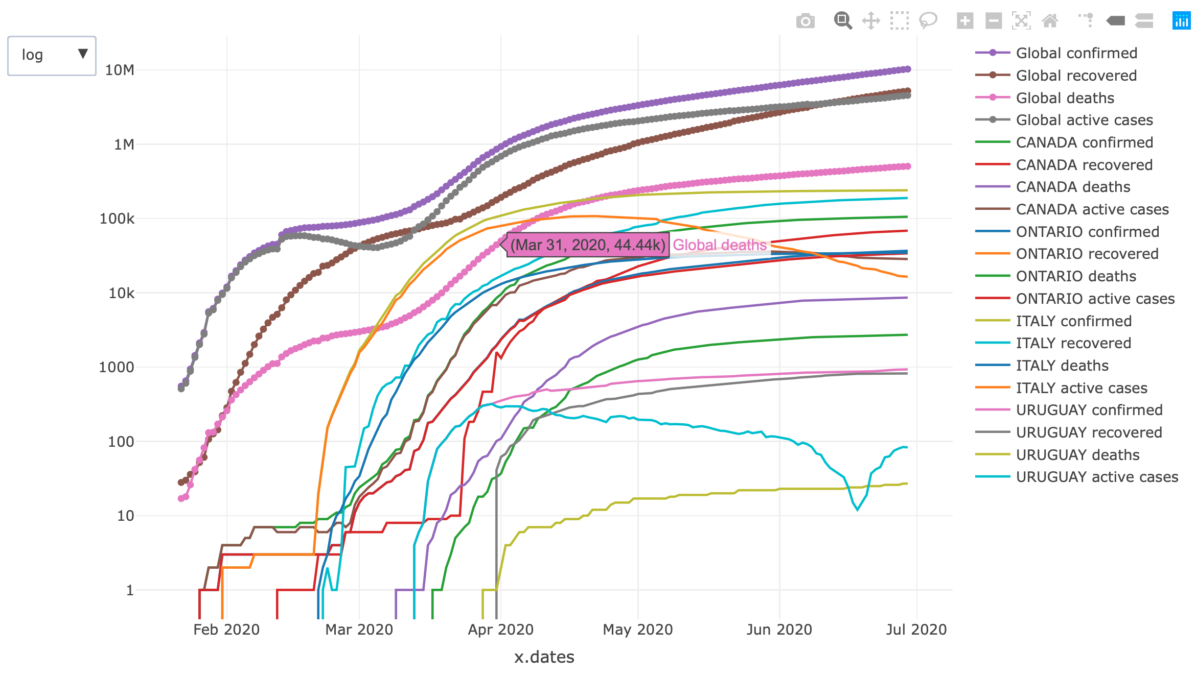
The function totals.plt will generate plots of the total number of cases as a function of time. It can be used for the total data or for a specific or multiple locations. The function can generate static plots and/or interactive ones, as well, as linear and/or semi-log plots.
Plotting Cases in the World
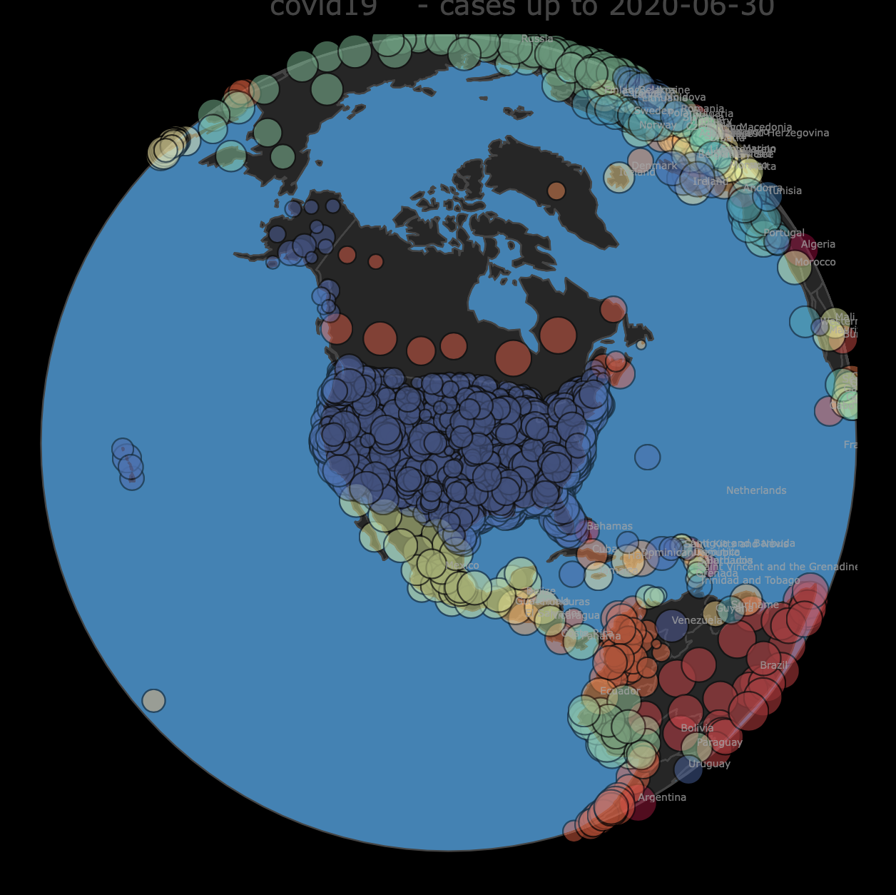
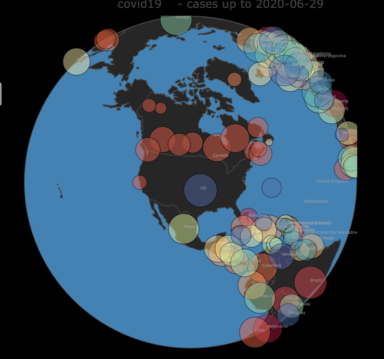
The function live.map will display the different cases in each corresponding location all around the world in an interactive map of the world. It can be used with time series data or aggregated data, aggregated data offers a much more detailed information about the geographical distribution.
2.2.2 Modelling the Evolution of the Virus Spread
The covid19.analytics package allows users to model the dispersion of the disease by implementing a simple Susceptible-Infected-Recovered (SIR) model [44, 45]. The model is implemented by a system of ordinary differential equations (ODE), as the one shown by Eq.(1).
| (1) |
where represents the number of susceptible individuals to be infected, the number of infected individuals and the number of recovered ones at a given moment in time. The coefficients and are the parameters controlling the transition rate from to and from to respectively; is the total number of individuals, i.e. ; which should remain constant, i.e.
| (2) |
Eq.(1) can be written in terms of the normalized quantities, , , and ; as
| (3) |
Although the ODE SIR model is non-linear, analytical solutions have been found [46]. However the approach we follow in the package implementation is to solve the ODE system from Eq.(1) numerically.
The function generate.SIR.model implements the SIR model from Eq.(1) using the actual data from the reported cases. The function will try to identify data points where the onset of the epidemic began and consider the following data points to generate proper guesses for the two parameters describing the SIR ODE system, i.e. and .
It does this by minimizing the residual sum of squares (RSS) assuming one single explanatory variable, i.e. the sum of the squared differences between the number of infected cases and the quantity predicted by the model ,
| (4) |
The ODE given by Eq.(1) is solved numerically using the ode function from the deSolve and the minimization is tackled using the optim function from base R.
After the solution for Eq.(1) is found, the function will provide details about the solution, as well as, plot the quantities in a static and interactive plot.
The generate.SIR.model function also estimates the value of the basic reproduction number or basic reproduction ratio, , defined as,
| (5) |
which can be considered as a measure of the average expected number of new infections from a single infection in a population where all subjects can be susceptible to get infected.
The function also computes and plots on demand, the force of infection, defined as, , which measures the transition rate from the compartment of susceptible individuals to the compartment of infectious ones.
For exploring the parameter space of the SIR model, it is possible to produce a series of models by varying the conditions, i.e. range of dates considered for optimizing the parameters of the SIR equation, which will effectively “sweep” a range for the parameters and . This is implemented in the function sweep.SIR.models, which takes a range of dates to be used as starting points for the number of cases used to feed into the generate.SIR.model producing as many models as different ranges of dates are indicated. One could even use this in combination to other resampling or Monte Carlo techniques to estimate statistical variability of the parameters from the model.
3 Examples and Applications
In this section we will present some basic examples of how to use the main functions from the covid19.analytics package.
3.1 Installation
We will begin by installing the covid19.analytics package. This can be achieved in two alternative ways:
-
1.
installing the latest stable version of the package directly from the CRAN repository. This can be done within an R session using the install.packages function, i.e.
¯> install.packages("covid19.analytics") ¯ -
2.
installing the development version from the package’s GITHUB repository, https://github.com/mponce0/covid19.analytics using the devtools package [47] and its install_github function. I.e.
¯# begin by installing devtools if not installed in your system
¯> install.packages("devtools")
¯# install the covid19.analytics packages from the GITHUB repo
¯> devtools::install_github("mponce0/covid19.analytics")
¯
After having installed the covid19.analytics package, for accessing its functions, the package needs to be loaded using R’s library function, i.e.
¯> library(covid19.analytics)
¯
The covid19.analytics uses a few additional packages which are installed automatically if they are not present in the system. In particular, readxl is used to access the data from the City of Toronto [36], ape is used for pulling the genomics data from NCBI; plotly and htmlwidgets are used to render the interactive plots and save them in HTML documents, deSolve is used to solve the differential equations modelling the spread of the virus, and gplots, pheatmap are used to generate heatmaps.
3.2 Retrieving and Accessing Data
Lst. 1 shows how to use the covid19.data function to obtain data in different cases.
In general, the reading functions will return data frames. Exceptions to this, are when the functions need to return a more complex output, e.g. when combining "ALL" type of data or when requested to obtain the original data from the City of Toronto (see details in Table LABEL:table:covid19Fns). In these cases, the returning object will be a list containing in each element dataframes corresponding to the particular type of data. In either case, the structure and overall content can be quickly assessed by using R’s str or summary functions.
3.3 Basic Analysis
3.3.1 Identifying Geographical Locations
One useful information to look at after loading the datasets, would be to identify which locations/regions have reported cases. There are at least two main fields that can be used for that, the columns containing the keywords: ’country’ or ’region’ and ’province’ or ’state’. Lst. 5 show examples of how to achieve this using partial matches for column names, e.g. "Country" and "Province".
3.3.2 Reports
An overall view of the current situation at a global or local level can be obtained using the report.summary function. Lst. 6 shows a few examples of how this function can be used.
A typical output of the report generation tool is presented in Lst. 7.
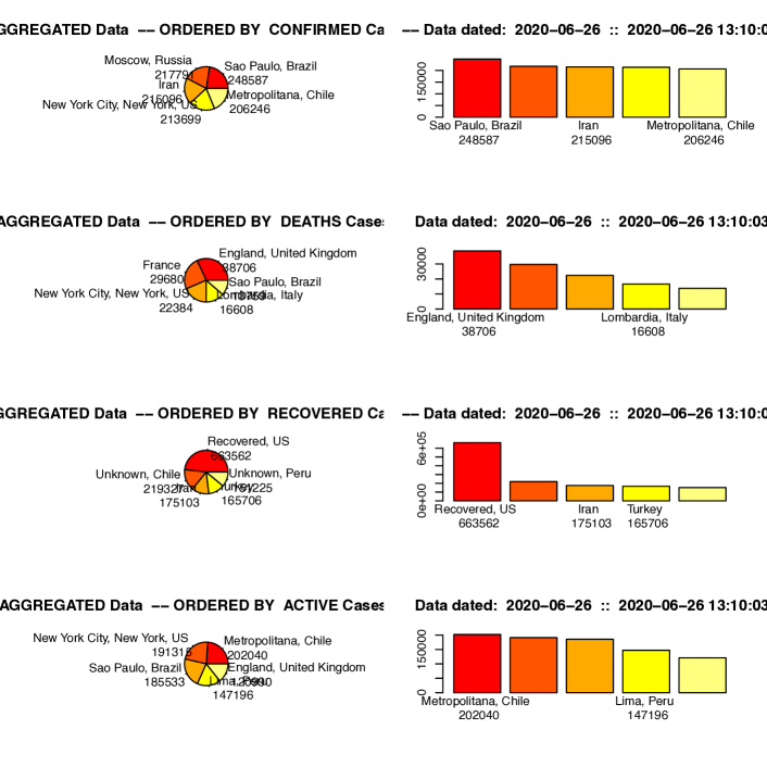
fig:report
A daily generated report is also available from the covid19.analytics documentation site, https://mponce0.github.io/covid19.analytics/.
3.3.3 Totals per Geographical Location
The covid19.analytics package allows users to investigate total cumulative quantities per geographical location with the totals.per.location function. Examples of this are shown in Lst. 8.

3.3.4 Growth Rate
Similarly, utilizing the growth.rate function is possible to compute the actual growth rate and daily changes for specific locations, as defined in Sec. 2.2. Lst. 9 includes examples of these.
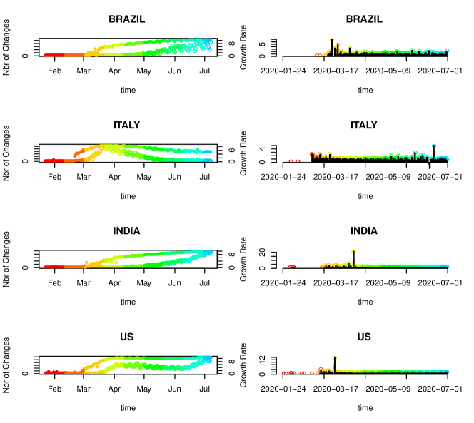


3.3.5 Trends
In addition to the cumulative indicators described above, it is possible to estimate the global trends per location employing the functions single.trend, mtrends and itrends. The first two functions generate static plots of different quantities that can be used as indicators, while the third function generates an interactive representation of a normalized a-dimensional trend. The Lst. 10 shows examples of the use of these functions. Fig. 6 displays the graphical output produced by these functions.
3.3.6 Interactive Visualization Tools
Most of the analysis functions in the covid19.analytics package have already plotting and visualization capabilities. In addition to the previously described ones, the package has also specialized visualization functions as shown in Lst.11. Many of them will generate static and interactive figures, see Table LABEL:table:covid19Fns for details of the type of output. In particular the live.map function is an utility function which allows to plot the location of the recorded cases around the world. This function in particular allows for several customizable features, such as, the type of projection used in the map or to select different types of projection operators in a pull down menu, displaying or not the legend of the regions, specify rescaling factors for the sizes representing the number of cases, among others. The function will generate a live representation of the cases, utilizing the plotly package and ultimately open the map in a browser, where the user can explore the map, drag the representation, zoom in/out, turn on/off legends, etc.
3.4 Modeling the Virus Spread
Last but not least, one the novel features added by the covid19.analytics package, is the ability of model the spread of the virus by incorporating real data. As described in Sec. 2.2, the generate.SIR.model function, implements a simple SIR model employing the data reported from an specified dataset and a particular location. Examples of this are shown in Lst.12. The generate.SIR.model function is complemented with the plt.SIR.model function which can be used to generate static or interactive figures as shown in Fig. 8.
The generate.SIR.model function as described in Sec.2 will attempt to obtain proper values for the parameters and , by inferring the onset of the epidemic using the actual data. This is also listed in the output of the function (see Lst.13), and it can be controlled by setting the parameters t0 and t1 or deltaT, which are used to specify the range of dates to be considered for using when determining the values of and . The fatality rate (constant) can also be indicated via the fatality.rate argument, as well, as the total population of the region with tot.population.
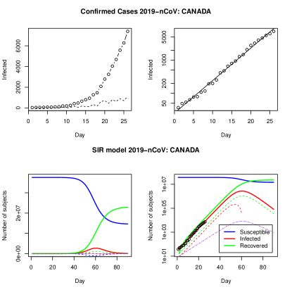
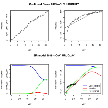
Fig.(8), also raises an interesting point regarding the accuracy of the SIR model. We should recall that this is the simplest approach one could take in order to model the spread of diseases and usually more refined and complex models are used to incorporate several factors, such as, vaccination, quarantines, effects of social clusters, etc. However, in some cases, specially when the spread of the disease appears to have enter the so-called exponential growth rate, this simple SIR model can capture the main trend of the dispersion (e.g. left plot from Fig.8). While in other cases, when the rate of spread is slower than the freely exponential dispersion, the model clearly fails in tracking the actual evolution of cases (e.g. right plot from Fig.8).
Finally, Lst. 14 shows an example of the generation of a sequence of values for , and actually any of the parameteres describing the SIR model. In this case, the function takes a range of values for the initial date t0 and generates different date intervals, this allows the function to generate multiple SIR models and return the corresponding parameters for each model. The results are then bundle in a "matrix"/"array" object which can be accessed by column for each model or by row for each paramter sets.
3.5 Working with your own data
As mentioned before, the functions from the covid19.analytics package also allow users to work with their own data, when the data is formated in the Time Series strucutre as discussed in Sec.2.1.2. This opens a large range of possibilities for users to import their own data into R and use the functions already defined in the covid19.analytics package. A concrete example of how the data has to be formatted is shown in Lst. 15. The example shows how to structure the data in a TS format from “synthetic” data generated from randomly sampling different distributions. However this could be actual data from other places or locations not accesible from the datasets provided by the package, or some researchers may have access to their own private sets of data too. The example also shows two cases, where the data can include the "status" column or not, and whether it could be more than one location. As a matter of fact, we left the "Long" and "Lat" fields empty but if one includes the actual coordinates, the maping function live.map can also be used with these structured data.
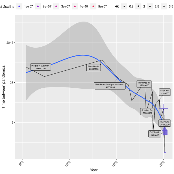
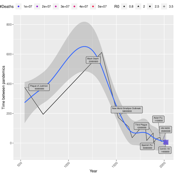
3.6 Studying Pandemics Trends
The covid19.analytics provides access to previous historical pandemic records. Lst. 16 and Fig.9, show an example of how this data can be used to gain insights into past pandemics ocurrences.
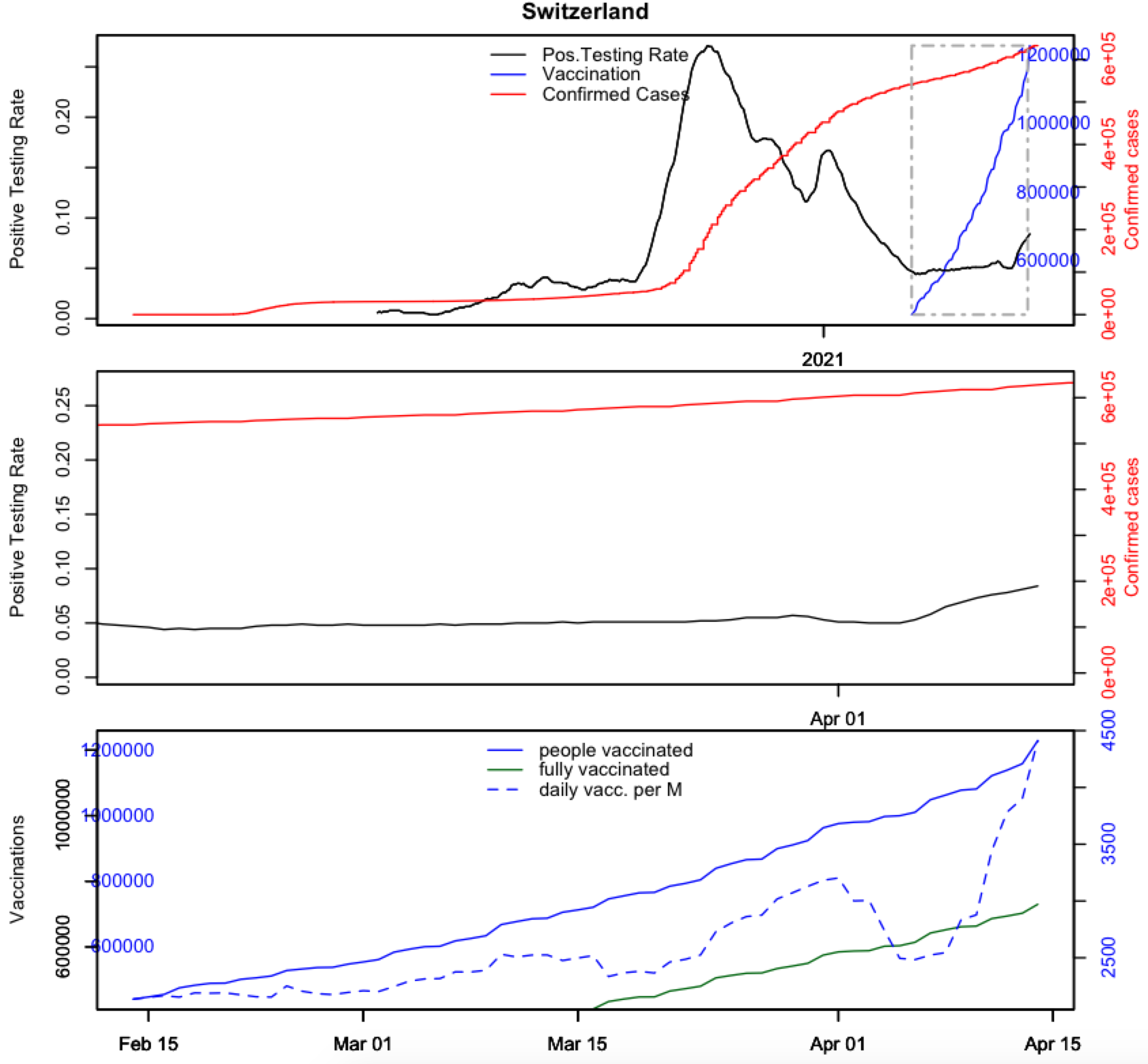
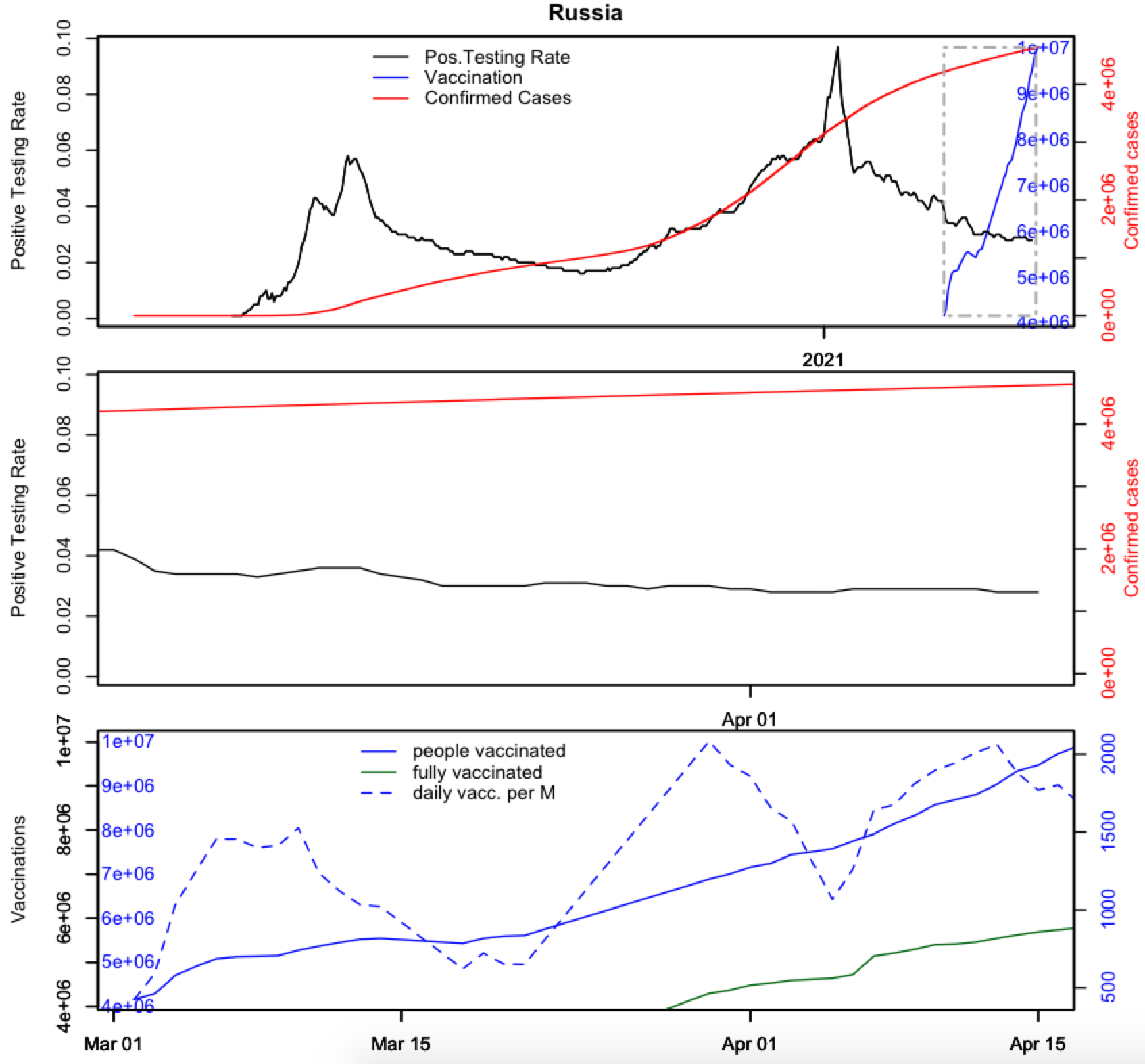
3.7 Testing and Vaccination
Using the testing and vaccination data can get insights into the way in which the pandemic is spreading. For instance, it could be used as indicator of how efficient the vaccination campaing are being against the virus spread. Lst.17 shows the example of a function that visualize the positive testing rate and vaccinations for a given country. Examples of the application of this function are shown in Fig. 10. Some interesting observations can be done by considering the information presented in these plots, for instance, how effective are being the vaccinations, are vacciantions changing the rate of contagion, are vaccinations curbing the pandemics, what is the effect of single vaccination vs fully vaccinated individuals, etc.
3.8 Genomics
The covid19.analytics package provides access to genomics data available at the NCBI databases [40, 41]. The covid19.genomic.data is the master function for accesing the different variations of the genomics information available as shown in Table 2. In addition to that there are a few helper functions which can also be used for retrieving specific types, such as: c19.refGenome.data, c19.ptree.data, c19.fasta.data, c19.NPs.data, c19.NP_fasta.data. Lst. 18 show examples of how to use these functions for retrieving the different type of genomics data for the SARS-CoV-2 virus.
Each of these functions return different objects, Lst. 19 shows an example of the different structures for some of the objects. The most involved object is obtained from the covid19.genomic.data when combining different types of datasets.
One aspect that should be mentioned with respect to the genomics data is that, in general, these are large datasets which are continuously being updated hence increasing theirs sizes even more. These would ultimately present pragmatical challenges, such as, long processing times or even starvation of memory resources. We will not dive into major interesting examples, like DNA sequencing analysis or building phylogenetics trees; but packages such as ape, apegenet, phylocanvas, and others can be used for these and other analysis.
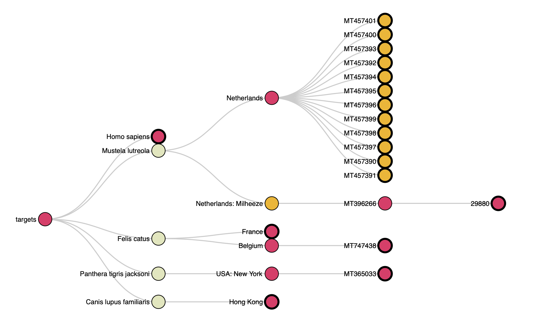
One simple example we can present is the creation of dynamical categorization trees based on different elements of the sequencing data. We will consider for instance the data for the nucleotides as reported from NCBI.
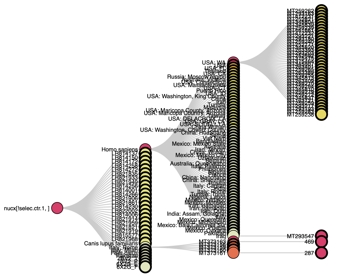
The example on Lst. 20 shows how to retrieve either nucleotides (or proteins) data and generate categorization trees based on different elements, such as, hosting organism, geographical location, sequences length, etc. In the examples we employed the collapsibleTree package, that generates interactive browsable trees through web browsers.
4 Case Study: The covid19.analytics Dashboard Explorer
In this section we will present and discuss, how the covid19.analytics Dashboard Explorer is implemented. The main goal is to provide enough details about how the dashboard is implemented and works, so that users could modify it if/as they seem fit or even develop their own. For doing so, we will focus in three main points:
-
1.
the front end implementation, also know as the user interface, mainly developed using the shiny package
-
2.
the back end implementation, mostly using the covid19.analytics package
-
3.
the web server installation and configuration where the dashboard is hosted
4.1 Dashboard’s Front End Implementation
The covid19.analytics Dashboard Explorer is built using the Shiny package [48] in combination with the covid19.analytics package. Shiny allows users to build interactive dashboards that can work through a web interface. The dashboard mimics the covid19.analytics package commands and features but enhances the commands as it allows users to use dropdowns and other control widgets to easily input the data rather than using a command terminal. In addition the dashboard offers some unique features, such as a Personal Protective Equipment (PPE) model estimation, based on realistic projections developed by the US Centers for Disease Control and Prevention (CDC).
The dashboard interface offers several features:
-
1.
The dashboard can be run on the cloud/web allowing for multiple users to simultaneously analyze the data with no special software or hardware requirements. The Shiny package makes the dashboard mobile and tablet compatible as well.
-
2.
It aids researchers to share and discuss analytical findings.
-
3.
The dashboard can be run locally or through the web server.
-
4.
No programming or software expertise is required which reduces technical barriers to analyzing the data. Users can interact and analyze the data without any software expertise therefore users can focus on the modeling and analysis. In these times the dashboard can be a monumental tool as it removes barriers and allows a wider and diverse set of users to have quick access to the data.
-
5.
Interactivity. One feature of Shiny and other graphing packages, such as Plotly, is interactivity, i.e. the ability to interact with the data. This allows one to display and show complex data in a concise manner and focus on specific points of interest. Interactive options such as zoom, panning and mouse hover all help in making the user interaction enjoyable and informative.
-
6.
Fast and easy to compare. One advantage of a dashboard is that users can easily analyze and compare the data quickly and multiple times. For example users can change the slider or dropdown to select multiple countries to see the total daily count effortlessly. This allows the data to be displayed and changed as users analysis requirements change.
4.1.1 Accessing the covid19.analytics Dashboard Explorer
The dashboard can be laucnhed locally in a machine with R, either through an interactive R session or in batch mode using Rscript or R CMD BATCH or through the web server accessing the following URL https://covid19analytics.scinet.utoronto.ca.
For running the dashboard locally, the covid19.analytics package has also to be installed. For running the dashboard within an R session the package has to be loaded and then it should be invoked using the following sequence of commands,
        > library(covid19.analytics)

        > covid19Explorer()
The batch mode can be executed using an R script containing the commands listed above. When the dashboard is run locally the browser will open a port in the local machine –localhost:port– connection, i.e. http://127.0.0.1. It should be noted, that if the dashboard is launched interactively within an R session the port used is 5481 –http://127.0.0.1:5481–, while if this is done through an R script in batch mode the port used will be different.
4.1.2 Specific Libraries Needed in the Dasbhoard
To implement the dashboard and enhance some of the basic functionalities offered, the following libraries were specifically used in the implementation of the dashboard:
-
1.
shiny [48]: The main package that builds the dashboard.
-
2.
shinydashboard [49]: This is a package that assists us to build the dashboard with respect to themes, layouts and structure.
-
3.
shinycssloaders [50]: This package adds loader animations to shiny outputs such as plots and tables when they are loading or (re)-calculating. In general, this are wrappers around base CSS-style loaders.
-
4.
plotly [51]: Charting library to generate interactive charts and plots. Although extensively used in the core functions of the covid19.analytics , we reiterate it here as it is great tool to develop interactive plots.
-
5.
DT [52]: A DataTable library to generate interactive table output.
-
6.
dplyr [53]: A library that helps to apply functions and operations to data frames. This is important for calculations specifically in the PPE calculations.
The R Shiny package makes developing dashboards easy and seamless and removes challenges. For example setting the layout of a dashboard typically is challenging as it requires knowledge of frontend technologies such as HTML, CSS3 and Bootstrap4 to be able to position elements and change there asthetic properties. Shiny simplifies this problem by using a built in box controller widget which allows developers to easily group elements, tables, charts and widgets together. Many of the CSS properties, such as, widths or colors are input parameters to the functions of interest. The sidebar feature is simple to implement and the Shiny package makes it easy to be compatible across multiple devices such as tablets or cellphones. The Shiny package also has built in layout properties such as FluidRow or Columns making it easy to position elements on a page. The library does have some challenges as well. One challenge faced is theme design. ShinyDashboard does not make it easy to change the whole color theme of the dashboard outside of the white or blue theme that is provided by default. The issue is resolved by having the developer write custom CSS and change each of the various properties manually.
4.1.3 Dashboard Layout
The dashboard contains two main components a sidebar and a main body. The sidebar contains a list of all the menu options. Options which are similar in nature are grouped in a nested format. For example the dashboard menu section called "Datasets and Reports", when selected, displays a nested list of further options the user can choose such as the World Data or Toronto Data. Grouping similar menu options together is important for making the user understand the data. The main body displays the content of a page. The content a main body displays depends on the sidebar and the selected menu option the user selects.
There are three main generic elements needed to develop a dashboard: layouts, control widgets and output widgets. The layout options are components needed to layout the features or components on a page. In this dashboard the layout widgets used are the following:
-
1.
Box: The boxes are the main building blocks of a dashboard. This allows us to group content together.
-
2.
TabPanels: TabPanels allow us to create tabs to divide one page into several sections. This allows for multiple charts or multiple types of data to be displayed in a single page. For example in the Indicators page there are four tabs which display four different charts with mosaic tab displaying the charts in different configurations.
-
3.
Header and Title: these are used to display text, title pages in the appropriate sizes and fonts.
An example describing these elements and its implementation is shown in Lst. 21.
Shiny modules are used when a shiny application gets larger and complicated, they can also be used to fix the namespacing problem. However shiny modules also allow for code reusability and code modularity as the code can be broken into several pieces called modules. Each module can then be called in different applications or even in the same application multiple times. In this dashboard we break the code into two main groups user interface (UI) modules and server modules. Each menu option has there own dedicated set of UI and associated server modules. This makes the code easy to build and expand. For each new menu option a new set of UI and sever module functions will be built. Lst. 21 is also an example of an UI module, where it specifies the desing and look of the element and connect with the active parts of the application.
Lst. 25 shows an example of a server function called reportServer. This type of module can update and display charts, tables and valueboxes based on the user selections. This same scenario occurs for all menu options with the UI/server paradigm.
Another way to think about the UI/server separation, is that the UI modules are in charge of laying down the look of a particular element in the dahboard, while the sever is in charge of dynamically ‘filling’ the dynamical elements and data to populate this element.
Control widgets, also called input widgets, are widgets which users use to input data, information or settings to update charts, tables and other output widgets. The following control widgets were used in this dashboard:
-
1.
NumericalInput: A textbox that only allows for numerical input which is used to select a single numerical value.
-
2.
SelectInput: a dropdown that may be multi select for allowing users to select multiple options as in the case of the country dropdown.
-
3.
Slider: The slider in our dashboard is purely numerical but used to select a single numerical value from a given range of a min and max range.
-
4.
Download Button: This is a button which allows users to download and save data in various formats such as csv format.
-
5.
Radiobuttons: Used to select only one from a limited number of choices.
-
6.
Checkbox: Similar in purpose to RadioButtons that also allow users to select one option from a limited number of options.
Output control widgets are widgets that are used to display content/information back to the user. There are three main ouput widgets used in this dashboard:
-
1.
PlotlyOuput: This widget output and creates Plotly charts. Plotly is a graphical package library used to generate interactive charts.
-
2.
RenderTable: Is an output that generates the output as an interactive table with search, filter and sort capabilities provided out of the box.
-
3.
ValueBox: This is a fancy textbox with border colors and descriptive font text to generate descriptive text to users such as the total number of deaths.
The dashboard contains the menus and elements shown in 22 and described below:
-
1.
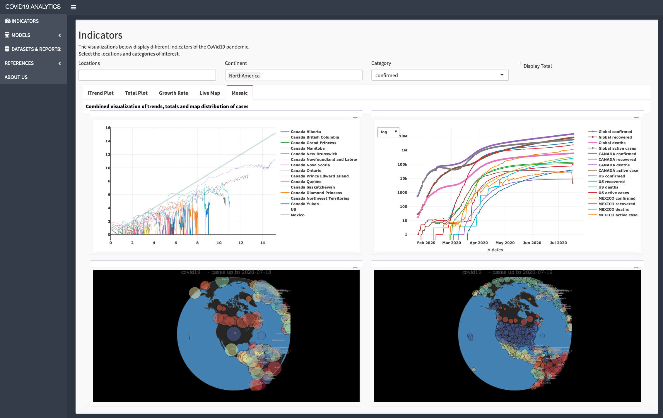
Indicators: This menu section displays different CoViD19 indicators to analyze the pandemic. There are four notable indicators Itrend, Total Plot, Growth Rate and Live map, which are displayed in each of the various tabs. Itrend displays the “trend” in a log-log plot, Total plot shows a line graph of total number, Growth rate displays the daily number of changes and growth rate (as defined in Sec. 2.2), Live map shows a world map of infections in an aggregated or timeseries format. These indicators are shown together in the "Mosaic" tab.
-
2.
Models: This menu option contains a sub-menu presenting models related to the pandemic. The first model is the SIR (Susceptible Infection Recovery) which is implemented in the covid19.analytics package. SIR is a compartmental model to model how a disease will infect a population. The second two models are used to estimate the amount of PPE needed due to infectious diseases, such as Ebola and CoViD19.
-
3.
Datasets and Reports: This section provides reporting capability which outputs reports as csv and text files for the data. The World Data subsection displays all the world data as a table which can be filtered, sorted and searched. The data can also be saved as a csv file. The Toronto data displays the Toronto data in tabular format while also displaying the current pandemic numbers. Data Integrity section checks the integrity and consistency of the data set such as when the raw data contains negative numbers or if the cumulative quantities decrease. The Report section is used to generate a report as a text file.
-
4.
References: The reference section displays information on the github repo and documentation along with an External Dashboards section which contains hyperlinks to other dashboards of interest. Dashboards of interest are the Vaccine Tracker which tracks the progress of vaccines being tested for covid19, John Hopkins University and the Canada dashboard built by the Dall Lana School of Epidemiology at the University of Toronto.
-
5.
About Us: Contact information and information about the developers.
4.1.4 Additional Elements of the Dashboard
In addition to implementing some of the functionalities provided by the covid19.analytics package, the dashboard also includes a PPE calculator. The hospital PPE is a qualitative model which is designed to analyze the amount of PPE equipment needed for a single CoViD19 patient over a hospital duration. The PPE calculation implemented in the covid19.analytics Dashboard Explorer is derived from the CDC’s studies for infectious diseases, such as Ebola and CoViD19. The rationality is that Ebola and CoViD19 are both contagious infections and PPE is used to protect staff and patients and prevent transmission for both of these contagious diseases.
The Hospital PPE calculation estimates and models the amount of PPE a hospital will need during the CoViD19 pandemic. There are two analysis methods a user can choose to determine Hospital PPE requirement. The first method to analyze PPE is to determine the amount of PPE needed for a single hospitalized CoViD19 patient. This first model requires two major component: the size of the healthcare team needed to take care of a single CoViD19 patient and the amount of PPE equipment used by hospital staff per shift over a hosptialization duration. The model is based off the CDC Ebola crisis calculation [54]. Alhough Ebola is a different disease compared to CoViD19, there is one major similarity. Both CoViD19 and Ebola are diseases which both require PPE for protection of healthcare staff and the infected patient. To compensate the user can change the amount of PPE a healthcare staff uses per shift. That information can be adjusted by changing the slider values in the Advanced Setting tab. The calculation is pretty straightforward as it takes the PPE amount used per shift and multiplies it by the number of healthcare staff and then by the hospitalization duration.
The first model has two tabs. The first tab displays a stacked bar chart displaying the amount of PPE equipment user by each hospital staff over the total hospital duration of a single patient. It breaks each PPE equipment by stacks. The second tab panel called Advanced settings has a series of sliders for each hospital staff example nurses where users can use the slider to change the amount of PPE that the hospital staff will user per shift.
The second model is a more recent calculation developed by the CDC [55]. The model calculates the burn rate of PPE equipment for hospitals for a one week time period. This model is designed specifically for Covid19. The CDC has created an excel file for hospital staff to input their information and also an android app as well which can be utilized.
This model also implemented in our dashboard, is simplified to calculate the PPE for a one week setting. The one week limit was implemented for two reasons, first to limit the amount of input data a user has to enter into the system as too much data can overwhelm and confuse a user; second because the CoViD19 pandemic is a highly fluidic situation and for hospital staff to forecast their PPE and resource equipments greater than a one week period may not be accurate.
Note that this model is not accurate if the facilitiy recieves a resupply of PPE. For resupplied PPE start a new calculation. There are four tab panels to the burn rate calculation which displays charts and settings. The first tab Daily Usage displays a multi-line chart displaying the amount of PPE used daily, . The calculation for this is a simple subtraction between two consecutive days, i.e. the second day () from the first day () as noted in Eq.(6).
| (6) |
The tab panel called Remaining Supply shows a multi line chart the number of days the remaining PPE equipment will last in the facility. The duration of how long the PPE equipment can last in a given facility, inversely depends on the amount of CoViD19 patients admitted to the hospital. To calculate the remaining PPE one calculates the average amount of PPE used over the one week duration and then divides the amount of PPE at the beginning of the day by the average PPE usage, as shown in Eq.(7),
| (7) |
where denotes the time average over a period of time.
The third panel called PPE per patient displays a multi line chart of the burn rate, i.e. the amount of PPE used per patient per day. Eq.(8) represents the calculation as the remaining PPE supply divided by the number of CoViD19 patients in the hospital staff during that exact day.
| (8) |
The fourth tab called Advanced settings is a series of show and hide “accordians” where users can input the amount of PPE equpiment they have at the start of each day. There are six collapsed boxes for each PPE equipment type and for CoViD19 patient count. Expanding a box displays seven numericalInput textboxes which allows users to input the number of PPE or patient count for each day.
The equations describing the PPE needs, Eqs.(6,7,8) are implemented in the shiny dashboard using the dplyr library. The dplyr library allows users to work with dataframe like objects in a quick and efficient manner. The three equations are implemented using a single dataframe. The Advanced Setting inputs of the Burn Rate Analysis tab are saved into a dataframe. The PPE equations –Eqs.(6-8)– are implemented on the dataframe by creating new columns that are then appended to the existing dataframe. This results in the final version of the dataframe as shown in Lst. 23 which is then used to generate the corresponding charts.
4.2 Dashboard’s Back End Implementation
The back-end implementation of the dashboard is achieved using the functions presented in Sec.2 on the server module of the dashboard. The main strategy is to use a particular function and connect it with the input controls to feed the needed arguments into the function and then capture the output of the function and render it accordingly.
Let’s consider the example of the globe map representation shown in the dashboard which is done using the live.map function. Lst. 24 shows how this function connects with the other elements in the dashboard: the input elements are accessed using input$... which in this are used to control the particular options for the displaying the legends or projections based on checkboxes. The output returned from this function is captured through the renderPlotly({...}) function, that is aimed to take plotly type of plots and integrate them into the dashboard.
Another example is the report generation capability using the report.summary function which is shown in Lst. 25. As mentioned before, the input arguments of the function are obtained from the input controls. The output in this case is rendered usign the renderText({...}) function, as the output of the original function is plain text. Notice also that there are two implementations of the report.summary, one is for the rendering in the screen and the second one is for making the report available to be downloaded which is handled by the downloadHandler function.
4.3 Dashboard’s Server Configuration
The final element in the deployment of the dashboard is the actual set up and configuration of the web server where the application will run. The actual implementation of our web dashboard, accessible through https://covid19analytics.scinet.utoronto.ca, relies on a virtual machine (VM) in a physical server located at SciNet headquarters.
We should also notice that there are other forms or ways to "publish" a dashboard, in particular for shiny based-dashboards, the most common way and perhaps straighforward one is to deploy the dashboard on https://www.shinyapps.io. Alternatively one could also implement the dashboard in a cloud-based solution, e.g. https://aws.amazon.com/blogs/big-data/running-r-on-aws/. Each approach has its own advantages and disadvantages, for instance, depending on a third party solution (like the previous mentioned) implies some cost to be paid to or dependency on the provider but will certainly eliminate some of the complexity and special attention one must take when using its own server. On the other hand, a self-deployed server will allow you for full control, in principle cost-effective or cost-controled expense and full integration with the end application.
In our case, we opted for a self-controlled and configured server as mentioned above. Moreover, it is quite a common practice to deploy (multiple) web services via VMs or “containers”. The VM for our web server runs on CentOS 7 and has installed R version 4.0 from sources and compiled on the VM.
After that we proceeded to install the shiny server from sources, i.e. https://github.com/rstudio/shiny-server/wiki/Building-Shiny-Server-from-Source.
After the installation of the shiny-server is completed, we proceed by creating a new user in the VM from where the server is going to be run. For security reasons, we recommend to avoid running the server as root. In general, the shiny server can use a user named "shiny". Hence a local account is created for this user, and then logged as this user, one can proceed with the installation of the required R packages in a local library for this user. All the neeeded packages for running the dashboard and the covid19.analytics package need to be installed.
Lst. 26 shows the commands used for creating the shiny user and finalizing the configuration and details of the log files.
The R script containing the shiny app to be run should be placed in /etc/shiny-server and confiurations details about the shiny interface are adjusted in the /etc/shiny-server/shiny-server.conf file.
Permissions for the application file has to match the identity of the user launching the server, in this case the shiny user.
At this point if the installation was sucessful and all the pieces were placed properly, when the shiny-server command is executed, a shiny hosted app will be accessible from localhost:3838.
Since the shiny server listens on port 3838 in plain http, it is necessary to setup an Apache web server to act as a reverse proxy to receive the connection requests from the Internet on ports 80 and 443, the regular http and https ports, and redirect them to port 3838 on the same host (localhost).
For dealing with the Apache configuration on port 80, we added the file /etc/httpd/conf.d/rewrite.conf as shown in Lst. 27.
For handling the Apache configuration on port 443, we added this file /etc/httpd/conf.d/shiny.conf, as shown in Lst.28.
This VirtualHost receives the https requests from the Internet on port 443, establishes the secure connection, and redirects all input to port 3838 using plain http. All requests to "/" are redirected to "http://0.0.0.0:3838/app1/", where app1 in this case is a subdirectory where a particular shiny app is located.
There is an additional configuration file, /etc/httpd/conf.d/ssl.conf, which contains the configuration for establishing secure connections such as protocols, certificate paths, ciphers, etc.
4.3.1 Decentralized Systems and Services
The main tool we use in order to communicate updates between the different elements we use in the development and mantainance of the covid19.analytics package and dashboard web interface is orchestrated via GIT repositories. In this way, we have in place version control systems but also offer decentralized with multiple replicas. Fig. 13 shows an schematic of how our network of repositories and service is connected. The central hub for our package, is located at the GIThub repo htttps://github.com/mponce0/covid19.analytics; we then have (and users can too) our own clones of local copies of this repo –we usually use this for development and testing–. When a stable and substantial contribution to the package is reached, we submit this to the CRAN repository. Similarly, when an update is done on the dashboard we can synchronize the VM via git pulls and deploy the updates on the server side.
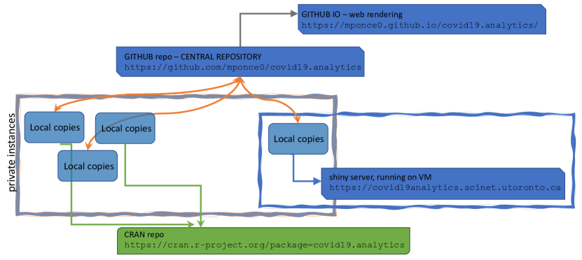
5 Conclusions
In this paper we have presented and discussed the R covid19.analytics package, which is an open source tool to obtain, analyze and visualize data of the CoViD19 pandemic. The package also incorporates a dashboard to facilitate the access to its functionalities to less experienced users.
As today, there are a few dozen other packages also in the CRAN repository that allow users to gain access to different datasets of the CoViD19 pandemic. In some cases, some packages just provide access to data from specific geographical locations or the approach to the data structure in which the data is presented is different from the one presented here. Nevertheless, having a variety of packages from which users can try and probably combine, is an important and crucial element in data analysis. Moreover it has been reported different cases of data misuse/misinterpretation due to different issues, such as, erroneous metadata or data formats [56] and in some cases ending in articles’ retractions [57]. Therefore providing additional functionalities to check the integrity and consistency of the data, as our the covid19.analytics package does is paramount. This is specially true in a situation where the unfolding of events and data availability is flowing so fast that sometimes is even hard to keep track of all the changes.
Moreover, the covid19.analytics package offers a modular and versatile approach to the data, by allowing users to input their own data for which most of the package functions can be applied when the data is structured using a time series format as described in this manuscript.
The covid19.analytics is also capable of retrieving genomics data, and it does that by incorporating a novel, more reliable and robust way of accessing and designing different pathways to the data sources.
Another unique feature of this package is the ability of incorporating models to estimate the disease spread by using the actual data. Although a simple model, it has shown some interesting results in agreement for certain cases. Of course there are more sophisticated approaches to shred light in analyzing this pandemic; in particular novel “community” approaches have been catalyzed by this too [58]. However all of these approaches face new challenges as well[59], and on that regards counting with a variety, in particular of open source tools and direct access to the data might help on this front.
Acknowledgments
MP wants to thank all his colleagues at SciNet, especially Daniel Gruner for his continous and unconditional support, and Marco Saldarriaga who helped us setting up the VM for installing the shiny server.
References
-
[1]
R Core Team, R: A Language and Environment
for Statistical Computing, R Foundation for Statistical Computing, Vienna,
Austria (2016).
URL https://www.R-project.org/ -
[2]
R. Ihaka, R. Gentleman,
R: A language for data
analysis and graphics, Journal of Computational and Graphical Statistics
5 (3) (1996) 299–314.
URL https://doi.org/10.1080/10618600.1996.10474713 -
[3]
M. Ponce,
covid19.analytics:
Load and Analyze Live Data from the CoViD-19 Pandemic, r package version 2.1
(2020).
URL https://CRAN.R-project.org/package=covid19.analytics -
[4]
D. Cyranoski, The biggest
mystery: what it will take to trace the coronavirus source, Naturedoi:10.1038/d41586-020-01541-z.
URL http://dx.doi.org/10.1038/d41586-020-01541-z -
[5]
S. Mallapaty, Animal source
of the coronavirus continues to elude scientists, Naturedoi:10.1038/d41586-020-01449-8.
URL http://dx.doi.org/10.1038/d41586-020-01449-8 -
[6]
P. Zhou, X.-L. Yang, X.-G. Wang, B. Hu, L. Zhang, W. Zhang, H.-R. Si, Y. Zhu,
B. Li, C.-L. Huang, et al.,
A pneumonia outbreak
associated with a new coronavirus of probable bat origin, Nature 579 (7798)
(2020) 270–273.
doi:10.1038/s41586-020-2012-7.
URL http://dx.doi.org/10.1038/s41586-020-2012-7 -
[7]
K. G. Andersen, A. Rambaut, W. I. Lipkin, E. C. Holmes, R. F. Garry,
The proximal origin of
sars-cov-2, Nature Medicine 26 (4) (2020) 450–452.
doi:10.1038/s41591-020-0820-9.
URL https://doi.org/10.1038/s41591-020-0820-9 -
[8]
M. Letko, S. N. Seifert, K. J. Olival, R. K. Plowright, V. J. Munster,
Bat-borne virus diversity,
spillover and emergence, Nature Reviews Microbiologydoi:10.1038/s41579-020-0394-z.
URL https://doi.org/10.1038/s41579-020-0394-z -
[9]
A. Gupta, M. V. Madhavan, K. Sehgal, N. Nair, S. Mahajan, T. S. Sehrawat,
B. Bikdeli, N. Ahluwalia, J. C. Ausiello, E. Y. Wan, et al.,
Extrapulmonary
manifestations of covid-19, Nature Medicine 26 (7) (2020) 1017–1032.
doi:10.1038/s41591-020-0968-3.
URL http://dx.doi.org/10.1038/s41591-020-0968-3 -
[10]
E. J. Williamson, A. J. Walker, K. Bhaskaran, S. Bacon, C. Bates, C. E. Morton,
H. J. Curtis, A. Mehrkar, D. Evans, P. Inglesby, et al.,
Opensafely: factors
associated with covid-19 death in 17 million patients, Naturedoi:10.1038/s41586-020-2521-4.
URL http://dx.doi.org/10.1038/s41586-020-2521-4 -
[11]
E. P. Scully, J. Haverfield, R. L. Ursin, C. Tannenbaum, S. L. Klein,
Considering how biological
sex impacts immune responses and covid-19 outcomes, Nature Reviews
Immunologydoi:10.1038/s41577-020-0348-8.
URL https://doi.org/10.1038/s41577-020-0348-8 -
[12]
C. Willyard, Coronavirus
blood-clot mystery intensifies, Nature 581 (7808) (2020) 250–250.
doi:10.1038/d41586-020-01403-8.
URL http://dx.doi.org/10.1038/d41586-020-01403-8 -
[13]
J. D. Silverman, N. Hupert, A. D. Washburne,
Using
influenza surveillance networks to estimate state-specific prevalence of
sars-cov-2 in the united states, Science Translational MedicinearXiv:https://stm.sciencemag.org/content/early/2020/06/22/scitranslmed.abc1126.full.pdf,
doi:10.1126/scitranslmed.abc1126.
URL https://stm.sciencemag.org/content/early/2020/06/22/scitranslmed.abc1126 -
[14]
T. Greenhalgh, J. L. Jimenez, K. A. Prather, Z. Tufekci, D. Fisman,
R. Schooley, Ten
scientific reasons in support of airborne transmission of SARS-CoV-2, The
Lancetdoi:10.1016/S0140-6736(21)00869-2.
URL https://doi.org/10.1016/S0140-6736(21)00869-2 -
[15]
C. V. Fry, X. Cai, Y. Zhang, C. S. Wagner,
Consolidation in a
crisis: Patterns of international collaboration in early covid-19 research,
PLOS ONE 15 (7) (2020) e0236307.
doi:10.1371/journal.pone.0236307.
URL http://dx.doi.org/10.1371/journal.pone.0236307 -
[16]
D. Singh Chawla, Critiqued
coronavirus simulation gets thumbs up from code-checking efforts, Nature
582 (7812) (2020) 323–324.
doi:10.1038/d41586-020-01685-y.
URL http://dx.doi.org/10.1038/d41586-020-01685-y - [17] D. Duque, D. Morton, B. Singh, Z. Du, R. Pasco, L. Meyers, Timing social distancing to avert unmanageable covid-19 hospital surges, PNAS; Proceedings of the National Academy of Sciencesdoi:10.1073/pnas.2009033117.
-
[18]
D. Adam, Special report:
The simulations driving the world’s response to covid-19, Nature 580 (7803)
(2020) 316–318.
doi:10.1038/d41586-020-01003-6.
URL http://dx.doi.org/10.1038/d41586-020-01003-6 -
[19]
P. J. Hotez, D. B. Corry, M. E. Bottazzi,
Covid-19 vaccine design: the
janus face of immune enhancement, Nature Reviews Immunology 20 (6) (2020)
347–348.
doi:10.1038/s41577-020-0323-4.
URL https://doi.org/10.1038/s41577-020-0323-4 -
[20]
S. F. Ahmed, A. A. Quadeer, M. R. McKay,
Covidep: a web-based
platform for real-time reporting of vaccine target recommendations for
sars-cov-2, Nature Protocolsdoi:10.1038/s41596-020-0358-9.
URL https://doi.org/10.1038/s41596-020-0358-9 -
[21]
P. Block, M. Hoffman, I. J. Raabe, J. B. Dowd, C. Rahal, R. Kashyap, M. C.
Mills, Social network-based
distancing strategies to flatten the covid-19 curve in a post-lockdown
world, Nature Human Behaviour 4 (6) (2020) 588–596.
doi:10.1038/s41562-020-0898-6.
URL https://doi.org/10.1038/s41562-020-0898-6 -
[22]
D. Faranda, I. P. Castillo, O. Hulme, A. Jezequel, J. S. W. Lamb, Y. Sato,
E. L. Thompson, Asymptotic estimates
of sars-cov-2 infection counts and their sensitivity to stochastic
perturbation, Chaos: An Interdisciplinary Journal of Nonlinear Science
30 (5) (2020) 051107.
arXiv:https://doi.org/10.1063/5.0008834, doi:10.1063/5.0008834.
URL https://doi.org/10.1063/5.0008834 -
[23]
B. Korber, W. M. Fischer, S. Gnanakaran, H. Yoon, J. Theiler, W. Abfalterer,
N. Hengartner, E. E. Giorgi, T. Bhattacharya, B. Foley, K. M. Hastie, M. D.
Parker, D. G. Partridge, C. M. Evans, T. M. Freeman, T. I. de Silva,
A. Angyal, R. L. Brown, L. Carrilero, L. R. Green, D. C. Groves, K. J.
Johnson, A. J. Keeley, B. B. Lindsey, P. J. Parsons, M. Raza,
S. Rowland-Jones, N. Smith, R. M. Tucker, D. Wang, M. D. Wyles, C. McDanal,
L. G. Perez, H. Tang, A. Moon-Walker, S. P. Whelan, C. C. LaBranche, E. O.
Saphire, D. C. Montefiori,
Tracking
changes in sars-cov-2 spike: Evidence that d614g increases infectivity of the
covid-19 virus, Celldoi:10.1016/j.cell.2020.06.043.
URL http://www.sciencedirect.com/science/article/pii/S0092867420308205 -
[24]
M. F. Boni, P. Lemey, X. Jiang, T. T.-Y. Lam, B. W. Perry, T. A. Castoe,
A. Rambaut, D. L. Robertson,
Evolutionary origins of
the sars-cov-2 sarbecovirus lineage responsible for the covid-19 pandemic,
Nature Microbiologydoi:10.1038/s41564-020-0771-4.
URL http://dx.doi.org/10.1038/s41564-020-0771-4 -
[25]
E. Dong, H. Du, L. Gardner,
An interactive web-based
dashboard to track covid-19 in real time, The Lancet Infectious Diseases
20 (5) (2020) 533–534.
doi:10.1016/S1473-3099(20)30120-1.
URL https://doi.org/10.1016/S1473-3099(20)30120-1 -
[26]
A. Palayew, O. Norgaard, K. Safreed-Harmon, T. H. Andersen, L. N. Rasmussen,
J. V. Lazarus, Pandemic
publishing poses a new covid-19 challenge, Nature Human Behaviourdoi:10.1038/s41562-020-0911-0.
URL https://doi.org/10.1038/s41562-020-0911-0 -
[27]
E. Callaway, Will the
pandemic permanently alter scientific publishing?, Nature 582 (7811) (2020)
167–168.
doi:10.1038/d41586-020-01520-4.
URL http://dx.doi.org/10.1038/d41586-020-01520-4 -
[28]
D. Kwon, How swamped
preprint servers are blocking bad coronavirus research, Nature 581 (7807)
(2020) 130–131.
doi:10.1038/d41586-020-01394-6.
URL http://dx.doi.org/10.1038/d41586-020-01394-6 -
[29]
N. Vabret, R. Samstein, N. Fernandez, M. Merad, A. S. Schanoski, A. Rodriguez,
A. Moreira, A. Chan, A. Charap, A. Leader, A. Magen, B. Salomé, C. C.
Bozkus, C. Moon, C. Gruber, D. F. Ruan, D. Lozano-Ojalvo, D. Jha, E. Meritt,
E. Risson, E. Dalla, E. Humblin, E. Cody, F. Cossarini, G. Lubitz,
G. Britton, G. Martinez-Delgado, I. R. Torres, J. Mateus-Tique, J. Redes,
J. Tan, J. Shang, J. Kim, J. Grout, J. Chung, J. Catalan, J. Kodysh, J. Noel,
K. Lindblad, L. Malle, L. Pia, M. Agrawal, M. Casanova-Acebes, M. Kuksin,
M. Suprun, M. Aleynick, M. Roberto, M. Brown, M. Lin, M. Park, M. Spindler,
M. Wilk, M. Belabed, M. Saffern, M. Ota, M. Centa, N. Vaninov, P. Hamon,
R. Levantovsky, S. Hegde, S. Chen, T. Plitt, T. O’Donnell, V. Pothula, V. Van
Der Heide, Z. Mahmood, A. Khamporst, A. Horowitz, B. Brown, D. Homann,
D. Bogunovic, E. Grasset, E. Kenigsberg, J. Faith, K. Alexandropoulos,
M. Lafaille, N. Bhardwaj, P. Heeger, S. Mehandru, U. Laserson, T. S. I. R.
Project, Trainees, Faculty,
Advancing scientific
knowledge in times of pandemics, Nature Reviews Immunology 20 (6) (2020)
338–338.
doi:10.1038/s41577-020-0319-0.
URL https://doi.org/10.1038/s41577-020-0319-0 -
[30]
Epidy Health Research Ltd., COVID-19 Risk
Factors: literature database & meta-analysis, accessed: 2020-07-21.
URL https://corona.epidy.com -
[31]
CoronaWhy, accessed: 2020-06-01 (2020).
URL http://coronawhy.org/ - [32] V. Tykhonov, A. Polishko, A. Kiulian, M. Komar, CoronaWhy: Building a Distributed, Credible and Scalable Research and Data Infrastructure for Open Science, SciNLP: Natural Language Processing and Data Mining for Scientific Text, 2020.
-
[33]
K. Hornik, The
comprehensive r archive network, WIREs Computational Statistics 4 (4) (2012)
394–398.
arXiv:https://onlinelibrary.wiley.com/doi/pdf/10.1002/wics.1212,
doi:https://doi.org/10.1002/wics.1212.
URL https://onlinelibrary.wiley.com/doi/abs/10.1002/wics.1212 -
[34]
COVID-19 Data Repository by
the Center for Systems Science and Engineering (CSSE) at Johns Hopkins
University, accessed: 2020-06-01 (2020).
URL https://github.com/CSSEGISandData/COVID-19 -
[35]
Health Canada –
covid19 cases in Canada, accessed: 2020-10-14 (2020).
URL https://health-infobase.canada.ca/src/data/covidLive -
[36]
COVID-19:
Status of Cases in Toronto, accessed: 2020-06-01 (2020).
URL https://www.toronto.ca/home/covid-19/covid-19-latest-city-of-toronto-news/covid-19-status-of-cases-in-toronto/ -
[37]
Open Data
Toronto – covid19 cases in the City of Toronto, accessed: 2020-10-14
(2020).
URL https://open.toronto.ca/dataset/covid-19-cases-in-toronto/ -
[38]
Visual Capitalist,
Visualizing
the History of Pandemics & The Race to Save Lives: Comparing Vaccine
Development Timelines, accessed: 2021-01-20 (2020).
URL https://www.visualcapitalist.com/history-of-pandemics-deadliest/ -
[39]
Our World In Data, Our World
In Data – CoVid19 Data Repository, accessed: 2021-01-20 (2020).
URL https://github.com/owid/covid-19-data/ -
[40]
National
Center for Biotechnology Information, accessed: 2020-07-25.
URL https://www.ncbi.nlm.nih.gov/search/all/?term=sars-cov-2 -
[41]
NCBI Resource Coordinators,
Database resources of the
National Center for Biotechnology Information, Nucleic Acids Research
46 (D1) (2017) D8–D13.
arXiv:https://academic.oup.com/nar/article-pdf/46/D1/D8/23162308/gkx1095.pdf,
doi:10.1093/nar/gkx1095.
URL https://doi.org/10.1093/nar/gkx1095 - [42] E. Paradis, K. Schliep, ape 5.0: an environment for modern phylogenetics and evolutionary analyses in R, Bioinformatics 35 (2019) 526–528. doi:10.1093/bioinformatics/bty633.
- [43] D. J. Winter, rentrez: an r package for the ncbi eutils api, The R Journal 9 (2017) 520–526. doi:10.7287/peerj.preprints.3179v2.
- [44] W. O. Kermack, A. G. McKendrick, A contribution to the mathematical theory of epidemics, Proceedings of the royal society of london. Series A, Containing papers of a mathematical and physical character 115 (772) (1927) 700–721.
- [45] D. Smith, L. Moore, et al., The SIR model for spread of disease: the differential equation model, Loci.(originally Convergence.) https://www.maa.org/press/periodicals/loci/joma/the-sir-model-for-spread-of-disease-the-differential-equation-model.
-
[46]
T. Harko, F. S. Lobo, M. Mak,
Exact
analytical solutions of the Susceptible-Infected-Recovered (SIR) epidemic
model and of the SIR model with equal death and birth rates, Applied
Mathematics and Computation 236 (2014) 184 – 194.
doi:10.1016/j.amc.2014.03.030.
URL http://www.sciencedirect.com/science/article/pii/S009630031400383X -
[47]
H. Wickham, J. Hester, W. Chang,
devtools: Tools to Make
Developing R Packages Easier, r package version 2.3.0 (2020).
URL https://CRAN.R-project.org/package=devtools -
[48]
W. Chang, J. Cheng, J. Allaire, Y. Xie, J. McPherson,
shiny: Web Application
Framework for R, r package version 1.4.0.2 (2020).
URL https://CRAN.R-project.org/package=shiny -
[49]
W. Chang, B. Borges Ribeiro,
shinydashboard:
Create Dashboards with ’Shiny’, r package version 0.7.1 (2018).
URL https://CRAN.R-project.org/package=shinydashboard -
[50]
A. Sali, D. Attali,
shinycssloaders:
Add CSS Loading Animations to ’shiny’ Outputs, r package version 0.3 (2020).
URL https://CRAN.R-project.org/package=shinycssloaders -
[51]
C. Sievert, Interactive Web-Based Data
Visualization with R, plotly, and shiny, Chapman and Hall/CRC, 2020.
doi:10.1201/9780429447273.
URL https://plotly-r.com -
[52]
Y. Xie, J. Cheng, X. Tan, DT: A
Wrapper of the JavaScript Library ’DataTables’, r package version 0.13
(2020).
URL https://CRAN.R-project.org/package=DT -
[53]
H. Wickham, R. François, L. Henry, K. Müller,
dplyr: A Grammar of Data
Manipulation, r package version 1.0.0 (2020).
URL https://CRAN.R-project.org/package=dplyr -
[54]
Centers for Disease Control and Prevention,
Estimated
Personal Protective Equipment (PPE) Needed for Healthcare Facilities,
accessed: 2020-07-14 (2020).
URL https://www.cdc.gov/vhf/ebola/healthcare-us/ppe/calculator.html -
[55]
Centers for Disease Control and Prevention,
Personal
Protective Equipment (PPE) Burn Rate Calculator, accessed: 2020-07-14
(2020).
URL https://www.cdc.gov/coronavirus/2019-ncov/hcp/ppe-strategy/burn-calculator.html -
[56]
H. Ledford, R. Van Noorden,
High-profile coronavirus
retractions raise concerns about data oversight, Nature 582 (7811) (2020)
160–160.
doi:10.1038/d41586-020-01695-w.
URL http://dx.doi.org/10.1038/d41586-020-01695-w -
[57]
L. M. Schriml, M. Chuvochina, N. Davies, E. A. Eloe-Fadrosh, R. D. Finn,
P. Hugenholtz, C. I. Hunter, B. L. Hurwitz, N. C. Kyrpides, F. Meyer, I. K.
Mizrachi, S.-A. Sansone, G. Sutton, S. Tighe, R. Walls,
Covid-19 pandemic reveals
the peril of ignoring metadata standards, Scientific Data 7 (1) (2020) 188.
doi:10.1038/s41597-020-0524-5.
URL https://doi.org/10.1038/s41597-020-0524-5 -
[58]
M. Luengo-Oroz, K. Hoffmann Pham, J. Bullock, R. Kirkpatrick, A. Luccioni,
S. Rubel, C. Wachholz, M. Chakchouk, P. Biggs, T. Nguyen, T. Purnat,
B. Mariano, Artificial
intelligence cooperation to support the global response to covid-19, Nature
Machine Intelligence 2 (6) (2020) 295–297.
doi:10.1038/s42256-020-0184-3.
URL https://doi.org/10.1038/s42256-020-0184-3 -
[59]
Y. Hu, J. Jacob, G. J. M. Parker, D. J. Hawkes, J. R. Hurst, D. Stoyanov,
The challenges of deploying
artificial intelligence models in a rapidly evolving pandemic, Nature
Machine Intelligence 2 (6) (2020) 298–300.
doi:10.1038/s42256-020-0185-2.
URL https://doi.org/10.1038/s42256-020-0185-2 - [60] M. Ponce, A. Sandhel, covid19.analytics: An r package to obtain, analyze and visualize data from the corona virus disease pandemic (2020). arXiv:2009.01091.
Appendix A List of Figures, Tables and Listings
Appendix B Package Software Engineering Features
-
1.
Version Control: https://github.com/mponce0/covid19.analytics
-
2.
Continuous Integration (CI), via TravisCI: https://travis-ci.org/mponce0/covid19.analytics
-
3.
Code Coverage, with codecov: https://codecov.io/gh/mponce0/covid19.analytics
-
4.
Unit Testing
-
5.
Publications:
- (a)
- (b)
-
(c)
JOSS, [60]: https://doi.org/10.21105/joss.02995
- (d)