On COVID-19 Modelling
Robert Schaback111Address:
Prof. Dr. R. Schaback, Institut für Numerische und Angewandte Mathematik,
Universität Göttingen,
Lotzestraße 16-18, 37083 Göttingen
schaback@math.uni-goettingen.de,
http://num.math.uni-goettingen.de/schaback/
May 10, 2020
This contribution analyzes the COVID-19 outbreak by comparably simple mathematical and numerical methods. The final goal is to predict the peak of the epidemic outbreak per country with a reliable technique. This is done by an algorithm motivated by standard SIR models and aligned with the standard data provided by the Johns Hopkins University. To reconstruct data for the unregistered Infected, the algorithm uses current values of the infection fatality rate and a data-driven estimation of a specific form of the recovery rate. All other ingredients are data-driven as well. Various examples of predictions are provided for illustration.
1 Introduction and Overview
This contribution starts in section 2 with a rather elementary reconciliation of the standard SIR model for epidemics, featuring the central notions like Basic Reproduction Number, Herd Immunity Threshold, and Doubling Time, together with some critical remarks on their abuse in the media. Experts can skip over this completely. Readers interested in the predictions should jump right away to section 5.
Section 3 describes the Johns Hopkins data source with its limitations and flaws, and then presents a variation of a SIR model that can be applied directly to the data. It allows to estimate basic parameters, including the Basic Reproduction Number, but does not work for predictions of peaks of epidemics.
To achieve the latter goal, section 4 combines the data-compatible model of section 3 with a SIR model dealing with the unknown Susceptibles and the unregistered Infectious. This needs two extra parameters that should be extracted from the literature. The first is the infection fatality rate, as provided e.g. by [11, 10], combined with the case fatality rate that can be deduced from the Johns Hopkins data. This parameter is treated in section 4.3, and like [2] it gives a detection rate for the confirmed cases.
Section 4.4 introduces a version of a recovery rate that can be directly used in the model and estimated from the infection fatality rate and the observable case fatality and case death rates. However, this parameter is not needed for prediction, just for determination of the unknown variables from the known data as long as the latter are available.
Then section 5 combines all of this into an algorithm that makes predictions under the assumption that there are no further changes to the parameters induced by political action. It estimates the parameters of a full SIR model from the available Johns-Hopkins data by the techniques of section 4, using two additional technical parameters: the number of days used backwards for estimation of constants, and the number of days in which recovery or death must be expected, for estimation of case fatality and recovery rates. After the data-driven estimation of these parameters, the prediction uses only the case fatality rate. All other ingredients are derived from the Johns Hopkins data.
Results are presented in section 5. Given the large uncertainties in the Johns-Hopkins data, the predictions are rather plausible. However, reality will have the final word on this prediction model.
The paper closes with a summary and a list of open problems.
2 Classical SIR Modeling
This contains some basic notions that are useful for modelling epidemics, and that were in use in the media during the COVID-19 outbreak. Among other things, there will be a rigid mathematical underpinning of what is precisely meant by
-
•
flattening the epidemic outbreak,
-
•
basic reproduction number,
-
•
Herd Immunity Threshold, and
-
•
doubling time,
pointing out certain abuses of these notions. This will not work without calculus, but things were kept as simple as possible. Readers should take the opportunity to brush up their calculus knowledge. Experts should go over to section 3.
2.1 The Model
The simplest standard “SIR” model of epidemics (e.g. [4] and easily retrievable in the wikipedia [12]) deals with three variables
-
1.
Susceptible (),
-
2.
Infectious (), and
-
3.
Removed ().
The Removed cannot infect anybody anymore, being either dead or immune. This is the viewpoint of bacteria of viruses. The difference between death and immunity of subjects is totally irrelevant for them: they cannot proliferate anymore in both cases. The SIR model cannot say anything about death rates of persons.
The Susceptible are not yet infected and not immune, while the Infectious can infect Susceptibles. The three classes , and are disjoint and add up to a fixed total population count . All of these are ideally assumed to be smooth functions of time , and satisfy the differential equations
| (1) |
where the dot stands for the time derivative, and where and are positive parameters. The product models the probability that an Infectious meets a Susceptible. Note that the Removed of the SIR model are not the Recovered of the Johns Hopkins data that we treat later, and the SIR model does not account for the Confirmed counted there.
Since , the equation is kept valid at all times. The term moves Susceptibles to Infectious, while moves Infectious to Removed. Thus represents an infection rate while the removal rate accounts for either healing or fatality after infection, i.e. immunity. Political decisions about reducing contact probabilities will affect , while resembles the balance between the medical aggressivity of the infection and the quality of the health care system.
As long as the Infectious are positive, the Susceptibles are decreasing, while the Removed are increasing. Excluding the trivial case of zero Infectious from now on, the Removed and the Susceptible will be strictly monotonic.
Qualitatively, the system is not really dependent on , because one can multiply , and by arbitrary factors without changing the system. As an aside, one can also go over to relative quantities with the two differential equations
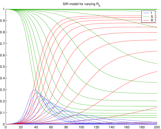
Figure 1 shows some simple examples that will be explained in some detail below.
2.2 Conditions for Outbreaks
We start by looking at the initial conditions. Since everything is invariant under an additive time shift, we can start at time 0 and consider
and see that the Infectious decrease right from the start if
| (2) |
and this keeps going on since must decrease and
| (3) |
There is no outbreak in this case, because there are not enough Susceptibles at start time. The case means that there is no infection at all, and we ignore it, though it is a solution to the system, with throughout.
2.3 The Peak
If there is a time instance (maybe above) where the Infectious are positive and do not change, we have
| (4) |
If holds, this situation cannot occur, and must be decreasing all the time, i.e. the infection dies out. This is what everybody wants. There is no outbreak. In case of we go back to the initial situation of the previous section and see that there is no outbreak due to if there is an infection at all.
The interesting case is . Then the first part of (3) shows that as soon as is larger than the peak time , the Infectious will decrease due to (4). Therefore the zero of must be a maximum, i.e. a peak, and it is unique. The Infectious go to zero even in the peak situation.
It is one of the most important practical problems in the beginning of an epidemic to predict
-
•
whether there will be a peak at all,
-
•
when the possible peak will come, and
-
•
how many Infectious will be at the peak.
This can be answered if one has good estimates for and , and we shall deal with this problem in the major part of this paper,
In real life it is highly important to avoid the peak situation, and this can only be done by administrative measures that change and to the situation . This is what management of epidemics is all about, provided that an epidemic follows the SIR model. We shall see how countries perform.
2.4 Basic Reproduction Number
The quotient
is called the basic reproduction number. If it is not larger than one, there is no outbreak, whatever the initial conditions are. If it is larger than one, there is an outbreak provided that
| (5) |
holds. In that case, there is a time where reaches a maximum, and (4) holds there. When we discuss an outbreak in what follows, we always assume and (5). If we later let tend to 1 from above, we also require that tends to from below, in order to stay in the outbreak situation.
Both and change under a change of time scale, but the basic reproduction number is invariant. Physically, and have the dimension , but is dimensionless.
2.5 Examples
Figure 1 shows a series of test runs with and with fixed and varying from to , such that varies from to . Due to the realistically small being of the population, one cannot see the decaying cases near startup, but the tails of the blue curves are decaying examples by starting value, due to when started at time . Decreasing flattens the blue curves for . One can observe that always dies out, while and tend to fixed positive levels. We shall prove this below. From the system, one can also infer that has an inflection point where has its maximum, since . If only would be observable, one could locate the peak of via the inflection point of .
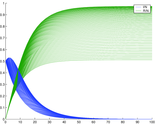
Figure 2 shows an artifical case with a large starting value , fixed and varying from 0.005 to 0.3, letting vary from 0.05 to 3. In contrast to Figure 1, this example shows cases with small properly. The essence is that the Infectious go down, whether they have a peak or not, and there will always be a portion of Susceptibles. Again, we shall prove this below.
2.6 Herd Immunity Threshold
This is a number related to the Basic Reproduction Number by
following a special scenario. If a population is threatened by an infection with Basic Reproduction Number , what is the number of immune persons needed to prevent an outbreak right from the start? We can read this off equation (2) in the ideal situation that and , namely
implying
as the threshold between outbreak and decay. This does not refer to a whole epidemic scenario, nor to an epidemic outbreak. It is a condition to be checked before anything happens, and useless within a developing epidemic, whatever the media say.
In the peak situation of (4), the fraction
of the Non-Susceptible at the peak of is exactly the Herd Immunity Threshold. Thus it is correct to say that if the Immune of a population are below the Herd Immunity Threshold at startup, and if the Basic Reproduction Number is larger than one, the sum of the Immune and the Infectious will rise up to the Herd Immunity Threshold and then the Infectious will decay. This is often stated imprecisely in the media.
Furthermore, the Herd Immunity Threshold has nothing to do with the important long-term ratio of Susceptibles to Removed. We shall address this ratio in section 2.11.
2.7 Locating the Peak
The most interesting questions during an outbreak with are
-
•
At which time will we reach the maximum of the Infectious, and
-
•
what is , i.e. how many people will maximally be infectious at that time?
It will turn out that there are no easy direct answers. From (4) we see that at the maximum of the Susceptibles have the value
i.e. the portion of the population is susceptible. From that time on, the Infectious decrease. In terms of and , the value
of the Non-Susceptibles marks the peak of the Infectious at the Herd Immunity Threshold. “Flattening the curve”, as often mentioned in the media, is intended to mean making the maximum of smaller, but this is not exactly what happens, since the maximum is described by the penultimate equation concerning the Susceptibles, while for we only know
| (6) |
yielding that the left-hand side gets smaller if gets closer to one. Politically, this requires either making smaller via reducing contact probabilities or making larger by improving the health system, or both. Anyway, “flattening the curve” works by letting tend to 1 from above, but the basic reproduction number does not directly determine the time of the maximum or the value there. We shall improve the above analysis in section 2.13.
2.8 Analyzing the Outbreak
In the beginning of the outbreak, is near to one, and therefore
models an exponential outbreak with exponent , with a solution
If this is done in discrete time steps , one has
The severity of the outbreak is not controlled by , but rather via . Publishing single values does not give any information about . Better is the ratio of two subsequent values
and if this gets smaller over time, the outbreak gets less dramatic because gets smaller. Really useful information about an outbreak does not consist of values and not of increments, but of increments of increments, i.e. some second derivative information. This is what the media rarely provided during the outbreak.
2.9 Doubling Time
Another information used by media during the outbreak is the doubling time, i.e. how many days it takes until daily values double. This is the number in
or
i.e. it is inversely proportional to . If political action doubles the “doubling time”, if halves . If politicians do this repeatedly, they never reach , and they never escape an exponential outbreak if they do this any finite number of times. Extending the doubling time will never prevent a peak, it only postpones it and hopefully flattens it. When presenting a “doubling time”, media should always point out that this makes only sense during an exponential outbreak. And it is not related to the basic reproduction number , but rather to the difference .
2.10 Spread of Infections
Media often say that the basic reproduction number gives the number of persons an average Infectious infects while being infectious. This is a rather mystical statement that needs underpinning. The quantity
is a value that has the physical dimension of time. It describes the ratio between current Infectious and current newly Removed, and thus can be seen as the average time needed for an Infectious to get Removed, i.e. it is the average time that an Infectious can infect others. Correspondingly,
are the newly Infected, and therefore
can be seen as the time it needs for an average Infectious to generate a new Infectious. The ratio then gives how many new Infectious can be generated by an Infectious while being infected, but this is only close to if , i.e. at the start of an outbreak. A correct statement is that is the average number of infections an Infectious generates while being infectious, but within an unlimited supply of Susceptibles.
2.11 Long-term Behavior
Besides the peak in case , it is interesting to know the portions of the population that get either removed (by death or immunity) or get never in contact to the infection. This concerns the long-term behavior of the Removed and the Susceptibles. Figures 1 and 2 demonstrate how and level out under all circumstances shown, but is this always true, and what is the final ratio?
If we are at a time behind the possible peak at , or in a decay situation enforced by starting value, like in (2), we know that must decrease exponentially to zero. This follows from
| (7) |
showing that must decrease linearly, or must decrease exponentially. Thus we get rid of the Infectious in the long run, keeping only Susceptibles and Removed. Surprisingly, this happens independent of how large is.
Dividing the first equation in (1) by the third leads to
and when setting and , we get
| (8) |
with the solution
| (9) |
when assuming at startup. Since is increasing, it has a limit for , and in this limit
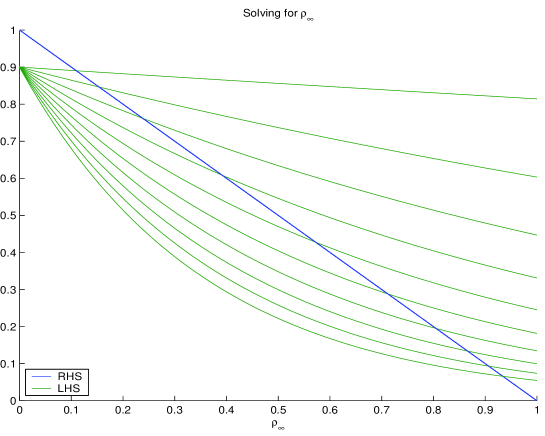
holds, together with the condition , because there are no more Infectious. The equation
has a unique solution in dependent on and . See Figure 3 for illustration. The right-hand side of the equation is the fixed blue line, while the green curves are the left-hand side for varying values of . The intersection points are the values of that solve the equation. Looking at both sides of the equation as functions of , an increase of for fixed lets the intersection point move towards 1 on the axis.
Qualitatively, we can use (8) or (9) in the form
| (10) |
to see that the ratio of Removed to Susceptibles increases with , but there is a logarithm involved.
All of this has some serious implications, if the model is correct for an epidemic situation. First, the Infectious always go to zero, but Susceptibles always remain. This means that a new infection can always arise whenever some infected person enters the sanitized population. The outbreak risk is dependent on the portion of the Susceptibles. This illustrates the importance of vaccination, e.g. against measles or influenza.
The above analysis shows that large values of lead to large relative values of Removed to Susceptible in the limit. The consequence is that systems with large have a dramatic outbreak and lead to a large portion of Removed. This is good news in case that the rate of fatalities within the Removed is low, but very bad news otherwise.
When politicians try to “flatten the curve” by bringing below 1 from some time on, this will automatically decrease the asymptotic rate of Removed and increase the asymptotic rate of Susceptibles in the population. This is particularly important if the rate of fatalities within the Removed is high, but by the previous argument the risk of re-infection rises due to the larger portion of Susceptibles.
The decay situation (7) implies that
and consequently
Therefore the final rate of the Removed is not smaller than the Herd Immunity Threshold. This is good news for possible re-infections, but only if the death rate among the Removed is small enough.
2.12 Asymptotic Exponential Decay
In a decay situation like in (7), we get
to see that the exponential decay is not ruled by as in the outbreak case with , but rather by . This also holds for large because counteracts. The bell shapes of the peaked curves are not symmetric with respect to the peak.
2.13 Back to the Peak
If we go back to analyzing the peak of at for , we know
and get
leading to
as the exact value at the maximum, improving (6). Note that the final log is positive due to the condition (5) for an outbreak.
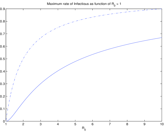
For standard infections that have starting values very close to one, the maximal ratio of Infectious is
Figure 4 shows the behaviour of the function, and this is what “flattening the curve” is all about. A value of gets a maximum of more than 40% of the population infectious at a single time. If 5% need hospital care, this implies that a country needs hospital beds for 2% of the population. The dotted line leaves the log term out, i.e. is marks the rate of the Susceptibles at the peak, and by (6) the difference is the rate of the Recovered at the peak.
To analyze the peak time , we use
to get an upper bound for the exponential outbreak
that implies a lower bound for of the form
This needs improvement.
2.14 Flattening the Curve
To get a quantitative result about “flattening the curve”, we first evaluate the integral
assuming , and set it equal to an integral over the constant value at the maximum, i.e. we squeeze the area under the curve into a rectangle of length under the maximal value, i.e.
This implies
and if we “flatten the curve” by letting tend to 1 from above, we see that the length of the above rectangle goes to infinity like , because tends to 1.
If there is no peak, e.g. if is below 1 either at the beginning or after some political intervention, one can repeat the above argument starting with the Infectious at some time looking at the area under from to infinity:
leading to
This needs improvement as well.
2.15 The Infection Timescale
Here is a detour that is well-known in the SIR literature. The SIR system can be written as
and in a new time variable with , one gets the system
for and as functions of the new infection timescale that one can fix as
to make sure that . This implies
The beauty of this is that the roles of and are perfectly split, like the roles of and . In the new timescale, increases linearly and decreases exponentially. The Basic Reproduction Number then describes the fixed ratio
like in (10), and the result (9) of section 2.11 comes back as
for the case . This approach has the disadvantage to conceal the peak within the new timescale, and is useless for peak prediction.
2.16 Estimating and Varying Parameters
If data for the SIR model were fully available, one could solve for
| (11) |
and we shall use this in section 3.3. The validity of a SIR model can be tested by checking whether the right-hand sides for and are roughly constant. If data are sampled locally, e.g. before or after a peak, the above technique should determine the parameters for the global epidemic, i.e. be useful for either prediction or backward testing.
However, in pandemics like COVID-19, the parameters and change over time by administrative action. This means that they should be considered as functions in the above equations, and then their changes may be used for conclusions about the influence of such actions. This is intended when media say that “ has changed”. From this viewpoint, one can go back to the SIR model and consider and as “control functions” that just describe the relation between the variables.
But the main argument against using (11) is that the data are hardly available. This is the concern of the next section.
3 Using Available Data
Now we want to confront the modelling of the previous section with available data. This is crucial for maneuvering countries through the epidemics [13]222Original text in German, April 16th: Schnelle Modelle, die dem Abgleich mit der Wirklichkeit standhalten, sind eine wichtige Voraussetzung, das Land politisch durch die Seuche zu steuern. .
3.1 Johns Hopkins Data
In this text, we work with the COVID-19 data from the CSSEGISandData repository of the Johns Hopkins University [7]. They are the only source that provides comparable data on a worldwide scale.
The numbers there are
-
1.
Confirmed () or cumulative infected
-
2.
Dead (), and
-
3.
Recovered ()
as cumulative integer valued time series in days from Jan. 22nd, 2020. All these values are absolute numbers, not relative to a total population. Note that the unconfirmed cases are not accessible at all, while the Confirmed contain the Dead and the Recovered of earlier days.
At this point, we do not question the integrity of the data, but there are many well-known flaws. In particular, the values for specific days are partly belonging to previous days, due to delays in the chains of data transmission in different countries. This is why, at some points, we shall apply some conservative smoothing of the data. Finally, there are inconsistencies that possibly need data changes. For an example, consider that usually COVID-19 cases lead to recovery or death within a rather fixed period, e.g. days. But some Johns Hopkins data have less new Infectioned at day than the sum of Recovered and Dead at day . And, there are countries like Germany who deliver data of Recovered in a very questionable way. The law in Germany did not enforce authorities to collect data of Recovered, and the United Kingdom did not report numbers of Dead and Recovered from places outside the National Health System, e.g. from Senior’s retirement homes. Both strategies have changed somewhat in the meantime, as of early May, but the data still keep these flaws.
We might assume that the Dead plus the Recovered of the Johns Hopkins data are the Removed of the SIR model, and that the Infectious of the Johns Hopkins data are the Infectious of the SIR model. But this is not strictly valid, because registration or confirmation come in the way.
On the other hand, one can take the radical viewpoint that facts are not interesting if they do not show up in the Johns Hopkins data. Except for the United Kingdom, the important figures concern COVID-19 casualties that are actually registered as such, others do not count, and serious cases needing hospitalization or leading to death should not go unregistered. If they do in certain countries, using such data will not be of any help, unless other data sources are available. If SIR modelling does not work for the Johns Hopkins data, it is time to modify the SIR technique appropriately, and this will be tried in this section.
An important point for what follows is that the data come as daily values. To make this compatible with differential equations, we shall replace derivatives by differences.
3.2 Examples
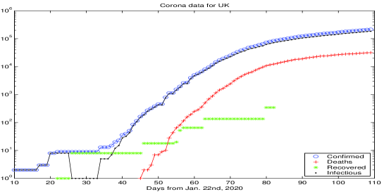
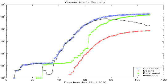
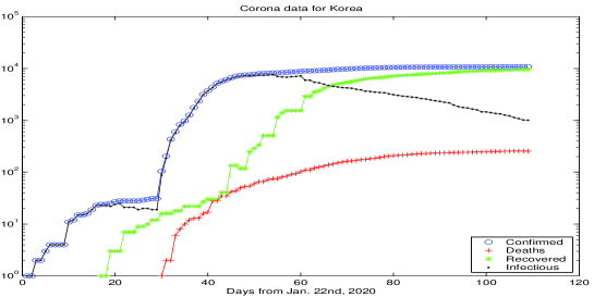
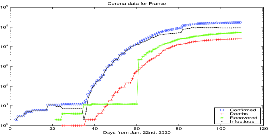
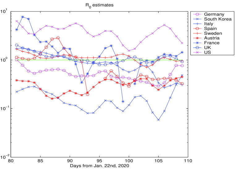
To get a first impression about the Johns Hopkins data, Figure 5 shows raw data up to day 109 (May 10th, as of this writing). The presentation is logarithmic, because then linearly increasing or decreasing parts correspond to exponentially increasing or decreasing numbers in the real data. Many presentations in the media are non-logarithmic, and then all exponential outbreaks look similar. The real interesting data are the Infectious in black that show a peak or not. The other curves are cumulative. The data for other countries tell similar stories and are suppressed.
The media, in particular German TV, present COVID-19 data in a rather debatable way. When mentioning Johns Hopkins data, they provide , , and separately without stating the most important figures, namely , their change, and the change of their change. When mentioning data of the Infectious from the Robert Koch institute alongside, they do not say precisely that these are non-cumulative and should be compared to the data of the Johns Hopkins University. And, in most cases during the outbreak, they did not mention the change of the change. Quite like all other media.
One can see in Figure 5 that Germany and South Korea have passed the peak of the Infectious, while France is roughly at the peak and the United States are still in an exponential outbreak. The early figures, below day 40, are rather useless, but then an exponential outbreak is visible in all cases. This outbreak changes its slope due to political actions, and we shall analyze this later. See [3] for a detailed early analysis of slope changes.
There are strange anomalies in the Recovered (green). France seems not to have delivered any data between days 40 and 58, Germany changed the data delivery policy between days 62 and 63, and the UK data for the Recovered are a mess.
It should be noted that the available medical results on the COVID-19 disease often state that Confirmed will die or survive after a more or less fixed number of days, roughly 14 to 21. This would imply that the red curves for the Dead and the green curves for the Recovered should roughly follow the blue curves for the Confirmed with a fixed but measurable delay. This is partially observable, but much less accurately for the Recovered.
3.3 The Johns Hopkins Data Model
The idea is to define a model that works exclusively with the Johns Hopkins data, but comes close to a SIR model, without being able to use . Since the SIR model does not distinguish between recoveries and deaths, we set
and let the Infectious be comparable, i.e.
which implies
and we completely omit the Susceptibles. From now on, we shall omit the subscript when we use the Johns Hopkins data, but we shall use when we go back to the SIR model.
Now we go back to (11) in section 2.16 and use
defining time series and that model and without knowing . This is equivalent to the model
that maintains , and we may call it a Johns Hopkins Data Model. It is very close to a SIR model if the time series is not considered to be constant, but just an approximation of .
3.3.1 Estimating
By brute force, one can consider
| (12) |
as a data-driven substitute for
Then there is a rather simple observation:
-
If is smaller than one, the Infectious decrease.
It follows from
but this is visible in the data anyway and not of much help.
Since models , it always underestimates . This underestimation gets dramatic when it must be assumed that gets seriously smaller than .
At this point, it is not intended to forecast the epidemics. The focus is on extracting parameters from the Johns Hopkins data that relate to a background SIR-type model.
3.3.2 Example
Figure 6 shows estimates via for the last four weeks before day 109, i.e. March 10th. Except for the United States, all countries were more or less successful in pressing below one. In all cases, is too close to one to have any influence. The variation in is not due to the decrease in , but should rather be attributed to political action. As mentioned above, the estimates for by are always too optimistic.
For the figure, the raw Johns Hopkins data were smoothed by a double action of a filter on the logarithms of the data. This smoother keeps constants and linear sections of the logarithm invariant, i.e. it does not change local exponential behavior. This smoothing was not applied to Figure 5. It was by far not strong enough to eliminate the apparent 7-day oscillations that are frequently in the Johns Hopkins data, see the figure. Data from the Robert Koch Institute in Germany have even stronger 7-day variations.
3.3.3 Properties of the Model
As long as is roughly constant, the above approach will always model an exponential outbreak or decay, but never a peak, because the difference equations are linear. It can only help the user to tell if there is a peak ahead or behind, depending on being larger or smaller than 1. If is kept below one, the Confirmed Infectious will not increase, causing no new threats to the health system. Then the factor will not decrease substantially, and a full SIR model is not necessary.
On the other hand, if a country manages to keep smaller than some , it is clear that it takes
steps to bring the Confirmed Infectious down to 1, if we assume and to be constant. Making small is not the best strategy. Instead, one should maximize .
As long as countries keep the clearly below one, e.g. below 1/2, this would mean that stays below one if , i.e. as long as the majority of the population has not been in contact with the SARS-CoV-2 virus. This is good news. But observing a small can conceal a situation with a large if is small. This is one reason why countries need to get a grip on the Susceptibles nationwide.
It is tempting to use the above technique for prediction in such a way that the and the are fitted to a constant or a linear function, and using the values of the fit for running the system into the future. This is very close to extending the logarithmic plots of Figure 5 by lines, using pencil and ruler, and thus hardly interesting.
So far, the above argument cannot replace a SIR model. It only interprets the available data. However, monitoring the Johns Hopkins data in the above way will be very useful when it comes to evaluate the effectivity of certain measures taken by politicians. It will be highly interesting to see how the data of Figure 6 continue, in particular when countries relax their contact restrictions.
3.4 Extension Towards a SIR Model
For cases where one still has to expect , e.g. UK, US and Sweden around day 90 (see Figure 6), the challenge remains to predict a possible peak. Using the estimates from the previous section is questionable, because they concern the subpopulation of Confirmed and are systematically underestimating . The “real” SIR model will have different parameters, and it needs the Susceptibles to model a peak or to make the estimates realistic. So far, the Johns Hopkins data work in a range where is still close to one, and the Susceptibles are considered to be abundant. But the bad news for countries with is that underestimates .
Anyway, if one trusts the above time series as approximations to and , one can run a SIR model, provided one is in the case and has reasonable starting values. But these are a problem, because the unconfirmed Infectious and the unconfirmed Recovered are not known, even if, for simplicity, one assumes that there are no unconfirmed COVID-19 deaths.
For an unrealistic scenario, consider Total Registration, i.e. all Infected are automatically confirmed. Then the Susceptibles in the Johns Hopkins model would be . Now the estimate for must be corrected to
but this change will not be serious during the outbreak.
If the time series for and for are boldly used as predictors for and in a SIR model, and if the model is started using in the discretized form
one gets a crude prediction of the peak in case .
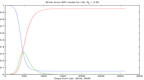
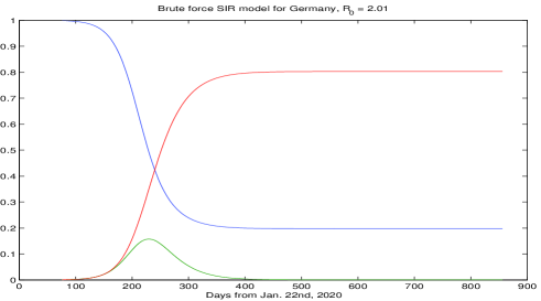
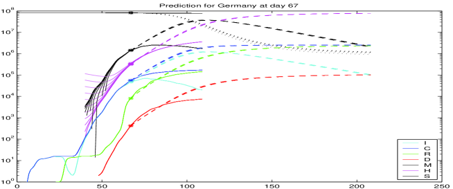
Figure 7 shows results for two cases. The top shows the case for the United States using data from day 109 (May 10th) and estimating and from the data one week before. The peak is predicted at day 472 with a total rate of 33% Infectious. To see how crude the technique is, the second plot shows the case of Germany using data up to day 75, i.e. before the peak, and the peak is predicted at day 230 with about 16% Infected. At day 75, was estimated at 2.01, but a few days later the estimate went below 1 (Figure 6) by political intervention changing considerably. See Figure 12 for a much better prediction using data only up to day 67.
4 Extended SIR Model
To get closer to what actually happens, one should combine the data-oriented Johns Hopkins Data Model with a SIR model that accounts for what happens outside of the Confirmed. We introduce the time series
-
for the Susceptibles like in the SIR model,
-
for the Infectious, not yet confirmed, ( standing for mysterious),
-
for the unconfirmed Recovered ( standing for healed).
This implies that all deaths occur within the Confirmed, though this is a highly debatable issue. It assumes that persons with serious symptoms get confirmed, and nobody dies of COVID-19 without prior confirmation.
4.1 The Hidden Model
The Removed from the viewpoint of a global SIR model including and are , and thus the SIR model is
| (13) |
To run this hidden model with constant , one needs initial values and good estimates for and , which are not the ones of the Johns Hopkins Data Model of section 3.3.
4.2 The Observable Model
The Johns Hopkins variables and are linked to the hidden model via . They follow an observable model
| (14) |
with instantaneous case death and recovery rates and for the Confirmed Infectious. These rates can be estimated separately from the available Johns Hopkins data, and we shall do this below. We call thes rates instantaneous, because they artificially attribute the new deaths or recoveries at day to the previous day, not to earlier days. In this sense, they are rather artificial, and we shall address this question. They are case rates, because they concern the Confirmed.
The observable model is coupled to the hidden model only by . Any data-driven from the observable model can be used to enter the variable of the hidden model, but in an unknown ratio. Conversely, any version of the hidden model produces values that do not determine the part. Summarizing, there is no way to fit the hidden model to the data without additional assumptions.
Various possibilites were tried to connect the Hidden to the Observable. Two will be presented now.
4.3 Infection Fatality Rates and the -Day Rule
Recall that the parameter in the observable model (14) relates case fatalities to the confirmed Infectious of the previous day. In contrast to this, the infection fatality rate in the standard literature, denoted by here, is relating to the infection directly, independent of the confirmation, and gives the probability to die of COVID-19 after infection with the SARS-CoV-2 virus. It is % by [1] and % by [11], but specialized for China. Recent data from the Heinsberg study by Streeck et. al. [10] gives a value of 0.37% for the Heinsberg population in Germany. The idea to use the infection fatality rate for information about the hidden system comes from [2]. The way to use it will depend on how to handle delays, and it turned out to be difficult to use these rates in a stable way.
Let us focus on probabilities to die either after an infection or after confirmation of an infection. The first is the infection fatality rate given in the literature, but what is the comparable case fatality rate when using the Johns Hopkins data? It is clearly not the in (14), giving the ratio of new deaths at day as a fraction of the confirmed Infectious at day . It makes much more sense to use the fact that COVID-19 diseases end after days from confirmation with either death or recovery. Let us call this the -day rule. Suggested values for range between 14 and 21.
4.3.1 Estimation of Case Fatality Rates
Following [9], one can estimate the probability to die on day after confirmation, and this works in a stable way per country, based only on and , not on the unstable data. In [9] this approach was used to produce values that comply with the -day rule, but here we use it for estimating the case fatality. The technique of [9] performs a fit
| (15) |
i.e. it assigns all new deaths at day to previous new infections on previous days in a hopefully consistent way, minimizing the error in the above formula under variation of the probabilities . If the are known for days 1 to , the case fatality rate is
This argument can also be seen the other way round: the new Confirmed at day 1 enter into with probability , into with probability and so on. The rest enters into the new Recovered at day with probability if we set . Thus the case fatality rate can be expressed as like above.
At this point, there is a hidden assumption. Persons that are new to the Confirmed at day are not dead and not recovered. The change to the Confirmed is therefore understood as the number of new registered infections. Otherwise, one might replace by in (15), but this would connect a cumulative function to a non-cumulative function. Furthermore, this would use the unsafe data of the Recovered.
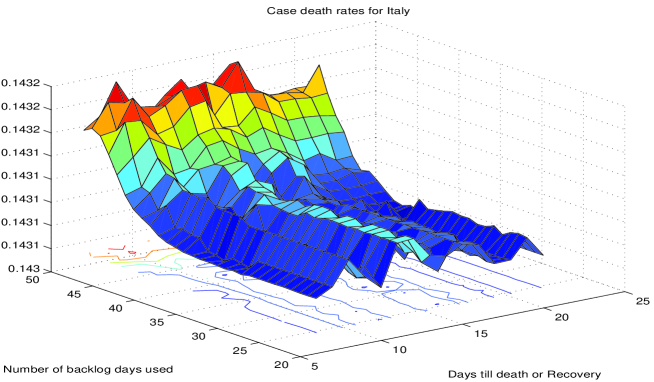
In fact, equation (15) is unexpectedly reliable, provided one looks at the sum of the probabilities . This follows from series of experiments that we do not document fully here, In [9], data for days backwards were used for the estimation, and results did not change much when more or less data were used or when was modified. Here, the range was tested, and backlogs of up to 50 days from day 109 (as of this writing). See Figure 8 below for an example. Larger lead to somewhat larger fatality rates, because the method has more leeway to assign deaths to confirmations, but the increase is rather small when is increased beyond 14. It is remarkable that suffices for a rather good fit for US, UK, Sweden, and Italy. In contrast to other countries, this means that 7 days after confirmation are enough to assign deaths consistently to previous confirmations, indicating that a large portion of confirmations concern rather serious cases.
In general, the fit gets better when the backlog is not too large, avoiding use of outdated data, and the resulting rate does not change much when backlogs are shortened. Roughly, the rule of a backlog of days works well, together with to allow enough leeway to ensure a small fitting error. Note that all variations of and the backlog data have a rather small effect on the sum of the , while the will vary strongly.
See the first column of Table 1 for estimates of case fatality rates for different countries, calculated on day 109 (May 10th). These depend strongly on the strategy for confirmation. In particular, they are high when only serious cases are confirmed, e.g. cases that need hospital care. If many more people are tested, confirmations will contain plenty of much less serious cases, and then the case fatality rates are low. The values were entered manually after inspection of a plot of the rates as functions of and the backlog. See Figure 8 for how the value 0.143 for Italy was determined.
| Country | Death | Detection |
|---|---|---|
| rate | rate | |
| Germany | 0.046 | 0.130 |
| South Korea | 0.020 | 0.300 |
| Italy | 0.143 | 0.042 |
| Spain | 0.117 | 0.051 |
| Sweden | 0.157 | 0.038 |
| Austria | 0.040 | 0.150 |
| France | 0.151 | 0.040 |
| UK | 0.157 | 0.038 |
| US | 0.067 | 0.089 |
The instantaneous case death rate of (14) for the Johns Hopkins data comes out around 0.004 for Germany by direct inspection of the data via
| (16) |
while the Case Fatality Rate in Table 1 is about 0.045. The deaths have to be attributed to different days using the -day rule, they cannot easily be assigned to the previous day without making the rate smaller.
4.3.2 Using Fatality Rates for the Hidden Model
If the case fatality rates of Table 1 are used with the infection fatality rate of , one should obtain an estimate of the total Infectious. If the formula (15) is written as
in terms of the previous new infections with infection fatality probabilities , one should maintain
and this works by setting
| (17) |
in general, without using the unstable .
4.3.3 The Detection Rate
The quotient can be called the detection rate, stating the fraction of Infectious that is entering confirmation. See the second column of Table 1. Note that all of this is dependent on good estimates of the infection fatality rate, and the new value by [10] will roughly double the detection rate for Germany.
All of this is comparable to the findings of [2] and uses the basic idea from there, but is executed with a somewhat different technique.
A simple way to understand the quotient as a detection rate is to ask for the probability for Confirmation. If the probability to die after Confirmation is , and if there are no deaths outside confirmation, then
and
It is tempting to replace by in (17), but this would make cumulative.
4.3.4 Local Estimation of Fatality Rates
4.4 Recovery Rates
We need another parameter to make the model work. There are many choices, and after some failures we selected the constant in a model equation
Following what was mentioned about instantaneous rates in section 4.2, this is an instantaneous Infection Recovery Rate, relating the new unregistered Recovered to the unregistered Infections the day before.
4.4.1 Estimation of Recovery Rates
A good value of can come out of an experiment that produces a time series for and , i.e. for unregistered Infectious and unregistered Recovered. Then the instantaneous Infection Recovery rate can be obtained directly by
The Infection Recovery rate does not help much, because we need an instantaneous rate that has no interpretation as a probability.
Without additional input, we can look at the instantaneous Case Recovery rate
| (18) |
that is available from the Johns Hopkins data, and comes out experimentally to be rather stable. The rate must be larger, because we now are not in the subpopulation of the Confirmed, and nobody can die without going first into the population of the Confirmed. As long as no better data are available, we use the formula
| (19) |
that accounts for two things:
-
1.
the value is increased by the ratio of Recovered probabilities for the Infected and the Confirmed,
-
2.
the value is multiplied by a factor for transition to immediate rates, and this factor is the transition factor for the Confirmed Recovered.
The above strategy is debatable and may be the weakest point of this approach. However, others turned out to be worse, mainly due to instability of results. Furthermore, the final prediction does not need it. It enters only in the intermediate step when , and are calculated in the time range of the available Johns Hopkins data, see section 4.5. And, finally, there is hope that there will be medical experiments that yield reliable values directly.
4.4.2 Practical Approximation of Recovery Rates
In (19) the rate is fixed, and the rate is determined locally via section 4.3.4. The rate follows from the time series
as in (14). This works for countries that provide useful data for the Recovered. In that case, and in others to follow below, we can take the time series itself as long as we have data. For prediction, we estimate the constant from the time series using a fixed backlog of days from the current day. Since many data have a weekly oscillation, due to data being not properly delivered during weekends, the backlog should not be less than 7.
4.5 Model Completion
We now have everything to run the hidden model, but we do it first for days that have available Johns Hopkins data. This leads to estimations of , and from the observed data of the Johns Hopkins source. With the parameters from above, we use the new relations
| (20) |
The first equation is a priori and determines . One could run it over the whole range of available data, if the parameter were fixed, like . But since we estimate it via section 4.3 that resulted in Table 1, we should use section 4.3.4 to calculate locally.
The second is a posteriori and lets follow from , but we postpone it. The third model equation in (13) will be handled defining by brute force via
| (21) |
We then set up the second model equation for as
| (22) |
that can be solved if an initial value is prescribed. The first model equation in (13) is used to define by
| (23) |
The model is run by executing (22) for a starting value , yielding the . Then (20) is run to produce the and , with starting values. If and are calculated by (23) and (21), respectively, the balance equation follows from (22).
4.5.1 Influence of Starting Values
Since the populations are large, the starting values for are not important. The starting value for is irrelevant for itself, because only differences enter, but it determines the starting value for due to the balance equation. Anyway, it turns out experimentally that the starting values do not matter, if the model is started early. The hidden model (13) depends much more strongly on than on the starting values. See Figure 12 for an example.
4.5.2 Parameter Estimation
4.5.3 Examples
The figures to follow in section 5.2 show the original Johns Hopkins data together with the hidden variables , and that are calculated by the above technique. Note that the only ingredients beside the Johns Hopkins data are the number for the -day rule, the Infection Fatality Rate from the literature, and the backlog for estimation of constants from time series.
5 Predictions using the Full Model
To let the combined model predict the future, or to check what it would have predicted if used at an earlier day, we take the completed model of the previous sections up to a day and use the values and for starting the prediction. With the variable , we use the recursion
| (24) |
This needs fixed values of and that we estimate from the time series for and by using a backlog of days, following Section 4.5.2. The instantaneous rates and can be calculated via their time series, as in (18) and (16), using the same backlog. We do this at the starting point of the prediction, and then the model runs in what can be called a no political change mode. Examples will follow in section 5.2.
5.1 Properties of the Full Model
The first part of the full model (24) runs as a standard SIR model for the variables and , and inherits the properties of these as described in section 2. It does not use the parameter of the second equation in (20), and it uses the first the other way round, now determining from , not from .
The balances and are maintained automatically, and the time series for , and stay monotonic as long as and are nonnegative. To check the monotonicity of , consider
The bracket is positive if
which is enough for practical purposes.
5.2 Examples of Predictions
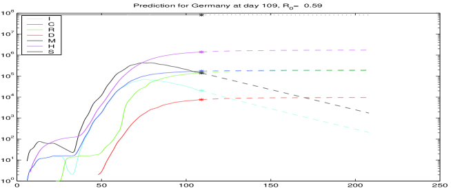
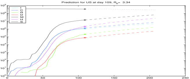
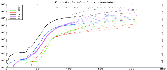
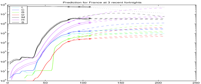
Figure 9 shows predictions on day 109, May 10th, for Germany, Sweden, US and UK, from the top. The plots for countries behind their peak are rather similar to the one for Germany. The other three countries are selected because they still have to face their peak, if no action is taken to change the parameters. The estimated values are 0.59, 1.37, 3.34, and 1.20, respectively. Note that these are not directly comparable to Figure 6, because they are the fitted constant to the backlog of a week, and using (21) and (23) instead of (12). The black and magenta curves are the estimated and values, while the values are hardly visible on the top. The hidden and in black and magenta follow roughly the observable and in blue and cyan, but with a factor due to the detection rate that is different between countries, see Table 1.
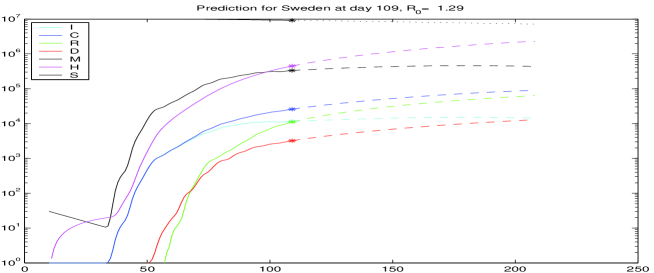

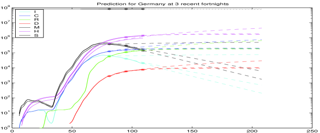
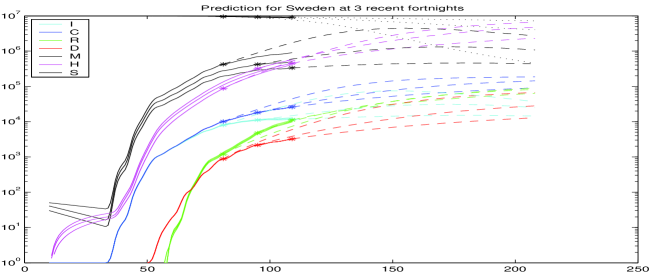
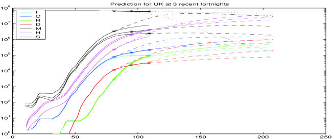
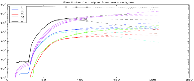
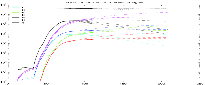
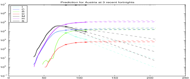
To evaluate the predictions, one should go back and start the predictions for earlier days, to compare with what happened later. Figure 11 shows overplots of predictions for days 81, 95, and 109, each a fortnight apart. The starting points of the predictions are marked by asterisks again. Now each prediction has slightly different estimates for , and due to different available data. Recall that the determination of these variables is done while there are Johns Hopkins data available, following section 4.5, and will be dependent on the data-driven estimations described there. In particular, the case fatality rates and detection rates of Table 1 change with the starting point of the prediction, and they determine , and backwards, see the figure for Sweden.
All test runs were made for the infection fatality rate , the delay for estimating case fatalities, and a backlog of 7 days when estimating constants out of recent values of time series. The choice is somewhat between % from [1], % from [11], and % from [10]. New information on infection fatality rates should be included as soon as they are available.
The Johns Hopkins data were smoothed by a double application of the 1/4, 1/2, 1/4 filter on the logarithms, like for Figure 6. For UK and Sweden, the data for the confirmed Recovered were replaced by the -day rule estimation via [9] and a backlog of days. The original data were too messy to be useful, unfortunately.
For an early case in Germany, Figure 12 shows the prediction based on data of day 67, March 27 th. On the side, the figure contains a wide variation of the starting value at the starting point, by multipliers between 1/32 and 32. This has hardly any effect on the results. The peak of about 20 million Infected is predicted on day 111, May 12th, with roughly a million Confirmed and about 20000 casualties at the peak and about 100.000 finally. Note that the real death count is about 7500 on May 11th, and the prediction of the day, in Figure 9, targets a final count of below 10000. The parameter changes by political measures turned out to be rather effective, like in many countries that applied similar strategies. But since parts of the population want to go back to their previous lifestyle, all of this is endangered, and the figures should be monitored carefully.
Of course, all of this makes sense only under the assumption that reality follows the model, in spite of all attempts to design a model that follows reality.
6 Conclusion and Open Problems
So far, the model presented here seems to be useful, combining theory and practically available data. It is data-driven to a very large extent, using only the infection fatality rate from outside for prediction, and the approximation (19) for calibration.
On the downside, there is quite a number of shortcomings:
-
•
Like the data themselves, the model needs regular updating. As far as the Johns Hopkins data are concerned, the model updates itself by using the latest data, but it needs changes as soon as new information on the hidden infections come in.
-
•
There may be better ways of estimating the hidden part of the epidemics. However, it will be easy to adapt the model to other parameter choices. If time series for the unknown variables get available, the model can easily be adapted to being data-driven by the new data.
-
•
The treatment of delays is unsatisfactory. In particular, infected persons get infected immediately, and the -day rule is not followed at all places in the model. But the rule is violated as well in the data [9].
-
•
There is no stochastics involved, except for simple things like estimating constants by least squares, or for certain probabilistic arguments on the side, e.g. in section 4.3.1. But it is not at all clear whether there are enough data to do a proper probabilistic analysis.
-
•
As long as there is no probabilistic analysis, there should be more simulations under perturbations of the data and the parameters. A few were included, e.g. for section 4.3.1 and Figures 8 and 12, but a large number was performed in the background when preparing the paper, making sure that results are stable, but there are never too many test simulations.
- •
-
•
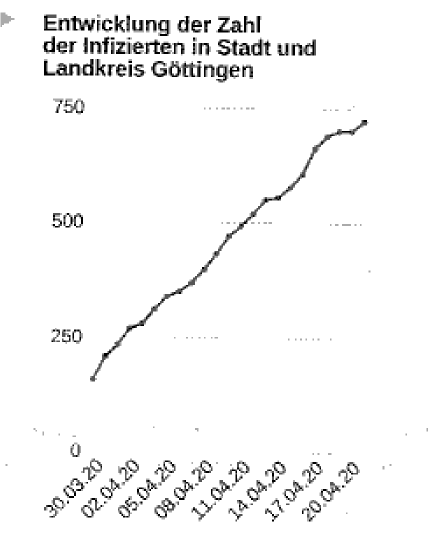
Under certain circumstances, epidemics do not show an exponential outbreak, in particular if they hit only locally and a prepared population. See Figure 13 for the COVID-19 cases in Göttingen and vicinity.
-
•
Estimates for the peak time in section 2.13 need improvement.
-
•
Same for the underpinning of “flattening the curve” in section 2.14.
MATLAB programs are available on request.
References
-
[1]
An der Heiden M, Buchholz U:
Modellierung von Beispielszenarien der SARS-CoV-2-Epidemie 2020 in Deutschland,
DOI 10.25646/6571.2https://www.rki.de/DE/Content/InfAZ/N/Neuartiges_Coronavirus/Modellierung_Deutschland.pdf -
[2]
Christian Bommer & Sebastian Vollmer,
Average detection rate of SARS-CoV-2 infections is estimated around six percent,www.uni-goettingen.de/de/document/download/ff656163edb6e674fdbf1642416a3fa1.pdf/Bommer%20&%20Vollmer%20(2020)%20COVID-19%20detection%20April%202nd.pdf -
[3]
Jonas Dehning, Johannes Zierenberg, Paul Spitzner,
Michael Wibral, Joao Pinheiro Neto, Michael Wilczek, and Viola Priesemann,
Inferring COVID-19 spreading rates and potential change points for case number forecasts
arXiv:2004.01105v2 -
[4]
Hethcote HW: The mathematics of infectious diseases.
SIAM review 2000;42(4):599-653 -
[5]
Frank C. Hoppensteadt and Paul Waltman,
A problem in the theory of epidemics I,
Math. Biosci. 9 (1970), 71-91 -
[6]
Frank C. Hoppensteadt and Paul Waltman,
A problem in the theory of epidemics II,
Math. Biosci. 12 (1971), 133-145. -
[7]
COVID-19 repository at GitHub,
https://github.com/CSSEGISandData/COVID-19/tree/master/csse_covid_19_data/csse_covid_19_time_series -
[8]
Robert-Koch-Institut,
SARS-CoV-2 Steckbrief zur Coronavirus-Krankheit-2019 (COVID-19),
dated 24.4.2020https://www.rki.de/DE/Content/InfAZ/N/Neuartiges_Coronavirus/Steckbrief.html#doc13776792bodyText2 -
[9]
Schaback, R. : Modelling Recovered Cases and Death Probabilities
for the COVID-19 Outbreak,
dated March 26th, 2020, https://arxiv.org/abs/2003.12068 -
[10]
Streeck et. al: Preliminary results from the Heinsberg outbreak,
cited after Göttinger Tageblatt, May 5th, page 3. -
[11]
Estimates of the severity of coronavirus disease 2019:
a model-based analysis,
www.thelancet.com/infection
Published online March 30, 2020
https://doi.org/10.1016/S1473-3099(20)30243-7 -
[12]
Compartmental Models in Epidemiology,
https://en.wikipedia.org/wiki/Compartmental_models_in_epidemiology -
[13]
Andreas Sentker: Bloß raus hier !
Article in the weekly journal DIE ZEIT, April 16th, 2020, page 20.