1076 \vgtccategoryResearch \vgtcpapertypeplease specify \authorfooter Keshav Dasu is with UC Davis. E-mail: kdasu@ucdavis.edu. Kwan-Liu Ma is with UC Davis. E-mail: ma@ucdavis.edu. Joyce Ma is with The Exploratorium. E-mail: jma@exploratorium.edu. Jennifer Frazier is with The Exploratorium. E-mail: jfrazier@exploratorium.edu. \shortauthortitleBiv et al.: Global Illumination for Fun and Profit
Sea of Genes:
A Reflection on Visualising Metagenomic Data for Museums
Abstract
We examine the process of designing an exhibit to communicate scientific findings from a complex dataset and unfamiliar domain to the public in a science museum. Our exhibit sought to communicate new lessons based on scientific findings from the domain of metagenomics. This multi-user exhibit had three goals: (1) to inform the public about microbial communities and their daily cycles; (2) to link microbes’ activity to the concept of gene expression; (3) and to highlight scientists’ use of gene expression data to understand the role of microbes. To address these three goals, we derived visualization designs with three corresponding stories, each corresponding to a goal. We present three successive rounds of design and evaluation of our attempts to convey these goals. We could successfully present one story but had limited success with our second and third goals. This work presents a detailed account of an attempt to explain tightly coupled relationships through storytelling and animation in a multi-user, informal learning environment to a public with varying prior knowledge on the domain and identify lessons for future design.
keywords:
Narrative visualization, storytelling, animation, evaluation, user studies, informal learning environmentsK.6.1Management of Computing and Information SystemsProject and People ManagementLife Cycle; \CCScatK.7.mThe Computing ProfessionMiscellaneousEthics \vgtcinsertpkgIntroduction
Visualizations are increasingly central to the practice of science. They are used across a range of scientific disciplines to analyze phenomena, such as changes in microbiomes and shifts in climate. There have been several large-scale efforts to develop scientific and information visualizations for the public: the National Oceanic and Atmospheric Administration’s (NOAA’s) Science on a Sphere presents earth systems datasets such as tsunamis, climate models, and sea surface temperature on a large spherical display for aquariums and museums [52]; DeepTree [8] visualizes evolutionary data for exploration on a tabletop interface in natural history museums; MacroScope [69] ports a range of visualizations into a large interactive display for a wide range of academic and museum settings; and Living Liquid [45, 34] created interactive visualizations for a hands-on museum environment. Each of these projects, as well as many others [23, 66, 30], have contributed to our understanding of the opportunities and limitations of visualizations in museum settings. However, these projects visualized concepts such as currents, weather, evolutionary trees, and migration paths that the public has familiarity with.
This paper examines the challenges of creating a museum exhibit from a complex dataset from an emerging and unfamiliar field: metagenomics. Metagenomics, the characterization of all the genetic data in a sample, is revolutionizing our understanding of microbes. Researchers use these data to determine what species are present, what functions they perform, how these functions change over time, and infer how microbes interact [14]. Metagenomics is one of the primary ways researchers study microbes. Microbes play a central role in almost all aspects of life on earth [14]. Ocean microbes use energy from the sun to produce half the oxygen we breathe and drive our climate; soil microbes impact the food we eat; and scientists are beginning to understand the complex and critical roles billions of microbes living in our bodies have on our health [14]. Despite the significance of metagenomics to scientific research, few efforts have introduced these data to the public through interactive visualization. Instead, exhibits [58, 17, 55] rely on electron micrographs and graphics of microbes.
Even though the visualization field has explored narrative elements as a strategy for engaging users with complex data [68, 12, 11], there has been limited work on visualization exhibits that present complex content from an unfamiliar domain in a museum setting. Unfamiliar domain, in this context, refers to the targeted audience having little prior knowledge of the domain. We examine the application of narrative visualization strategies and animation effects to reduce complexity and create familiarity when presenting scientific findings through a museum exhibit. The exhibit is called Sea of Genes. First, we provide a detailed documentation of the design process for developing such an exhibit and the challenges we faced compared to our prior exhibit design experiences. We then address limitations and constraints of designing a visualization exhibit in an informal learning environment and point out directions for research in this space. This work presents a detailed account of an attempt to explain tightly-coupled relationships through storytelling and animation in a multi-user, informal learning environment to the public with varying prior knowledge on the domain. We discuss takeaways and provide guidance for studying science museum exhibits, which we believe is especially valuable to both the field of metagenomics and other scientific domains.
1 Related Work
Extensive work has been done on the application of narrative devices and visualization of complex data. There has also been research on the use of animation for teaching unfamiliar concepts. With Sea of Genes we paired principles from both educational animation and narrative visualization to develop an exhibit that could successfully present content from both a complex dataset in an unfamiliar domain.
1.1 Value of Narratives
Kosara and Mackinlay [38] define a narrative as “a clearly defined path that is composed of a sequence of ordered steps, containing either text, images, visualizations, video, or any combination of the latter”. Each step can be thought of as a story that relates the ‘who, where, when and how’ of an event that occurred. The ordering of these steps creates the narrative. How the order is set impacts its reception. Storytelling is the activity of sharing a narrative. Theorists posit narratives are fundamental to human sensemaking [10] and intelligence [65]. Research [16] has found stories help us connect and remember facts. The roles and forms narratives may serve and can take in visualization continue to be active areas of research. For example, Gershon and Page [24] discuss the value of storytelling when developing applications. Segel and Heer [68] provide a comprehensive review of narrative visualization as used by online journalists. These works motivate the value of using narrative to communicate concepts to the lay audience.
1.2 Narrative Frameworks
Many visualization researchers have analyzed and designed a number of methodologies and frameworks to apply narrative techniques [68, 38, 24, 35, 47]. Narratives convey a message, enhance comprehension, make transparent causality, increase engagement, and summarize and simplify a complex message. The narrative visualization literature describes a number of approaches on how to embed a narrative. Segel and Heer’s case study of Gapminder Human Development Trends [68] explores how narratives enable complex information to be comprehended quickly by the user. Hullman and Diakopoulos [35] discuss a set of omission techniques used for simplifying complex data. Lee et al. [42] describe a process of working with data analysts to extract only what is relevant to the story as well as how setting and device choice influence the presentation of a story. These works provided insights for Sea of Genes on how to use narrative to communicate lessons from the complex metagenomic dataset. We expand on the current literature with how the museum setting, especially a highly interactive one, affects the presentation of a narrative.
Gershon and Page [24] contend conveying a story in general is more effective when images are combined with text or data. While images in themselves convey a lot of information, we need data and text to reduce the ambiguity in the message. They also identify continuity as an important element. Continuity may result from a causal flow that also enables retention and recall. If a user perceives continuity, this may also imply they have understood the causality. Our design must focus on preserving the continuity between each step in our narrative, since the sequence in which they are presented matters for our stories.
Segel and Heer [68] provide an overview of how visual elements have been employed in traditional media such as comics, books, and films to tell stories. Their focus is on the role of graphical elements and interactivity in maintaining continuity in the flow of the narrative. They identify author-driven and reader-driven as two polar extremes of visualization. We contextualize these two terms for the museum setting as designer-driven and visitor-driven. In a designer-driven approach, the story is linear and the visitor has no control of the narrative. It presents to the visitor a fixed sequence of events with which they can interact. In a “pure” visitor-driven approach, there is no predefined narrative. Instead, there is no fixed sequence of events, and the visitor would select and order events to create a narrative. By blending these two extremes in our own design, we seek to retain continuity and provide visitors freedom to explore.
Narratives have been widely applied in history and art museums to help visitors make personal connections to an object or a collection [5, 64]. A study [2] on the roles narratives play in interactive science exhibits found enhancing exhibits with personal stories improved the exhibit experience for visitors and helped create personal connections to the content. However, adding stories seemed to reduce the visitors’ physical interactions and explorations with the exhibit. Similarly, a study [44] examining the use of narrative introduction to describe the dataset visualized in an exhibit, found it did not improve data exploration. Further study of narrative applied to interactive visualization is needed, examining its applicability and effectiveness in communicating complex and unfamiliar content. We identified a set of related stories, which we could present in layers. Sea of Genes provided us with an opportunity to assess the effectiveness of applying the aforementioned narrative strategies to breakdown a complex metagenomic dataset to then present a layered story to the public.
1.3 Animation for Learners
Research on how animation affects learning has gone through two eras of consideration. In the first era (1990’s), researchers studied the impact animation has on learning by evaluating it next to static graphics [73, 28, 49]. These studies report inconsistent or inconclusive findings on the effects of animation on learning. In particular, although Schnotz and Grzondziel [67] found animation performed better, it had an interactive component [22] confounding the results. Tversky and Morrison [73] were highly skeptical animations could be effective for conveying complex systems. They suggest two principles to note as conditions for an animation to be effective: Apprehension and Congruence. The Apprehension principle states “the structure and content of the external representation should be readily and accurately perceived.” A drawback of animation is the perceptual and cognitive limitation of processing a changing visualization, e.g. complex interactions may occur too quickly to be understood. The Congruence principle states “the structure and content of the external representation should correspond to the desired structure and content of the internal representation.” In principle, animation should be effective for expressing changes. Most animations violate these principles. People conceive a dynamic process as a sequence of steps, thus violating the Congruence principle. In order for an animation to be effective Tversky [73] believes animations must explain rather than simply show.
Rather than comparing animations’ effectiveness to static graphics, recent studies focus on understanding the cognitive processes involved in processing dynamic visualizations and identifying the steps leading to comprehension [51, 1]. Berney and Betrancourt [7] conduct a meta-analysis on animation for learning and section the factors into three main groups: (a) specific to the learners, (b) specific to the instructional material, and (c) specific to the learning context. Studies [13, 37] that address group (a), to which museum visitors belong, found varying prior knowledge requires varying presentation forms to achieve a learning task. Therefore, with Sea of Genes we need to consider other ways to enforce the animation, which we detail in Section 5. Chanlin [13] found animation enhanced both novice and experienced learners’ learning. Specifically, for novices it helped facilitate learning of descriptive facts. Berney and Betrancourt form a hypothesis based on Ploetzner and Lowe’s [59] work that “well-designed” expository animations contain all the elements needed to draw learners’ attention to the right place at the right time. That is, our animation should facilitate directing visitors attention to each point when necessary.
2 Sea of Genes
Sea of Genes is a multi-user interactive visualization exhibit at the Exploratorium, a science museum. The exhibit is within the Living Systems Gallery of the museum, and uses a combination of animation techniques and narrative elements to communicate three key stories found in a metagenomic dataset of marine microbes:
-
•
Microbial interactions occur in a predictable daily rhythm.
-
•
Genes turn on and off according to a daily rhythm.
-
•
Scientists collect data about the genes of microbes.
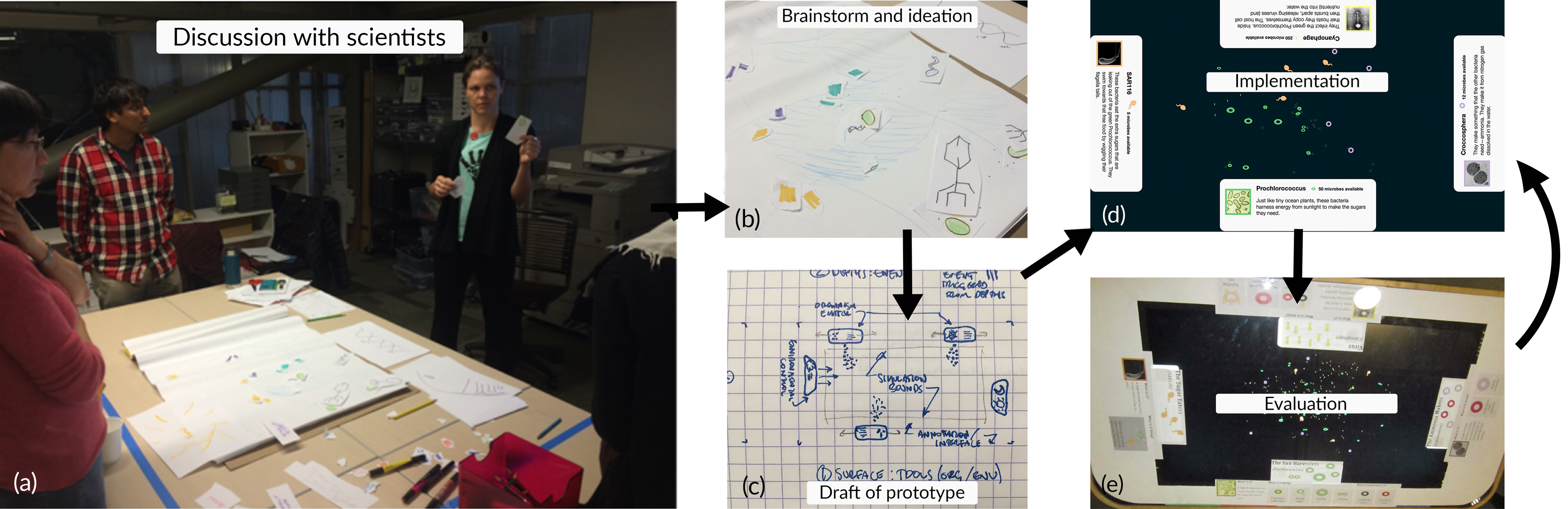
This exhibit was created through an interdisciplinary collaboration that brought together expertise in academic and commercial visualization practices, scientific research, and museum design and evaluation. The Exploratorium led the collaboration and provided a curator, project manager, writer, graphic design, exhibit designer, learning researcher, and evaluators. A visualization group provided a graduate student and professor to provide expertise in visualization and HCI research to assist the exhibit design. The University of Hawaii at Manoa provided a lead data scientist and marine microbiologist who provided datasets and content expertise. Stamen Design provided a digital graphic designer and visualization designer to provide expertise in public-facing commercial visualization design and public installation.
2.1 The Dataset
The data used for Sea of Genes were collected and analyzed by oceanographers affiliated with the Center for Microbial Oceanography: Research and Education (C-MORE) at the University of Hawai’i at Manoa and the Monterey Bay Aquarium Research Institute (MBARI). A full description of the data collection and analysis methods were published in a series of articles [56, 4, 3] during 2014–2017.
The 2014–2015 samples were collected using an Environmental Sampling Processor (ESP) [56, 4], a free-drifting sampling device that collects environmental and genomic data at specified times in the ocean, in this case, every 4 hours for 3 days. The 2017 samples were collected every 4 hours for 4 days using Niskin bottles [3] deployed from a research vessel. Planktonic microbial assemblages were collected by passing seawater through a 0.22 m pore-sized filter, preserved in RNA later, and stored at -80°C within 24 hours of retrieval from the instrument. RNA was extracted, cDNA was generated, and Illumina sequencing [3] was performed. Metatranscriptome reads were mapped to ortholog clusters of proteins constructed from the phylogenetic groups of interest. Function was assigned by KEGG Orthology annotation. Read count tables were normalized to total read count, with threshold set to achieve R2 value 0.8 using the R packages igraph and WGCNA [40]. These count tables contained information about daily patterns in microbes such as: time of collection, taxonomic assignment, gene function and expression levels, and the peak time of expression. From this, C-MORE and MBARI scientists were able to infer which microbes were present, what functions they performed, and when those functions occurred over the course of a 24 hour period. They provided us access to these data sets and assisted in interpretation, (Figure 2a).
2.2 Hardware and Implementation
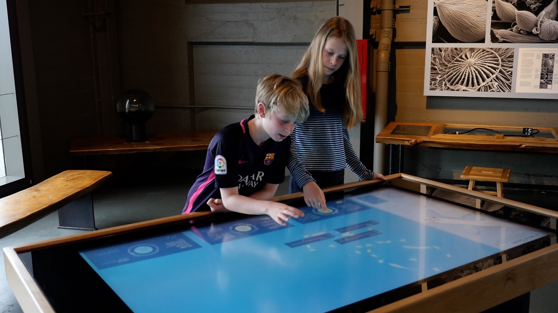
For Sea of Genes we decided to use an interactive touch table, which has been shown to encourage collaboration and attract attention [32, 63, 60]. A feature of the museum context is the ability to support social experiences [20]. Hinrichs et al.’s [31] findings suggest using a large interactive display gives the visualization a presence within an exhibition. These displays allow people to enjoy and participate from a distance and decide whether to engage further. In our previous project we used the Multitaction object-tracking table [45], which attracted and engaged visitors with the visualization. We took advantage of the social context of the museum by using a larger 3M 65” touch-table at 4k resolution as our exhibit display to accommodate either 6 visitors interacting all around it or 3 visitors from one side.
To support an iterative development cycle, Sea of Genes is web-based and written in ECMAScript 6, JavaScript 6. JavaScript is lightweight and is suited for rapid prototyping. Each microbe had its own custom sprite and a set of animated behaviors derived from their transcripts. The transcripts were functionally annotated, and patterns of sequential function were grouped into high level categories (e.g., genes involved in preparing a cell to divide, then genes involved in the actual division). The time of expression for each transcript was determined by the time of day the sample was collected and the normalized amount of transcript in the sample. Details on the visualization process are expanded upon in Section 5. We provided a configuration file the museum staff can edit, allowing them to modify parameters such as the number of microbes and length of time for the 24hour period to cycle. To package for distribution we used the open source software Electron by github.io [19]. For our own development we deployed the exhibit on OSX architecture.
3 Design Considerations and Evaluation Methods
Interpreting metagenomic data requires understanding microbes, their genes, and gene expression. To create an experience around this complex dataset, we worked with C-MORE scientists to (1) synthesize their research into a narrative comprised of three related stories, and (2) apply techniques from established narrative frameworks to layer the following three stories into a cohesive narrative:
-
S1.
Microbial interactions occur in a predictable daily rhythm. The first story conveyed to visitors that microbes form communities similar to larger organisms. The interactions and functions these microbes perform during the day and night differ.
-
S2.
Genes turn on and off according to a daily rhythm. The second story focused on how the microbial interactions and actions in the first story are a result of the gene expressions of specific genes, which control microbial function.
-
S3.
Scientists collect data about the genes of microbes to make sense of the temporal patterns in microbial functions. The final story was scientists collected data and identified the expressed genes responsible for a microbial function.
These stories were the synthesis of the C-MORE scientists’ research and, taken together, could provide the public an understanding of how marine microbes are studied and what they do. From discussion with the scientists we found S1 and S2 were closely related to one another, with S2 explaining the molecular underpinnings of, or genetic expression for, the behavior in S1. S3 further elaborates that scientists study S2 to make sense of the temporal patterns in microbial interaction captured in S1. In short, we needed to show the public (S1) microbes have interactions that occur in a predictable daily rhythm which (S2) are the result of gene expressions, and (S3) scientists analyze these gene expression data to identify temporal patterns. How we present these stories is constrained by the considerations of an informal learning environment in an interactive science museum.
3.1 Museum Considerations
Museums are informal learning environments referred to as “designed environments” in which exhibits are developed to help structure visitor experiences, in line with institutional goals and values [53]. In addition to facilitating visitor engagement and comprehension of complex datasets, the team needed to ensure the exhibit design considered the informal learning context. The following considerations were identified and informed by our collaborators at the Exploratorium, which we used to constrain and guide our design process.
C1. Free-choice learning environment. As with other types of informal learning environments, the experiences in museums, as compared to the formal setting of the classroom, are motivated and guided by personal interests rather than compulsory requirements [2, 5]. This is often referred to as a ”free-choice” learning environment. In such an environment visitors may not encounter or even choose to attend to our exhibit. The exhibit design must consider methods to attract and retain visitor attention. As free-choice learning environments [53], museums employ a variety of techniques to attract and sustain visitors interests and engagement at exhibits. For example, DeepTree [15], an interactive visualization of the tree of life had strategically placed features which invited attention and used the interactive table to encourage collaboration. Likewise, the interactive plankton visualization in the Living Liquid project [45], used an animated visualization paired with a tangible interface to captivate visitors’ interest and serve as gateway for exploration of plankton patterns.
C2. Public comprehension. The audience we design for is the visiting public, who are typically not domain experts. Since our museum attracts a diverse audience we do not know where, on the spectrum of novice to expert, our visitor’s prior knowledge is. Furthermore, the open space layout of the exhibits means there are no guarantees a visitor will come to the Sea of Genes exhibit with the prerequisite knowledge learned from a prior exhibit [6]. Therefore, we cannot assume familiarity with the underlying dataset or domain itself. Similarly, we cannot assume representations which experts use for interpreting the data will translate to the public [15]. However, we should be mindful to not trivialize the experience to exclude experts or people who want to explore the content matter deeply.
C3. Readily decipherable. When designing an exhibit in a science museum there is a need for fast decoding and ready interpretation of the visualization [46]. In the Exploratorium’s Traits of Life exhibit collection holding times at a signle exhibit ranged from 12 to 149 seconds [29]. In other words, visitors have a short dwell time at exhibits and within this time they need to decode what is visually presented. Our design should thus accelerate this decode process.
C4. Support Multi-user Interaction. Exhibit design must allow for multiple visitors to view or interact. This comes in both the need to support social groups who frequent the museum and facilitate collaborative learning [21]. There are also logistical reasons for multi-user exhibits, such as preventing queues and facilitating visitor movement in the overall exhibit space, and providing more visitors access to an exhibit. Designing for multiple users has several implications. Because we cannot assume a visitor will come to the exhibit in its initial state, the design should ensure a visitor’s can interpret and interact with the exhibit regardless of the state of the visualization. Furthermore, a visitor’s interaction with the exhibit must not adversely affect another visitor’s experience. Ideally, there are supports to encourage visitors to share their thoughts with each other and come to a common understanding of their shared exhibit experience.
3.2 Evaluation Process
Formative evaluation is an integral part of the iterative exhibit development process at the Exploratorium (Figure 2 e). Depending on the complexity of the exhibit, development may entail several rounds of prototyping and evaluation, with each successive round testing prototypes with modifications informed by visitor feedback and behavior data collected through evaluation. For Sea of Genes we conducted three successive rounds of prototyping and evaluation.
4 Visualization Design
Three iterations were designed and tested, each adding on one story from S1–3. During each iteration every design choice was guided by our considerations, C1–4. The following discussion is organized according to key design decisions made during our iterative development and evaluation process.
4.1 Constructing the Stories
The first step we took, guided by Lee et al.’s [42] approach, was to spend time exploring the data and extracting data excerpts to use and support S1 and S2, as described in Section 4. A study was conducted earlier at the Exploratorium to examine prior knowledge and interests in marine microbes and metagenomics. A large majority (96%) of the 136 visitors interviewed described microbes by a role they believed microbes played, while few used scientific taxonomic classifications [43]. Consequently, we decided to focus on functional roles. To identify familiar functions from the dataset we referred to the Next Generation Science Standards (NGSS) [54] and consulted with our partners at University of Hawaii (UH). The science standards specify science concepts taught at each grade level and are used to guide the design of educational experiences. The Exploratorium often designs for middle school level; however, we found that most of the functions were not covered until high school. With this in mind we consulted with our partners, who suggested selecting microbes from their dataset based on their roles in a microbial ecosystem and could demonstrate S1–2. Selecting microbes based on roles rather than taxonomic classification would assist visitor familiarity C2. Four microbes were chosen for the first prototype (Figure 2). We selected phototrophs, Prochlorococcus, which draw energy from the sun, heterotrophs, SAR116, which consume other forms of energy like sugar, photo-heterotrophs, Crocosphaera, which draw energy from the sun and eat other forms of energy, and viruses. Viruses are not in NGSS; so, we relied on another prior study [70] that found 71% of teens knew viruses caused infections, and 79% recognized images of the type of virus used in the Hawaii dataset. Next, we chose microbial functions to animate for each microbe. We selected functions from the data that had a strong daily pattern and were familiar to museum visitors [43], selecting functions behind photosynthesis and cell division, which are concepts that are encountered in U.S. middle schools according to NGSS.
Prior studies [43, 70] suggest visitors believed microbes had a larger role in our ecosystems. However, we needed to determine which story to center the design around. Our previous study [43] found 95% of visitors knew microbes lived in the ocean, and although 28% were initially surprised that microbes have genetic material, a majority (71%) when told this fact found it reasonable and believable. S2 and S3 required explaining to the public the link between microbes and genetics. Prior work [41] found the general public had a limited understanding of basic genetic terms and concepts, suggesting that visitors would have difficulty with S2 and hence S3. For this reason the team decided that the main feature of the exhibit should be S1, an animation of microbial behavior with familiar descriptions.
4.2 Prototype 1
Our scientific partners at UH helped identify which stories could be told from their data. One of the stories within the dataset was that microbes have function that are on a daily cycle. Based on a previous study [43], we focused on this daily cycle of microbial functions, which we predicted may give visitors a more familiar entry point in to the metagenomics data.
We collaborated with our scientific partners at the UH to create a visualization with somewhat familiar representations to visitors (C2) and to simplify the complexity of the data (C3). From our discussions we created a model of microbial interactions that could best tell S1 and offer some familiarity for visitors. The model simulates a 24 hour period showing the functions each microbe performed during this time. The objective of Prototype 1 was to see if visitors could follow S1. If they were able to do so then we would try to layer in S2 and finally S3.
We chose to have a central animation based on prior work [13] indicating that animations could be effective for conveying these concepts to novices, C2. However, animations, when designed for teaching those with varying domain knowledge, require varying the presentation forms to be effective in achieving a desired learning task [13, 37]. We decided to layer the three related stories in an exhibit, we sought to present each story within a form, starting with S1 as an animation. We chose S1 to be the focus of the animation since of the three stories it could have the most familiarity with visitors [43] and, as the first story, it is the foundation upon which the other stories are built. This animation would serve as our entry point [33], and be the centerpiece to attract visitors to the exhibit. This would also provide us with the opportunity to determine if a “well-designed” expository animation actually contains all the elements needed to draw the learners’ attention to the right place at the right time [7] allowing visitors to quickly decode (C3) and understand S1. With Prototype 1 our intent was to have a minimalist animation. Our animation (Figure 3a) was driven by our curated model of microbial interaction and portrayed microbes as icons interacting with one another. This animation had three main elements: (1) Four main microbial characters (Figure 3c), (2) A background which transitioned from light to dark blue (Figure 3b) and back over a set period of 45 seconds (C3) to illustrate a 24 hour period, and (3) Control panels that described each of the four microbes (Figure 3a). The control panels were static and only provided textual information about each microbe. We included a simple visitor interaction of tapping on the control panel to inject viruses into the pool. Our goal was to communicate S1 using an animation that showed the functions of microbes during a 24 hour period informed by metagenomic data.
The evaluation for Prototype 1 sought to determine if visitors could interpret this first story from the animation. The exhibit was placed near other exhibits that focused on microorganisms. One was an exhibit on the microbes that live in the termite gut, with a live microscope view of these microbes. The other was a Winogradsky panel that shows microbial diversity and discusses energy production. While there was not a designed exhibition, this context seemed to best support the content of Sea of Genes.
To recruit participants for the evaluation, an evaluator stood near the exhibit and approached every third person as they walked passed a predetermined imaginary line near the exhibit. If the systematically selected visitor was with a group, the whole group was invited to participate as well. Consenting visitors were asked to use the exhibit. Because it was an early prototype and not all of the labels or the touch interactivity was implemented, the evaluator verbally described these aspects to the participants:
-
Evaluator:
This exhibit shows how microscopic life behave in the ocean. The water changes color from dark, for night, to light blue, for day. You can release different organisms into the water to see what they do. The touch is not working yet, so just let me know which organism you want, and I’ll release them for you.
When participants indicated that they were done, the evaluator asked the visitor who interacted the most within their group a set of questions designed to gauge usability and comprehension. In this evaluation, we talked with a total of 38 visitors111The demographic breakdown of the evaluation participants was: 18 adults, 12 teenagers, and 8 children, with 20 females and 18 males. over the course of four days. When we asked visitors what they found interesting, over 55% of them talked about the interactions between microbes in general, with a minority (6 out of 38 visitors) mentioning a specific interaction shown in the animation, for example:
-
Visitor03:
[It was interesting] infection of Cyanophage to Prochlorococcus, and SAR116 eating. How it [infected Prochlorococcus] burst and a bunch came out.
-
Visitor37:
One thing was SAR116 and Prochlorococcus working together [was interesting]. [I] noticed the SAR116 were going by Prochlorococcus and right after the Prochlorococcus were making sugar.
However, a majority (58%) of the visitors found parts of the animation confusing. There were multiple reasons visitors had difficulty interpreting this animation. First, a few visitors complained that in the animation, the microbes’ small size and thus poor resolution made it difficult to distinguish one type from another, e.g.:
-
Visitor01:
Some stuff was really small, so you couldn’t see what was happening
-
Visitor17:
These [Prochlorococcus] in particular appear to move randomly. A better graphic representation would be helpful.
Second, visitors could not decipher parts of the animation to make sense of microbial behavior, e.g.,:
-
Visitor24:
No idea what those guys [Crocosphaera] do.
-
Visitor29:
Didn’t understand what SAR116 were doing.
This was particularly the case when microbes appeared and disappeared as they were born and died, e.g.:
-
Visitor01:
Some would disappear, especially this one [SAR116]. It was hard to see why they disappeared.
A smaller number (29%) of visitors noticed differences between day and night, even though the evaluator described the transition at the beginning of their exhibit use.
-
Visitor38:
The light and dark. Seeing difference between what’s there and thrives in the light versus dark.
Our evaluation of this prototype showed visitors were interested in the interactions between microbes. A few noticed behaviors such as infection and eating. The majority, however, could only glean that there is a microbial community but may not have discerned the specifics of the behaviors or relationships. This may have been due to the presence of too many unique animated elements; Pylyshyn and Storm [61] showed people can only track up to 5 independent moving targets accurately. Rather than notice the individual unique animations between microbes, the excessive amount of moving elements may have led to it being processed as one entity. Thus, we hypothesize this prototype fell to the Gestalt principle of Common Fate [57], which states humans perceive visual stimuli that move in the same speed or direction as parts of a single stimulus. Furthermore, processing both this visual information and decoding what it means may have distracted visitors from paying attention to the background color change. We needed to improve how we portrayed our microbes to make clear the interactions of interest and focus visitor attention. Yet, this evaluation indicated that the animation was able to convey that microbes interact with one another, enough that 55% of visitors talked about it, the first aspect of S1; however, it drew too much attention, resulting in few visitors seeing or discussing the daily aspect. Based on the evaluation data findings, it was clear that we had to improve our animation to better support visitors’ interpretation of the microbial functions and their daily rhythm.
4.3 Prototype 2
For the next version we wanted to (1) improve our animation presenting S1 by making it easier for visitors to interpret and (2) layer on S2 by visually communicating that gene expression going on and off is what drives the microbial functions seen in S1. Furthermore, for this version we elected a more designer-driven approach for presenting the narrative. That is rather than let the visitors independently navigate the visualization and discover stories on their own, we sought to have more control on actively guiding visitors to the stories. Because these changes would introduce more information to decode, we had to carefully revise the animation to convey the additional information without overwhelming the visitors [24, 7]. To accomplish these tasks we focused on the following elements of the exhibit.
-
•
Appearance of microbes and their behavior (C1 and C3). Visual designers worked closely with the UH scientists and exhibit specialists to define how microbes and their behavior would appear in the exhibit (Figure 6).
-
•
Control panel for interaction and interpretation (C2 and C4). Central to interactivity was a control panel with a “well” of microbes that visitors could drag into the exhibit. The control panel also described the creatures and a timeline chart that tracked the timing of activities seen throughout the day (Figure 4a).
-
•
Annotations: New text was added to focus visitors to relevant information and reduce time finding what to observe (C3). These annotations also conveyed that microbial behavior and relationships follow a daily pattern (Figure 4b).
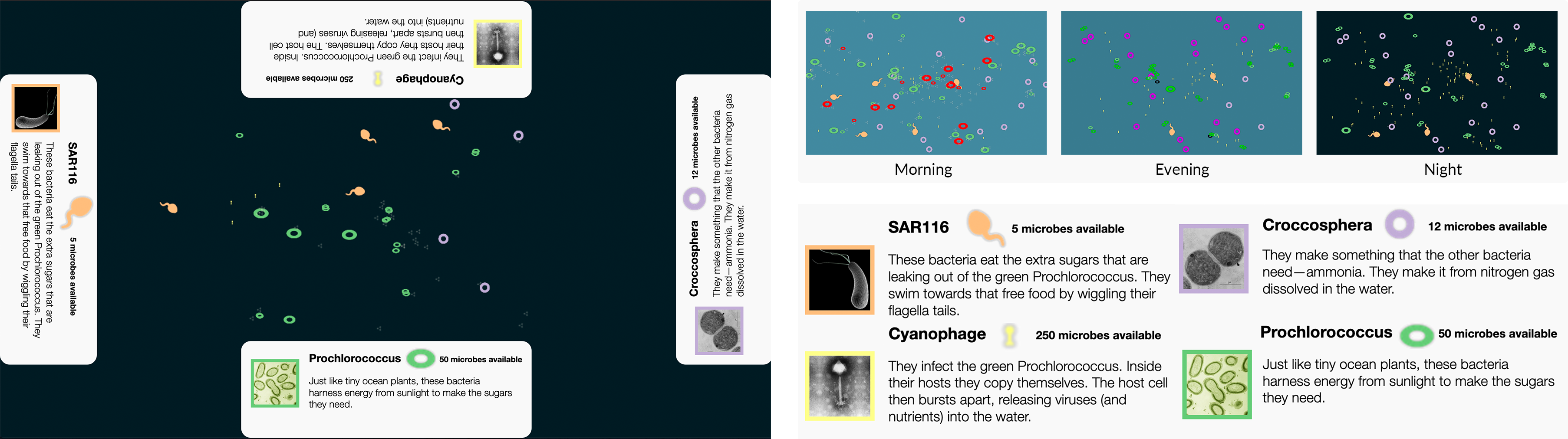
To improve interpretation of each story, we sought to reduce noise and confusion by both lowering the number of microbes and improving the quality of assets and animations [35, 73]. Some visitors who saw Prototype 1 reported having trouble identifying the microbes. Therefore, the microbe community was reduced from 4 to 3 and the assets of each microbe were changed to be more realistic compared to the previous version, (C3). The simulated ocean animation now only contained three microbial types: SAR116, Cyanophage, and Prochlorococcus as shown in Figure 6. We created non-scientific names for these microbial characters to reinforce their functional role in the ocean ecosystem and provide some familiarity to our visitors [48, 50, 25]. “Sun Harvesters” was the name given to Prochlorococcus, a microbe that makes energy from the sun. “Sugar Eaters” was the name given to SAR116, a microbe that lives on sugars produced by other microbes. “The virus” was the name given to cyanophage, a virus that infects Prochlorococcus. To reduce the amount of information visitors needed to process, we also showed a fewer number of microbes in the overall animation.
The previous prototype relied heavily on visitor participation and engagement; specifically, they had to invest time in interpreting and navigating the animation to discover S1. This dependency we formed on visitor participation conflicts with C1 so we chose to pivot in a different direction. In this prototype, we wanted to assert our narrative and lessen the time it takes to do so (C3). We added annotations to direct visitors to the stories (C3). Annotations have been used effectively in several studies of information visualizations [35, 27, 36, 26] to add information, convey meaning, show data provenance, represent uncertainty, and highlight points of interest for users. Annotations also strengthen the narrative by drawing attention to aspects of the story we want to tell (C3). Our annotations would pop-up and highlight a microbial action (Figure 4b) delivering a characterized message of what microbial function was occurring as well as reinforcing when it occurred. This reinforcement aligns with the theories [13, 37] about the learning benefits of multiple forms of representation. The characterized message was also designed to both anthropomorphize the microbe and highlight key interactions. In marketing, anthropomorphism has been shown to have positive and significant influence on personal value [62]. By providing human-like characteristics to the messages we theorized that visitors would engage more and process the narrative quicker (C3). These annotations would be triggered when an observable function occurred. Only one would be triggered at a time to not overwhelm the visitors (C3 and C4) but to guide them through the story.
Lastly, we updated the control panels (Figure 4a) by simplifying the text and providing a timeline chart to highlight the temporal aspect of microbial behavior. This version included all microbes in the simulation and not just viruses. The timeline was included to enable visitors to see the entire daily cycle for each type of microbe and provide context for what was occurring in the animation. An indicator, synced to the internal animation clock, would slide across the timeline to both reinforce the time and highlight what function each microbe was performing (C2 and C3). Although animation implicitly illustrates time [1], we needed to convey to the visitors the repetition of similar behaviors during the 24 hour period.
The evaluation was conducted with 21 museum visitors recruited near the exhibit prototype222There were 15 adults, 5 teenagers, and 2 child participants. Nine were male, and 12 were female., following an evaluation protocol similar to that of Prototype 1. However, in this evaluation, the evaluator did not describe anything about the exhibit since all the exhibit labels and touch interactivity were implemented. Instead, visitors were invited to use the prototype however they saw fit.
This evaluation found that visitors noticed the microbial interactions; when asked what they thought the exhibit was trying to show, 71% mentioned microbial interactions, S1, with 86% of visitors mentioning at least one microbial interaction when asked what they saw in the exhibit. These findings suggest that a majority of the visitors understood aspects of the first layer of the story: Microbes interact with each other, S1. But, they continued to struggle with noticing the daily cycle: Close to half of the visitor said that it was difficult to distinguish between day and night in the animation, and only one-third of the visitors mentioned a specific temporal pattern in microbial activities. This was despite the addition of the timeline chart and emphasizing temporal patterns in both the control and the label.
The third layer of the story, S3, was only partially conveyed. Although 62% reported thinking that the animations was based on real data, a third of that group thought what they saw in the animated ocean was a representation of what researchers see. For example:
-
Visitor08:
They went on a boat and collected it in a bucket and put it in a petri dish and put it under a microscope and looked at it.
These results suggest that the first story, depicted through the central animation, was communicated clearer due to the additions of anthropomorphized annotations and asset improvements. We suspect that annotations helped visitors decode more readily, made the unfamiliar more familiar, and drew their attention to the salient parts of the visualization. Visitors no longer needed to decipher what the role of “procholoroccus” was and instead could observe the “Sun harvester” explain simply what it was performing.
For our next version we sought to further improve how we convey S2 and S3. Specifically, we sought to help visitors track temporal changes such as noticing microbes perform different abilities over a period, which many did not readily notice. And, we needed to better highlight the underlying meta-genomics and meta-transcriptomics data, S2.
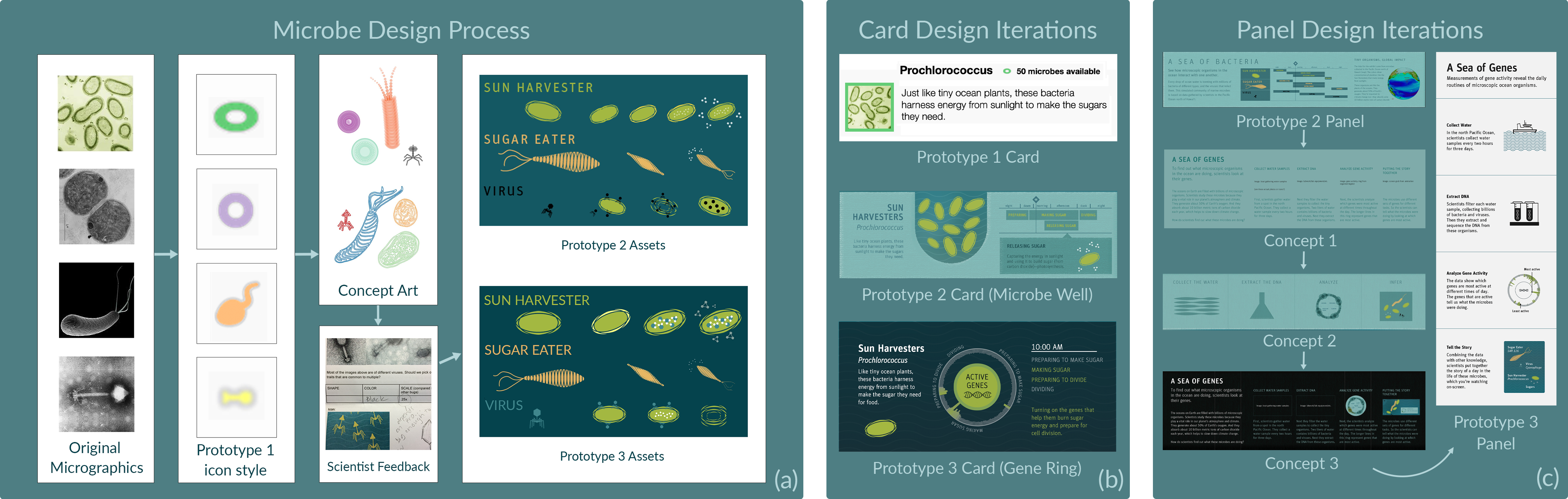
4.4 Prototype 3
For the final iteration of Sea of Genes, we focused efforts on sharpening the communication of S2 and S3 by emphasizing connections to the underlying metagenomic data. Our evaluation of Prototype 2 showed that although the prototype had fewer distractions relative to Prototype 1, S2 and S3 were largely unnoticed. The changes in Prototype 2 made the exhibit more effective in communicating S1.
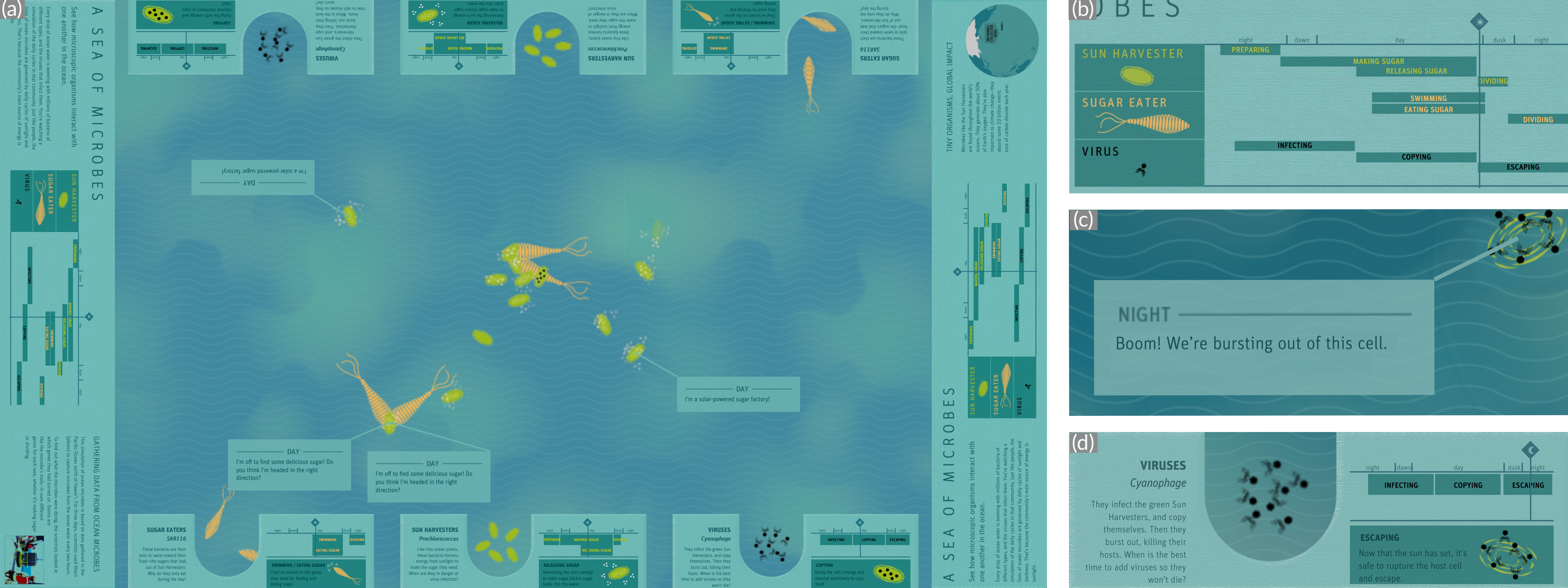
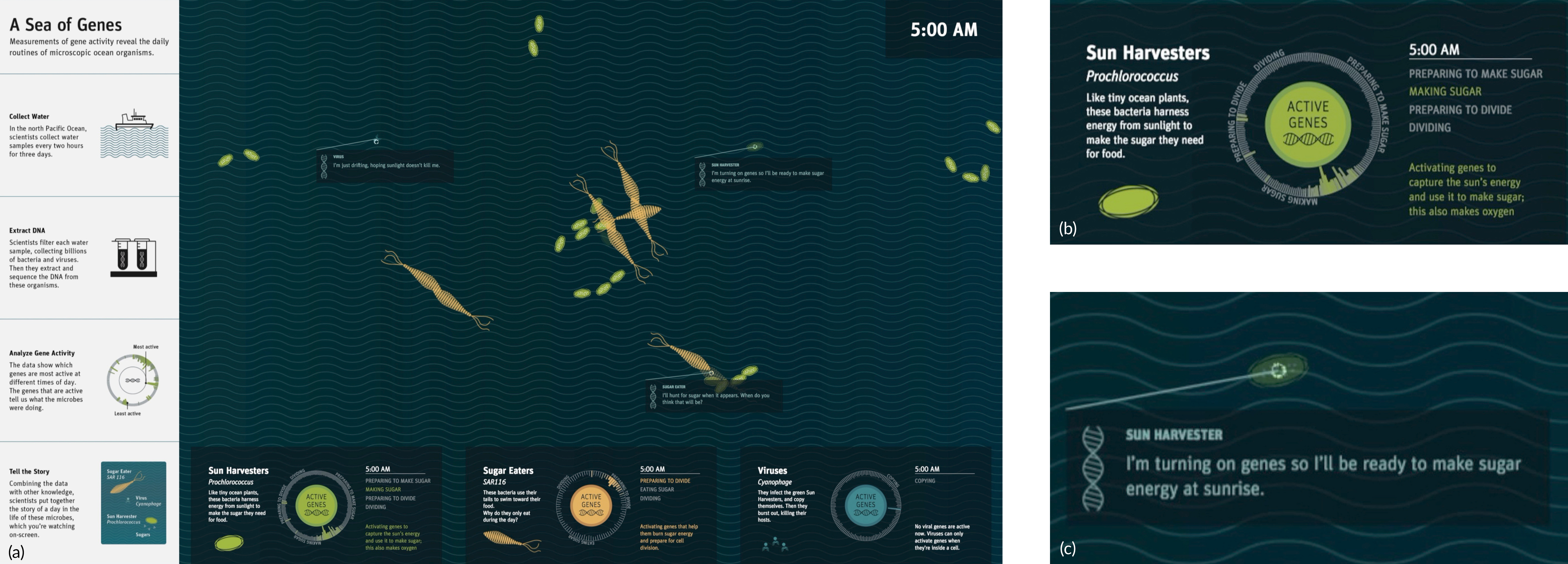
We changed the orientation of the exhibit and reduced the number of panels around the table to focus attention on the animation. We hypothesized that having a single orientation for the exhibit would make it easier for visitors to decode the visualization (C3). Fixing the orientation appears to contradict our C4, supporting multi-user interaction. However, an evaluation of a similar tabletop visualization, Plankton Populations [45], found visitors tended to use one side even though it supported multi-orientation use. In line with C2, we moved the label to the left side of the exhibit and removed all complex graphic elements [48, 50, 25]. The new label (Figure 5a) told S3, expressing how the data was collected and how the representations in the visualization were linked in four steps: (1) Collect Water; (2) Extract DNA; (3) Analyze Gene Activity; (4) Tell the story.
To emphasize that the animation is based on genetic data, S2, we made the following additions: A large title that included the word genes (A Sea of Genes) (Figure 5a), the legends and microbe annotations were adapted to refer to genes (Figure 5b), and the iconic DNA helix was added to the middle of the gene activity wheel and the annotation boxes (Figure 5c). We modified the design of the timeline chart to emphasize S2 and passively support S1. The new representation would display the underlying genomic data as a radial histogram (Figure 5b). We considered using a circos visualization, as they have been used by the New York Times to supplement stories on metagenomics and comparative genomics [39], however, it would only increase decode time (violating C3) and we could not assume our visitors would be familiar with that representation (C2). Rather, we designed a visualization where each gene related to a particular behavior was grouped around the circumference of the circle (all of the photosynthesis-related genes under “Preparing to Make Sugar”). Each gene had an activity range and was displayed as a dynamic histogram; length of the bar was determined by the normalized amount of transcript in the sample. So, through the course of 24 hours different areas of the circle would have waves of gene activity, similar to an equalizer.
Part of the success of conveying S1 in the previous prototype may have been a result of the interactivity we provided visitors, i.e, the ability to add microbes to the animation. We chose to shift the story the interaction emphasized from S1 to S2. Rather than adding a microbe, tapping on the revamped card (Figure 5b) would highlight all microbes of that type and show their gene activity, Figure 5c.
Prototype 3 was evaluated as part of a larger summative evaluation conducted by an external museum evaluation group, Inverness Research. This evaluation sought to find the key understandings that visitors came away with from their interaction with the exhibit. While conducting the study, Inverness found that visitors were not spending sufficient time at the exhibit and therefore would not be able answer the questions in their exit interview. So, they focused their efforts on mediated interviews, in which visiting groups were recruited to interact with the exhibit and answer questions immediately afterwards. A total of 13 mediated interviews were conducted. The interview results reported 2 of the 13 groups understood that scientists collected data while on boats, and that something about what they collected is represented on the screen of the table. However, there was no clear evidence that visitors understood that the data represented was gene expression. Furthermore, the mediated interviews indicated that visitors could not figure out what to do or where to begin, and were often confused. For example, seven visitors said they were not sure where to start or what to do:
-
Group A:
Honestly, its way over my head. I’m interested in what’s happening, I just don’t know what to do and I can’t understand it. I guess there are Sun Harvesters and Sugar Eaters? There is a lot of empty space. I keep waiting for something to happen. My instinct is to ask how do I make it work so I can learn something? But I can’t make it work. So there are three types of genes?
Despite our efforts to design the exhibit to emphasize S2 and S3, visitors were still extremely confused by what was presented. The additions of annotations, improving the exhibit, changing to a single orientation, clearer animations, better assets, and fewer visual elements only seemed to help bring visitor attention to S1. One reason, we believe, is usability problems made it difficult to convey the last two stories. That is, visitors did not understand what their role was with the exhibit and did not feel they could participate with it. The time spent figuring out their role (C3) resulted in visitors leaving the exhibit before learning anything deeper than aspects of S1.
5 Discussion
This project was a collaborative effort between several parties in an effort to develop a functional exhibit for deployment. With real-world collaborative projects, time and resources are often limited, which add significant constraints. We worked with exhibit designers, who have a deep understanding of conveying scientific information to the public. Our scientific partners at the University of Hawaii ensured the accuracy and fidelity of the data and their representation. A design and data-visualization firm from the industry both expedited the process and offered their own insights into design and development. Every prototype was tested with real targeted users. The entirety of the project itself was built over the course of 2016–18. From our significant evaluation effort over the iterative design process of developing Sea of Genes, we identify relevant usability issues and areas of future work.
With this paper, we introduced a set of considerations that should be addressed when designing narrative visualizations for an informal learning environment. We believe applying these considerations, as we have shown in this paper, can support future designers attempting to visualize complex data for museum environments. At the time of development, we looked over literature [45, 34, 8, 68, 72] for relevant techniques to apply to develop a successful exhibit under our considerations; (C1) free-choice learning environment, (C2) public comprehension, (C3) readily decipherable, and (C4) multi-user friendly. We found limited research that met such an intersection and applied what we could, which gave some success. With more time and resources we would have rigorously examined each technique in narrative visualization under these considerations. However, in a real word setting of developing an exhibit where time and staffing are constrained, such analysis was not possible. We studied available narrative frameworks to identify concepts relevant for our work. We now present a discussion on the intersection of narrative visualization and museum design.
Storytelling Frameworks: Segel and Heer [68] present a set of structures for balancing “designer”-driven vs “visitor”-driven narratives. Stolper et al. [72] provide an updated discussion of narrative visualization strategies with focus on systems with an “author”-driven predefined narrative. These structures have been applied and shown to be effective in a variety of situations. However, these structures need to be viewed and evaluated under our considerations C1–4. Testing these structures and developing frameworks and methodologies that cater towards “visitor-driven” would aid the museum community. Most analysis has been on settings (e.g. online journalism) where the user does not have distractions or free choice. Visitors need to be engaged, and with other settings like the Exploratorium, exhibits need to support interaction and multiple users. There is a clear need to aid exhibit designer’s through further exploration and research into this space.
Here, we examine three structures: Martini Glass, Interactive Presentation, and Drill-down for our museum exhibit design considerations.
The Martini Glass structure for narrative visualization allows for directing visitor attention explicitly to a set of points before releasing them with an understanding to make inferences for themselves. However, with C1 and evidenced by Boy et al. [9], it is difficult to assume they will get past the “designer”-driven direct messaging and reach the exploration part. A study [44] conducted at the Exploratorium examined if a narrative introduction could better contextualize the exhibit and found it had no real advantage over not-including it. This introduction was a slideshow presenting where the dataset came from and its scientific significance, similar to S3. Furthermore, under C4 if the exhibit is at the exploration state, then new visitors are missing key information that allows them to truly participate, excluding them of this experience.
Next, the Interactive Presentation structure allows for an individual to progress through the story when they are ready to do so, and allows them to repeat steps. This structure, however, does not allow for multiple people to follow along (C4), in the sense of allowing any visitor to step forward or backwards, which could disrupt other’s experience. This constraint could be addressed by transforming the presentation into a looped animation. The loop could also allow visitors to follow along back to points where they missed, ideally allowing for understanding at their pace. However, even with using an animated loop, as the animation advances new information is continuously presented. While visitors have started understanding a scene the animation has progressed, introducing new material to decode, leading to either confusion or frustration with the exhibit, as seen with Prototype 3.
The Drill-Down approach appears to have the most promise but there is still a constraint on what you can train a visitor to do and expect C2. The structure allows for telling multiple related stories since it is built on drilling into sub-stories and adding new details. However, there are several challenges with this structure when attempting to construct an exhibit experience with intuitive interactions that can be received by the majority of visitors. There is the delicate balance of presenting either new visualizations or materials in the sub-views without overwhelming a visitor with content. Then there is the additional challenge of ensuring that the exhibit is accessible to multiple visitors (i.e., if one visitor is drilling-down, it will not interfere with another visitor’s experience). Furthermore, depending on the relationships between stories this structure may struggle since it requires a central story to reach all other sub-stories. Treating stories as graphs, documenting what kind of graphs each of these structures can present under C1-4 is a direction that could merit great value for presenting in such conditions. How it handles such stories as Sea of Genes with strong parallel themes between stories, S1 and S2, is an open question.
Stories as graphs: Narratives are predominantly linear and are most effective in conveying a single perspective. According to Spiro and Jehng [71], “linearity of media is not a problem when the subject matter being taught is well structured and fairly simple. However, as content increases in complexity and ill-structuredness, increasingly greater amounts of important information are lost with linear approaches.” Can we create visual narratives that permit multiple perspectives and allow different narrative flows? As Hullman and Diakopolus [35] point out conveying a point of view requires careful over-emphasis. It is well known that multiple perspectives are needed to learn complex topics [18]. We do not have good frameworks for classifying story complexity in a manner that can inform visualizations. A simple narrative has one causal pathway and is unidirectional. How do we characterize structures that are more complex? A taxonomy may allow us to develop visualization techniques. Effective storytelling is subject of interest to a diverse group of researchers in social sciences, computer science, and biological sciences. A taxonomy may allow us to map findings from these disparate domains and develop theories and guidelines. One approach could be to use graph theory. Here milestones, events, or information would be nodes and connections or flows represent edges. A simple story is a unidirectional planar graph with no branches. Let us call this a basic graph. In our narrative, we had a more general network. The activities of an individual microbe (e.g., sun-harvester preparing sugar) is close to a basic graph. The activities of these microbes interacting (e.g., “preparing sugar” & “eating sugar”) creates a more general graph. Since these connections occurred in parallel and all share the same time dynamics we have a directed graph that represents S1. The role of genes, S2, however, changes the structure of the graph. We could view the genomics as nested information. Embedded in each node corresponding to an event (e.g., “preparing sugar”), there was genomic data (e.g., time of expression & amount of transcript). In our visualization, we present the embedded data in a narrative that was occurring in parallel in a separate space. That is, we presented genomic data in a dynamic histogram on the bottom of the screen separate from the animation in the center while both update in parallel. Our limited success in effectively connecting these two stories for the visitors highlights the need to consider other visualization techniques for these graphs. In short, we contend that there is a need for a richer taxonomy.
6 Conclusion and Future Work
Reflecting on this endeavor we find there is space for further research at the intersection of storytelling, data visualization, and informal learning. The current storytelling structures are effective in many situations; however, delving deeper into the union of exhibit design and narrative visualization could extend the current structures, introduce ”visitor”-driven methodologies, or offer adjustments and considerations to ”author”-driven methodologies.
The process of communicating scientific findings as multiple stories visually in an informal learning environment brought many challenges. We need better understanding of how to construct readily decipherable visual abstractions of a complex science, while maintaining scientific authenticity and accessibility to the public. If the abstraction was too simple they didn’t understand or notice the science, when the science was emphasized they were confused. Communicating multiple related stories is another challenge. We need to ensure the underlying connections between each story is reflected visually. In our final iteration each story was embedded in a unique encoding; the community of microbes S1, a radial histogram S2, and a side panel S3. A visual link between these three was not explicit enough to be received by visitors. We had some implicit clues, such as when a visitor touches a microbe a small radial histogram inside the microbe appears that correlates to the larger one. At the time of development, designing a visual link was not considered. Our entry point into the exhibit was the community of microbes. Yet, from the entry point to the two ancillary visualizations there isn’t an explicit visual cue for a visitor to follow. We lacked in our design a visual encoding that functions as a through-line for our stories. In other words, there should be a visual encoding to reflect a common theme or consistent element within our stories. Perhaps such an encoding would help visitors continue to the other stories beyond the entry point. This requires the stories are not disjoint and have a minimum of one factor in common.
We reviewed our process for designing Sea of Genes. From our reflection we believe there is clear value in sharing experiences and lessons learned. Overall this study supports retrospective analysis of design work in new cross-disciplinary domains even if the desired goals were not met. Theories are typically shown to work in their documented space; however, there is value in reporting how these theories behave when tested outside of these documented spaces. We hope our extensive case study will stimulate additional research in approaches for visualizing complex data from unfamiliar domains for the public to explore in physical settings including museums and visitors centers.
Acknowledgments
The authors wish to thank Elisha Wood-Charlson and Ed DeLong for sharing the SCOPE dataset and for their time and expertise. We would also like to thank Eric Rodenbeck, Nicolette Hayes, and Andrew Wong of Stamen Design for collaborating on the design and development of the prototypes, and Meghan Kroning, Tamara Kubacki, Katherine Nam- macher, and Janine Penticuff for evaluation assistance. This research has been supported in part by the U.S. National Science Foundation through grants DRL-1323214, DRL-1322828, and IIS-1528203 and by the Gordon and Betty Moore Foundation. Any opinions, findings, and conclusions or recommendations expressed in this material are those of the authors and do not necessarily reflect the view of the Foundations.
References
- [1] S. Ainsworth. How do animations influence learning. In Recent innovations in educational technology that facilitate student learning, pp. 37–67. Information Age Publishing, Charlotte, NC, 2008.
- [2] S. Allen. Finding significance. Exploratorium, 2004.
- [3] F. O. Aylward, D. Boeuf, D. R. Mende, E. M. Wood-Charlson, A. Vislova, J. M. Eppley, A. E. Romano, and E. F. DeLong. Diel cycling and long-term persistence of viruses in the ocean’s euphotic zone. Proceedings of the National Academy of Sciences, 114(43):11446–11451, 2017. doi: 10 . 1073/pnas . 1714821114
- [4] F. O. Aylward, J. M. Eppley, J. M. Smith, F. P. Chavez, C. A. Scholin, and E. F. DeLong. Microbial community transcriptional networks are conserved in three domains at ocean basin scales. Proceedings of the National Academy of Sciences, 112(17):5443–5448, 2015. doi: 10 . 1073/pnas . 1502883112
- [5] L. Bedford. Storytelling: The real work of museums. Curator: The Museum Journal, 44(1):27–34, 2001. doi: 10 . 1111/j . 2151-6952 . 2001 . tb00027 . x
- [6] P. Bell, B. Lewenstein, A. W. Shouse, M. A. Feder, et al. Learning science in informal environments: People, places, and pursuits, vol. 140. National Academies Press Washington, DC, 2009. doi: 10 . 17226/12190
- [7] S. Berney and M. Bétrancourt. Does animation enhance learning? a meta-analysis. Computers & Education, 101:150–167, 2016. doi: 10 . 1016/j . compedu . 2016 . 06 . 005
- [8] F. Block, M. S. Horn, B. C. Phillips, J. Diamond, E. M. Evans, and C. Shen. The DeepTree exhibit: Visualizing the tree of life to facilitate informal learning. IEEE Transactions on Visualization and Computer Graphics, 18(12):2789–2798, 2012. doi: 10 . 1109/TVCG . 2012 . 272
- [9] J. Boy, F. Detienne, and J.-D. Fekete. Storytelling in information visualizations: Does it engage users to explore data? In Proceedings of the ACM Conference on Human Factors in Computing Systems, pp. 1449–1458. ACM, New York, NY, 2015. doi: 10 . 1145/2702123
- [10] J. S. Bruner. Actual minds, possible worlds. Harvard University Press, 2009.
- [11] C. Bryan, K.-L. Ma, and J. Woodring. Temporal summary images: An approach to narrative visualization via interactive annotation generation and placement. IEEE Transactions on Visualization and Computer Graphics, 23(1):511–520, 2017. doi: 10 . 1109/TVCG . 2016 . 2598876
- [12] Y.-Y. Chan and H. Qu. Finavistory: Using narrative visualization to explain social and economic relationships in financial news. In International Conference on Big Data and Smart Computing, pp. 32–39. IEEE, New York, NY, 2016. doi: 10 . 1109/BIGCOMP . 2016 . 7425798
- [13] L.-J. ChanLin. Animation to teach students of different knowledge levels. Journal of Instructional Psychology, 25(3):166–175, 1998.
- [14] N. R. Council. The new science of metagenomics: Revealing the secrets of our microbial planet. National Academies Press, 2007.
- [15] P. Davis, M. Horn, L. Schrementi, F. Block, B. Phillips, E. M. Evans, J. Diamond, and C. Shen. Going deep: Supporting collaborative exploration of evolution in natural history museums. In Proceedings of the Conference on Computer Supported Collaborative Learning, vol. 1, pp. 153–160. International Society of the Learning Sciences, Madison, WI, 2013. doi: 10 . 22318/cscl2013 . 1 . 153
- [16] N. M. Dudukovic, E. J. Marsh, and B. Tversky. Telling a story or telling it straight: The effects of entertaining versus accurate retellings on memory. Applied Cognitive Psychology, 18(2):125–143, 2004. doi: 10 . 1002/acp . 953
- [17] Invisible you-the human microbiome exhibition. http://www.edenproject.com/visit/whats-here/invisible-you-the-human-microbiome-exhibition. Eden project.
- [18] E. Einsiedel. The challenges of translating genomic knowledge. Clinical Genetics, 70(5):433–437, 2006. doi: 10 . 1111/j . 1399-0004 . 2006 . 00682 . x
- [19] Electron — Build cross platform desktop apps with JavaScript, HTML, and CSS. https://electronjs.org/.
- [20] J. H. Falk and L. D. Dierking. Learning from museums: Visitor experiences and the making of meaning. Altamira Press, 2000.
- [21] J. H. Falk and L. D. Dierking. The museum experience revisited. Routledge, 2016.
- [22] E. L. Ferguson and M. Hegarty. Learning with real machines or diagrams: Application of knowledge to real-world problems. Cognition and Instruction, 13(1):129–160, 1995. doi: 10 . 1207/s1532690xci1301_4
- [23] T. Geller. Interactive tabletop exhibits in museums and galleries. IEEE Computer Graphics and Applications, 26(5):6–11, 2006. doi: 10 . 1109/MCG . 2006 . 111
- [24] N. Gershon and W. Page. What storytelling can do for information visualization. Communications of the ACM, 44(8):31–37, 2001. doi: 10 . 1145/381641
- [25] P. Ginns. Meta-analysis of the modality effect. Learning and Instruction, 15(4):313–331, 2005. doi: 10 . 1016/j . learninstruc . 2005 . 07 . 001
- [26] D. P. Groth and K. Streefkerk. Provenance and annotation for visual exploration systems. IEEE Transactions on Visualization and Computer Graphics, 12(6):1500–1510, 2006. doi: 10 . 1109/TVCG . 2006 . 101
- [27] J. Heer, F. B. Viégas, and M. Wattenberg. Voyagers and voyeurs: Supporting asynchronous collaborative information visualization. In Proceedings of the SIGCHI conference on Human factors in computing systems, pp. 1029–1038. ACM, New York, NY, 2007. doi: 10 . 1145/1240624
- [28] M. Hegarty, S. Kriz, and C. Cate. The roles of mental animations and external animations in understanding mechanical systems. Cognition and Instruction, 21(4):209–249, 2003. doi: 10 . 1207/s1532690xci2104_1
- [29] G. Hein. Traits of life: A collection of life science exhibits. Technical report, Exploratorium, San Francisco, CA, mar 2003.
- [30] U. Hinrichs and S. Carpendale. Gestures in the wild: Studying multi-touch gesture sequences on interactive tabletop exhibits. In Proceedings of the SIGCHI Conference on Human Factors in Computing Systems, p. 3023–3032. Association for Computing Machinery, New York, NY, USA, 2011. doi: 10 . 1145/1978942 . 1979391
- [31] U. Hinrichs, H. Schmidt, and S. Carpendale. EMDialog: Bringing information visualization into the museum. IEEE Transactions on Visualization and Computer Graphics, 14(6):1181–1188, 2008. doi: 10 . 1109/TVCG . 2008 . 127
- [32] E. Hornecker. “I don’t understand it either, but it is cool”–Visitor interactions with a multi-touch table in a museum. In IEEE International Workshop on Horizontal Interactive Human Computer Systems, pp. 113–120. IEEE, New York, NY, 2008. doi: 10 . 1109/TABLETOP . 2008 . 4660193
- [33] E. Hornecker, P. Marshall, and Y. Rogers. From entry to access: how shareability comes about. In Proceedings of the Conference on Designing Pleasurable Products and Interfaces, pp. 328–342. ACM, New York, NY, 2007. doi: 10 . 1145/1314161 . 1314191
- [34] C.-H. Hsueh, J. Chu, K.-L. Ma, J. Ma, and J. Frazier. Fostering comparisons: Designing an interactive exhibit that visualizes marine animal behaviors. In IEEE Pacific Visualization Symposium, pp. 259–263. IEEE, New York, NY, 2016. doi: 10 . 1109/PACIFICVIS . 2016 . 7465282
- [35] J. Hullman and N. Diakopoulos. Visualization rhetoric: Framing effects in narrative visualization. IEEE Transactions on Visualization and Computer Graphics, 17(12):2231–2240, 2011. doi: 10 . 1109/TVCG . 2011 . 255
- [36] P. Isenberg and S. Carpendale. Interactive tree comparison for co-located collaborative information visualization. IEEE Transactions on Visualization and Computer Graphics, 13(6):1232–1239, 2007. doi: 10 . 1109/TVCG . 2007 . 70568
- [37] S. Kalyuga. Relative effectiveness of animated and static diagrams: An effect of learner prior knowledge. Computers in Human Behavior, 24(3):852–861, 2008. doi: 10 . 1016/j . chb . 2007 . 02 . 018
- [38] R. Kosara and J. Mackinlay. Storytelling: The next step for visualization. Computer, 46(5):44–50, 2013. doi: 10 . 1109/MC . 2013 . 36
- [39] M. Krzywinski, J. Schein, I. Birol, J. Connors, R. Gascoyne, D. Horsman, S. J. Jones, and M. A. Marra. Circos: An information aesthetic for comparative genomics. Genome Research, 19(9):1639–1645, 2009. doi: 10 . 1101/gr . 092759 . 109
- [40] P. Langfelder and S. Horvath. Wgcna: An r package for weighted correlation network analysis. BMC Bioinformatics, 9(1):559, 2008. doi: 10 . 1186/1471-2105-9-559
- [41] A. D. Lanie, T. E. Jayaratne, J. P. Sheldon, S. L. Kardia, E. S. Anderson, M. Feldbaum, and E. M. Petty. Exploring the public understanding of basic genetic concepts. Journal of Genetic Counseling, 13(4):305–320, 2004. doi: 10 . 1023/B:JOGC . 0000035524 . 66944 . 6d
- [42] B. Lee, N. H. Riche, P. Isenberg, and S. Carpendale. More than telling a story: Transforming data into visually shared stories. IEEE Computer Graphics and Applications, 35(5):84–90, 2015. doi: 10 . 1109/MCG . 2015 . 99
- [43] J. Ma. Visitors’ prior knowledge and interests in marine microbes and metagenomics. Technical report, Exploratorium, San Francisco, CA, jan 2011. ”https://www.exploratorium.edu/sites/default/files/pdfs/visitors-prior-marine.pdf”.
- [44] J. Ma. Engaging museum visitors with scientific data through visualization: A comparison of three strategies. In Annual Meeting of the American Educational Research Association, pp. 1–18. The American Educational Research Association, Washington, DC, 2013.
- [45] J. Ma, I. Liao, K.-L. Ma, and J. Frazier. Living Liquid: Design and evaluation of an exploratory visualization tool for museum visitors. IEEE Transactions on Visualization and Computer Graphics, 18(12):2799–2808, 2012. doi: 10 . 1109/TVCG . 2012 . 244
- [46] J. Ma, K.-L. Ma, and J. Frazier. Decoding a complex visualization in a science museum–an empirical study. IEEE Transactions on Visualization and Computer Graphics, 26(1):472–481, 2019. doi: 10 . 1109/TVCG . 2019 . 2934401
- [47] K.-L. Ma, I. Liao, J. Frazier, H. Hauser, and H.-N. Kostis. Scientific storytelling using visualization. IEEE Computer Graphics and Applications, 32(1):12–19, 2011. doi: 10 . 1109/MCG . 2012 . 24
- [48] R. E. Mayer and R. Moreno. A split-attention effect in multimedia learning: Evidence for dual processing systems in working memory. Journal of Educational Psychology, 90(2):312–320, 1998. doi: 10 . 1037/0022-0663 . 90 . 2 . 312
- [49] R. Moreno and R. Mayer. Interactive multimodal learning environments. Educational Psychology Review, 19(3):309–326, 2007. doi: 10 . 1007/s10648-007-9047-2
- [50] R. Moreno, R. E. Mayer, H. A. Spires, and J. C. Lester. The case for social agency in computer-based teaching: Do students learn more deeply when they interact with animated pedagogical agents? Cognition and Instruction, 19(2):177–213, 2001. doi: 10 . 1207/S1532690XCI1902_02
- [51] J. B. Morrison, B. Tversky, and M. Betrancourt. Animation: Does it facilitate learning. Technical Report SS-00-04, Association for the Advancement of Artificial Intelligence, Palo Alto, California, 2000.
- [52] Science On a Sphere. https://sos.noaa.gov/What_is_SOS/. National Oceanic and Atmospheric Administration (NOAA).
- [53] National Research Council. Learning science in informal environments: People, places, and pursuits. National Academies Press, 2009.
- [54] NGSS. Next generation science standards: For states, by states. The National Academies Press, Washington, DC, 2013.
- [55] Zoo in you. https://omsi.edu/exhibitions/zoo-in-you/. Oregon Museum of Science and Industry (OMSI).
- [56] E. A. Ottesen, C. R. Young, S. M. Gifford, J. M. Eppley, R. Marin, S. C. Schuster, C. A. Scholin, and E. F. DeLong. Multispecies diel transcriptional oscillations in open ocean heterotrophic bacterial assemblages. Science, 345(6193):207–212, 2014. doi: 10 . 1126/science . 1252476
- [57] S. E. Palmer. Vision science: Photons to phenomenology. MIT press, 1999.
- [58] S. Perkins and R. DeSalle. The secret world inside you. https://www.amnh.org/exhibitions/the-secret-world-inside-you/. American Museum of Natural History.
- [59] R. Ploetzner and R. Lowe. A systematic characterisation of expository animations. Computers in Human Behavior, 28(3):781–794, 2012. doi: 10 . 1016/j . chb . 2011 . 12 . 001
- [60] B. Potvin, C. Swindells, M. Tory, and M.-A. Storey. Comparing horizontal and vertical surfaces for a collaborative design task. Advances in Human-Computer Interaction, 2012(6):10 pages, 2012. doi: 10 . 1155/2012/137686
- [61] Z. W. Pylyshyn and R. W. Storm. Tracking multiple independent targets: Evidence for a parallel tracking mechanism. Spatial Vision, 3(3):179–197, 1988. doi: 10 . 1163/156856888X00122
- [62] P. A. Rauschnabel and A. C. Ahuvia. You’re so lovable: Anthropomorphism and brand love. Journal of Brand Management, 21(5):372–395, 2014. doi: 10 . 1057/bm . 2014 . 14
- [63] Y. Rogers and S. Lindley. Collaborating around vertical and horizontal large interactive displays: which way is best? Interacting with Computers, 16(6):1133–1152, 09 2004. doi: 10 . 1016/j . intcom . 2004 . 07 . 008
- [64] J. Rounds. Storytelling in science exhibits. Exhibitionist, 21(2):40–43, 2002.
- [65] R. C. Schank. Tell me a story: Narrative and intelligence. Northwestern University Press, 1995.
- [66] H. Schmidt, U. Hinrichs, A. Dunning, and S. Carpendale. memory [en]code Building a Collective Memory within a Tabletop Installation. In Computational Aesthetics in Graphics, Visualization, and Imaging. The Eurographics Association, Aire-la-Ville, Switzerland, 2007. doi: 10 . 2312/COMPAESTH/COMPAESTH07/135-142
- [67] W. Schnotz, J. Böckheler, and H. Grzondziel. Individual and co-operative learning with interactive animated pictures. European Journal of Psychology of Education, 14(2):245–265, 1999. doi: 10 . 1007/BF03172968
- [68] E. Segel and J. Heer. Narrative visualization: Telling stories with data. IEEE Transactions on Visualization and Computer Graphics, 16(6):1139–1148, 2010. doi: 10 . 1109/TVCG . 2010 . 179
- [69] D. Smit, T. Grah, M. Murer, V. van Rheden, and M. Tscheligi. Macroscope: First-person perspective in physical scale models. In Proceedings of the Twelfth International Conference on Tangible, Embedded, and Embodied Interaction, pp. 253–259. ACM, New York, NY, 2018. doi: 10 . 1145/3173225
- [70] A. N. Spiegel, J. McQuillan, P. Halpin, C. Matuk, and J. Diamond. Engaging teenagers with science through comics. Research in Science Education, 43(6):2309–2326, 2013. doi: 10 . 1007/s11165-013-9358-x
- [71] R. Spiro and J. Jehng. Cognitive flexibility, random access instruction and hypertext: Theory and technology for the nonlinear and multi-dimensional traversal of complex subject matter. Cognition, Education, and Multimedia: Exploring Ideas in High Technology, pp. 163–205, 1990.
- [72] C. D. Stolper, B. Lee, N. H. Riche, and J. Stasko. Emerging and recurring data-driven storytelling techniques: Analysis of a curated collection of recent stories. Technical report, Microsoft Research, Washington, USA, 2016.
- [73] B. Tversky, J. B. Morrison, and M. Betrancourt. Animation: Can it facilitate? International Journal of Human-Computer Studies, 57(4):247–262, 2002. doi: 10 . 1006/ijhc . 2002 . 1017