∎
Mississippi State University
Mississippi State, MS, 39762, USA
Tel.: +1-662.325.1630
Fax: +1-662.325.7012
22email: sfrance@business.msstate.edu 33institutetext: Ulas Akkucuk 44institutetext: Department of Managment
Bogazici University
Bebek, Istanbul, 34342
Tel.: +90-212-359-54-00
Fax: +90-212-287-78-51
44email: ulas.akkucuk@boun.edu.tr
A Review, Framework and R toolkit for Exploring, Evaluating, and Comparing Visualizations
Abstract
This paper gives a review and synthesis of methods of evaluating dimensionality reduction techniques. Particular attention is paid to rank-order neighborhood evaluation metrics. A framework is created for exploring dimensionality reduction quality through visualization. An associated toolkit is implemented in R. The toolkit includes scatter plots, heat maps, loess smoothing, and performance lift diagrams. The overall rationale is to help researchers compare dimensionality reduction techniques and use visual insights to help select and improve techniques. Examples are given for dimensionality reduction of manifolds and for the dimensionality reduction applied to a consumer survey dataset.
Keywords:
Dimensionality reduction mapping solution quality model selection1 Introduction
The problem of dimensionality reduction is core to statistics, machine learning, and visualization. High dimensional data can contain a large amount of noise and importantly for visualization, the human brain can only comprehend three dimensions. Thus, there is a need to reduce data into an interpretable format by converting high dimensional data into two or three dimensions, which can subsequently be visualized using a two or three dimensional scatterplot. To meet the need for dimensionality reduction methods, a plethora of algorithms and associated fitting methods have been developed. A researcher wishing to perform dimensionality reduction for visualization will be presented with a choice of hundreds of algorithms. Which algorithm should be used? This paper describes a visualization framework called QVisVis and associated software tools implemented in R to help choose dimensionality reduction methods, tune these methods, and visually evaluate the quality of dimensionality reduction solutions. The major contributions of these paper are to review and synthesize previous work on evaluating and “visualizing” performance metrics, create an overall visualization framework for “visualizing” visualization quality, and implement the framework in an R toolkit.
1.1 Visualization Design and Evaluation
The roots of much of modern data-based visualization come from exploratory data analysis, which was popularized by John Tukey REF685 , who developed an array of simple tools, such as the box plot, to help summarize, explore, and ultimately gain insight from data. This idea of “exploration” is still core to modern visualization. Visualization exploration REF1502 can be thought of as a process where a user tunes parameters to transform and explore data. At each stage of the process, parameters are passed to a visualization transform REF1503 function, which creates the visualization, which the user then uses to further train parameters, as part of a feedback loop. When implementing data visualization systems, both artistic REF1504 and data-based engineering considerations come into play. An overarching consideration, which subsumes both artistic and engineering aspects is that of design REF1505 . Design considerations are succinctly categorized using the scheme adapted from the Roman era design work of Vitruvius REF1506 , where design is evaluated on a triad of soundness, attractiveness, and utility. This design based view can be combined with the previously described process based view in a design activity framework REF1507 . Here, the design process is split into activities, which fall into one or more of the categories understand, ideate, make, and deploy. The researcher will try to understand the problem along with its opportunities and constraints and then generate ideas, which are then implemented and finally deployed.
Throughout all of the stages of the visualization process and in particular the ideate and make stages, there is a need to evaluate visualizations. There are several methods and frameworks for evaluating visualizations, some qualitative and some quantitative REF1512 , which include case studies, controlled experiments and usability tests REF1511 . One qualitative framework is the value based evaluation framework REF1508 . Here, a visualization’s value is expressed as a function of how a user can find insights in the minimal amount of time, discover insights, uncover the essence or sense of the data, and generate confidence in the data and data domain. The ability to generate insight is particularly important, but as “insight” is a qualitative, many-faceted concept, it can be difficult to measure, requiring deep, open ended exploration, with an emphasis on the problem domain REF1509 . Another approach to visualization evaluation is to look at the validity of the different abstracted steps of visualization process REF1510 , ranging from the high level problem characterization, through data/operations, encoding/interaction, and finally algorithm design. At each stage, threats to validity may occur and these must be dealt with. From an evaluation perspective, there may not be one single optimal visualization and visualization evaluation will involve a trade-off between different visualization criteria. For example, there is often a trade-off between optimizing local visualization features vs. the overall global consistency of a visualization REF1513 .
1.2 Evaluation for Dimensionality Reduction
This paper deals with a specific type of visualization evaluation. When data are transformed from a higher number of dimensions to an embedding in a lower number of dimensions, the projection is not always perfect, due to reduced degrees of freedom in the destination embedding. For example, an item may be the nearest neighbor of many different points in high dimensional space, but only two points in one dimensional space REF1514 ; REF1517 . This issue has been apparent from the early days of visualization. It is impossible to perfectly represent a three dimensional globe on a two dimensional map and keep a perfect representation of distances. Thus, throughout history, a range of different map projections have been created REF398 , each with some distortion of actual distances. Different map projections have different types of distortion. For example, the Mercator projection is conformal, i.e., local angles and shapes are preserved, but distances at higher latitudes are distorted and seem much greater than actuality. An equirectangular projection, preserves distances along meridians, but is not conformal. The Mercator projection is widely used in navigation, where the conformal property is important. The equirectangular projection, because of a lack of conformality, cannot be used in navigation, but is often used in raster visualization, due to its relatively even global spacing. The decision to use a specific map visualization is essentially a trade-off, with different types of distortion being more or less problematic for different applications. A projection is chosen in order that the map distortion has minimal effect in the problem domain. The level of distortion at different areas of the mapping can be visualized using Tissot’s Indicatrix REF1516 , which plots ellipses at regular intervals on the map to show distortion relative to a unit sphere.
In the context of dimensionality reduction, the final output (usually in two or three dimensions) is often used for visualization. However, visualization can be utilized to help understand and analyze the dimensionality reduction process. For example, the DimStiller system REF1618 utilizes scree plots, inter-variable correlations, and scatterplot matrices of derived solutions colored by class to help inform and optimize the dimensionality reduction process. Visualization can be used at all stages of the visualization process including the dimensionality reduction, visualization, and user analysis stages REF1620 , with simple visualizations such as scatterplots and parallel coordinates approaches being particularly usefulREF1619 .
The QVisVis framework described in this paper includes several techniques to help evaluate the quality of visualizations created using dimensionality reduction techniques. These tools utilize quantitative measures of item neighborhood recovery, building on the ideas of nearest neighborhood recovery REF1514 ; REF1517 . In a similar fashion to Tissot’s Indicatrix, visual representations help quantify and visualize the distortions from perfection in the lower dimensional data visualization. A range of visual tools are included and together they are utilized to give a broad view of visualization performance, help tune parameters for dimensionality reduction algorithms, and help users understand the trade-offs involved in visualizing data, particularly with respect to the trade-off between local and global data quality. The methods can be used at the algorithm/design stage of the visualization process, or at a higher level in the abstraction stage, to help comprehend the relationship between the source data attributes and visualization performance. The remainder of this paper follows the following structure. First, a brief overview of the dimensionality reduction problem is given, along with a summary of several classic dimensionality reduction algorithms. Then, rank-order methods of calculating solution agreement metrics are reviewed. This is followed by a description of the different visualizations included in the framework. Visualization examples are given for classic dimensionality reduction methods performed in 3 dimensional manifold. A real world data example is given, where consumer preference survey data with 135 dimensions is visualized in two dimensions. Here, the t-SNE (stochastic neighborhood embedding) method is compared with two classic dimensionality reduction methods for multiple parameter settings.
2 Dimensionality Reduction
This section gives a brief overview of dimensionality reduction. A more detailed exposition is available in a detailed comparative review REF1518 .
Let be a source matrix of data for n items given in m dimensions. Here is the value of item i on dimension j. The data can be transformed into a proximity matrix , where is the proximity between items i and j. This measure can either be a similarity or a distance , where implies that . A range of similarity measures and dissimilarity measures can be employed. The exact measure will depend on the data set characteristics, such as size, data type, dimensional and sparsely. A common measure of similarity is the correlation, which is given in (1). A common measure of distance is the Euclidean distance, which is given in (2) and is a special case for of the or Minkowski norms used to define vector spaces REF1521 .
| (1) |
Here, is the mean value for vector .
| (2) |
Parameterized distance metrics can be optimized or “learned” for optimal performance on a given dataset REF1520 . These learned metrics often perform better than standard metrics.
2.1 PCA and Classical MDS
One of the classic, most commonly used dimensionality reduction methods is PCA (principal component analysis) REF304 ; REF1498 . PCA can take noisy high dimensional data and convert these data into lower dimensional data that account for the maximum possible variance and have mutually uncorrelated dimensions. There are two major variants of PCA. The first utilizes the covariance matrix and the second the correlation matrix. A correlation matrix is used if one wishes to normalize the variance across items and a covariance matrix is used if one wishes to account for this variance in the analysis. Define a similarity matrix S, where for a correlation matrix, is given in (1) and for a covariance matrix, is the numerator of (1). This matrix is sometimes referred to as the scalar products matrix. An eigendecomposition is then performed. Here, contains a set of diagonalized eigenvalues, which give the variance explained by each derived dimension. The lower dimensional solution for k dimensions is . The values of where i is greater than the dimensionality k in are set to be equal to 0.
In some applications, the source data may be directly gathered similarity or dissimilarity data, which can occur when users directly rate the similarity or dissimilarity of items or where similarity is derived from some measure of co-occurrence, such as shopping items being purchased together. Consider some dissimilarity matrix where is the directly derived dissimilarity between items i and j. By ensuring that the dissimilarities meet the basic distance axioms and triangle inequality REF1522 , can be considered to be a distance matrix . The method of Classical MDS REF53 ; REF54 converts a dissimilarity/distance matrix into a scalar products matrix, using the double centering formula given in (3).
| (3) |
Here, is a matrix of row (or column means) of D and is a matrix of overall distance means. The resulting scalar products matrix can be analyzed using the same method as the scalar products matrix in PCA.
2.2 Distance based MDS
An alternative to classical MDS is distance based MDS REF50 ; REF51 , which is often used in visualization applications REF282 ; REF886 . Here data are reduced to a predefined lower dimensional solution using a loss function called “Stress” that minimizes the differences between the source distances/dissimilarities and the distances in the lower dimensional solution. The Stress function is given in (4).
| (4) |
Here, each is a transformed input dissimilarity . The transform function is dependent on the level of the data. For ordinal scale data, a monotone transformation can be used REF51 and for continuous data a simple shift/scaling transformation can be used. A wide range of transformations, including spline transformations are available REF277 , along with a range of variants of the Stress function REF1523 , for different data and usage scenarios. The value of is the Euclidean distance between points i and j in the lower dimensional derived solution. The Stress function can be optimized using a simple gradient descent or majorization optimization method REF120 . The weights by default are set to 1 for present data and 0 for missing data. However, weights can be altered for domain specific importance or to alter the trade-off between local and global recovery. For example, there are variants of local multidimensional scaling REF352 ; REF464 , where weights are higher for local distances and can be set to 0 if distances are greater than a certain threshold.
2.3 Local Linear Embedding
The methods discussed thus far are global methods. They utilize global fitting procedures that attempt to accurately reconstruct both smaller local distances and larger global distances. There are several methods that prioritize local fitting. One method is LLE (Local Linear Embedding) REF402 . Each point in a configuration can be represented using a weighted linear combination of nearby points. A minimization function to set the weights is given in (5).
| (5) |
Here, the values of are set to minimize the difference between each and its linear combination of nearby points using constrained least squares optimization. The size of the neighborhood for each item is an input parameter to the LLE procedure. The fitted weights are then used to create a derived lower dimensional solution using (6).
| (6) |
Here, is the lower dimensional output vector for item i. The total system of equations defined in (6) can be solved as a sparse eigenvector problem.
In summary, a range of dimensionality reduction techniques have been described in this section. These techniques were chosen both for popularity, the quality of solution, available implementation software, and parameterizion options that allow the local/global recovery trade-off to be altered, a concept that is at the core of the visualization framework described in this paper.
2.4 Additional Techniques
The four basic techniques described in the previous section illustrate several aspects of the dimensionality reduction problem. With dimensionality reduction techniques, there is a trade-off between local and global solution recovery. Some methods, such as LLE, focus on local recovery, while others focus on global reconstruction REF514 . The optimal technique very much depends on the application. In some instances, local neighborhood accuracy is important, for example, when dealing with nonlinear manifolds REF1524 or mapping applications where the user of a visualization wishes to ask questions such as “which is the nearest neighbor of item i?”. In other cases, for example when creating a “bigger picture” global map, the overall global scale and accuracy is important. These trade-offs will be explored in the subsequently described QVisVis framework. Another aspect of any dimensionality reduction technique is the fitting or optimization algorithm. The methods described thus far utilize some optimization procedure, either using a nonlinear optimization algorithm or an eigenvector decomposition. In the case of LLE, a parameter (neighborhood size) could be utilized to tune the procedure, creating a trade-off between different aspects of solution quality. This idea of parameter tuning is explored further when describing the overall visualization framework.
In addition to the basic techniques above, several other techniques were implemented to demonstrate the QVisVis framework. These were chosen both for popularity, the ability to cope with a wide range of datasets, and strong conceptual relationships with the basic techniques. Isomap REF173 is a variant of classical MDS designed for nonlinear data. Isomap creates a network, where items are joined if they are within a certain neighborhood of one another. The neighborhood is defined by either a distance or by the number of nearest neighbors k. Shortest path network distances between items are then calculated using an algorithm such as Dijkstra’s algorithm REF525 . The rationale behind the technique is that by taking network distances rather than straight Euclidean distances, it is easier to extract nonlinear surfaces embedded in higher dimensional space. The size of the neighborhood is a trade-off. Taking neighborhoods of size that include every other point in the configuration results in Euclidean distances and a global fitting method. Conversely, taking small neighborhood sizes could result in very poor global recovery and if too small, disconnected graphs that cannot be processed. The Laplacian eigenmap method REF513 has the same initial step of creating a neighborhood graph and the same tuning parameters as the Isomap method. A matrix of weights are then defined either simply with if items are connected and if items are not connected. For a more complex scheme, the weights for connected items are given as (7) and are parameterized by t, the kernel smoothing parameter.
| (7) |
If is a diagonal matrix where and the graph Laplacian is defined as , then the process of finding a lower dimensional solution can be summarized in the generalized eigenvector equation given in (8).
| (8) |
Given possible eigenvalues from and a required k dimensional solution, the eigenvectors form the lower dimensional solution. There are several similar methods and variants for Laplacian eigenmaps. For example, the diffusion maps method REF1532 utilizes a similar formulation to the Laplacian Eigenmaps method and uses a similar eigenvector decomposition, but is based on a slightly different kernel Laplacian distance framework.
3 Solution Agreement
Each of the dimensionality reduction methods described in the previous section implements some goodness of fit criterion. These criteria are measured on different scales and utilize different fitting methodologies, so cannot be compared directly. Thus, some method independent measure of solution fit is required. Rank order methods of solution agreement that measure item neighborhood recovery provide such a criteria independent measure of solution quality. Measures of solution agreement based on the Rand index REF435 and the Hubert-Arabie adjusted Rand index REF169 ; REF863 for clustering agreement have been developed to measure dimensionality reduction solution quality REF160 ; REF161 ; REF406 ; REF352 . In addition, continuous measures have been used to measure changes in relative distances, such as point compression and stretching REF1616 .
3.1 The Agreement Metric
Given some solution configuration and a distance metric function , a ranking matrix can be derived from , where for row i, is the ascending ranking of on row i, excluding . The neighborhood matrix gives the indexes for the rankings, so that for row i and column j, , where . Consider two neighborhood configurations A and B with neighborhood matrices defined as and . In a dimensionality reduction context, A is the higher dimensional solution and B is the derived solution. Let be the number of elements shared by the first k columns of and . The agreement for a neighborhood of size k is be defined as (9).
| (9) |
If then is a local nearest neighbor measure of recovery. If then is a global measure of neighborhood recovery across all neighborhood sizes. The measure can be adjusted to account for random agreement either by sampling randomly from an empirical distribution REF160 ; REF161 or by calculating expected agreement using a hypergeometric distribution REF406 ; REF352 ; REF57 as . The subsequent adjusted agreement is given as (10).
| (10) |
The agreement can be summed across all possible values of . The value of over k is bounded by 1. A measure of quality, given in REF57 , is the proportion of the area across between the random value and 1 that is below the function111This value is usually in . However, it is possible that if there is less agreement than random, this value is less than 0.. This value is denoted as and is given in (11). It is conceptually similar to the receiver operating character (ROC) curve REF1628 measures utilized for analyzing classification performance REF1629 ; REF1630 .
| (11) |
A function weighted variant of is given in (12).
| (12) |
A simple indicator function can be used to find for some subset of . More complex functions can be utilized. Consider a situation where nearest neighbors are important, for example, finding competing brands in a brand mapping exercise. Here, local recovery is important, but some medium range recovery is required. For the first third of the remaining items, a full weighting is utilized, which then linearly decreases to 0 over the second third of the items. The resulting weighting function is given in (13).
| (13) |
3.2 Extensions
The agreement metric for a single value of k is general for any two configurations and . In practical usage, it can be thought of as analogous to a correlation coefficient. In fact, a partial agreement coefficient can be implemented in a similar manner to a partial correlation coefficient REF887 , where a third configuration is believed to influence the relationship between and . Here, the agreement rates between and and and are removed from the relationship. The agreement measure is symmetric in that is only incremented if an item is in the neighborhoods of both and . While may be a higher dimensional solution and a lower dimensional solution, the order does not matter. There are variants of the agreement metric where solution order does matter and where asymmetric solution quality is measured by counting items in the higher dimensional neighborhoods, but not in the lower dimensional neighborhoods and vice versa REF1526 ; REF434 ; REF1527 . Both symmetric and asymmetric agreement metrics are brought together elegantly using the idea of a co-ranking matrix REF632 ; REF1600 ; REF1526 .
Consider a higher dimensional solution and an output embedding , with neighborhood matrices and , with a co-ranking matrix defined as . The value of is the number of items that are in column i in and in column j in , i.e., . For a given item i, if another item j is a nearer neighbor to i in the output solution than in the output solution then this is known as an “intrusion” into the solution. For the converse, this is an “extrusion”. For a given value of k, the intrusion or extrusion is defined as soft if and are on the same side of k and hard if k splits the values. A summary is given below.
-
1.
Hard Intrusion:
-
2.
Soft Intrusion:
-
3.
Hard Extrusion:
-
4.
Soft Extrusion:
To conclude, a range of metrics is available for calculating neighborhood or rank order agreement between solution configurations. The basic agreement metric is symmetric, but non-symmetric metrics can be utilized. Both symmetric and non-symmetric metrics are summarized by a co-ranking matrix. There are several dimensions of agreement. Agreement can range over the size of neighborhood k or by the position in either the input or the output visualization. In fact, item specific agreement can be calculated by only including the terms for a specific item.
4 A Visualization Framework for Agreement
Much of the previous work on agreement metrics has included simple visualizations to view and explore the level of agreement. The simplest type of visualization is a line plot, where k is plotted on the abscissa and the level of agreement is plotted on the ordinate. This graph can be shaded to give an area plot of the proportion of the available “lift” gained over random agreement REF57 . Multiple dimensionality reduction techniques can be compared against one another, along with the expected level of agreement. Another method is to plot the lower dimensional embedding and shade by the level of neighborhood recovery for each of the plotted items REF1529 ; REF1528 . This type of neighborhood visualization can help identify regions of the visualization where neighbor recovery is poor. Furthermore, to examine relative performance over time, a heatmap can be produced, showing the level of agreement either over k for each item or across the co-ranking matrix REF631 ; REF1528 .
4.1 Basic Taxonomy
This section describes a simple taxonomy for dimensionality reduction visualization. Beyond the models for visualization design and evaluation described previously, several different types of design taxonomy have been described in the visualization literature, including a framework that classifies algorithms based on design considerations and discrete and continuous display attributes REF1530 and a framework that cross-classifies data features with visualization design features REF1530 .
The purpose of the taxonomy is to summarize the previously discussed aspects of dimensionality reduction visualization into an abstract framework. The elements of the framework define both the type of display, the level of information contained in the display, and the type of insight to be gained from the data. Combining the visualization display type with the insight type provides the template for the visualization. We draw from both of the above frameworks, though for dimensionality reduction applications, the data types are relatively fixed. The overall summary of the aspects of algorithm performance to be visualized are given in Table 1.
| Name | Values | Desc. |
|---|---|---|
| Config | ,,both | Whether configuration , , or both is/are plotted. The chosen configurations should have 2 or 3 dimensions |
| Comp | Simple or Compare | If simple then an absolute measure of agreement is given. If compare, multiple methods (and ’s) are compared. |
| Eval | Hard, Soft, Both | Whether or not hard, soft, or both intrusions/extrusions are included. |
| Adjust | No, Yes | Whether or not the adjusted variant of the agreement metric is used. |
| Range(k) | Helps define the local to global trade-off. The subset of k-values plotted. | |
| Aggr | All,Item | Whether or not the aggregate agreement is plotted for all points or for each item individually. |
| Param | Single,Multiple | Whether or not a single parameter set is used or multiple parameter sets are used. |
The actual graphics plotting techniques are kept separate from the framework, which is at a slightly higher level of abstraction. Different graphics methods are able to deal with different levels of the framework. For example, for a scatterplot, it would not be visually useful to aggregate agreement across all points.
5 Visualization Examples
To demonstrate the use of the framework, six different manifolds were created, each with 1000 points in 3 dimensions. These were two spheres, one with points mapped at regular intervals and one with points generated randomly, a Swiss roll, and three toruses, one with randomly spaced points, one with a large ring diameter with regularly spaced points, and one with a small ring diameter with regularly spaced points. Each of the three dimensional manifolds was run using several different dimensionality algorithms in R. The algorithms were chosen to give a variance in terms of solution quality and different levels of trade-off between local and global recovery. The algorithms are listed below.
-
1.
PCA: The basic PCA algorithm was implemented with the Princomp package in R.
-
2.
Smacof Distance MDS: The basic distance based MDS procedure was implemented with the smacof package in R REF452
-
3.
Local MDS:Implements Smacof distance MDS as above, but with weights for the lowest 10% of distances and for all other distances.
-
4.
LLE:Local linear embedding, implemented using the dimRed package REF1434 in R.
-
5.
Isomap:Implemented using the dimRed package in R.
-
6.
Laplacian Eigenmaps: Implemented using the dimRed package in R.
-
7.
Diffusion Maps: Implemented using the DiffusionMaps package in R.
- 8.
5.1 Scatter Plots
Scatterplots are a core element of exploratory data analysis. Scatterplots enable users to see and interpret patterns in the data. They are used as both an initial step to evaluate data assumptions and correlations before running inferential statistical models and also to help analyze patterns for model parameters and residuals after an analysis has been run.
Scatterplots are commonly used to analyze visualizations with respect to data clusters. For example, in REF1605 , colored scatterplots are utilized to show a range of different data class and neighborhood validation metrics and in REF1599 , scatterplots are colored by neighborhood recovery and by the network centrality of plotted points. In REF1617 , PCA-biplots (scatterplots with vectors showing the original dimensions) are used to analyze the projection of clusters in three dimensions into two dimensions. Beyond the methods described in Section 1.2, several of the papers describing methods of solution agreement include plots of solution points colored by local values of the agreement metrics REF631 ; REF1529 ; REF1528 .
The QVisVis framework described in this paper allows for a range of scatterplots to be created. Both 2D and 3D scatterplots can be created. The scatterplots are colored based on the level of agreement. Three types of agreement coloring are available. The first is absolute coloring, where the level of agreement goes from 0 to a maximal level of agreement. The second is relative to random agreement, where the expected random agreement is subtracted from the level of agreement. The third is comparative coloring, where the difference in agreement between two configurations is taken.
The first example shows the difference between a local and global method. Figure 1 shows the comparative agreement between LLE and Smacof for each manifold across all k on the original higher dimensional configuration. If the average agreement for an item is greater for the first technique (LLE) than the second technique (Smacof) then the point is shaded blue. If the opposite occurs then the point is shaded red. Greater differences give darker colors.
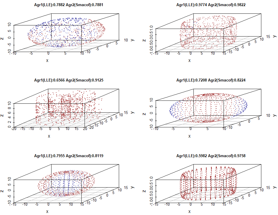
One can see that the average agreement for Smacof is greater than LLE on all of the manifolds except for the circle with random points. For this circle, some areas have better recovery with Smacof and others have better recovery with LLE. The third torus, with the small diameter and the regularly spaced rings has particularly bad recovery with LLE, which is probably because the local recovery algorithm does not manage to properly recreate distances between the rings. The second torus, the large diameter torus is interesting, as the interior points have better performance with LLE and the exterior points have better performance with Smacof. Figure 2 shows a similar diagram, but is restricted to local neighborhoods for .
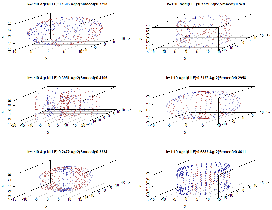
The pattern here is a little different. The overall agreement values are much lower. This is to be expected, as to get perfect local neighborhood recovery of 10 points when there are 1000 points in each configuration is very difficult. Also, the relative performance of LLE vs. Smacof is much stronger than for the all k example, which again is to be expected, as LLE is a local method and Smacof is a global method. For most of the configurations, the performance between LLE and Smacof is very similar. The exception is the small diameter torus, which in this instance, has much better recovery for LLE than for Smacof. This is probably because LLE can recreate the local within ring distances, but for Smacof, there may be some overlap/interference between the rings.
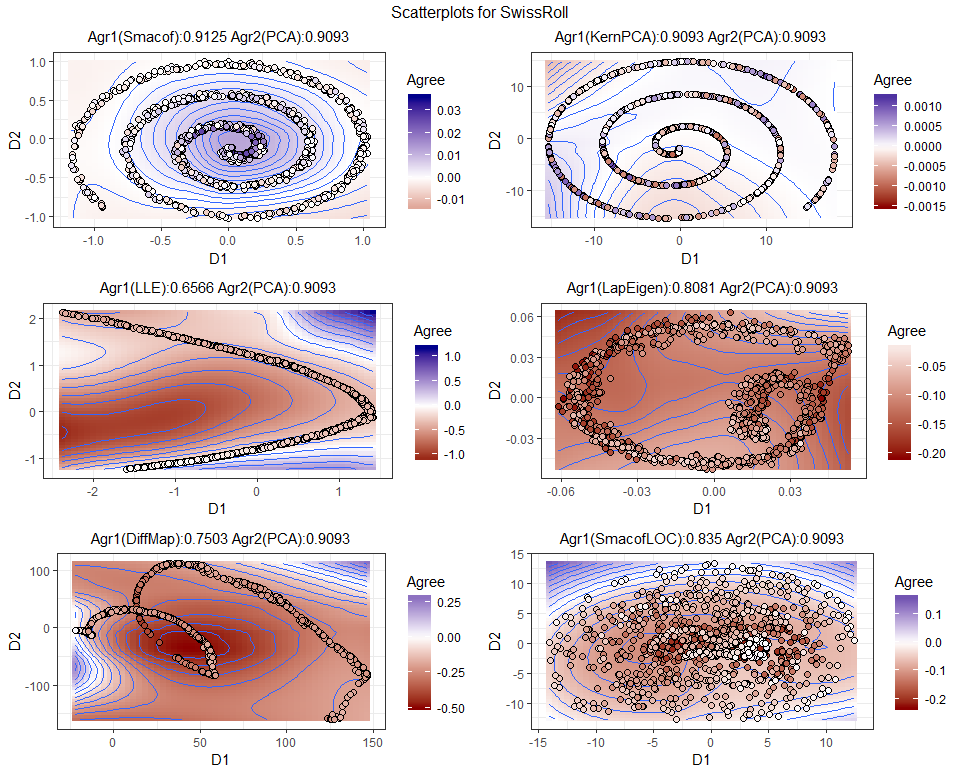
A similar set of analyses were performed using the 2D scatterplot functions, but this time aimed to compare the basic PCA technique with a range of other techniques on two different manifolds, the sphere and the Swiss roll. The 2D scatterplot function for QVisVis has a similar color scheme to the 3D scatterplot function. The 2D scatterplot allows users to view the shape of the lower dimensional configuration and thus relate the level of agreement to the actual mapping. The plotted shape is for the first comparison technique. A set of six scatterplots comparing PCA to six other dimensionality reduction techniques for the random circle is given in Figure 3.
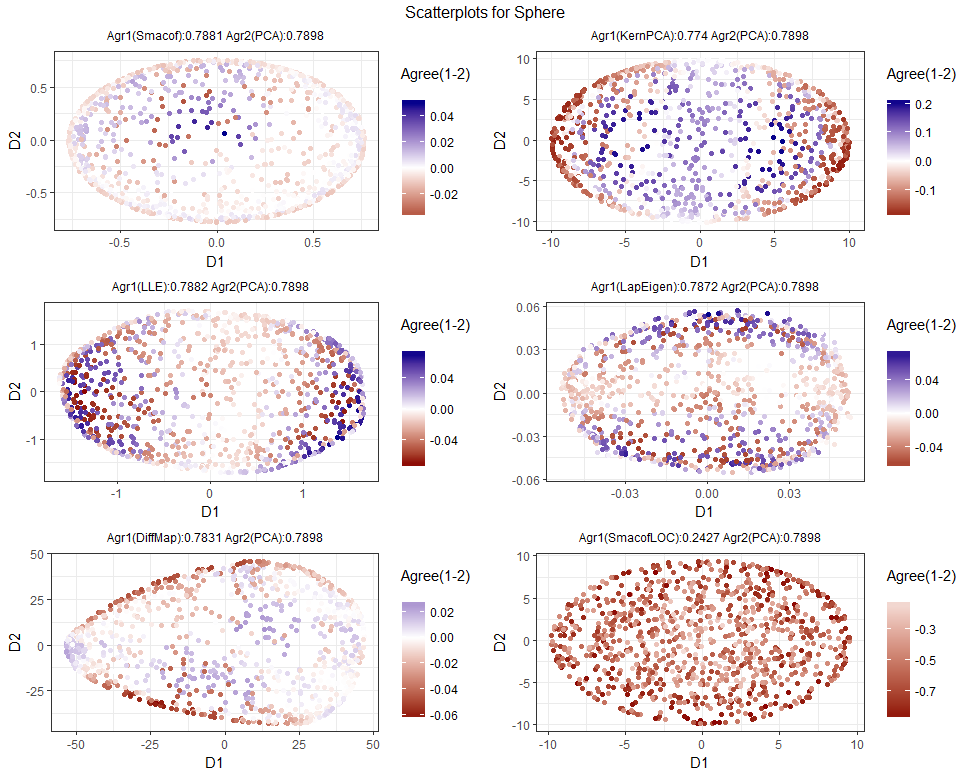
Across all k, PCA performs quite well against the other methods, which is to be expected, as it is a global method. Smacof and PCA have very similar results, which can be determined from both the similarity in overall agreement rate and the light colors for the individual items, which indicates little difference in agreement. Most techniques render a 2D circle from the sphere, though for the diffusion maps method this was somewhat distorted. Local MDS performs very badly, giving very poor global recovery, with nearly every item shaded dark red, indicating much poorer item-wise agreement than PCA.
As per the last example, the visualization is repeated, but only for local neighborhoods. The resulting example is given in Figure 4.
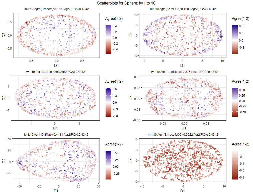
The results are a little more even, which is indicated with generally lighter shades of blue and red. The blues and reds are more evenly distributed, so local neighborhood recovery is less dependent on the area of the visualization than global neighborhood recovery. Again, Local MDS performed badly, indicating that the neighborhood size was perhaps set too low. The diffusion maps technique has the best overall neighborhood recovery, which demonstrates that a technique can have trouble recovering an overall shape, but can still have good neighborhood recovery. The process was repeated for the Swiss roll dataset. The all k visualization for the Swiss Roll is given in Figure 5. The Swiss roll is quite often used as a classic example of how global dimensionality reduction techniques can have problems with local neighborhood recovery, as the distances between the concentric layers of the roll can distort the results from dimensionality reduction methods.
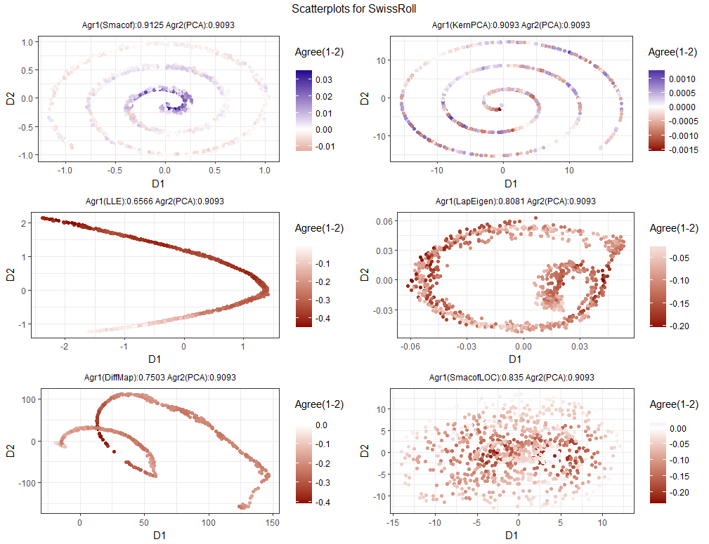
Here, PCA again has strong global recovery, though Smacof has slightly better recovery than both PCA and kernel PCA. PCA and kernel PCA are almost identical, showing that the implemented kernel (Gaussian) had very little effect on the overall embedding. All the other methods had poor overall recovery. Some evidence of a “roll” can be seem for the Laplacian Eigenmap and the diffusion maps methods, but the exactness of the shape is lost.
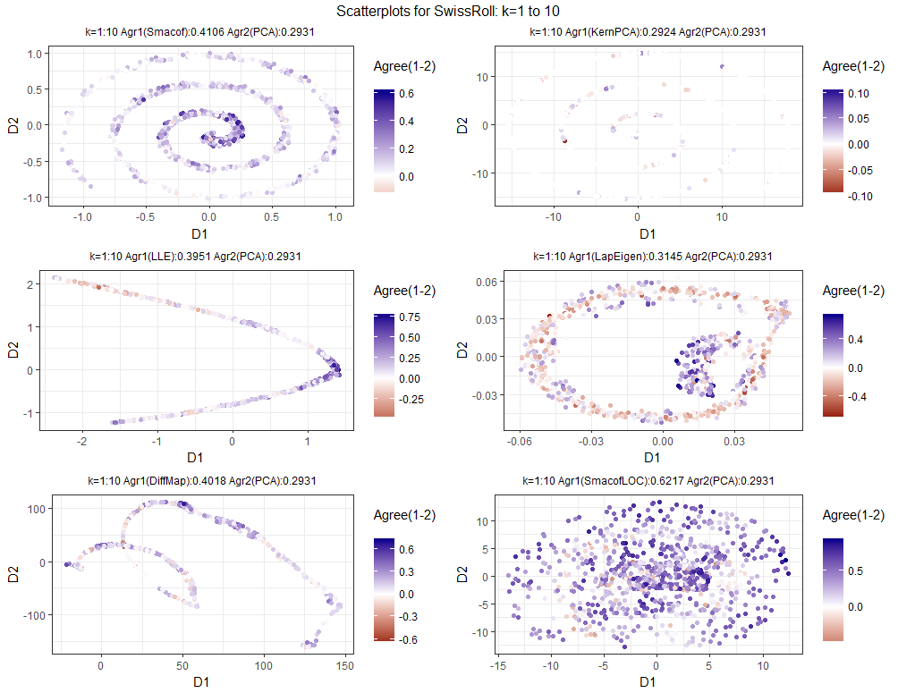
For , the seemingly random local MDS solution has by far the best local recovery, while PCA and kernel PCA have quite poor recovery. The kernel PCA vs. PCA comparison plot has almost disappeared, as the configurations have almost identical item-wise agreement, making most of the points the same color as the background. The poor performance for PCA may be due to the width dimension of the Swiss roll collapsing onto a two dimensional spiral. This means that items are almost randomly placed on top of one another, giving poor item-wise local recovery.
5.2 Heatmaps
For the scatterplot figures, the plots varied by comparison technique and (in the first two plots) shape. It would be possible to create a series of scatterplots that covered different values of k, but for 1000 item datasets, multiple values of k must be combined in a scatterplot. Heatmaps have long been used to analyze values over sets of parameters REF1534 or for comparing quality values across techniques. For example, REF1606 give a polygon heatmap for three different solution quality metrics (stress, correlation, and neighborhood preservation), where each technique represents a vertex of the polygon and the points in the interior of the polygon are determined by a weighted sum of the values at the vertices. Heatmaps have been used to analyze dimensionality reductions solutions, for example, by relating source dimensions to the lower dimensional projection plane REF1621 .
In the QVisVis framework, a heatmap can display agreement over both k and item dimensions. Though the ability to see where a point is on the mapping is lost if the points are logically ordered relative to their place on the visualization, some sense of place can be kept. As per the scatterplots, the items are colored on a blue/red continuum for the agreement of the first technique minus the second technique.
The first graph, given in Figure 7, shows a comparative heatmap, showing the results of Kernel PCA vs. Isomap.
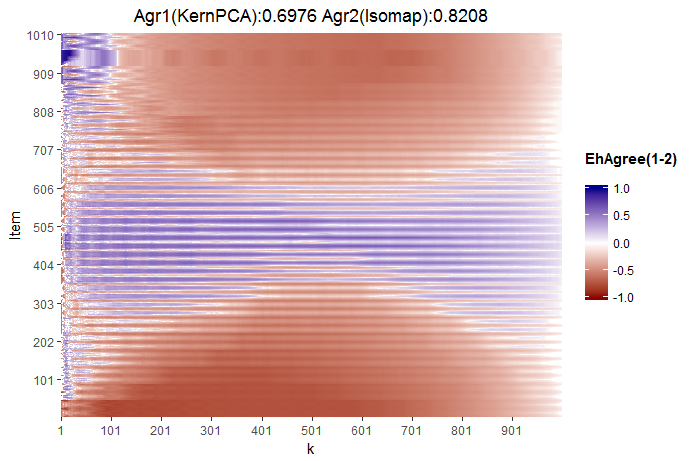
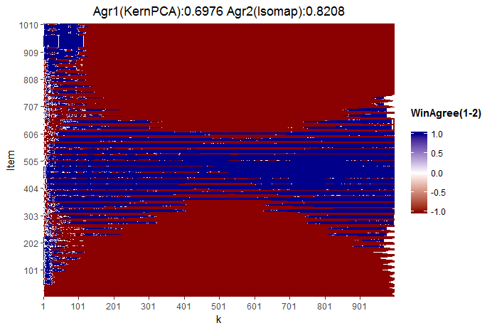
The overall agreement across all k is 0.8208 for Isomap and 0.6976 for Kernel PCA. One can see that there is a good deal of consistency across k. Most of the items in the center of the configuration have outperformance with Kernel PCA over the whole range of k. To give a sharper idea of wins vs. losses, a binary heatmap can be created, where the agreement is coded as 1 if technique 1 wins, -1 if technique 2 wins, and 0 if the agreements are equal. This binary map is given in Figure 8.
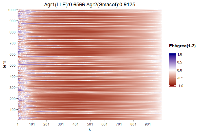
The Heatmap for LLE vs. Smacof on the large diameter regular torus is an interesting one. In terms of overall agreement Smacof dominates LLE quite substantially. However, the techniques are quite evenly matched for low values of k. But, as k increases, Smacof begins to dominate LLE on all items. The red colors lessen a little as k tends towards , but this is to be expected, as for , agreement values are equal to 1 for all techniques.
5.3 Heatmaps Overlays
Heatmaps can be overlaid onto the plot of the points. This has been done to give a gradient map of partial stress REF1604 . It is also utilized in the VisCoDeR REF1602 tool for comparing dimensionality reduction algorithms. In VisCoDeR, dimensionality projections are animated throughout the process of dimensionality reduction and are points are colored by data cluster. A greyscale Voronoi diagram that is shaded by local solution quality is displayed behind the projected points. In REF1622 , a similar Voronoi diagram is utilized, but tears and false neighborhoods in the configuration are given different colors.
QVisVis utilizes a local regression and point interpolation (loess) REF1631 ; REF1624 approach to overlaying heatmaps onto scatterplots. This is implemented in the loess() function in R and is used to create a smoothed surface across the space of the scatterplot. To ensure that the point colors do not blend into the loess colored background, points are given a black outline. In addition, points can be superimposed onto the smoothed surface plot with external color schemes based on cluster or categorical attribute. An example is given in Figure 10. Here the scatterplot for the Swiss roll dataset given in Figure 5 is plotted with a loess surface. The loess surface helps users explore overall patterns in performance. For example in the Smacof vs. PCA comparison, Smacof has stronger agreement towards the center of the roll, but worse agreement towards the outside of the roll.
5.4 Performance Lift Area Plots
The performance lift area plots are designed to show the overall agreement metric in terms of area above expected agreement. The area plots implemented in QVisVis can be utilized for comparing single dimensionality reduction techniques with random agreement or for comparing dimensionality reduction techniques against one another. Performance lift area plots for six different dimensionality reduction techniques vs. the Swiss roll are given in Figure 11.
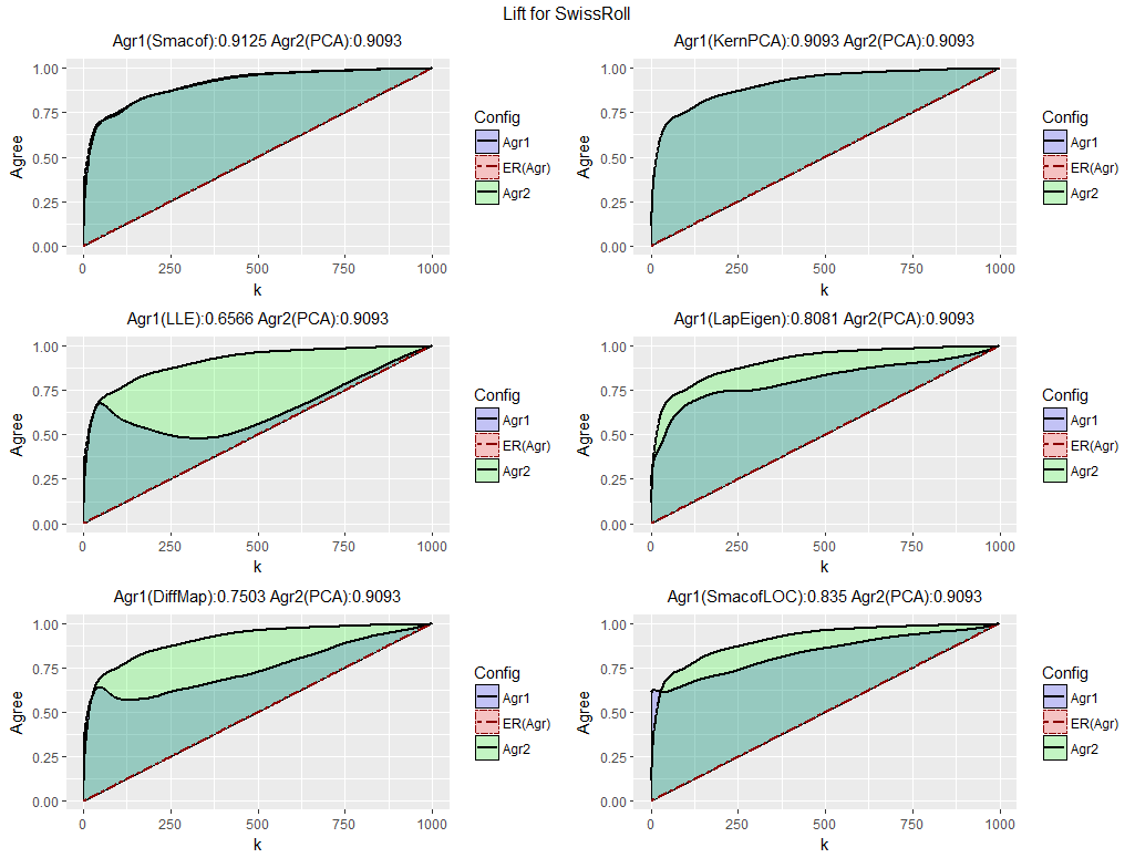
On each diagram, each of the lift techniques is assigned a color. The area between a technique’s lift curve and expected agreement is colored in that color. If two techniques overlap then a color intermediate to the two colors is shown. One can see that across all k, PCA outperforms most of the techniques, except for Smacof, which maintains a slight, but consistent outperformance. A few of the diagrams are particularly interesting. After , LLE seems to almost implode and it’s performance rapidly reverts back to almost random performance. SmacofLOC has a slight area of outperformance for very small k, but then is dominated by PCA, which again emphasizes the local nature of the algorithm.
6 A Consumer Mapping Example with t-SNE
Consumer mapping is a widely applied method to help segment consumers and understand consumer responses to marketing activities REF152 . A range of multidimensional scaling based methods have been utilized in marketing mapping applications REF1625 ; REF1633 . To demonstrate the use of QVisVis on real-world data, several algorithms were tested on a set of consumer data222Data can be downloaded from https://www.kaggle.com/miroslavsabo/young-people-survey, which gives music, movie, and lifestyle preferences for a young adults. The dataset has 1010 items and 135 questions, each requiring a Likert scale response from . It has a few missing values, which account for 0.4% of the data. The t-SNE method REF1626 ; REF1632 , which is a variant of stochastic neighborhood embedding REF1627 , was implemented, as it is optimized to give good local neighborhood recovery. It has been used in marketing mapping applications, e.g., REF1249 , where local neighborhood recovery is important. In this example, the QVisVis framework was used for tuning “perplexity” , which is a parameter that is approximately one third of the number of nearest neighbors included when calculating the lower dimensional embedding. Distance MDS implemented with Smacof and LLE were selected as benchmarks, as they are designed for global and local recovery respectively. The t-SNE method was implemented using the “Rtsne” wrapper package. Initial tuning of the perplexity parameter p showed strong values of local neighborhood recovery () for . This value was used, along with the maximum possible value () and an intermediate value () in order to examine the trade-off between the perplexity parameter and performance. Parameter tuning was also performed for LLE by using the “calc_k” function in the “lle” R package. To create an overall comparison, performance lift diagrams were created to compare recovery across all k. For Smacof, basic MDS was implemented with an ordinal distance transformation. The three parameter settings of t-SNE were each compared with each of Smacof and LLE, giving 6 diagrams. The resulting visualizations are shown in Figure 12.
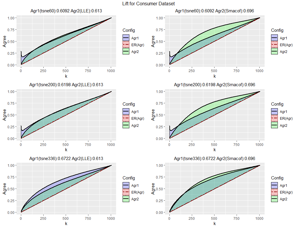
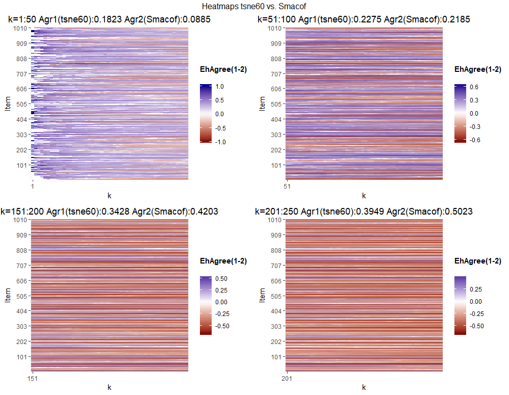
One can see that t-SNE with the smaller perplexity values outperforms both LLE and Smacof when recovering nearest neighbors. t-SNE dominates LLE across all values of k for and , though for larger values of k, LLE outperforms t-SNE with perplexity of 60. t-SNE outperforms Smacof for small values of k (up to around ), but for large values of k, Smacof outperforms t-SNE. This performance effect is present for all three perplexity values, though it decreases as p increases. To examine this effect further, a set of heatmaps was produced comparing t-SNE with with Smacof. Comparisons were created for , , , and to give two heatmaps each on either side of the performance inversion between t-SNE and Smacof. As could be expected, as k increases, the heatmaps go from mostly blue (t-SNE outperformance) to red (Smacof outperformance). The aggregate aggrement statistics emphasize this pattern. For , t-SNE has over double the agreement of Smacof (0.1823 vs. 0.0885), while for , agreement for t-SNE was substantially lower than for Smacof. The heatmaps are given in Figure 14.
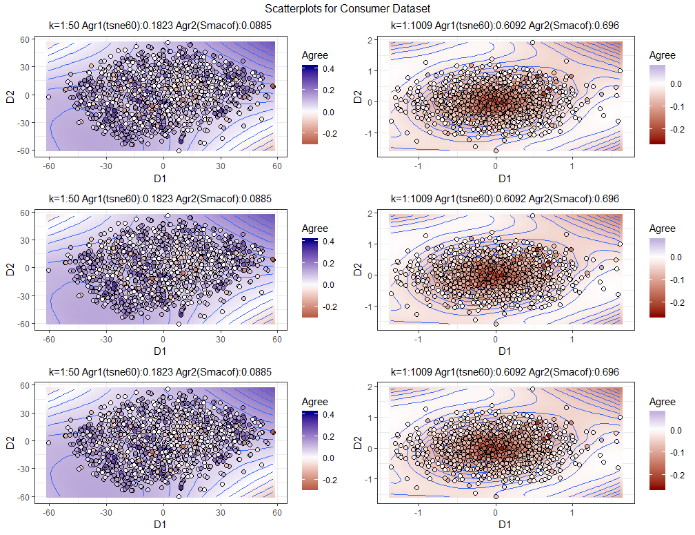
To further look at the differences in performance, scatterplots with loess smoothing were plotted comparing each t-SNE solution with the Smacof solution. Three plots were created for “local” to show near neighbor recovery and three plots were taken showing “global” agreement across all k. For the three local plots, the t-SNE solution was used and for the three global plots, the Smacof solution was used. As expected, t-SNE strongly dominates in the local plots and Smacof outperforms in the global plots. There also seems to be a slight effect, where Smacof does relatively better towards the center of the configuration and t-SNE does better towards the edge of the configuration.
Overall, in a situation where local neighborhood agreement is important, for example, where a marketing manager who wishes to examine relationships betweeen individual customers, then the results show that t-SNE has the best recovery. However, if global agreement is important, for example, if a marketing manager wishes to examine segments across an entire customer dataset, ordinal MDS implemented with Smacof gives very good performance (though only slightly better than t-SNE with the maximum value of p). In the context of calculating agreement, this example showed how multiple visualizations can give different insights into comparative performance, across both neighborhood size and the geography of the solution configuration.
7 Discussion and Future Work
This paper presents a review and synthesis of rank-based methods of analyzing dimensionality reduction performance. This review is used to build a framework for analyzing and visualizing dimensionality reduction performance entitled QVisVis. It is a practical framework, designed to help evaluate dimensionality reduction techniques and to give insight into the performance of the techniques beyond a simple numeric quality metric. The overall framework allows for dimensionality reduction algorithm performance to be analyzed versus random agreement and against other techniques. It allows users to examine the local vs. global performance trade-off and to examine performance in different areas of the source (if 3 dimensional) and output visualizations.
Much further work can be done on the framework and software. The current visualizations show solution agreement, but other relevant information, such as measures of item centrality of the point could be shown REF1599 . The software has the ability to draw visualizations across different technique parameter settings, but this ability was not emphasized in this paper and future work could help develop visual based methods of parameter tuning. The visualizations are currently static. Animated visualizations could parsimoniously help users see how visualization performance changes over time and a wide variety of neighborhood sizes and parameter settings. Finally, a wider range of quality measures could be implemented. For example. the NIEQA method REF1535 shows how well item neighborhoods are preserved under normalization.
In this paper, the idea of solution quality is based upon objective, quantitative criteria. However, in practical visualization contexts, human perception of visualization is important. There have been several article on incorporating human perceptions of visualizations into evaluation of visual embeddings, for example, in REF1607 , a user survey is used to analyze human perceptions of visualizations with respect to quantitative quality metrics. In a similar fashion, other work has gathered survey data on the quality of cluster seperation for different types of scatterplot REF1608 and on testing how well visualizations allow users to carry out tasks, such as analyzing the number of clusters and relative distances in visualizations REF1610 . In REF1623 , human perceptions of scatterplot similarity were compared with scagnostic measures and correlations were found to be low (), indicating that much of what humans observe when assessing scatterplots cannot be explained by simple shape based metrics. The combination of quantitative quality metrics and the analysis of human interaction with visualizations and could lead to further insights into visualization quality.
The scatterplots created in the QVisVis framework can be used to show i) the relative performance of different techniques, ii) performance vs. different parameterizations of techniques, or iii) performance across different subsets of neighborhood recovery. For parsimony, the examples in this paper are quite simple. However, by combining i, ii, and iii, we could get many hundreds of scatterplots. These could be displayed in scatterplot matrices (SPLOMs), but this is not practical when there are large number of scatterplots. The method of scagnostics, which was proposed by John Tukey REF1615 , involves analyzing scatterplots by shape based characteristics such as the minimum spanning tree, convex hull, or “skeleton” REF1612 formed by the scatterplots and by the features exhibited by the scatterplots such as the convexity, monotonicity, and sparsity of the scatterplots REF1611 . These characteristics can then be used to explore and cluster scatterplots REF1613 or mathematical transforms of scatterplots REF1614 . Combining agreement metrics with overall scatterplot scagnostics could give a deeper understanding of the features and quality of dimensionality reduction algorithms.
References
- (1) Akkucuk, U.: Nonlinear mapping: Approaches based on optimizing an index of continuity and applying classical metric MDS on revised distances. Ph.D. thesis, Rutgers University, Newark, NJ (2004)
- (2) Akkucuk, U., Carroll, J.D.: PARAMAP vs. Isomap: A comparison of two nonlinear mapping algorithms. Journal of Classification 23(2), 221–254 (2006)
- (3) Andrew, V.M., Purchase, H.: On the role of design in information visualization. Information Visualization 10(4), 356–371 (2011)
- (4) Aupetit, M.: Visualizing distortions and recovering topology in continuous projection techniques. Neurocomputing 70(7), 1304–1330 (2007)
- (5) Belkin, M., Niyogi, P.: Laplacian eigenmaps for dimensionality reduction and data representation. Neural Computation 15(6), 1373–1396 (2003)
- (6) Bertini, E., Tatu, A., Keim, D.: Quality metrics in high-dimensional data visualization: An overview and systematization. IEEE Transactions on Visualization and Computer Graphics 17(12), 2203–2212 (2011)
- (7) Borg, I., Groenen, P.J.F.: Modern Multidimensional Scaling: Theory and Applications, 2 edn. Springer, New York, NY (2005)
- (8) Bradley, A.P.: The use of the area under the roc curve in the evaluation of machine learning algorithms. Pattern Recognition 30(7), 1145–1159 (1997)
- (9) Buja, A., Swayne, D.F., Littman, M.L., Dean, N., Hofmann, H., Chen, L.: Data visualization with multidimensional scaling. Journal of Computational and Graphical Statistics 17(2), 444–472 (2008)
- (10) Carpendale, S.: Evaluating Information Visualizations, pp. 19–45. Information Visualization: Human-Centered Issues and Perspectives. Springer, Heidelberg, Germany (2008)
- (11) Carroll, J.D., Wish, M.: Multidimensional perceptual models and measurement methods, Handbook of Perception, vol. 2, pp. 391–447. Academic Press, New York, NY (1974)
- (12) Chen, L.: Local multidimensional scaling for nonlinear dimension reduction, graph layout and proximity analysis. Ph.D. dissertation, University of Pennsylvania (2006)
- (13) Chen, L., Buja, A.: Local multidimensional scaling for nonlinear dimension reduction, graph drawing, and proximity analysis. Journal of the American Statistical Association 104(486), 209–219 (2009)
- (14) Chen, L., Buja, A.: Stress functions for nonlinear dimension reduction, proximity analysis, and graph drawing. Journal of Machine Learning Research 14, 1145–1173 (2013)
- (15) Cleveland, W.S.: Robust locally weighted regression and smoothing scatterplots. Journal of the American Statistical Association 74(368), 829–836 (1979)
- (16) Coifman, R.R., Lafon, S.: Diffusion maps. Applied and Computational Harmonic Analysis 21(1), 5–30 (2006)
- (17) Coimbra, D.B., Martins, R.M., Neves, T., Telea, A.C., Paulovich, F.V.: Explaining three-dimensional dimensionality reduction plots. Information Visualization 15(2), 154–172 (2016)
- (18) Cutura, R., Holzer, S., Aupetit, M., Sedlmair, M.: VisCoDeR: A tool for visually comparing dimensionality reduction algorithms. In: Proceedings of European Symposium on Artificial Neural Networks, Computational Intelligence and Machine Learning (ESANN)
- (19) Dang, T.N., Wilkinson, L.: ScagExplorer: Exploring scatterplots by their scagnostics. pp. 73–80. IEEE, Piscataway,NJ (2014). DOI 10.1109/PacificVis.2014.42
- (20) Dijkstra, E.W.: A note on two problems in connexion with graphs. Numerische Mathematik 1(1), 269–271 (1959)
- (21) Etemadpour, R., Motta, R., de Souza Paiva, J.G., Minghim, R., Oliveira, M.C.F., Linsen, L.: Perception-based evaluation of projection methods for multidimensional data visualization. IEEE Transactions on Visualization & Computer Graphics 21(1), 81–94 (2015)
- (22) France, S.L.: Properties of a General Measure of Configuration Agreement. Algorithms from and for Nature and Life. Springer Verlag, Heidelberg, Germany (2013)
- (23) France, S.L., Carroll, J.D.: Development of an agreement metric based upon the Rand index for the evaluation of dimensionality reduction techniques, with applications to mapping customer data. In: P. Perner (ed.) Lecture Notes in Artificial Intelligence, Proceedings Conference MLDM 2007, pp. 499–517. Springer, Heidelberg, Germany (2007)
- (24) France, S.L., Carroll, J.D.: Two-way multidimensional scaling: A review. IEEE Transactions on Systems, Man, and Cybernetics, Part C (Applications and Reviews) 41(5), 644–661 (2011)
- (25) France, S.L., Ghose, S.: Marketing analytics: Methods, practice, implementation, and links to other fields. Expert Systems with Applications 119, 456–475 (2019)
- (26) Groenen, P.J.K., Mathar, R., Heiser, W.J.: The majorization approach to multidimensional scaling for Minkowski distances. Journal of Classification 12(1), 3–19 (1995)
- (27) Hand, D.J., Till, R.J.: A simple generalisation of the area under the ROC curve for multiple class classification problems. Machine Learning 45(2), 171–186 (2001)
- (28) Hanley, J.A., McNeil, B.J.: The meaning and use of the area under a receiver operating characteristic (ROC) curve. Radiology 143(1), 29–36 (1982)
- (29) Hinton, G., Roweis, S.: Stochastic neighbor embedding. In: S. Becker, S. Thrun, K. Obermayer (eds.) Proceedings of the 15th International Conference on Neural Information Processing Systems, pp. 857–864. MIT Press, Cambridge, MA, USA (2002). URL http://dl.acm.org/citation.cfm?id=2968618.2968725
- (30) Hubert, L.J., Arabie, P.: Comparing partitions. Journal of Classification 2(1), 193–218 (1985)
- (31) Ingram, S., Munzner, T., Irvine, V., Tory, M., Bergner, S., Möller, T.: DimStiller: Workflows for dimensional analysis and reduction. In: A. MacEachren, S. Miksch (eds.) 2010 IEEE Symposium on Visual Analytics Science and Technology, pp. 3–10. IEEE, Piscataway,NJ (2010)
- (32) Jankun-Kelly, T.J., Ma, K.L., Gertz, M.: A model and framework for visualization exploration. IEEE Transactions on Visualization and Computer Graphics 13(2), 357–369 (2007)
- (33) Karatzoglou, A., Smola, A., Hornik, K., Zeileis, A.: kernlab - An S4 package for kernel methods in R. Journal of Statistical Software 11(9), 1–20 (2004)
- (34) Kaski, S., Nikkila, J., Oja, M., Venna, J., Toronen, P., Castren, E.: Trustworthiness and metrics in visualizing similarity of gene expression. BMC Bioinformatics 4(1), 48 (2003)
- (35) Kraemer, G.: Package ‘dimRed’ (2017). URL https://cran.r-project.org/web/packages/dimRed/
- (36) Kruskal, J.B.: Multidimensional scaling for optimizing a goodness of fit metric to a nonmetric hypothesis. Psychometrika 29(1), 1–27 (1964)
- (37) Kruskal, J.B.: Nonmetric multidimensional scaling: A numerical method. Psychometrika 29(2), 115–129 (1964)
- (38) Laskowski, P.H.: The traditional and modern look at Tissot’s indicatrix. The American Cartographer 16(2), 123–133 (1989)
- (39) Lee, J., Verleysen, M.: Quality assessment of nonlinear dimensionality reduction based on k-ary neighborhoods. In: Y. Saeys, H. Liu, I. Inza, L. Wehenkel, Y.V. de Peer (eds.) New Challenges for Feature Selection in Data Mining and Knowledge Discovery, vol. 4, pp. 21–35. JMLR: Workshop and Conference Proceedings (2008)
- (40) Lee, J.A., Verleysen, M.: Quality assessment of dimensionality reduction: Rank-based criteria. Neurocomputing 72(7-9), 1431–1443 (2009)
- (41) Lee, J.A., Verleysen, M.: Scale-independent quality criteria for dimensionality reduction. Pattern Recognition Letters 31(14), 2248–2257 (2010)
- (42) de Leeuw, J., Mair, P.: Multidimensional scaling using majorization: SMACOF in R. Journal of Statistical Software 31(3) (2009)
- (43) Lespinats, S., Aupetit, M.: CheckViz: Sanity check and topological clues for linear and non-linear mappings. Computer Graphics Forum 30(1), 113–125 (2011)
- (44) Lueks, W., Mokbel, B., Biehl, M., Hammer, B.: How to evaluate dimensionality reduction? In: B. Hammer, T. Villmann (eds.) Proceedings of the Workshop - New Challenges in Neural Computation 2011, vol. 5, pp. 29–37 (2011)
- (45) Ma, Y., Fu, Y.: Manifold learning theory and applications, 1 edn. CRC press, Boca Raton, FL (2011)
- (46) van der Maaten, L.: Accelerating t-SNE using tree-based algorithms. The Journal of Machine Learning Research 15(1), 3221–3245 (2014)
- (47) van der Maaten, L., Hinton, G.: Visualizing data using t-SNE. Journal of machine learning research 9, 2579–2605 (2008)
- (48) van der Maaten, L., Postma, E., den Herik, J.V.: Dimensionality reduction: A comparative review. Journal of Machine Learning Research 10, 66–71 (2009)
- (49) Martins, R.M., Coimbra, D.B., Minghim, R., Telea, A.C.: Visual analysis of dimensionality reduction quality for parameterized projections. Computers & Graphics 41, 26–42 (2014)
- (50) Martins, R.M., Minghim, R., Telea, A.C.: Explaining neighborhood preservation for multidimensional projections. In: R. Borgo, C. Turkay (eds.) Computer Graphics and Visual Computing (CGVC), pp. 1–8. The Eurographics Association (2015)
- (51) Matute, J., Telea, A.C., Linsen, L.: Skeleton-based scagnostics. IEEE Transactions on Visualization and Computer Graphics 24(1), 542–552 (2018)
- (52) McKenna, S., Mazur, D., Agutter, J., Meyer, M.: Design activity framework for visualization design. IEEE Transactions on Visualization and Computer Graphics 20(12), 2191–2200 (2014)
- (53) Mokbel, B., Lueks, W., Gisbrecht, A., Hammer, B.: Visualizing the quality of dimensionality reduction. Neurocomputing 112, 109–123 (2013)
- (54) Motta, R., Minghim, R., de Andrade Lopes, A., Oliveira, M.C.F.: Graph-based measures to assist user assessment of multidimensional projections. Neurocomputing 150(B), 583–598 (2015)
- (55) Munzner, T.: A nested model for visualization design and validation. IEEE Transactions on Visualization and Computer Graphics 15(6), 921–928 (2009)
- (56) North, C.: Toward measuring visualization insight. IEEE Computer Graphics and Applications 26(3), 6–9 (2006)
- (57) Pagliosa, P., Paulovich, F.V., Minghim, R., Levkowitz, H., Nonato, L.G.: Projection inspector: Assessment and synthesis of multidimensional projections. Neurocomputing 150(B), 599–610 (2015)
- (58) Pandey, A.V., Krause, J., Felix, C., Boy, J., Bertini, E.: Towards understanding human similarity perception in the analysis of large sets of scatter plots. In: J. Kaye, A. Druin, C. Lampe, D. Morris, J.P. Hourcade (eds.) Proceedings of the 2016 CHI Conference on Human Factors in Computing Systems, pp. 3659–3669. ACM, New York, NY, USA (2016)
- (59) Plaisant, C.: The challenge of information visualization evaluation. In: M.F. Costabile (ed.) Proceedings of the Working Conference on Advanced Visual Interfaces, AVI ’04, pp. 109–116. ACM, New York, NY, USA (2004)
- (60) Pollio, V.: Vitruvius: The Ten Books on Architecture, 1 edn. Harvard University Press, Cambridge,MA (1914)
- (61) Pryke, A., Mostaghim, S., Nazemi, A.: Heatmap visualization of population based multi objective algorithms. In: S. Obayashi, K. Deb, C. Poloni, T. Hiroyasu, T. Murata (eds.) Evolutionary Multi-Criterion Optimization, pp. 361–375. Springer, Heidelberg, Germany (2007)
- (62) Qu, Z., Hullman, J.: Evaluating visualization sets: Trade-offs between local effectiveness and global consistency. In: Proceedings of the Sixth Workshop on Beyond Time and Errors on Novel Evaluation Methods for Visualization, BELIV ’16, pp. 44–52. ACM, New York, NY, USA (2016)
- (63) Rand, W.M.: Objective criteria for the evaluation of clustering methods. Journal of the American Statistical Association 66(336), 846–850 (1971)
- (64) Ringel, D.M., Skiera, B.: Understanding competition using big consumer search data. In: R.H.S. Jr. (ed.) 47th Hawaii International Conference on System Sciences, pp. 3129–3138 (2014)
- (65) Ringel, D.M., Skiera, B.: Visualizing asymmetric competition among more than 1,000 products using big search data. Marketing Science 35(3), 511–534 (2016)
- (66) Roweis, S.T., Saul, L.K.: Nonlinear dimensionality reduction by locally linear embedding. Science 290(5500), 2323–2326 (2000)
- (67) Sacha, D., Zhang, L., Sedlmair, M., Lee, J.A., Peltonen, J., Weiskopf, D., North, S.C., Keim, D.A.: Visual interaction with dimensionality reduction: A structured literature analysis. IEEE Transactions on Visualization and Computer Graphics 23(1), 241–250 (2017)
- (68) Schölkopf, B., Smola, A., Müller, K.R.: Kernel principal component analysis. In: W. Gerstner, A. Germond, M. Hasler, J.D. Nicoud (eds.) Artificial Neural Networks — ICANN’97, pp. 583–588. Springer Verlag, Heidelberg,Germany (1997)
- (69) Sedlmair, M., Munzner, T., Tory, M.: Empirical guidance on scatterplot and dimension reduction technique choices. IEEE Transactions on Visualization & Computer Graphics 19(12), 2634–2643 (2013)
- (70) Seifert, C., Sabol, V., Kienreich, W.: Stress maps: analysing local phenomena in dimensionality reduction based visualisations. In: Proceedings of the 1st European Symposium on Visual Analytics Science and Technology (EuroVAST’10), vol. 1, pp. 1–6 (2010)
- (71) Shlens, J.: A tutorial on principal components analysis (2005). https://arxiv.org/abs/1404.1100
- (72) Shyu, W.M., Grosse, E., Cleveland, W.S.: Local regression models, pp. 309–376. Statistical models in S. Chapman and Hall, Boca Raton,FL (1991)
- (73) Silva, V.D., Tenenbaum, J.B.: Global versus local methods in nonlinear dimensionality reduction. In: S. Becker, S. Thrun, K. Obermayer (eds.) Advances in Neural Information Processing Systems 15, pp. 705–712. MIT Press, Cambridge, MA (2003)
- (74) Snyder, J.P.: Flattening the earth: Two thousand years of map projections, 1 edn. University Of Chicago Press, Chicago, USA (1997)
- (75) Sobczyk, A.: Projections in Minkowski and Banach spaces. Duke Math.J. 8(1), 78–106 (1941)
- (76) Stahnke, J., Dörk, M., Müller, B., Thom, A.: Probing projections: Interaction techniques for interpreting arrangements and errors of dimensionality reductions. IEEE Transactions on Visualization and Computer Graphics 22(1), 629–638 (2016)
- (77) Stasko, J.: Value-driven evaluation of visualizations. In: H. Lam, P. Isenberg, T. Isenberg, M. Sedlmair (eds.) Proceedings of the Fifth Workshop on Beyond Time and Errors: Novel Evaluation Methods for Visualization, BELIV ’14, pp. 46–53. ACM, New York, NY, USA (2014)
- (78) Steinley, D.: Properties of the Hubert-Arabie adjusted Rand index. Psychological methods 9(3), 386–396 (2004)
- (79) Tatu, A., Bak, P., Bertini, E., Keim, D., Schneidewind, J.: Visual quality metrics and human perception: An initial study on 2D projections of large multidimensional data. In: G. Santucci (ed.) Proceedings of the International Conference on Advanced Visual Interfaces, AVI ’10, pp. 49–56. ACM, New York, NY, USA (2010)
- (80) Tenenbaum, J.B., de Silva, V., Langford, J.C.: A global geometric framework for nonlinear dimensionality reduction. Science 290(5500), 2319–2323 (2000)
- (81) Torgerson, W.S.: Multidimensional scaling, I: theory and method. Psychometrika 17(4), 401–419 (1952)
- (82) Torgerson, W.S.: Theory and Methods of Scaling, 1 edn. Wiley, New York (1958)
- (83) Tory, M., Möller, T.: Rethinking visualization: A high-level taxonomy. In: M. Ward, T. Munzner (eds.) IEEE Symposium on Information Visualization, pp. 151–158 (2004)
- (84) Tuan, N.D., Wilkinson, L.: Transforming scagnostics to reveal hidden features. IEEE Transactions on Visualization and Computer Graphics 20(12), 1624–1632 (2014)
- (85) Tukey, J.W.: Exploratory Data Analysis, 1 edn. Addison-Wesley, Reading, MA (1977)
- (86) Tukey, J.W., Tukey, P.A.: Computer graphics and exploratory data analysis: An introduction. In: Proceedings of the Sixth Annual Conference and Exposition: Computer Graphics 85, pp. 773–785. National Computer Graphics Association, Fairfax,VA (1985)
- (87) Tversky, A., Hutchinson, J.W.: Nearest neighbor analysis of psychological spaces. Psychological Review 93(1), 3–22 (1986)
- (88) Tversky, A., Rinott, Y., Newman, C.M.: Nearest neighbor analysis of point processes: Applications to multidimensional scaling. Journal of Mathematical Psychology 27(3), 235–250 (1983)
- (89) Upson, C., Jr., T.F., Kamins, D., Laidlaw, D., Schlegel, D., Vroom, J., Gurwitz, R., van Dam, A.: The application visualization system: a computational environment for scientific visualization. IEEE Computer Graphics and Applications 9(4), 30–42 (1989)
- (90) Venna, J., Kaski, S.: Neighborhood preservation in nonlinear projection methods: An experimental study. In: G. Dorffner, H. Bischof, K. Hornik (eds.) Artificial Neural Networks — ICANN 2001, pp. 485–491. Springer Berlin Heidelberg, Berlin, Heidelberg (2001)
- (91) Venna, J., Kaski, S.: Local multidimensional scaling. Neural Networks 19(6-7), 889–899 (2006)
- (92) Vidal, R., Ma, Y., Sastry, S.: Generalized Principal Component Analysis, 1 edn. Springer, New York, NY (2016)
- (93) Viégas, F.B., Wattenberg, M.: Artistic data visualization: Beyond visual analytics. In: D. Schuler (ed.) Online Communities and Social Computing, pp. 182–191. Springer, Heidelberg, Germany (2007)
- (94) Wedel, M., Kamakura, W.A.: Market Segmentation: Conceptual and Methodological Foundations, 2 edn. Kluwer Academic Publishers, Boston, MA (2000)
- (95) Wilkinson, L., Anand, A., Grossman, R.: Graph-theoretic scagnostics. In: J.T. Stasko, M. Ward (eds.) IEEE Symposium on Information Visualization, 2005. INFOVIS 2005., pp. 157–164. IEEE, Piscataway, NJ (2005)
- (96) Yang, L., Jin, R.: Distance metric learning: A comprehensive survey. working paper, Michigan State University. (2006). http://www.cse.msu.edu/~rongjin/semisupervised/dist-metric-survey.pdf
- (97) Zhang, P., Ren, Y., Zhang, B.: A new embedding quality assessment method for manifold learning. Neurocomputing 97, 251–266 (2012)