Expanding tidy data principles to facilitate missing data exploration, visualization and assessment of imputations
Nicholas Tierney, Dianne Cook
\PlaintitleExpanding tidy data principles to facilitate missing data exploration, visualization and assessment of imputations
\ShorttitleExplore missingness with \pkgnaniar
\Abstract
Despite the large body of research on missing value distributions and imputation, there is comparatively little literature with a focus on how to make it easy to handle, explore, and impute missing values in data. This paper addresses this gap. The new methodology builds upon tidy data principles, with the goal of integrating missing value handling as a key part of data analysis workflows. We define a new data structure, and a suite of new operations. Together, these provide a connected framework for handling, exploring, and imputing missing values. These methods are available in the R package naniar.
\Keywordsstatistical computing, statistical graphics, data science, data visualization, tidyverse, data pipeline, \proglangR
\Plainkeywordsstatistical computing, statistical graphics, data science, data visualization, tidyverse, data pipeline, R
\Address
Nicholas Tierney
Monash University
Department of Econometrics and Business Statistics E774, Menzies Building Monash University, Clayton
E-mail:
URL: http://www.njtierney.com
1 Introduction
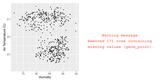
As data science has become a more solid field, theories and principles have developed to describe best practices. One such idea is ‘tidy data,’ which defines a clean, analysis-ready format that informs workflows converting raw data through a data analysis pipeline (Wickham, 2014). Another idea is the grammar of graphics, describing how to map data values into a visualization (Wilkinson, 2012). These principles have been widely adopted, but do not address the problem of missing data. In particular, there is little guidance on how to handle missing values in a data analysis workflow. Most analysis and visualization software simply drop missing values when making a plot, although some (\pkgggplot2) provide a warning (Figure 1).
The imputation literature focuses on ensuring valid statistical inference is made from incomplete data. This is approached chiefly through probabilistic modelling, assuming the mechanism of missing data is known to the analyst. It does not address how to explore, understand, and handle missing data structures and mechanisms.
However, something must be known about the missing value structure to produce a complete dataset for analysis, whether by case- or variable-deletion, or with imputation. Decision tree models or latent group analysis can reveal structures or patterns of missingness (Tierney et al., 2015; Barnett et al., 2017), but are not definitive. While there are times where the missing data mechanism is obvious, determining this is typically not straightforward. To understand their structure and possible mechanisms, the analyst must explore the data with visualizations, summaries, and modelling, in an iterative fashion.
While there have been many software tools for exploring missing data, they do not work together. The graphics literature provides several solutions for exploring missings visually by incorporating them into the plot in some way. For example, imputing values to be 10% below the minimum to include all observations into a scatter plot (Cook and Swayne, 2007), or treating missing values as an equal category of data (Unwin et al., 1996). The ideas from the graphics literature need to be translated into tidy data tools to integrate missing data handling in a data analysis pipeline.
This paper is organized in the following way. The next section (2) provides the background to tidy data principles and tools (2.1) and missing data representations (2.2). Section 3 summarises existing software for handling missing data. The new work extending the tidy tools to facilitate exploring, visualizing, and imputing missing data is discussed in Section 4. Graphics (5) and Numerical summaries (6) of missing values are then discussed. An application illustrating the use of the new methods is shown in Section 7. Section 8 discusses strengths, limitations, and future directions.
2 Background
2.1 Tidy data concepts and methods
Features of tidy data were formally described in Wickham (2014), and were discussed in terms of their importance for data science by Donoho (2017), and tools for data analysis. Tidy data is defined by Wickham and Grolemund (2016) as:
- 1.
Each variable must have its own column.
- 2.
Each observation must have its own row.
- 3.
Each value must have its own cell.
Tidy data is easier to work with and analyze because the variables are in the same format as they would be put into modelling software. This helps the analyst works swiftly and clearly, closing up opportunities for errors. Tidy data principles are general, but are comprehensively implemented in the R programming language, so this paper focuses on R (R Core Team, 2020).
Tidy tools require the same tidy data input and output. This consistency means multiple tools can be composed together into a sequence, allowing for rapid, elegant, and complex operations. Contrasting tidy tools are messy tools. These have tidy input but messy output. Messy tools slow down analysis by shifting the focus from analysis to transforming output so it is the right shape for the next step in the analysis. This makes the work at each step harder to predict, and more complex and difficult to maintain. This disrupts workflow, and invites errors. Tidy tools fall into three broad categories: data manipulation, visualization, and modelling.
2.1.1 Data manipulation
Data manipulation is made input- and output-tidy with R packages \pkgdplyr and \pkgtidyr (Wickham et al., 2017a; Wickham and Henry, 2018). These provide the five “verbs” of data manipulation: data reshaping, sorting, filtering, transforming, and aggregating. Data reshaping goes from long to wide formats; sorting arranges rows in a specific order; filtering removes rows based on a condition; transforming, changes existing variables or adds new ones; aggregating creates a single value from many values, say, for example, in computing the minimum, maximum, and mean.
2.1.2 Visualizations
Visualization tools only have tidy data as their input, as the output is a graphic. The popular domain specific language \pkgggplot2 maps variables in a dataset to features (referred to as aesthetics) of a graphic (Wickham, 2009). For example, a scatterplot can be created by mapping two variables to the x and y axes, and specifying a point geometry.
2.1.3 Modelling
Modelling tools work well with tidy data, as they have a clear mapping from variables in the data to the formula for a model. For example in R, y regressed on x and z is: \codelm(y x + z). Modelling tools are input tidy, but their output is always messy - it is not in the right format for subsequent steps in analysis. For example, estimated coefficients, predictions, and residuals from one model cannot be easily combined with the output of another model. Messy models have been partially addressed with the \pkgbroom package, which tidies up model outputs into a tidy data format for data analysis, and the developing \pkgrecipes package, which helps make modelling input- and output-tidy (Kuhn and Wickham, 2019).
2.1.4 The tidyverse
Defining tidy data and tidy tools has resulted in a growing set of packages known collectively as the “tidyverse” (Wickham et al., 2019). These are constructed to share similar principles in their design and behavior, and cover the breadth of an analysis - from importing, tidying, transforming, visualizing, modelling, to communicating (Wickham and Grolemund, 2016; Wickham et al., 2019; Wickham, 2017). This has led to more tools for specific parts of analysis - from reading in data with \pkgreadr, \pkgreadxl, and \pkghaven, to handling character strings with \pkgstringr, dates with \pkglubridate, and performing functional programming with \pkgpurrr (Wickham et al., 2017b; Wickham and Bryan, 2017; Wickham and Miller, 2018; Wickham, 2018; Grolemund and Wickham, 2011; Henry and Wickham, 2017). It has also led to a burgeoning of new packages for other fields following similar design principles, creating fluid workflows for new domains. For example, the \pkgtidytext (Silge and Robinson, 2016) package for text analysis, the \pkgtsibble (Wang et al., 2020) package for time series data, and \pkgtidycensus (Walker, 2018) for working with US census and boundary data.
2.1.5 Tidy formats for missing data
Current tools for missing data are messy. Missing data tools can be used to perform imputations, missing data diagnostics, and data visualizations. However, these tools suffer the same problems as modelling: They use tidy input, but produce messy output - their output is challenging to integrate with other steps of data analysis. The complex, often multivariate nature of imputation methods also makes makes them difficult to represent. Visualization methods for missing data do not map data features to the aesthetics of a graphic, as in \pkgggplot2, limiting expressive exploration.
Taking existing methods from the missing data graphics literature, and translating and expanding them into tidy data and tidy tools would create more effective data visualizations. Defining these concepts allows the focus to be more general than just software, but rather, an extensible framework for tidy tools to explore missing data.
2.2 Missing data representation and dependence
The convention for representing missingness is a binary matrix, , for data with rows and columns:
There are many ways each value can be missing, we adopt the notation used in van Buuren (2012). The information in can be used to arrive at three categories of missing values: Missing completely at random (MCAR), missing at random (MAR), and missing not at random (MNAR). The distribution of missing values in can depend on the entire dataset, represented as . This relationship can be defined by the missing data model , the probability of missingness is conditional on data observed, data missing, and some probability parameter of missingness, . This helps to precisely define categories of missing values.
MCAR is where values being missing have no association with observed or unobserved data, that is, . Essentially, the probability of an observation being missing is unrelated to anything else, only the parameter , the overall probability of missingness. Although a convenient scenario, it is not actually possible to confirm, or clearly distinguish from MAR, as it relies on statements on data unobserved. In MAR, missingness only depends on data observed, not data missing, that is, . Some structure or dependence between missing and observed values is allowed, provided it can be explained by data observed, and some overall probability of missingness. In MNAR, missingness is related to values observed, and unobserved: . This assumes conditioning on all observations: data goes missing due to some phenomena unobserved, including the structure of the missing data itself. This presents a challenge in analysis, as it is difficult to verify, and implies bias in analysis due to the unobserved phenomena. Visualizations can help assess whether data may be MCAR, MAR or MNAR.
3 Existing Software
Methods for exploring, understanding, and imputing missing data are more accessible now than they have ever been. Values can be imputed with one value (single imputation), or multiple values (multiple imputation), creating datasets. This section discusses existing software for single and multiple imputation, and missing data exploration.
3.1 Imputation
VIM (Kowarik and Templ, 2016) implements well-used imputation methods K nearest neighbors, regression, hot-deck, and iterative robust model-based imputation. These diverse approaches allows for imputing with semi-continuous, continuous, count, and categorical data. VIM identifies imputed cases by adding an indicator variable with a suffix _imp. So Var1 has a sibling column, Var1_imp, with values TRUE or FALSE indicating imputation. \pkgVIM also has a variety of visualization methods, discussed in 3.2. \pkgsimputation provides an interface to imputation methods from VIM, in addition providing hotdeck imputation, and the EM algorithm (van der Loo, 2017; Dempster et al., 1977). \pkgsimputation provides a consistent formula interface for all imputation methods, and always returns a dataframe with the updated imputations. \pkgHmisc (Harrell Jr et al., 2018), provides predictive mean matching, \pkgimputeTS (Moritz and Bartz-Beielstein, 2017), provides time series imputation methods, and \pkgmissMDA (Josse and Husson, 2016), imputes data using principal components analysis.
Multiple imputation is often regarded as best practice for imputing values (Schafer and Graham, 2002), as long as appropriate caution is taken (Sterne et al., 2009). Popular and robust methods for multiple imputation include the \pkgmice, \pkgAmelia, and \pkgmi packages (van Buuren and Groothuis-Oudshoorn, 2011; Honaker et al., 2011; Gelman and Hill, 2011). \pkgmice implements the method of chained equations, using a variable-wise algorithm to calculate the posterior distribution of parameters to generate imputed values. The workflow in \pkgmice revolves around imputing data, returning completed data, and fitting a model and pooling the results.
Amelia (Honaker et al., 2011) assumes data are multivariate normal, and samples from the posterior, and allows for incorporation of information on the values in a prior. It uses the computationally efficient (and parallelizable) Expectation-Maximization Bootstrap (EMB) algorithm (Honaker and King, 2010). \pkgnorm (to R by Alvaro A. Novo. Original by Joseph L. Schafer <jls@stat.psu.edu>., 2013), provides multiple imputation using EM for multivariate normal data, drawing from methods in the NORM software (Schafer, 1999). \pkgnorm does not provide a framework for tracking missing values, instead providing tools for making inference from multiple imputation.
mi (Gelman and Hill, 2011) also uses Bayesian models for imputation, providing better handling of semi-continuous values, and data with structural or perfect correlation. A collection of analysis models are also provided in \pkgmi, to work with data it has imputed. These include linear models, generalized linear models, and their corresponding Bayesian components. This approach promotes fluid workflow, with a similar penalty to tidying up model output, which is still messy.
3.1.1 Summary
Each imputation method provides practical methods for different use cases, but most have different output structures, and do not have consistent interfaces in their implementation. This makes them inherently messy and challenging to integrate into an analysis pipeline. For example, combining different imputation methods from different pieces of software is not currently straightforward. \pkgsimputation resolves some of these complications with a simple approach of a unified syntax for all imputation, and always returns a dataframe of imputed values. This reduces the friction of working with other tools, but comes at the cost of identifying imputed values. An ideal approach would use consistent, simple data structures that work with other analysis tools, and help track missing values. This would make imputation outputs tidy, streamlining subsequent analysis.
3.2 Exploration
The primary focus of most missing data packages is making inferences, and exploring imputed values, not on exploring relationships in missing values, and identifying possible patterns. Texts covering the exploration phase of missing data have the same problem as with modelling: the input is tidy, but the output does not work with other tools (van Buuren, 2012); this is inefficient. Methods for exploring missing values are primarily covered in literature on interactive graphics (Swayne and Buja, 1998; Unwin et al., 1996; Cook and Swayne, 2007), and are picked up again in a discussion of a graphical user interface (Cheng et al., 2015).
The missingness matrix can be used to assess missing data dependence. It has been used in interactive graphics, dubbed a “shadow matrix”, to link missing and imputed values to the data, facilitating their display (Swayne and Buja, 1998), focusing heavily on multivariate numeric data. This is an idea upon which this new work builds.
The MANET (Missings Are Now Equally Treated) software Unwin et al. (1996) focussed on multivariate categorical data, with missingness explicitly added as a category. MANET also provided univariate visualizations of missing data using linked brushing between a reference plot of the missingness for each variable, and a plot of the data as a histogram or barplot. The MANET software is no longer maintained and cannot be installed. The approach of Swayne and Buja (1998) in the software XGobi, further developed in ggobi (Cook and Swayne, 2007), focussed on multivariate quantitative data. Missingness is incorporated into plots in ggobi by setting them to be 10% below the minimum value.
MissingDataGUI provides a Graphical User Interface (GUI) for exploring missing data structure, both numerically and visually. Using a GUI to explore missing data facilitates rapid insight into missingness structures. However, this comes as a trade off, as insights are not captured or recorded with a GUI, making it challenging to incorporate into reproducible analyses. This distracts and breaks analysis workflow, inviting mistakes.
VIM (Visualizing and Imputing Missing Data) provides visualization methods to identify and explore observed, imputed, and missing values. These include spinograms, spinoplots, missingness matrices, plotting missingness in the margins of other plots, and other summaries. However, these visualizations do not map variables to graphical aesthetics, creating friction when moving through analysis workflows, making them difficult to extend to new circumstances. Additionally, data used to create the visualizations cannot be accessed, posing a barrier to further exploration.
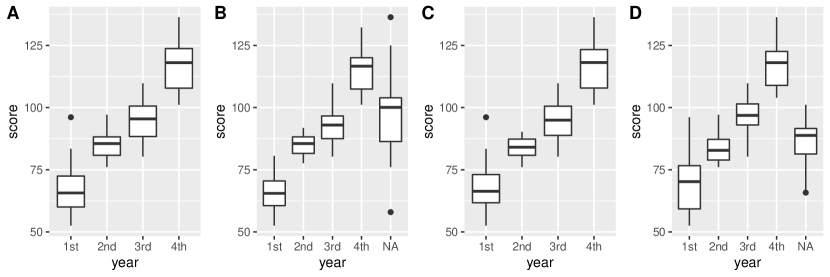
ggplot2 removes missing values with a warning (Figure 1), and only incorporates missingness into visualizations when mapping a discrete variable with missings to a graph aesthetic. This has some limitations, shown in Figure 2, a boxplot visualization of school grade and test scores. If there are missings in a continuous variable like test score, \pkgggplot2 omits the missings and prints a warning message. However, if a discrete variable like school year has missing values, an NA category is created for school year, where scores are placed (Figure 2).
4 Tidy framework for missings
Applying tidyverse principles has the potential to clarify missing data exploration, visualization, and imputation. This section discusses how these principles are applied for data structures (4.1), common operations (verbs) (4.3), graphics (5), and data summaries (6). Care has been taken to make the names and design these features intuitive for their purpose, and is discussed throughout.
4.1 Data structure
A data structure facilitating exploration of missing data needs to be simple to reason with and to transport with a data analysis, otherwise it will not be used. A useful template common in missing data literature, is the matrix, where 0 and 1 indicate not missing and missing, respectively. This matrix was used to explore missing values in the interactive graphics library XGobi, called a “missing value shadow”, or “shadow matrix”, defined as a copy of the original data with indicator values of missingness. The shadow matrix could be interactively linked to the data. However, there are some limitations to the shadow matrix. Namely, the values 0 and 1 can be confusing representations of missing values, since it is not clear if 0 indicates an absence of observation, or the presence of a missing value.
We propose a new form for tidy representation of missing data based on these ideas from past research. Four features are added to the shadow matrix to facilitate analysis of missing data, illustrated in Figure 3.
-
1.
Missing value labels. Simple labels for missing and not missing to clearly identify missing values for analysis and plotting. We propose “NA” and “!NA”. (Figure 3). This improves the 0 and 1 values in , which do not clearly identify missingness. These values follow a principle: “clarity of labelling” - the matrix’s meaning is transparent, and anybody looking at these values could understand what they mean, which is not the case of binary values. Equally, these values could instead be “missing” or “present”.
-
2.
Special missing values: Building on missing value labels, the values in the shadow matrix can be “special” missing values, indicated by “NA_<suffix>”. For example: NA_instrument uses a short label, “instrument”, indicating instrument error resulting in missing values. These could be also used to indicate imputations, (Figure 3).
-
3.
Coordinated names: Variable names in the shadow matrix gain a consistent short suffix, "_NA", keeping names coordinated throughout analysis (Figure 3). It makes a clear distinction with var_NA being a random variable of the missingness of a variable, var. This suffix is short and easy to remember during data analysis, and shifts the focus from the value of a variable, to its missingness state.
-
4.
Connectedness: Binding the shadow matrix column-wise to the original data creates a single, connected, nabular data format, in sync with the data. It is useful for visualization, summaries, and tracking imputed values, discussed in more detail in 4.2.
4.2 Nabular data
Nabular data binds the shadow matrix column-wise to the original data. It is a portmanteau of NA and tabular. Nabular data explicitly links missing values to data, keeping corresponding observations together and removing the possibility of mismatching records (Figure 3). Nabular data facilitates visualization and summaries by allowing the user to reference the missingness of a variable in a coordinated way: the missingness of var, as var_NA during analysis. Nabular data is a snapshot of the missingness of the data. This means when nabular data are imputed, those imputed values can easily be identified in analysis (var vs var_NA). Nabular data is not unlike classical data formats with quality or flag variables associated with each measured variable, e.g. Scripps CO2 data (Keeling et al., 2005), GHCN data (Durre et al., 2008).
Although a binary missingness matrix, , could be generated during analysis instead of using a nabular data structure, there are key advantages to using nabular data. Firstly, missing value labels NA and !NA are clearer than TRUE or FALSE. Secondly, special missing values cannot be added easily during analysis with a logical matrix. Finally, the logical matrix cannot capture which values are imputed if imputation has already taken place. Imputing values on nabular data automatically tracks these imputations.
Using additional columns to represent missingness information follows best practices for data organization, described in Ellis and Leek (2017) and Broman and Woo (2017): (1) Keep one thing in a cell and (2) Describe additional features of variables in a second column. Here they suggest to indicate censored data with an extra variable called “VariableNameCensored”, which would be TRUE if censored, otherwise FALSE. This information can now be represented in the shadow columns as special missing values. Encoding special missing values is achieved by defining logical conditions and suffixes. This is implemented with the recode_shadow function in \pkgnaniar (4.3.5).
Special missing values are not a new idea, and have been implemented in other statistical programming languages, SPSS, SAS, and STATA. These typically represent missing values as a full-stop, ., and record special missing values as .a - .z. These special values from these languages break the tidy principle of one column having one type of value, as they record both the value, and the multivariate missingness state.
4.3 Missing data operations
Common missing data operations can be considered verbs, in the tidyverse sense. For missing data, these include: scan, replace, add, shadow, impute, track, and flag. Data can be scanned to find possible missings not coded as NA. These values can then be replaced with NA. To facilitate exploration, summaries of missingness can be added as a summary column to the original data. The data can be augmented with the shadow matrix values, helping explore missing data, as well as facilitating the process of imputing, and tracking. Finally, unusual or specially coded missing values can be flagged.
4.3.1 scan: Searching for common missing value labels
This operation is used to search the data for specific conventional representations of missings, such as, “N/A”, “MISSING”, -99. This is implemented in the function miss_scan_count(), which returns a table of occurrences of that value for each variable. A list of common NA values for numbers and characters, can be provided to help check for typical representations of missings. These are implemented in naniar as common_na_numbers and common_na_strings.
4.3.2 replace: Replacing values with missing values
Once possible missing values have been identified, these values can be replaced. For example, a dataset could have the values -99 meaning a missing value. naniar implements replacement with the function, replace_with_na(). Values -99 could be replaced in the x column with: replace_with_na(dat_ms, replace = list(x = -99)). For operating on multiple variables, there are scoped variants for replace_with_na: _all, _if, and _at. This means replace_with_na_all operates on all columns, replace_with_na_at operates at specific columns, and replace_with_na_if makes a conditional change on columns if they meet some condition (such as is.numeric or is.character).
4.3.3 add: Adding missingness summary variables
Understanding the missingness structure can be improved by adding summary information alongside the data. For example, in Tierney et al. (2015), the proportion of missings in a row is used as the outcome in a model to identify variables important in predicting missingness structures. naniar implements a series of functions to add these missingness summaries to the data, starting with add_. These are inspired by the add_count function in dplyr, which adds count information for specified groups or conditions. naniar provides operations to add the number or proportion of missingness, the missingness cluster, or the presence of any missings, with: add_n_miss(), add_prop_miss(), add_miss_cluster, and add_any_miss(), respectively (Table 1). There are also functions for adding information about shadow values, and readable labels for any missing values with add_label_shadow() and add_label_missings().
| Function | Adds column which: |
|---|---|
| add_n_miss(data) | Contains the number missing values in a row |
| add_prop_miss(data) | Contains the proportion of missing values in a row |
| add_miss_cluster(data) | Contains the missing value cluster |
4.3.4 shadow: Creating nabular data
Nabular data has the shadow matrix column-bound to existing data. This facilitates visualization and summaries, and allows for imputed values to be tracked. Nabular data can be created with nabular():
R> nabular(dat_ms)
# A tibble: 5 x 6 x y z x_NA y_NA z_NA <dbl> <chr> <dbl> <fct> <fct> <fct> 1 1 A -100 !NA !NA !NA 2 3 N/A -99 !NA !NA !NA 3 NA <NA> -98 NA NA !NA 4 -99 E -101 !NA !NA !NA 5 -98 F -1 !NA !NA !NA
4.3.5 flag: Describing different types of missing values
Unusual or spurious data values are often identified and flagged. For example, there might be special codes to mark an individual dropping out of a study, known instrument failure in weather instruments, or for values censored in analysis. naniar provides tools to encode these special types of missingness in the shadow matrix of nabular data, using recode_shadow(). This requires specifying the variable to contain the flagged value, the condition for flagging, and a suffix. This is then recoded as a new factor level in the shadow matrix, so every column is aware of all possible new values of missingness. For example, -99 could be recoded to indicate a broken machine sensor for the variable x with the following:
R> nabular(dat_ms) R+ recode_shadow(x = .where(x == -99 "broken_sensor"))
# A tibble: 5 x 6 x y z x_NA y_NA z_NA <dbl> <chr> <dbl> <fct> <fct> <fct> 1 1 A -100 !NA !NA !NA 2 3 N/A -99 !NA !NA !NA 3 NA <NA> -98 NA NA !NA 4 -99 E -101 NA_broken_sensor !NA !NA 5 -98 F -1 !NA !NA !NA
4.3.6 impute: Imputing values
naniar does not reinvent the wheel for imputation, instead working with existing methods. However, naniar provides a few imputation methods to facilitate exploration and visualization: impute_below, impute_mean, and impute_median. While useful to explore structure in missingness, they are not recommended for use in analysis. impute_below imputes values below the minimum value, with some controllable jitter (random noise) to reduce overplotting.
Similar to simputation, each impute_ function returns the data with values imputed. However, naniar does not use a formula syntax, instead each function has “scoped variants” _all, _at and _if as in 4.3.2. impute_ functions with no scoped variant, (impute_mean), will work on a single vector, but not a data.frame. One challenge with this approach is imputed value locations are not tracked. This issue is resolved with \codenabular data covered in Section 4.3.7.
4.3.7 track: Shadow and impute missing values
To evaluate imputations they need to be tracked. This is achieved by first using nabular data, then imputing, and imputed values can then be referred to by their shadow variable, _NA (Figure 4). The code below shows the track pattern, first using nabular, then imputing with impute_lm. label_shadow then adds a label to facilitate identifying missings:
R> aq_imputed <- nabular(airquality) R+ as.data.frame() R+ simputation::impute_lm(Ozone Temp + Wind) R+ simputation::impute_lm(Solar.R Temp + Wind) R+ add_label_shadow() R> R> head(aq_imputed)
Ozone Solar.R Wind Temp Month Day Ozone_NA Solar.R_NA Wind_NA Temp_NA 1 41.00000 190.0000 7.4 67 5 1 !NA !NA !NA !NA 2 36.00000 118.0000 8.0 72 5 2 !NA !NA !NA !NA 3 12.00000 149.0000 12.6 74 5 3 !NA !NA !NA !NA 4 18.00000 313.0000 11.5 62 5 4 !NA !NA !NA !NA 5 -11.67673 127.4317 14.3 56 5 5 NA NA !NA !NA 6 28.00000 159.5042 14.9 66 5 6 !NA NA !NA !NA Month_NA Day_NA any_missing 1 !NA !NA Not Missing 2 !NA !NA Not Missing 3 !NA !NA Not Missing 4 !NA !NA Not Missing 5 !NA !NA Missing 6 !NA !NA Missing
Multiple missing or imputed values can be mapped to a graphical element in ggplot2 by setting the color or fill aesthetic in ggplot to any_missing, a result of the add_label_shadow() function. (Figure 4). Imputed values can also be compared to complete case data, grouping by any_missing, and then summarizing, similar to other dplyr summary workflows shown below in Table 2, showing similarities and differences in imputation methods.
R> aq_imputed R> group_by(any_missing) R> summarise_at(.vars = vars(Ozone), R> .funs = lst(min, mean, median, max))
| any_missing | min | mean | median | max |
|---|---|---|---|---|
| Missing | -16.86418 | 41.22494 | 45.4734 | 78 |
| Not Missing | 1.00000 | 42.09910 | 31.0000 | 168 |
5 Graphics
Missing values are often ignored when plotting data - which is why the data visualization software, MANET, was named and is an acronym corresponding to “Missings Are Now Equally Treated” (Unwin et al., 1996). However, plots can help to identify the type of missing value patterns, even those of MCAR, MAR or MNAR. Here we summarise how to systematically explore missing patterns visually, and define useful plots to make, relative to the nabular data structure.
5.1 Overviews
The first step is to get an overview of the extent of the missingness. Overview visualizations for variables and cases are provided with gg_miss_var and gg_miss_case (Figure 5A), drawing attention to the amount of missings, and ordering by missingness. The “airquality” dataset (from base R), is shown, and contains daily air quality measurements in New York, from May to September, 1973. We learn from figure 5A-B, that two variables contain missings, approximately one third of observations have one missing value, and a tiny number of observations are missing across two variables. These overview plots are created from the shadow matrix in long form (Figure 3). Numerical statistics can also be reported (Section 6).
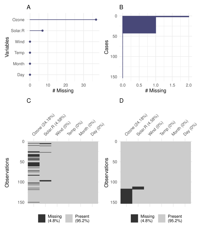
The shadow matrix can be put into long form, allowing both the variables and cases to be displayed using a heatmap style visualization, with vis_miss() from \pkgvisdat (Tierney, 2017) (Figure 3). This also provides numerical summaries of missingness in the legend, and for each column (Figure 5C-D). Clustering can be applied to the rows, and columns arranged in order of missingness (Figure 5D). Similar visualizations are available in other packages such as \pkgVIM, \pkgmi, \pkgAmelia, and \pkgMissingDataGUI. A key improvement is vis_miss() orients the visualization analogous to a regular data structure: variables form columns and are named at the top, and each row is an observation. Using \pkgggplot2, as the foundation, makes the plot easily customizable.
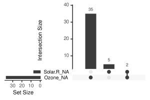
The number of times observations are missing together can be visualized using an “upset plot” (Conway et al., 2017). An alternative to a Venn diagram, an upset plot shows the size and features of overlapping sets, and scales well with more variables. An upset plot can be constructed from the shadow matrix, as shown in Figure 6 which displays the overlapping counts of missings in the airquality data. The bottom right shows the combinations of missingness, the top panel shows the size of these combinations, and the bottom left shows missingness in each variable. This provides similar information to Figure 5A-D, but more clearly illustrating overlapping missingness, where 2 cases are missing together in variables Solar.R and Ozone.
5.2 Univariate
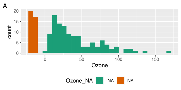
Missing values are typically not shown for univariate visualizations such as histograms or densities. Two ways to use nabular data to present univariate data with missings are discussed. The first imputes values below the range to facilitate visualizations. The second displays two plots of the same variable according to the missingness of a chosen variable.
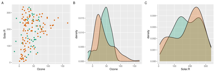
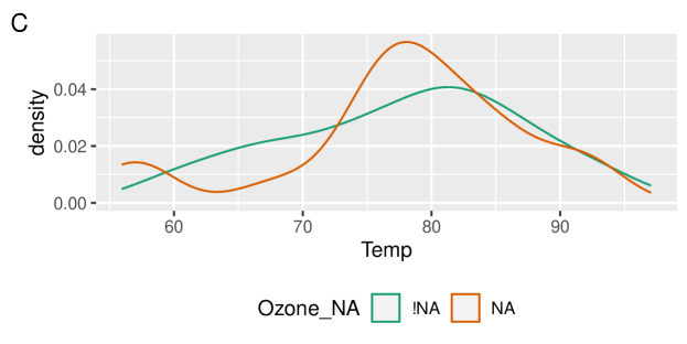
Imputing values below the range. To visualize the amount of missings in each variable, the data is transformed into nabular form, then values are imputed below the range of data using impute_below_all. Figure 7A shows a histogram of Ozone values on the right in green, and the histogram of missing ozone values on the left, in orange. The missings in Ozone are imputed and Ozone_NA is mapped to the fill aesthetic. Nabular data facilitates adding counts of missingness to a histogram, allowing examination of a variables’ distribution of values, and also the magnitude of missings.
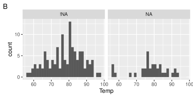
Univariate split by missingness. The distribution of a variable can be shown according to the missingness of another variable. The shadow matrix part of nabular is used to handle the faceting, and color mapping. Figure 7 shows the values of temperature when ozone is present, and missing, using a faceted histogram (B), and an overlaid density (C). This shows how values of temperature are affected by the missingness of ozone, and reveals a cluster of low temperature observations with missing ozone values. This type of plot can facilitate exploring missing data distributions. For example, we would expect if data were MCAR, for values to be roughly uniformly missing throughout the histogram or density.
5.3 Bivariate
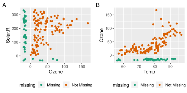
To visualize missing values in two dimensions the missing values can be placed in plot margins, by imputing values below the range of the data. Using nabular data identifies imputed values, and color makes missingness pre-attentive (Treisman, 1985). The steps of imputing and coloring are combined into geom_miss_point(). Figure 8 shows a mostly uniform spread of missing values for Solar.R and Ozone. As geom_miss_point() is a defined \pkgggplot2 geometry, it works with features such as faceting and mapping other variables to graphical aesthetics.
5.4 Multivariate
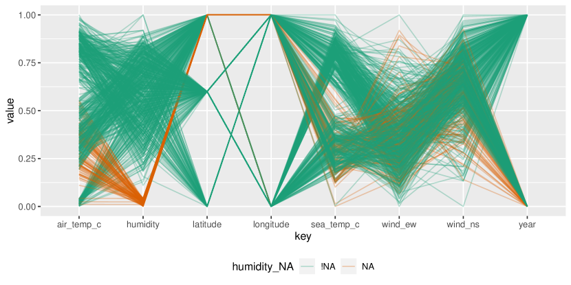
Parallel coordinate plots can help to visualize missingness beyond two dimensions. They transform variables to the same scale, ranging between 0 and 1. The oceanbuoys dataset from \pkgnaniar is used for this visualization, containing measurements of sea and air temperature, humidity, and east west and north south wind speeds. Data was collected in 1993 and 1997, to understand and predict El Niño and El Niña. Figure 9 is a parallel coordinate plot of oceanbuoys, with missing values imputed to be 10% below the range, and values colored according to whether humidity was missing (humidity_NA). Figure 9 shows humidity is missing at low air and sea temperatures, and humidity is missing in one year, and one location.
6 Numerical summaries
This section describes approaches to summarizing missingness, and an implementation in \pkgnaniar. Numerical summaries should be easy to remember with consistent names and output, returning either a single number 6.1, or a dataframe 6.2, so they integrate well with plotting and modelling tools. How these work with other tools in an analysis pipeline is shown in 6.3.
6.1 Single number summaries
The overall number, proportion, or percent of missing values in a dataset should be simple to calculate. naniar provides the functions n_miss, prop_miss and pct_miss, as well as their complements. Summaries for variables and cases are made by appending _case or _var to these summaries. An overview is shown in Table 3.
| Missing Function | missing value | Complete function | complete value |
|---|---|---|---|
| n_miss | 44.00 | n_complete | 874.00 |
| prop_miss | 0.05 | prop_complete | 0.95 |
| pct_miss | 4.79 | pct_complete | 95.21 |
| pct_miss_case | 27.45 | prop_complete_case | 72.55 |
| pct_miss_var | 33.33 | pct_complete_var | 66.67 |
6.2 Summaries and tabulations of missing data
Presenting the number and percent of missing values for each variable, or case, provides a summary usable in data handling, or in models to inform imputation. For example, potentially dropping variables, or deciding to include others in an imputation model. Another useful approach is to tabulate the frequency of missing values for each variable or case; that is, the number of times there are zero missings, one missing, two, and so on. These summaries and tabulations are shown for variables in Tables 4 and 5, and implemented with miss_var_summary and miss_var_table. Case-wise (row-wise) summaries and tabulations are implemented with miss_case_summary and miss_case_table.
These summaries order rows by the number of missings (n_miss), to show the most missings at the top. The number of missings across a repeating span, or finding “runs” or “streaks” of missings in given variables can also be useful for identifying missingness patterns, and are implemented with miss_var_span, and miss_var_run.
| variable | n_miss | pct_miss |
|---|---|---|
| Ozone | 37 | 24.2 |
| Solar.R | 7 | 4.6 |
| Wind | 0 | 0.0 |
| Temp | 0 | 0.0 |
| Month | 0 | 0.0 |
| Day | 0 | 0.0 |
| n_miss_in_var | n_vars | pct_vars |
|---|---|---|
| 0 | 4 | 66.7 |
| 7 | 1 | 16.7 |
| 37 | 1 | 16.7 |
6.3 Combining numerical summaries with grouping operations
It is useful to explore summaries and tabulations within groups of a dataset. naniar works with dplyr’s group_by operator to produce grouped summaries, which work well with the “pipe” operator. The code and table below 6 show an example of missing data summaries for airquality, grouped by month.
| Month | variable | n_miss | pct_miss |
|---|---|---|---|
| 5 | Ozone | 5 | 16.1 |
| 5 | Solar.R | 4 | 12.9 |
| 5 | Wind | 0 | 0.0 |
| 5 | Temp | 0 | 0.0 |
| 5 | Day | 0 | 0.0 |
| 6 | Ozone | 21 | 70.0 |
| 6 | Solar.R | 0 | 0.0 |
| 6 | Wind | 0 | 0.0 |
| 6 | Temp | 0 | 0.0 |
| 6 | Day | 0 | 0.0 |
7 Application
This section shows how the methods described so far are used together in a data analysis workflow. We analyse a case study of housing data for the city of Melbourne from January 28, 2016 to March 17, 2018. The data was compiled by scraping weekly property clearance data (Tierney, 2019). There are 27,247 properties, and 21 variables in the dataset. The variables include real estate type (town house, unit, house), suburb, selling method, number of rooms, price, real estate agent, sale date, and distance from the Central Business District (CBD).
The goal in analyzing this data is to accurately predict Melbourne housing prices. The data contains many missing values. As a precursor to building a predictive model, this analysis focuses on understanding the patterns of missingness.
7.1 Exploring patterns of missingness
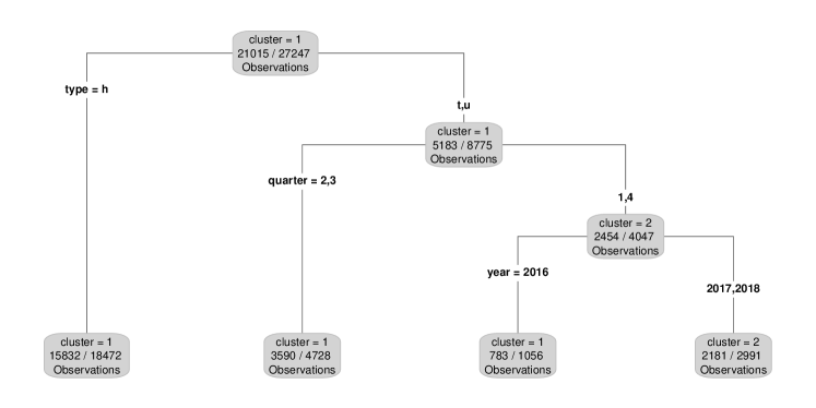
Figure 10A shows 9 variables with missing values. The most missings are in “building area”, followed by “year built”, and “land size”, with similar amounts of missingness in “Car”, “bathroom”, “bedroom2”, “longitude”, and “latitude.” Figure 10B reveals there are up to 50% missing values in cases, and the majority of cases have more than 5% values missing. The variables “building area” and “year built” have more than 50% missing data, and so could perhaps be omitted from subsequent analysis, as imputed values are likely to be spurious. Three missingness clusters are revealed by visualizing missingness in the whole dataset, clustering and arranging the rows and columns of the data (Figure 11).
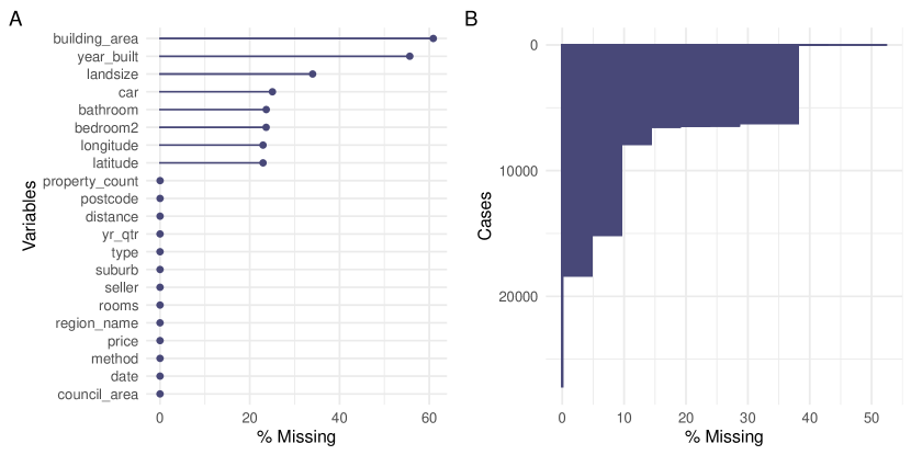
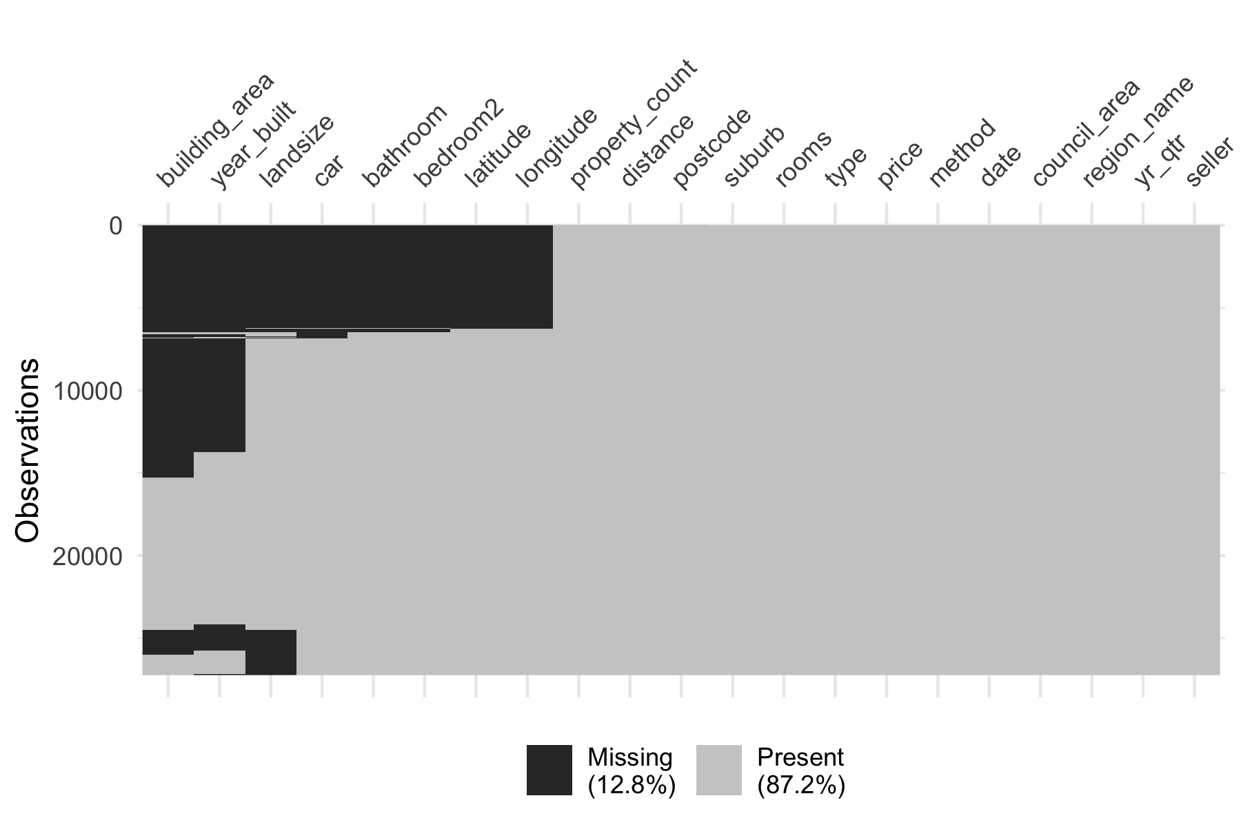
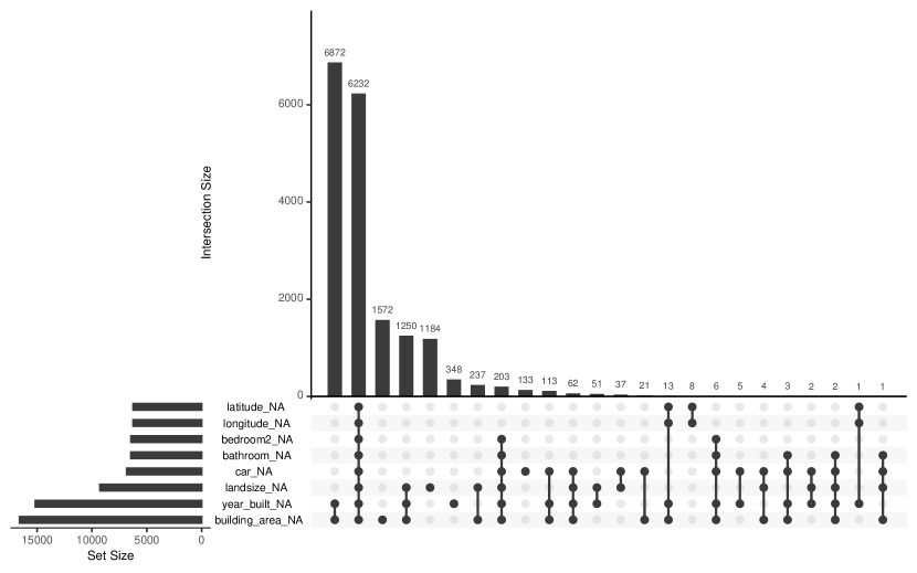
Figure 12 shows missingness patterns with an upset plot (Conway et al., 2017), displaying 8 intersecting sets of missing variables. Two patterns stand out: two, and five variables missing, providing further evidence of the missingness patterns seen in Figures 10 and 12.
Tabulating the number of missings in variables in Table 7 (left) shows three groups of missingness. Tabulating missings in cases (Table 7 (right)) shows six patterns of missingness. These overview plots lead to the removal of two variables from with more than 50% missingness from analysis: “building area” and “year built”.
| n_miss_in_var | n_vars | pct_vars |
|---|---|---|
| 0 | 10 | 47.6 |
| 1 | 2 | 9.5 |
| 3 | 1 | 4.8 |
| 6254 | 2 | 9.5 |
| 6441 | 1 | 4.8 |
| 6447 | 1 | 4.8 |
| 6824 | 1 | 4.8 |
| 9265 | 1 | 4.8 |
| 15163 | 1 | 4.8 |
| 16591 | 1 | 4.8 |
| n_miss_in_case | n_cases | pct_cases |
|---|---|---|
| 0 | 8887 | 32.6 |
| 1 | 3237 | 11.9 |
| 2 | 7231 | 26.5 |
| 3 | 1370 | 5.0 |
| 4 | 79 | 0.3 |
| 5 | 8 | 0.0 |
| 6 | 203 | 0.7 |
| 8 | 6229 | 22.9 |
| 9 | 2 | 0.0 |
| 11 | 1 | 0.0 |
7.2 Exploring missingness patterns for imputation
Using information from 7.1, the following variables are explored for features predicting missingness: “Land size”, “latitude”, “longitude”, “bedroom2”, “bathroom”, “car”, and “land size”.
Missingness structure is explored by clustering the missing values into groups. Then, a classification and regression trees (CART) model is applied to predict these missingness clusters using the remaining variables (Tierney et al., 2015; Barnett et al., 2017). Two clusters of missingness are identified and predicted using all variables in the dataset with the CART package rpart (Therneau and Atkinson, 2018), and plotted using the rpart.plot package (Milborrow, 2018). Importance scores reveal the following variables as most important in predicting missingness: “rooms”, “price”, “suburb”, “council area”, “distance”, and “region name”. These variables are important for predicting missingness, so are included in the imputation model.
7.3 Imputation and diagnostics
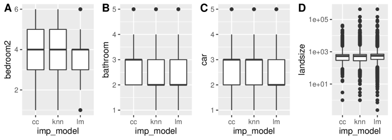
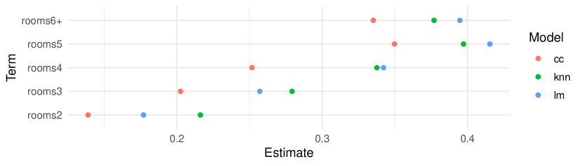
simputation is used to implement two imputations: simple linear regression and K nearest neighbors. Values are imputed stepwise in ascending order of missingness. The track missings pattern is applied (described in 4.3.7), to assess imputed values. Imputed datasets are compared on their performance in a model predicting log house price for 4 variables (Figure 14). Compared to KNN imputed values, the linear model imputed values closer to the mean.
7.4 Assessing model predictions
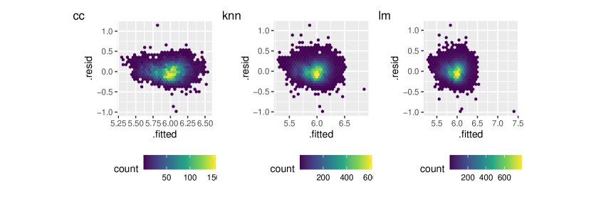
Coefficients of the linear model of log price vary for room for different imputed datasets (Figure 15). Notably, complete cases underestimate the impact of room on log price. A partial residual plot (Figure 16) shows there is not much variation amongst the models from the differently imputed datasets.
7.5 Summary
The naniar and visdat packages implement the methods discussed in the paper, building on existing tidy tools and strike a compromise between automation and control, making analysis efficient, readable, but not overly complex. Each tool has clear intent and effects - summarising, plotting or generating data or augmenting data in some way. This not only reduces repetition and typing in an analysis, but most importantly, allows for clear expression of intent, making exploration of missing values fluent.
8 Discussion
This paper has described new methods for exploring, visualizing, and imputing missing data. The work was motivated by recent developments of tidy data, and extends them for better missing value handling. The methods have standard outputs, function arguments, and behavior. This provides consistent workflows centered around data analysis that integrate well with existing imputation methodology, visualization, and modelling.
The nabular data structures discussed in the paper are simple by design, to promote flexibility. They could be used to create different visualizations than were shown in the paper. The analyst can use the data structures to decide on appropriate visualization for their problem. The data structures could also be used to support interactive graphics, in the manner of MANET and ggobi. Linking the plots (via linked brushing) could facilitate exploration of missingness, and could be implemented with \pkgplotly (Sievert, 2018) for added interactivity. Animating between different sets of imputed values could also be possible with packages like \pkggganimate (Pedersen and Robinson, 2017).
Other data structures such as spatial data, time series, networks, and longitudinal data would be supported by the inherently tabular, nabular data, if they are first structured as wide tidy format. Large data may need special handling, and additional features like efficient storage of purely imputed values and lazy evaluation. Special missing value codes could be improved by creating special classes, or expanding low level representation of NA at the source code level.
The methodology described in this paper can be used in conjunction with other approaches to understand multivariate missingness dependencies (e.g. decision trees (Tierney et al., 2015), latent group analysis (Barnett et al., 2017), and PCA (Lê et al., 2008)). Evaluating imputed values using a testing framework like van Buuren (2012) is also supported.
The approach meshes with the dynamic nature of data analysis, allowing the analyst to go from raw data to model data in a fluid workflow.
9 Acknowledgements
The authors would like to thank Miles McBain, for his key contributions and discussions on the naniar package, in particular for helping implement geom_miss_point, and for his feedback on ideas, implementations, and names. We also thank Colin Fay for his contributions to the naniar package, in particular for his assistance with the replace_with_na functions. We also thank Earo Wang and Mitchell O’Hara-Wild for the many useful discussions on missing data and package development, and for their assistance with creating elegant approaches that take advantage of the tidy syntax. We would also like to thank those who contributed pull requests and discussions on the naniar package, in particular Jim Hester and Romain François for improving the speed of key functions, Ross Gayler for discussion on special missing values, and Luke Smith for helping naniar be more compliant with ggplot2. We would also like to thank Amelia McNamara for discussions on the paper.
References
- Barnett et al. (2017) Barnett AG, McElwee P, Nathan A, Burton NW, Turrell G (2017). “Identifying patterns of item missing survey data using latent groups: an observational study.” BMJ open, 7(10), e017284.
- Broman and Woo (2017) Broman KW, Woo KH (2017). “Data organization in spreadsheets.” Technical Report e3183v1, PeerJ Preprints.
- Cheng et al. (2015) Cheng X, Cook D, Hofmann H (2015). “Visually Exploring Missing Values in Multivariable Data Using a Graphical User Interface.” Journal of statistical software, 68(1), 1–23.
- Conway et al. (2017) Conway JR, Lex A, Gehlenborg N (2017). “UpSetR: an R package for the visualization of intersecting sets and their properties.” Bioinformatics, 33(18), 2938–2940.
- Cook and Swayne (2007) Cook D, Swayne DF (2007). Interactive and Dynamic Graphics for Data Analysis With R and GGobi. 1st edition. Springer Publishing Company, Incorporated.
- Dempster et al. (1977) Dempster AP, Laird NM, Rubin DB (1977). “Maximum Likelihood from Incomplete Data via the EM Algorithm.” Journal of the Royal Statistical Society. Series B, Statistical methodology, 39(1), 1–38.
- Donoho (2017) Donoho D (2017). “50 Years of Data Science.” Journal of computational and graphical statistics: a joint publication of American Statistical Association, Institute of Mathematical Statistics, Interface Foundation of North America, 26(4), 745–766.
- Durre et al. (2008) Durre I, Menne MJ, Vose RS (2008). “Strategies for Evaluating Quality Assurance Procedures.” Journal of Applied Meteorology and Climatology, 47(6), 1785–1791.
- Ellis and Leek (2017) Ellis SE, Leek JT (2017). “How to share data for collaboration.” Technical Report e3139v1, PeerJ Preprints.
- Gelman and Hill (2011) Gelman A, Hill J (2011). “Opening Windows to the Black Box.” Journal of Statistical Software, 40.
- Grolemund and Wickham (2011) Grolemund G, Wickham H (2011). “Dates and Times Made Easy with lubridate.” Journal of Statistical Software, 40(3), 1–25. URL http://www.jstatsoft.org/v40/i03/.
- Harrell Jr et al. (2018) Harrell Jr FE, with contributions from Charles Dupont, many others (2018). Hmisc: Harrell Miscellaneous. R package version 4.1-1, URL https://CRAN.R-project.org/package=Hmisc.
- Henry and Wickham (2017) Henry L, Wickham H (2017). purrr: Functional Programming Tools. R package version 0.2.4, URL https://CRAN.R-project.org/package=purrr.
- Honaker and King (2010) Honaker J, King G (2010). “What to Do about Missing Values in Time-Series Cross-Section Data.” American journal of political science, 54(2), 561–581.
- Honaker et al. (2011) Honaker J, King G, Blackwell M (2011). “Amelia II: A Program for Missing Data.” Journal of Statistical Software, 45(7), 1–47. URL http://www.jstatsoft.org/v45/i07/.
- Josse and Husson (2016) Josse J, Husson F (2016). “missMDA: A Package for Handling Missing Values in Multivariate Data Analysis.” Journal of Statistical Software, Articles, 70(1), 1–31. ISSN 1548-7660. 10.18637/jss.v070.i01. URL https://www.jstatsoft.org/v070/i01.
- Keeling et al. (2005) Keeling CD, Piper SC, Bacastow RB, Wahlen M, Whorf TP, Heimann M, Meijer HA (2005). “Atmospheric CO2 and 13CO2 Exchange with the Terrestrial Biosphere and Oceans from 1978 to 2000: Observations and Carbon Cycle Implications.” In IT Baldwin, MM Caldwell, G Heldmaier, RB Jackson, OL Lange, HA Mooney, ED Schulze, U Sommer, JR Ehleringer, M Denise Dearing, TE Cerling (eds.), A History of Atmospheric CO2 and Its Effects on Plants, Animals, and Ecosystems, pp. 83–113. Springer New York, New York, NY.
- Kowarik and Templ (2016) Kowarik A, Templ M (2016). “Imputation with the R Package VIM.” Journal of Statistical Software, 74(7), 1–16. 10.18637/jss.v074.i07.
- Kuhn and Wickham (2019) Kuhn M, Wickham H (2019). recipes: Preprocessing Tools to Create Design Matrices. R package version 0.1.8, URL https://CRAN.R-project.org/package=recipes.
- Lê et al. (2008) Lê S, Josse J, Husson F (2008). “FactoMineR: A Package for Multivariate Analysis.” Journal of Statistical Software, 25(1), 1–18. 10.18637/jss.v025.i01.
- Milborrow (2018) Milborrow S (2018). rpart.plot: Plot ’rpart’ Models: An Enhanced Version of ’plot.rpart’. R package version 2.2.0, URL https://CRAN.R-project.org/package=rpart.plot.
- Moritz and Bartz-Beielstein (2017) Moritz S, Bartz-Beielstein T (2017). “imputeTS: Time Series Missing Value Imputation in R.” The R Journal, 9(1), 207–218. URL https://journal.r-project.org/archive/2017/RJ-2017-009/index.html.
- Pedersen and Robinson (2017) Pedersen TL, Robinson D (2017). gganimate: A Grammar of Animated Graphics. R package version 0.9.9.9999, URL http://github.com/thomasp85/gganimate.
- R Core Team (2020) R Core Team (2020). R: A Language and Environment for Statistical Computing. R Foundation for Statistical Computing, Vienna, Austria. URL https://www.R-project.org/.
- Schafer (1999) Schafer J (1999). NORM: Multiple imputation of incomplete multivariate data under a normal model. Computer Software.
- Schafer and Graham (2002) Schafer JL, Graham JW (2002). “Missing data: our view of the state of the art.” Psychological methods, 7(2), 147–177.
- Sievert (2018) Sievert C (2018). plotly for R. URL https://plotly-book.cpsievert.me.
- Silge and Robinson (2016) Silge J, Robinson D (2016). “tidytext: Text Mining and Analysis Using Tidy Data Principles in R.” JOSS, 1(3). 10.21105/joss.00037. URL http://dx.doi.org/10.21105/joss.00037.
- Sterne et al. (2009) Sterne JaC, White IR, Carlin JB, Spratt M, Royston P, Kenward MG, Wood AM, Carpenter JR (2009). “Multiple imputation for missing data in epidemiological and clinical research: potential and pitfalls.” BMJ, 338, b2393.
- Swayne and Buja (1998) Swayne DF, Buja A (1998). “Missing data in interactive high-dimensional data visualization.” Computational statistics, pp. 1–8.
- Therneau and Atkinson (2018) Therneau T, Atkinson B (2018). rpart: Recursive Partitioning and Regression Trees. R package version 4.1-13, URL https://CRAN.R-project.org/package=rpart.
- Tierney (2017) Tierney N (2017). “visdat: Visualising Whole Data Frames.” JOSS, 2(16), 355. 10.21105/joss.00355. URL http://dx.doi.org/10.21105/joss.00355.
- Tierney (2019) Tierney N (2019). “njtierney/melb-housing-data: Melbourne Housing Data Releae.” 10.5281/zenodo.2575484. URL https://doi.org/10.5281/zenodo.2575484.
- Tierney et al. (2015) Tierney NJ, Harden FA, Harden MJ, Mengersen KL (2015). “Using decision trees to understand structure in missing data.” BMJ open, 5(6), e007450.
- to R by Alvaro A. Novo. Original by Joseph L. Schafer <jls@stat.psu.edu>. (2013) to R by Alvaro A Novo Original by Joseph L Schafer <jls@statpsuedu> P (2013). norm: Analysis of multivariate normal datasets with missing values. R package version 1.0-9.5, URL https://CRAN.R-project.org/package=norm.
- Treisman (1985) Treisman A (1985). “Preattentive processing in vision.” Computer vision, graphics, and image processing, 31(2), 156–177.
- Unwin et al. (1996) Unwin A, Hawkins G, Hofmann H, Siegl B (1996). “Interactive Graphics for Data Sets with Missing Values: MANET.” Journal of computational and graphical statistics: a joint publication of American Statistical Association, Institute of Mathematical Statistics, Interface Foundation of North America, 5(2), 113–122.
- van Buuren (2012) van Buuren S (2012). Flexible Imputation of Missing Data. CRC Press.
- van Buuren and Groothuis-Oudshoorn (2011) van Buuren S, Groothuis-Oudshoorn K (2011). “mice: Multivariate Imputation by Chained Equations in R.” Journal of Statistical Software, 45(3), 1–67. URL http://www.jstatsoft.org/v45/i03/.
- van der Loo (2017) van der Loo M (2017). simputation: Simple Imputation. R package version 0.2.2, URL https://CRAN.R-project.org/package=simputation.
- Walker (2018) Walker K (2018). tidycensus: Load US Census Boundary and Attribute Data as ’tidyverse’ and ’sf’-Ready Data Frames. R package version 0.4.6, URL https://CRAN.R-project.org/package=tidycensus.
- Wang et al. (2020) Wang E, Cook D, Hyndman RJ (2020). “A new tidy data structure to support exploration and modeling of temporal data.” Journal of Computational and Graphical Statistics, 0(0), 1–13. 10.1080/10618600.2019.1695624.
- Wickham (2009) Wickham H (2009). ggplot2: Elegant Graphics for Data Analysis. Springer-Verlag New York. ISBN 978-0-387-98140-6. URL http://ggplot2.org.
- Wickham (2014) Wickham H (2014). “Tidy Data.” Journal of statistical software, 59(10), 1–23.
- Wickham (2017) Wickham H (2017). “The tidy tools manifesto.” https://cran.r-project.org/web/packages/tidyverse/vignettes/manifesto.html. Accessed: 2018-4-10.
- Wickham (2018) Wickham H (2018). stringr: Simple, Consistent Wrappers for Common String Operations. R package version 1.3.0, URL https://CRAN.R-project.org/package=stringr.
- Wickham et al. (2019) Wickham H, Averick M, Bryan J, Chang W, McGowan LD, François R, Grolemund G, Hayes A, Henry L, Hester J, Kuhn M, Pedersen TL, Miller E, Bache SM, Müller K, Ooms J, Robinson D, Seidel DP, Spinu V, Takahashi K, Vaughan D, Wilke C, Woo K, Yutani H (2019). “Welcome to the tidyverse.” Journal of Open Source Software, 4(43), 1686. 10.21105/joss.01686.
- Wickham and Bryan (2017) Wickham H, Bryan J (2017). readxl: Read Excel Files. R package version 1.0.0, URL https://CRAN.R-project.org/package=readxl.
- Wickham et al. (2017a) Wickham H, Francois R, Henry L, Müller K (2017a). dplyr: A Grammar of Data Manipulation. R package version 0.7.4, URL https://CRAN.R-project.org/package=dplyr.
- Wickham and Grolemund (2016) Wickham H, Grolemund G (2016). R for data science: import, tidy, transform, visualize, and model data. First edition edition. O’Reilly, Sebastopol, CA. ISBN 9781491910399 9781491910368. OCLC: ocn968213225.
- Wickham and Henry (2018) Wickham H, Henry L (2018). tidyr: Easily Tidy Data with ’spread()’ and ’gather()’ Functions. R package version 0.8.0, URL https://CRAN.R-project.org/package=tidyr.
- Wickham et al. (2017b) Wickham H, Hester J, Francois R (2017b). readr: Read Rectangular Text Data. R package version 1.1.1, URL https://CRAN.R-project.org/package=readr.
- Wickham and Miller (2018) Wickham H, Miller E (2018). haven: Import and Export ’SPSS’, ’Stata’ and ’SAS’ Files. R package version 1.1.1, URL https://CRAN.R-project.org/package=haven.
- Wilkinson (2012) Wilkinson L (2012). “The grammar of graphics.” Handbook of Computational Statistics.