The Turtleback Diagram for
Conditional Probability
Abstract
We elaborate on an alternative representation of conditional probability to the usual tree diagram. We term the representation “turtleback diagram” for its resemblance to the pattern on turtle shells. Adopting the set theoretic view of events and the sample space, the turtleback diagram uses elements from Venn diagrams—set intersection, complement and partition—for conditioning, with the additional notion that the area of a set indicates probability whereas the ratio of areas for conditional probability. Once parts of the diagram are drawn and properly labeled, the calculation of conditional probability involves only simple arithmetic on the area of relevant sets. We discuss turtleback diagrams in relation to other visual representations of conditional probability, and detail several scenarios in which turtleback diagrams prove useful. By the equivalence of recursive space partition and the tree, the turtleback diagram is seen to be equally expressive as the tree diagram for representing abstract concepts. We also provide empirical data on the use of turtleback diagrams with undergraduate students in elementary statistics or probability courses.
Keywords: Visualization; graph representation; recursive space partition; Venn diagram.
1 Introduction
Conditional probability [1, 2, 3, 4] is an important
concept in probability and statistics. It has been widely acknowledged that the concept of conditional probability,
and particularly its application in practical contexts, is difficult for students [5, 6, 7, 8, 9, 10, 11, 12] and especially those without much background or
previous training in mathematics at the college level.
Let and be two events, then the conditional
probability of given is defined as
| (1) |
Our experience with undergraduate students is that a major difficulty in understanding and working effectively with conditional probability lies in the level of abstraction involved in the concepts of “event” and “conditioning”; see also [7].
The focus of this article is on productive visual representations for the understanding and application of conditional probability. The significant role of visual representation in mathematics is well-established; see, for example, [13, 14]. While visualization is an important topic in statistics (see, e.g., [15, 16]), the role of visualization in statistics education or practice is not as well documented. In particular, there is actually not much research into productive visualization of conditional probability [17, 18]; popular
books such as [19] do not dedicate much effort to visual explanations of the Bayes theorem. There has been
some research on school student difficulties with conditional probability [6, 8, 10, 11, 12] but much less so for undergraduates. Our aim in discussing turtleback diagrams is to provide a visual tool for the representation of conditional probability that may, additionally, be used in further research on student understanding of conditional probability.
2 Student difficulties in understanding conditional probability
Tomlinson and Quinn [9], in discussing their graphic model for representing conditional probability (see Section 3.2.1), state:
“Conditional probability is a difficult topic for students to master. Often counter-intuitive, its central laws are composed of abstract terms and complex equations that do not immediately mesh with subjective intuitions of experience. If students are to acquire the mathematical skills necessary for rational judgement, teaching must focus on challenging the personal biases and cognitive heuristics identified by psychologists, and demonstrate in the most accessible way—the power of probabilistic reasoning.” (p.7)
Documented student difficulties with conditional probability can be summarized as one of three main types [7]:
-
1.
Interpreting conditionality as causality.
-
2.
Identifying and describing the conditioning event.
-
3.
Confusing and .
Tarr and Jones [8] developed a valid and reliable framework for addressing student difficulties with conditional probability, in the context of sampling without replacement. This framework is particularly valuable in carrying out research as to which visual representation of conditional probability is most useful in assisting students and teachers.
3 Visual representations of conditional probability
3.1 Tree diagrams
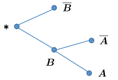
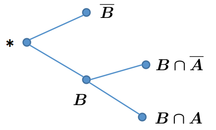
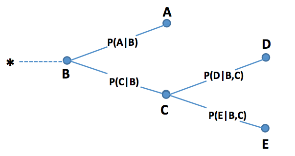
Tree diagrams have been used by many to help understand conditional probability. The idea of a tree diagram is to use nodes for events, the splitting of a node for sub-events, and the edges in the tree for conditioning. For example, Figure 1 is an illustration of conditional probability. Node indicates the sample space , and we will use them interchangeably throughout. Two possible events, either or , may happen. This is represented by two tree nodes and . The splitting of node into two nodes and indicates that, given , two possible events, and , may occur. The edges, and indicate conditional probabilities, and , respectively.
Tree diagrams help many students to understand the concept of conditional probability and apply it for problem solving,
but is not so effective to many others especially those less prepared ones. Basically, they find the following two aspects
non-intuitive. One is to represent events by tree nodes, which usually appear as dots or small circles, but events are sets
and are more naturally represented by Venn diagram [20] type of notations. Another is the idea to represent
conditional probability by tree edges; it is hard to see any straightforward connections of this to (1).
To address issues with the tree diagram, let us re-examine the idea of graphical visualization. There are two important
ingredients (or steps) in visualizing an abstract mathematical concept. One is a concrete graphical representation
of the target mathematical objects. This step would offload part of the burden of the brain by concrete graph objects,
without which one has to keep relevant abstract mathematical objects in the brain and gets ready for subsequent
mathematical operation. The second is that, the mathematical concept or operation can be understood or achieved by
a simple operation on the graphical objects. This is the step to be carried out in the brain, and preferred to be simple
(or at least conceptually simple). If a balance could be achieved between these two ingredients in visualizing a mathematical
concept, then the graphical tool would be successful. This explains why the Venn diagram has been so successful
since it was introduced, and has now become the standard graphical tool for set theory. Essentially, the Venn diagram
converts the set objects to graph objects in such a way that many set relationships or operations could be accomplished
by ‘reading’ the diagram—the mathematical operation is done directly by the human visual system, instead of having to
invoke both the visual system and the brain. On the other hand, for the tree diagram, each of the two ingredients does
some job but there is room for improvement.
The turtleback diagram we propose tries to optimize the two steps involved in the design of a graphical tool for conditional
probability. In particular, it views events and the sample spaces as sets, and uses elements from Venn diagrams—set intersection,
complement and partition—for conditioning, with the additional notion that the area of a set indicates probability whereas
the ratio of areas associated with relevant sets indicates conditional probability. Once parts of the diagram are drawn and
properly labelled, the calculation of conditional probability involves just simple arithmetic on the area of relevant sets. This
makes it particularly easy to understand and use for problem solving.
3.2 Other visual representations
There have been several prior attempts to represent conditional probability visually [21, 9, 22, 23], and we discuss briefly three of these below.
3.2.1 Tomlinson-Quinn graphical model
This graphical model, for facilitating a visually moderated understanding of conditional probability, described in [9],
is a modified tree diagram.
Tomlinson and Quinn visualize compound events as nodes of a tree (see Figure 2 of [9],
so essentially their idea is still a tree diagram in which they carry out a Venn-diagram like visualization at each tree node.
3.2.2 Roullete-wheel diagrams
Yamagishi [22] introduces roullete-wheel diagrams as a visual representation tool; see Fig 1, p. 98 of [22]. He argues that
“the graphical nature of [roulette-wheel diagrams] take advantage of people’s automatic visual computation in grasping the relationship between the prior and posterior probabilities.” (p. 105).
and provides experimental evidence that use of roulette-wheel diagrams increases understanding of conditional probability beyond that for tree diagrams. In this regard, Sloman et al. [24] state:
“The studies reported support the nested-sets hypothesis over the natural frequency hypothesis. …The nested-sets hypothesis is the general claim that making nested-set relations transparent will increase the coherence of probability judgment.” (p. 307)
3.2.3 Iconic diagrams
“Iconicity” is the lowest of Terrence Deacon’s three levels of symbolic interpretation111In Deacon’s framework, there are three levels of referential relationship in a cognitive process, including iconic, indexical, and symbolic reference, where higher levels are built hierarchically upon lower levels. [25], as it is for Peirce on whose semiotic work Deacon’s theory is based. An icon is a form of graphical representation that requires no significant depth of interpretation: an icon brings to mind, without any apparent intermediate thought, something that it resembles. For example, the diagram in Figure 2 is universally iconic for human beings.

Brase [23] carried out a number of experiments from which he inferred that an iconic representation of a Bayesian probability question is more effective in eliciting correct responses than either no visual aids, or Venn diagrams.
A modified version of Brase’s question is as follows:
“A new test has been developed for a particular form of cancer found only in women. This new test is not completely accurate. Data from other tests indicate a woman has 7 chances out of 100 of having cancer. The test indicated positively only 5 of these women as having cancer. On the other hand, the test indicated a positive result for 14 of the 93 women without cancer.
Janine is tested for cancer with this new test. Janine has probability of a positive result from the test, with a probability of actually having cancer.”
An iconic representation for this problem is shown in Figure 3.
The strength of such iconic representations is that they reduce the calculation of probabilities to simple counting problems and, as Brase [23] demonstrates, are effective in assisting students to get correct answers. A weakness of iconic representations such as these, are that they rely on counting discrete items and so are quite limited in representing more realistic probabilities.
3.3 Turtleback diagrams
Our focus is on how to represent an event graphically, how to relate it to the sample space, how to express the notion of conditioning such that it would be easy to understand the concept of conditional probability, to gather pieces of information together, and to solve problems accordingly.
We start by treating the sample space (denoted by ) and events as sets,
and in terms of graph, as a region and its sub-regions, similarly as in a Venn diagram. Assume the region
representing the original sample space has an area of .
To simplify our discussion (or to abuse the notation), we will use a label,
say , to denote the region associated with event . Note that here the
label can be either a single letter, or several letters (such a case indicates
the intersection of events. For example, a label indicates the intersection
of events and and thus that of regions and ). Similarly we can
use the union of two regions (viewed as sets) to represent the union of two
events. Other operations of events can also be defined accordingly in terms of set operations; we omit
the details here. To quantify the chance of an event, we associate it with the
area of the relevant region. For example, is indicated by the
area of region .
The centerpiece in ‘graphing’ conditional probability is to express the notion of conditioning.
This can be achieved by re-examining the definition of conditional probability as given in (1).
It can be interpreted as follows. Let be the event of interest. Upon conditioning, say, on
event , both the new effective sample space and event in this new sample space can
be viewed as their restriction on , that is, becomes and
becomes , respectively. The conditional probability can
now be interpreted as the proportion of the part of that is inside (i.e., )
out of region , that is,
| (2) |
Now we can describe how to sketch a turtleback diagram. We start by drawing a circular disk which represents the sample space . Then we represent events by partitioning the circular disk and the resulting subregions. To facilitate our discussion, we define the partition of a set [26]. is a partition of set if and , for all .
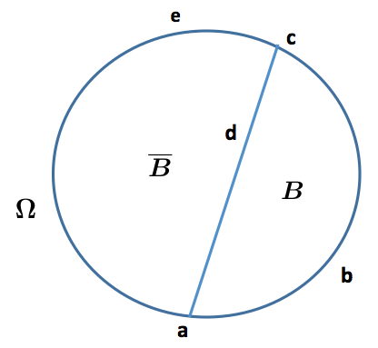
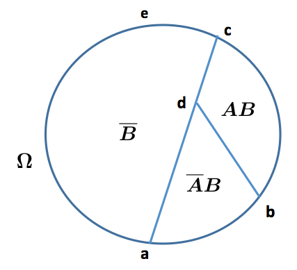
We will use Figure 4 to assist our description. To represent the partition , we use a straight line “adc” to split the circular disk into two halves, i.e., regions surrounded by “abcda” and “adcea”, which stands for event and , respectively. The regions corresponding to event and can be further split for a more refined representation involving other events. To represent conditional probability as defined by (1), event is written as
| (3) |
which can be represented by splitting the region for , i.e., “abcda”, with a straight line “db”. The conditional
probability can then be calculated as the ratio of the area for region “bcdb” and that for region
“abcda”.
The turtleback diagram leads to a partition of the sample space as follows
| (4) | |||||
| (5) |
Continuing this process, we can define
events as complicated as we like in a simple hierarchical
fashion as a nesting sequence of partitions
where , , and is a refinement
of for index in the sense that each element
in is a subset of some element in .
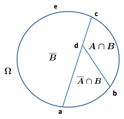
We can now assign labels to each of the sub-regions, e.g., by the name of
the relevant events to indicate that a particular region is associated with that event.
For example in Figure 4, we assign labels and
to regions “bcdb” and “abda”, respectively. Here, means ,
and indicates , and the same convention carries over throughout.
Accordingly, the turtleback diagram simplifies
to the right panel in Figure 4. Note that here
an event need not be a connected region, rather it could be a collection of
patches (i.e., small regions) with each of them capturing
information from a different source. This causes a little burden in
calculation but costs really nothing conceptually, or, in terms of the ability of
visualization.
One advantage of such a recursive-partition representation of the sample space
is that the data are now highly organized and we can easily
operate on it, for example to find out the probability of a certain event.
The idea of organizing the data via recursive space-partition and manipulating by
their labels has been explored in CART (classification and regression trees [27])
and more recently, random projection trees [28], as
well as a recent work of one author and his colleagues [29]. Note that dividing a
region into a number of small patches also entails the total probability
formula, an important ingredient in conditional probability to which formula
(3) is related. We will use the ‘Lung disease and
smoking’ example to illustrate the use of turtleback diagrams for conditional probability.
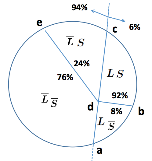
3.4 The lung disease and smoking example
This example is taken from online sources (see [30]). It is described as follows.
“According to the Arizona Chapter of the American Lung Association, of population have lung disease. Of those having lung disease, are smokers; of those not having lung disease, only are smokers. Answer the following questions.
- (1)
If a person is randomly selected in the population, what is the chance that she is a smoker having lung disease?
- (2)
If a person is randomly selected in the population, what is the chance that she is a smoker?
- (3)
If a person is randomly selected and is discovered to be a smoker, what is the chance that she has lung disease?”
According to the information given in the problem, we can sketch a graph as Figure 5. Labels and area information to each sub-regions are assigned properly. Assume the circular disk has an area of . Now we can answer the questions quickly as follows.
-
(1)
The answer is simply the area of region “adba”, which is .
-
(2)
The answer is the area of region “edbae”, which is . This is, in essence, the total probability formula .
-
(3)
Recognizing that this involves conditional probability and is the ratio of two relevant areas,
(area of “adba”/area of “edbae”)=0.0552/0.2808=0.1966.
3.5 Difficulty with the Venn diagram
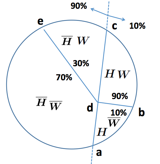
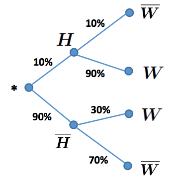
The Venn diagram is known as the standard graphical tool for set theory. Both Venn diagram and the turtleback diagram use regions to represent sets. However, there is a major difference. In a turtleback diagram, as illustrated in Figure 4, straight lines, such as line “adc”, “db” etc, are used to split the sample space and regions. In contrast, the Venn diagram represents events by drawing circular disks. Partitioning the sample space in such a way would cause substantial difficulty in handling the complement operation, one crucial ingredient in conditional probability. One has to deal with a setting where the complement of a region would surround the region itself, for example, in Figure 6, and surround and , respectively. This would cause extra burden to the human brain or the visual system. We will illustrate with the ‘Lung disease and smoking’ example.
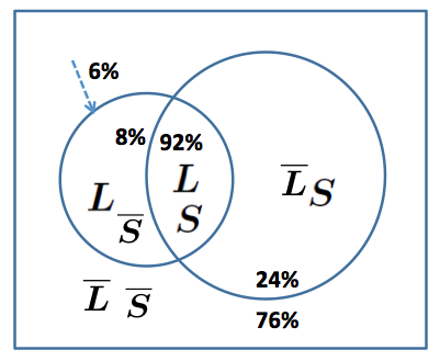
In Figure 6, one would find it tricky to label the region and put area information for (which is ) without causing confusion. Moreover, it may require some extra work (versus simply “reading” from the graph) to assign the label , or to calculate the area of this region. In contrast, the turtleback diagram (c.f. Figure 5) introduces straight lines, e.g., “adc”, “ed”, and “db”, which readily avoids obstacles caused by set intersections or complements in a Venn diagram.
4 Semantic equivalence of the turtleback and the tree diagram
Given a graphical representation, it is natural to ask questions about its expressive
power–will it be expressive enough to represent a complicated or very abstract concept?
We will show that the turtleback diagram is equally expressive as the tree diagram.
The way that the turtleback diagram progressively
refines the partition over the sample space is essentially a recursive space
partition, where the sets involved in the
partition are organized as a chain of enclosing sets. For example, in
Figure 4, we have
| (6) |
By equivalence (see, for example, [27]) between the recursive space partition and the tree structure, we can actually show the “semantic” equivalence between the turtleback diagram and the tree diagram. The remaining of this section is dedicated to this. Let a tree node correspond to a set in a recursive space partition with the following three properties:
-
1)
The root node corresponds to the sample space ;
-
2)
All the child nodes of a node form a decomposition of this node;
-
3)
Down from the root node, the nodes along any path form a chain of enclosing sets.
Property 2) entails the total probability formula, and property 3) corresponds to a refinement of a partition. This allows one to turn the turtleback diagram in Figure 4 into a tree representation, that is, the left panel of Figure 7. The “chain” property forces a child node to be a restriction of its parent node. We can use this to simplify the labels for the tree nodes, e.g., the left panel becomes the right in Figure 7. Note that in the right panel, really node corresponds to the set , that is, the intersection of all sets along the path from the root to node (i.e., the tree path ).
For real world conditional probability problems, often the following formula is used instead of (1), due to availability of information from multiple sources
| (7) |
where . This requires the calculation of probabilities in the form
of , or in other words, the probability of the intersection of
multiple events.
In Figure 7, by construction node , through path ,
has a size , and node has size . We can now endow the weight
of edge according to the proportion of node (treated as a subset of )
out of , or the probability of transition to node given that one has reached node
from the root. This equals . Such a definition is valid as the size of nodes
and satisfies .
Thus, in Figure 8, the probability that one arrives at a node, say , along the path is given by
| (8) |
which is simply the product of edge weights along the path (the edge weight for is ). Same reasoning extends to any node in a tree. Thus we have provided a tree-based interpretation of the turtleback diagram for conditional probability. Such an algebraic system on the tree has the following two properties:
-
1.
The probability of arriving at any node equals the product of edge weights along the path.
-
2.
The weight of an edge has weight given by .
This is exactly what a tree diagram would represent. The above properties extend readily to a series of events. For example, the probability of a series of events, can be computed as the probability of arriving at node along the tree path (c.f., Figure 8)
| (9) | |||||
This approach applies even for non-sequential events, as one can artificially attach an order to the
events according to the “arrival” of relevant information. Thus, we have shown the semantic equivalence
between the turtleback diagram and the tree diagram. Their difference is mainly on the visual representation,
which matters as visual tools.
The tree diagram appears to be less intuitive than the turtleback diagram as there is no longer an
association between the area of a region and its probability (one may use the thickness of an edge
to indicate the probability, but that is less attractive too). However,
the tree diagram seems to scale better to large problems.
5 Case studies
We consider four examples in case study, including the ‘Lung disease and smoking’ example, the ‘History and war’ example, the ‘Lucky draw’ example, and ‘the urn model’ example [1]. As a matter of fact, very few students (about ) can do the ‘History and war’ example completely correctly in an in-class practice, after explaining to them the non-graph based concept of conditional probability. That motivated us to adopt the graph-based approach. In the following, we provide the details of the examples.
5.1 The lung disease and smoking example
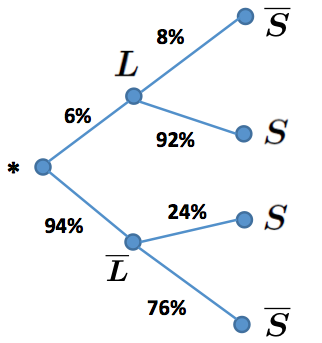
With the tree diagram, the answer to (1) is the probability of reaching node along the path , which is the product of edge weights along this path and is calculated as . The solution to (2) is the sum of products of edge weights along two paths, and , that is, , and (3) by the ratio of the product of edge weights along path over that over two paths, which is .
5.2 The History and War example
This example is artificially created so that it has a similar problem structure as the ‘Lung disease and smoking’ example. It is described as follows.
“According to a market research about the preference of movies, of the population like movies related to history. Of those who like movies related to history, also like movies related to wars; of those who do not like movies related to history, only like movies related to wars. Answer the following questions.
- (a)
If a person is randomly selected in the population, what is the chance that she likes both movies related to wars and movies related to history?
- (b)
If a person is randomly selected in the population, what is the chance that she likes movies related to wars?
- (c)
If a person is randomly selected and is discovered to like movies related to wars, what is the chance that she likes movies related to history?”
We can construct a turtleback diagram as the left panel of Figure 10. One can quickly answer the questions as follows. (a) is the area of region “adba”, which is given by , (b) is the total area of region “edbae”, which is given by , and (c) is the ratio of (a) and (b) which is .
Similarly, the right panel of Figure 10 is a tree diagram. One can answer the questions as follows. (a) is the product of edge weights along the path , which is given by , (b) is the sum of the product of edge weights along two paths, and , which is given by , and (c) is the ratio of (a) and (b) which is .
5.3 The lucky draw example
The lucky draw example is taken from the popular lucky draw game. This example is especially useful as many sampling without replacement problems can be converted to this and solved easily. Here we take a simplified version with the total number of tickets being and there is only one prize ticket. The description is as follows.
“There are tickets in a box with one being the prize ticket. people each randomly draws one ticket from the box without returning the drawn ticket to the box. Is this a fair game (i.e., each draws the prize ticket with the same chance)?”
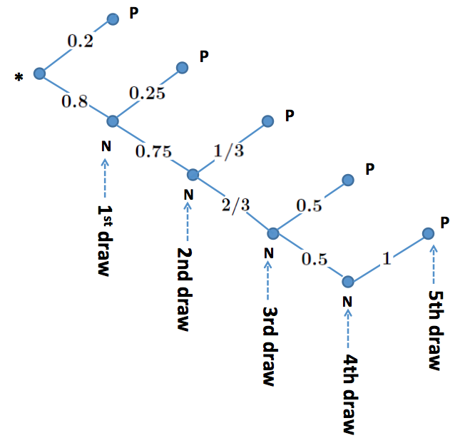
Figure 11 depicts the process of ticket drawing. As here our interest is the prize ticket, the tree branch that has already seen the prize ticket will not grow further. Easily the probability of getting the prize ticket at the first draw is . Following Figure 11, the probability of getting the prize ticket at the second draw is the product of edge weights along the path , which is . Similarly, the probability of getting the prize ticket at the third draw is given by , and so on.
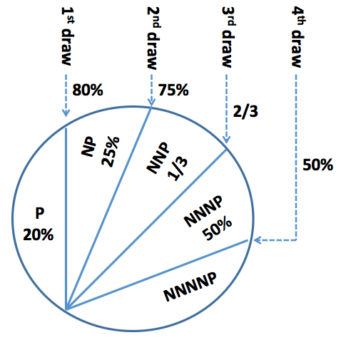
Figure 12 is the turtleback diagram for the ‘Luck draw’ game. Easily the probability of getting the prize ticket at the first draw is the area of the region labelled as “P”, which is . Following the figure, the probability of getting the prize ticket at the second draw is the area of the region labelled as “NP”, which is . Similarly, the probability of getting the prize ticket at the third draw is given by , and so on.
5.4 An urn model example
This can be viewed as an extension of the lucky draw problem in the sense that there are more than one prize tickets here. Note that this example mainly serves to demonstrate that both the tree and the turtleback diagram could be used to solve problems of such a complexity (one can solve this problem quickly by distinguishing the two green balls and apply result of the lucky draw game222Label the two green balls as and , respectively. Then the probability of getting a green ball at each draw is simply that of getting or . Either or can be treated as the only prize ticket in the lucky draw game thus the probability of getting either one is , and so the probability of getting a green ball at any draw is always .). Assume there are greens balls and red balls. The problem is described as follows.
“There are green balls and red balls in an urn. One randomly picks one ball for five times from the urn without returning. Will each draw have the same chance of getting the green ball?”
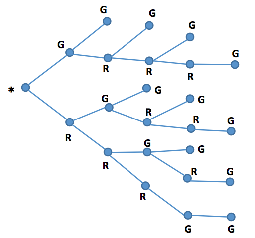
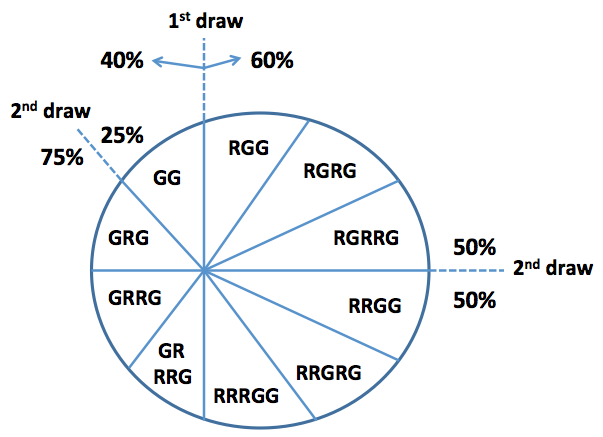
Figure 13 is the tree diagram for the urn model. We are not going to calculate the probability of getting a green ball for each draw, instead we only do it for the third draw. The probability of getting a green ball at the third draw is give by the sum of the product of edge weights along three paths
which is
. One can similarly
calculate that the probability of getting a green ball at other draws all
equal to .
Figure 14 is the turtleback diagram for the urn model. To calculate the probability that the
third draw gets a green ball, we simply sum up
the area of all regions with a label such that the third letter is “G”. That is, the total area of regions labelled as
which is
The calculation seems a little tedious, but conceptually very simple, as long as one could follow the way the regions are partitioned.
| Course | # students | Class size | Institute |
|---|---|---|---|
| STAT235 | 128 | 40-60 | UMKC |
| MTH231 | 25 | 10-20 | UMassD |
| MTH331 | 72 | 35-45 | UMassD |
6 Empirical data
We carried out case studies on over students. This includes students in the
elementary statistics class, STAT235 (non-calculus based), at University of Missouri Kansas City (UMKC)
during 2012-2013, and students from elementary statistics, MTH231, and elementary probability, MTH331,
classes at University of Massachusetts Dartmouth (UMassD) during 2015-2017. These three courses had
a fairly different student population. For STAT235, about 30% from engineering, 30% from business, and
the rest from such diverse majors as biology, chemistry, psychology, political sciences, education etc.
For MTH231, about 80% are from mathematics or data science, and the rest from majors such as computer
science, electrical engineering, criminal justice etc. For MTH331, about 75% from computer science or electrical
engineering, 20% from mathematics or data science, and the rest from other engineering majors or economics,
physics etc. Table 1 gives a summary of students involved in the case studies.
The study is carried out as follows. First we explain to students the concept of conditional probability with
a non-graph based approach. Then we continue with two exercises. In the first exercise, we explain to
students the ‘Lung disease and smoking’ example, with both the turtleback and the tree diagram, and
have students solve the ‘History and war’ problem, or vice versa (for different classes we were teaching).
In another exercise, we explain the ‘Lucky draw’ example, and have students solve the ‘Urn model’ problem,
or vice versa. Due to time constraints on the course schedule, we did not ask students to solve problems
using a particular technique followed by its discussion. Rather we discussed both the turtleback and the tree
diagrams, and let students choose one of them for problem solving. Table 2 is a
breakdown of the number of students involved.
| Course | Lung disease and | War and history | Lucky | Urn |
|---|---|---|---|---|
| smoking | movie | draw | model | |
| STAT235 | 66 | 62 | 62 | 66 |
| MTH231 | 14 | 11 | 14 | 11 |
| MTH331 | 37 | 35 | 35 | 37 |
| Total | 117 | 108 | 111 | 114 |
| Neither | Either one | Prefer | Prefer | |
| Question | helpful | helpful | Turtleback | Tree |
| Lung disease and smoking | 13.7% | 86.3% | 53.0% | 33.3% |
| War and history movies | 11.1% | 88.9% | 54.6% | 34.3% |
| Lucky draw | 17.1% | 82.9% | 34.2% | 48.6% |
| Urn model | 21.9% | 78.1% | 31.6% | 46.5% |
We collect two types of data from the case studies, one on students’ preference between graph and non-graph based
approach, and the other on students’ preference between the turtleback and the tree diagram. Here, except for the case
of non-graph based approach, by preference we mean the students actually used the technique for problem solving, and
nearly in all such cases they could apply it correctly in solving the assigned problem; so we use this as measurement of
learning outcome (with an understanding that further experiments may be needed to validate this). The results
are reported in Table 3. The data collected are quite encouraging. About 78-88% students found a
graph tool helpful. For the ‘Lucky draw’ and the ‘Urn model’, fewer students found it helpful. This is possibly because
these two problems appear to be harder to students: even a graphical tool may not help them much.
Further experiments are needed to validate or understand this.
In terms of a preference for which graphical tool, the results show an interesting pattern. For the ‘Lung disease and smoking’
and the ‘War and history’ example, more students prefer the turtleback diagram to the tree diagram, around 53-54% vs
33-34%. The ‘Lucky draw’ and the ‘Urn model’ examples exhibit an opposite pattern, more students prefer the tree
diagram to the turtleback diagram, around 46-48% vs 31-34%333Since in all cases, the sample size is large
enough and the difference between contrast groups is significant, we did not carry out a hypothesis testing using the
reported data.. This is probably due to the fact that, in the first two examples, the sample spaces and events involve
populations in the usual sense, while the last two examples involve sequential decisions, for which a tree structure that
represents the decision dichotomy may be more natural (although in such cases, the concept of conditional probability
is not as natural as that in the turtleback diagram). Further experiments are needed to confirm this. The advantage of
the turtleback diagram over the tree diagram appears to decrease as the problem becomes harder, but this is not a
serious problem for beginning students as those who most need help from a graphical representation are just those
who could not solve simple problems. Moreover, we do not expect one single graphical tool can help solve all the problems,
rather different people may use different tools for a particular problem.
7 Potential research questions
Many instances of conditional probability occur in sampling without replacement. Tarr and Jones [8] describe a framework for assessing middle school students’ thinking in conditional probability and independence, which is elaborated in [12]. This framework is a levels model, with 4 levels—Subjective, Transitional, Informal Quantitative, and Numerical—subject to all the difficulties such a model has as students transition from one level to another.
Research Question 1: Are turtleback diagrams, as compared to tree diagrams, helpful to students, at any or all of the Tarr-Jones framework levels, in understanding conditional probability. If so, how can we measure and assess the comparative utility of turtleback diagrams compared to tree diagrams?
Research Question 2: Related to Research Question 1, specifically, how helpful are turtleback diagrams in helping students understand conditional probability in the context of sampling without replacement?
Conditional probability is increasingly being introduced into middle school in the United States. The Conference Board of the Mathematical Sciences [31] stated:
Of all the mathematical topics now appearing in middle grades curricula, teachers are least prepared to teach statistics and probability. Many prospective teachers have not encountered the fundamental ideas of modern statistics in their own K-12 mathematics courses…Even those who have had a statistics course probably have not seen material appropriate for inclusion in middle grades curricula. (p. 114)
Research Question 3: Are turtleback diagrams helpful to middle school teachers of probability and statistics in (a) enhancing their own understanding of conditional probability and (b) assisting them to better teach conditional probability? If so, how and to what extent?
8 Conclusions
Motivated by difficulties encountered by many
undergraduate students new to statistics, we re-examined the definition and representation of conditional probability, and presented a Venn-diagram like approach: the turtleback diagram. We discussed our graphical tool in the context of other graphical models for conditional probability, and carried out case studies on over students of elementary statistics or probability classes.
Our case study results are encouraging and the graph-based approaches could potentially lead to significant improvements in both the students’ understanding of conditional probability and problem solving.
While the existing tree diagram is preferred to the turtleback diagram on problems
that involve a sequential decision, the turtleback diagram is considered more helpful
in settings where the underlying population resembles the usual human population; it is
exactly in such situations that weaker students are more likely to need help.
Though the turtleback diagram appears very different from the tree diagram, we are
able to unify them and show their equivalence in terms of semantics.
Our discussion suggests
a simple framework for visualizing abstract concepts, that is, a suitable graph representation of the abstract
concept followed by a simple post-processing in the visual-brain system. A good visualization idea needs to
balance both. We are able to use such a framework to interpret the difficulty encountered by the tree diagram,
and aid our development of the turtleback diagram. Further studies are expected to validate or to adopt such
a framework to general visualization tasks. Given the increasingly important role played by data visualization
in data science and exploratory data analysis [15, 32, 16, 33], it
would be worthwhile to give a few remarks here comparing the graph representation of abstract concepts and
data visualization. These two concepts are different yet closely related. Graphical representation aims to
understand an abstract (or complicated) concept by representing elements of the concept with a graph, while
data visualization seeks to understand the data or the information behind by displaying aspects (i.e., descriptive
statistics) of the data. In terms of implementation, as both aim to help understanding or reasoning, the used
graphical objects need to be simple (though simple in different ways in the two cases). In data visualization,
the graphical objects need to be simple so that people can quickly grasp the information conveyed or to understand
the concept behind without resorting to paper and pencil; in graphical representation of concepts, the objects
need to be conceptually simple and easy to manipulate for applications of the concepts.
Our case studies suggest that it is worthwhile to introduce such graphical tools to students whose success
would seem to depend on them. We hope that this will benefit our statistics colleagues who are teaching
elementary statistics and students who are struggling with the concept of conditional probability and its
application to problem solving. The potential savings in time can be huge. As a conservative estimate, assume
each year there are about million bachelor’s degrees awarded in US (about million awarded
in 2009). Assume there are about of them have taken an elementary statistics class, and about
of them need help and succeed with our proposed approach, and further assume an average class
size of . If each instructor saves hours of time in each elementary statistics class and each student
who benefits from our approach saves hour, then the estimated total amount of time saved is at least
hours per year in the U.S. alone.
Acknowledgement
The authors are grateful to Professor Yong Zeng at UMKC for kindly pointing to the ‘Lung disease and smoking’ example, and for encouragement and support on some of the case studies.
References
- [1] Rice, J. (1995) Mathematical Statistics and Data Analysis (Second Edition). Duxbury Press.
- [2] Johnson, R. and Tsui, K. (2003) Statistical Reasoning and Methods. John Wiley.
- [3] Ancker, J. S. (2006) The language of conditional probability. Journal of Statistics Education, 14, 1-5.
- [4] Mann, P. (2003) Introductory Statistics. John Wiley.
- [5] Tversky, A. and Kahneman, D. (1980) Causal schemas in judgments under uncertainty. Progress in social psychology, 1, 49-72.
- [6] Fischbein, E. and Gazit, A. (1984) Does the teaching of probability improve probabilistic intuitions? Educational studies in mathematics, 15, 1-24.
- [7] Falk, R. (1986) Conditional probabilities: insights and difficulties. Proceedings of the Second International Conference on Teaching Statistics, 292-297.
- [8] Tarr, J. E. and Jones, G. A. (1997) A framework for assessing middle school students? Thinking in conditional probability and independence. Mathematics Education Research Journal, 9, 39-59.
- [9] Tomlinson, S. and Quinn, R. (1997) Understanding conditional probability. Teaching Statistics, 19, 2-7.
- [10] Tarr, J. E. (2002) The confounding effects of the phrase ’50-50 Chance’ in making conditional probability judgments. Focus on Learning Problems in Mathematics, 24, 35-53.
- [11] Yáñez, G. C. (2002) Some challenges for the use of computer simulations for solving conditional probability problems. The 6th International Conference on Teaching Statistics, Cape Town, South Africa.
- [12] Tarr, J. E. and Lannin, J. K. (2005) How can teachers build notions of conditional probability and independence? In Exploring Probability in School (pp. 215-238), Springer, US.
- [13] Arcavi, A. (2003) The role of visual representations in the learning of mathematics. Educational studies in mathematics, 52, 215-241.
- [14] Presmeg, N. C. (2006) Research on visualization in learning and teaching mathematics. Handbook of research on the psychology of mathematics education, Sense Publishers, Rotterdam, 205-235.
- [15] Tukey J. (1977) Exploratory Data Analysis. Addison-Wesley.
- [16] Cleveland, W. S. (1993) Visualizing Data. Hobart Press.
- [17] Morris, D. (2016) Bayes’ Theorem Examples: A Visual Introduction For Beginners. ISBN-13: 978-1549761744.
- [18] Collins, R. (2017) Bayes Theorem Examples: Visual Book for Beginners. CreateSpace Independent Publishing Platform ISBN-13: 978-1547270385.
- [19] Gelman, A. and Carlin, J. B. and Stern, H.S. and Dunson, D.B. and Vehtari, A. and Rubin, D.B. (2013) Bayesian Data Analysis, 3rd Edition, Chapman and Hall, London.
- [20] Edwards, A. W.F. (2004) Cogwheels of the Mind: The Story of Venn Diagrams. Johns Hopkins University Press, Baltimore, MD.
- [21] Gigerenzer, G. and Hoffrage, U. (1995) How to improve Bayesian reasoning without instruction: frequency formats. Psychological review, 102(4), 684-705.
- [22] Yamagishi, K. (2003) Facilitating normative judgments of conditional probability: Frequency or nested sets? Experimental Psychology, 50, 97-106.
- [23] Brase, G. L. (2009) Pictorial representations in statistical reasoning. Applied Cognitive Psychology, 23, 369-381.
- [24] Sloman, S. A., Over, D., Slovak, L. and Stibel, J. M. (2003) Frequency illusions and other fallacies. Organizational Behavior and Human Decision Processes, 91, 296-309.
- [25] Deacon, T. W. (1998) The symbolic species: The co-evolution of language and the brain. WW Norton & Company, NY.
- [26] Chartrand, G., Zhang, P. (2011) Discrete Mathematics. Waveland Press, Inc.
- [27] Breiman, L., Friedman, J., Olshen, R. and Stone, C. (1984) Classification and Regression Trees. Wadsworth, CA.
- [28] Dasgupta, S. and Freund, Y. (2008) Random projection trees and low dimensional manifolds. Fortieth ACM Symposium on Theory of Computing (STOC), 537-546.
- [29] Yan, D., Huang, L. and Jordan, M. (2009) Fast approximate spectral clustering. Proceedings of the 15th international conference on Knowledge discovery and data mining (SIGKDD), 907-916.
- [30] Weiss, N. A. (2012) Introductory Statistics. Addison-Wesley, 193.
- [31] Conference Board of the Mathematical Sciences (2001) The mathematical education of teachers. American Mathematical Society, Providence, RI.
- [32] Tufte E. (1983) The Visual Display of Quantitative Information. Graphics Press, CT.
- [33] Yau, N. (2011) Visualize this: the flowing data guide to design, visualization, and statistics. Wiley.