Visualizing a Million Time Series with
the Density Line Chart
Abstract.
Data analysts often need to work with multiple series of data—conventionally shown as line charts—at once. Few visual representations allow analysts to view many lines simultaneously without becoming overwhelming or cluttered. In this paper, we introduce the DenseLines technique to calculate a discrete density representation of time series. DenseLines normalizes time series by the arc length to compute accurate densities. The derived density visualization allows users both to see the aggregate trends of multiple series and to identify anomalous extrema.
1. Introduction
Time series are a common form of recorded data, in which values continuously change over time but must be measured and sampled at discrete intervals. Time series play a central role in many domains (Fulcher et al., 2013): finance and economics (stock data, inflation rate), weather forecasting (temperature, precipitation, wind, pollution), science (radiation, power consumption), health (blood pressure, mood levels), and public policy (unemployment rate, income rate) to name a few. Often, an individual time series corresponds to a context such as the location of a sensor. Therefore, analysts may have many series to consider—multiple stocks or the unemployment rates in different counties. These multiple contexts can result in datasets with as many as thousands of time series.
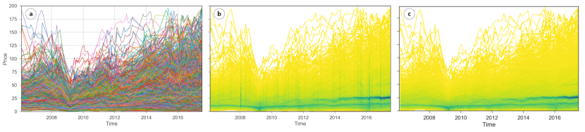
Multiple series are typically visualized as line charts with one line per series (Playfair, 1801). However, even with as few as a hundred lines, overplotting makes it difficult for analysts to see patterns and trends. Existing techniques simply do not scale to these numbers of series. A naïve density-based technique suffers from a different issue: lines with extreme slopes are overrepresented in the visualization.
We present the DenseLines technique, which allows analysts to make sense of many time series. In this paper, we show that the technique is scalable in the number of series, at the cost of removing the ability to trace individual lines. DenseLines allows analysts to answer questions such as: “What are the major trends in my time series data?” and “Are these time series behaving similarly to each other?” The core of the technique is to compute a density as the number of time series that pass through a particular space in the time and value dimensions; and to normalize the density contribution of each line by its arc length, such that each series has the same total weight. The density can then be visualized with a color scale, as seen in Figure 1 (c). The technique is scalable, meaning that additional lines or higher resolution data do not affect the visual complexity of the chart; it is amenable to interaction techniques and different color scales.
We validate the technique through a series of examples, including stock data, hard drive statistics, a case study of data analysts at a large cloud services organization, and with a synthetic dataset of a million time series. Our implementations of DenseLines in Rust111https://github.com/domoritz/line-density-rust and in JavaScript with WebGL222https://domoritz.github.io/line-density are available as open source.
2. Related Literature
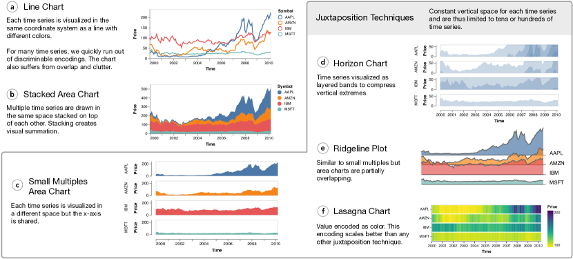
The standard encoding of time series—time mapped to a horizontal axis and value to the vertical axis, with line segments connecting the points—has been in use for centuries (Playfair, 1801). Multiple series can be visualized as superimposed lines, each with a different color or other distinctive encodings (Figure 1 (a), Figure 2 (a)).
2.1. Visualizing Many Series
Javed et al. (Javed et al., 2010) survey visualization techniques for line charts with multiple time series. They empirically compare the design’s effectiveness for varying tasks and numbers of series. One important finding is that clutter (Ellis and Dix, 2007) can be overwhelming to users: presenting users with more lines tends to decrease correctness in perceptual tasks while also increasing task completion time. Even for fairly small numbers of series—Javed et al. limit themselves to eight while previous studies were often restricted to two (Heer et al., 2009; Simkin and Hastie, 1987)—chart elements rapidly lose discriminability and become cluttered.
Juxtaposition (Javed and Elmqvist, 2012)—placing charts next to each other—reduces clutter but requires more space (Figure 2 c - f)). LiveRAC (McLachlan et al., 2008) uses a matrix of reorderable small multiples (Figure 2 (c)) (Tufte and Schmieg, 1985) to provide high information density for exploring larger numbers of time series. Horizon charts (Figure 2 (d)) (Saito et al., 2005; Heer et al., 2009) reduce the space in charts by dividing the line into layered bands. Ridgeline plots (Figure 2 (e)) instead allow overlap between the time series333This representation is inspired by the classic 1979 Joy Division “Unknown Pleasures” album cover. It shows a figure from the PhD thesis of the astronomer Harold Craft, who recorded radio intensities of the first known pulsar (Craft Jr, 1970)..
A time series can also save space by encoding value as color, and so use a small, but constant, amount of vertical space (Figure 2 (f)). Swihart et al. coined the term “Lasagna Plot” (Swihart et al., 2010) for this representation to contrast it with the line chart with too many lines. Rather than having tangled “noodles” (lines), each series is shown as a layer through time. The Line Graph Explorer (Kincaid and Lam, 2006) uses this technique to enable users to explore dozens of time series. Juxtaposition maintains an ability to look at each of the series, and is so limited in the degree to which it can scale. It is thus useful for a small number of series; on the order of tens or at most hundreds.
Figure 2 compares time series visualizations but we find that ultimately none scale to visualizing large numbers of time series at the same time. A broad selection of visual designs found in (Aigner et al., 2011) build on these patterns and share the limitations.
Each visualization technique emphasizes different properties of the data and are thus preferred in particular domains. For example, neuroscientists often use ridgeline plot because they care about seeing where high peaks occur . In juxtaposed visualizations the order matters and time series that are close are easier to compare than those that are far apart. DenseLines plot all data in the same space and emphasizes density and outliers.
2.2. Searching for Specific Patterns or Insights
Rather than attempting to visualize all the series, another approach is to search the dataset for lines that behave in particular ways. Wattenberg’s QuerySketch (Wattenberg, 2001) and Hochheiser and Shneiderman’s TimeBoxes (Hochheiser and Shneiderman, 2004) allow users to select a subset of lines based on their shape characteristics. These techniques scale to very large sets of time series but provide a limited view of the data. Konyha et al. discuss interaction techniques for filtering time series data (Konyha et al., 2012).
2.3. Visualizing Density
The design of DenseLines draws its inspiration from density visualizations, which are commonly used to declutter scatterplots (Carr et al., 1987). Density alone is sufficient to see trends, clusters, and other patterns, and to recognize outlier regions (Wickham, 2013). Past work has plotted density marks by reducing the opacity of the marks (Hinrichs et al., 2015), by smoothing (Wickham, 2013), or by binning data across both the X and Y values, and then encoding the number of records in each bin using color. Compared to bagplots and boxplots for time series data (Hyndman and Shang, 2010), density based visualizations do not merge different groups in multi-modal data (e.g., bundles of similar time series). A density representation can also be applied to other chart types such as network graphs (Zinsmaier et al., 2012), and trajectories (Scheepens et al., 2011). Continuous Parallel Coordinates (Heinrich and Weiskopf, 2009) and Parallel Coordinates Density Plots (Artero et al., 2004) visualize parallel coordinate plots for high dimensional data with many records. Parallel Edge Splatting (Burch et al., 2011) visualizes networks that evolve over time, and uses the increased density of line crossings to show how subsequent generations of the network differ.
With hundreds or thousands of time series it becomes less important to trace individual lines. Analysts often want to know the amount of data in regions of a particular time and value. Visualization designers often use transparency blending methods. However, similar to transparency blending in scatterplots, there are two main drawbacks. If the opacity is set too low, individual outlier lines may become invisible. If the opacity is set too high, dense regions with different densities become indistinguishable. Heatmaps are a widely used, scalable alternative to scatterplots that address this issue by explicitly mapping the density in a discretized space to color. DenseLines follows this basic pattern and provides a scalable alternative to line charts by counting the amount of data in regions of a particular time and value.
Lampe and Hauser (Lampe and Hauser, 2011) proposed Curve Density Estimates, which uses kernel density estimation to render smooth curves. DenseLines is a special case of Curve Density estimates where data is aggregated into bins; the output is discrete rather than smooth. DenseLines is to Curve Density Estimates what discrete histograms (binned plots) are to smoothed density estimates. They share similar disadvantages and advantages. One the one hand, excessive variability in aggregates of a binned plot can distract from the underlying pattern. On the other hand, smoothing can “smear” values into areas without data—if the count in a cell in a binned plot is more than zero there must be data in the cell. While smooth summaries can be statistically more robust, binned summaries are easier to compute. DenseLines can be computed faster than Curve Density Estimates and are also easier to implement, which could help with the adoption of the technique. For large datasets, we can approximate smooth density estimates without sacrificing performance. For this, we can follow the Bin-Summarize-Smooth approach by Hadley Wickham (Wickham, 2013) and bin and summarize with DenseLines first and then smooth the output. By smoothing the summarized output—whose size only depends on the resolution but not the original data—we can compute output similar to Curve Density Estimates for large data in a fraction of the time (Figure 3).
2.4. Arc Length in Data Visualization
In DenseLines, we normalize the contribution of a line to the density by the arc length. This normalization precisely corrects the additional ink of steep slopes. After normalization, each time series contributes equally to the heatmap. In a regular line chart, the average value has to be computed by sampling values at regular intervals along the x-axis. In a normalized line chart, the average is the weighted average of regular samples along the line itself. A “normalized line chart” might thus aid in aggregate tasks over time series data similar to colofields (Correll et al., 2012). Scheidegger et al. (Meyer et al., 2008) normalized properties of isosurfaces to derive statistics of the underlying data using a similar method. Normalization for time series data makes similar assumptions and has similar goals as the mass conservation method Heinrich and Weiskopf use in Continuous Parallel Coordinates (Heinrich and Weiskopf, 2009). Talbot et al. (Talbot et al., 2011) use arc length to select a good aspect ratio in charts. However, we are the first to use it to normalize line charts. The normalization yields similar results as the column-normalized grids in Lampe et al.’s Curve Density Estimates (Lampe and Hauser, 2011) but does not rely on a kernel to compute densities.
3. The Design of DenseLines
A chart representing multiple time series may support a number of different tasks. Our goal is to let analysts recognize dense regions along both the time and the value dimension while preserving extrema. These tasks represent user tasks that are common for telemetry data from monitoring clusters of servers: analysts have an interest in knowing about collective user behavior and server performance. In addition to supporting these tasks, the representation should scale: additional time series should not impede interpretation.
The DenseLines technique focuses on the visualization of multiple time series with identical temporal and similar value domain. Similar to multi-series line chart, DenseLines uses unified chart axes. However, rather than showing individual series, our goal is to support the analysis of dense areas in the chart (local areas where many time series pass), as well as extreme values (outliers). A DenseLines chart defines local density as the density of lines. We compute density by binning the chart into regions; the density of a bin measures the number of lines that pass through that bin. This definition is more subtle than for a scatterplot heatmap: the data that underlies line charts is not usually recorded at every point. Rather, a line chart connects a set of time/value pairs; the technique must count how many different series lines pass through each bin.
3.1. Normalization of Density by Arc Length
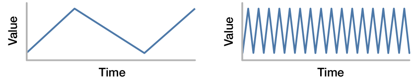
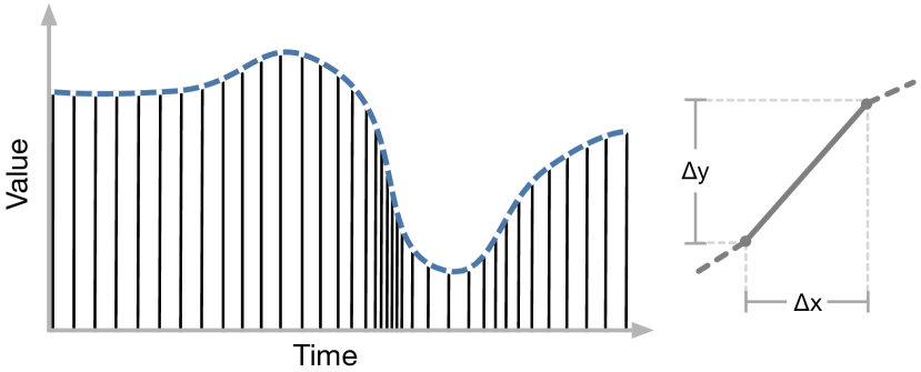
Line charts present a distinct challenge: lines with steep slopes are rendered with more pixels. Since a time series is a continuous value that is recorded at discrete intervals, both time series in Figure 4 can be defined by the same number of data points. Both series have the same average value (and so the same area under the curve). However, the series on the right is plotted with more pixels. Consequently, density based techniques for time series give more weight to lines with steep slopes. Figure 5 (left) shows that when the slope is steep, more points are needed for the same time span. We need to reduce the weight (i.e. number of pixels or amount of ink) of steep line segments such that each line contributes equally to the density in the heatmap. Concretely, for any time span, the contribution of each series to the heatmap has to be the same.
We address this issue by normalizing the density of a line at a particular time by its arc length at that point in time. To understand why normalization by the arc length satisfies the requirements from above, we can look at a single line segment (Figure 5, right). Within the same time interval, each series has the same extent in the time dimension but different extent in the value dimension. To correct the contribution of each segment, we have to divide its weight by the length of the segment. Then every segment has the same weight regardless of its slope. The length of a segment with horizontal extent of and a vertical extent of can be derived from the Pythagorean theorem as . In the limit of the length of an arc defined by and its first derivative (slope) is . Notice that the difference between the arc length and the slope decreases with increasing slope. However, when the slope is (horizontal line), the normalization by arc length is .
3.1.1. Practical Approximation
In DenseLines, we use a practical simplification for normalizing lines by arc length—as used in Curve Density Estimates by Lampeẽa (Lampe and Hauser, 2011). In practice, we can assume one line segment per column (similar to the M4 time series aggregation (Jugel et al., 2014)) and normalize by the number of pixels drawn in each column. A horizontal line is not affected (normalization by 1). Also consistent with our requirements, every series gets the same overall weight. Mathematically, this simplification is asymptotically equivalent to normalization by arc length (in the limit of increasingly small bins).
In a rasterized line chart, each column of a single line chart that is normalized by the arc length sums up to one. Lampe et al. discuss in their Curve Density Estimates paper (Lampe and Hauser, 2011) that this enables us to interpret each column as a 1D probability density estimate. A 1 indicates that all lines were 100% of their time in the corresponding row. 0.5 shows that the lines combined spent 50% in the row. For a DenseLines chart with many time series, the count in each cell is the number of lines that go through it but counting lines that are half of the time are in another cell (but the same column) only half etc.. With some explanation for new users, DenseLines charts can have meaningful color scales and legends.
3.1.2. Problems of Density without Normalization
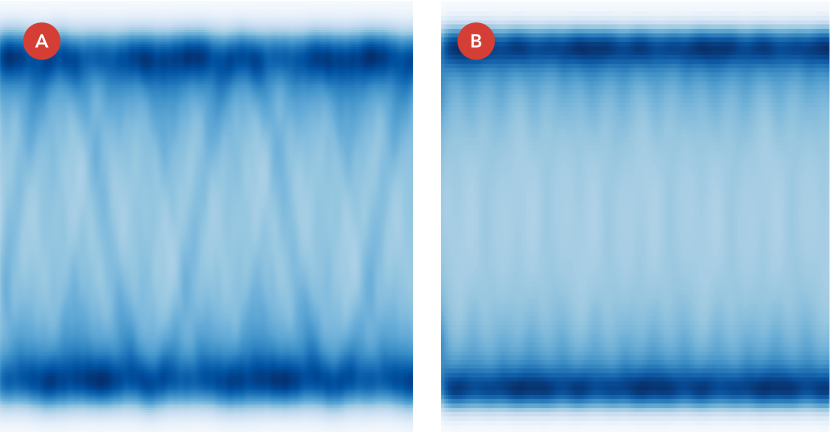
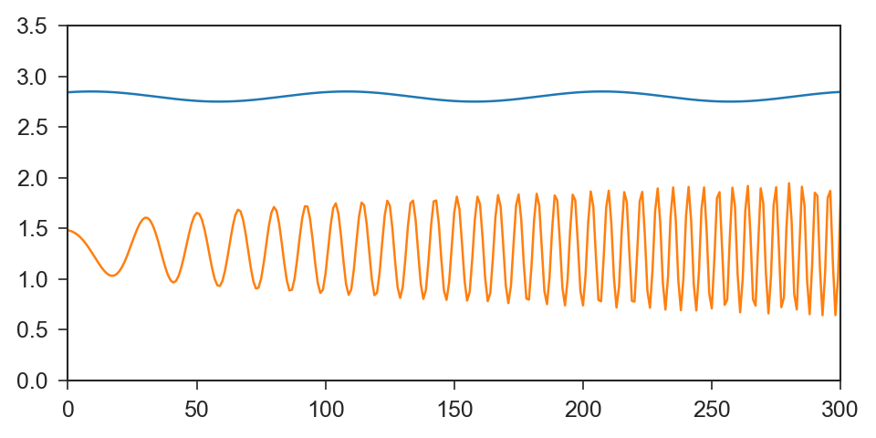
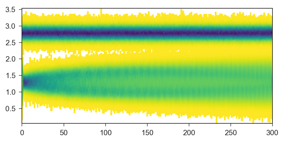
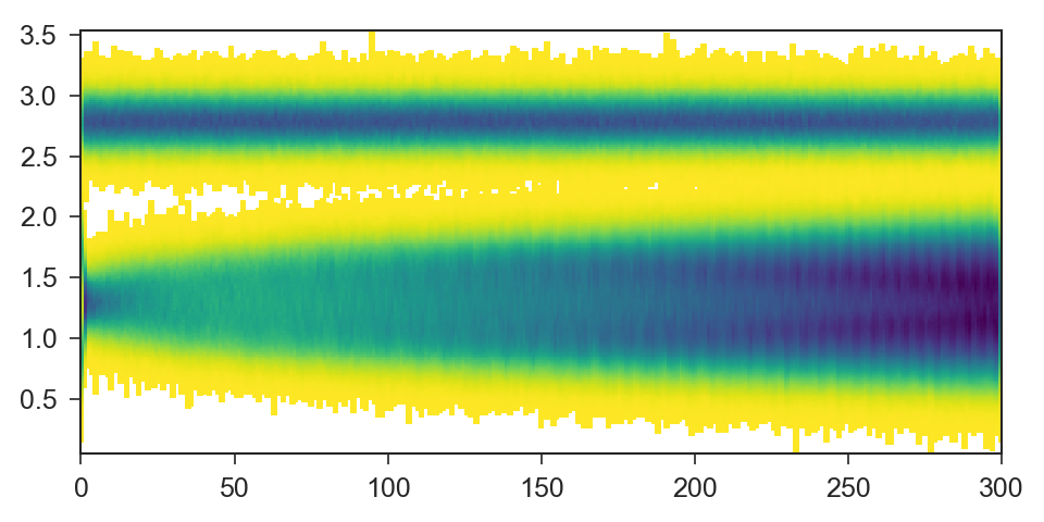
A lack of normalization in DenseLines leads to visible artifacts (Figure 1 (b)) and can produce misleading results. To demonstrate this, we generated time series from a model of two time series 6(a). The first series is a sine wave with a constant frequency. The second series has a higher frequency. The frequency and the amplitude increase with time in the second series. 6(b) shows density with normalization (DenseLines). It accurately shows constant density even as the frequency increases. The increasing amplitude is visible. Without the normalization (6(c)), the density of the second time series appears higher, although there are lines in each group. Moreover, the density appears to increase with time, which is also not true.
3.2. DenseLines Algorithm
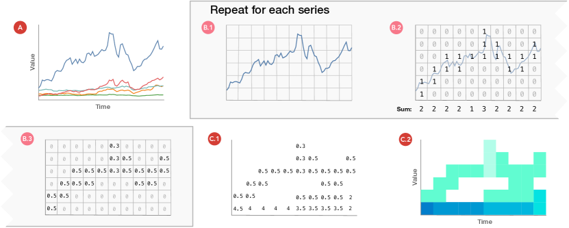
We compute the normalized density with the algorithm illustrated in Figure 7. The input is a dataset with many time series (A). We start by defining a two-dimensional matrix where each entry represents a bin in the time / value space. The time and value dimensions are discretized into equally sized bins. Using Bresenham’s line algorithm (Bresenham, 1977), we render the time series over the bins (B.1). Each bin that the line passes through gets a value of 1 and 0 otherwise (B.2). Alternatively, the value in each bin can correspond to the darkness of an anti-aliased line (Crow, 1977). We then normalize each value by the count of items in their column (B.3). These steps are repeated for every series. In a final step, the matrices of all time series are added together (C.1). The values in the matrix now represent the density of a particular bin in the time and value dimensions. The density can then be encoded using a color map (C.2).
Each line can be processed independently and the render, count, and normalize step can run in parallel. It can be implemented on MapReduce (Dean and Ghemawat, 2004) and on a GPU. We implemented DenseLines in a JavaScript Prototype with GPU computation444https://github.com/domoritz/line-density. Our implementation uses WebGL to processes time series at a resolution of in ~ seconds on a 2014 MacBook Pro with Iris Graphics. At a lower resolution of , the algorithm runs for ~ seconds. Because the algorithm can be implemented efficiently on parallel processors and GPUs, densities can be recomputed at interactive speeds when the user wants to explore a subset of the time series, zoom, or change binning parameters.
We can tweak the scale that encodes the density values to emphasize certain patterns (Figure 7, (C.2)). For instance, by adding a discontinuity between zero density and the lowest non-zero density, we can ensure that outliers are not hidden (Kandel et al., 2012). We can also apply smoothing (Wickham, 2013) to remove noise or run other analysis algorithms on the computed density map. For the examples in this paper we use Viridis (Smith and van der Walt, 2015), a perceptually uniform, multi-hue color scale. If we encode the value in each cell as the size of a circle rather that with a color map, we could use it as an overlay over a color heatmap for example to highlight a selected subset of the time series. As with many heatmap algorithms, bin size is a parameter to the algorithm; larger bins smooth noise and emphasize broader trends, while smaller bins help identify finer-grained phenomena.
3.3. Implementing DenseLines on the GPU
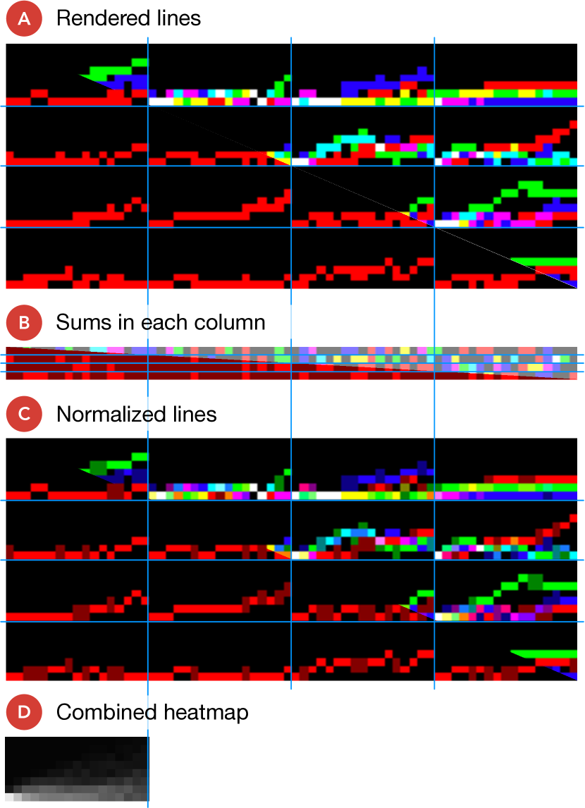
To efficiently use the GPU in our prototype JavaScript implementation, we implemented the rendering and normalization steps in WebGL shaders. Figure 8 gives an overview of our implementation. First, we render a batch of lines into a texture (A) of maximum size necessary and allowed by the GPU. We use the available color channels (red, green, blue and alpha) to render four lines in the same part of the texture. Lines have to be kept separate because each line needs to be normalized independently. In the second step, we compute the count of pixels in each row for each line. The result is a buffer (B) that has the same width as the texture for the lines but is only as high as there are rows of time series. In the third step, we normalize the lines in the values in the first texture (A) by the counts in the second texture (B) into a new texture (C). Lastly, we collect the normalized time series that are spread across the texture and in different color channels (C) into a single output (D). We repeat these steps until all batches of time series have been processed. You can try the demo at https://domoritz.github.io/line-density. The page has a link to the source code and the shaders.
3.4. Limitations and Opportunities
With large-scale data, no single technique can handle all tasks. The DenseLines technique is designed for a specific set of tasks. It is useful when there are many time series sharing the same domain and assessment of aggregate trends and outliers are more important than distinguishing the behavior of individual series. The technique does have some limitations. DenseLines makes it difficult, for example, to recognize information about slopes in particular areas. It is not possible to tell whether the same line is the extremum at different points in time. Some of these specific questions could be addressed with cross-highlighting, or by superimposing highlights and selections. In an interactive system, a line density visualization could be useful as part of the overview stage of information seeking (Shneiderman, 1996). In DenseLine charts the display space is binned and not continuous as in line charts. Thus, the resulting matrices can be subtracted to compute and visualize the difference between two large sets of time series.
4. Demonstration on Public Data
We first demonstrate DenseLines on a stock market dataset of historical New York Stock Exchange closing prices in Figure 1 (c). Dense clusters of lines are easy to spot in blue, while bright yellow shows areas with few stock price lines. The drop that came with the financial crisis in 2008 is clearly visible. Similarly, we can see two dense bands of stock values around and , showing that companies (or customers) tend toward round stock prices.
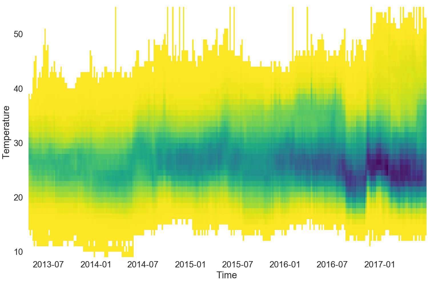
We also examine a dataset of over time series. Backblaze—a cloud storage provider with PB of hard drive storage (Fall 2017)—publishes daily hard drive statistics from the drives in their data centers (bac, 2013). Figure 9 shows the time series of the hard drive temperature (SMART 194) for over hard drives. This visualization effectively displays an aggregation of individual records. We can see that no hard drive goes above C with most of them staying between C and C.
5. Case Study: Analyzing Server Use
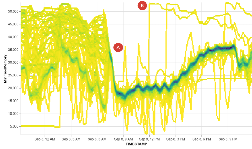
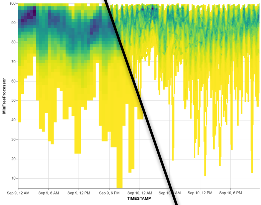
Our case study concerns a real-life deployment of DenseLines. Brad runs operations for software-as-a-service hosted at a large cloud services organization. Among his other work, Brad is responsible for ensuring that the servers remain well-balanced. Brad was analyzing a particular cluster of 140 machines that runs a critical process. From time to time, a server would overload and crash—when it did so, it would have a great deal of free memory. The load balancer would detect this crash, restart the process, and reallocate jobs to other servers. Brad wanted to know how crashes relate to each other, and to better understand the nature of his cluster. A standard line chart of Brad’s data suffers from tremendous clutter. Brad adopted a few chart variants: a chart that shows the inner percentiles of his data and another which limits the display to samples of ten lines. In both cases neither outliers nor trends were visible.
We built a version of DenseLines that works inside Brad’s data analytics tool (Figure 10). He instantly recognized the overall rhythm of the data. He pointed to the thickness of the blue line and noted that “it shows […] how tightly grouped things are.” On the left side, the machines are poorly balanced; after point (A), the blue area gets dark and thin showing that the machines are well-balanced. Brad said that his analysis “is all about outliers and deviations from the norm,” and pointed to point (B). He recognized the distinctive pattern—a single vertical line—of a single server crashing. Brad found it helpful to see the extremes: “The yellow shading […] ensures that I’m seeing effectively all of the areas that have been touched by one line of some kind.” Conversely, he found it useful to see when no machines were crashing: “The light color is comprehensive. If it is white, there was no line that hit that.”
Brad showed us a different cluster of 55 servers running background tasks (Figure 11). The servers have a slow daily cycle, running from daytime peak hours to night-time quiescence. However, they also run compute jobs every hour on the hour. Using a wide bin size, about two hours, brings out the daily cycle; a smaller bin size of fifteen minutes emphasizes the hourly spikes.
Brad has begun to incorporate DenseLines into his group’s regular reviews and into his understanding of how his servers work; he presents DenseLines as part of his monitoring process.
6. Conclusion
DenseLines is a discrete version of Curve Density Estimates (Lampe and Hauser, 2011) that scales well to large time series datasets. The technique reveals the density of time series data by computing locations where multiple series share the same value. The visualization supports many typical line chart tasks, at the cost of some fidelity to individual lines. DenseLines shows places where at least one series has an outlier, and so can help locate them; it identifies dense regions and conveys the distribution of lines within these regions. As we continue to place sensors, gather more data, and broaden analysis systems, the ability to overview and interactively explore multiple time series on similar axes will become increasingly important. We look forward to other techniques that continue to explore the space of large temporal datasets.
Acknowledgements.
We thank Kim Manis, Brandon Unger, Steven Drucker, Alper Sarikaya, Ove Daae Lampe, Helwig Hauser, Carlos Scheidegger, Jeffrey Heer, Michael Correll, Matthew Conlen, and the anonymous reviewers for their comments and feedback.References
- (1)
- bac (2013) 2013. Hard Drive Data and Stats. (2013). https://www.backblaze.com/b2/hard-drive-test-data.html
- Aigner et al. (2011) Wolfgang Aigner, S. Miksch, Heidrun Schuman, and C. Tominski. 2011. Visualization of Time-Oriented Data (1st ed.). Springer Verlag. 286 pages. https://doi.org/10.1007/978-0-85729-079-3
- Artero et al. (2004) Almir Olivette Artero, Maria Cristina Ferreira de Oliveira, and Haim Levkowitz. 2004. Uncovering Clusters in Crowded Parallel Coordinates Visualizations. In Proceedings of the IEEE Symposium on Information Visualization (INFOVIS ’04). IEEE Computer Society, Washington, DC, USA, 81–88. https://doi.org/10.1109/INFOVIS.2004.68
- Bresenham (1977) Jack Bresenham. 1977. Graphics and A Linear Algorithm for Incremental Digital Display of Circular Arcs. IBM System Communications Division 20(2) (1977), 100–106. https://doi.org/10.1145/359423.359432
- Burch et al. (2011) Michael Burch, Corinna Vehlow, Fabian Beck, Stephan Diehl, and Daniel Weiskopf. 2011. Parallel Edge Splatting for Scalable Dynamic Graph Visualization. IEEE Transactions on Visualization and Computer Graphics 17, 12 (Dec. 2011), 2344–2353. https://doi.org/10.1109/TVCG.2011.226
- Carr et al. (1987) D. B. Carr, R. J. Littlefield, W. L. Nicholson, and J. S. Littlefield. 1987. Scatterplot Matrix Techniques for Large N. J. Amer. Statist. Assoc. 82, 398 (1987), 424–436. https://doi.org/10.2307/2289444
- Correll et al. (2012) Michael Correll, Danielle Albers, Steven Franconeri, and Michael Gleicher. 2012. Comparing Averages in Time Series Data. In Proceedings of the SIGCHI Conference on Human Factors in Computing Systems (CHI ’12). ACM, New York, NY, USA, 1095–1104. https://doi.org/10.1145/2207676.2208556
- Craft Jr (1970) Harold Dumont Craft Jr. 1970. Radio Observations of the Pulse Profiles and Dispersion Measures of Twelve Pulsars. (1970).
- Crow (1977) Franklin C. Crow. 1977. The Aliasing Problem in Computer-generated Shaded Images. Commun. ACM 20, 11 (Nov. 1977), 799–805. https://doi.org/10.1145/359863.359869
- Dean and Ghemawat (2004) Jeffrey Dean and Sanjay Ghemawat. 2004. MapReduce: Simplified Data Processing on Large Clusters. Commun. ACM 51 (2004), 107–113. https://doi.org/10.1145/1327452.1327492
- Ellis and Dix (2007) G. Ellis and A. Dix. 2007. A Taxonomy of Clutter Reduction for Information Visualisation. IEEE Transactions on Visualization and Computer Graphics 13, 6 (Nov 2007), 1216–1223. https://doi.org/10.1109/TVCG.2007.70535
- Fulcher et al. (2013) Ben D Fulcher, Max A Little, and Nick S Jones. 2013. Highly comparative time-series analysis: the empirical structure of time series and their methods. Journal of the Royal Society, Interface / the Royal Society 10, 83 (2013). https://doi.org/10.1098/rsif.2013.0048
- Heer et al. (2009) Jeffrey Heer, Nicholas Kong, and Maneesh Agrawala. 2009. Sizing the horizon: the effects of chart size and layering on the graphical perception of time series visualizations. CHI ’09 (2009), 1303–1312. https://doi.org/10.1145/1518701.1518897
- Heinrich and Weiskopf (2009) Julian Heinrich and Daniel Weiskopf. 2009. Continuous Parallel Coordinates. IEEE Transactions on Visualization and Computer Graphics 15, 6 (Nov. 2009), 1531–1538. https://doi.org/10.1109/TVCG.2009.131
- Hinrichs et al. (2015) Uta Hinrichs, Stefania Forlini, Bridget Moynihan, Justin Matejka, Fraser Anderson, and George Fitzmaurice. 2015. Dynamic Opacity Optimization for Scatter Plots. CHI 2015 (2015), 2–5. https://doi.org/10.1145/2702123.2702585
- Hochheiser and Shneiderman (2004) Harry Hochheiser and Ben Shneiderman. 2004. Dynamic query tools for time series data sets: Timebox widgets for interactive exploration. Information Visualization 3, 1 (2004), 1–18. https://doi.org/10.1057/palgrave.ivs.9500061
- Hyndman and Shang (2010) Rob J. Hyndman and Han Lin Shang. 2010. Rainbow Plots, Bagplots, and Boxplots for Functional Data. Journal of Computational and Graphical Statistics 19, 1 (2010), 29–45. https://doi.org/10.1198/jcgs.2009.08158 arXiv:https://doi.org/10.1198/jcgs.2009.08158
- Javed and Elmqvist (2012) W. Javed and N. Elmqvist. 2012. Exploring the design space of composite visualization. In 2012 IEEE Pacific Visualization Symposium. 1–8. https://doi.org/10.1109/PacificVis.2012.6183556
- Javed et al. (2010) Waqas Javed, Bryan McDonnel, and Niklas Elmqvist. 2010. Graphical perception of multiple time series. IEEE Transactions on Visualization and Computer Graphics 16, 6 (2010), 927–934. https://doi.org/10.1109/TVCG.2010.162
- Jugel et al. (2014) Uwe Jugel, Zbigniew Jerzak, Gregor Hackenbroich, and Volker Markl. 2014. M4: A Visualization-Oriented Time Series Data Aggregation. PVLDB 7 (2014), 797–808. https://doi.org/10.14778/2732951.2732953
- Kandel et al. (2012) Sean Kandel, Ravi Parikh, Andreas Paepcke, Joseph M Hellerstein, and Jeffrey Heer. 2012. Profiler : Integrated Statistical Analysis and Visualization for Data Quality Assessment. Proceedings of Advanced Visual Interfaces, AVI (2012), 547–554. https://doi.org/10.1145/2254556.2254659 arXiv:10.1145/2254556.2254659
- Kincaid and Lam (2006) Robert Kincaid and Heidi Lam. 2006. Line Graph Explorer: scalable display of line graphs using Focus+Context. AVI ’06: Proceedings of the Working Conference on Advanced Visual Interfaces (2006), 404–411. https://doi.org/10.1145/1133265.1133348
- Konyha et al. (2012) Zoltán Konyha, Alan Lež, Krešimir Matković, Mario Jelović, and Helwig Hauser. 2012. Interactive Visual Analysis of Families of Curves Using Data Aggregation and Derivation. In Proceedings of the 12th International Conference on Knowledge Management and Knowledge Technologies (i-KNOW ’12). ACM, New York, NY, USA, Article 24, 8 pages. https://doi.org/10.1145/2362456.2362487
- Lampe and Hauser (2011) O. Daae Lampe and H. Hauser. 2011. Curve Density Estimates. Computer Graphics Forum 30, 3 (6 2011), 633–642. https://doi.org/10.1111/j.1467-8659.2011.01912.x
- McLachlan et al. (2008) Peter McLachlan, Tamara Munzner, Eleftherios Koutsofios, and Stephen North. 2008. LiveRAC: Interactive Visual Exploration of System Management Time-Series Data. Human Factors (2008), 1483–1492. https://doi.org/10.1145/1357054.1357286
- Meyer et al. (2008) M. Meyer, C. E. Scheidegger, J. M. Schreiner, B. Duffy, H. Carr, and C. T. Silva. 2008. Revisiting Histograms and Isosurface Statistics. IEEE Transactions on Visualization and Computer Graphics 14, 6 (Nov 2008), 1659–1666. https://doi.org/10.1109/TVCG.2008.160
- Playfair (1801) William Playfair. 1801. The commercial and political atlas: representing, by means of stained copper-plate charts, the progress of the commerce, revenues, expenditure and debts of england during the whole of the eighteenth century. T. Burton.
- Saito et al. (2005) Takafumi Saito, Hiroko Nakamura Miyamura, Mitsuyoshi Yamamoto, Hiroki Saito, Yuka Hoshiya, and Takumi Kaseda. 2005. Two-tone pseudo coloring: Compact visualization for one-dimensional data. In Proceedings - IEEE Symposium on Information Visualization, INFO VIS. 173–180. https://doi.org/10.1109/INFVIS.2005.1532144
- Scheepens et al. (2011) Roeland Scheepens, Niels Willems, Huub van de Wetering, Gennady Andrienko, Natalia Andrienko, and Jarke J. van Wijk. 2011. Composite Density Maps for Multivariate Trajectories. IEEE Transactions on Visualization and Computer Graphics 17, 12 (Dec. 2011), 2518–2527. https://doi.org/10.1109/TVCG.2011.181
- Shneiderman (1996) B. Shneiderman. 1996. The eyes have it: a task by data type taxonomy for information visualizations. In Proceedings 1996 IEEE Symposium on Visual Languages. 336–343. https://doi.org/10.1109/VL.1996.545307
- Simkin and Hastie (1987) David Simkin and Reid Hastie. 1987. An Information-Processing Analysis of Graph Perception. Source Journal of the American Statistical Association 82, 398 (1987), 454–465. https://doi.org/10.1080/01621459.1987.10478448
- Smith and van der Walt (2015) Nathaniel Smith and Stéfan van der Walt. 2015. A Better Default Colormap for Matplotlib. (2015). https://www.youtube.com/watch?v=xAoljeRJ3lU
- Swihart et al. (2010) Bruce J Swihart, Brian Caffo, Bryan D James, Matthew Strand, Brian S Schwartz, and Naresh M Punjabi. 2010. Lasagna plots: a saucy alternative to spaghetti plots. Epidemiology (Cambridge, Mass.) 21, 5 (2010), 621–5. https://doi.org/10.1097/EDE.0b013e3181e5b06a
- Talbot et al. (2011) Justin Talbot, John Gerth, and Pat Hanrahan. 2011. Arc Length-Based Aspect Ratio Selection. IEEE Transactions on Visualization and Computer Graphics 17 (2011), 2276–2282. https://doi.org/10.1109/TVCG.2011.167
- Tufte and Schmieg (1985) Edward R Tufte and Glenn M Schmieg. 1985. The visual display of quantitative information. American Journal of Physics 53, 11 (1985), 1117–1118.
- Wattenberg (2001) Martin Wattenberg. 2001. Sketching a Graph to Query a Time-series Database. In CHI ’01 Extended Abstracts on Human Factors in Computing Systems (CHI EA ’01). ACM, New York, NY, USA, 381–382. https://doi.org/10.1145/634067.634292
- Wickham (2013) Hadley Wickham. 2013. Bin-summarise-smooth : A framework for visualising large data. InfoVis 2013 August (2013). http://vita.had.co.nz/papers/bigvis.html
- Zinsmaier et al. (2012) Michael Zinsmaier, Ulrik Brandes, Oliver Deussen, and Hendrik Strobelt. 2012. Interactive level-of-detail rendering of large graphs. IEEE Transactions on Visualization and Computer Graphics 18, 12 (2012), 2486–2495. https://doi.org/10.1109/TVCG.2012.238