Colors —Messengers of Concepts: Visual Design Mining for Learning Color Semantics
Abstract
This paper studies the concept of color semantics by modeling a dataset of magazine cover designs, evaluating the model via crowdsourcing, and demonstrating several prototypes that facilitate color-related design tasks. We investigate a probabilistic generative modeling framework that expresses semantic concepts as a combination of color and word distributions —color-word topics. We adopt an extension to Latent Dirichlet Allocation (LDA) topic modeling called LDA-dual to infer a set of color-word topics over a corpus of 2,654 magazine covers spanning 71 distinct titles and 12 genres. While LDA models text documents as distributions over word topics, we model magazine covers as distributions over color-word topics. The results of our crowdsourced experiments confirm that the model is able to successfully discover the associations between colors and linguistic concepts. Finally, we demonstrate several simple prototypes that apply the learned model to color palette recommendation, design example retrieval, image retrieval, image color selection, and image recoloring.
category:
H.1.2 Models and Principles User/Machine Systems –human factorscategory:
H.5.2 Information Interfaces and Presentation UIkeywords:
Color semantics, topic modeling, visual design mining, visual design language, interaction design, aesthetics, color palette recommendation, design example retrieval, image retrieval, image color selection, image recoloring.Ali Jahanian, S.V.N. Vishwanathan, and Jan P. Allebach, 2014. Colors —Messengers of Concepts: Visual Design Mining for Learning Color Semantics
Author’s addresses: A. Jahanian (current address) MIT, jahanian@csail.mit.edu; S.V.N. Vishwanathan, (current address) Jack Baskin School of Engineering, Computer Science Department, University of California Santa Cruz, vishy@ucsc.edu; J. P. Allebach, School of Electrical and Computer Engineering, Purdue University, allebach@purdue.edu.
1 Introduction
Although researchers have endeavored to understand the role of color perception in design of human computer interactions, in user engagement and first impression [Lindgaard et al. (2006), Reinecke et al. (2013)], trust and credibility [Lindgaard et al. (2011), Pengnate and Antonenko (2013)], performance [Moshagen et al. (2009), Sonderegger and Sauer (2010)], aesthetics and usability [Lavie and Tractinsky (2004), Hassenzahl (2004)], and culture [Cyr et al. (2010), Reinecke and Bernstein (2011), Reinecke and Gajos (2014)], understanding the cognitive aspect of color merits further investigation. It is more evident in the recent studies [Derefeldt et al. (2004), Skorupski and Chittka (2011)] that colors are cognitive: Perceived by our visual system, colors are classified at higher levels of abstraction into verbal and semantic categories [Humphreys and Bruce (1989), Barsalou (1999)] by a visual task such as color categorization [Derefeldt et al. (2004)]. Nevertheless, in practice, for instance in visual design, color combinations are designed not only to be appealing, but also to be silent salespersons that communicate with the audience [Eisemann (2000), Frascara (2004), Newark (2007), Samara (2007)]. In schools of design, students learn creation and usage of color palettes to convey emotions and ideas [Whitfield and Wiltshire (1982), Ou et al. (2012)]. Devising generative models which can associate color combinations with linguistic concepts, based on the work of designers, might enable more meaningful user interactions for communicating with colors through color design and cognition.
Color semantics in computer science and engineering has been observed as a gap [Smeulders et al. (2000), Sethi et al. (2001), Mojsilovic and Rogowitz (2001), Liu et al. (2007)]. Nevertheless, in terms of associating emotions and moods with colors, there is a recent body of work [Csurka et al. (2010), Solli and Lenz (2010), Murray et al. (2012)]. In current frameworks, the semantics are labels provided by human inputs, leading to a manual collection and a limited number of semantics. However, the task of automatically inferring the linguistic concepts from the data is still unsolved. Another limitation is that these semantics are defined in bipolar scales, such as happy-sad. This limits the notion of color semantics to the opposites. In other words, more abstract concepts, such as management will not be captured.
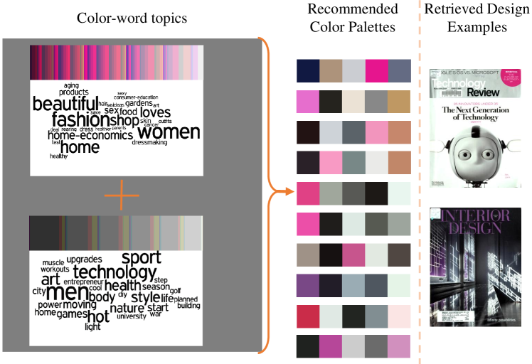
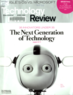
In this paper, we investigate a probabilistic generative modeling framework to associate color combinations with linguistic concepts from professional design examples. The model is an adaptation of LDA-dual, an extension of the popular Latent Dirichlet Allocation (LDA) topic model [Blei et al. (2003)] to jointly link colors and words, and infer color-word topics. Originally, the LDA-dual model was proposed by Shu et al. [Shu et al. (2009)] for complete entity resolution of names in the bibliography of scientific publications. Because LDA is both an inference mechanism and a generative model, our framework utilizes both these features to automatically infer semantics, and to enables more meaningful user interactions for color selection and design. As one application, Fig. 1 shows a system for finding design examples based on color semantics.
In visual design, designers use both colors and words as design elements to carry their messages in a unified form of design. This observation suggests that each design’s theme might be a combination of words and color distributions; and each design may include a proportion of various themes. A similar intuition is argued in LDA [Blei et al. (2003)], for textual documents. That is, a document can be viewed as a proportion of different topics, where each topic is a histogram of words. Although one may adopt LDA to capture the underlying word topics or color topics in design examples, our aim is to simultaneously link both of these topics via our framework. The model produces combined color-word topics. The word topics are multinomial distributions on words; and the color topics are histograms of colors. Later, to facilitate the user interactions, we visualize the word topics as word clouds, and discretize the resulting color histograms to yield a mapping to 5-color palettes.
Seeking good examples of visual design, we collected a relatively large corpus of magazine covers. We chose magazine covers for two reasons: First, by using a variety of data sources including the Internet, archives of our own university library, and widely accessible newsstands, we were able to create a dataset of 2,654 covers from 71 titles and 12 genres. Second, designers spend many days conceptualizing and creating a magazine cover that attracts the audience at first glance, while competing with other magazines on a newsstand [Foges (1999)]. In this process, designers carefully choose a color palette for the cover based on the topic and cover lines of the issue in order to convey a very specific concept.
To verify whether or not users agree with the associations between color combinations and linguistic concepts produced by the model, we conduct a crowdsourced experiment. In particular, users are shown discretized color palettes and a choice of word clouds and are asked to select the most appropriate word cloud for the given color palette. Based on the user feedback, we infer the relevance of the color palette to the word cloud in the experiment.
The flow of this paper is as follows. In Sec. 2, we present a study on color semantics in both theoretical and practical aspects. This section is then followed by Sec. 3 where we review related work in computer science and engineering. In Sec. 4, we discuss how we preprocess the data, and define vocabularies for words and the basis that we use to represent colors in our system. We then discuss the inference and generative mechanisms in the modeling framework in Sec. 5. For ease of visualization, in Sec. 6 we represent the word topics as word clouds, and discretize the resulting color histograms to yield a mapping to a pool of 5-color palettes. We then discuss the design of the crowdsourcing experiments in Sec. 7, and analyze the crowd responses in Sec. 8. In Sec. 9, we suggest a number of applications for color semantics to demonstrate how semantics can enable more meaningful user interactions. We specifically discuss color palette selection and design example recommendation, image retrieval, color region selection in images, and pattern colonization in image recoloring. We conclude this paper and suggest a number of interesting avenues for future work in Sec. 10.
2 Theory of Color Semantics
Colors are colorful: more than physical attributes of objects, colors are cognitive and have names, meanings, and values. In the following subsections, these aspects of colors are briefly reviewed, and the need to understand the role of color semantics in analysis and synthesis of visual designs in HCI is elucidated.
2.1 Color Cognition
While color perception is a rich area of research, color cognition is relatively new [Pylyshyn et al. (1999)]. That is, although color is perceived as the result of wavelength discrimination, it is also cognitive [Skorupski and Chittka (2011)]. Derefeldt et al. [Derefeldt et al. (2004)] elucidate that “cognitive” means that after visual perception, color is classified to a higher level of abstraction into verbal and semantic categories [Humphreys and Bruce (1989), Barsalou (1999)] by a visual task such as color categorization.
Heer and Stone [Heer and Stone (2012)] suggest that when this categorization capability (in the concept of color naming) is deployed in user interfaces that model human category judgements, it might demonstrate more meaningful and novel user interactions. What the boundaries are for color naming, and how this concept can be compared with color meanings has not yet received the attention of scientists.
2.2 Color Naming
The earliest effort to understand linguistic categorization of colors is perhaps the work of Berlin and Kay for elucidating that color naming is universal and related to evolution [Berlin (1991)]. Before their work, most linguists believed that the concept of color naming —associating names with colors— is not universal. As Kay and McDaniel [Kay and McDaniel (1978)] summarize, the two main misconceptions about color naming among linguists were that color naming is a matter of cultural relativism and that semantic primes in languages are discrete entities. The latter doctrine was not able to address compound terms, e.g. green-blue. This inadequacy motivated Kay and McDaniel to describe color categories as continuous functions using fuzzy set theory. The universality claim of color naming [Berlin (1991)] does pertain under some conditions, as explained by Palmer in his book Vision Science: Photons to Phenomenology [Palmer (1999)]. Although color naming associates words with colors, there are other trends of research that investigate meanings and higher level abstractions/semantics of colors.
2.3 Color Meanings and Semantics
The first systematic approach to quantifying “meanings” of linguistic concepts comes from measurement of meaning by Osgood [Osgood (1952), Osgood (1957)]. Osgood proposes a semantic space based on pairs of polar terms, such as happy-sad or kind-cruel, and terms it a “semantic differential” as an “objective index of meaning” [Osgood (1952)]. Osgood then studies cross-cultural generality of his semantic space and finds significant similarities between different primitive cultures [Osgood (1960)]. Later, Osgood compiled a 620-concept Atlas of Affective Meanings, explained in [Osgood (1971)] with a report of cross-cultural studies in 23 cultures. Adams and Osgood [Adams and Osgood (1973)] investigate the 8 color concepts of Osgood’s Atlas —color (vs monochrome), white, grey, black, red, yellow, green, and blue— among 20 countries and report that for instance, the relative affective meaning of red is strong and active. Another similar attempt is due to Wright and Rainwater [Wright and Rainwater (1962)], yet with a more visual communication language perspective in color meanings and connotations. This is where a set of more design-oriented color semantics such as “elegant” or “showiness” emerges.
A breakthrough in design-based color semantics is the study by Kobayashi [Kobayashi (1981)]. Kobayashi defines a meaning scale to relate “worlds of people and objects with worlds of colors” and terms it Color Image Scale [Kobayashi (1991)]. This scale is comprised of two bipolar dimensions: warm-cool and soft-hard. Kobayashi’s scale has significant contributions to visual design: It is based on 3-color combinations (3-color palettes) rather than single color patches (swatches). It also relates these 3-color combinations with two levels of abstractions, one with 180 semantics, and the other with 15 higher level semantics. Because of these characteristics, Kobayashi’s scale is taught in many color courses in schools of design (e.g. see [Green-Armytage (2006)]). Later cross-cultural studies acknowledge the universality of Kobayashi’s bipolar scales [Ou et al. (2004a), Ou et al. (2004b), Ou et al. (2012)]. A similar effort in association of colors and words was undertaken by Sivik as mentioned in [Hardin and Maffi (1997)].
2.4 Color Semantics, Emotions, and Preferences
While investigating meanings of colors, some researchers have attempted to understand the emotions and moods evoked by colors and how feelings about colors can influence our performance (e.g. see [Thüring and Mahlke (2007)] and [Lin et al. (2013a)]). From a psychological point of view for instance, Crozier [Crozier (1996)] argues that theories of preference based on innate and learned reactions should be considered while studying color meanings. Crozier summarizes that red, for instance, has the innate mood of the alert signal and also is involved in sexual behaviour in many species; or white is learned to be associated with purity in some cultures. Although Crozier acknowledges that the like-dislike bipolar scale in prior studies is a useful measure to investigate color moods, he argues that meanings of individual colors should be considered within the context (syntax, semantics, and culture) in which they are examined, also adding other factors such as age and gender.
Later, Ou et al. [Ou et al. (2004a), Ou et al. (2004b), Ou et al. (2004c)] studied color emotions and color preferences to clarify the relations between them. Although their studies agreed with prior work in defined scales of warm/cool, heavy/light, and active/passive, they found notable differences in the like-dislike scale between their two groups of participants, who were Chinese and British. They also found a tendency for their participants to prefer color combinations that hold opposite emotions.
2.5 Color Semantics and Cross-cultural Considerations
Hutchings summarizes that “The Principle of Adaptation of Ideas accounts for regional variations in colour folklore. This embodies a Darwinian-type principle of behavior, that is, ‘to survive within a community, a belief must have relevance to that community”’ [Hutchings (2004)]. Nevertheless, it is observed that in the information era, common sense about colors is increasing [Carroll (2007)]. Such a cultural problem in HCI can be thought of as “minor science” as [Ghassan and Blythe (2013)] suggest.
In a recent cross-cultural study of color emotions of 190 two-color combinations from inhabitants of eight countries: Argentina, France, Germany, Iran, Spain, Sweden, Taiwan, and UK, Ou et al. [Ou et al. (2012)] report consistency for warm/cool, heavy/light, and active/passive. This study also points out some inconsistency for like/dislike. For instance, Argentinian participants preferred more grayish colors in contrast to other participants. However, additional cross-cultural studies could shed light on our knowledge in color semantics and personal preferences.
2.6 Color Semantics in Applied Arts
Krippendorff states that “Design is making sense (of things)” [Krippendorff (1989)]. This sense making in applied arts is often equated with communication via elements of design. Professional designers and researchers have specifically emphasized the role of colors and color semantics as a means of visual language [Green-Armytage (2006), Hutchings (1995)]. In architecture [Hogg et al. (1979), Caivano (2006), Ural and Yilmazer (2010)], interior design [Poldma (2009)], textile design [Lee and Lee (2006)], and product design in marketing [Madden et al. (2000)], understanding values of colors and color semantics is acknowledged as a knowledge that can support not only non-designers, but also professional designers who conceptualize and ideate designs based on their own intuitions. This knowledge can enhance the processes involved in design, such as inspiring, brainstorming, exemplifying, and communicating among designers over design prototypes (see [Poldma (2009)]).
2.7 Color Semantics in HCI
Although some studies in HCI investigate the role of colors in aesthetics and usability [Lavie and Tractinsky (2004), Hassenzahl (2004), Hoffmann and Krauss (2004), De Angeli et al. (2006), Schmidt et al. (2009), Navarre et al. (2009), Moshagen and Thielsch (2010), Lee and Koubek (2010), Reinecke and Bernstein (2011), Sauer and Sonderegger (2011), Reinecke et al. (2013), Thüring and Mahlke (2007), Lindgaard (2007), Hassenzahl and Monk (2010), Lindgaard et al. (2011), Lee and Koubek (2011), Yang et al. (2012)] and performance of the user [Moshagen et al. (2009), Sonderegger and Sauer (2010), Lin et al. (2013a)], the notion of color semantics has been barely addressed. As an example, consider a scenario in which users are surfing the Web for a “massage therapy” website. Users perhaps expect to see a website with color combinations that impress them with “calm”, “soothing”, and “elegant” moods. If the color design of such a website fails to convey these moods, it will then negatively affect the trust, credibility, and marketing of its business (See [Lindgaard et al. (2011), Pengnate and Antonenko (2013)]).
We believe that color semantics is a legitimate challenge to be addressed in various venues of HCI: in automatic design [Lok and Feiner (2001), Gajos and Weld (2004), Hurst et al. (2009), Jahanian et al. (2012), Hunter et al. (2011), Kuhna et al. (2012)], design by example [Hartmann et al. (2008b), Herring et al. (2009), Lee et al. (2010), Kumar et al. (2011)], design grammar [Talton et al. (2012)], design of user interaction [Carroll (1997), Fallman (2003), Löwgren (2007), Zimmerman et al. (2007), Forlizzi et al. (2008), Stolterman (2008), Hashim et al. (2009), Chen (2011)], quantifying aesthetics of design [Lavie and Tractinsky (2004), Datta et al. (2006), Reinecke et al. (2013)], user experience design [Hassenzahl and Tractinsky (2006), Mahlke (2008), Hartmann et al. (2008a), Löwgren (2009), Law (2011), Bargas-Avila and Hornbæk (2011), van Schaik et al. (2012)], and color design [Luo (2006), Tokumaru et al. (2002), Tsai and Chou (2007), Wang et al. (2008), Ou et al. (2009), Hsiao et al. (2013), Jahanian et al. (2013a)]. As Fallman argues, HCI needs to be understood and acknowledged as a design-oriented process in terms of philosophy and theory and methodological foundations [Fallman (2003)]. Dearden and Finlay suggest that we need to identify patterns that are both timeless and culturally sensitive [Dearden and Finlay (2006)]. Hoffmann and Krauss [Hoffmann and Krauss (2004)] conclude that many researchers do not recognize the importance of visual aesthetics in the communication intent. We need to work on semantic color vocabularies and define and propose them as domain-specific knowledge to HCI. This motivates us to revisit the concept of color semantics, utilize it in design mining and data-driven approaches to learn from the work of professional designers, and investigate theoretical and practical aspects of color semantics in user interaction design.
3 Related Work
Our work lies at the intersection of four research areas: color semantics and meaning, probabilistic topic models, user study via crowdsourcing, and click modeling.
3.1 Color Semantics and Meaning
Semantics in computer science and engineering has been observed as a gap [Liu et al. (2007), Eakins et al. (1999), Sethi et al. (2001), Mojsilovic and Rogowitz (2001), Zhou and Huang (2000), Smeulders et al. (2000), Chen et al. (2003)] that merits more investigation. Nevertheless, in terms of color emotions and moods, there is a recent body of work. Csurka et al. [Csurka et al. (2010)] collected a dataset of color combinations and their associated labels, and applied a Gaussian mixture model to the data based on some low level color features of the color combinations. Unlike our work, their dataset is collected from a limited number of good designs suggested in [Eisemann (2000)] and mainly from an online dataset of colors [ColourLovers (2014)] produced mostly by amateurs. The noisiness of the labels in this online dataset was acknowledged by both these authors and [O’Donovan et al. (2011)]. Another difference is that their model does not categorize the color combinations as joint combinations of labels and colors.
Applications of color semantics have recently come to the attention of researchers. In image retrieval, Solli and Lenz [Solli and Lenz (2010)] defined a mathematical framework for Kobayashi’s Color Image Scale. This framework is utilized by [Jahanian et al. (2013b), Jahanian et al. (2013a)] in designing alternative and customized magazine covers for non-designers based on color moods. For color mood transfer of images, Murray et al. [Murray et al. (2012)] applied the 15 moods suggested by Csurka et al. [Csurka et al. (2010)]. In contrast to our work, where we use human judgment to evaluate the goodness of our model, they use human input to build their models. In design mining the Web, Kumar et al. [Kumar et al. (2013)] reported using expressive colors (color moods) to support data-driven design tools.
In researching linguistic categorization of colors, color naming and its cross-cultural aspects are topics that have been under investigation for decades [Palmer (1999)]. There is a body of work in computer science and engineering to model color naming (e.g. [Mojsilovic (2005)].) In recent work, Heer and Stone [Heer and Stone (2012)] reviewed statistical color naming models, with the goal of fitting a model to single colors and their associated names. These associations are either from human judgments or retrieved from Internet search engines. For the latter, topic modeling was explored by Weijer et al. [Van De Weijer et al. (2009)] who used Probabilistic Latent Semantic Analysis (PLSA), and Schauerte and Stiefelhagen [Schauerte and Stiefelhagen (2012)] who used Latent Dirichlet Allocation (LDA). In contrast to color naming, our color semantics work takes into consideration design examples, color combinations, and different levels of abstraction. Also, unlike prior work, we adapt topic models to jointly link colors and words, and then verify the associations through user studies.
3.2 LDA Topic Modeling
The goal in LDA topic modeling is to infer underlying themes or topics of textual document corpora, where each topic is a multinomial distribution over words, and each document is a mixture of topics [Blei et al. (2003), Blei (2012)]. Because for color semantics we need to infer compound (color-word) topics, we adapt LDA-dual [Shu et al. (2009)] by viewing each magazine cover as a combined bag of words and colors. The closest work to our research is perhaps [Feng and Lapata (2010)], where LDA is used for image annotation. The authors consider a document as a mixture of low level image features (extracted by SIFT techniques) and words. However, in our adaptation of LDA-dual model, we incorporate two independent multinomial distributions, one each for observed colors and words.
3.3 User Studies via Crowdsourcing
Viability of crowdsourcing graphical perception, including color visualization, has been confirmed by recent work of Heer and Bostock [Heer and Bostock (2010)]. In several tests, they replicated the results of prior laboratory experiments using crowdsourcing and reported consistency between the results. The scalability yet inexpensiveness of online experiments involving color overrides some of their limitations, such as the inability to control for variations in visual acuity. For instance, Lin et al. [Lin et al. (2013a)] employ crowdsourcing to confirm improvement in subjects’ performance when color semantics is utilized in information visualization. Reineke et al. [Reinecke et al. (2013), Reinecke and Gajos (2014)] utilize cross-cultural crowdsourcing to study some perceived aesthetics aspects of visual complexity and colorfulness in a dataset of website designs. Inspired by their online setup, we also captured demographic information from the subjects during our crowdsourcing experiments. However, we emphasize that our goals from the crowdsourcing experiments are completely different from work of Reinecke et al. While they wish to infer bias in perception based on demography and cultures, we use this information to validate the output of a statistical model.
3.4 Click Modeling
The goal in click modeling is to model the user’s interactions with sponsored search results or ads. In a recent work, Govindaraj et al. [Govindaraj et al. (2014)] reviewed click models, and suggested a new model by taking into account relations between the user’s clicks on a list of URLs (provided by a search engine in response to the user’s query). Modeling the user’s back and forth clicks on a list of URLs, they then infer the probability of clicking on different vertical positions of URLs, regardless of their contents. Inspired by this work, we treat the participants responses as a click modeling problem. Arguably our model is simpler than that proposed by Govindaraj et al. However, unlike web-search where the user can choose not to click on any of the results, in our case the user needs to make a choice. Furthermore, since our users participate willingly in our study, the level of user engagement is high. Therefore, we believe that our simple model suffices.
4 Data Collection
Our dataset of magazine covers includes 2,654 covers from 71 magazine titles and 12 genres. We collected approximately 1,500 of these covers by scanning them from magazines held by a number of libraries and newsstands in our university. The rest of the cover images were downloaded from the Internet. Although we developed a web crawler tool to collect magazine covers, because many magazine publishers do not provide archives with high quality images, in half of the cases we had to collect online images by hand111This data will be made available for academic research upon request.. We attempted to collect roughly 12 different genres of magazines to capture different contexts of design. These genres include Art, Business, Education, Entertainment, Family, Fashion, Health, Nature, Politics, Science, Sports, and Technology. To this end, we loosely followed the Dewey Classification method [OCLC (2014a)], the WorldCat indexing system [OCLC (2014b)], suggestions from our librarians, as well as the description of the magazine by the publishers. Table \@slowromancapi@ in the appendix contains a summary of our dataset. Note that the genres are tentative. In fact, this supports the use of LDA: magazines rarely include only one topic and usually are a combination of different topics (or genres in this context).
4.1 Preprocessing
The preprocessing of cover images was performed using the Matlab Image Processing toolbox222The MathWorks, Inc., Natick, MA.. We use 512 basic colors obtained by quantizing the sRGB color space with 8 bins in each channel. Given this color basis, each magazine cover (image) is then a histogram of these colors. To feed the images to LDA-dual, we scale them to 300200 pixels using bicubic interpolation. The down-sizing was done to reduce the computation without affecting the distribution of the colors in the images.
To extract color palettes from the images, we used the color theme extraction code by [Lin and Hanrahan (2013)]. In their implementation, the algorithm needs to take the saliency map of the given image (using the code by [Judd et al. (2009)]), as well as the segmentation of the given image (using the code by [Felzenszwalb and Huttenlocher (2004)]). In our work, we however used the saliency map code by [Harel et al. (2007)], since it was easily accessible. Note that these color palettes are not the input to the model, but are later used to visualize the inferred color combinations.
4.2 Word Vocabulary
To capture the words to be associated with color distributions of the magazine covers, the words on the covers were transcribed by hand. To create a word vocabulary, we first prune the transcribed words and then create a histogram of words. Because a more meaningful vocabulary results in more meaningful topics, we filter out special characters, numbers, common stop words333Provided by MySQL database, available at https://dev.mysql.com/doc/refman/5.1/en/fulltext-stopwords.html. (e.g. articles and lexical words), and an additional handcrafted list of stop words (see Table \@slowromancapii@ in the appendix). Compound words formed with a hyphen or dash are decomposed. A version of the Porter Stemming algorithm [Porter (1980)] is used to equate different forms of a word, for instance “elegant” and “elegance.” Finally, a mapping from month to season is applied. In order to include the context and classes of the magazines with the associated words, the periodical category to which each magazine title belongs was added to the set of words. We collected these periodical categories from the WorldCat indexing system, which is the largest international network of library content and services [OCLC (2014b)].
5 Statistical Model
When ideating about visual design, the designer takes into account the topic or the context within which he or she is asked to convey his or her message. For instance, when the context is politics, the designer may tend to use darker, “heavier” and more “formal” colors. However this is not the only factor, the words in the design also influence the designer’s choice of colors. Figure 2 illustrates that pink — which is usually used for topics related to feminity — has been used in a variety of magazines from different genres. This observation suggests that each design’s theme might be a combination of words and color distributions; and each design may include a proportion of various themes. Our goal is to model these combinations of words and colors, and infer proportions of these combinations in magazine cover designs. A similar intuition has been argued in statistical topic modeling, specifically LDA [Blei et al. (2003)], for modeling word distributions in documents as proportions of different word topics.
LDA (Latent Dirichlet Allocation) is an intuitive approach to infer topics from text data. As Blei et al. [Blei et al. (2003), Blei (2012)] describe, instead of categorizing and exploring documents using tools such as keywords, we may first categorize documents based on topics. This allows us to explore topics of interest and find related documents. For example, a document about sociology may include different topics, such as biology, evolution, history, and statistics with different proportions. Each of these individual topics can be viewed as a multinomial distribution over a fixed vocabulary of words. Accordingly, each document, which can be viewed as a bag of words, is a combination of these topics with some proportions. Typically, a value for the number of topics is chosen by hand. The latent topics, as well as the topic proportions of each document, are inferred by LDA using the observed data, which are the words in the documents.
Just as word topics are distributions over words, one may think of color topics as distributions over colors. One may argue that by only using LDA, we might be able to model the distribution of the colors on the covers, and infer the color topics. We could then utilize crowdsourcing, and ask participants to label the inferred color topics to include combined color-word topics, and hence the color semantics associations. The problem with this approach is that we cannot capture the associations created in each design by the designer. Moreover, we cannot perform this modeling in an automatic fashion, since we need human judgements to label the color topics, and this labeling will be performed by naive subjects. Hence, we will lose the valuable insight that the designer put into selecting color and word topic combinations.
A better approach is to model the links or the associations between the color topics and word topics to infer combined color-word topics. This means that the LDA model framework needs to be extended. Such an extension was recently proposed by Shu et al. [Shu et al. (2009)]. The key to this extension is the proportions vector . In our case, for each cover design, the proportion is a combination of color assignments, as well as word assignments. Similar to LDA, these assignments are modeled with multinomial (and conjugated by Dirichlet) distributions.
5.1 Review of LDA-dual Model for Color Semantics
In this section, we review the LDA-dual model proposed by Shu et. al [Shu et al. (2009)], and explain how to adapt this model for color semantics. Our implementation444Our implementation is available upon request. is an extension of the Matlab Topic Modeling toolbox [Steyvers and Griffiths (2014)] developed by [Griffiths and Steyvers (2004)] for LDA.
Assume that there are color-word topics denoted by and magazine covers denoted by . Let denote the number of words in the vocabulary and denote the number of color swatches, where each swatch is a patch of color defined by using its sRGB values555Recall that we discretize and use eight values for each of the three sRGB color channels. Therefore, .. Moreover, let denote the number of words and denote the number of color swatches in magazine cover . Let denote the -th word in the -th document and denote the -th color swatch in the -th document. Each magazine cover includes some proportion of each word topic, as well as each color topic. Let denote the word topic assignment to the word and denote the color topic assignment to the color swatch . Note that these assignments are latent. Also let and denote the multinomial distributions of the word topics and the color topics, respectively.
Each magazine cover includes some proportion of the color-word topics. These proportions are latent, and one may use the dimensional probability vector to denote the corresponding multinomial distribution for a document .
Let , , and be the hyper-parameters of the three Dirichlet distributions for the color topics, word topics, and the proportions , respectively. Let denote the Dirichlet distribution, and denote the discrete distribution that is drawn from a Dirichlet distribution.
Given the above notation, the generative model for LDA-dual can be written as follows:
-
1.
Draw word topics .
-
2.
Draw color topics .
-
3.
For each document :
-
•
Draw .
-
•
For each word with
-
–
Draw
-
–
Draw
-
–
-
•
For each color with
-
–
Draw
-
–
Draw
-
–
-
•
A graphical model for this generative process is illustrated in Fig. 3, where the shaded nodes denote observed random variables and the unshaded nodes are latent random variables.
If we let , , , , , , , , and , then the joint distribution corresponding to the LDA-dual model above can be written as
| (1) |
Figure 4 provides a graphical illustration of the generative mechanism and the inference procedure described below. This figure is a symbolic representation of the model. In each sub-figure, a cylinder represents a color-word topic. Each arrow represents the probability of each cover being drawn from a given color-word topic. Each cover includes a histogram of colors and a list of words (each word is superscripted by its corresponding color-word topic). In the generative process, we know the distribution of the color-word topics, and can produce the distribution of the colors and words on the magazine covers. For instance, “Cover 1” is completely (with probability ) generated by color-word topic 1. “Cover 2” is generated by equal distributions of both “color-word topic 1” and “color-word topic 2”. In the statistical inference mechanism, we only know the distribution of the colors and the words for each cover. We do not know (represented by question marks) the color-word topics, their proportions, and the assignments of the colors and words of each cover to these color-word topics.
5.2 Inference
Since and are observed, inference entails computing
| (2) |
Theoretically, the above distribution can be obtained by computing the joint probability distribution of the latent and the observed variables, and then computing the marginal probability of the observations. In practice, however, topic modeling algorithms approximate the result to bypass the computational complexity of the solution. There are often two approaches for this approximation [Blei (2012)]: variational inference [Jordan et al. (1999), Teh et al. (2006)] and Markov chain Monte Carlo (MCMC) sampling [Andrieu et al. (2003), Griffiths (2002)]. For the sampling approach, the collapsed Gibbs version of sampling is discussed in [Porteous et al. (2008), Griffiths and Steyvers (2004), Shu et al. (2009)]. We extend MCMC collapsed Gibbs sampling version implemented in the Matlab Topic Modeling toolbox [Steyvers and Griffiths (2014)] developed by [Griffiths and Steyvers (2004)] for LDA (see [Jahanian (2014)] for our derivations of LDA-dual).

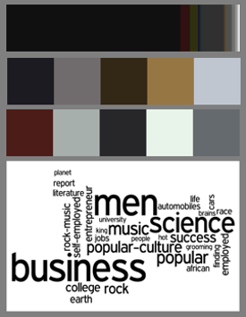
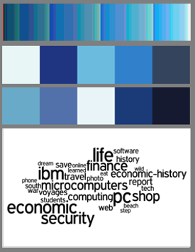
Although some variants of LDA can automatically find an optimal value for the number of topics , based on our domain knowledge from the data collection process, we simply set . Because each color-word topic includes proportions of the color basis and the vocabulary words, we visualize a topic as a pair of colors and words histograms. Figure 5 (a) illustrates the 12 topic histogram pairs for , , and . We tuned the values for , , and by trial and error to produce visually pleasing color histograms and semantically meaningful word histograms. The visualized histograms just illustrate the principal components. Of course, other levels of granularity can be visualized if needed (see [Jahanian (2014)] for more examples). Note that in this figure, similar to “WORD_TOPIC_1”, “COLOR_TOPIC_1” is a distribution over some colors. WORD_TOPIC_1 itself has some proportion in the entire dataset (). The summation of all the word topics proportions is . Similarly, all the color topic proportions add up to . Here, just for visualization, we show the length of each color topic based on its ratio to the color topic —COLOR_TOPIC_4, which has the largest proportion.
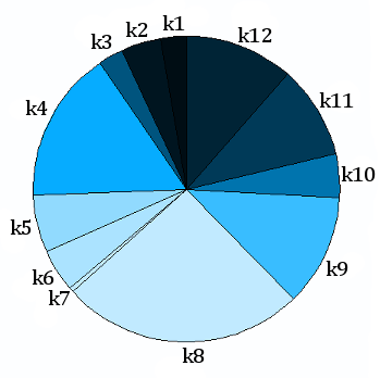
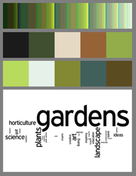
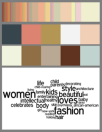
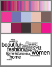
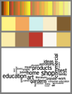
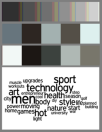
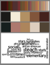
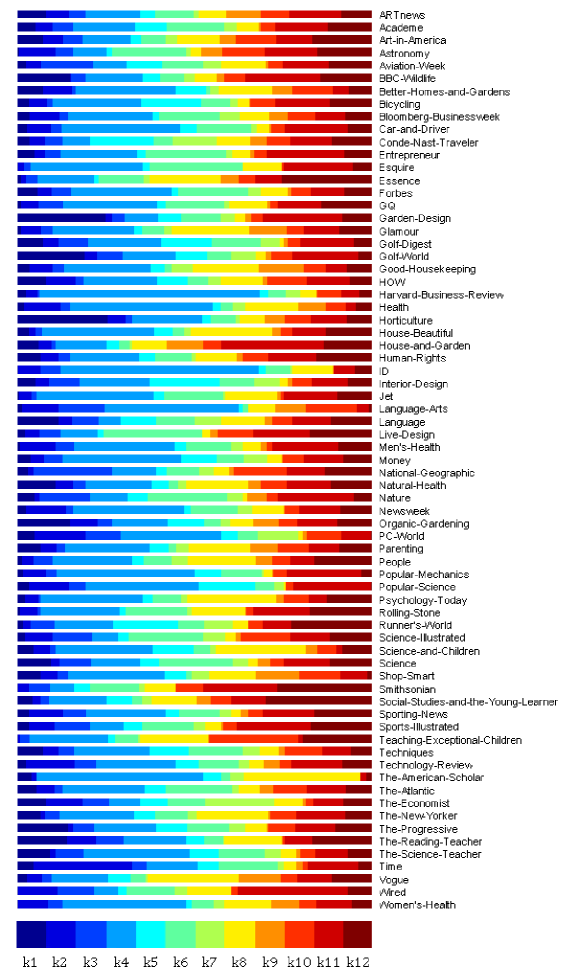
Figures 5 (b), (c), and (d) illustrate the proportions of each of the inferred color-word topics for three magazine title designs in the dataset. For instance, note that Vogue as a fashion magazine has and as two of the dominant color-word topics. As can be seen, and contain words such as “women”, “fashion”, “love”, and “beauty”, while the corresponding color histograms contain pastel and pink colors, which are often associated with fashion magazines. On the other hand, Horticulture, which is a nature magazine, has the highest proportion of , which pre-dominantly contains shades of green. The words in include gardening-related words such as “gardens”, “landscapes”, and “plants”. See Fig. 14 for all 71 magazine titles.
6 Interpreting The Model Output
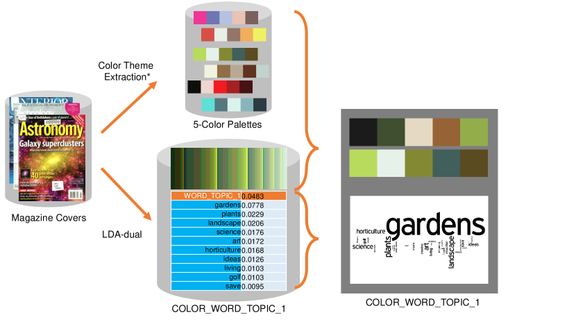
Visualizing the results of LDA is a topic of research [Chaney and Blei (2012), Chuang et al. (2012)]. Chaney and Blei [Chaney and Blei (2012)], for example, suggest a visualization mechanism for exploring and navigating through inferred topics from LDA and their corresponding documents. Although their work does not completely address the usability evaluation of this mechanism, it inspired our visualization mechanism for our user study. In order to evaluate the color semantics hypothesis, we need to display both the color histogram and the word histogram to the participants in our user study in a comprehensive, yet unbiased fashion. We address this via a two-step process. The word histograms are converted to word clouds, while the color histograms are converted to color palettes using the mechanism described below. Figure 6 illustrates the visualization process.
6.1 From Color Histograms to Color Palettes
We use 5-color palettes as proxies to represent each of the color histograms in Fig. 5 (a). These palettes are drawn from a pool of 5-color palettes, one for each magazine cover in the dataset (refer to Sec. 4.1 for the mechanism of creation of this pool).
The intuition behind using 5-color palettes is that when designers are asked to design a media piece, they often choose a 3-color, 5-color, or occasionally a 7-color palette, and consistently use it; so that their designs are clean and sophisticated, as opposed to busy and cluttered.
In order to find the 5-color palettes that are closest to the color topic histograms, we define a similarity metric as follows: Let denote a color topic histogram with the 512 color basis defined earlier, and denote a 5-color palette. An intuitive similarity metric is the Euclidean distance between color swatches of and . Among the possible color spaces, we choose the CIE L*a*b* color space with a D65 reference white point. It is considered to be a perceptually uniform space, where around (the distance between two colors) corresponds to one JND (Just Noticeable Difference) [Sharma (2002)].
Defining the color similarity distance problem as a bipartite graph matching between and with and nodes, respectively, we find the minimum distance cost of this graph using the Hungarian method [Kuhn (1955)]. Equation 3 defines the weighted Euclidean distances between the nodes of these two graphs. Here, the weight corresponds to the weight of the -th color in the color topic histogram ; and denotes the distance in CIE L*a*b* between the -th color from and the -th color from . This metric can be thought as a version of The Earth Mover’s distance suggested by Rubner et al. [Rubner et al. (2000)] for image retrieval, with the weight vector representing color importance.
| (3) |
Computing for a given color topic histogram and all 5-color palettes, we can choose the closest of them as proxies to the histogram (see Fig. 6). In the user study, we present two series of questions for the first and the second closest color palettes, because just one color palette may not provide an adequate visualization of the entire topic histogram. See Fig. 13 for the entire color-word topics.
6.2 From Weighted Bag of Words to Word Clouds
Figures 6 illustrates how we visualize each word topic histogram with a word cloud. The word cloud (or tag cloud) is a visualization technique used to show the relative weights of words through different font sizes. The weights resemble frequency of occurrence or importance of the words in a word dataset. A suite of word cloud algorithms and their usabilities are discussed in [Seifert et al. (2008)]. Because of the popularity of word clouds in visualizing categories, and the fact that words are randomly scattered over a layout, we used this technique in our user study. Using wordle666http://www.wordle.net, we generated black and white word clouds to avoid introducing any color bias. Note that whereas we chose two color palettes for each color topic, we developed only one word cloud for each word topic.
7 User Study
The main aim of this section is to validate the output of the probabilistic topic model. In particular, we want to understand if casual users (who are not necessarily designers) agree with the association between color combinations and linguistic concepts produced by our model.
7.1 Participants
Our color semantics online survey777http://goo.gl/P4W9XL is hosted at our university’s survey system. It was advertised through social networks and the university email network. So far, we have collected 859 responses from 487 (56.69%) females, 367 (42.72%) males, and 5 others (0.58%), in the age range of 18 to 80 years (with mean ). The participants are from 70 countries and natively speak 66 different languages, with the majority from the US (59.84%). There are 348 (40.51%) participants who have lived in more than one country. There are 352 (40.97%) participants with college degrees, 451 (52.50%) with graduate degrees, and 55 others (pre-high school, high school, and professional degree). The majority of the participants, 716 (83.35%) are non-designers. In contrast, there are 130 (15.13%) participants with three or more years of experience in visual design (including graphic design, interior design, and textiles.)
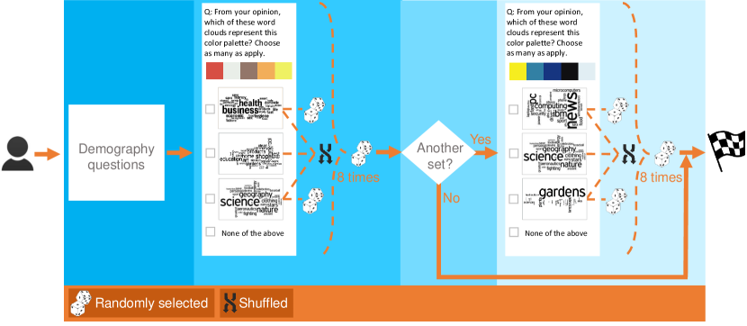
7.2 Stimuli and Procedure
Figure 7 illustrates the flow of the survey. In order to simulate a matching experiment between pairs of color and word topics, we designed a question as follows: one 5-color palette is shown in the left side of the screen, and three shuffled and randomly chosen word clouds, as well as a “None of the above” option are shown on the right side arranged in vertical order. Each question is a multiple choice (represented by multiple choice check boxes). For each question, we asked the participant to choose as many word clouds, as in his/her opinion apply to the 5-color palette shown. If the participant felt that none of the word clouds applied to the 5-color palette, he/she could choose “None of the above”. Among the three randomly drawn word clouds, one is the word cloud inferred from the model.
The survey is divided into two subsets of questions. The reason for this is that otherwise some participants may lose interest in finishing the experiment. This observation was made in the pilot experiment 888This pilot experiment is hosted at http://goo.gl/WFnjHL. The data collected for this experiment is available upon request.. More specifically, we created 24 questions for the first and second closest 5-color palettes corresponding to the 12 inferred color topics. However to avoid exhausting the participants, we randomly draw 8 questions from the 12 questions of the closest color palettes and ask the participants to answer them. Then we ask the participants if they would like to continue by taking another set of 8 questions (this time drawn from the 12 questions of the second closest color palettes). Of all participants, 61.35% of the users chose to continue, and answered all 16 questions.
Note that the reason for shuffling the word clouds in each question is because we conjectured that there might be a position bias in the vertically arranged options. In Sec. 8, we explain how we were inspired by the click model in [Govindaraj et al. (2014)], and utilized this framework to analyze the experimental results.
8 Interpreting the User Study
In this section we explain the statistical inference mechanism that we used to understand the user responses.
8.1 Statistical Model
First, we define some notation. Let denote the event that the -th color palette was displayed. Also, let denote the event that the user selected (clicked on) the -th word cloud, and denote the probability that the -th word cloud was selected by the user in response to the -th color palette. In order to compute we note that
| (4) |
There are three possible positions at which a word cloud can be displayed. Let denote the event that the -th word cloud was displayed at position , and let denote the event that the user selected the -th word cloud which was displayed at the -th position. Then
| (5) |
If denotes the event that the -th word cloud was selected for display and the event that it was displayed at position , then
| (6) |
According to our experimental design, each word cloud has an equal probability of appearing in any one of the three positions. Therefore
| (7) |
On the other hand, we always select the -th word cloud (the true word cloud according to our model) for the -th color palette. The other two slots are filled by selecting any two of the remaining 11 word clouds uniformly at random. Therefore
| (8) |
All that remains is to estimate . For this task, we borrow from the cascade click model [Govindaraj et al. (2014)] and write the probability as a product of the following two factors:
-
•
the probability that the -th position is examined by an user, the so-called position bias. It is denoted as .
-
•
the intrinsic relevance of the word cloud to the color palette . This is the quantity that we seek to infer from the user responses; and we will denote it as .
In other words,
| (9) |
and by using (5) and letting , we can write
| (10) |
Note that can be pre-computed as follows:
| (11) |
where denotes the total number of trials (each question in our survey is equivalent to one trial), and denotes the number of times the word cloud at position was selected in any of the trials. In our experiments, we found the position bias of the options (in the vertical order) for the first set of the questions to be (in turn); and (in turn) for the second set of the questions. Note that for each set, these numbers do not sum up to , because of the fact that the participant could choose more than one word cloud.
These numbers indicate that the position bias for each option is not equal, and even though we shuffled the three choices of word clouds in the first three vertical positions, we need to account for the position bias. We note that the fourth option —“None of the above”— is clicked less than the other options. This indicates that our participants wished to provide an answer, as well as the fact that they may have not thought that the associations between the word clouds and the colors were too abstract. We also note that in the second set of the questions, the fourth number is lower than the one in the first set of questions. This perhaps means that the participants who chose to participate in one more set of the questions in the survey were more confident regarding their conclusions.
As the last step, let denote the number of trials in which the -th color palette was displayed, and denote the number of trials in which the -th color palette was displayed and the -th word cloud was selected. We can assume that the trials are independent, and therefore the probability of observing this data under model (10) can be written as
| (12) |
The maximum likelihood estimate for is simply , from which we can infer , the maximum likelihood estimate for , as
| (13) |
8.2 Analyzing the Results
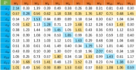
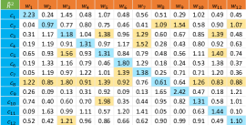
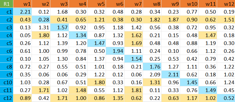
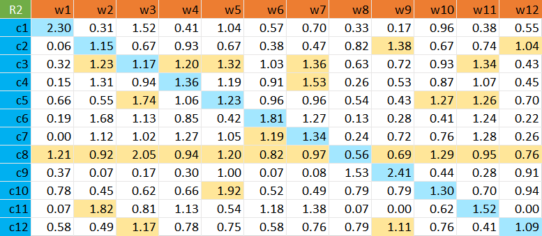
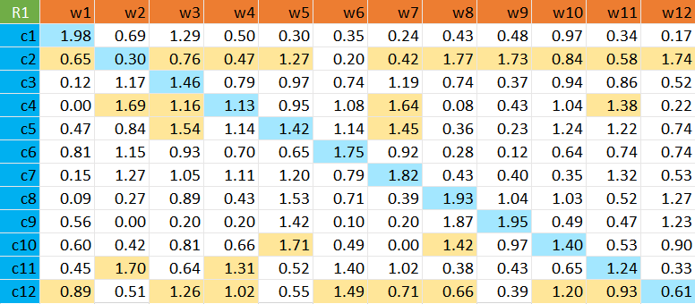
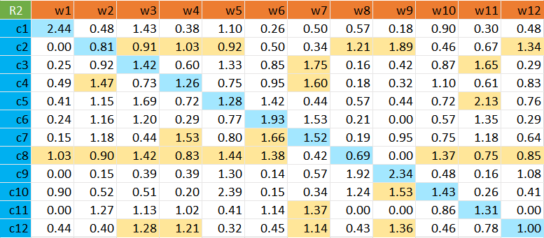
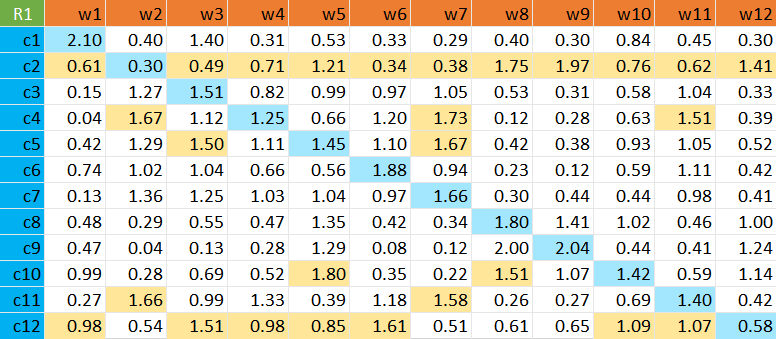
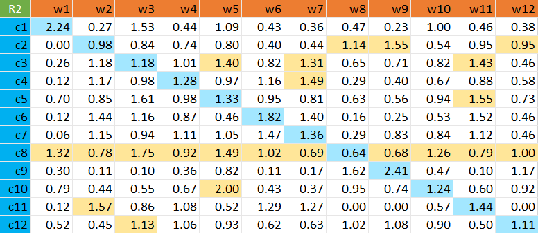
Figure 8 illustrates two relevance matrices and . (resp. ) corresponds to the inferred relevance of the first (resp. second) closest color palette to the word cloud produced by LDA-dual. The rows are color palettes, as proxies to color topics histograms, and the columns are word clouds, as proxies to word topics histograms. The -th elements of these matrices are the intrinsic relevance values , computed from the observed responses of the participants using the model described in the previous section. Higher values of mean that the users found a high correlation between the -th word cloud and the -th color palette. If the participants find the word cloud produced by our model to be the most relevant for a given color palette, then the diagonal entries, marked in blue, should contain the highest values. Whenever an off-diagonal entry is larger than the corresponding diagonal entry, it is marked yellow in the figure.
Note that for the first set of 12 color palettes, subjects selected the “None of the above” option on average for of the trials. The minimum was , which occurred for ; and the maximum was , which occurred for . For the second set of 12 color palettes, the average was . The minimum was , which occurred for ; and the maximum was , which occurred for . Frequent selection of the “None of the above” option for a given color palette suggests that participants had more difficulty associating this palette with the word clouds that were shown. In the relevance matrices, we do not compute the numbers for each color palette against the “None of the above” option. Thus the matrices do not contain the 13-th column. However, if the participant has selected “None of the above” as well as other options, we take into account those options. One reason for this decision is when the participant chooses an option along with this option, he/she may feel that the other option applies but he/she is not certain about it.
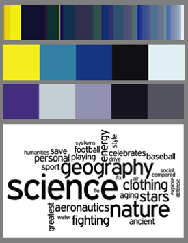
As it is observed from the relevance matrices in Fig. 8, in most cases the diagonal elements are higher than the off-diagonal elements. This indicates a strong correlation between the results of LDA-dual and the opinion of the participants (also see the next section for an aggregated measure). We studied the entries with the highest relevance values such as and . Referring to Figs 13 (a) and (i), one reason these values are high could be because green for “garden” () and pink and purple for “fashion” and “women” () are intuitive and widely accepted associations across different cultures.
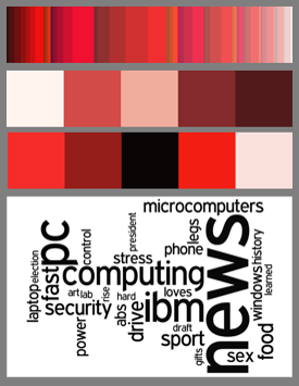
There are a few color palettes such as in where the users assign higher relevance to word clouds other than the one produced by the LDA-dual model. To understand this, note that in Fig. 13 (b), the first 5-color palette which is predominantly contains shades of red and black. Unsurprisingly, users assign higher relevance to word clouds and , which are about “sex” and “beauty.” In our dataset however, the red and black color combinations are often used by news magazines such as Time and The Economist, and computer magazines such as PC Magazine. One can perform a similar analysis for other color palettes such as in and in to infer why there is a mismatch between the model output and the relevance values assigned by the users. This also shows why it is important to perform a user study; domain specific color palettes and their associated linguistic concepts may not always transfer to a general context.
To understand differences between female versus male and non-US versus US participants, we computed the corresponding relevance matrices (see Fig. 15). Comparing these matrices with Fig. 8, we do not observe any significant differences. This indicates that our results do not depend significantly on the gender or cultural background of the users. However, when we compare the designers versus non-designers, we note that there are more zero values in the off-diagonals for designers. This indicates that designers exhibit a stronger bias against selecting certain word clouds for certain color palettes, perhaps because of their training [Whitfield and Wiltshire (1982)].
8.3 Aggregated Measures
We have defined two different measures to assess the strength of the relationships of elements in a matrix as indicated by the magnitude of the diagonal elements relative to the off-diagonal elements in each row. For the definitions below, it is assumed that the matrix elements are all non-negative, and are defined from
| (14) |
for each relevance matrix and .
The first measure is the diagonal dominance . For each row, it is simply the ratio of the diagonal element in that row to the average value of the non-diagonal elements in that row:
| (15) |
where is a diagonal element, and is the mean of off-diagonal elements:
| (16) |
To get a summary assessment, we can average the diagonal dominance over all the rows of the matrix:
| (17) |
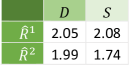
For the two matrices and in Fig.8, the average diagonal dominances are and , respectively (see Fig. 9). So on average, the diagonal element is twice as large as the other elements in the row. This suggests that despite the wide variability of the data in the matrices, the diagonal elements do tend to dominate.
The second measurement is the diagonal separation . It is also defined for each row, and is also a ratio:
| (18) |
The numerator is the absolute value of the difference between the diagonal element and the mean of the off-diagonal elements in that row. The denominator is the standard deviation of the off-diagonal elements in that row:
| (19) |
To get a summary assessment, we can again average the diagonal separation over all the rows of the matrix:
| (20) |
As Fig. 9 summarizes, for matrix (Fig. 8 (a)), the average diagonal separation is . Thus, on average, the diagonal element is more than two standard deviations away from the mean of the off-diagonal elements. This is a very good level of separation. For the second matrix, (Fig. 8 (b)), the average diagonal separation is . While this is not as large as it is for the first matrix , it still indicates very good separation.
Overall, these two separate measures support the conclusion that on average, the diagonal elements are, indeed, significantly stronger than the off-diagonal elements.
9 Applications
Similar to the applications of color naming proposed by Heer and Stone [Heer and Stone (2012)], in order to illustrate how color semantics enables more meaningful user interactions, we present a number of applications in color palette selection and design example retrieval, image retrieval, and recoloring images using semantics.
9.1 Color Palettes Selection Using Semantics
One way to make design accessible to the masses is to recommend design elements and design examples. In content creation, for instance, the user needs to use a color combination that is both appealing and aligned with his/her purpose of design. While this need seems more immediate for the non-designer, a designer may also prefer to see examples for a more creative or even an inspiring color combination. Our inferred color semantics can be applied in color palette recommendation. Although there are pools of color palettes available online [Incorporated (2014), ColourLovers (2014)], it is not easy to navigate, find, or recommend a set of palettes based on the user’s need (see [O’Donovan et al. (2011)] and [O’Donovan et al. (2014)]). Consider a scenario in which the user wishes to find a color palette that conveys meanings of both “technology” and “fashion.” Figure 1 illustrates such a scenario, where the user queries for “techy fashion”. This type of query is mapped to the word topics, and from them to their corresponding color topics. We then map these color topics to a set of color palettes in a pool of color palettes, created from the magazine dataset using techniques in [Lin and Hanrahan (2013)]. The user can then choose his/her preferred color palettes from the recommended set.
9.2 Design Example Recommendation
Another plausible application that could use our color semantics is recommendation of alternative designs. This can be done in several ways, i.e. by using a given a set of recommended color palettes (see Fig. 1), or directly, just by taking color semantics as the user’s input. Providing such examples can be utilized in creativity support tools [Shneiderman (2009)]. It can also facilitate design prototyping [Dow et al. (2010)]. Similarly, translating the associations inferred from the magazine covers to other kinds of media such as website remains a topic for future work. Because LDA-dual is a generative model, it can be used in automatic creation of designs based on the user’s preferences, similar to magazine cover design [Jahanian et al. (2013b)], and website design [Kumar et al. (2011)]. Utilizing generative models can also leverage the design-driven studies in HCI [Talton et al. (2012)].
9.3 Image Retrieval Using Color Semantics
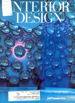
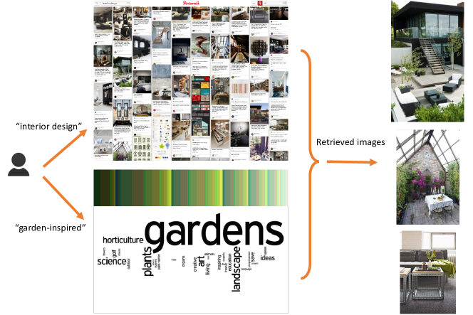
The gap of color semantics in computer vision, specifically for image retrieval, has been emphasized by prior work [Smeulders et al. (2000), Sethi et al. (2001), Mojsilovic and Rogowitz (2001), Liu et al. (2007)]. Nevertheless, the associations of color combinations and linguistic concepts can be utilized in designing high level image features for both current image retrieval algorithms [Solli and Lenz (2010)] as well as deep learning algorithms [Couprie et al. (2013), Socher et al. (2013)]. Figure 10 illustrates an application of our inferred color semantics in image retrieval. Consider a scenario in which, the user first makes a query in an image search community, e.g. Pinterest [Pinterest (2014)] about “interior design”. As a results, a number of images will be retrieved and suggested to the user. However, in order to explore and navigate through the retrieved images, the user may query for “garden-inspired” images. In this case, we are able to map this query to the color-word topics, and rank the already retrieved images based on the color topic histograms that represent “garden”.
9.4 Image Color Selection Using Semantics
As Heer and Stone [Heer and Bostock (2010)] note, a common interaction in image editing is to find a region of colors. They suggest two types of color region mechanisms based on color names: color name queries from the user, and using the magic wand tool. In our case, we use the user’s query and present the set of pixels that semantically contributes to the colors of an image. Figure 11 illustrates this kind of interaction. Figure 11 (a) is the original image, a screenshot of a travel agency website [TripAdvisor (2014)] nominated as one of the best designs (based on people’s votes) according to the Webby Awards 2014 [WebbyAwards (2014)]. We are interested to know what color regions have contributed to “travel” and “shop” in this image. Figure 11 (b) represents these regions, while turning the other regions to grayscale mode.


Note that in order to find these color regions we map the user’s queries to the word topics, and preserve their associated color topics in the image. Of course, utilizing the current image segmentation techniques leads to a smoother pixel selection.
9.5 Image Recoloring Using Semantics
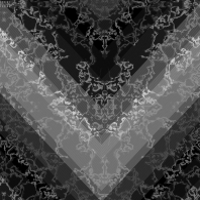
Given the fact that colors communicate messages, designers often modify color themes of their designs. Part of this color modification may involve recoloring an image [Lin et al. (2013b)], transferring a color theme to an image [Murray et al. (2012)], or enhancing a color theme of an image [Wang et al. (2010)]. In this section we suggest an application of color semantics for colorizing patterns (Fig. 12), based on techniques introduced by Lin et al. [Lin et al. (2013b)]999The recolored patterns in this paper are produced by S. Lin, at our request..
Figure 12 (a) illustrates a grayscale pattern. Using the color semantics associations, we are able to accept a user query, map it to the word topics, and use a 5-color palette as a representative of this color topic to colorize the original pattern. Figures 12 (b), (c), and (d) illustrate the results of colorizing the original pattern using “science”, “shop”, and “sports” and “men” queries, respectively.


10 Conclusion and Future Work
Taking into account that the goal of visual design is both to convey a message and to appeal to audiences aesthetically, we investigate design mining of designers’ thought processes in associating colors with linguistic concepts. We collected high quality examples of good designs, a dataset of 2,654 magazine cover designs in 71 titles and 12 genres. We then adapted LDA-dual, an extension of the popular LDA topic model, to simultaneously explain both designers’ choice of colors and choice of words on the magazine covers. To verify the inferred color semantics with the wisdom of the crowd, we used a crowdsourcing experiment. The results confirm that our model is able to successfully discover the association between colors and linguistic concepts. This completes the loop of our design mining system, from hypothesis inference to validation.
Our user study shows that users across different countries, gender, and age groups largely agree with the colors and linguistic concepts associations produced by our model. However, to put this in context, note that our experiment is biased toward an audience that is capable of reading and understanding the English language, is mainly college educated, and has access to the Internet. Arguably, the Internet is globalizing design by melting cultural perceptions [Carroll (2007)]. Nevertheless, studying color semantics in different cultures and folklore (similar to [Reinecke and Gajos (2014)] in studying aesthetics of low level features of colors) can increase our understanding of customized designs and hopefully help both designers and non-designers in communicating with their audiences.
We then suggest a number of applications for color semantics to demonstrate how semantics can enable more meaningful user interactions, and perhaps help masses to design better. We specifically discuss color palette selection and design example recommendation, image retrieval, color region selection in images, and pattern colonization in image recoloring. Nevertheless, at this stage, these applications are not final tools. They need to be investigated more in terms of user experience design, and to be evaluated how much they can actually facilitate user interactions. Incorporating these applications in current design creation tools is also part of the future work.
The present work is a first step towards our broader goal of making design accessible to the general public. We believe that this work can open up a number of interesting avenues for future work, some of which we now discuss.
10.1 Visual Design Language and User Interaction
From a broader perspective, association of linguistic concepts with design elements, specifically colors, can accelerate the development of a visual design language. This can enhance the user interaction mechanisms to be more intuitive and cognitive, and the user’s involvement in design tasks such as prototyping, collaboration, and critique. The LDA-dual model can be utilized to associate the critiques (in a design critique system such as [Xu et al. (2014)]) and semantic tags (in a design query system such as [Kumar et al. (2013)]) with design elements of the corresponding designs. This may provide more insight to understanding design critiques and queries.
10.2 Quantifying Aesthetics
Current computational models for quantifying aesthetics are based on low level features of design elements [Datta et al. (2006), Li and Chen (2009), Joshi et al. (2011), Reinecke et al. (2013)]. We believe that both outcomes of this work, the inferred color semantics and the application of LDA-dual model to color semantics, can leverage the current models of quantifying aesthetics. While the first outcome is intended to provide more high level features to evaluate a design based on the message that it is meant to convey, the second outcome can be used in linking linguistic concepts with colors, spatial composition (layout), and typography of visual media design.
APPENDIX
| Art | Business | ||
| Magazine Title | # Collected | Magazine Title | # Collected |
| Art in America | 49 | Bloomberg Businessweek | 50 |
| ARTNews | 50 | Entrepreneur | 52 |
| HOW | 41 | Forbes | 50 |
| ID | 1 | Harvard Business Review | 50 |
| Interior Design | 50 | Money | 48 |
| Live Design | 9 | The Economist | 29 |
| The New Yorker | 50 | ||
| Art Total: | 250 | Business Total: | 279 |
| Education | Entertainment | ||
| Magazine Title | # Collected | Magazine Title | # Collected |
| Academe | 40 | Conde Nast Traveler | 50 |
| Language | 36 | Jet | 50 |
| Language Arts | 2 | National Geographic | 44 |
| Social Studies and the Young Learner | 50 | People | 50 |
| Teaching Exceptional Children | 2 | Rolling Stone | 50 |
| Techniques | 48 | ||
| The American Scholar | 3 | ||
| The Reading Teacher | 3 | ||
| The Science Teacher | 50 | ||
| Education Total: | 234 | Entertainment Total: | 244 |
| Family | Fashion | ||
| Magazine Title | # Collected | Magazine Title | # Collected |
| Good Housekeeping | 61 | Esquire | 11 |
| Better Homes and Gardens | 30 | Essence | 50 |
| House Beautiful | 50 | Glamour | 50 |
| Parenting | 51 | GQ | 50 |
| ShopSmart | 40 | Vogue | 50 |
| Family Total: | 232 | Fashion Total: | 211 |
| Health | Nature | ||
| Magazine Title | # Collected | Magazine Title | # Collected |
| Health | 17 | BBC Wildlife | 25 |
| Men’s Health | 50 | Garden Design | 35 |
| Natural Health | 17 | House & Garden | 15 |
| Women’s Health | 50 | Organic Gardening | 17 |
| Health Total: | 134 | Nature Total: | 92 |
| Politics | Science | ||
| Magazine Title | # Collected | Magazine Title | # Collected |
| Human Rights | 42 | Astronomy | 10 |
| Newsweek | 50 | Nature | 50 |
| The Atlantic | 25 | Popular Science | 29 |
| The Progressive | 22 | Science | 119 |
| Time | 50 | Science and Children | 5 |
| Science Illustrated | 30 | ||
| Smithsonian | 38 | ||
| Politics Total: | 189 | Science Total: | 281 |
| Sports | Technology | ||
| Magazine Title | # Collected | Magazine Title | # Collected |
| Bicycling | 22 | Aviation Week | 45 |
| Car and Driver | 29 | PC World | 50 |
| Golf Digest | 26 | Popular Mechanics | 34 |
| Golf World | 24 | Technology Review | 17 |
| Runner’s World | 22 | Wired | 45 |
| Sporting News | 44 | ||
| Sports Illustrated | 50 | ||
| Sports Total: | 217 | Technology Total: | 191 |

| day | inside | meaning | reveals | things | winning | minute |
| dos | issue | meet | romney | tips | frances | colors |
| double | jennifer | minutes | ryan | today | small | grows |
| easy | joe | month | share | top | japan | green |
| essence | johns | nation | shows | trick | china | simple |
| exclusive | julie | needed | special | ultimate | stuff | autumn |
| eye | kate | obama | steve | undos | pages | design |
| faces | klein | ons | stop | ups | mitt | |
| falling | losing | picks | stories | wanted | week | |
| free | lost | preview | summer | ways | i | |
| good | makeover | rated | takes | white | super | |
| great | making | real | talking | work | perfect | |
| guide | matter | red | tells | year | spring |
References
- [1]
- Adams and Osgood (1973) Francis M. Adams and Charles E. Osgood. 1973. A cross-cultural study of the affective meanings of color. Journal of Cross-Cultural Psychology 4, 2 (1973), 135–156.
- Andrieu et al. (2003) Christophe Andrieu, Nando De Freitas, Arnaud Doucet, and Michael I. Jordan. 2003. An introduction to MCMC for machine learning. Machine Learning 50, 1-2 (2003), 5–43.
- Bargas-Avila and Hornbæk (2011) Javier A. Bargas-Avila and Kasper Hornbæk. 2011. Old wine in new bottles or novel challenges: a critical analysis of empirical studies of user experience. In Proceedings of the SIGCHI Conference on Human Factors in Computing Systems. ACM, 2689–2698.
- Barsalou (1999) Lawrence W Barsalou. 1999. Perceptual symbol systems. Behavioral and Brain Sciences 22, 04 (1999), 577–660.
- Berlin (1991) Brent Berlin. 1991. Basic color terms: their universality and evolution. University of California Pr.
- Blei (2012) David M. Blei. 2012. Probabilistic topic models. Commun. ACM 55, 4 (April 2012), 77–84.
- Blei et al. (2003) David M. Blei, Andrew Y. Ng, and Michael I. Jordan. 2003. Latent Dirichlet Allocation. The Journal of Machine Learning Research 3 (2003), 993–1022.
- Caivano (2006) Jose Luis Caivano. 2006. Research on color in architecture and environmental design: Brief history, current developments, and possible future. Color Research & Application 31, 4 (2006), 350–363.
- Carroll (1997) John M. Carroll. 1997. Human–computer interaction: Psychology as a science of design. International Journal of Human-Computer Studies 46, 4 (1997), 501–522.
- Carroll (2007) Noël Carroll. 2007. Art and globalization: Then and now. The Journal of aesthetics and art criticism 65, 1 (2007), 131–143.
- Chaney and Blei (2012) Allison June-Barlow Chaney and David M. Blei. 2012. Visualizing Topic Models.. In The International AAAI Conference on Weblogs and Social Media (ICWSM).
- Chen (2011) Yu Chen. 2011. Interface and interaction design for group and social recommender systems. In Proceedings of the fifth ACM conference on Recommender systems. ACM, 363–366.
- Chen et al. (2003) Yixin Chen, James Z Wang, and Robert Krovetz. 2003. An unsupervised learning approach to content-based image retrieval. In Signal Processing and Its Applications, 2003. Proceedings. Seventh International Symposium on, Vol. 1. IEEE, 197–200.
- Chuang et al. (2012) Jason Chuang, Christopher D. Manning, and Jeffrey Heer. 2012. Termite: Visualization techniques for assessing textual topic models. In Proceedings of the International Working Conference on Advanced Visual Interfaces. ACM, 74–77.
- ColourLovers (2014) ColourLovers. 2014. ColourLovers Creative Market Labs Inc. (2014). Retrieved November 14, 2014 from http://www.colourlovers.com
- Couprie et al. (2013) Camille Couprie, Clément Farabet, Laurent Najman, and Yann LeCun. 2013. Indoor semantic segmentation using depth information. arXiv preprint arXiv:1301.3572 (2013).
- Crozier (1996) WR Crozier. 1996. The psychology of colour preferences. Review of Progress in Coloration and Related Topics 26, 1 (1996), 63–72.
- Csurka et al. (2010) Gabriela Csurka, Sandra Skaff, Luca Marchesotti, and Craig Saunders. 2010. Learning moods and emotions from color combinations. In Proceedings of the Seventh Indian Conference on Computer Vision, Graphics and Image Processing. ACM, 298–305.
- Cyr et al. (2010) Dianne Cyr, Milena Head, and Hector Larios. 2010. Colour appeal in website design within and across cultures: A multi-method evaluation. International journal of human-computer studies 68, 1 (2010), 1–21.
- Datta et al. (2006) R. Datta, D. Joshi, J. Li, and J. Wang. 2006. Studying aesthetics in photographic images using a computational approach. Computer Vision–ECCV 2006 (2006), 288–301.
- De Angeli et al. (2006) Antonella De Angeli, Alistair Sutcliffe, and Jan Hartmann. 2006. Interaction, usability and aesthetics: what influences users’ preferences?. In Proceedings of the 6th conference on Designing Interactive systems. ACM, 271–280.
- Dearden and Finlay (2006) Andy Dearden and Janet Finlay. 2006. Pattern languages in HCI: A critical review. Human–computer interaction 21, 1 (2006), 49–102.
- Derefeldt et al. (2004) Gunilla Derefeldt, Tiina Swartling, Ulf Berggrund, and Peter Bodrogi. 2004. Cognitive color. Color Research & Application 29, 1 (2004), 7–19.
- Dow et al. (2010) Steven P. Dow, Alana Glassco, Jonathan Kass, Melissa Schwarz, Daniel L. Schwartz, and Scott R. Klemmer. 2010. Parallel prototyping leads to better design results, more divergence, and increased self-efficacy. ACM Transactions on Computer-Human Interaction (TOCHI) 17, 4 (2010), 18.
- Eakins et al. (1999) John Eakins, Margaret Graham, and Tom Franklin. 1999. Content-based image retrieval. In Library and Information Briefings. Citeseer.
- Eisemann (2000) Leatrice Eisemann. 2000. Pantone’s Guide to Communicating with Color. Grafix Press, Ltd.
- Fallman (2003) Daniel Fallman. 2003. Design-oriented human-computer interaction. In Proceedings of the SIGCHI conference on Human factors in computing systems. ACM, 225–232.
- Felzenszwalb and Huttenlocher (2004) Pedro F. Felzenszwalb and Daniel P. Huttenlocher. 2004. Efficient graph-based image segmentation. International Journal of Computer Vision 59, 2 (2004), 167–181.
- Feng and Lapata (2010) Yansong Feng and Mirella Lapata. 2010. Topic models for image annotation and text illustration. In Human Language Technologies: The 2010 Annual Conference of the North American Chapter of the Association for Computational Linguistics. Association for Computational Linguistics, 831–839.
- Foges (1999) Chris Foges. 1999. Magazine Design. RotoVision Press, Switzerland.
- Forlizzi et al. (2008) Jodi Forlizzi, John Zimmerman, and Shelly Evenson. 2008. Crafting a place for interaction design research in HCI. Design Issues 24, 3 (2008), 19–29.
- Frascara (2004) Jorge Frascara. 2004. Communication design: principles, methods, and practice. Allworth Communications, Inc.
- Gajos and Weld (2004) Krzysztof Z. Gajos and Daniel S. Weld. 2004. SUPPLE: automatically generating user interfaces. In Proceedings of the 9th international conference on Intelligent user interfaces. ACM, 93–100.
- Ghassan and Blythe (2013) Aysar Ghassan and Mark Blythe. 2013. On legitimacy: designer as minor scientist. In CHI’13 Extended Abstracts on Human Factors in Computing Systems. ACM, 2149–2158.
- Govindaraj et al. (2014) Dinesh Govindaraj, Tao Wang, and S. V. N. Vishwanathan. 2014. Modeling Attractiveness and Multiple Clicks in Sponsored Search Results. arXiv preprint arXiv:1401.0255 (2014).
- Green-Armytage (2006) Paul Green-Armytage. 2006. The value of knowledge for colour design. Color Research & Application 31, 4 (2006), 253–269.
- Griffiths (2002) Thomas Griffiths. 2002. Gibbs sampling in the generative model of latent Dirichlet allocation. Technical Report. Standford University.
- Griffiths and Steyvers (2004) Thomas L Griffiths and Mark Steyvers. 2004. Finding scientific topics. Proceedings of the National Academy of Sciences of the United States of America 101, Suppl 1 (2004), 5228–5235.
- Hardin and Maffi (1997) Clyde L Hardin and Luisa Maffi. 1997. Color categories in thought and language. Cambridge University Press.
- Harel et al. (2007) Jonathan Harel, Christof Koch, and Pietro Perona. 2007. Graph-based visual saliency. In Advances in Neural Information Processing Systems 19. MIT Press, 545–552.
- Hartmann et al. (2008b) Björn Hartmann, Loren Yu, Abel Allison, Yeonsoo Yang, and Scott R. Klemmer. 2008b. Design as exploration: creating interface alternatives through parallel authoring and runtime tuning. In Proceedings of the 21st annual ACM symposium on User interface software and technology. ACM, 91–100.
- Hartmann et al. (2008a) Jan Hartmann, Antonella De Angeli, and Alistair Sutcliffe. 2008a. Framing the user experience: information biases on website quality judgement. In Proceedings of the SIGCHI Conference on Human Factors in Computing Systems. ACM, 855–864.
- Hashim et al. (2009) Wan Norizan Wan Hashim, Nor Laila Md Noor, and Wan Adilah Wan Adnan. 2009. The design of aesthetic interaction: towards a graceful interaction framework. In Proceedings of the 2nd International Conference on Interaction Sciences: Information Technology, Culture and Human. ACM, 69–75.
- Hassenzahl (2004) Marc Hassenzahl. 2004. The interplay of beauty, goodness, and usability in interactive products. Human-Computer Interaction 19, 4 (2004), 319–349.
- Hassenzahl and Monk (2010) Marc Hassenzahl and Andrew Monk. 2010. The inference of perceived usability from beauty. Human–Computer Interaction 25, 3 (2010), 235–260.
- Hassenzahl and Tractinsky (2006) Marc Hassenzahl and Noam Tractinsky. 2006. User experience-a research agenda. Behaviour & Information Technology 25, 2 (2006), 91–97.
- Heer and Bostock (2010) Jeffrey Heer and Michael Bostock. 2010. Crowdsourcing graphical perception: using mechanical turk to assess visualization design. In Proceedings of the SIGCHI Conference on Human Factors in Computing Systems. ACM, 203–212.
- Heer and Stone (2012) Jeffrey Heer and Maureen Stone. 2012. Color naming models for color selection, image editing and palette design. In Proceedings of the 2012 ACM annual conference on Human Factors in Computing Systems. ACM, 1007–1016.
- Herring et al. (2009) Scarlett R. Herring, Chia-Chen Chang, Jesse Krantzler, and Brian P. Bailey. 2009. Getting inspired!: understanding how and why examples are used in creative design practice. In Proceedings of the SIGCHI Conference on Human Factors in Computing Systems. ACM, 87–96.
- Hoffmann and Krauss (2004) Ralf Hoffmann and Kirstin Krauss. 2004. A critical evaluation of literature on visual aesthetics for the web. In Proceedings of the 2004 annual research conference of the South African institute of computer scientists and information technologists on IT research in developing countries. South African Institute for Computer Scientists and Information Technologists, 205–209.
- Hogg et al. (1979) J. Hogg, S. Goodman, T. Porter, B. Mikellides, and DE Preddy. 1979. Dimensions and determinants of judgements of colour samples and a simulated interior space by architects and non-architects. British Journal of Psychology 70, 2 (1979), 231–242.
- Hsiao et al. (2013) Shih-Wen Hsiao, Chiao-Fei Hsu, and Kai-Wei Tang. 2013. A consultation and simulation system for product color planning based on interactive genetic algorithms. Color Research & Application 38, 5 (2013), 375–390.
- Humphreys and Bruce (1989) Glyn W. Humphreys and Vicki Bruce. 1989. Visual cognition: Computational, experimental, and neuropsychological perspectives. Lawrence Erlbaum Associates, Inc.
- Hunter et al. (2011) Andrew Hunter, Darryl Slatter, and David Greig. 2011. Web-based magazine design for self publishers. In IS&T/SPIE Electronic Imaging. International Society for Optics and Photonics, 787902–787902–6.
- Hurst et al. (2009) Nathan Hurst, Wilmot Li, and Kim Marriott. 2009. Review of automatic document formatting. In Proceedings of the 9th ACM Symposium on Document Engineering (DocEng’09). 99–108.
- Hutchings (1995) John Hutchings. 1995. The continuity of colour, design, art, and science. II. Application of the total appearance concept to image creation. Color Research & Application 20, 5 (1995), 307–312.
- Hutchings (2004) John Hutchings. 2004. Colour in folklore and tradition—The principles. Color Research & Application 29, 1 (2004), 57–66.
- Incorporated (2014) Adobe System Incorporated. 2014. Adobe Color CC. (2014). Retrieved November 14, 2014 from https://color.adobe.com
- Jahanian (2014) Ali Jahanian. 2014. Quantifying aesthetics of visual design applied to automatic design. Ph.D. Dissertation. Purdue University.
- Jahanian et al. (2012) Ali Jahanian, Jerry Liu, Daniel R. Tretter, Qian Lin, Niranjan Damera-Venkata, Eamonn O’Brien-Strain, Seungyon Lee, Jian Fan, and Jan P. Allebach. 2012. Automatic design of magazine covers. In IS&T/SPIE Electronic Imaging. International Society for Optics and Photonics, 83020N–83020N–8.
- Jahanian et al. (2013a) Ali Jahanian, Jerry Liu, Daniel R. Tretter, Qian Lin, Eamonn O’Brien-Strain, Seungyon Lee, Nic Lyons, and Jan P. Allebach. 2013a. Automatic design of colors for magazine covers. In IS&T/SPIE Electronic Imaging. International Society for Optics and Photonics, 83020N–83020N–8.
- Jahanian et al. (2013b) Ali Jahanian, Jerry Liu, Daniel R. Tretter, Qian Lin, Eamonn O’Brien-Strain, Seungyon Lee, Nic Lyons, and Jan P. Allebach. 2013b. Recommendation System for Automatic Design of Magazine Covers. In Proceedings of the 2013 ACM international conference on Intelligent User Interfaces. ACM.
- Jordan et al. (1999) Michael I. Jordan, Zoubin Ghahramani, Tommi S. Jaakkola, and Lawrence K. Saul. 1999. An introduction to variational methods for graphical models. Machine Learning 37, 2 (1999), 183–233.
- Joshi et al. (2011) D. Joshi, R. Datta, E. Fedorovskaya, Q.T. Luong, J.Z. Wang, J. Li, and J. Luo. 2011. Aesthetics and emotions in images. Signal Processing Magazine, IEEE 28, 5 (2011), 94–115.
- Judd et al. (2009) Tilke Judd, Krista Ehinger, Frédo Durand, and Antonio Torralba. 2009. Learning to predict where humans look. In Computer Vision, 2009 IEEE 12th international conference on. IEEE, 2106–2113.
- Kay and McDaniel (1978) Paul Kay and Chad K. McDaniel. 1978. The linguistic significance of the meanings of basic color terms. Language (1978), 610–646.
- Kobayashi (1981) Shigenobu Kobayashi. 1981. The aim and method of the color image scale. Color Research & Application 6, 2 (1981), 93–107.
- Kobayashi (1991) Shigenobu Kobayashi. 1991. Color Image Scale. Kodansha Intern.
- Krippendorff (1989) Klaus Krippendorff. 1989. On the essential contexts of artifacts or on the proposition that” design is making sense (of things)”. Design Issues 5, 2 (1989), 9–39.
- Kuhn (1955) Harold W. Kuhn. 1955. The Hungarian method for the assignment problem. Naval Research Logistics Quarterly 2, 1-2 (1955), 83–97.
- Kuhna et al. (2012) Mikko Kuhna, Ida-Maria Kivelä, and Pirkko Oittinen. 2012. Semi-automated magazine layout using content-based image features. In Proceedings of the 20th ACM international conference on Multimedia (MM ’12). ACM, 379–388.
- Kumar et al. (2013) Ranjitha Kumar, Arvind Satyanarayan, Cesar Torres, Maxine Lim, Salman Ahmad, Scott R. Klemmer, and Jerry O. Talton. 2013. Webzeitgeist: design mining the web. In Proceedings of the SIGCHI Conference on Human Factors in Computing Systems. ACM, 3083–3092.
- Kumar et al. (2011) Ranjitha Kumar, Jerry O. Talton, Salman Ahmad, and Scott R. Klemmer. 2011. Bricolage: example-based retargeting for web design. In Proceedings of the SIGCHI Conference on Human Factors in Computing Systems. ACM, 2197–2206.
- Lavie and Tractinsky (2004) Talia Lavie and Noam Tractinsky. 2004. Assessing dimensions of perceived visual aesthetics of web sites. International journal of human-computer studies 60, 3 (2004), 269–298.
- Law (2011) Effie Lai-Chong Law. 2011. The measurability and predictability of user experience. In Proceedings of the 3rd ACM SIGCHI symposium on Engineering interactive computing systems. ACM, 1–10.
- Lee et al. (2010) Brian Lee, Savil Srivastava, Ranjitha Kumar, Ronen Brafman, and Scott R. Klemmer. 2010. Designing with interactive example galleries. In Proceedings of the SIGCHI Conference on Human Factors in Computing Systems. ACM, 2257–2266.
- Lee and Koubek (2010) Sangwon Lee and Richard J. Koubek. 2010. The effects of usability and web design attributes on user preference for e-commerce web sites. Computers in Industry 61, 4 (2010), 329–341.
- Lee and Koubek (2011) Sangwon Lee and Richard J. Koubek. 2011. The impact of cognitive style on user preference based on usability and aesthetics for computer-based systems. International Journal of Human-Computer Interaction 27, 11 (2011), 1083–1114.
- Lee and Lee (2006) Young-Jin Lee and Joohyeon Lee. 2006. The development of an emotion model based on colour combinations. International Journal of Consumer Studies 30, 2 (2006), 122–136.
- Li and Chen (2009) Congcong Li and Tsuhan Chen. 2009. Aesthetic visual quality assessment of paintings. Selected Topics in Signal Processing, IEEE Journal of 3, 2 (2009), 236–252.
- Lin et al. (2013a) Sharon Lin, Julie Fortuna, Chinmay Kulkarni, Maureen Stone, and Jeffrey Heer. 2013a. Selecting Semantically-Resonant Colors for Data Visualization. In Eurographics Conference on Visualization (EuroVis), 2013 15th Annual Visualization Conference on, Vol. 32. EuroVis.
- Lin and Hanrahan (2013) Sharon Lin and Pat Hanrahan. 2013. Modeling How People Extract Color Themes from Images. In ACM Human Factors in Computing Systems (CHI).
- Lin et al. (2013b) Sharon Lin, Daniel Ritchie, Matthew Fisher, and Pat Hanrahan. 2013b. Probabilistic Color-by-Numbers: Suggesting Pattern Colorizations Using Factor Graphs. In ACM SIGGRAPH 2013 Papers.
- Lindgaard (2007) Gitte Lindgaard. 2007. Aesthetics, Visual Appeal, Usability and User Satisfaction: What Do the User’s Eyes Tell the User’s Brain? Australian Journal of Emerging Technologies & Society 5, 1 (2007).
- Lindgaard et al. (2011) Gitte Lindgaard, Cathy Dudek, Devjani Sen, Livia Sumegi, and Patrick Noonan. 2011. An exploration of relations between visual appeal, trustworthiness and perceived usability of homepages. ACM Transactions on Computer-Human Interaction (TOCHI) 18, 1 (2011), 1.
- Lindgaard et al. (2006) Gitte Lindgaard, Gary Fernandes, Cathy Dudek, and Judith Brown. 2006. Attention web designers: You have 50 milliseconds to make a good first impression! Behaviour & information technology 25, 2 (2006), 115–126.
- Liu et al. (2007) Ying Liu, Dengsheng Zhang, Guojun Lu, and Wei-Ying Ma. 2007. A survey of content-based image retrieval with high-level semantics. Pattern Recognition 40, 1 (2007), 262–282.
- Lok and Feiner (2001) Simon. Lok and Steven. Feiner. 2001. A survey of automated layout techniques for information presentations. In Proceedings of Smart Graphics, Vol. 2001. 61–68.
- Löwgren (2007) Jonas Löwgren. 2007. Pliability as an experiential quality: Exploring the aesthetics of interaction design. Artifact 1, 2 (2007), 85–95.
- Löwgren (2009) Jonas Löwgren. 2009. Toward an articulation of interaction esthetics. New Review of Hypermedia and Multimedia 15, 2 (2009), 129–146.
- Luo (2006) Ming Ronnier Luo. 2006. Applying colour science in colour design. Optics & laser technology 38, 4 (2006), 392–398.
- Madden et al. (2000) Thomas J. Madden, Kelly Hewett, and Martin S. Roth. 2000. Managing images in different cultures: a cross-national study of color meanings and preferences. Journal of international marketing (2000), 90–107.
- Mahlke (2008) Sascha Mahlke. 2008. Visual aesthetics and the user experience. Proceedings: The Study of Visual Aesthetics in Human-Computer Interaction 08292 (2008).
- Mojsilovic (2005) Aleksandra Mojsilovic. 2005. A computational model for color naming and describing color composition of images. Image Processing, IEEE Transactions on 14, 5 (2005), 690–699.
- Mojsilovic and Rogowitz (2001) Aleksandra Mojsilovic and Bernice Rogowitz. 2001. Capturing image semantics with low-level descriptors. In Image Processing, 2001. Proceedings. 2001 International Conference on, Vol. 1. IEEE, 18–21.
- Moshagen et al. (2009) Morten Moshagen, Jochen Musch, and Anja S Göritz. 2009. A blessing, not a curse: Experimental evidence for beneficial effects of visual aesthetics on performance. Ergonomics 52, 10 (2009), 1311–1320.
- Moshagen and Thielsch (2010) Morten Moshagen and Meinald T. Thielsch. 2010. Facets of visual aesthetics. International Journal of Human-Computer Studies 68, 10 (2010), 689–709.
- Murray et al. (2012) Naila Murray, Sandra Skaff, Luca Marchesotti, and Florent Perronnin. 2012. Toward automatic and flexible concept transfer. Computers & Graphics 36, 6 (2012), 622–634.
- Navarre et al. (2009) David Navarre, Philippe Palanque, Jean-Francois Ladry, and Eric Barboni. 2009. ICOs: A model-based user interface description technique dedicated to interactive systems addressing usability, reliability and scalability. ACM Transactions on Computer-Human Interaction (TOCHI) 16, 4 (2009), 18.
- Newark (2007) Quentin Newark. 2007. What is graphic design? Rockport Publishers.
- OCLC (2014a) OCLC. 2014a. Dewey Decimal Classification. (2014). Retrieved November 14, 2014 from http://www.oclc.org/dewey.en.html
- OCLC (2014b) OCLC. 2014b. WorldCat. (2014). Retrieved November 14, 2014 from http://www.worldcat.org
- O’Donovan et al. (2011) Peter O’Donovan, Aseem Agarwala, and Aaron Hertzmann. 2011. Color compatibility from large datasets. ACM Transactions on Graphics (TOG) 30, 4 (2011), 63.
- O’Donovan et al. (2014) Peter O’Donovan, Aseem Agarwala, and Aaron Hertzmann. 2014. Collaborative Filtering of Color Aesthetics. In Proceedings of the Workshop on Computational Aesthetics (CAe ’14). ACM, New York, NY, USA, 33–40. DOI:http://dx.doi.org/10.1145/2630099.2630100
- Osgood (1952) Charles E. Osgood. 1952. The nature and measurement of meaning. Psychological bulletin 49, 3 (1952), 197.
- Osgood (1957) Charles E. Osgood. 1957. The measurement of meaning. Vol. 47. University of Illinois Press.
- Osgood (1960) Charles E. Osgood. 1960. The cross-cultural generality of visual-verbal synesthetic tendencies. Behavioral Science 5, 2 (1960), 146–169.
- Osgood (1971) Charles E. Osgood. 1971. Exploration in Semantic Space: A Personal Diary1. Journal of Social Issues 27, 4 (1971), 5–64.
- Ou et al. (2009) Li-Chen Ou, Ming Ronnier Luo, and Guihua Cui. 2009. A Colour Design Tool Based on Empirical Studies. (2009).
- Ou et al. (2004a) Li-Chen Ou, M. Ronnier Luo, Andrée Woodcock, and Angela Wright. 2004a. A study of colour emotion and colour preference. Part I: Colour emotions for single colours. Color Research & Application 29, 3 (2004), 232–240.
- Ou et al. (2004b) Li-Chen Ou, M. Ronnier Luo, Andree Woodcock, and Angela Wright. 2004b. A study of colour emotion and colour preference. Part II: Colour emotions for two-colour combinations. Color Research & Application 29, 4 (2004), 292–298.
- Ou et al. (2004c) Li-Chen Ou, M. Ronnier Luo, Andrée Woodcock, and Angela Wright. 2004c. A study of colour emotion and colour preference. Part III: Colour preference modeling. Color Research & Application 29, 5 (2004), 381–389.
- Ou et al. (2012) Li-Chen Ou, M. Ronnier Luo, Pei-Li Sun, Neng-Chung Hu, Hung-Shing Chen, Shing-Sheng Guan, Andree Woodcock, José Luis Caivano, Rafael Huertas, Alain Treméau, and others. 2012. A cross-cultural comparison of colour emotion for two-colour combinations. Color Research & Application 37, 1 (2012), 23–43.
- Palmer (1999) Stephen E. Palmer. 1999. Vision science: Photons to phenomenology. The MIT press.
- Pengnate and Antonenko (2013) Supavich Pengnate and Pavlo Antonenko. 2013. A Multimethod Evaluation of Online Trust and Its Interaction with Metacognitive Awareness: An Emotional Design Perspective. International Journal of Human-Computer Interaction 29, 9 (2013), 582–593.
- Pinterest (2014) Pinterest. 2014. Pinterest. (2014). Retrieved November 14, 2014 from http://www.pinterest.com/
- Poldma (2009) Tiiu Poldma. 2009. Learning the dynamic processes of color and light in interior design. Journal of Interior Design 34, 2 (2009), 19–33.
- Porteous et al. (2008) Ian Porteous, David Newman, Alexander Ihler, Arthur Asuncion, Padhraic Smyth, and Max Welling. 2008. Fast collapsed Gibbs sampling for latent Dirichlet allocation. In Proceedings of the 14th ACM SIGKDD International Conference on Knowledge Discovery and Data Mining. ACM, 569–577.
- Porter (1980) Martin F. Porter. 1980. An algorithm for suffix stripping. Program: Electronic Library and Information Systems 14, 3 (1980), 130–137.
- Pylyshyn et al. (1999) Zenon Pylyshyn and others. 1999. Is vision continuous with cognition? The case for cognitive impenetrability of visual perception. Behavioral and brain sciences 22, 3 (1999), 341–365.
- Reinecke and Bernstein (2011) Katharina Reinecke and Abraham Bernstein. 2011. Improving performance, perceived usability, and aesthetics with culturally adaptive user interfaces. ACM Transactions on Computer-Human Interaction (TOCHI) 18, 2 (2011), 8.
- Reinecke and Gajos (2014) Katharina Reinecke and Krzysztof Z. Gajos. 2014. Quantifying Visual Preferences Around the World. In Proceedings of the SIGCHI Conference on Human Factors in Computing Systems. ACM.
- Reinecke et al. (2013) Katharina Reinecke, Tom Yeh, Luke Miratrix, Rahmatri Mardiko, Yuechen Zhao, Jenny Liu, and Krzysztof Z. Gajos. 2013. Predicting users’ first impressions of website aesthetics with a quantification of perceived visual complexity and colorfulness. In Proceedings of the SIGCHI Conference on Human Factors in Computing Systems. ACM, 2049–2058.
- Rubner et al. (2000) Yossi Rubner, Carlo Tomasi, and Leonidas J. Guibas. 2000. The Earth Mover’s distance as a metric for image retrieval. International Journal of Computer Vision 40, 2 (2000), 99–121.
- Samara (2007) Tim Samara. 2007. Design elements: A graphic style manual. Rockport Publishers.
- Sauer and Sonderegger (2011) Juergen Sauer and Andreas Sonderegger. 2011. The influence of product aesthetics and user state in usability testing. Behaviour & Information Technology 30, 6 (2011), 787–796.
- Schauerte and Stiefelhagen (2012) Boris Schauerte and Rainer Stiefelhagen. 2012. Learning robust color name models from web images. In Pattern Recognition (ICPR), 2012 21st International Conference on. IEEE, 3598–3601.
- Schmidt et al. (2009) Kristi E. Schmidt, Yili Liu, and Srivatsan Sridharan. 2009. Webpage aesthetics, performance and usability: Design variables and their effects. Ergonomics 52, 6 (2009), 631–643.
- Seifert et al. (2008) Christin Seifert, Barbara Kump, Wolfgang Kienreich, Gisela Granitzer, and Michael Granitzer. 2008. On the beauty and usability of tag clouds. In Information Visualisation, 2008. IV’08. 12th International Conference. IEEE, 17–25.
- Sethi et al. (2001) Ishwar K. Sethi, Ioana L. Coman, and Daniela Stan. 2001. Mining association rules between low-level image features and high-level concepts. Proceedings of the SPIE Data Mining and Knowledge Discovery 3 (2001), 279–290.
- Sharma (2002) Gaurav Sharma. 2002. Color fundamentals for digital imaging. In Digital Color Imaging Handbook, Gaurav Sharma (Ed.). CRC Press.
- Shneiderman (2009) Ben Shneiderman. 2009. Creativity support tools: A grand challenge for HCI researchers. Engineering the User Interface (2009), 1–9.
- Shu et al. (2009) Liangcai Shu, Bo Long, and Weiyi Meng. 2009. A latent topic model for complete entity resolution. In Data Engineering, 2009. ICDE’09. IEEE 25th International Conference on. IEEE, 880–891.
- Skorupski and Chittka (2011) Peter Skorupski and Lars Chittka. 2011. Is colour cognitive? Optics & Laser Technology 43, 2 (2011), 251–260.
- Smeulders et al. (2000) Arnold W. M. Smeulders, Marcel Worring, Simone Santini, Amarnath Gupta, and Ramesh Jain. 2000. Content-based image retrieval at the end of the early years. Pattern Analysis and Machine Intelligence, IEEE Transactions on 22, 12 (2000), 1349–1380.
- Socher et al. (2013) Richard Socher, Quoc V. Le, Christopher D. Manning, and Andrew Y. Ng. 2013. Grounded Compositional Semantics for Finding and Describing Images with Sentences. In NIPS Deep Learning Workshop.
- Solli and Lenz (2010) Martin Solli and Reiner Lenz. 2010. Color semantics for image indexing. In CGIV 2010: 5th European Conference on Colour in Graphics, Imaging, and Vision. IS&T, 353–358.
- Sonderegger and Sauer (2010) Andreas Sonderegger and Juergen Sauer. 2010. The influence of design aesthetics in usability testing: Effects on user performance and perceived usability. Applied ergonomics 41, 3 (2010), 403–410.
- Steyvers and Griffiths (2007) Mark Steyvers and Tom Griffiths. 2007. Probabilistic topic models. In Handbook of Latent Semantic Analysis, Simon Dennis Thomas K. Landauer, Danielle S. McNamara and Walter Kintsch (Eds.). Lawrence Erlbaum.
- Steyvers and Griffiths (2014) Mark Steyvers and Tom Griffiths. 2014. Matlab Topic Modeling Toolbox. (2014). Retrieved November 14, 2014 from http://psiexp.ss.uci.edu/research/programs_data/toolbox.htm
- Stolterman (2008) Erik Stolterman. 2008. The nature of design practice and implications for interaction design research. International Journal of Design 2, 1 (2008), 55–65.
- Talton et al. (2012) Jerry Talton, Lingfeng Yang, Ranjitha Kumar, Maxine Lim, Noah Goodman, and Radomír Měch. 2012. Learning design patterns with bayesian grammar induction. In Proceedings of the 25th annual ACM symposium on User interface software and technology. ACM, 63–74.
- Teh et al. (2006) Yee Whye Teh, David Newman, and Max Welling. 2006. A collapsed variational Bayesian inference algorithm for latent Dirichlet allocation. In The Neural Information Processing Systems (NIPS), Vol. 6. 1378–1385.
- Thüring and Mahlke (2007) Manfred Thüring and Sascha Mahlke. 2007. Usability, aesthetics and emotions in human–technology interaction. International Journal of Psychology 42, 4 (2007), 253–264.
- Tokumaru et al. (2002) Masataka Tokumaru, Noriaki Muranaka, and Shigeru Imanishi. 2002. Color design support system considering color harmony. In Fuzzy Systems, 2002. FUZZ-IEEE’02. Proceedings of the 2002 IEEE International Conference on, Vol. 1. IEEE, 378–383.
- TripAdvisor (2014) TripAdvisor. 2014. TripAdvisor LCC. (2014). Retrieved November 14, 2014 from http://www.tripadvisor.com/
- Tsai and Chou (2007) Hung-Cheng Tsai and Jyh-Rong Chou. 2007. Automatic design support and image evaluation of two-coloured products using colour association and colour harmony scales and genetic algorithm. Computer-Aided Design 39, 9 (2007), 818–828.
- Ural and Yilmazer (2010) Sibel Ertez Ural and Semiha Yilmazer. 2010. The architectural colour design process: An evaluation of sequential media via semantic ratings. Color Research & Application 35, 5 (2010), 343–351.
- Van De Weijer et al. (2009) Joost Van De Weijer, Cordelia Schmid, Jakob Verbeek, and Diane Larlus. 2009. Learning color names for real-world applications. Image Processing, IEEE Transactions on 18, 7 (2009), 1512–1523.
- van Schaik et al. (2012) Paul van Schaik, Marc Hassenzahl, and Jonathan Ling. 2012. User-experience from an inference perspective. ACM Transactions on Computer-Human Interaction (TOCHI) 19, 2 (2012), 11.
- Wang et al. (2010) Baoyuan Wang, Yizhou Yu, Tien-Tsin Wong, Chun Chen, and Ying-Qing Xu. 2010. Data-driven image color theme enhancement. ACM Transactions on Graphics (TOG) 29, 6 (2010), 146.
- Wang et al. (2008) Lujin Wang, Joachim Giesen, Kevin T. McDonnell, Peter Zolliker, and Klaus Mueller. 2008. Color design for illustrative visualization. Visualization and Computer Graphics, IEEE Transactions on 14, 6 (2008), 1739–1754.
- WebbyAwards (2014) WebbyAwards. 2014. The Webby Awards, The International Academy of Digital Arts and Sciences. (2014). Retrieved November 14, 2014 from http://www.webbyawards.com/
- Whitfield and Wiltshire (1982) Allan Whitfield and John Wiltshire. 1982. Design training and aesthetic evaluation: An intergroup comparison. journal of Environmental Psychology 2, 2 (1982), 109–117.
- Wright and Rainwater (1962) Benjamin Wright and Lee Rainwater. 1962. The meanings of color. The Journal of General Psychology 67, 1 (1962), 89–99.
- Xu et al. (2014) Anbang Xu, Shih-Wen Huang, and Brian P. Bailey. 2014. Voyant: Generating Structured Feedback on Visual Designs Using a Crowd of Non-Experts. Urbana 51 (2014), 61801.
- Yang et al. (2012) Tao Yang, Jared Linder, and Davide Bolchini. 2012. DEEP: design-oriented evaluation of perceived usability. International Journal of Human-Computer Interaction 28, 5 (2012), 308–346.
- Zhou and Huang (2000) Xiang S. Zhou and Thomas S. Huang. 2000. CBIR: from low-level features to high-level semantics. In Electronic Imaging. International Society for Optics and Photonics, 426–431.
- Zimmerman et al. (2007) John Zimmerman, Jodi Forlizzi, and Shelley Evenson. 2007. Research through design as a method for interaction design research in HCI. In Proceedings of the SIGCHI conference on Human factors in computing systems. ACM, 493–502.