241
\vgtccategorySystem
\vgtcinsertpkg
\teaser
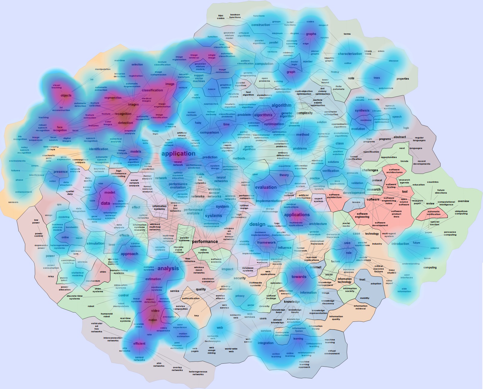
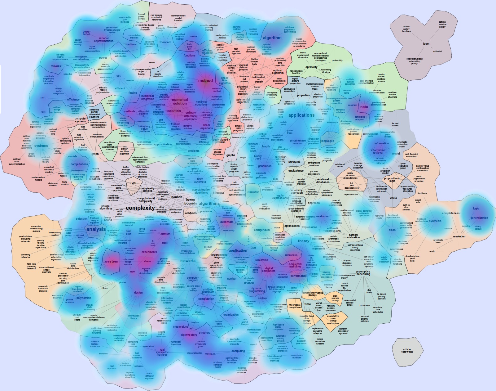
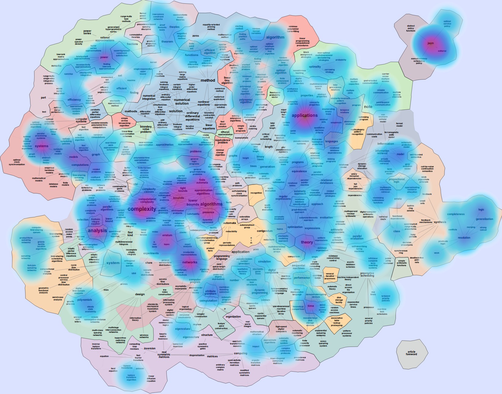
![[Uncaptioned image]](/html/1304.2681/assets/figs/tvcg_kwan_2_magnified.jpg) Map of TVCG based on 1,343 TVCG titles in DBLP,
heatmap overlay based on 34 papers by the most prolific TVCG author.
(Multi-Word Term extraction, C-Value with Unigrams ranking, Partial Match Jaccard Coefficient similarity, Pull Lesser Terms
filtering, number of terms 1500.)
Map of TVCG based on 1,343 TVCG titles in DBLP,
heatmap overlay based on 34 papers by the most prolific TVCG author.
(Multi-Word Term extraction, C-Value with Unigrams ranking, Partial Match Jaccard Coefficient similarity, Pull Lesser Terms
filtering, number of terms 1500.)
Maps of Computer Science
Abstract
We describe a practical approach for visual exploration of research papers. Specifically, we use the titles of papers from the DBLP database to create what we call maps of computer science (MoCS). Words and phrases from the paper titles are the cities in the map, and countries are created based on word and phrase similarity, calculated using co-occurence. With the help of heatmaps, we can visualize the profile of a particular conference or journal over the base map. Similarly, heatmap profiles can be made of individual researchers or groups such as a department. The visualization system also makes it possible to change the data used to generate the base map. For example, a specific journal or conference can be used to generate the base map and then the heatmap overlays can be used to show the evolution of research topics in the field over the years. As before, individual researchers or research groups profiles can be visualized using heatmap overlays but this time over the journal or conference base map. Finally, research papers or abstracts easily generate visual abstracts giving a visual representation of the distribution of topics in the paper. We outline a modular and extensible system for term extraction using natural language processing techniques, and show the applicability of methods of information retrieval to calculation of term similarity and creation of a topic map. The system is available at mocs.cs.arizona.edu.
Introduction
Providing efficient and effective data visualization is a difficult challenge in many real-world software systems. One challenge lies in developing algorithmically efficient methods to visualize large and complex data sets. Another challenge is to develop effective visualizations that make the underlying patterns and trends easy to see. Even tougher is the challenge of providing interactive access, analysis, and filtering. All of these tasks become even more difficult with the size of the data sets arising in modern applications. In this paper we describe maps of computer science (MoCS), a functional visualization system for a large relational data set, based on spatialization and map representations.
Spatialization is the process of assigning 2D or 3D coordinates to abstract data points, ideally in such a way that the spatial mapping has much of the characteristics of the original (higher dimensional) space. Multi-dimensional scaling (MDS), principal component analysis (PCA), and force-directed methods are among the standard techniques that allow us to spatialize high-dimensional data.
Map representations provide a way to visualize relational data with the help of conceptual maps as a data representation metaphor. Graphs are a standard way to visualize relational data, with the objects defining vertices and the relationships defining edges. It requires an additional step to get from graphs to maps: clusters of well-connected vertices form countries, and countries share borders when neighboring clusters are tightly interconnected.
Traditional maps offer a natural way to present geographical data (continents, countries, states) and additional properties defined with the help of contours and overlays (topography, geology, rainfall). In the process of data mining and data analysis, clustering is a very important step. It turns out that maps are very helpful in dealing with clustered data. There are several reasons why a map representation of clusters can be helpful. First, by explicitly defining the boundary of the clusters and coloring the regions, we make the clustering information clear. Second, as most dimensionality-reduction techniques lead to a two-dimensional positioning of the data points, a map is a natural generalization. Finally, while it often takes us considerable effort to understand graphs, charts, and tables, a map representation is intuitive, as most people are familiar with maps and map-based interactions such as pan and zoom.
We describe a practical approach for visualizing data from the DBLP bibliography server [31]. Specifically, we use the titles of 2,184,270 papers in the database to create, what we call, maps of computer science (MoCS), where words and phrases from the titles are the cities and where the countries are created based on co-occurrence. With the help of heatmap overlays, we can visualize the profile of a particular conference or journal over the base map. Similarly, individual researchers or groups such as a department can be used to generate heatmap profiles. The visualization system also makes it possible to change the data used to generate the base map. For example, a specific journal or conference can be used to generate the base map and then the heatmap overlays can be used to show the evolution of research topics in the field over the years with the help of small multiples. As before, individual researchers or research groups can profiles can be visualized using heatmap overlays but this time over the journal or conference base map. Finally, research papers or abstracts easily generate visual abstracts.
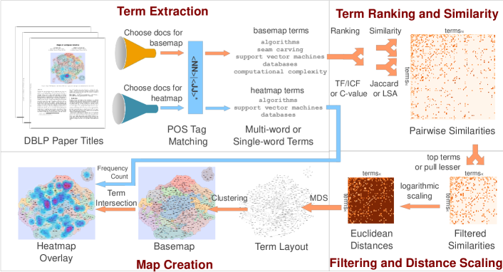
An overview of our MoCS system is in Figure 1 and our main contributions are as follows. First, we describe a fully functional visualization system MoCS which interactively generates base maps of computer science from the DBLP bibliography server: from maps based on all papers available in the database, to maps based on a particular journal or conference, to maps based on an individual researcher. Second, our system allows us to visualize temporal heatmap overlays making it possible to visualize the evolution of the field, journals, and conferences over time. Third, our system allows us to visualize individual heatmap overlays making it possible to visualize individual researchers in the field, or individual researchers in a particular conference, or individual papers in a particular conference. Finally, the MoCS system is modular, extensible and with complete source code, thus making it easy to change various components: from the various natural language processing steps, to the creation of the graph that models the topics, to the visualization of the results.
1 Related Work
Using maps to visualize non-cartographic data has been considered in the context of spatialization by Skupin and Fabrikant [41] and Fabrikant et al. [15]. Map-like visualization using layers and terrains to represent text document corpora dates back at least to 1995 Wise et al. approach [47]. Cortese et al. [10] also use a topographical map metaphor to visualize prefixes propagation in the Internet, where contour lines describing the propagation are calculated using a force directed algorithm. The problem of effectively conveying change over time using a map-based visualization was studied by Harrower [22]. Also related is work on visualizing subsets of a set of items using geometric regions to indicate the grouping. Byelas and Telea [6] use deformed convex hulls to highlight areas of interest in UML diagrams. Collins et al. [8] use “bubblesets,” based on isocontours, to depict multiple relations among a set of objects. Simonetto et al. [40] automatically generate Euler diagrams which provide one of the standard ways, along with Venn diagrams, for visualizing subset relationships.
GMap uses the geographic map metaphor for visualizing relational data and was proposed in the context of visualizing recommendations, where the underlying data is TV shows and the similarity between them [20, 24]. This approach combines graph layout and graph clustering, together with appropriate coloring of the clusters and creating countries based on clusters and connectivity in the original graph. A comprehensive overview of graph based representations by von Landesberger et al. [45] considers visual graph representation, interaction, editing, and algorithmic analysis.
Word clouds and tag clouds have been in use for many years [43, 38]. The popular tool, Wordle [44] took word clouds to the next level with high quality design, graphics, style and functionality. While these early approaches do not explicitly use semantic information such as word relatedness in placing the words in the cloud, several more recent approaches do. Koh et al. [28] use interaction to add semantic relationship in their ManiWordle approach. Parallel tag clouds by Collins et al. [9] are used to visualize evolution over time with the help of parallel coordinates. Cui et al. [11] couple trend charts with word clouds to keep semantic relationships, while visualizing evolution over time with help of force-directed methods. Wu et al. [48] introduce a method for creating semantic-preserving word clouds based on a seam-carving image processing method and an application of bubble sets. Paulovich et al. [37] combine semantic proximity with techniques for fitting word clouds inside general polygons. They apply this technique to a collection of documents and obtain several word clouds of related terms, while optimizing word packing into polygons with semantic preservation. Hierarchically clustered document collections have been the domain of many visualizations based on self-organizing maps [30], Voronoi diagrams [2], and Voronoi treemaps [36]. Of course, classical treemaps [39] and their variants are also often used to visualize text collections.
There is a great deal of related work on natural language processing, text summarization, topic extraction and associated visualizations. Statistical topic modeling relies on machine learning techniques to extract semantic or thematic topics from a text collection, e.g., via Latent Semantic Analysis [12], or Latent Dirichlet Allocation [4]. Extensions to these topic models allow discovery of topics underlying multi-word phrases [46] and the use of additional syntactic structure, such as sentence parse trees, to aid inference of topics [5]. The topics provide an abstract representation of the text collection and are used for searching and categorization. For example, Grouper [49] presents search results as sets of documents clustered by common phrases. TopicNets [21] assigns the top two words as a summary of the underlying text. TopicIslands [34] is one of the early visualizations, based on wavelets. More recently, Facetatlas [7] uses similarity between documents to create a graph which can be used to visually explore the data. PhraseNets supports search for user provided word-pairs which are then used to create graph-based visualization of text [42]. TagRiver [16] uses word clouds to visualize temporal changes in semantic data. The TIARA system [32] uses text summarization techniques and ThemeRiver-style visualization [23] to summarize large text collections.
2 Maps of Computer Science
Here we describe the main steps in the system: natural language processing (term extraction, term ranking, term filtering, similarity matrix), graph and map generation (distance matrix, embedding, clustering, coloring).
2.1 Term Extraction
In the first step of map creation, multi-word terms are extracted from the titles of papers in DBLP. Part of speech (POS) tags are used to choose words that constitute topically meaningful terms, and exclude functional words (words that convey little semantic meaning, such as “the”, “and”, and “a”). The Natural Language Toolkit (NLTK) POS tagger [3] is used to label the words in all titles with POS tags. Before running the tagger, titles are converted to lowercase, since the tagger is case-sensitive, and more likely to incorrectly label capitalized words as proper nouns. Once a title is tagged, maximal subsequences of words with POS tags matching the following regular expression are extracted from titles:
and are tags representing normal adjectives, comparative adjectives, and superlative adjectives, respectively, while , , , and are nouns, plural nouns, proper nouns, and proper plural nouns, respectively. This regular expression was chosen to extract a subset of noun and adjectival phrases including modifiers such as noun adjuncts and attributive adjectives. For example, the paper title “Interactive Support for Non-Programmers: The Relational and Network Approaches” is assigned the tag sequence . The subsequences , , , and are matched, and their corresponding word sequences “interactive support”, “non-programmers”, “relational”, and “network approaches” are extracted as terms. Maps can be created with these multi-word terms (Fig. 2), or the terms can be broken up into their constituent words (Fig. 3) to parallel the word-based visual representations of systems such as Wordle [44].
Maps and visualizations made from single words can display broad associations between words, as demonstrated in the semantic word clouds of Wu et al. [48]. Multi-word terms can provide a fine-grained view of the topics represented in the database of paper titles. For example, using single-word terms extracted from the titles of 40,000 randomly sampled DBLP papers, and the Latent Semantic Analysis similarity function (described below), the 5 most similar terms to “network” are “neural”, “wireless’, “sensor”, “analysis”, and “model”. This list of similar terms helps reveal that there are different types of networks. Using multi-word terms and the C-value With Unigrams ranking function (described below), we find that the terms “neural network” and “wireless sensor network” appeared frequently in titles, and are both ranked in the top 1500 terms from this document set, helping to explain why “neural”, “wireless”, and “sensor” were highly associated with “network” in the single-word version. We can use multi-word terms and similarity to investigate what topics are closely related to each specific type of network. Using the Jaccard similarity function (described below), the 4 terms ranked as most similar to “neural network” are “predictions”, “genetic algorithm”, “dynamics”, and “combinatorial optimization problem”, while the 4 most similar terms to “wireless sensor network” are “reinforcement”, “mobile robot”, “modeling”, and “energy”, showing disparate applications and related topics for the two different types of networks.
2.2 Term Ranking
Once multi-word or single word terms are extracted, they can be assigned importance scores, or weights, based on their usage in the corpus of titles. Terms are then ordered by their weights to produce a ranking of terms, of which the top terms can be selected for inclusion in the visual map representation. We implement four such ranking functions in the MoCS system: Term Frequency, Term Frequency/Inverse Comparison Frequency, C-Value, and C-Value with Unigrams.
Under the term frequency ranking function, each term’s weight is the number of times it occurred within the corpus. Term frequency tends to highly weight functional words such as determiners and conjunctions: words that appear frequently but convey little meaning such as “the”, “a”. In our system, many of these functional words are already excluded by the term extraction step, if their POS tags do not match the noun and adjectival phrase extraction expression. However, we still want to provide the option to exclude common phrases that convey little semantic meaning, such as “introduction” (which occurs 9th in a list of multi-word terms ordered by frequency from a 1,000,000 title sample of DBLP, occurring 618 times). To accomplish this, a standard modification to term-frequency is term frequency–inverse document frequency (TF/IDF), where a term’s weight in a text collection is proportional to its frequency in the document and inversely proportional to the number of other documents it appears in. In our domain, consisting of many short documents (titles), terms usually only occur once in each document, so the inverse document frequency of a term is almost always 1. Therefore, we further modify TF/IDF to this corpus by treating the entire collection of titles as a single document, and counting the term’s frequency in a reference corpus from a different domain to use as the inverse weighting value. We refer to the resulting method as term frequency–inverse comparison frequency (TF/ICF). A term’s weight under TF/ICF is the number of times the term appeared in the corpus of documents (target corpus), divided by the number of times that term appeared in a disparate corpus of text from a different domain (the comparison corpus):
In the above equation, is a term, is the count of times that appeared in the target corpus (DBLP titles) as a complete term, and is the count of times that appeared in the comparison corpus. The MoCS system currently uses the Brown Corpus [17], a selection of English text drawn from newspapers, fiction, and other wide-distribution literature, as the comparison corpus.
C-value [18] is specifically designed for multi-word term ranking, accounting for possible nesting of multi-word terms (where short terms appear as word subsequences of longer terms). C-value incorporates total frequency of occurrence, frequency of occurrences of the term within other longer terms, the number of types of these longer terms, and the number of words in the term. The weight assigned by C-value is proportional to the logarithm of the number of words in a term, so we also include a modified implementation, C-value With Unigrams, that adds one to this length before taking the logarithm. This modification allows single word terms to be assigned non-zero weight and be included in the set of top terms.
After terms are assigned importance weights, they are sorted in order of descending weight, and the top terms are selected for possible inclusion in the map. (Number of Terms) is a configurable parameter passed to the MoCS system. Larger values of produce maps that include terms ranked lower by the chosen ranking algorithm, i.e., words with lower weighted term frequency in the set of titles queried.
2.3 Similarity Matrix Computation
Once a set of top terms is selected, pairwise similarity values between top terms are calculated. We seek similarity functions that measure how closely the topics represented by two terms are related. Terms that refer to the same or similar topic, or topics that are closely associated, should receive high similarity values. We use term-document co-occurrence as the basis of these similarity values, assuming that terms that appear together in multiple documents (paper titles) are more likely to be related in meaning.
The similarity functions take a term-document matrix, , as input. The columns of correspond to titles of papers from DBLP, and rows correspond to terms extracted by the term-extraction step. The entries in the matrix are calculated as
where is the number of times the term indexed by appeared in the document indexed by . We implement three similarity functions in the MoCS system: Latent Semantic Analysis, Jaccard Coefficient, and Partial Match Jaccard coefficient.
Latent Semantic Analysis (LSA), described by Deerwester et al. [12], is a method of extracting underlying semantic representation from the term-document matrix, . A low-rank approximation to the term-document matrix is used to calculate the distance between terms in a vector-space representation reflecting meaning in topical space. The singular value decomposition
is calculated using sparse-matrix methods. Rows in the product represent terms as feature vectors in the high-dimensional semantic space. Terms are compared using cosine similarity [33] of the feature vectors to produce a matrix of pairwise similarities between terms. The cosine similarity of two term vectors is calculated as
The value returned by this function is bounded between 0, indicating a maximal angle between the term vectors in semantic space and no similarity between the terms, and 1, indicating the term vectors, measuring decomposed co-occurrence, are identical.
LSA is a standard approach to calculating term and document similarity in information retrieval. However, as in the term ranking stage, terms rarely occur more than once in a single document (particularly if they are multi-word terms). In our case, the entries in the term-document matrix are effectively boolean. Depending on the term-ranking algorithm used to select the most important terms, the term-document matrix can also be quite sparse.
We provide Jaccard coefficient [25] as an alternative similarity function to accommodate the nearly boolean nature of the term-document matrix. Jaccard calculates pairwise term similarity as the number of documents two terms appeared together in, divided by the number of documents either term appeared in:
where and are the sets of documents that the two terms being compared appeared in. Like LSA, Jaccard Coefficient produces a value between 0, indicating terms did not appear together in any documents and have no similarity, and 1, indicating terms never appeared separately, and have maximal similarity. Jaccard coefficient alone treats terms as atomic units: multi-word terms only match if they are identical. This approach produces very sparse similarity matrices when used with a ranking algorithm such as C-value that prioritizes multi-word terms.
Partial Match Jaccard Coefficient, attempts to address the sparsity of the C-value matrices, by treating two terms as identical for the purpose of co-occurrence calculation if they contain a common subsequence of words. For example, if “partial match jaccard coefficient” and “similarity” both occurred as multi-word terms in a paper title, and “similarity” and “jaccard coefficient” were present in our list of top-terms but “partial match jaccard coefficient” was not, this function would count a co-occurrence between “similarity” and “jaccard coefficient” because the top term is a subsequence of the longer term found in the title.
2.4 Term Filtering and Distance Calculation
Term similarities have been calculated between the highest ranked terms in the previous step. The next stage in the pipeline is filtering, choosing the terms to include in the map. We implement two filtering methods in the MoCS system: Top Terms and Pull Lesser Terms.
Top Terms is the simplest type of filtering, where we take the top-ranked terms from the highest ranked terms . The default for in our current system is 150. In practice, sparsity of data causes this method to produce fragmented maps, as the top terms often have low similarity to other top terms (particularly when the multi-word term-extraction system is used).
Pull Lesser Terms attempts to address the fragmentation of the top terms method, by using not only the highest ranked terms, but also maps lesser-ranked terms if they are similar to a top-ranked term. Specifically, this method takes as input the highest ranked terms, , and their pairwise similarities, as calculated in the ranking and similarity steps of the pipeline. The method plots the highest ranked terms, , from among , and the most similar terms from for each term in . These most similar terms are plotted regardless of whether they are members of the set . Effectively, this method pulls in terms beyond the top , if they are more similar to a top term than any of the other top terms. The default parameter values for and in our current system are , .
The pairwise term similarity matrix is next converted into a matrix of distances for use by the multi-dimensional scaling or force-directed algorithms of GMap. Let be the similarity between two terms, calculated using either LSA, Jaccard Coefficient, or Partial Match Jaccard Coefficient. Some choices of document sets and ranking and similarity functions produce terms with a similarity distribution more narrow than the theoretical range of the similarity function, so rescaled similarity values are calculated as
The distance between these two terms, , is calculated using these rescaled similarity values as
where is a small, positive, constant scaling value, currently set to , used to ensure a non-zero value inside the logarithm in the case that two terms have a pairwise similarity of 0. Linear transformations of similarities into distances produced maps that looked dense, crowded, and highly fragmented. A logarithmic scale allows comparison of relative distance between terms with low pairwise similarity by magnifying the distances between these terms. This produces more less crowded maps, since most term pairs have low pairwise similarity compared to the highest similarity pair of terms in the map (which are used in the normalization).
2.5 Map Generation
We begin with a summary of the GMap algorithm for generating maps from static graphs [24]. The input to the algorithm is a set of terms and pairwise similarities between these terms, from which an undirected graph is extracted. The set of vertices corresponds to the terms extracted from titles and the set of edges corresponds to the top pairwise similarities between these terms as determined by the chosen filtering algorithm. In its full generality, the graph is vertex-weighted and edge-weighted, with vertex weights corresponding to some notion of the importance of a vertex and edge weights corresponding to some notion of the closeness between a pair of vertices. In the MoCS system, the relative frequencies of terms are used to determine the font size of the node label, using a linear scale with the minimum frequency term producing the smallest label and the maximum frequency term producing the largest label. The weight of an edge can be defined by the strength of the similarity between a pair of words or terms, and these edges can be marked in the base map of terms.
In the first step of GMap the graph is embedded in the plane using a scalable force-directed algorithm [19] or multidimensional scaling (MDS) [29]. In the second step, a cluster analysis is performed in order to group vertices into clusters, using a modularity-based clustering algorithm [35].
We use information from the clustering to guide the MDS-based layout. In the third step of GMap, the geographic map corresponding to the data set is created, based on a modified Voronoi diagram of the vertices, which in turn is determined by the embedding and clustering. Here “countries” are created from clusters, and “continents” and “islands” are created from groups of neighboring countries. Borders between countries and at the periphery of continents and islands are created in fractal-like fashion. Finally, colors are assigned with the goal that no two adjacent countries have colors that are too similar. In the context of visualizing dynamic data where the relative change of popularity of important, we also use a heatmap overlay to highlight the “hot” regions. Further geographic components can be added to strengthen the map metaphor. For instance, edges can be made semi-transparent or even modified to resemble road networks. In places where there are large empty spaces between vertices in neighboring clusters, lakes, rivers, or mountains can be added, in order to emphasize the separation.
2.6 Heatmap Overlays
To visualize the profile of a target query set of papers (for example, papers from a specified time range, author, conference, or journal) over a map, we use heatmap overlays. Heatmaps highlight the terms in the basemap that also occur in the target query, with color intensity proportional to the frequency of the term’s occurrence in the heatmap query. Separate database queries are issued for the papers used to produce the basemap and heatmaps (Fig. 1), allowing a subset of the papers chosen for the basemap to be used as the target query. For example, a basemap can be constructed from a sample of all available papers, and a heatmap constructed from all papers for a particular journal (Fig. 5d), or a heatmap of a single author can be overlaid on a basemap of papers from a journal that author frequently publishes in (Fig. Maps of Computer Science).
Whichever type of terms are chosen for the basemap (multi-word or single-word) are also used to construct the heatmap overlay. If is the set of terms found in the query used to produce the basemap, and is the set of terms from the documents to be visualized in the heatmap, the terms highlighted in the heatmap are the intersection of these two groups, . The heatmap intensity, , of each term in is the number of times appeared in documents in the target query. These intensities are transformed on a logarithmic scale to allow terms with low values to be visible in the heatmap, and then normalized so that the most frequently appearing term has intensity 1. The final normalized and rescaled intensity value, is
where is a small additive constant (currently set to 1) that ensures terms that only appeared once in the heatmap query still receive a positive value.
Basemaps are rendered in the browser as vector graphics, and heatmaps are drawn as a semi-transparent raster overlay using the OpenLayers heatmap implementation. This implementation uses a radial gradient centered at terms with a defined intensity value, where the color intensity at the center of the term is proportional to the value for the term. Currently, the radius of diffusion for the radial gradient is constant across all terms in a map and chosen to correspond to roughly half the average distance between terms. To ensure that each term in has an overlay that exactly covers its visual area in the basemap, this method might be improved by making the diffusion radius for each term a function of the distance to the closest term in the map. Alternatively, Inverse Distance Weighting could be used to calculate color intensities for all points over the basemap based on the heatmap intensity values of all terms.
3 DBLP Visualization
3.1 Individual Heatmap Overlays
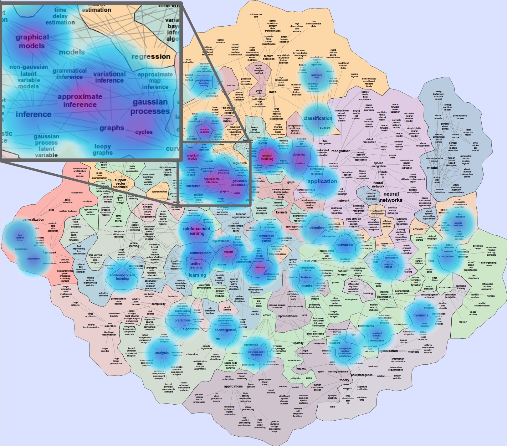
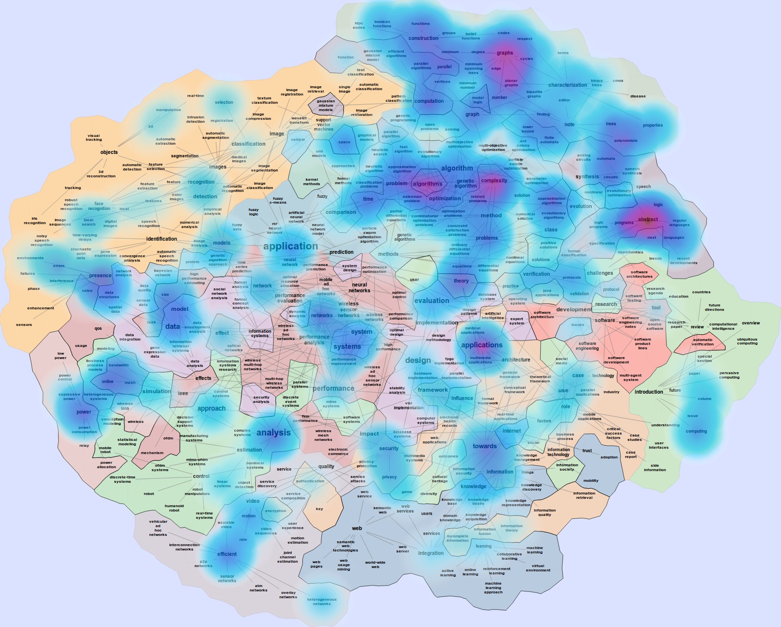
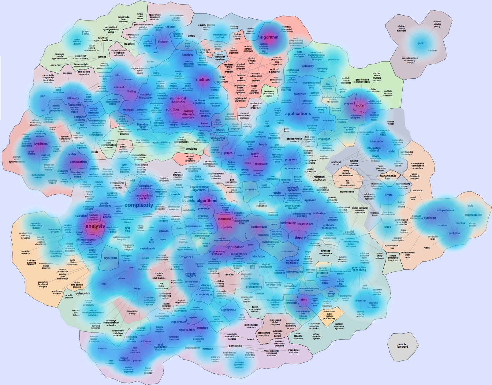
The MoCS system allows separate database queries for the documents used to produce the basemap and the documents used to produce the heatmap overlay. Using the author information in DBLP, we can produce heatmap overlays of individual researchers over conferences and journals that they frequently publish in. Figure 4 shows a basemap constructed from titles of all papers published at the Conference on Neural Information Processing Systems (NIPS), with a heatmap constructed from the titles of papers by the most prolific author at NIPS. We see activity throughout the basemap, with particular intensity over a section of terms referring to inference in graphical models.
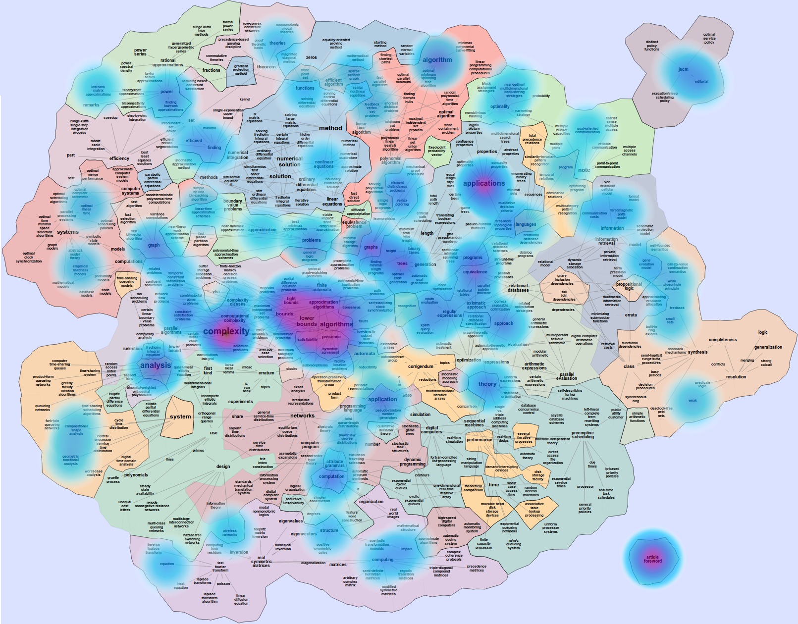
3.2 Conference and Journal Overlays
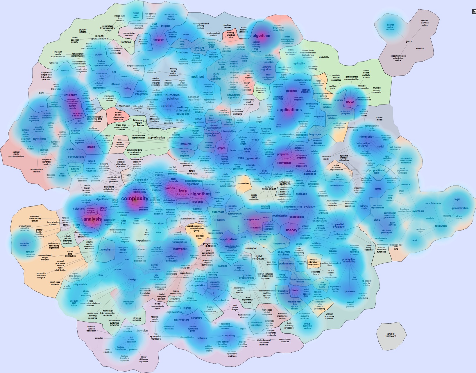
The bibliographic information stored in DBLP allows us to plot heatmaps of specific conferences and journals over a basemap of all documents. Fig. 5 shows heatmaps of papers from four venues: the Computer Vision and Pattern Recognition conference (CVPR), the Symposium on Theory of Computing (STOC), the International Conference on Web Services (ICWS), and Transactions on Visualization and Computer Graphics (TVCG). These heatmaps are plotted from all available paper titles in the DBLP database for each venue. The basemap over which the heatmaps are plotted is made from 70,000 paper titles sampled uniformly from all entries in DBLP. Some similarities can be seen between the venues: all share relatively high intensity in their heatmaps over terms “application”, “analysis”, “method”, and “evaluation” Some notable topical differences between venues also stand out. CVPR has a high intensity region in the northwest corner of the map over terms such as “images”, “objects”, and “recognition”, while STOC has most high intensity in the northeast corner of the map, over terms related to “graphs”, “complexity”, and “graphs”. ICWS has a high intensity in the south of the map over terms “web services” and “systems” while TVCG is literally all over the map, as visualization is associated with all areas of computing: from visualization of algorithms to algorithms for visualization, from design and analysis to applications and systems.
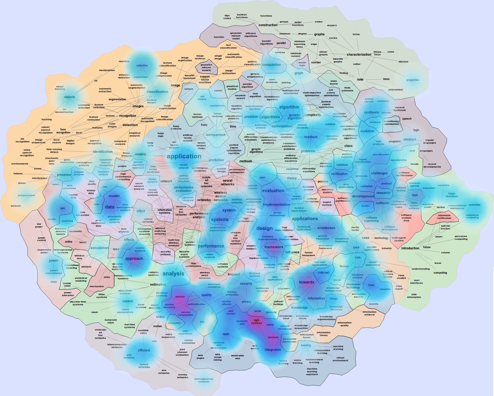
Effective heatmap coverage is a function both of the number of available documents being plotted, and how well terms in the heatmap query set are represented in the base map. Comparing the TVCG and ICWS heatmaps to the CVPR and STOC heatmaps demonstrates this relationship between document availability and heatmap coverage. Fewer papers are available for TVCG and ICWS in DBLP, causing these venues have lesser representation in the basemap (which is constructed from documents randomly sampled from all documents in DBLP), and so their heatmaps cover less area.
3.3 Temporal Heatmap Overlays
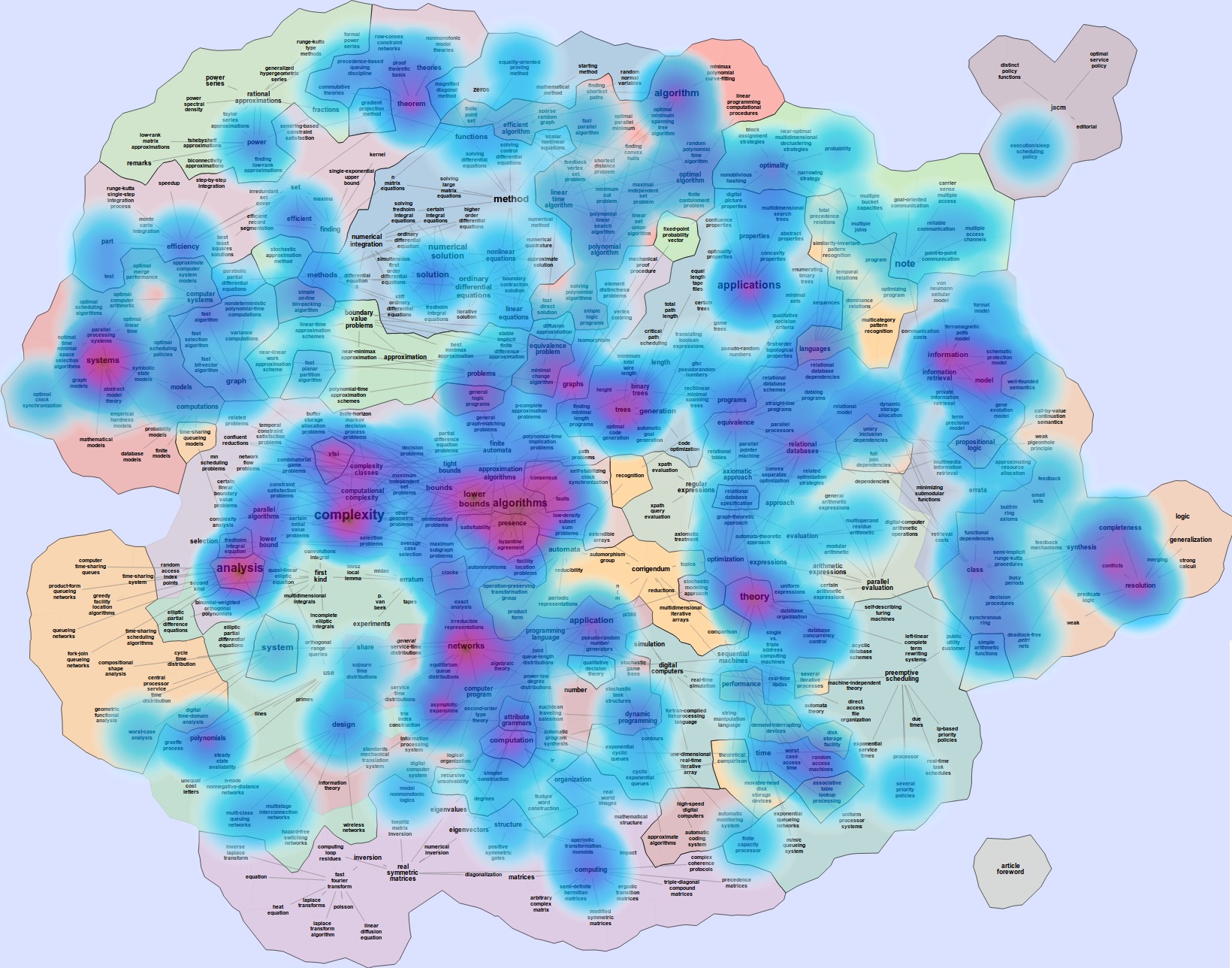
Specifying different date ranges for heatmap queries allows the generation of maps that show how areas of research have spread across the topic basemaps over time. The maps in Fig. 6 show how terms in the titles of papers published in the Journal of the ACM (JACM) have shifted over the past six decades, starting in 1954. The heatmap for papers from 1954-1963 has high intensity values over terms dealing with numerical and matrix methods. Computational complexity grows in intensity in the 1964-1973 map, and complexity and algorithmic bounds outpace numerical methods in 1974-1983. The algorithmic bound terms remain consistently intense throughout the remaining decades. An easy to notice trend is that the focus of the journal has noticeably narrowed over time: in the first four decades the topics are all over the map, but in the last decade the topics are concentrated around complexity, algorithms, and bounds.
3.4 Individual Paper Heatmaps
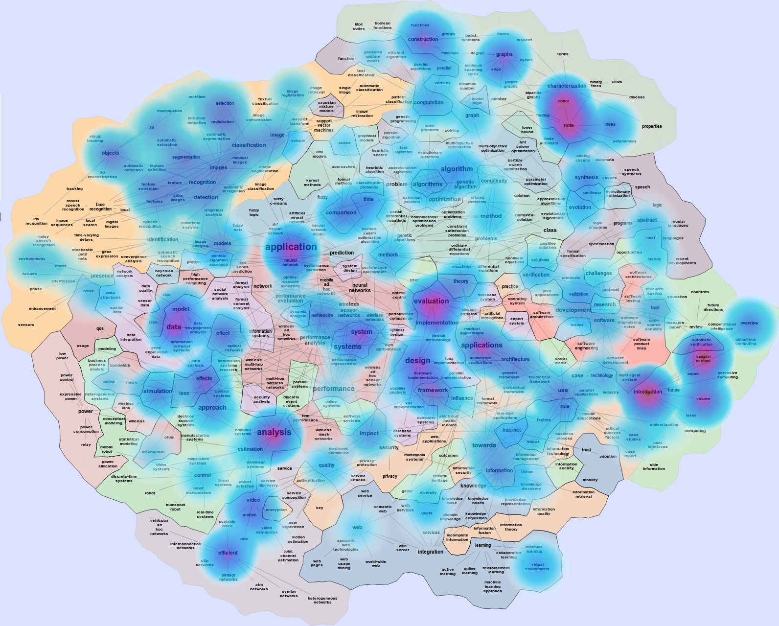
To construct a heatmap visualization of the topics in a single paper, we can run the same term extraction algorithms outlined above on the abstract or full body text of a paper. This heatmap is then overlaid on a basemap constructed from DBLP paper titles, as above. Figure 7 shows a heatmap constructed from terms in the abstract of this paper, over a single-word basemap of TVCG paper titles.

4 Implementation
4.1 Modularity
The system is built with a modular design to accommodate future incorporation of additional natural language processing algorithms. Each of the stages of the map generation pipeline (ranking, similarity, and filtering) is handled by a separate module of code. Within each module, the functions that perform the module’s task are designed to be substitutable, taking standardized input and output. We plan to expand the system’s capabilities by testing the ability of other ranking, similarity, and filtering algorithms to produce maps that provide a better visual representation of the underlying topic space. Source code for the system is available for others who wish to experiment with algorithms of their own.
4.2 Database
Paper titles and meta-information are stored in a SQL database, containing entries for 2,184,270 papers, journal articles, conference proceedings, theses, and books. This bibliographic information is parsed from an XML dump of DBLP entries, containing author, conference or journal, and date meta-information for each paper title [31]. There are over one million personal web pages listed in DBLP, with title “Home Page”, and tag information is used to exclude these. Additionally, as DBLP contains papers with titles in several languages, an effort is made to detect the language of each title, using a trigram character classifier. Titles classified as English by this classifier are marked in the database, and only these titles are currently used in the map generation. Each paper is associated with its author and journal or conference if this information is available in DBLP. The database contains records for 1,324 journals, 6,904 conferences, and 1,237,445 authors which can be used to filter document title queries for map construction.
4.3 Server
The system is implemented using Python 2.7. Full source code (for map making, the DBLP database interface, and the web server) is available at github.com/dpfried/mocs. Natural language processing code for term extraction is implemented using utilities from the NLTK [3] library. The NumPy and SciPy [27] numerical computation libraries are used for implementing the similarity functions and ranking algorithms. The server is hosted in Django, using Celery as a back-end task manager, and SQLAlchemy for database interface. Maps are displayed in the user’s browser using SVG rendering capabilities of AT&T’s GraphViz system [13]. These SVG elements are rendered in a zoomable and pannable container provided by the open source OpenLayers JavaScript display library [1]. Heatmaps are overlaid with the heatmap plugin in OpenLayers, together with additional JavaScript that calculates term positions and SVG coordinate transforms, in order to correctly position the heatmap over the basemap when zooming.
5 Conclusions and Future Work
In this paper we presented a practical approach for visualizing large-scale a bibliographic data via natural language processing and using a geographic map metaphor. We described the MoCS system in the context of the DBLP bibliography server and demonstrated several possible explorative visualization uses of the system. The novel aspects of the system include modifications to natural language processing techniques (allowing us to work with only titles of research papers), the ability to combine arbitrary basemaps with heatmap overlays (showing temporal evolution, or profiles of conferences and journals), and the modularity and availability of the interactive visualization system (making it possible to experiment with different approaches to various subproblems). An interactive interface to the system, and a video of the system in action, are available at mocs.cs.arizona.edu.
There are likely more possible uses of such a visualization system. For example, many journals (e.g., Cell, Earth and Planetary Science, Molecular Phylogenomics and Evolution) have recently added requirements for graphical abstracts as a part of research papers. These are single-panel images designed to give readers an immediate understanding of the take-home message of the paper. MoCS can be used to generate graphical abstracts using a basemap from the journal and heatmap of the submission.
We would have liked to compare the performance of our system against earlier and related approaches. However, this is nearly impossible as very few such systems are fully functional online or provides source code. We contacted the authors of a dozen earlier semantic word-cloud or spatialization based systems but none were able to share source code or executables.
While ours is indeed a functional system, and it does offer various options for the natural language processing step, for the generation of the graph, and for the final map rendering, there are many possible future directions:
-
1.
We would like to experimentally verify whether our maps based on research paper titles correspond to what experts in the field expect to see. If not, topic models for term extraction and similarity that incorporate lexical priors, or words that are of specific interest can be used [26]. Thus, we could specify “seed words” or “start words” that must included in the map.
-
2.
How much additional information and precision can be gained from abstracts compared to just titles of papers? Similarly, what is the additional information gain when going from abstracts to entire papers?
-
3.
We can study departmental, state-wide, and even country-wide profiles over the base map of CS. This would hopefully allow us to visually compare and contrast the type of research done in different universities, states, and countries.
-
4.
Automatically labeling countries on the map could be accomplished by looking for the most frequent conferences and journals with topics in a particular country, and extracting the top 2-3 relevant terms.
- 5.
-
6.
Only terms that appear in both the basemap and heatmap queries are currently displayed in heatmaps. To create heatmaps that also cover related terms in the map, the pairwise term similarity values could be used to diffuse heatmap intensity onto terms that were unseen in the heatmap query, but that are similar to those seen in the query.
-
7.
The graph embedding and graph clustering combinations that are available in GMap often result in fragmented maps. We would like to expand the functionality of GMap by providing cluster-based (and thus non-fragmented) embedding.
-
8.
The methodology described here is not limited to computer science research papers. It should be possible to generalize to other research areas, starting with physics (due to ArXiv) and medicine (PubMed).
Acknowledgements.
We thank Henry Kerschen for help with the the webpage for maps of computer science server: mocs.cs.arizona.edu. We also thank Stephan Diehl, Sandiway Fong, Yifan Hu, and David Sidi for discussions about this project and ongoing system evaluation.References
- [1] OpenLayers: Free maps for the web. http://www.openlayers.org/.
- [2] K. Andrews, W. Kienreich, V. Sabol, J. Becker, G. Droschl, F. Kappe, M. Granitzer, P. Auer, and K. Tochtermann. The infosky visual explorer: exploiting hierarchical structure and document similarities. Information Visualization, 1(3-4):166–181, 2002.
- [3] S. Bird, E. Klein, and E. Loper. Natural language processing with Python. O’Reilly Media, Incorporated, 2009.
- [4] D. M. Blei, A. Y. Ng, and M. I. Jordan. Latent dirichlet allocation. Journal of Machine Learning Research, 3:993–1022, 2003.
- [5] J. Boyd-Graber and D. M. Blei. Syntactic topic models. arXiv preprint arXiv:1002.4665, 2010.
- [6] H. Byelas and A. Telea. Visualization of areas of interest in software architecture diagrams. In ACM Symp. on Software Visualization (SoftVis’06), pages 105–114, 2006.
- [7] N. Cao, J. Sun, Y.-R. Lin, D. Gotz, S. Liu, and H. Qu. Facetatlas: Multifaceted visualization for rich text corpora. IEEE Transactions on Visualization and Computer Graphics, 16(6):1172–1181, 2010.
- [8] C. Collins, G. Penn, and S. Carpendale. Bubble sets: Revealing set relations with isocontours over existing visualizations. IEEE TVCG, 15(6):1009–1016, 2009.
- [9] C. Collins, F. B. Viégas, and M. Wattenberg. Parallel tag clouds to explore and analyze faceted text corpora. In IEEE VAST, pages 91–98, 2009.
- [10] P. F. Cortese, G. D. Battista, A. Moneta, M. Patrignani, and M. Pizzonia. Topographic visualization of prefix propagation in the internet. IEEE TVCG, 12:725–732, 2006.
- [11] W. Cui, Y. Wu, S. Liu, F. Wei, M. X. Zhou, and H. Qu. Context-preserving, dynamic word cloud visualization. Computer Graphics and Applications, 30:42–53, 2010.
- [12] S. Deerwester, S. T. Dumais, G. W. Furnas, T. K. Landauer, and R. Harshman. Indexing by latent semantic analysis. Journal of the American society for information science, 41(6):391–407, 1990.
- [13] J. Ellson, E. R. Gansner, E. Koutsofios, S. C. North, and G. Woodhull. Graphviz and dynagraph—static and dynamic graph drawing tools. In Graph Drawing Software, pages 127–148. Springer, 2004.
- [14] G. Erkan and D. R. Radev. Lexrank: Graph-based lexical centrality as salience in text summarization. J. Artif. Intell. Res. (JAIR), 22:457–479, 2004.
- [15] S. I. Fabrikant, D. R. Montello, and D. M. Mark. The distance-similarity metaphor in region-display spatializations. IEEE Computer Graphics & Application, 26:34–44, 2006.
- [16] A. Forbes, B. Alper, T. Höllerer, and G. Legrady. Interactive folksonomic analytics with the tag river visualization. In Interactive Visual Text Analytics for Decision Making Workshop. 2011.
- [17] W. N. Francis and H. Kučera. Manual of information to accompany a standard corpus of present-day edited American English, for use with digital computers. Brown University, Department of Lingustics, 1979.
- [18] K. Frantzi, S. Ananiadou, and H. Mima. Automatic recognition of multi-word terms:. the c-value/nc-value method. International Journal on Digital Libraries, 3(2):115–130, 2000.
- [19] T. Fruchterman and E. Reingold. Graph drawing by force directed placement. Software-Practice and Experience, 21:1129–1164, 1991.
- [20] E. Gansner, Y. Hu, S. Kobourov, and C. Volinsky. Putting recommendations on the map - visualizing clusters and relations. In 3rd ACM Conf. on Recommender Systems, pages 345–348, 2009.
- [21] B. Gretarsson, J. O’Donovan, S. Bostandjiev, T. Höllerer, A. U. Asuncion, D. Newman, and P. Smyth. Topicnets: Visual analysis of large text corpora with topic modeling. ACM TIST, 3(2):23, 2012.
- [22] M. Harrower. Tips for designing effective animated maps. Cartographic Perspectives, 44:63–65, 2003.
- [23] S. Havre, E. G. Hetzler, P. Whitney, and L. T. Nowell. Themeriver: Visualizing thematic changes in large document collections. IEEE Trans. Vis. Comput. Graph., 8(1):9–20, 2002.
- [24] Y. Hu, E. Gansner, and S. Kobourov. Visualizing Graphs and Clusters as Maps. IEEE Computer Graphics and Applications, 99(1):54–66, 2010.
- [25] P. Jaccard. Etude comparative de la distribution florale dans une portion des Alpes et du Jura. Impr. Corbaz, 1901.
- [26] J. Jagarlamudi, H. Daumé III, and R. Udupa. Incorporating lexical priors into topic models. In EACL, pages 204–213, 2012.
- [27] E. Jones, T. Oliphant, P. Peterson, et al. SciPy: Open source scientific tools for Python, 2001–.
- [28] K. Koh, B. Lee, B. H. Kim, and J. Seo. Maniwordle: Providing flexible control over wordle. IEEE Trans. Vis. Comput. Graph., 16(6):1190–1197, 2010.
- [29] J. B. Kruskal and M. Wish. Multidimensional Scaling. Sage Press, 1978.
- [30] K. Lagus, T. Honkela, S. Kaski, and T. Kohonen. Self-organizing maps of document collections: A new approach to interactive exploration. In KDD, pages 238–243, 1996.
- [31] M. Ley. DBLP - some lessons learned. PVLDB, 2(2):1493–1500, 2009.
- [32] S. Liu, M. X. Zhou, S. Pan, W. Qian, W. Cai, and X. Lian. Interactive, topic-based visual text summarization and analysis. In Proceedings of the 18th ACM conference on Information and knowledge management, pages 543–552, 2009.
- [33] C. D. Manning, P. Raghavan, and H. Schütze. Introduction to information retrieval, volume 1. Cambridge University Press Cambridge, 2008.
- [34] N. E. Miller, P. C. Wong, M. Brewster, and H. Foote. Topic islands - a wavelet-based text visualization system. In IEEE Visualization, pages 189–196, 1998.
- [35] M. E. J. Newman. Modularity and community structure in networks. Proc. Natl. Acad. Sci. USA, 103:8577–8582, 2006.
- [36] A. Nocaj and U. Brandes. Organizing search results with a reference map. IEEE Transactions on Visualization and Computer Graphics, 18(12):2546–2555, 2012.
- [37] F. V. Paulovich, F. M. B. Toledo, G. P. Telles, R. Minghim, and L. G. Nonato. Semantic wordification of document collections. Computer Graphics Forum, 31(3):1145–1153, 2012.
- [38] A. W. Rivadeneira, D. M. Gruen, M. J. Muller, and D. R. Millen. Getting our head in the clouds: toward evaluation studies of tagclouds. In CHI, pages 995–998, 2007.
- [39] B. Shneiderman and M. Wattenberg. Ordered treemap layouts. In INFOVIS, pages 73–78, 2001.
- [40] P. Simonetto, D. Auber, and D. Archambault. Fully automatic visualisation of overlapping sets. Computer Graphics Forum, 28:967–974, 2009.
- [41] A. Skupin and S. I. Fabrikant. Spatialization methods: a cartographic research agenda for non-geographic information visualization. Cartography and Geographic Information Science, 30:95–119, 2003.
- [42] F. van Ham, M. Wattenberg, and F. B. Viégas. Mapping text with phrase nets. IEEE Trans. Vis. Comput. Graph., 15(6):1169–1176, 2009.
- [43] F. B. Viégas and M. Wattenberg. Timelines - tag clouds and the case for vernacular visualization. Interactions, 15(4):49–52, 2008.
- [44] F. B. Viégas, M. Wattenberg, and J. Feinberg. Participatory visualization with wordle. IEEE Trans. Vis. Comput. Graph., 15(6):1137–1144, 2009.
- [45] T. von Landesberger, A. Kuijper, T. Schreck, J. Kohlhammer, J. van Wijk, J.-D. Fekete, and D. Fellner. Visual analysis of large graphs: State-of-the-art and future research challenges. Computer Graphics Forum, 30(6):1719–1749, 2011.
- [46] X. Wang, A. McCallum, and X. Wei. Topical n-grams: Phrase and topic discovery, with an application to information retrieval. In Data Mining, 2007. ICDM 2007. Seventh IEEE International Conference on, pages 697–702. IEEE, 2007.
- [47] J. A. Wise, J. J. Thomas, K. Pennock, D. Lantrip, M. Pottier, A. Schur, and V. Crow. Visualizing the non-visual: spatial analysis and interaction with information from text documents. In IEEE Symp. on Information Visualization, pages 51–58, 1995.
- [48] Y. Wu, T. Provan, F. Wei, S. Liu, and K.-L. Ma. Semantic-preserving word clouds by seam carving. In Computer Graphics Forum, volume 30, pages 741–750, 2011.
- [49] O. Zamir and O. Etzioni. Grouper: a dynamic clustering interface to web search results. Computer Networks, 31(11):1361–1374, 1999.