Assessing the consistency of community structure in complex networks
Abstract
In recent years, community structure has emerged as a key component of complex network analysis. As more data has been collected, researchers have begun investigating changing community structure across multiple networks. Several methods exist to analyze changing communities, but most of these are limited to evolution of a single network over time. In addition, most of the existing methods are more concerned with change at the community level than at the level of the individual node. In this paper, we introduce scaled inclusivity, which is a method to quantify the change in community structure across networks. Scaled inclusivity evaluates the consistency of the classification of every node in a network independently. In addition, the method can be applied cross-sectionally as well as longitudinally. In this paper, we calculate the scaled inclusivity for a set of simulated networks of United States cities and a set of real networks consisting of teams that play in the top division of American college football. We found that scaled inclusivity yields reasonable results for the consistency of individual nodes in both sets of networks. We propose that scaled inclusivity may provide a useful way to quantify the change in a network’s community structure.
pacs:
89.75.Fb, 89.75.Hc, 89.75.KdI Introduction
In recent years, the study of real-world complex networks has increased dramatically; social networks Lusseau and Newman (2004), the world wide web Flake et al. (2002), and faculty collaboration networks Börner et al. (2004) are among the most commonly studied.
An offshoot of this expansion has been the study of community structure in complex networks. Introduced in 2002 by Girvan and Newman Girvan and Newman (2002), the community structure of a network helps make sense of the interactions between the nodes. In that paper, the authors analyze a network consisting of the members of a karate club that split into two factions, a faculty collaboration network across Europe, and several others. Mathematical community analysis was able to identify the two factions of the karate club and split the collaboration network into several geographically coherent groups.
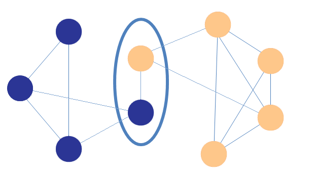
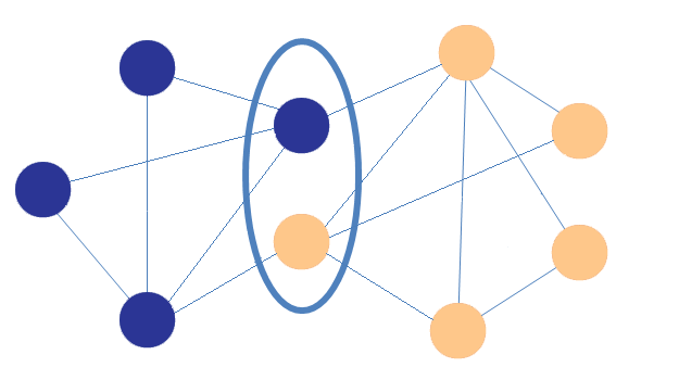
In the past few years, more complex datasets have been studied, and the change in community structures of networks over time has become an area of focus. Fig. 1 shows an example of changing community structure in two realizations of a simple network. Such shifts are easy to imagine on a larger scale in a complex network with many realizations.
The consistency (or lack thereof) of communities in a given network over time can be a good indicator of large-scale change in a network. Hopcroft, et al. Hopcroft et al. (2004) studied the changes in a network consisting of journal articles from the NEC CiteSeer database and their references. The communities correlated well with certain fields of study, and the emergence of new communities over time was shown to mirror the emergence of new fields in the literature.
While change in the community structure of a network has recently become an object of study, many of the methods proposed explicitly or implicitly make assumptions based on the idea of change over time Palla et al. (2007); Chakrabarti et al. (2006); Asur et al. (2007); Fenn et al. (2009). These methods do not lend themselves well to the analysis of multiple realizations of a single network. The assumption that networks progress from one to the next in a linear fashion is not appropriate when the networks are not linearly related.
In addition, the existing methods spend relatively little time on how best to identify the same community across several networks; in some cases, it is assumed that communities are sufficiently consistent over time to make this a moot point. Across networks that are not linearly related, this assumption does not hold. The variation in the community structure of multiple networks can be significant, so a more rigorous way to quantify the consistency of community structure is necessary.
In this paper, we propose a method for comparing the consistency of community structure across different realizations of a network, be they the same network over time or simultaneous realizations of a single network. In particular, we propose a method to describe how consistently each node is part of the same community across different partitions, which we call scaled inclusivity. This method enables us to identify which nodes tend to remain in the same community in different network partitions, forming a ”core” of that community. Likewise, the method also allows identification of transient nodes that become part of different communities across partitions.
The remainder of this manuscript is organized as follows: Section II describes the analysis algorithm, Section III describes the simulated and real data networks used, Section IV describes the results of the algorithm applied to both simulated and real data, and Section V discusses the implications of this work.
II Methods
Community structure analysis is a difficult problem. There are many community detection methodologies, and finding better algorithms is an area of ongoing research. We use the QCut algorithm, but any community detection algorithm could be used. We only evaluate a method that places each node into exactly one community, and the method we propose here requires that each node be in at least one community. The most common metric used to evaluate community structure, modularity, was introduced by Newman and Girvan Newman and Girvan (2004):
| (1) |
where is the number of modules in the network, is the total number of intra-modular edges in module () , is the total degree for the vertices in , and is twice the total number of edges (the sum of the degree for all vertices in the network). Maximizing has been proven to be an NP-hard problem Brandes et al. (2006), meaning that the only way to guarantee an optimal solution is to try all possible solutions. Because this is impractical for all but the smallest networks, various algorithms have been created to balance optimization of with run time. In our analysis, we used the QCut algorithm introduced in Ruan and Zhang (2008). It should be emphasized that we are not attempting to evaluate or demonstrate the effectiveness of the QCut algorithm, but rather use QCut as a method to identify community structure.
The method described here is used to assess consistency of partitions on a set of networks assumed to have a similar underlying structure or on a series of networks with alterations in the structure over time. While the former is a collection of multiple realizations of the networks without any ordering (e.g., metabolic networks from different samples or brain connectivity networks from multiple subjects), the latter has a particular ordering of the networks in which one network is a rewired version of the prior one. In both cases, it is assumed that the nodes are constant and that there exists a true partition of the nodes which may or may not be explicitly known.
II.1 Identify best partition
The first step is to identify the best partition for each of realizations of the network with nodes. The goal of this step is to find a reasonable partition of the network since each run of the QCut algorithm (like many community structure algorithms currently available) may produce slightly different partitions. This step starts by generating multiple partitions by the QCut algorithm — times on a network (). Because the goal of any modularity-based algorithm is to maximize Q (Eq. 1), the run that produced the partition with the highest Q value for the network is chosen as the best partition for this network, denoted by . It should be noted that this step is unnecessary for deterministic community structure algorithms.
For nondeterministic community structure algorithms that are not based on optimization of a single parameter, an alternative method is to choose the partition that is most similar to the others. We propose the Jaccard similarity index to determine similarity.
Let be the -th partition () of network . For any pair of partitions and (), the similarity of the partitions is assessed by calculating the Jaccard similarity index
| (2) |
where and are sets of node pairs with the same community memberships in partitions and , respectively. For example, in partition , if nodes and are in the same community (i.e., ), then that node pair is included in the set . The advantage of the Jaccard index is that it does not depend on the arbitrary numbering of communities across partitions. Even if community 5 in may correspond to community 11 in , the Jaccard index can assess the similarity between partitions without re-assigning community numbers. Calculating for all pairs of partition results in matrix whose -th element is if and 0 if .
II.2 Assess consistency of classification
The next step assesses the consistency of a single partition when compared with the rest of the group. That single partition is chosen from the group and is denoted by ; it is compared to for , where . To do so, consistency between communities in and is first assessed at the community level. Assume consists of communities and consists of communities. Then a community-by-community similarity matrix is calculated, with its -th element (), () calculated as
| (3) |
where is the set of nodes belonging to the -th community in (i.e., ) and is the set of nodes belonging to the -th community in (i.e.,). The resulting values range from 0 to 1, where 0 indicates zero overlap between the two communities and 1 represents no change in the member nodes. This metric is preferable to the relative overlap (intersection over union) because it yields a lower value in the case of partial overlap between a large community and a smaller community. In other words, it more harshly penalizes poor specificity. The similarity matrix is calculated for all realizations where , and is used to summarize consistent community membership, relative to the reference partition, at the nodal level. A vector of length denoted as , with each element corresponding to each node, is used to record the consistency in community memberships. We consider three different ways to assess this: binary exclusivity, binary inclusivity, and scaled inclusivity.
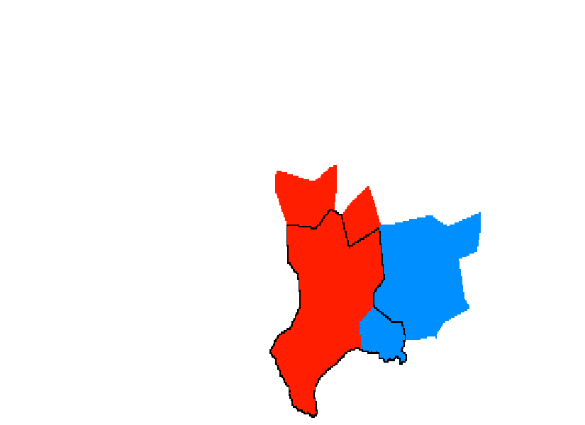
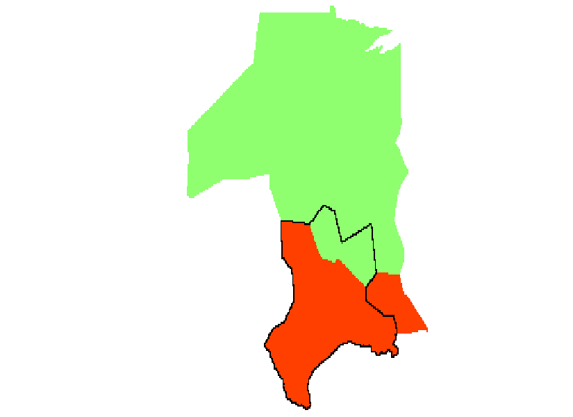
In binary exclusive classification, a single community in each realization is identified as the best match for each community in the reference partition . This is done by finding the maximum in each column of the similarity matrix , corresponding to community in the reference partition. If the column maximum occurs on the -th row, that indicates community of partition corresponds best to community of the reference partition . For all the nodes corresponding to community in partition , a value of 1 is added to the corresponding elements of the recording vector . This process is repeated for all communities in , and the occurrence of the best match is counted at the nodal level. The partitions from all realizations , are compared against , producing the final value of the recording vector with each nodal value summarizing the number of times it was ”correctly” classified relative to the reference partition . Although this approach is intuitive, it fails to account for cases where multiple communities roughly split a community in the reference partition. For example, in time series data, it is possible that two communities will merge to form a larger community in the reference partition (see Fig. 2); it seems inaccurate to only count the larger of these two communities as correctly classified.
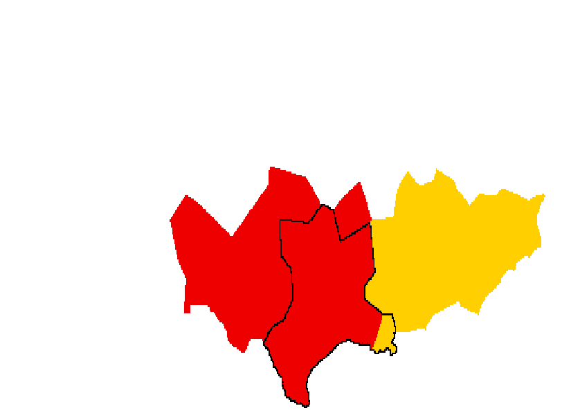
An alternative approach is binary inclusivity, which is similar to binary exclusivity. However, two communities in one network that evenly split a community in the referent network can both be counted as correct classifications. As in binary exclusivity, the similarity matrix is used to calculate the similarity of the communities, but all communities with some overlap are included. One could restrict this to communities with extensive overlap, but some threshold would have to be determined for the similarity value of the communities in question. For all the nodes belonging to the communities identified as the best matches, a value of 1 is added to the corresponding elements in the recording vector . The process is repeated for all the communities in the reference partitions for partitions from all the realizations , as in binary exclusivity described above. One disadvantage of this method is that a very large community can include a part of a small community, but all common elements are considered equally correct. In addition, without a threshold, all nodes are assigned the same value at every step, which yields no useful information. Appropriately defining a threshold is a difficult and subjective task, and potentially small differences between some communities included and excluded are not reflected by assigning binary values.
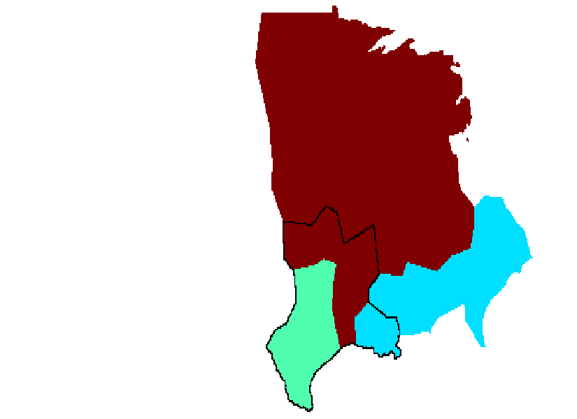
Finally, scaled inclusivity takes into account any matching with any community in the reference partition. While binary exclusivity and inclusivity only add a value of 1 to nodes corresponding to the matching communities, scaled inclusivity adds the value to (i.e., where ). Thus, how well a node is classified in any given realization is scaled based on how well its communities in the two networks match. As in binary exclusivity and inclusivity, this process is repeated for all the communities in the reference partition for partitions from all the realizations .
In the remainder of this paper, we consider scaled inclusivity because this method best captures the consistency and change in community organization.
II.3 Generate weighted average maps of consistency
Bias is inherent in the scaled inclusivity of a network that is based on a single referent partition . Every other partition is compared to this partition; the classification of the nodes in has significant effects on the consistency values. To minimize this bias, the best partition for each realization ( for ) is selected as the referent partition in turn. Thus, maps are computed. These maps are then averaged together using group similarity weights from the Jaccard similarity index. This serves to minimize the bias of any one network while still valuing the partitions that are most similar to the rest of the group.
Recall that matrix contains the Jaccard similarity index for every pair of partitions and , with =0 where . The column sum of , , is calculated, and the resulting vector is normalized to give the weights for the weighed average. Thus, the weight assigned to each scaled inclusivity map is proportional to the summed similarity of that partition to the rest of the group.
II.4 Determine most representative partition by node
A further analysis of scaled inclusivity can provide information about which realization is best when evaluating a certain portion of the network. To calculate this, a scaled inclusivity map is generated with each partition in turn as the referent partition, as above. From these, a map can be generated to show, for each node in the network, which realization has the highest scaled inclusivity value. This indicates that the node’s classification in that realization is its most consistent classification - that the group community structure in this region is best captured by this partition. Groups of nodes that are best characterized by the same partition are of interest, especially if they correspond to a single community, because this indicates that this partition does a particularly good job of characterizing that community for the entire group of networks. However, it should be noted that the actual scaled inclusivity values should be taken into account: if a given area has low scaled inclusivity values, then it does not matter what partition best represents this region because it is inconsistent across all realizations.
II.5 Generate more informative maps of individual communities
Scaled inclusivity, as described above, has a major limitation when considering a single community from a single partition. Such an analysis only includes nodes in the community of interest, even if every other partition had more nodes in the corresponding community. To solve this problem, another map can be made separately for each community in . The first step is to add the value to , just as above. Secondly, the value is subtracted from every node in that is not in (). Thus, if and have any overlap, nodes in the intersection will have a certain value added, and nodes only in will have a negative value with equal magnitude subtracted. These values can be summed for in where and as long as is held constant. In this way, the negative values will not cancel out positive values - positive values occur only for nodes in , and negative values occur only for nodes not in . Much as high positive values indicate consistent classification in and a community in with significant overlap with , very negative values indicate consistent classification outside of but in a community in with significant overlap with . In other words, they are consistently classified in the same community as nodes in across the other partitions. This is a useful distinction to make in the case the referent partition contains a community of interest that lacks certain nodes or segments that are included in all other partitions. In this case, the values of those nodes would be very negative, indicating group consistency in spite of absence from the referent partition’s community.
III Data
III.1 Simulated Data
The first data set to be tested consists of 30 simulated networks using code from Lancichinetti et al. (2008). These networks were mapped onto a network of the 256 most populous cities in the United States to more easily visualize the community structure of the network.
Lancichinetti, et al. Lancichinetti et al. (2008) describe a method for creating unweighted, undirected networks to test various community structure algorithms. A key component of this algorithm is that degree and community size distributions are power laws, as in many real-world networks.
Parameters of the algorithm are number of nodes (), mixing parameter (), average degree (), maximum degree (), minimum community size (), maximum community size (), and the exponents of the power law degree and community size distributions ( and , respectively). The mixing parameter is defined such that every node shares a fraction 1- links with other nodes in its community and a fraction links with nodes outside its community.
The algorithm computes degree and community size distributions based on the input parameters, and nodes are assigned a degree. Nodes are then assigned to communities, and the network is rewired to preserve degree and approximate .
The code to run this algorithm was made freely available online by the authors (http://santo.fortunato.googlepages.com/benchmark. tgz). We used this code to generate 30 networks, each with = 256, = 0.35, = 10, = 50, = 15, = 51, = 2, and = 1. The network size was chosen to be fairly small for computational ease. Minimum community size was set to give a relatively consistent number of communities (). The remaining parameters were adjusted slightly from the default values such that community analysis would show imperfect results similar to the community analysis of real-world networks. The sizes of the communities for each of the 30 networks can be seen in Table 1.
| Network | Number of Nodes in each Community | |||||||||||
|---|---|---|---|---|---|---|---|---|---|---|---|---|
| 1 | 16 | 16 | 17 | 29 | 29 | 32 | 33 | 39 | 45 | |||
| 2 | 15 | 15 | 19 | 20 | 22 | 29 | 30 | 36 | 70 | |||
| 3 | 15 | 18 | 21 | 27 | 30 | 34 | 35 | 38 | 38 | |||
| 4 | 15 | 15 | 18 | 19 | 21 | 22 | 22 | 24 | 30 | 32 | 38 | |
| 5 | 15 | 18 | 22 | 23 | 27 | 29 | 34 | 40 | 48 | |||
| 6 | 15 | 15 | 17 | 19 | 24 | 27 | 29 | 31 | 35 | 44 | ||
| 7 | 15 | 18 | 20 | 22 | 23 | 27 | 27 | 28 | 34 | 42 | ||
| 8 | 22 | 22 | 26 | 28 | 29 | 31 | 31 | 31 | 36 | |||
| 9 | 15 | 15 | 16 | 20 | 24 | 30 | 32 | 33 | 34 | 37 | ||
| 10 | 20 | 25 | 26 | 28 | 28 | 29 | 32 | 33 | 35 | |||
| 11 | 16 | 16 | 18 | 19 | 20 | 20 | 21 | 21 | 32 | 36 | 37 | |
| 12 | 17 | 23 | 28 | 31 | 36 | 38 | 39 | 44 | ||||
| 13 | 16 | 22 | 23 | 30 | 31 | 39 | 40 | 55 | ||||
| 14 | 17 | 17 | 19 | 24 | 26 | 27 | 38 | 40 | 48 | |||
| 15 | 16 | 21 | 26 | 26 | 31 | 31 | 33 | 36 | 36 | |||
| 16 | 15 | 19 | 20 | 20 | 22 | 24 | 28 | 33 | 35 | 40 | ||
| 17 | 17 | 22 | 24 | 28 | 35 | 35 | 38 | 57 | ||||
| 18 | 19 | 22 | 24 | 24 | 27 | 30 | 35 | 36 | 39 | |||
| 19 | 15 | 21 | 26 | 31 | 31 | 32 | 32 | 32 | 36 | |||
| 20 | 22 | 30 | 32 | 32 | 32 | 33 | 37 | 38 | ||||
| 21 | 17 | 18 | 19 | 20 | 24 | 25 | 27 | 32 | 35 | 39 | ||
| 22 | 16 | 16 | 19 | 20 | 20 | 21 | 23 | 33 | 38 | 50 | ||
| 23 | 16 | 17 | 19 | 26 | 28 | 33 | 38 | 39 | 40 | |||
| 24 | 17 | 17 | 17 | 18 | 18 | 18 | 18 | 23 | 25 | 26 | 27 | 32 |
| 25 | 15 | 16 | 17 | 17 | 18 | 22 | 25 | 33 | 34 | 59 | ||
| 26 | 15 | 15 | 16 | 17 | 18 | 24 | 26 | 29 | 30 | 32 | 34 | |
| 27 | 20 | 23 | 31 | 32 | 33 | 35 | 36 | 46 | ||||
| 28 | 15 | 19 | 20 | 25 | 25 | 26 | 27 | 29 | 29 | 41 | ||
| 29 | 18 | 22 | 24 | 25 | 27 | 27 | 27 | 40 | 46 | |||
| 30 | 16 | 19 | 19 | 26 | 29 | 33 | 34 | 40 | 40 | |||
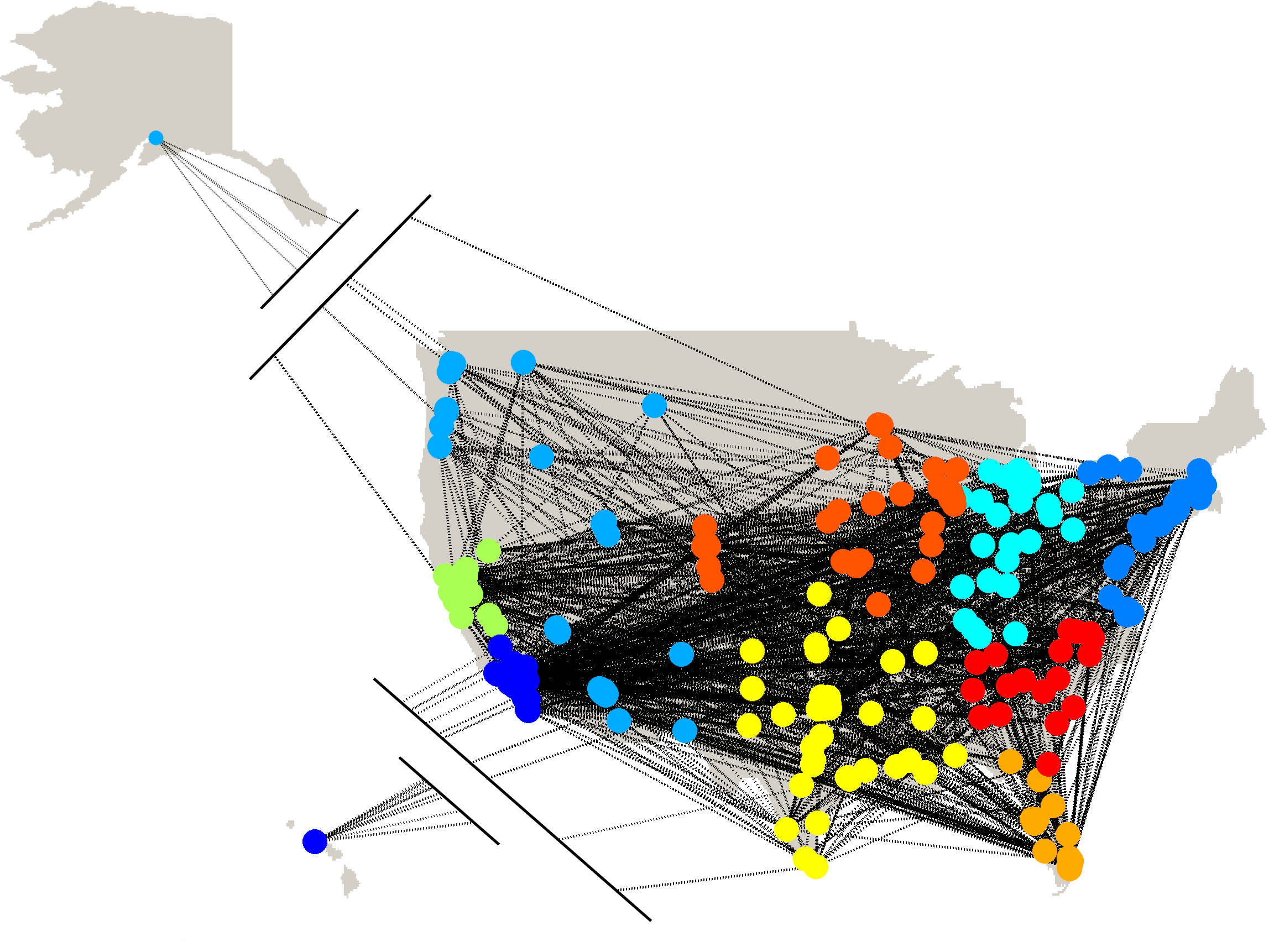
The nodes assigned to a given community in any individual network were random. In order to visualize these networks and to give the networks some consistency in their community structure, the nodes were assigned to the 256 most populous cities in the United States according to 2009 census data Bureau (2010). Consider the matrix , whose rows () contain the longitude and latitude of a given city ( = 1,2,). Recall that is the set of nodes in community ( = 1,2,,) and = . Let be the set of coordinate pairs ( {1,2,,256}) such that also has size . For each network, each city was manually assigned to a community based on community size and geographical proximity. Each node is assigned to an arbitrary node , and the cities inherit the links from the associated nodes to keep the network structure intact.
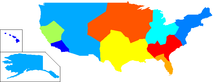
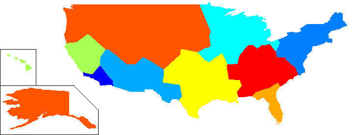
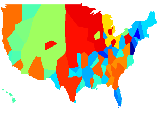
An example of one of the networks (network 30) is shown in Fig. 3 with each node color-coded according to community membership. We also generated an alternative space-filling visualization. The United States Census Bureau releases the latitude and longitude of the borders of the country Bureau (2010). A map was generated using these coordinates, and it was converted into a 1200x600 image. Let be a pixel in this grid ( {1,2,, 1200}, {1,2,,600}). For every within U.S. borders, the Euclidean distance to each of the 256 most populous cities was computed, and the pixel was assigned to the nearest city. Fig. 4 shows the simulated communities for network 30 (a) and for network 3 (b). The communities are shown by color-coding the pixels assigned to each node. These networks are shown as examples of typical community structure. The two are fairly similar, but no community is identical between them. It should be noted that due to differences in spacing, some nodes have very few assigned pixels, while others have many. In other words, the area of a community is not necessarily indicative of the number of nodes it contains.
III.2 Real Data
The second set of test data comes from NCAA College Football from the years 1995 to 2009. In this network, each team that was active in the Football Bowl Subdivision (formerly Division IA, hereafter called FBS) constitutes a node, and every game played between two FBS teams is a link. In each season, teams play eleven or twelve regular season games and one or two postseason games. Teams are organized into conferences, which usually consist of between eight and twelve teams. Teams generally play other teams in their own conference more often than teams in other conferences. The main exceptions are independent schools, which are not members of any conference. In addition, schools may play one game each season against teams that are not in the FBS. These games were not counted in the network. In rare cases, teams may have played two games against the same opponent in one season. The second game was not counted; there were no weighted links in these networks. Some teams joined the FBS during the time period in question. Any games played by these teams against FBS opponents prior to joining the FBS were not counted in the network. For consistency in the analysis, these nodes were included in the networks for these seasons, but each team belonged to an isolated community until the year it joined the FBS.
This data set lends itself well to network analysis both because of its size (N=120) and because the communities in the network are well-defined in reality. Each conference represents a community, and each independent team is counted as a separate community as well.
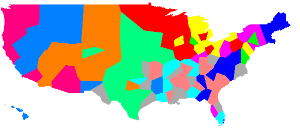
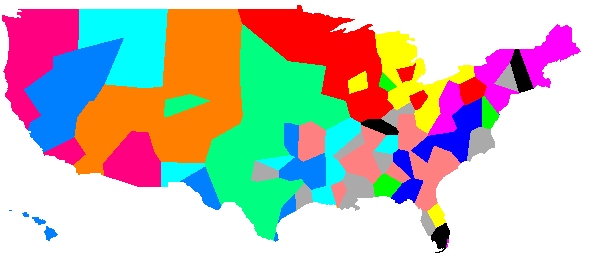
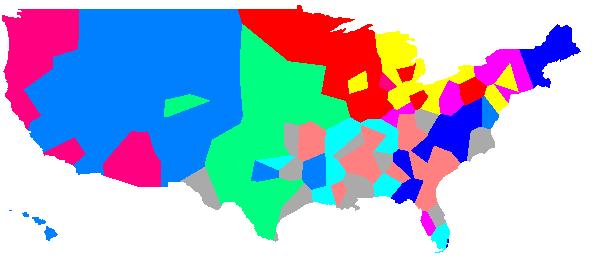
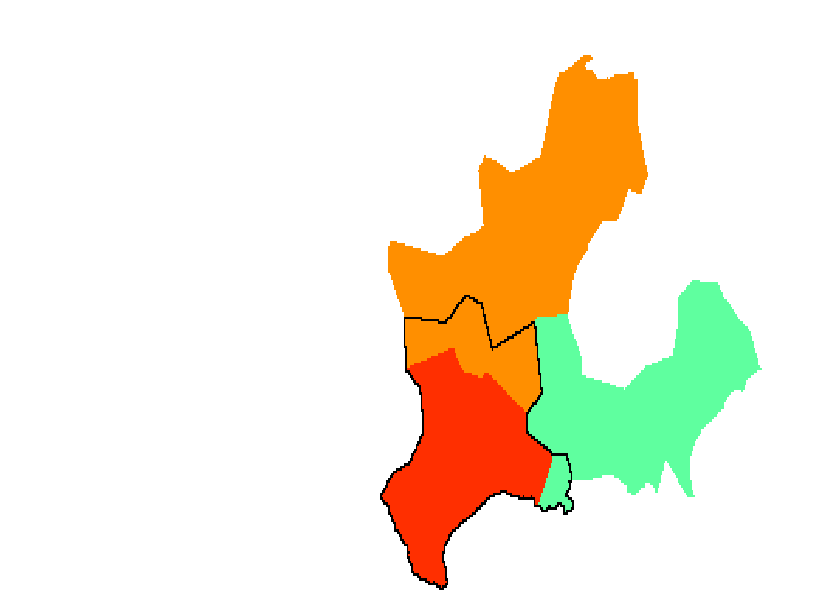
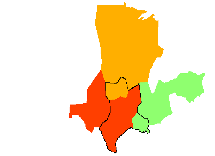
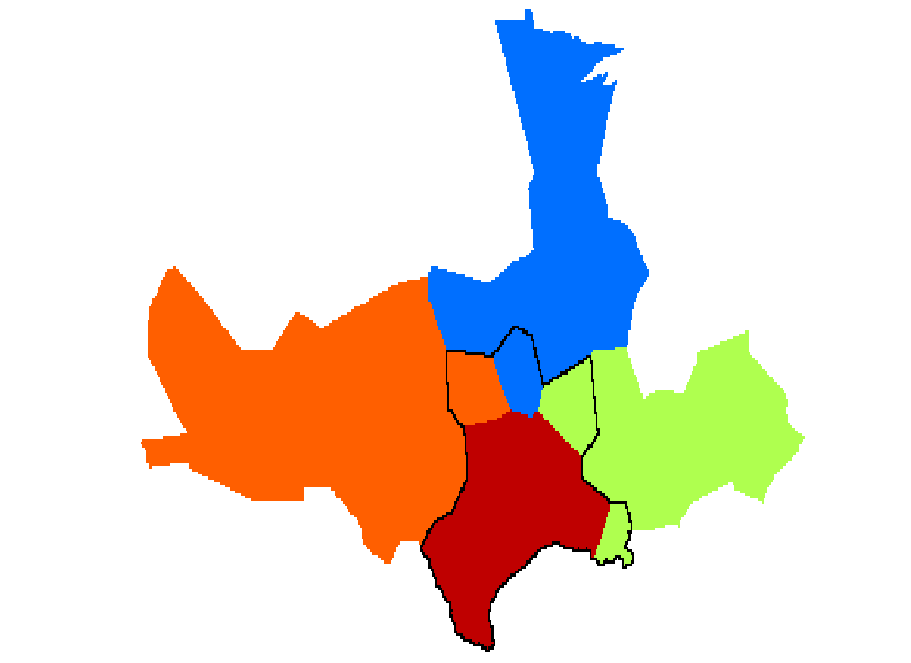
The conferences that existed in 2009 were the Atlantic Coast Conference (ACC), the Big 12, the Big East, the Big Ten, Conference USA (CUSA), the Mid-American Conference (MAC), the Mountain West Conference (MWC), the Pac-10, the Southeastern Conference (SEC), the Sun Belt Conference, and the Western Athletic Conference (WAC). In 2009, there were three independent teams: Notre Dame, Army, and Navy. Several conferences that existed in 1995 (the first year of our analysis) are no longer in existence: the Big 8 (now the Big 12), the Big West, and the Southwest Conference (SWC). Finally, there were 120 FBS teams in 2009, whereas there were 107 in 1995. The conference alignment for 2009 and 2003 are shown in Fig. 5 as examples of the full landscape. All the same conferences existed in these two seasons, but a number of teams changed conferences, and four teams joined the FBS between 2003 and 2009.
The total number of teams in each conference for each season can be seen in Table 2. Table 2 reveals some basic information about the consistency of community structure between 1995 and 2009. For example, several conferences came into existence (CUSA, the MWC, and the Sun Belt), and several ceased to exist (the Big 8, the Big West, and the SWC). In addition, some conferences changed in size (the ACC, the Big East, the MAC, and the WAC), while others remained constant (the Big Ten, the Pac 10, and the SEC). Finally, the number of independents decreased fairly steadily over the time period in question.
| Year | ACC | Big 8 | Big 12 | Big East | Big Ten | Big West | CUSA | MAC | MWC | Pac 10 | SEC | SWC | Sun Belt | WAC | Ind. |
|---|---|---|---|---|---|---|---|---|---|---|---|---|---|---|---|
| 1995 | 9 | 8 | 0 | 8 | 11 | 9 | 0 | 10 | 0 | 10 | 12 | 8 | 0 | 10 | 12 |
| 1996 | 9 | 0 | 12 | 8 | 11 | 6 | 6 | 10 | 0 | 10 | 12 | 0 | 0 | 16 | 11 |
| 1997 | 9 | 0 | 12 | 8 | 11 | 6 | 7 | 12 | 0 | 10 | 12 | 0 | 0 | 16 | 9 |
| 1998 | 9 | 0 | 12 | 8 | 11 | 6 | 8 | 12 | 0 | 10 | 12 | 0 | 0 | 16 | 8 |
| 1999 | 9 | 0 | 12 | 8 | 11 | 7 | 9 | 13 | 8 | 10 | 12 | 0 | 0 | 8 | 7 |
| 2000 | 9 | 0 | 12 | 8 | 11 | 6 | 9 | 13 | 8 | 10 | 12 | 0 | 0 | 9 | 9 |
| 2001 | 9 | 0 | 12 | 8 | 11 | 0 | 10 | 13 | 8 | 10 | 12 | 0 | 7 | 10 | 7 |
| 2002 | 9 | 0 | 12 | 8 | 11 | 0 | 10 | 14 | 8 | 10 | 12 | 0 | 7 | 10 | 6 |
| 2003 | 9 | 0 | 12 | 8 | 11 | 0 | 11 | 14 | 8 | 10 | 12 | 0 | 8 | 10 | 4 |
| 2004 | 11 | 0 | 12 | 7 | 11 | 0 | 11 | 14 | 8 | 10 | 12 | 0 | 11 | 10 | 2 |
| 2005 | 12 | 0 | 12 | 8 | 11 | 0 | 12 | 12 | 9 | 10 | 12 | 0 | 8 | 9 | 4 |
| 2006 | 12 | 0 | 12 | 8 | 11 | 0 | 12 | 12 | 9 | 10 | 12 | 0 | 8 | 9 | 4 |
| 2007 | 12 | 0 | 12 | 8 | 11 | 0 | 12 | 13 | 9 | 10 | 12 | 0 | 8 | 9 | 4 |
| 2008 | 12 | 0 | 12 | 8 | 11 | 0 | 12 | 13 | 9 | 10 | 12 | 0 | 9 | 9 | 3 |
| 2009 | 12 | 0 | 12 | 8 | 11 | 0 | 12 | 13 | 9 | 10 | 12 | 0 | 9 | 9 | 3 |
The mapping procedure for the simulated data was replicated here with containing the latitude and longitude of team ( = 1,2,,120). Thus, the pixels were assigned to teams instead of cities. As before, the number of pixels assigned to a single node varied greatly; community size in pixels does not necessarily indicate community size in number of teams.
IV Results
IV.1 Simulated Data
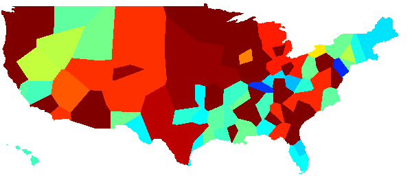
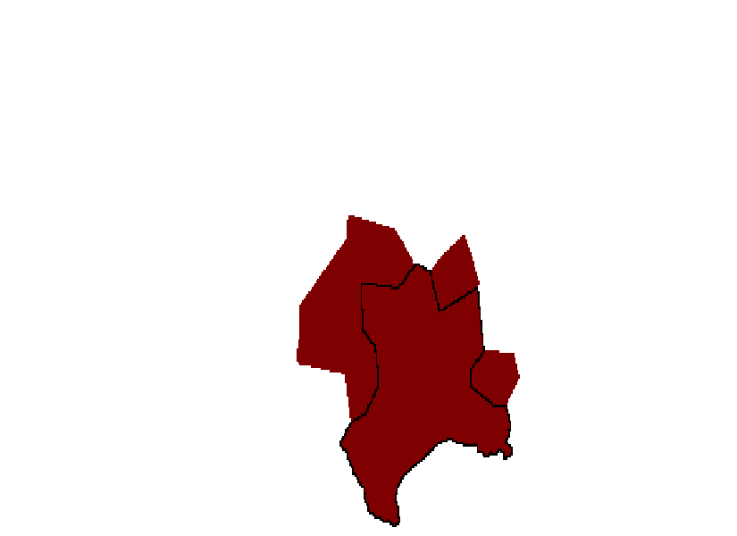
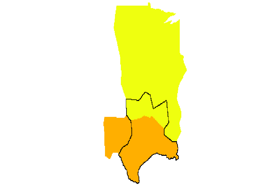
We conducted the analysis in Section II on the 30 simulated networks to evaluate the effectiveness of the algorithm. For this analysis, we ran QCut 10 times for each realization (). The community sizes of the best results of QCut can be seen in Table 3, included for comparison with the simulated community sizes as seen in Table 1. Here, we will look more closely at the scaled inclusivity of a representative network (network 30). The simulated communities can be seen in Fig. 4(a), and the best QCut results for network 30 can be seen in Fig. 6. Note the misclassified nodes in the community containing Texas in the QCut results (which are to be expected from any community structure algorithm).
| Network | Community Sizes | ||||||||||||
|---|---|---|---|---|---|---|---|---|---|---|---|---|---|
| 1 | 14.1 | 16 | 17 | 22 | 28 | 31 | 32 | 33 | 34 | 43 | |||
| 2 | 13.4 | 15 | 17 | 18 | 20 | 23 | 29 | 30 | 36 | 68 | |||
| 3 | 15.0 | 16 | 18 | 21 | 28 | 32 | 32 | 36 | 36 | 37 | |||
| 4 | 14.2 | 15 | 15 | 17 | 20 | 20 | 22 | 22 | 24 | 30 | 32 | 39 | |
| 5 | 14.3 | 15 | 18 | 22 | 23 | 29 | 29 | 33 | 42 | 45 | |||
| 6 | 14.8 | 15 | 15 | 17 | 19 | 24 | 27 | 29 | 31 | 35 | 44 | ||
| 7 | 15.3 | 16 | 18 | 21 | 22 | 22 | 27 | 27 | 28 | 34 | 41 | ||
| 8 | 14.7 | 22 | 22 | 26 | 28 | 29 | 31 | 31 | 31 | 36 | |||
| 9 | 15.4 | 15 | 16 | 17 | 20 | 22 | 30 | 32 | 33 | 34 | 37 | ||
| 10 | 14.8 | 20 | 27 | 27 | 28 | 28 | 28 | 31 | 32 | 35 | |||
| 11 | 14.7 | 16 | 16 | 18 | 19 | 20 | 20 | 21 | 21 | 32 | 36 | 37 | |
| 12 | 13.7 | 17 | 24 | 28 | 31 | 36 | 38 | 40 | 42 | ||||
| 13 | 14.1 | 16 | 23 | 23 | 30 | 31 | 39 | 41 | 53 | ||||
| 14 | 15.4 | 17 | 18 | 19 | 25 | 25 | 27 | 38 | 39 | 48 | |||
| 15 | 13.3 | 18 | 21 | 27 | 27 | 31 | 32 | 32 | 32 | 36 | |||
| 16 | 14.5 | 15 | 19 | 20 | 20 | 22 | 24 | 28 | 33 | 35 | 40 | ||
| 17 | 14.3 | 17 | 24 | 28 | 28 | 35 | 35 | 38 | 51 | ||||
| 18 | 14.0 | 19 | 22 | 24 | 24 | 27 | 32 | 35 | 36 | 37 | |||
| 19 | 15.0 | 15 | 21 | 26 | 30 | 31 | 32 | 32 | 33 | 36 | |||
| 20 | 13.5 | 22 | 30 | 32 | 32 | 33 | 34 | 36 | 37 | ||||
| 21 | 15.4 | 17 | 18 | 19 | 20 | 24 | 25 | 27 | 32 | 35 | 39 | ||
| 22 | 13.5 | 16 | 16 | 19 | 20 | 21 | 21 | 23 | 33 | 38 | 49 | ||
| 23 | 15.2 | 17 | 17 | 21 | 27 | 28 | 33 | 36 | 37 | 40 | |||
| 24 | 13.0 | 17 | 17 | 17 | 18 | 18 | 18 | 19 | 23 | 25 | 26 | 26 | 32 |
| 25 | 12.6 | 17 | 17 | 17 | 18 | 19 | 22 | 25 | 33 | 34 | 54 | ||
| 26 | 14.1 | 15 | 15 | 16 | 17 | 18 | 24 | 26 | 29 | 30 | 32 | 34 | |
| 27 | 14.5 | 21 | 24 | 30 | 32 | 33 | 35 | 36 | 45 | ||||
| 28 | 15.2 | 15 | 19 | 20 | 25 | 25 | 26 | 27 | 29 | 30 | 40 | ||
| 29 | 14.5 | 18 | 22 | 24 | 25 | 27 | 27 | 27 | 41 | 45 | |||
| 30 | 15.5 | 16 | 19 | 20 | 26 | 29 | 33 | 34 | 39 | 40 | |||


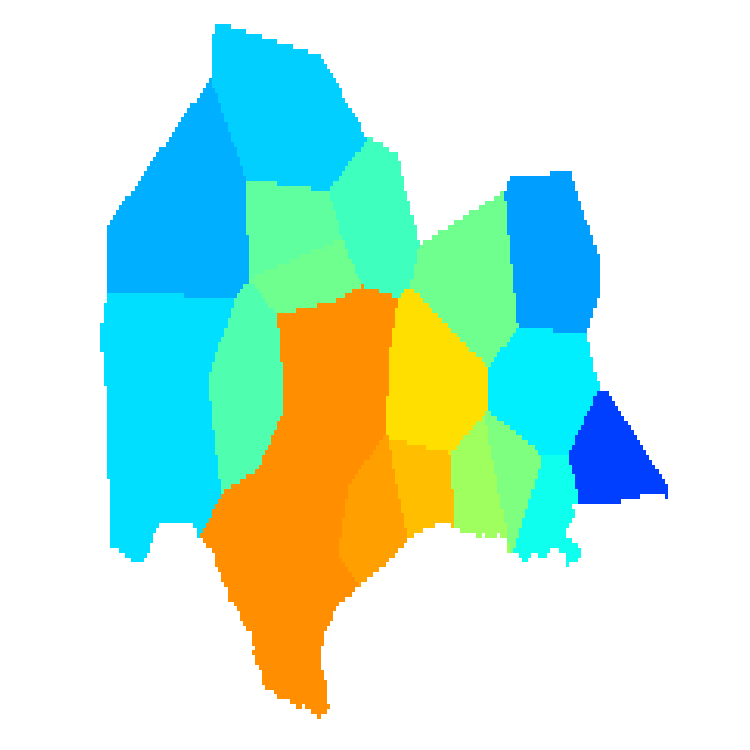
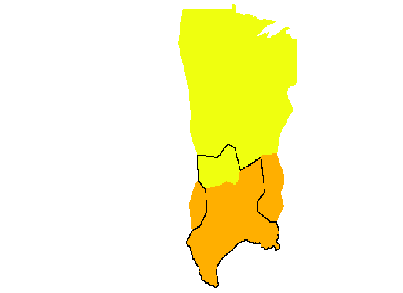
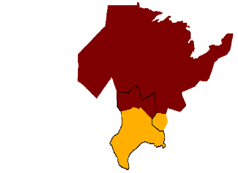
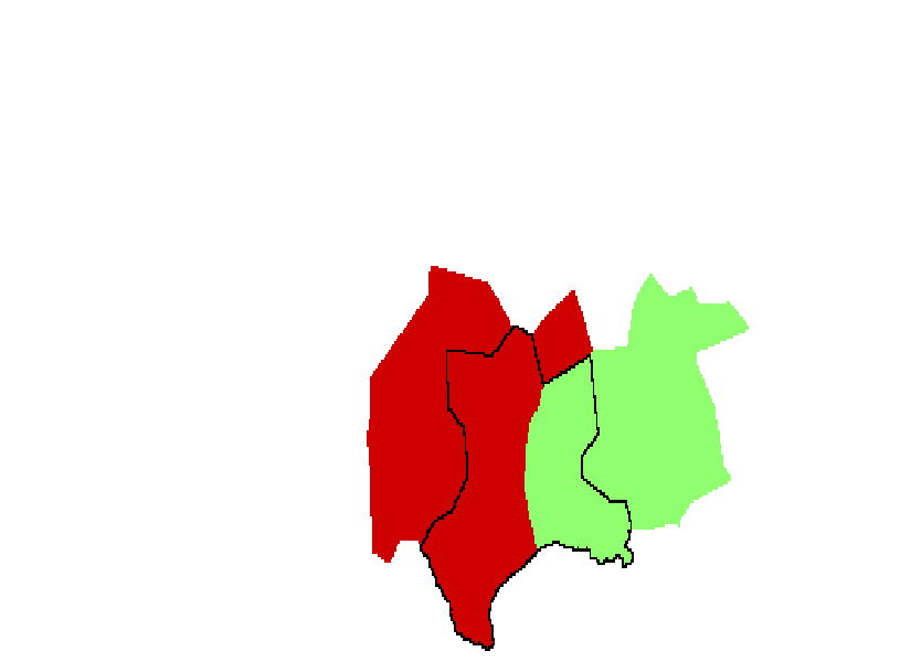
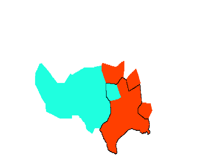
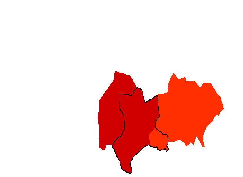
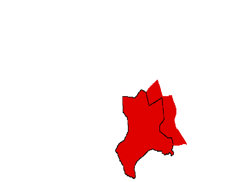
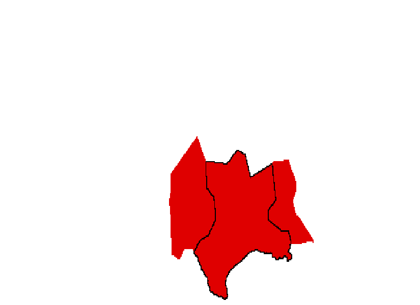
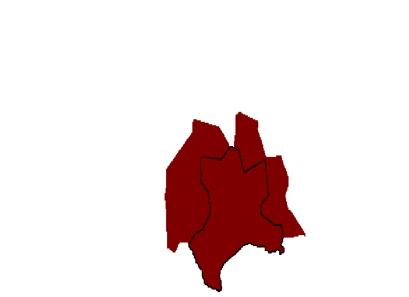
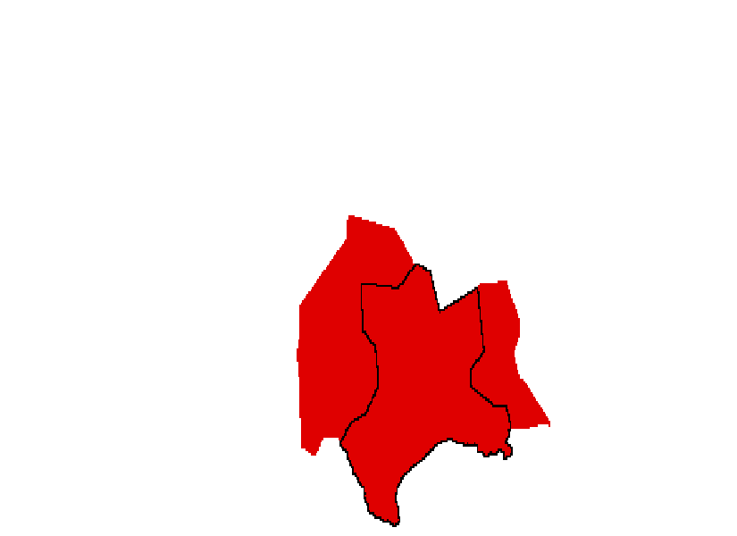
The scaled inclusivity map using network 30 as the reference partition was generated for both the simulated communities and for the results of QCut (Fig. 7). Notice the similarities and differences between the two maps, especially for the two nodes that were misclassified in network 30 (as seen in Fig. 6). In the map made from the partitions generated by QCut, those nodes were not consistently classified in the communities they occupy in network 30, so their scaled inclusivity values were quite low. This would seem to indicate that these nodes were not at all consistently classified across networks. However, in the simulated communities, these nodes were fairly consistent in their classification. The community including Texas was isolated for both the simulated communities and the results of QCut (Fig. 8) to make the differences more easily visible. Note that the nodes in central and south Texas have the highest scaled inclusivity values, and the nodes around that region have lower values. The appendix contains images of all simulated communities that overlap with the Texas community for each realization to allow the reader to visually evaluate the consistency of the nodes in that community. The nodes in this region were classified together in the same community in all other networks, but due to imperfect overlap between their communities and the community shown here, their scaled inclusivity values are less than the optimal value of 29. The other nodes shown here are sometimes included in that community and sometimes not, resulting in their lower scaled inclusivity values.
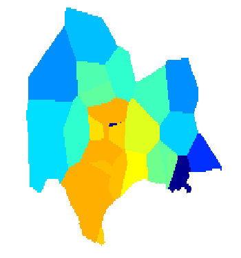
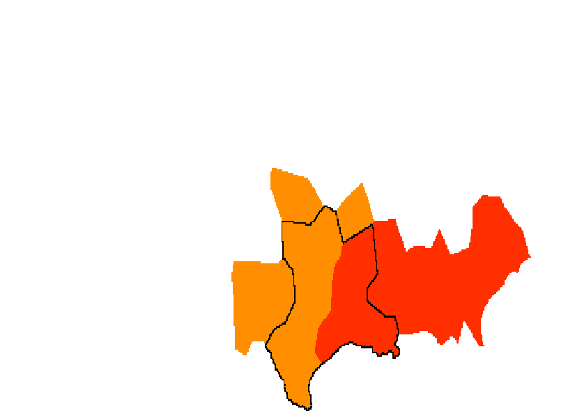
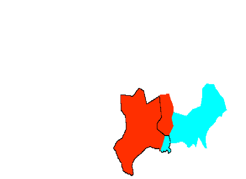
In addition, the scaled inclusivity map containing both positive and negative values is shown in Fig. 9. This map appears very similar to Fig. 8(b), but the negative values reveal more information. The node in central Texas has a very negative value - its absolute value is roughly equal to the nodes around it with positive values. The node in Louisiana, however, is not so negative. This indicates that the node in central Texas is consistently classified with the other nodes around it in the other realizations of the network; the node in Louisiana, though, is inconsistent in its classification across realizations. Thus, for the group, we can look at the node in Texas as belonging to the community containing the rest of central and south Texas across most subjects. The negative values reveal the distinction between the two misclassified nodes in this community.
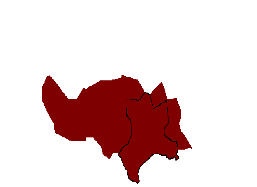
In a real data set, the true community structure is typically unknown; the only data available are the results of a community detection algorithm, making misclassified nodes such as those in Texas and Louisiana much more difficult to detect. Nodes that were misclassified or merely in a different community only in the referent partition appear to have very low scaled inclusivity values, as seen in Fig. 8(b). However, in part (a), it can be seen that those nodes were more consistently classified in the simulated communites. In order to more effectively evaluate the consistency of each node, irrespective of the specific community assignment, we generated the weighted average map, which can be seen in Fig. 10. The Jaccard index value for each network, which was used to generate the weights for the weighted average, is included in Table 3. Note that the nodes that were misclassified in network 30 have values that better match their neighbors and better reflect their consistency across all networks. This visualization may give better information about the consistency of individual nodes across multiple realizations when the true community structure is unknown. There is one significant caveat to this approach. The weighted average uses a partition from every realization as a referent. As a result, there is no single underlying community structure, and its consistency cannot be evaluated. However, the consistency of each individual node is better characterized.
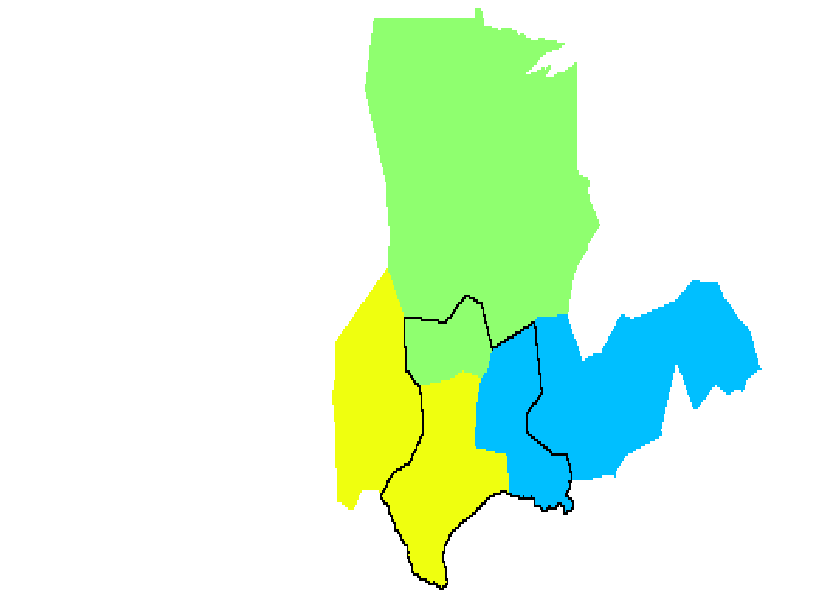
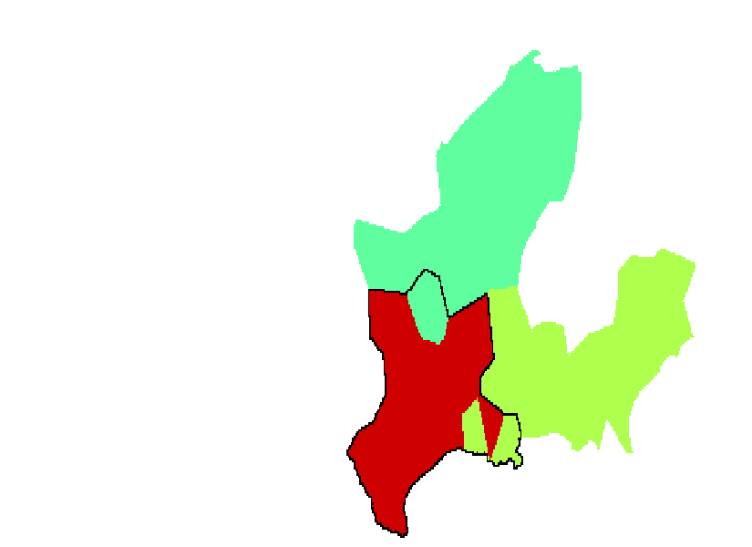
Fig. 11 shows another map of the USA. In this case, every partition was used as the referent partition , and a map was made showing which partition yielded the highest scaled inclusivity value for each node. This map reveals which referent partition best characterizes each node or region.This map is useful when interpreting the negative scaled inclusivity maps together with the weighed average map. Regions of consistent community structure can be identified on the weighted average map. To then evaluate the organization of a community in any particular region, one would consult a negative scaled inclusivity map. However, as negative scaled inclusivity maps, by necessity can only be generated for one community of a particular referent partition, the ”best” referent needs to be identified. Maps showing the referent that had the highest scaled inclusivity value (Fig. 11) are then consulted to pick the most appropriate partition to examine. For example, the northeastern United States has relatively high values, and the region is best characterized by partition 1. The negative scaled inclusivity map for that region can be seen in Fig. 12.
IV.2 Real Data
We again conducted the analysis as described in Section II (with ) to get the best partition from QCut () for every year under consideration for the college football networks. The community structure of the best run of QCut for 2009 is visible in Fig. 13. It should be noted that this partition is not the same as the true conference alignment. The football conferences form well-defined communities in general, but a network based solely on games played may result in partitions that do not directly match the conferences. For example, independent schools are put into a larger community, in part because they tend to play a large number of schools from one conference. It some cases, teams from two geographically close conferences played a large number of interconference games. An optimal partition of this network lumps two such conferences together into one community. This occurred during multiple seasons with the Sun Belt and the SEC as well as with the MWC and the WAC.
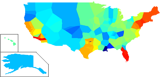
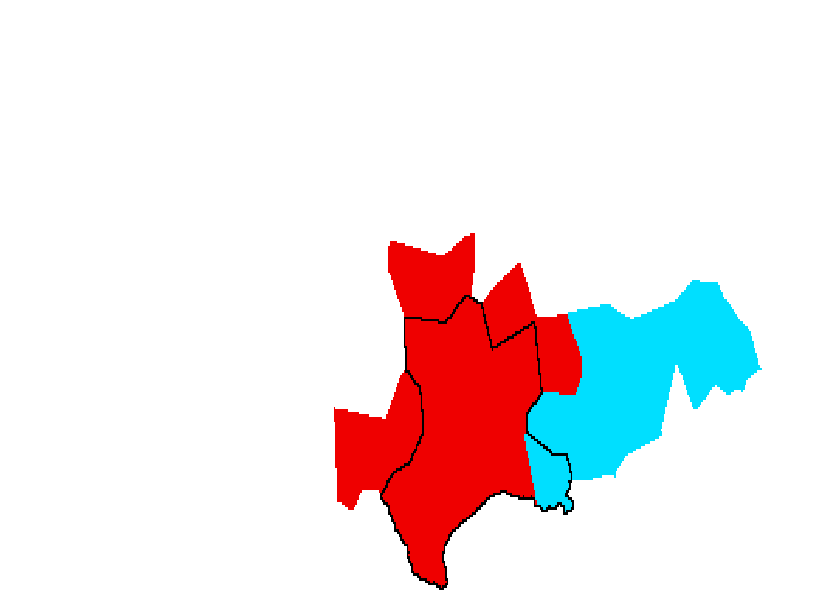
The overall scaled inclusivity map was generated for the true conference alignment and the results of QCut, and the results are visible in Fig. 14. The consistency is significantly higher in the network showing the true conference alignment. This is due to differences between the true conference membership and the community structure identified using QCut.

For time series data, there is likely a single network (probably the first or last realization, although not necessarily) that is of greatest interest. In networks with linear order, the scaled inclusivity for the most recent realization shows how consistently the community structure over time aligns with the current or most recent version of the network. However, the overall characterization of the group of networks may be of interest as well. The scaled inclusivity of the FBS networks was shown for 2009 because it is the most recent network; we have also included the weighted average map for FBS (Fig. 15) and the maximum scaled inclusivity map (Fig. 16). Interestingly, the weighted average map is very similar to the map for 2009. Of even more interest is that the maximum scaled inclusivity values appeared mostly in the first few networks. It should be noted here that because of how this was calculated, in the event of equal maximum scaled inclusivity values, the earliest network in the time series will be chosen. This may be the case here for conferences that remained unchanged throughout the time period studied, such as the PAC 10 and the Big Ten.
V Discussion
This paper has introduced scaled inclusivity, which is a new method for evaluating the consistency of the partitioning of related networks. There are several methods for determining the community structure of a network; the best way to partition a network is an area of ongoing research. The comparison of community analyses has recently become of interest as well. Emphasis has been placed on the change in community structure over time as various datasets evolve.
Several methods have been proposed for the comparison of community structure in different networks. Palla, et. al. Palla et al. (2007) studied the relationships between size, age, stationarity, and lifetime of communities. They investigate the characteristics of communities with short and long lifespans in changing networks. The stationarity is defined as the average consistency from each time step to the next. They propose a method for determining the best match among communities in consecutive time steps; we consider every pair of communities with any overlap when calculating scaled inclusivity. Asur et. al. Asur et al. (2007) define community events (continue, merge, split, form, and dissolve) and node events (appear, disappear, join, and leave). They captured the occurrence of these events over time and used that information to characterize the dynamic community structure of the network. Chakrabarti, et. al. Chakrabarti et al. (2006) define a method for evolutionary clustering, which seeks to balance the quality of fit for any specific network with similarity to previous and subsequent partitions. Fenn, et. al. Fenn et al. (2009) track community changes by using centrality metrics to analyze the roles of individual vertices in economic networks. As in scaled inclusivity, two communities at different times are compared if they have any common nodes; the method does not attempt to select the best matching communities. These methods are designed specifically to characterize change over time but are not well suited to cross-sectional analysis.
Hopcroft, et. al. Hopcroft et al. (2004) take a different approach. They use a community detection algorithm that finds the ”natural communities” of a network. This analysis leaves some nodes out as not belonging to any community. Then, to compare across time, they use a metric they call the best match, which is defined as follows for two communities and :
| (4) |
In that paper, they investigated citation networks from the NEC CiteSeer database at two different time points. Because citation networks never lose edges and because only two realizations were investigated, they manually compared the best match communities from the two datasets, noting the growth and emergence of communities over time and the corresponding changes in the fields they characterize. This method could be applied on longitudinal or cross-sectional datasets, provided that the number of networks is limited.
To our knowledge, this is the first methodology to allow a network-wide unbiased comparison of community structure across multiple realizations of a network. Scaled inclusivity differs in several ways from other approaches for evaluating the consistency of community structure. In scaled inclusivity, the partitions of multiple networks are compared to a reference partition with no a priori assumptions about which communities match one another. Every node is independently assigned a scaled value for each comparison to the reference partition based on how well the communities containing that node match in the two partitions. It is thus possible to quantify the consistency of a node’s classification across the partitions of several networks. One advantage of this approach is the inclusion of all nodes in the final analysis. Instead of only indicating the most consistent communities, scaled inclusivity assigns a consistency value to every node in the network. In addition, because the method makes no assumptions about the relationship among the networks, scaled inclusivity is equally applicable to cross-sectional (across-network) and longitudinal (across time) analyses. Finally, scaled inclusivity can be applied to datasets of any size.
We tested our algorithm on one simulated dataset and one real dataset. The simulated data used randomly generated communities which were manually assigned to the most populous cities in the United States to yield geographically contiguous communities. We found that the areas with the highest scaled inclusivity values (and thus the highest consistency of classification) were Texas, Florida, the Northeast, Southern California, and Northern California. Florida and the Northeast are highly consistent because of the geographic constraints placed on the community definitions when generating the networks. The most natural way to put these regions into geographical communities is to start from the edges of the map and work inward. For both California regions, the density of nodes determined the consistency of classification. The generally limited community size and the concentration of cities in Southern California caused those cities to be placed in the same community in nearly every map. A similar effect can be seen in Northern California as well. While there is not such a simple explanation for the high scaled inclusivity in Texas, the central region of Texas that has the highest consistency is grouped together in every partition, as can be seen in the Appendix. In addition, the Midwest, Southeast, and West varied more in their community boundaries due to changing community size; this is reflected in their lower scaled inclusivity values. Overall, the data seem to reflect the consistency of the partitions.
We also compared college football networks for the years 1995 to 2009. The scaled inclusivity for the true conference alignment closely follows what would be expected. The SEC, PAC-10, and Big Ten teams all had the highest possible scaled inclusivity values, which is to be expected because these conferences did not change membership during the time period studied. The teams in the Big 12 had only slightly lower values; the additions to the Big 8 in 1996 made a small but noticeable impact on the consistency of the conference as a whole. Conferences that have changed drastically since 1995 have much lower values, including the Big East, the WAC, Conference USA, and the Sun Belt. As with the simulated data, the scaled inclusivity values for the college football network fit with the known changes in community structure.
The results were less promising for the analysis of the football network performed on the QCut results. Due to the misclassifications of some teams (especially independents) and the combinations of conferences in certain years, the most consistent conferences are not so easily identified. Some of these problems are probably not a result of the community structure algorithm but rather of the network itself. Independent teams frequently play many teams from conferences located nearby, and conferences with overlapping territory also form rivalries with many inter-conference games. As a result, the inclusion of independent teams and the combination of multiple conferences is to be expected. The scaled inclusivity values are still generally lower for the less consistent conferences, but the differences are less clear. The results of this analysis are more difficult to interpret than similar results from the true conference alignments.
Among the difficulties inherent in identifying consistency or change in network community structure is the limitation of current algorithms. Because finding a network partition with optimal modularity has been shown to be an NP-complete problem, any algorithm based on modularity that runs in a reasonable amount of time will yield imperfect results. In many cases, the solution given may vary across multiple runs on the same network. In addition, there is evidence to suggest that the problem of optimizing Q has a degenerate search space, meaning many solutions exist with near-optimal values of Q that have significantly different community structure Good et al. (2010). To mitigate these effects on our analysis, we ran the modularity algorithm (QCut) multiple times for each network and selected the best results. This prevents a single improbable run from skewing the results of the analysis. However, we have seen that imperfections in the reference partition can unduly influence the final scaled inclusivity values in situations where a node is consistently classified in all other networks. To counter this problem, we generated a weighted average of the scaled inclusivity with each partition as the referent partition, a map that uses negative values to evaluate the consistency of nodes not included in the referent’s community, and a map showing which referent partition yielded the highest scaled inclusivity value for each node independently. All of these methods minimize the bias from a single partition on the final evaluation of consistency. This was demonstrated in greater detail with the community containing Texas in Section IV.
In this paper, we propose a method for comparing the consistency of community structure across different realizations of a network, be they the same network over time or multiple realizations of a single network. In particular, we propose a method to describe how consistently each node is part of the same community across different partitions using a metric called scaled inclusivity. This method enables us to identify which nodes tend to remain in the same community in different partitions, forming a ”core” of that community. Likewise, the method also allows identification of nodes that become part of different communities across partitions.
Community structure analysis is a growing field, and new algorithms to find the optimal partition of a network are being developed. Improved algorithms promise better partitioning of complex networks, which would render our method more effective in analyzing the consistency of the true community structure across networks. In addition, some recent community structure algorithms permit a node to be a member of multiple communities Palla et al. (2005); Baumes et al. (2005). This is thought to better characterize the community structure of some real-world networks. Basing our analysis on such algorithms is an avenue for potential future research. Finally, a key future application of the scaled inclusivity algorithm is its use on biological networks. The study of networks across subjects in research studies is rapidly growing, and the ability to compare the community structures of different populations promises to be a valuable research tool. Some of the growing subfields of biological network science include complex brain networks, protein networks, genome networks, and metabolic networks.
Acknowledgements.
This work was supported in part by the National Institute of Neurological Disorders and Stroke (NS070917 and NS039426-09S1) and the Translational Science Institute of Wake Forest University (TSI-K12).*
Appendix A Community maps of reference community containing Texas for all other simulated networks
References
- Lusseau and Newman (2004) D. Lusseau and M. E. J. Newman, Physical Review E, 271 (2004).
- Flake et al. (2002) G. W. Flake, S. Lawrence, C. L. Giles, and F. M. Coetzee, IEEE Computer, 35, 66 (2002).
- Börner et al. (2004) K. Börner, J. T. Maru, and R. L. Goldstone, Proc. Natl. Acad. Sci. USA, 101 Suppl 1, 5266 (2004), ISSN 0027-8424.
- Girvan and Newman (2002) M. Girvan and M. E. J. Newman, Proc. Natl. Acad. Sci. USA, 99, 7821 (2002).
- Hopcroft et al. (2004) J. Hopcroft, O. Khan, B. Kulis, and B. Selman, Proc. Natl. Acad. Sci. USA, 101, 5249 (2004).
- Palla et al. (2007) G. Palla, A. Barabási, and T. Vicsek, Nature, 446, 664 (2007).
- Chakrabarti et al. (2006) D. Chakrabarti, R. Kumar, and A. Tomkins, in KDD ’06: Proceedings of the 12th ACM SIGKDD international conference on Knowledge discovery and data mining (ACM, New York, NY, USA, 2006) pp. 554–560, ISBN 1-59593-339-5.
- Asur et al. (2007) S. Asur, S. Parthasarathy, and D. Ucar, in KDD ’07: Proceedings of the 13th ACM SIGKDD international conference on Knowledge discovery and data mining (ACM, New York, NY, USA, 2007) pp. 913–921, ISBN 978-1-59593-609-7.
- Fenn et al. (2009) D. J. Fenn, M. A. Porter, M. McDonald, S. Williams, N. F. Johnson, and N. S. Jones, Chaos: An Interdisciplinary Journal of Nonlinear Science, 19, 033119 (2009).
- Newman and Girvan (2004) M. E. J. Newman and M. Girvan, Physical Review E, 69 (2004).
- Brandes et al. (2006) U. Brandes, D. Delling, M. Gaertler, R. Görke, M. Hoefer, Z. Nikolski, and D. Wagner, Technical Report 2006-19, ITI Wagner, Faculty of Informatics, Universität Karlsruhe (TH) (2006).
- Ruan and Zhang (2008) J. Ruan and W. Zhang, Physical Review E, 77 (2008).
- Lancichinetti et al. (2008) A. Lancichinetti, S. Fortunato, and F. Radicchi, Physical Review E, 78 (2008).
- Bureau (2010) U. C. Bureau, “Annual population estimates,” (2010).
- Good et al. (2010) B. H. Good, Y.-A. de Montjoye, and A. Clauset, Phys. Rev. E, 81, 046106 (2010).
- Palla et al. (2005) G. Palla, I. Derenyi, I. Farkas, and T. Vicsek, NATURE, 435, 814 (2005).
- Baumes et al. (2005) J. Baumes, M. K. Goldberg, M. S. Krishnamoorthy, M. Magdon-Ismail, and N. Preston, in IADIS AC (2005) pp. 97–104.