The Trade-offs with Space Time Cube Representation of Spatiotemporal Patterns
Abstract
Space time cube representation is an information visualization technique where spatiotemporal data points are mapped into a cube. Fast and correct analysis of such information is important in for instance geospatial and social visualization applications. Information visualization researchers have previously argued that space time cube representation is beneficial in revealing complex spatiotemporal patterns in a dataset to users. The argument is based on the fact that both time and spatial information are displayed simultaneously to users, an effect difficult to achieve in other representations. However, to our knowledge the actual usefulness of space time cube representation in conveying complex spatiotemporal patterns to users has not been empirically validated. To fill this gap we report on a between-subjects experiment comparing novice users’ error rates and response times when answering a set of questions using either space time cube or a baseline 2D representation. For some simple questions the error rates were lower when using the baseline representation. For complex questions where the participants needed an overall understanding of the spatiotemporal structure of the dataset, the space time cube representation resulted in on average twice as fast response times with no difference in error rates compared to the baseline. These results provide an empirical foundation for the hypothesis that space time cube representation benefits users when analyzing complex spatiotemporal patterns.
1 Introduction
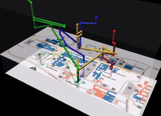
The space time cube is an information visualization technique that displays spatiotemporal data inside a cube, sometimes called an “aquarium” [7]. The height axis is used to denote time. The space time cube was originally proposed by Torsten Hägerstrand in the early 1970s in a seminal paper on time geography [6], and has since then been mainly used to display geospatial data [8]. The space time cube representation has been proposed by Kraak [5] and others [3, 4] as a tool in spatiotemporal visualization [3,4,5]. Recent applications of space time cube representation include geospatial visualization [3, 4, 5] and visualization of sport [9]. Figure 2 shows an example of space time cube representation.
Information visualization researchers have stated that the theoretical advantage of the space time cube is the ability to efficiently convey complex spatiotemporal patterns to users [3, 4, 5]. The argument is based on the fact that space time cube representation presents users with the full spatiotemporal dataset in a single view, in contrast to traditional 2D displays where complex spatiotemporal information is often conveyed using time slider controls, animation or resolution-limited pseudocolor sequences [12].
However, before we research and build complex space time cube applications a solid understanding of the costs and benefits of presenting users with space time cube representation is desirable. To our knowledge no formal empirical experiment comparing space time cube against a baseline 2D visualization has been carried out. Hence we do not know if there is any advantage at all in using space time cube representation. As has recently been argued in the literature (e.g. [13]), evaluation is an important contribution towards changing some parts of the information visualization field into a “hard” science.
1.1 Contributions
In this paper we present empirical results from a baseline comparison where we investigate users’ ability to quickly and correctly answer a set of questions in varying difficulty and complexity about a dataset in the continuous spatiotemporal domain.
We provide empirical data that highlight the trade-offs in space time cube representation. Our results show that space time cube representation results in more errors for novice users answering a category of “simple” questions such as “Are two persons at the same place at 9:00?” More interestingly, the results also reveal that using space time cube representation the average response times were reduced from 121 s to 60 s when novice users were asked to answer questions that required an overall understanding of the spatiotemporal patterns in the dataset. The latter result supports the claim that space time cube representation is advantageous in conveying complex spatiotemporal data to users. Further, it motivates research and evaluation of new space time cube representations for a plethora of application domains.
1.2 Research Questions
Given the lack of foundation from previous empirical research results, we decided to focus this investigation on the most basic questions:
-
1.
Can novice users understand and use a space time cube system effectively after a short amount of practice?
-
2.
Are there measurable performance differences in terms of error rates and response times between a space time cube system and a baseline 2D system?
-
3.
Are there measurable performance differences in terms of error rates and response times between a space time cube system and a baseline 2D system for specific categories of questions?
The two dependent variables were error and response time. Error is indicative of if users understood the dataset under a particular visualization. Response time shows how long it took participants to make an informed decision using a particular visualization. Relative longer response times indicate that a particular visualization was not as efficient. Unlike error, the significance of response time may differ for different tasks (as long as the response time difference is not severe, e.g. one minute vs. one hour).
We decided to concentrate on novice users for the following reasons. First, it is hard to find expert users that have proficiency in either a space time cube system, or in another visualization system that can be used as a suitable baseline [11]. Most likely, expert users have varying knowledge of an ensemble of different visualization systems and tools, creating difficulties for a direct comparison between two systems. Second, if we can show that space time cube representation is advantageous to novice users, such a result is in itself useful as an empirical building block: researchers then know that novice users understand space time cube representation relatively quickly and can easily recruit non-expert participants for many different experimental setups. Third, if novice users are shown to use space time cube representation effectively, there is no reason to believe expert users would not be able to do the same. In fact, expert users are most likely even better.
Note that we do not rule out the possibility of a study of expert users’ experience with space time cube representation. However, we do believe such a study is probably more interesting from another perspective, for example, to study how expert users analyze complex spatiotemporal patterns.
2 Domain
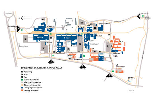
We decided to use human walking traces overlaid on a schematic of a university campus area as our domain. Figure 1 shows the campus map. Note that we cropped the outside areas of the map (e.g. road entrances). Clearly, the map choice may affect experimental results. Different maps can be designed for many different purposes, and no map is “perfect” unless (possibly) it is specifically tailored for a particular set of analytic questions. To avoid this issue altogether we settled for using the official campus map that was designed by university staff and has been in use on, for example, notice boards all over the campus for many years. A walking data analysis application is realistic in practice given recent interest in social visualization. For example, Aipperspach [1] describes recent work on visualizing walking data. We acquired the walking data by tracking volunteer students’ movement along the campus during a day.
3 Systems
A dilemma when comparing a visualization method such as space time cube representation with another is the choice of a suitable baseline. Clearly no baseline representation will ever be “fair” from all perspectives of information visualization. This dilemma makes costly empirical experiments risky and may be a factor influencing the limited number of user studies in the information visualization field [11]. In some specific instances researchers can compare different interfaces such as 2D and 3D against each other using the same system, such as Sebrechts et al. [10] study on visualization of search results in text, 2D and 3D. Sebrecths et al. [10] et al. approached the “fairness dilemma” by constructing the 2D interface by simply flattening their 3D interface.
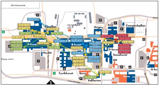
With regards to space time cube representation we believe that some approach needs to be taken to gain any clarity in the issue. However, unlike Sebrechts et al. [10], we attempted to create a fair baseline given assumptions on what we set out to investigate in our experiment, rather than creating a baseline that is as closely related to the 3D system as possible. We focused on a baseline comparison where both representations aim at providing users with an overall understanding of the spatiotemporal patterns in the dataset at a glance. After all, it is this advantage of space time cube representation that is most often argued in the literature [3, 4, 5]. We rejected time sliders and animations that partition the temporal dimension of datasets into discrete time steps, because users cannot get an overview of the dataset at a glance with such representations. Recognizing the limitation of granularity with ordinal pseudocolor sequences [12] we gave up any attempts of using sophisticated color scales to reveal time information. Instead we compromised for an approach where critical time points in 2D are indicated with semantic markup (text), see Figure 3. This choice gives users the ability to perceive an overview of the spatiotemporal patterns at a glance, even with 2D. Note that the labels (markup) in Figure 3 can easily be turned on or off with the keyboard.
Both the space time cube system and 2D baseline system are interactive. With the space time cube system users can for instance pan, rotate and zoom in and out. With the baseline 2D system the user can toggle the display of time labels and zoom in and out of a portion of the map.
It is important to note that the purpose of the baseline 2D system is to provide the space time cube representation with a reasonable baseline. That is, the space time cube should “beat” the baseline in at least some aspect to merit further research by the information visualization community. The purpose of the 2D baseline system is not to investigate how 2D visualization can be made more effective. This in itself is an interesting research question, but out of scope of this paper.
3.1 Space Time Cube System
To perform our investigation we developed a space time cube system capable of rendering walking data traces inside a cube (see Figure 2). The system has a “measurement” plane that can be moved up and down along the height axis to make it easier to read when a particular event occurred. The exact time of the measurement plane’s current position is displayed to the right of the space time cube display area.
The space time cube system is controlled via either the keyboard or a graphical user interface (gui). Using the gui or a keyboard the user can rotate, zoom and move the measurement plane up or down.
3.2 Baseline 2D System
The baseline 2D system displays walking data traces using different colors (green, blue, yellow, red; see also Figure 3). The colors were the same as in the space time cube system.
The colored line traces indicate different persons, and the labels indicate the start and end time for a person at specific point in the map. Users can toggle the display of labels and zoom in and out with the keyboard.
4 Method
We used a between-subjects experimental design where participants were exposed to one of two conditions: either they used a space time cube system, or the baseline 2D system.
Often within-subjects experimental design is preferable since 1) variation between conditions is controlled within the participant; and 2) generally a smaller number of participants are required. However, in this experiment it is plausible that participants become increasingly familiar with the material and task during the experiment. With a within-subjects design there is a risk that one condition (call it condition A) better aids participants in understanding the material and the task than the other condition (call it condition B). This asymmetrical skill-transfer effect would in fact penalize the performance of condition A when preceded by condition B, and unfairly benefit condition B when preceded by condition A. To avoid this confound a between-subjects design was used, and the number of participants in the experiment was increased accordingly ().
4.1 Participants
30 participants, 15 male and 15 female, were recruited from the university campus. The participants were screened for color blindness. None had any previous experience in using information visualization tools. The groups were gender-balanced.
4.2 Apparatus
The experiment was conducted on two laptops with 15′′ screens and 32-bit color depth. Although the physical dimensions of the laptop screens were identical, the screen resolution varied slightly in the vertical dimension. The first laptop had a screen resolution of 1280 1024 while the second laptop had a screen resolution of 1280 800.
4.3 Material
To assess the participants’ understanding of the dataset, a set of 15 questions were designed. The questions were grouped into four different question categories of varying difficulties and complexities according to Andrienko et al. [2]. Along with a description of each question category we supply an example from the material used in the conducted study (translated from Swedish).
- Question Category 1
-
Simple “when” and simple “what + where”: describes an object’s property at a given point in time, e.g. “Where is the red person at 14:00?”
- Question Category 2
-
Simple “when” and general “what + where”: describes the situation at a given point in time, e.g. “Are any two persons at the same place at 9:00?”
- Question Category 3
-
General “when” and simple “what + where”: describes an object’s characteristics over time, e.g. “Which buildings are visited by the yellow person during the day?”
- Question Category 4
-
General “when” and general “what + where”: describes the development of an entire situation over time, e.g. “Who is on the campus area for the longest time?”
15 questions were used in the experiment. Question categories 1–3 had 4 questions, question category 4 had 3 questions.
The questions were graded as either “correct” or “incorrect” based on a predefined marking scheme.
4.4 Procedure
The participants were divided into two gender-balanced groups. One group used the baseline 2D system while the second group used the space time cube system. The experiment consisted of two sessions: a practice session and a testing session. After the two sessions participants were interviewed. The experiment was designed to require a maximum of one hour of participants’ time.
4.4.1 Practice Session
The first session was a practice session where participants were asked to answer a set of written questions with the help of either system (space time cube or the baseline 2D system). The practice session lasted around 20 minutes. The domain and the questions used for the practice session were different from the material in the testing session. In the practice session lightning strike data was used. The space time cube system visualized lightning strikes as small red spheres in the cube. A corresponding system generously provided by the Swedish Meteorological and Hydrological Institute (smhi) was used as the practice baseline 2D system. The purpose of the practice session was to introduce information visualization tools to the participants and get them used to answering spatiotemporal questions with the help of the system under investigation. The systems used in the practice session were not designed to be directly comparable against each other. Therefore we do not report the results from the practice session.
4.4.2 Testing Session
After a brief break participants proceeded with the testing session that followed immediately after the practice session. The domain used in the testing session was the human walking data, explained in Section 2 earlier. The procedure in the testing session was otherwise identical to the one used in the practice session.
5 Results
Analysis of variance (anova) was used for all statistical tests described in this paper.
5.1 Error
The average error rate across all question categories for the baseline was 16% in comparison to 23% for the space time cube representation. The difference is not statistically significant (F1,28 = 4.167, p = 0.051), although very close on the 0.05 level.
Breaking down error rates into individual question categories, error rates were lower with the baseline 2D representation for the simple question categories 1 and 2 that asked about objects’ properties, or a situation, at a given time. For these question categories the baseline 2D system had close to 0% error rate (Figure 4). In question category 2 the baseline 2D system resulted in significantly fewer errors (F1,28 = 9.800, p 0.005). Error rates were particularly high in question category 3, but no statistical significant difference between the systems was found (F1,28 = 2.343, p = 0.137). Question category 4 was unique in the sense that the space time cube had a lower average error rate in comparison to 2D (31% for the 2D baseline system vs. 20% for the space time cube). However, the difference was not significant (F1,28 = 1.862, p = 0.183). From the results it is clear that participants found it harder to answer questions in categories 3 and 4 (cf. Figure 4).
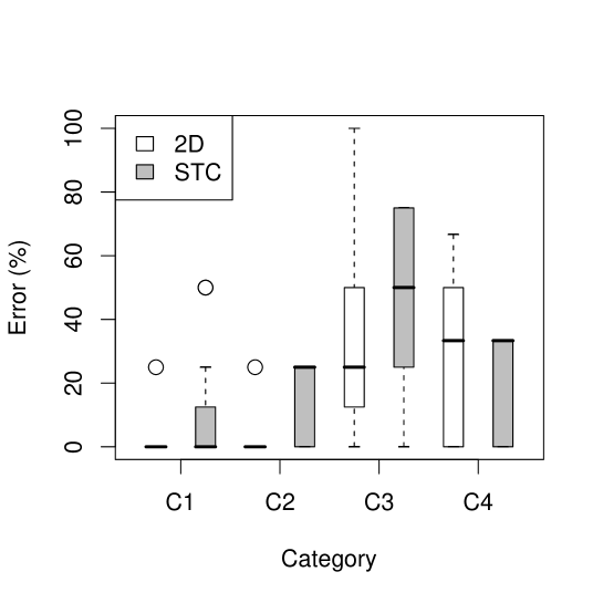
These results are somewhat expected since the participants were novice users of visualization tools, and only had a single session of practice before the testing session. The fact that there was no statistical difference found between the baseline 2D and space time cube system in neither question category 3 nor category 4, shows that the higher error rates can most likely be attributed to the difficulty increase of the question answering task in general, rather than a particular deficiency in either system. Surprisingly, error rates are more pronounced for question category 3 than category 4, even though questions in category 4 demand much more understanding of the dataset than questions in category 3.
Figure 5 plots the error rate for individual participants in each condition for question categories 1–4, ranked by performance (top performer using baseline 2D representation against top performer using space time cube representation, and so on). Question category 4 in Figure 5 is particularly interesting because this question category concerns the most difficult questions on the dataset. Note that, for question category 4 in Figure 5, at all corresponding ranking positions every participant that used space time cube representation consistently had the same or lower error rate than his or her counterpart who used the baseline 2D representation.


5.2 Response Time
The average response time per question using the 2D baseline representation was 3 seconds lower (63 seconds) than space time cube (60 seconds). The result was not significant (F1,28 = 0.217, p = 0.645).
Figure 6 shows the response times for the individual question categories. We found a high-magnitude statistically significant difference in question category 4 where space time cube representation halved the average response time from 121 s in the baseline 2D system down to 60 s (F1,28 = 6.957, p 0.05). This result supports the hypothesis that space time cube representation is efficient in supporting users’ understanding of complex spatiotemporal patterns in datasets.
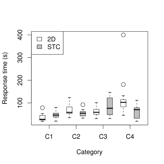
Figure 7 plots the response times for individual participants in each condition for question categories 1–4, ranked by performance. As can be seen in question category 4 in Figure 7, at all corresponding ranking positions every participant using space time cube representation consistently outperformed his or her counterpart using baseline 2D representation.


5.3 Open Comments
Participants gave us some open comments at the interview part in the experiment. When interpreting these comments it is important to keep in mind that participants had only experienced one representation.
The baseline 2D system was perceived as easy, interesting to use, “fun” and participants thought it had a “professional” feel. Eight participants stated that they thought the interconnected lines made the visualization easier to interpret, one participant stated the opposite.
Space time cube representation was perceived as intuitive, engaging, easy to understand and “cool”. Three participants stated difficulties with using the measurement plane (along the time axis). Eight participants explicitly stated that they had no problem manipulating the measurement plane.
6 Conclusions
In relation to the research questions we posed in the introduction of this paper, we found that novice users could indeed work effectively with the space time cube representation after a short amount of practice. Overall there are no measurable performance differences in either error rates or response times between the space time cube system and the baseline 2D system. However, in individual question categories significant differences in both error rates and response times were found. It has been argued that the real benefit of the space time cube is in supporting users when observing nontrivial spatiotemporal patterns that require a “bird’s-eye” view of the dataset [3, 4, 5]. The dramatic reduction in response times for the most complex and demanding questions in category 4 supports this hypothesis.
Our results also show that novice users are generally more error prone when answering a category of “simple” questions, such as “Are any two persons at the same place at 9:00?” (question category 2), when using space time cube representation. When developing systems that are expected to be used by non-experts (e.g. teaching support), we suggest implementing an alternative visualization view that more effectively aids novice users’ perception of individual data points at specific locations or points in time.
It is hard and perhaps misleading to attempt to directly generalize the implications of the results found in any experiment that compares two information visualization systems against each other. Clearly different material (both questions and map choice) might affect the experimental outcome. Nevertheless, it is worth emphasizing that every effort was made to ensure that the experiment would be as unbiased as possible. For example, the map and the walking data participants analyzed was real data and not artificially constructed for the purpose of the experiment. Moreover, the questions asked were designed and distributed into several categories according to the formalism proposed by Andrienko et al. [2]. It is perhaps best to view our contribution as supporting a hypothesis, call it the “space time cube hypothesis”. Essentially this hypothesis says that space time cube visualization aids users in analyzing complex spatiotemporal patterns. In general, one cannot prove a hypothesis, only disprove it. We did not disprove the “space time cube hypothesis”—in fact our results show that users are significantly faster with a space time cube representation when answering questions on complex spatiotemporal patterns. Our final conclusions are twofold. First, everything else equal, for complex spatiotemporal patterns there is no reason to believe space time cube representation would not result in faster response times than a baseline 2D representation similar to the one used in our experiment. Second, space time cube is worth further consideration and investigation by information visualization researchers. Prior to the experimental results presented here, there was no hard empirical motivation that space time cube representation had any benefit at all. From our results we can deduce that space time cube is at least worth further investigation, for example by varying data density, choice of maps, domains or level of expertise among the participants.
7 Acknowledgments
This work was in part sponsored by sics Linköping. We thank Piotr Zieliński and David Stern for their assistance.
References
- [1] R. Aipperspach. “Visualization of social data for the home,” Social Visualization: Exploring Text, Audio, and Video Interactions Workshop at ACM Conf. on Human Factors in Computing Systems, (no page numbers), 2006.
- [2] N. Andrienko, G. Andrienko, and P. Gatalsky. “Exploratory spatio-temporal visualization: an analytical review,” J. Visual Lang. and Computing, vol. 14, no. 6, pp. 503–541, 2003.
- [3] P. Gatalsky, N. Andrienko and G. Andrienko. “Interaction analysis of event data using space-time cube,” Proc. IEEE 8th Intl. Conf. on Information Visualization, pp. 145–152, 2004.
- [4] T. Kapler and W. Wright. “GeoTime Information Visualization,” Proc. IEEE Symp. on Information Visualization, pp. 25–32, 2004.
- [5] M. Kraak. “The space time cube revisited from a geovisualization perspective,” Proc. 21st Intl. Cartographic Conf., pp. 1988–1996, 2003.
- [6] T. Hägerstrand. “What about people in regional science?” Papers in Regional Science, vol. 24, no. 1, pp. 7–24, 1970.
- [7] T. Hägerstrand. “Space, time and human conditions,” Dynamic Allocation of Urban Space, A. Karlquist, L. Lundquist and F. Snickars, eds., Farnborough: Saxon House, pp. 3–12, 1975.
- [8] H. Miller. “What about people in geographic information science?” Re-presenting Geographic Information Systems, P. Fisher and D. Unwin, eds., New York: John Wiley & Sons, pp. 215–242, 2005.
- [9] A. B. Moore, P. Whigham, C. Holt, C. Aldridge and K. Hodge. “A time geography approach to the visualisation of sport,” Proc. 7th Intl. Conf. on GeoComputation, (no page numbers), 2003.
- [10] M. M. Sebrechts, J. V. Cuginini, S. J. Laskowski, J. Vasilakis and M. S. Miller. “Visualization of search results: a comparative evaluation of text, 2D and 3D interfaces,” Proc. 22nd Annual ACM Conference on Research and Development in Information Retrieval, pp. 3–10, 1999.
- [11] M. Tory and T. Möller. “Human factors in visualization research,” IEEE Trans. Visualization and Computer Graphics, vol. 10, no. 1, pp. 72–84, 2004.
- [12] C. Ware. Information Visualization: Perception for Design. Amsterdam: Morgan Kauffman, 2004.
- [13] J. J. van Wijk. “Views on visualization,” IEEE Trans. Visualization and Computer Graphics, vol. 12, no. 4, pp. 421–432, 2006.