[
Comparing
Cosmic Microwave Background Datasets
Abstract
To extract reliable cosmic parameters from cosmic microwave background datasets, it is essential to show that the data are not contaminated by residual non-cosmological signals. We describe general statistical approaches to this problem, with an emphasis on the case in which there are two datasets that can be checked for consistency. A first visual step is the Wiener filter mapping from one set of data onto the pixel basis of another. For more quantitative analyses we develop and apply both Bayesian and frequentist techniques. We define the “contamination parameter” and advocate the calculation of its probability distribution as a means of examining the consistency of two datasets. The closely related “probability enhancement factor” is shown to be a useful statistic for comparison; it is significantly better than a number of quantities we consider. Our methods can be used: internally (between different subsets of a dataset) or externally (between different experiments); for observing regions that completely overlap, partially overlap or overlap not at all; and for observing strategies that differ greatly.
We apply the methods to check the consistency (internal and external) of the MSAM92, MSAM94 and Saskatoon Ring datasets. From comparing the two MSAM datasets, we find that the most probable level of contamination is 12%, with no contamination only 1.05 times less probable, 50% contamination about 8 times less probable and 100% contamination strongly ruled out at over times less probable. From comparing the 1992 MSAM flight with the Saskatoon data we find the most probable level of contamination to be 50%, with no contamination only 1.6 times less probable and 100% contamination 13 times less probable. Our methods can also be used to calibrate one experiment off of another. To achieve the best agreement between the Saskatoon and MSAM data we find that the MSAM data should be multiplied by (or Saskatoon data divided by): .
pacs:
98.70.Vc]
I Introduction
The cosmic microwave background (CMB) is black body radiation with a mean temperature of K [1]. This mean is modulated by a dipole due to our peculiar motion with respect to the radiation field. If one removes the dipole, the temperature is uniform in every direction to . Precision measurement of these tiny deviations from isotropy can tell us much about the Universe [2].
Unfortunately, precision measurement of fluctuations is not an easy task. Even given sufficient detector sensitivity and observing time, one still has to contend with many possible contaminants such as side lobe pickup of the Kelvin Earth and atmospheric noise (even from high-altitude balloons). In addition there can be contamination of CMB observations by astrophysical foregrounds.
Despite these difficulties there is good reason to believe that, at least for some experiments, the signals observed from sub-orbital platforms are not dominated by contaminants. One of the best reasons for believing this comes from the comparisons that have been done—between FIRS and DMR [3], Tenerife and DMR [4], MSAM and Saskatoon [5], two years of Python data [6], and two flights of MSAM [7]. Especially for the case when data being compared are from two different instruments, almost the only thing their acquisitions have in common is that they were observing the same piece of sky–each dataset has entirely different sources of systematic error.
In addition to confirming the astrophysical origin of the estimated signal, comparison can greatly improve the ability to detect foreground contamination. Perhaps the best evidence for the thermal nature of anisotropy comes from the comparison between the MSAM92 and Saskatoon datasets. Together, these observations span a frequency range from 36 GHz to greater than 170 GHz. In [5] it was found that the spectral index () is constrained to be . For CMB, free-free and dust over this frequency range we expect , and , respectively. The authors conclude that the signals (in the region of overlap) are not dominated by contamination from known astrophysical foregrounds, but are, rather, primarily CMB.
We should not let this apparent success fool us into thinking that going to the next level of precision will be easy. There is a big difference in the level of toleration of contaminants when the goal switches from detection to precision measurement. It is likely that there will be significant levels of contamination (from the atmosphere, side lobes, and foregrounds) in future sub-orbital missions. It may be difficult to convincingly demonstrate that contamination is low without comparison.
Given the importance of comparison, we feel it is worth improving upon the methods used previously. Past treatments have had to ignore much relevant data, and make uncontrolled approximations. This is due to the fact that generally the two datasets being compared were obtained from instruments observing the sky in different ways. The beam patterns and differencing schemes may differ as in the case of the MSAM/Saskatoon comparison. In [5] one of the MSAM differencing schemes was approximately recreated in software in order to do the comparison. However, no use of software could change the fact that the MSAM and Saskatoon beam patterns, although they have fairly similar full-widths at half-maximum, differ significantly in shape. Even when the differencing schemes and beam patterns are the same, there can still be barriers to a direct comparison. The two MSAM flights took data with essentially the same beam pattern and applied the same differencing, but in this case the direct comparison is frustrated by the fact that the pixels do not all line up exactly. Therefore in [7], pixels within half a beam width of each other were approximated as being at the same point, and those pixels with no partner from the other dataset within this distance were ignored. Half of the data were lost this way.
Here we develop methods of comparing datasets that do not require any information to be thrown away. Differences in demodulation schemes, and effects due to non-overlapping pixels are automatically taken into account. The inevitable price we pay for this is model-dependence. However, we generally expect the model-dependence to be small and indeed find it to be so in the case studies shown here.
An extremely useful tool for visual comparison is the Wiener filter. Roughly speaking, it allows us to interpolate the results from one experiment onto the expected results for another experiment that has observed the sky differently. After some notational preliminaries in section II, in section III we introduce the Wiener filter in the context of the probability distribution of the signal, given the data. Also in this section we describe the datasets and apply the Wiener filter to them.
When comparing datasets we are testing the consistency of our model of the datasets. We emphasize that meaningful model consistency testing demands the existence of other models with which to compare. Therefore we extend our model of the data to include a possible contaminant and calculate the probability distribution of its amplitude, given the data. We find a more limited extension of the model space to also be useful, in which we only consider one alternative to no contamination: complete contamination. We define the “probability enhancement factor” as the logarithm of the ratio of the probability of no contamination to the probability of complete contamination. This Bayesian approach to comparison is described and applied in section IV.
In section V we discuss and apply frequentist techniques such as tests. The probability enhancement factor can also be used as the basis for a frequentist test—and it is in fact the well-known likelihood ratio test. We demonstrate that the probability enhancement factor has more discriminatory power than any of the other tests considered.
After a further look at the data with the probability enhancement factor in section VI, we discuss the fixing of relative calibration in section VII and possible contamination due to dust in section VII. Finally we summarize our results in section IX.
II Preliminaries
Before moving on to a discussion of the various statistics to be used in comparing datasets, we give some review which will serve to define our notation, following Ref. [8].
In general, CMB observations are reduced to a set of binned observations of the sky, or pixels, , together with a noise covariance matrix, . We model the observations as contributions from signal and noise,
| (1) |
We assume that the signal and noise are independent with zero mean, with correlation matrices given by
| (2) |
so
| (3) |
where indicate an ensemble average. With the further assumption that the data are Gaussian, these two-point functions are all that is necessary for a complete statistical description of the data.
One important complication to the above description comes from the existence of constraints. Often the data, , are susceptible to some large source of noise, or a not-well-understood source of noise that contaminates only one mode of the data. For example, there may be an unknown offset in the data. In this case, the average is usually subtracted from . Similarly, the monopole and dipole are explicitly subtracted from the all-sky COBE/DMR data, because the monopole is not determined by the data and the dipole is local in origin. In general, placing any constraint on the data or some subset thereof, such as insisting that its average be zero, results in additional correlations in . We take this into account by adding these additional correlations, , to the noise matrix to create a “generalized noise matrix,” , where . In the limit that the amplitude of gets large, this is equivalent to projecting out those modes which are now unconstrained by the data, but we find this scheme simpler to implement numerically. Thus in the text below we always write the noise matrix as instead of . The details of this procedure for handling the effect of constraints are explained in [8].
Due to finite angular resolution and switching strategies designed to minimize contributions from spurious signals (such as from the atmosphere), the signal is generally not simply the temperature of the sky in some direction, , but a linear combination of temperatures:
| (4) |
where is sometimes called the “beam map”, “antenna pattern” or “synthesis vector”. If we discretize the temperature on the sky then we can write the beam map in matrix form, .
The temperature on the sky, like any scalar field on a sphere, can be decomposed into spherical harmonics
| (5) |
If the anisotropy is statistically isotropic, i.e., there are no special directions in the mean, then the variance of the multipole moments, , is independent of and we can write:
| (6) |
For theories with statistically isotropic Gaussian initial conditions, the angular power spectrum, , is the entire statistical content of the theory in the sense that any possible predictions of the theory for the temperature of the microwave sky can be derived from it ***Non-linear evolution will produce non-Gaussianity from Gaussian initial conditions but this is quite sub-dominant for ..
The theoretical covariance matrix, , is related to the angular power spectrum by
| (7) |
where
| (8) |
is called the window function of the observations and is the angular separation between the points on the sphere labeled by and .
Within the context of a model, the depend on some parameters, , which could be the Hubble constant, baryon density, redshift of reionization, etc. The theoretical covariance matrix will depend on these parameters through its dependence on . We can now write down the probability distribution for the data, given the model parameters, :
| (10) | |||||
The here stands generically for information—in this case the information that the noise is Gaussian-distributed with zero mean and variance .
III Wiener Filters
A Derivation
Bayes’ theorem [17]
| (11) |
follows from elementary rules of probability. If we take to be a Gaussian distribution with zero mean and covariance and to be a Gaussian with mean and variance then with a little algebra it follows that the probability distribution for the signal, given the data, and , is:
| (12) |
where and
| (13) |
is the Wiener filter [18]. As one can immediately see from Eq. (12), the most probable value of the signal is given by . As with all Gaussian distributions, this most probable value is also the mean: .
Thus the Wiener filter operating on the data provides us with the most probable estimate of the underlying signal. Of course, this is the most probable signal only once we assume a power spectrum, , which is used to calculate . Fortunately this model dependence is quite weak: the Wiener filter provides a robust estimate of the underlying signal provided theories are not chosen which are clearly incompatible with the data.
The Wiener filter can be very helpful for visualizing the underlying signal. For example, often the data are oversampled; that is, there are closely spaced data points with plenty of scatter and large error bars. In a sense, the Wiener filter knows that the high spatial frequency scatter is due to noise and not signal and performs a smoothing of the data—an interpolation controlled by the different statistical properties of the noise and signal.
One can also use the dataset to calculate the most probable signal in some other dataset†††In Ref. [18] the Wiener filter was used to calculate the most probable signal in the Tenerife data, given the COBE/DMR data.; let’s call the two datasets and , where the subscripts refer here to the entire appropriate data vector, not the single element at a particular pixel. Before getting to , we describe some notation for joint datasets. We represent the total data vector as
| (14) |
This vector will have a total covariance matrix
| (17) | |||||
| (20) |
where represents the theoretical covariance between the pixels of experiments and , and . We will also define . We assume that the experiments have no common noise sources and thus .
With this notation established we can now write
| (21) |
where ,
| (22) |
and we refer to the Wiener-filtering of dataset one “onto” dataset two.
Thus Wiener-filtering provides us with an excellent tool for visual comparsion of datasets. Even if each dataset is expressed in different generalized pixels, since we can Wiener filter one onto the other, we can compare the signal predictions in the same space. We will see applications of this following the next section, which describes the MSAM and Saskatoon datasets.
The Wiener filter can also be derived without reference to anything other than the two-point correlation function of the signal and noise. Assume we want to be such that the variance is minimal. Differentiating with respect to , setting to zero and solving for results in . Thus the minimum-variance estimate of the signal does not depend on the Gaussianity of the signal and noise distributions. Although, of course, the uncertainty in the estimate does [18].
One final expression we will need below is the probability distribution for the data itself, (as opposed to the signal in the second dataset) given and relevant matrices. It is the same as the above after changing to and to .
B Applications
For Gaussian signal and noise, the Wiener filter provides the maximum-Likelihood reconstruction of the signal; it is also optimal in the minimum-variance sense discussed above. One can construct a Wiener filter from the pixelized data space onto the same space or from the pixelized data space to any other linear combination of map pixels—such as the map pixels themselves. Wiener filter maps have been made for the SK dataset [12] and the COBE/DMR dataset [9]. Map-making though is not the most useful means for comparing observations that are not themselves maps, and it is not suggested by the statistical techniques we discussed earlier. Here we Wiener filter onto the experimental pixel space itself.
1 Description of the datasets
Before jumping into the applications to the Saskatoon and MSAM datasets we must describe them. They have considerable spatial overlap and similar angular resolutions. Otherwise, however, the two datasets are very different and a comparison provides a strong check on systematic errors.
MSAM is a balloon-borne bolometric instrument with approximately half-degree (fwhm) resolution in 4 frequency bands centered at 170, 280, 500 and 680 GHz [13]. The data, at each frequency, are binned into pixels on the sky with two different antenna patterns, , referred to as 2-beam and 3-beam or single-difference and double-difference (see corresponding window functions in Fig. 1). Simultaneously, long time-scale drifts are removed which has the effect of introducing off-diagonal noise correlations. From this multi-frequency data, a fit is made to temperature fluctuations about a 2.73K black-body component and the optical depth of a dust component. The dust is assumed to have a temperature of 20K and emissivity that varies with frequency to the 1.5 power.
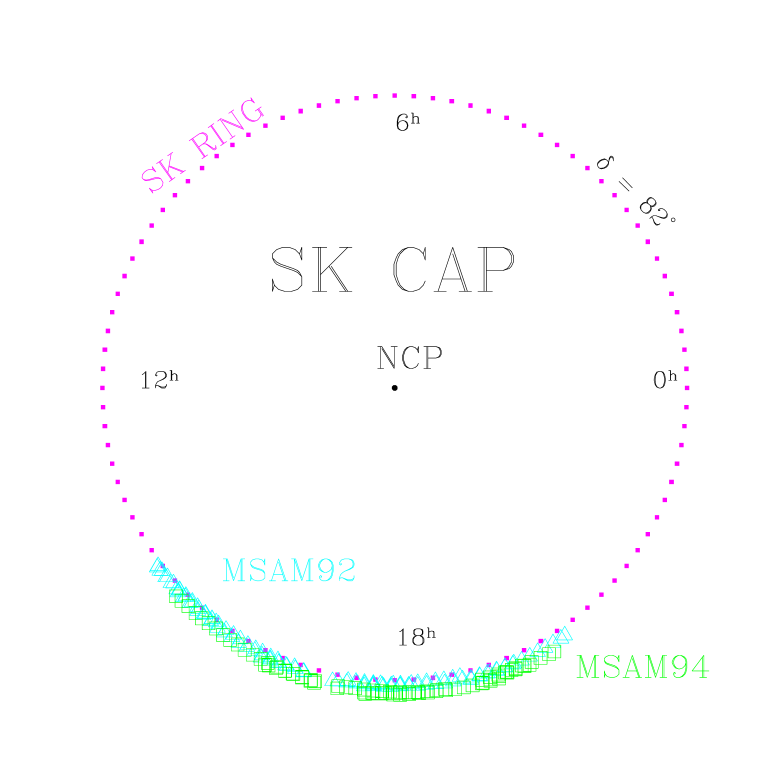
The MSAM instrument flew in 1992 [14], 1994 [15] and 1995 [16]. In each year a narrow strip of sky with nearly constant declination was observed. The purpose of the 1994 flight was to confirm the results from the 1992 flight and so each targeted the same strip of sky at (see Fig. 1). Note that, due to, for example, imperfect pointing control, the two flights have slightly different sky coverage. The final flight in 1995 observed near declination , chosen to be sufficiently far away from the first two flights for the signal correlations to be negligible. Therefore we do not consider the 1995 flight any further in this paper.
The SK data are reported as complicated chopping patterns (i.e., beam patterns, , above) in a circle of radius about around the North Celestial Pole. The data were taken over 1993-1995. Here we only use the 1995 data which were taken with angular resolution FWHM at approximately 40 GHz. More details can be found in [5].
The bulk of the data were in the “cap” configuration: constant-elevation scans tracing out curved rays from the pole, which were then binned in RA and subjected to various sinusoidal demodulation templates in software. Some of the 1995 data ( beam), however, were taken in the “ring” configuration, which isolated the data taken at , put into 96 RA bins, and then subjected to 3, 4, 5 and 6 point sinusoidal demodulations, this time along lines of constant declination. The ring data window functions are in Fig. 1. The region of overlap of the SK95 ring data with the MSAM data can be seen in Fig. 2.
The calibration of the SK dataset was performed by comparing with the star Casseiopia A. however, this star’s 30–40 GHz flux itself is poorly determined; hence, the original SK dataset was reported with a 14% calibration error. More recently, Leitch [10] in turn used the very well-determined amplitude of the CMB dipole itself to determine the flux of Cas A; this has resulted in a 5% increase in the temperature of the SK data (and errors), with a reduced calibration error of 7% (the flux of Cas A itself is now determined to , but there are additional sources of calibration error[11]). Except for Section VII, in the following we do not include the effects of calibration uncertainty.

2 Wiener-filtering MSAM92
An example of Wiener filtering with Eq. (13) is shown in Fig. 3. The data points are the values of the pixelized data, located horizontally according to the right ascension of the center of the pixel. The dependence of the pixels on declination and twist has been suppressed. The error bars are from the diagonal part of the (non-diagonal) noise covariance matrix. The central curve is the Wiener-filtered data and the bounding curves indicate the 68% confidence region for the signal. Because of the difference between the noise covariance matrix and the signal matrix, the Wiener filter essentially assumes that the high frequency behavior is noise and therefore smooths out the data. This smoothing is complicated by the off-diagonal noise correlations which explains some apparent disagreements between the data and the Wiener-filtered data. For example, around 20 hours in the top panel, the Wiener-filtered data are consistently above a number of the data points.

The Wiener filter is model-dependent—one must know (or assume) covariance matrices for the noise and signal. Presumably the noise covariance matrix is well-known and so the model-dependence resides in the choice of angular power spectrum. Of course, we can gain some knowledge of the angular power spectrum by performing a likelihood analysis of the data. The Wiener filter is generally quite robust to changes in the angular power spectrum that are smaller than those that significantly alter the likelihood—even large changes usually have very little effect. We demonstrate this robustness here with Fig. 4 which shows the Wiener-filtered data for a standard CDM spectral shape and also for a flat spectrum ( constant).

C Wiener-filtering MSAM94 onto MSAM92
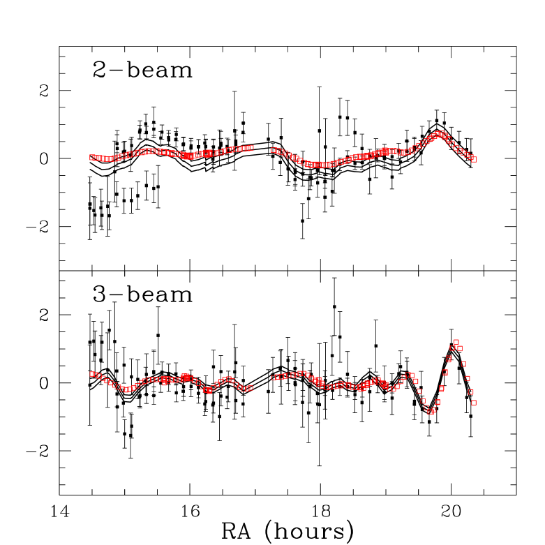
Besides Wiener filtering the data onto its own pixel space, we can Wiener filter it onto another pixel space (Eq. 22). This provides an excellent visual tool for checking compatibility of results. We show this first for the Wiener filtering of MSAM94 onto MSAM92, together with MSAM92 onto MSAM92 from the previous subsection. Notice that in Fig. 5 the 68% confidence regions mostly overlap each other. One can see the MSAM94 region get wider at either extreme in RA. This is because the MSAM94 pixels have a slightly shorter RA extent than the MSAM92 pixels ( to compared to to ).
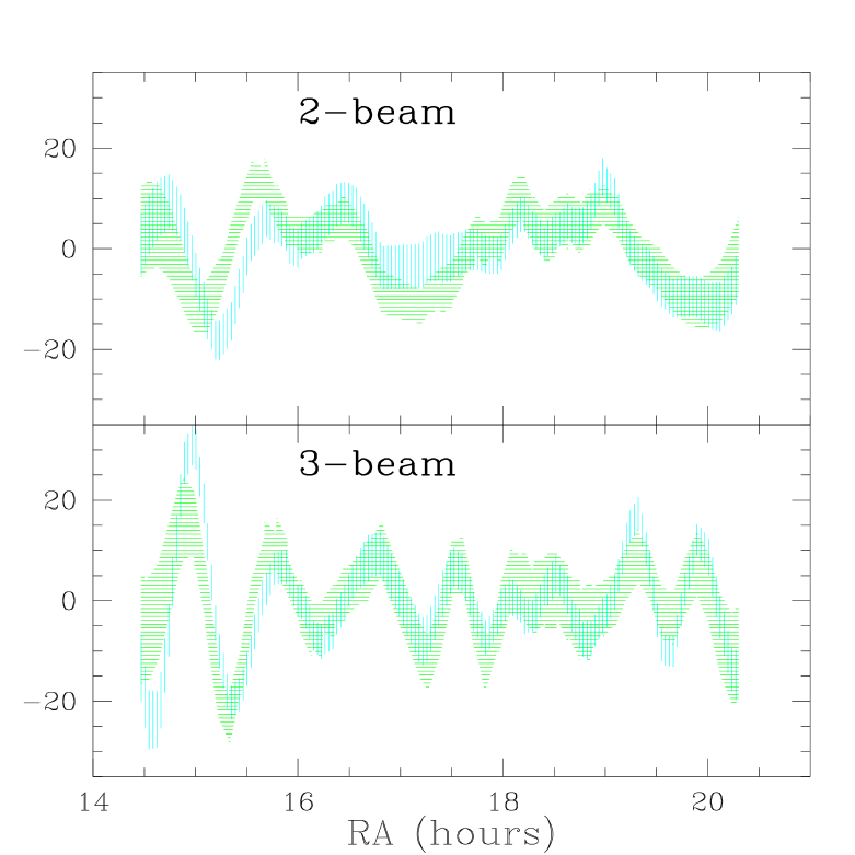
One can see in the figure that many features are seen by both datasets; they agree quite well. The most significant differences between the two estimates of the signal are in the region of 15.5 hours for the 2-beam signal and 14.5 hours for the 3-beam signal. We will discuss these slight anomalies later.
D SK95 onto MSAM92 and MSAM92 onto SK95
Figure 6 shows the same thing as Fig. 5 except that MSAM94 has been replaced with Ring95. Once again, the first impression is of general agreement, although the discrepancies here (at large RA) appear to be more significant than those seen in the MSAM92/MSAM94 comparison.
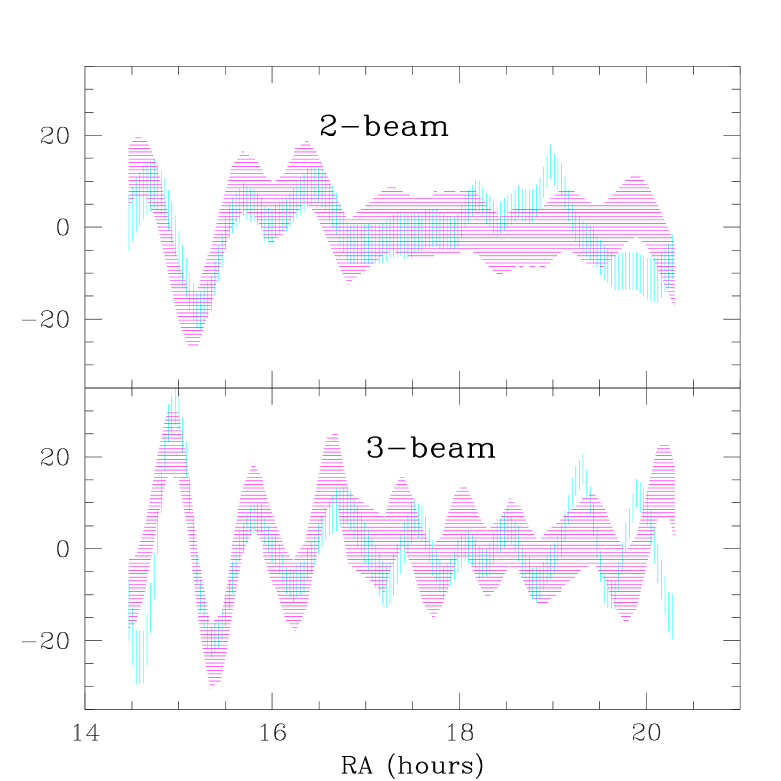
We can also filter the MSAM92 data onto the four Ring templates, as shown in Fig. 7. We have chosen the range of this plot to extend in RA further than the MSAM coverage. This allows one to see how the constraint behaves outside of the region of MSAM’s influence. Notice that the errors don’t become infinite. This is because of the prior information that went into the estimate of the probability distribution, i.e., the assumed power spectrum. Also note that the data have some influence slightly beyond the limit of the sky coverage. The dominant reason for this is the spatial extent of the antenna patterns. In addition, the intrinsic correlations (assumed in the prior) extend the influence to slightly beyond where the antenna response is zero.
With two dimensional Wiener filter maps (as with any two dimensional map) it is difficult to plot both the map and a confidence region expressing the level of uncertainty as we have done here for essentially one dimensional data. In 2D it is therefore often useful to show, in addition to the mean signal, several realizations consistent with its probability distribution (Eq. 12 or 21). Looking at several realizations allows one to see which features are significant and which aren’t. Realizations can also be useful in the 1D case to make up for the fact that the confidence region does not contain any information about correlated uncertainties. For the applications here, though, we have not found them to be useful and so have not shown any.
IV Bayesian Comparison
A natural question to ask is, “How consistent are the two datasets?”. The Wiener filter gives a visual, qualitiative answer to the question, but we would also like some quantitative answers as well. A better-formulated question is, “Is my model of the data an adequate description of the two datasets together?”. To answer this question, one can extend the model of the data to include a residual and then check to see if this extension increases the likelihood. For example, one could add a residual that is Gaussian-distributed with zero mean:
| (23) | |||||
| (24) |
Further restrictions on the form of must be made for the problem to not be degenerate. One could choose to be appropriate for a particular foreground contaminant [24], increased noise [9], or anything else that inspection of the data, combined with prior knowledge, has led the analyzer to suspect. Below we describe a particular choice of that is useful in the absence of any hints as to the likely nature of a possible contaminant.
A The contamination parameter,
To test the consistency of the pairs of datasets – or rather, to test the adequacy of our model of the datasets – we introduce the following residual:
| (25) |
and likewise for . To reduce the number of parameters in this model for the residual, we set . Now we must specify the probability distribution of . For simplicity, let’s take it to be a Gaussian random variable with zero mean. Clearly we want the cross-term in the variance to be zero () since we have in mind contaminants that are particular to each dataset. There is a lot of freedom in the choice of and —once again for simplicity let’s take these to be equal to and .
We have just added one parameter to whatever other parameters we were using to define the power spectrum. The model for the power spectrum we use here is standard CDM, with the amplitude as the only free parameter. We have expressed the amplitude as —the rms fluctuations in mass in 8h-1 Mpc spheres. The experiments in question do not have sufficient dynamic range to strongly constrain more than this one parameter. For COBE-normalized standard CDM, .
We can now explicitly show the complete parameter dependence of the covariance matrix in our model, by modifying Eq. (17) to:
| (28) |
where the tilde means the quantity is evaluated for .
We prefer to work with a slightly different parameterization (spanning the same model space) by replacing with which is the amplitude for the variance of the signal and the contaminant combined. We prefer to since its probability distribution of this quantity should be relatively independent of the level of contamination. Further, we prefer to use the fraction of contamination, rather than the contamination parameter itself. Probability distributions for and can be seen in Fig. 8.

One can see from the shape of the contour curves that and are very nearly uncorrelated. The reason is that the dominant contribution to the determination of comes from terms in the likelihood proportional to where and are in the same dataset, whereas is entirely determined by the cross-terms.
The most probable level of contamination indicated by the MSAM92/MSAM94 comparison is about 12%. However, there is virtually no evidence for non-zero contamination since the probability of zero contamination is only about 5% less. Complete contamination is strongly ruled out at more than times less probable. The MSAM92/SK95 datasets are much less constraining on the amount of contamination that may be present. While 50% is the most probable value, total contamination and no contamination are only about 13 and 1.6 times less likely respectively.
The residual, as we have modeled it here, is a particularly difficult one to constrain since it very nearly has the same statistical properties as the signal. We note that this is desirable in the sense that the ability to constrain the residual comes entirely from the comparison – that is, each dataset, by itself, has no constraint on the fractional contamination. Thus this model for the residual is a strong test of the agreement between the two datasets, rather than anything internal to them.
B The probability enhancement factor,
For many purposes, a much smaller extension into alternative hypothesis space may be useful. In particular, instead of examining a continuum, one could just compare the model with to the model with , at fixed . The interesting quantity is how much more probable one model is than the other, a quantity referred to as the odds. This particular odds, or rather its logarithm, we refer to as and call it the probability enhancement factor:
| (29) |
where (not to be confused with the present value of the Hubble constant!) is the hypothesis that and is the hypothesis that . Both hypotheses are understood to be fixed at the same . One can see from Eq. 28 that the cross-terms connecting the two different datasets in the covariance matrix vanish when with fixed. Therefore we can also write as
| (30) |
where is understood to be in Eq. 28 with and the second equality follows from the use of . This second equality gives rise to another interpretation of : indicates how much more probable dataset 1 is given that dataset 2 exists than it would be without the existence of dataset 2. And by the symmetry of the definition of we know that the statement is true under switching of 1 and 2. ‡‡‡There is even a third interpretation of as the log of the ratio of probability of no relative pointing error, to that of a gross relative pointing error which leaves the fields completely uncorrelated.
The probability enhancement factor, like the Wiener filter, depends on the assumed power spectrum used to calculate the theoretical covariance matrices. We find that for our parametrized model, within the most likely region of parameter space, the dependence of on the parameter is weak. In Fig. 9 we see the dependence of and on .§§§To be precise, we mean but in the following we drop this prime for simplicity and also because keeping the prime does not make sense in the context of the interpretation of as the increase in probability of one dataset given the other dataset. Notice that it doesn’t make much difference to whether one uses the best fit value of given by one of the two experiments or by the joint likelihood—or indeed by anything in the 68% confidence region because the dependence of on is quite flat in this region.
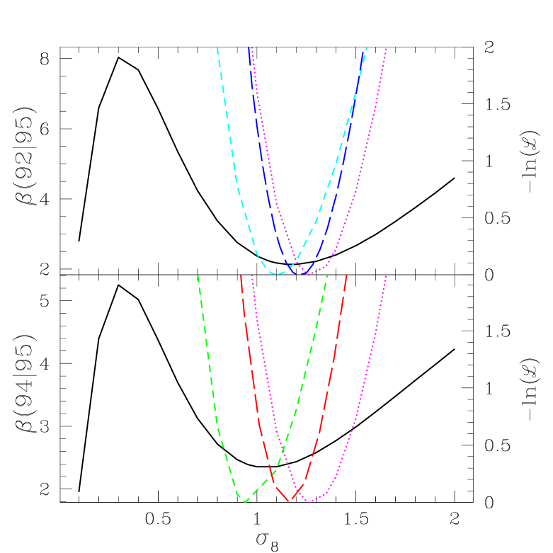
As can be seen from the log likelihood curves, the different datasets prefer slightly different values of ¶¶¶Some of this discrepancy may be due to calibration uncertainty which is not included in these log likelihood curves. We address this issue in a later section.. For all calculations of below and for the Wiener filtering in the previous section we have chosen a value of , in between the preferred values for SK and MSAM. It is also the normalization for this power spectrum suggested by the DMR data.
V Frequentist Statistics
We now discuss from the frequentist perspective. The frequentist approach to checking the consistency of a dataset is to invent some function of the data, called a statistic, and then to compare the measured value of the statistic to its probability distribution under various hypotheses. The probability enhancement factor, , can be viewed as a statistic since it is a function of the data. In fact, it is the logarithm of the well-known likelihood ratio statistic—in this case the ratio of the likelihood of to the likelihood of .
Some statistics are better than others at distinguishing among competing hypotheses. In this section, we see how and other statistics fare at discriminating between hypotheses and .
A Probability distributions of quadratic statistics
We restrict ourselves to studying quadratic functions of the data, for which we have analytic expressions for the mean and variance. In addition to various different quantities (to be defined below), the probability enhancement factor— due to the logarithm in the definition—is also a quadratic function of the data:
| (31) | |||||
| (32) | |||||
| (33) |
which follows from Eq. 30. Since it is a quadratic function of the data, it is straightforward to calculate the mean and variance.
In general, any quadratic function of the data, , has a mean under hypothesis of
| (34) |
and a variance of
| (35) |
where hypothesis is specified by .
For the case of we have, for hypotheses and :
| (36) | |||||
| (37) | |||||
| (38) | |||||
| (39) |
Note that if the experiments have nothing to do with each other () then the numerator and denominator of the argument of the logarithm are equal and therefore as we expect from the definition of in Eq. 29.
Given the observed value of , we can assess the validity of the two hypotheses by calculating the probability distribution of under each hypothesis. As shown above we can calculate the mean and variance analytically. To calculate the entire (non-Gaussian) distribution function though, we have used the Monte Carlo method. The results are plotted in Fig. 10 for the three possible pairings of the three datasets. The Monte Carlo method is quick because we first rotate to a basis where everything is diagonal and then make the realizations. The rotation to the diagonal basis only needs to be found once. The plots shown use between 4000 and 17000 realizations. Notice that the distribution of under is well-approximated by a Gaussian. The deviations from Gaussianity are larger under .

We see in the figure that which is consistent with the expected range for hypothesis 0 of . As a measure of the consistency, we have calculated the probability of getting a greater than this to be 0.70. We also see that under hypothesis such a value of is extremely unlikely; the probability of getting a greater than the measured one is less than 1%. We also find consistency with for the other two pairs of datasets: (c.f. ) and (c.f. ). For both of these, under hypothesis , the probability of getting a value of as high or higher than the measured one is .
B Comparison of comparisons
There are a handful of other quadratic functions of the data one might consider using for comparison of datasets. Here we define the ones under consideration by specifying the data vectors on which they are based:
| (40) | |||||
| (41) | |||||
| (42) | |||||
| (43) | |||||
| (44) | |||||
| (45) |
We clarify what we mean by two examples:
| (46) |
where , and
| (47) |
where
| (48) | |||||
| (49) |
The stands for joint, since this is the quantity in the joint likelihood function, . It is straightforward to show that , but, other than this relationship, the above s are all independent quantities.
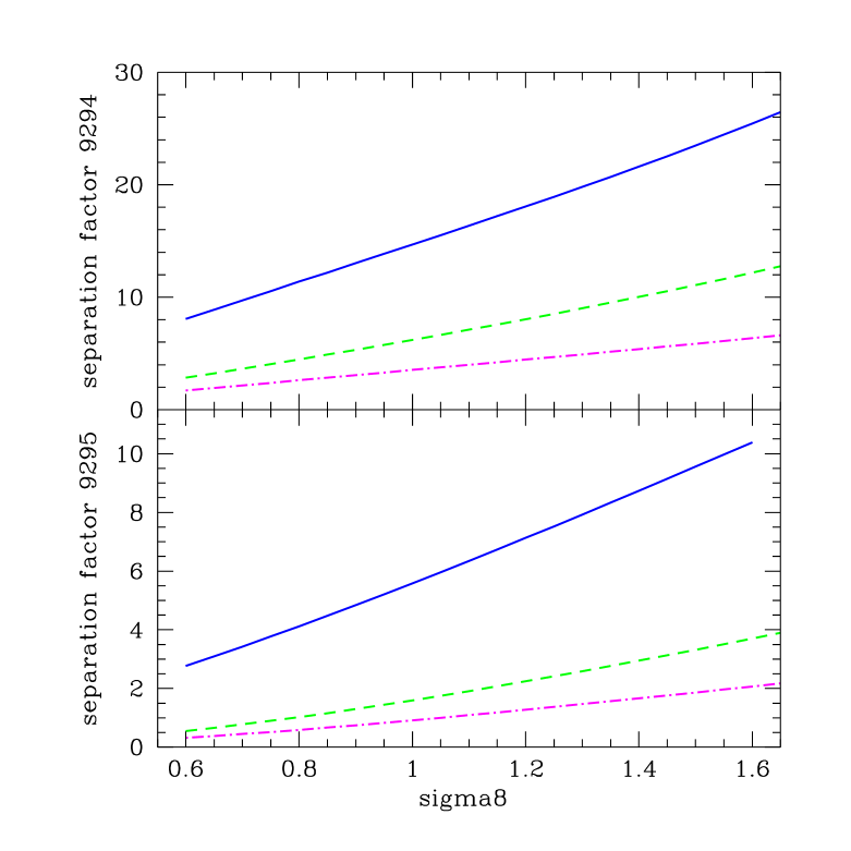
To judge the discriminating power of all our quadratic statistics, we use the separation factor,
| (50) |
where , are the means under the two hypotheses and is the standard error under . The separation factor is shown as a function of in Fig. 11. To avoid clutter, only two of the quantities are shown, and . The separation factors for the other s are bounded by these two.
One can clearly see the superiority, under this measure, of the Bayesian-motivated probability enhancement factor. For example, for , if we assume , it requires an fluctuation to get but only a () fluctuation to get (). The increase in all the separation factors with increasing is expected since discriminating power should increase with increasing signal-to-noise of the measurements.
The separation factor, as we have defined it, is the separation between the expected value of the two hypotheses in units of the standard error assuming (). One might also choose as another measure of discriminating power, this separation in units of the standard error assuming (). In showing that performs well under this measure we are assisted by a theorem: the likelihood ratio test is most powerful.
A simple hypothesis test can be made from any statistic by choosing some critical value : if then reject ; otherwise, accept ∥∥∥This assumes , if not then the test should be changed so that is rejected when .. Statisticians discuss the size and power of a test designed to discriminate between two hypotheses. The size of the test is the probability of rejecting if is true while the power is the probability of rejecting if is true. Clearly, we want the test to be such that the size is small and the power is large. By changing we can choose the size. The test based on the likelihood ratio statistic has the property that, for a given size, it is most powerful—that is, no other test with the same size has a greater power. For a discussion of the likelihood ratio statistic in the context of CMB observations see, e.g., [19].
To see the relevance with our separation factor, let’s set . Let’s further assume that we are in the asymptotic limit of large datasets so that all probability distributions are Gaussian. With , the size of the test will be 0.5 for all statistics. Since the size of this test is the same for all statistics, we know that the likelihood ratio test () will have the largest power. For the power is given by
| (51) | |||||
| (52) |
Since the error function monotonically increases with its argument, we see that the separation between and in units of will always be largest for the likelihood ratio statistic, .
We end this section with a brief consideration of one more quantity. One could ask if there is a set of map pixels, , that is consistent with the noise distribution:
| (53) |
Because of its model independence, one might also think that is a compelling choice for testing the consistency of two datasets. However, if the pixels for the two datasets are slightly different, then it will almost certainly be the case that a set of map pixels can be found that gives a reduced near unity. The problem is that this sky map may contain sharp spikes, highly inconsistent with our prior assumptions.
VI Applying to subsets of data
We have also calculated for various pairings of subsets of the data; the results are in the Table. All but one pairing (to be discussed later) have values of within of . Note that the last 8 rows of the table are the results for internal consistency checks.
Also included in the table are the values of . Under the separation factor criterion, this was the best other quadratic statistic. It is also of particular relevance to Figures 5, 6 and 7 since these show the data vectors on which is based.
Most of the reduced values are comfortably close to unity. The probability of exceeding is less than for only one of the entries—the 95_4,95_5 internal consistency check for which the probability is less than 1%.
| datasets | |||||
| 92,94_2 | 5.7 | 1.08 | 218 | ||
| 92,94_3 | 14.5 | 1.05 | 218 | ||
| 92,94 | 12.8 | 1.02 | 218 | ||
| 92,95_3 | -2.5 | 1.12 | 218 | ||
| 92,95_4 | 4.6 | 1.11 | 218 | ||
| 92,95_5 | -1.2 | 1.05 | 218 | ||
| 92,95_6 | -0.29 | 1.06 | 218 | ||
| 92,95 | 2.13 | 1.15 | 218 | ||
| 94,95_3 | 2.6 | 1.02 | 170 | ||
| 94,95_4 | 1.4 | 1.05 | 170 | ||
| 94,95_5 | -0.31 | 1.06 | 170 | ||
| 94,95_6 | -0.99 | 0.96 | 170 | ||
| 94,95 | 2.437 | 1.05 | 170 | ||
| 92_2,92_3 | 8.29 | 1.16 | 109 | ||
| 94_2,94_3 | 6.81 | 0.93 | 85 | ||
| 95_3,95_4 | 1.72 | 1.25 | 95 | ||
| 95_3,95_5 | 0.65 | 1.09 | 95 | ||
| 95_3,95_6 | 1.29 | 1.08 | 95 | ||
| 95_4,95_5 | -1.03 | 1.48 | 95 | ||
| 95_4,95_6 | 2.26 | 1.05 | 95 | ||
| 95_5,95_6 | -0.10 | 1.08 | 95 |
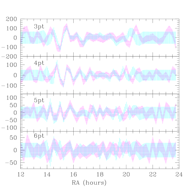
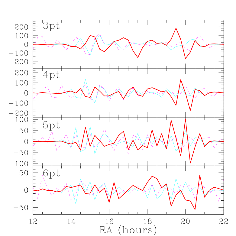
We have also found another breakup of the data to be useful. To identify localized problems in the data, we have calculated as a function of the amount of data included. For example, in Fig. 12, we have plotted vs. , where the star in indicates that only 95 data with RA have been included. One can see here features associated with the discrepancies seen in the Wiener filter figures. Figures 13 and 14 show the results of similar calculations. For Fig. 14, the order in which the data is included is reversed (see caption) in order not to overemphasize the discrepant data at low RA.


From the first two entries of the Table and also from Fig. 14 we see that the 3-beam datasets are more consistent with each other than the 2-beam datasets, where there is a hint of a problem at low RA. This hint can also be seen in the Wiener-filtered data shown in Fig. 5. Possibly confusing is that in Fig. 5 the discrepancy looks stronger in the 3-beam Wiener-filtered data. However, this is because the 2-beam data has significant influence on the best estimate of the 3-beam signal. Evidence for this relevance of the 2-beam data for the 3-beam data (and vice-versa) comes from the fact that and are large at and respectively. A further clue that the problem is with the 2-beam data is in Fig. 13 where there is a suggestion of a problem at low RA with the 2-beam but not the 3-beam.
The better agreement between the 3-beam datasets than between the 2-beam datasets is possibly due to the greater susceptibility of the 2-beam data to atmospheric contamination. In particular, the 2-beam data is susceptible to atmospheric gradients while the 3-beam is not. A gradient can arise as the pendulating motion of the gondola causes the motion of the chopping flat to be slightly different from constant elevation [20]. Presumably one could test this hypothesis by searching for signals in the time stream with the balloon pendulation period.
Both from the Wiener filter figures and the cumulative plot (Fig. 14) we can see that the MSAM92 and MSAM94 data agree very well at large RA and therefore what’s observed is really on the sky and not some instrumental artifact. In contrast, the MSAM92/SK Wiener filter figures and cumulative plots show discrepancies. These may be due to instrumental problems—in which case the problem must be with SK95—or foreground contamination which could affect either instrument. We discuss the possibility of foreground contamination in section VIII on dust.
VII Fixing Calibrations by Comparing Datasets
Every dataset must be calibrated by using the same apparatus to observe a radiation source of known brightness. This observation allows for the conversion of the data from some arbitrary units to temperature or brightness units. Often the brightness of the source in the passband of interest is only known to 10% or so in which case the calibration is a significant source of uncertainty. If is the uncalibrated data then we define the calibration factor as , where is the calibrated data. Similarly, the uncalibrated noise covariance matrix gets adjusted by : , since the noise is determined from the data itself.
One can do likelihood analysis on the uncalibrated data, but with the appropriate covariance matrix:
| (54) |
For a joint dataset, and , we have (dropping the primes):
Note that this covariance matrix, and hence the likelihood, depends only on and . The degeneracy among the three parameters is broken by the calibration measurements of each experiment, which are usually modeled by a Gaussian:
| (55) |
If one is exploring this likelihood space by direct evaluation, note that one can first evaluate on a two dimensional grid (, ) and then evaluate the three-dimensional by adding in the (very easy to calculate) calibration measurement terms. The data as we receive it has already been calibrated so we usually take .
We have evaluated this for the MSAM92 dataset and a subset of the SK95 ring dataset, from to , covering the range of influence of the MSAM92 data. For MSAM92 we take and . For SK we use the Netterfield et al. calibration and . We find in this case that is minimized at , and . If the Leitch recalibration is used (, ) then is minimized at , and .
We can also neglect the calibration measurements entirely and use the two datasets themselves to find the best relative calibration, .
| (56) |
where and . We find that, once again restricting the SK95 data to between 13 and 22 hours that . Netterfield et al. [5] find from their analysis that .
Note that there is a possible problem for joint power spectrum analysis if relative calibration uncertainty is not taken into account. For overlapping experiments neglect of this uncertainty could artificially boost high frequency power.
VIII Dust
There is a marginally significant discrepancy between the MSAM observations and those of Saskatoon at large RA. This discrepancy is possibly due to foreground contamination of either the SK or MSAM datasets. This hypothesis is supported by the fact that the discrepancy occurs where the observations are closest to the plane of the galaxy. Further, from the MSAM interstellar dust data, one can see that the discrepancy occurs roughly where the dust is brightest—see Fig. 15.
Besides different spectral dependence from the CMB, interstellar dust also has a different spatial frequency dependence than the CMB. Schlegel, Finkbeiner, and Davis [21] have used the DIRBE and IRAS maps to infer the power spectrum of interstellar dust. They find that away from the plane of the galaxy it has the shape . We have therefore used a power spectrum with this shape to Wiener filter the MSAM dust data—see Fig. 15. The dust is also known to be highly non-Gaussian. While the mean signal does not depend on the statistics of the signal, the uncertainties in the signal do. Therefore one should bear this in mind when interpreting the graph since the error bars in the figure were calculated assuming Gaussianity. Along with the MSAM dust data is the result of convolving the MSAM beam pattern with the IRAS SISSA 240 micron map [22]. The IRAS data have been scaled to fit the MSAM data. Note that the agreement for the 3-beam data is much better than for the 2-beam data, once again suggesting that it is a more reliable dataset.
What we have referred to as the MSAM CMB and dust data are obtained by fitting each pixel of the four frequency channels (170GHz, 220GHz, 500GHz, 680GHz) of MSAM data to a CMB component and a dust component. From this fit we get the CMB temperature and dust optical depth. The dust is assumed to be a “grey” body with temperature and emissivity index .
Using this model, the dust feature at large RA should not be showing up in the lowest frequency channel. Therefore the fit ascribes the structure seen in the 170GHz channel to CMB. However, the model may be an inadequate description; there may be a component correlated with the dust with stronger emission at 170GHz than the thermal dust emission itself. Indeed, the shape of the dust feature at large RA is somewhat similar to the MSAM CMB feature at large RA.
The Saskatoon data is single frequency and thus harder to directly check for contamination. Despite the low frequency, dust (or a source correlated with dust) contamination is a possibility. Several datasets point to a correlation between high frequency maps dominated by thermal emission from dust and lower frequency measurements [23]. A weak, but significant, correlation has been seen [24] in a correlation analysis of the entire SK dataset and dust maps made by [21]; also see [25]. The cause of this correlation is not yet known although an hypothesis has been advanced by Draine and Lazarian [26] that it is due to dipole emission from spinning dust grains.
To investigate this possibility, we have Wiener-filtered the MSAM92 dust measurements onto the SK95 data in the region of overlap with MSAM. For the shape of the dust power spectrum we used [21] with amplitude chosen to maximize the likelihood given the MSAM dust data. Although, as expected, the dust is brightest in the region of the discrepancy, we have been unable to identify any more detailed relation between the predicted dust signal and the discrepancy.
There is another reason for believing the problem may lie with the SK data. The SK team also did some internal consistency checks on their data, one of which is the A-B test. Their A and B detectors measured orthogonal linear polarizations, and thus for an unpolarized, or weakly polarized, signal, A-B should be consistent with zero. However, for the region of overlap with MSAM, they find for 80 degrees of freedom. The origin of this asymmetry is unclear, possibly an instrumental artifact. It is probably too large to be explained by rotational emission from dust grains since Draine and Lazarian predict that this component of the dust emission is only between 0.1% and 10% polarized.
IX Summary
We have demonstrated the usefulness of the Wiener filter for making visual comparisons of datasets. We have emphasized that meaningful consistency testing requires alternative models with which to compare. Thus we have explicitly extended our model of the data to include a possible contaminant and calculated the probability distribution of the amplitude of this contaminant. For purposes of extracting just one number from the comparison we advocate calculating the ratio of the probability of no contamination to the probability of infinite contamination. Viewed as a statistic, we have shown this “probability enhancement factor” to be better than various statistics at discriminating between competing hypotheses.
The utility of our comparison statistics was shown by exercising them on the MSAM92, MSAM94 and SK95 data. We have found from comparing MSAM92 and MSAM94 that the most probable level of contamination is 12%, with zero contamination only 1.05 times less probable, and total contamination over times less probable. From comparing MSAM92 and SK95 we have found that the most probable level of contamination is 50%, with zero contamination only 1.6 times less probable, and total contamination 13 times less probable. Looking at subsets of the data we find a region at large RA where the SK and MSAM measurements disagree. From IRAS and from the MSAM dust measurements we know that this region is also the dustiest region of the overlap between SK and MSAM. The origin of the discrepancy is unclear and may be due to instrumental artifacts in SK, or foreground contamination of either the SK or MSAM measurements.
A revolution is underway in the quality and quantity of CMB data—a revolution generated by the satellites MAP and Planck [27] as well as by a number of balloon and ground-based programs. The amount of data may soon be too large for the type of complete statistical analysis described here. However, any approximate methods developed for extracting the power spectrum or parameters will also be applicable to the statistical procedures introduced here.
Acknowledgements.
We thank the MSAM and SK teams for making their datasets available. In particular, we are grateful for assistance from Casey Inman, Jason Puchalla and Grant Wilson.REFERENCES
- [1] J. Mather et al., Astrophys. J. 354, L37 (1990); D.J. Fixsen et al, ibid 473, 576 (1996).
- [2] L. Knox, Phys. Rev. D52 4307 (1995); G. Jungman, M. Kamionkowski, A. Kosowsky & D.N. Spergel, Phys. Rev. Lett. 76, 1007 (1996); ibid, Phys. Rev. D54, 1332 (1996); J.R. Bond, G. Efstathiou & M. Tegmark, astro-ph/9702100; M. Zaldarriaga, D. Spergel & U. Seljak, astro-ph/9702157.
- [3] K. Ganga, E. Cheng, S. Meyer and L. Page, 1993, ApJLett. 410, L57.
- [4] C. H. Lineweaver et al., 1995, ApJ448, 482
- [5] C.B. Netterfield, M.J. Devlin, N. Jarosik, L. Page & E.J. Wollack, ApJ474, 47 (1997); E.J. Wollack, M.J. Devlin, N. Jarosik, C.B. Netterfield, L. Page & D. Wilkinson, ApJ476, 440 (1997).
- [6] J. E. Ruhl, M. Dragovan, S. R. Platt, J. Kovac & G. Novak, ApJLett. 453, L1 (1995); S. R. Platt, J. Kovac, M. Dragovan, J. B. Peterson, & J. E. Ruhl, ApJ475, L1 (1994).
- [7] C. A. Inman, E. S. Cheng, D. A. Cottingham, D. J. Fixsen, M. S. Kowitt, S. S. Meyer, L. A. Page, J. L. Puchalla, J. E. Ruhl, & R. F. Silverberg, ApJ478, L1 (1997).
- [8] J.R. Bond, A.H. Jaffe & L. Knox, astro-ph/9708203, Phys. Rev. D, in press.
- [9] J. R. Bond, Phys. Rev. Lett. 74, 4369 (1994); J. R. Bond, in Cosmology and Large Scale Structure, Les Houches Session LX, eds. R. Schaeffer et al. (Elsevier: Sciences Press, Amsterdam), pp. 469-674.
- [10] E. Leitch, private communication.
- [11] C.B. Netterfield, private communication.
- [12] M. Tegmark, A de Oliveira-Costa, M J Devlin, C B Netterfield, L Page & E J Wollack 1997, ApJLett, 474, L77-L80
- [13] D. J. Fixsen, et al., ApJ470, 63 (1996).
- [14] E. S. Cheng, et al., ApJ, 422, L37 (1994).
- [15] E. S. Cheng, et al., ApJ, 456, L71 (1996).
- [16] E. S. Cheng, et al., astro-ph/9705041, ApJLett. (in press).
- [17] For a review of Bayesian inference see Sec. 2 of P. C. Gregory and T. J. Loredo, ApJ398, 146 (1992); see also D. S. Sivia, Data Analysis: A Bayesian Tutorial (Clarendon, Oxford, 1996).
- [18] For a more detailed derivation see, e.g., E. F. Bunn, Y. Hoffman and J. Silk, preprint astro-ph/9509045.
- [19] Readhead et al., ApJ346, 566 (1989).
- [20] S. S. Meyer, private communication.
- [21] Schlegel, D. J., Finkbeiner, D. P. & Davis, M., astro-ph/9710327, ApJ(submitted).
- [22] J. Puchalla, private communication.
- [23] A. Kogut et al., ApJ464, L5 (1996); E. M. Leitch, A. C. S. Readhead, T. J. Pearson and S. T. Myers, preprint astro-ph/9705241.
- [24] A. H. Jaffe, D. Finkbeiner, & J. R. Bond, preprint.
- [25] A. de Oliveira-Costa, A. Kogut, M. J. Devlin, C. B. Netterfield, L. A. Page & E. J. Wollack, ApJ482, L17 (1997).
- [26] B. Draine and A. Lazarian, ApJLett., in press.
-
[27]
C. Bennett et al., MAP experiment home page,
http://map.gsfc.nasa.gov (1996); M. Bersanelli et al., COBRAS/SAMBA, The Phase A Study for an ESA M3 Mission, preprint (1996); Planck home page, http://astro.estec.esa.nl/SA-general/Projects/Cobras/cobras.html (1996).