The bixplot: A variation on the boxplot
suited for bimodal data
Abstract
Boxplots and related visualization methods are widely used exploratory tools for taking a first look at collections of univariate variables. In this note an extension is provided that is specifically designed to detect and display bimodality and multimodality when the data warrant it. For this purpose a univariate clustering method is constructed that ensures contiguous clusters, meaning that no cluster has members inside another cluster, and such that each cluster contains at least a given number of unique members. The resulting bixplot display facilitates the identification and interpretation of potentially meaningful subgroups underlying the data. The bixplot also displays the individual data values, which can draw attention to isolated points. Implementations of the bixplot are available in both Python and R, and their many options are illustrated on several real datasets. For instance, an external variable can be visualized by color gradations inside the display.
Keywords: clustering; exploratory data analysis; graphical display; violin plot; visualization.
1 Background and motivation
John Tukey’s boxplot was a cornerstone of his monumental project called Exploratory Data Analysis developed in (Tukey, 1977). His goal was to create a branch of statistics that put the data front and center, by starting the analysis with a set of tools that allow the data to reveal interesting properties and patterns before carrying out any probability-based inference. Many of his tools were graphical. At that time computing power was limited, leading to a focus on simple methods. Some could even be applied by hand, such as the so-called stem-and-leaf plots. But whereas some of these methods became obsolete when computing power grew exponentially, the boxplot is still ubiquitous and will likely remain so in the foreseeable future.
One might ask what gave the boxplot such staying power. At the time, people seeing the boxplot for the first time may have thought that it was merely an oversimplified representation of a univariate distribution. Instead of a histogram, there was only a box going from the first quartile to the third quartile, inside of which a line indicated the position of second quartile, that is, the median. For instance, look at the first boxplot in the top left panel of Figure 1. The data are logarithms of the concentrations of cholesterol and triglycerides of 320 patients, analyzed by Scott et al. (1978) and available in (Hand et al., 1994). The lines above and below the box are called the whiskers, and range to the furthest datapoints that are considered inlying, according to a rule based on the quartiles. Only the points outside these whiskers are actually plotted, and flagged as outliers. Pointing attention to outliers based on an objective rule was an instance of letting the data speak, and possibly tell the user something she might not have anticipated.
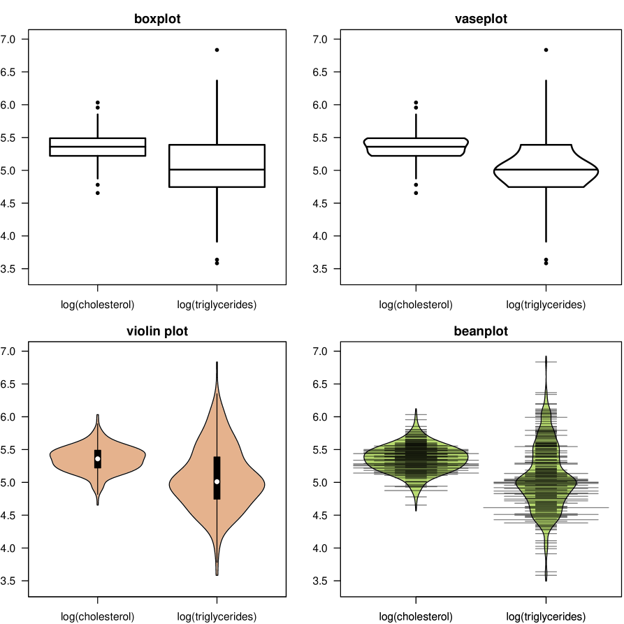
As a minimalist graphical display of a single univariate dataset the boxplot would not have gained many followers, but its real strength is when several variables are displayed simultaneously, as illustrated in the top left panel of Figure 1. In that situation the boxplots allow easy comparison between the central location of these data sets (their median) and their scatter (the height of the box, which is the interquartile range). The position of the median inside the box says something about symmetry, or lack of it. Finally, the whiskers and plotted outliers depict the tails of the data distribution. In this example we see that the central tendency of log(triglycerides) is lower than that of log(cholesterol) and that its variability is higher, that both samples look fairly symmetric, and that there are only a few points slightly outside the whiskers, meaning that there are no big outliers. Nowadays, the results of numerical experiments are often displayed by such parallel boxplots instead of tables. Some extensions of the boxplot were proposed by McGill et al. (1978), Rousseeuw et al. (1999) and Hubert and Vandervieren (2008).
Over time, as more computing power became available, various graphical refinements of the 1977 boxplot were proposed, roughly at decade-long intervals. Benjamini (1988) introduced the vaseplot, which replaced the sides of the box by estimated density curves of the datapoints between the first and third quartiles, as in the top right panel of Figure 1. Next, Hintze and Nelson (1998) proposed to plot the density over the entire data range, yielding the violin plot of the same data in the bottom left panel of Figure 1. A narrow version of the box and whiskers remains in the middle of each violin, without showing the outliers explicitly. The final display in the bottom right panel of Figure 1 is the beanplot of Kampstra (2008). Unlike the previous displays it also shows the datapoints in the bulk of the data, as horizontal lines. Most of these have the same length, but when several points coincide the short lines are stacked by default. This draws attention to tied data values. The stacking can be switched off when detecting ties is not among the goals of the data analysis. The resulting set of horizontal lines, then all equally long, is called a rug plot or a strip chart. The beanplot does not contain a box or whiskers, but it allows to draw long horizontal lines at the average value or at the quartiles. In R the boxplot is implemented as the function graphics::boxplot, the violin plot as vioplot::vioplot (Adler et al., 2025), and the beanplot as beanplot::beanplot (Kampstra, 2008). In Python, the library seaborn (Waskom, 2021) contains the functions seaborn.boxplot() and seaborn.violinplot(). All of these functions have an option to plot the data horizontally instead of vertically.
In spite of its many virtues, the boxplot also has some deficiencies. It was noticed early on that the boxplot is unable to express that a dataset is bimodal. Indeed its design implicitly assumes that the dataset is unimodal, apart from possible outliers. Yet, bimodal univariate distributions are common across a variety of scientific domains, including psychology, medicine, ecology, and the study of animal behavior. In these fields, observed data often reflect a mixture of subpopulations that may arise from biological variability or heterogeneous experimental conditions. Recognizing and visualizing such distributional patterns can provide valuable insights into the underlying processes that generate them. For instance, reaction times in cognitive tasks can exhibit bimodality that reflect dual cognitive processes such as fast automatic versus slower controlled decision making (Freeman and Dale, 2013). Behavioral and physiological traits can also display bimodal distributions, potentially reflecting phenotypic differences with a strong genetic basis. While less common, multimodal distributions also occur. In ecology, for instance, individual body‑size distributions within bird communities have been shown to be multimodal, indicating clear ecological or functional groupings (Thibault et al., 2011). In this note we will show bimodal and multimodal data involving fish, flowers, penguins, and cars.
Despite the ubiquity of non-unimodal distributions and the relevance of modes for data interpretation, there is currently no variation on the boxplot specifically designed to detect and display modes. The violin plot and the beanplot do share the important advantage that the plotted density curve can have more than one local maximum, which hints at non-unimodality, but no attempt is made to fit a mixture of distributions to the data. Also, the summary statistics in the violin plot are still those of the boxplot inside of it: the median and the first and third quartiles would not describe the data well if it came from such a mixture distribution, and the whisker endpoints based on them would be misleading.
To address this limitation we propose a different variation on the boxplot that checks each variable for unimodality. For variables deemed unimodal, the display combines a boxplot with elements of the violin plot and the beanplot. Variables not deemed unimodal are subjected to a clustering algorithm created for this purpose, after which the clusters are displayed with their boxes and estimated densities. Figure 2 visualizes three generated datasets. The first is Gaussian, the second is a mixture of two Gaussians with different sample sizes, and the third is a mixture of three Gaussians. In the left panel we see that the fitted densities in the violin plots have the appropriate number of local maxima, but we do not see the data inside the violins so it is hard to separate the mixtures visually. The proposed plots are in the right hand panel. The display of the unimodal data looks similar to the violin plot but with a superimposed boxplot, and the rug visualizes all the datapoints as in a beanplot. The two components of the bimodal data are now shown by separate bodies in different colors, and in this example the densities overlap. The rug also offers visual support for the existence of two clusters. We can see that the bottom cluster contains more members, because here the areas of the bodies are drawn proportional to the cardinality of the clusters (also other sizing options are available). The three components of the multimodal data are separated in the same way.
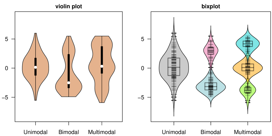
Since the proposed visual display is suited for bimodal data and multiple mixtures, we combined bi and ix to the string bix yielding the short name bixplot. The name can be justified further by the fact that it combines the boxplot, the density trace of the violin plot, and the rug of the beanplot. There are options for the color of the body inside the density curve, the density curve itself, the border of the boxplot, the part of the rug lines inside the body, and the part outside the body. The user can also set the line widths in all of these plots, as well as the degree of transparency in the body. The user can also choose whether to omit the body, density, boxplot, or rug plot.
The paper is structured as follows. Section 2 applies the bixplot display to several real datasets and illustrates some of its graphical options, making use of our implementations in both R and Python. Section 3 sketches the main steps of its construction, and Section 4 concludes. The Supplementary Material contains more examples, technical details, and the software.
2 Real data examples
The first dataset is about exploratory behavior in fish during three experimental rounds (Kerr and Ingram, 2021). The measurements are latency times in seconds. The top row of Figure 3 shows their violin plots on the left, which hint at bimodality in each round. This is more pronounced in the bixplot display on the right. The output of the bixplot function provides summary statistics of each cluster, including the medians and quartiles corresponding to the boxplots inside. They indicate that the centers of the modes shifted upward in later rounds. An option was used to restrict the bixplot display to latencies between 0 seconds and 300 seconds, because the dataset was bounded by these lower and upper limits.
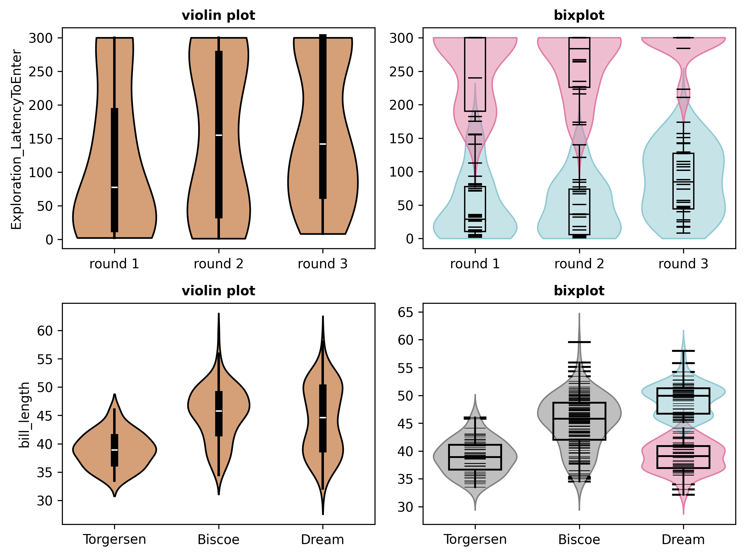
The Palmer penguins dataset is available in R as datasets::penguins and was analyzed in detail by VanderPlas et al. (2023). It describes adult penguins covering three species found on three islands in the Palmer Archipelago, Antarctica, including their size (flipper length, body mass, bill dimensions) and sex. The bottom row of Figure 3 displays the bill length measurements of penguins on the three islands (Torgersen, Biscoe, and Dream). The bixplot display on the right uncovers bimodality in animals from Dream Island but not from Biscoe Island, a distinction that the violin plot on the left did not make as clearly. The rug plot of Dream Island confirms the bimodality.
Another illustration of the bixplot as an exploratory tool uses the well-known iris data. It contains measurements of the variables sepal length and width, and petal length and width, for 50 flowers from each of 3 species of iris. Let us pretend for a moment that we see these data for the first time and that we have to analyze them without knowing the class labels (flower species). If we first standardize the four variables and run the bixplot function on them, we obtain the left panel of Figure 4. It tells us that the sepal length and width appear unimodal, whereas the petal length seems bimodal in the sense that it can be described by two clusters. The petal width might even be summarized by three clusters. As the latter two variables contain the most structure we plot them against each other, yielding the right panel of Figure 4. Its marginal densities were also produced by the bixplot function, using options to make the bixplots one-sided and to add them to the existing scatterplot. The points in the lower left part of the scatterplot form a nicely separated cluster (which is actually the Setosa species). The remaining points look like a single cluster in the petal length direction, while petal widths suggest they could have two modes. To resolve this ambiguity, the next step in the data exploration could be to apply a clustering algorithm to the multivariate data formed by all 4 variables together. Depending on the method used, this would separate these remaining points in two clusters that roughly correspond to the Versicolor and Virginica species. The Supplementary Material contains a similar display of the Top Gear car dataset of Alfons (2016).
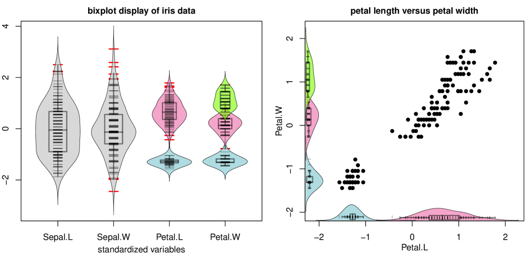
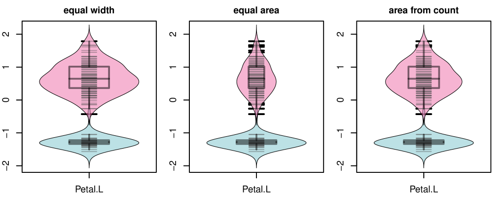
The bixplot display offers many options to tailor it to your needs. For instance, in the left panel of Figure 4 the option was chosen to plot the parts of the rug lines outside of the bodies in bright red. This makes points in low-density regions more noticeable, such as the largest values of Sepal.W. Apart from outliers, also points that lie in between well-separated clusters stand out in this way, like the one in Petal.L. Moreover, we see that the unimodal variables Sepal.L and Sepal.W have bodies of the same widths. That is the default, but it can be changed at will by the user. Also the widths of each box and rug plot can be chosen, as well as all the colors. The bodies of the clusters of Petal.L and Petal.W have different colors, that can also be chosen. By default the areas of the bodies are proportional to the number of members in the clusters of the same variable, but there is also an option to make the areas of all clusters of the same variable equal, or to equalize the widths of the bodies in the same variable. Figure 5 illustrates the three versions for the Petal.L variable. The different sizing options affect the visual prominence of modes while preserving their summary statistics.
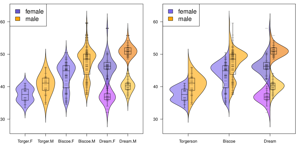
We now return to the penguins data. The bottom row of Figure 3 displays the bill length as a function of the island, but now we would like to perform a more detailed analysis by also taking the sex of the animals into account. The left panel of Figure 6 has six bixplots, one for each combination of island and sex. We see that the first four of them are deemed to consist of a single cluster, whereas on Dream Island both the female and male penguins show two clusters. The display represents females in purple and males in orange. In this situation there is an option we can apply, that mirrors the bixplots of females and males on opposite sides of each island’s vertical line, as in the right hand panel of Figure 6. Each island thus shows two ‘half’ bixplots, one for each sex. This allows for direct within-island comparisons, and saves horizontal space.
The left panel of Figure 7 shows bixplots of the standardized bill_depth, bill_length, and flipper_length variables of the penguins data, this time not split by island. What is new here is that the rugs inside them do not have a single color. Instead the rugs are colored according to another continuous variable, the body_mass of the animal, with its color bar on the right. The display reveals that body_mass has a strong positive association with the variable flipper_length. Its relation with the other two variables is less clear and requires looking at scatterplots.
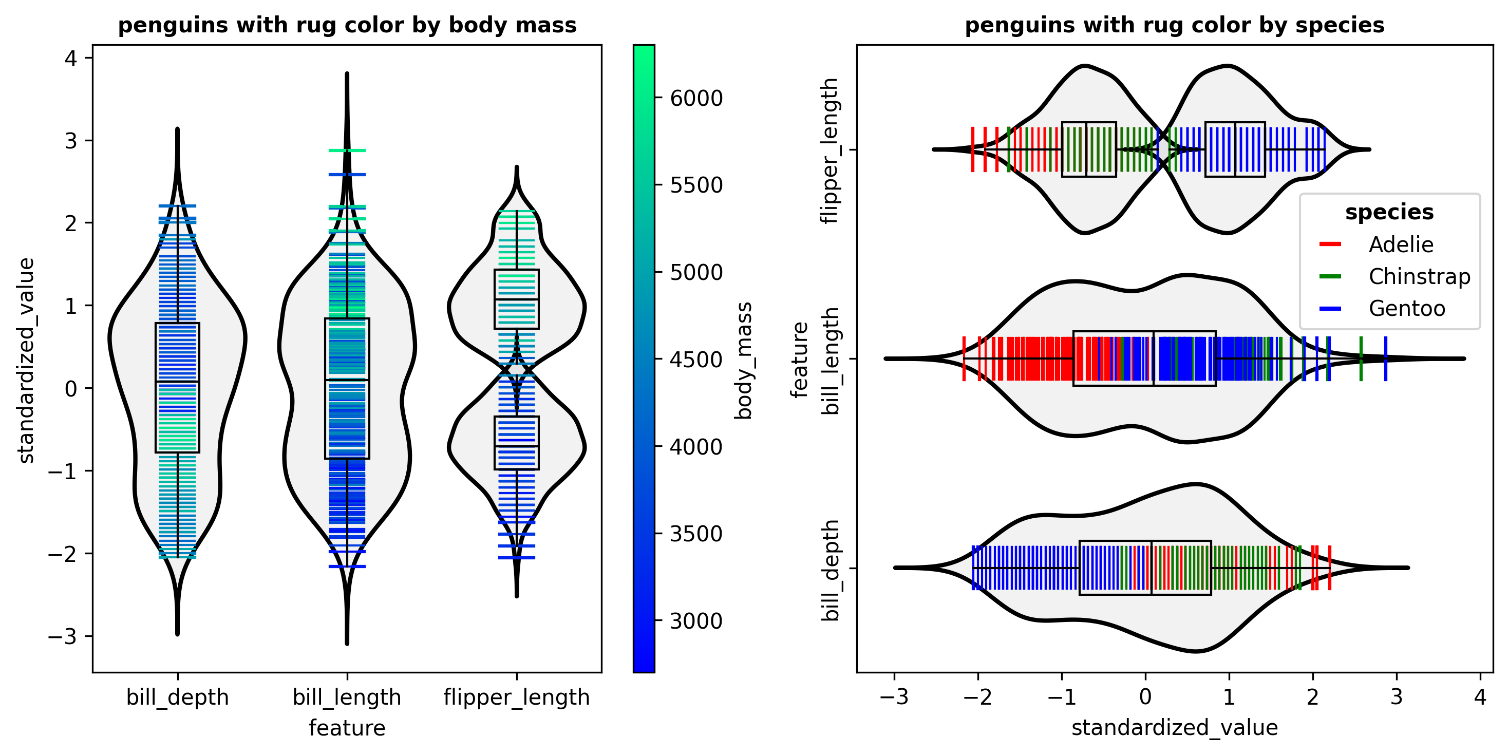
The rug colors can also be mapped to a categorical variable. In the right hand panel of Figure 7 the rug lines are colored according to the species variable with levels Adelie, Chinstrap and Gentoo. This panel also illustrates the option to plot the bixplots horizontally. We see at a glace that Gentoo penguins tend to have a smaller bill_depth and longer flipper_length. In the Supplementary Material the rugs of the iris data are colored by their species too. There we also color the rugs of continuous variables in the Titanic data (Friendly et al., 2019) by a categorical variable.
The bixplots in this note and the Supplementary Material can be drawn with both our Python and R implementations. In fact, Figures 3, 7, S1, and S4 were made in Python, and the others in R. The plot commands can be very short due to their default options. We ensured that option names closely match those of boxplots in R and the seaborn.violinplot() function in Python, so existing calls to these functions will often run with bixplot as well.
3 Construction of the bixplot
When constructing the bixplot of a variable, that is, a univariate numeric dataset, the first thing we look at is the number of non-missing values. To reduce the risk that detected clusters arise from noise alone, we allow to search for at most n/minN clusters, where minN defaults to 15. So if is under twice minN we do not attempt to cluster the data. Also when the user specifies the maximal number of clusters kmax as 1, the data are treated as a single cluster. In both cases the body of the bixplot is determined by a kernel density estimate as in the violin plot, and the boxplot and rug plot are superimposed. There is an option to jitter the position of the rug lines, which is useful when the data contains many ties.
When and we test whether the hypothesis of unimodality should be rejected. For this purpose we use Hartigan’s dip test (Hartigan and Hartigan, 1985). The dip test detects a deviation from unimodality by computing the vertical distance between the empirical distribution function of the data and a unimodal distribution function, and looking how small that distance can be made. Formally, the dip statistic is given by
where is the class of unimodal cumulative distribution functions. If exceeds a critical value, the null hypothesis is rejected and the distribution is considered non-unimodal. By default we use the 0.01 significance level.
When Hartigan’s dip test rejects unimodality, we need to obtain an appropriate clustering of the data. In view of the interpretation of clusters as modes we need the clusters to be contiguous, that is, no cluster has members inside another cluster. In other words, the clusters must be inside successive disjoint intervals. Not all methods of clustering or fitting mixture distributions satisfy this property. Clustering methods that assign each point to the cluster with the closest central point do. We can compute central points by the robust -medoids clustering method of Kaufman and Rousseeuw (1987). The -medoids algorithm partitions data into clusters by selecting actual data points, called medoids, as cluster centers. It minimizes the total deviation defined as the sum of distances between each point and the medoid of its assigned cluster :
This is also called Partitioning Around Medoids (PAM). It is implemented in the KMedoids class of the Python library scikit-learn-extra (Scikit-learn-extra development team, 2020), and as the pam function in the R package cluster (Maechler et al., 2013) that contains the recent fast algorithm of Schubert and Rousseeuw (2021).
Moreover, in order to be able to interpret clusters as modes we need to obtain clusters with sufficiently many members. By itself the -medoids method does not guarantee this, and indeed a single isolated point may be put in a cluster by itself. This issue also occurs with the -means method, and was addressed by Bradley et al. (2000) who constructed a version of -means with the constraint that each cluster contain at least a given number of members. Their algorithm makes use of linear programming. We have extended this idea to -medoids and implemented it. We went a bit further by constraining the clustering to having a minimal number clusMinN of unique values in each cluster. This allows to draw a meaningful density curve, and avoids the algorithm trying to satisfy the constraint by assigning tied cases to different clusters. By default clusMinN is set to 3, but the user can change this. Our algorithm starts from the unconstrained -medoids method, and then each step reassigns points to clusters by a transport method, alternated with recomputing the centers. These iteration steps cannot increase the objective function. The process continues until no further changes occur in the assignments or a given number of iterations is reached. A more thorough description of the constrained -medoids method is provided in Section B of the Supplementary Material.
The above algorithm is carried out for values of ranging from 2 to kmax. The maximal number of clusters kmax is set by the user and can be at most floor(n/minN), and is also truncated at 5 in order to keep the plot readable. It remains to choose . For each value of we compute the silhouette score (Rousseeuw, 1987) of the resulting clustering, given by
where is the average distance of point to all other points in its cluster, and is the lowest average distance of to any other cluster. We then select the number of clusters as the yielding the highest .
4 Conclusions
This note introduced the bixplot, an extension of the boxplot that was specifically designed to detect and display clusters in univariate data and collections of univariate variables. For this purpose a dedicated constrained univariate clustering method has been developed. The bixplot display incorporates density curves as in the violin plot, as well as a rug plot that shows the individual data values as in the beanplot. In order to facilitate the use of the bixplot display, we have constructed extensive implementations in both Python and R, with practical defaults that allow for short function calls. On the other hand, a lot of options are available to tailor the display to the user’s needs. Several real data illustrations have been provided in the text and the Supplementary Material.
We would like to stress that the bixplot display is
an exploratory tool, meaning that its purpose is to
assist the user’s intuition about the data. It is
not a confirmatory method like a significance test.
For instance, when the bixplot shows three clusters
in a variable this is an indication, and not a
confirmation that the population the data came
from has exactly three components. There exist
inferential methods for that purpose but they
require probabilistic assumptions like
Gaussianity, that we do not wish to restrict
ourselves to.
Software availability. The
Python implementation is maintained by C.
Montalcini and available at
https://github.com/camontal/bixplot,
including an html file that
illustrates its use by reproducing all
the bixplot displays in the text.
The R code is maintained by P.
Rousseeuw and is available at
https://wis.kuleuven.be/statdatascience/code/bixplot_r_code.zip
which also contains an example script for
all the figures.
References
- Adler et al. (2025) Daniel Adler, S. Thomas Kelly, Tom M. Elliott, and Jordan Adamson. vioplot: Violin Plot. CRAN, R package, 2025. https://CRAN.R-project.org/package=vioplot.
- Alfons (2016) Andreas Alfons. robustHD: Robust methods for high-dimensional data. CRAN, R package, 2016. https://CRAN.R-project.org/package=robustHD.
- Benjamini (1988) Yoav Benjamini. Opening the Box of a Boxplot. The American Statistician, 42:257–262, 1988.
- Bradley et al. (2000) P. S. Bradley, K. P. Bennett, and A. Demiriz. Constrained K-Means Clustering. Microsoft, 2000. Technical Report MSR-TR-2000-65.
- Freeman and Dale (2013) Jonathan B. Freeman and Rick Dale. Assessing bimodality to detect the presence of a dual cognitive process. Behavior Research Methods, 45(1):83–97, 2013. doi: 10.3758/s13428-012-0225-x.
- Friendly et al. (2019) Michael Friendly, Jürgen Symanzik, and Ortac Onder. Visualizing the Titanic disaster. Significance, 16(1):14–19, 2019. https://doi.org/10.1111/j.1740-9713.2019.01229.x.
- Hand et al. (1994) David Hand, F. Daly, A. Lunn, K. McConway, and E. Ostrowski. A Handbook of Small Data Sets. London: Chapman and Hall, 1994.
- Hartigan and Hartigan (1985) J. A. Hartigan and P. M. Hartigan. The Dip Test of Unimodality. The Annals of Statistics, 13(1):70–84, 1985. ISSN 0090-5364.
- Hintze and Nelson (1998) Jerry L. Hintze and Ray D. Nelson. Violin Plots: A Box Plot-Density Trace Synergism. The American Statistician, 52:181–184, 1998.
- Hubert and Vandervieren (2008) Mia Hubert and Ellen Vandervieren. An adjusted boxplot for skewed distributions. Computational Statistics and Data Analysis, 52:5186–5201, 2008.
- Kampstra (2008) Peter Kampstra. Beanplot: A Boxplot Alternative for Visual Comparison of Distributions. Journal of Statistical Software, 28:1–9, 2008. doi: 10.18637/jss.v028.c01.
- Kaufman and Rousseeuw (1987) Leon Kaufman and Peter J. Rousseeuw. Clustering by means of Medoids. In Y. Dodge, editor, Statistical Data Analysis Based on the –Norm and Related Methods, pages 405–416. North-Holland, Amsterdam, 1987.
- Kerr and Ingram (2021) Nicky R Kerr and Travis Ingram. Personality does not predict individual niche variation in a freshwater fish. Behavioral Ecology, 32(1):159–167, 2021. doi: 10.1093/beheco/araa117.
- Maechler et al. (2013) Martin Maechler, Peter Rousseeuw, Anja Struyf, Mia Hubert, and Kurt Hornik. cluster: Methods for Cluster Analysis. CRAN, R package, 2013. https://CRAN.R-project.org/package=cluster.
- McGill et al. (1978) Robert McGill, John W. Tukey, and Wayne A. Larsen. Variations of Box Plots. The American Statistician, 32:12–16, 1978.
- Rousseeuw (1987) Peter J. Rousseeuw. Silhouettes: A graphical aid to the interpretation and validation of cluster analysis. Journal of Computational and Applied Mathematics, 20:53–65, 1987. URL https://doi.org/10.1016/0377-0427(87)90125-7.
- Rousseeuw et al. (1999) Peter J. Rousseeuw, Ida Ruts, and John W. Tukey. The Bagplot: A Bivariate Boxplot. The American Statistician, 53(4):382–387, 1999.
- Schubert and Rousseeuw (2021) Erich Schubert and Peter J. Rousseeuw. Fast and Eager -Medoids Clustering: Runtime Improvement of the PAM, CLARA, and CLARANS Algorithms. Information Systems, 101:101804, 2021. URL https://doi.org/10.1016/j.is.2021.101804.
- Scikit-learn-extra development team (2020) Scikit-learn-extra development team. Scikit-learn-extra – A set of useful tools compatible with scikit-learn, 2020. https://github.com/scikit-learn-contrib/scikit-learn-extra.
- Scott et al. (1978) David W. Scott, Antonio M. Gotto, James S. Cole, and G. Antony Gorry. Plasma lipids as collateral risk factors in coronary artery disease. Journal of Chronic Diseases, 31:337–345, 1978.
- Thibault et al. (2011) Katherine M. Thibault, Ethan P. White, Allen H. Hurlbert, and S. K. Morgan Ernest. Multimodality in the individual size distributions of bird communities. Global Ecology and Biogeography, 20(1):145–153, 2011. ISSN 1466-8238. doi: 10.1111/j.1466-8238.2010.00576.x.
- Tukey (1977) John W. Tukey. Exploratory Data Analysis. Reading, MA: Addison-Wesley, 1977.
- VanderPlas et al. (2023) Susan VanderPlas, Yawei Ge, Anthony Unwin, and Heike Hofmann. Penguins Go Parallel: A Grammar of Graphics Framework for Generalized Parallel Coordinate Plots. Journal of Computational and Graphical Statistics, 32(4):1572–1587, 2023. https://doi.org/10.1080/10618600.2023.2195462.
- Waskom (2021) Michael L. Waskom. seaborn: statistical data visualization. Journal of Open Source Software, 6(60):3021, 2021. doi: 10.21105/joss.03021. URL https://doi.org/10.21105/joss.03021.
Supplementary Text
Appendix A More examples of the bixplot display
The Top Gear data of Alfons (2016) contains numerical and categorical variables on 297 cars. Here we consider four numeric variables: the Weight of the car, its TopSpeed and Price, and its engine Displacement, as well as the categorical variable DriveWheel with the levels Front, Rear and 4WD. The variable Price is very skewed so we log transformed it. Afterward the four numerical variables were standardized. The bixplot of these variables revealed an outlier in Weight at the low end. This turned out to be a car (the Peugeot 107) with an impossibly low weight of 210 kilograms, so we set that entry to missing. Rerunning the bixplot on the cleaned data gave the left panel of Figure S1.
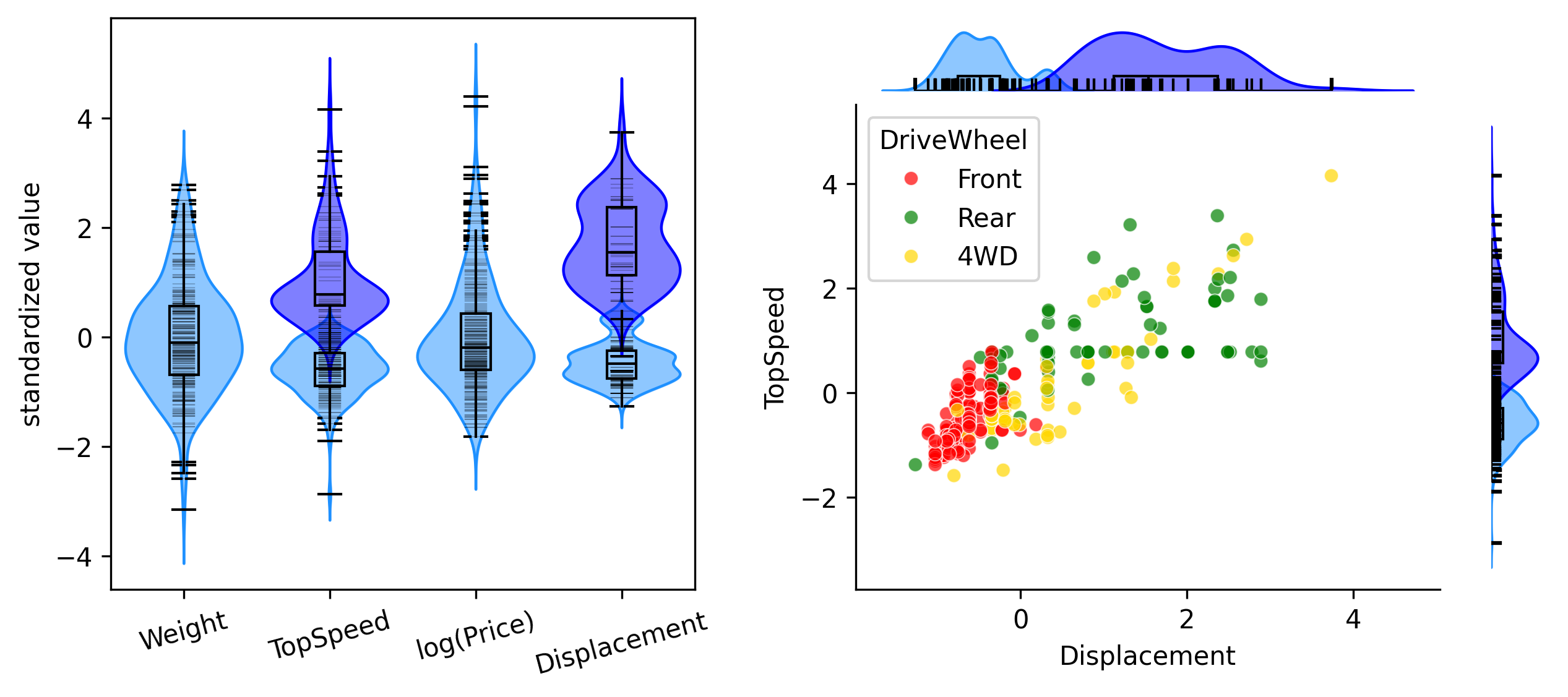
Among the four variables, TopSpeed and Displacement are deemed not unimodal and fitted by two clusters. Since those variables have the most structure we then plot them against each other, with the marginal distributions plotted in the horizontal and vertical directions by the bixplot function. We also color coded the points by DriveWheel. From this plot we conclude that there is a group of cars with small engines, low top speed, and mostly front wheel drive. These are basically compact city cars. The remaining cars are more powerful and faster, with mainly rear wheel drive and four wheel drive.
The tooth growth dataset is about an experiment with 60 guinea pigs. Each animal received one of three dose levels of vitamin C (0.5, 1, and 2 mg/day) by one of two supplements, orange juice (coded as OJ) or ascorbic acid (denoted as AA). The response is the size of cells responsible for tooth growth. The data are available from R as datasets::ToothGrowth. The left panel of Figure S2 shows the response in function of the vitamin C dose, with the two supplement types side by side. As there are only 10 animals for each combination, the bixplot function did not attempt to cluster them. From the display we see for low and intermediate doses of vitamin C that orange juice typically had higher responses, whereas for the highest dose the median responses were similar and the variability was lower with orange juice.
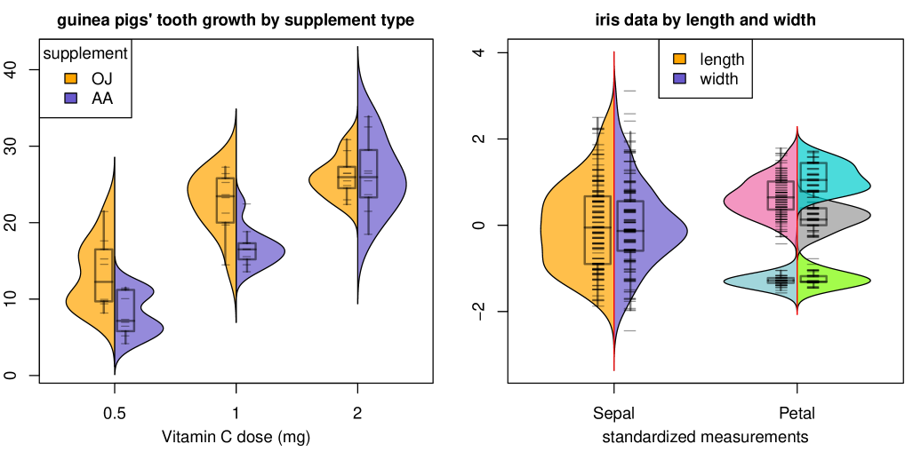
The right hand panel of Figure S2 shows the same information about the iris data as in the left panel of Figure 4, but now displayed with length and width side by side in four ‘half’ bixplots.
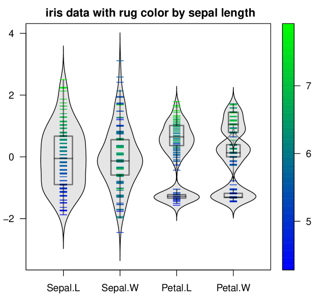
The left panel of Figure S3 contains the same information, but moreover the rug of each variable is colored according to the first variable, Sepal.L . The gradation is obvious in the bixplot of variable Sepal.L itself, but we see that the rug of Petal.L is colored similarly, indicating a positive association between these variables. On the other hand there is not much similarity with the color in Sepal.W .
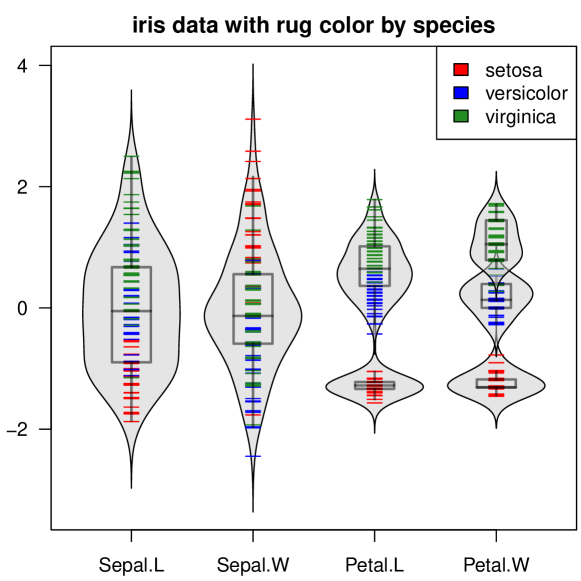
In the right hand panel of Figure S3 the rugs are instead colored according to the categorical variable Species. The three species nicely match the clusters in Petal.W and Petal.L . The colors inside Sepal.L are roughly similar, whereas Sepal.W again behaves differently.
The final illustration uses the well-known Titanic dataset which contains information on the passengers of the RMS Titanic. For its history and visualizations see Friendly et al. (2019). The data are freely available from https://www.kaggle.com/c/titanic/data and the R package classmap (Raymaekers and Rousseeuw, 2023). Among the available variables only two are numeric, the Age of the passenger and the Fare they paid. Since the fares are very skewed we decided to visualize log(Fare) instead. For illustration purposes we look at the first 100 passengers in the dataset, and we standardize both variables. The left panel in Figure S4 shows their bixplot display, in which each variable was split according to the factor Survival. The results for casualty and for survived are shown side by side. The median age and especially the local maximum of its density are higher among the survivors than among the casualties. The relation between fare and survival is more subtle. From the boxes we see that the medians of log(fare) are similar between the groups, and the quartiles are a bit higher for the survivor group. Here the main difference is not in the middle of the data. For the very lowest fares, the density is somewhat bigger on the casualty side, and its local maximum is lower. And for fares much above the third quartile, the density is a bit bigger on the survivor side. We can conclude that there were more casualties among passengers with very low fares, and a few more survivors among those paying very high fares.
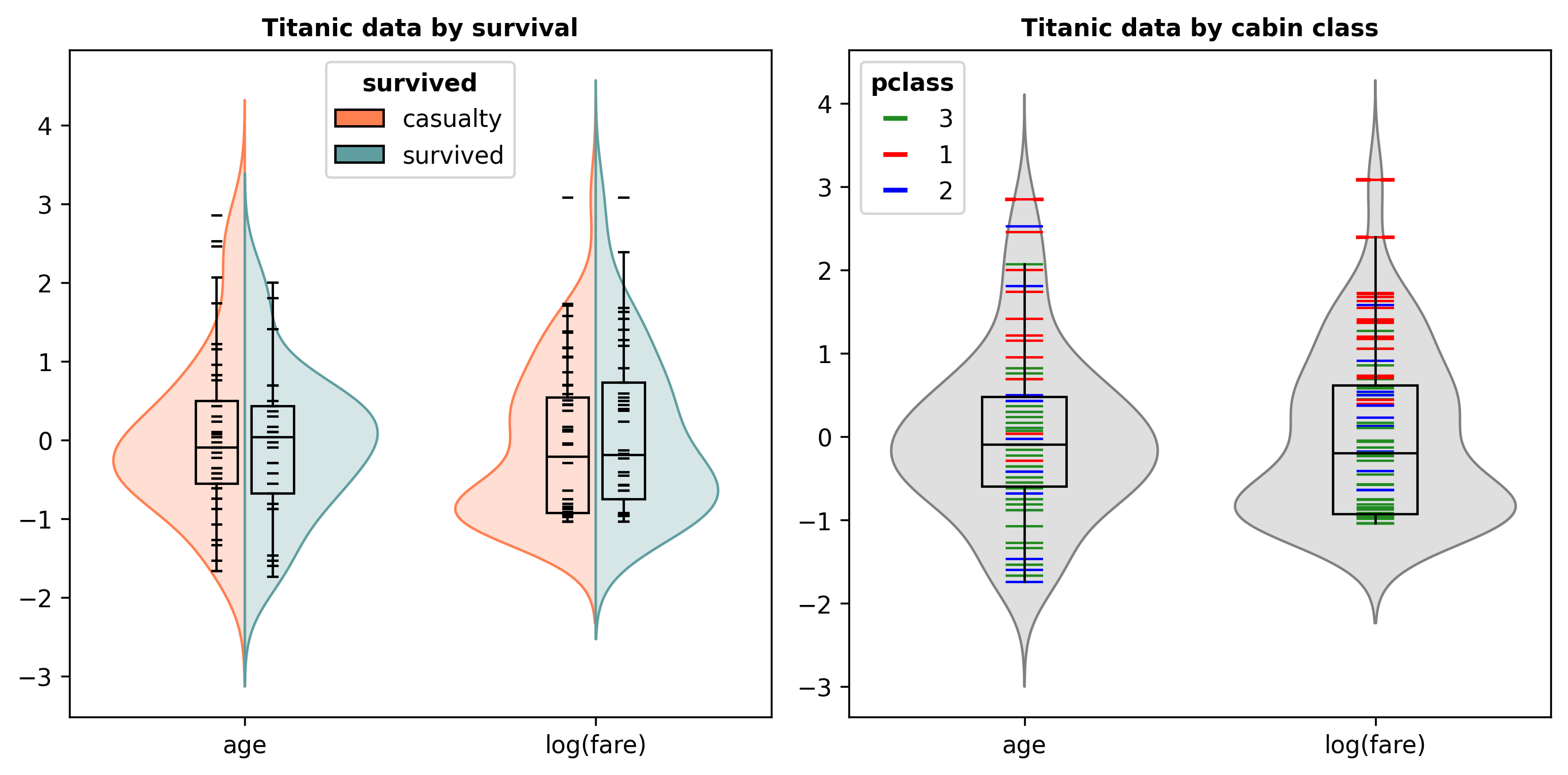
We also want to investigate the relation with another categorical variable, the cabin class. Since that one has three levels, we cannot do so with the side by side mechanism. Instead we color the rugs by the levels of the cabin class in the right hand panel of Figure S4. We see that the fare paid for first class was typically highest, followed by second class and third class, which is only natural. But we also see that there is a relation between age and cabin class, with people of higher age typically occupying better cabins. This relation seems stronger than one might have expected. After seeing this, one might be tempted to investigate whether such a pattern has weakened over the last century.
Appendix B More on the construction of the bixplot
For datasets with many cases (that is, large ) the computation time of the clustering algorithm could become high, and the rug plot in the display could get overcrowded. To avoid this, when is above a given bigN the computations are carried out on a random subset of size bigN. The default bigN is 500, but the user can set it higher. In order not to miss the furthest outliers, the lowest data value and the highest are always included in the subset.
Hartigan’s dip test is carried out by the R package diptest (Maechler and Ringach, 2024), and in Python we used the diptest package (Urlus, 2022).
Inside the constrained clustering algorithm, we made a small change to the -medoids algorithm. In its standard version the algorithm restricts the medoids to cases in the dataset, because this allows it to deal with datasets that do not have coordinates but are given by a matrix of dissimilarities between cases, or a kernel matrix. However, here we are in the framework of univariate data, so we do know the individual data values. For a cluster with an odd number of members, its medoid is unique and equals its sample median. But for clusters with an even number of members, its two central data values might not coincide, and then the medoid can be taken as either of them, so it is not unique. However, the median of the cluster is then defined as the midpoint of the two central values and is therefore unique. Moreover, the objective function (the sum of the distances of all cluster members to the center) is the same for the median and for each of the two medoids. Therefore, we have opted to use the median in the algorithm because it is unique. As a side benefit, if the user would flip the sign of a variable, the median behaves as expected.
In order to be able to interpret clusters as modes we need to obtain a partition where each cluster contains at least clusMinN of unique members, where clusMinN is given by the user and defaults to 3. (Similarly, when a variable has fewer values than clusMinN, only points are drawn.) We have implemented this in a constrained version of -medoids for given , following ideas of Bradley et al. (2000) who constructed a version of -means with this type of constraint. We will provide a sketch of the algorithm. For simplicity we first assume that the univariate dataset of size does not have any ties, so each of its values is unique. The algorithm starts with running an unconstrained -medoid clustering, yielding a set of centers denoted as for . Then we alternate 2 steps. The first of these is to assign the cases to the centers, in such a way that at least clusMinN cases are assigned to each. For this purpose we will maintain an matrix with zero-one entries for and groups . The entries are membership indicators, with
| (1) |
The constraint we need to satisfy says that clusMinN for each . We can write the objective function of -medoids with another matrix, the cost matrix given by its entries
| (2) |
These are the distances of each case to each center, so the objective function in the main text equals . The first step in the alternation is thus the constrained optimization
| (3) | ||||
| subject to |
This can be seen as a general linear program if we allow the memberships to vary continuously between 0 and 1, with the constraints for and for all and . But it is more efficient to restrict the to 0 or 1 from the start, making it an integer programming problem. This enables us to use a technique developed for transportation problems, implemented as the function lp.transport in the R package lpSolve (Csárdi and Berkelaar, 2024), and as the function LpProblem in the Python package pulp (Mitchell et al, 2011). Note that the first time we run (3) the objective function may increase, because the initial -medoid clustering did not have the constraint, but afterward it can only decrease the objective or keep it unchanged.
The other step in the alternation is to recompute the centers, by
| (4) |
This is not a linear operation, but it does not have to be: only the objective in (3) needs to be linear in , which it is for any cost matrix . Note that the univariate median minimizes the sum of distances, so this step will never increase the objective function. It follows that iterating the two alternating steps needs to converge after sufficiently many iterations, but in the code we have a limit on the number of iterations anyway, that can be chosen by the user.
The above description assumed that there were no ties among the hence they are all unique. If this is not the case, the optimization (3) may assign tied to different centers as a way to satisfy the constraint, which is undesirable. Instead we combine tied to cases that are unique, and some of which correspond to more than one . We then apply the constrained step (3) to the to avoid breaking ties. Next we copy the resulting memberships of the to the corresponding and update the centers in (4) using all the , and continue iterating this way.
Additional references
- Csárdi and Berkelaar (2024) Gábor Csárdi and Michel Berkelaar. lpSolve: Linear/integer problems. CRAN, R package, 2024. https://CRAN.R-project.org/package=lpSolve.
- Maechler and Ringach (2024) Martin Maechler and Dario Ringach. diptest: Hartigan’s Dip Test Statistic for Unimodality. CRAN, R package, 2024. https://CRAN.R-project.org/package=diptest.
- Mitchell et al. (2011) Stuart Mitchell, Michael O’Sullivan, and Iain Dunning. Pulp: A Linear Programming Toolkit for Python. Technical Report, The University of Auckland, New Zealand, 2011. https://pypi.org/project/PuLP/.
- Raymaekers and Rousseeuw (2023) Jakob Raymaekers and Peter J. Rousseeuw. classmap: Visualizing Classification Results. CRAN, R package, 2023. https://CRAN.R-project.org/package=classmap.
- Urlus (2022) Ralph Urlus. diptest: A Python/C++ Implementation of Hartigan’s Dip Test for Unimodality. PyPI package, version 0.6.1, 2022. https://pypi.org/project/diptest/.