An Introduction to Topological Data Analysis Ball Mapper in Python
Abstract
Visualization of data is an important step in the understanding of data and the evaluation of statistical models. Topological Data Analysis Ball Mapper (TDABM) after dlotko2019ball, provides a model free means to visualize multivariate datasets without information loss. To permit the construction of a TDABM graph, each variable must be ordinal and have sufficiently many values to make a scatterplot of interest. Where a scatterplot works with two, or three, axes, the TDABM graph can handle any number of axes simultaneously. The result is a visualization of the structure of data. The TDABM graph also permits coloration by additional variables, enabling the mapping of outcomes across the joint distribution of axes. The strengths of TDABM for understanding data, and evaluating models, lie behind a rapidly expanding literature. This guide provides an introduction to TDABM with code in Python.
Keywords: Topological Data Analysis, Ball Mapper, PyBallMapper, Python
1 Introduction
Consider data as a point cloud. The cloud has dimensions, with each data point having co-ordinates on each . The location of point , in the point cloud is analogous to the placement of point onto a scatter plot. The notion of a point cloud allows us to consider the appearance of data in cases where 111The case where can be visualized with a three dimensional scatterplot, but the reading of three-dimensional scatter plots is not always straightforward. For cases where , human abilities to interpret graphical representations create difficulties in creating a full illustration of the full dimensionality of the data.. This guide presents a means to visualize the resulting point cloud as an abstract two-dimensional representation. We present the Topological Data Analysis Ball Mapper (TDABM) algorithm of dlotko2019ball. The purpose of this guide is to provide an introduction to TDABM and to discuss the code required to implement TDABM on a user dataset. Throughout the provided code is as implemented in Python using the pyBallMapper library222The Python library pyBallMapper is available from https://github.com/dioscuri-tda/pyBallMapper/tree/main. The code to recreate this guide is available as a Jupyter Notebook at https://github.com/srudkin12/BM-Guide.. Consider a dataset , which comprises the variables that are of interest. The first objective is to understand the relationships between the variables within . matejka2017same reminds on the importance of visualization of datasets. In addition to demonstrating correlation structures, visualization at the exploratory data analysis stage enables the identification of outliers, potential leverage points and other irregularities which may warrant further investigation. To the dataset, an outcome of interest, , is introduced. Mapper algorithms, like TDABM, aim to map across the multidimensional space of . In the two-dimensional scatterplot setting, can be shown by coloring points. The mapping on a 2-dimensional case is attainable on a scatterplot by coloring the data points. As the challenge of simultaneously viewing the variables becomes harder as increases, so the ability to show the mapping of also intensifies. It is the inability to map outcomes across multiple dimensions to which TDABM speaks.
Within the growing literature applying TDABM within Economics and Finance, data may be grouped into representations of time series and of cross sections. rudkin2024return considers the time series of Bitcoin returns, taking each weekly return as the axis in the point cloud. With the contemporary value and 4 lags, the resulting point cloud has 5 dimension. Further considerations of time series include rudkin2023regional and rudkin2023economic. In the majority of published applications in Economics and Finance, take a dataset constructed of multiple variables, rather than a single time series. rudkin2023economic take the socio-demographic characteristics of UK parliamentary constituencies as the axes of the cloud. tubadji2025cultural and rudkin2024topology similarly look at the joint distribution of regional socio-demographic characteristics, focusing on the European Union NUTS regions. In Finance the joint distribution of firm characteristics represent the inputs for dlotko2021financial and qiu2020refining. In all cases the first objective is to identify structure within the data.
The diversity of outcomes of interest studied in the emerging literature is also notable. Papers such as rudkin2024return, dlotko2021financial and qiu2020refining have a forecasting approach. A forecasting approach takes data from a current period and asks what will happen to in the subsequent periods. For rudkin2024return, the object is to predict the direction of Bitcoin returns in subsequent periods. rudkin2023regional looks at how the trajectory of development predicts the subsequent resilience of the region to the Global Financial Crisis. The ability of TDABM to found a forecasting model is discussed in rudkin2024return and charmpi2023topological. Discussion of forecasting here is placed within the context of TDA-based representations of the point cloud. Our discussion is independent of the ability of time series of topological signals to improve forecast performance. See shultz2023applications for more on wider applications of TDA.
The original mapper algorithm was proposed by singh2007topological. The singh2007topological mapper first creates a segmentation of the data using a mechanism such as cluster analysis. A lens function reduces the dimensionality of the data. Once reduced in dimension, the data is split into equally sized bins with overlap. The overlap between bins is used to construct edges between the discs that represent each bin. Determination of lens function, clustering algorithm, number of bins and bin overlap, mean that the original mapper algorithm has many choice parameters. Contrasting with the single choice parameter in TDABM, one of the advantages of TDABM is clear. Work on the stability of the mapper algorithm also confirms TDABM to have an advantage. There are other methods of visualizing multivariate data, such as T-SNE or Principal Components Analysis (PCA), but both require dimension reduction. Dimension reduction causes data loss and hence is not seen as preferable when a method exists that does not require dimension reduction. TDABM requires no reduction of dimensions and therefore can be considered superior to T-SNE or PCA.
This guide is presented over 4 sections. Section 2 delivers an exposition of the two artificial datasets used within the guide. An explanation of the implementation of TDABM on the example dataset is provided by Section 3. Section LABEL:sec:art is the primary reference point for applying TDABM. Within Section LABEL:sec:art, I walk through the construction of the TDABM graph with the code echoing the implementation in Python. The Python implementation of TDABM is discussed in Section LABEL:sec:pybm. Finally, Section LABEL:sec:summary summarises the guide and provides suggestions for further work.
2 Data
I use two datasets to illustrate TDABM within this guide. The code for the production of the dataset is provided within the accompanying .ipynb file. both of the datasets are bivariate, with and . Both datasets have 1000 observations, . In the first dataset the correlation between and is 0, in the second dataset we have . Like any distance based methodology, it is important to ensure that the values of each variable are on comparable scales. One means of ensuring that variables are on the same scale is to standardize. Both and are standardized.
The code which is used to create the datasets is given in Box 2. The code can be readily changed to produce alternative correlations between the two variables. The random.seed(101) is selected in order to ensure that the correlation is close to 0.5 for the specific random values generated. Having a fixed seed ensures that the results are all replicable. The resulting summary statistics of and are provided in Table 1.
| Statistic | Dataset 1 | Dataset 2 | ||||
|---|---|---|---|---|---|---|
| X1 X2 Y Mean | 0.000 | 0.000 | 0.000 | 0.000 | 0.000 | 0.000 |
| Standard deviation | 1.000 | 1.000 | 1.418 | 1.000 | 0.999 | 1.002 |
| Minimum | -1.738 | -1.749 | -3.244 | -1.738 | -2.335 | -2.240 |
| 25% | -0.833 | -0.852 | -0.988 | -0.833 | -0.774 | -0.761 |
| 50% | -0.028 | 0.032 | 0.019 | -0.028 | 0.051 | 0.009 |
| 75% | 0.844 | 0.859 | 1.027 | 0.844 | 0.723 | 0.713 |
| Maximum | 1.753 | 1.734 | 3.400 | 1.753 | 2.308 | 2.339 |
Notes: Summary statistics for the two artificial bivariate datasets used in this paper. is computed such that . and are drawn independently from . Variables are standardized. In Dataset 2, is further adjusted to ensure correlation of 0.5 with . . Replication code is included within the accompanying .ipynb file.
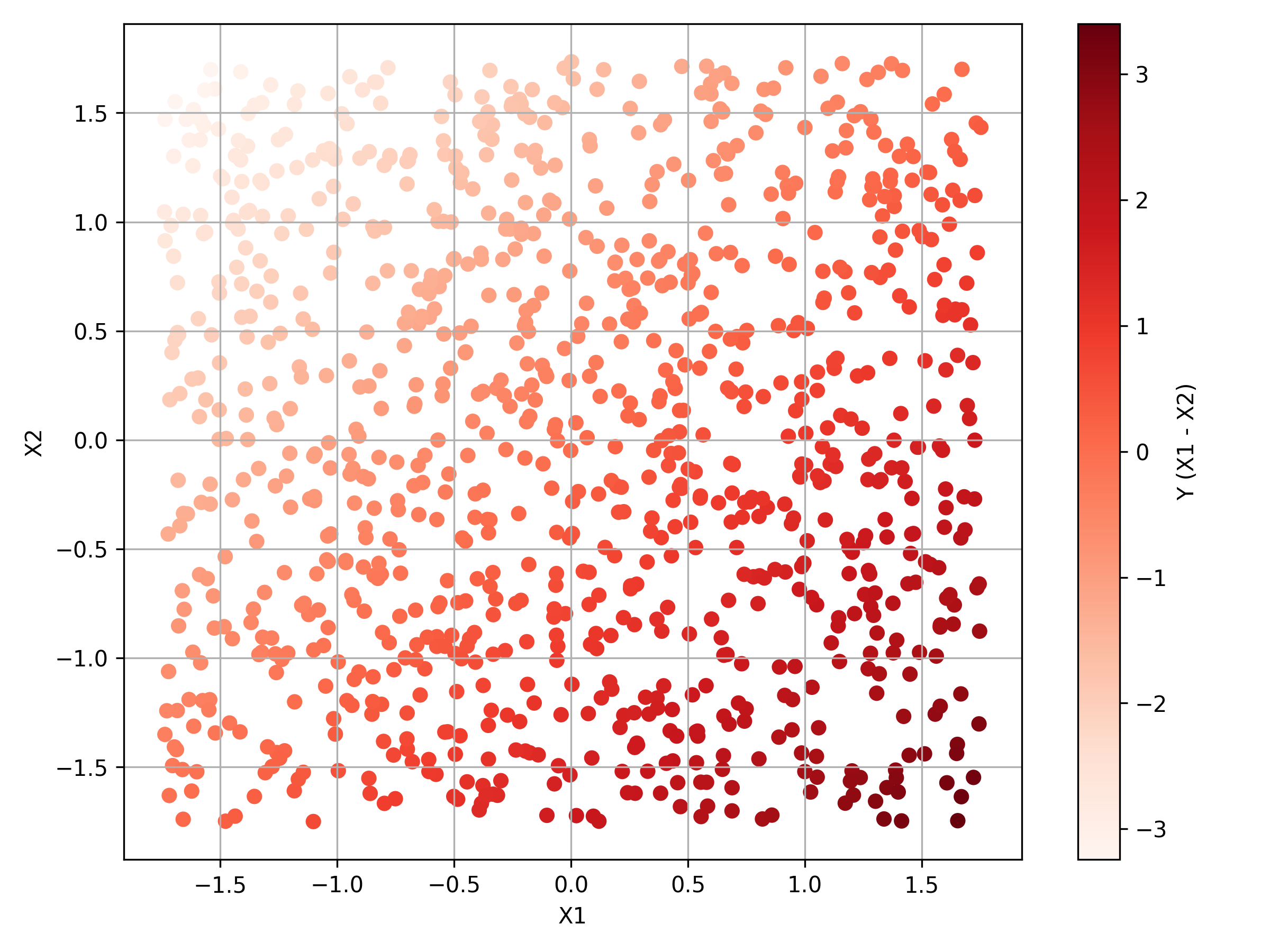
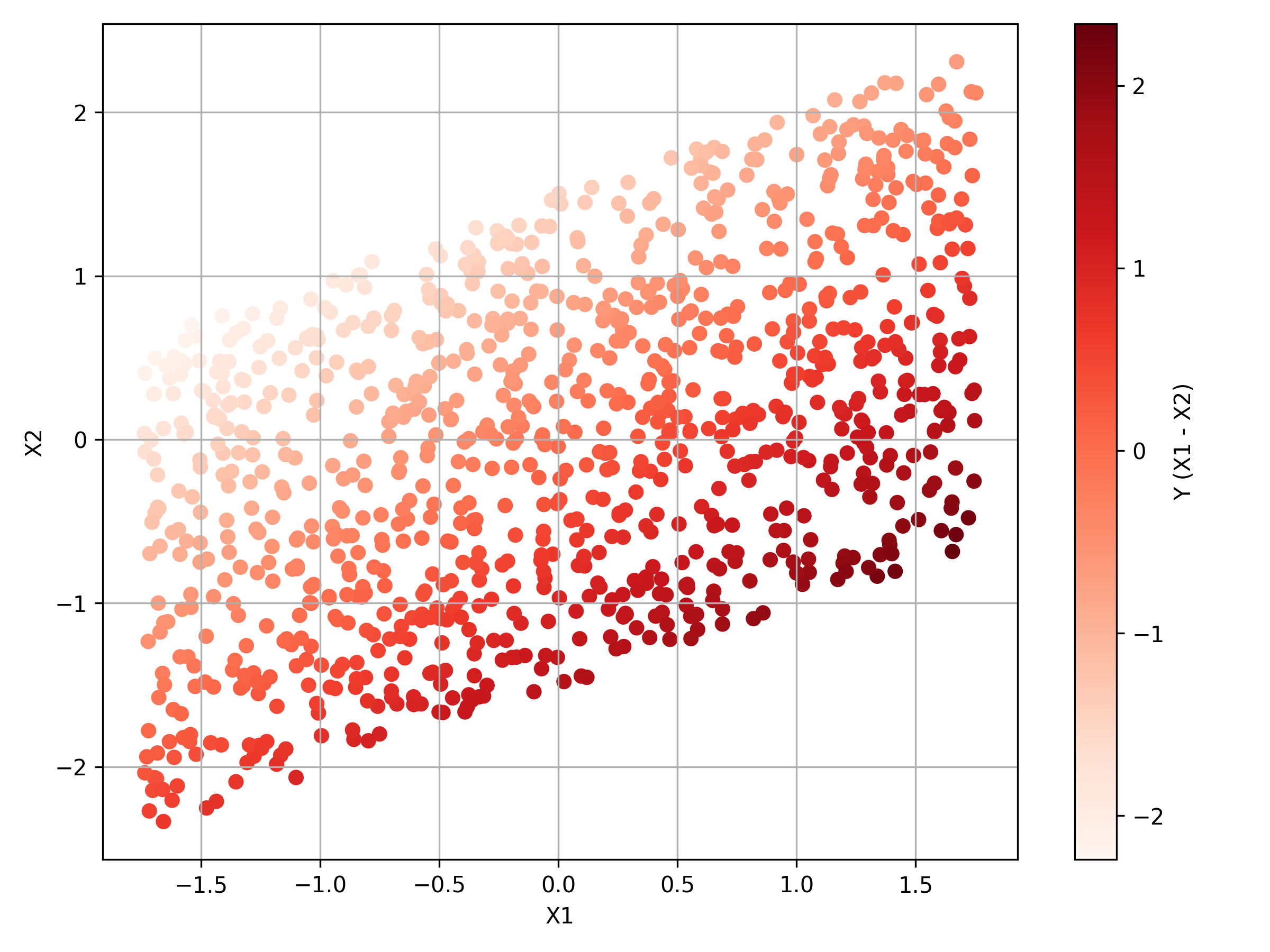
Table 1 confirms that the summary statistics are in line with expectation. As the data has been standardised, the mean is 0 and standard deviation 1 for both and . There are no discernable differences between the summary statistics for the two datasets, despite there being a correlation in Dataset 2. Both datasets share the same and so the summary statistics for in the first and fourth columns are identical. The correlation is confirmed as 0.496 in the output. To see the data, Figure 1 provides scatter plots for the two datasets.
 |
 |
| (a) Dataset 1 | (b) Dataset 2 |
Notes: Scatterplots for the two artificial bivariate datasets used in this paper. is computed such that . and are drawn independently from . Variables are standardized. In Dataset 2, is further adjusted to ensure correlation of 0.5 with . . Coloration is according to the value of .
The largest values of appear when takes its’ highest values and when is at its lowest values. Meanwhile the smallest values of appear when is low and is high. The result is a diagonal pattern with the lowest values being to the upper left. Panel (a) shows that Dataset 1 has a clear pattern within the output. In panel (b), and are correlated and so the points are also arranged around the leading diagonal. The differentiation in the colours is harder to identify. However, because Python reassigns the colors for the points according to the specific dataset being plotted, the graduation between the lowest and highest values can still be seen within panel (b).
3 Methodology
Within this guide there is a dataset with variables. For each point, , , the location in the point cloud is set as , . In the simplest case a point cloud is similar to a scatter plot. For the examples used in this guide , ensuring that the scatterplot is indeed analogous to the point cloud. In addition to , the TDABM algorithm requires two further inputs. Firstly, a coloration variable which is available for all data points. Secondly, a radius for the balls in the cover, . The radius performs a similar function to the scale when plotting a cartographic map. A small radius means that many details appear within the structure of the data. At a higher radius the global picture is apparent, but the microstructure of the data is obscured. In considering a dataset, trying multiple values of is recommended. Only after seeing the true data structure can a radius be chosen. TDABM creates a cover of allowing the abstract visualization of in two dimensions.
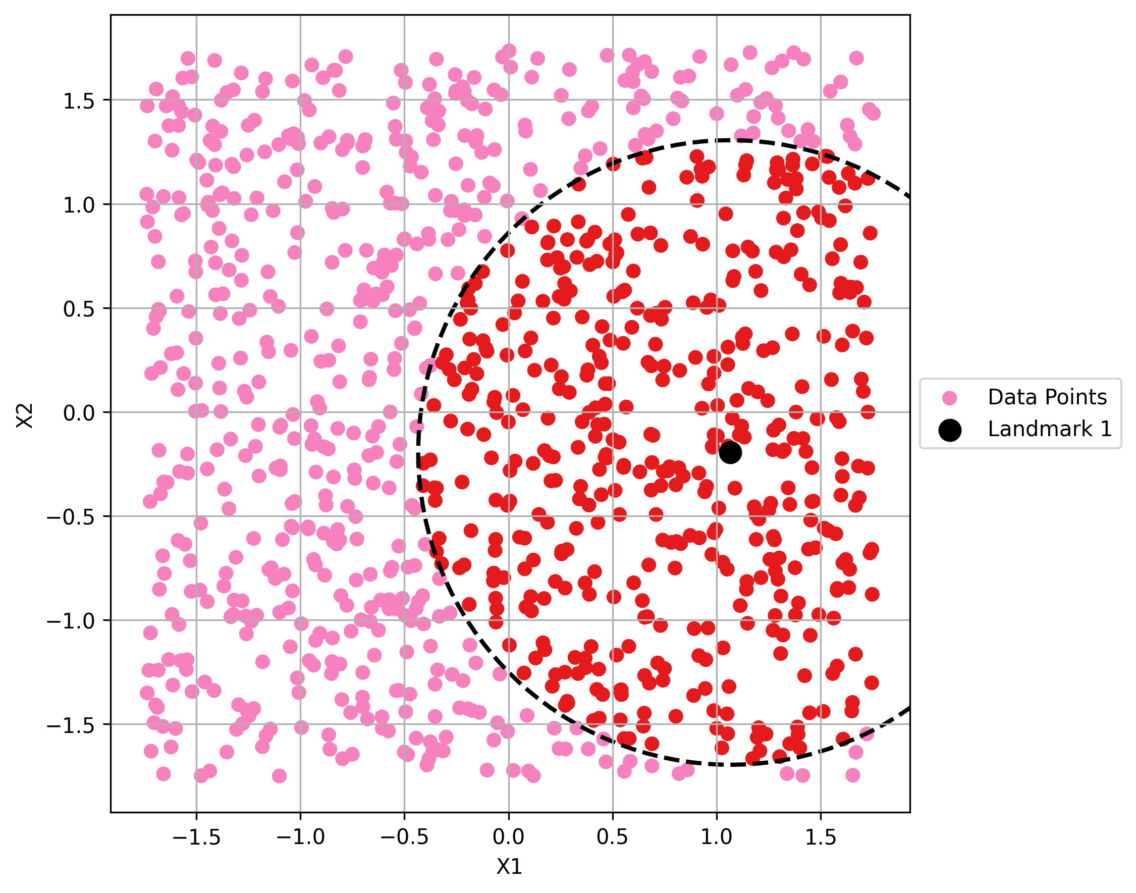
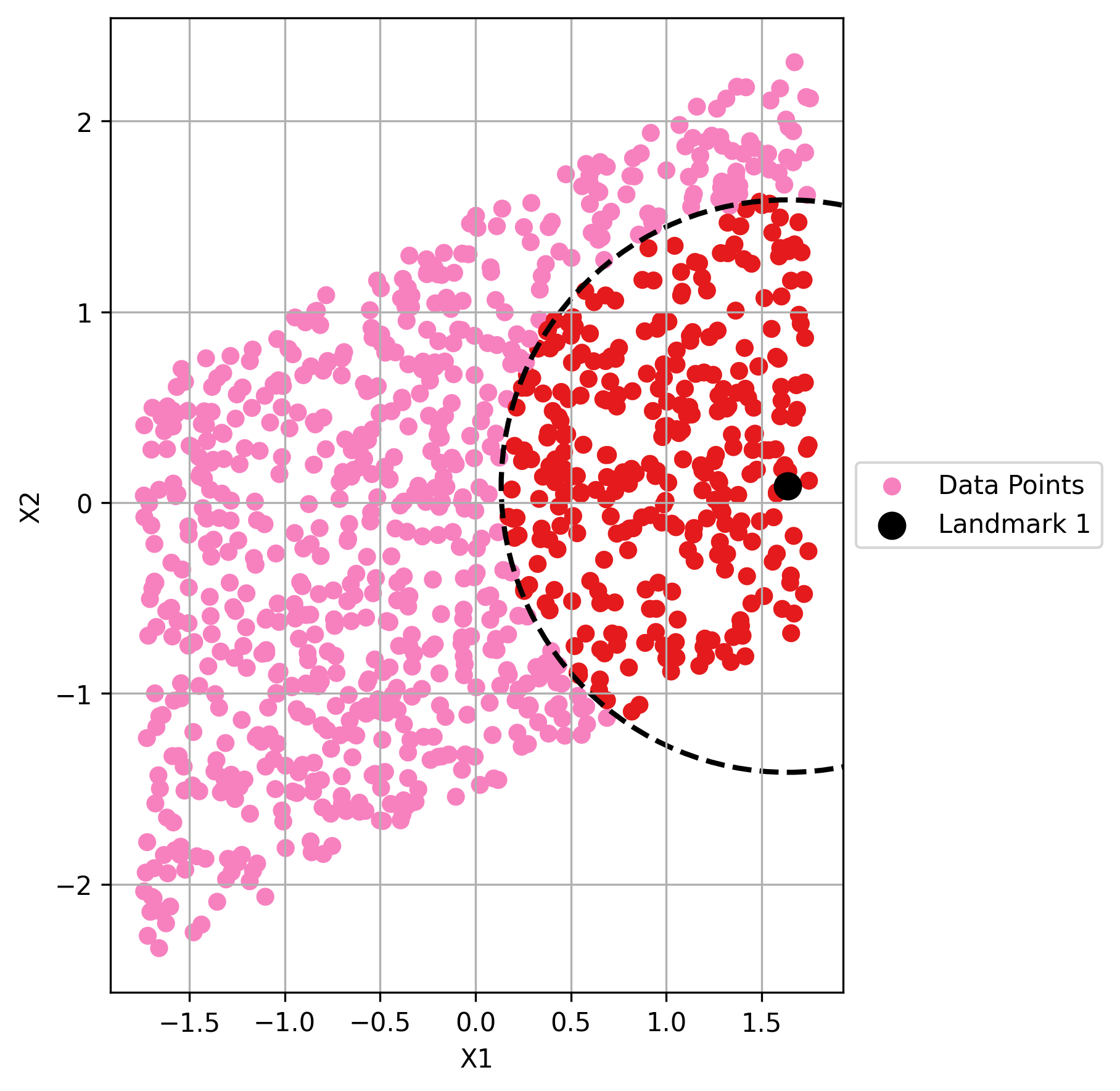
As written in dlotko2019ball, the TDABM algorithm begins by choosing a point at random from . The selected point becomes , the first landmark. In Python the selection of the first landmark is coded as per Box 3. In the case of the first selection there is no need to consider whether any point is covered. Around the landmark a ball of radius is constructed. All points within the ball are considered to be covered by the ball that has been drawn around . The ball around is labelled as Ball 1 and can be written as . In the example . The full code for the construction of Ball 1 is placed in Box 3.
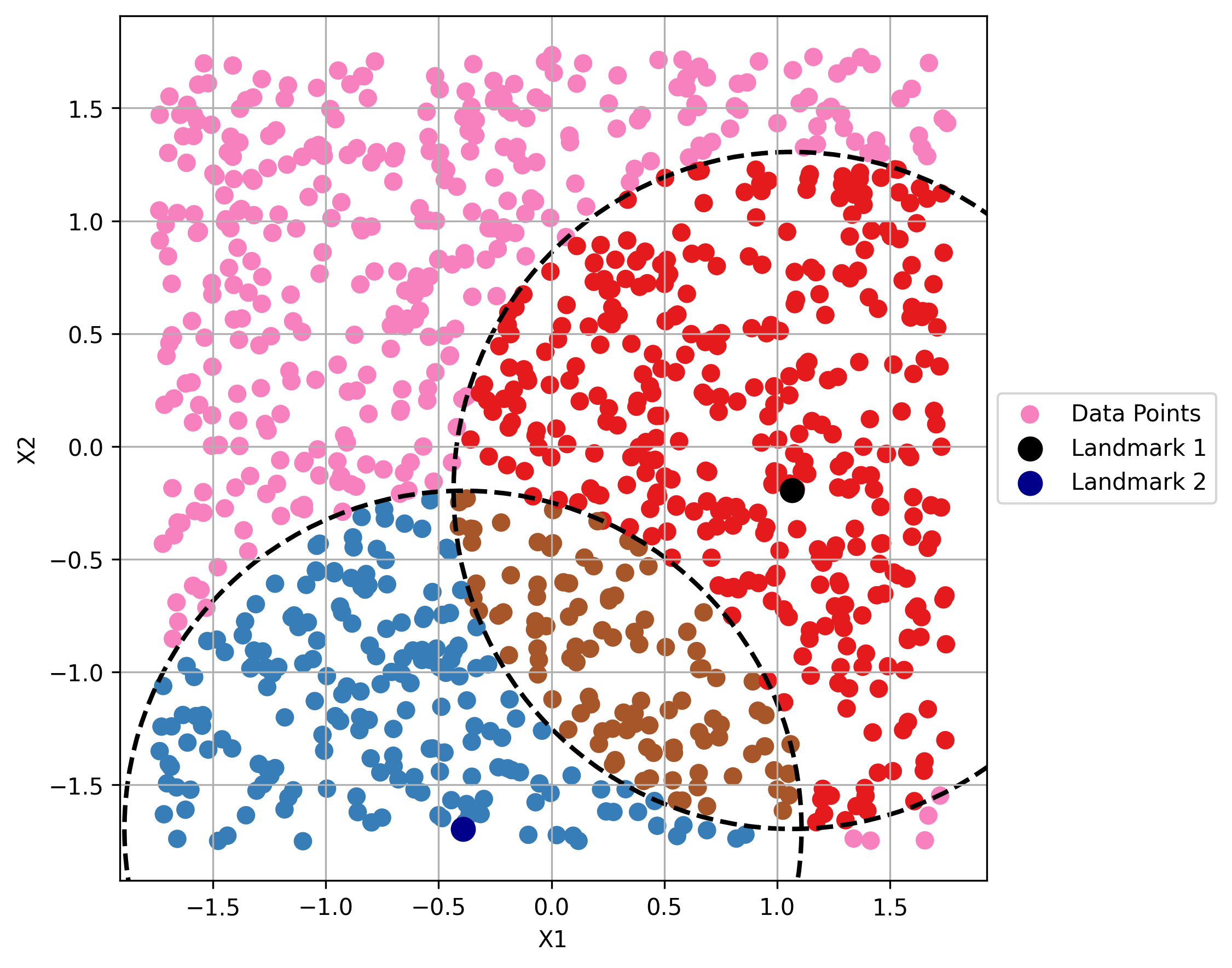
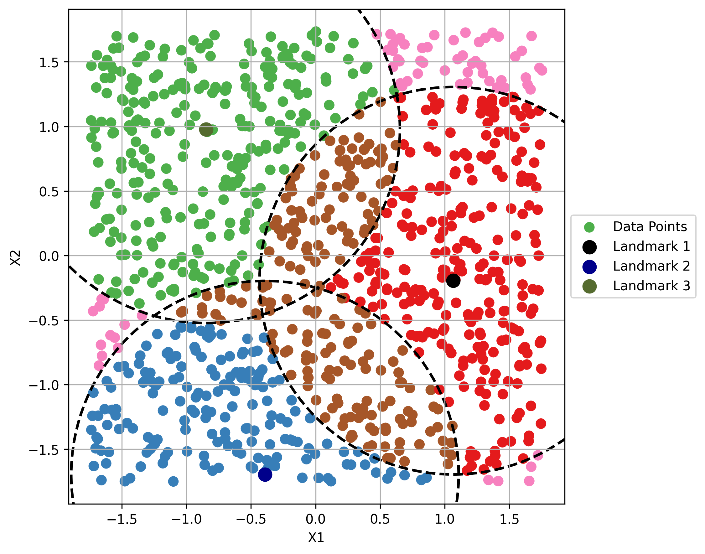
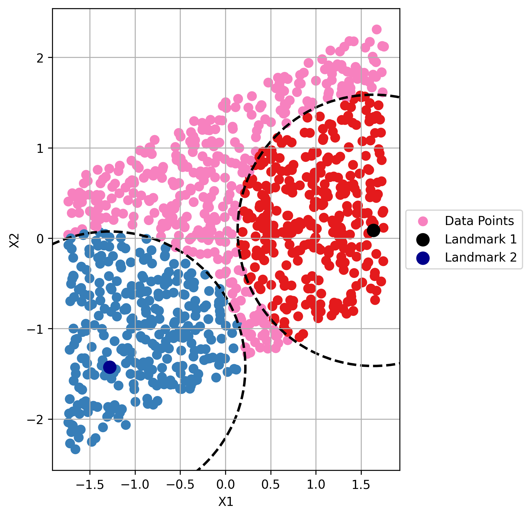
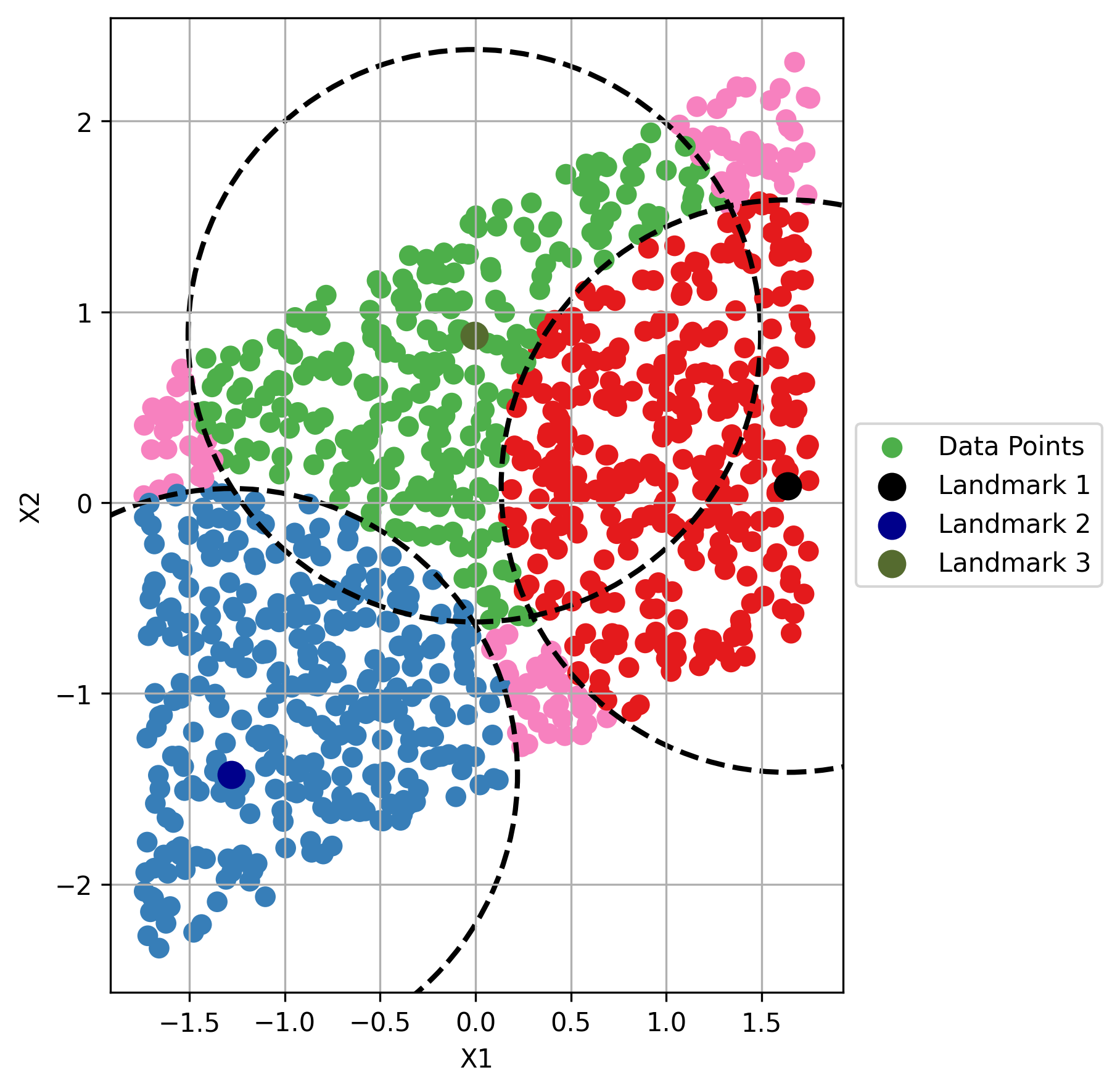
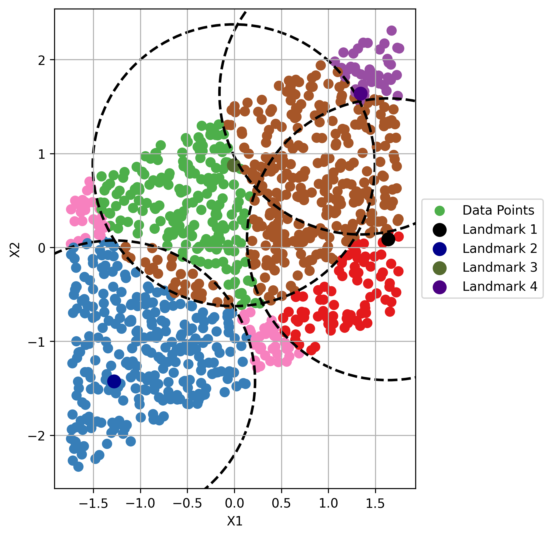
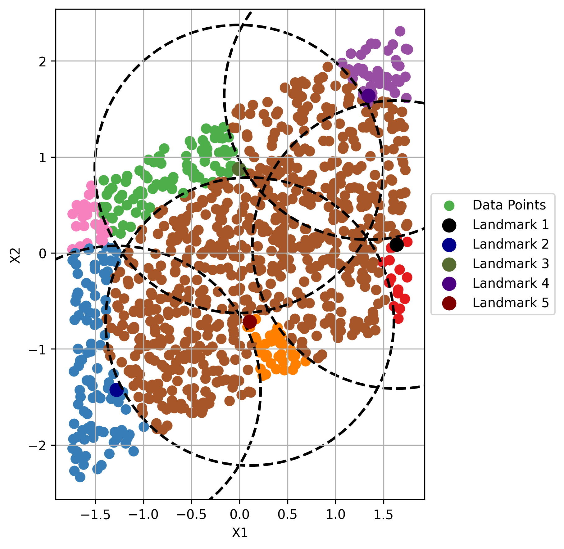
The second landmark, is chosen at random from all of the points which are not covered by Ball 1. A ball of radius is then constructed around , becoming Ball 2, . Collectively, and combine to become the cover . Points outside are still uncovered. A third landmark is selected from and becomes . The process continues until , that is there are no uncovered points. Figure 2 shows the construction of the cover of Dataset 1. Figure 3 presents the process for Dataset 2.
 |
 |
| (a) Landmark 1 | (b) Landmark 2 |
 |
 |
| (c) Landmark 3 | (d) Landmark 4 |
 |
 |
| (e) Landmark 5 | (f) Landmark 6 |
Notes: Figures represent the stepwise construction of the TDABM style plot. Landmarks refer to the points that would be the landmarks of the balls in a TDABM plot. Numbering of landmarks is the order of selection. Landmarks are selected from the uncovered points (pink) until all points can be found within at least one circle (all other colors). Dashed circles represent the boundaries of the balls around each landmark. Dataset 1 has two variables and , and contains 1000 points. and are drawn at random from . Standardization is applied to allow comparison with Dataset 2.
Figure 2 shows Ball 1 being constructed in panel (a). The red points are covered by Ball 1, whilst the pink points are uncovered. A second ball is added in panel (b). There is an intersection between the two balls. The intersection points are colored in brown. Ball 2 is colored blue. The landmarks of Balls 1 and 2, and respectively, are illustrated as larger points in darker colors. Continuing the construction process, panel (c) shows the addition of Ball 3 around . The majority of the points are covered in the example, but there are three small areas of pink on the plot. Progressively panels (d), (e) and (f), show Balls 4, 5 and 6 covering those pink points. At the point of reaching panel (f) the cover is complete.
Within the process of replicating the theoretical TDABM algorithm in Python all of the code follows a similar pattern. Box 3 provides an example of the code needed to produce Ball 5. Within the accompanying code file, the use of 1 and 2 refers to the dataset. Distinction is also drawn between the two methods of constructing the example cover. Here, the use of random_point105 informs that landmark 5 is being selected for dataset 1. Since the code is designed as an illustration the population of the circle_membership variable is abridged. Points that are only in a single ball are identified by requiring that only one of the inside_circleXX dummies be equal to 1. To be in an intersection between two balls, a point must have a value of 1 for two, or more, of the inside_circleXX dummies. Hence all pairwise comparisons are made. Finally a value of 8 is assigned where all of the inside_circleXX dummies are 0. As the number of balls increases, so the process of assigning the circle_membership values becomes longer. In the TDABM algorithm there is no need to look at the individual steps. The code provided here is purely to explain intuitively what is being done by the Python function.
Across the 6 panels of Figure 2, the number of lines in the code increases greatly. As more balls are added, the number of lines to identify members of an individual ball increases. The number of pairwise combinations of balls is also rapidly increasing when more balls are added to the cover. The length of the code, as entered into the .ipynb file, continues to grow as the number of landmarks increases. The resulting columns in df1 replicate the information that is held within the TDABM algorithm, and merge that information with the genuine data point information.
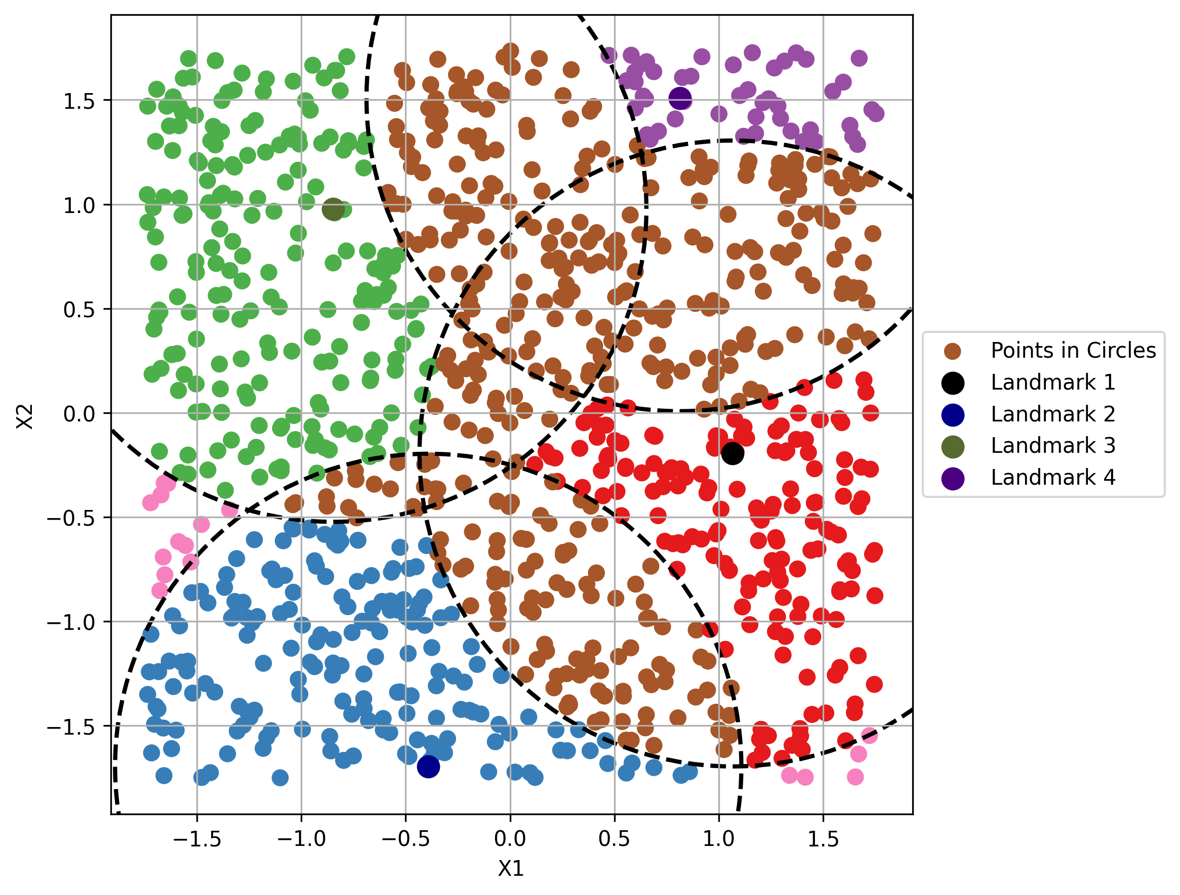
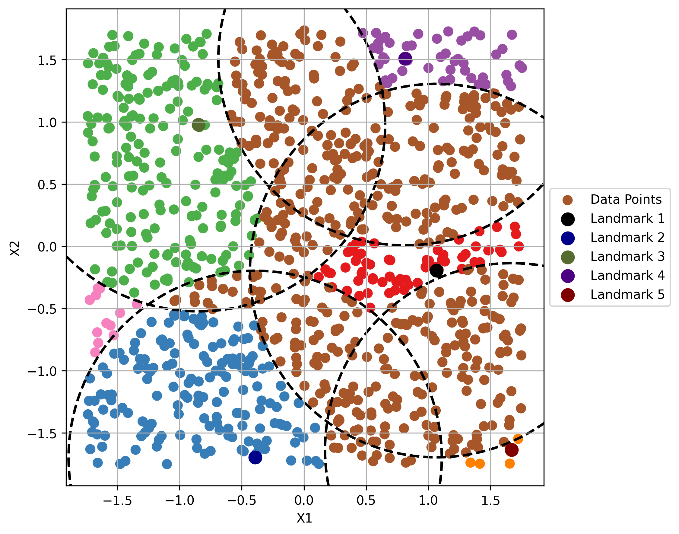
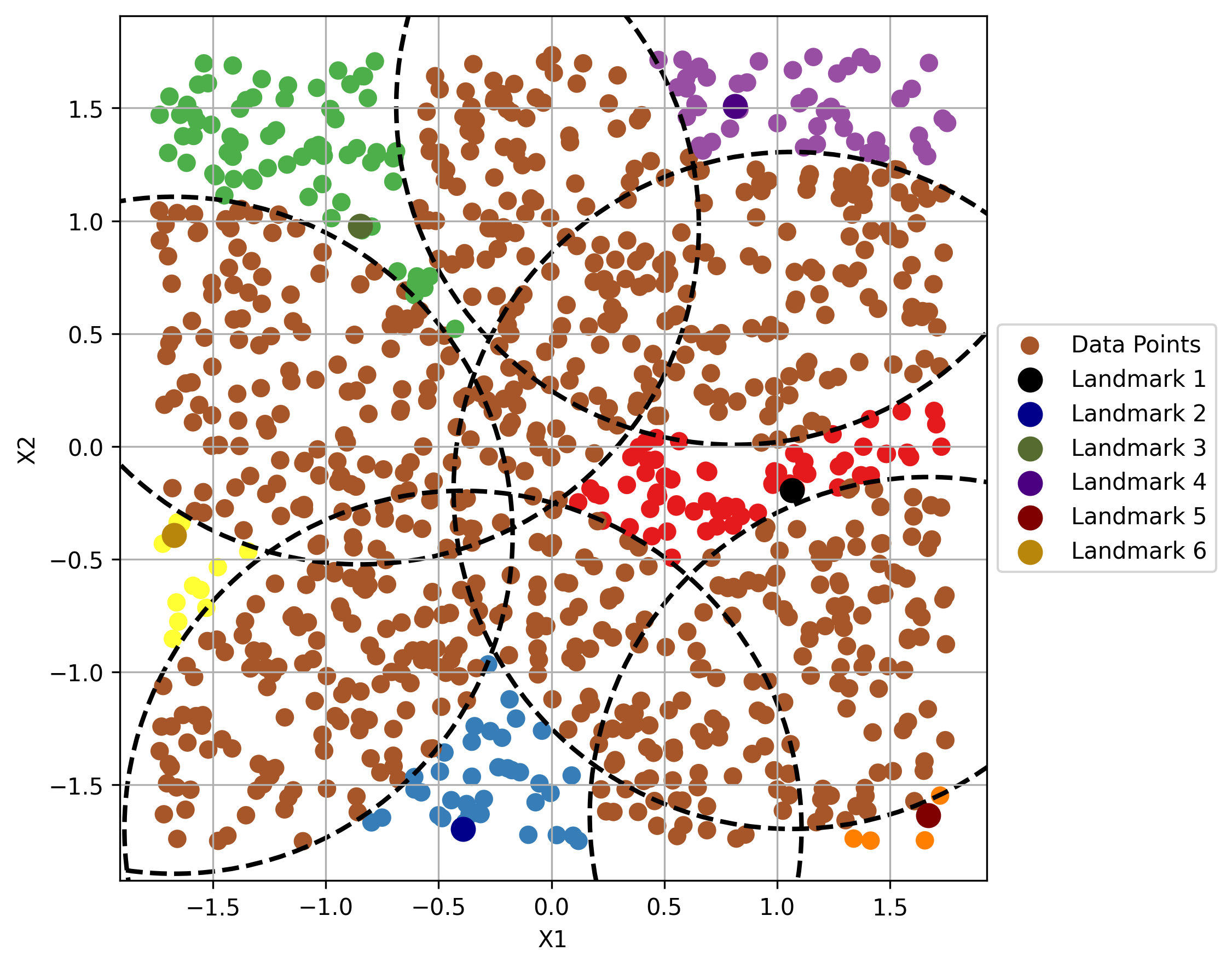
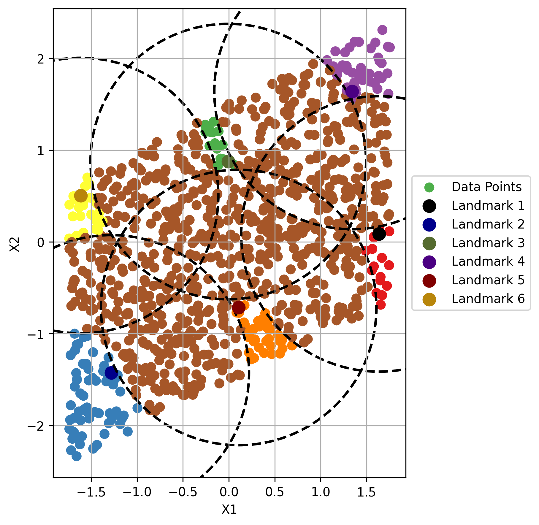
The process can be replicated on Dataset 2. The case of Dataset 2 is plotted in Figure 3. In the construction of Ball 2, panel (b) of Figure 3, there is no intersection between the first two balls. Only when Ball 3 is added in panel (c) are any overlaps noted. There are three pockets of uncovered points. Panels (d) to (f) add the balls required to complete the cover of Dataset 2.
 |
 |
 |
| (a) Landmark 1 | (b) Landmark 2 | (c) Landmark 3 |
 |
 |
 |
| (d) Landmark 4 | (e) Landmark 5 | (f) Landmark 6 |
Notes: Figures represent the stepwise construction of the TDABM style plot. Landmarks refer to the points that would be the landmarks of the balls in a TDABM plot. Numbering of landmarks is the order of selection. Landmarks are selected from the uncovered points (pink) until all points can be found within at least one circle (all other colors). Dashed circles represent the boundaries of the balls around each landmark. Dataset 2 has a correlation between and of 0.497. Dataset 2 contains 1000 points initially drawn at random from . Standardization is applied and Dataset 2 transformed to obtain the desired correlation of approximately 0.5.
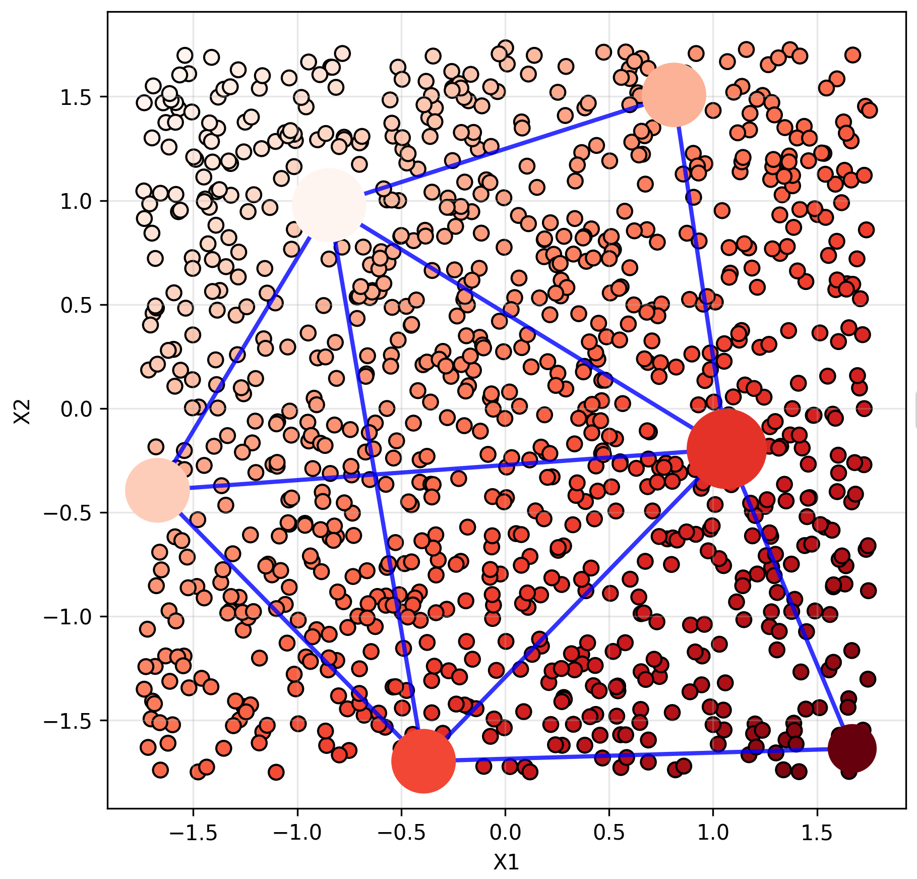
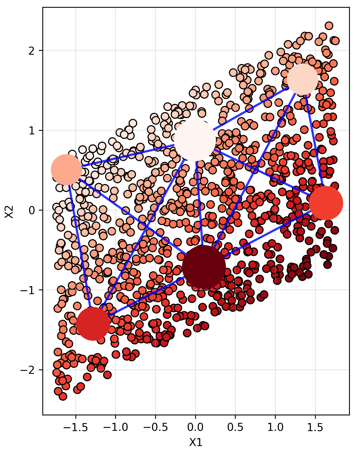
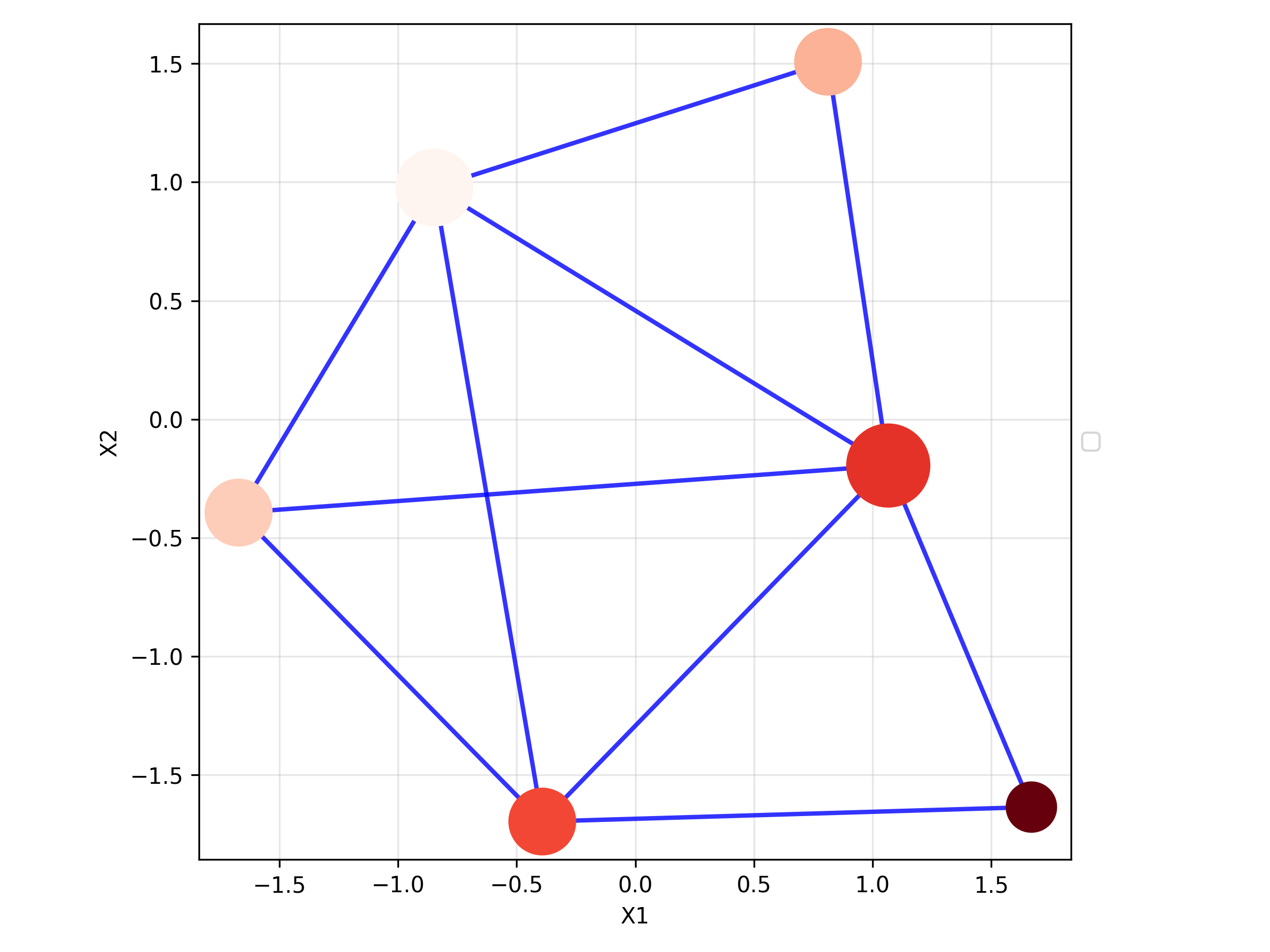
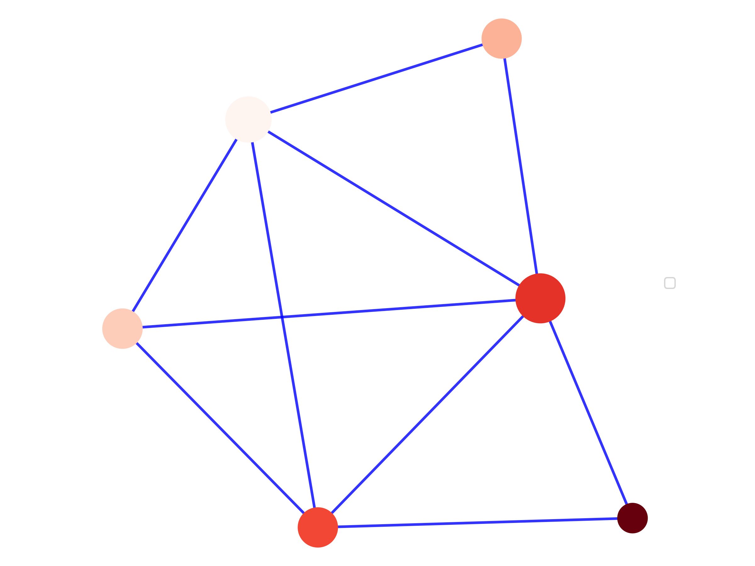
Figures 2 and 3 show how a cover is constructed. The cover is the first stage of the TDABM algorithm. The second stage is to construct the actual map of the data. The visualization is created by converting the information amongst the ball members into a representation of each ball. Each ball is shown in a TDABM graph as a disc. The number of points in the ball informs on the density of the data within the neighborhood of the landmark. In a TDABM graph, the number of points in the ball is captured in the size of the disc that represents each ball. There is also information about for each data point. To preserve information about , an average across all ball members is taken. The average value of informs the color of each disc. In order to understand the relative positioning of the balls, edges are drawn between any pairs of balls for which the intersection is non-empty. From Figures 2 and 3, it can be seen that there are many non-empty intersections.
The construction of the TDABM graphs for the Dataset 1 and Dataset 2 is provided in Figure 4. In panels (a) and (b), the original datapoints are visible. Coloration of the data points is according to the value of . The balls are shown by the dashed circles, as they were in Figures 2 and 3. All of the information that would be captured in the TDABM graph is visible in panels (a) and (b). The TDABM style graph is overlaid onto the plot. Discs are sized according to the number of points within the ball. Discs are colored according to the average value of across all of the points within the ball. The edges are added across all intersections that are non-empty.
 |
 |
| (a) Dataset 1 with Discs | (b) Dataset 2 with Discs |
 |
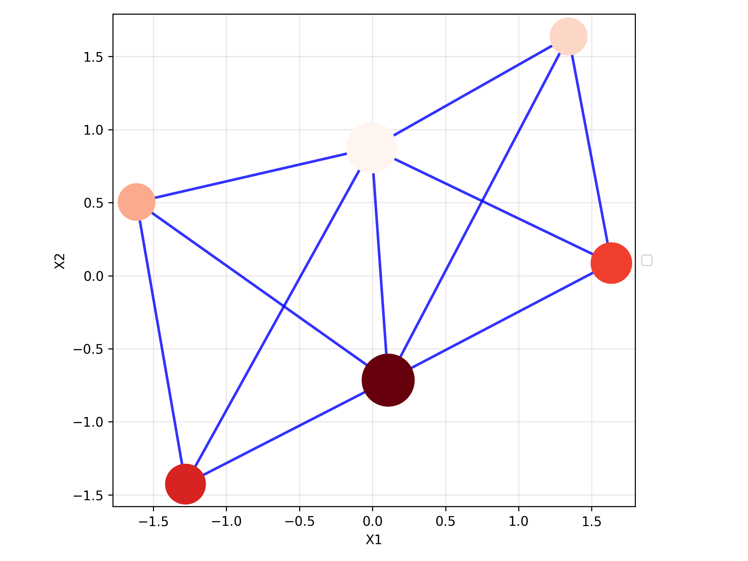 |
| (c) Structure with Axes 1 | (b) Structure with Axes 2 |
 |
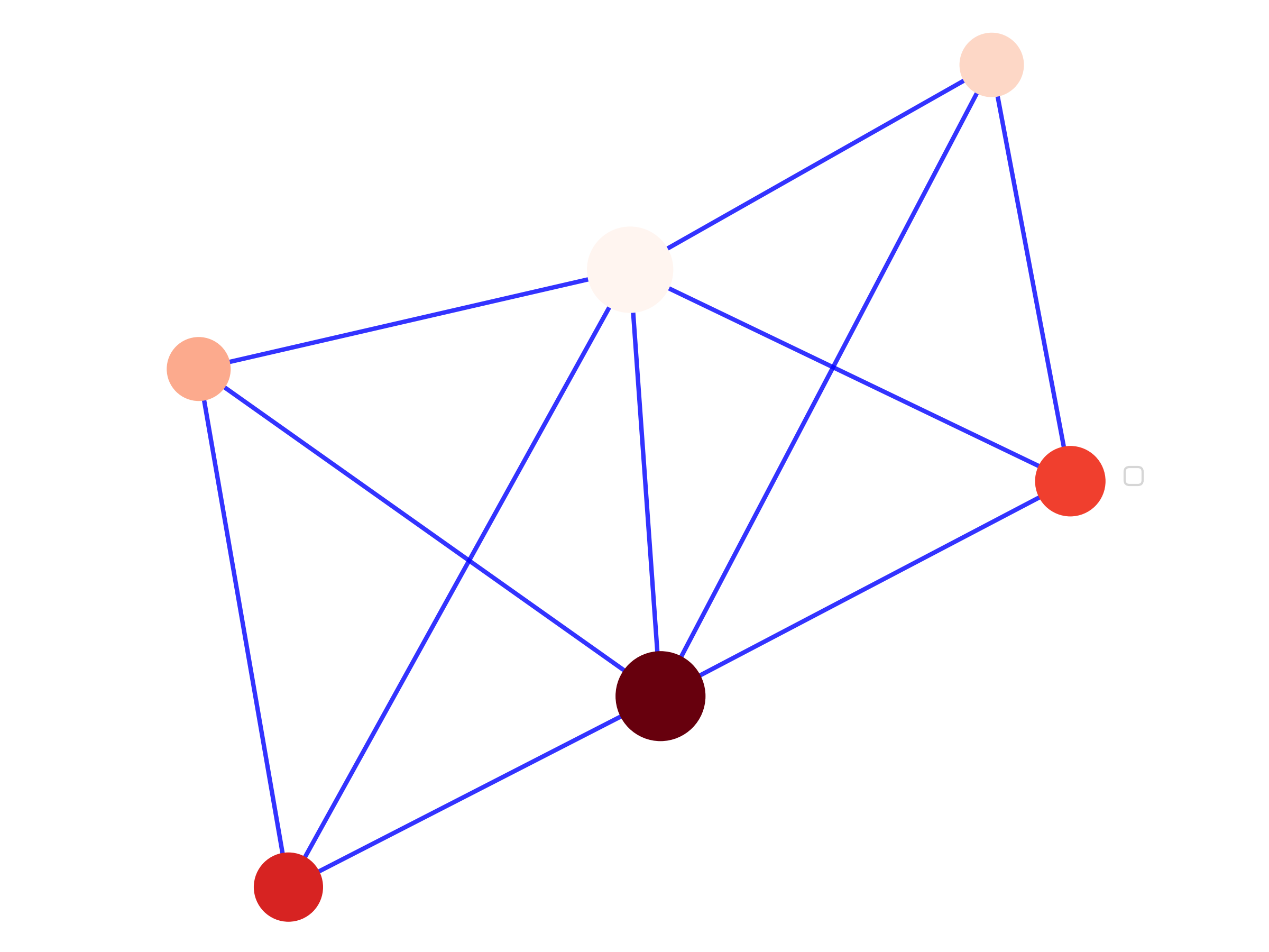 |
| (a) TDABM Equivalent 1 | (b) TDABM Equivalent 2 |
Notes: Figures represent the transition from the full dataset to the TDABM style plot. Dataset 1 has no correlation between and , whilst Dataset 2 has a correlation between and of 0.497. Both datasets contain 1000 points initially drawn at random from . Standardization is applied and Dataset 2 transformed to obtain the desired correlation of approximately 0.5.