Concept Based Explanations and Class Contrasting
Abstract
Explaining deep neural networks is challenging, due to their large size and non-linearity. In this paper, we introduce a concept-based explanation method, in order to explain the prediction for an individual class, as well as contrasting any two classes, i.e. explain why the model predicts one class over the other. We test it on several openly available classification models trained on ImageNet1K, as well as on a segmentation model trained to detect tumor in stained tissue samples. We perform both qualitative and quantitative tests. For example, for a ResNet50 model from pytorch model zoo, we can use the explanation for why the model predicts a class ’A’ to automatically select six dataset crops where the model does not predict class ’A’. The model then predicts class ’A’ again for the newly combined image in 71% of the cases (works for 710 out of the 1000 classes).111The code including an .ipynb example is available on git: https://github.com/rherdt185/concept-based-explanations-and-class-contrasting
1 Introduction
Interpreting deep neural networks is challenging. At the same time, the range of their use cases increases, also into more critical areas like medicine (Jansen et al., 2023). As the stakes of the application become higher, the need for interpretability increases.
There is a wide range of existing work that focuses on the challenge of explaining such deep neural networks. Earlier methods employ heat maps, where the idea is to highlight pixels in the input that are important for the prediction of the model. Those are usually gradient based (like DeepLift (Shrikumar et al., 2019), Integrated Gradients (Sundararajan et al., 2017), Smooth Grad (Smilkov et al., 2017) or GradCAM (Selvaraju et al., 2017)), or pertubation based (like RISE (Petsiuk et al., 2018)). There are some problems with such heatmap based methods. Previous work raised concerns about the reliability of some gradient based methods (Adebayo et al., 2018) and they may also not increase human understanding of the model (Kim et al., 2018). A more fundamental problem is while those heatmap methods show where the model is seeing something, they do not explain what the model is seeing there, which becomes a problem if what a human sees in the area highlighted by the heatmap does not align with what the model is seeing there (Fel et al., 2023).
As a consequence, other methods emerged that focus on concept based explanation. (Olah et al., 2018) combined saliency maps used in hidden layers with visualizing the internal activations at those layers (therefore combining where the model is seeing something, with what it is seeing there). TCAV (Kim et al., 2018) tests the importance of human defined concepts for the prediction of a specific class (e.g. how important the concept of stripes is for the prediction of the class zebra). ACE (Ghorbani et al., 2019) goes a step further, and extracts those concepts automatically from a dataset, removing the need for human defined concepts. CRAFT (Fel et al., 2023) takes this another step further, and allows to create concept based heatmaps explaining individual images. Further CRAFT uses a human study to show the practical utility of the method.
We also propose a concept based method, both for explaining a single class (like ACE or CRAFT), as well as contrasting any two classes. Unlike ACE as well as CRAFT that both first extract the concepts, and later score them (ACE using TCAV and CRAFT using sobol indice), we first score the activations using attribution and afterwards extract the concepts (so we have no scoring after we extracted the concepts, we assume that all extracted concepts are relevant for the class). And we get a new set of concepts per class. Further, we do not conduct a human user study, but test the faithfulness of the explanation to the model. The idea for the test is that concept based methods extract concepts that are important for the prediction of a given class, and show them to the user in the form of one or more dataset examples (e.g. crops of dataset images).
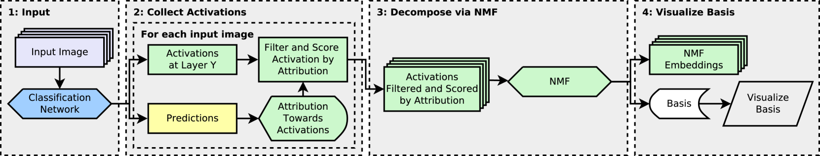
Then if we extract the n (in the following we always use six) most important concepts for a given class ’A’, then combine the dataset examples for those n concepts and pass the resulting image into the model, it should predict class ’A’ (i.e. we take the concept examples that would be shown to the user as the explanation for class ’A’ and then pass those into the model as a combined image and check whether the model predicts class ’A’ for that combined image). We test this also while taking the dataset examples only from images where the model does not predict class ’A’ (e.g. we take six crops from images where the model does not predict class ’A’, then for a ResNet50 from pytorch model zoo the model predicts class ’A’ for the combined image for 71.0% of the classes). An example of this is shown in Figure 1. If we allow to sample the dataset crops also from images where the model predicts class ’A’, then it works for 94.1% of the classes.
2 Related Work
This work is focused on providing explanations for already trained deep neural networks, as opposed to training inherently interpretable models (Nauta et al., 2023).
Previous work employed attribution methods, that can be used to generate heat maps, to highlight areas in the input image that are important for the output ((Shrikumar et al., 2019), (Petsiuk et al., 2018)). A fundamental problem with such methods is that they only highlight where in the input the model is seeing something, but do not explain what the model is seeing there. Using such attribution methods at the input layer (like its usually done), can give unreliable results. For some of those methods (Adebayo et al., 2018) has shown that they fail a sanity check and produce similar explanations for a trained and randomly initialized model. Those methods that passed the check, tend to give noisy explanations (Smilkov et al., 2017).
In our case, we use attribution methods (DeepLift with SmoothGrad), but at a hidden layer, not at the input layer. That is similar to (Olah et al., 2018), where attribution methods at a hidden layer were coupled with visualization techniques, therefore answering both where the model is seeing something (attribution) and what it is seeing there (visualization). Similar to (Olah et al., 2018) we also use non-negative matrix factorization (NMF) (Lee & Seung, 1999) on the intermediate activations at a hidden layer to get the explanation down to a manageable number of concepts (we use six). But instead of using all activations, we first filter and score them by attribution, and instead of running NMF on a single image only we run it simultaneously on up to 60 images. Using such a dataset of images to extract relevant concepts is similar to ACE and CRAFT, but we use the whole images to extract concepts instead of using image crops. After we extracted the concepts, then we use image crops to visualize them to the user or run the prediction test on the model.
The test we use for validating the explanation for a single class, is inspired by (Carter et al., 2019). There two images of two classes were combined, to change the prediction of the model to a third class (e.g. combine an image of grey whale with one of a baseball, then the model predicts great white shark for the combined image). Finding such combinations required manual selection of a user based on insights into the model. In our case, finding such combinations works automatically and we use six images instead of two. Also we do not use the whole image, but only a crop of each of the six images (32x32 or 74x74 depending on the hidden layer we use).
| Model | Layer | Average Pred | Predicts Desired Class | Above 0.1 | Above 0.2 | Above 0.5 |
|---|---|---|---|---|---|---|
| ResNet50 Robust | 3.5 | 0.178 0.311 | 22.0% | 30.3% | 23.4% | 16.0% |
| ResNet50 | 3.5 | 0.539 0.437 | 56.3% | 67.4% | 62.2% | 54.0% |
| ResNet34 | 3.5 | 0.300 0.375 | 34.3% | 46.6% | 40.6% | 28.0% |
| ResNet50 Robust | 4.2 | 0.415 0.341 | 72.8% | 74.9% | 63.0% | 36.4% |
| ResNet50 | 4.2 | 0.898 0.216 | 94.1% | 98.3% | 97.1% | 92.1% |
| ResNet34 | 4.2 | 0.852 0.244 | 92.5% | 97.8% | 95.7% | 88.4% |
| Model | Layer | Average Pred | Predicts Desired Class | Above 0.1 | Above 0.2 | Above 0.5 |
|---|---|---|---|---|---|---|
| ResNet50 Robust | 3.5 | 0.103 0.229 | 14.0% | 19.4% | 15.1% | 7.7% |
| ResNet50 | 3.5 | 0.284 0.389 | 30.0% | 40.0% | 35.4% | 27.3% |
| ResNet34 | 3.5 | 0.175 0.300 | 20.0% | 30.1% | 24.6% | 15.4% |
| ResNet50 Robust | 4.2 | 0.190 0.229 | 42.9% | 48.9% | 32.2% | 11.3% |
| ResNet50 | 4.2 | 0.619 0.358 | 71.0% | 86.0% | 79.0% | 62.6% |
| ResNet34 | 4.2 | 0.547 0.354 | 65.4% | 83.7% | 74.3% | 55.4% |
3 Models
We evaluate our method on three openly available models trained for classification of natural images (ImageNet1K (Deng et al., 2009)) and an in-house model trained to segment tumor in digital pathology tissue images. For the ImageNet models we use a ResNet50 and a ResNet34 (He et al., 2016) from pytorch model zoo, and a ResNet50 with weights trained for adversarial robustness (Santurkar et al., 2019) (in the following we refer to this model as ResNet50 Robust). For the model trained to segment tumor in digital pathology tissue images we use a modified UNet with a ResNet34 backbone, in the following we refer to this model as ResNet34 Digipath.
In our method we perform operations at a hidden layer of the model. For the digipath model we always use layer3.2 (that would be 21 layers into the ResNet34). For the ImageNet models we use layer3.5 (which would be 27 layers into the ResNet34 or 40 layers into the ResNet50) unless otherwise noted, but we also use layer4.2 (the last convolutional layer) in two experiments. And we always use the layer after relu, so that we have non-negative activations and can use NMF.
4 Individual Class
In this section we first describe our method and then our experimental results for explaining a single class.
4.1 Generation Process
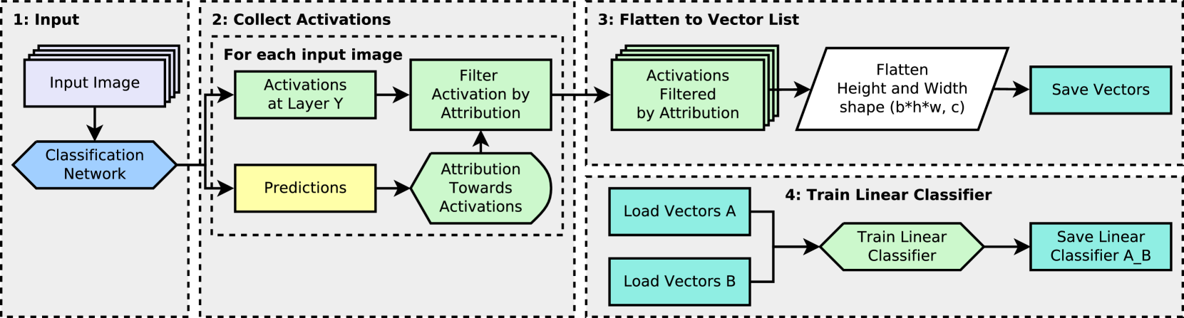
We want to explain why the model predicts a specific class ’A’, by extracting and visualizing the n (we use six) main features that support that class. Those can be seen as the six prototypes for that class. Figure 2 shows how we extract those six features. First we have a list of images unseen in training (we use the validation data for the imagenet models). We only use images where the model predicts class ’A’ as majority class and we use up to 60 images (if there are less images in the validation data where the model predicts class ’A’, then we use less images). It is important to note here that we ignore the ground truth label, we include only those and all those images where the model predicts class ’A’. Excluding falsely classified images may omit crucial information necessary to understand why the model fails.
For each of the images we extract the intermediate activations at a hidden layer Y (this layer needs to be chosen manually, and that same layer is then used for the whole process). Then we filter and score those activations pixel wise by attribution (we compute the attribution for class ’A’ towards layer Y). As attribution method we always use DeepLift together with SmoothGrad (using 20 samples and a standard deviation in the gaussian noise of 0.25). The attribution is computed from the prediction of the model for class ’A’ before softmax. As baseline for DeepLift we use a white image after normalization for the ImageNet models, and a white image for the digipath model. The attribution method outputs something of shape (batch, channels, height, width), we then compute the mean over the channel dimension to get the contribution per pixel. Then those pixels that have negative attribution are set to zero (we only include those pixels that contribute positively for class ’A’), the others are multiplied by the attribution (so that pixels with higher positive attribution have higher impact).
Then in the third step, those filtered and scored activations are decomposed using non-negative-matrix-factorization (NMF) into n (we use six) features. The NMF outputs a list of embeddings (we do not use those), and n vectors (the basis of the reduced space). In the last step we visualize those six vectors (described in the next section Section 4.2), and interpret those visualizations as showing six prototypes the model is using to predict class ’A’. Those visualizations would be our explanation why the model predicts class ’A’.
4.2 Visualize NMF Basis Vectors
In this section we describe the method we use to visualize the six NMF basis vectors. Each NMF basis vector, is a vector in a hidden layer of the model. Given such a vector out of the hidden layer Y, the goal is to visualize (find an input that represents ). We use dataset examples as visualization method.
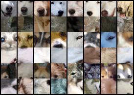
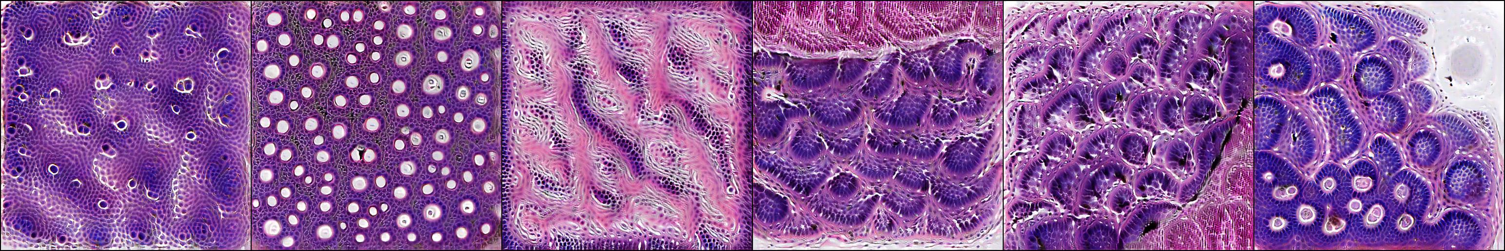
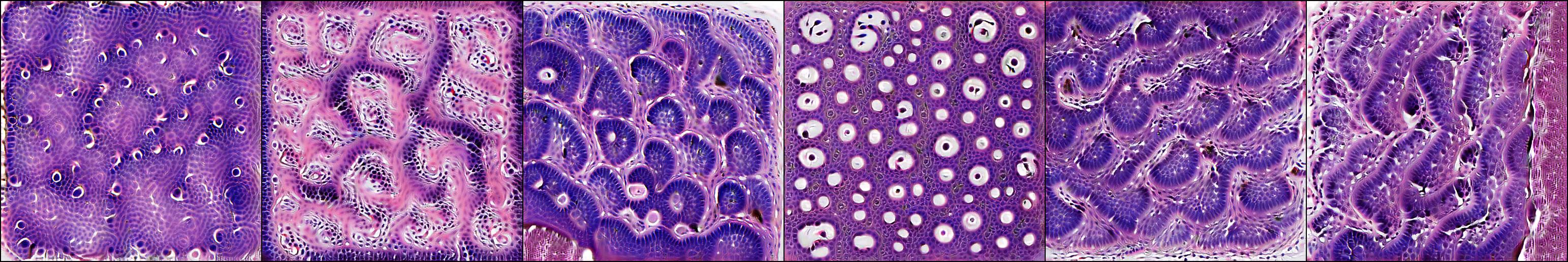
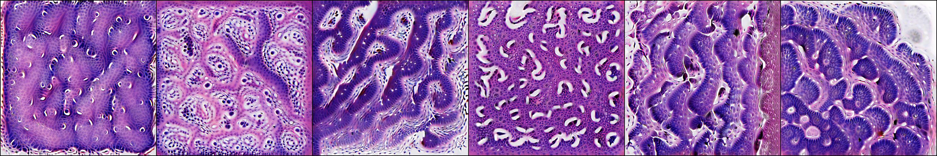
We sample dataset crops of a size of 32x32 (in case we use layer3.5, if we use layer4.2 then the crop size is 74x74) that have most similarity with . To choose those crops, we first pass all 50000 validation images into the model and access the intermediate activations at layer Y. Then we do a 2x2 average pool on those activations. In the next step we sample the m (we use eight, but that is only for display purposes, for the test we only use the one with the highest cosine similarity) pixels out of those activations that have the highest cosine similarity with . Then we extract the image crops at those positions. For layer3.5, after the 2x2 average pool, each pixel in the activations corresponds to a 32x32 patch in the input image. For layer4.2 that would be 74x74. An example of this is shown in Figure 6. Each row shows the eight most similar dataset crops for one of the NMF basis vectors (the six columns represent the six basis vectors). The similarity decreases from left to right.
4.3 Test Explanations
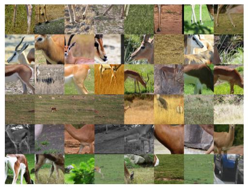
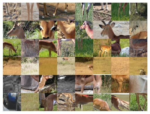
Since we do not know what features the model is using to make its prediction (we do not have ground truths), it is difficult to validate how correct/wrong the explanation is. For our validation test, we first combine the dataset visualization for each of the six concepts into a single image, by concatenating them in the height dimension. Then we check whether the model predicts class ’A’ for that created image. For example, we would pass the first column of Figure 5 (the figure shows the dataset visualizations for Alaskan Malamute) into the model and then check whether/how much the model predicts Alaskan Malamute for that image.
The result for all 1000 classes is shown in Table 1. We run this test for the three ImageNet models. Under average prediction we report the mean and standard deviation of the prediction over running the test for each of the 1000 classes. Predicts desired class reports how often the model predicts the class we wish to explain for the set of prototypes for that class (for the six concepts combined to a single image). Above 0.1 reports how often the model predicts the class we wish to explain with at least 0.1 confidence (score after softmax), similar for above 0.2 and above 0.5. The test works best for the ResNet50 model, when using layer3.5 the model predicts the class we wish to explain in 56.3% of the cases (works for 563 out of the 1000 classes). That still leaves 437 classes where the test fails, for those classes we should be careful about trusting the explanation. When using the last convolutional layer, then it actually works in 94.1% of the cases.
What can be a bit unclear, is whether the model predicts the desired class ’A’ for the visualizations because the visualizations represent the main features the model is using to predict that class ’A’, or whether it is because those visualizations are crops from images where the model is already predicting class ’A’ and then it does the same for the image combined of the crops. Therefore, we also run this test while sampling the visualizations only from images where the model is not predicting class ’A’ as majority class, and those results are shown in Table 2. For example, for the ResNet50 model this test works in 30.0% of the cases (works for 300 out of the 1000 classes) when using layer3.5 and in 71.0% of the cases when using layer4.2 (the last convolutional layer). While this test performs a bit worse compared to allowing class ’A’, it makes a stronger point if it works.
For both tests and all the models, using the last convolutional layer performs better compared to using the earlier layer.
5 Class Contrasting
In this section we look at contrasting classes, i.e. investigating why the model predicts class ’A’ over ’B’. A problem that can arise from only explaining each class individually, is that the explanation for two classes can be very similar (e.g. Alaskan Malamute and Siberian Husky, see Section 6), where the explanations look virtually indistinguishable. In that example, the explanation for Alaskan Malamute actually fails (for the dataset visualization the model predicts an average of 0.14 for Alaskan Malamute, and the majority class is Eskimo Dog with a prediction of 0.37, and the prediction for Siberian Husky is 0.16). So there we rather get an explanation for a more generic dog. Providing an explanation (six prototypes again) that contrast Alaskan Malamute with Siberian Husky, provides a better explanation for Alaskan Malamute compared to looking at that class in isolation. For that new explanation the model predicts 0.50 for Alaskan Malamute.
| Model | Default Pred | Shifted Pred | Pred Swap 0.1 | Pred Swap 0.2 | Pred Swap 0.5 |
|---|---|---|---|---|---|
| ResNet34 Digipath | 0.018 (0.021) | 0.458 (0.342) | 69.4% | 65.2% | 49.0% |
| ResNet50 Robust | 0.001 0.000 (0.004) | 0.637 0.004 (0.392) | 79.5% 0.2 | 73.9% 0.3 | 60.4% 0.4 |
| ResNet34 | 0.000 0.000 (0.003) | 0.263 0.004 (0.382) | 29.1% 0.3 | 27.4% 0.3 | 23.1% 0.4 |
| ResNet50 | 0.000 0.000 (0.002) | 0.335 0.005 (0.411) | 34.3% 0.6 | 32.8% 0.5 | 29.5% 0.6 |
5.1 Method
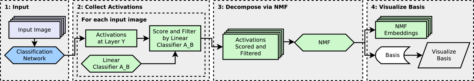
The idea is to train a linear classifier (single linear layer with a scalar bias and a sigmoid in the end) for binary classification between activations that are predictive for class ’A’ and those that predictive for class ’B’. Then the normal of the hyperplane spanned by the linear classifier would ideally point from class ’A’ to ’B’, and those activations that are far along the hyperplane normal in the direction of class ’A’ would be predictive for class ’A’ vs ’B’. Its a similar approach as before for explaining a single class, the only difference is that instead of using attribution to filter and score the activations, we use the linear classifier to filter and score the activations. The rest is the exact same. Figure 3 shows our approach to generate the hyperplane separating class ’A’ and ’B’. This hyperplane is used in the next step shown in Figure 4 to extract the n most important concepts separating class ’A’ from ’B’.
5.1.1 Hyperplane
First we describe Figure 3, which shows the generation process of the linear classifier. Step 1 to 3 are done individually per class, step 4 is run for all combinations of any two classes. In the case of ImageNet with 1000 classes we would get roughly one million linear classifier (we exclude the combination of a class with itself). Step 1 and 2 are similar to Figure 2, the only difference is that we do not scale the activations by the attribution, but filter only. And the filtering is a bit more aggressive. Instead of filtering out only those pixels that have negative attribution we also filter out all those pixels that have less than 0.25 of the maximum attribution over all pixels of that image. The reason why we choose a higher cutoff, is that previously the activations would be scaled by the attribution, so that those with lower attribution would have lower impact on the final prototypes. But now all the activations that pass the filtering step have the same impact on the linear classifier, therefore we use a higher cutoff.
In the next step the activations of the pixels remaining after the filtering are saved (i.e. we save a list of vectors per class, each vector representing a pixel in the activations at layer Y). Then in the last step we train a linear classifier to do binary classification between two lists of vectors, that were created in step three (one list for class ’A’ and one for class ’B’). The linear classifier is always trained for 100 epochs, running the whole dataset at once (no mini-batching). As optimizer we use stochastic gradient descent (Robbins & Monro, 1951), (Bottou, 2010) with a learning rate of 0.01.
5.1.2 Extract Separating Concepts
Now we describe how we extract the six prototypes for the contrasting. Figure 4 shows our method to find those six concepts separating class ’A’ from ’B’. The method is similar to the method explaining a single class, shown in Figure 2. The only difference is in step 2, where we now scale and filter the activations by the linear classifier, instead of using attribution.
We run the linear classifier (without the sigmoid, so only the dot product between the weight vector and the pixel and adding the scalar bias) pixel wise on all the intermediate activations we get at layer Y. If is the weight vector, is the scalar bias and is a pixel of the intermediate activations at layer Y, then we do: , where the output is a scalar value. Then for each pixel we do: , that is we scale the activations by if is larger than zero, otherwise we set those activations to zero. We only keep those activations that are on the side of the hyperplane that is predictive for class ’A’, and scale those remaining activations by how far along the hyperplane normal they are. The remaining two steps are the exact same as for explaining a single class. The modified activations are decomposed via NMF into six concepts, and those six concepts are then visualized.


5.2 Results
5.2.1 Shifting Test
The test we propose for the contrasting, tests the direction of the hyperplane. Ideally, the hyperplane normal should point from class ’B’ towards class ’A’. This means that if we would start from an image of class ’B’, and then translate the activations in the hidden layer along the hyperplane normal, we would like the model to swap prediction to class ’A’. We do the translation using ten offset values (those are fixed and the same for all classes and models) and report the result of the offset value where the prediction for class ’A’ is highest.
The results from this translation test are shown in Table 3. In the following we describe how to read that table. Default pred as well as shifted pred both show the results for class ’A’. Default pred shows the mean prediction for class ’A’ for the original activations (when not adjusting anything). Shifted pred shows the mean prediction for class ’A’ when translating the activations along the hyperplane normal. For the digipath model we run all combination of classes (there we only have 37 classes), and report the mean ( standard deviation over all samples). For the imagenet models we have too many classes to run all combinations time wise, instead there we use each of the 1000 classes as starting class (’B’), and for each of them we choose only 10 random classes (’A’) to shift towards. Then we repeat this 5 times and report mean standard deviation over the 5 runs as well as ( standard deviation over all samples).
The next three columns show in how many of the class combinations the model swaps prediction (i.e. for those shifted activations the model now predicts class ’A’ as majority class instead of class ’B’). Also the model needs to predict class ’A’ with at least a certain average confidence. For example, for pred swap 0.5 it would need to predict at least 0.5 for class ’A’, on average over all samples.
We can see that for all the models, the original prediction for class ’A’ is very low (default pred column). Which makes sense, since we choose images where the model is predicting another class ’B’ as majority class. But the shifted prediction becomes much larger. When comparing the shifted prediction with the default prediction, we have a minimum increase factor of 25x for the ResNet34 Digipath model, and a maximum increase factor of 1494x for the ResNet50 model. We get a minimum average shifted prediction of 0.263 for the ResNet34 model, and a maximum of 0.637 for the ResNet50 Robust model.
| Class | Original Pred | Person Inserted Pred | Black Inserted Pred |
|---|---|---|---|
| Siberian Husky | 0.377 | 0.265 | 0.342 |
| Alaskan Malamute | 0.203 | 0.265 | 0.189 |
6 Case Studies
6.1 Alaskan Malamute vs Siberian Husky
In this section we investigate why the ResNet50 Robust model classifies an image as Alaskan Malamute vs Siberian Husky and vice versa (in the appendix we show more examples also from the other models). We apply the method at layer3.5. Both classes are dog breeds that look very similar. Figure 5 shows visualizations from dataset crops for those six most important concepts supporting Alaskan Malamute, whereas Figure 6 shows the same for Siberian Husky. We can see that the model mostly uses the dog nose, eyes and ears to predict either class. For example, the first concept for Siberian Husky shows dog noses, the second looks unclear (from the dataset visualization it looks like fur), the third shows eyes, the fourth looks like it shows fur at the head, the fifth shows the top of head without ears and the last shows pointy ears. But both sets of images (Alaskan Malamute vs Siberian Husky) look very similar, just based on this it is not possible to understand why the model predicts one class versus the other.
Next we can contrast both classes (using our method described in Section 5), and look at the six most important concepts separating one class from the other. Now we can see differences between the visualizations of both classes. For Alaskan Malamute, there is now only one component showing part of the dog head (the full head without ears in this case), as shown in the second row of Figure 7. For Siberian Husky, most of the components still show parts of the dog head, the bottom most component looks a bit different though. Now it shows larger eyes. For the Alaskan Malamute, the three bottom most components are interesting (since they were also not present when looking only at the Alaskan Malamute class in isolation), shown in Figure 7. The top of those bottom three components shows dog feet on grass, the next one shows grass and the last one looks like the top of human heads. The last two components (grass and top of human heads), point to a bias in the model, cause whether the dog is standing on grass or snow, or whether a human is next to the dog or not, does not change the class the dog belongs to. So the model should not rely on those features to separate between the two dog classes.
To test this bias, we insert an image of a person into each of the sixty images predicted as Siberian Husky (always at the bottom right), and then check whether the model changes its prediction to Alaskan Malamute. Something to note is that the person is cropped out of a (validation) image where the model predicts Alaskan Malamute. One of those sixty modified images is shown in Figure 9, once with the person inserted and once with zeros inserted. The image is shown after normalization.

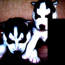
Table 4 shows the average prediction for Siberian Husky and Alaskan Malamute for those sixty images. Originally the model predicts more Siberian Husky (0.377). After inserting the person into the lower right of each of the images, the model predicts the same amount of Siberian Husky and Alaskan Malamute (both 0.265). Since we occlude part of the image by inserting the person, we also test the prediction if we insert zeros (black) instead of the person. In that case the prediction does not change much, and slightly decreases for both Siberian Husky as well as Alaskan Malamute.
7 Additional Discussion
The method to explain a single class could be seen as an interpretability method (which was our goal), but can also been seen as a method to generate high level adversarial examples. That is, because it provides an automated method to extract crops from six images where the model is not predicting the targeted class, then for the combined image the model is often predicting that targeted class. This test (or attack) works worse for the ResNet50 Robust model which has adversarially robust weights (it was trained for robustness against gradient descent attacks). While it still works for 42.9% of the classes, the confidence is lower (the average prediction for the targeted class is only 0.190). Also, when it predicts the targeted class, then only for 11.3% of the classes does it do so with a confidence of larger than 0.5. As comparison, the ResNet50 and ResNet34 model with weights from pytorch model zoo do so for 62.6% respectively 55.4% of the classes (much more often). For the ResNet50 model with weights from pytorch model zoo the test (or attack) works for 71.0% of the classes and the confidence for the targeted class is higher, there we have an average prediction of 0.619. Similar for the ResNet34 model with weights from pytorch model zoo, there the test works for 65.4% of the classes with an average prediction of 0.547.
While using the last convolutional layer (layer4.2) provides best results in the test, the explanations may be less interpretable compared to using layer3.5.
8 Limitations
We only tested the method on convolutional neural networks. Further, for a class where the test fails, the method should likely not be trusted. Also we need to manually choose a hidden layer in the model where the method should be applied at (we could potentially run the prediction test for the prototypes for different layers of the model, and then choose the layer where the test performs best).
9 Acknowledgments
R.H. is funded by the Deutsche Forschungsgemeinschaft (DFG, German Research Foundation) - Projectnumber 459360854 (DFG FOR 5347 Lifespan AI). D.O.B. acknowledges the financial support by the Federal Ministry of Education and Research (BMBF) within the T!Raum-Initiative ”#MOIN! Modellregion Industriemathematik” in the sub-project ”MUKIDerm”.
References
- Adebayo et al. (2018) Adebayo, J., Gilmer, J., Muelly, M., Goodfellow, I. J., Hardt, M., and Kim, B. Sanity checks for saliency maps. In Bengio, S., Wallach, H. M., Larochelle, H., Grauman, K., Cesa-Bianchi, N., and Garnett, R. (eds.), Advances in Neural Information Processing Systems 31: Annual Conference on Neural Information Processing Systems 2018, NeurIPS 2018, December 3-8, 2018, Montréal, Canada, pp. 9525–9536, 2018. URL https://proceedings.neurips.cc/paper/2018/hash/294a8ed24b1ad22ec2e7efea049b8737-Abstract.html.
- Bottou (2010) Bottou, L. Large-scale machine learning with stochastic gradient descent. In Lechevallier, Y. and Saporta, G. (eds.), Proceedings of COMPSTAT’2010, pp. 177–186, Heidelberg, 2010. Physica-Verlag HD. ISBN 978-3-7908-2604-3.
- Carter et al. (2019) Carter, S., Armstrong, Z., Schubert, L., Johnson, I., and Olah, C. Activation atlas. Distill, 2019. doi: 10.23915/distill.00015. https://distill.pub/2019/activation-atlas.
- Deng et al. (2009) Deng, J., Dong, W., Socher, R., Li, L., Kai Li, and Li Fei-Fei. ImageNet: A large-scale hierarchical image database. In 2009 IEEE Conference on Computer Vision and Pattern Recognition, pp. 248–255, 2009. doi: 10.1109/CVPR.2009.5206848.
- Fel et al. (2023) Fel, T., Picard, A., Béthune, L., Boissin, T., Vigouroux, D., Colin, J., Cadène, R., and Serre, T. Craft: Concept recursive activation factorization for explainability. In Proceedings of the IEEE/CVF Conference on Computer Vision and Pattern Recognition (CVPR), pp. 2711–2721, June 2023.
- Ghorbani et al. (2019) Ghorbani, A., Wexler, J., Zou, J., and Kim, B. Towards automatic concept-based explanations, 2019. URL https://arxiv.org/abs/1902.03129.
- He et al. (2016) He, K., Zhang, X., Ren, S., and Sun, J. Deep residual learning for image recognition. In 2016 IEEE Conference on Computer Vision and Pattern Recognition (CVPR), pp. 770–778, 2016. doi: 10.1109/CVPR.2016.90.
- Jansen et al. (2023) Jansen, P., Baguer, D. O., Duschner, N., Arrastia, J. L., Schmidt, M., Landsberg, J., Wenzel, J., Schadendorf, D., Hadaschik, E., Maass, P., Schaller, J., and Griewank, K. G. Deep learning detection of melanoma metastases in lymph nodes. European Journal of Cancer, 188:161–170, 2023. ISSN 0959-8049. doi: https://doi.org/10.1016/j.ejca.2023.04.023. URL https://www.sciencedirect.com/science/article/pii/S0959804923002241.
- Kim et al. (2018) Kim, B., Wattenberg, M., Gilmer, J., Cai, C., Wexler, J., Viegas, F., and Sayres, R. Interpretability beyond feature attribution: Quantitative testing with concept activation vectors (tcav), 2018. URL https://arxiv.org/abs/1711.11279.
- Kokhlikyan et al. (2020) Kokhlikyan, N., Miglani, V., Martin, M., Wang, E., Alsallakh, B., Reynolds, J., Melnikov, A., Kliushkina, N., Araya, C., Yan, S., and Reblitz-Richardson, O. Captum: A unified and generic model interpretability library for pytorch, 2020.
- Lee & Seung (1999) Lee, D. D. and Seung, H. S. Learning the parts of objects by non-negative matrix factorization. Nature, 401(6755):788–791, 1999. ISSN 1476-4687. doi: 10.1038/44565. URL https://doi.org/10.1038/44565.
- Nauta et al. (2023) Nauta, M., Schlötterer, J., van Keulen, M., and Seifert, C. Pip-net: Patch-based intuitive prototypes for interpretable image classification. In Proceedings of the IEEE/CVF Conference on Computer Vision and Pattern Recognition (CVPR), pp. 2744–2753, June 2023.
- Nguyen et al. (2016) Nguyen, A., Dosovitskiy, A., Yosinski, J., Brox, T., and Clune, J. Synthesizing the preferred inputs for neurons in neural networks via deep generator networks, 2016. URL https://arxiv.org/abs/1605.09304.
- Olah et al. (2017) Olah, C., Mordvintsev, A., and Schubert, L. Feature visualization. Distill, 2017. doi: 10.23915/distill.00007. https://distill.pub/2017/feature-visualization.
- Olah et al. (2018) Olah, C., Satyanarayan, A., Johnson, I., Carter, S., Schubert, L., Ye, K., and Mordvintsev, A. The building blocks of interpretability. Distill, 2018. doi: 10.23915/distill.00010. https://distill.pub/2018/building-blocks.
- Paszke et al. (2019) Paszke, A., Gross, S., Massa, F., Lerer, A., Bradbury, J., Chanan, G., Killeen, T., Lin, Z., Gimelshein, N., Antiga, L., Desmaison, A., Köpf, A., Yang, E. Z., DeVito, Z., Raison, M., Tejani, A., Chilamkurthy, S., Steiner, B., Fang, L., Bai, J., and Chintala, S. Pytorch: An imperative style, high-performance deep learning library. In Wallach, H. M., Larochelle, H., Beygelzimer, A., d’Alché-Buc, F., Fox, E. B., and Garnett, R. (eds.), Advances in Neural Information Processing Systems 32: Annual Conference on Neural Information Processing Systems 2019, NeurIPS 2019, December 8-14, 2019, Vancouver, BC, Canada, pp. 8024–8035, 2019. URL https://proceedings.neurips.cc/paper/2019/hash/bdbca288fee7f92f2bfa9f7012727740-Abstract.html.
- Patel et al. (2020) Patel, P., Nawrocki, S., Hinther, K., and Khachemoune, A. Trichoblastomas mimicking basal cell carcinoma: The importance of identification and differentiation. Cureus, 12(5):e8272, 2020. doi: 10.7759/cureus.8272. URL https://doi.org/10.7759/cureus.8272.
- Petsiuk et al. (2018) Petsiuk, V., Das, A., and Saenko, K. Rise: Randomized input sampling for explanation of black-box models, 2018.
- Robbins & Monro (1951) Robbins, H. and Monro, S. A Stochastic Approximation Method. The Annals of Mathematical Statistics, 22(3):400 – 407, 1951. doi: 10.1214/aoms/1177729586. URL https://doi.org/10.1214/aoms/1177729586.
- Santurkar et al. (2019) Santurkar, S., Ilyas, A., Tsipras, D., Engstrom, L., Tran, B., and Madry, A. Image synthesis with a single (robust) classifier. In Wallach, H., Larochelle, H., Beygelzimer, A., d'Alché-Buc, F., Fox, E., and Garnett, R. (eds.), Advances in Neural Information Processing Systems, volume 32. Curran Associates, Inc., 2019. URL https://proceedings.neurips.cc/paper_files/paper/2019/file/6f2268bd1d3d3ebaabb04d6b5d099425-Paper.pdf.
- Selvaraju et al. (2017) Selvaraju, R. R., Cogswell, M., Das, A., Vedantam, R., Parikh, D., and Batra, D. Grad-cam: Visual explanations from deep networks via gradient-based localization. In Proceedings of the IEEE International Conference on Computer Vision (ICCV), Oct 2017.
- Shrikumar et al. (2019) Shrikumar, A., Greenside, P., and Kundaje, A. Learning important features through propagating activation differences, 2019.
- Smilkov et al. (2017) Smilkov, D., Thorat, N., Kim, B., Viégas, F., and Wattenberg, M. Smoothgrad: removing noise by adding noise, 2017. URL https://arxiv.org/abs/1706.03825.
- Sundararajan et al. (2017) Sundararajan, M., Taly, A., and Yan, Q. Axiomatic attribution for deep networks. In Precup, D. and Teh, Y. W. (eds.), Proceedings of the 34th International Conference on Machine Learning, volume 70 of Proceedings of Machine Learning Research, pp. 3319–3328. PMLR, 06–11 Aug 2017. URL https://proceedings.mlr.press/v70/sundararajan17a.html.
- TorchVision maintainers and contributors (2016) TorchVision maintainers and contributors. TorchVision: PyTorch’s Computer Vision library. Software, 2016. URL https://github.com/pytorch/vision. GitHub repository.
- Virtanen et al. (2020) Virtanen, P., Gommers, R., Oliphant, T. E., Haberland, M., Reddy, T., Cournapeau, D., Burovski, E., Peterson, P., Weckesser, W., Bright, J., van der Walt, S. J., Brett, M., Wilson, J., Millman, K. J., Mayorov, N., Nelson, A. R. J., Jones, E., Kern, R., Larson, E., Carey, C. J., Polat, İ., Feng, Y., Moore, E. W., VanderPlas, J., Laxalde, D., Perktold, J., Cimrman, R., Henriksen, I., Quintero, E. A., Harris, C. R., Archibald, A. M., Ribeiro, A. H., Pedregosa, F., van Mulbregt, P., and SciPy 1.0 Contributors. SciPy 1.0: Fundamental Algorithms for Scientific Computing in Python. Nature Methods, 17:261–272, 2020. doi: 10.1038/s41592-019-0686-2.
Appendix A Hardware and Software
On the software side we use pytorch (Paszke et al., 2019) version 1.13.1 with cuda version 11.6 and torchvision (TorchVision maintainers and contributors, 2016) version 0.14.1. For the attribution methods (for DeepLift and SmoothGrad) we use the captum library (Kokhlikyan et al., 2020) version 0.6.0. For NMF we use scipy (Virtanen et al., 2020) version 1.10.1.
For the hardware, we ran the experiments on a Linux server with 8 Nvidia RTX 2080Ti GPUs and we also used another Linux server with 4 Nvidia RTX A6000 GPUs. But the experiments are all doable on a single RTX 2080Ti GPU.
Appendix B Generate Visualizations via Gradient Descent
In the main paper we only showed examples where we generate the visualizations by sampling crops from validation images. We can also synthesize them via gradient descent though, similar to (Olah et al., 2017) or (Nguyen et al., 2016). For the following digipath example, we also generate the visualizations for each of the six prototypes via gradient descent in the latent space of a GAN (generative adversarial network). Such visualizations might be more faithful compared to sampling dataset examples. For example in Figure 11 the last third and the last two images show palisading cell edges with different orientations (the first one shows an upper right edge, the next one a lower right edge and the last one a left edge). But in the corresponding dataset visualizations shown in Figure 13 (third row and last two rows), there is no edge orientation visible, but they simply show BCC islands. Meaning, from the dataset visualizations alone, we could not see that the model is actually looking at the edge of the BCC island that has a specific orientation (from only the dataset example we could think that its looking for the islands themselves, or for a right edge instead of a left edge).
Appendix C Basal Cell Carcinoma vs Trichoblastoma
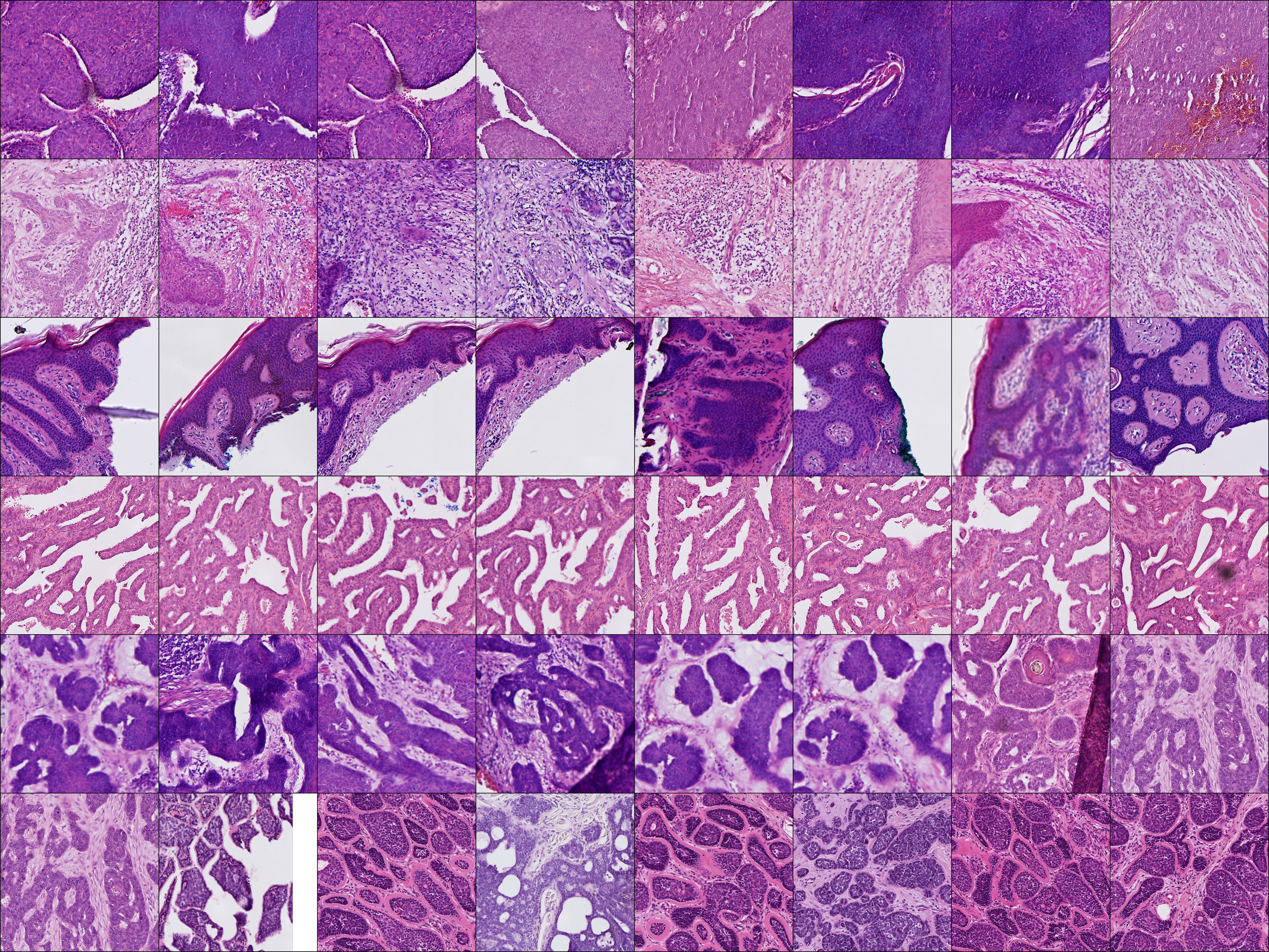
Basal Cell Carcinoma (BCC) as well as Trichoblastoma look clinically very similar to each other (Patel et al., 2020). Human experts as well as the AI model can separate them, and in this section we investigate why the model predicts Basal Cell Carcinoma over Trichoblastoma. First we can look at the main concepts the model uses to predict BCC shown in Figure 11 and compare them to the main concepts the model uses to predict Trichoblastoma shown in Figure 10. The problem is that the concepts look very similar (which makes sense since the two diseases look clinically similar), there is no single concept that is present for one class but not the other. For example the first concept from the left for Trichoblastoma looks similar compared to the first from the left for BCC. The second one for Trichoblastoma looks similar to the fourth for BCC and the third looks similar to the second. And the last three concepts for Trichoblastoma show palisading cell edges with different orientations, similar to the third and last two concepts for BCC. So those visualizations are not enough to spot a difference between Trichoblastoma and BCC.
In the next step we look at the visualizations pro BCC we get from contrasting the two classes. Figure 12 shows the 6 main concepts that are pro BCC vs Trichoblastoma. The second, third and fourth concept look differently from the 6 main concepts pro Trichoblastoma (so here we can now see a difference). For interpreting those 3 concepts we can look at dataset examples, shown in Figure 14. The fourth concept shows white areas inside tumor, which could resemble cleavage (in BCC the tumor is often separated from the surrounding tissue by white area). The third concept shows epidermis, which is also interesting since according to (Patel et al., 2020) BCC is sometimes attached to the epidermis, whereas Trichoblastoma never is.
For the quantitative check, the average maximum prediction for BCC in Trichoblastoma images is 0.013 and the average maximum prediction for Trichoblastoma is 0.889. So at this point the model is very sure that the images are Trichoblastoma and not BCC. When masking 20% of the input pixels that lie furthest on the Trichoblastoma side of the hyperplane between Trichoblastoma and BCC, then the maximum average prediction for BCC goes up to 0.408, which is an increase by a factor of 31. And the average maximum prediction for Trichoblastoma goes down to 0.467, so now the model is no longer sure whether the images belong to BCC or Trichoblastoma. We mask the input pixels in steps of 10%, and masking more or less than those 20% reduces the prediction for BCC. Something to note, is that between BCC and Trichoblastoma this masking only works one way, from Trichoblastoma to BCC. Doing it the other way around (using BCC images and mask the most important features for BCC vs Trichoblastoma) reduces the predictions for both BCC as well as Trichoblastoma.
Shifting the activations in the latent space in the direction of the hyperplane normal works both ways. Here we reach an average maximum prediction for BCC of 0.721 (at that point the prediction for Trichoblastoma is 0.481). And the other way around, we reach an average maximum prediction for Trichoblastoma of 0.673 and at that point the prediction for BCC is 0.017.
Appendix D Examples for Single Class for the ResNet50