Jovis: A Visualization Tool for PostgreSQL Query Optimizer
Abstract.
In the world of relational database management, the query optimizer is a critical component that significantly impacts query performance. To address the challenge of optimizing query performance due to the complexity of optimizers – especially with join operations – we introduce Jovis. This novel visualization tool provides a window into the often intricate process of query optimization in PostgreSQL, making it more accessible and understandable. PostgreSQL employs two different query optimization strategies: the Dynamic Programming (DP) Optimizer for most scenarios and the Genetic Query Optimizer (GEQO) for more complex queries with numerous joins, both of which are supported in Jovis. Our tool visualizes the optimizer’s decision-making process, from evaluating access paths for each relation to determining join orderings, all using data derived from the optimizer’s logs. Jovis not only clarifies the query optimization process through visualizations but also serves as an invaluable learning tool for learners and a practical resource for experienced database professionals looking to optimize their query performance or even the query optimizer itself. The source code has been made available at https://github.com/snu-jovis.
1. Introduction
In relational database management systems, the query optimizer holds formidable importance as it is a key determinant of query performance. Because SQL is declarative, no information is given as to how to process queries, thus leaving the optimizer responsible for finding an efficient execution plan. This involves planning access methods for each relation and determining the optimal join sequence of relations. However, the optimizer is known to be a highly complex system due to the NP-hard nature of generating the optimal query plan within the vast search space (Ibaraki and Kameda, 1984). Notably, query optimization is NP-hard with respect to the number of joins. Among operators in relational algebra, join is the most challenging one to process and optimize, yet the critical factor of query performance.
In PostgreSQL, the optimizer examines possible query plans by generating them using data structures called paths. These paths contain the information the optimizer requires and are evaluated using a cost model. PostgreSQL employs two types of optimizers: the Dynamic Programming (DP) Optimizer and the Genetic Query Optimizer (GEQO). These optimizers differ in the algorithm implemented for determining the optimal join sequence. The DP Optimizer, a standard approach, enumerates query plans by modeling the query graph as a hypergraph (Moerkotte and Neumann, 2008). However, when dealing with queries involving a large number of join operations, the DP Optimizer becomes infeasible due to the excessive time and memory required. In such cases, PostgreSQL switches to using the GEQO. GEQO initially generates a set of possible join sequences randomly. Then, it iteratively generates a new sequence by combining two existing ones using a mechanism called edge recombination crossover (ERX) as the default (Group, 2024).
Because PostgreSQL uses two types of optimizers, and both of them consider a substantial number of query plans, understanding the complex processes involved in choosing the optimal plan and the rationale behind that choice is highly challenging. To address this problem and enhance comprehension of query optimization in PostgreSQL, visualization tools that offer essential summary and detailed information are necessary. Such tools would benefit both learners aiming to grasp the details of query optimization and practitioners seeking to optimize queries manually (e.g.using hints). Additionally, the GEQO has remaining implementation tasks. The tasks involve optimizing parameter settings and reducing redundant work, as the GEQO uses a standard optimizer on join selection and cost estimation from scratch in each step. Also, the other recombination mechanisms can be considered for further optimization of GEQO. By leveraging visualization tools, practitioners can explore the challenge the GEQO holds and evaluate their optimizations by observing cost trends and analyzing chosen join sequences and recombination processes.
Despite the necessity of visualizing PostgreSQL’s query optimization procedure, particularly in determining the optimal ordering of joins, current visualization tools for query optimizers lack the ability to visualize how optimizers function internally. Instead, they mainly focus on analyzing the optimal query plan that has ultimately been chosen (Scheibli et al., 2015) or optimizing the resulting query plan (Anneser et al., 2023; Tan et al., 2022).
In this demonstration, we present Jovis, an interactive visual exploration tool designed to provide user-friendly and effective visualizations of PostgreSQL’s optimizer decision-making process. Given an SQL query, Jovis automatically generates visual representations of the planning procedure of access paths for each relation and join orderings by leveraging the logs emitted during query optimization. Jovis adapts its visual presentation according to the specific optimization algorithm employed, distinguishing between the standard optimizer and the GEQO. For standard optimization using dynamic programming, Jovis depicts the procedure as a directed acyclic graph (DAG), whereas for GEQO implemented with a genetic algorithm, it employs a grid heatmap visualization. Besides, it provides the cost of each path, enhancing the understanding of PostgreSQL’s cost-based search and the visualization of ERX executed in GEQO to show how plans for joining relations evolve throughout the generation. Moreover, the resulting optimal query plan passed to the executor is represented as a tree, and various interactive features are provided to enable comprehensive exploration. We will demonstrate Jovis using the TPC-H and TPC-DS decision support benchmarks to signify its usefulness and effectiveness in the exploration of PostgreSQL’s query optimizer. We will also use custom queries to ensure the Jovis’s applicability beyond the standardized benchmarks.
2. Related Work
Visualization tools for query optimizers have been demonstrated actively in the database community. For example, Picasso (Haritsa, 2010) employs various diagrams to depict the behaviors of the optimizer. QE3D (Scheibli et al., 2015) offers diverse views for visualizing distributed query plans, including three-dimensional representation. DBinsight (Rong et al., 2022) presents a tool for visualizing the query processing pipeline. MOCHA (Tan et al., 2022) provides a tool focusing on operator selection impact, allowing users to switch operators and observe corresponding performance changes. QO-Insight (Anneser et al., 2023) targets steered query optimizers, offering a visual interface for exploring query execution traces.
While these existing tools share the objective of providing interactive visualization for query optimizers, Jovis distinguishes itself by focusing on the optimizer’s procedural aspects. Jovis mainly visualizes the stages involved in reaching the optimal query plan. It showcases cost estimation for each query plan at every stage, offering a comprehensive understanding of the optimizer’s decision. With a user-friendly interface, Jovis facilitates exploration of these visualizations, helping users gain insights that can potentially be leveraged to optimize query plans or even the optimizer.
Efforts have also been made to develop a functional system capable of building, presenting, and browsing visualizations of genetic algorithm data (da Cruz, 2014). The visualization approach adopted by Jovis is based on this work. However, Jovis is tailored specifically to GEQO, using the optimizer’s unique data extracted from the logs and supporting features essential for exploring genetic query optimization. Notably, to the best of our knowledge, there is currently no visualization tool dedicated to GEQO.
3. Overview of Jovis
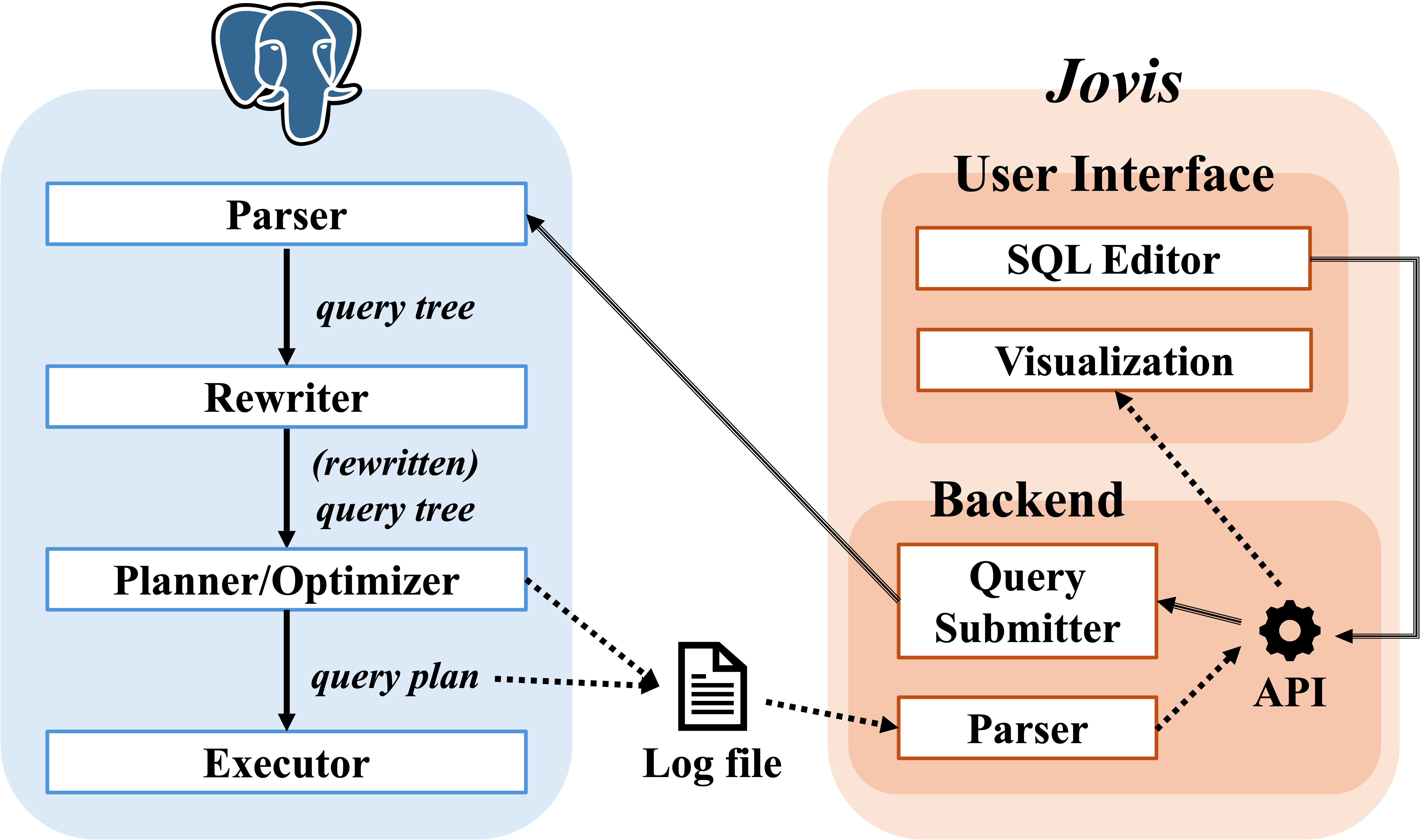

This section provides an overview of the architecture of Jovis’s illustrated in Figure 1. It consists of a graphical user interface (GUI) with visualization components for both the DP Optimizer and GEQO and a backend containing the query submitter and parser.
3.1. Graphical User Interface
The Jovis GUI, illustrated in Figure 2, is implemented using the React library and D3.js (Bostock et al., 2011) for data-driven visualizations and user interactions. A. In the SQL editor, users input their queries, select the desired database, and then submit the query for execution. Upon completion of query execution, the optimziation procedure for both the DP Optimizer and GEQO is visualized using distinctive graph types to illustrate the distinct optimization procedures effectively. Besides, Jovis supports subqueries, including those with WITH clauses, by enabling the visualization of multiple optimizer processes concurrently. B. In the History tab, Jovis maintains a record of previous queries submitted by users, and in the Presets tab, TPC-H and TPC-DS queries are provided. These features aim to make the testing process more accessible to users.
Dynamic Programming Optimizer. The view C is specifically designed to visualize the DP optimization procedure effectively. The DP Optimizer is the standard optimizer and is invoked when the number of relations to join is below the geqo_threshold. This threshold parameter informs PostgreSQL when to utilize either the DP optimizer or the GEQO, providing flexibility in optimization strategies based on query complexity (Group, 2024).
C1. The DP Optimizer models the query graph as a hypergraph. It adopts a bottom-up approach, illustrating relations as nodes and operators as edges. Through iterative steps, it incrementally constructs connected sub-graphs by adding new edges to nodes until the complete query plan is achieved. At each iteration, the costs of new operators are estimated. DAG is effective in visualizing the bottom-up strategy since DAG can have multiple parent nodes. To effectively depict this bottom-up strategy, Jovis employs a DAG due to its ability to have multiple children and parents, which fits the characteristics of the optimization process where various access paths are considered. In the DAG, rectangular nodes represent access paths, including the scan or join strategies executable towards their upper node, while circular nodes represent relation or join sequences of multiple relations. Each node is color-coded to distinguish between different types of access paths, enabling easy identification. The use of DAG helps users visually grasp all the access paths considered during the query optimization process. Moreover, Jovis’s support for subqueries enables users to inspect multiple DAGs, each corresponding to a specific subquery.
By setting the scale as cost, the size of operator nodes adjusts based on their estimated cost. This clearly shows why the optimizer chose a particular operator. Also, initiating the animation by pressing the Play button allows users to observe the chosen access path for each iteration. The opacity of the non-selected node is reduced, enabling users to track both current selections and previously evaluated options. This feature offers dynamic exploration, from selecting the best access path for a single relation to navigating the decision-making process for identifying the cheapest total join cost.
C2. Within the DAG, users can interact with operator nodes by clicking on them to access all the cost metrics, including total cost, run cost, and startup cost. For operator nodes representing joins, Jovis provides a simplified cost calculation formula, helping in understanding the cost calculation process of each join strategy.
C3. The optimal query plan results from query optimization, which can be retrieved using the EXPLAIN command. When queries contain subqueries, a single DAG cannot cover the entire query plan. Instead, the optimal query plan for the entire query is illustrated using a tree. This design choice is motivated by the inherent tree format of EXPLAIN ANALYZE result, where a root node labeled Plans branches into nested Plan nodes. To deal with the cases where the tree becomes excessively large due to a complex query plan, zoom and movable feature is implemented to enhance usability.
Genetic Query Optimizer. The view D is designed to visualize the GEQO procedure. GEQO is invoked when the number of join operations hits or exceeds the geqo_threshold. Throughout the steps called generations, each generation maintains a pool comprising candidate join sequences, called genes. Genes with lower estimated costs are thought of as more fit. Each generation creates a new gene using two existing genes, and the least fit gene is discarded from the pool. This iterative process continues until a preset number of join sequences have been evaluated. Note that geqo_threshold is set to 5 in Figure 2 for illustration purposes, but it performs effectively with larger values such as the default value of 12.
D1. Inspired by the genetic algorithm visualization by Cruz (da Cruz, 2014), Jovis utilizes a grid heatmap to visualize the genes within pools throughout the generations. The heatmap represents the estimated cost of genes using color gradients, implemented using d3-interpolate. As shown in D1a, by color-coding each square, the convergence of costs across generations becomes apparent, which reveals the effectiveness of GEQO in improving fitness.
Furthermore, range sliders have been implemented to help users focus on specific generations and genes they want to explore. As depicted in D1b, when the generation range is narrowed down to a predefined threshold, the visualization of ERX appears for finer insights. The relationship between parents and their offspring is illustrated using edges.
D2. The cost chart is designed as a line chart to present the best, worst, median, and average estimated cost throughout the generations. Users can hover over the line to pinpoint the generation they wish to analyze, and precise values for each metric are shown. A logarithmic scale for the y-axis has been implemented to address issues with visualizing smaller metric trends when there’s a significant gap in values between metrics. Users can toggle between linear and logarithmic scales through checkbox; this adds flexibility. Also, users can focus on a specific metric of their interest by clicking it in the legend.
D3. Users can interact with the heatmap by clicking on a specific gene they want to explore. The join sequence of the clicked gene is displayed as a tree, with each operator’s cost represented through a stacked bar chart. Within this chart, users can detect the percentage contribution of each operator to the total cost. By clicking on individual stacks, the corresponding operator in the tree is marked as red, and its estimated cost and percentage are shown at the bottom. This view provides users with an understanding of how the total cost is calculated, especially focusing on the join strategies.
D4. This is identical to C3.
D5. When ERX visualization is activated, the recombination process for a chosen gene is depicted through an arc diagram. Please note that the selected gene should be the offspring generated in that generation. The arc diagram is efficient when dealing with a substantial number of objects, such as the relations involved in joins within this context. Each parental gene’s contribution is represented by a distinct color-coded edge, and upon hovering over each relation, the corresponding edges are highlighted, showing whether they are involved in the recombination crossover.
3.2. Backend
The Jovis backend is responsible for establishing a connection between the frontend, equipped with a GUI, and PostgreSQL via an API service. As shown in Figure 1, the query submitter transmits user queries from the user interface to the dedicated PostgreSQL database. Within PostgreSQL, the query goes through parsing, rewriting, and optimization to determine the optimal execution plan by estimating the cost of numerous possible query plans. The executor then executes this plan, and the log data are returned to the backend. Subsequently, the backend’s parser formats this data into JSON with all necessary fields and information required by the Jovis user interface for visualization.
Jovis enhances the PostgreSQL optimizer’s transparency by augmenting its logging capabilities. The default PostgreSQL codebase provides limited visibility into its internal states; thus, Jovis introduces a minimal patch that enriches logging with detailed internal state information. For the DP Optimizer, the patch captures and logs RelOptInfo instances, which contain access paths for each relation and their joins, during the query plan enumeration phase. In the case of GEQO, it logs each step of join sequence generation, which involves creating new sequences through recombination crossover techniques. These internal states are written to a log file during the process of PostgreSQL query optimization.
Upon receiving query results from PostgreSQL, the backend processes the log file. Given that log data is plain text that is lengthy and unstructured, a parser is crucial in converting it into more readable and structured data. The parser first determines the optimizer type and adds it to the result data. For the DP Optimizer, the parser processes RelOptInfo to extract essential information such as path lists, path costs, and the cheapest path, presenting it in JSON format suitable for visualization. Similarly, for GEQO, the parser extracts generation information, including join sequences and their costs, and transforms it into JSON format. The parsed data are included in the response data together with the query result, then it is passed to the user interface for visualization.
4. Demonstration Scenarios
This section illustrates the user experience with Jovis through two main scenarios. The demonstration aims to showcase the interactive features of Jovis and its effectiveness in both learning and query performance optimization. Both scenarios start with users entering their custom queries or utilizing presets and then proceeding to select the database.
Dynamic Programming Optimizer. When the DAG in C1 is constructed, users observe all the scan types, join sequences, and join strategies considered during the query optimization. By clicking the play button, the interface simulates the optimization process, allowing users to explore how the optimal join sequences and cheapest access paths were determined step by step. For those curious about costs and the rationale behind the optimizer’s decision, clicking on a node reveals detailed cost information in C2.
Genetic Query Optimizer. The grid heatmap representing the evolution of join sequences is constructed in D1. Users observe the convergence towards best fitness (i.e., cost), highlighting GEQO’s power in improving the overall fitness of query plans over successive generations. Users select any gene within the heatmap, then a tree representing join sequences and strategies with a stacked bar chart for cost is displayed in D3. Users inspect specific generations by adjusting the range through sliders. When the selected range is sufficiently small, the color-coded edges appear, and by clicking the offspring, users trace the origin of each edge of the join sequence in D5. Moving on to D2, users monitor the cost across generations with various metrics. Database professionals may opt to optimize GEQO by using alternative recombination mechanisms. They will evaluate the performance of their customized GEQO by comparing the grid heatmap, cost chart, and optimal query plan in D4.
In both scenarios, users who wish to explore unselected access paths input hints in the editor using the pg_hint_plan extension. This will demonstrate how tweaking the query plan affects the optimization process, optimal query plan, and total cost.
5. Conclusion
We propose Jovis, a visualization tool designed for PostgreSQL’s query optimizers. Our demonstration shows that Jovis benefits learners and professionals with insights to enhance query performance or optimizer effectively by elucidating the complex decision-making process of optimizers.
References
- (1)
- Anneser et al. (2023) Christoph Anneser, Mario Petruccelli, Nesime Tatbul, David Cohen, Zhenggang Xu, Prithviraj Pandian, Nikolay Laptev, Ryan Marcus, and Alfons Kemper. 2023. QO-Insight: Inspecting Steered Query Optimizers. PVLDB 16, 12 (2023), 3922–3925.
- Bostock et al. (2011) Michael Bostock, Vadim Ogievetsky, and Jeffrey Heer. 2011. D3 Data-Driven Documents. IEEE Transactions on Visualization and Computer Graphics 17, 12 (2011), 2301–2309.
- da Cruz (2014) António Malta Lopes da Cruz. 2014. Visualization for Genetic Algorithms.
- Group (2024) The PostgreSQL Global Development Group. 2024. PostgreSQL: Documentation: 16: Chapter 62. Genetic Query Optimizer. https://www.postgresql.org/docs/16/geqo.html
- Haritsa (2010) Jayant R. Haritsa. 2010. The Picasso database query optimizer visualizer. PVLDB 3, 1–2 (2010), 1517–1520.
- Ibaraki and Kameda (1984) Toshihide Ibaraki and Tiko Kameda. 1984. On the optimal nesting order for computing N-relational joins. ACM Trans. Database Syst. 9, 3 (1984), 482–502.
- Moerkotte and Neumann (2008) Guido Moerkotte and Thomas Neumann. 2008. Dynamic programming strikes back. In Proceedings of the 2008 ACM SIGMOD International Conference on Management of Data. 539–552.
- Rong et al. (2022) Ying Rong, Hui Li, Kankan Zhao, Xiyue Gao, and Jiangtao Cui. 2022. DBinsight: A Tool for Interactively Understanding the Query Processing Pipeline in RDBMSs (CIKM ’22). 4960–4964.
- Scheibli et al. (2015) Daniel Scheibli, Christian Dinse, and Alexander Boehm. 2015. QE3D: Interactive Visualization and Exploration of Complex, Distributed Query Plans. In Proceedings of the 2015 ACM SIGMOD International Conference on Management of Data (SIGMOD ’15). 877–881.
- Tan et al. (2022) Jess Tan, Desmond Yeo, Rachael Neoh, Huey-Eng Chua, and Sourav S Bhowmick. 2022. MOCHA: a tool for visualizing impact of operator choices in query execution plans for database education. PVLDB 15, 12 (2022), 3602–3605.