PUB: Plot Understanding Benchmark and Dataset for Evaluating Large Language Models on Synthetic Visual Data Interpretation
Streszczenie
The ability of large language models (LLMs) to interpret visual representations of data is crucial for advancing their application in data analysis and decision-making processes. This paper presents a novel synthetic dataset designed to evaluate the proficiency of LLMs in interpreting various forms of data visualizations, including plots like time series, histograms, violins, boxplots, and clusters. Our dataset is generated using controlled parameters to ensure comprehensive coverage of potential real-world scenarios. We employ multimodal text prompts with questions related to visual data in images to benchmark several state-of-the-art models like ChatGPT or Gemini, assessing their understanding and interpretative accuracy. To ensure data integrity, our benchmark dataset is generated automatically, making it entirely new and free from prior exposure to the models being tested. This strategy allows us to evaluate the models’ ability to truly interpret and understand the data, eliminating possibility of pre-learned responses, and allowing for an unbiased evaluation of the models’ capabilities. We also introduce quantitative metrics to assess the performance of the models, providing a robust and comprehensive evaluation tool. Benchmarking several state-of-the-art LLMs with this dataset reveals varying degrees of success, highlighting specific strengths and weaknesses in interpreting diverse types of visual data. The results provide valuable insights into the current capabilities of LLMs and identify key areas for improvement. This work establishes a foundational benchmark for future research and development aimed at enhancing the visual interpretative abilities of language models. In the future, improved LLMs with robust visual interpretation skills can significantly aid in automated data analysis, scientific research, educational tools, and business intelligence applications.
Introduction
In recent years, large language models (LLMs) have demonstrated remarkable capabilities in understanding and generating human language (Yao et al. 2024). These advancements have sparked significant interest in their potential applications across diverse domains, including natural language processing and automated reasoning. As LLMs evolve, there is increasing emphasis on their multimodal capabilities (Yin et al. 2023), particularly their ability to interpret and analyze visual data representations. This encompasses interpreting series plots, clusters, histograms, boxplots, and violin plots—areas where current LLMs encounter notable challenges. Integrating visual and textual data remains a complex task, underscoring the need for further advancements to enhance the effectiveness of LLMs in comprehensive data analysis.
A significant concern in the development and evaluation of multimodal LLMs is data contamination. When a model is trained or evaluated on data that it has previously encountered, the results can be misleading. For instance, (Liu et al. 2023) used data generated by GPT-4 from publicly available Internet sources, while (Xu et al. 2023) relied on Kaggle data. Such practices can result in an overestimation of the true capabilities of the model and do not accurately reflect its generalization performance (Balloccu et al. 2024). This issue compromises the reliability of the benchmarks and impedes research progress by presenting an inflated view of the performance of the model.
To address these challenges, we introduce the Plot Understanding Benchmark (PUB), a novel synthetic data set designed to evaluate the proficiency of LLMs in interpreting various forms of data visualization. Our dataset is generated using controlled parameters to ensure comprehensive coverage of potential real-world scenarios. This approach not only eliminates the risk of data contamination, but also ensures that the evaluation is based solely on the model’s ability to interpret and understand visual data rather than relying on previous knowledge, maintaining its validity over time and ensuring that future evaluations remain unbiased and reflective of real model capabilities.
The nature of our benchmark allows for quantifying the LLM’s responses to various kinds of visualizations and assessing its performance in a nuanced way. By manipulating different parameters within the generated plots, such as axis scales, data density, color schemes, and overall plot shape, we can systematically control the visual inputs presented to the LLM. This parameterization enables us to identify which aspects of the visualizations most significantly impact the LLM’s ability to interpret and respond accurately. Furthermore, it allows for a detailed analysis of the LLM’s sensitivity to specific features, thus providing insights into the underlying mechanisms of visual data interpretation. Through this approach, we can pinpoint strengths and weaknesses in the LLM’s performance, facilitating targeted improvements and advancements in the development of more robust and capable models. Additionally, this method allows us to observe the conditions under which the model is more likely to produce hallucinations, enabling a clearer understanding of the factors that influence the odds of such occurrences and paving the way for mitigating these issues in future iterations of LLMs.
Furthermore, we introduce quantitative measures for assessing the performance of models, which have been previously missing in this context. These measures provide a robust and accurate tool for evaluating model capabilities, ensuring that our assessments are grounded in objective metrics rather than subjective evaluations.
Our study benchmarks several state-of-the-art LLMs such as GPT-4 (Achiam et al. 2023), Gemini (Team et al. 2023), or Claude (Anthropic 2024) revealing varying degrees of success in interpreting different types of visual data. The results highlight specific strengths and weaknesses, offering valuable insights into the current capabilities of LLMs and identifying key areas for future improvement.
The implications of our findings are far-reaching. Enhancing the visual interpretative abilities of LLMs can significantly advance automated data analysis, scientific research, educational tools, and business intelligence applications. As such, this work not only provides a foundational benchmark for evaluating LLMs’ visual interpretation skills but also lays the groundwork for future research and development aimed at creating more robust and versatile language models.
In the following sections, we detail the construction of our synthetic dataset, the methodology for benchmarking LLMs, the results of our evaluations, and the potential future applications of improved LLMs in various domains.
Related Work
Recent advancements in LLMs have demonstrated their impressive capabilities in understanding and generating human language. However, extending these abilities to multimodal tasks, particularly in visual data interpretation, presents unique challenges that have sparked considerable research interest.
Multimodal Large Language Models
Multimodal LLMs (MLLMs) aim to integrate text with visual or other non-textual data to enhance understanding and reasoning. For example, Li et al. (Li et al. 2024) introduced SEED-Bench, a benchmark designed to evaluate the proficiency of multimodal LLMs in processing and generating visual content. Their work highlights the importance of assessing LLMs’ capabilities across diverse visual tasks, emphasizing the need for comprehensive benchmarks in this domain.
Similarly, Zhang et al. (Zhang et al. 2023) proposed M3exam, a multilingual and multimodal benchmark to evaluate LLMs’ performance across different tasks and languages, highlighting the versatility and potential of these models in handling complex, real-world scenarios.
Benchmarking and Evaluation
The development of benchmarks plays a crucial role in advancing the field by providing standardized methods to assess and compare the performance of different models. Chen et al. (Chen et al. 2024) introduced VisEval, a benchmark specifically designed to evaluate LLMs in visual data analysis. Their work underscores the challenges LLMs face in interpreting complex visual representations and the importance of robust evaluation methodologies to ensure accurate performance assessments.
Further, Gadre et al. (Gadre et al. 2023) discussed the importance of dataset design in benchmarking, introducing DATACOMP as a new standard for multimodal dataset creation. This work highlights the significance of deduplication and data-centric approaches in enhancing the generalization capabilities of LLMs.
Challenges in Visual Data Interpretation
The ability of LLMs to accurately interpret and analyze visual data remains an underexplored area. Malode (Malode 2024) emphasized the need for optimized LLMs capable of handling multimodal data, identifying key challenges such as data contamination and overestimation of model performance due to exposure to training data during evaluation.
Moreover, McIntosh et al. (McIntosh et al. 2024) critically analyzed the inadequacies of current benchmarking practices, especially in the context of generative AI. Their work calls for a re-evaluation of existing benchmarks to better reflect the complex, multimodal nature of real-world tasks.
Dataset Construction
The objective of this paper is to benchmark the capability of multimodal models in understanding and interpreting various types of plotted data. To achieve this, we generate a variety of synthetic datasets, and create diverse visualizations of the results. This chapter details the steps involved in creating these datasets, ensuring they provide a comprehensive basis for evaluating the performance of multimodal models.
Time Series
Data Generation
Our priority was to create artificial plots that resemble real-world data as closely as possible. To achieve this, we generate random time series data using a random walk process and a geometric random walk, as these methods are widely used in financial and economic data analysis (Hull 1989; Malkiel 1973). The random walk process is defined as follows:
| (1) |
where are independent and identically distributed random variables with a mean of zero and a standard deviation of one.
The geometric random walk is defined as follows:
| (2) |
where is the initial value, is the drift, is the variance, and is the random walk process.
This process is parameterized by two additional values: drift and variance. The drift, , represents the overall trend of the time series. A positive drift indicates an upward trend over time, suggesting consistent growth, whereas a negative drift implies a downward trend, indicating a gradual decline. The variance, , quantifies the degree of volatility or fluctuation in the time series. A higher variance means the data points are more spread out from the trend, leading to larger and more frequent changes, while a lower variance results in data points that are closer to the trend, producing smoother and more stable movements.
Having those two additional parameters allows us to measure how well the model responds to different kinds of plots and quantify its performance in a more nuanced way. The drift and variance values are randomly sampled from a predefined range to ensure a diverse set of time series plots with varying characteristics.
Data Transformation and Anomaly Introduction
To enhance the realism of artificial time series data and evaluate model robustness, we apply several data transformation techniques and introduce anomalies. Data smoothing is achieved using a moving average filter, where the window size is determined by a smoothing factor, , to stabilize the data and aid trend identification. Pointwise anomalies simulate unexpected deviations at random points, with both the number and magnitude of anomalies being randomly determined to test the model’s ability to detect and manage irregularities. To introduce variability in scale and offset, we randomize data ranges applying random shifts () and scaling factors (), assessing the resilience of the model to changes in the scale and range of the data. In addition, consecutive data points are randomly removed to simulate missing-data scenarios, reflecting real-world issues such as sensor failures.
Clusters
Data Generation
In order to check model ability to understand and interpret visualisation of clustered data we create diverse synthetic dataset by varying the number of clusters and samples. The number of clusters and the number of samples per cluster are randomly chosen to introduce variability. Cluster standard deviations are also randomized to ensure different degrees of overlap or separation between clusters. The data is generated using isotropic Gaussian blobs, and metadata such as cluster center location and standard deviations are recorded for each dataset for later evaluation.
Clustering Algorithms
To ensure a comprehensive assessment, we apply a variety of clustering algorithms, randomly selecting from K-Means, Mean Shift, DBSCAN, or no clustering for each sample dataset. Different algorithms reveal diverse patterns and structures, providing a thorough evaluation of the model’s capabilities. This approach tests the robustness of the model across various clustering scenarios and enhances its applicability to real-world data, where diverse clustering behaviors are common. Random selection ensures a broad range of clustering scenarios and, for algorithms requiring parameters, these are also randomly determined.
The clustering results are visualized using scatter plots with randomised options for marker styles, colors, and additional plot elements like legend.
Histograms
Data Generation
To evaluate the models’ ability to interpret histogram visualizations, we generate diverse synthetic datasets characterized by various parameters, including distribution type, size, and additional specifics such as mean, standard deviation, or skewness, to capture a wide range of real-world scenarios. The datasets are generated to follow several types of distributions, including uniform, normal, exponential, Poisson, multimodal, and skewed (both left and right) distributions. This variety ensures that models encounter a broad spectrum of typical and complex statistical patterns. Parameters for each distribution type are randomly determined within realistic bounds to ensure variability. For example, the mean and standard deviation for normal distributions or the lambda for Poisson distributions are varied to create diverse datasets. Additionally, anomalies such as extra bins outside the normal range or the removal of certain bins are introduced randomly to test the models’ robustness and ability to detect irregular patterns.
Boxplots and Violin Plots
Data Generation
We generate synthetic datasets to evaluate models on both boxplots and violin plots, using a variety of statistical distributions. For boxplots, data includes normal, log-normal, exponential, and mixed distributions, with varied parameters like mean, standard deviation, and scale.
For violin plots, we use normal, log-normal, exponential, gamma, beta, Weibull, Cauchy, uniform, and triangular distributions. Datasets feature 5-10 series and 50-100 points, with randomized parameters to simulate diverse real-world scenarios.
Visualisation
To create a more diverse dataset, we employ various visualization techniques with randomized settings, such as line colors, marker styles, grid presence, and axis scaling. This randomization introduces variability, ensuring that the models are tested under a wide range of visual conditions.
For time series, the line colors and the visibility of the grid are chosen randomly. Clustering results are visualized using scatter plots with various markers styles and plot elements. Histograms are created with different bin counts and visual settings like color and grid lines. Boxplots and violin plots are adjusted in terms of series count, color schemes, and axis ranges to reflect the data’s spread and outliers.
This approach provides a comprehensive framework for assessing how visual presentation impacts the models’ ability to interpret data, ensuring that the evaluation covers a broad spectrum of visual scenarios.
Image Degradation
To evaluate the models’ ability to accurately interpret images under different conditions, we introduce various distortions. After generating the initial dataset, a portion of it is selected and augmented using one of the following methods, resulting in a second, modified dataset.
Noise
We add a noise following a normal distribution to the image. The resulting image is a mixture of the original plot and noise:
| (3) |
where is the noise coefficient.
Rotate
We introduce rotation to the image, with the angle of the rotation randomly selected from the range (-60, 60).
Image Overlay
To further challenge the models’ interpretative abilities, we introduce an image overlay augmentation. This process involves pasting smaller, distinct images onto the original images within the dataset. By introducing these overlays, we simulate real-world scenarios where visual data may include occlusions, distractions, or additional objects.
Benchmark procedure
Prompts
In our benchmark, we employ multimodal prompts to evaluate the interpretive capabilities of LLMs on visual data. These prompts consist of a textual question paired with an image of a data plot, which requires the model to analyze the visual information and provide a structured response.
For instance, a prompt may ask the model to identify the largest cluster within a scatter plot and respond with the coordinates of the bounding box in JSON format. Another example involves approximating a plot with a series of points, where the model must generate an ordered list of coordinates that approximate the visual data.
The structured responses are requested in a specific JSON format, ensuring consistency and enabling precise evaluation of the model’s performance. By varying the types of questions and the corresponding visual data, we comprehensively assess the models’ abilities to interpret and respond to different visual scenarios.
Time Series
Detecting Minimal and Maximal Values
This test assesses the proficiency of LLMs in identifying the minimum and maximum values within a dataset. Given a plot, the model is tasked with pinpointing the intervals that contain these extreme values. The performance score is calculated using the following formula:
| (4) |
Here, and represent the predicted minimum and maximum values, while and denote the actual minimum and maximum values. The score intuitively reaches 1 if the model accurately identifies the minimal and maximal points and drops to 0 if the predicted intervals encompass the entire plot. This evaluation provides a clear metric for determining the model’s accuracy in recognizing critical data points, thereby contributing to a comprehensive understanding of its capabilities in visual data analysis.
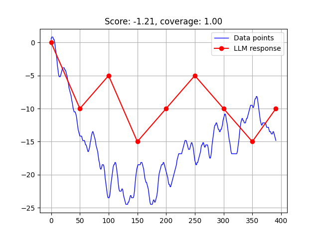

Data Approximation
This test evaluates the LLM’s ability to accurately interpret and replicate a given time series plot through a piecewise linear approximation (Figure 1(a)). The LLM is presented with a time series plot and tasked with approximating it using up to nn points. The score is derived from the mean squared error between the LLM’s piecewise linear approximation and the original plot.
| (5) |
The piecewise linear approximation generated from the LLM’s output serves as a robust indicator of the model’s comprehension. High performance in this test suggests that the LLM can effectively detect and replicate trends, values, and overall patterns in the data, demonstrating a strong understanding of the graphical information presented. This makes our benchmark particularly valuable for assessing the practical capabilities of LLMs in interpreting visual data. Such an evaluation provides insights into the LLM’s ability to process and approximate real-world data, highlighting its potential applicability in various analytical and decision-making tasks involving time series data.
Detecting Pointwise Anomalies
We measure how well the model detects anomalies in the time series data. Given a plot, the model is tasked with identifying points that deviate significantly from the overall trend.
The LLM is asked to output the coordinate of the points it considers to be anomalies, returning an empty list, should there be no anomalies. To calculate the score, we check if the model predicted the correct number of anomalies and how closely the predicted points match the actual anomalies.
If model predicts the correct number of anomalies, the score is calculated as follows:
| (6) |
Where is the set of actual anomalies, is the set of predicted anomalies, and is the middle of the x-axis.
Intuitively, the score will be 1 if the model correctly identifies the anomalies, 0 if the model’s guess is as good as just guessing the middle of the x-axis, and negative if it’s worse.
Detecting Missing Points
We evaluated the model’s ability to detect missing points in the time series data. During the data generation process, we randomly remove a subset of points from the time series plot, covering a predefined percentage of the data.
Given a plot, the model is asked to identify the range where the points are missing, if there is any. To calculate the score, we first check if the model correctly identified the presence of missing points. Then we measure how closely the predicted range matches the actual range where the points are missing.
If the model correctly identifies the presence of missing points, the score is calculated as follows, using the Jacaard similarity coefficient:
| (7) |
Where is the interval where the points are missing and is the interval predicted by the model.
Clusters
Detecting Clusters
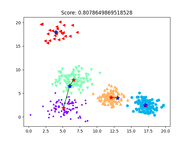
The task presented to the LLMs is to determine the locations of clusters within a scatter plot and provide the coordinates of the bounding areas occupied by these clusters (Figure 1(b)).
The LLMs’ responses are evaluated based on the accuracy of the detected clusters’ locations. The primary metric used for this evaluation is the Intersection over Union (IoU). IoU is a standard metric in object detection and image segmentation tasks, it is defined as the area of the intersection divided by the area of the union of the two bounding boxes.
Intersection over Union (IoU) Calculation:
| (8) |
The IoU metric provides a robust measure of how well the predicted cluster locations match the actual cluster locations. An IoU score of 1 indicates perfect alignment, whereas a score of 0 indicates no overlap. For each cluster, we calculate the IoU between the model-predicted bounding box and the ground truth bounding box. The overall performance is then assessed by averaging the IoU scores across all clusters.
Detecting Cluster’s Center
This task involves identifying the centers of clusters within a scatter plot and providing the coordinates of these centers (Figure 1(c)).
To evaluate the models’ performance in identifying cluster centers, we use a metric based on Euclidean distance. This metric involves pairing the predicted cluster centers (p) with the ground truth (gt), so that each point of both groups is in at least one pair (m pairs). We compute the Euclidean distance between each paired ground truth and the predicted cluster center . This gives us a measure of how close the predictions are to the actual centers.
Additionally, we compute the Euclidean distance from each ground truth cluster center to the center of the dataset plot (c) (for n clusters). This provides a baseline measure of the distribution of the clusters within the plot.
| (9) |
This evaluation metric ranges from to 1, where a positive score indicates that the predicted cluster centers are closer to the ground truth centers than the ground truth centers are to the center of the dataset plot, suggesting high precision in the model’s predictions. A score of zero implies that the model’s predictions are, on average, as accurate as simply guessing the center of the plot. Conversely, a negative score indicates that the predicted centers are farther from the ground truth than the ground truth centers are from the plot center, highlighting significant inaccuracies in the model’s predictions.
Biggest Cluster
To assess the model’s ability to localize the largest cluster within the data, we evaluate three key aspects: the proportion of correctly enclosed points, the area efficiency of the bounding rectangle, and a penalty for incorrectly included points. These factors are combined into a final score, providing a comprehensive measure of the model’s performance.
The final score for cluster localization is calculated as the arithmetic mean of three components:
| (10) |
Where:
- is the proportion of correctly enclosed points.
- compares the area of the minimal bounding box of the cluster to the area of the predicted rectangle.
- accounts for incorrectly included points.
This score reflects the accuracy and efficiency of the model in cluster location.
Histograms
Distribution Identification
This task evaluates the model’s ability to identify the distribution type in a histogram. The DistributionChecker class compares the model’s predicted distribution against the actual distribution type in the metadata. The model scores 1.0 if the predicted distribution matches the actual distribution. Additionally, if the actual distribution is skewed (left or right) and the predicted distribution is exponential, the model also scores 1.0. This scoring accounts for cases where skewed distributions are often approximated by exponential distributions. This approach provides a robust evaluation of the model’s ability to recognize different statistical distributions, accommodating both exact matches and reasonable approximations.
MinMax Evaluation
This evaluation assesses the model’s accuracy in predicting the minimum and maximum ranges within histogram data using the Jaccard Similarity Index. The index measures the overlap between the predicted and actual intervals:
| (11) |
The Jaccard similarity is computed separately for the minimum and maximum intervals, and the final evaluation metric, the Overall Score, is the average of these two similarities:
| (12) |
Here, denotes the average Jaccard similarity for the minimum and maximum intervals, respectively. This metric comprehensively measures the model’s ability to predict data ranges within histograms accurately.
Monotonicity Evaluation
This task assesses the model’s ability to identify monotonic intervals (either increasing or decreasing) in histogram data. The score is determined by the ratio of correctly predicted monotonic intervals to the total number of predicted intervals:
| (13) |
Here, is the count of correctly predicted increasing intervals, is the count of correctly predicted decreasing intervals, and is the total number of predicted monotonic intervals. This score reflects the model’s ability to detect and represent underlying patterns accurately.
BelowXValuePercentage
This class evaluates the model’s accuracy in predicting the percentage of data points falling below a specified threshold. The evaluation metric is:
| (14) |
The score reflects how close the predicted percentage is to the actual percentage, minimizing the absolute difference.
FindAnomaly
This class assesses the accuracy of predicting anomaly ranges within histogram data using the Weighted Jaccard Similarity, which considers a radius around both predicted and actual anomaly ranges:
| (15) |
In this formula, is the size of the intersection of the extended ranges, and is the size of the union of the extended ranges. This metric measures the overlap between predicted and actual anomaly ranges, accommodating minor deviations for a comprehensive assessment.
| Model | Clustering | Histograms | Series | Boxplots | Violins |
|---|---|---|---|---|---|
| gpt-4o | 0.549 | 0.57 | 0.44 | 0.491 | 0.472 |
| gpt-4o-mini | 0.432 | 0.40 | 0.19 | 0.342 | 0.356 |
| claude-3-5-sonnet | 0.682 | 0.46 | -317.38 | 0.603 | 0.579 |
| claude-3-opus | 0.495 | 0.32 | -23.64 | - | - |
| claude-3-haiku | 0.392 | 0.33 | -18.36 | 0.308 | 0.289 |
| gemini-1.5-pro | 0.637 | 0.54 | -123.45 | 0.607 | 0.572 |
| gemini-1.5-flash | 0.566 | 0.44 | -6520.23 | 0.513 | 0.471 |
Boxplots and Violin Plots
Highest and Lowest Median
For both boxplots and violin plots, the median of each plot is calculated to evaluate the predictions of the highest and lowest medians. The indices corresponding to the plots with the highest and lowest medians are identified and compared to predicted values. Correct identification of these indices earns 0.5 points for each correct prediction (one for the highest and one for the lowest), with a maximum score of 1.0.
Biggest and Smallest Range
The range of data in each plot is determined by calculating the difference between the maximum and minimum values. For both types of plot, the indices of the plots with the largest and smallest ranges are identified. Then these indices are compared with predicted values. Correctly predicting the index of the plot with the largest range earns 0.5 points, as does correctly predicting the smallest range, for a total possible score of 1.0.
Biggest and Smallest IQR
The interquartile range (IQR), calculated as the difference between the 75th and 25th percentiles, is used to evaluate predictions regarding variability within each plot. The indices of the plots with the largest and smallest IQRs are identified and compared to the predicted indices. Correct predictions earn 0.5 points each, resulting in a maximum score of 1.0.
Experiments
To evaluate the performance of multimodal models in interpreting various types of plots, we conducted a series of experiments across different plot categories. These experiments were designed to assess how well the models handle diverse visual presentations and tasks.
Experimental Setup
Models and Data
We evaluated several state-of-the-art multimodal models, including GPT-4o, GPT-4o-mini, Claude-3 (various versions), and Gemini-1.5 (various versions). Each model was tested on a comprehensive dataset of synthetic plots, which included scatter plots, histograms, time series, boxplots, and violin plots. Dataset were create in two version, one without any distortions and other with random augmentation.
Reproducibility
All experiments were conducted under consistent conditions, and model performance was evaluated based on the pre-defined metrics. Details of the experimental setup, including model configurations and data generation parameters, are provided in the Appendix.
Results
Table 1 presents the overall performance of each model across different plot categories. claude-3-5-sonnet leads with the highest scores in both clustering (0.682) and violin plots (0.579), while gemini-1.5-pro excels in boxplots (0.607). In contrast, gpt-4o-mini consistently shows lower performance across most categories. Detailed results for each model on specific metrics are provided in the Technical appendix.
Clustering
The performance of various models were evaluated based on their ability to identify the biggest cluster, detect cluster centers, and estimate cluster areas. Among the models, claude-3-5-sonnet achieved the highest overall score of 0.682, excelling in identifying the largest cluster and determining cluster centers. In contrast, gpt-4o-mini showed the lowest performance with an overall score of 0.432, indicating room for improvement in cluster detection and center localization.
Histograms
The models’ abilities to interpret histogram data were evaluated using various metrics, including distribution detection, identification of minimum and maximum bin values, monotonicity analysis, and estimating the percentage of data below a specific threshold. Model gpt-4o led in overall performance with a score of 0.57, performing particularly well in predicting the percentage of data below a specified value. On the other hand, claude-3-opus had the lowest overall score of 0.32, struggling particularly with distribution detection and monotonicity assessment.
Series
The models’ performance in handling series data was evaluate on broad rage of tasks, such as identifying minimum and maximum intervals, approximating the plot with points, and detecting pointwise anomalies. Notably, most models struggled with the approximation task, with some models like claude-3-5-sonnet and gemini-1.5-flash showing negative overall scores due to significant deviations in approximations. gpt-4o was the most consistent performer with an overall score of 0.44, indicating its relative robustness in series-related tasks.
Boxplots
In the boxplot evaluation the models were assessed based on their ability to identify medians, overall ranges, and interquartile ranges (IQR). gemini-1.5-pro performed the best with an overall score of 0.607, particularly excelling in detecting IQRs. gpt-4o-mini, however, showed the lowest performance with an overall score of 0.342, indicating challenges in accurately identifying key boxplot features.
Violins
Lastly, the models’ performance was evaluated based on their ability to interpret the violin plots. claude-3-5-sonnet again emerged as a top performer with an overall score of 0.579, showing strong results in estimating medians and overall ranges. gpt-4o-mini, however, lagged with an overall score of 0.356, indicating difficulties in accurately interpreting the density and distribution characteristics of the violin plots.
Conclusion
This study provides a detailed evaluation of multimodal models’ capabilities in interpreting various types of plots, including clustering results, histograms, time series, boxplots, and violin plots. Our findings indicate significant variability in model performance across different tasks and visualization settings. The introduction of specialized metrics for assessing model accuracy has highlighted both strengths and limitations in current models.
The results underscore the need for robust models that can handle diverse visual data effectively. Future research should focus on improving model performance across different plot types and visualization settings to enhance overall accuracy and reliability.
Literatura
- Achiam et al. (2023) Achiam, J.; Adler, S.; Agarwal, S.; Ahmad, L.; Akkaya, I.; Aleman, F. L.; Almeida, D.; Altenschmidt, J.; Altman, S.; Anadkat, S.; et al. 2023. Gpt-4 technical report. arXiv preprint arXiv:2303.08774.
- Anthropic (2024) Anthropic, A. 2024. The claude 3 model family: Opus, sonnet, haiku. Claude-3 Model Card, 1.
- Balloccu et al. (2024) Balloccu, S.; Schmidtová, P.; Lango, M.; and Dušek, O. 2024. Leak, Cheat, Repeat: Data Contamination and Evaluation Malpractices in Closed-Source LLMs. arXiv:2402.03927.
- Chen et al. (2024) Chen, N.; Zhang, Y.; Xu, J.; Ren, K.; and Yang, Y. 2024. VisEval: A Benchmark for Data Visualization in the Era of Large Language Models. arXiv preprint arXiv:2407.00981.
- Gadre et al. (2023) Gadre, S. Y.; Ilharco, G.; Fang, A.; Hayase, J.; Smyrnis, G.; Nguyen, T.; Marten, R.; et al. 2023. DataComp: In search of the next generation of multimodal datasets. In Advances in Neural Information Processing Systems, volume 36, 27092–27112. Curran Associates, Inc.
- Hull (1989) Hull, J. 1989. Options, Futures, and Other Derivatives.
- Li et al. (2024) Li, B.; Ge, Y.; Ge, Y.; Wang, G.; Wang, R.; Zhang, R.; and Shan, Y. 2024. SEED-Bench: Benchmarking Multimodal Large Language Models. In Proceedings of the IEEE/CVF Conference on Computer Vision and Pattern Recognition (CVPR), 13299–13308.
- Liu et al. (2023) Liu, F.; Wang, X.; Yao, W.; Chen, J.; Song, K.; Cho, S.; Yacoob, Y.; and Yu, D. 2023. MMC: Advancing Multimodal Chart Understanding with Large-scale Instruction Tuning. arXiv preprint arXiv:2311.10774.
- Malkiel (1973) Malkiel, B. G. 1973. A Random Walk Down Wall Street.
- Malode (2024) Malode, V. M. 2024. Benchmarking public large language models. Thesis, HAW Hamburg.
- McIntosh et al. (2024) McIntosh, T. R.; Susnjak, T.; Liu, T.; Watters, P.; and Halgamuge, M. N. 2024. Inadequacies of Large Language Model Benchmarks in the Era of Generative Artificial Intelligence. arXiv:2402.09880.
- Team et al. (2023) Team, G.; Anil, R.; Borgeaud, S.; Wu, Y.; Alayrac, J.-B.; Yu, J.; Soricut, R.; Schalkwyk, J.; Dai, A. M.; Hauth, A.; et al. 2023. Gemini: a family of highly capable multimodal models. arXiv preprint arXiv:2312.11805.
- Xu et al. (2023) Xu, Z.; Du, S.; Qi, Y.; Xu, C.; Yuan, C.; and Guo, J. 2023. ChartBench: A Benchmark for Complex Visual Reasoning in Charts. ArXiv, abs/2312.15915.
- Yao et al. (2024) Yao, Y.; Duan, J.; Xu, K.; Cai, Y.; Sun, Z.; and Zhang, Y. 2024. A survey on large language model (llm) security and privacy: The good, the bad, and the ugly. High-Confidence Computing, 100211.
- Yin et al. (2023) Yin, S.; Fu, C.; Zhao, S.; Li, K.; Sun, X.; Xu, T.; and Chen, E. 2023. A survey on multimodal large language models. arXiv preprint arXiv:2306.13549.
- Zhang et al. (2023) Zhang, W.; Aljunied, M.; Gao, C.; Chia, Y. K.; and Bing, L. 2023. M3Exam: A Multilingual, Multimodal, Multilevel Benchmark for Examining Large Language Models. In 37th Conference on Neural Information Processing Systems (NeurIPS 2023) Track on Datasets and Benchmarks.