VERA: Generating Visual Explanations of Two-Dimensional Embeddings via Region Annotation
Abstract
Two-dimensional embeddings obtained from dimensionality reduction techniques, such as MDS, t-SNE, and UMAP, are widely used across various disciplines to visualize high-dimensional data. These visualizations provide a valuable tool for exploratory data analysis, allowing researchers to visually identify clusters, outliers, and other interesting patterns in the data. However, interpreting the resulting visualizations can be challenging, as it often requires additional manual inspection to understand the differences between data points in different regions of the embedding space. To address this issue, we propose Visual Explanations via Region Annotation (VERA), an automatic embedding-annotation approach that generates visual explanations for any two-dimensional embedding. VERA produces informative explanations that characterize distinct regions in the embedding space, allowing users to gain an overview of the embedding landscape at a glance. Unlike most existing approaches, which typically require some degree of manual user intervention, VERA produces static explanations, automatically identifying and selecting the most informative visual explanations to show to the user. We illustrate the usage of VERA on a real-world data set and validate the utility of our approach with a comparative user study. Our results demonstrate that the explanations generated by VERA are as useful as fully-fledged interactive tools on typical exploratory data analysis tasks but require significantly less time and effort from the user.
Index Terms:
Dimensionality reduction, Embedding, Visualization, Visual explanation, Explainable AII Introduction
Two-dimensional, point-based visualizations of high-dimensional data are ubiquitous throughout various domains of science, including biology, economics, chemistry, political science, astronomy, and physics [1]. With the advent of big data, analyzing data sets with tens of thousands of features and millions of samples has now become commonplace. A common step during exploratory data analysis is the visualization of these high-dimensional data sets. Today, data science practitioners have at their disposal a plethora of scalable dimensionality reduction methods, including principal components analysis (PCA) [2], linear discriminant analysis (LDA) [3], FreeViz [4], multidimensional scaling (MDS) [5], t-distributed stochastic neighbor embedding (t-SNE) [6], and uniform manifold approximation and projection (UMAP) [7]. These can be used to visually uncover underlying structure, such as clusters, transitions, or outliers, and to support exploratory data analysis and hypothesis generation.
After performing dimensionality reduction, analysts typically inspect the resulting visualization and relate the visual structures to the original high-dimensional features [8, 9, 10]. Linear methods, such as PCA, LDA, and FreeViz, provide intuitive explanations of their inferred dimensions because their axes can be easily related to the original features by examining their projection loadings. However, linear approaches are limited in the types of high-dimensional structures they can reveal. In contrast, nonlinear dimensionality reduction approaches such as MDS, t-SNE, and UMAP are capable of revealing complex structures and patterns. However, relating the obtained embedding dimensions to the original features becomes more challenging. With the recent development of increasingly scalable dimensionality reduction techniques [7, 11, 12], analysts routinely generate multiple embeddings during exploratory data analysis using different parameter settings and algorithms, each potentially revealing different aspects of the underlying data manifold [13]. Each resulting embedding must then be manually inspected, which can be time consuming and tedious, highlighting the need for automated approaches to generating explanations of two-dimensional embeddings.
Interpreting two-dimensional embeddings typically involves loading data into an interactive tool of choice, selecting groups of points, inspecting their feature value distributions, comparing these with the values of the remaining data points, and annotating the resulting data map. Although interactive tools allow users to explore every aspect of the visualization in great detail with multiple analyses, the goal of most initial exploratory data analysis is to get a rough overview of the two-dimensional embedding obtained. While many interactive tools facilitate this process with tools such as automatic clustering, feature ranking, or automatic identification of discriminative features, the analyst must still manually interact with the tool to gain insight into the embedding. Due to the fairly repetitive nature of this process, automated tools can take much of the cognitive load off the user and automatically identify the most salient features in a given embedding. Such automated tools can be easily integrated into existing dimensionality reduction pipelines, producing embedding explanations as a by-product of the analysis. Although less powerful and comprehensive than fully interactive platforms, automated explanation generation tools can provide a quick, big-picture view of a given embedding. Once the analyst has identified an embedding of particular interest, he or she can then perform a thorough investigation using a more comprehensive interactive tool of choice, drilling down into the various features of the embedding space.
To address the problems highlighted above, we propose Visual Explanations via Region Annotation (VERA), an automated tool for generating static visual explanations of arbitrary embeddings. VERA requires no user input and automatically identifies the most salient features in a given embedding. While several explanation approaches have been developed to aid in the interpretation of two-dimensional embeddings, these are often limited to a single explanation [14, 15, 16] or require the user to manually inspect a large number of explanations [17, 18]. VERA is specifically designed to automatically generate multiple static visual explanations that require no human input, while remaining as informative as interactive approaches to common exploratory data analysis tasks.
II Related Work
Alongside the development of novel dimensionality reduction approaches for visualization [5, 6, 7], numerous visualization tools have also been developed to aid in understanding and establishing trust in the resulting embeddings.
One prominent avenue of research has focused on identifying distortions in embeddings, which are inevitably introduced during any dimensionality reduction process [19]. Visual approaches range from visualizing local measures of stress [20, 21] and neighborhood preservation metrics [22, 23, 24], to interactive tools aimed at identifying and correcting distortions [25, 26]. Nonato and Aupetit [19] provide an excellent overview of embedding distortions and their associated methods. These methods primarily aim to assess the trustworthiness and reliability of the spatial relationships between data samples in the embedding.
Another active area of research has focused on developing methods to aid in the interpretation of two-dimensional embeddings, typically by relating different regions of the embedding space to particular high-dimensional feature values. While several approaches have proposed modifying non-linear dimensionality reduction algorithms to enhance interpretability [27, 28], we here focus on techniques that aim to visually explain the different regions of the embedding.
Several approaches aim to explain embeddings globally, typically by expressing the embedding dimensions as linear combinations of the original features [29, 30]. While global approaches work well for linear projections, many modern dimensionality reduction techniques rely on highly non-linear transformations of the original feature space, making these approaches inapplicable to embeddings produced by these methods. Local approaches instead focus on explaining local visual patterns such as clusters, transitions, and outliers in the embedding space. These methods typically enrich the resulting two-dimensional scatter plot with additional graphical elements [31, 9, 16] or provide an interactive interface through which users can navigate and explore the embedding space [8, 26, 10].
Local approaches typically identify regions of the embedding space, most commonly clusters, and determine which feature values are characteristic of the data points contained within each cluster. Several strategies have been developed to identify the most salient features of a particular cluster. Joia et al. [31] developed an SVD-based approach to identify characteristic features in visual clusters. Da Silva et al. [14] and subsequent extensions by Van Driel et al. [15] and Tian et al. [16] identify low-variance features across different regions of the embedding. Pagliosa et al. [32] developed and applied a similar, interactive, variance-based approach to visual clusters. Other approaches jointly embed samples and features into the same embedding space. For instance, Broeksema et al. [29] use multiple correspondence analysis to embed both samples and features into a single embedding space and use Voronoi tessellations to define regions of characteristic feature values in the embedding space. Cheng and Mueller [9] developed a similar, MDS-based approach in which features are positioned near samples with high values of that particular feature. In their approach, regions are defined using kernel density estimates.
While identifying characteristic features for particular regions can help identify what a particular region corresponds to, people generally tend to prefer contrastive explanations that describe the differences between regions [33]. Several approaches have been developed to generate contrastive explanations, often highlighting the differences between visual clusters in the embedding space. Kandogan [8] uses a combination of metrics to identify features that distinguish between clusters in the embedding. Fujiwara et al. [34] identifies discriminative features using a contrastive variant of PCA. Marcilio et al. [35] use t-tests to identify characteristic features for each cluster, while Bibal et al. [10] uses decision trees to identify discriminative features between clusters. Marcilio and Eler [36], on the other hand, use Shapley values to explain clusters in the embedding. Importantly, all of these methods require some degree of user interaction, either manual cluster definition or manual interactive inspection of the identified features.
Interactive interfaces have been developed to facilitate the exploration of two-dimensional embeddings [26, 37, 38]. Many of these tools are limited to a single dimensionality reduction algorithm [29, 37, 39], which limits their general applicability. In addition, interactive tools require user input by design. While they often provide helpful functionality to facilitate common data exploration tasks, they ultimately still require some degree of user interaction, which can be time consuming and cognitively demanding.
In this manuscript, we propose VERA, a fully automatic approach for generating static visual explanations of arbitrary two-dimensional embeddings. VERA generates local explanations that associate different regions of the embedding space with particular high-dimensional feature values. Unlike most existing methods, VERA does not rely on identifying clusters in the embedding space, and can identify regions that span clusters or identify subregions of clusters. Drawing on insights from the social sciences, we design VERA to generate contrastive explanations, ensuring that the explanations generated are informative, relevant, and satisfying.
III Methods
In this section, we describe Visual Explanations via Region Annotation (VERA), our proposed approach for generating static visual explanations for two-dimensional embedding. Miller [33] argues that, when generating everyday explanations, people tend to prefer contrastive explanations over descriptive explanations. Therefore, we design VERA with contrastivity in mind, and have taken great care that each step works towards generating informative and satisfying explanations. Miller further posits that explanations involve three cognitive processes: explanation generation, selection, and evaluation. In this work, we aim to automate the first and second of these cognitive processes. In the first step, we generate several potential explanations, then rank and select the most salient of these in the second step. The evaluation step is ultimately left to the end user, as only they can evaluate the usefulness of an explanation for their particular problem.
Before proceeding, we must first define the necessary terminology. Given an arbitrary data set comprised of a set of high-dimensional features and its corresponding two-dimensional embedding , our aim is to visually relate different regions of back to the original, high-dimensional features . We refer to each high-dimensional feature as a base variable. Base variables can take on a wide range of values, some of which may be characteristic of particular regions of . For instance, data points in a particular cluster may all share the same category or contain similar numeric values. We package groupings of informative values into rules, which typically define some particular categorical value or some numeric interval of values. A rule is defined as a function , which evaluates to if the rule condition is met for a given data sample and otherwise. Rules are associated with regions via explanatory variables . Explanatory variables represent pairs of rules and regions , . Each region represents a set of points contained within the region. Explanatory variables can be merged into explanatory variable groups associated with rule and region . As explanatory variable groups serve the same purpose as explanatory variables, we use the two terms interchangeably. Once we have identified a set of informative explanatory variables , we next want to display these to the user. Simultaneously displaying all explanatory variables to the user in a single plot would likely result to overlapping regions, unreadable labels, and overall information clutter. Instead, we group explanatory variables into panel that follow the principles of contrastive explanation. We refer to each panel as a visual explanation and use the two terms interchangeably. Finally, a single panel will typically convey information about a single base variable or group of correlated base variables or may show a single partitioning of the embedding space. Therefore, we show the user a user-specified number of panels. We refer to a collection of panels as a layout .
We describe the two different types of visual explanations proposed in this work. Constrastive explanations typically consider a single base variable and depict where in the embedding space particular values of that variable occur. Descriptive explanations, on the other hand, aim to describe what feature values are characteristic for specific regions of the embedding space. Contrastive explanations can help answer questions like “Where do the different values of this feature occur?” while descriptive explanations aid in answering questions like “What feature values are characteristic for this cluster?”.
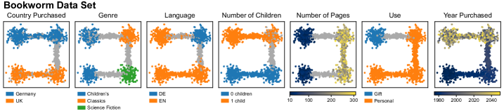
In the following sections, we illustrate the different steps of our approach using a fictional, guiding example. We construct a synthetic dataset, where each point corresponds to a book owned by a fictional literary enthusiast, which we aptly call the Bookworm dataset. The dataset consists of seven features: book language, genre, number of pages, year and country of purchase, whether or not the book owners had children at the time of purchase, and whether or not the book was purchased for personal use or as a gift. A two-dimensional embedding of this dataset is provided in advance, showing four distinct clusters of books connected by three transitions. The embedding, colored by the seven different feature values, is shown in Fig. 1.
Through these books, we can manually trace the life of this fictional bookworm. The books in the bottom left cluster give us a peek into their childhood; the cluster is filled with children’s books, presumably given to them by their parents. Their teenage years are characterized by the bottom right cluster, filled with longer science fiction books. After spending their formative years in the United Kingdom, they packed up their belongings and made Germany their new home, where their literary tastes switched to the German classics, which remained their favorite books to this day. Soon thereafter, they had their first child, which they also decided to raise with an appreciation for the literary arts. However, to ensure their child be instilled with a sense of British national pride, they stubbornly refused to allow their child to read books from Germanic authors, and enforced a strict English, literature diet.
In the subsequent sections, we will develop the building blocks of VERA and, through those, uncover this same life story, but in an automated fashion.
III-A Region Construction
Visualization regions represent collections of data points in the embedding that share a common characteristic and serve as the fundamental building block in the construction of visual explanations. A region represents a collection of one or more polygons in the embedding space, each containing a set of data points. Ideally, a region should contain all data points with a particular characteristic and exclude all other data points. However, in most real-world embeddings, there is rarely a clean separation between points with a particular feature value and those without.
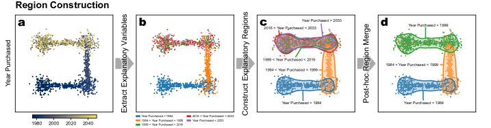
At a high level, our region construction procedure follows three steps, depicted in Fig. 2. For each base variable, we group samples based on their feature values, determining several ranges of numeric values or particular categories. We then pair each semantic rule with a spatial region of the embedding space in which the data points satisfy the rule. Finally, we merge over-fragmented, overlapping regions to obtain more informative regions.
III-A1 Extracting Explanatory Variables
An input data set can contain both categorical and numeric variables. Since our aim is to explain regions of the embedding in terms of the base variables’ values, we must first identify localized values or ranges of values in the embedding space. We discretize numeric variables into binary indicator variables using -Means quantization. By default, we construct five bins corresponding to the typical five-point scale: “very low”, “low”, “medium”, “high”, and “very high”. For instance, the numeric variable in Fig. 2.a is discretized into five bins, shown in Fig. 2.b. Categorical variables are one-hot encoded, resulting in binary indicator variables, each corresponding to a particular category. Each indicator variable is associated with a rule indicating its discretization interval or category selection. For each base variable, this procedure generates a collection of explanatory indicator variables, each associated with its own rule, corresponding to a particular value range or category.
III-A2 Constructing Explanatory Regions
To construct regions, we adopt a procedure similar to that of splatterplots [40]. For each binary indicator variable, we obtain its kernel density estimate (KDE) using a Gaussian kernel and extract contour lines at a user-specified level, defaulting at . In our running example, the five categories corresponding to discretization bins in Fig. 2.b are used to construct five corresponding regions, shown in Fig. 2.c. Note that, in general, when particular feature values are enriched in multiple regions of the space, the KDE may be multimodal, and we may end up with more than one contour line. Having obtained both rules and regions for each binary, indicator variable, we can now package these into explanatory variables , containing rules and regions .
An important consideration when estimating the KDE is setting the bandwidth of the Gaussian kernel. Different embedding algorithms produce embeddings that can span across different scales, e.g., one embedding may span from to along its dimensions, while another may span from to . Additionally, a single scale parameter may not be appropriate for data sets containing different numbers of samples. For instance, in a dataset with 50 samples, we are likely interested in groups of 10-20 points, while in a dataset containing 2 million samples, the groups of interest are likely larger. Conceptually, the scale parameter provides an implicit trade-off between region understandability and complexity. The scale can be used to specify the level of detail of the extracted regions with larger scales resulting in more general, big-picture explanations of the embedding and smaller bandwidths revealing more fine-grained details. We here set the scale to equal the median distance of each point’s -th nearest neighbor, where we set . To allow users to modulate the trade-offs between understandability and complexity, users can modify the scale via a scaling factor parameter.
When embedding high-dimensional data sets into two-dimensions, dimensionality reduction methods inevitably introduce distortions into the resulting embedding [24, 41, 19]. Including poorly mapped samples in the kernel density estimation may result in the detection of spurious regions, which may mislead the user. To remedy this, users can provide mapping distortion estimates for each data point, which are subsequently used to weight samples in the KDE step.
III-A3 Post-hoc Region Merging
In our treatment of numeric variables, we discretized features to obtain semantic ranges of feature values. However, it is unlikely that a single number of bins will result in the optimal discretization for all numeric variables. For instance, in Fig. 2.c, the values in the top section of the embedding are discretized into three bins, resulting in overlapping regions that clutter the visualization. Spatially, however, these three regions exhibit nearly perfect overlap and could be merged into a single region. Similar issues can arise with overlapping categories in categorical variables. To reduce this kind of spatial overlap, we develop a post-hoc merging procedure for the explanatory variables obtained from the previous steps.
When considering a merge of two regions, we must first ensure a sufficiently high degree of spatial overlap. At this phase, we only consider merging explanatory variables originating from the same base variable. We define the maximum overlap between two regions and as
where denotes the number of points within the region. If the maximum overlap between two regions exceeds a user-specified threshold, in our case defaulting to , we merge the two regions. The maximum overlap ensures that small regions, which are completely contained within larger region, are merged into the larger region.
Each explanatory variable is comprised of a region containing points , the majority of which satisfy its associated rule . To quantify the proportion of data points satisfying the rule in a given region, we define the purity of a region as
Merging two low-overlap regions may decrease the purity of the resulting region. To quantify the effect of a potential merge, we define the purity gain of two regions as
To avoid unreliable, low-purity regions, we require the maximum purity gain to exceed a user-specified threshold, in our case defaulting to .
When merging two explanatory variables, it is also important to consider the semantic compatibility of the two associated rules. For ordinal and discretized numeric features, we allow the merging of consecutive bins. For instance, the discretization rules could be merged into , but not into . Nominal categorical features have no natural ordering, therefore, we apply no such restrictions to these.
Two explanatory variables are merged if they satisfy all three criteria. For instance, in our running example in Fig. 2, consider the top section of the embedding in Fig. 2.c. The three regions exhibit near-perfect overlap, scoring a maximum overlap close to 1. Because the underlying data points are distributed evenly among the three regions, the purity of each region will be close to . A new region merged from any pair of these regions would include roughly of the points, giving a purity gain of about . Finally, the three rules are semantically compatible and can be merged into a single, open-ended interval. The final, merged explanatory variable is shown in Fig. 2.d.
Features whose values exhibit no spatial correlation with the embedding space are merged into a single explanatory variable. These variables hold no explanatory power and are discarded from subsequent analysis. Having obtained our final explanatory variables, we can apply filtering to enforce a minimum size and purity, discarding small and unreliable regions.
III-B Contrastive Explanations
Contrastive explanations show where particular values of a given base variable occur in the region. This is akin to coloring points in a scatter plot based on their feature values, one feature at a time, but with two advantages. First, our procedure filters out spatially irrelevant features and ranks the remaining ones in terms of their information content, allowing the user to inspect only the most relevant features. Second, by performing discretization, our approach prevents outliers skewing the color scale, a common nuisance in scatter plots.
III-B1 Explanation Construction
The region construction process generates a set of explanatory variables for each base variable, each associated with its own region of the embedding space. While we could directly construct panels by including all explanatory variables for each base variable, we can further refine these further for contrastive explanations.
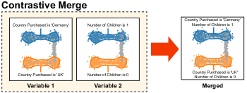
We devise the contrastive merge, which merges spatially overlapping explanatory variables from different base variables into explanatory variable groups. Unlike the post-hoc merging procedure described in Section III-A3, where we merged only explanatory variables originating from a single base variable, we here merge pairs of explanatory variables between two base variables. To perform the contrastive merge between two base variables and , we require that each explanatory variable has a spatially overlapping . If such a bipartite matching is found, we merge all bipartite pairs of explanatory variables, effectively merging two base variables into one. For instance, the two panels depicting two base variables in Fig. 3 exhibit perfect overlap and are subsequently merged into a single panel. This procedure not only reduces the number of panels needed to convey the same amount of information but can also reveal potentially non-linear correlations between high-dimensional features.
III-B2 Explanation Selection
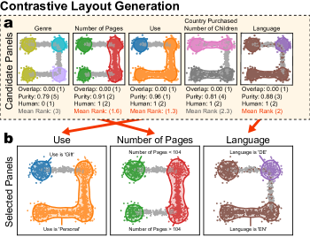
Generating contrastive explanations is straightforward: We simply include all explanatory variables associated with each high-dimensional, base variable in separate panels. However, this alone provides little benefit to the user, as they would then have to inspect as many panels as there are features. Instead, we develop a ranking procedure that identifies the most informative features and orders them by their spatial localization.
Features whose values are localized to particular regions of the embedding space are likely to be more informative than features with values spread evenly across the embedding space. Explanatory variables associated with highly-localized features exhibit lower overlap between their regions than those associated with evenly distributed features. We compute the overlap between two explanatory variables as the Jaccard similarity of their regions. To obtain the total region overlap of a panel , we compute the mean overlap between all pairs of explanatory variables .
The purity of each region indicates what proportion of the samples encompassed by the region satisfy the associated rule. High-purity regions signify a stronger spatial pattern than low-purity regions, and should be preferred. For each panel, we compute the mean purity of the contained explanatory variables.
A well-known finding from psychology states that human working memory has limited capacity and can pay attention to only a handful of items at a time. Several bounds have been proposed, including seven [42], four [43], and two [44]. We apply these findings to explanation selection, using an intermediate estimate of 3. Panels containing a large number of explanatory variables place more cognitive load on the user and are likely to overwhelm the user, therefore, simpler panels with fewer explanatory variables are preferred. To quantify this effect, we define the human attention score where denotes the the number of contained explanatory variables in panel .
We compute these three metrics for each panel and rank the panels accordingly. This results in three panel rankings. To obtain a single, final panel ranking, we compute the weighted sum of individual rankings and select the top panels with the highest overall rankings. This process is illustrated in Fig. 4.
III-C Descriptive Explanations
Descriptive explanations describe regions of the embedding space by determining sets of features and feature values characteristic for each particular region. Unlike contrastive explanations, which characterize a single feature, descriptive explanations identify combinations of explanatory variables localized in the same regions of the embedding space across different base variables, uncovering potentially interesting relationships between features and feature values.
III-C1 Explanation Construction
As in contrastive explanation construction, the regions produced by the procedure outlined in Section III-A serve as a good starting point for generating explanations, but can be further refined to convey descriptive information using the descriptive merge.
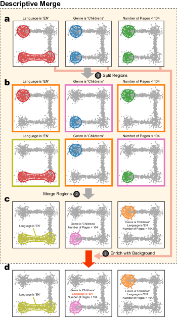
The descriptive merge procedure comprises of three basic steps. In the first step, each explanatory variable produced in Section III-A is split into new explanatory variables into its disjoint regions. If an explanatory variable contains only a single region, it is not split. For instance, the three explanatory variables shown in Fig. 5.a are each comprised of two regions, each of which is split into two explanatory variables in Fig. 5.b.
In the second step, we collect the split explanatory variables and identify overlapping regions, which we merge into explanatory variable groups. Two explanatory variables can be merged if they reach a sufficiently high degree of minimum spatial overlap. The minimum overlap between two regions and is defined as
This approach is reminiscent of the post-hoc region merge procedure described in Section III-A3, where we required the maximum overlap to exceed a particular threshold. There, the maximum overlap metric ensured that smaller regions encompassed by larger regions are absorbed into the larger region. Here, this approach would generate misleading regions. Consider two explanatory variables and associated with rules and regions respectively. If corresponds to a small region, entirely contained within the much larger region , the merged rule would indicate that the points within the new region satisfy both rules and . Because the new region contains points from both and , a large proportion of points in would not satisfy rule and would be misleading.
The merged regions produced in the previous step contain rules originating from regions with nearly perfect overlap. However, these new regions can be subsets of larger regions with their own associated rules. In the third step, provided the regions achieve a sufficiently high minimum overlap, we add rules from larger regions to the smaller, newly formed ones. Importantly, we do not merge the regions; we only add rules to the smaller regions. For example, the pink region in the middle panel of Fig. 5.c represents shorter children’s books, obtained by merging the perfectly overlapping regions in Fig. 5.b highlighted in pink. However, these books are also contained within the yellow region in the left panel of Fig. 5.c, which corresponds to English books. The pink cluster in Fig. 5.c can therefore be enriched with the rule from the yellow cluster. The resulting explanatory variable is shown in Fig. 5.d. We refer to this process as background enrichment.
III-C2 Explanation Selection
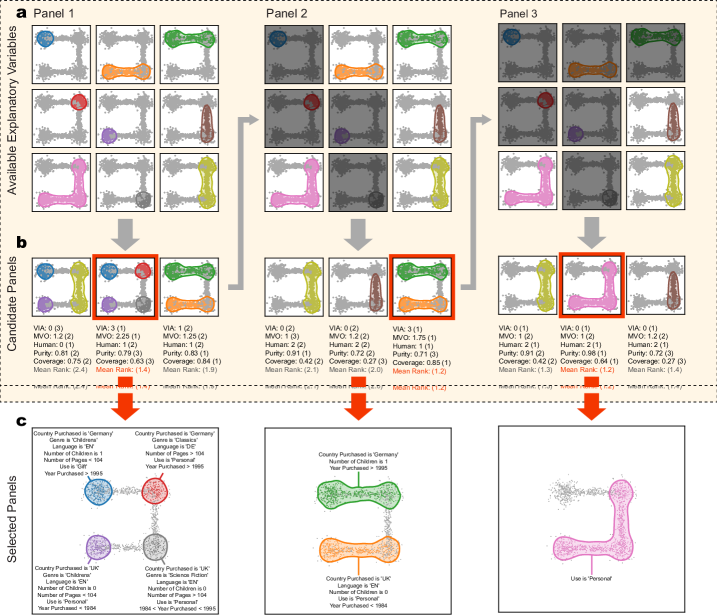
Descriptive explanations are generated and selected in an iterative fashion. Given an initial set of available explanatory variables , we first identify all potential combinations of explanatory variables such that the overlap between regions does not exceed some user-specified threshold. We cast this as an independent set problem, where each node in the graph corresponds to a particular explanatory variable, and edges are placed between them where the overlap between their corresponding regions exceeds the threshold. The independent sets of this graph correspond to collections of spatially non-overlapping regions, which are then considered candidate panels.
A key consideration when generating descriptive explanations is how to enforce the principles of contrastive explanation. In contrastive explanations, the panels show regions of different feature values for single base variables and are contrastive by nature. Here, however, each panel can contain explanatory variables comprised describing different features. In this case, a user may not be able to compare regions with one another within a single panel, as the different regions may correspond to different features.
To enforce a level of contrastivity, we score each panel according to its mean variable occurrence (MVO). The MVO counts the occurrence of each included base variable in the explanatory variables and reports the mean value. A high MVO indicates that the many of the included base variables appeared in multiple explanatory variables. If a base variable appears in all explanatory variables, we assign a special variable in all (VIA) score of 1 and 0 otherwise.
Additionally, we score each panel according to its sample coverage, i.e., what proportion of all data points are contained within any given region in the panel. We also include the mean purity and human attention score from Section III-B2, preferring panels with high-purity regions and panels with a manageable number of explanatory variables.
In order to select the best panel, we apply the same weighted rank-based approach as in Section III-B2 to the five metrics described above. We insert the most highly-ranked panel into the resulting layout, and the explanatory variables are removed from the set of available explanatory variables . We repeat the procedure until we generate the requested number of panels or until we run out of available explanatory variables . The procedure is illustrated in Fig. 6.
IV Usage Scenario
Here, we present a typical usage scenario using visual explanations generated by VERA. As our guiding example, we use the IBM Employee Attrition data set [45]. The data set describes 1,470 fictional employees characterized by 33 features. We obtain a two-dimensional embedding using the t-SNE algorithm using the openTSNE library [46].
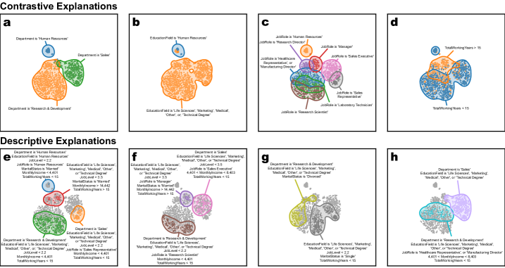
Fig. 7 shows the resulting VERA explanations. The four contrastive panels in Figs. 7.a-d show the four most spatially localized features. These indicate that the most salient features separating the clusters in the embedding correspond to the employees’ department, education, job role, and total working years. Figs. 7.a-b show that the primary discriminating features between clusters are the employee department and education field. Fig. 7.c shows the different job roles, while Fig. 7.d separates more junior from senior employees.
The four descriptive explanations depicted in Figs. 7.e-h characterize the different regions of the embedding space. The blue cluster in Fig. 7.e describes the characteristics of the human resources department, indicating more junior, married individuals with a lower salary. The red cluster identifies more senior, married, and higher-salary individuals. Cross-referencing this panel with Fig. 7.c, we can see that the majority of these employees are in either managerial or research director roles. We can similarly inspect the other regions to gain further insight into the employees’ landscape.
Notice that many of the identified regions do not correspond to particular clusters but characterize particular parts of clusters. For instance, the gray region in Figs. 7.g corresponds to employees who are single, have been working for fewer than 15 years, and have a low job level. We may guess that these correspond to younger, more junior employees. On the other hand, the employees in the yellow cluster are primarily divorced. We are provided with no information about their job level or total working years. Therefore, we do not assume any particular values about these employees.
V User Evaluation
To evaluate the effectiveness of our approach, we conducted a comparative user study comparing the speed and accuracy with which users could reason about low-dimensional embeddings using both a traditional interactive data exploration tool and our newly proposed VERA explanations.
V-A Study Design
We choose the Orange data mining toolkit [47] as our interactive tool of choice because of its ease of use and focus on visual data exploration. Orange includes many standard visualization tools for exploring two-dimensional nonlinear embeddings, including scatter plots and box plots. A typical workflow in Orange might include loading data, data embedding in scatter visualisation, selecting groups of points, and comparing their feature distributions to the remaining data points in a box plot.
We prepare two sets of three real-world data sets each, with varying complexity. The first data set group comprises the Iris [48], Employee Attrition [45], and Raisin [49] data sets. The second data set group includes the Penguins [50], Titanic [51], and Wine Quality [52] data sets. For each data set, participants were asked to answer a series of typical questions during the exploration of two-dimensional embeddings, including, “What makes this cluster different from the remaining clusters?”, “What characterizes the samples in this cluster?”, and “Do you notice any trend along this region?”.
We recruited about one hundreed bachelor’s students enrolled in the Introduction to Machine Learning course at the Faculty of Computer and Information Science at the University of Ljubljana. Prior to the study, the participants had some familiarity with Orange but were not familiar with VERA explanations. Before conducting the study, we provided a short tutorial on both Orange and VERA explanations. We randomly assigned participants to one of two user groups. The first group first used Orange to answer questions related data sets , then used VERA explanations for questions relating to data sets in . Conversely, the second group first used VERA to answer questions relating to , then used Orange to answer questions relating to the data sets in .
To asses the participant’s response time and accuracy, we timed how long it took each participant to answer all questions related to a particular data set group and determined whether they answered the questions correctly. Upon completing both data set groups, we asked participants to answer a final questionnaire in which they could provide feedback related to the two tools.
V-B Results
The results of our study show that participants using VERA explanations performed as well as participants using Orange, but in significantly less time. The difference in user performance was not statistically significant, with 91% of participants answering correctly when using Orange and 93% when using VERA (t-test ). On the other hand, participants in both user groups answered questions significantly faster when using VERA explanations. On average, participants using Orange took minutes to complete questions related to and minutes to complete questions related to . Conversely, participants using VERA explanations required and minutes for each data set group, representing an increase in speed of approximately 33% (). These results confirm that participants in both groups were able to answer the questions with approximately the same level of accuracy, but at a faster rate when using VERA explanations.
Interestingly, participants often answered questions by mentioning more features when using VERA explanations. When generating explanations using Orange, participants mentioned an average of features in their answers. When generating explanations using VERA explanations, this number increased to (). This discrepancy could be due to several factors. For example, when exploring two-dimensional embeddings with an interactive tool, users typically have to scroll through the many different features to explore their correspondence to the embedding space. Participants often stop their exploration after identifying one or two informative features, potentially missing other equally informative features. VERA explanations, on the other hand, provide all relevant explanations at once. While these explanations are limited in the number of features they display, the explanation ranking mechanisms in VERA ensure that the user sees the most salient features first. Thus, the user simply sees all the features and cannot miss them by accident.
In the final feedback questionnaire, we asked participants to document their experience with both tools. Consistent with the quantitative results, most participants (91%) reported that they were able to answer questions more quickly using the VERA explanations. The majority of participants (77%) also confirmed that the static explanations provided were just as informative as Orange. Surprisingly, when asked which tools they trusted more, 50% of participants said they trusted both tools equally, 20% said they trusted VERA explanations more, and 30% said they trusted Orange more. We expected that users would tend to trust full-featured, interactive toolkits like Orange more than static visual explanations because these tools provide users with multiple methods to verify their findings and allow them to drill down into specific parts of the visualization as they see fit. VERA explanations, on the other hand, are static and offer no such options, forcing the user to simply trust the image.
Finally, we asked participants which types of VERA explanations they found more informative, and asked them to rate each type of explanation for its usefulness on a typical five-point Likert scale. Consistent with Miller’s [33] findings, most participants (75%) selected contrastive explanations as the most informative, while 15% found both types of explanations equally informative, and 10% found descriptive explanations more informative. Contrastive explanations received a higher overall rating of , while descriptive explanations received a lower overall rating of . We note that this result does not imply that descriptive explanations are not useful, but rather highlights the need to use both contrastive and descriptive explanations in tandem.
VI Limitations and Future Work
While we have shown that the visual explanations generated by VERA are useful, there are still a number of limitations to the proposed approach that provide avenues for future research.
The present study considers only tabular data, where each feature conveys some human-readable, semantic meaning. Today, analysts routinely deal with data sets of different modalities, for which our approach may also prove useful. For example, in compositional data sets such as text corpora and gene expression data, descriptive explanations could be used to identify characteristic groups of words or highly expressed genes for different regions of the embedding space. Applying our proposed approach to other data modalities, such as image, sound, video, and graph data, where semantically meaningful features are scarce, is not straightforward. For these data modalities, more specialized approaches are likely to be needed to address the needs of each particular modality.
Another limitation of our approach is the issue of scaling as the number of features increases. The case study highlighted above and the datasets used in the user study contain a maximum of 33 features. As currently designed, VERA would likely struggle to produce meaningful visualizations when faced with hundreds or thousands of features. For example, contrastive explanations typically show the top most informative features. As the number of features increases, more panels are needed to get a complete view of all spatially localized features. Descriptive explanations, on the other hand, suffer from a different limitation. Each descriptive panel typically contains several explanatory variables along with their associated rule descriptors. As we increase the number of total features, the number of rule descriptors also increases, leading to information-dense and eventually incomprehensible labels. However, with recent advances in natural language processing [53, 54], we could use large language models (LLMs) to summarize potentially long lists of feature descriptors and display short, automatically generated summaries instead of long feature descriptors. For text data, LLMs could also be used to generate topic descriptions. Where available, ontologies could be used to perform ontology enrichment analysis to identify more semantically meaningful labels. For example, in gene expression data, we could replace long lists of genes with enriched Gene Ontology terms [55], or in drug prescription data, we could replace lists of drugs with enriched Anatomical Therapeutic Chemical codes [56]. These can also be summarized by an LLM into a shorter, more human-readable label. Recent advances in LLM research open up exciting new avenues of research for automatic explanation generation that will benefit not only visual explanations, but the entire field of explicable artificial intelligence as a whole.
A final consideration is that of interactivity. While the development of VERA was motivated primarily by the need for fully automated tools to generate static, visual explanations of two-dimensional embeddings, one can easily envision an interactive system in which visual explanations are integrated into a rich, interactive platform. Interactive systems allow the user to explore the embedding in much more detail, to focus on subsets of the embedding space, and to drill down into the specific visual structures. Similar to splatterplots [40], such an interactive system can also take into account the available screen space and dynamically adjust the level of detail shown accordingly. Such a user interface could be seamlessly integrated into existing visual analytics tools such as Orange [47], complementing their existing interactive data exploration tools.
VII Conclusion
In today’s era of large, heterogeneous, high-dimensional data sets, unsupervised dimensionality reduction approaches have become essential to exploratory data analysis. These methods help analysts make sense of vast amounts of data, allowing them to visually discover interesting structures in two-dimensional maps and drive hypothesis generation. Recent algorithmic developments have enabled these methods to scale to massive data sets, and it has become commonplace to generate multiple such embeddings using different algorithms and parameter settings, as each may reveal a different facet of the underlying data manifold. However, examining each of these embeddings is time consuming and tedious. Typically, analysts interrogate each embedding in an interactive tool, identifying points of interest, examining their underlying feature distributions, and assigning semantic labels to groups of points.
We present Visual Explanations via Region Annotation (VERA), a fully automated approach for generating static visual explanations of arbitrary two-dimensional embeddings. VERA aims to relate different regions of the embedding space to the original high-dimensional features. Unlike most existing approaches, VERA does not rely on the identification of clusters in the embedding space, but automatically determines potentially interesting regions in the embedding space. Importantly, VERA requires no manual human intervention and can be easily integrated into existing dimensionality reduction pipelines, producing visual explanations as a by-product of the analysis. VERA produces two complementary types of explanations. Contrastive explanations identify the most spatially salient features and show where particular feature values occur in the embedding. On the other hand, descriptive explanations aim at describing certain regions of space in terms of certain high-dimensional feature values. Drawing on insights from the social sciences, we pay particular attention to ensuring that our explanations follow the principles of contrastivity, so that the resulting explanations are as informative and satisfying as possible. We validate the utility of our approach through a comparative user study, which shows that our visual explanations are as informative as full-fledged, interactive tools for answering common embedding interpretation tasks. Importantly, however, due to the static nature of our explanations, users are able to gain insight into their embeddings in significantly less time.
Overall, our work contributes to the growing field of interpretable machine learning and offers a new perspective on explaining nonlinear embeddings in terms of their original features.
Code Availability and Reproducibility
Our open-source, Python implentation of VERA is freely-available at https://github.com/pavlin-policar/vera and is licensed under the BSD-3 license. The materials used to prepare this manuscript are available at https://github.com/pavlin-policar/vera-paper.
Acknowledgments
This work was supported by the Slovenian Research Agency grants P2-0209 and V2-2272.
References
- [1] S. Liu, D. Maljovec, B. Wang, P.-T. Bremer, and V. Pascucci, “Visualizing high-dimensional data: Advances in the past decade,” IEEE Transactions on Visualization and Computer Graphics, vol. 23, no. 3, pp. 1249–1268, 2017.
- [2] I. T. Jolliffe, Principal Component Analysis. Springer, 2002.
- [3] R. A. Fisher, “The use of multiple measurements in taxonomic problems,” Annals of Eugenics, vol. 7, no. 2, pp. 179–188, 1936.
- [4] J. Demšar, G. Leban, and B. Zupan, “FreeViz—An intelligent multivariate visualization approach to explorative analysis of biomedical data,” Journal of biomedical informatics, vol. 40, no. 6, pp. 661–671, 2007.
- [5] J. B. Kruskal and M. Wish, Multidimensional Scaling. SAGE Publications, Inc., 1978.
- [6] L. Van der Maaten and G. Hinton, “Visualizing data using t-SNE,” Journal of Machine Learning Research, vol. 9, no. 11, 2008.
- [7] L. McInnes, J. Healy, and J. Melville, “UMAP: Uniform Manifold Approximation and Projection for Dimension Reduction,” ArXiv e-prints, 2018.
- [8] E. Kandogan, “Just-in-time annotation of clusters, outliers, and trends in point-based data visualizations,” in 2012 IEEE Conference on Visual Analytics Science and Technology (VAST), pp. 73–82, 2012.
- [9] S. Cheng and K. Mueller, “The Data Context Map: Fusing Data and Attributes into a Unified Display,” IEEE Transactions on Visualization and Computer Graphics, vol. 22, pp. 121–130, jan 2016.
- [10] A. Bibal, A. Clarinval, B. Dumas, and B. Frénay, “IXVC: An interactive pipeline for explaining visual clusters in dimensionality reduction visualizations with decision trees,” Array, vol. 11, p. 100080, 2021.
- [11] G. C. Linderman, M. Rachh, J. G. Hoskins, S. Steinerberger, and Y. Kluger, “Fast interpolation-based t-SNE for improved visualization of single-cell RNA-seq data,” Nature Methods, vol. 16, no. 3, pp. 243–245, 2019.
- [12] P. Lambert, C. de Bodt, M. Verleysen, and J. A. Lee, “SQuadMDS: A lean Stochastic Quartet MDS improving global structure preservation in neighbor embedding like t-SNE and UMAP,” Neurocomputing, vol. 503, pp. 17–27, 2022.
- [13] D. Kobak and P. Berens, “The art of using t-sne for single-cell transcriptomics,” Nature Communications, vol. 10, p. 5416, Nov 2019.
- [14] R. R. O. d. Silva, P. E. Rauber, R. M. Martins, R. Minghim, and A. C. Telea, “Attribute-based Visual Explanation of Multidimensional Projections,” in EuroVis Workshop on Visual Analytics (EuroVA) (E. Bertini and J. C. Roberts, eds.), The Eurographics Association, 2015.
- [15] D. v. Driel, X. Zhai, Z. Tian, and A. Telea, “Enhanced Attribute-Based Explanations of Multidimensional Projections,” in EuroVis Workshop on Visual Analytics (EuroVA) (C. Turkay and K. Vrotsou, eds.), The Eurographics Association, 2020.
- [16] Z. Tian, X. Zhai, D. van Driel, G. van Steenpaal, M. Espadoto, and A. Telea, “Using multiple attribute-based explanations of multidimensional projections to explore high-dimensional data,” Computers & Graphics, vol. 98, pp. 93–104, 2021.
- [17] R. Faust, D. Glickenstein, and C. Scheidegger, “DimReader: Axis Lines That Explain Non-Linear Projections,” IEEE Transactions on Visualization and Computer Graphics, vol. 25, no. 1, pp. 481–490, 2019.
- [18] G. Plumb, J. Terhorst, S. Sankararaman, and A. Talwalkar, “Explaining Groups of Points in Low-Dimensional Representations,” in Proceedings of the 37th International Conference on Machine Learning (H. D. III and A. Singh, eds.), vol. 119 of Proceedings of Machine Learning Research, pp. 7762–7771, PMLR, 13–18 Jul 2020.
- [19] L. G. Nonato and M. Aupetit, “Multidimensional projection for visual analytics: Linking techniques with distortions, tasks, and layout enrichment,” IEEE Transactions on Visualization and Computer Graphics, vol. 25, no. 8, pp. 2650–2673, 2019.
- [20] T. Schreck, T. von Landesberger, and S. Bremm, “Techniques for precision-based visual analysis of projected data,” Information Visualization, vol. 9, no. 3, pp. 181–193, 2010.
- [21] C. Seifert, V. Sabol, and W. Kienreich, “Stress Maps: Analysing Local Phenomena in Dimensionality Reduction Based Visualisations,” in EuroVAST 2010: International Symposium on Visual Analytics Science and Technology (J. Kohlhammer and D. Keim, eds.), The Eurographics Association, 2010.
- [22] M. Aupetit, “Visualizing distortions and recovering topology in continuous projection techniques,” Neurocomputing, vol. 70, no. 7, pp. 1304–1330, 2007.
- [23] S. Lespinats and M. Aupetit, “Checkviz: Sanity check and topological clues for linear and non-linear mappings,” Computer Graphics Forum, vol. 30, no. 1, pp. 113–125, 2011.
- [24] R. M. Martins, D. B. Coimbra, R. Minghim, and A. Telea, “Visual analysis of dimensionality reduction quality for parameterized projections,” Computers & Graphics, vol. 41, pp. 26–42, 2014.
- [25] N. Heulot, M. Aupetit, and J.-D. Fekete, “ProxiLens: Interactive Exploration of High-Dimensional Data using Projections,” in EuroVis Workshop on Visual Analytics using Multidimensional Projections (M. Aupetit and L. van der Maaten, eds.), The Eurographics Association, 2013.
- [26] J. Stahnke, M. Dörk, B. Müller, and A. Thom, “Probing projections: Interaction techniques for interpreting arrangements and errors of dimensionality reductions,” IEEE Transactions on Visualization and Computer Graphics, vol. 22, no. 1, pp. 629–638, 2016.
- [27] E. Couplet, P. Lambert, M. Verleysen, D. Mulders, J. A. Lee, and C. De Bodt, “Natively Interpretable t-SNE,” in Proceedings of AIMLAI workshop, vol. 1, p. 1, 2023.
- [28] M. Scicluna, J.-C. Grenier, R. Poujol, S. Lemieux, and J. G. Hussin, “Toward computing attributions for dimensionality reduction techniques,” Bioinformatics advances, vol. 3, no. 1, p. vbad097, 2023.
- [29] B. Broeksema, A. C. Telea, and T. Baudel, “Visual Analysis of Multi‐Dimensional Categorical Data Sets,” Computer Graphics Forum, 2013.
- [30] D. B. Coimbra, R. M. Martins, T. T. Neves, A. C. Telea, and F. V. Paulovich, “Explaining three-dimensional dimensionality reduction plots,” Information Visualization, vol. 15, no. 2, pp. 154–172, 2016.
- [31] P. Joia, F. Petronetto, and L. Nonato, “Uncovering representative groups in multidimensional projections,” Computer Graphics Forum, vol. 34, no. 3, pp. 281–290, 2015.
- [32] L. Pagliosa, P. Pagliosa, and L. G. Nonato, “Understanding attribute variability in multidimensional projections,” in 2016 29th SIBGRAPI Conference on Graphics, Patterns and Images (SIBGRAPI), pp. 297–304, 2016.
- [33] T. Miller, “Explanation in artificial intelligence: Insights from the social sciences,” Artificial Intelligence, vol. 267, pp. 1–38, 2019.
- [34] T. Fujiwara, O.-H. Kwon, and K.-L. Ma, “Supporting Analysis of Dimensionality Reduction Results with Contrastive Learning,” IEEE Transactions on Visualization and Computer Graphics, vol. 26, no. 1, pp. 45–55, 2020.
- [35] W. E. Marcílio-Jr, D. M. Eler, and R. E. Garcia, “Contrastive analysis for scatterplot-based representations of dimensionality reduction,” Computers & Graphics, vol. 101, pp. 46–58, 2021.
- [36] W. E. Marcílio-Jr and D. M. Eler, “Explaining dimensionality reduction results using shapley values,” Expert Systems with Applications, vol. 178, p. 115020, 2021.
- [37] A. Chatzimparmpas, R. M. Martins, and A. Kerren, “t-viSNE: Interactive Assessment and Interpretation of t-SNE Projections,” IEEE Transactions on Visualization and Computer Graphics, vol. 26, no. 8, pp. 2696–2714, 2020.
- [38] K. Eckelt, A. Hinterreiter, P. Adelberger, C. Walchshofer, V. Dhanoa, C. Humer, M. Heckmann, C. Steinparz, and M. Streit, “Visual exploration of relationships and structure in low-dimensional embeddings,” IEEE Transactions on Visualization and Computer Graphics, vol. 29, p. 3312–3326, mar 2022.
- [39] A. Bibal, V. Vu, G. Nanfack, and B. Frénay, “Explaining t-SNE embeddings locally by adapting LIME,” in ESANN 2020, pp. 393–398, ESANN (i6doc.com), 2020.
- [40] A. Mayorga and M. Gleicher, “Splatterplots: Overcoming overdraw in scatter plots,” IEEE Transactions on Visualization and Computer Graphics, vol. 19, no. 9, pp. 1526–1538, 2013.
- [41] D. J. Lehmann and H. Theisel, “General projective maps for multidimensional data projection,” Computer Graphics Forum, vol. 35, no. 2, pp. 443–453, 2016.
- [42] G. A. Miller, “The magical number seven, plus or minus two: Some limits on our capacity for processing information.,” Psychological Review, vol. 63, no. 2, pp. 81–97, 1956.
- [43] N. Cowan, “The magical number 4 in short-term memory: A reconsideration of mental storage capacity,” Behavioral and Brain Sciences, vol. 24, no. 1, p. 87–114, 2001.
- [44] F. Gobet and G. Clarkson, “Chunks in expert memory: evidence for the magical number four … or is it two?,” Memory, vol. 12, pp. 732–747, Nov. 2004.
- [45] I. W. D. Scientists, “Ibm employee attrition dataset.”
- [46] P. G. Poličar, M. Stražar, and B. Zupan, “openTSNE: A Modular Python Library for t-SNE Dimensionality Reduction and Embedding,” Journal of Statistical Software, vol. 109, no. 3, p. 1–30, 2024.
- [47] J. Demšar, T. Curk, A. Erjavec, Č. Gorup, T. Hočevar, M. Milutinovič, M. Možina, M. Polajnar, M. Toplak, A. Starič, et al., “Orange: data mining toolbox in python,” The Journal of Machine Learning Research, vol. 14, no. 1, pp. 2349–2353, 2013.
- [48] E. Anderson, “The species problem in iris,” Annals of the Missouri Botanical Garden, vol. 23, no. 3, pp. 457–509, 1936.
- [49] I. Çinar, M. Koklu, and S. Tasdemir, “Raisin.” UCI Machine Learning Repository, 2023.
- [50] A. M. Horst, A. P. Hill, and K. B. Gorman, palmerpenguins: Palmer Archipelago (Antarctica) penguin data, 2020. R package version 0.1.0.
- [51] R. J. M. Dawson, “The “unusual episode” data revisited,” Journal of Statistics Education, vol. 3, no. 3, 1995.
- [52] P. Cortez, A. Cerdeira, F. Almeida, T. Matos, and J. Reis, “Modeling wine preferences by data mining from physicochemical properties,” Decision support systems, vol. 47, no. 4, pp. 547–553, 2009.
- [53] T. Brown, B. Mann, N. Ryder, M. Subbiah, J. D. Kaplan, P. Dhariwal, A. Neelakantan, P. Shyam, G. Sastry, A. Askell, S. Agarwal, A. Herbert-Voss, G. Krueger, T. Henighan, R. Child, A. Ramesh, D. Ziegler, J. Wu, C. Winter, C. Hesse, M. Chen, E. Sigler, M. Litwin, S. Gray, B. Chess, J. Clark, C. Berner, S. McCandlish, A. Radford, I. Sutskever, and D. Amodei, “Language models are few-shot learners,” in Advances in Neural Information Processing Systems (H. Larochelle, M. Ranzato, R. Hadsell, M. Balcan, and H. Lin, eds.), vol. 33, pp. 1877–1901, Curran Associates, Inc., 2020.
- [54] H. Touvron, T. Lavril, G. Izacard, X. Martinet, M.-A. Lachaux, T. Lacroix, B. Rozière, N. Goyal, E. Hambro, F. Azhar, A. Rodriguez, A. Joulin, E. Grave, and G. Lample, “LLaMA: Open and Efficient Foundation Language Models,” 2023.
- [55] G. O. Consortium, “The Gene Ontology (GO) database and informatics resource,” Nucleic Acids Research, vol. 32, pp. D258–D261, 01 2004.
- [56] P. G. Poličar, D. Stanimirović, and B. Zupan, “Nation-wide eprescription data reveals landscape of physicians and their drug prescribing patterns in slovenia,” in Artificial Intelligence in Medicine (J. M. Juarez, M. Marcos, G. Stiglic, and A. Tucker, eds.), (Cham), pp. 283–292, Springer Nature Switzerland, 2023.