SMSupplementary References
Enhancing predictive imaging biomarker discovery through treatment effect analysis
Abstract
Identifying predictive biomarkers, which forecast individual treatment effectiveness, is crucial for personalized medicine and informs decision-making across diverse disciplines. These biomarkers are extracted from pre-treatment data, often within randomized controlled trials, and have to be distinguished from prognostic biomarkers, which are independent of treatment assignment. Our study focuses on the discovery of predictive imaging biomarkers, aiming to leverage pre-treatment images to unveil new causal relationships. Previous approaches relied on labor-intensive handcrafted or manually derived features, which may introduce biases. In response, we present a new task of discovering predictive imaging biomarkers directly from the pre-treatment images to learn relevant image features. We propose an evaluation protocol for this task to assess a model’s ability to identify predictive imaging biomarkers and differentiate them from prognostic ones. It employs statistical testing and a comprehensive analysis of image feature attribution. We explore the suitability of deep learning models originally designed for estimating the conditional average treatment effect (CATE) for this task, which previously have been primarily assessed for the precision of CATE estimation, overlooking the evaluation of imaging biomarker discovery. Our proof-of-concept analysis demonstrates promising results in discovering and validating predictive imaging biomarkers from synthetic outcomes and real-world image datasets.
Introduction
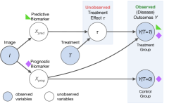
Identifying predictive biomarkers is crucial for determining which subgroup of individuals will have a positive treatment effect and ultimately for making informed treatment decisions in numerous disciplines with treatments ranging from medical treatments and health programs to environmental strategies and public policies. Precision medicine, for example, relies on predictive biomarkers to tailor interventions to individual patients and ensure optimized patient outcomes. Generally, a biomarker is a measurable characteristic associated with an individual’s outcome such as disease progression, patient well-being, or physiologic measures [1]. Although the term originally stems from the biomedical field, it can also refer to covariates in general contexts. Predictive biomarkers act as drivers of treatment effect heterogeneity [2] and are therefore treatment-specific. They do not influence the outcome of the control group, unlike treatment-independent prognostic biomarkers, which are associated with the outcome independent of treatment assignment [3], as illustrated in Fig. 1. The discovery of predictive biomarkers plays an important role not only in explaining the causal mechanisms behind treatment effects and supporting informed treatment decisions but also in driving the development of novel treatments across various domains. In particular, there has been a growing interest in leveraging the vast amount of non-invasively acquired information provided across different imaging modalities to discover so-called imaging biomarkers, especially predictive imaging biomarkers [4].
In previous research, the discovery process of predictive imaging biomarkers involves handcrafted radiomics features (e.g. shape, intensity, and texture of tumors or lesions [5, 6, 7, 8]) as candidates to determine their predictive performance. This process typically contains several steps including segmentation to define regions of interest, feature extraction, and feature selection.
While ML and deep learning approaches have been employed to facilitate the discovery of imaging biomarkers [9, 10, 11, 12, 5, 6, 13], the training processes rely on handcrafted radiomics-based features and have the risk of introducing human bias, as shown by Hosny et al. [14]. Some approaches directly aim at discovering predictive biomarkers and distinguishing them from prognostic ones [15, 16, 17, 18], but are limited to tabular input data. More flexibility and adaptability are offered by deep-learning-based conditional average treatment effect (CATE) estimation methods [19, 20, 21, 22, 23, 24], which have the potential to identify predictive biomarker candidates from a set of tabular covariates as well [25, 16]. CATE estimation differs from a standard supervised learning task and requires different modeling approaches as the ground truth for our quantity of interest – the individual treatment effect – is not available. This is due to the fundamental problem of causal inference [26]: It is impossible to observe both potential outcomes, treated and untreated, from the same individual simultaneously, yet they are necessary to compute the individual treatment effect. For CATE estimation, the presence of strong prognostic biomarkers, which is frequently encountered in practice, can negatively impact the performance of CATE estimation methods, even though they are not relevant for the treatment effect and, thus, for treatment decision-making. For instance, CATE estimation methods can mistakenly identify prognostic as predictive biomarkers, as studies have shown [27, 25, 15], which may lead to ineffective or even harmful treatment recommendations. It is therefore essential to ensure that these methods can distinguish these two types of biomarkers. CATE estimation methods have been originally designed for tabular inputs and remain a widely unexplored topic in the context of image inputs. In response to this gap, recent advancements have adapted deep-learning-based CATE estimation methods to estimate treatment effects not only from medical images [28, 29, 30, 31] but also other types of images [32, 33, 34].
Yet, none of these image-based methods directly describe how predictive biomarkers can be identified and interpreted or address how well models manage to do so, which is an important but often overlooked performance metric to consider when evaluating CATE estimation methods, as noted by Curth et al. [2]. To conduct such an evaluation, a benchmarking environment was proposed by Crabbé et al.[25], albeit only applicable to tabular data. Adapting the evaluation of predictive biomarker discovery from tabular data to imaging biomarkers introduces a significant challenge: Extracting imaging biomarkers is complicated by the high-dimensional and structured nature of image data, which lacks distinct pre-defined features. Consequently, a critical step in interpreting these biomarkers is determining the specific image features upon which the black-box ML model depends. This step is vital for drug development and clinical decision-making.
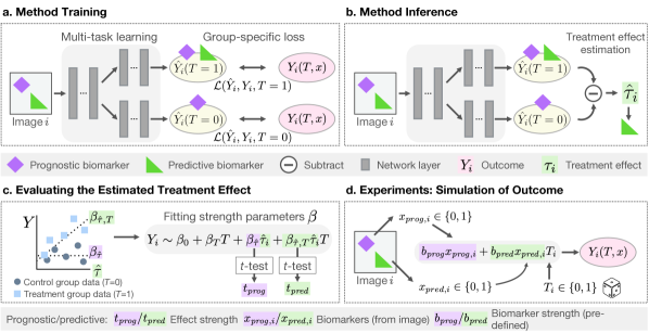
In this paper, we define a novel task in response to the challenges mentioned above: discovering predictive imaging biomarkers directly from image data in a data-driven way, without requiring handcrafted features or a separate feature extraction step. We introduce an evaluation protocol tailored to this task and provide experiments as a proof-of-concept, demonstrating how a multi-task learning CATE estimation model can be used to discover predictive biomarker candidates (Fig. 2). We use statistical testing to investigate how the estimated treatment effect depends on varying predictive signal strengths and enable the verification and interpretation of the discovered predictive imaging biomarker candidates by evaluating our model using explainable artificial intelligence (XAI) methods [35, 36, 37, 38, 39]. By applying XAI methods we provide visual explanations of the black-box model predictions by creating attribution maps based on input images and thereby facilitate the interpretation of the predictive imaging biomarkers candidates identified by our method. Our experimental design utilizes pre-defined imaging biomarkers with varying predictive and prognostic effects on synthetic outcomes, enabling us to benchmark our model’s performance on real image data. The experiments on natural and medical images demonstrate that our image-based CATE estimation model can identify predictive imaging biomarkers with a much higher predictive strength compared to a baseline that does not distinguish between prognostic and predictive effects. Our experimental design further allows us to investigate whether the predictive imaging biomarkers identified by our image-based CATE estimator can be attributed to the correct ground truth features.
Methods
Treatment heterogeneity and predictive biomarkers
We describe how treatment effects, which cannot be observed directly, can be estimated from data by introducing the concept of potential outcomes. Here, we consider pre-treatment images and data collected through randomized controlled trials (RCTs), the typical experimental setting for discovering biomarkers in clinical research. The relation between outcomes, defined by a problem-specific measure of interest, and treatment effect has been described by the Neyman-Rubin causal model [40], where the individual treatment effect (ITE) for an individual is defined as the difference between potential outcomes , . Here, we assume a binary treatment variable for whether a treatment is applied or not. In RCTs, is randomly assigned and indicates whether an individual belongs to the control group () or treatment group (). Since it is not possible to observe the counterfactual outcomes and thus measure the ITE due to the fundamental problem of causal inference, in practice, the conditional average treatment effect (CATE)
| (1) |
is estimated instead. The CATE depends on observable pre-treatment covariates , which can for example be extracted from images . In medical applications, such covariates that measure image features are called imaging biomarkers. Only heterogeneous treatment effects, i.e. effects that vary among individuals and covariates , are relevant for making treatment decisions or subgroup selection. Therefore, we are interested in identifying covariates that directly contribute towards the heterogeneous treatment effect and interact with the treatment, also known as predictive biomarkers. Under the assumption that prognostic effects and predictive effects are additive as in
| (2) |
the CATE defined in equation (1) yields , which only depends on predictive biomarkers . In this case, treatment effect estimation automatically separates prognostic and predictive effects and thus identifies predictive biomarkers . Generally, a biomarker can be both prognostic and predictive at the same time if it contributes to both and . Figure 1 depicts the relationship between biomarkers or and outcomes .
Image-based treatment effect estimator
To enable the discovery of predictive imaging biomarkers, we leverage a neural network-based CATE estimator. Specifically, we adapt a TARNet model [19] originally designed for tabular inputs to image inputs, similar to the network described by Durso-Finley et al. [28]. The network has shared convolutional layers as encoders to facilitate learning the similarities between the control and treatment groups arising from prognostic effects [41], alongside two treatment-specific output heads for predicting the corresponding outcome . During the training of our multi-task learning model (Fig. 2a), we apply the loss to the corresponding head, depending on which RCT group the input data belongs to. In each training step, the total loss is calculated as the sum of the loss of the control group head output and the treatment group head output, so that the weights of both heads are updated independently. Subsequently during inference (see Fig. 2b), the CATE is estimated by subtracting the model’s control group output from the treatment group output: . In contrast to the two-headed model, we expect a standard prediction model with a single head to learn to predict the average outcome across groups from both predictive and prognostic biomarkers, as it does not differentiate between the treatment group or control group. The predicted outcome of such a network is the composition of both predictive and prognostic effects. It is therefore used as a baseline to validate whether the CA estimator could successfully discover a predictive biomarker.
Proposed evaluation
Statistical evaluation of the predictive strength
We test the interaction between the biomarker candidate and treatment, as seen in Fig. 2c, to verify whether the estimated CATE is indeed predictive and can be considered a predictive biomarker candidate. Such an evaluation is also performed in clinical practice [3, 42]. We assume a linear relationship between biomarkers and outcome (equation (2)) and perform a linear regression of the outcomes with the formula
| (3) |
which includes an interaction term and coefficients . We test the null hypothesis that the biomarker-treatment interaction coefficient is using the Student’s -test with the -value test statistic, which is proportional to the estimated . This test is additionally repeated with the other fit coefficients . The -value ratio can be used as an indicator for the predictive strength of the estimated CATE is compared to its prognostic strength.
To estimate the experimental lower (prognostic) and upper (predictive) bound for the relative predictive strength, we conduct the same evaluation with either a purely prognostic or a purely predictive ground truth biomarker and replace in equation (3).
Interpretation using feature attribution methods
We also investigate which input image features the trained model is sensitive to when predicting the CATE and whether they correspond to predictive imaging biomarkers. Since a direct quantitative assessment is not straightforward for general image features, unlike for tabular data, we rely on visual explanations through attribution maps [35] instead. To this end, we employ the XAI methods expected gradients (EG) [37] and guided gradient-weighted class activation mapping (GGCAM) [38, 39] to generate attribution maps from the trained model and input images. The attribution maps enable us to visually analyze how much individual pixels contribute to either the prognostic effect via the attribution map of the control group head prediction or the predictive effect via the attribution map of the estimated CATE .
Simulation of imaging biomarkers and outcomes for validation
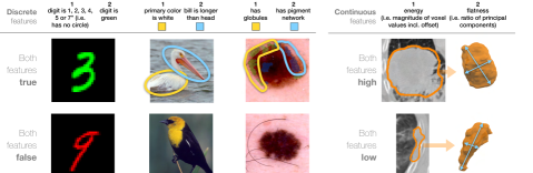
To study the CATE estimator’s ability to identify predictive imaging biomarkers in the presence of prognostic imaging biomarkers, we conduct experiments on data with varying predictive and prognostic biomarker strengths. Since ground truth counterfactual treatment outcomes are unavailable in real data, we generate synthetic data to experimentally verify our model and simulate the ground truth treatment outcomes (Fig. 2d). We introduce a novel approach for simulating outcomes based on imaging biomarkers where we assign image features to biomarker values instead of directly simulating outcomes from tabular biomarkers. This entails selecting features from available image information such as attributes, class labels, or radiomics features, as shown in Fig. 3. In our examples, the biomarkers are either purely prognostic or predictive and can take on binary or continuous values depending on the dataset. The outcomes are then generated according to a simple linear function, where we assume that no offset and constant treatment effect are present for simplicity
| (4) |
similar to a case considered by Krzykalla et al. [43]. An important aspect of using simulated outcomes is that we can control the size of prognostic or predictive effects by choosing different values for parameters . The biomarker parameter strength ratio can be interpreted as a measure of the signal-to-noise ratio of the predictive effect in the input data. Since we consider an RCT setting, the treatment variable is chosen randomly with probabilities .
Experimental Setup
Datasets and imaging biomarker features
We evaluate our CATE estimator on four diverse publicly available datasets also shown in Fig. 3: colored digits (MNIST [44, 45]) with semi-synthetic image features, images of different bird species (CUB-200-2011 [46]) as an example of a natural image dataset, as well as skin lesion images (ISIC 2018 [47, 48]) and 3D lung computed tomography (CT) scans of non-small cell lung cancer (NSCLC) tumors (NSCLC-Radiomics [49]) as examples of real-world medical datasets.
Colored MNIST (CMNIST).
We adapt the MNIST dataset consisting of 60,000 training images of handwritten digits of size and introduce color as an image feature. The color of the foreground pixels of the digits is determined based on the random variable sampled from a binomial distribution (with equal probability ). We define the following set of binary features as imaging biomarkers : (a) the color of the digit being green or not as prognostic feature and digits not having a loop or not (i.e. vs. ) as the predictive feature or (b) vice versa.
Bird species dataset (CUB-200-2011).
The dataset includes RGB images of 200 different bird species, 5,794 for testing and 5,994 for training, which we further split into training and validation data with a split. From the binary attributes of the birds, we select two visually distinct biomarkers with high annotator certainty: (a) “has primary color: white” as the prognostic feature and “has bill length: longer than head” as the predictive feature or (b) vice versa.
Skin lesion dataset (ISIC 2018).
The ISIC 2018 dataset contains RGB images of skin lesions with a designated training dataset of 2,594 images, which is split into a training and validation set of sizes 2,075 and 519 respectively. Final evaluations are performed on the designated validation set with 100 images. We identify dermoscopic attributes, i.e. visual skin lesion patterns, using ground truth segmentation masks and assign their presence to biomarkers. In feature set (a) the presence of globules is prognostic and the presence of a pigment network is predictive, or in (b) vice versa. Both features have been evaluated as imaging biomarkers for diagnosing melanoma [50, 51] making them realistic examples of biomarkers. Unlike the features of the previous datasets, these features are based on the presence of patterns rather than localized features or color values.
Lung cancer CT dataset (NSCLC-Radiomics).
This dataset comprises 415 3D CT volumes of pre-treatment scans of NSCLC patients and ground truth segmentation masks of the lung tumor volumes. We crop the volumes to the largest connected tumor volume bounding box, use 332 samples for 5-fold cross-validation, and reserve 83 for testing. We define two continuous, uncorrelated radiomics features described by Zwanenburg et al. [52] as biomarkers, which have both been evaluated for their prognostic or predictive value before [53, 8]: (a) the shaped-based feature “flatness” describing the ratio between the smallest and largest principal tumor components as a prognostic feature and the first-order statistics feature “energy” characterizing the sum of squares of tumor intensity values as a predictive feature or (b) vice versa. The flatness feature is inverse to the actual flatness of the tumor. Values close to 0 indicate flat shapes, whereas values close to 1 indicate sphere-like shapes. Energy depends strongly on both volume and minimum pixel intensity value as the minimum intensity value is added as an offset. The radiomics features were extracted from the tumor volume with PyRadiomics [54] using the ground truth segmentation maps.
We split all datasets randomly into two equally sized subsets: a control group () and a treatment group dataset () and generate group-specific outcomes according to equation (4). For each CMNIST feature set, we choose the biomarker strength parameters , resulting in training 121 models. For the remaining datasets, we choose the biomarker strength parameters , resulting in 36 different trained models.
Implementation details
In our experiments, the two-headed CATE estimation models are all based on the ResNet architecture tailored to each dataset. For the CMNIST experiments, we utilize a MiniResNet (ResNet-14) with 14 layers, 0.20 M parameters, and only three building blocks. In the CUB-200-2011 and ISIC 2018 experiments, we employ a two-headed ResNet-18 with 11.18 M parameters, and for the NSCLC-Radiomics a two-headed 3D ResNet with 33.30 M parameters. In all architectures, the treatment-specific heads consist of either the last fully connected layer or the last four fully connected layers for NSCLC-Radiomics experiments. Its preceding convolutional layers learn shared presentations of control and treatment group data. We use the classic (one-headed) version of the corresponding ResNet architectures as our baseline models. The models for CMNIST are trained for 400 epochs with a mini-batch size of 1000. For CUB-200-2011 and ISIC 2018, the models are trained with a mini-batch size of 64 and for 1000 or 2000 epochs respectively. The NSCLC-Radiomics models are trained with a batch size of 8 and 2000 epochs. For data all datasets, we use the mean squared error loss function, a learning rate of , and the SGD optimizer.
For preprocessing, we apply zero padding of size 2 to each edge of the CMNIST images. The CUB-200-2011 images are resized so their smaller edge has the size . We augment the data by performing random crop and horizontal flips so that all final images have the size . We resize the ISIC 2018 images to for the shorter edge, crop them to between and of their previous size, and resize them again to size . We augment them with random horizontal and vertical flips, randomly applied rotations by 90 degrees and color jitters. During the inference of both CUB-200-2011 and ISIC 2018 images, center crops are used. All 2D images are normalized by subtracting the mean and dividing by the standard deviation of the respective channel from the training dataset. For the NSCLC-Radiomics dataset, we added padding of value -1024 (HU) so that all 3D patches are of the size . All radiomics features are normalized by subtracting the mean and dividing by the standard deviation of each feature. 3D image augmentations are implemented using the MONAI deep-learning framework[55] and include random flipping, random rotation by 90 degrees along the xy axis, and random zooming with probability 0.5 by a factor in the range . Resampling to the median spacing of the dataset [0.9765625, 0.9765625, 3.0] mm is based on Isensee et. al [56] and uses a third-order spline in-plane and nearest-neighbor interpolation out-of-plane.
For the statistical evaluations, linear regression using ordinary least squares and -tests for the fit coefficients as described in section “Proposed Evaluation” are performed using the statsmodels python module [57]. To create attribution maps, we use expected gradients (EG) [37] for CMNIST and guided gradient-weighted class activation mapping (GGCAM) [38, 39] for the other three datasets. Using EG allows us to determine the attribution of each color channel in contrast to CAM methods, which is vital for discovering the color-related CMNIST biomarkers. Both methods are implemented using Captum [58] and enhanced by SmoothGrad [59] to make the attribution maps less noisy and more robust.
Results
Predictive strength of the estimated CATE
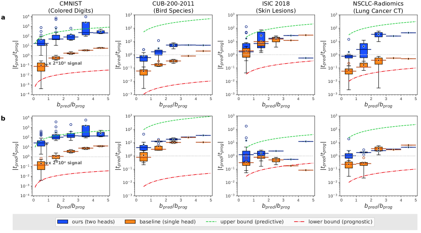
We present the results of our quantitative experimental validation protocol in Fig. 4, where the estimated relative predictive strength provides insights into its dependency on the relative size of the true predictive effect used in the outcome simulation as described in Fig. 2c-d. Absolute ratios are plotted for a better comparison.
Across the four datasets, our CATE estimation model shows increasing relative predictive strength with increasing relative predictive biomarker signal strength . It surpasses the baseline models in most cases, especially for low . While the CMNIST results are similar for both models trained on biomarker sets (a) and (b), the difference is more pronounced for the other three datasets, indicating a greater influence of the choice of biomarkers on the predictions.
Our model demonstrates the best performance on the CMNIST dataset out of all four datasets. This is evident from the significantly larger gap between our model and baseline, for example, reaching a factor in the order of for in the range of 0 and 1, and from the results being much closer to the upper bound than the lower bound.
Although the relative predictive strength for the CUB-200-2011 dataset is lower than that for the CMNIST, it is still significantly above the lower bound, and closer to the upper bound. For in the range of 0 and 1, the median differs from the baseline by a factor of 10 and 5 for biomarker sets (a) and (b) respectively. Here, the dependency on the choice of biomarkers is evident from the smaller gap between the boxplots of our model and baseline in set (b) compared to (a).
The ISIC 2018 results show smaller absolute values , yet the relative predictive strength mean values remain above 1, except for two outliers at high as they are based on only a single sample. In set (a), the absolute values are higher and much closer to the upper bound than the lower bound but exhibit greater boxplot overlaps with the baseline for low compared to set (b), where “has globules” is predictive. In set (b), the medians differ by a factor of 4 for relative in the range of 0 and 1. The large baseline values suggest that the baseline model also strongly relies on the predictive biomarker “has pigment networks”.
On the NSCLC-Radiomics dataset, our model demonstrates larger gaps in terms of between our model and baseline particularly for smaller . However, the gaps decrease slightly with increasing for biomarker set (b). The performance differs between biomarker sets (a) and (b), with medians of our models and baseline differing by a factor of 13 and 4 respectively for in the range of 0 and 1.
Interpretation of predictive imaging biomarkers using feature attribution
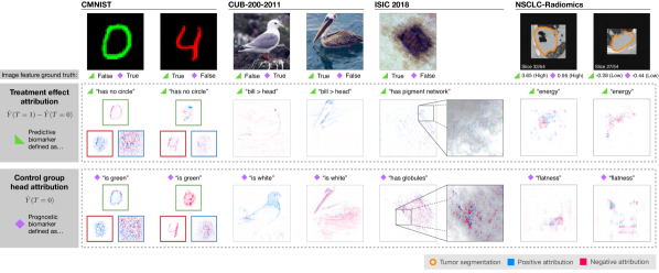
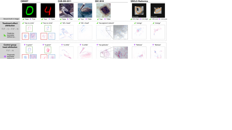
In Fig. 5, we illustrate our XAI-based evaluation scheme to assess whether the image features identified by our CATE estimation model as predictive and prognostic biomarkers correspond to the ground truth biomarkers. By applying attribution methods [36, 37, 38, 39] to our model and an input image, we obtain an attribution map, indicating positive (blue) and negative (red) attribution from each pixel to the prediction. We show attribution maps of the predicted CATE output , which is expected to be sensitive to only the predictive biomarkers as depicted in Fig. 2b and the control group head , which is expected to be sensitive to the prognostic feature. Here, the results are based on models trained with .
For the CMNIST examples, the attribution maps of the predicted CATE output show mostly negative attribution in the green channel of the first example, which corresponds to the fact that the predictive biomarker “has no circle” is absent in the input image. Similarly, the treatment effect attribution maps of the second example (red digit four) show weaker negative attribution from the digit in the red channel with some noisy positive attribution in the background. More positive attribution can be observed in the green channel, indicating that the model correctly infers that the predictive biomarker “has no circle” is present. The control group head output correctly identifies the prognostic biomarker, i.e. “digit is green”, in the respective color channel, which is evident from the mainly positive attribution in the green color channel in the first example and negative attribution in the red color channel for the second example. For the attribution maps of both outputs, only noisy attribution is present for the blue channel, suggesting that the model does not use this channel for prediction.
In the first CUB-200-2011 example, where the predictive biomarker “bill is longer than head” is absent, the attribution map for the output is predominantly negative. It mainly covers the eye, and outlines of the throat and breast. However, the attribution is not as localized to a specific region as in the second example, where the predictive biomarker is present and the overall attribution is positive. Here, it is apparent that features of the head are primarily used for the predictions, while the main body and wings are ignored, reinforcing the importance of the bill and head region for determining the predictive biomarker. The attribution map for the output shows overall positive attribution, especially in the white head and breast region from the first image of a primarily white bird. For the second image of a darker bird, the attribution map is overall negative, particularly in the dark wing, main body, and pouch region. These patterns indicate that the model correctly identifies the presence or absence of the prognostic biomarker in the corresponding example.
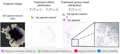
The ISIC 2018 image depicts a pigment network surrounding a darker pigmented center. Upon closer examination of the attribution map overlaid with the original image, several patterns become apparent. However, the allocation of positive or negative attribution only provides limited insight, possibly due to the intricate nature of the image features. In the attribution maps of the treatment effect , positive attributions are given to the periphery surrounding outside of the dark center where also the pigment network is located. Notably, the model relies on the lighter, less pigmented gaps between the dark grid-like or vein-like structures to detect the pigment network. This suggests that the gaps contain sufficient information for detecting the pigment network, as they only attribute positively to the pigment network output. The attribution map for the head reveals that the model primarily uses the dark center of the lesion for control group predictions. The red and blue spots in the map indicate the model’s search for the small globule dots.
In the first NSCLC-Radiomics example, the highest absolute values of the output attribution maps are observed within the tumor area. While the attention maps show negative attributions in the darker area of the tumor, positive attributions can be seen in the surrounding areas, indicating the presence of a strong predictive biomarker. This observation is consistent with the ground truth, where the energy value is comparably high, whereas mostly negative attributions are observed for the second example with a lower energy value. However, the attributions are mainly given to the areas outside the outline of the tumor, potentially due to the network’s difficulty in correctly identifying the tumor boundary. The attribution maps for the head show strong attributions mainly outside the tumor outline, which relates to the prognostic biomarker flatness. Additionally, artifacts around the border suggest that the patch shapes contribute partially to the prediction.
Further results and a more detailed qualitative XAI analysis can be found in Supplementary Fig. 1-6 and Supplementary section “Additional feature attributions results for interpreting of predictive imaging biomarkers”.
Discussion
In this paper, we introduce the task of identifying predictive imaging biomarkers and an approach to solving this task using image-based CATE estimators, which enable the discovery of new predictive imaging biomarkers without possibly biased handcrafted features or image feature extractors. This also makes detecting even abstract concepts from high-dimensional data possible, as demonstrated by our experiments. We illustrate how such a model’s performance in identifying various types of predictive imaging biomarkers can be studied in two ways: (1) the quantitative performance relative to prognostic interactions and (2) the qualitative performance by comparing attribution maps to the pre-defined ground truth imaging biomarkers.
The results show a high relative predictive strength when compared to our experimental baseline as well as our experimental upper and lower bound. These results suggest that the estimated CATE is a reliable measure for the predictive effect and the predictive biomarker itself under the assumption of a linear biomarker-outcome relation. We can also conclude from the comparison with our baseline that, in most cases, our model is able to identify the predictive biomarkers from our simulated data while not being affected by prognostic biomarkers. The results demonstrate that the model can do so for different types of biomarkers and input images, even when predictive effects are smaller than prognostic effects for , which is often observed in real-world scenarios. However, exceptions in the performance occur for the CUB-200-2011, ISIC 2018, and NSCLC-Radiomics dataset, particularly when is large and where the values are close to the baseline. The weaker performance of the model in these cases might be due to the model’s lower accuracy in predicting the outcomes when facing more abstract features. Also, the imbalance and distribution of image features found in the datasets likely contribute to the prediction accuracy. In the ISIC 2018 dataset, the area covered by the pigment network is much larger than that covered by globules, causing the baseline model to be biased towards predicting pigment networks. This also explains why is higher for biomarker set (a) with “has a pigment network” as the predictive biomarker, compared to set (b) with “has globules” as the predictive biomarker. For the NSCLC-Radiomics, the model performs better at identifying the “flatness” feature than the “energy” feature, which has a highly right-skewed distribution with some outliers at high values. In practical applications with unknown predictive effects, a quantitative evaluation would entail performing regression and -tests on the regression parameters as described in section “Proposed Evaluation” to assess the model’s ability to identify information relevant for treatment effects (i.e. predictive biomarkers).
Across all four datasets, the treatment effect attribution maps generated by our model correspond to the image features chosen as predictive biomarkers, empirically demonstrating that the image-based CATE estimator is indeed able to identify the correct predictive biomarkers automatically. This holds for both localized features based on color and shape (CMNIST, CUB-200-2011, NSCLC-Radiomics), as well as first-order statistics (NSCLC-Radiomics) or patterns (ISIC 2018). In applications, our previously described XAI analysis is essential for identifying and interpreting predictive and prognostic imaging biomarkers. Unlike tabular data, images lack discrete candidates for assigning a feature importance score. Consequently, distinguishing between predictive and prognostic imaging biomarkers using attribution maps becomes challenging when located in the same image areas. The heatmap focuses on the same pixels (as in the case of energy and flatness in the lung cancer CT example), making it difficult to discern whether an image feature that is both predictive and prognostic is present, or if two independent imaging biomarkers with distinct meanings are simply spatially overlapping. In such cases, other XAI methods such as counterfactual explanations [60] can be employed to quantify the effect of different properties of the same feature. Even though our feature attribution evaluation may be potentially ambiguous for abstract biomarkers, for example, due to noise, it can offer valuable insights into which features the model uses for its predictions and the interpretation of predictive biomarker candidates.
While we acknowledge the limitations of using only semi-synthetic data due to the current unavailability of public RCT image datasets with verified predictive imaging biomarkers, we also emphasize its advantage. Semi-synthetic data enables us to gain insights and demonstrate the performance of CATE estimation models in a reproducible way, as discussed by Curth et al. [2] and Crabbé et al. [25]. Our predictive imaging biomarker discovery and evaluation approach does not rely on handcrafted features such as radiomics. Instead, we use radiomics features as biomarkers to simulate outcomes in our experiments, serving merely as a baseline for conducting performance comparisons.
The approach described in this work provides a foundation for future imaging biomarker research aiming to discover novel predictive imaging biomarkers from diverse imaging modalities and within different problem settings. This may involve addressing non-linear biomarker-outcome relations, e.g. survival or time-to-event data, and mitigating confounding effects in observational data. The experiments and analysis methods we outline in this paper offer initial insights for developing image-based CATE estimation methods tailored to specific problems. This could include using different network architectures for vision tasks and CATE estimators that previously have been applied to only tabular data. Overall, we believe that image-based CATE estimators can serve as a valuable tool for discovering previously unknown predictive biomarkers from imaging data, thereby enhancing treatment decision-making for personalized medicine and other fields.
Data availability
All datasets analyzed in this study are publicly available. The MNIST dataset can be accessed at http://yann.lecun.com/exdb/mnist/, the CUB-200-2011 dataset at http://www.vision.caltech.edu/datasets/cub_200_2011/, the ISIC 2018 dataset at https://challenge.isic-archive.com/data/#2018, and the NSCLC-Radiomics dataset at https://www.cancerimagingarchive.net/collection/nsclc-radiomics/.
References
- [1] Lohr, K. N. Outcome measurement: concepts and questions. \JournalTitleInquiry 37–50 (1988).
- [2] Curth, A., Svensson, D., Weatherall, J. & van der Schaar, M. Really doing great at estimating CATE? a critical look at ML benchmarking practices in treatment effect estimation. In Thirty-fifth Conference on Neural Information Processing Systems Datasets and Benchmarks Track (Round 2) (2021).
- [3] Ballman, K. V. Biomarker: predictive or prognostic? \JournalTitleJournal of clinical oncology: official journal of the American Society of Clinical Oncology 33, 3968–3971 (2015).
- [4] O’Connor, J. P. B. et al. Imaging biomarker roadmap for cancer studies. \JournalTitleNature Reviews Clinical Oncology 14, 169–186, DOI: 10.1038/nrclinonc.2016.162 (2017).
- [5] Limkin, E. et al. Promises and challenges for the implementation of computational medical imaging (radiomics) in oncology. \JournalTitleAnnals of Oncology 28, 1191–1206 (2017).
- [6] Lambin, P. et al. Radiomics: the bridge between medical imaging and personalized medicine. \JournalTitleNature reviews Clinical oncology 14, 749–762 (2017).
- [7] Kumar, V. et al. Radiomics: the process and the challenges. \JournalTitleMagnetic resonance imaging 30, 1234–1248 (2012).
- [8] Bortolotto, C. et al. Radiomics features as predictive and prognostic biomarkers in nsclc. \JournalTitleExpert Review of Anticancer Therapy 21, 257–266 (2021).
- [9] Kickingereder, P. et al. Large-scale radiomic profiling of recurrent glioblastoma identifies an imaging predictor for stratifying anti-angiogenic treatment responseradiomic profiling of bev efficacy in glioblastoma. \JournalTitleClinical Cancer Research 22, 5765–5771 (2016).
- [10] Chaddad, A. et al. Radiomics in glioblastoma: current status and challenges facing clinical implementation. \JournalTitleFrontiers in oncology 9, 374 (2019).
- [11] Parmar, C., Grossmann, P., Bussink, J., Lambin, P. & Aerts, H. J. Machine learning methods for quantitative radiomic biomarkers. \JournalTitleScientific reports 5, 1–11 (2015).
- [12] Park, J. E. & Kim, H. S. Radiomics as a quantitative imaging biomarker: practical considerations and the current standpoint in neuro-oncologic studies. \JournalTitleNuclear medicine and molecular imaging 52, 99–108 (2018).
- [13] Lou, B. et al. An image-based deep learning framework for individualising radiotherapy dose: a retrospective analysis of outcome prediction. \JournalTitleThe Lancet Digital Health 1, e136–e147 (2019).
- [14] Hosny, A., Aerts, H. J. & Mak, R. H. Handcrafted versus deep learning radiomics for prediction of cancer therapy response. \JournalTitleThe Lancet Digital Health 1, e106–e107 (2019).
- [15] Sechidis, K. et al. Distinguishing prognostic and predictive biomarkers: an information theoretic approach. \JournalTitleBioinformatics 34, 3365–3376 (2018).
- [16] Boileau, P., Qi, N. T., van der Laan, M. J., Dudoit, S. & Leng, N. A flexible approach for predictive biomarker discovery. \JournalTitleBiostatistics 24, 1085–1105 (2023).
- [17] Zhu, W., Lévy-Leduc, C. & Ternès, N. Identification of prognostic and predictive biomarkers in high-dimensional data with pplasso. \JournalTitleBMC bioinformatics 24, 25 (2023).
- [18] Bahamyirou, A., Schnitzer, M. E., Kennedy, E. H., Blais, L. & Yang, Y. Doubly robust adaptive lasso for effect modifier discovery. \JournalTitleThe International Journal of Biostatistics 18, 307–327 (2022).
- [19] Shalit, U., Johansson, F. D. & Sontag, D. Estimating individual treatment effect: generalization bounds and algorithms. In International Conference on Machine Learning, 3076–3085 (PMLR, 2017).
- [20] Alaa, A. M., Weisz, M. & Van Der Schaar, M. Deep counterfactual networks with propensity-dropout. \JournalTitlearXiv preprint arXiv:1706.05966 (2017).
- [21] Hassanpour, N. & Greiner, R. Learning disentangled representations for counterfactual regression. In International Conference on Learning Representations (2019).
- [22] Shi, C., Blei, D. & Veitch, V. Adapting neural networks for the estimation of treatment effects. \JournalTitleAdvances in neural information processing systems 32 (2019).
- [23] Curth, A. & van der Schaar, M. Nonparametric estimation of heterogeneous treatment effects: From theory to learning algorithms. In International Conference on Artificial Intelligence and Statistics, 1810–1818 (PMLR, 2021).
- [24] Zhang, W., Liu, L. & Li, J. Treatment effect estimation with disentangled latent factors. In AAAI Conference on Artificial Intelligence (2020).
- [25] Crabbé, J., Curth, A., Bica, I. & van der Schaar, M. Benchmarking heterogeneous treatment effect models through the lens of interpretability. In Thirty-sixth Conference on Neural Information Processing Systems Datasets and Benchmarks Track (2022).
- [26] Holland, P. W. Statistics and causal inference. \JournalTitleJournal of the American statistical Association 81, 945–960 (1986).
- [27] Hermansson, E. & Svensson, D. On discovering treatment-effect modifiers using virtual twins and causal forest ml in the presence of prognostic biomarkers. In International Conference on Computational Science and Its Applications, 624–640 (Springer, 2021).
- [28] Durso-Finley, J., Falet, J.-P., Nichyporuk, B., Douglas, A. & Arbel, T. Personalized prediction of future lesion activity and treatment effect in multiple sclerosis from baseline mri. In International Conference on Medical Imaging with Deep Learning, 387–406 (PMLR, 2022).
- [29] Durso-Finley, J. et al. Improving Image-Based Precision Medicine with Uncertainty-Aware Causal Models. In Greenspan, H. et al. (eds.) Medical Image Computing and Computer Assisted Intervention – MICCAI 2023, 472–481 (Springer Nature Switzerland, Cham, 2023).
- [30] Ma, W. et al. Treatment outcome prediction for intracerebral hemorrhage via generative prognostic model with imaging and tabular data. In International Conference on Medical Image Computing and Computer-Assisted Intervention, 715–725 (Springer, 2023).
- [31] Jiang, X., Zhou, X. & Kosorok, M. R. Deep doubly robust outcome weighted learning. \JournalTitleMachine Learning 113, 815–842 (2024).
- [32] Jerzak, C. T., Johansson, F. & Daoud, A. Image-based treatment effect heterogeneity. \JournalTitlearXiv preprint arXiv:2206.06417 (2022).
- [33] Takeuchi, K., Nishida, R., Kashima, H. & Onishi, M. Grab the reins of crowds: Estimating the effects of crowd movement guidance using causal inference. \JournalTitlearXiv preprint arXiv:2102.03980 (2021).
- [34] Jiang, Z. et al. Estimating causal effects using a multi-task deep ensemble. \JournalTitlearXiv preprint arXiv:2301.11351 (2023).
- [35] Simonyan, K., Vedaldi, A. & Zisserman, A. Deep inside convolutional networks: Visualising image classification models and saliency maps. In Workshop at International Conference on Learning Representations (2014).
- [36] Sundararajan, M., Taly, A. & Yan, Q. Axiomatic Attribution for Deep Networks. \JournalTitlearXiv:1703.01365 [cs] (2017). ArXiv: 1703.01365.
- [37] Erion, G., Janizek, J. D., Sturmfels, P., Lundberg, S. M. & Lee, S.-I. Improving performance of deep learning models with axiomatic attribution priors and expected gradients. \JournalTitleNature machine intelligence 3, 620–631 (2021).
- [38] Selvaraju, R. R. et al. Grad-cam: Visual explanations from deep networks via gradient-based localization. In 2017 IEEE International Conference on Computer Vision (ICCV), 618–626, DOI: 10.1109/ICCV.2017.74 (2017).
- [39] Springenberg, J. T., Dosovitskiy, A., Brox, T. & Riedmiller, M. Striving for simplicity: The all convolutional net. In ICLR (workshop track) (2015).
- [40] Rubin, D. B. Causal inference using potential outcomes: Design, modeling, decisions. \JournalTitleJournal of the American Statistical Association 100, 322–331 (2005).
- [41] Curth, A. & van der Schaar, M. On inductive biases for heterogeneous treatment effect estimation. \JournalTitleAdvances in Neural Information Processing Systems 34, 15883–15894 (2021).
- [42] Polley, M.-Y. C. et al. Statistical and practical considerations for clinical evaluation of predictive biomarkers. \JournalTitleJournal of the National Cancer Institute 105, 1677–1683 (2013).
- [43] Krzykalla, J., Benner, A. & Kopp-Schneider, A. Exploratory identification of predictive biomarkers in randomized trials with normal endpoints. \JournalTitleStatistics in Medicine 39, 923–939 (2020).
- [44] Deng, L. The mnist database of handwritten digit images for machine learning research [best of the web]. \JournalTitleIEEE Signal Processing Magazine 29, 141–142, DOI: 10.1109/MSP.2012.2211477 (2012).
- [45] Arjovsky, M., Bottou, L., Gulrajani, I. & Lopez-Paz, D. Invariant risk minimization. \JournalTitleCoRR abs/1907.02893 (2019).
- [46] Wah, C., Branson, S., Welinder, P., Perona, P. & Belongie, S. The caltech-ucsd birds-200-2011 dataset. Tech. Rep. CNS-TR-2011-001, California Institute of Technology (2011).
- [47] Codella, N. et al. Skin lesion analysis toward melanoma detection 2018: A challenge hosted by the international skin imaging collaboration (isic). \JournalTitlearXiv preprint arXiv:1902.03368 (2019).
- [48] Tschandl, P., Rosendahl, C. & Kittler, H. The ham10000 dataset, a large collection of multi-source dermatoscopic images of common pigmented skin lesions. \JournalTitleScientific data 5, 1–9, DOI: 10.1038/sdata.2018.161 (2018).
- [49] Aerts, H. J. W. L. et al. Data From NSCLC-Radiomics (version 4). https://doi.org/10.7937/K9/TCIA.2015.PF0M9REI (2014). Data set.
- [50] Gareau, D. S. et al. Digital imaging biomarkers feed machine learning for melanoma screening. \JournalTitleExperimental dermatology 26, 615–618 (2017).
- [51] Gareau, D. S. et al. Deep learning-level melanoma detection by interpretable machine learning and imaging biomarker cues. \JournalTitleJournal of Biomedical Optics 25, 112906–112906 (2020).
- [52] Zwanenburg, A. et al. The image biomarker standardization initiative: standardized quantitative radiomics for high-throughput image-based phenotyping. \JournalTitleRadiology 295, 328–338 (2020).
- [53] Aerts, H. J. et al. Decoding tumour phenotype by noninvasive imaging using a quantitative radiomics approach. \JournalTitleNature communications 5, 4006 (2014).
- [54] Van Griethuysen, J. J. et al. Computational radiomics system to decode the radiographic phenotype. \JournalTitleCancer research 77, e104–e107 (2017).
- [55] Cardoso, M. J. et al. Monai: An open-source framework for deep learning in healthcare. \JournalTitlearXiv preprint arXiv:2211.02701 (2022).
- [56] Isensee, F., Jaeger, P. F., Kohl, S. A., Petersen, J. & Maier-Hein, K. H. nnu-net: a self-configuring method for deep learning-based biomedical image segmentation. \JournalTitleNature methods 18, 203–211 (2021).
- [57] Seabold, S. & Perktold, J. statsmodels: Econometric and statistical modeling with python. In 9th Python in Science Conference (2010).
- [58] Kokhlikyan, N. et al. Captum: A unified and generic model interpretability library for pytorch (2020). 2009.07896.
- [59] Smilkov, D., Thorat, N., Kim, B., Viégas, F. B. & Wattenberg, M. Smoothgrad: removing noise by adding noise. \JournalTitleCoRR abs/1706.03825 (2017). 1706.03825.
- [60] Goyal, Y. et al. Counterfactual visual explanations. In International Conference on Machine Learning, 2376–2384 (PMLR, 2019).
Acknowledgements
We acknowledge funding from the German Research Foundation (DFG) as part of the Priority Programme 2177 Radiomics: Next Generation of Biomedical Imaging (project identifier: 428223917) and Collaborative Research Center 1389 (UNITE Glioblastoma – project identifier: 404521405). PV is funded through an Else Kröner Clinician Scientist Endowed Professorship by the Else Kröner Fresenius Foundation (reference number: 2022 EKCS.17). This work was partly funded by Helmholtz Imaging (HI), a platform of the Helmholtz Incubator on Information and Data Science. We thank David Zimmerer for the feedback on the manuscript.
Author contributions statement
S.X., J.P., P.V., P.J., and K.M.H. conceived the project design. S.X. conducted the experiments and performed the quantitative analysis and evaluations, and L.K. performed the XAI analysis of the results. S.X., L.K., and P.J. prepared the figures. S.X. drafted the main manuscript text. All authors reviewed, edited, and approved the final manuscript.
Additional information
Competing interests
The authors declare no competing interests.
Supplementary Information
Explainable AI Methods
For the attribution maps in Fig. 5 of the main paper, we use Expected Gradients (EG) \citeSMerion_improving_2020 for the CMNIST dataset and guided Gradient-weighted Class Activation Mapping (GGCAM) \citeSMSelvaraju2017,Springenberg2014 for the other two datasets. Due to its up-sampling mechanism, GGCAM is only suitable to a limited extent to compute the attribution of each RGB channel individually. For the results presented in the supplementary section “Additional feature attributions results for interpreting predictive imaging biomarkers”, we additionally apply Integrated Gradients (IG) \citeSMsundararajan_axiomatic_2017 with a black (i.e. zero) baseline value and the traditional Gradient-weighted Class Activation Mapping (GCAM).
Integrated Gradients.
IG calculates a path integral from a baseline value to the actual value for each of the input features, in our case pixels or voxels.
| (5) |
However, selecting a baseline value for IG is often ambiguous, and executing multiple path integrals across different baseline values can be inefficient.
Expected Gradients.
To avoid selecting a baseline value as would be necessary for IG, Erion et al. \citeSMerion_improving_2020 presented a solution based on a probabilistic baseline computed over a sample of observations:
| (6) | ||||
| (7) | ||||
| (8) |
with as the baseline, the input feature number and as the underlying data distribution. In practice, EG is computed via a mini-batch procedure by drawing samples for and , computing the expression inside the expectation, and averaging over the mini-batch.
(Guided)-GradCAM.
GGCAM is the combination of Guided Backpropagation (GB) \citeSMSpringenberg2014 and GradCAM \citeSMSelvaraju2017. GradCAM computes the attribution via backpropagation into a selected hidden layer, usually the last convolutional layer, and up-samples it to the input size. GradCAM leverages the idea that convolutional neural networks transform spatial to semantic information by attributing to the semantic information, which is then up-sampled back into the input space. GB, on the other hand, backpropagates directly from a target output into the original image but via a guiding function, overriding non-negative gradients from Rectified Linear Unit (ReLU) activation functions. GGCAM takes the element-wise product between GB and the non-negative GradCAM attributions, leveraging both the semantic information from GradCAM and the more fine-grained spatial information in the input space from GB.

Additional feature attributions results for interpreting predictive imaging biomarkers
Further attribution maps for samples from the CMNIST, CUB-200-2011, ISIC 2018, and NSCLC-Radiomics dataset and the control head , CATE and additionally the treatment group head output are presented in Supplementary Fig. 6, 7, 8 and 10, respectively. Each figure showcases the results of four examples with varying presence or values of predictive and prognostic biomarkers.
CMNIST.
We extend our analysis of the main paper and show two additional CMNIST images and IG attribution maps in Supplementary Fig. 6. The blue color channel only shows noisy attribution for both EG and IG attribution maps, suggesting minimal impact on the model’s predictions. While attribution maps for the digit color channel show consistent patterns across EG and IG methods, they differ for the other remaining color channel. For the control group head output , a positive attribution is observed from the green color channel for both the digit 0 and 7 in the top row, whereas a negative attribution is observed in both the red and also green color channel of the digit 9 and 4 in the bottom row. This indicates that the model correctly identifies the prognostic biomarker “digit is green” from the relevant color channel. The attribution maps of the predicted CATE output exhibited notable negative attribution in the color channel of the digit color for both the digit 0 and 9 in the left column, indicating the absence of the predictive biomarker “has no circle”. An overall positive attribution was observed in the green color channel of digit 7, suggesting the presence of the predictive biomarker. However, a more negative attribution with some noisy positive attribution is seen for the red channel of the digit four, indicating some ambiguity in identifying the presence of the predictive biomarker.

CUB-200-2011.
The extended results for the CUB-200-2011 dataset are shown in Supplementary Fig. 7. The GCAM attribution maps of the control group head output indicate that the model focuses the most on the main body of the bird. The GGCAM attribution maps reveal overall negative attributions from the wing and tail (top left and top right) or from the belly region (bottom left) and an overall positive attribution from the tail and head/neck region (bottom right). While this suggests that the model incorrectly identifies the prognostic biomarker “has primary color: white” of the top left bird as black due to the black wings, it correctly identifies it in the other three cases. For the predicted CATE output , the GCAM attribution maps highlight the beak and neck areas, which corresponds to the areas where the predictive biomarker “has bill length: longer than head”, but also parts of the bottom areas of the birds. The GGCAM attribution maps show overall positive attributions in all examples except the bottom right, indicating that it is more difficult for the model to correctly distinguish the relative bill lengths, except for the top and bottom right examples.
ISIC 2018.
As mentioned in the section “Interpretation of predictive biomarkers using feature attribution” and shown in Fig. 5 of the main paper, the model likely uses the lighter gaps or “holes” between the dark vein-like grid structure to detect pigment networks. We expect the treatment group head to be sensitive to both predictive and prognostic biomarkers. In Supplementary Fig. 8 we observe in the treatment group head’s attribution map that there is positive attribution again (shown in blue) in the light interspaces but also negative attribution (in red) in the dark veins. This observation also supports the hypothesis that the model associates the dark veins with the globules but detects the pigment network correctly through the light interspaces as seen for the treatment effect attribution map, as the lighter interspaces are uniquely present in pigment networks. The Supplementary Fig. 6 shows the results for three additional examples from the ISIC 2018 dataset. The GCAM attribution maps show a lack of clear localization, except for the bottom left example, indicating that the network does not identify a clear localization of the biomarkers. When comparing the GGCAM attribution maps, even though the attribution maps show that the network identifies some structures, only the location of the predictive biomarker “has pigment network” is likely correctly identified by the network in the bottom left example when comparing to the ground truth segmentation.
NSCLC-Radiomics.

The additional attribution map results for the NSCLC-Radiomics dataset are depicted in Supplementary Fig. 10. Both the GCAM and GGCAM attribution maps for the control group output show the most attribution from areas surrounding the tumors. This is especially evident in areas where the tumor shape is not spherical or round, such as in the bottom right color of the upper left tumor example or the thinner section in the middle of the lower left tumor example. GCAM attribution maps for the CATE output show that the model tends to focus on the darker parts of the image slices. The corresponding GGCAM attribution maps reveal more negative attributions from the darker parts of the images, but strong positive attributions from the neighboring lighter parts in all four examples. This observation aligns with the fact that the minimum pixel intensity value contributes strongly to the predictive biomarker feature “energy”.
To provide deeper insights into how the model identifies 3D features, we also show the 3D attribution maps for one example in Supplementary Fig. 11. Here, the 3D attribution map for the control group output highlights an area above the tumor, likely erroneously. The CATE output shows a high attribution on the upper right side of the tumor where it appears flat. This area likely corresponds to the region where the principal components lie and which contributes to the predictive biomarker “flatness”.
CATE estimation performance and biomarker identification performance
In CATE estimation, a model’s performance is usually evaluated using the Precision of Estimating Heterogeneous Effects (PEHE) \citeSMhill2011bayesian metric, which is defined as
| (9) |
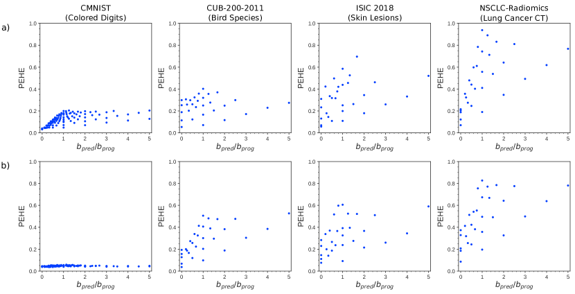
where denotes the number of test samples, the true CATE and the estimated CATE for a test sample . In Supplementary Fig. 12 and Supplementary Table 1, where the PEHE metric is reported alongside the root mean square error (RMSE) of the prediction of factual outcomes, we observe a better CMNIST compared to the other three datasets. This observation also corresponds to the performance for the relative predictive strength as observed in Fig. 4 of the main paper.
There are variations within the same dataset between models trained with biomarkers on feature sets (a) and (b), which is likely since it is slightly easier for the models to identify one type of prognostic and predictive biomarker combinations than the others. A lower RMSE but a high PEHE indicates that the model can only predict the factual outcomes well but not the counterfactual outcomes, which slight effects of overfitting could cause. Due to the different sampling space of the simulation parameters and , only a limited comparison can be made for CMNIST with the other two datasets, however. As the scale of the CATE automatically changes with parameters and \citeSMcrabbe2022benchmarking, also the PEHE changes, which therefore also depends on the absolute value of and . This phenomenon further the comparability across different ratios .
The RMSE and PEHE results for NSCLC-Radiomics are worse and have a slightly larger variance than for the CUB-200-2011 and ISIC 2018 datasets, which also explains the models’ worse performance in identifying predictive biomarkers as shown in Fig. 4 of the main paper.
However, it is generally not possible to directly conclude a model’s performance concerning identifying the correct imaging biomarkers just from the PEHE metrics alone \citeSMcrabbe2022benchmarking, curth2021really. In our case, the exact value of the CATE is not directly important for the evaluation, as our main task of interest is identifying predictive imaging biomarkers. Therefore, the PEHE is only suitable as a secondary evaluation metric alongside the evaluation methods mentioned in the section “Proposed evaluation” of the main paper.
| Dataset | Feature Set | PEHE | RMSE |
|---|---|---|---|
| CMNIST | (a) | 0.121 | 0.094 |
| (b) | 0.045 | 0.115 | |
| CUB-200-2011 | (a) | 0.227 | 0.304 |
| (b) | 0.277 | 0.261 | |
| ISIC 2018 | (a) | 0.304 | 0.352 |
| (b) | 0.308 | 0.362 | |
| NSCLC-Radiomics | (a) | 0.475 | 0.561 |
| (b) | 0.469 | 0.633 |
naturemag-doi \bibliographySMsample