[figure]style=plain
Are Large Vision Language Models up to the Challenge of Chart Comprehension and Reasoning? An Extensive Investigation into the Capabilities and Limitations of LVLMs
Abstract
Natural language is a powerful complementary modality of communication for data visualizations, such as bar and line charts. To facilitate chart-based reasoning using natural language, various downstream tasks have been introduced recently such as chart question answering, chart summarization, and fact-checking with charts. These tasks pose a unique challenge, demanding both vision-language reasoning and a nuanced understanding of chart data tables, visual encodings, and natural language prompts. Despite the recent success of Large Language Models (LLMs) across diverse NLP tasks, their abilities and limitations in the realm of data visualization remain under-explored, possibly due to their lack of multi-modal capabilities. To bridge the gap, this paper presents the first comprehensive evaluation of the recently developed large vision language models (LVLMs) for chart understanding and reasoning tasks. Our evaluation includes a comprehensive assessment of LVLMs, including GPT-4V and Gemini, across four major chart reasoning tasks. Furthermore, we perform a qualitative evaluation of LVLMs’ performance on a diverse range of charts, aiming to provide a thorough analysis of their strengths and weaknesses. Our findings reveal that LVLMs demonstrate impressive abilities in generating fluent texts covering high-level data insights while also encountering common problems like hallucinations, factual errors, and data bias. We highlight the key strengths and limitations of chart comprehension tasks, offering insights for future research.
1 Introduction
Natural language and visualizations are two powerful complementary modalities to communicate data insights. While visualizations can be very effective in finding patterns, trends, and outliers in data, natural language can help explain the key insights in visualizations and answer questions about data Hoque et al. (2022). People commonly integrate text with graphical charts to enhance the communication of the key data message as this combination helps direct attention to specific elements of the chart and offers necessary explanations that might otherwise go unnoticed Stokes et al. (2022). Furthermore, combining natural language interfaces for charts has numerous other important benefits such as enhancing chart accessibility Alam et al. (2023) and supporting visualization education Bach et al. (2023).
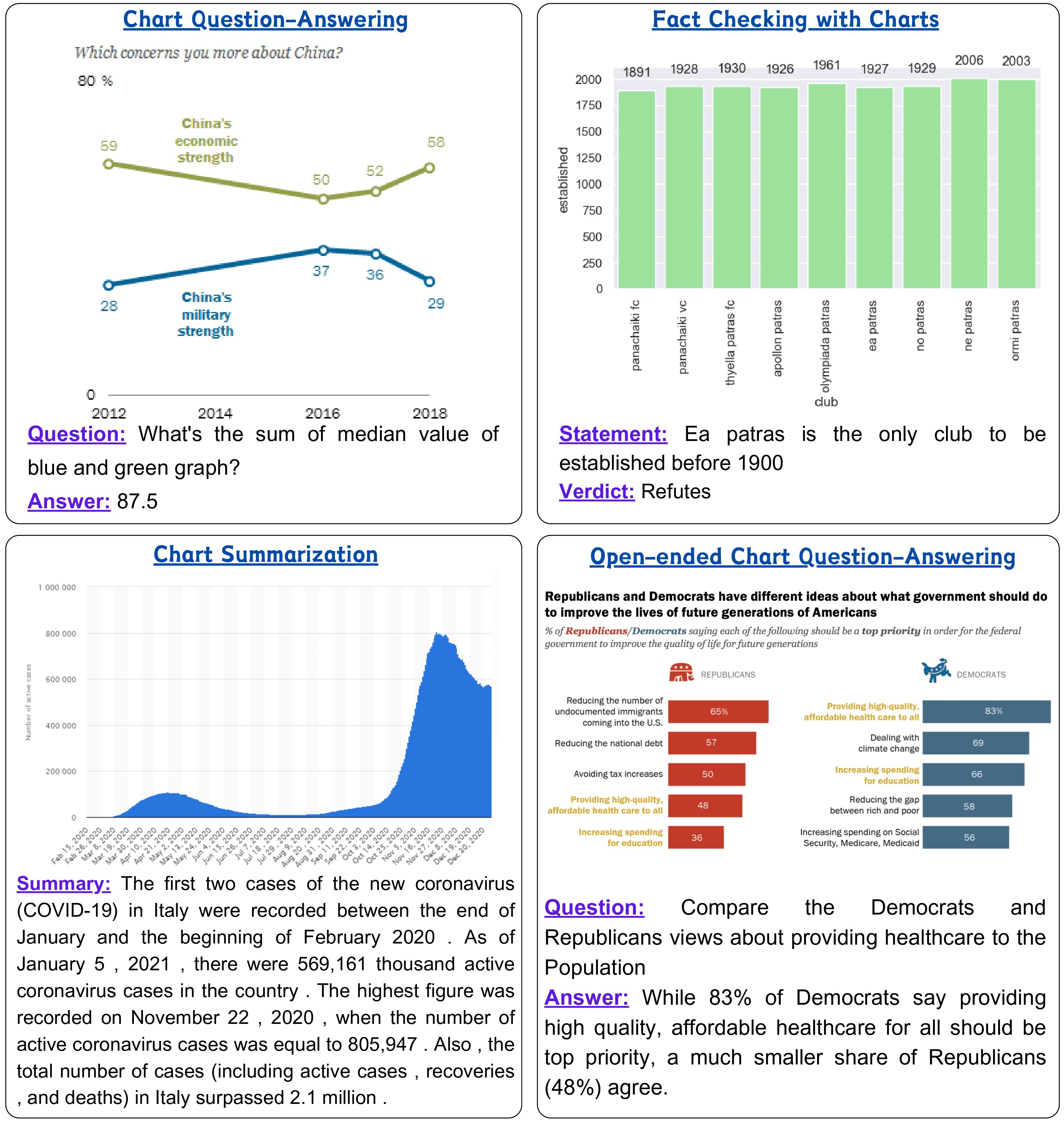
Given that chart comprehension and reasoning can be mentally demanding, researchers have introduced various tasks to aid users in chart analysis (see Figure 1). These include chart question answering Masry et al. (2022); Kantharaj et al. (2022a); Lee et al. (2022), natural language generation for charts Obeid and Hoque (2020); Shankar et al. (2022), and fact-checking with charts Akhtar et al. (2023a, b). To address these tasks, a prevalent approach involves pre-training of models Su et al. (2020); Li et al. (2020); Kim et al. (2021); Cho et al. (2021); Liu et al. (2022); Masry et al. (2023) on language and vision tasks Du et al. (2022). However, in recent years, there has been dramatic progress in the development and widespread adoption of LLMs Anil et al. ; Chowdhery et al. (2023); Hoffmann et al. (2022); OpenAI et al. (2023); Touvron et al. (2023a, b). While in the beginning, the LLMs were only capable of processing textual data, the rapid progress in this field has paved the way for the development of Multi-modal Large Vision Language Models (LVLMs) including GPT-4V OpenAI et al. (2023), Gemini Team et al. (2023), LLaVA Liu et al. (2023), and MiniGPT-4 Zhu et al. (2023). Given the rapid rise of these LVLMs, there is a pressing question: Are LVLMs up to the challenge of chart comprehension and reasoning?
In this paper, we aim to answer this question by investigating the capabilities and limitations of LVLMs in the domain of chart reasoning and comprehension. Specifically, we examine whether the latest state-of-the-art LVLMs, such as GPT-4V and Gemini-pro-vision (we will refer to it as Gemini from now on), can effectively interpret charts as well as identify key insights from the charts solely based on the chart images. This setup is crucial in real-world scenarios where the underlying data tables of charts are often unavailable. To this end, we performed an extensive qualitative and quantitative analysis of the performance of the GPT-4V and Gemini on four different benchmark datasets: ChartQA Masry et al. (2022), OpenCQA Kantharaj et al. (2022b), Chart Summarization Kantharaj et al. (2022c), Fact-checking Akhtar et al. (2023a), in zero-shot setting. In addition, we assessed their ability to generate semantically rich content Lundgard and Satyanarayan (2021).
In summary, we present the first extensive evaluation of state-of-the-art LVLMs in different downstream tasks involving chart understanding to address the following research questions:
- RQ1:
-
RQ2:
How do GPT-4V and Gemini compare in informativeness, fluency, and factual correctness of the generated responses? (§4.3)
-
RQ3:
Can they identify the factual correctness of the statements about charts? (§4.5)
-
RQ4:
What are some common error types in their generated responses? (§4.3)
-
RQ5:
How different types of semantic contents (e.g., simple stats. vs complex trends) are covered by the generated texts (§4.6)?
Further, we will make all our prompts as well as LVLMs’ responses open source for future research.
2 Related Work
2.1 Chart-related Downstream Tasks
Several downstream tasks associated with charts have been proposed recently. For instance, in the chart question answering task, which refers to answering queries regarding charts, several benchmarks such as DVQA Kafle et al. (2018), FigureQA Kahou et al. (2018), PlotQA Methani et al. (2020), ChartQA Masry et al. (2022), and Chart-Bench Xu et al. (2024) have been proposed. These benchmarks mostly concentrate on factoid questions requiring visual and arithmetic reasoning to answer the questions. Other tasks, such as the Open-ended Question Answering (OpenCQA) require explanatory responses by interpreting chart data Kantharaj et al. (2022a). Chart summarization task Shankar et al. (2022) involves creating short natural language descriptions from charts describing various trends, patterns, or outliers that can be inferred from the charts, as explored in Shankar et al. (2022); Obeid and Hoque (2020); Tang et al. (2023); Rahman et al. (2023). Moreover, there have been some recent studies Akhtar et al. (2023a, b) where the main focus is verifying facts about charts. Our evaluation is centered on these four tasks, chosen for their involvement of both linguistic and visualizations and open-sourced datasets. While there are other areas like infographic comprehension Mathew et al. (2022) and science diagram question answering Kembhavi et al. (2016), our research is devoted to chart-related tasks.
2.2 Evaluation of Large Language Models
Traditionally, LLMs are evaluated in standard benchmarks focused on specific areas such as reasoning, demonstrated by BigBench Srivastava et al. (2023), common sense QA as seen in MMLU Hendrycks et al. (2021), or code generation, like in HumanEval Chen et al. (2021). In response to the rapid evolution of LLMs in these open-ended tasks, some of the earliest works Laskar et al. (2023); Qin et al. (2023); Bang et al. (2023) evaluate the state-of-the-art LLM, i.e., ChatGPT OpenAI (2022) in benchmark NLP tasks. OpenAI’s introduction of GPT-4 marked a significant advancement as the first general-purpose LVLM, outperforming other LVLMs proposed in Liu et al. (2023); Dai et al. (2023); Zhu et al. (2023), particularly in scenarios lacking extensive annotated data. Google’s Gemini has recently emerged as a strong competitor, showcasing impressive multi-modal performance Team et al. (2023) on various benchmarks.
Recently, some studies Qi et al. (2023); Fu et al. (2023) have compared Gemini and GPT-4V models on various image recognition and understanding tasks. However, the evaluation of LVLMs in chart-related tasks is rare. Previous works focused on chart question answering and summarization using early LLMs (GPT 3.5) Do et al. (2023), and examined factual inaccuracies in GPT-4V generated chart captions Huang et al. (2023), but none considered chart images directly as input. Thus, a comprehensive evaluation comparing state-of-the-art LVLMs on reasoning tasks using chart images as input is lacking. This study aims to bridge this gap by exploring if LVLMs’ image-understanding capabilities can extend to chart reasoning and comprehension tasks, that require generating outputs directly from the chart images.
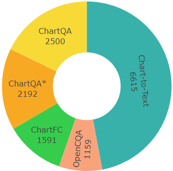
| ChartQA | OpenCQA | Chart-to-Text | ChartFC | ||||||||||
| Human | Augmented | Total | ChartQA∗ | ||||||||||
| Charts | Qs. | Charts | Qs. | Charts | Qs. | Charts | Qs. | Charts | Qs. | Pew | Stat. | Supp. | Ref. |
| 625 | 1250 | 987 | 1250 | 1612 | 2500 | 1340 | 2192 | 1159 | 1159 | 1393 | 5222 | 885 | 706 |
3 Methodology
3.1 Tasks
In this work, we mainly focus on four major chart-related downstream tasks: (1) Factoid Chart Question Answering: we use ChartQA Masry et al. (2022), a benchmark consisting of factoid question-answer pairs for charts with a particular focus on visual and logical reasoning questions; (2) Chart Summarization: we choose Chart-to-Text Shankar et al. (2022), a large-scale benchmark for chart summarization; (3) Open-ended Chart Question Answering: we consider OpenCQA Kantharaj et al. (2022a), another QA benchmark in which answers are explanatory texts; (4) Fact-checking with Charts: we utilize the ChartFC dataset which contains (statement, verdict) as pairs Akhtar et al. (2023a). We also create a new dataset (called ChartQA∗) by modifying the original charts in ChartQA, in which charts do not explicitly show data values as labels. We introduce this setup to see whether LVLMs’ performance relies on the explicit labels of the data values rather than their ability to recover data values from the visual elements in the chart. More details about ChartQA∗ dataset construction process are provided in §A.1.2.
3.2 Prompt Construction
In our approach for both qualitative and quantitative evaluation, we first develop a task instruction, called T, tailored to a particular test sample, denoted as X. We then integrate this task instruction with the existing text of the test sample to create a unified prompt, designated as P. This prompt P and the Chart image C are given as input to the respective LVLMs to generate the corresponding response, termed R. A detailed description of our prompts is provided in Appendix A.3, and examples of prompts are included in Table 8. In order to come up with the best-performing prompt, we tried many techniques and used the one that gives a consistent performance.
3.3 Evaluation
In the following, we demonstrate our evaluation methodology in various chart-related tasks.
Factoid Chart Question-Answering: We perform a comprehensive quantitative evaluation of the LVLMs on ChartQA in two different experimental setups, i.e., zero-shot Chain-of-Thought (CoT) Wei et al. (2023), and Program-aided Language Models (PAL) Gao et al. (2023) inspired by their recent success in various domains.
Chart Summarization & Open-ended Chart Question-Answering: To automatically evaluate and assess the performance of LVLMs in chart summarization and Open-ended Chart Question-Answering tasks, we employ both quantitative and qualitative evaluation methods. For the automatic evaluation, like prior work Kantharaj et al. (2022c), we leverage a suite of automatic evaluation metrics, including BLEU Papineni et al. (2002), CIDEr Vedantam et al. (2015), BLEURT Sellam et al. (2020), BERTScore Zhang et al. (2017), and Perplexity Hugginface (2023). Further, we also employ an automatic hallucination detection metric FAVA Mishra et al. (2024) in the Chart Summarization task. In terms of qualitative evaluation, we perform an extensive human evaluation on 120 random samples, with 30 from the Pew dataset and 90 from Statista for Chart Summarization. Each sample includes a chart, underlying data table, gold summary, and generated summaries by Gemini and GPT4V. We compare the LVLM-generated summaries on three key criteria: Factual Correctness, Coherence, and Fluency. Similarly, in the Open-ended Chart Question-Answering task, we conduct a human evaluation study that assesses the same three criteria: Factual Correctness, Coherence, and Fluency.
Fact Checking with Charts: For fact-checking, similar to prior work, we only conduct a quantitative evaluation in terms of the F1 metric.
Coverage of semantic levels: To assess the capability of the LVLMs in generating texts about charts with rich semantics, we follow the four-level framework from Lundgard and Satyanarayan (2021): Level 1 covers low-level information about the chart such as chart type, axes, etc; Level 2 presents statistical and relational aspects such as descriptive statistics and correlations; Level 3 is about perceptual and cognitive phenomena describing complex trends, and patterns, and Level 4 provides domain-specific insights such as social and political contexts. We created a set of question-answer pairs based on the charts from the ChartQA dataset to analyze these semantic levels.
4 Results and Discussion
4.1 General Observations
We present some general observations based on our comprehensive evaluation of the LVLMs:
• Gemini is a better Chain-of-Thought reasoner than GPT-4V in terms of step-by-step reasoning, while GPT-4V is
better at generating code than Gemini to answer simple or complex questions about charts (Table 2).
• Overall, GPT-4V produces more coherent and factually correct statements while Gemini is found superior on fluency (Table 3).
• Both models frequently fail to discern the patterns when asked about complex trends and patterns in multi-series line charts (Figure 3).
• Both models struggle to recover accurate color encoding information about charts (Table 22).
• When the data values are not annotated in the charts, the performance of both of the models in the Factoid-based Chart Question-Answering task drops drastically (Table 6).
| ChartQA (zero-shot CoT) | ChartQA (zero-shot PAL) | OpenCQA | Chart-to-Text | ChartFC | ||||||
| () | () | () | () | () | ||||||
| Model | aug. | human | avg. | aug. | human | avg. | Pew | Statista | ||
| Gemini Team et al. (2023) | 74.96 | 70.72 | 72.84 | 46.08 | 46.08 | 46.08 | 6.84 | 28.5 | 25.8 | 65.8 |
| GPT-4V OpenAI et al. (2023) | 72.64 | 66.32 | 69.48 | 75.44 | 65.68 | 70.56 | 3.31 | 35.9 | 18.2 | 69.6 |
4.2 Performance in ChartQA task
We examine the RQ1 in this section by evaluating the performance of the LVLMs in ChartQA in two different prompting setups, (i) zero-shot Chain-of-Thought (CoT) Wei et al. (2023) prompting and (ii) prompting strategy introduced in Program-aided Language models (PAL) Gao et al. (2023). Since both the models have already been evaluated on the ChartQA benchmark in few-shot CoT Team et al. (2023); OpenAI et al. (2023), we wanted to understand how good the models are in zero-shot setup. Also, we choose the PAL setup to examine whether separating the computation of complex queries and deferring it to a Python interpreter improves the performance of factoid question answering with charts. In ChartQA, the test set is divided into two sets: (i) human-generated, and (ii) augmented (model-generated). For further details on the datasets, refer to the Appendix A.1. Below, we present our key findings (see experimental results in Table 2).
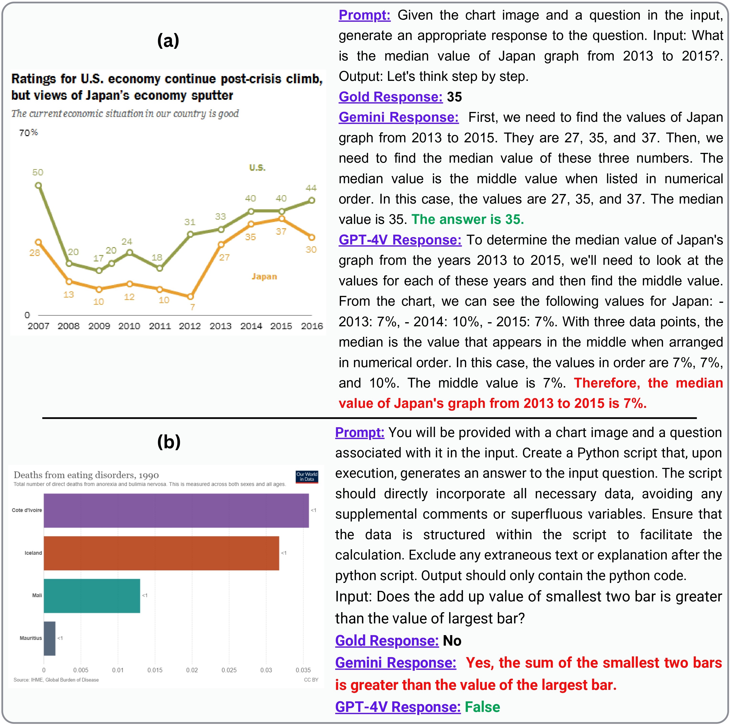
Gemini excels as a Chain-of-Thought reasoner. In the case of zero-shot CoT, the Gemini outperformed GPT-4V by a margin of 4% (Table 2). Figure 2(a) depicts an example case where a line chart about the economic situation of two countries is given and the models are prompted to answer the following question: What is the median value of Japan graph from 2013 to 2015?. With CoT reasoning, Gemini reached the correct conclusion, whereas GPT-4V answered incorrectly.
GPT-4V shines in program-aided reasoning. The LVLMs were tasked with creating Python code in PAL-setup, to answer questions based on specific charts. GPT-4V performed significantly better compared to Gemini by consistently producing more effective and functional code, achieving an accuracy of 71%, outperforming Gemini’s 46%. Gemini’s lower accuracy is primarily because of its inability to generate executable code in an average of 35% of cases, across both human-generated and augmented test sets. Figure 2(b) depicts an example where a bar chart illustrates the deaths from eating disorders in 1990 in four different countries and the models were prompted to answer the following question: Does the add up value of smallest two bars is greater than the value of the largest bar?. Using the PAL method, the models generated Python scripts, with GPT-4V reaching the correct conclusion, while Gemini answered incorrectly.
| Model | Factual Correctness (%) | Coherence (%) | Fluency (%) | |||
| Statista | Pew | Statista | Pew | Statista | Pew | |
| Gemini Win | 17 | 40 | 28 | 35 | 54 | 55 |
| GPT4v Win | 59 | 45 | 72 | 65 | 46 | 45 |
| Tie | 24 | 15 | 0 | 0 | 0 | 0 |
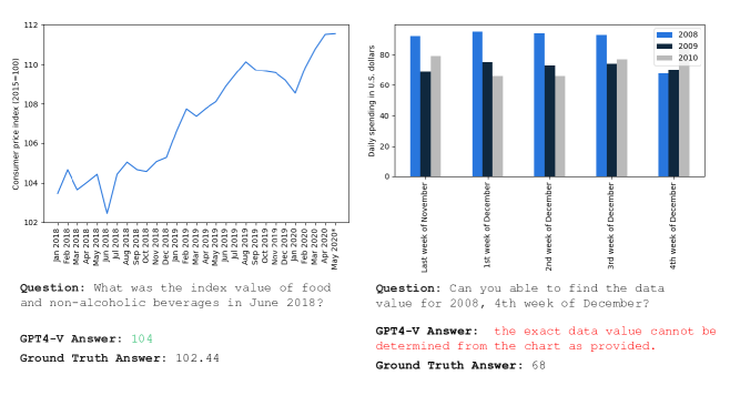
Both Gemini and GPT-4V heavily rely on the data labels. As demonstrated in Table 6, the absence of text labels that show data values diminishes the performance of both models, with GPT-4V being more affected. Moreover, GPT-4V frequently declines to respond when data labels are absent, as depicted in the right example in Figure 8. Our manual analysis suggests that these models exhibit better performance when the values of chart objects (e.g., bars, lines) align closely with the y-axis labels, leveraging these labels as a reference point, as illustrated in the left example in Figure 8. Conversely, a disparity between the visual element values and y-axis labels leads to poorer performance. These findings underscore a critical limitation in the capabilities of both Gemini and GPT-4V in interpolating the data values of the chart visual elements (e.g., bars, lines, pie) based on their visual attributes (e.g., heights, areas).
| Entity (↓) | Relation (↓) | Contradictory (↓) | Unverifiable (↓) | Invented (↓) | Subjective (↓) | Total (↓) | ||||||||
| Pew | Statista | Pew | Statista | Pew | Statista | Pew | Statista | Pew | Statista | Pew | Statista | Pew | Statista | |
| Gemini | 3.58 | 1.89 | 0.3 | 0.38 | 0.24 | 0.34 | 0.02 | 0.07 | 0.01 | 0.05 | 0.02 | 0.03 | 4.18 | 2.74 |
| GPT4V | 3.54 | 2.51 | 0.35 | 0.38 | 0.14 | 0.14 | 0.03 | 0.04 | 0.12 | 0.14 | 0.03 | 0.02 | 4.23 | 3.26 |
4.3 Performance in Chart Summarization
To answer RQ2 and RQ4, we assess the text generation capabilities of Gemini and GPT-4V using both automatic metrics (see Table 7) and qualitative metrics (see Table 3).
Gemini excels in emulating gold summaries.
According to the BLEU measure, Gemini surpassed GPT-4V in producing chart summaries, closely resembling the gold standard.
However, in terms of BERTScore, GPT-4V performs comparably to Gemini, suggesting that when measuring token similarity rather than exact match, both GPT-4V and Gemini perform similarly in generating summaries akin to the gold standard.
Gemini generates more fluent summaries. From qualitative analysis, we observe that in terms of fluency, Gemini wins 54% and 55% of the time in Statista and Pew datasets, respectively (Table 3). This trend is also reflected in the Perplexity metric (Table 7), where Gemini outperforms GPT-4V.
GPT-4V performs better in Factual Correctness and Coherence. In terms of factual correctness, it is observed that summaries generated by GPT4V outperform those generated by Gemini 59% and 45% of the time for Statista and Pew respectively. With respect to the organization and logical flow of generated summaries, it is noted that among GPT-4V and Gemini, GPT-4V wins 72% and 65% of the time in Statista and Pew datasets respectively. In some cases, both generated factually incorrect summaries as shown in Table 17, 18.
GPT-4V includes more (incorrect) visual references. Research suggests that referencing visual features in a chart can aid readers in coordinating between the chart and the text Kim et al. (2020). Unlike Gemini, GPT-4V frequently mentions chart features (e.g., “horizontal bars represent…”). Unfortunately, summaries generated by GPT-4V often contain incorrect references to visual features such as colors, as illustrated in Table 19.
GPT-4V captures trends better. Identifying and explaining important trends is critical in chart analysis Lundgard and Satyanarayan (2021). Table 20 demonstrates an example where both models correctly captured simple trends. However, our investigation indicates that Gemini is more prone to missing trends, while GPT-4V tends to capture trends more effectively (see Table 21).
Gemini generates summaries with fewer hallucinations.
Detecting hallucinations in summaries generated by LVLMs is a challenging and critical task. We employ FAVA Mishra et al. (2024) to identify the nature of hallucinations in the generated summary presented in Table 4. We observe that Gemini produced slightly fewer hallucinations in chart summarization. Examples of different hallucination errors are shown Figure 10.
4.4 Performance in OpenCQA task
Similar to the Chart-to-Text task, OpenCQA favors Gemini on all automatic metrics, except perplexity (Table 5). In a human evaluation with 50 random samples, responses generated by both GPT-4V and Gemini were perceived as fluent and coherent. However, both models produced some factual errors. Comparing factual correctness between the models, we find that GPT-4V generated factually incorrect information in 17 cases, while Gemini did so in 9 cases out of the 50 samples.
4.5 Performance in Fact-checking task
To understand whether LVLMs are proficient in identifying factually correct statements regarding charts, we experimented with the test set from the ChartFC dataset Akhtar et al. (2023a), and inquired into RQ3. We evaluated the performances of GPT-4V and Gemini models using the F1-Score metric (see Table 2), comparing them to the current best model that employs a combination of ResNet He et al. (2016) model for encoding visual information and BERT Devlin et al. (2019) for encoding linguistic information. The outcomes were impressive, with Gemini achieving a 3.1% increase in F1-score (65.8%), and GPT-4V showing a 6.9% improvement (69.6%), both significantly exceeding the existing benchmark of 62.7%. Nonetheless, the results suggest that there is considerable scope for further development in this task.
4.6 Analysis of Semantic Levels
Analyzing different levels of semantic content is critical in evaluating models for chart-related tasks as readers’ takeaways from charts are heavily influenced by such levels (e.g., simple stats vs. explaining complex trends) Stokes et al. (2022). Therefore, we analyze these semantic levels using the four-level framework as explained in §3.3 to answer RQ5. For the experiment, we prompted the LVLMs with questions related to those four levels, i.e., asking questions about fine-grained semantic contents like x-axis/y-axis labels, chart types, color-encoding information (related to Level-1), maxima/minima (related to Level-2), trend and patterns (related to Level-3). For the more challenging Level-4 which requires additional context and domain-specific information Kantharaj et al. (2022c), we analyzed model responses for 150 instances. For other levels, we evaluated 50 random samples. To elicit domain-specific information, we prompted the models to summarize charts in one paragraph (which is related to Level-4).
GPT-4V is better identifying the chart elements and their visual attributes.
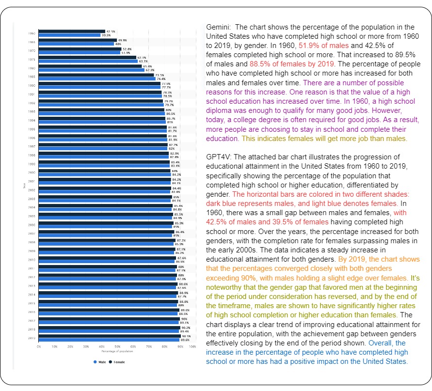
When asked about simple information related to chart construction (e.g., chart type, axis information, and visual attributes such as color, length, and position) related to semantic Level 1, GPT-4V correctly answered 64% of the time, whereas Gemini had a success rate of 56%. GPT-4V’s responses were more comprehensive, offering precise chart classification (e.g., distinguishing between horizontal and vertical bar charts) and detailed descriptions of axis labels. In contrast, Gemini’s answers are notably more concise (see Table 23).
LVLMs struggle with color encoding identification. When prompted about color encoding information in a chart (Level-1), such as “What do each of the colors represent in the chart?” the models often fail to extract accurate color information. This difficulty is more pronounced when portions of the chart contain multiple colors or shades of one color, as depicted in Table 22. Accurate color encoding extraction is crucial for various chart-related tasks, making this a significant bottleneck.
GPT-4V is more proficient in identifying simple statistics from the chart. Our experiments show that GPT-4V effectively identifies simple statistics belonging to Level 2 like minima, maxima, and outliers, and compares them accurately compared to Gemini. GPT-4V provided correct answers 90% of the time for such questions, while Gemini achieved a 68% accuracy rate. Gemini encountered difficulties, particularly in accurately identifying outliers, often mislabeling extreme values.
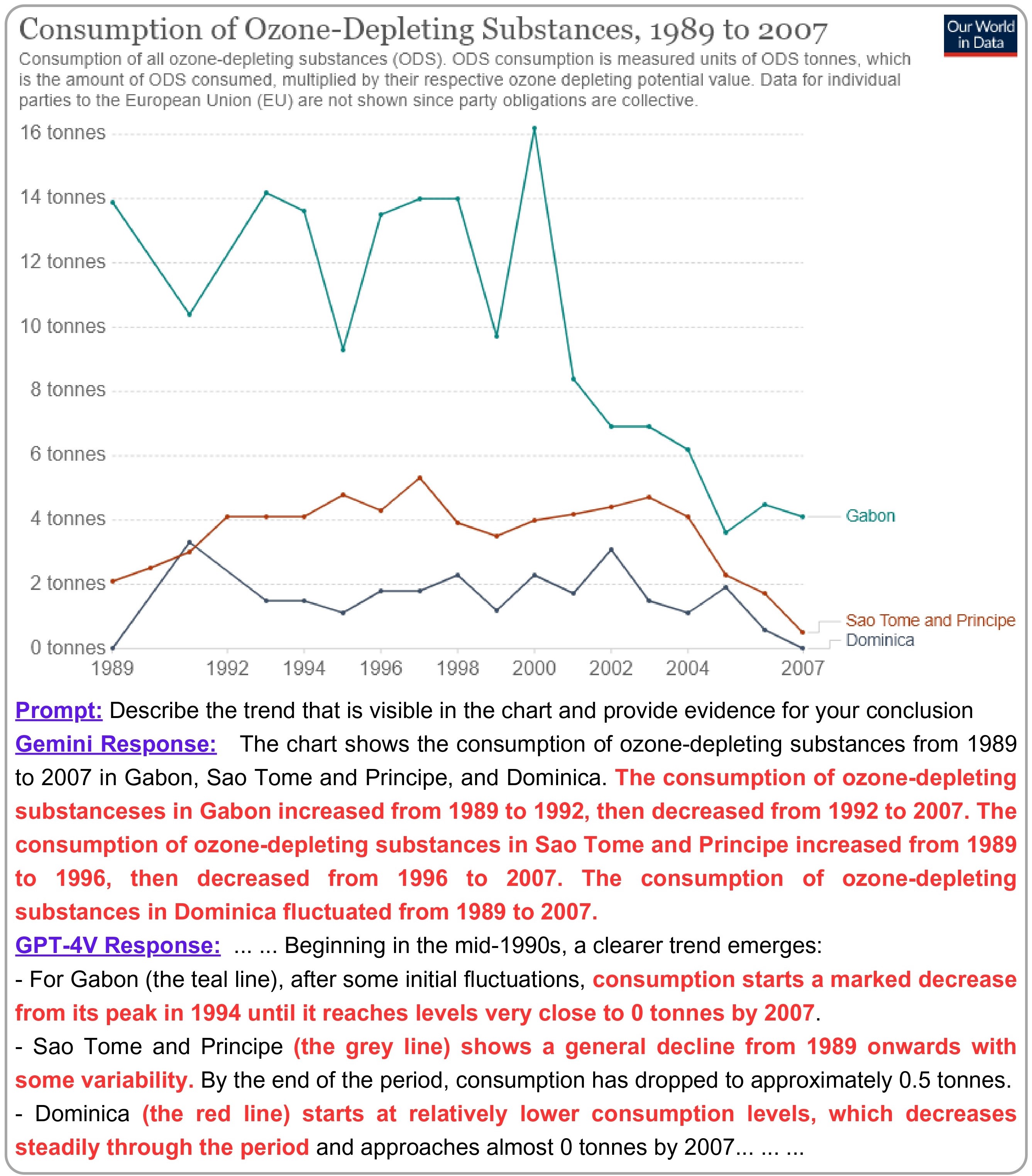
Identifying complex trends and patterns remains challenging. While the models excel in recognizing simple, steadily increasing, or decreasing trends in charts related to semantic Level 3, they struggle with line charts featuring multiple, highly fluctuating lines. Figure 3 illustrates such a scenario, where the chart indicates that Ozone-Depleting substance consumption in Gabon peaked in 2000. However, the Gemini model inaccurately states, “The consumption of ozone-depleting substances in Gabon increased from 1989 to 1992, then decreased from 1992 to 2007.” Similarly, the GPT-4V model’s response, “… consumption starts a marked decrease from its peak in 1994 until it reaches levels very close to 0 tonnes by 2007.”, is completely inaccurate and inconsistent with the chart data.
Challenges in generating domain-specific information.
Both Gemini and GPT-4V models fail to generate domain-specific (Level-4) content beyond the chart content. This aligns with the findings from previous studies Kantharaj et al. (2022c). Gemini tends to produce shorter analyses (75.33 words on average) compared to GPT-4V (averaging 149.5 words). Despite its brevity, Gemini was more likely to generate domain-specific information, doing so approximately 12% of the time, compared to GPT-4V, which achieves this only 8.67% of the time. These findings underscore the challenges inherent in generating domain-specific insights.
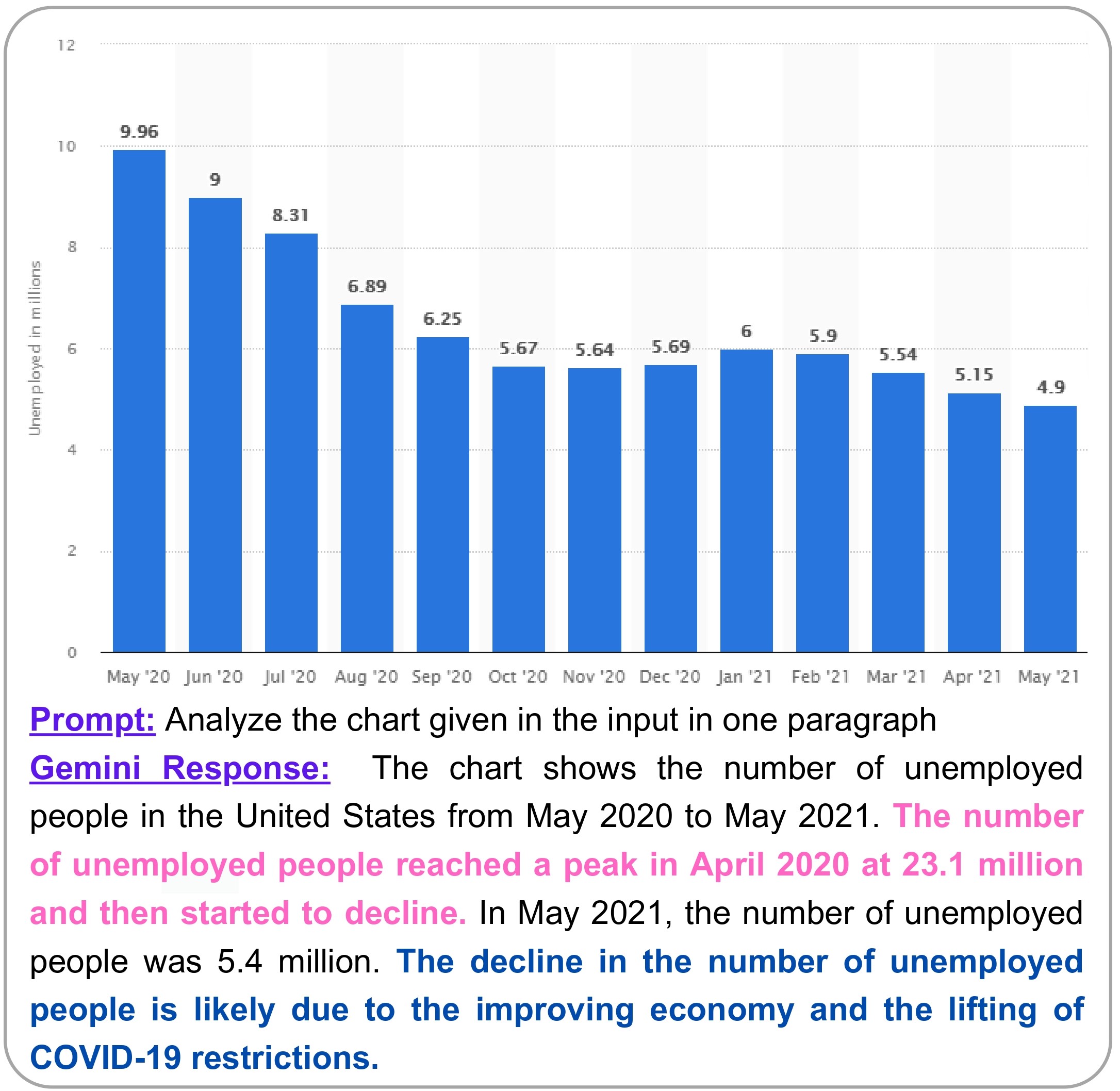
Gemini can extrapolate factually accurate insights beyond the chart data. We observed Gemini’s ability to generate pertinent insights not explicitly represented in the chart in our evaluation. For example, in Figure 4, although the x-axis labels of the bars began in May 2020, Gemini generated the following statement: “The number of unemployed people reached a peak in April 2020 at 23.1 million and then started to decline.” While this information wasn’t directly evident in the chart data, it aligns closely with statistics from the U.S. Bureau of Labor Statistics Statistics (2020). One possible explanation is that it might have encountered similar statistical representations or accessed external sources. Despite the original chart focusing on male unemployment statistics, Gemini’s extrapolated insights remained relevant to the broader topic of discussion.
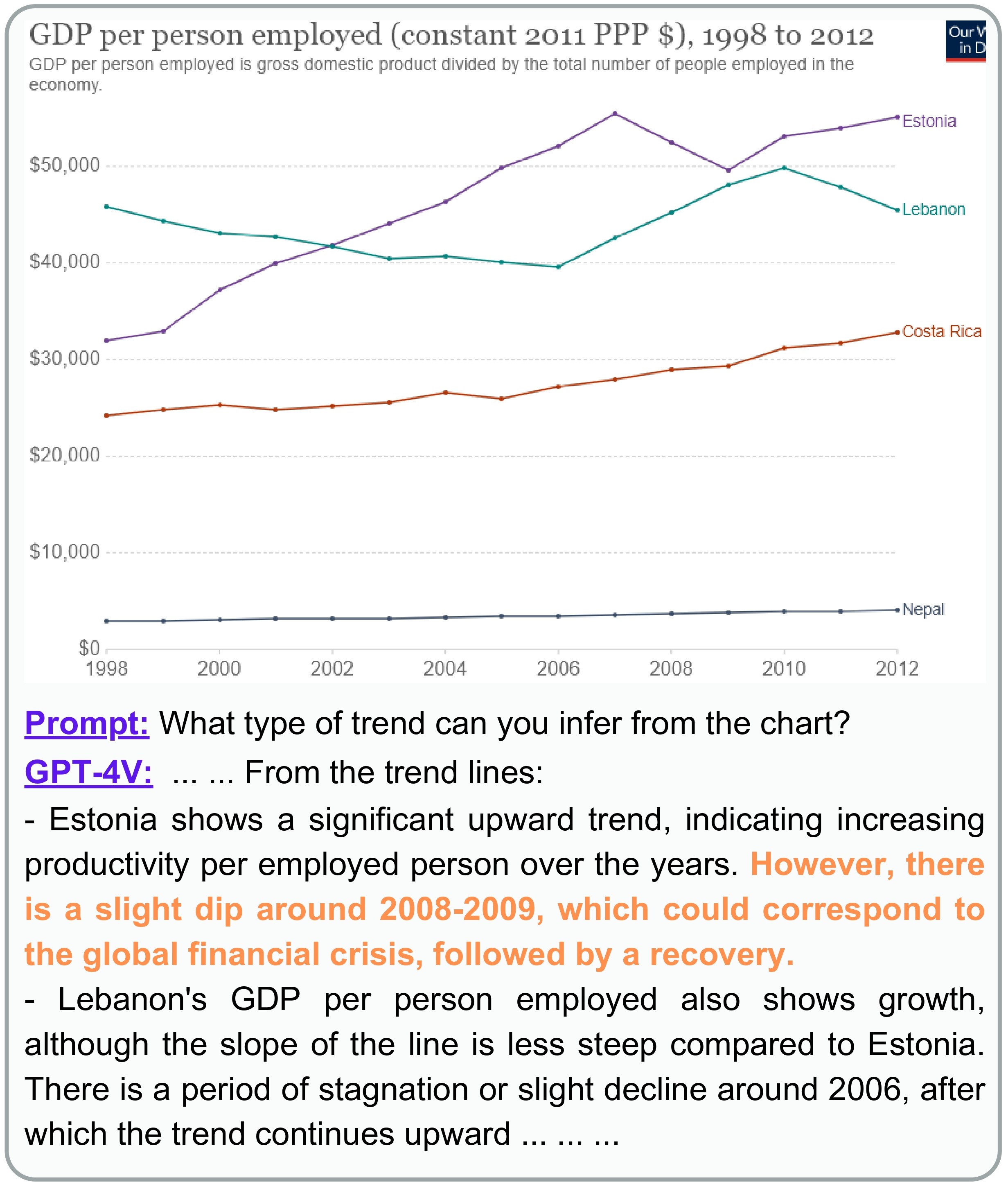
4.7 Presence of bias in Model responses
A notable concern with LVLMs is their potential for biased output generation OpenAI et al. (2023). Specifically, in examining GPT-4V’s responses, we notice instances where the model offers causal explanations that might be influenced by biases inherent in the training data. For instance, during the period 2008-2009, certain trends were attributed to the global financial crisis, but these correlations could be coincidental and not directly caused by the global financial crisis. In one such example demonstrated in Figure 5, when provided a chart about the GDP per employed person of four countries, and a prompt with the question, “What type of trend can you infer from the chart?” as an input, the model generated the following: “Estonia shows a significant upward trend… However, there was a slight dip around 2008-2009, which could correspond to the global financial crisis, followed by a recovery.” While Estonia’s data showed a slight dip, attributing it solely to the global financial crisis may be inaccurate. Notably, Lebanon and Costa Rica also experienced GDP increases during this period, suggesting a more nuanced interpretation is needed.
5 Conclusion
In this work, we present the first comprehensive study of LVLMs, i.e., GPT-4V and Gemini, to understand their capabilities and shortcomings in interpreting and deriving insights only from chart images. This is important in real-world scenarios since data tables associated with charts are not always available. We perform both qualitative and quantitative analysis to evaluate the LVLMs across various tasks and setups. We explore the models’ performance in zero-shot CoT prompting and program-aided reasoning, assessing the impact of these techniques on chart question-answering tasks. Furthermore, we analyze LVLMs’ performance in open-ended text generation from chart tasks and evaluate the models in terms of coherence, factual correctness, and fluency. In addition, in terms of semantic content coverage, we assess the LVLMs’ ability to describe visual encoding elements, simple statistics, and complex trends. Finally, we identify and categorize common errors in the LVLMs’ responses, offering valuable insights for future improvements. We hope that our research marks a significant step forward in the field, laying the groundwork for future explorations and enhancements in LVLMs’ application to chart understanding and reasoning tasks.
Limitations
Since the pretraining corpus of both the large vision language models (LVLMs) is unknown (not open-source), some of the datasets used for evaluation may or may not appear in the pretraining data or instruction tuning data of the models. Although we covered all the important tasks, i.e., Chart Summarization, Chart Question-Answering, Open-ended Chart Question-Answering, and Fact Checking with Charts, etc., there are some tasks, i.e., Chart-to-table not addressed in this research. At the time of evaluation, we did not provide any underlying data table corresponding to the chart in the input. However, our motivation for this research was to show how different state-of-the-art LVLMs perform when the underlying data table is not present for chart understanding tasks, which is often the case in real-world scenarios. Further, variations of charts and labels are limited due to the open-sourced datasets available for the tasks. We did not perform the human evaluation in the ChartQA task, since the task is based on factoid-QA about Charts and only requires single token answers (either text or a numerical value), for which automatic evaluation is sufficient.
Ethics Statement
This study independently evaluated LVLMs’ responses without involving any external parties, hence, no extra financial compensation was necessary. The authors themselves performed all the human assessments presented in this paper. As the focus of the research was solely on assessing LVLM’s capabilities, effectiveness, and limitations in several chart understanding tasks, the human evaluation performed by the authors does not add any ethical issues or unwanted biases. Further, the datasets utilized in this study are all open-sourced academic datasets, thus licensing was not required. Additionally, no information has been used that can directly relate to the identification of any person while evaluating the responses from LVLMs.
References
- Akhtar et al. (2023a) Mubashara Akhtar, Oana Cocarascu, and Elena Simperl. 2023a. Reading and reasoning over chart images for evidence-based automated fact-checking. In Findings of the Association for Computational Linguistics: EACL 2023, pages 399–414, Dubrovnik, Croatia. Association for Computational Linguistics.
- Akhtar et al. (2023b) Mubashara Akhtar, Nikesh Subedi, Vivek Gupta, Sahar Tahmasebi, Oana Cocarascu, and Elena Simperl. 2023b. Chartcheck: An evidence-based fact-checking dataset over real-world chart images.
- Alam et al. (2023) Md Zubair Ibne Alam, Shehnaz Islam, and Enamul Hoque. 2023. Seechart: Enabling accessible visualizations through interactive natural language interface for people with visual impairments. In Proceedings of the 28th International Conference on Intelligent User Interfaces, IUI ’23, page 46–64, New York, NY, USA. Association for Computing Machinery.
- (4) Rohan Anil, Andrew M. Dai, Orhan Firat, Melvin Johnson, and Dmitry Lepikhin et al. Palm 2 technical report.
- Bach et al. (2023) Benjamin Bach, Mandy Keck, Fateme Rajabiyazdi, Tatiana Losev, Isabel Meirelles, Jason Dykes, Robert S Laramee, Mashael AlKadi, Christina Stoiber, Samuel Huron, et al. 2023. Challenges and opportunities in data visualization education: A call to action. IEEE Transactions on visualization and computer graphics.
- Bang et al. (2023) Yejin Bang, Samuel Cahyawijaya, Nayeon Lee, Wenliang Dai, Dan Su, Bryan Wilie, Holy Lovenia, Ziwei Ji, Tiezheng Yu, Willy Chung, et al. 2023. A multitask, multilingual, multimodal evaluation of chatgpt on reasoning, hallucination, and interactivity. arXiv preprint arXiv:2302.04023.
- Chen et al. (2021) Mark Chen, Jerry Tworek, Heewoo Jun, Qiming Yuan, and Henrique Ponde de Oliveira Pinto et al. 2021. Evaluating large language models trained on code.
- Cho et al. (2021) Jaemin Cho, Jie Lei, Hao Tan, and Mohit Bansal. 2021. Unifying vision-and-language tasks via text generation. In ICML.
- Chowdhery et al. (2023) Aakanksha Chowdhery, Sharan Narang, and Jacob Devlin et al. 2023. Palm: Scaling language modeling with pathways. Journal of Machine Learning Research, 24(240):1–113.
- Dai et al. (2023) Wenliang Dai, Junnan Li, Dongxu Li, Anthony Meng Huat Tiong, Junqi Zhao, Weisheng Wang, Boyang Li, Pascale Fung, and Steven Hoi. 2023. Instructblip: Towards general-purpose vision-language models with instruction tuning.
- Devlin et al. (2019) Jacob Devlin, Ming-Wei Chang, Kenton Lee, and Kristina Toutanova. 2019. BERT: Pre-training of deep bidirectional transformers for language understanding. In Proceedings of the 2019 Conference of the North American Chapter of the Association for Computational Linguistics: Human Language Technologies, Volume 1 (Long and Short Papers), pages 4171–4186, Minneapolis, Minnesota. Association for Computational Linguistics.
- Do et al. (2023) Xuan Long Do, Mohammad Hassanpour, Ahmed Masry, Parsa Kavehzadeh, Enamul Hoque, and Shafiq Joty. 2023. Do llms work on charts? designing few-shot prompts for chart question answering and summarization.
- Du et al. (2022) Yifan Du, Zikang Liu, Junyi Li, and Wayne Xin Zhao. 2022. A survey of vision-language pre-trained models. In Proceedings of the Thirty-First International Joint Conference on Artificial Intelligence, IJCAI-22, pages 5436–5443. International Joint Conferences on Artificial Intelligence Organization. Survey Track.
- Fu et al. (2023) Chaoyou Fu, Renrui Zhang, Zihan Wang, Yubo Huang, Zhengye Zhang, Longtian Qiu, Gaoxiang Ye, Yunhang Shen, Mengdan Zhang, Peixian Chen, Sirui Zhao, Shaohui Lin, Deqiang Jiang, Di Yin, Peng Gao, Ke Li, Hongsheng Li, and Xing Sun. 2023. A challenger to gpt-4v? early explorations of gemini in visual expertise.
- Gao et al. (2023) Luyu Gao, Aman Madaan, Shuyan Zhou, Uri Alon, Pengfei Liu, Yiming Yang, Jamie Callan, and Graham Neubig. 2023. Pal: Program-aided language models.
- He et al. (2016) Kaiming He, Xiangyu Zhang, Shaoqing Ren, and Jian Sun. 2016. Deep residual learning for image recognition. In 2016 IEEE Conference on Computer Vision and Pattern Recognition (CVPR), pages 770–778.
- Hendrycks et al. (2021) Dan Hendrycks, Collin Burns, Steven Basart, Andy Zou, Mantas Mazeika, Dawn Song, and Jacob Steinhardt. 2021. Measuring massive multitask language understanding.
- Hoffmann et al. (2022) Jordan Hoffmann, Sebastian Borgeaud, Arthur Mensch, Elena Buchatskaya, Trevor Cai, Eliza Rutherford, Diego de Las Casas, Lisa Anne Hendricks, Johannes Welbl, Aidan Clark, Tom Hennigan, Eric Noland, Katie Millican, George van den Driessche, Bogdan Damoc, Aurelia Guy, Simon Osindero, Karen Simonyan, Erich Elsen, Jack W. Rae, Oriol Vinyals, and Laurent Sifre. 2022. Training compute-optimal large language models.
- Hoque et al. (2022) Enamul Hoque, Parsa Kavehzadeh, and Ahmed Masry. 2022. Chart question answering: State of the art and future directions. Journal of Computer Graphics Forum (Proc. EuroVis), pages 555–572.
- Huang et al. (2023) Kung-Hsiang Huang, Mingyang Zhou, Hou Pong Chan, Yi R. Fung, Zhenhailong Wang, Lingyu Zhang, Shih-Fu Chang, and Heng Ji. 2023. Do lvlms understand charts? analyzing and correcting factual errors in chart captioning.
- Hugginface (2023) Hugginface. 2023. Huggingface evaluation metric, perplexity.
- Hunter (2007) J. D. Hunter. 2007. Matplotlib: A 2d graphics environment. Computing in Science & Engineering, 9(3):90–95.
- Kafle et al. (2018) Kushal Kafle, Brian Price, Scott Cohen, and Christopher Kanan. 2018. Dvqa: Understanding data visualizations via question answering. Proceedings of the IEEE Computer Society Conference on Computer Vision and Pattern Recognition, pages 5648–5656.
- Kahou et al. (2018) Samira Ebrahimi Kahou, Vincent Michalski, Adam Atkinson, Ákos Kádár, Adam Trischler, and Yoshua Bengio. 2018. Figureqa: An annotated figure dataset for visual reasoning. 6th International Conference on Learning Representations, ICLR 2018 - Workshop Track Proceedings, pages 1–20.
- Kantharaj et al. (2022a) Shankar Kantharaj, Xuan Long Do, Rixie Tiffany Ko Leong, Jia Qing Tan, Enamul Hoque, and Shafiq Joty. 2022a. Opencqa: Open-ended question answering with charts. In Proceedings of EMNLP (to appear).
- Kantharaj et al. (2022b) Shankar Kantharaj, Xuan Long Do, Rixie Tiffany Ko Leong, Jia Qing Tan, Enamul Hoque, and Shafiq Joty. 2022b. Opencqa: Open-ended question answering with charts. arXiv preprint arXiv:2210.06628.
- Kantharaj et al. (2022c) Shankar Kantharaj, Rixie Tiffany Leong, Xiang Lin, Ahmed Masry, Megh Thakkar, Enamul Hoque, and Shafiq Joty. 2022c. Chart-to-text: A large-scale benchmark for chart summarization. In Proceedings of the 60th Annual Meeting of the Association for Computational Linguistics (Volume 1: Long Papers), pages 4005–4023, Dublin, Ireland. Association for Computational Linguistics.
- Kembhavi et al. (2016) Aniruddha Kembhavi, Mike Salvato, Eric Kolve, Minjoon Seo, Hannaneh Hajishirzi, and Ali Farhadi. 2016. A diagram is worth a dozen images. In European conference on computer vision, pages 235–251. Springer.
- Kim et al. (2020) Dae Hyun Kim, Enamul Hoque, and Maneesh Agrawala. 2020. Answering questions about charts and generating visual explanations. In Proceedings of the 2020 CHI Conference on Human Factors in Computing Systems, pages 1–13.
- Kim et al. (2021) Wonjae Kim, Bokyung Son, and Ildoo Kim. 2021. Vilt: Vision-and-language transformer without convolution or region supervision. In Proceedings of the 38th International Conference on Machine Learning, volume 139 of Proceedings of Machine Learning Research, pages 5583–5594. PMLR.
- Laskar et al. (2023) Md Tahmid Rahman Laskar, M Saiful Bari, Mizanur Rahman, Md Amran Hossen Bhuiyan, Shafiq Joty, and Jimmy Huang. 2023. A systematic study and comprehensive evaluation of ChatGPT on benchmark datasets. In Findings of the Association for Computational Linguistics: ACL 2023, pages 431–469, Toronto, Canada. Association for Computational Linguistics.
- Lee et al. (2022) Kenton Lee, Mandar Joshi, Iulia Turc, Hexiang Hu, Fangyu Liu, Julian Eisenschlos, Urvashi Khandelwal, Peter Shaw, Ming-Wei Chang, and Kristina Toutanova. 2022. Pix2struct: Screenshot parsing as pretraining for visual language understanding. arXiv preprint arXiv:2210.03347.
- Li et al. (2020) Liunian Harold Li, Mark Yatskar, Da Yin, Cho-Jui Hsieh, and Kai-Wei Chang. 2020. What does BERT with vision look at? In Proceedings of the 58th Annual Meeting of the Association for Computational Linguistics, pages 5265–5275, Online. Association for Computational Linguistics.
- Liu et al. (2022) Fangyu Liu, Francesco Piccinno, Syrine Krichene, Chenxi Pang, Kenton Lee, Mandar Joshi, Yasemin Altun, Nigel Collier, and Julian Martin Eisenschlos. 2022. Matcha: Enhancing visual language pretraining with math reasoning and chart derendering. arXiv preprint arXiv:2212.09662.
- Liu et al. (2023) Haotian Liu, Chunyuan Li, Qingyang Wu, and Yong Jae Lee. 2023. Visual instruction tuning.
- Lundgard and Satyanarayan (2021) Alan Lundgard and Arvind Satyanarayan. 2021. Accessible visualization via natural language descriptions: A four-level model of semantic content. IEEE transactions on visualization and computer graphics, 28(1):1073–1083.
- Masry et al. (2023) Ahmed Masry, Parsa Kavehzadeh, Xuan Long Do, Enamul Hoque, and Shafiq Joty. 2023. UniChart: A universal vision-language pretrained model for chart comprehension and reasoning. In Proceedings of the 2023 Conference on Empirical Methods in Natural Language Processing, pages 14662–14684, Singapore. Association for Computational Linguistics.
- Masry et al. (2022) Ahmed Masry, Do Long, Jia Qing Tan, Shafiq Joty, and Enamul Hoque. 2022. ChartQA: A benchmark for question answering about charts with visual and logical reasoning. In Findings of the Association for Computational Linguistics: ACL 2022, pages 2263–2279, Dublin, Ireland. Association for Computational Linguistics.
- Mathew et al. (2022) Minesh Mathew, Viraj Bagal, Rubèn Tito, Dimosthenis Karatzas, Ernest Valveny, and CV Jawahar. 2022. Infographicvqa. In Proceedings of the IEEE/CVF Winter Conference on Applications of Computer Vision, pages 1697–1706.
- Methani et al. (2020) Nitesh Methani, Pritha Ganguly, Mitesh M. Khapra, and Pratyush Kumar. 2020. Plotqa: Reasoning over scientific plots. In Proceedings of the IEEE/CVF Winter Conference on Applications of Computer Vision (WACV).
- Mishra et al. (2024) Abhika Mishra, Akari Asai, Vidhisha Balachandran, Yizhong Wang, Graham Neubig, Yulia Tsvetkov, and Hannaneh Hajishirzi. 2024. Fine-grained hallucinations detections. arXiv preprint.
- Obeid and Hoque (2020) Jason Obeid and Enamul Hoque. 2020. Chart-to-text: Generating natural language descriptions for charts by adapting the transformer model. In Proceedings of the 13th International Conference on Natural Language Generation, pages 138–147, Dublin, Ireland. Association for Computational Linguistics.
- OpenAI et al. (2023) OpenAI, :, Josh Achiam, Steven Adler, Sandhini Agarwal, and Lama Ahmad et al. 2023. Gpt-4 technical report.
- OpenAI (2022) OpenAI. 2022. Chatgpt: Optimizing language models for dialogue.
- Papineni et al. (2002) Kishore Papineni, Salim Roukos, Todd Ward, and Wei-Jing Zhu. 2002. Bleu: a method for automatic evaluation of machine translation. In Proceedings of the 40th annual meeting of the Association for Computational Linguistics, pages 311–318.
- Qi et al. (2023) Zhangyang Qi, Ye Fang, Mengchen Zhang, Zeyi Sun, Tong Wu, Ziwei Liu, Dahua Lin, Jiaqi Wang, and Hengshuang Zhao. 2023. Gemini vs gpt-4v: A preliminary comparison and combination of vision-language models through qualitative cases.
- Qin et al. (2023) Chengwei Qin, Aston Zhang, Zhuosheng Zhang, Jiaao Chen, Michihiro Yasunaga, and Diyi Yang. 2023. Is chatgpt a general-purpose natural language processing task solver?
- Rahman et al. (2023) Raian Rahman, Rizvi Hasan, Abdullah Al Farhad, Md. Tahmid Rahman Laskar, Md. Hamjajul Ashmafee, and Abu Raihan Mostofa Kamal. 2023. Chartsumm: A comprehensive benchmark for automatic chart summarization of long and short summaries. Proceedings of the Canadian Conference on Artificial Intelligence.
- Sellam et al. (2020) Thibault Sellam, Dipanjan Das, and Ankur P Parikh. 2020. Bleurt: Learning robust metrics for text generation. arXiv preprint arXiv:2004.04696.
- Shankar et al. (2022) Kantharaj Shankar, Leong Rixie Tiffany Ko, Lin Xiang, Masry Ahmed, Thakkar Megh, Hoque Enamul, and Joty Shafiq. 2022. Chart-to-text: A large-scale benchmark for chart summarization. In In Proceedings of the Annual Meeting of the Association for Computational Linguistics (ACL), 2022.
- Srivastava et al. (2023) Aarohi Srivastava, Abhinav Rastogi, Abhishek Rao, Abu Awal Md Shoeb, and Abubakar Abid et al. 2023. Beyond the imitation game: Quantifying and extrapolating the capabilities of language models.
- Statistics (2020) U.S. Bureau Labor Statistics. 2020. Unemployment-rate.
- Stokes et al. (2022) Chase Stokes, Vidya Setlur, Bridget Cogley, Arvind Satyanarayan, and Marti A Hearst. 2022. Striking a balance: Reader takeaways and preferences when integrating text and charts. IEEE Transactions on Visualization and Computer Graphics, 29(1):1233–1243.
- Su et al. (2020) Weijie Su, Xizhou Zhu, Yue Cao, Bin Li, Lewei Lu, Furu Wei, and Jifeng Dai. 2020. Vl-bert: Pre-training of generic visual-linguistic representations. In International Conference on Learning Representations.
- Tang et al. (2023) Benny J. Tang, Angie Boggust, and Arvind Satyanarayan. 2023. VisText: A Benchmark for Semantically Rich Chart Captioning. In The Annual Meeting of the Association for Computational Linguistics (ACL).
- Team et al. (2023) Gemini Team, Rohan Anil, Sebastian Borgeaud, Yonghui Wu, and Jean-Baptiste Alayrac et al. 2023. Gemini: A family of highly capable multimodal models.
- Touvron et al. (2023a) Hugo Touvron, Thibaut Lavril, Gautier Izacard, Xavier Martinet, Marie-Anne Lachaux, Timothée Lacroix, Baptiste Rozière, Naman Goyal, Eric Hambro, Faisal Azhar, Aurelien Rodriguez, Armand Joulin, Edouard Grave, and Guillaume Lample. 2023a. Llama: Open and efficient foundation language models.
- Touvron et al. (2023b) Hugo Touvron, Louis Martin, Kevin Stone, Peter Albert, and Amjad Almahairi et al. 2023b. Llama 2: Open foundation and fine-tuned chat models.
- Vedantam et al. (2015) Ramakrishna Vedantam, C Lawrence Zitnick, and Devi Parikh. 2015. Cider: Consensus-based image description evaluation. In Proceedings of the IEEE conference on computer vision and pattern recognition, pages 4566–4575.
- Wei et al. (2023) Jason Wei, Xuezhi Wang, Dale Schuurmans, Maarten Bosma, Brian Ichter, Fei Xia, Ed Chi, Quoc Le, and Denny Zhou. 2023. Chain-of-thought prompting elicits reasoning in large language models.
- Xu et al. (2024) Zhengzhuo Xu, Sinan Du, Yiyan Qi, Chengjin Xu, Chun Yuan, and Jian Guo. 2024. Chartbench: A benchmark for complex visual reasoning in charts.
- Zhang et al. (2017) Yuchen Zhang, Panupong Pasupat, and Percy Liang. 2017. Macro grammars and holistic triggering for efficient semantic parsing. EMNLP 2017 - Conference on Empirical Methods in Natural Language Processing, Proceedings, pages 1214–1223.
- Zhu et al. (2023) Deyao Zhu, Jun Chen, Xiaoqian Shen, Xiang Li, and Mohamed Elhoseiny. 2023. Minigpt-4: Enhancing vision-language understanding with advanced large language models.
Appendix A Appendices
A.1 Datasets
A.1.1 ChartQA
In our study, we employ the test set from the ChartQA dataset, as introduced by Masry et al. Masry et al. (2022). The test set of the dataset is composed of two primary categories of questions: those created by humans and those augmented by models. Specifically, the set of human-generated questions includes 625 distinct charts with 1250 corresponding question-answer pairs. Similarly, the model-generated, or augmented set, comprises 987 unique charts and 1250 question-answer pairs.
A.1.2 ChartQA∗
We introduce this dataset as a variation of the ChartQA dataset, in which charts do not explicitly show data values as labels near the corresponding chart elements (e.g., bars, lines), rather the model needs to estimate these values from the chart (e.g., based on bar heights and axis labels). We introduce this setup to see whether LVLMs’ performance relies on the explicit labels of the data values rather than their ability to recover data values from the visual elements in the chart. For this purpose, we modified the ChartQA dataset using Matplotlib Hunter (2007), removing the data labels from the chart images while keeping everything else the same (see examples in Figure 7. Of the 1509 chart images in the test set, 1340 were successfully redesigned. The remaining 169 images were excluded due to missing metadata.
A.1.3 ChartFC
For the fact-checking with charts task, we utilize the ChartFC dataset from Akhtar et al. Akhtar et al. (2023a). The dataset is structured so that each entry contains a claim phrased in natural language, a related chart image, and a label that falls into one of two categories: ‘supports’ or ‘refutes’. We evaluate the LVLMs in the test set of the dataset, which contains 885 examples belonging to the ‘supports’ class and 706 examples belonging to the ‘refutes’ class. The dataset comprises bar charts with different types, i.e., horizontal/vertical.
A.1.4 Chart-to-Text
In our chart summarization study, we utilize the Chart-to-Text Kantharaj et al. (2022c) benchmark. This benchmark encompasses two primary datasets: Statista111https://www.statista.com/ and Pew222https://www.pewresearch.org/. Each sample within both datasets comprises a chart image, an underlying data table, a chart title, and a human-written gold summary. For our experimental purposes, we utilize the complete test split from each dataset, encompassing 1,393 samples from Pew and 5,222 samples from Statista.
A.1.5 OpenCQA
To study LVLMs performance on the Open-ended Chart Question-Answering task, we utilize the benchmark dataset OpenCQA from Kantharaj et al. Kantharaj et al. (2022b). The dataset contains five different types of charts, i.e., bar, line, area, scatter, and pie. For our experiments, we use the test set from the dataset which comprises 1159 charts and 1159 question-answer pairs.
A.2 Analysis of 4-level semantics
In order to evaluate the models in the four semantic levels, we utilize the charts from the ChartQA Masry et al. (2022) dataset, and take 50 instances each for level 1, 2, 3, and 150 instances for level 4.
| Model | BLEURT (↑) | CIDEr (↑) | PPL (↓) | BERTScore (↑) |
| Gemini | -0.28 | 1.88 | 2.06 | 0.87 |
| GPT-4V | -0.45 | 1.63 | 1.85 | 0.85 |
| Model | ChartQA | ChartQA∗ |
| Gemini | 52.04 | 38.53 ( 13.51%) |
| GPT-4V | 57.51 | 20.52 ( 36.99%) |
| Model | BLEURT (↑) | CIDEr (↑) | PPL (↓) | BERTScore (↑) | ||||
| Pew | Stat | Pew | Stat | Pew | Stat | Pew | Stat | |
| Gemini | -0.3 | -0.3 | 1.79 | 1.9 | 1.61 | 1.7 | 0.87 | 0.86 |
| GPT-4V | -0.3 | -0.4 | 1.34 | 1.28 | 1.69 | 1.75 | 0.85 | 0.85 |
A.3 Prompt Construction
In order to come up with the best-performing prompt, we tried many different techniques and used the one that gave a consistent performance. For the zero-shot PAL experiment, we specifically designed the prompt asking the model to output a Python script, which upon execution would give us the final answer to the question. In the case of the 4-Level semantics experiment, we devised questions pertinent to each semantic level and aimed to evaluate the models’ proficiency in identifying the various levels of semantic information embedded in the chart image. We created questions relevant to each of the semantic levels, targeting each of the semantic levels, i.e., Level - 1 (e.g., chart type, x-axis/y-axis labels, color encoding information, etc.), Level - 2 (e.g., maxima, minima, or outliers), Level - 3 (e.g., trends or patterns), Level - 4 (e.g., domain-specific insights). Example prompts can be found in Table 8.
| Task | Setup | Prompt |
| ChartQA | Chain-of-Thought (CoT) | Given the chart image and a question in the input, generate an appropriate response to the question. Input: {question}. Output: Let’s think step by step. |
| Program-aided Language Modeling (PAL) | You will be provided with a chart image and a question associated with it in the input. Create a Python script that, upon execution, generates an answer to the input question. The script should directly incorporate all necessary data, avoiding any supplemental comments or superfluous variables. Ensure that the data is structured within the script to facilitate the calculation. Exclude any extraneous text or explanation after the python script. Output should only contain the python code. Input: {question} | |
| 4-level of semantic contents | Level - 1 | 1. What is the chart type in the input image? 2. What is the range of x-axis? 3. What is the range of y-axis? 4. What are the x-axis and y-axis labels in the chart? 5. What do each of the colors represent in the chart? 6. What is the chart type in the input image? |
| Level - 2 | 1. Identify the axis that contains a numerical range. What is the maximum value in that axis? 2. Identify the axis that contains a numerical range. What is the minimum value in that axis? 3. Are there any outliers in the chart? 4. Compare between the labels that hold the minimum and maximum values. | |
| Level - 3 | 1. What type of trend can you infer from the chart? 2. Describe the trend that is visible in the chart and provide evidence for your conclusion. | |
| Level - 4 | Analyze the chart given in the input in one paragraph. | |
| Open-ended Chart QA | - | Provide an open-ended answer to the following question based on the provided chart image. |
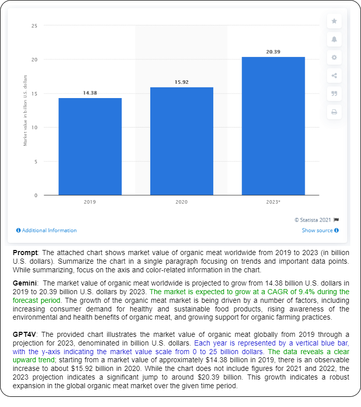
| Chart Summarization | - | The attached chart shows {title}. Summarize the chart in a single paragraph focusing on trends and important data points. While summarizing, focus on the axis and color-related information in the chart. |
| Fact-Checking with Charts | - | For the given chart image, determine if the following claim statement in the input is supported by the chart. If supported, then output ’supports’, otherwise output ’refutes’. Input: {claim} |
A.4 Additional Experimental Results
In this section, we present additional experimental results of our automatic evaluation of the Chart-to-text, OpenCQA benchmark, and the newly created ChartQA∗ benchmark. Here, Table 7 represents the performance on Chart-to-text, while Table 5 represents the performance of Gemini and GPT-4V across different metrics, i.e., BLEURT, CIDEr, Perplexity, and BERTScore, and Table 6 represents the performance of the models in ChartQA∗ benchmark.
| ChartQA-Human | |
| Prompt: Given the chart image and a question in the input, generate an appropriate response to the question. Input: Does the sum of smallest two segment value is greater then the the largest segment value of the graph? Output: Let’s think step by step. |
![[Uncaptioned image]](/html/2406.00257/assets/emnlp2020-templates/Figures_llmeval_charts/CoT-pos.png)
|
| Gold-Label: No | |
| Gemini-pro-vision Response: The smallest two segments are “Don’t know” and “U.S. has responsibility”. Their values are 6% and 39%, respectively. Their sum is 45%. The largest segment is “U.S. doesn’t have responsibility” with the value of 55%. Therefore, the sum of the smallest two segments is not greater than the largest segment value. | |
| GPT-4V Response: To determine this, we must add the values of the two smallest segments and compare the sum to the value of the largest segment. The smallest segments are 6% (“Don’t know”) and 39% (“U.S. has responsibility”), which sum up to 45%. The largest segment is 55% (“U.S. doesn’t have responsibility”). Comparing the two sums, 45% is less than 55%, meaning the sum of the smallest two segments is not greater than the value of the largest segment. | |
| ChartQA-Human | |
| Prompt: Given the chart image and a question in the input, generate an appropriate response to the question. Input: What is the average of the smallest gray bar and largest light blue bar? Output: Let’s think step by step. |
![[Uncaptioned image]](/html/2406.00257/assets/emnlp2020-templates/Figures_llmeval_charts/CoT-neg.png)
|
| Gold-Label: 21.5 | |
| Gemini-pro-vision Response: The smallest gray bar is 1% in 1979 and the largest light blue bar is 37% in 2004. So the average of the two is (1+37) / 2 = 19%. | |
| GPT-4V Response: To find the average of the smallest gray bar and the largest light blue bar, we must first identify these values from the chart. In this chart, the gray bars represent the “Centrist” political group while the light blue bars represent the “Center-right” political group. The smallest percentage for the gray “Centrist” bars is in the year 2014 with 9%. The largest percentage for the light blue “Center-right” bars is in the year 2014 with 29%. Now, we calculate the average of these two percentages: Average = (Smallest gray bar value + Largest light blue bar value) / 2 Average = (9% + 29%) / 2 Average = 38% / 2 Average = 19% So, the average of the smallest gray bar and the largest light blue bar is 19%. | |
| ChartQA-Augmented | |
| Prompt: Given the chart image and a question in the input, generate an appropriate response to the question. Input: What was the average number of applications per job posting on LinkedIn in the United States? Output: Let’s think step by step. |
![[Uncaptioned image]](/html/2406.00257/assets/emnlp2020-templates/Figures_llmeval_charts/CoT-aug-pos.png)
|
| Gold-Label: 2.5 | |
| Gemini-pro-vision Response: The average number of applications per job posting on LinkedIn in the United States was 2.5. | |
| GPT-4V Response: Based on the chart provided, the average number of applications per job posting on LinkedIn in the United States is 2.5. | |
| ChartQA-Augmented | |
| Prompt: Given the chart image and a question in the input, generate an appropriate response to the question. Input: In what year did the coverage ratio for bad loans increase steadily? Output: Let’s think step by step. |
![[Uncaptioned image]](/html/2406.00257/assets/emnlp2020-templates/Figures_llmeval_charts/CoT-aug-neg.png)
|
| Gold-Label: 21.5 | |
| Gemini-pro-vision Response: The coverage ratio for bad loans increased steadily from 2010 to 2017. In 2010, the coverage ratio was 53%. In 2011, it increased to 51%. In 2012, it increased to 48%. In 2013, it increased to 49%. In 2014, it increased to 54%. In 2015, it increased to 56%. In 2016, it increased to 61%. | |
| GPT-4V Response: The coverage ratio for bad loans began to increase steadily starting in the year 2013. From this point onward, the chart shows a consistent upward trend, from 48% in the year 2012 to 61% in January 2017. | |
| ChartQA-Human | |
| Prompt: You will be provided with a chart image and a question associated with it in the input. Create a Python script that, upon execution, generates an answer to the input question. The script should directly incorporate all necessary data, avoiding any supplemental comments or superfluous variables. Ensure that the data is structured within the script to facilitate the calculation. Exclude any extraneous text or explanation after the python script. Output should only contain the python code. Input: What’s the ratio of smallest segment and second largest segment? |
![[Uncaptioned image]](/html/2406.00257/assets/emnlp2020-templates/Figures_llmeval_charts/PAL-pos-hum.png)
|
| Gold-Label: 0.33333333 | |
| Gemini-pro-vision Response: Ratio of smallest (7) and second largest (21) segments: 0.33. | |
| GPT-4V Response: 0.3333333333 | |
| ChartQA-Human | |
| Prompt: You will be provided with a chart image and a question associated with it in the input. Create a Python script that, upon execution, generates an answer to the input question. The script should directly incorporate all necessary data, avoiding any supplemental comments or superfluous variables. Ensure that the data is structured within the script to facilitate the calculation. Exclude any extraneous text or explanation after the Python script. The output should only contain the Python code. Input: What’s the median value of the red graph? |
![[Uncaptioned image]](/html/2406.00257/assets/emnlp2020-templates/Figures_llmeval_charts/PAL-neg-hum.png)
|
| Gold-Label: 14.5 | |
| Gemini-pro-vision Response: 4.5 | |
| GPT-4V Response: 4.3 | |
| ChartQA-Augmented | |
| Prompt: You will be provided with a chart image and a question associated with it in the input. Create a Python script that, upon execution, generates an answer to the input question. The script should directly incorporate all necessary data, avoiding any supplemental comments or superfluous variables. Ensure that the data is structured within the script to facilitate the calculation. Exclude any extraneous text or explanation after the python script. Output should only contain the python code. Input: What was the share of fish and seafood expenditure of U.S. households in 2018? |
![[Uncaptioned image]](/html/2406.00257/assets/emnlp2020-templates/Figures_llmeval_charts/PAL-pos-aug.png)
|
| Gold-Label: 16 | |
| Gemini-pro-vision Response: The share of fish and seafood expenditure of U.S. households in 2018 was 16% | |
| GPT-4V Response: 16 | |
| ChartQA-Augmented | |
| Prompt: You will be provided with a chart image and a question associated with it in the input. Create a Python script that, upon execution, generates an answer to the input question. The script should directly incorporate all necessary data, avoiding any supplemental comments or superfluous variables. Ensure that the data is structured within the script to facilitate the calculation. Exclude any extraneous text or explanation after the python script. Output should only contain the python code. Input: How many cases of COVID-19 were confirmed across eight hospitals in Tokyo? |
![[Uncaptioned image]](/html/2406.00257/assets/emnlp2020-templates/Figures_llmeval_charts/PAL-neg-aug.png)
|
| Gold-Label: 375 | |
| Gemini-pro-vision Response: The total number of cases across the eight hospitals in Tokyo is 666. | |
| GPT-4V Response: 3000 | |
| Chart-to-Text Pew | |
| Prompt: The attached chart shows as more Americans go mobile, Pew Research Center will conduct more survey interviews via cellphone % of USS adults living in households with only % of interviews conducted on cellphones. Summarize the chart in a single paragraph focusing on trends and important data points. While summarizing, focus on the axis and color-related information in the chart. |
![[Uncaptioned image]](/html/2406.00257/assets/emnlp2020-templates/Figures_llmeval_charts/C2T_Pew_Factually_incorrect.png)
|
| Gold-Summary: Pew Research Center will increase the percentage of respondents interviewed on cellphones from 65% to 75% in most of its 2016 telephone surveys. We’re making this change to ensure our survey samples properly represent the now roughly half (47%) of U.S. adults whose only phone is a cellphone. | |
| Gemini-pro-vision Response: The two line graphs show the percentage of US adults living in households with only wireless telephone service and the percentage of interviews conducted on cellphones in typical Pew Research Center surveys from 2004 to 2016. The percentage of US adults living in households with only wireless telephone service increased from 5% in 2004 to 47% in 2016. At the same time, the percentage of interviews conducted on cellphones in typical Pew Research Center surveys increased from 2% in 2004 to 75% in 2016. This suggests that Pew Research Center is increasingly conducting more survey interviews via cellphone as more Americans go mobile. | |
| GPT-4V Response: The chart illustrates two related trends pertaining to the adoption of mobile phones and the methodology of Pew Research Center surveys in the United States from 2004 to 2016. On the left side, the chart with an orange line indicates a steady rise in the percentage of U.S. adults living in households with only wireless telephone service, starting at nearly 5% in 2004 and climbing to 47% by 2016. On the right, the corresponding chart with a blue line shows the percentage of interviews conducted on cellphones in typical Pew Research Center surveys. This trend is also upward, beginning at approximately 10% in 2004 and reaching 75% in 2016. The two trends display a correlated increase over the time period, highlighting both the growing preference for cellphones over landlines among Americans and the corresponding shift in survey methods to accommodate this change. | |
| Chart-to-Text Statista | |
| Prompt: The attached chart shows gender parity index for gross enrollment ratios in primary, secondary and tertiary education in developing regions in 2012. Summarize the chart in a single paragraph focusing on trends and important data points. While summarizing, focus on the axis and color-related information in the chart. |
![[Uncaptioned image]](/html/2406.00257/assets/emnlp2020-templates/Figures_llmeval_charts/C2T_Statista_Factually_incorrect.png)
|
| Gold-Summary: This statistic shows the Gender Parity Index (GPI) for gross enrollment ratios in primary, secondary and tertiary education in developing regions in 2012. The Gender Parity Index measures the relative access to education of men and women. In 2012, more women than men were enrolled in tertiary education in Eastern Asia with a GPI score of 1.08. | |
| Gemini-pro-vision Response: The chart shows the gender parity index for gross enrollment ratios in primary, secondary, and tertiary education in developing regions in 2012. The x-axis shows the gender parity index, while the y-axis shows the region. The color of the bar indicates the level of education. For primary education, the gender parity index is above 0.95 in most developing regions, with the highest value in Latin America and the Caribbean (1.07) and the lowest value in Sub-Saharan Africa (0.84). For secondary education, the gender parity index is above 0.90 in most developing regions, with the highest value in Latin America and the Caribbean (1.07) and the lowest value in South-Eastern Asia (0.92). For tertiary education, the gender parity index is above 0.85 in most developing regions, with the highest value in Caucasus and Central Asia (1.08) and the lowest value in Sub-Saharan Africa (0.64). Overall, the chart shows that there is a large disparity in the gender parity index for gross enrollment ratios in primary, secondary, and tertiary education in developing regions. While there has been progress in recent years, there is still room for improvement. | |
| GPT-4V Response: The chart presents the Gender Parity Index (GPI) for gross enrollment ratios across primary, secondary, and tertiary education levels in various developing regions for the year 2012. The horizontal axis shows the GPI, ranging from 0 to 1.6, with markers designating primary (blue dot), secondary (black dot), and tertiary (gray dot) education levels. GPI values above 1 indicate a higher enrollment ratio for females compared to males, while values below 1 indicate higher enrollment for males. Key data points reflecting trends include Southern Asia having a notable GPI of 0.81 in primary education, indicating significantly lower female enrollment compared to males. Conversely, Latin America & the Caribbean show a GPI of 1.28 for tertiary education, meaning female enrollment substantially exceeds that of males. Sub-Saharan Africa has the lowest GPI in tertiary education at 0.64, suggesting large gender disparities favoring males. Secondary education generally displays GPI values closer to parity across regions, with many values hovering around 0.92 to 1.02. Lastly, the overall GPI for developing regions shows females almost reach parity with males in primary and secondary education (GPIs of 0.96 and 0.97), while tertiary education exhibits a slight female predominance | |
| Chart-to-Text | |
| Prompt: The attached chart shows global market share of smartphones with a triple camera setup in 2019, by brand. Summarize the chart in a single paragraph focusing on trends and important data points. While summarizing, focus on the axis and color-related information in the chart. |
![[Uncaptioned image]](/html/2406.00257/assets/emnlp2020-templates/Figures_llmeval_charts/C2T_Visual_incorrect.png)
|
| Gold-Summary: The ranking illustrates the global market share of smartphones with a triple camera setup in 2019, by brand. In 2019, Samsung accounted for 27 percent of the triple camera smartphone market. | |
| Gemini-pro-vision Response: The chart shows the global market share of smartphones with a triple camera setup in 2019, by brand. Samsung is the market leader with a 27% share. Huawei is second with a 23% share. Vivo is third with a 17% share. LG is fourth with a 16% share. Xiaomi is fifth with a 10% share. HMD is sixth with a 3% share. The chart shows that Samsung and Huawei are the clear leaders in the market for smartphones with a triple camera setup. Vivo, LG, and Xiaomi are also significant players in the market. HMD is a distant sixth. | |
| GPT-4V Response: The chart illustrates the global market share of smartphones featuring a triple camera setup in 2019, segmented by brand. The horizontal bars, shaded in varying shades of blue, represent each brand’s market share, displayed on the x-axis which ranges from 0% to 30%. Samsung leads the market with the highest share, represented by the darkest shade of blue, accounting for 27% of the market. Huawei follows closely, with a 23% share in a slightly lighter blue. Vivo and LG come next with 17% and 16%, respectively; their corresponding bars are in progressively lighter shades of blue. Xiaomi holds a 10% share, while HMD has the smallest segment visualized, at 3%, depicted with the lightest blue. The chart is a visual representation of the significant hold Samsung and Huawei have in the triple camera smartphone segment, while also showing a quite notable presence of other brands such as Vivo, LG, and Xiaomi in this market. | |
| Chart-to-Text | |
| Prompt: The attached chart shows HeidelbergCement’s global revenue from FY 2009 to FY 2018 (in billion euros). Summarize the chart in a single paragraph focusing on trends and important data points. While summarizing, focus on the axis and color-related information in the chart. |
![[Uncaptioned image]](/html/2406.00257/assets/emnlp2020-templates/Figures_llmeval_charts/C2T_correct_trend.png)
|
| Gold-Summary: This statistic represents HeidelbergCement’s global revenue between the fiscal year of 2009 and the fiscal year of 2019. In the fiscal year of 2019, the German multinational building materials company generated around 18.85 billion euros (or about 21.1 billion U.S. dollars) in revenue. | |
| Gemini-pro-vision Response: HeidelbergCement’s global revenue experienced fluctuations but showed an overall increase from FY 2009 to FY 2018. The revenue started at 11.12 billion euros in FY 2009 and reached 18.85 billion euros in FY 2018, representing a growth of 70%. The highest increase occurred from FY 2016 to FY 2017, when the revenue jumped from 15.17 billion euros to 17.27 billion euros. The color blue is used to represent the data in the chart. | |
| GPT-4V Response: The chart shows HeidelbergCement’s global revenue from the fiscal year 2009 to 2018, with revenue figures represented in billions of euros on the vertical axis and the fiscal years on the horizontal axis. The chart displays a positive trend in revenue over the ten-year period, with some fluctuations. Starting at €11.12 billion in 2009, there was a slight increase until 2012 when revenue peaked at €14.02 billion. After a decrease to €13.47 billion in 2015, the revenue then showed a significant upward trend, reaching the highest point of €17.27 billion in 2017 before a slight decrease in 2018 to €18.08 billion. The bars in the chart are uniformly colored in blue, and the year-over-year changes are clearly indicated by the varying heights of these bars. The upward trend signifies a general growth in HeidelbergCement’s global revenue over the decade. | |
| Chart-to-Text | |
| Prompt: The attached chart shows frequency of car models stolen to order in Great Britain (UK) in 2011 and 2012 (in offences per 10,000 registered vehicles). While summarizing, focus on the axis and color-related information in the chart. |
![[Uncaptioned image]](/html/2406.00257/assets/emnlp2020-templates/Figures_llmeval_charts/C2T_missing_trend.png)
|
| Gold-Summary: This statistic shows the frequency with which luxury or prestige cars are stolen in Great Britain in 2011 and 2012. These types of luxury cars are mostly stolen to order, meaning that they were sought out specifically on request rather than stolen by an opportunist. BMW, especially the X6 model, was by far the luxury brand which was stolen the most over this period. | |
| Gemini-pro-vision Response: The chart shows the frequency of car models stolen to order in Great Britain (UK) in 2011 and 2012, with the BMW X6, BMW M3, and BMW M5 being the most stolen car models. The BMW X6 had the highest frequency, with 183 thefts per 10,000 registered vehicles. The BMW M3 and BMW M5 had 67 and 54 thefts per 10,000 registered vehicles, respectively. Other car models with significant thefts include the BMW X5, BMW 6 Series, Audi S3, Audi Q7, Mercedes-Benz CLS-Class, and BMW 5 Series, with 51, 37, 33, 30, 30, and 26 thefts per 10,000 registered vehicles, respectively. | |
| GPT-4V Response: The attached chart displays the frequency of certain car models being stolen to order in Great Britain for the years 2011 and 2012, with the vertical axis representing the number of thefts per 10,000 registered vehicles and the horizontal axis listing the car models. The BMW X6 stands out as the most targeted model, with a theft rate significantly higher at 183 thefts per 10,000 vehicles. The next most stolen models are the BMW M3 and BMW M5, with lower but still considerable theft rates of 67 and 54 respectively. The frequency then gradually decreases with other BMW models and a few Audi and Mercedes-Benz models, such as the Audi S3 and Mercedes-Benz M-Class showing the lowest frequency of the listed models with 26 thefts each. Overall, the chart indicates a clear preference amongst car thieves for BMW models, specifically the high-performance ’M’ series and the X6 SUV. | |
| Semantic Evaluation: Level - 1 | |
![[Uncaptioned image]](/html/2406.00257/assets/emnlp2020-templates/Figures_llmeval_charts/color-l1err-1.png)
|
Prompt: What do each of the colors represent in the chart?
Gemini-pro-vision Response: The colors represent the different causes of death. GPT-4V Response: The chart is a horizontal bar graph showing the death rates per 100,000 population from various causes in the United States for the year 1966. Each color on the chart represents a different cause of death, as indicated by the labels on the left side of the graph. Here are the colors and corresponding causes of death they represent: - Reddish-pink: Heart disease - Orange: Cancers - Dark teal blue: Stroke - Green: Accidents - Light blue: Pneumonia and influenza - Dark blue: Road accidents - Purple: Diabetes - Yellow: Suicide - Light green: Tuberculosis Adjacent to each color bar is the specific death rate for that cause of death per 100,000 population, with heart disease being the leading cause at 371.7 deaths per 100,000 and tuberculosis being the least within the top causes of death listed at 3.9 deaths per 100,000. |
![[Uncaptioned image]](/html/2406.00257/assets/emnlp2020-templates/Figures_llmeval_charts/color-shade-l1err-3.png)
|
Prompt: What do each of the colors represent in the chart?
Gemini-pro-vision Response: The blue color represents the percentage of respondents who think that reforming the Vatican is an important priority for Pope Francis. The white color represents the percentage of respondents who think that it is not too important or should not be done. The gray color represents the percentage of respondents who don’t know. GPT-4V Response: The chart is a pie chart showing the opinions of U.S. Catholics on the importance of reforming the Vatican as a priority for Pope Francis, based on the information provided by the Pew Research Center. Here’s what each color represents: - Light Blue: 35% view reforming the Vatican as a top priority. - Dark Blue: 40% believe it is important, but a lower priority. - Grey: 13% think it is not too important or should not be done. - Black: 11% don’t know or have no opinion on the matter. |
| Semantic Evaluation: Level - 1 | |
![[Uncaptioned image]](/html/2406.00257/assets/emnlp2020-templates/Figures_llmeval_charts/l1-ex-1.png)
|
Prompt: What is the chart type in the input image?
Gemini-pro-vision Response: The chart type in the input image is a bar chart. GPT-4V Response: The chart in the image is a horizontal bar chart. This type of chart is used to represent data with rectangular bars where the length of the bar is proportional to the value of the variable. In this bar chart, the bars represent the amount of various food items one could buy after working one hour in the manufacturing sector in the year 1950. |
![[Uncaptioned image]](/html/2406.00257/assets/emnlp2020-templates/Figures_llmeval_charts/l1-ex-2.png)
|
Prompt: What is the range of x-axis?
Gemini-pro-vision Response: 0 to 40. GPT-4V Response: The image you provided is a pie chart, and pie charts do not have an x-axis or y-axis as you would find in line graphs or bar charts. Instead, they display data in a circular format, with each slice of the pie representing a proportion of the whole. This particular pie chart is about the opinions of U.S. Catholics on Vatican Reform and does not include the concept of a range for an axis. |
| Semantic Evaluation: Level - 2 | |
![[Uncaptioned image]](/html/2406.00257/assets/emnlp2020-templates/Figures_llmeval_charts/l2-ex.png)
|
Prompt: Identify the axis that contains a numerical range. What is the maximum value in that axis?
Gemini-pro-vision Response: The y-axis contains a numerical range. The maximum value on the y-axis is 18.7. GPT-4V Response: The axis that contains a numerical range in the image is the vertical (y-axis). It represents the "Multiple of annual gross earnings" for "Gross pension wealth." The maximum value on this axis is 18, which is the highest labeled horizontal line, but it does not match the value of the tallest bar. The tallest bar represents Luxembourg, with a value of 18.7, as indicated by the number above the bar. Hence, the actual maximum value depicted on the graph is 18.7, even though the axis itself is only labeled up to 18. |
| Semantic Evaluation: Level - 3 | |
|---|---|
![[Uncaptioned image]](/html/2406.00257/assets/emnlp2020-templates/Figures_llmeval_charts/l3-ex-1.png)
|
Prompt: Describe the trend that is visible in the chart and provide evidence for your conclusion.
Gemini-pro-vision Response: The chart displays a clear upward trend over the period from 2000 to 2019. Starting at 12.7% in 2000, the data point rises consistently throughout the years, reaching 72.1% by 2019. This increase is steady with no evident declines, indicating a notable and persistent growth in the metric being measured, which is the “Share of Internet users” as seen on the y-axis. Every consecutive year shows an increase from the previous year. The x-axis, which represents time, clearly shows this is over a 20-year timespan. The evidence for the conclusion is in the plotted data points themselves, each one being higher than the previous, without any dips or downward movements. The consistent increase in the percentage points reflects a robust and sustained growth in internet usage among the population being analyzed. GPT-4V Response: The chart shows the share of internet users from 2000 to 2019. The trend is upward, with the share of internet users increasing from 12.7% in 2000 to 76.1% in 2019. The evidence for this conclusion is that the line on the chart is going up. |
![[Uncaptioned image]](/html/2406.00257/assets/emnlp2020-templates/Figures_llmeval_charts/l3-ex-2.png)
|
Prompt: Describe the trend that is visible in the chart and provide evidence for your conclusion.
Gemini-pro-vision Response: The chart shows the coverage of pregnant women receiving antiretroviral drugs (ARV) for preventing mother-to-child transmission (MTCT) of HIV. The coverage in Cape Verde increased from 50% in 2010 to 98% in 2016. The coverage in Latvia increased from 22% in 2011 to 88% in 2016. The coverage in Tajikistan increased from 58% in 2013 to 95% in 2016. GPT-4V Response: The chart presents data on the coverage of pregnant women receiving antiretroviral drugs (ARV) for preventing mother-to-child transmission (MTCT) of HIV in three different countries—Cape Verde, Latvia, and Tajikistan—from 2010 to 2016. A clear trend from this chart is that coverage increased in all three countries over the given time period. 1. Cape Verde shows a consistently high coverage close to or at 100% throughout the period, with slight fluctuations but generally maintaining a plateau. 2. Latvia presents a dramatic increase starting from just above 20% in 2010 to reaching approximately 80% by 2016. 3. Tajikistan also shows considerable improvement, with the coverage starting at around 40% in 2010 and ending up just below 80% in 2016. The evidence for these trends is in the trajectory of the lines for each country, which show upward slopes over the years, reflecting an increasing percentage of pregnant women receiving ARV drugs to prevent MTCT of HIV. Each point on the lines represents the data recorded for the corresponding year, clearly illustrating the progress each country has made throughout these years. |
![[Uncaptioned image]](/html/2406.00257/assets/emnlp2020-templates/Figures_llmeval_charts/l3-ex-3.png)
|
Prompt: Describe the trend that is visible in the chart and provide evidence for your conclusion.
Gemini-pro-vision Response: The chart shows that the saving rate in Belgium and Mexico has been on a downward trend since the early 1990s. While Belgium’s saving rate has remained relatively stable since the mid-2000s, Mexico’s saving rate has seen a slight recovery since the early 2000s. GPT-4V Response: The chart you provided shows the saving rates as a percentage of GDP for Belgium and Mexico from 1984 to 2006. Here’s the trend based on the information presented: For Belgium: - The saving rate starts off at around 10% in 1984. - There’s a slight decrease until a sharp drop around 1986, where it reaches just above 3%, the lowest point on the chart for Belgium. - A steady increase follows until around 1989, where the saving rate exceeds 10% again. - From 1990 to the end of the chart, the saving rate fluctuates but generally maintains within the range of roughly 9% to slightly above 11%, without any drastic changes. For Mexico: - The saving rate is shown starting from 1990 on this chart (indicating no data provided or not tracked for the prior years). - It starts out at around 6% in 1990. - There’s a rather volatile pattern with significant ups and downs until 1995, where it dips to the lowest point, close to 4%. - From this point on, there is a relatively steady upward trend, with some fluctuations but a clear overall increase in the saving rate. - This ends with a sharp increase between 2004 and 2006, where the saving rate jumps to around 6% to just under 11%. Evidence for these trends comes from observing the lines on the chart and noting the changes in direction |
| Semantic Evaluation: Level - 4 | |
![[Uncaptioned image]](/html/2406.00257/assets/emnlp2020-templates/Figures_llmeval_charts/l4-ex-1.png)
|
Prompt: Analyze the chart given in the input in one paragraph.
Gemini-pro-vision Response: The chart shows the number of bands in each province and territory of Canada. As of 2021, British Columbia has the most bands, with 199, followed by Ontario with 126, and Saskatchewan with 70. The Northwest Territories has the least bands, with 26. GPT-4V Response: The chart presented is a horizontal bar chart showing the number of bands in various regions or provinces of a country, which appears to be Canada given the regions listed. British Columbia leads with the highest number at 199 bands, followed by Ontario with 126 bands. These two regions have significantly more bands compared to the others. Saskatchewan comes in third with 70 bands, while Manitoba has a close 63. Alberta and Quebec show a mid-range number of bands, with 45 and 40 respectively. The Atlantic region is represented with 34 bands, and the Northwest Territories have 26. Yukon has the fewest bands, represented by a count of 16. Overall, the chart provides a clear visualization of a disparity in the number of bands among the regions, hinting at a possible correlation between population, cultural factors, or policies that influence the number of music bands in these areas. |
![[Uncaptioned image]](/html/2406.00257/assets/emnlp2020-templates/Figures_llmeval_charts/l4-ex-2.png)
|
Prompt: Analyze the chart given in the input in one paragraph.
Gemini-pro-vision Response: The chart shows the number of visitors in millions from 2017 to 2020. The number of visitors increased from 48.5 million in 2017 to 50 million in 2018 and remained the same in 2019. However, the number of visitors decreased to 51 million in 2020 due to the COVID-19 pandemic. The number of visitors decreased even further to 29 million in 2020 post-coronavirus. GPT-4V Response: The chart is a bar graph representing the number of visitors in millions over a period from 2017 through 2020, where 2020 is split into “pre-coronavirus” and "post-coronavirus" periods, indicating the impact of the COVID-19 pandemic on visitor numbers. From 2017 to 2020 pre-coronavirus, there is an upward trend in visitor numbers, starting at approximately 48.5 million in 2017 and peaking at 51 million just before the coronavirus impact. Notably, in the post-coronavirus period of 2020, there is a significant drop to 29 million visitors, reflecting the drastic reduction likely due to travel restrictions, lockdowns, and other measures put in place to combat the spread of COVID-19. |