Toward the Categorical Data Map
Oliver Deussen
Abstract
Categorical data does not have an intrinsic definition of distance or order, and therefore, established visualization techniques for categorical data only allow for a set-based or frequency-based analysis, e.g., through Euler diagrams or Parallel Sets, and do not support a similarity-based analysis. We present a novel dimensionality reduction-based visualization for categorical data, which is based on defining the distance of two data items as the number of varying attributes. Our technique enables users to pre-attentively detect groups of similar data items and observe the properties of the projection, such as attributes strongly influencing the embedding. Our prototype visually encodes data properties in an enhanced scatterplot-like visualization, encoding attributes in the background to show the distribution of categories. In addition, we propose two graph-based measures to quantify the plot’s visual quality, which rank attributes according to their contribution to cluster cohesion. To demonstrate the capabilities of our similarity-based approach, we compare it to Euler diagrams and Parallel Sets regarding visual scalability and show its benefits through an expert study with five data scientists analyzing the Titanic and Mushroom datasets with up to 23 attributes and 8124 category combinations. Our results indicate that the Categorical Data Map offers an effective analysis method, especially for large datasets with a high number of category combinations.
Index Terms:
Categorical data, dimensionality reduction, cluster analysis, similarity-based representation, information visualizationI Introduction
Categorical data can be encountered in numerous domains, such as representing inventory data describing product properties like color in sales or bioinformatics, encoding the genes formed by nucleotide sequences. In contrast to numeric and ordinal data, categorical data does not have an intrinsic order or distance associated with each value pair. The visual analysis of categorical data is challenging since categorical data describes an attribute by name only, with the only supported operators being equality and mode.
Currently, there are two widespread methods of visualizing categorical data: (1) Frequency-based visualizations [1, 2, 3] map the categorical values to their frequencies, for example, through bar charts, pie charts, or enhanced variants, such as stacked bar charts. In contrast, (2) set visualizations solely focus on the set nature of categorical data items, specifically their intersections [4], such as Euler diagrams (see Fig. 1 (left)). Set visualizations like Euler diagrams do not scale well for sets with many intersections because visual clutter is detrimental to their readability. Other, less common solutions treat dimensions independently and map data to a continuous design model [5, 6, 7], leveraging visualization types that initially have been designed for numerical data, such as scatterplots or parallel coordinate plots. However, these approaches deviate from the discrete nature of categorical data and suffer from visual clutter and overplotting, limiting their readability [8]. Approaches, such as Parallel Sets [9] and Sankey diagrams [10], follow the frequency and set-based paradigms (see Fig. 1 (right)). These approaches trade effectiveness in visualizing the presence of subsets for the presentation of frequency information. Thus, these approaches require additional design considerations since they tend to emphasize preselected attributes over others [11].
None of the previously described techniques support the distance-based analysis of categorical data, i.e., encoding the similarity of categorical data items using distance such that similar data items are placed close to each other while differing data items are positioned far apart. Analyzing categorical data based on a group or subset similarity is useful, e.g., visually clustering data items only differing in a few attributes can help us better understand important characteristics of the group. Generally, this would allow us to apply methods from cluster analysis to categorical data.
Thus, the challenge is finding an effective way to describe distance relations between categorical data items to represent the dissimilarity of data points such that the distance reflects their dissimilarity. At the same time, the whole visualization remains coherent and interpretable. We further need to find a visual mapping that enables the interpretation of distances and simultaneously conveys the properties of data items, i.e., effectively visualizing an item’s attributes by using color and position to visually encode attributes. Through this, We address the combinatorial problem of categorical data, i.e., that with the increasing number of attributes and categories, the number of required colors to represent a category with distinguishable colors becomes increasingly difficult.
Tacking these challenges, we contribute the following:
-
(1)
A design study using 2D-projection methods, i.e., dimensionality reduction techniques, for categorical data while visually encoding the category distribution into the background. Through layout enrichment, we enable the exploration of the data distribution, enhancing orientation and navigation. Additionally, we contribute four glyph designs to represent categorical subsets.
-
(2)
A description and discussion of distance measures for categorical data based on the interpretation of data items as sets and one-hot encoding, which allows representing dissimilarity as the number of differing elements.
-
(3)
Quality measures based on subset distribution to guide the analysis, recommending layout enriched views on attributes contributing strongly to clusters and subset separation.
-
(4)
An online demonstrator (dennig.dbvis.de/categorical-data-map) making the acquired results accessible. To further aid reproducibility, we openly publish all our datasets and source code via OSF (osf.io/jzd46) and the Data Repository of the University of Stuttgart (DaRUS) [14].
With this work, we aim to widen the analytical capabilities for categorical data, particularly for exploratory analysis.
II Related Work
II-A Visualization Techniques for Categorical Data
Set visualization is one of the core techniques to for categorical data. To visualize the members of sets and their intersections, Venn and Euler diagrams are the two most prevalent representations [15]. Multiple adaptations of both techniques mitigate challenges, e.g., to preserve semantics [16], draw area-proportional diagrams [17], or incorporate glyphs to show additional information [18]. Other set visualization techniques use lines to indicate set intersections [19] and matrices to show the cardinality of intersection sets [20], or include the semantic context to visualize sets [21]. Alsallakh et al. presented a comprehensive survey on set visualizations [4]. There are also frequency-based visualization methods that focus on attribute frequencies, such as Mosaic plots [1] and Parallel Bargrams [2] by mapping data item occurrences to one or multiple attributes, e.g., a rectangle’s area. Other methods map data to a continuous design model, such that they are compatible with visualization for numeric data, e.g., Rosario et al. [7] describe the mapping of categorical data to numeric values for the visualization in Parallel Coordinates [22]. Hybrid methods consider both aspects, e.g., Parallel Sets [9, 8] and Sankey diagrams [10]. However, Parallel Sets and Sankey diagrams can suffer from the Müller-Lyer and Sine illusions [23, 24] where lines seem to vary in distance or length.
While plenty of approaches visualize categorical data, to the best of our knowledge, none focus on similarity analysis.
II-B Dimensionality Reduction for Categorical Data
Our approach makes use of dimensionality reduction. However, there exist dimensionality reduction methods for categorical data that do not focus on similarity but rather describe the central oppositions in the data [25]. When needing to reduce the dimensionality of categorical data, Correspondence Analysis (CA), similar to Principal Component Analysis (PCA) [26] for numerical data, extracts the standard coordinates, yielding a Biplot [27] of the reduced space. In case of more than two categorical variables, Multiple Correspondence Analysis (MCA) can be used to reduce the number of dimensions showing the central oppositions [25]. Factor analysis of mixed data (FAMD) is a principal component technique for continuous and categorical variables [28]. The continuous variables are scaled to unit variance, and the categorical variables are transformed into a disjunctive data table and then scaled using the specific scaling of MCA to balance the influence of both continuous and categorical variables in the analysis. Multiple Factor Analysis (MFA) combines these methods for mixed data: It uses PCA when variables are quantitative, MCA when variables are qualitative, and FAMD when the active variables belong to either of the two types. The Data Context Map [29] visualizes mixed-data using an MDS-based plot and displaying categorical attributes on top of the projection while also coloring points and regions according to the predominant category. The approach by Thane et al. [30] uses force-directed graph layouts to visualize categorical datasets representing categories as nodes while edges represent their co-occurrence.
In contrast to existing methods, we derive a similarity relation for categorical data by first aggregating data points and subsequently defining a distance between the subsets.
II-C Layout Enrichment for 2-Dimensional Data Projections
The idea to enrich scatterplot layouts by encoding additional information in the background of a projection is not new [31]. The main usage occurs for the visualization of distortions in the topology of the embedding resulting from dimensionality reduction [32]. Lespintas and Aupetit proposed CheckViz [33], visualizing the presence of tears (i.e., missing neighborhood) and shuffled data (i.e., wrong neighborhood). Broeksema et al. explored the visualization of categorical data, combining MCA with an enhanced treeview to integrate data record information. They used dimensionality reduction to plot categorical data and showed. However, they did not address the high redundancy of categorical datasets [34]. Sohns et al. followed a similar approach; however, they used non-linear dimensionality reduction methods to project mixed data while using categorical attributes to highlight areas of the embedding space. However, this approach excludes all categorical attributes from the dimensionality reduction process altogether [35]. Morariu et al. encode the projection’s quality into the background of scatterplots [36] while projecting projections.
In this work, we use layout enrichment to visualize the layout of different categories of attributes in dimensionality reduction, allowing users to observe the distribution and grouping of data items and subsets using Voronoi diagrams.
II-D Measures for Quality and Patterns in Visualizations
Quality measures for visualizations describe a set of measurements designed to optimize visualizations in terms of readability and clutter reduction [37]. Other measures quantify the presence of patterns in a visualization. Instead of removing any information from the visualization, metrics measure their characteristics, which can be used to compare and rank different visualizations. Examples are: Magnostics for matrix visualizations [38], Scagnostics for general patterns and trends on scatterplots of numeric data [39], SepMe, a machine-learning based approach to quantify the presence of clusters in scatterplots [40], ClustMe quantifies the visual separation of classes in scatterplots [41], Pargnostics for parallel coordinate plots [42], Visualgnostics projections of high-dimensional data [43], Pixgnostics for pixel-based visualizations [44], and ParSetgnostics for Parallel Sets [11].
We contribute two graph-based measures for the quantification of visual quality for 2-dimensional projections of categorical data. In this way, we improve the exploration of categorical data by recommending layout-enriched views according to their visual structure.
III Constructing the Categorical Data Map
Typically, categorical datasets exhibit inherent sparsity, i.e., only a fraction of all possible combinations category combinations is present in a dataset, e.g., for the Mushroom dataset, only 8124 out of 243.799.621.632.000 possible combinations. Thus, we assume that there are relationships among the existing categories restricting their distribution. Additionally, categorical datasets can be highly redundant, e.g., the Titanic dataset contains 2201 data entries but only 24 unique entries, i.e., only 24 subsets, considering all attributes. Thus, we leverage these properties in the design of the Categorical Data Map as an analytical approach for the similarity-based analysis of categorical subsets with the following requirements:
-
(R1)
Distance of categorical subset in a scatterplot should indicate similarity, i.e., subsets with a low distance should differ in fewer attributes than subsets with a high distance.
-
(R2)
Allow analysts to find groups of subsets by clustering similar categorical subsets and separating outliers.
-
(R3)
Highlight attributes contributing to the clustering of subsets enabling navigation and orientation in the projection.
-
(R4)
Provide a recommendation for attributes to explore first, linked to the distribution of categories in the plot.
An example of our approach is shown in Fig. 2. (R1) and (R2) are described further in subsection III-A and subsection III-B. We address (R3) by evaluating different glyph designs for subsets of categorical data (see subsection III-C). We address (R4) in subsection III-E, describing measures to rank attributes according to their degree of splitting the embedding into connected areas. In the following, we describe how we derive distance relations of categorical data and how a projection-based approach, i.e., the Categorical Data Map, is constructed.
III-A Data Representations and Distance Measures
In this section, we describe data representations and distance measures that we use to project categorical subsets using dimensionality reduction. In the following, we define the relationship between data items and subsets to address (R1) and (R2). We selected set-based and numeric representations and distance measures based on their common use in visual data analysis [47] and highlight relations between them and other representations where applicable. In the following, we describe data abstractions for categorical data.
Set Representation: A data item is represented by a set with the same size as the number of attributes of the dataset. In the set representation, every category for every attribute gets a unique symbol, representing its value. The relation between the representative sets is used to determine the relation between two data items and enables set operations. We use the union and the intersection set operation to define distance relations.
Regular One-Hot Encoding: The conversion of the attributes of a data item into a numeric representation can be achieved via one-hot encoding, often used in machine learning [48]. The result is a binary vector where the presence of an attribute is displayed by an on-bit at a specific position. Subsequently, distance measures for numeric data, such as Manhattan or Euclidean distance, can be applied.
Reduced One-Hot Encoding: In addition, we construct a reduced version of one-hot encoding, where binary attributes, i.e., attributes with only two possible categories, are not transferred into two dimensions but a single one. This leads to non-binary categories being weighted higher than binary ones in the projection. This kind of distortion needs to be considered when using this representation.
We use the representation described above, with the corresponding type of distance measure defined in the following. Distance measures for sets are used with set-based representations, while distance measures for numeric representations are used with one-hot encoding-based representations.
Distance Measures for Sets: Our approach uses existing distance measures that can be adapted to categorical data. We choose these measures based on the recommendations and examples from Cha’s comprehensive survey on distance functions [49], as well as the evaluations of similarity measures for categorical data [50, 51], intending to model similarity for vector representations and set representations. We found three set-based similarity coefficients describing the similarity of sets. In the following, we define and as two sets.
One measure for the similarity of sets is the Overlap coefficient, which is defined as
| (1) |
and its distance [46]. Akin to the Hemming distance [52], which measures how many positions differ when comparing two strings, the Overlap coefficient gives us the ratio of the size of the intersection relative to the size of the smaller of the two. Measuring the number of differing attributes is easier to understand then the following measures, since it does not add additional emphasis.
The Jaccard Similarity Index is defined as
| (2) |
and its associated distance or dissimilarity measure [53]. Jaccard Similarity Index differs from the Overlap coefficient in that it measures the number of elements in the intersection of the two sets relative to their union, which, in comparison to the Jaccard distance, will yield a lower similarity and a larger distance for differing sets, and thus, provide bigger effect on dissimilar sets. This effect needs to be considered when using this distance measure.
The Sørensen-Dice coefficient is defined as
| (3) |
and its distance [54, 55]. It defines a semi-metric, since it does not full fill the requirements of the triangle inequality.
Distance Measures for Numeric Representations: For determining distances between one-hot encoded representations, we use two Minkowski distance measures. In the following, we define and as two vectors of equal size. The Minkowski distance is defined as
| (4) |
The survey on distance functions by Cha [49] describes the Minkowski distance functions in general but only gives practical application for the Euclidean and the Manhattan distance. Therefore, we limit ourselves to those two. The Euclidean distance, which is defined as with . The Euclidean distance enforces a spacial and geometric relationship, i.e., as its name suggests, the distance relationship points have in N-dimensional Euclidean space for N-dimensional input vectors. The Manhattan distance is defined as with . The Manhattan distance treats the dimensions of the input vectors as independent or orthogonal to each other.
In literature, there are also distance measures for mixed data, such as the Gower distance [56] or the “unified metric for the clustering of categorical and numerical attributes” by Cheung and Jia [57]. These measures combine distances for categorical, categorical, and numeric data, e.g., the Gower distance uses the Manhattan distance for numeric and ordinal attributes and the Sørensen-Dice coefficient for categorical attributes. We exclude these measures since they work with mixed data, which, given the preprocessing described in the previous subsection, will automatically act like the Sørensen-Dice for set-based representations or the Manhatten distance for on-hot encoding-based representations.
Relationships Between Distance Measures: For our distance calculations, we can assume that the sets representing a categorical data entire all have the same size, i.e., . This has an impact on the result of distance measures, leading to identical results. With this assumption, the Overlap and Sørensen-Dice coefficients act identical, i.e., for (see Proof 1 in the supplementary material).
Additionally, the Manhattan distance acts like the Overlap coefficient if used with classical one-hot encoding (OHE). In OHE, the absence and presence of a category are represented as one bit of information. As the input to the Manhattan distance, this yields the number of bits that differ between the two inputs. This is identical to the simplified dissimilarity measure (i.e., distance measure) of the Overlap coefficient, which can be simplified to , defining a metric (see Proof 2 in the supplementary material).
However, for the reduced form of OHE, the quality of Manhattan distance to any other distance or similarity no longer holds. This transformation gives additional weight to binary attributes by representing two categories with only one bit, skipping the representation of the absence or presence of the complementary category. The Jaccard Similarity Index and the Euclidean distance have unique behavior in all cases.
Thus, we do not need to consider all possible combination when using different data representations and distance measures with the Categorical Data Map.
III-B Projecting Categorical Data
The categorical data map should allow cluster similar categorical subsets and separating outliers addressing (R1) and (R2). Thus, we rely on dimensionality reduction (DR) to create a scatterplot-like visualization.
Prepocessing: We convert all data items into a set representing their categorical data values. We define the set of all attributes as and the possible categories associated with attribute as the set with . Thus, is the cardinality of a set representing a data item, i.e., the number of attributes since a data item has one category associated with each attribute. From a practical point of view, we make sure that all categories have a unique descriptor across all attributes. Thus, is the number of unique categories across all dimensions and the size of our vector representation for one-hot encoding (see subsection III-A). With this, we can use the sets and , each describing the categories of a data item to define similarity. The three set-based distance measures described in subsection III-A can be applied directly. We also include one-hot encoding, converting each categorical value to a new binary dimension and using classical distance measures, such as Euclidean or Manhattan distance, to derive a dissimilarity relationship. We can use a combination of a data representation and a matching distance measure to calculate a distance matrix used with DR methods.
Subset-based Representation of Categorical Data: Since categorical datasets can contain many duplicates, projecting each data point individually, using a DR method would lead to multiple data points being projected to the same position. The main reason is that the distance of identical points is zero. For iterative loss-based projection methods, this distance is rarely optimized to zero, which introduces distortions for this type of setup. Other methods plot identical points in the same location, resulting in overplotting. A second reason is that we want to show the subsets represented by a point; thus, showing all points individually is not our goal. Reducing the number of data points also improves the runtime of projection algorithms. The remaining data item describes the prototype of the represented data subset. Thus, rather than projecting the individual data points, we remove all duplicates and project one data point for each existing combination of attribute values, i.e., for each categorical subset. The size of this subset is later represented visually (see subsection III-C).
Projection Methods: DR techniques are a set of non-/linear transformation methods with which a dataset’s dimensionality can be reduced. We selected the following DR methods:
Multidimensional Scaling (MDS): This method describes a set of linear and nonlinear DR techniques. They preserve pairwise distances. Multiple criteria are possible; Kruskal’s stress optimization criterion is usually used [58].
t-distributed Stochastic Neighbor Embedding (t-SNE): This technique is a nonlinear DR method. It enforces cluster structure by the divergence of a probability distribution of pairs of high-dimensional objects to keep similar data items near and dissimilar ones apart [45].
Multiple Correspondence Analysis (MCA): This method is the categorical equivalent of PCA. It reduces categorical data to numeric values by quantifying the data items and their categories. MCA creates groups of items that are similar according to their categories. Objects sharing the same categories are placed close together, and objects with differing categories placed are far apart [25].
For the Categorical Data Map, we selected MDS and t-SNE. Both methods create a projection using a distance matrix. We chose the two methods based on their popularity and common usage in visual data analysis [47]. We also include MCA as a DR method designed explicitly for categorical data and, to our knowledge, the only existing technique that does not require a distance matrix but uses the categorical data directly. We create a dissimilarity matrix to compute the projection given one of the described distance measures. The only exception is MCA, as the only dimension reduction method specifically designed for categorical data. The MCA is performed with the set representation of the underlying subset.
Overlap Reduction: Given that some subsets in the categorical data may differ in only one or a few attributes, these subsets will be projected close to each other. This property is desirable in the design of a map by keeping the distances representing similarity coherent. However, it may also introduce overlap if the projected point visually encodes the subset categories through a glyph representation. Additionally, points that are close together will yield small or narrow-shaped Voronoi cells. Thus, we allow for two types of overlap reduction:
Force-directed Graph Drawing: This type of layout applies forces to the nodes and edges of a graph [59]. We add a repulsive force to all points with a strength equal to the radius of the glyph while all points are vertices of a fully connected graph, forcing all points into a configuration without overlap.
Lloyds’s Algorithm: This algorithm relaxes a Voronoi diagram by iteratively moving the point of a cell closer to the centroid of the cell [60], effectively enlarging small cells in each step. We apply iterations of Lloyds’s algorithm until all glyphs can be drawn without overlap.
III-C Representing Categorical Data Subsets in Scatterplots
We implemented the visual components of the Categorical Data Map using D3 [61]. To represent categorical subsets, we developed four glyph representations and the layout enrichment based on experiences gained during the design phase addressing (R3). We use the d3.schemeCategory10 color scale, a well-established color scale for categorical data.
(a) Area square (b) Bar square (c) Area circle (d) Arc circle
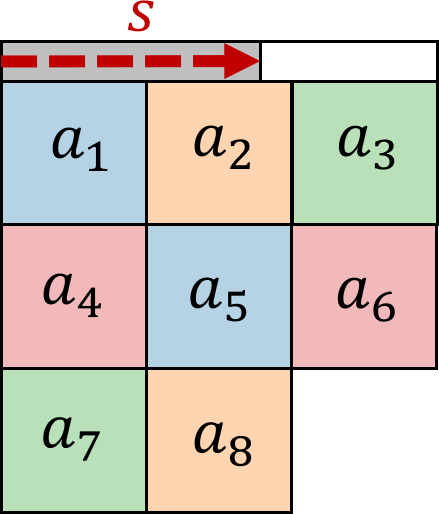
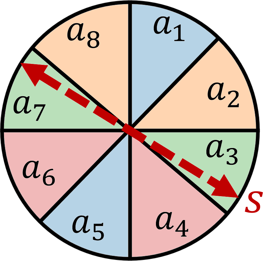
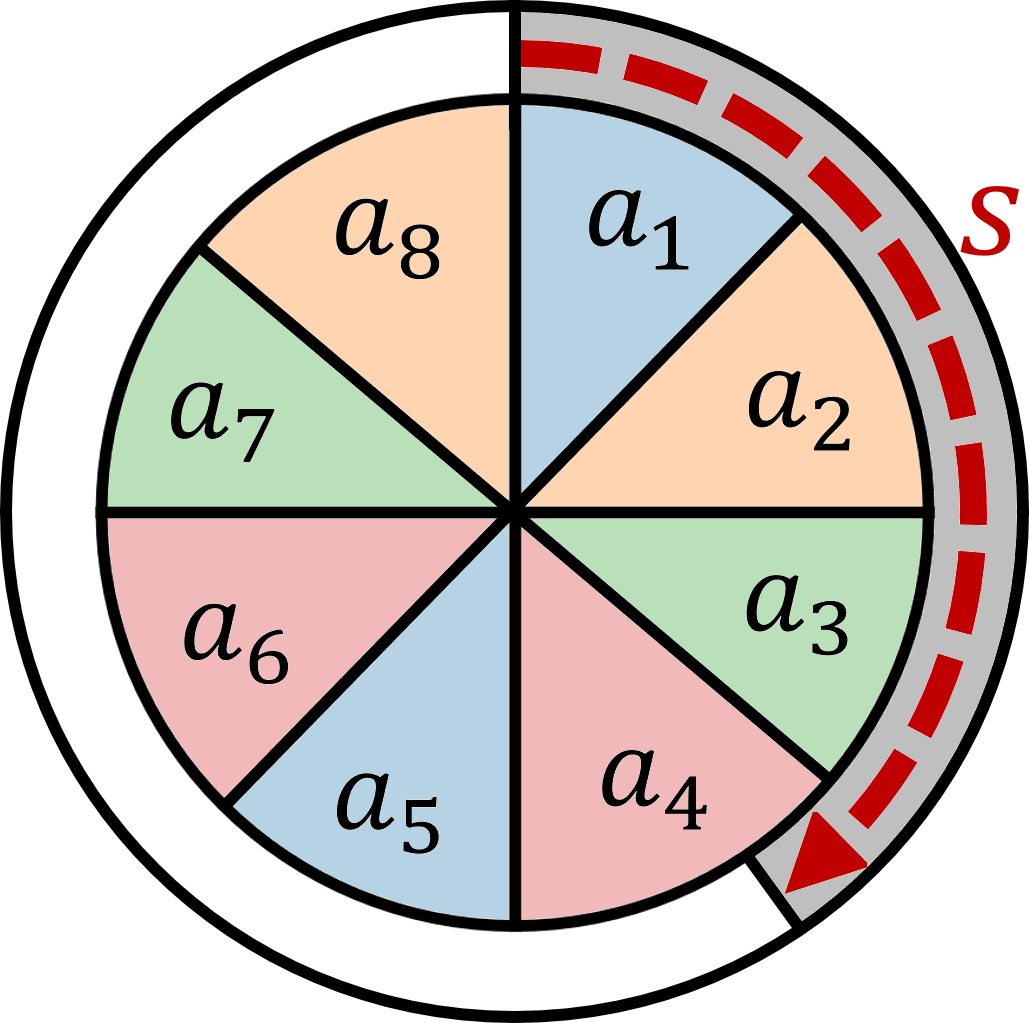
Glyph Representation: To represent categorical subsets, we developed four glyph representations. All glyphs visualize the attributes and their respective values by dividing a square or circle into segments of equal size, such that each segment represents one attribute. This square-based glyph is inspired by pixel visualizations pioneered by Keim et al. [62]. In Fig. 3, this is represented by the categories to for the case of a dataset with eight attributes. For all glyphs, the segments are colored according to the respective category of the attribute. However, we discuss some limitations in section VI. The area-based glyphs represent the relative size of a subset by the area (see Fig. 3 (a) and (c)). Thus, we calculate the width and height accordingly. The bar- and arc-based glyphs have a fixed size to minimize space requirements and overlap issues with neighboring glyphs (see Fig. 3 (b) and (d)). To reduce overlap while preserving the relative proximity of the projected points, we decided to map a subset’s size to a bar at the top or an arc sounding the glyph as an alternative encoding for the subset size. Hence, each unique subset is represented by an equally sized square or circle with an indicator filled according to the relative percentage of data points the subset represents. This enables users to perceive similar subsets and assess the size of each group.
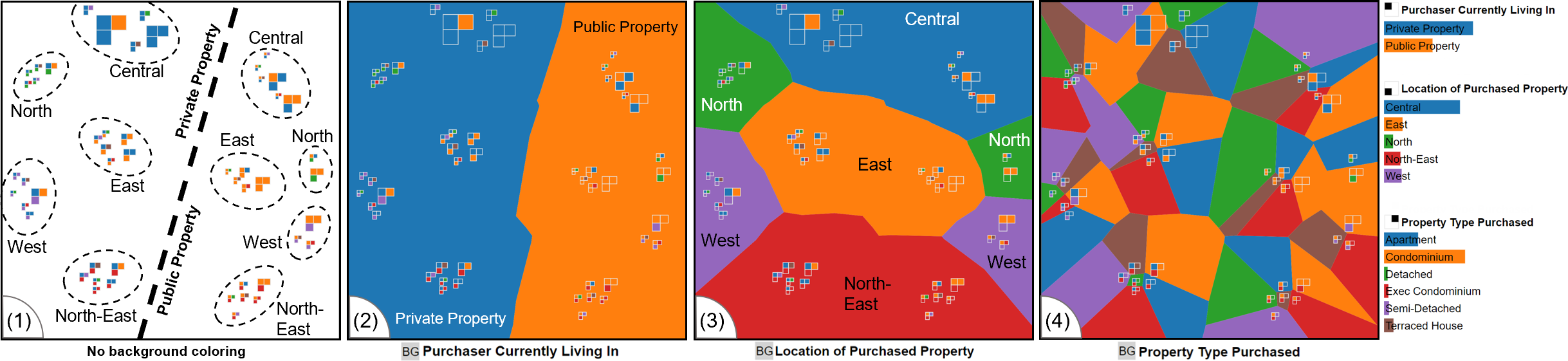
Layout Enrichment: To enable the observation of cluster characteristics and explore attributes in the projected space, we show a Voronoi diagram for a selected attribute Fig. 2). The Voronoi diagram automatically partitions the map into polygons such that each polygon contains exactly one subset. By selecting one attribute of interest, the partition for the selected attribute gets displayed in the background of the projection. The color of the polygon then encodes the category of the selected attribute. Thereby, it is possible to directly spot cluster regions for the selected attribute and to identify cluster boundaries and outlying data points. The appearance of the background can differ a lot across attributes (see Fig. 5). Attributes form distinct contiguous areas of different sizes, indicating a neighborhood or larger area of subsets of the same category. We quantify this property to rank attributes since large contiguous areas are easier to interpret and hint at attributes with a high impact on the projection. We also added detail-on-demand using tooltips, allowing users to see the respective category for each polygon directly.
III-D Interacting with Attributes and Subsets
Our method does not focus on interaction. However, our prototype allows for interactions on attributes and subsets.
Attribute Selection: Users can change the attribute visualized through layout enrichment. However, we also show the outline for categories of a second selected attribute (see Fig. 4). We add the borders of categories to the foreground if another attribute is already selected and visualized in the background. This visual cue does allow for the observation of one main attribute and a second attribute, similar to the outline of MosaicSets [63], which introduces less clutter and thus requires less effort to perceive. We initially used textures with different colors to represent different categories. However, using textures of different colors to fill each cell in the Voronoi portioning introduced excessive clutter, and the interpretation of common regions was difficult.
Subset Selection: We allow for the selection and highlighting of groups of subsets. Once the user has selected data items, using Lasso selection, we show the common categories of the selection and highlight all data items outside of the selection with the same combination of categories. This interaction enables cluster analysis since all categories that contribute to the selection are highlighted. Additionally, all subsets matching the common categories of the selection are also highlighted. Together, this allows analysts to observe and judge group cohesion along with the contributing attributes.
III-E Measuring Fracturedness
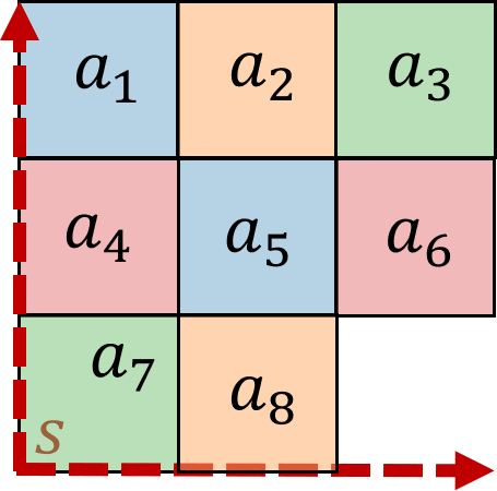
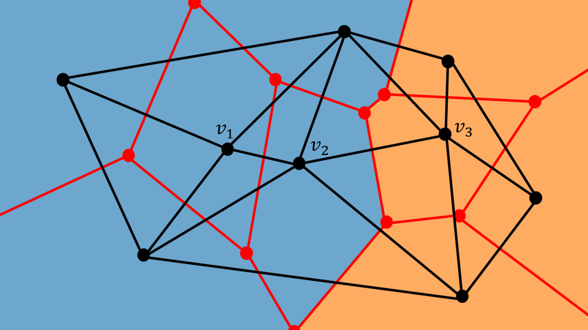
We quantify fracturedness, generally defined as the strength with which the Voronoi partitioning of an attribute appears disjointed and fractured (see Fig. 5). We use fracturedness to suggest attributes for analysis, e.g., the lower the fracturedness value, the larger the continus areas of categories and thus the more straightforward to orient along addressing (R4). We use the Delaunay triangulation of the Voronoi diagram as a basis for our measures [65]. Before describing the measures, we define the common notations following established notations [66, 67]. Let be the Delaunay triangulation of the discrete set of points resulting from the projection (see subsection III-B). Thus, is an undirected graph and the dual graph of the Voronoi diagram of the points Therefore, there exists exactly one for every defining its x,y-location, and categories. Each vertex has exactly one associated category for each attribute .
Edge-based Fracturedness: We measure the number of edges in that connect cells with different associated attributes. This concept is shown Fig. 6. We define an edge as with and . An edge contributes to fracturedness, if the category for the analyzed attribute and its associated categories in differs for the connected vertices, i.e., for .
| (5) |
| (6) |
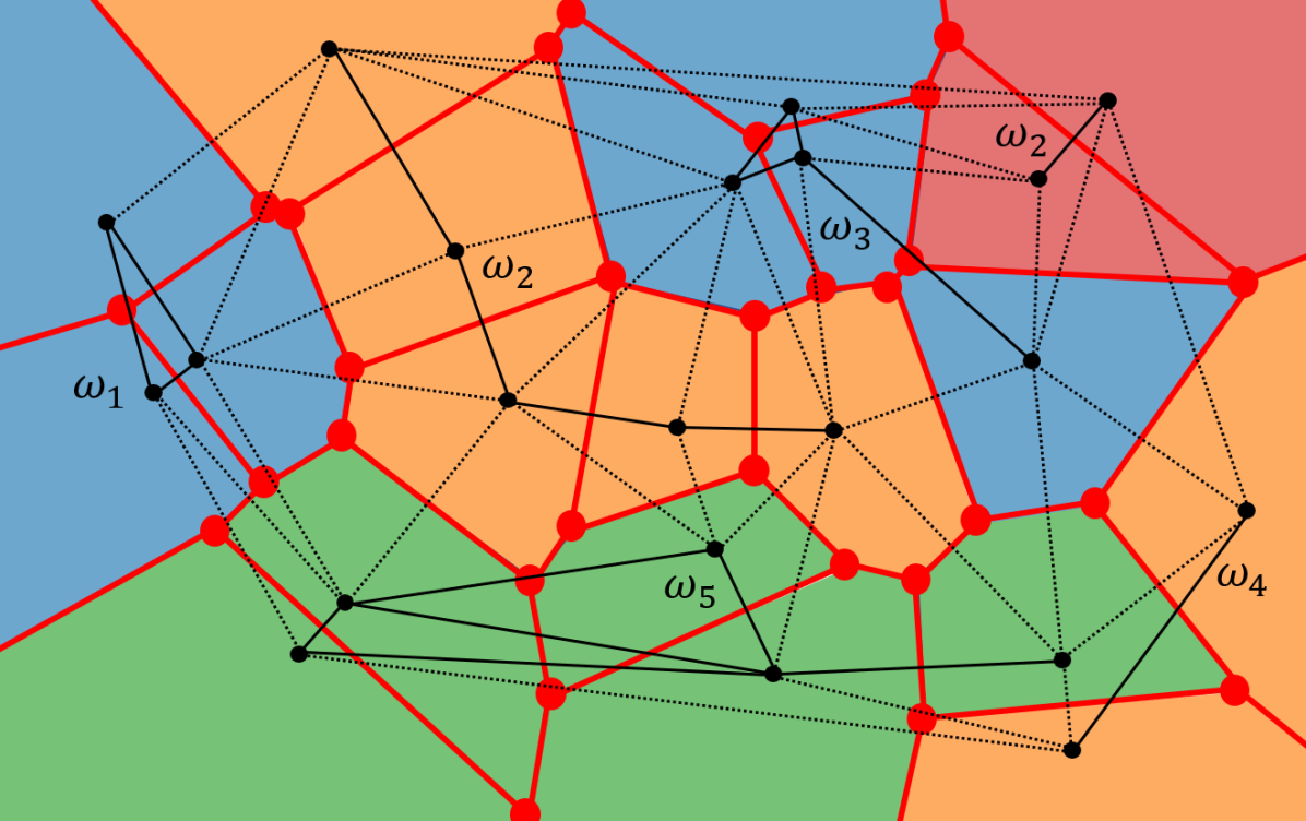
Component-based Fracturedness: This measure quantifies the number of continuous areas an attribute produces in the plot through its categories. We show the concept of component-based fracturedness in Fig. 7. Each category defines an induced subgraph of , with for all of an attribute . The induced subgraph is a graph with the vertices and the edges in with both of its vertices in . We formally define for a category in Equation 7.
| (7) |
With this definition, a category defines a partition of , i.e., and a vertex can only have one category , thus for a given attribute . Therefore, there exits subgraphs of for attribute . Let be the number of connected components of any graph . The component-based fracturedness is dependent on the number of connected components of all subgraphs for each . We define the sum of the number of components of all induced subgraphs as for an attribute . is formally defined in Equation 8.
| (8) |
We can also quantify the fracturedness a single category contributes to the overall measure. This allows us to differentiate categories forming contiguous areas and highly fractured ones. The fracturedness of a single category is defined in Equation 9.
| (9) |
The overall fracturedness of a projection for an attribute is denoted by which we define in Equation 10. allows us to compare different attributes and is an alternative measure to .
| (10) |
The sum of all components-based fracturedness values of individual categories is summing to the fracturedness of the attribute the above value. We express this relationship in Equation 11.
| (11) |
A mathematical proof of the equivalence described in Equation 11 is available in the supplementary material.
IV Interpreting the Categorical Data Map
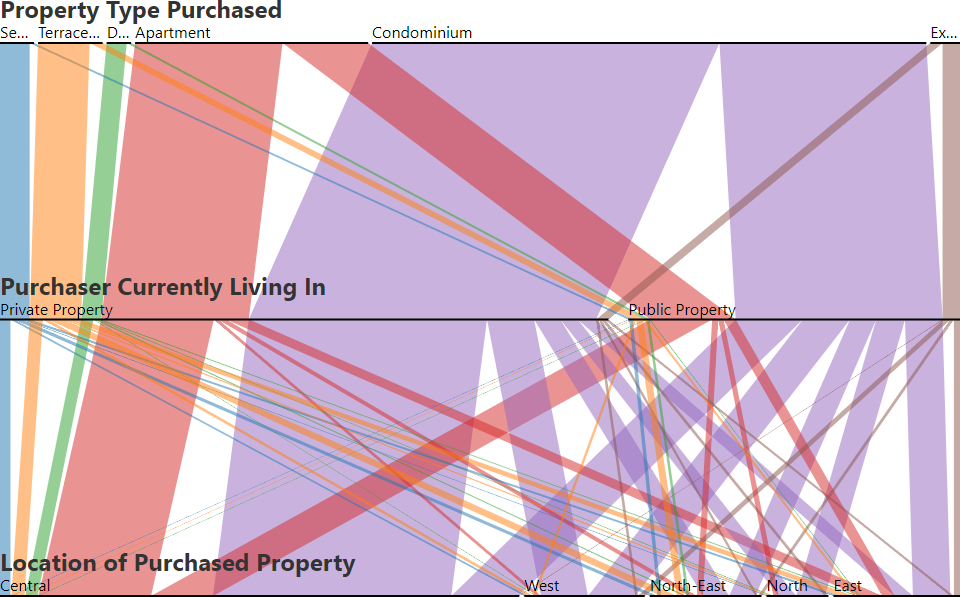
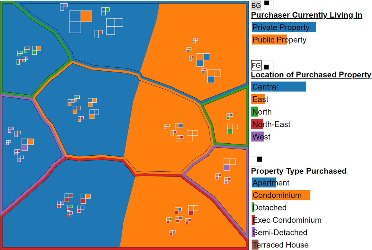
In the following, we perform a case study on cluster and attribute analysis, using the Property Sales dataset [13] (see Fig. 2) to show how to interpret emerging patterns for cluster, outlier, and similarity analysis. We chose this dataset because of its simplicity and ability to explain concepts. However, it lacks the complexity of large categorical datasets, which we will address in an expert study (see section V).
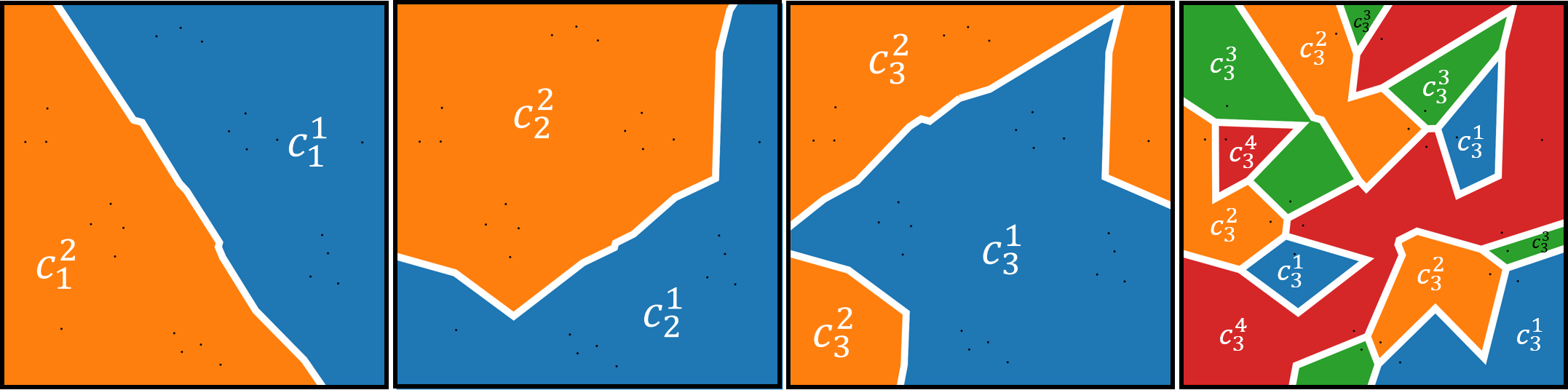
Cluster Analysis There exist a total of possible data items, given that all combinations of attributes are allowed, resulting in an exponential growth in the number of possible and unique data items. Hence, we can assume that there are dependencies and relationships among the categories contained in a dataset impacting their their distribution. This means that groups of subsets that share a set of attributes should form perceivable structures (i.e., clusters) when projected using dimensionality reduction methods. Thus, our approach benefits from and leverages the sparsity of categorical data.
For the Property Sales dataset, there are ten clusters (see Fig. 2 (1)). There is a symmetric split along the center of the projection. Given the size of this dataset, we can observe that the two attributes Purchaser Currently Living In and Location of Property dominate the appearance of the project. Looking at glyph sizes, the categories Private Propriety and Central often occur together while {Private Propriety, Central, Condomimum} is the largest unique subset.
Attribute Analysis: By encoding the attribute values in the background, we enable users to analyze the distribution of subsets in the projection with respect to one or two attributes. For the Property Sales dataset, we found that the attribute Purchaser Currently Living In creates a clear and straight division between subsets (see Fig. 2 (2)). We can also see a second level of grouping by the Location of Property attribute forming a close to orthogonal split in the project, which can be spotted with our visualizations (see Fig. 2 (3) and Fig. 4). We also found that the appearance of the partitioning depends a lot on the selected attributes. When observing the layout enrichment, attributes present themselves on a spectrum from a few clearly separated groups to intermingled and highly fractured appearances. Property Type Purchased does not contribute to the clustering of elements. We can also see that for the Location of Property attribute, the areas of the categories North and West are disjointed, which is reflected in both measures, hinting at a harder-to-interpret layout enrichment and ant-tribute not contributing to cluster cohesion.
V Evaluation
We compare our Categorical Data Map directly to existing visualization of categorical data, such as Parallel Sets [9, 8]. Additionally, we performed an expert study on the Titanic [64] and Mushroom [68] datasets with five data scientists.
V-A Comparison to Euler Diagrams and Parallel Sets
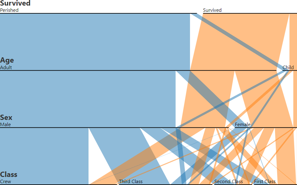
For categorical data, each data point has exactly one category for each attribute, while in Euler diagrams, the number of sets an element is included is not restricted, i.e., it could be in less. Thus, to truthfully represent categorical data in Euler diagrams, there need to be sets, i.e., one set for each category of all attributes. Euler diagrams may require the selection of specific subsets of attributes and, therefore, are less suitable for exploratory data analysis. For highly intersecting sets, automatic layout methods might not create a single diagram [12]. We show an example of an automatically generated split Euler diagram for the Titanic dataset in Fig. 9 (left). The attribute Age was removed to reduce the diagram’s complexity. The Titanic dataset requires ten sets. However, even with eight sets, the visualization is disjointed.
Parallel Sets are alternative categorical sets visualization, combining principles from stacked bars and parallel coordinate plots. Fig. 9 (right) shows the Titanic dataset in a through overlap reduced readability improved Parallel Sets visualization. Small subsets are represented as very thin ribbons on the lowest level, which can be hard to perceive. Visualizing the Mushroom dataset with classical Parallel Sets is not visually feasible since it will have 22 ribbon layers and 8123 subsets on the lowest level (see supplementary material). Alsakran et al. [69] addressed this issue by only visualizing 2-dimensional subsets in a modified Parallel Sets visualization. However, the relation between 2-dimensional subsets is lost. Thus, we argue that Euler diagrams and Parallel Sets, as examples of established visualizations for categorical data, do not scale with increasing dataset size or, more specifically, the number of attributes.
V-B Qualitative Expert User Study
To evaluate the Categorical Data Map we performed a paired analytics study [70]. We conducted an expert study with five data scientists, E1–E5, with varying backgrounds. All participants were Ph.D. candidates and students. All were male, and the age range was 25 to 30 years. All experts had experience in the area of information visualization and visual analytics. During the study, we asked the experts to verbalize their thought process so that we could capture it.
All trials followed a predefined structure and took between 43 and 57 minutes. The study was conducted in German. The study started with an introduction to the Categorical Data Map using the Property Sales dataset by Hassan et al. [71] shown in Fig. 2 and included a description of the square area glyph, layout enrichment, and interactions to introduce the expert to the prototype. After the introduction, the experts had the opportunity to ask questions regarding our approach.
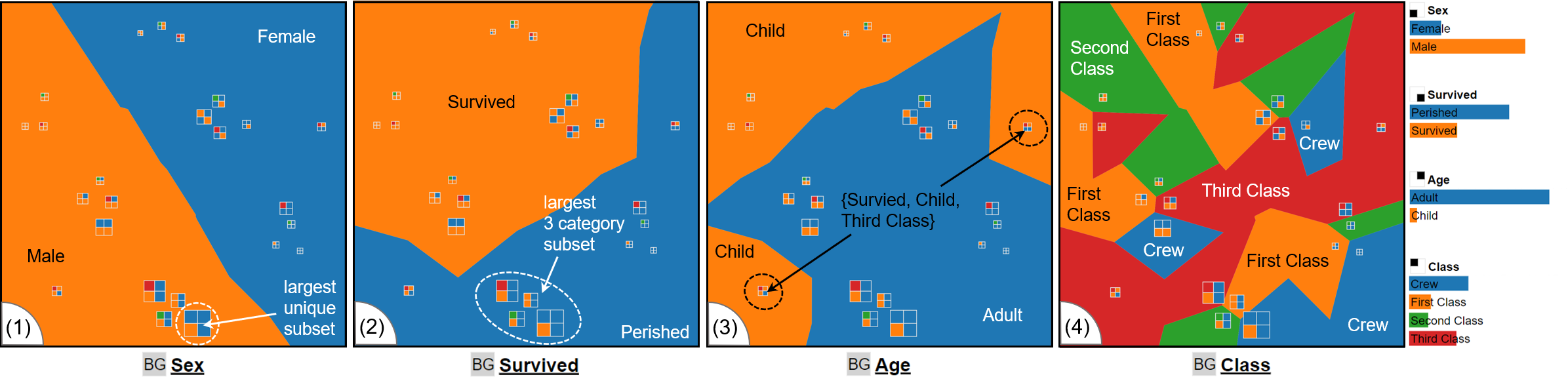
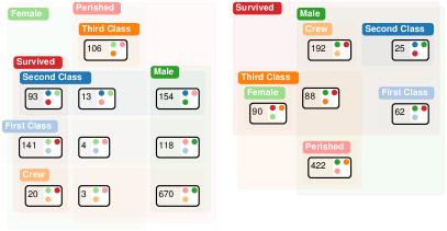
Titanic Dataset: The experts had to analyze the Titanic dataset [64] using the Categorical Data Map shown in Fig. 8. E1–E5 were able to locate the largest subset {Male, Perished, Adult, Crew} by looking at the vitalization without any additional interaction (see Fig. 8 (1)). E1–E5 used Lasso selection to find and validate that the largest subset regarding three attributes is {Male, Perished, Adult} (see Fig. 8 (2)). Additionally, E1–E5 were able to find six clusters and two outliers. E1, E3, and E4 found that the outliers were subsets representing the subsets for the {Survived, Child, Crew} categories (see Fig. 8 (3)). E1, E3, and E5 commented on the high number of perished males and the large number of casualties among the {Male, Crew}. E1–E5 used the layout enrichment to navigate and reason about the location of subsets, including the Class attribute (see Fig. 8 (4)). E2 commented on the close to orthogonal split in the projection between Sex and Survived shown in Fig. 8 (1) and (2).
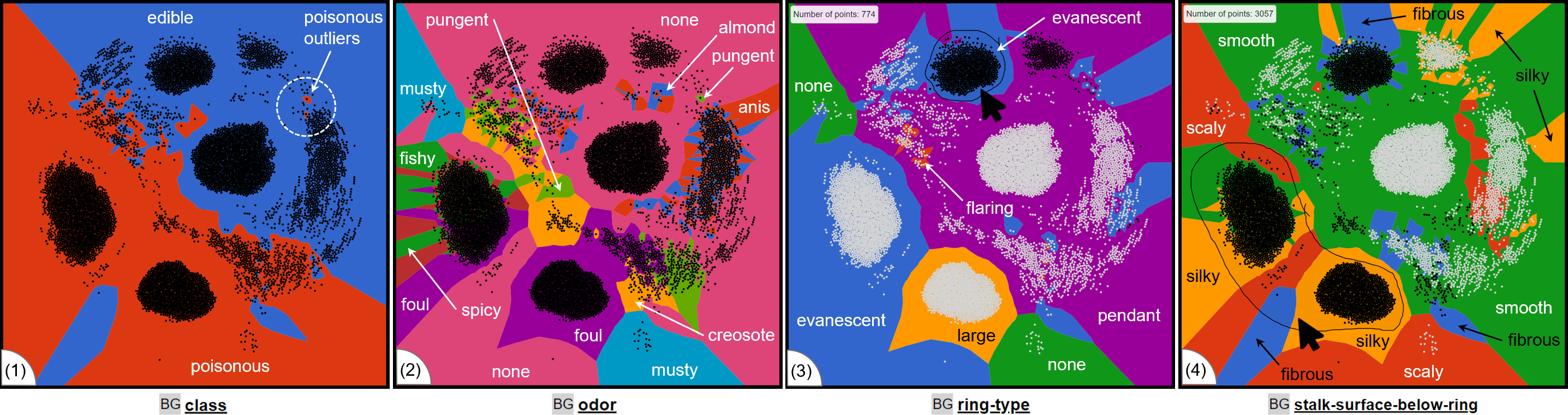
Mushroom Dataset: E1–E5 had the opportunity to perform an open exploration task and were only given the information that the dataset is about mushrooms and that the class attribute indicates their poisonousness. The glyph was replaced with a simple black dot. E1–E5 perceived five clusters right at the outset. E2 and E3 used the Lasso selection together with layout enrichment to determine differentiating categories for cluster separation, e.g., evanescent, large, and pendent for the ring-type attribute (see Fig. 10 (3)). E1–E5 found the poisonous outliers nested in the group representing edible mushrooms (see Fig. 10 (1)) being poisonous mushrooms very similar to edible ones. E1–E5 found the general rule that mushrooms with an odor of fishy, foul, musty, spicy, and other unpleasant smells indicate a poisonous mushroom (see Fig. 10 (2)). During the open exploration task, E1, E2, and E3 found the rule without additional information. E4 and E5 needed help to find the class and oder combination. However, E4 and E5 could deduce the rule by only interpreting the plot. E3, being the quickest in exploring the dataset, found that stalk-surface-below-ring is silky for the majority of poisonous mushrooms and that the stalk-surface-below-ring is largely smooth for edible ones. E3 found that poisonous mushrooms generally have a silky stalk-surface-below-ring and few edible ones are silky but rather smooth (see Fig. 10 (4)).
General Comments: Before concluding the study, the participants were asked to comment on their preferences for the available glyph designs. E1, E2, and E4 preferred a circular glyph design (see Fig. 3 (c) and (d)) over a square design. E3 and E5 preferred square glyph designs (see Fig. 3 (a) and (b)). E1 and E3 found that the area-based glyphs are inferior to the alternative designs for reading off precise subset sizes. E1 found the glyph hard to interpret because of multiple possible interpretations if rotated. E1 commented that the layout enrichment is very useful for navigation and orientation and helps to perceive the impact on category groups. However, E1 also noted that the layout enrichment does not indicate the number of data items with the category. E3 mentioned a general preference for the map metaphor by being helpful for orientation among different subsets. E2 mentioned potential scalability issues with the glyph for large datasets, e.g., for a high number of attributes and proposed semantic zoom as a potential option. E1–E5 commented that ordering attributes according to their fracturedness was understandable and useful. During the general questions at the end, E2–E4 freely explored plots created with other distance measures and DR methods. E3 commented that the result of MCA-based plots was hard to interpret, noticing the disjointed layout enrichment. E1 mentioned issues with the encoding of categories, such as the category North not being located north of the plot or the category brown not having the color brown, and suggested being able to change the color of a category manually.
VI Discussion and Future Work
In this section, we discuss lesson-learned findings regarding our approach and reflect on the design decisions, as well as computational complexity and future work.
Visualizing Attributes and Categories: We initially used circular glyphs as shown on Fig. 3 (c) and (d), which had the benefit of using the available space effectively since overlap minimization relative to the radius is straightforward to implement. The subset size encoding by the arc around the circle enables finer-grained distinction of sizes since it offers more space. However, during the design phase, users misinterpreted the circle segments as pie charts, a common method for displaying categorical data. Thus, we decided to circumvent this common misconception by using square-based representation for the categorical subsets. However, three out of five experts preferred a circular glyph design.
There are visual limitations to the number of dimensions and categories that our approach is able to support. The number of visually distinguishable categories is limited by the number of square segments that fit into the glyph, which is limited by the screen space. The number of attributes is limited by the number of colors, which have to be distinguishable and memorizable. Thus, we suggest following Miller’s Law [72] for the number of dimensions and attributes, which proposes a maximum of seven plus or minus two. Alternatively, we suggest interactions such as semantic zoom, e.g., removing attributes for which all subsets have the same category after zooming in on a specific area.
Encoding of Subset Sizes: We evaluated four different visual encodings for the size of a categorical data subset (see Fig. 3). The area-based glyph makes it easier to perceive subset sizes at a glance, and thus, a user can spot the distribution of the dataset directly, but it suffers from overlap, especially for tight clusters. There is a benefit of applying methods to reduce the overlap. We are able to largely mitigate the overlap problem with the encoding-based design since it requires less space but the assessment of subset sizes takes more effort. Finally, all glyph designs benefit from a mechanism that moves the currently selected subset to the top, such that all dimensions can be equally well observed. With interaction, it is possible to remove the subset size information altogether. However, this limits analysis to datasets and tasks where the subset sizes it not important, e.g., the Mushroom dataset.
Encoding of Attributes Into the Background: Fig. 8 shows that encoding an attribute into the visualization gives insight into the topology of the projection. We could also show the benefit of encoding multiple dimensions into the background to allow for a more complex representation of the topology.
We found that the number of categories does weakly influence the fracturedness of an attribute. However, the main factor is the number of subsets containing the attribute, i.e., an attribute with two categories and an occurrence and a half and half split among the subsets will yield a low fracturedness. With increased imbalance between the categories, the fracturedness may increase if other more balanced attributes are present.
We also found that a force-directed graph layout will preserve the location of projected points better than Lloyd’s algorithm. Lloyd’s algorithm changes the appearance of clusters in a less predictable way and changes the structure where overlap is not a problem. Thus, we suggest the use of force-directed graph layout over Lloyd’s algorithm.
We discussed the use of weighted Voronoi diagrams [73] to better reflect the subset size in the background encoding. The use of a weighted Voronoi diagram will conflict with the truthful representation of areas assigned to a specific category, more specifically, for imbalanced datasets, the area of one Voronoi cell extends below the point of its neighbors. This behavior makes the layout enrichment hard to interpret since points are placed inside an area representing a category they do not belong to. For datasets with only unique entries, the weight Voronoi diagram will be identical to the regular Voronoi diagram. To organize subsets, we also considered Voronoi Treemaps [74]. However, Voronoi Treemaps require a hierarchical structure, just like regular Tree Maps [75] and, thus, cannot be applied to categorical data without additional information to derive a hierarchy of attributes.
Computational Complexity: Computationally, the number of data records poses potential limitations. The time complexity of projecting data is determined by the dimensionality reduction methods. However, since categorical data sets are sparse, as discussed in section IV, the number of projected subsets is significantly lower than that of data records. The Voronoi diagram calculation and the corresponding Delaunay triangulation are both in . The time complexity of calculating the fracturedness measures depends on the number of vertices and edges of the Delaunay triangulation, which will have n vertices and edges, where is the number of vertices on the convex hull. The time complexity of calculating is edge-based fracturedness is based on enumerating all edges of the Delaunay triangulation and has a time complexity of . The time complexity of calculating component-based fracturedness is dependent on the algorithm for determining the number of components. We use a depth-first search-based approach with time complexity of . Thus, the dimensionality reduction method employed poses the highest contribution to the time complexity, e.g., for MDS and for t-SNE , which will be the overall time complexity.
Future Work: One interesting observation we made was that, in clusters, flipping neighboring subsets and their representing cells could decrease fracturedness for an attribute while only marginally increasing the fracturedness of other attributes. Thus, flipping neighboring subsets in clusters can improve the layout for a given attribute. We think that the concept of fracturedness can be transferred to high-dimensional space when analyzing categorical data. Such a measure can be used to compare the low- and high-dimensional representations and provide a quality measure for projections of categorical data. In this paper, we made qualitative statements about the effectiveness of dimensionality reduction methods for projecting categorical data. The next logical step is a quantitative evaluation of dimensionality methods, also considering the different types of representations and distance measures.
VII Conclusion
We presented a novel projection-based visualization method to address the need for similarity-based analysis techniques for categorical data by leveraging distance relations based on set intersections to create enhanced, interactive glyph-based scatterplot-like visualizations called the Categorical Data Map. Because of the inherent sparsity of categorical data, groups of similar data items are grouped into clusters. We visualized attributes and categories by calculating a Voronoi partitioning and coloring the cells according to the category of the associated attribute. Our method allows for exploring the categorical data space through segmentation, enabling the orientation along an automatic or user-selected attribute. For automatic selection, we rank-order attributes along a visual property we defined as fracturedness, for which we provided two measures. Through a case study, we showed that our Categorical Data Map can support the identification of similar subsets and clusters, as well as the detection of attributes with a strong influence on the topology of the embedding. Additionally, in an expert study, we were able to confirm that our approach facilitates the analysis of categorical data, especially for large datasets, by grouping similar subsets while, through layout enrichment, visualizing the distribution of categories of an attribute. We published a demonstrator and our results online so that users can interactively experiment with our approach and build upon our results. We conclude that the Categorical Data Map provides an effective way to analyze large categorical datasets, especially in exploratory scenarios.
References
- [1] H. Hofmann, A. Siebes, and A. F. X. Wilhelm, “Visualizing association rules with interactive mosaic plots,” in 6th ACM SIGKDD Int. Conf. on Knowledge Discovery and Data Mining. ACM, 2000, pp. 227–235.
- [2] K. Wittenburg, T. Lanning, M. Heinrichs, and M. Stanton, “Parallel bargrams for consumer-based information exploration and choice,” in 14th Annual ACM Symp. User Interface Softw. Technol. ACM, 2001, pp. 51–60.
- [3] M. Spenke and C. Beilken, “Visualization of Trees as Highly Compressed Tables with InfoZoom,” in IEEE Symp. Inf. Vis., 2003, pp. 122–123.
- [4] B. Alsallakh, L. Micallef, W. Aigner, H. Hauser, S. Miksch, and P. J. Rodgers, “The state-of-the-art of set visualization,” Comput. Graph. Forum, vol. 35, no. 1, pp. 234–260, 2016.
- [5] S. T. Teoh and K. Ma, “Paintingclass: interactive construction, visualization and exploration of decision trees,” in 9th ACM SIGKDD Int. Conf. on Knowledge Discovery and Data Mining. ACM, 2003, pp. 667–672.
- [6] D. F. Jerding and J. T. Stasko, “The information mural: A technique for displaying and navigating large information spaces,” IEEE Trans. Vis. Comput. Graph., vol. 4, no. 3, pp. 257–271, 1998.
- [7] G. E. Rosario, E. A. Rundensteiner, D. C. Brown, M. O. Ward, and S. Huang, “Mapping nominal values to numbers for effective visualization,” Inf. Vis., vol. 3, no. 2, pp. 80–95, 2004.
- [8] R. Kosara, F. Bendix, and H. Hauser, “Parallel sets: Interactive exploration and visual analysis of categorical data,” IEEE Trans. Vis. Comput. Graph., vol. 12, no. 4, pp. 558–568, 2006.
- [9] F. Bendix, R. Kosara, and H. Hauser, “Parallel sets: Visual analysis of categorical data,” in IEEE Symp. Inf. Vis., 2005, pp. 133–140.
- [10] A. B. W. Kennedy and H. R. Sankey, “The thermal efficiency of steam engines,” Minutes Proc. Inst. Civ. Eng., vol. 134, pp. 278–312, 1898.
- [11] F. L. Dennig, M. T. Fischer, M. Blumenschein, J. Fuchs, D. A. Keim, and E. Dimara, “Parsetgnostics: Quality metrics for parallel sets,” Comput. Graph. Forum, vol. 40, no. 3, pp. 375–386, 2021.
- [12] P. Paetzold, R. Kehlbeck, H. Strobelt, Y. Xue, S. Storandt, and O. Deussen, “Recteuler: Visualizing intersecting sets using rectangles,” Comput. Graph. Forum, vol. 42, no. 3, pp. 87–98, 2023.
- [13] L. C. Koh, A. Slingsby, J. Dykes, and T. S. Kam, “Developing and applying a user-centered model for the design and implementation of information visualization tools,” in 15th Int. Conf. Inf. Vis., 2011, pp. 90–95.
- [14] F. L. Dennig, L. Joos, D. Blumberg, D. A. Keim, and M. T. Fischer, “Replication Data for: “The Categorical Data Map”,” 2023.
- [15] M. E. Baron, “A note on the historical development of logic diagrams: Leibniz, euler and venn,” The Mathematical Gazette, vol. 53, no. 384, pp. 113–125, 1969.
- [16] R. Kehlbeck, J. Görtler, Y. Wang, and O. Deussen, “SPEULER: semantics-preserving euler diagrams,” IEEE Trans. Vis. Comput. Graph., vol. 28, no. 1, pp. 433–442, 2022.
- [17] J. G. Pérez-Silva, M. Araujo-Voces, and V. Quesada, “nvenn: generalized, quasi-proportional venn and euler diagrams,” Bioinformatics, vol. 34, no. 13, pp. 2322–2324, 2018.
- [18] L. Micallef, P. Dragicevic, and J. Fekete, “Assessing the effect of visualizations on bayesian reasoning through crowdsourcing,” IEEE Trans. Vis. Comput. Graph., vol. 18, no. 12, pp. 2536–2545, 2012.
- [19] P. J. Rodgers, G. Stapleton, and P. Chapman, “Visualizing sets with linear diagrams,” ACM Trans. Comput. Hum. Interact., vol. 22, no. 6, pp. 27:1–27:39, 2015.
- [20] A. Lex, N. Gehlenborg, H. Strobelt, R. Vuillemot, and H. Pfister, “Upset: Visualization of intersecting sets,” IEEE Trans. Vis. Comput. Graph., vol. 20, no. 12, pp. 1983–1992, 2014.
- [21] W. Meulemans, N. H. Riche, B. Speckmann, B. Alper, and T. Dwyer, “Kelpfusion: A hybrid set visualization technique,” IEEE Trans. Vis. Comput. Graph., vol. 19, no. 11, pp. 1846–1858, 2013.
- [22] A. Inselberg, “The plane with parallel coordinates,” Vis. Comput., vol. 1, no. 2, pp. 69–91, August 1985.
- [23] R. H. Day and E. J. Stecher, “Sine of an illusion,” Perception, vol. 20, pp. 49–55, 1991.
- [24] S. VanderPlas and H. Hofmann, “Signs of the sine illusion—why we need to care,” J. Comput. Graph. Stat., vol. 24, no. 4, pp. 1170–1190, 2015.
- [25] M. Greenacre and Blasius, Multiple Correspondence Analysis and Related Methods, 1st ed. Chapman & Hall/CRC, 2006.
- [26] I. T. Jolliffe, Principal Component Analysis. Springer, 1986.
- [27] K. R. Gabriel, “The biplot graphic display of matrices with application to principal component analysis,” Biometrika, vol. 58, no. 3, pp. 453–467, 12 1971.
- [28] J. Pagès, Multiple Factor Analysis by Example Using R, 1st ed., ser. R Series. Chapman & Hall/CRC, 2014.
- [29] S. Cheng and K. Mueller, “The data context map: Fusing data and attributes into a unified display,” IEEE Trans. Vis. Comput. Graph., vol. 22, no. 1, pp. 121–130, 2016.
- [30] M. Thane, K. M. Blum, and D. J. Lehmann, “CatNetVis: Semantic Visual Exploration of Categorical High-Dimensional Data with Force-Directed Graph Layouts,” in 25th Eurographics Conference on Visualization, T. Hoellt, W. Aigner, and B. Wang, Eds. The Eurographics Association, 2023.
- [31] L. G. Nonato and M. Aupetit, “Multidimensional projection for visual analytics: Linking techniques with distortions, tasks, and layout enrichment,” IEEE Trans. Vis. Comput. Graph., vol. 25, no. 8, pp. 2650–2673, 2019.
- [32] M. Aupetit, “Visualizing distortions and recovering topology in continuous projection techniques,” Neurocomputing, vol. 70, no. 7-9, pp. 1304–1330, 2007.
- [33] S. Lespinats and M. Aupetit, “Checkviz: Sanity check and topological clues for linear and non-linear mappings,” Comput. Graph. Forum, vol. 30, no. 1, pp. 113–125, 2011.
- [34] B. Broeksema, A. C. Telea, and T. Baudel, “Visual analysis of multi-dimensional categorical data sets,” Comput. Graph. Forum, vol. 32, no. 8, pp. 158–169, 2013.
- [35] J. Sohns, M. Schmitt, F. Jirasek, H. Hasse, and H. Leitte, “Attribute-based explanation of non-linear embeddings of high-dimensional data,” IEEE Trans. Vis. Comput. Graph., vol. 28, no. 1, pp. 540–550, 2022.
- [36] C. Morariu, A. Bibal, R. Cutura, B. Frenay, and M. Sedlmair, “Predicting user preferences of dimensionality reduction embedding quality,” IEEE Trans. Vis. Comput. Graph., vol. 29, no. 1, pp. 745–755, 1 2023.
- [37] M. Behrisch, M. Blumenschein, N. W. Kim, L. Shao, M. El-Assady, J. Fuchs, D. Seebacher, A. Diehl, U. Brandes, H. Pfister, T. Schreck, D. Weiskopf, and D. A. Keim, “Quality metrics for information visualization,” Comput. Graph. Forum, vol. 37, no. 3, pp. 625–662, 2018.
- [38] M. Behrisch, B. Bach, M. Hund, M. Delz, L. von Rüden, J. Fekete, and T. Schreck, “Magnostics: Image-based search of interesting matrix views for guided network exploration,” IEEE Trans. Vis. Comput. Graph., vol. 23, no. 1, pp. 31–40, 2017.
- [39] L. Wilkinson, A. Anand, and R. L. Grossman, “Graph-theoretic scagnostics,” in IEEE Symp. Inf. Vis., 2005, pp. 157–164.
- [40] M. Aupetit and M. Sedlmair, “Sepme: 2002 new visual separation measures,” in IEEE Pacific Vis. Symp., C. Hansen, I. Viola, and X. Yuan, Eds. IEEE Computer Society, 2016, pp. 1–8.
- [41] M. M. Abbas, M. Aupetit, M. Sedlmair, and H. Bensmail, “Clustme: A visual quality measure for ranking monochrome scatterplots based on cluster patterns,” Comput. Graph. Forum, vol. 38, no. 3, pp. 225–236, 2019.
- [42] A. Dasgupta and R. Kosara, “Pargnostics: Screen-space metrics for parallel coordinates,” IEEE Trans. Vis. Comput. Graph., vol. 16, no. 6, pp. 1017–1026, 2010.
- [43] D. J. Lehmann, F. Kemmler, T. Zhyhalava, M. Kirschke, and H. Theisel, “Visualnostics: Visual guidance pictograms for analyzing projections of high-dimensional data,” Comput. Graph. Forum, vol. 34, no. 3, pp. 291–300, 2015.
- [44] J. Schneidewind, M. Sips, and D. A. Keim, “Pixnostics: Towards measuring the value of visualization,” in IEEE Symp. Vis. Anal. Sci. Technol., 2006, pp. 199–206.
- [45] L. van der Maaten and G. Hinton, “Visualizing data using t-sne,” J. Mach. Learn. Res., vol. 9, no. 86, pp. 2579–2605, 2008.
- [46] D. Szymkiewicz, “Une conlribution statistique à la géographie floristique,” Acta Societatis Botanicorum Poloniae, vol. 11, no. 3, pp. 249–265, 1934.
- [47] F. L. Dennig, M. Miller, D. A. Keim, and M. El-Assady, “Fs/ds: A theoretical framework for the dual analysis of feature space and data space,” IEEE Trans. Vis. Comput. Graph., 2023, early Access.
- [48] J. Brownlee, “Why one-hot encode data in machine learning?” Online, 2017, https://machinelearningmastery.com/why-one-hot-encode-data-in-machine-learning/, last accessed 2023-03-01.
- [49] S.-H. Cha, “Comprehensive survey on distance/similarity measures between probability density functions,” Int. J. Math. Models Methods Appl. Sci., vol. 1, no. 4, pp. 300–307, 2007.
- [50] S. Boriah, V. Chandola, and V. Kumar, “Similarity measures for categorical data: A comparative evaluation,” in SIAM International Conference on Data Mining. SIAM, 2008, pp. 243–254. [Online]. Available: https://doi.org/10.1137/1.9781611972788.22
- [51] Z. Sulc and H. Rezanková, “Comparison of similarity measures for categorical data in hierarchical clustering,” J. Classif., vol. 36, no. 1, pp. 58–72, 2019. [Online]. Available: https://doi.org/10.1007/s00357-019-09317-5
- [52] W. M. Waggener, Pulse Code Modulation Techniques. Springer, 1994.
- [53] P. Jaccard, “The distribution of the flora in the alpine zone.1,” New Phytologist, vol. 11, no. 2, pp. 37–50, 1912.
- [54] T. Sørenson, “A method of establishing groups of equal amplitude in plant sociology based on similarity of species content and its application to analyses of the vegetation on danish commons,” Kongelige Danske Videnskabernes Selskab, vol. 5, no. 4, pp. 1–34, 1948.
- [55] L. R. Dice, “Measures of the amount of ecologic association between species,” Ecology, vol. 26, no. 3, pp. 297–302, 1945.
- [56] J. C. Gower, “A general coefficient of similarity and some of its properties,” Biometrics, vol. 27, no. 4, pp. 857–871, 1971.
- [57] Y. Cheung and H. Jia, “A unified metric for categorical and numerical attributes in data clustering,” in Advances in Knowledge Discovery and Data Mining, ser. Lecture Notes in Computer Science, vol. 7819. Springer, 2013, pp. 135–146.
- [58] J. B. Kruskal, “Multidimensional scaling by optimizing goodness of fit to a nonmetric hypothesis,” Psychometrika, vol. 29, no. 1, pp. 1–27, 1964.
- [59] S. G. Kobourov, “Spring embedders and force directed graph drawing algorithms,” CoRR, vol. abs/1201.3011, 2012.
- [60] S. P. Lloyd, “Least squares quantization in PCM,” IEEE Trans. Inf. Theory, vol. 28, no. 2, pp. 129–136, 1982.
- [61] M. Bostock, V. Ogievetsky, and J. Heer, “D3 data-driven documents,” IEEE Trans. Vis. Comput. Graph., vol. 17, no. 12, pp. 2301–2309, 2011.
- [62] D. A. Keim, “Designing pixel-oriented visualization techniques: Theory and applications,” IEEE Trans. Vis. Comput. Graph., vol. 6, no. 1, pp. 59–78, 2000.
- [63] P. Rottmann, M. Wallinger, A. Bonerath, S. Gedicke, M. Nöllenburg, and J. Haunert, “Mosaicsets: Embedding set systems into grid graphs,” IEEE Trans. Vis. Comput. Graph., vol. 29, no. 1, pp. 875–885, 2023.
- [64] R. J. M. Dawson, “The ”unusual episode” data revisited,” 1995, http://jse.amstat.org/v3n3/datasets.dawson.html, last accessed 2023-03-01.
- [65] F. Aurenhammer, “Voronoi diagrams - A survey of a fundamental geometric data structure,” ACM Comput. Surv., vol. 23, no. 3, pp. 345–405, 1991. [Online]. Available: https://doi.org/10.1145/116873.116880
- [66] J. Clark and D. A. Holton, A First Look at Graph Theory. World Scientific, 1991.
- [67] M. Aupetit and T. Catz, “High-dimensional labeled data analysis with topology representing graphs,” Neurocomputing, vol. 63, pp. 139–169, 2005.
- [68] G. Lincoff and N. A. Society, National Audubon Society field guide to North American mushrooms, ser. Audubon Society field guide series. Knopf: Distributed by Random House New York, 1981.
- [69] J. Alsakran, X. Huang, Y. Zhao, J. Yang, and K. Fast, “Using entropy-related measures in categorical data visualization,” in IEEE Pacific Vis. Symp., 2014, pp. 81–88.
- [70] L. T. Kaastra and B. D. Fisher, “Field experiment methodology for pair analytics,” in Fifth Workshop on Beyond Time and Errors: Novel Evaluation Methods for Visualization, H. Lam, P. Isenberg, T. Isenberg, and M. Sedlmair, Eds. ACM, 2014, pp. 152–159.
- [71] S. Hassan and G. Pernul, “Efficiently managing the security and costs of big data storage using visual analytics,” in 16th International Conference on Information Integration and Web-based Applications & Services, 2014, pp. 180–184.
- [72] G. A. Miller, “The magical number seven, plus or minus two: Some limits on our capacity for processing information,” Psychological Review, pp. 81–97, 1956.
- [73] P. F. Ash and E. D. Bolker, “Generalized dirichlet tessellations,” Geometriae Dedicata, vol. 20, no. 2, pp. 209–243, 4 1986.
- [74] M. Balzer and O. Deussen, “Voronoi treemaps,” in IEEE Symp. Inf. Vis., J. T. Stasko and M. O. Ward, Eds. IEEE Computer Society, 2005, pp. 49–56.
- [75] B. Shneiderman, “Tree visualization with tree-maps: 2-d space-filling approach,” ACM Trans. Graph., vol. 11, no. 1, pp. 92–99, 1992.