What is different between these datasets?
Abstract
The performance of machine learning models heavily depends on the quality of input data, yet real-world applications often encounter various data-related challenges. One such challenge could arise when curating training data or deploying the model in the real world - two comparable datasets in the same domain may have different distributions. While numerous techniques exist for detecting distribution shifts, the literature lacks comprehensive approaches for explaining dataset differences in a human-understandable manner. To address this gap, we propose a suite of interpretable methods (toolbox) for comparing two datasets. We demonstrate the versatility of our approach across diverse data modalities, including tabular data, language, images, and signals in both low and high-dimensional settings. Our methods not only outperform comparable and related approaches in terms of explanation quality and correctness, but also provide actionable, complementary insights to understand and mitigate dataset differences effectively.
1 Introduction
Some of the most serious challenges facing the data revolution involves data itself: it is often hard to acquire, hard to share, hard to generate, and hard to troubleshoot. If we generate more data, how do we know it follows the same distribution as our original dataset? If we obtain datasets from different sources, how do we know what is different between them? These questions about data generation and comparisons are important: they arise when we generate medical datasets to protect patient privacy [8, 52, 18], generate data to augment small datasets, study data from multiple related sources, or try to determine whether distribution shift has occurred [20, 9, 17, 60]. Thus, it is important to be able to understand the differences between datasets.
Most previous works in this direction studied distribution shift, focusing on detecting whether or not distribution shift has occurred, as well as detecting differences in statistical features between datasets (e.g., mean, median, and variance, etc.) We claim that knowing whether changes have occurred is not good enough, nor is viewing the data through a few basic statistical measurements. Understanding the true nature and extent of the changes can help human operators make informed decisions.
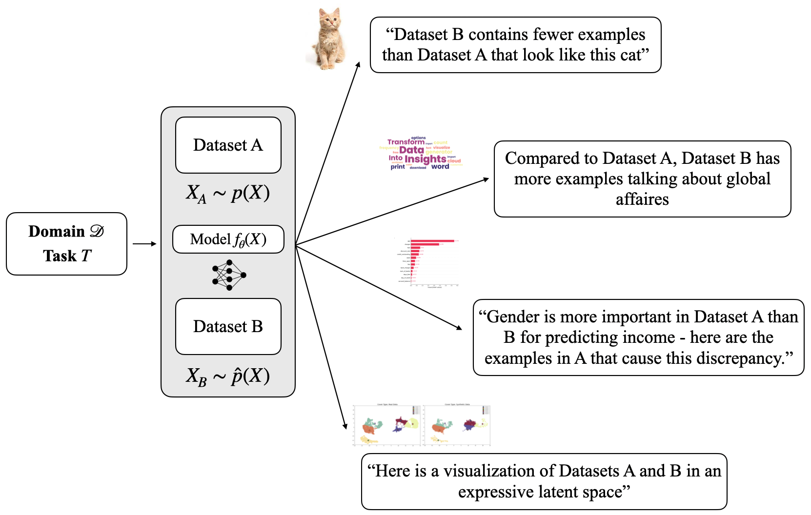
In this work, we propose an explainable AI toolbox for examining the differences between any two datasets, providing detailed and actionable information. We provide approaches for several data modalities, including high dimensional complex data, with examples in audio, time series signal, image, and text data. Our toolbox is summarized in Figure 1. It encompasses a variety of explanation types, including prototype explanations (e.g., “Dataset B contains fewer examples that look like this”), explanations that involve feature importances (these examples are why feature is more important for Dataset than ), explanations that compare interpretable attributes of natural language datasets, and most explanations are accompanied by visualizations that allow users to examine high-dimensional data and samples. Note that we are not aiming to provide a comprehensive toolbox, as there are an infinite number of ways one could examine the difference between two datasets, and sorting through these could easily be overwhelming. Instead, we aim for a small set of simple good tools that suffice in many cases.
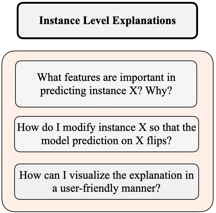
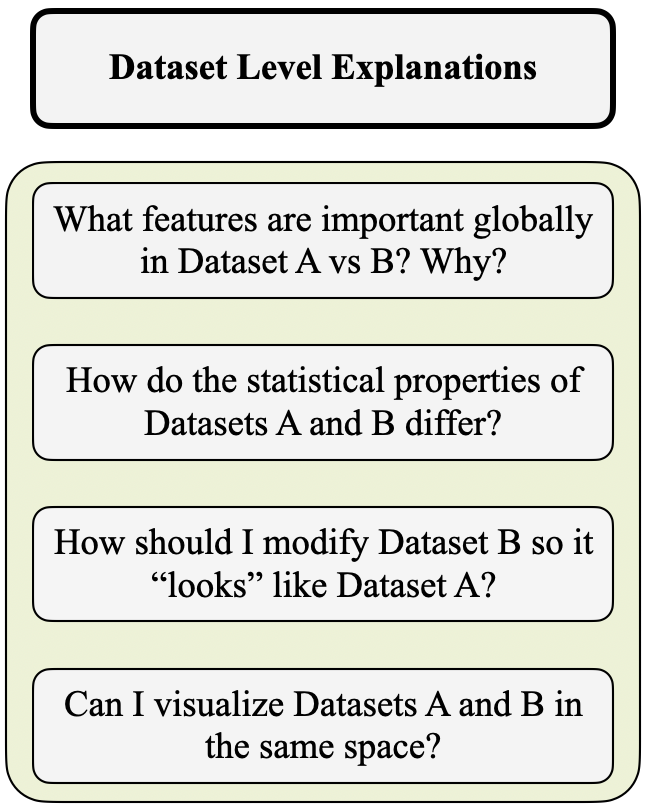
Figure 2 shows how traditional explainable AI (XAI), which explains predictions for single data points, is different than the dataset-level explanations we provide here. One major difference between our task and typical XAI applications is that XAI is often avoidable – a black box model can be replaced with an interpretable model that does not require XAI techniques because it comes with faithful explanations [36]. The task we study here (explaining differences between datasets) has no such alternative.
2 Related Works
In this section, we introduce and discuss several related previous works to this study in three major directions.
Distribution Shift
Our study is adjacent to distribution shift analysis, though our focus is broader: we do not focus on any specific type of distribution shift (such as covariant shift [45] or label shift [63]), rather we focus on the changes between datasets with no particular assumptions on the type of shift. Previous efforts have largely focused on the detection and analysis of the shifts [46, 23, 57], and the improvement of model generalizability to alleviate the effects of distribution shift [21, 23, 47, 40]. However, to the best of our knowledge, most works have not explored explaining distribution shifts in a human-understandable manner. The closest work to ours from this literature is possibly that of Zhang et al. [62], who proposed an approach to attribute model performance changes due to distribution shifts based on Shapley values [39]. Their study requires access to a casual graph or extensive prior knowledge of the variables and distributions in the dataset, which can be limiting in many use cases. We focus more broadly on explaining differences between datasets, with no requirements of prior knowledge or a task-related model.
Instance-level Explanations
The conventional instance-level explanation literature has largely focused on post-hoc analysis, i.e., analysing a prediction from a trained model. Some well-known work [34, 35] has focused on learning simpler explanation functions that approximate the model around the neighbourhood of a point. The output of these functions is a score for each feature representing its contribution to a given prediction. The feature importance-based explanation literature has also examined methods that compute the gradient of the prediction with respect to the input [30, 37, 42, 44, 48]. Another line of research focuses on counterfactual explanations [59, 54, 3, 53], which provide changes to a given instance so that the model flips its prediction (or, in the case of Antoran et al. [3], becomes certain of its prediction). As far as we can tell, none of these types of approaches can be applied to explaining the difference between two datasets; instead, they all explain a model.
Dataset-level Explanations
To the best of our knowledge, there is very limited literature on dataset-level explanations. The most relevant work on dataset-level explanations is that of Kulinski and Inouye [25], which uses optimal transport [33] maps to explain mean shifts in distributions of the datasets (or individual clusters). The user is provided with the original clusters and the transported clusters and can visually inspect the difference between the two to derive insights. However, their method focuses exclusively on mean shifts between clusters and requires both datasets to be of the same size, which can be limiting (see Section 12 in the appendix for an example). Shin et al. [41] provides dataset-level explanations for graph classification tasks by comparing examples in a dataset to salient sub-graph prototypes frequently observed in the dataset. Zhu et al. [64] introduce natural language explanations for visual datasets. In particular, for each attribute or class in the dataset, the explanation consists of the most salient image samples in dataset , their shifted versions in dataset , and a natural language description of their differences. This method depends on having a 1-to-1 correspondence between items in and that are not usually available. For textual data, Elazar et al. [14] explores properties of several large-scale text corpora to uncover insights on the relative presence of attributes such as toxicity, level of contamination, and n-gram statistics.
Inspired by previous works and their shortcomings, we aim to produce a dataset explanation toolbox that effectively summarises dataset-level differences for image, signal, text, and tabular data by providing human-interpretable, actionable explanations.
3 Methods
Overview of Methodology
In this paper, we aim to illuminate the differences between datasets and consisting of features and possibly labels , i.e., and . is not always required, it can either be the label for the original task of the dataset, or it can be constructed using sample membership (i.e., samples assigned label 0 and samples assigned label 1). Both and belong to the same domain (e.g., both consist of animal images), but other properties of the datasets and their corresponding task models may differ, such as feature and class distributions, (latent) cluster structure, and model performance metrics. While these aspects of datasets are relatively easy to capture, what is not trivial is producing actionable insights into dataset differences. For instance, using our explanation toolbox, we can reveal that lacks examples of a certain archetype that are more prevalent in , that certain human-interpretable attributes are more prevalent in , and that one dataset contains ‘culprit’ examples that are most responsible for the divergence between and .
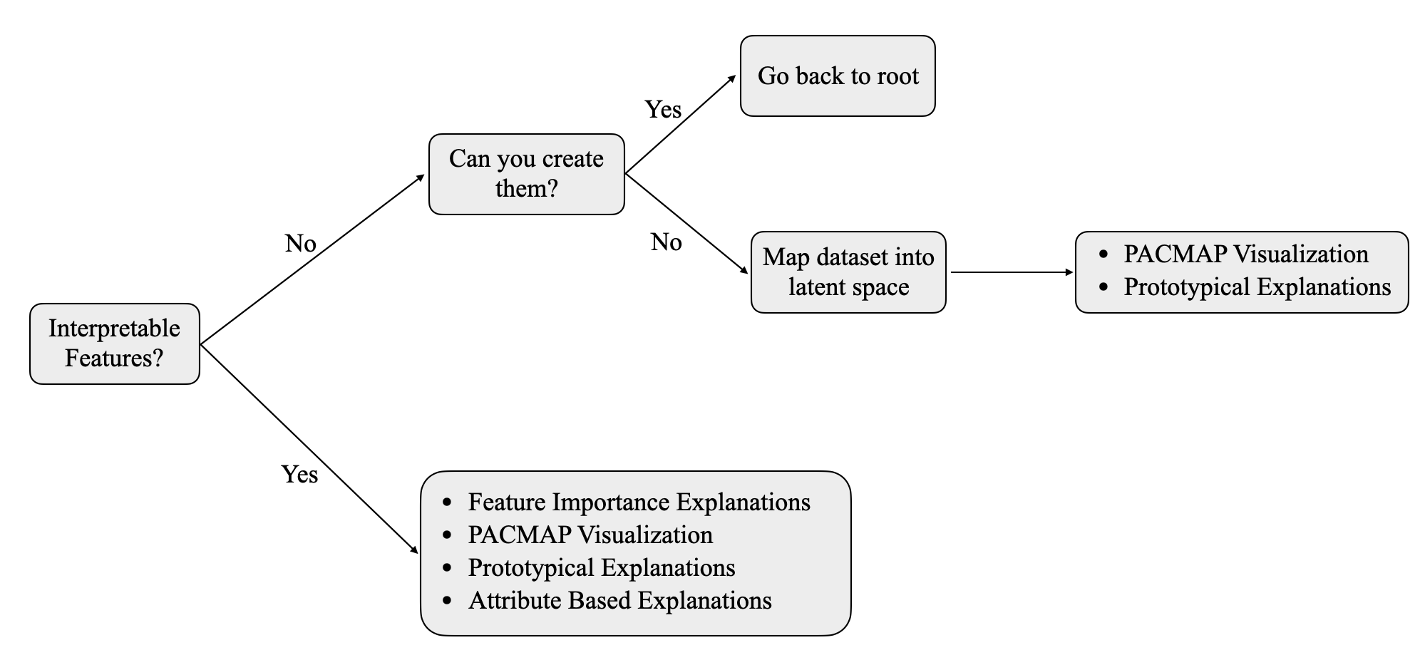
Our pipeline for exploring the differences between datasets is illustrated in Figure 3, which includes three novel algorithms:
The first two explanations involve generating, analysing, and comparing salient samples and their features in either dataset. The final explanation involves creating interpretable attributes for each dataset and examining the dataset in terms of those attributes.
3.1 Explanations Based on Influential Examples
3.1.1 Introduction
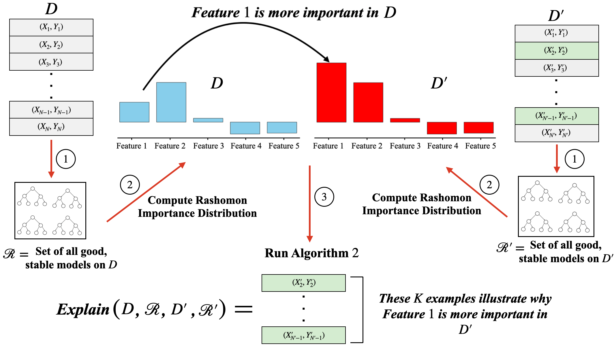
This section examines explanations that take into account differences between datasets by considering which features are intrinsically important in either dataset relative to the underlying task. An intrinsically important feature is one whose importance for the underlying data distribution remains stable across multiple well-trained models and perturbations of the dataset. Donnelly et al. [13] show that not considering this model-agnostic representation of feature importance can cause researchers to arrive at multiple equally valid, yet contradictory conclusions about the data. After determining the intrinsic importance of features, we ask the question: Given Datasets and , which examples from Dataset should I remove so that the intrinsic importance of features in both datasets for the underlying task are as similar as possible? To the best of our knowledge, this is a novel way of looking at two datasets while taking into account an underlying task (e.g., classification). To determine intrinsic feature importances for a labeled dataset, we employ the Rashomon Importance Distribution (RID) framework of Donnelly et al. [13]. This quantifies the importance of a feature across the set of all good models in a class. Given a dataset , a hypothesis class , regularization strength , and tolerance , the Rashomon set is defined as the set of all models in whose empirical losses are within of the minimum empirical loss [38]:
| (1) |
Our intrinsic variable importance will average a variable importance metric over Rashomon sets constructed on bootstrap samples.
3.1.2 Definitions of Relevant Importance Measures
Before we introduce the method to compute the intrinsic feature importances, we first define the following terms:
Definition 3.1 (Local Feature Importance Measure – LFIM).
Given a predictor from a hypothesis class and a dataset with features, a local feature importance measure is a function that outputs a vector representing the relative contribution of each feature towards the output prediction for a specific input . A lot of work has been devoted to the development of faithful feature importance measures [34, 30, 13] – in principle, any of these can be used in our explanation toolbox. We assume that this feature importance measure is a property of the dataset and the model in question.
Definition 3.2 (Global Feature Importance Measure – GFIM).
Given a predictor from a hypothesis class and a dataset with features, a global feature importance measure will provide a similar vector as an LFIM, except that it represents the predictive power of each feature in the entire dataset. In this paper, we consider GFIM to be the average LFIM vector across all examples in a dataset, i.e., .
Definition 3.3 (Local Intrinsic Feature Importance Measure – LiFIM).
Given a dataset with features, a local intrinsic feature importance measure for an example computes the importance of each feature in by aggregating the LFIMs of well-trained, stable models in . This involves computing Rashomon sets of bootstrapped samples from , storing models associated with each set and aggregating their LFIMs. The precise technique is detailed below in this section.
Definition 3.4 (Global Intrinsic Feature Importance Measure – GiFIM).
Given a dataset with features, a global feature importance measure will provide a similar vector as an LiFIM, except that it represents a holistic summary of the intrinsic predictive power of each feature across an entire dataset. In this paper, we consider GiFIM to be the average of LiFIMs across all examples in a dataset, i.e., .
Under the framework of Donnelly et al. [13], we can compute the LiFIM and GiFIM of models in the following manner:
-
•
Bootstrap the dataset times.
-
•
For each bootstrapped dataset , compute its Rashomon set . For decision trees, this can be done using TreeFARMS [56].
-
•
Compute the LFIMs of each example under each model in each Rashomon set using any method in literature (here, we use SHAP [30]). Under computational constraints, a random sample of models from each Rashomon set can also be used.
-
•
The LiFIM for an example is computed by taking the mean (over bootstraps and Rashomon sets) of feature importances. That is:
(2) If a model appears more than once across different Rashomon sets, this results in that model’s feature importance vector having a larger contribution to the final LiFIM.
-
•
The GiFIM for the dataset is the average of LiFIMs in the dataset, i.e.
.
In this paper, given and , the influential example explanation provides the following information to the user: A set of examples from that, if removed from the dataset, would align the GiFIMs of and the most. Concretely, let and be the GiFIMs on and . We aim to find the set of examples in such that is minimized, where is the Euclidean distance metric between two vectors. That is and will have more aligned intrinsic feature importances on average. We now explain how we obtain these influential examples.
3.1.3 Determining the Influential Examples
In order to provide influential example explanations, we first define the notion of influence for a test loss function.
Definition 3.5 (Influence Function for Test Loss [24]).
Given the following:
-
•
training and test datasets , and
, -
•
a trained, parameterized model ,
-
•
the minimizer of the training loss: ,
-
•
the empirical test loss ,
an influence function for training point estimates the theoretical change in the test loss if the model is trained using . By applying techniques from Koh and Liang [24], we can write this as:
| (3) |
where is the Hessian of the parameters evaluated at . This is essentially an approximation of the following form:
| (4) |
where
| (5) |
is the set of parameters that minimize the loss on all training examples except .
Algorithm 1 finds the examples that are most detrimental to the performance of the discriminator (i.e., have the highest positive influence value ). Because the discriminator learns to distinguish between and based on their respective feature importance measures, removing the examples found by our algorithm will make the remaining feature importances look more indistinguishable. That is, once we find the set of examples to remove, will become smaller – we also demonstrate this through empirical studies later. Knowledge of these influential examples can be valuable to the end user, not only to precisely understand the properties of ‘culprit’ examples that make and different, but also to design ways to remediate this difference by generating or removing certain examples.
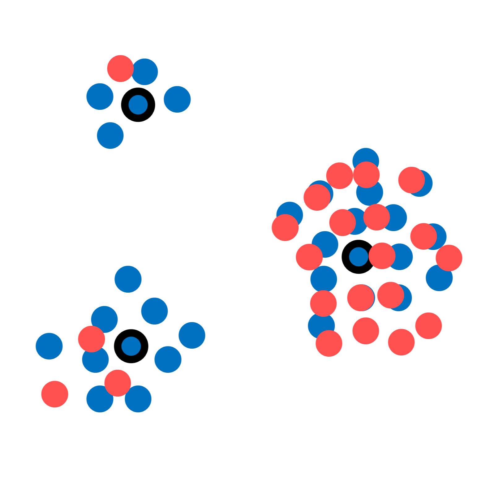
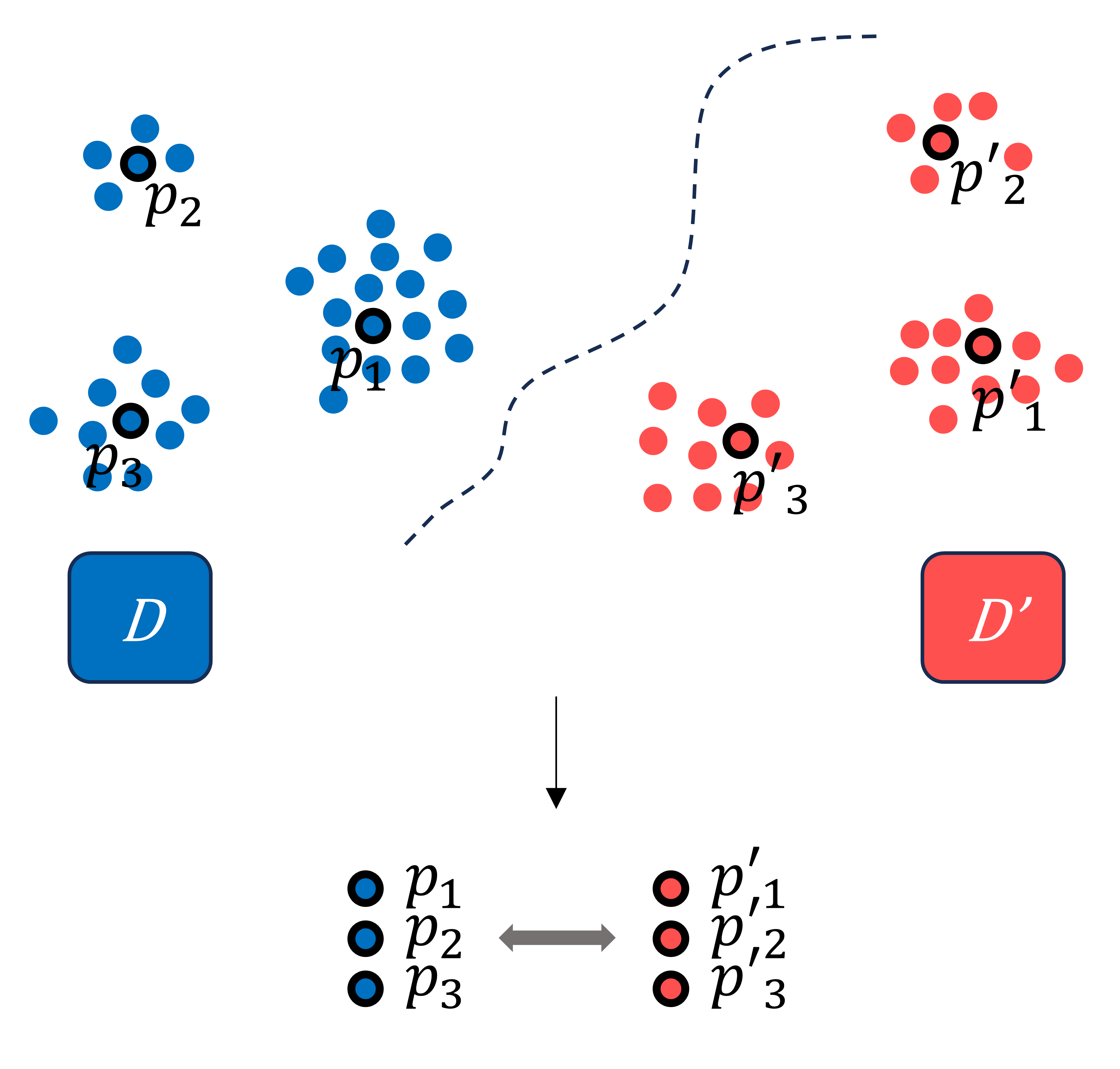
3.2 Prototype-Based Explanations
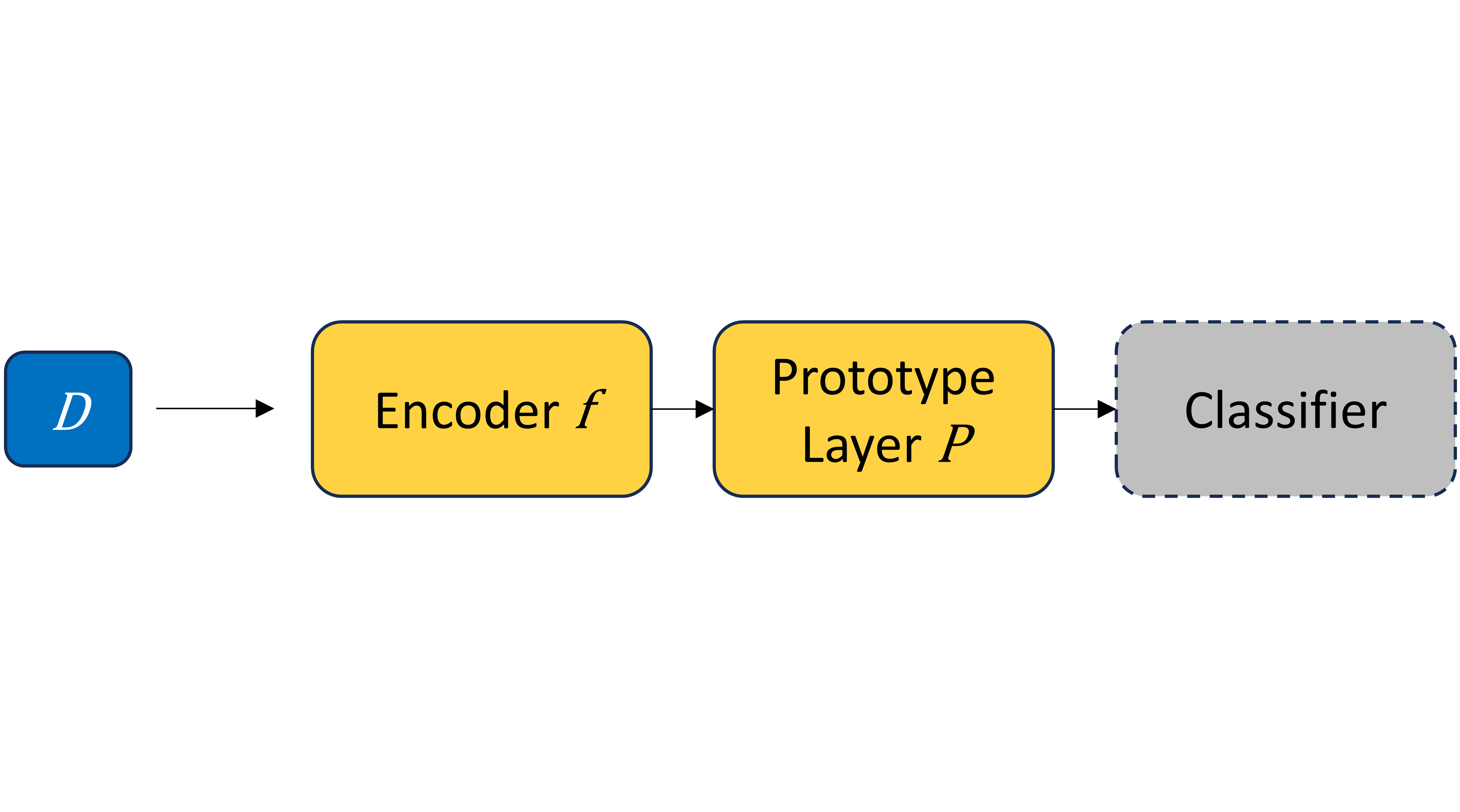
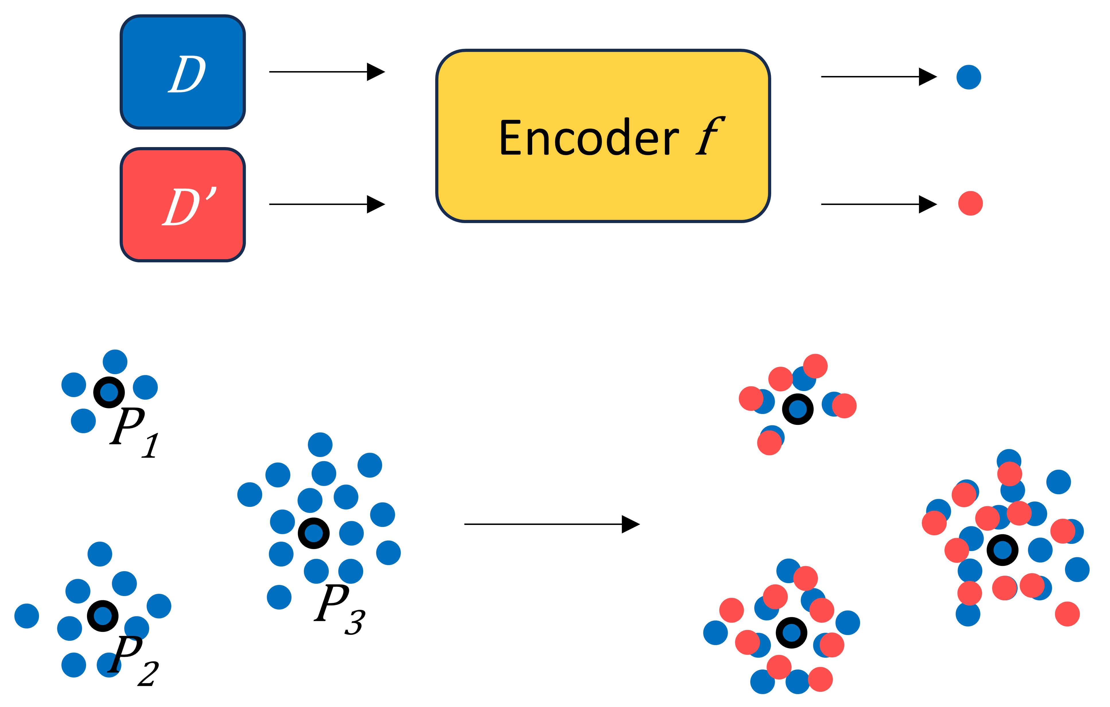
Given a dataset, , prototype-based explanations use a set of prototypical samples , each of which is a meaningful and faithful representation of its neighbouring samples (latent neighbourhood). There are multiple ways to create the prototypes. One way is to simply choose them manually with domain knowledge. We show an example of this for explaining the difference between males and females in the Adult dataset in Section 4.1. A second way is to use the cluster centers from a clustering method like -means as the cluster centers (similar to [25]). This is illustrated in Section 4.2 to explain the difference between low and high risk examples in the HELOC dataset. Thirdly, as shown in Figure 5(a), prototypes and their surrounding latent space can be learned in a neural network in a supervised and end-to-end fashion, where the encoder , prototype set , and the final classifier layer are the learnable-components. We use this approach for explaining differences between real and synthetic PPG data and human and machine generated audio. For this last approach, we adapt ProtoPNet [7] and its variant [4] to project both and into the same latent space of the learned encoder, as illustrated in Figure 5(b). ProtoPNet tends to have similar accuracy to its non-interpretable counterparts despite being trained to use case-based reasoning, thus providing assurance of the quality of the learned latent space from a performance perspective. In this latent space, we make quantitative comparisons between the learned prototypes and the samples in .
Once the prototypes are created, there are multiple ways we could leverage them to explain datasets. We propose three such ways, which, to the best of our knowledge, are novel. Subsection 3.2.1 describes some quantitative comparisons of datasets that can be made based on learned prototypes. Subsection 3.2.2 introduces partial prototypes, where quantitative dataset comparisons are only made using salient features of prototypes. Lastly, in Subsection 3.2.3, we again leverage supervised prototype learning, but with dataset membership as training labels; the resulting prototypes are examples from both and and can summarize the unique information and distinguishing factors within each dataset.
Our prototype-based explanations provide an efficient and interpretable analysis of the disparities between the two datasets, enabling potentially actionable clues for improving either dataset. These explanations are well-suited for working with high-dimensional data, even if the features themselves are not interpretable (like pixels or single points of a time series).
3.2.1 Quantitative-Comparison-Based Explanations
Once the prototypes corresponding to are generated, we can use two metrics to analyze the differences between and :
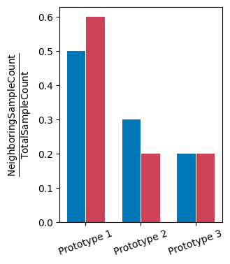
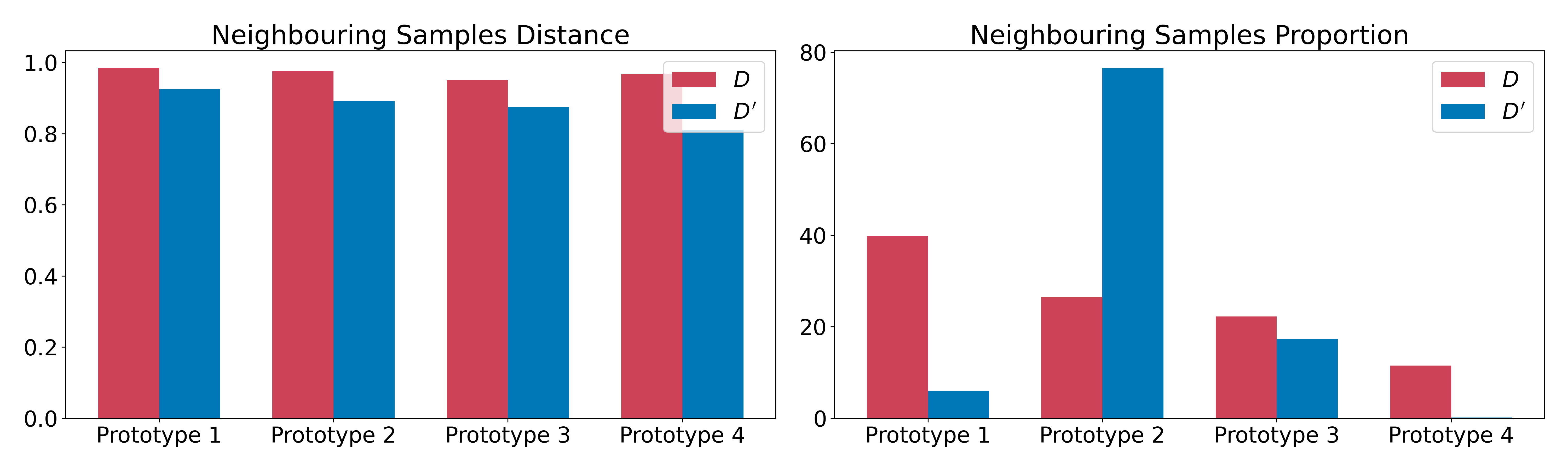
Definition 3.6 (neighbouring sample proportion difference – NSPD).
The neighbouring samples for prototype are defined as the samples that have as their closest prototype. The neighbouring sample distribution difference for is calculated as the difference between the percentage of ’s neighbouring samples in and the percentage of ’s neighbouring samples in .
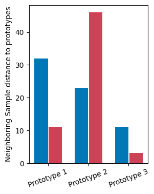
Definition 3.7 (neighbouring sample distance difference – NSDD).
The neighbouring sample distance difference for is calculated as the difference between the average neighbouring sample distance to in and the average neighbouring sample distance to in . The distance between a sample’s feature and a prototype in the latent space is calculated using cosine distance.
We can compute these differences either in the original feature space or project the prototypes to a latent space using a learned encoder. Figures 5(a) and 5(b) illustrate the process of obtaining prototypes in latent space. While the number of prototypes should be determined on a case-by-case basis. In Section 11.1 in the appendix, we examine how adjusting the number of prototypes influences the balance between the explanation’s complexity and its faithfulness.
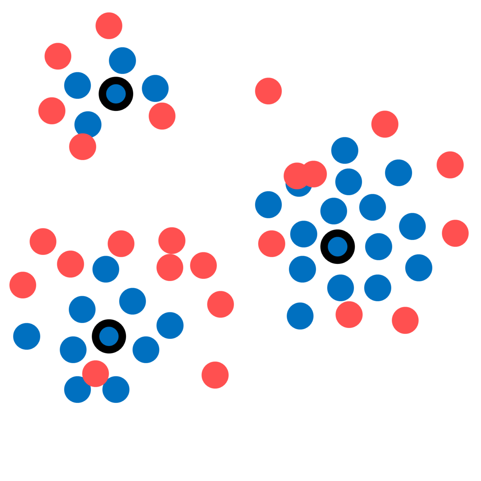
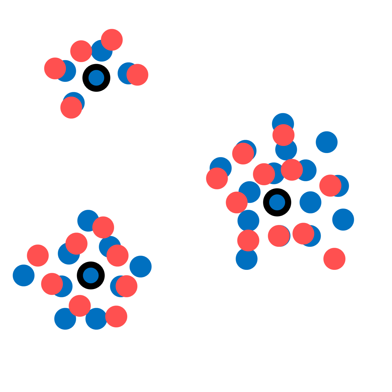
We show an example of two toy datasets with high NSPD and low NSDD in Figure 5(g), another pair of toy datasets with high NSDD but low NSPD in Figure 5(h), and a pair of toy datasets with both low NSDD and low NSPD in Figure 5(i) to illustrate Def. 3.6 and Def. 3.7 in practice. In addition to quantitative comparisons, users can also inspect each prototype and perform visual comparisons with samples in and . We show examples of this throughout the paper.
3.2.2 Partial Prototype-Based Explanations: Greedy Feature Selection
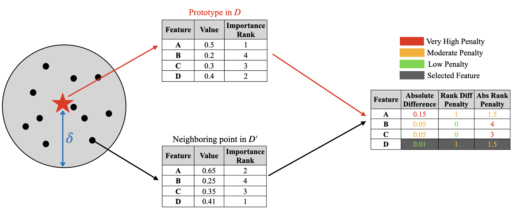
For tabular datasets with a large number of features, it is useful to use only a subset of relevant variables within the NSDD and NSPD calculation. As we will see, using a good subset will allow a high-quality approximation of the full NSDD and NSPD (see Section 11.2 in the appendix), with a much sparser feature set. Our partial prototypical explanation provides the NSDD and the NSPD for the prototype along with the most relevant features of the prototype for the user to focus on. The notion of a relevant feature is based on two desiderata: value stability and rank stability.
Definition 3.8 (Value Stability).
The chosen features must remain approximately constant around the prototype region, i.e., given a prototype from dataset and chosen feature indices , we want to ensure
is small, where is a distance metric that can compare vectors of the same dimension (e.g., , , or distances that use inner products). If the dataset is labeled, we can optionally one-hot encode the labels and append them to the example vector before computing distances. While we chose examples in that are in an overall neighbourhood of the prototype, there may be some features whose values in the neighbourhood vary less than others. Thus, if we choose only features due to interpretability constraints, we are best off choosing important features whose values are most stable in the neighbourhood. One important clarification: for the NSDDs and NSPDs of partial prototypes to remain approximately similar to the original prototypes, we want to preserve the structure of the prototype neighbourhood as much as possible. Selecting more features will preserve neighbourhood structure better but will lead to a loss in interpretability – this tradeoff is illustrated in the appendix (Section 11).
Definition 3.9 (Rank Stability).
The features selected should capture as much of the true model behavior as possible, i.e., they should be important for the prototype in and similarly important for its neighbours in both and . This helps the end user reason about neighbouring sample distribution and distance differences only in terms of features that are equally important for both datasets. To this end, we generate the LiFIM using the Rashomon Importance Distribution (RID) method that can return a vector containing intrinsic feature importance scores for each feature in . The equivalent LiFIM for is . We further break down rank stability into two components below: To enable this, we propose a score for each feature, and we will use the top scoring features within the partial prototype explanation:
-
•
Rank Difference Penalty : If feature is deemed to be very for the prototype (according to ), but this feature is not so important for prototype neighbours in either or , it is assigned a high penalty score – this feature is less likely to be one of the selected. This penalty therefore penalizes the relative rank differences in the importance of feature in predicting the label for a prototype in and its neighbours in and .
-
•
Absolute Rank Penalty: The above mechanism could result in features which are less important for both the prototype and its neighbourhood being selected (as only the relative rank difference is penalized). However, the chosen features should be important for both the prototype and the neighbourhood. The absolute rank penalty aims to ensure that a chosen feature that has low rank difference penalty is also an important feature.
As these forces can be opposing, we propose a score function for each feature that is based on a user-defined tradeoff between rank stability and value stability. Given feature , datasets and , an example , and LiFIM , let be the rank of the importance of the feature (i.e., if is the most important feature, then ). Then, the scoring function for feature given example and prototype is:
| (6) | ||||
The same scoring function can be defined for an example . Algorithm 2 then sums up scores across both datasets for each feature and prototype.
where the user can choose parameters , , and to weigh the relative importance of each desideratum. This naturally induces a tradeoff between value stability and rank stability, which is illustrated in Figure 24 in the appendix.
We note that having a feature importance function is not strictly necessary for the scoring mechanism and may only be used if the dataset is labelled. Otherwise, one can simply set the parameters and to and work only with the value stability desiderata. In Section 4.2 of this paper, we will demonstrate examples of partial prototypes for a few real-world tabular datasets. In the appendix (Section 11.2, we also share recommendations for choosing an appropriate value of . In particular, a large value of will provide the user with a larger prototype vector, making it less interpretable but more expressive. However, a very small value of may not necessarily preserve the NSDDs and NSPDs, degrading the quality of the explanation.
3.2.3 Prototype-Summarization-Based Explanations
Here we continue using the same definition of dataset and , and prototype set as above. By forming a binary classification task using the samples from dataset and (i.e., samples from dataset are assigned label 1, and samples from dataset are assigned label 0), a ProtoPNet or a prototype learning network can be trained to distinguish between samples from the two datasets. The model learns prototypes for and another prototypes for . These prototypes are representative of the unique information and distinguishing factors within the corresponding datasets. Users can inspect the prototypes and form conclusions on the differences between the two datasets without the need to inspect a large number of samples. We show an illustration of this process in Figure 7. In Section 4.6, we show an example of how prototype summarization explanations can be used to explain distribution shifts using a small number of representative samples.
3.3 LLM-Based Explanations using Interpretable Attributes
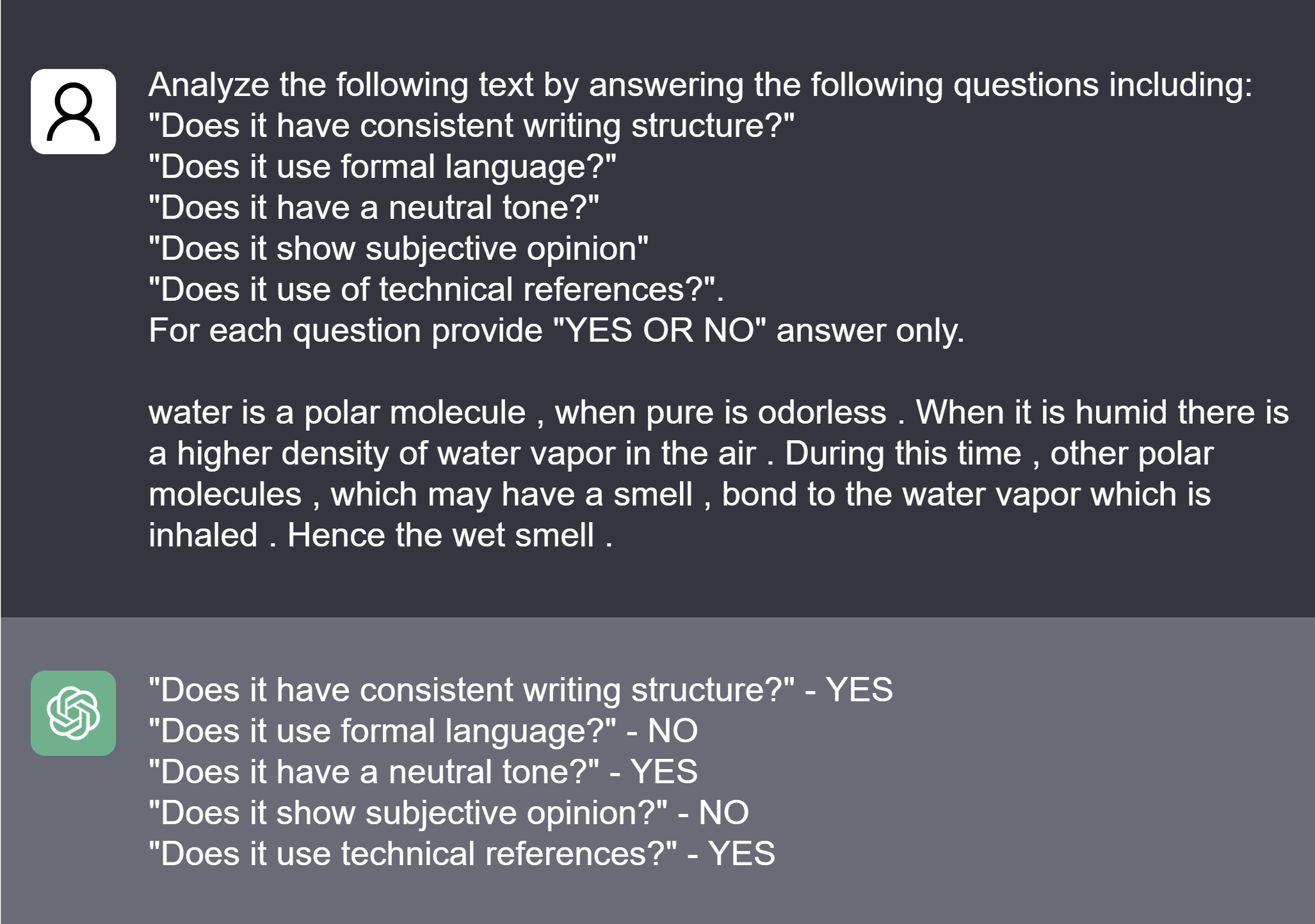
With the recent development of large language models (LLMs) such as LLama 2 [51] and GPT series (e.g., GPT-3, GPT-3.5, GPT-4) [32], it has become feasible to evaluate linguistic aspects of natural language corpora from both humans and machines using LLMs. The adaptability [61, 32] of the LLMs to different domains enables users to analyze text without the need for domain-specific model training or fine-tuning. LLMs are known for yielding untrustworthy results; however, studies show [27] that they are very trustworthy for certain types of tasks (e.g., “Does this text exhibit anger?”). Our strategy is to analyze text by querying LLMs in such a way that their answers are trustworthy and using these answers to analyze the difference between corpora.
In this study, we leverage the GPT-3.5 Turbo to analyze the differences between two text corpora and generate language / linguistic attributes-based dataset explanations. Attributes could include writing structure consistency, emotion, tone, wording choices, language formality, etc. These attributes could be arbitrarily chosen by the user to adapt to a specific task. Recent work from Elazar et al. [14] also introduced several meaningful attributes that can be used for comparing text datasets, including “usage of toxic language,” “level of personally identifiable information,” and a variety of statistics of the text corpora. Given two datasets and , the user chooses a set of attributes . Here each attribute provided is presented as a question to the LLM, for example: “Does the text contain emotion?”.
For each input in and , we query GPT-3.5 Turbo using the following prompt:
After querying, we collected YES or NO from each GPT answer and calculated the percentage of YES for each attribute in both and . Explanations for differences between and were formed by comparing differences in dataset-level attribute percentages (e.g., has a higher percentage of samples with attribute than that of .) This dataset difference explanation is interpretable for humans because each attribute is interpretable. In this study, we have used binary attribute queries; however, this approach could also be extended to attributes with ranks (e.g., high, medium, low, etc.). We have found that the LLMs are good at distinguishing specific aspects of human and machine-generated text, as we will show this in our experiments.
4 Experiments
Different data modalities and tasks require different types of explanations. For instance, using influential example-based explanations is appropriate for tabular data, as the feature values are interpretable. However, for image and signal data with non-interpretable features (e.g., a pixel value or a signal value at time ), feature importance would not be as interpretable for humans. Here we provide several case studies of different tasks and data modalities utilizing the proposed dataset-level explanation approaches.
4.1 Explaining Low Dimensional Tabular Data: Adult Dataset [5]
This example is only three-dimensional (so we do not require complex dimension reduction), and prototypes will be chosen in a simple heuristic manner based on feature percentiles and depth-2 decision trees. We will qualitatively compare our results with those of Kulinski and Inouye [26], who use an optimal transport formulation, for the same datasets. This dataset contains demographic information from the US Census database. In particular, each data point corresponds to information on age, gender, education levels, marital status, race, and occupation of an individual. To facilitate qualitative comparison with Kulinski and Inouye [26], we perform the same preprocessing on the dataset.
Dataset
corresponds to the dataset of all males, but with the same subset of features as Kulinski and Inouye [26] – age, education, and income. The income feature is encoded as if the annual income is and otherwise.
Dataset
This is the dataset of all females, preprocessed in the same manner as . Thus, we will be examining differences between the two “gender” datasets.
4.1.1 Prototype-based Explanations
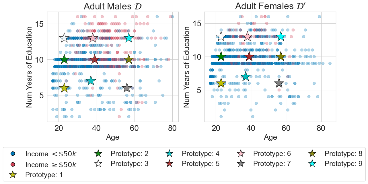
To construct prototypes, we first defined categories of education levels: lower, medium, and high. These correspond to the , , and percentiles of education years in the male dataset . We categorised age in the same manner as education. prototypes were then constructed, corresponding to all possible combinations of education level and age. To construct an income feature, we trained a shallow decision tree classifier on to predict if income from age and education level. Each prototype was then passed through this decision tree and the tree’s prediction (the majority vote in the leaf) was used as the income feature for the prototype.
| Feature 1 | Feature 2 | Feature 3 | |
|---|---|---|---|
| Prototype 2 | Age | Education Years | Income |
| 23 | 10 | 0 | |
| Prototype 4 | Age | Education Years | Income |
| 38 | 7 | 0 | |
| Prototype 6 | Age | Education Years | Income |
| 40 | 13 | 1 | |
| Prototype 8 | Age | Education Years | Income |
| 59 | 7 | 0 |
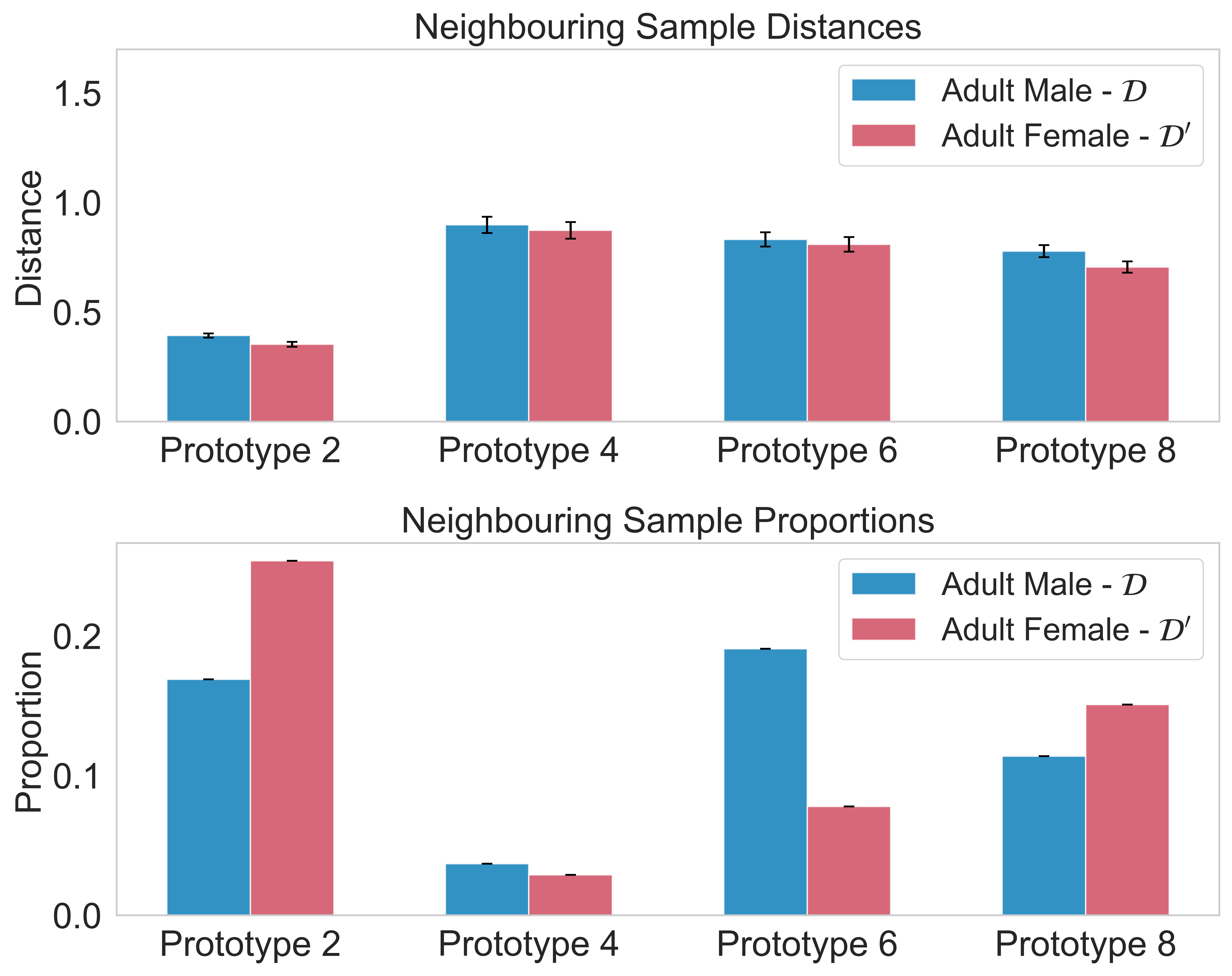
A visualization of the Adult male and female datasets is seen in Figure 8. We can now interpret the NSPD and NSDD for the datasets in terms of these prototypes. To facilitate comparison with Kulinski and Inouye [25], consider the prototype corresponding to middle aged individuals with a bachelor’s degree who earn more than (i.e., education = , age = , income = ). This is marked as Prototype in Table 1. Figure 9 shows that there are comparatively fewer examples of this archetype in the female dataset than in the male dataset. An explanation is therefore: Compared to the male dataset, the female dataset contains fewer individuals who have a bachelors degree, are middle aged, and earn a high income. Similar comparisons can be made for other prototypes.
4.1.2 Comparison with Kulinski and Inouye [25]
The explanation computed by Kulinski and Inouye [25] on this dataset is the following: The income difference between the male and female datasets is largest in middle-aged adults with a bachelor’s degree. While it is difficult to compare such dataset explanations with ours quantitatively, we note that we are able to obtain a similar explanation above using just data visualisation, constructing prototypes heuristically, and examining relative differences in prototype neighbourhoods. In contrast, Kulinski and Inouye [25] employ a more involved approach using an optimal transport formulation.
A second benefit is computation. The approach of Kulinski and Inouye [25] scales at least quadratically with the number of datapoints [10], as it relies on using the Sinkhorn algorithm. The main computational bottleneck in our explanation is the method used for computing prototypes on a dataset – if simple heuristics are used as above, this will be very efficient.
4.1.3 Influential Example Explanations
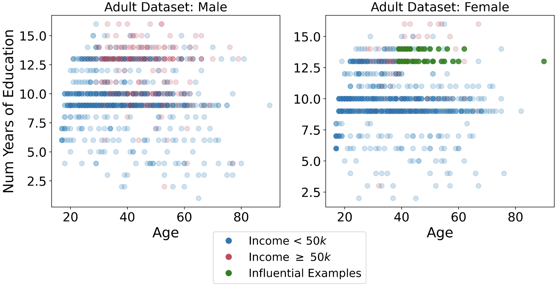
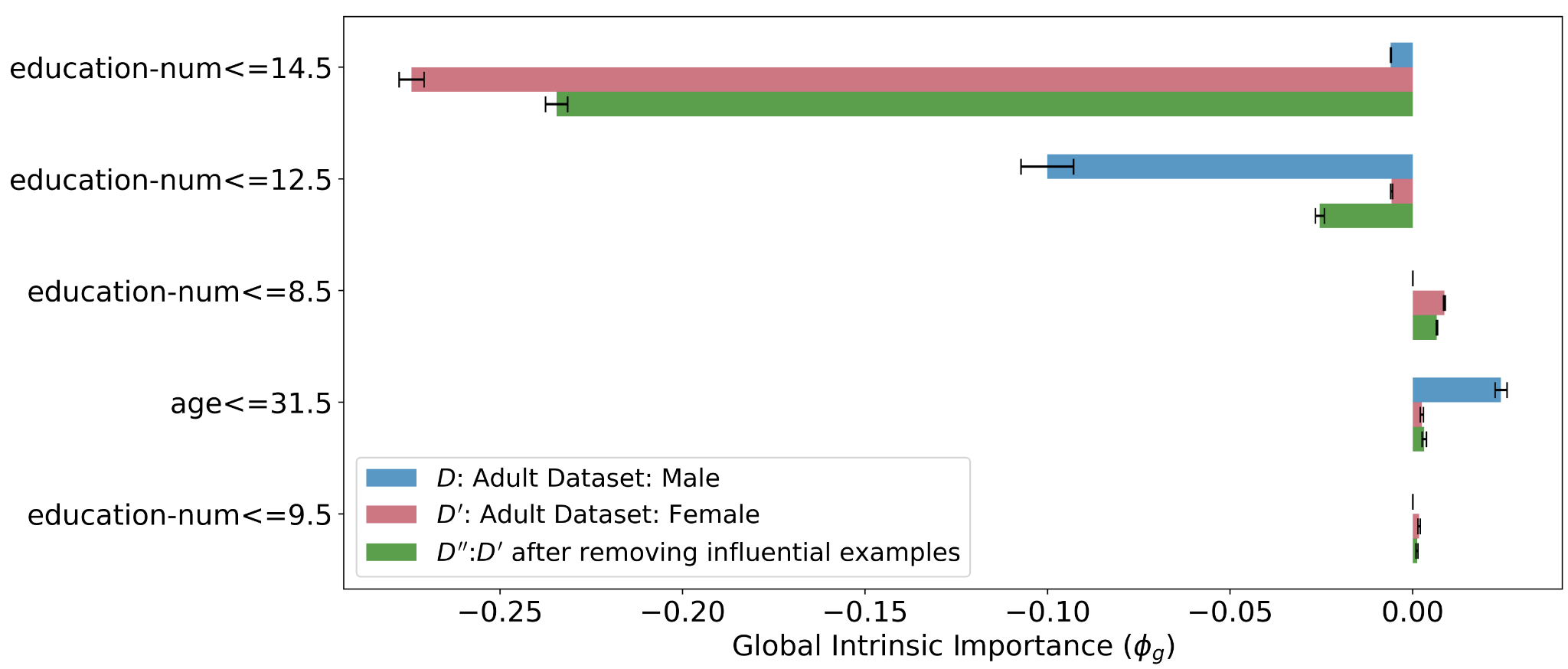
We followed the procedure as outlined in Section 4.2.3 for the Adult male () and female datasets (). We identified influential examples in and examined their characteristics – these correspond to only of the dataset. In order to use GOSDT [28] decision trees, we first binarised the age and education-num features by thresholding - we use the optimized thresholding method in [28]. In the previous section, we were considering unsupervised comparisons between the two datasets. In this section, we predict whether the income (binary classification) and form dataset explanations with respect to the underlying task. For visualization purposes, Figure 10 shows non-binarised features and the respective influential examples.
| Dataset | Age | Num Education Years | Income | Income | |
|---|---|---|---|---|---|
| Adult male: | 39.86 0.42 | 10.10 0.08 | 709 | 291 | |
| Adult female: | 36.13 0.44 | 9.91 0.07 | 899 | 101 | |
| Influential Examples in | 46.12 1.21 | 13.38 0.07 | 38 | 12 |
Given the above information, we can posit one dataset explanation: For the Adult datasets, having fewer than years of education is more strongly associated with lower income in women than men. This is in large part due to a few highly educated years), middle-aged women, most of whom are not earning well. Thus, analysing the properties of influential examples in datasets can uncover insights as to why and differ in their intrinsic feature importances for the given task.
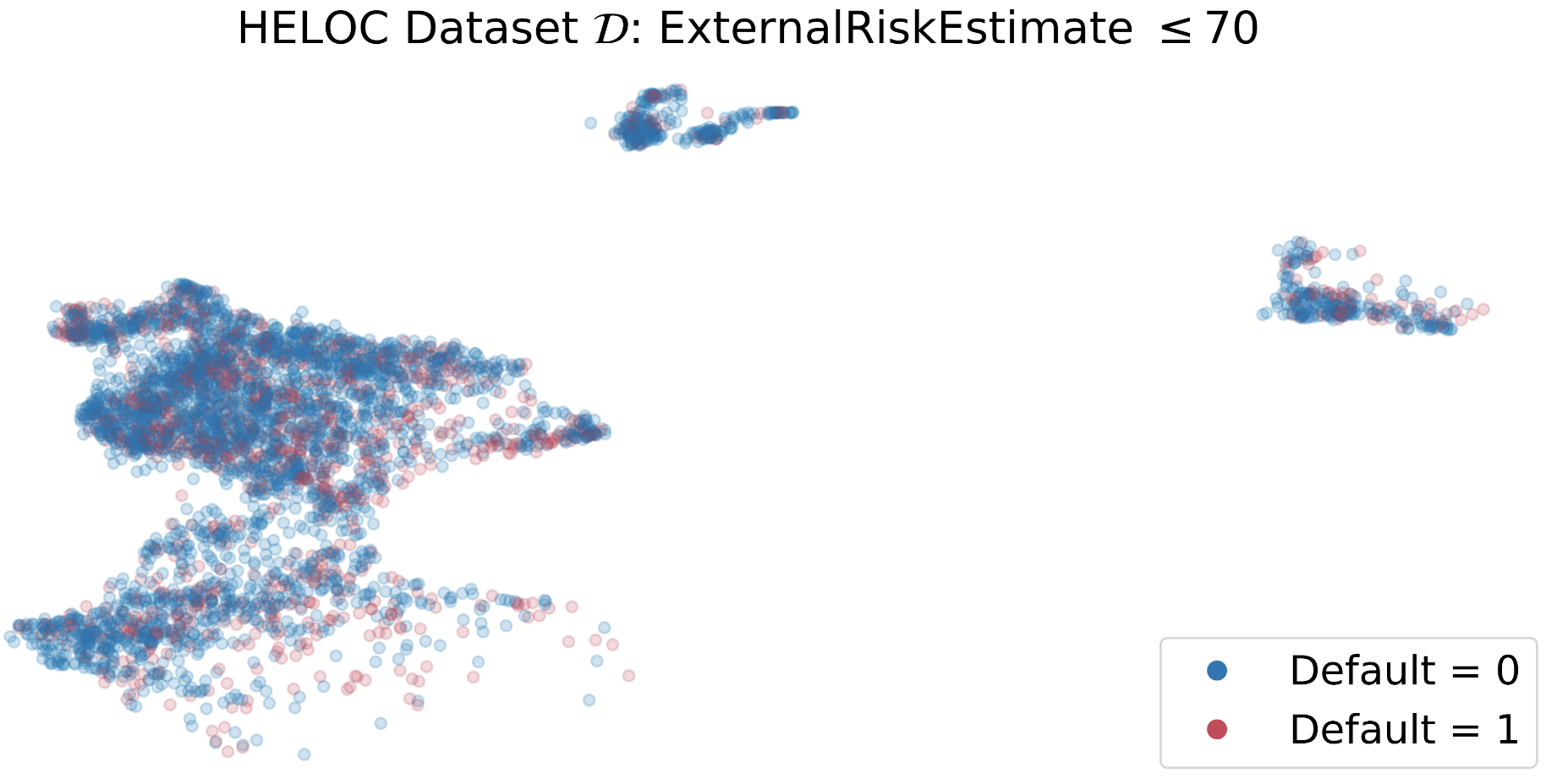
4.2 Explaining High Dimensional Tabular Data: HELOC Dataset [16]
This dataset, which was used in the Explainable Machine Learning Challenge, contains information from the credit reports of around people. In particular, it contains features relating to trade characteristics (e.g., total trades, overdue trades, etc), consolidated risk indicators (external risk estimate, longest delinquency period, etc), and miscellaneous indicators (e.g., length of credit history). The task is to predict whether an applicant for a loan will repay it back within years.
Following Kulinski and Inouye [26], we generate two separate datasets by splitting the HELOC dataset on the variable ExternalRiskEstimate.
Dataset
This is the low risk dataset. Concretely, . ExternalRiskEstimateis a black-box metric computed by external agencies that estimates the risk of defaulting. We chose to split the data on this feature because it is likely that there is a distribution shift between individuals with high and low ExternalRiskEstimate.
Dataset
This is the high risk dataset. .
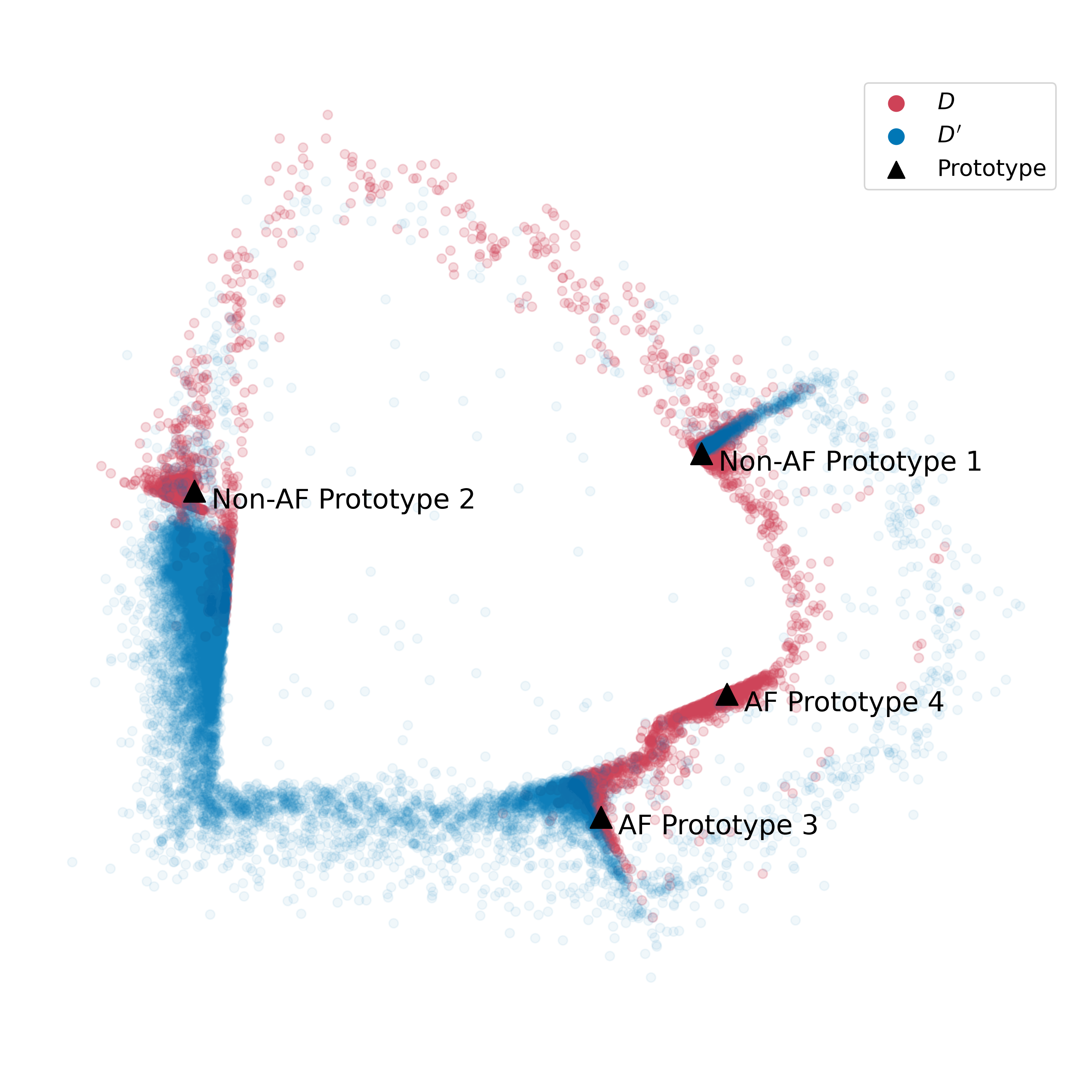
Starting with , we define the prototypes to be the cluster centers in obtained after -means clustering on the high dimensional space and projecting them to a lower dimensional space using PaCMAP [55].
4.2.1 PaCMAP Visualizations
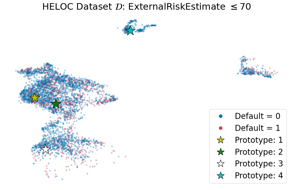
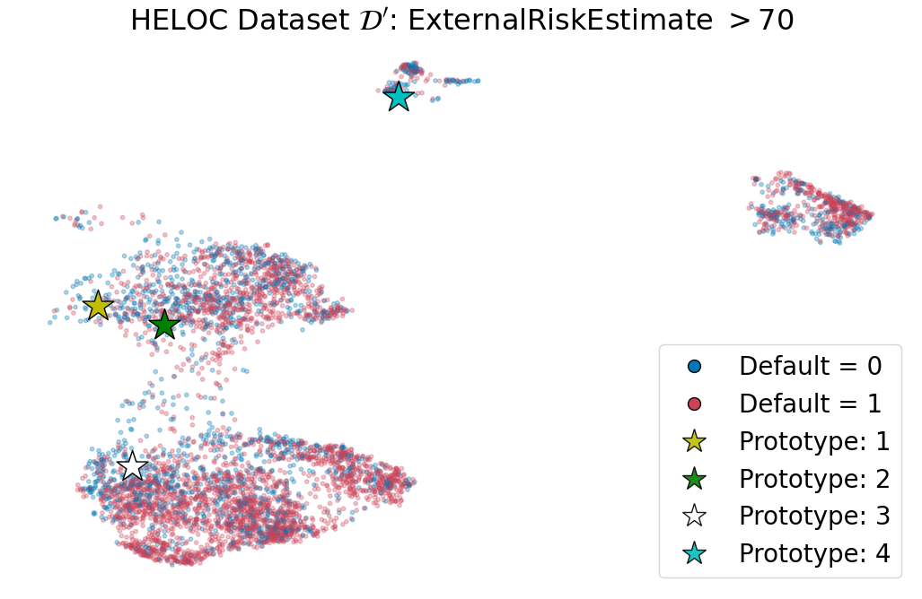
To generate these projections, we combined and , ran PaCMAP on this combined dataset, and plotted the lower dimensional datasets separately. The PaCMAP visualizations serve as explanations on their own; because PaCMAP preserves the global structure of datasets, visualizing them on a common projected space enables us to understand the cluster structure and relative shifts qualitatively. Even a bird’s eye view of the datasets using PaCMAP provides us with some useful information. For one, both datasets have similar structures in the feature space, implying that their features are likely to take on the same range of values. Another indication is the larger presence of people who defaulted on their loan in the higher risk dataset (i.e. class labels).
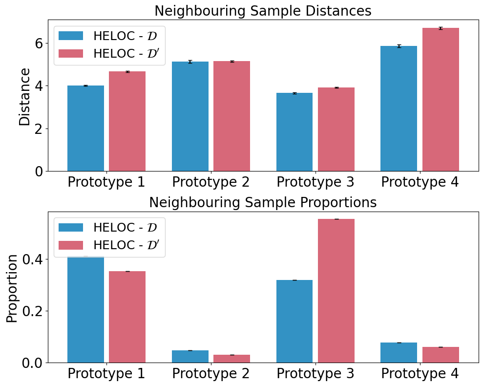
4.2.2 Prototype-Based Explanations
| Feature 1 | Feature 2 | Feature 3 | Feature 4 | |
|---|---|---|---|---|
| P1 | NumRevolvingTradesWBalance | PercentInstallTrades | NumInstallTradesWBalance | NumInqLast6M |
| 3 | 0 | 1 | 1 | |
| P2 | MSinceOldestTradeOpen | NumTrades60Ever2DerogPubRec | NumTrades90Ever2DerogPubRec | NumRevolvingTradesWBalance |
| 1 | 1 | 97 | 5 | |
| P3 | NumSatisfactoryTrades | NumTrades60Ever2DerogPubRec | MSinceOldestTradeOpen | PercentInstallTrades |
| 1 | 1 | 7 | 0 | |
| P4 | NumTotalTrades | NumInqLast6M | MSinceMostRecentInqexcl7days | MaxDelqEver |
| 0 | 2 | 2 | 18 |
Given the prototypes in , the explanation compares the NSPD and NSDD of and for these prototypes. From Figure 13, we can also analyze a small subset of salient features for a prototype (aka the partial prototype) to understand the properties of the prototype and its neighbourhood in and in an interpretable manner.
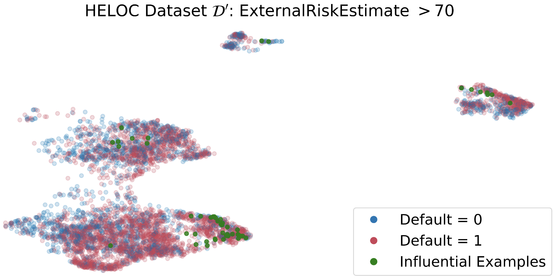
4.2.3 Influential Example Explanations
We now attend to influential example-based explanations for HELOC. We use the Rashomon Importance Distribution (RID) [13] as the feature importance measure (see Section 4 for details). As with Section 4.1, we first binarized the features in and using thresholding using the method in [28] as this is required as input to GOSDT and the RID framework. Let and be the global intrinsic feature importance measures (GiFIM) for the datasets and respectively (see Definition 3.4).
-
•
We first identified the influential examples in using Algorithm 1. Because is of size , these influential examples correspond to only of the dataset.
-
•
We then removed these examples from the dataset . Call this new dataset .
-
•
Lastly, we recomputed the LiFIMs and GiFIMs on .
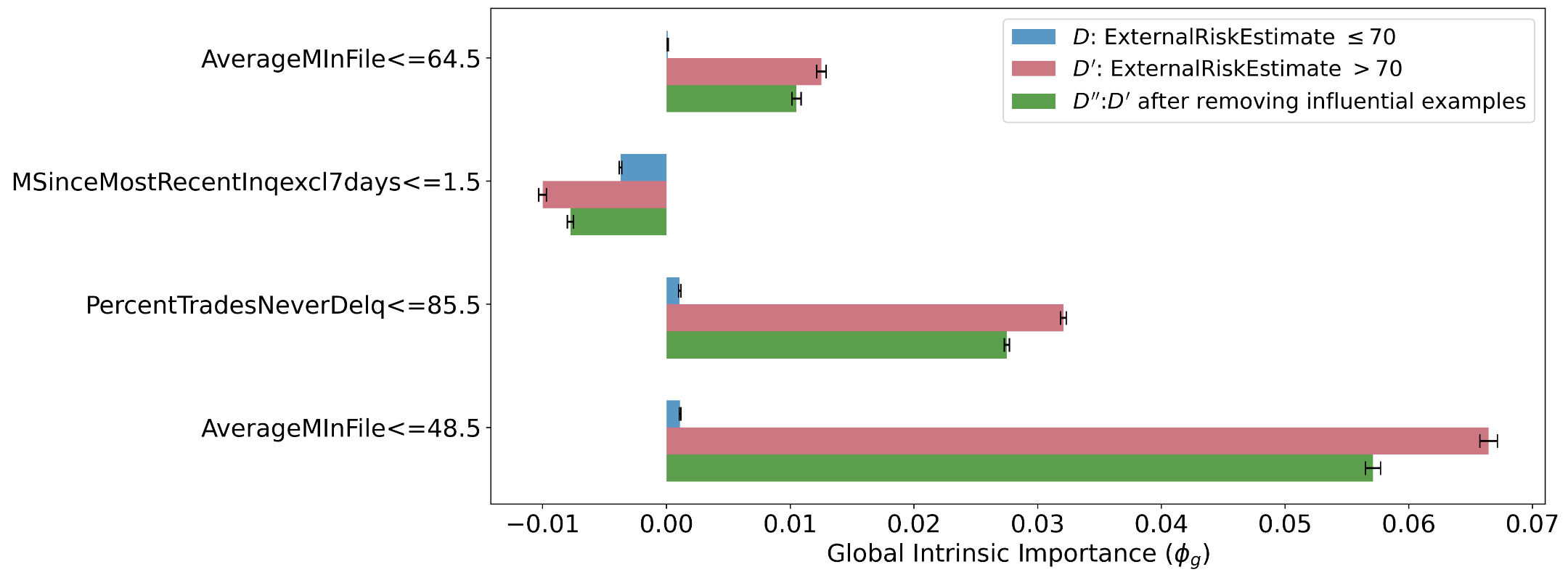
We now show the resulting feature importances in Figure 15. We then look at the features whose importances were most affected by this removal.
| Dataset | AverageMinFile | MSinceMostRecentInq | TradesNeverDelq | Default = 0 | Default = 1 | |
|---|---|---|---|---|---|---|
| 67.00 0.47 | 0.1 0.07 | 91.01 0.21 | 1746 | 3566 | ||
| 86.76 0.46 | 0.70 0.09 | 97.10 0.08 | 3390 | 1169 | ||
| Influential Examples in | 106.92 4.99 | NaN | 99.16 0.28 | 6 | 44 |
We can now compare the two datasets by considering the properties of influential examples in Table 4 and the GiFiMs of important features in Figure 15. The dataset difference explanation therefore tells us the following: The binary features TradesNeverDelq , , , and are considered to be unusually important in the higher risk dataset compared to . However, this is in large part due to a few individuals in who mostly defaulted on their loan in the last years despite having non-delinquent trades, longer credit history, and no recent credit inquiries.
4.3 Explaining Cardiac Signal Datasets
Cardiac signals are essential in clinical diagnostics and disease screening. The advancement of machine learning and deep learning has facilitated numerous studies to automate cardiac disease detection, further improving reliability and efficiency. However, the scarcity of large open-access datasets poses a challenge for practitioners and machine learning researchers. Given this context, the need for accurate and high-quality synthetic cardiac data becomes imperative. In this experiment, we aim to showcase our method by comparing synthetic data against real-world data and derive actionable items to improve synthetic data generation.
Dataset
Photoplethysmography (PPG) was chosen as a representative form of the signal modality due to its rising popularity in recent years as the medium for heart monitoring on wearable devices. In this study, we chose the Stanford PPG dataset, which was collected from subjects wearing smartwatches while performing regular daily activities [50]. Using the dataset’s signal quality labels, we sampled a subset of 16,058 25-second signals that contain a relatively small amount of noise, each accompanied by an atrial fibrillation (AF) or non-atrial fibrillation (non-AF) label. During preprocessing, signal amplitudes were normalized into the 0-1 range and resampled to have 2400 timesteps. We show samples of real PPG signals in Figure 23(a).
Dataset
A popular PPG processing and simulation tool, neurkit2 [31], was used to generate a synthetic PPG dataset containing 3,000 30-second signals for this study. Synthetic signals were created with the addition of varying levels of signal noise and artifacts to mimic realistic conditions. A detailed description of the simulation parameters can be found in appendix 9; we also show a few generated synthetic PPG signals in Figure 23(a). Signal amplitudes were normalized to the 0-1 range and resampled to have 2400 timesteps.
4.3.1 Prototype Quantitative-Comparison-Based Explanations
The comparisons were conducted using the prototypical explanation method introduced in Section 3.2.1. A 1D-ResNet-34 model is used as the encoder. To accommodate the relatively small dataset size, we first pre-trained the encoder using a multitask approach. The encoder was trained to optimize both a signal reconstruction MSE loss as part of an autoencoder, and the cross-entropy loss for the AF detection classification task (AF vs. non-AF classification). The pre-trained encoder was then used to train the prototype learning model following the approach in previous work [4].
Results
We are able to visualize the projection of encoded samples in both and . We can observe the difference in coverage of samples to the samples in the latent space. The learned prototypical samples of are shown in Figure 16. We calculate the quantitative difference using the NSPD and NSDD metrics defined in Section 3.2, and the results are shown in Figure 17. From these results, we conclude that the synthetic data generator does generate samples similar to those of the real dataset in terms of latent space distance; however, there is a discrepancy between the number of certain types of signals generated in the synthetic dataset and in the real dataset. This conclusion is supported by the fact that the NSDD is relatively small, indicating a similarity in features related to AF classification between generated signals and the prototypes comparable to that between the real samples and the prototypes (shown in Figure 17); in addition, we observe large NSPDs for prototypes , and , indicating that there are insufficient samples similar to prototype and , and too many samples similar to prototype . By inspecting the learned prototypes, we could potentially improve the realism and quality of the generated signals by introducing more variable and organic noise corruptions similar to those in prototypes and , in addition to those in the neurokit 2 [31].

4.3.2 Prototype-Summarization-Based Explanations
In addition to the quantitative-comparison-based explanations, we can also apply prototype-summarization-based explanations introduced in Section 3.2.3 to gain more insights. Instead of training the model to classify AF vs non-AF, we simply train the model to classify whether a sample belongs to the real dataset or the synthetic dataset . The pre-training and prototype learning are the same as before. We learn two prototypes for each dataset.
Result
We show the learned prototypes in Figure 18. An obvious difference that this set of prototypes captures is the presence of baseline wander[6] in the synthetic data but not in real data. This artifact is characterized by the vertical shift of the signals of each cardiac cycle. We added orange dotted lines to aid the visualization of this artifact. A second difference exists in the form of signal morphology; the shape signal of each cardiac cycle in the synthetic prototypes is consistent and different from those in the real dataset. The synthetic signal only has one type of waveform due to the limitation of the generation algorithm, whereas real signals can have vastly different shapes (e.g., prototype ). To mitigate these differences, we can apply baseline wander removal methods and increase the similarity to the real dataset; we could also develop more realistic signal generation methods to produce more waveform variety. This analysis serves as a supplement to the differences we discovered above in quantitative-comparison-based explanations.
4.4 Explaining Audio Datasets
Dataset
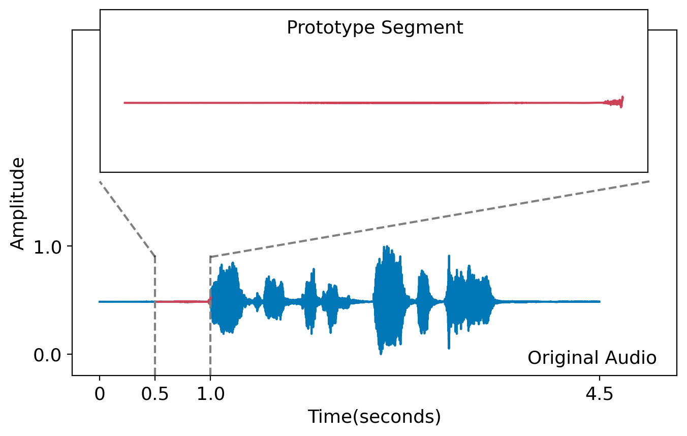
We use the human emotional speech audio dataset RAVDESS [29], which contains 928 audios of 24 different human speakers speaking two statements with a range of emotions. Statements contain “Kids are talking by the door,” 02 = “Dogs are sitting by the door.” Audios labeled neutral, happy, sad, and angry were included in this experiment. Figure 19 shows a human audio example.
Dataset
For this study, we leveraged the Coqui TTS [15] to generate AI audio. The AI audio is generated using 58 AI speakers, and includes the same set of emotions as the human in , speaking the same two statements. We generated 864 machine-generated audio signals. In Figure 19, we show a machine-generated audio example.
Forming the explanation
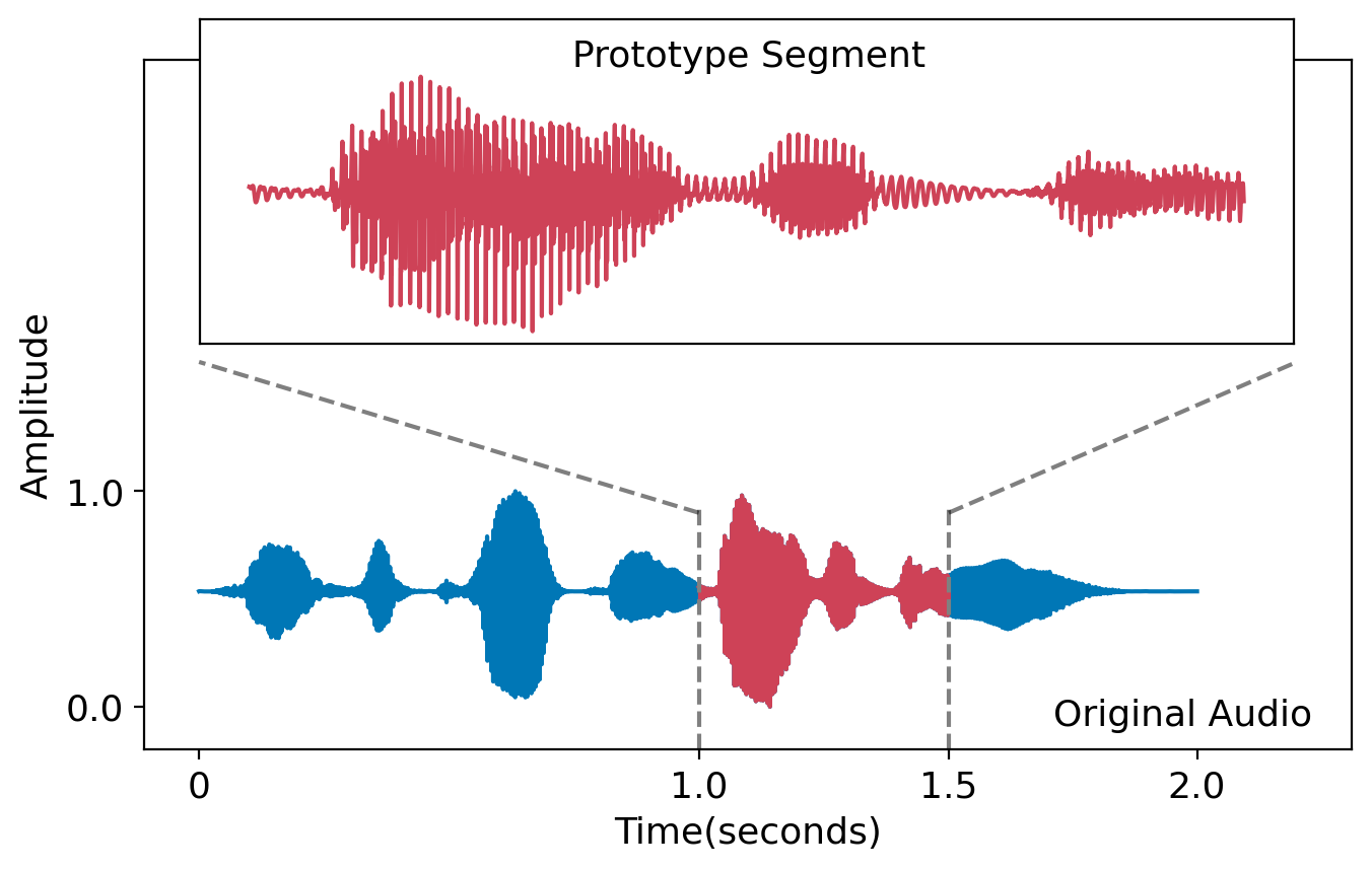
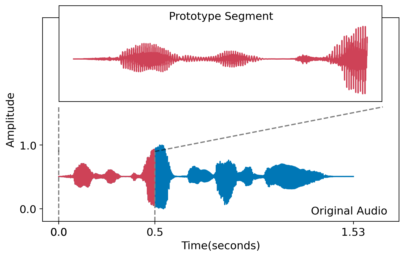
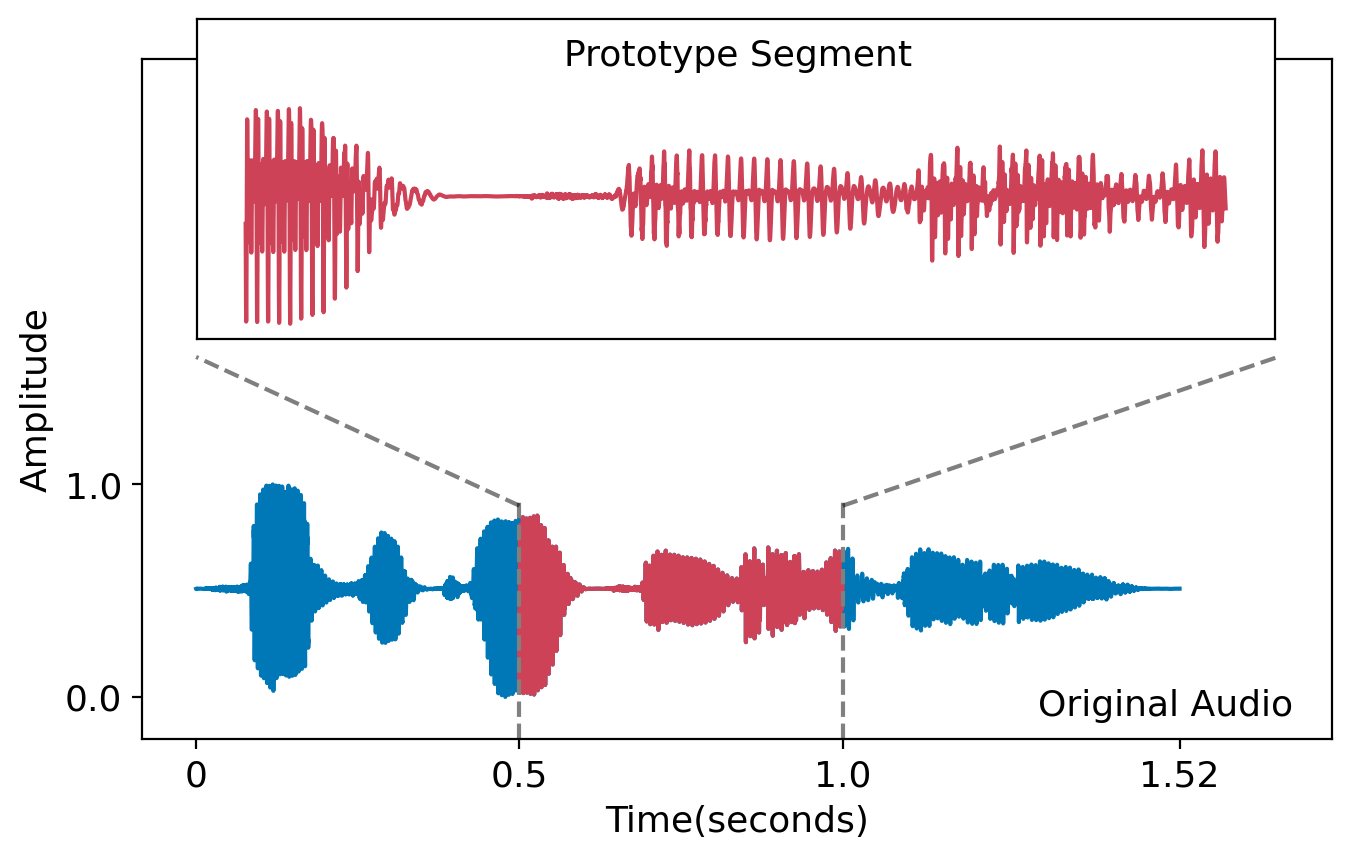
For explanations, we used the “Prototype-summarization-based explanations” described in Section3.2.3. We trained a binary human vs. machine-generated audio prototype-based classifier by fine-tuning the pretrained HUBERT audio classification model [58]. 1434 audios were used for training and 358 audios were used for evaluations. During training, each audio was first sliced into 4 equal-length continuous segments and fed into the network, and each prototype is a 0.5-second segment of the audio signal. For each input audio, we use its most similar segment to each prototype to represent the affinity of the audio to the prototype. This means we can pinpoint the specific differences between human audio and machine audio, rather than just comparing entire audio signals, which is less informative.
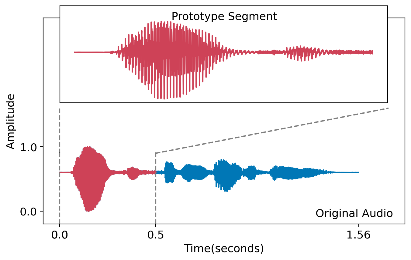
Result
It is difficult for a human to tell the difference between the generated and real audio examples, thus we did not know in advance whether there were any differences between them. We show the learned prototypes in Figure 19, two prototypes each for and . These comparisons immediately provide insight into the difference between the human and machine-generated datasets. Specifically, our results indicate that humans tend to wait before starting to speak, whereas the machine audio starts right away. A second observation we can make is the machine audio waveform has highly periodic patterns where peak-to-peak intervals remain almost constant throughout the audio piece; we can also see the machine audio signal amplitude always changes gradually as opposed to human audio, where there may appear more sudden amplitude changes (e.g., jagged contours of human prototype waveforms). We attribute the the second observation to human nature; human tends to speak with varying speed, loudness, and pitch, whereas synthetic audio always maintains the same pace throughout the whole speech in a more monotonic tone. As mentioned, without this analysis, we were not able to discern these subtle differences between machine-generated and human audio before conducting this analysis
The model’s insights lead immediately to ways to improve the machine-generated audio to make it more akin to human voice: (1) add in a random wait period before the machine speaks, (2) add frequency and amplitude distortion to the machine audio.
4.5 Using Interpretable Attributes to Explain Natural Language Datasets
Dataset and
We first define datasets and . In this example, we used the HC-3-English dataset [19] as a sample dataset for text dataset difference explanations. HC-3-English contains answers to questions from both humans () and ChatGPT (2022 version) () collected from several domains and tasks, including open-domain question-answering (QA), financial, medical, legal, and psychological areas. Human and ChatGPT answers are not compared pairwise (i.e., we did not assume a one-to-one mapping between the answers). Instead, we analyzed the differences between all human answers against all ChatGPT answers. We hypothesize that the datasets can be meaningfully compared using the following attributes:
-
1.
Have consistent writing structure
-
2.
Use formal language
-
3.
Have a neutral tone
-
4.
Show subjective opinion
-
5.
Use of technical references
These attributes can fairly reliably be determined by querying language models.
Forming the explanation
Using the prompt template defined in Section 3.3, we show two query-answer examples in Figure 20. After answers were collected from GPT for all samples in the dataset, we formed explanations based on the results shown in Table 5 – on these question-answering tasks, among the attributes analyzed, humans and ChatGPT answers mainly differ in use of formal language usage, use of subjective opinion and writing structure consistency. That is, we found that humans tend to show more subjectivity in their answers and tend to use more informal language than ChatGPT. Also, humans are much less likely to use consistent writing structure throughout each writing sample.
A simple logistic regression model was able to reach 85% accuracy in predicting whether the text is produced by humans or ChatGPT with the five attributes we collected for each text sample. This indicates that the selected attributes are often able to correctly identify differentiating attributes between the two datasets.
Have consistent writing structure Use formal language Have a neutral tone Show subjective opinion Use of technical references Human 59.4% 22.6% 77.5% 26.9% 35.0% ChatGPT 99.2% 93.2% 99.6% 0.9% 35.2% ChatGPT (Informal) 69.9% 10.1% 68.9% 17.5% 18.3%
Improving
Following the conclusions that we have reached, to improve the similarity between and , we aimed to make each sample in appear more informal and colloquial. Here we again leveraged GPT-3.5 Turbo to “humanize” the ChatGPT text samples. For each text in , we used the following prompt:
The attribute calculated for the improved is shown in the last row of Table 5 (ChatGPT (informal)). Using the attributes, on the same test split, the same logistic regression classifier was only able to achieve 45% accuracy. The decrease in the model’s predictive performance indicates an increase in similarity between the text samples in and .
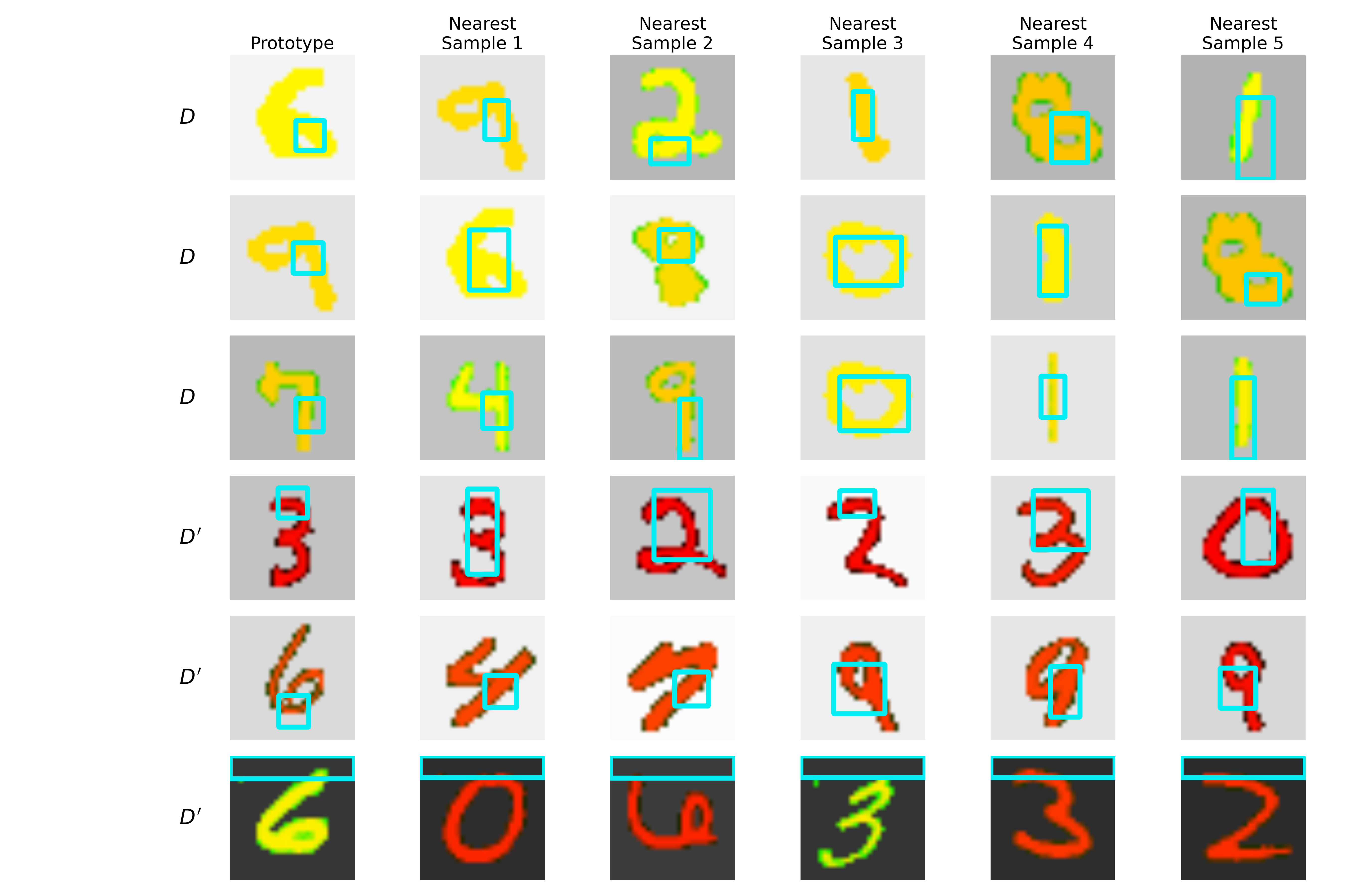
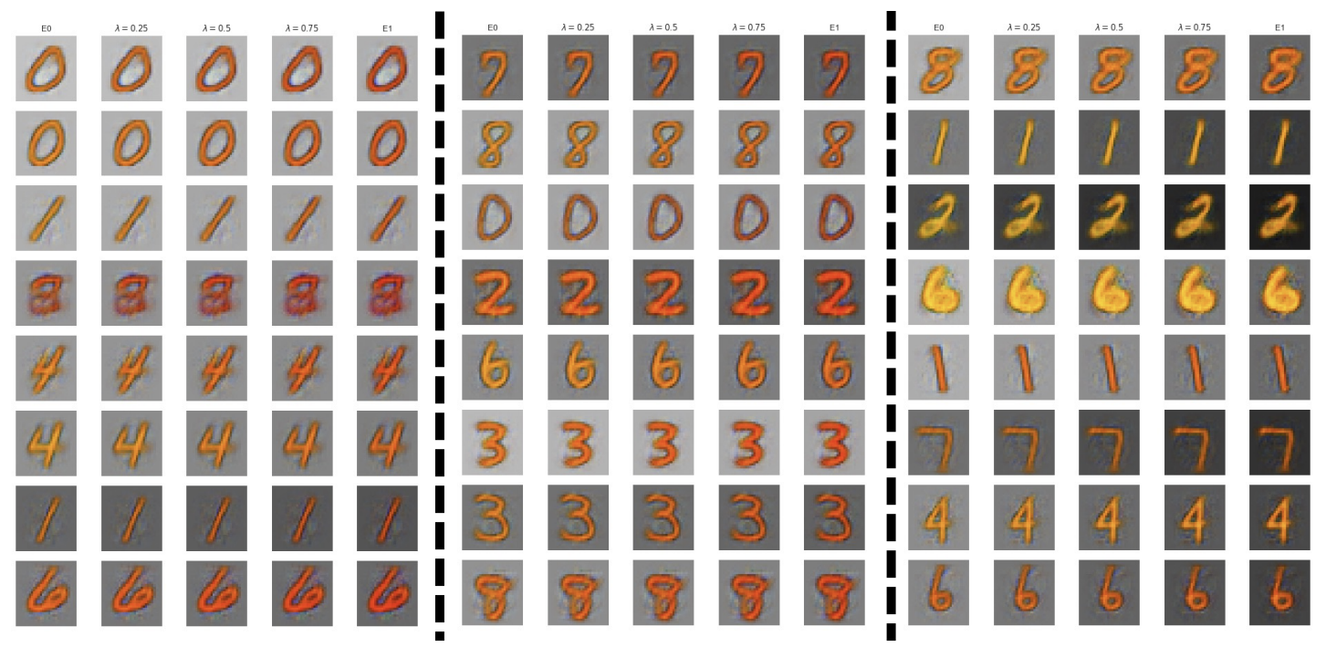
4.6 Explaining Image Datasets (MNIST)
Dataset and
Similar to previous work [25], we created two different datasets from a modified version of the MNIST dataset [12]. MNIST contains 60,000 handwritten digits in black and white form in its training split. We defined the background portion as pixel location with value and the rest as the digit portion. These images were first converted into RGB color format and we set the blue and green channels to 0. For each image, we sampled two values from a uniform distribution: (dark color) and (light color). The green channel of the color image was filled with for the digit pixel locations and the background pixel locations are replaced with for all channels. If both and (both light color), the sample was assigned to , else the sample was assigned to . The same processing was applied to the MNIST test set. This means that images in have yellow writing (which is light green) and light backgrounds (light gray). All other images (red digit and/or dark background) are in .
Forming the explanation
We treat this as a binary image classification task. For this task, we trained a VGG-13 [43] as the backbone and learned 6 prototypes, 3 for each dataset. We used a similar setup as the original ProtoPNet [7], where each learned prototype represents a patch in the prototype image, and the similarity between images and prototypes is measured by comparing each latent patch of the image and the prototype patch. This allows a more fine-grained understanding of the dataset, more specifically, which part of the image or what characteristics are contributing the most to the differences between and .
Result
For explanations, we again used the “Prototype-summarization-based explanations” described in Section 3.2.3. In Figure 21, we display the learned prototypes and their nearest 5 neighbours to assist in demonstrating the learned patterns in each dataset. For dataset , the model picked out dark red digits ( and ), and dark backgrounds (). For dataset , the main characteristic the model picked out is the bright yellow digit parts corresponding to . We can deduce from this explanation (the last row) that the existence of a dark background is a distinguishing factor for samples, regardless of digit color; the combination of bright yellow digit and light background is the distinguishing factor for samples (since red digit alone does not indicate membership).
Let us compare the results of a similar MNIST-based dataset example in previous work [25] (reproduced in Figure 22 in the appendix). Our explanation method disentangled the concepts in the datasets (i.e., digit color and background color) and provided users with more localised indicators of the characteristics of each concept. As a result, using our method, the users do not have to inspect more than a dozen images and “guess” patterns, whereas, in their approach in Figure 22, it is unclear as to which factor is contributing to the difference in dataset assignments since there is no highlighting on any of the figures.
5 Discussion
In this work, we developed practical approaches to understand shifts in data distributions in an interpretable manner. Our approaches can be seen as constituents of a dataset explanation toolbox, whose taxonomy is outlined in Figure 3. Distribution shifts, however, can take on many forms, and what classifies as an interpretable explanation for a shift can be highly context-dependent. We view our work as one of the early efforts to explain dataset differences. To this end, we highlight some caveats associated with our explanations below and provide directions for future work.
Potential Failure Modes and Avenues for Future Research
It is unclear how to evaluate dataset-level explanations.
Compared to instance-level explanations, for which there exist several evaluation criteria, there is not yet a well-defined metric to assess the quality of dataset-level explanations. For instance-level explanations, Agarwal et al. [2] has focused on the evaluation of explanations such as SHAP [30], LIME [34], and IntegratedGrad [49] along several axes such as performance, faithfulness, and stability. Other works such as that of Antoran et al. [3] have evaluated counterfactual explanations through human subject experiments [11]. Analogous tasks for dataset-level explanations are unclear at this point, as there exists no standard evaluative framework. We have some tools to quantify the efficacy of our explanations and their associated tradeoffs (e.g., see Section 11 in the appendix), but these are merely a starting point.
One potential evaluation would show that taking action based on our explanations would make two datasets more similar, as we showed in Sections 4.1, 4.2, and 4.5. Kulinski and Inouye [26] performed such an evaluation for their distribution shift recourse method by showing that their explanation maps Dataset A to a data distribution that more closely resembles that of Dataset B. For our toolbox, we show a recourse-based evaluation for influential example explanations in the appendix of this paper, however, analogous recourse is not yet clear for other forms of explanations, e.g., prototype-based explanations. We could envision generating/collecting data around prototypes that are not represented in one of the two datasets, for example. Other evaluations could include the creation of benchmark datasets with known ground truth differences that future dataset explanations need to uncover. It is also not yet clear which explanation is most suitable for a given dataset or whether this is subjective and depends on the human. Figure 3 in the paper provides a starting point for choosing an explanation method, but this is based more on the modality of the dataset rather than any inherent property of the data itself (e.g., latent structure, dimensionality).
There is no general explanation framework yet for comparing complex natural language datasets:
It is not yet clear how we can design a generic framework for dataset-level explanations for more complex tasks involving sequence modeling (e.g., machine translation, summarisation, etc.) where the dataset contains paired sequences. In the absence of such a framework, some form of bespoke interpretable attribute design as in Section 4.5 may be necessary, however, we leave this as an open direction for future work.
There is no guarantee of actionability:
The actionability of insights and explanations generated from our analysis may vary based on the task. A generated insight can be very actionable if a difference between datasets can be directly fixed by tuning a parameter in the generative algorithm or changing the data sampling and collection strategy. For instance, in Section 4.5, we used prompt engineering to create a new question-answering dataset that has attributes closer to those of the human dataset. In other cases, the explanation may not directly translate to an obvious modification of the dataset, but can be used for exploratory data analysis.
For high dimensional data with non-interpretable features, the quality of the explanation may depend on the quality of the latent space:
For prototype-based explanations derived from training discriminators (e.g., in Sections 4.6 and 4.5), the prototype distances are computed in the latent space. The underlying assumption is that distances in the latent space are meaningful. That is, if two examples are close in latent space, it is because these examples share some similar characteristics that are semantically meaningful and interpretable to humans. Even if the latent space quality is good, it is not clear whether PaCMAP projections of the space can maintain global structure when the input data is extremely high dimensional (e.g. s of dimensions). The visualizations should therefore be interpreted with caution in these cases. See Huang et al. [22] for a review on trustworthiness of dimension reduction methods.
There is no guarantee of completeness:
Prototype methods capture a sufficient set of differences between the two datasets but do not necessarily capture all differences between the datasets. In other words, there may be other ways the datasets differ that are not captured by a single prototype model. It is not actually clear that this is problematic in most cases.
Influential example explanations can only be used if local feature importance can be computed:
In particular, some methods such as Permutation Importance and Gini-impurity provide global feature importances (GiFIMs) directly, with no information given on the importance of a feature for the prediction of a particular instance (LiFIM). Because our explanation technique relies on a) computing GiFIMs as an aggregate of LiFIMs, and b) computing influences from LiFIMs, methods that skip this step will not be compatible with our technique. Future work could seek to implement fast computation of influential example explanations in these situations to generalise to broader types of feature importance measures.
6 Conclusion
In conclusion, we developed an explainable AI paradigm for explaining the differences between any two datasets in an interpretable manner. The suite of approaches proposed in this work could provide end users with insights and actionable clues to understand and mitigate the differences. With case studies and experiments that cover a variety of data modalities and common machine learning tasks, we demonstrate the comprehensiveness and adaptability of our methods. This framework could be useful for scientific applications in which one dataset is generated to have the same distribution as a real dataset. It could also be useful for detecting flaws in generated data for medical applications, where the data were generated to protect patient privacy. It could also be useful for understanding differences between models trained on two similar datasets and highlighting erroneous examples in specific regions of the space.
7 Ethics note
This can be used to help improve deep fake techniques and adverse/ malicious machine signal, image, and tabular data generation in various domains.
8 Acknowledgement
We thank Jon Donnelly and Srikar Katta for helpful discussions and guidance on using Rashomon variable importance. We acknowledge support from NIH 1R01HL166233-01, NIH/NIBIB 5P41-EB028744, and NSF 3332788.
References
- [1]
- Agarwal et al. [2022] Chirag Agarwal, Satyapriya Krishna, Eshika Saxena, Martin Pawelczyk, Nari Johnson, Isha Puri, Marinka Zitnik, and Himabindu Lakkaraju. 2022. OpenXAI: Towards a Transparent Evaluation of Model Explanations. In Advances in Neural Information Processing Systems, S. Koyejo, S. Mohamed, A. Agarwal, D. Belgrave, K. Cho, and A. Oh (Eds.), Vol. 35. Curran Associates, Inc., 15784–15799. https://proceedings.neurips.cc/paper_files/paper/2022/file/65398a0eba88c9b4a1c38ae405b125ef-Paper-Datasets_and_Benchmarks.pdf
- Antoran et al. [2021] Javier Antoran, Umang Bhatt, Tameem Adel, Adrian Weller, and José Miguel Hernández-Lobato. 2021. Getting a {CLUE}: A Method for Explaining Uncertainty Estimates. In International Conference on Learning Representations. https://openreview.net/forum?id=XSLF1XFq5h
- Barnett et al. [2023] Alina Jade Barnett, Zhicheng Guo, Jin Jing, Wendong Ge, Cynthia Rudin, and M. Brandon Westover. 2023. Interpretable Machine Learning System to EEG Patterns on the Ictal-Interictal-Injury Continuum. arXiv:2211.05207 [cs.CV]
- Becker and Kohavi [1996] Barry Becker and Ronny Kohavi. 1996. Adult. UCI Machine Learning Repository. DOI: https://doi.org/10.24432/C5XW20.
- Charlton et al. [2018] P. H. Charlton, D. A. Birrenkott, T. Bonnici, M. A. F. Pimentel, A. E. W. Johnson, J. Alastruey, L. Tarassenko, P. J. Watkinson, R. Beale, and D. A. Clifton. 2018. Breathing Rate Estimation From the Electrocardiogram and Photoplethysmogram: A Review. IEEE Rev Biomed Eng 11 (2018), 2–20.
- Chen et al. [2019] Chaofan Chen, Oscar Li, Daniel Tao, Alina Barnett, Cynthia Rudin, and Jonathan K Su. 2019. This Looks Like That: Deep Learning for Interpretable Image Recognition. In Advances in Neural Information Processing Systems, H. Wallach, H. Larochelle, A. Beygelzimer, F. d'Alché-Buc, E. Fox, and R. Garnett (Eds.), Vol. 32. Curran Associates, Inc. https://proceedings.neurips.cc/paper_files/paper/2019/file/adf7ee2dcf142b0e11888e72b43fcb75-Paper.pdf
- Chen et al. [2021] Richard J. Chen, Ming Y. Lu, Tiffany Y. Chen, Drew F. K. Williamson, and Faisal Mahmood. 2021. Synthetic data in machine learning for medicine and healthcare. Nature Biomedical Engineering 5, 6 (01 Jun 2021), 493–497. https://doi.org/10.1038/s41551-021-00751-8
- Chirra et al. [2018] Prathyush Chirra, Patrick Leo, Michael Yim, B. Nicolas Bloch, Ardeshir R. Rastinehad, Andrei Purysko, Mark Rosen, Anant Madabhushi, and Satish Viswanath. 2018. Empirical evaluation of cross-site reproducibility in radiomic features for characterizing prostate MRI. In Medical Imaging 2018: Computer-Aided Diagnosis (Society of Photo-Optical Instrumentation Engineers (SPIE) Conference Series, Vol. 10575), Nicholas Petrick and Kensaku Mori (Eds.). Article 105750B, 105750B pages. https://doi.org/10.1117/12.2293992
- Cuturi [2013] Marco Cuturi. 2013. Sinkhorn Distances: Lightspeed Computation of Optimal Transport. In Advances in Neural Information Processing Systems, C.J. Burges, L. Bottou, M. Welling, Z. Ghahramani, and K.Q. Weinberger (Eds.), Vol. 26. Curran Associates, Inc. https://proceedings.neurips.cc/paper_files/paper/2013/file/af21d0c97db2e27e13572cbf59eb343d-Paper.pdf
- Delaney et al. [2023] Eoin Delaney, Arjun Pakrashi, Derek Greene, and Mark T. Keane. 2023. Counterfactual explanations for misclassified images: How human and machine explanations differ. Artificial Intelligence 324 (2023), 103995. https://doi.org/10.1016/j.artint.2023.103995
- Deng [2012] Li Deng. 2012. The mnist database of handwritten digit images for machine learning research. IEEE Signal Processing Magazine 29, 6 (2012), 141–142.
- Donnelly et al. [2023] Jon Donnelly, Srikar Katta, Cynthia Rudin, and Edward P. Browne. 2023. The Rashomon Importance Distribution: Getting RID of Unstable, Single Model-based Variable Importance. arXiv:2309.13775 [cs.LG]
- Elazar et al. [2023] Yanai Elazar, Akshita Bhagia, Ian Magnusson, Abhilasha Ravichander, Dustin Schwenk, Alane Suhr, Pete Walsh, Dirk Groeneveld, Luca Soldaini, Sameer Singh, Hanna Hajishirzi, Noah A. Smith, and Jesse Dodge. 2023. What’s In My Big Data? arXiv:2310.20707 [cs.CL]
- Eren and The Coqui TTS Team [2021] Gölge Eren and The Coqui TTS Team. 2021. Coqui TTS. https://doi.org/10.5281/zenodo.6334862
- FICO [2018] FICO. 2018. Explainable Machine Learning Challenge.
- Gao et al. [2022] Irena Gao, Shiori Sagawa, Pang Wei Koh, Tatsunori Hashimoto, and Percy Liang. 2022. Out-of-Distribution Robustness via Targeted Augmentations. In NeurIPS 2022 Workshop on Distribution Shifts: Connecting Methods and Applications. https://openreview.net/forum?id=Bcg0It4i1g
- Giuffrè and Shung [2023] Mauro Giuffrè and Dennis L. Shung. 2023. Harnessing the power of synthetic data in healthcare: innovation, application, and privacy. npj Digital Medicine 6, 1 (09 Oct 2023), 186. https://doi.org/10.1038/s41746-023-00927-3
- Guo et al. [2023] Biyang Guo, Xin Zhang, Ziyuan Wang, Minqi Jiang, Jinran Nie, Yuxuan Ding, Jianwei Yue, and Yupeng Wu. 2023. How Close is ChatGPT to Human Experts? Comparison Corpus, Evaluation, and Detection. arXiv preprint arxiv:2301.07597 (2023).
- Guo et al. [2022] Lin Lawrence Guo, Stephen R. Pfohl, Jason Fries, Alistair E. W. Johnson, Jose Posada, Catherine Aftandilian, Nigam Shah, and Lillian Sung. 2022. Evaluation of domain generalization and adaptation on improving model robustness to temporal dataset shift in clinical medicine. Scientific Reports 12, 1 (17 Feb 2022), 2726. https://doi.org/10.1038/s41598-022-06484-1
- Hendrycks et al. [2021] Dan Hendrycks, Steven Basart, Norman Mu, Saurav Kadavath, Frank Wang, Evan Dorundo, Rahul Desai, Tyler Zhu, Samyak Parajuli, Mike Guo, et al. 2021. The many faces of robustness: A critical analysis of out-of-distribution generalization. In Proceedings of the IEEE/CVF International Conference on Computer Vision. 8340–8349.
- Huang et al. [2022] Haiyang Huang, Yingfan Wang, Cynthia Rudin, and Edward P Browne. 2022. Towards a comprehensive evaluation of dimension reduction methods for transcriptomic data visualization. Communications biology 5, 1 (2022), 719.
- Jang et al. [2022] Sooyong Jang, Sangdon Park, Insup Lee, and Osbert Bastani. 2022. Sequential covariate shift detection using classifier two-sample tests. In International Conference on Machine Learning. PMLR, 9845–9880.
- Koh and Liang [2017] Pang Wei Koh and Percy Liang. 2017. Understanding Black-box Predictions via Influence Functions. In Proceedings of the 34th International Conference on Machine Learning (Proceedings of Machine Learning Research, Vol. 70), Doina Precup and Yee Whye Teh (Eds.). PMLR, 1885–1894. https://proceedings.mlr.press/v70/koh17a.html
- Kulinski and Inouye [2023a] Sean Kulinski and David I Inouye. 2023a. Towards explaining distribution shifts. In International Conference on Machine Learning. PMLR, 17931–17952.
- Kulinski and Inouye [2023b] Sean Kulinski and David I. Inouye. 2023b. Towards Explaining Distribution Shifts. In Proceedings of the 40th International Conference on Machine Learning (Proceedings of Machine Learning Research, Vol. 202), Andreas Krause, Emma Brunskill, Kyunghyun Cho, Barbara Engelhardt, Sivan Sabato, and Jonathan Scarlett (Eds.). PMLR, 17931–17952. https://proceedings.mlr.press/v202/kulinski23a.html
- Laskar et al. [2023] Md Tahmid Rahman Laskar, M Saiful Bari, Mizanur Rahman, Md Amran Hossen Bhuiyan, Shafiq Joty, and Jimmy Huang. 2023. A Systematic Study and Comprehensive Evaluation of ChatGPT on Benchmark Datasets. In Findings of the Association for Computational Linguistics: ACL 2023, Anna Rogers, Jordan Boyd-Graber, and Naoaki Okazaki (Eds.). Association for Computational Linguistics, Toronto, Canada, 431–469. https://doi.org/10.18653/v1/2023.findings-acl.29
- Lin et al. [2020] Jimmy Lin, Chudi Zhong, Diane Hu, Cynthia Rudin, and Margo Seltzer. 2020. Generalized and scalable optimal sparse decision trees. In Proceedings of the 37th International Conference on Machine Learning (ICML’20). JMLR.org, Article 571, 11 pages.
- Livingstone and Russo [2018] S. R. Livingstone and F. A. Russo. 2018. The Ryerson Audio-Visual Database of Emotional Speech and Song (RAVDESS): A dynamic, multimodal set of facial and vocal expressions in North American English. PLoS One 13, 5 (2018), e0196391.
- Lundberg and Lee [2017] Scott M. Lundberg and Su-In Lee. 2017. A Unified Approach to Interpreting Model Predictions. In Proceedings of the 31st International Conference on Neural Information Processing Systems (Long Beach, California, USA) (NIPS’17). Curran Associates Inc., Red Hook, NY, USA, 4768–4777.
- Makowski et al. [2021] Dominique Makowski, Tam Pham, Zen J. Lau, Jan C. Brammer, François Lespinasse, Hung Pham, Christopher Schölzel, and S. H. Annabel Chen. 2021. NeuroKit2: A Python toolbox for neurophysiological signal processing. Behavior Research Methods 53, 4 (feb 2021), 1689–1696. https://doi.org/10.3758/s13428-020-01516-y
- OpenAI [2023] OpenAI. 2023. GPT-4 Technical Report. arXiv:2303.08774 [cs.CL]
- Peyré and Cuturi [2019] Gabriel Peyré and Marco Cuturi. 2019. Computational Optimal Transport: With Applications to Data Science. Foundations and Trends® in Machine Learning 11, 5-6 (2019), 355–607. https://doi.org/10.1561/2200000073
- Ribeiro et al. [2016] Marco Tulio Ribeiro, Sameer Singh, and Carlos Guestrin. 2016. ”Why Should I Trust You?”: Explaining the Predictions of Any Classifier. In Proceedings of the 22nd ACM SIGKDD International Conference on Knowledge Discovery and Data Mining, San Francisco, CA, USA, August 13-17, 2016. 1135–1144.
- Ribeiro et al. [2018] Marco Tulio Ribeiro, Sameer Singh, and Carlos Guestrin. 2018. Anchors: High-Precision Model-Agnostic Explanations. Proceedings of the AAAI Conference on Artificial Intelligence 32, 1 (April 2018). https://doi.org/10.1609/aaai.v32i1.11491
- Rudin [2019] Cynthia Rudin. 2019. Stop Explaining Black Box Machine Learning Models for High Stakes Decisions and Use Interpretable Models Instead. Nature Machine Intelligence 1 (May 2019), 206–215.
- Selvaraju et al. [2017] Ramprasaath R. Selvaraju, Michael Cogswell, Abhishek Das, Ramakrishna Vedantam, Devi Parikh, and Dhruv Batra. 2017. Grad-CAM: Visual Explanations from Deep Networks via Gradient-Based Localization. In 2017 IEEE International Conference on Computer Vision (ICCV). 618–626. https://doi.org/10.1109/ICCV.2017.74
- Semenova et al. [2022] Lesia Semenova, Cynthia Rudin, and Ronald Parr. 2022. On the Existence of Simpler Machine Learning Models. In 2022 ACM Conference on Fairness, Accountability, and Transparency (FAccT ’22). ACM. https://doi.org/10.1145/3531146.3533232
- Shapley et al. [1953] Lloyd S Shapley et al. 1953. A value for n-person games. (1953).
- Shen et al. [2021] Zheyan Shen, Jiashuo Liu, Yue He, Xingxuan Zhang, Renzhe Xu, Han Yu, and Peng Cui. 2021. Towards out-of-distribution generalization: A survey. arXiv preprint arXiv:2108.13624 (2021).
- Shin et al. [2022] Yong-Min Shin, Sun-Woo Kim, Eun-Bi Yoon, and Won-Yong Shin. 2022. Prototype-Based Explanations for Graph Neural Networks (Student Abstract). Proceedings of the AAAI Conference on Artificial Intelligence 36, 11 (June 2022), 13047–13048. https://doi.org/10.1609/aaai.v36i11.21660
- Simonyan et al. [2013] Karen Simonyan, Andrea Vedaldi, and Andrew Zisserman. 2013. Deep Inside Convolutional Networks: Visualising Image Classification Models and Saliency Maps. CoRR abs/1312.6034 (2013). http://dblp.uni-trier.de/db/journals/corr/corr1312.html#SimonyanVZ13
- Simonyan and Zisserman [2015] Karen Simonyan and Andrew Zisserman. 2015. Very Deep Convolutional Networks for Large-Scale Image Recognition. In International Conference on Learning Representations.
- Smilkov et al. [2017] Daniel Smilkov, Nikhil Thorat, Been Kim, Fernanda B. Viégas, and Martin Wattenberg. 2017. SmoothGrad: removing noise by adding noise. CoRR abs/1706.03825 (2017). arXiv:1706.03825 http://arxiv.org/abs/1706.03825
- Sugiyama et al. [2007] Masashi Sugiyama, Matthias Krauledat, and Klaus-Robert Müller. 2007. Covariate shift adaptation by importance weighted cross validation. Journal of Machine Learning Research 8, 5 (2007).
- Sun et al. [2021] Yiyou Sun, Chuan Guo, and Yixuan Li. 2021. React: Out-of-distribution detection with rectified activations. Advances in Neural Information Processing Systems 34 (2021), 144–157.
- Sun et al. [2020] Yu Sun, Xiaolong Wang, Zhuang Liu, John Miller, Alexei Efros, and Moritz Hardt. 2020. Test-time training with self-supervision for generalization under distribution shifts. In International conference on machine learning. PMLR, 9229–9248.
- Sundararajan et al. [2017a] Mukund Sundararajan, Ankur Taly, and Qiqi Yan. 2017a. Axiomatic Attribution for Deep Networks. In Proceedings of the 34th International Conference on Machine Learning - Volume 70 (Sydney, NSW, Australia) (ICML’17). JMLR.org, 3319–3328.
- Sundararajan et al. [2017b] Mukund Sundararajan, Ankur Taly, and Qiqi Yan. 2017b. Axiomatic Attribution for Deep Networks. In Proceedings of the 34th International Conference on Machine Learning - Volume 70 (Sydney, NSW, Australia) (ICML’17). JMLR.org, 3319–3328.
- Torres-Soto and Ashley [2020] Jessica Torres-Soto and Euan A Ashley. 2020. Multi-task deep learning for cardiac rhythm detection in wearable devices. NPJ Digit. Med. 3, 1 (Sept. 2020), 116.
- Touvron et al. [2023] Hugo Touvron, Louis Martin, Kevin Stone, Peter Albert, Amjad Almahairi, Yasmine Babaei, Nikolay Bashlykov, Soumya Batra, Prajjwal Bhargava, Shruti Bhosale, Dan Bikel, Lukas Blecher, Cristian Canton Ferrer, Moya Chen, Guillem Cucurull, David Esiobu, Jude Fernandes, Jeremy Fu, Wenyin Fu, Brian Fuller, Cynthia Gao, Vedanuj Goswami, Naman Goyal, Anthony Hartshorn, Saghar Hosseini, Rui Hou, Hakan Inan, Marcin Kardas, Viktor Kerkez, Madian Khabsa, Isabel Kloumann, Artem Korenev, Punit Singh Koura, Marie-Anne Lachaux, Thibaut Lavril, Jenya Lee, Diana Liskovich, Yinghai Lu, Yuning Mao, Xavier Martinet, Todor Mihaylov, Pushkar Mishra, Igor Molybog, Yixin Nie, Andrew Poulton, Jeremy Reizenstein, Rashi Rungta, Kalyan Saladi, Alan Schelten, Ruan Silva, Eric Michael Smith, Ranjan Subramanian, Xiaoqing Ellen Tan, Binh Tang, Ross Taylor, Adina Williams, Jian Xiang Kuan, Puxin Xu, Zheng Yan, Iliyan Zarov, Yuchen Zhang, Angela Fan, Melanie Kambadur, Sharan Narang, Aurelien Rodriguez, Robert Stojnic, Sergey Edunov, and Thomas Scialom. 2023. Llama 2: Open Foundation and Fine-Tuned Chat Models. arXiv:2307.09288 [cs.CL]
- Tucker et al. [2020] Allan Tucker, Zhenchen Wang, Ylenia Rotalinti, and Puja Myles. 2020. Generating high-fidelity synthetic patient data for assessing machine learning healthcare software. npj Digital Medicine 3, 1 (09 Nov 2020), 147. https://doi.org/10.1038/s41746-020-00353-9
- Upadhyay et al. [2021] Sohini Upadhyay, Shalmali Joshi, and Himabindu Lakkaraju. 2021. Towards Robust and Reliable Algorithmic Recourse. In Advances in Neural Information Processing Systems, M. Ranzato, A. Beygelzimer, Y. Dauphin, P.S. Liang, and J. Wortman Vaughan (Eds.), Vol. 34. Curran Associates, Inc., 16926–16937. https://proceedings.neurips.cc/paper_files/paper/2021/file/8ccfb1140664a5fa63177fb6e07352f0-Paper.pdf
- Ustun et al. [2019] Berk Ustun, Alexander Spangher, and Yang Liu. 2019. Actionable Recourse in Linear Classification. In Proceedings of the Conference on Fairness, Accountability, and Transparency (Atlanta, GA, USA) (FAT* ’19). Association for Computing Machinery, New York, NY, USA, 10–19. https://doi.org/10.1145/3287560.3287566
- Wang et al. [2021] Yingfan Wang, Haiyang Huang, Cynthia Rudin, and Yaron Shaposhnik. 2021. Understanding How Dimension Reduction Tools Work: An Empirical Approach to Deciphering t-SNE, UMAP, TriMap, and PaCMAP for Data Visualization. Journal of Machine Learning Research 22, 201 (2021), 1–73. http://jmlr.org/papers/v22/20-1061.html
- Xin et al. [2022] Rui Xin, Chudi Zhong, Zhi Chen, Takuya Takagi, Margo Seltzer, and Cynthia Rudin. 2022. Exploring the Whole Rashomon Set of Sparse Decision Trees. In Advances in Neural Information Processing Systems, S. Koyejo, S. Mohamed, A. Agarwal, D. Belgrave, K. Cho, and A. Oh (Eds.), Vol. 35. Curran Associates, Inc., 14071–14084. https://proceedings.neurips.cc/paper_files/paper/2022/file/5afaa8b4dd18eb1eed055d2d821b58ae-Paper-Conference.pdf
- Yang et al. [2021b] Jingkang Yang, Kaiyang Zhou, Yixuan Li, and Ziwei Liu. 2021b. Generalized out-of-distribution detection: A survey. arXiv preprint arXiv:2110.11334 (2021).
- Yang et al. [2021a] Shu-wen Yang, Po-Han Chi, Yung-Sung Chuang, Cheng-I Jeff Lai, Kushal Lakhotia, Yist Y Lin, Andy T Liu, Jiatong Shi, Xuankai Chang, Guan-Ting Lin, et al. 2021a. SUPERB: Speech processing Universal PERformance Benchmark. arXiv preprint arXiv:2105.01051 (2021).
- Yang et al. [2022] Wenzhuo Yang, Jia Li, Caiming Xiong, and Steven C. H. Hoi. 2022. MACE: An Efficient Model-Agnostic Framework for Counterfactual Explanation. arXiv:2205.15540 [cs.AI]
- Yang et al. [2023] Yuzhe Yang, Haoran Zhang, Dina Katabi, and Marzyeh Ghassemi. 2023. Change is Hard: A Closer Look at Subpopulation Shift. In Proceedings of the 40th International Conference on Machine Learning (Proceedings of Machine Learning Research, Vol. 202), Andreas Krause, Emma Brunskill, Kyunghyun Cho, Barbara Engelhardt, Sivan Sabato, and Jonathan Scarlett (Eds.). PMLR, 39584–39622. https://proceedings.mlr.press/v202/yang23s.html
- Ye et al. [2023] Junjie Ye, Xuanting Chen, Nuo Xu, Can Zu, Zekai Shao, Shichun Liu, Yuhan Cui, Zeyang Zhou, Chao Gong, Yang Shen, Jie Zhou, Siming Chen, Tao Gui, Qi Zhang, and Xuanjing Huang. 2023. A Comprehensive Capability Analysis of GPT-3 and GPT-3.5 Series Models. ArXiv abs/2303.10420 (2023). https://api.semanticscholar.org/CorpusID:257632113
- Zhang et al. [2023] Haoran Zhang, Harvineet Singh, Marzyeh Ghassemi, and Shalmali Joshi. 2023. ”Why Did the Model Fail?”: Attributing Model Performance Changes to Distribution Shifts. In Proceedings of the 40th International Conference on Machine Learning (Honolulu, Hawaii, USA) (ICML’23). JMLR.org, Article 1744, 29 pages.
- Zhang et al. [2013] Kun Zhang, Bernhard Schölkopf, Krikamol Muandet, and Zhikun Wang. 2013. Domain adaptation under target and conditional shift. In International conference on machine learning. PMLR, 819–827.
- Zhu et al. [2022] Zhiying Zhu, Weixin Liang, and James Zou. 2022. GSCLIP : A Framework for Explaining Distribution Shifts in Natural Language. arXiv:2206.15007 [cs.CL]
Appendix
9 PPG simulation parameters
The synthetic PPG signals were generated using the following parameters using neurokit2 [31]. Parameter values were chosen either as a fixed value or randomly chosen from the listed value range.
| Parameters | Value Range |
|---|---|
| sampling_rate | 80 |
| heart_rate | 81 - 100 |
| frequency_modulation | 5 - 21 |
| ibi_randomness | 5 - 21 |
| drift | 0 - 1 |
| powerline_amplitude | 0 - 1 |
| burst_amplitude | 0 - 1 |
| burst_number | 0 - 9 |
| noise_shape | laplace |
| artifacts_amplitude | 1 |
| artifacts_frequency | 5 - 9 |
| artifacts_number | 15 - 31 |
| linear_drift | True / False |
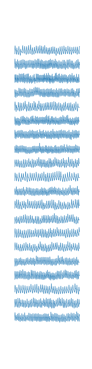
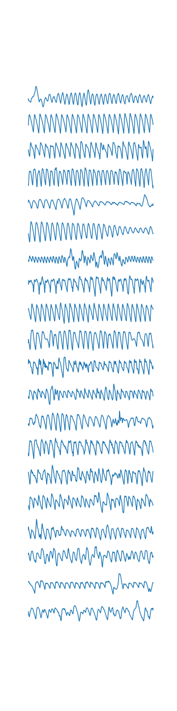
10 Partial Prototype Feature Selection: Sensitivity Analysis
From Figure 24, we can see the following:
-
•
There exists a tradeoff between importance rank difference and average importance rank – this is analogous to a bias-variance tradeoff. In particular, one can choose a feature that is on average more important in a prototype neighbourhood, but this feature will have higher variation in importance rank. That is, the absolute rank difference between the feature’s importance for the prototype and the importance of its neighbourhood point will be higher.
-
•
There is also a tradeoff between average importance rank and value stability. This means that one can choose a feature that is on average more important to the underlying task in a prototype neighbourhood, but this feature is likely to take on a larger spread of values.
Navigating these tradeoffs according to user requirements is an essential aspect of choosing the correct partial prototype features that are truly representative of the neighbourhood.
11 Evaluation of Explanation Methods
We perform several evaluations of our explanations in order to characterise their quality under different scenarios. As is typical with function approximation, approximation faithfulness and completeness is sacrificed if we reduce the complexity of the explanations. We define explanation quality in terms of its faithfulness to the underlying difference between two datasets:
Definition 11.1 (Faithfulness).
The faithfulness of a dataset difference explanation is the extent to which the explanation captures the actual difference between two datasets. The exact measure of faithfulness depends on the type of dataset explanation being generated.
11.1 Prototype-Based Explanations for NSPD and NSDD
The main assumption made for prototype-based explanations of this type is that the prototype is representative of the neighbourhood. This is generally true if the neighbourhood is small, but the quality of the explanation will degrade as the neighbourhood grows, because it will contain more varied data. On the other hand, the explanations are more general if they cover a larger neighbourhood. This is analogous to an argument made in selecting the number of clusters for -means, except that prototypes are a generalisation of cluster-centres and can be chosen to prioritise certain neighbourhoods. Based on the above analysis, we have two conflicting desiderata for an ideal prototypical explanation:
-
•
Each prototype must faithfully represent its neighbourhood, which means the neighbourhood should be sufficiently small.
-
•
The explanations must be general, which means the neighbourhood should be sufficiently large. (This leads to a smaller overall number of prototypes.)
We illustrate the tradeoffs associated with these desiderata for explaining the HELOC and Adult datasets in the figures below. We assume a similar setup as in Sections 4.2 and 4.1.
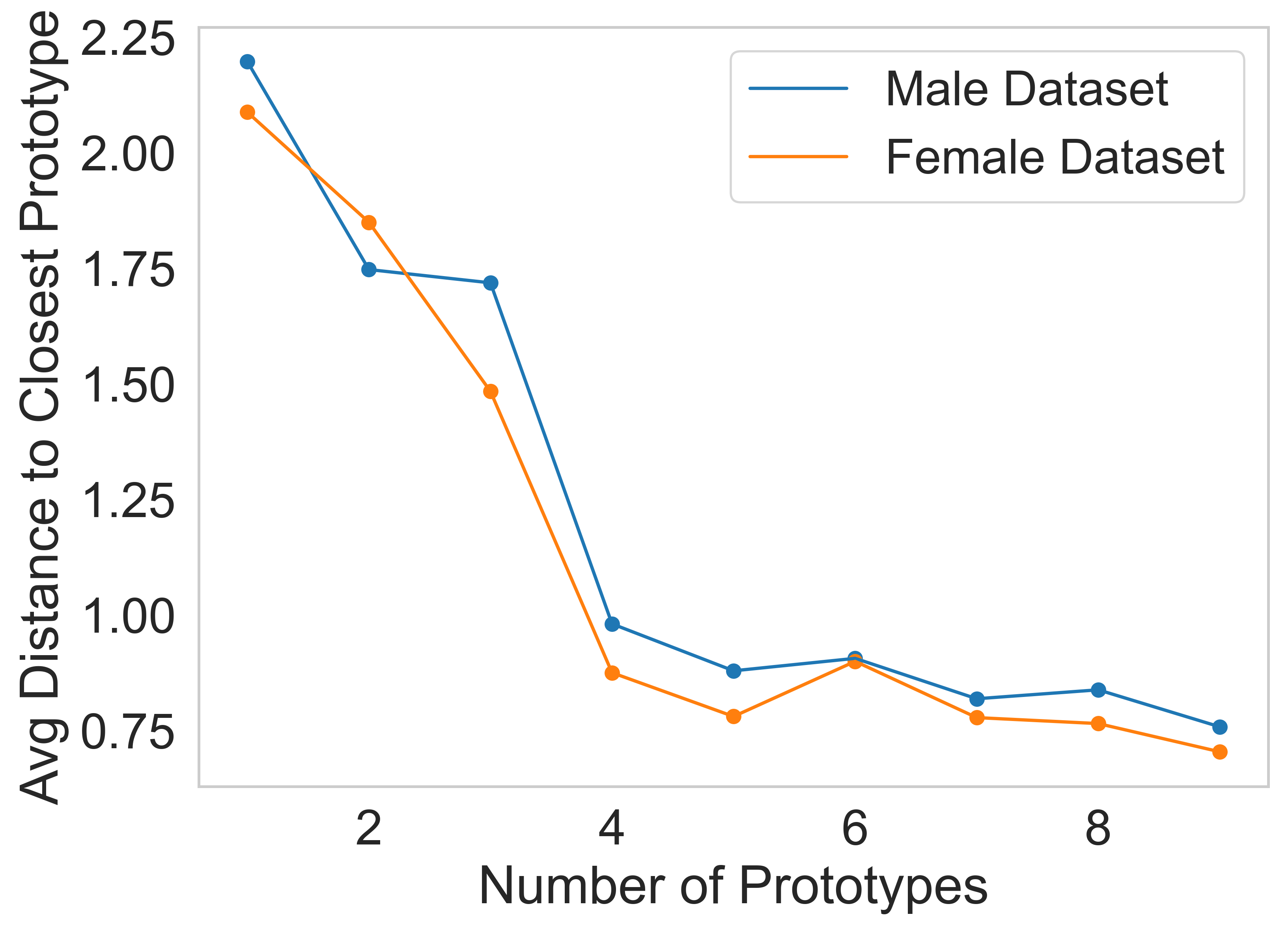
11.2 Choosing Partial Prototypes
For tabular datasets such as HELOC, we want to choose a subset of features for each prototype that best represent the neighbourhood. In Section 4.2.3, we selected features according to the following desiderata:
-
•
The chosen features should not vary much in the neighbourhood of the prototype.
-
•
The chosen features should be important for both the prototype and its neighbourhood. Here, importance is measured relative to the underlying task at hand.
Because the distance metric used in computing the NSPD and NSDD involved all of the features, when we then restrict ourselves to using a subset of the features, the observations within the neighbourhood may differ from each other on this subset. To capture this degradation in the distance metric, we use two measures of faithfulness:
Definition 11.2 (Random Triplet Accuracy (from Wang et al. [55])).
Choose any points from a dataset over trials. The random triplet accuracy then measures the proportion of trials where the triplets maintain their relative order in both low and high-dimensional space feature spaces.
Definition 11.3 (Global Permutation Accuracy).
The global permutation accuracy captures the distance between permutations. Given two arrays containing separate distance measurements, first argsort both arrays. The global permutation accuracy is the proportion of positions where the rankings of elements in both arrays match (e.g., if element has the largest distance in both arrays, then this is considered one match).
Let be a prototype of interest in dataset . Let be all the points in its neighbourhood. Let represent the chosen subset of features, with corresponding partial prototype . We now illustrate this degradation in explanation quality as a function of .
-
1.
We first order the points in according to distance from the prototype . Let represent this ordering.
-
2.
We then select random features from the feature set and compute the partial prototype .
-
3.
We now order points in according to distance to the partial prototype. Let represent this new ordering of points.
-
4.
We then compute the Random Triplet and Global Permutation Accuracies of the chosen features.
11.3 Influential Example Explanations: Alignment
We now evaluate influential example explanations by asking the question:
Given datasets and and their respective models, are we choosing the right examples from either dataset to remove to remediate feature importance differences between the datasets?
The first step in the explanation pipeline is training a discriminator to classify whether the local intrinsic feature importance (LiFIM) for an example originates from or (see Algorithm 1). Then, by computing influences for LiFIM, we determine the appropriate examples that have the highest (positive) influence on the discriminator loss (i.e., removing them increases the loss). We first determine the validity of our method by computing the theoretical influences of each example in and using Equation 3 and then empirically calculating the loss of the discriminator after the example is removed from training. This is shown in Figure 27 below. Here, the empirical estimates match the theoretically computed values for the influence. We remark here that these are results for logistic regression, whereas the correlation may not be as high for nonlinear functions, though other works have found high correlations [24].
In the next step, we want to see if the removed examples actually change the global feature importance measure when the task model is retrained.
-
•
Without loss of generality, we choose the dataset we are removing examples from as . For HELOC, this corresponds to the High-Risk dataset with ExternalRiskEstimate . For Adult, this is the Female dataset.
-
•
We remove a varying of the most influential examples from decided by Algorithm 1. Let be the set of examples removed and and the task specific models trained on and respectively.
-
•
We then compute the average global feature importance alignment between the dataset and the datasets and respectively. Given GiFIMs , , and for , , and respectively, alignment is defined as:
(7) or the reduction in error between GiFIMs of and once the influential examples are removed from consideration.
-
•
For the task models, we experiment with decision trees of different depths to see if there is any impact on alignment.
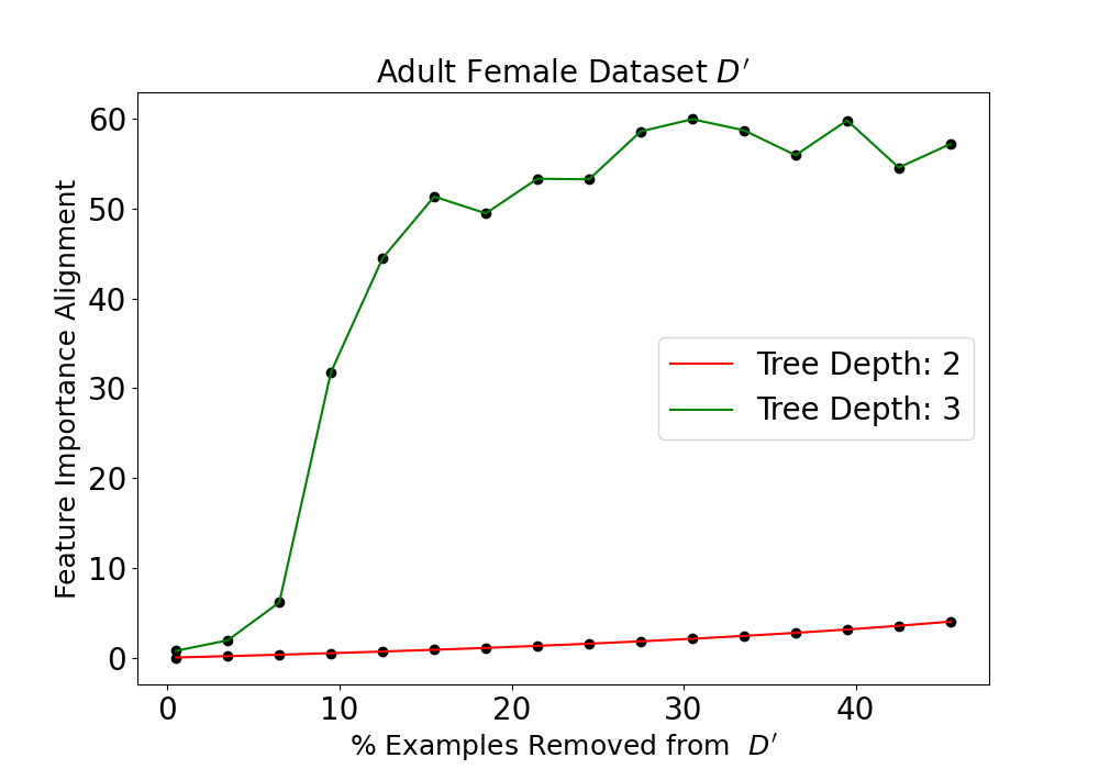
12 Illustrating a Failure Mode of Kulinski and Inouye [25]
12.1 Methodology
We now illustrate an example where the distribution shift explanation of Kulinski and Inouye [25] is incoherent, but our prototype-based explanations are able to accurately capture dataset differences. In particular, we simulate the mean shift of a mixture of Gaussians – Case below is the same setup as Kulinski and Inouye [25]. Because the cluster centres are shifted by the same amount, we call the cluster centres of and paired.
Case 1:
-
•
We first sample points uniformly from the circumference of a circle of given radius . These points are the cluster centres of a mixture of Gaussians with isotropic covariances and equal cluster proportions. We sample points around each cluster centre. Call this resulting dataset of points .
-
•
We then repeat this procedure, but with a circle radius of . Call this resulting dataset .
Case 2:
-
•
Dataset is generated in the same manner with the same parameters as above.
-
•
We then sample cluster centres with a circle radius of . The resulting mixture of Gaussians still has isotropic covariances, but we now change the cluster proportions. To generate cluster proportions, we sample a dimensional probability vector from a Dirichlet distribution with parameters . This is a distribution with the following pdf:
(8) with is the Beta function serving as the normalizing constant. This setup ensures that the generated vector satisfies . We then sample from the mixture of Gaussians according to these cluster proportions, generating points. Call this dataset .
Explanation computed by Kulinski and Inouye [25]:
The explanation finds clusters in and illustrates how they shift from to using an optimal transport formulation. The final output is the shifted cluster center and the map from to - this is illustrated in the Figures below.
12.2 Case 1: Our explanation and Kulinski and Inouye [25] is coherent
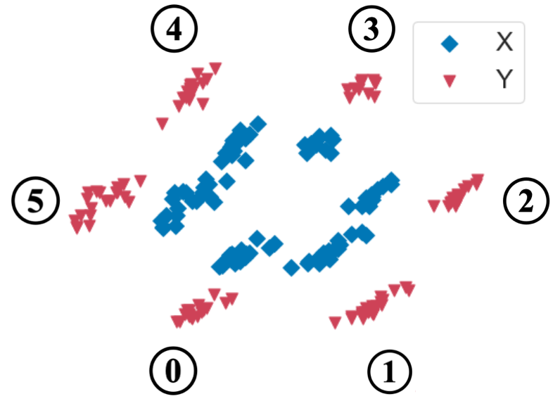
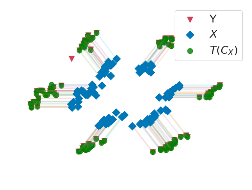
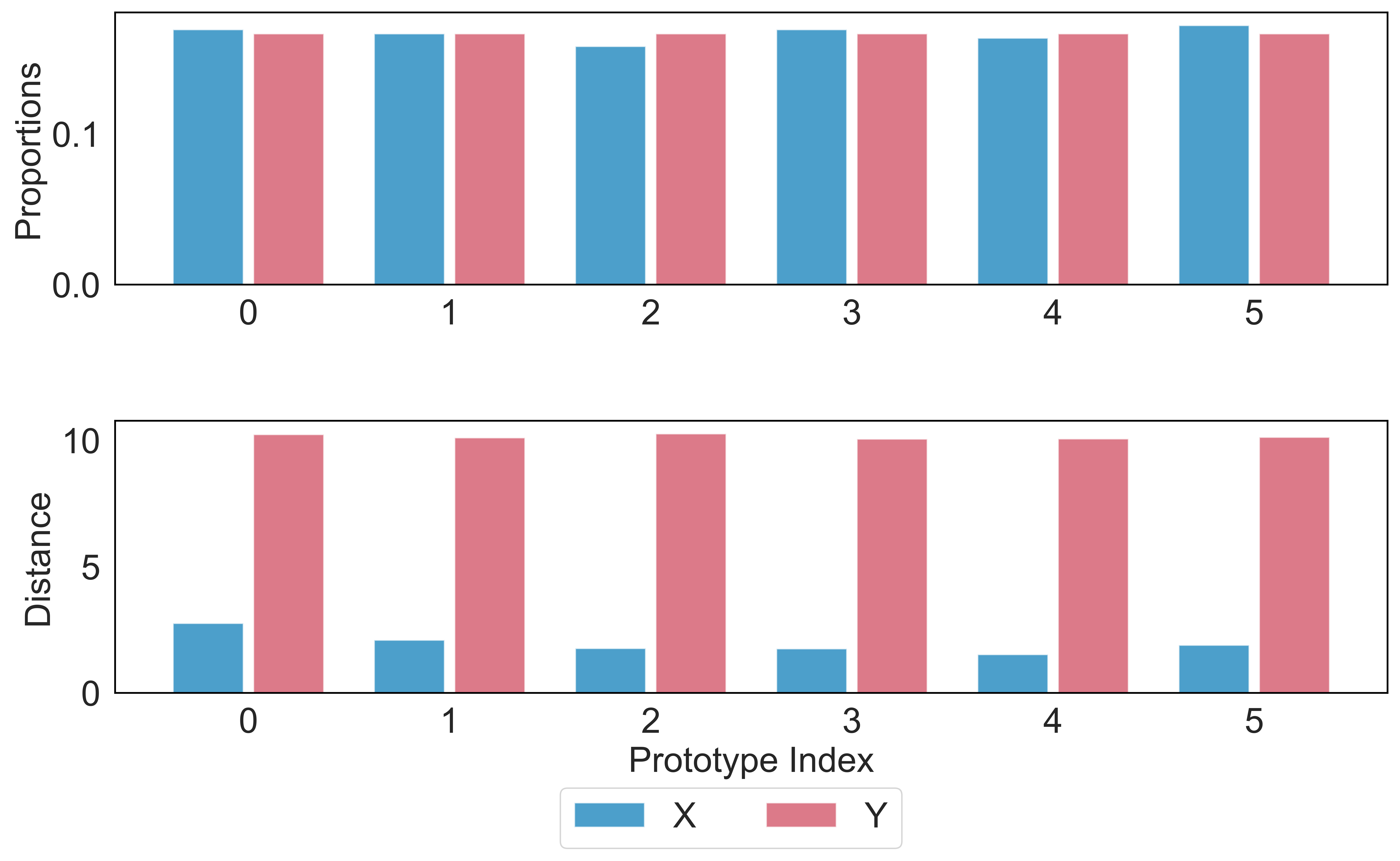
Middle - The explanation map showing the shift of each cluster in to the corresponding cluster in computed by Kulinski and Inouye [25]. Their method almost perfectly maps each point from to and the explanation is coherent.
Top Bar Plot: (Our Explanation) Proportion of points belonging to each prototype (cluster centre) in for both datasets. The proportions are the same for all clusters.
Bottom Bar Plot: (Our Explanation) Average distance of points to the closest prototype (cluster centre) in for both datasets. This is constantly high for dataset , suggesting a constant shift in clusters has occurred.
12.3 Case 2: Our explanation is coherent but Kulinski and Inouye [25] is not
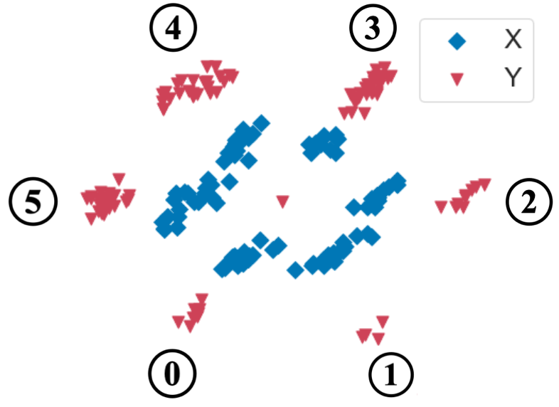
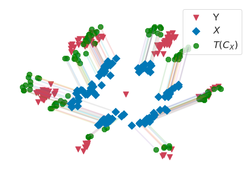
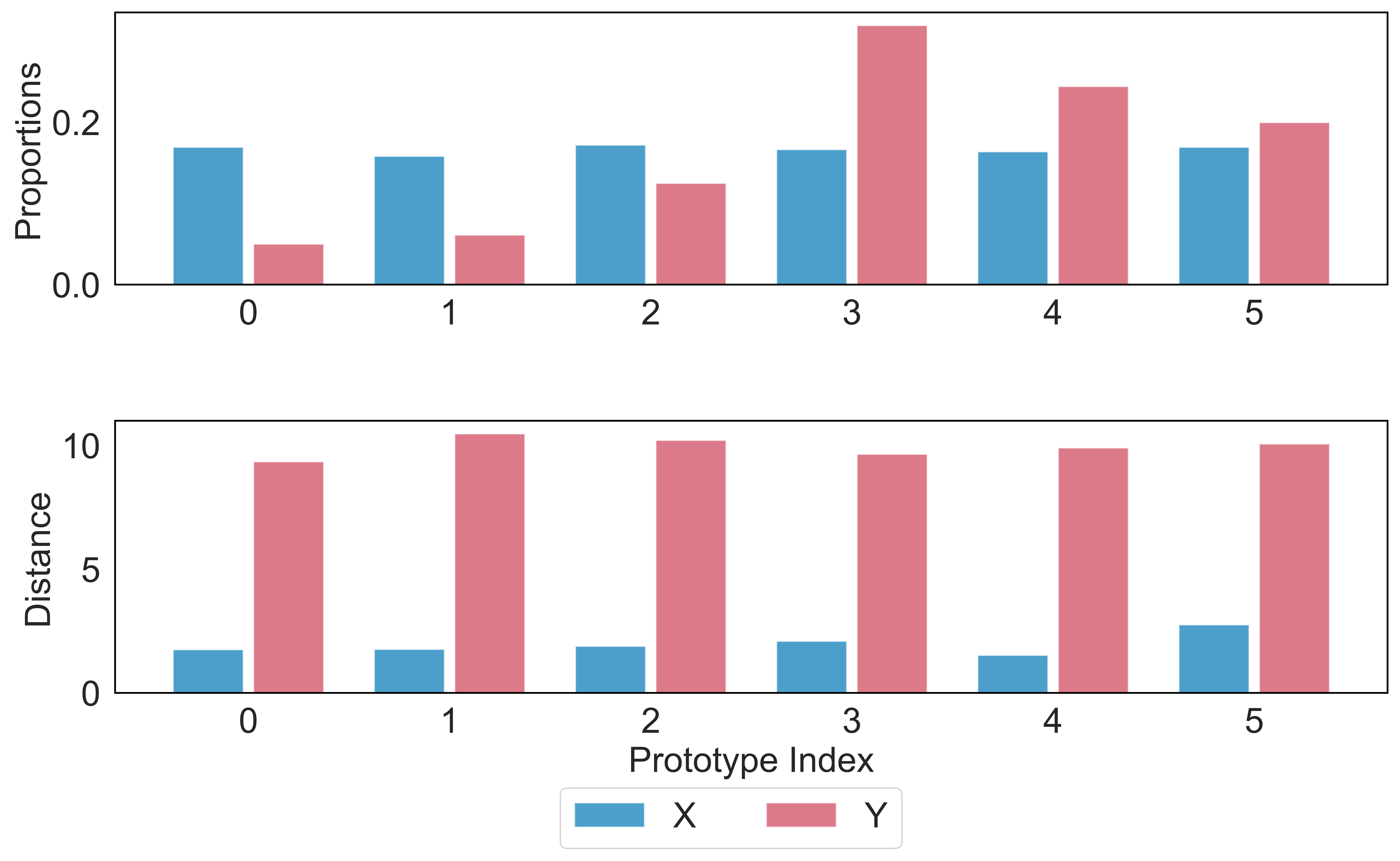
Middle – The explanation from Kulinski and Inouye [25] is now unable to map the shift in clusters from to as there is no longer a no one-to-one mapping between points in the clusters. This renders the explanation uninterpretable.
Top Bar Plot: (Our Explanation) Proportion of points belonging to each prototype (cluster centre) in for both datasets. The proportions are now different across all clusters and can be visually validated from the diagram, which is what we want to see from our explanation.
Bottom Bar Plot: (Our Explanation) Average distance of points closest prototype (cluster centre) in for both datasets. This is constantly high for dataset , suggesting only a constant shift in cluster centres has occurred.
Our prototype-based explanations can, therefore, quantify exactly how cluster proportions and distances have changed.