Knowledge Acquisition and Integration with Expert-in-the-loop
Abstract.
Constructing and serving knowledge graphs (KGs) is an iterative and human-centered process involving on-demand programming and analysis. In this paper, we present Kyurem, a programmable and interactive widget library that facilitates human-in-the-loop knowledge acquisition and integration to enable continuous curation a knowledge graph (KG). Kyurem provides a seamless environment within computational notebooks where data scientists explore a KG to identify opportunities for acquiring new knowledge and verify recommendations provided by AI agents for integrating the acquired knowledge in the KG. We refined Kyurem through participatory design and conducted case studies in a real-world setting for evaluation. The case-studies show that introduction of Kyurem within an existing HR knowledge graph construction and serving platform improved the user experience of the experts and helped eradicate inefficiencies related to knowledge acquisition and integration tasks.
1. Introduction
With enterprises increasingly adopting Knowledge Graphs (KGs) as the foundation for managing data and building intelligent agents for search, recommendation, and conversation, among others, graph-centered data science is practiced more and more within organizational workflows (Gutierrez and Sequeda, 2021). These workflows involve iterative and human-centered tasks such as new knowledge acquisition and recommendation, knowledge integration, and curation of the modeled information (Ilyas et al., 2022; Bharadwaj et al., 2017; Dong et al., 2014; Haase et al., 2019). Therefore, supporting these workflows require experts such as data scientists to blend programming with interactive exploration. While computational notebooks are suitable for supporting such workflows, the implications of instrumenting programmable and interactive interfaces for workflows involving knowledge graphs is underexplored.

In this work, we focus on two specific tasks within the human resources knowledge graph (HRKG hereafter) construction and serving platform at Company-X— knowledge acquisition and knowledge integration, an industrial lab focusing on natural language processing, data management, and human-centered AI research. Company-X is a subsidiary of a large holding and conducts research and development for the other subsidiaries with worldwide businesses in staffing, human resources, travel, marketing, and other online consumer services. Knowledge graph (KG) construction and serving plays a central role at Company-X. Deploying and maintaining a KG that can be shared across applications has obvious benefits, as applications such as QA systems, search engines, conversational agents (Quamar et al., 2020), and training large language models (Zhao et al., 2021) require accurate and up-to-date facts about entities and relations. Therefore, facilitating a broad range of knowledge that is accurate and updated continuously is of utmost importance. The HRKG platform at Company-X is similar to other such platforms in industry (Ilyas et al., 2022; Bharadwaj et al., 2017; Dong et al., 2014; Haase et al., 2019), where, information about entities is obtained by integrating data from multiple structured (e.g., relational databases, taxonomies, other KGs) and unstructured sources (e.g., documents, web text) (Chen et al., 2020).
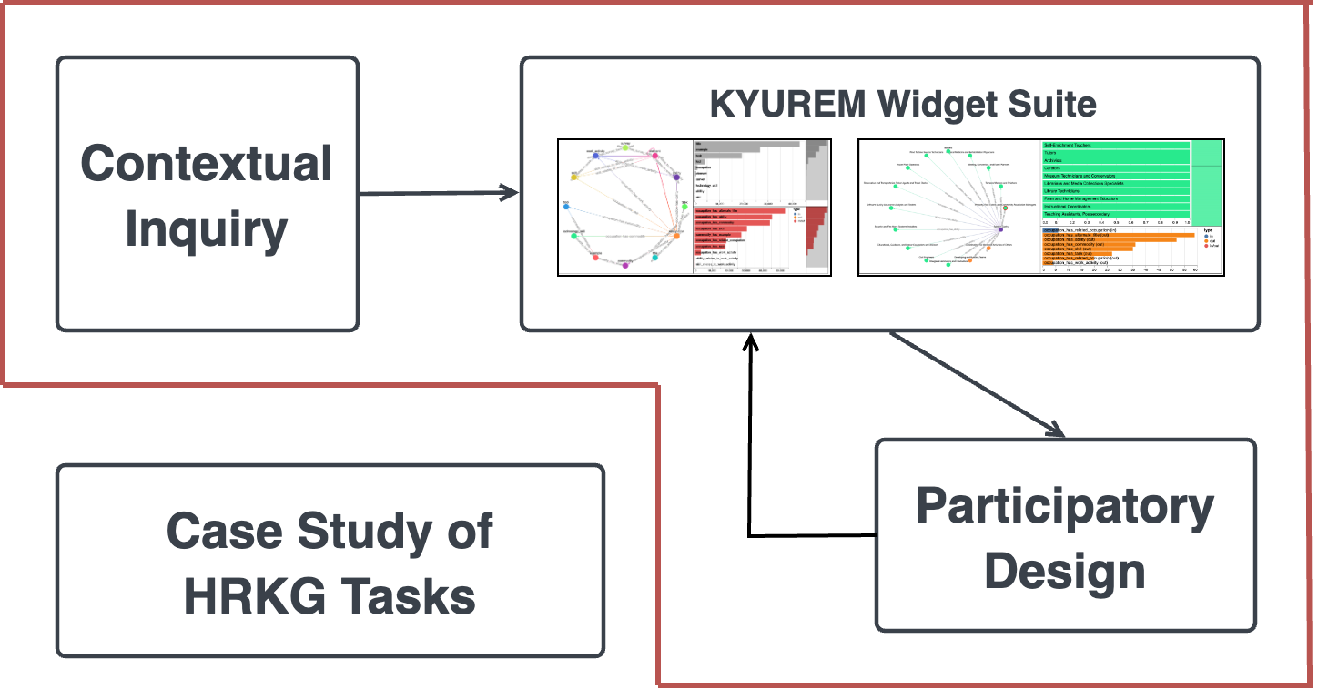
As shown in Figure 1a, the KG construction and maintenance involves various tasks from knowledge acquisition to knowledge integration and canonicalization. All of these steps involve multiple stakeholders (e.g., engineers, researchers, taxonomy architects) and require significant human intervention. Within the KG construction and serving workflow, data practitioners face many challenges. To better understand the challenges and to provide meaningful solutions we conducted several studies within Company-X (see Figure 1b.) We conducted a contextual inquiry-style study (Holtzblatt and Beyer, 1997), where we observed the work practices of three data practitioners working on projects related to knowledge acquisition and integration within the HRKG platform. The study helped understand the pain points of the practitioners and informed design guidelines to assist the experts in performing knowledge acquisition and integration within the HRKG. One such example is the negative user experience with existing tools stemming from frequent context switching to accommodate multiple objectives, e.g., programming, and visualization. Using programmable and interactive interfaces integrated with Computational notebooks (e.g., Jupyter (Kluyver et al., 2016) and Observable (Inc., 2022)) may minimize such context switching.
To address these gaps, we implement Kyurem widget suite — a library of interactive widgets built using the Magneton framework (Choi et al., 2023) — to specifically support expert-in-the-loop knowledge acquistion and integration tasks. The in-notebook widgets display task-specific visualizations and support user interactions on the interface. The task-specific visualizations and their corresponding interactions are implemented based on design guidelines identified from existing work on graph visualization and exploration (Liu et al., 2018; Nobre et al., 2019; Pienta et al., 2015; Pretorius et al., 2014; Kerracher et al., 2015; Ahn et al., 2013; Lee et al., 2006). To enable graph-centric data science, we build a python library that translates user interactions on the widgets to graph queries. We worked with data practitioners (e.g., researchers, engineers, and data scientists) at Company-X in weekly participatory design sessions over six weeks to further understand their requirements. Informed by these sessions, we implemented additional Kyurem widgets and components supporting tasks such as new knowledge acquisition and acquired knowledge integration. Finally, we conducted two case studies to understand the implications of instrumenting Kyurem within the in-house HRKG platform. The experience of the experts-in-the-loop were positively impacted by the introduction of Kyurem. Participants also found new insights that were previously not apparent to them due to the absence of interactive interfaces, such as data quality issues with the knowledge acquisition tasks.
2. Related Work
A graph or a network is an abstract data type consisting of a finite set of nodes (entities) and edges (relations) (Liu et al., 2018). Depending on the properties of the nodes and edges, graphs can be of various types: homogeneous or heterogeneous and directed or undirected (Liu et al., 2018; Nobre et al., 2019). Furthermore, graphs can be static or dynamic. In this paper, we focus on static Knowledge Graphs (KGs) — a directed heterogeneous graph with edges encoding facts among nodes (e.g., Person lives_in City) (Noy et al., 2019). Visualizing KGs requires displaying both graph topology (i.e., structure) and attributes associated with the nodes and edges. We refer the readers to a survey of heterogeneous graph visualization for further details (Nobre et al., 2019). Besides the node and edge properties, any graph visualization system must consider other aspects such as scale, sparsity, and visualization goal. In Kyurem, we made such rendering decisions by referring to the usage guidelines communicated through the decades-long research conducted by the data visualization and HCI communities on defining graph layouts, encoding, and underlying data operations (Liu et al., 2018; Nobre et al., 2019; Pienta et al., 2015). Instead of generating visualizations from scratch, Kyurem leverages existing graph visualization libraries. These libraries provide built-in features such as choice of multiple layout algorithms, scaling to larger datasets, customization and extensibility for add-ons, compatibility with different setups (e.g., browsers, touch screens), rendering capabilities in various formats (e.g., WebGL, SVG, and CSS-based), and integration with existing graph databases such as Neo4j (Miller, 2013). We utilize an existing embeddable graph visualization library called Cytoscape.js (Franz et al., 2016) as Kyurem embeds visualizations in Jupyter Notebook cells. Other popular libraries include D3.js (Bostock et al., 2011), G6 (G6, 2022), Neovis.js (Neovis.js, 2022), Sigma.js (Sigma.js, 2022), and Vivagraph.js (VivaGraph.js, 2022), among others.
The primary goal of Kyurem is to support various exploration tasks within knowledge graphs as users work on projects related to KG construction and serving. To this end, we refer to existing graph task taxonomies to define various interactions representing a user’s exploration goal (Pretorius et al., 2014; Kerracher et al., 2015; Ahn et al., 2013; Lee et al., 2006). Various bespoke graph exploration tools are available in industry (Graphileon, 2022; Graphistry, 2022; Graphpolaris, 2022; Kineviz, 2022; Graphaware, 2022; linkurious, 2022; Neo4j, 2022a, b; yWorks, 2022). These tools enable graph exploration via direction manipulation or graph querying. These tools do not support blending codes with visualizations, forcing users to use different tools for their analysis workflow. Graphistry (Graphistry, 2022), igraph (igraph, 2022), and NetworkX (NetworkX, 2022) offer python packages and libraries for network analysis in computational notebooks such as Jupyter Notebook. Graphistry additionally supports GPU-accelerated rendering of large graph visualizations. However, the generated visualizations are static objects displayed in notebook cells lacking interactivity and are unsuitable for interactive graph exploration. There are academic prototypes for general purpose and targeted graph exploration as outlined in various surveys (Pienta et al., 2015; Liu et al., 2018). While these are also bespoke tools lacking integration with interactive programming environments, they inform different layouts for visualizing graphs (Henry et al., 2007; Shneiderman and Aris, 2006), interactions (Pienta et al., 2017b, a; Chau et al., 2011), and underlying data operations (Shen et al., 2006). Kyurem, on the other hand, is embedded within the existing data science ecosystem, i.e., in computational notebooks.
3. Design Goal Formulation
We now present a contextual inquiry of data science workflows within the HRKG platform that helped understand the challenges of the practitioners with their existing workflows and informed design guidelines for building assistive tools.
3.1. Contextual Inquiry of Graph Exploration Workflows
Contextual inquiries are ethnographic field studies where researchers interview a small group of people in their natural environment as they conduct their work activities (context) to gain an in-depth understanding of their work practices (Holtzblatt and Beyer, 1997). As opposed to formative studies which are reflective and require participants to recall their experiences from memory, contextual inquiries take place in the participants’ day-to-day work environment — Company-X in this case. We conducted the study by recruiting three data practitioners — one researcher, one engineer, and one data scientist — by reaching out to them in Slack111https://slack.com/. These participants contributed to various projects related to knowledge acquisition (discovering new entities and relations), curation (graph understanding and standardization), and integration (graph alignment and merging) within the HRKG platform. Participants in each session brought their laptops, tools, and documents (Google Sheets and Slides). The sessions lasted for minutes, where we observed participants performing their project-specific tasks with their existing tools and setup. During observation, we intervened as needed to ask follow-up questions to gain a deeper understanding of the participants’ decisions and their pain points.
3.2. Key Takeaways
Tedious Context Switching. While the participants were involved in different projects within the platform, such as knowledge acquisition, curation, and integration, their work setup involving graphs was somewhat similar. These individual projects or phases could be further broken down into smaller tasks — viewing and assessing data, formulating a hypothesis on how to perform the intended task, and verifying the outcomes of the executed task — similar to Rahman et al. (Rahman and Kandogan, 2022). However, completing such multi-purpose tasks required participants to use different tools — command-line environments, computational notebooks such as Jupyter, and code editors such as Visual Studio Code222https://code.visualstudio.com/ for programming; Neo4j browser333https://neo4j.com/developer/neo4j-browser/ for querying and visually exploring graphs and tools such as Matplotlib (Hunter, 2007) for visualizing data; editors such as spreadsheets, and notebook cell outputs for viewing and verifying program outputs. Participants complained about tedious context switching among these tools.
Lack of Flexibility in Workflows. Surprisingly, participants’ graph exploration experiences were limited to using the Neo4j browser. While there are bespoke tools (Graphistry, 2022; Graphileon, 2022; linkurious, 2022) and even Neo4j desktop extensions (Neo4j, 2022a, b; yWorks, 2022), using those meant (a) “adding another new tool” to the already iterative and messy experience and (b) learning a new platform. Moreover, using desktop-based tools had additional limitations, e.g., company policy prohibiting the hosting of proprietary and sensitive data on personal computers. When using the Neo4j browser the participants could not leverage rich graph layouts, visualizations, and interactions available in various charting libraries mentioned in Section 2. Additionally, the browser lacked support for common visualizations such as bar charts and scatter plots, which are essential for downstream analysis and decision making. For viewing these charts, participants used a combination of notebooks or code editors and charting libraries in Python.
3.3. Design Goals
We opted for developing Kyurem, an interactive widget library designed to specifically support the knowledge curation and integration tasks within computation notebooks. Through Kyurem we aim to support the rendering of graph visualizations in notebooks and provide libraries that enable users to execute a suite of graph-specific data operations for visualizing and exploring graphs. Kyurem is built on top of the Magneton (Choi et al., 2023), an extensible framework which enables data science workflows within interactive programming environments. Our choice was informed by the observations of the contextual inquiry and solidified by the recommendation by existing work to blend the expressivity of codes with the interactivity of visualizations to ensure flexibility in workflows (Alspaugh et al., 2019) and evaluation studies conducted in recent work highlighting the suitability of such environments in eliminating context switching (Wu et al., 2020; Bäuerle et al., 2022).
4. Kyurem Design
We now provide an overview of Kyurem and it’s architecture and discuss how it evolved via participatory design.
4.1. Participatory Design
Inspired by earlier work (Bäuerle et al., 2022; Rahman et al., 2020), we conducted several participatory design sessions after developing the initial Kyurem framework. These sessions aimed to understand the specific needs of data science workers and then design and develop a core set of Kyurem components and widgets. We conducted weekly sessions over a six-week period focusing on three different projects related to knowledge acquistion and integration. These projects involved several collaborators in various roles within Company-X from researchers () and engineers () to product managers () and taxonomy architects (). Note that the taxonomy architect role was shared by a subset of researchers and engineers within the platform team. The sessions lasted between 30 minutes and an hour. The first session with each team involved introducing the core features of Kyurem and the base components. We then asked participants to describe their tasks step by step. While the weekly sessions involved the entire platform team, we also arranged ad-hoc participatory sessions with individual project leaders for a deeper dive into the project-specific requirements and iteratively refined Kyurem features.
We collected several systems- and feature-level enhancement requests for Kyurem from these participatory design sessions. These requests fall into three themes: data modality (i.e., ability to explore multi-modal data such as text, JSON documents, and graphs), perceptual scalability (i.e., ease of overviewing large-scale data), and synchrony of navigation (i.e., seamless context switching among multiple-coordinated views.) Based on the participant feedback, we implemented eight basic components shown in Figure 4 in Appendix A. These components were designed to support various enhancements and augmentation requests mentioned above: multi-modal data exploration (components b,f,g, and h in Figure 4), (ii) scalable overview via faceted graph (component a in Figure 4), and (iii) multiple-coordinated views achieved by combining components into widgets (Figure 3.) We provide a detailed account of how the participatory session with participants helped prioritize the select of these components in Appendix A.
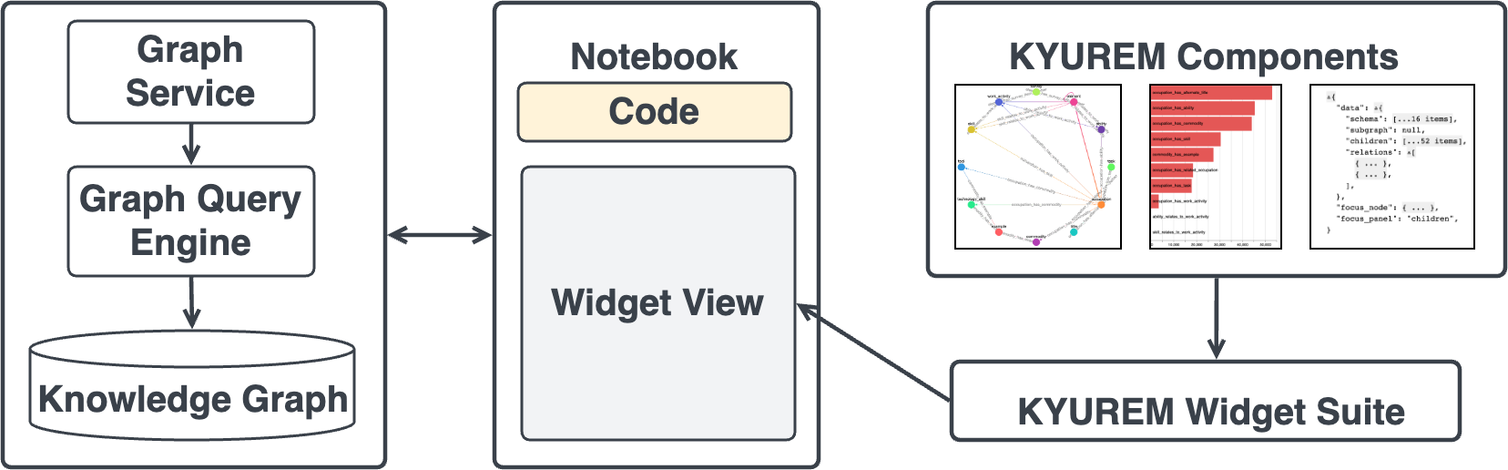
4.2. Kyurem System Architecture
Figure 1c provides an overview of the system we developed to support graph exploration and analysis using the Kyurem library. At the heart of the system is the Kyurem widget suite, a collection of widgets that support programmatic and interactive graph exploration within computational notebooks. The base widget in the suite is extended from the Magneton framework (Choi et al., 2023). Users’ actions in the front-end components trigger various functions, via Graph Service, in the back-end. Examples of graph-specific operations include generating graph schema, finding node neighborhoods, and computing distributions of nodes and relations, among others. The operations are part of an in-house graph query library, which is published as a Python package. Each operation is mapped to the corresponding graph query, which is executed by the graph query manager and returned to the front-end. Note that the graph data operations can be initiated from the widget, notebook, or the front-end components.
5. Case Study
We performed a preliminary evaluation of Kyurem with data practitioners working on two tasks within the HRKG platform: new knowledge acquisition and knowledge integration. To understand the usage benefits and limitations of Kyurem, we conducted case studies lasting 60 minutes where a member of each the team employed Kyurem to accomplish their respective tasks in a Jupyter notebook. For the study, the participants worked with an HR knowledge graph and a related job description corpus. However, the case studies involved Company-X’s proprietary knowledge graph and datasets. Therefore, to demonstrate various features of Kyurem, we use a knowledge graphs and dataset constructed from O*NET (Peterson et al., 1999). However, the information conveyed in the screenshots reflects the original work setting and experience of the participants. We asked the participants about their experience using Kyurem widgets and discussed the limitations of Kyurem within the context of their tasks and the HRKG platform. Note that the interviews were recorded (with participant permission), and transcripts were generated via an automated transcription service. We further corrected spelling and grammatical mistakes in those documents by referring to the recording. Therefore, the quotes presented in this paper are essentially paraphrases. We now discuss the case-study scenarios in detail.
5.1. Study 1: New Knowledge Acquisition
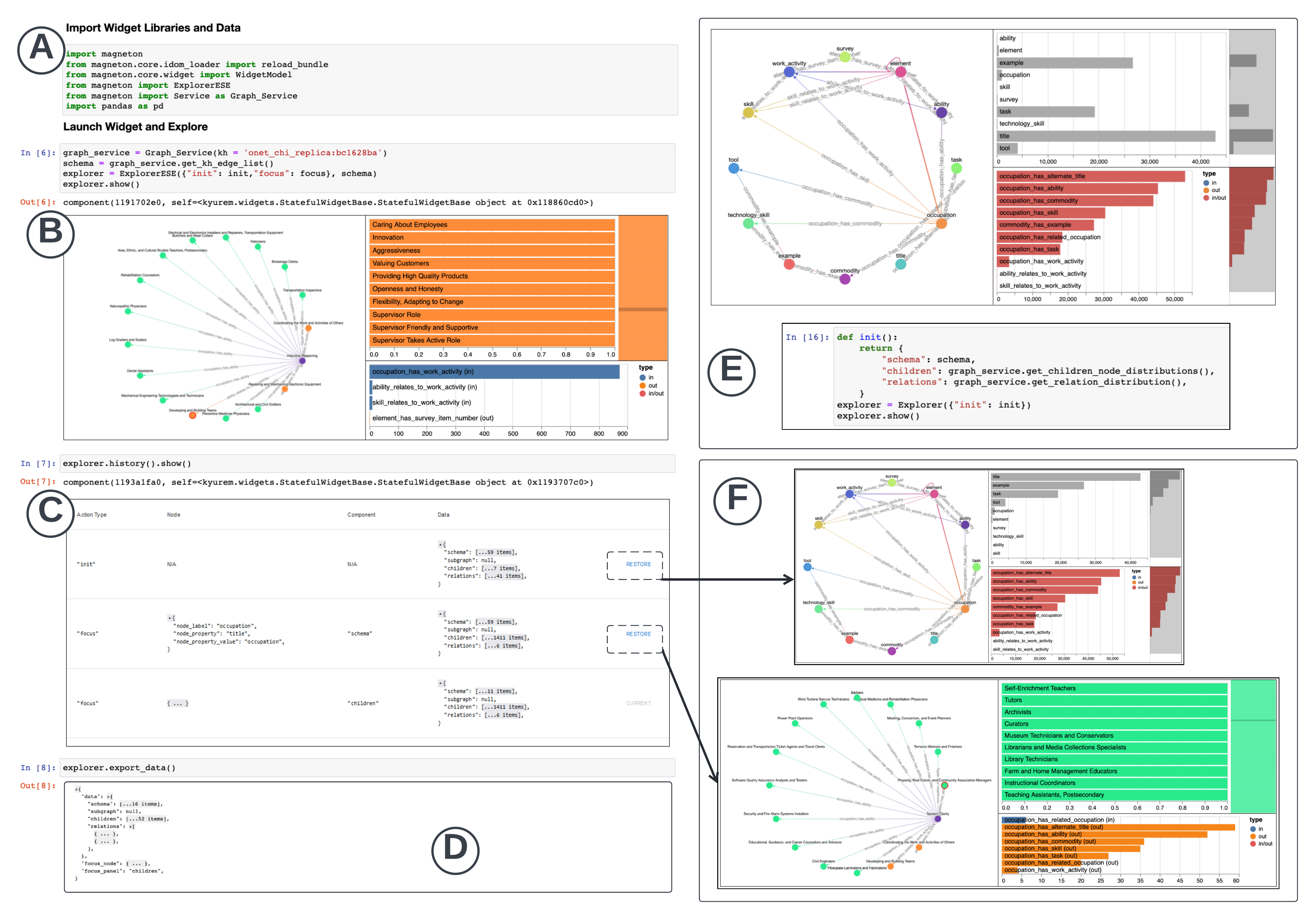
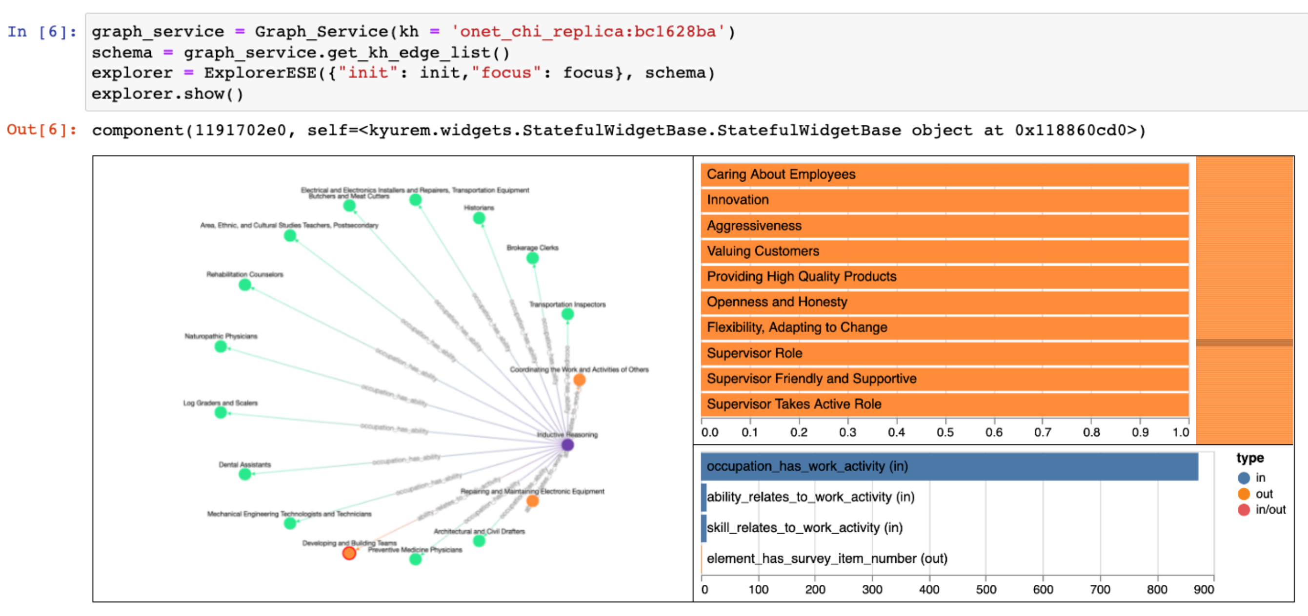
The participant for this case study worked in the knowledge acquisition project deployed to add new entities and relations to the graph. The newly discovered entities and relations expand the knowledge graph, further enhancing the domain understanding. For this session, the participant only focused on a new entity mining task known as entity set expansion (ESE) (Shao et al., 2022). Given a collection of user-provided examples, known as seeds (e.g., inductive reasoning) of an entity type (e.g., ability), an ESE algorithm mines new instances of that entity type from a text corpus (e.g., job descriptions). In this study, the participant focused on exploring the graph to identify potential candidates (entity types) for expansion and their corresponding seed, i.e., example entities. Furthermore, the participant wanted to explore the mention of an entity in a job description corpus to gauge their suitability as seeds for the ESE task subjectively. Given these requirements, we provided an ESE-explorer widget (Figure 3) by extending the explorer widget used in the first study. We added a static table component (Figure 4h) to view the text corpus.
Elimination of Context Switching. When exploring the notebook, the participant found the coordinated views between the sub-graph and table components to be the most useful. In their previous workflow, participants explored the graph (to collect seeds) and the corpus (to verify seed suitability) in the Neo4j browser and spreadsheets, respectively. The exercise forced the participant to move back and forth between multiple tools. The other alternative was to write multiple scripts, one for querying graph nodes (using Cypher) and another for searching and returning matching job descriptions (using Python), and then view the results in a spreadsheet. The experience was so cumbersome that the participant would be left “exhausted” due to frequent tool switching.
Easier Qualitative Validation. The exploration in the Kyurem widget helped the participants make informed decisions and even discard candidates that they previously selected based on commonsense — “looking at the context, I would not have selected this (entity) as a seed.” Moreover, the distribution component helped steer the participant’s exploration and find suitable entity types for expansion — low-frequency entities in the graph are good candidates for further expansion based on an external source. The participant was able to explore the corpus mention of entities of a given entity type to subjectively measure their expansion potential — “judging by their use in the corpus, this (entity type) does not seem like a good enough concept to grow.”
5.2. Study 2: Knowledge Integration
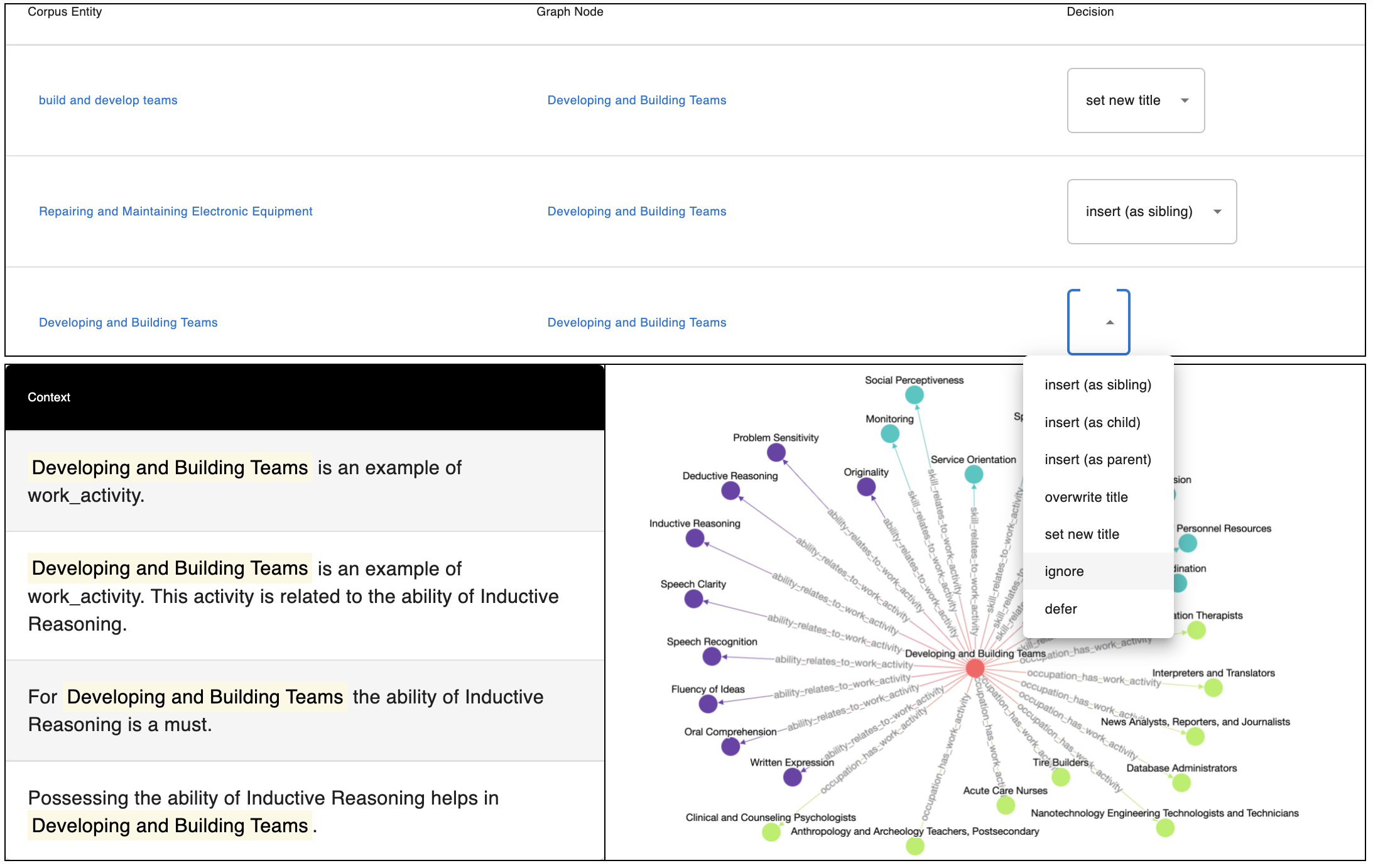
In the other case study, the participant was involved in the knowledge integration project, which focused on aligning and merging external information in the knowledge graph. Examples include entity alignment (Sun et al., 2020) between two knowledge graphs and aligning entities from the text corpus into the graph. In this session, the participant focused on verifying potential alignment candidates extracted from a text corpus and assigning merging decisions by exploring candidate entities in the in-house knowledge graph. We provided an verification widget (Figure 5 in Appendix A) for the verification task. The widget contained an interactive table component (Figure 4h) with a selection menu of alignment decisions (e.g., insert, ignore, defer) in one of the columns. The other two columns contained alignment candidates from two different sources: a job description corpus and a knowledge graph. Clicking a candidate displayed their context in the corresponding source which was displayed using the static table component. At the same time, a sub-graph component would display the corresponding graph entity neighborhood.
Seamless Workflow Execution. The participant’s previous experience was to run alignment scripts in a command-line interface and then view the candidates either in the command line. Then the participant would verify the alignments and add decision labels such as insert, ignore, or defer. Finally, the participant would execute another merging script on the verified data to update the in-house graph. To this end, the participant found it convenient to work in the computational notebook setting. The widget-based setup enabled the participant to stitch together three different tasks in the same ecosystem: being able to code, interactively explore, extract data from their interaction, and then execute follow-up programmatic decision — “ writing code, recompile, (and) visualize; this interactive and graphical feature is much better than CLI-based setup.”
Ease of Error Detection. In particular, the participant appreciated the ability to view the alignment candidates in the context of the corpus and graph (as shown by the bottom two components in Figure 5) and make decisions more confidently. The participant observed one alignment candidate444We are refraining from providing the specific example due to constraints related to proprietary data. where the corpus mention of an entity and the name of the nodes were similar but captured very different semantics when their context was viewed — “the structural property of the node and the semantics of the extraction (corpus entity) are not the same.”
6. Discussion
We acknowledge that the scope of our evaluation is limited, specifically targeting the graph exploration domain in the broader landscape of data science workflows while focusing on an industrial setting. Moreover, all the case study participants were employed at a single company. While we believe the observed practices exist widely in industry and academia, the choice of participants inevitably impacted the generalizability of the findings due to organizational norms, policies, and infrastructures. Additional studies could explore Kyurem’s usage benefits and limitations in diverse settings. Even so, the observed usage benefits and limitations of case studies highlight several opportunities for improvement.
Graph semantics and generalizability. In this work, we incrementally added new components and interactions based on feedback from participatory sessions. As Kyurem is adopted more and more within Company-X, continuous addition of graph visualizations, composite interfaces, and data operations would be required. However, these additions should not be arbitrary and practices should be enforced to ground their design on existing graph visualization and graph task taxonomy research. One intriguing aspect of Kyurem framework is its potential for generalizing to other domains beyond graphs, which has already been demonstrated with the table widgets. Supporting a new domain can be achieved by adding data management capabilities for the corresponding domain such as tables, text, and image. Similar to graphs, enabling exploratory analysis in other domains would require modeling the domain-specific semantics.
Addressing the layout gap. While not directly a limitation of Kyurem, the linear layout of notebooks may attenuate the benefits afforded by Kyurem. Kyurem attempts to bridge the layout gap by enabling multiple coordinated visualization and resizable panes. Even so, as the analytic session progresses, the number of widgets added may increase. Future studies may explore benefits of approaches such as split panes for coding and visualization (similar to B2 (Wu et al., 2020) and Leam (Rahman et al., 2021b)) or sticky views such as StickyLand (Wang et al., 2022), in the context of Kyurem widgets.
7. Conclusion
We contribute Kyurem, an interactive widget suite for composing that enables knowledge acquisition and integration tasks within computational notebooks. Compared to participants’ previous experience, Kyurem widgets enabled efficient executions of these tasks by blending programming and interactive analysis. Such a design provided a seamless experience to the users by eliminating tedious context switching. Moreover, the multiple coordinated view-based design of the widgets helped users uncover data quality issues and effectively review agent recommendations. In the short term, we continue to employ Kyurem to meet the needs of data practitioners in Company-X. We plan to deploy Kyurem to other workflows within the HRKG platform within Company-X which would require additional need finding and participatory design of widgets and enhancement of the graph service library.
References
- (1)
- Ahn et al. (2013) Jae-wook Ahn, Catherine Plaisant, and Ben Shneiderman. 2013. A task taxonomy for network evolution analysis. IEEE transactions on visualization and computer graphics 20, 3 (2013), 365–376.
- Alspaugh et al. (2019) Sara Alspaugh, Nava Zokaei, Andrea Liu, Cindy Jin, and Marti A. Hearst. 2019. Futzing and Moseying: Interviews with Professional Data Analysts on Exploration Practices. 25, 1 (jan 2019), 22–31. https://doi.org/10.1109/TVCG.2018.2865040
- Bäuerle et al. (2022) Alex Bäuerle, Ángel Alexander Cabrera, Fred Hohman, Megan Maher, David Koski, Xavier Suau, Titus Barik, and Dominik Moritz. 2022. Symphony: Composing Interactive Interfaces for Machine Learning. In CHI Conference on Human Factors in Computing Systems. 1–14.
- Bharadwaj et al. (2017) Shreyas Bharadwaj, Laura Chiticariu, Marina Danilevsky, Samarth Dhingra, Samved Divekar, Arnaldo Carreno-Fuentes, Himanshu Gupta, Nitin Gupta, Sang-Don Han, Mauricio A Hernández, et al. 2017. Creation and interaction with large-scale domain-specific knowledge bases. (2017).
- Bostock et al. (2011) Michael Bostock, Vadim Ogievetsky, and Jeffrey Heer. 2011. D3 data-driven documents. IEEE transactions on visualization and computer graphics 17, 12 (2011), 2301–2309.
- Chau et al. (2011) Duen Horng Chau, Aniket Kittur, Jason I Hong, and Christos Faloutsos. 2011. Apolo: interactive large graph sensemaking by combining machine learning and visualization. In Proceedings of the 17th ACM SIGKDD international conference on Knowledge discovery and data mining. 739–742.
- Chen et al. (2020) Wenhu Chen, Yu Su, Xifeng Yan, and William Yang Wang. 2020. Kgpt: Knowledge-grounded pre-training for data-to-text generation. arXiv preprint arXiv:2010.02307 (2020).
- Choi et al. (2023) Frederick Choi, Sajjadur Rahman, Hannah Kim, and Dan Zhang. 2023. Towards Transparent, Reusable, and Customizable Data Science in Computational Notebooks. In Extended Abstracts of the 2023 CHI Conference on Human Factors in Computing Systems. 1–8.
- Dong et al. (2014) Xin Luna Dong, Evgeniy Gabrilovich, Geremy Heitz, Wilko Horn, Ni Lao, Kevin Murphy, Thomas Strohmann, Shaohua Sun, and Wei Zhang. 2014. Knowledge Vault: A Web-Scale Approach to Probabilistic Knowledge Fusion. In The 20th ACM SIGKDD International Conference on Knowledge Discovery and Data Mining, KDD ’14, New York, NY, USA - August 24 - 27, 2014. 601–610. http://www.cs.cmu.edu/~nlao/publication/2014.kdd.pdf Evgeniy Gabrilovich Wilko Horn Ni Lao Kevin Murphy Thomas Strohmann Shaohua Sun Wei Zhang Geremy Heitz.
- Franz et al. (2016) Max Franz, Christian T Lopes, Gerardo Huck, Yue Dong, Onur Sumer, and Gary D Bader. 2016. Cytoscape. js: a graph theory library for visualisation and analysis. Bioinformatics 32, 2 (2016), 309–311.
- G6 (2022) G6. 2022. G6. Retrieved September 15, 2022 from https://g6.antv.vision/en
- Graphaware (2022) Graphaware. 2022. Hume. Retrieved September 15, 2022 from https://graphaware.com/products/hume/
- Graphileon (2022) Graphileon. 2022. Graphileon. Retrieved September 15, 2022 from https://graphileon.com/
- Graphistry (2022) Graphistry. 2022. Graphistry. Retrieved September 15, 2022 from https://www.graphistry.com/
- Graphpolaris (2022) Graphpolaris. 2022. Graphpolaris. Retrieved September 15, 2022 from https://graphpolaris.com/
- Gutierrez and Sequeda (2021) Claudio Gutierrez and Juan F Sequeda. 2021. Knowledge graphs. Commun. ACM 64, 3 (2021), 96–104.
- Haase et al. (2019) Peter Haase, Daniel M Herzig, Artem Kozlov, Andriy Nikolov, and Johannes Trame. 2019. metaphactory: A platform for knowledge graph management. Semantic Web 10, 6 (2019), 1109–1125.
- Henry et al. (2007) Nathalie Henry, Jean-Daniel Fekete, and Michael J McGuffin. 2007. NodeTrix: a hybrid visualization of social networks. IEEE transactions on visualization and computer graphics 13, 6 (2007), 1302–1309.
- Holtzblatt and Beyer (1997) Karen Holtzblatt and Hugh Beyer. 1997. Contextual design: defining customer-centered systems. Elsevier.
- Hunter (2007) John D Hunter. 2007. Matplotlib: A 2D graphics environment. Computing in science & engineering 9, 03 (2007), 90–95.
- igraph (2022) igraph. 2022. igraph - The network analysis package. Retrieved September 15, 2022 from https://igraph.org/
- Ilyas et al. (2022) Ihab F Ilyas, Theodoros Rekatsinas, Vishnu Konda, Jeffrey Pound, Xiaoguang Qi, and Mohamed Soliman. 2022. Saga: A Platform for Continuous Construction and Serving of Knowledge At Scale. arXiv preprint arXiv:2204.07309 (2022).
- Inc. (2022) Observable Inc. 2022. Observable. Retrieved September 15, 2022 from https://observablehq.com/
- Kerracher et al. (2015) Natalie Kerracher, Jessie Kennedy, and Kevin Chalmers. 2015. A task taxonomy for temporal graph visualisation. IEEE transactions on visualization and computer graphics 21, 10 (2015), 1160–1172.
- Kineviz (2022) Kineviz. 2022. GraphXR. Retrieved September 15, 2022 from https://www.kineviz.com/
- Kluyver et al. (2016) Thomas Kluyver, Benjamin Ragan-Kelley, Fernando Pérez, Brian E Granger, Matthias Bussonnier, Jonathan Frederic, Kyle Kelley, Jessica B Hamrick, Jason Grout, Sylvain Corlay, et al. 2016. Jupyter Notebooks-a publishing format for reproducible computational workflows. Vol. 2016. IOS Press, Amsterdam, Netherlands.
- Lee et al. (2006) Bongshin Lee, Catherine Plaisant, Cynthia Sims Parr, Jean-Daniel Fekete, and Nathalie Henry. 2006. Task taxonomy for graph visualization. In Proceedings of the 2006 AVI workshop on BEyond time and errors: novel evaluation methods for information visualization. 1–5.
- linkurious (2022) linkurious. 2022. Linkurious Enterprise. Retrieved September 15, 2022 from https://www.linkurious.com/
- Liu et al. (2018) Yike Liu, Tara Safavi, Abhilash Dighe, and Danai Koutra. 2018. Graph summarization methods and applications: A survey. ACM computing surveys (CSUR) 51, 3 (2018), 1–34.
- Liu et al. (2013) Zhicheng Liu, Biye Jiang, and Jeffrey Heer. 2013. imMens: Real-time visual querying of big data. In Computer Graphics Forum, Vol. 32. Wiley Online Library, 421–430.
- Miller (2013) Justin J Miller. 2013. Graph database applications and concepts with Neo4j. In Proceedings of the southern association for information systems conference, Atlanta, GA, USA, Vol. 2324.
- Neo4j (2022a) Neo4j. 2022a. Neo4j Bloom. Retrieved September 15, 2022 from https://neo4j.com/product/bloom/
- Neo4j (2022b) Neo4j. 2022b. Neodash. Retrieved September 15, 2022 from https://github.com/neo4j-labs/neodash
- Neovis.js (2022) Neovis.js. 2022. NeovisJS. Retrieved September 15, 2022 from https://github.com/neo4j-contrib/neovis.js/
- NetworkX (2022) NetworkX. 2022. NetworkX - Network analysis in python. Retrieved September 15, 2022 from https://networkx.org/
- Nobre et al. (2019) Carolina Nobre, Marc Streit, Miriah Meyer, and Alexander Lex. 2019. The State of the Art in Visualizing Multivariate Networks. Computer Graphics Forum (EuroVis) 38 (2019), 807–832. https://doi.org/10.1111/cgf.13728
- Noy et al. (2019) Natasha Noy, Yuqing Gao, Anshu Jain, Anant Narayanan, Alan Patterson, and Jamie Taylor. 2019. Industry-Scale Knowledge Graphs: Lessons and Challenges. Commun. ACM 62, 8 (jul 2019), 36–43. https://doi.org/10.1145/3331166
- Peterson et al. (1999) Norman G Peterson, Michael D Mumford, Walter C Borman, P Jeanneret, and Edwin A Fleishman. 1999. An occupational information system for the 21st century: The development of O* NET. American Psychological Association.
- Pienta et al. (2015) Robert Pienta, James Abello, Minsuk Kahng, and Duen Horng Chau. 2015. Scalable graph exploration and visualization: Sensemaking challenges and opportunities. In 2015 International conference on Big Data and smart computing (BIGCOMP). IEEE, 271–278.
- Pienta et al. (2017a) Robert Pienta, Fred Hohman, Alex Endert, Acar Tamersoy, Kevin Roundy, Chris Gates, Shamkant Navathe, and Duen Horng Chau. 2017a. VIGOR: interactive visual exploration of graph query results. IEEE transactions on visualization and computer graphics 24, 1 (2017), 215–225.
- Pienta et al. (2017b) Robert Pienta, Minsuk Kahng, Zhiyuan Lin, Jilles Vreeken, Partha Talukdar, James Abello, Ganesh Parameswaran, and Duen Horng Chau. 2017b. Facets: Adaptive local exploration of large graphs. In Proceedings of the 2017 SIAM International Conference on Data Mining. SIAM, 597–605.
- Pretorius et al. (2014) Johannes Pretorius, Helen C Purchase, and John T Stasko. 2014. Tasks for multivariate network analysis. In Multivariate Network Visualization. Springer, 77–95.
- Quamar et al. (2020) Abdul Quamar, Chuan Lei, Dorian Miller, Fatma Ozcan, Jeffrey Kreulen, Robert J Moore, and Vasilis Efthymiou. 2020. An ontology-based conversation system for knowledge bases. In Proceedings of the 2020 ACM SIGMOD International Conference on Management of Data. 361–376.
- Rahman et al. (2021a) Sajjadur Rahman, Mangesh Bendre, Yuyang Liu, Shichu Zhu, Zhaoyuan Su, Karrie Karahalios, and Aditya Parameswaran. 2021a. NOAH: Interactive Spreadsheet Exploration with Dynamic Hierarchical Overviews. Proceedings of the VLDB Endowment 14, 6 (2021), 970–983.
- Rahman et al. (2021b) Sajjadur Rahman, Peter Griggs, and Çağatay Demiralp. 2021b. Leam: An Interactive System for In-situ Visual Text Analysis. In CIDR. CIDRDB, cidrdb.org, 1–7.
- Rahman and Kandogan (2022) Sajjadur Rahman and Eser Kandogan. 2022. Characterizing Practices, Limitations, and Opportunities Related to Text Information Extraction Workflows: A Human-in-the-Loop Perspective (CHI ’22). Association for Computing Machinery, New York, NY, USA, Article 628, 15 pages. https://doi.org/10.1145/3491102.3502068
- Rahman et al. (2020) Sajjadur Rahman, Pao Siangliulue, and Adam Marcus. 2020. MixTAPE: Mixed-initiative Team Action Plan Creation Through Semi-structured Notes, Automatic Task Generation, and Task Classification. Proceedings of the ACM on Human-Computer Interaction 4, CSCW2 (2020), 1–26.
- Shao et al. (2022) Yutong Shao, Nikita Bhutani, Sajjadur Rahman, and Estevam Hruschka. 2022. Low-resource Entity Set Expansion: A Comprehensive Study on User-generated Text. In Findings of the Association for Computational Linguistics: NAACL 2022. Association for Computational Linguistics, Seattle, United States, 1343–1353.
- Shen et al. (2006) Zeqian Shen, Kwan-Liu Ma, and Tina Eliassi-Rad. 2006. Visual analysis of large heterogeneous social networks by semantic and structural abstraction. IEEE transactions on visualization and computer graphics 12, 6 (2006), 1427–1439.
- Shneiderman and Aris (2006) Ben Shneiderman and Aleks Aris. 2006. Network visualization by semantic substrates. IEEE transactions on visualization and computer graphics 12, 5 (2006), 733–740.
- Sigma.js (2022) Sigma.js. 2022. SigmaJS. Retrieved September 15, 2022 from https://www.sigmajs.org/
- Sun et al. (2020) Zequn Sun, Qingheng Zhang, Wei Hu, Chengming Wang, Muhao Chen, Farahnaz Akrami, and Chengkai Li. 2020. A benchmarking study of embedding-based entity alignment for knowledge graphs. arXiv preprint arXiv:2003.07743 (2020).
- VivaGraph.js (2022) VivaGraph.js. 2022. VivaGraphJS. Retrieved September 15, 2022 from https://github.com/anvaka/VivaGraphJS
- Wang et al. (2022) Zijie J Wang, Katie Dai, and W Keith Edwards. 2022. StickyLand: Breaking the Linear Presentation of Computational Notebooks. In CHI Conference on Human Factors in Computing Systems Extended Abstracts. 1–7.
- Wu et al. (2020) Yifan Wu, Joseph M Hellerstein, and Arvind Satyanarayan. 2020. B2: Bridging code and interactive visualization in computational notebooks. In Proceedings of the 33rd Annual ACM Symposium on User Interface Software and Technology. 152–165.
- yWorks (2022) yWorks. 2022. yWorks Explorer. Retrieved September 15, 2022 from https://www.yworks.com/
- Zhao et al. (2021) Yang Zhao, Jiajun Zhang, Yu Zhou, and Chengqing Zong. 2021. Knowledge graphs enhanced neural machine translation. In Proceedings of the Twenty-Ninth International Conference on International Joint Conferences on Artificial Intelligence. 4039–4045.
Appendix A Kyurem Components Design via Participatory Sessions
In this section, we provide a detailed account of how the participatory session with participants helped prioritize the select of these components (see Figure 4.)
Faceted Graph for Seamless Overview. A common task encountered across projects was free-form graph exploration — team members would explore graphs in graphical interfaces, e.g., Neo4j browsers, to understand the schema and get a high-level overview of the application domain. They would write scripts to compute entity type and relation distributions and filter the distributions via specific entity type or relation. ll of the projects involved working with large-scale graphs and text corpus. While Kyurem defers computation of all of the data operations in the back-end, there were additional scalability challenges, both perceptual and interactive (Rahman et al., 2021a; Liu et al., 2013). For example, node-link diagrams do not perceptually scale to thousands of nodes and edges, resulting in visual clutter. In addition, the browser memory becomes a bottleneck when rendering node-links diagrams for large graphs using a force-directed layout. Participants encountered such issues when exploring graphs in web-based Neo4j graph browsers. All of these tasks can be characterized as overview operations. We created component (a), known as a faceted graph or super-graph (Nobre et al., 2019), to generate overview of large graphs. We created component (d) to display entity type and relation distributions. However, scrolling the distributions involving too many elements, e.g., nodes, and relations, can be cumbersome. So we implemented component (c), a distribution with a minimap, to get a high-level overview of the distribution and scroll to regions of interest (similar to text editors such as sublime text.)

Multiple Coordinated Views to Reduce Visual Discontinuity. Besides new base components, participants also requested combining multiple components within a widget to accomplish more advanced tasks. The nature of the free-form exploration necessitated such views to first get an overview and then get additional details on demand. For example, participants requested multiple-coordinated views between graph and text corpus for two projects to obtain additional details on data points of interest. Figrue 5 shows an example of such a widget. Similarly, when clicking a node in the faceted graph or a bar in node distribution, participants requested to classify the relation distributions based on their incidence direction on the node, i.e., indegree or outdegree. So we implemented component (e) to display relation distribution by their incidence direction corresponding to a node.
Affordances for Multi-modal Data Exploration. As mentioned earlier, two of the projects involved exploring a text corpus alongside the graph to obtain additional context for decision making. In their current setup, practitioners used spreadsheets for viewing the corpus and manually filter relevant data. So they requested a mechanism to view relevant entries from the text corpus, e.g., textual descriptions of entities (nodes) in the graph. In response, we developed component (h), a static table with spans of interest (e.g., graph entity) highlighted in the text. Additionally, for one of the projects, participants requested advanced rendering functionalities in table cells (e.g., buttons, selection menu.) We developed component (g), an interactive table, to support those features. We implemented component (f), a hierarchical data viewer, to view JSON objects such as data states and items returned by data accessors. Participants requested this feature since the other alternatives were cumbersome, either loading the data in a JSON formatting application or viewing non-collapsible JSON outputs in a notebook cell.