Calibrating dimension reduction hyperparameters in the presence of noise
Abstract
The goal of dimension reduction tools is to construct a low-dimensional representation of high-dimensional data. These tools are employed for a variety of reasons such as noise reduction, visualization, and to lower computational costs. However, there is a fundamental issue that is highly discussed in other modeling problems, but almost entirely ignored in the dimension reduction literature: overfitting. If we interpret data as a combination of signal and noise, prior works judge dimension reduction techniques on their ability to capture the entirety of the data, i.e. both the signal and the noise. In the context of other modeling problems, techniques such as feature-selection, cross-validation, and regularization are employed to combat overfitting, but no such precautions are taken when performing dimension reduction. In this paper, we present a framework that models dimension reduction problems in the presence of noise and use this framework to explore the role perplexity and number of neighbors play in overfitting data when applying t-SNE and UMAP. More specifically, we show previously recommended values for perplexity and number of neighbors are too small and tend to overfit the noise. We also present a workflow others may use to calibrate hyperparameters in the presence of noise.
1 Introduction
In recent years, non-linear dimension reduction techniques have been growing in popularity due to their usefulness when analyzing high-dimensional data. To date, they are the most effective tools for visualizing high-dimensional data. Visualization plays a key role in identifying and understanding relationships within the data. It exposes patterns, trends, and outliers that can’t be discerned from the raw data. The most popular non-linear dimension reduction technique is t-distributed stochastic neighbor embedding (t-SNE, [17]).
Since the introduction of t-SNE, hyperparameter calibration has proven to be a difficult task. The most crucial hyperparameter, known as perplexity, controls how large a neighborhood to consider around a point when determining its location. Perplexity calibration is so troublesome, that perplexity-free versions of t-SNE have been proposed [6]. It is also an extremely important task, since t-SNE is known to produce unfaithful results when mishandled [9]. The original authors suggested values between 5 and 50 [17], while recent works have suggested perplexities as large as one percent of the sample size [10]. [3] studied the inverse relationship between perplexity and Kullback-Leibler divergence to design an automatic calibration process that “generally agrees with experts’ consensus.” Manual tuning of perplexity requires a deep understanding of the t-SNE algorithm and general knowledge of the data’s structure. When the data’s structure is available, we can visualize the results and choose the perplexity that best captures the hypothesized structure. In supervised problems, for example, we look for low-dimensional representations that cluster according to the class labels. For unsupervised problems, however, the structure is often unknown, so we cannot visually assess each representation. In these cases, we must resort to quantitative measures of performance to understand how the well the low-dimensional representation represents the high-dimensional data. While this strategy is heavily discussed in the machine learning literature, prior works disregard the possibility of overfitting when measuring performance.
In this paper, we present a framework for studying dimension reduction methods in the presence of noise (Section 3). We then use this framework to calibrate t-SNE and UMAP hyperparameters in both simulated and practical examples to illustrate how the disregard of noise leads to miscalibration (Section 4). We also discuss how other researchers may use this framework in their own work (Section 5).
2 Background
2.1 t-SNE
t-distributed stochastic neighbor embedding (t-SNE, [17]) is a nonlinear dimension reduction method primarily used for visualizing high-dimensional data. The t-SNE algorithm captures the topological structure of high-dimensional data by calculating directional similarities via a Gaussian kernel. The similarity of point to point is defined by
Thus for each point , we have a probability distribution that quantifies the similarity of every other point to . The scale of the Gaussian kernel, , is chosen so that the perplexity of the probability distribution , in the information theory sense, is equal to a pre-specified value also named perplexity,
Intuitively, perplexity controls how large a neighborhood to consider around each point when approximating the topological structure of the data [17]. As such, it implicitly balances attention to local and global aspects of the data with high values of perplexity placing more emphasis on global aspects. For the sake of computational convenience, t-SNE assumes the directional similarities are symmetric by defining
The define a probability distribution on the set of pairs that represents the topological structure of the data.
The goal is to then find an arrangement of low-dimensional points whose similarities best match the in terms of Kullback-Leibler divergence,
The low-dimensional similarities are defined using the t distribution with one degree of freedom,
The main downsides of t-SNE are its inherit randomness and sensitivity to hyperparameter calibration. The minimization of the KL divergence is done using gradient descent methods with incorporated randomness to avoid stagnating at local minima. As a result, the output differs between runs of the algorithm. Hence, the traditional t-SNE workflow often includes running the algorithm multiple times at various perplexities before choosing the best representation.
2.2 UMAP
Uniform Manifold Approximation and Projection (UMAP, [12]) is another nonlinear dimension reduction method that has been rising in popularity. Like t-SNE, UMAP is a powerful tool for visualizing high-dimensional data that requires user calibration. The architecture of the UMAP algorithm is similar to that of t-SNE’s — high-dimensional similarities are computed and the resulting representation is the set of low-dimensional points whose low-dimensional similarities best match the high-dimensional similarities. The cost function and the formulas for high/low-dimensional similarities differ from t-SNE. See [12] for details.
UMAP has a hyperparameter called n_neighbors that is analogous to t-SNE’s perplexity. It determines how large a neighborhood to use around each point when calculating high-dimensional similarities. The original authors make no recommendation for optimal values of n_neighbors, but their implementation defaults to n_neighbors = 15 [12].
3 Methods
3.1 Dimension Reduction Framework
Prior works quantitatively measure how well low-dimensional representations match the high-dimensional data. However, if we view the original data as a composition of signal and noise, we must not reward capturing the noise. This would lead to overfitting. Therefore, we should be comparing the low-dimensional representation against the signal underlying our data, rather than the entirety of the data.
Suppose the underlying signal of our data is captured by an -dimensional matrix . In the context of dimension reduction, the underlying signal is often lower dimension than the original data. Let be the dimension of the original data set, and let be the function that embeds the signal in data space. Define to be the signal embedded in data space. We then assume the presence of random error. The original data can then be modeled by
The dimension reduction method is applied to to get a low-dimensional representation . See Figure 1.
3.2 Reconstruction Error Functions
The remaining piece is a procedure for measuring dimension reduction performance. Suppose we have a reconstruction error function that quantifies how well the data set represents the data set . Prior works like [4], [7], [9], and [10] use various reconstruction error functions to quantify performance; only, they study to measure how well the constructed representation represents the original data . We argue it is more appropriate to compare against the underlying signal by examining .
Prior works in dimension reduction have suggested various quantitative metrics for measuring dimension reduction performance. In line with recent discussions of perplexity ([10] and [4]), we focus on two different metrics — one that measures local performance and one that measures global performance.
For local performance, we use a nearest-neighbor type metric called trustworthiness [18]. Let be the sample size and the rank of point among the nearest neighbors of point in high dimension. Let denote the set of points among the nearest neighbors of point in low dimension, but not in high dimension. Then
For each point, we are measuring the degree of intrusion into its -neighborhood during the dimension reduction process. The quantity is then re-scaled, so that trustworthiness falls between 0 and 1 with higher values favorable. Trustworthiness is preferable to simply measuring the proportion of neighbors preserved because it’s more robust to the choice of . For very large values of , we can get an estimate by only checking a random subsample of points . In this case,
For global performance, we use Shepard goodness [7]. Shepard goodness is the Kendall correlation (a rank-based correlation) between high and low-dimensional inter-point distances,
Again for very large values of , we can get an approximation by calculating the correlation between inter-point distances of a random subsample.
3.3 Using this framework
When using our framework to model examples, three components must be specified: , , and . These elements describe the original data, the underlying signal, and the embedding of the signal in data space, respectively. When simulating examples, it’s natural to start with the underlying signal then construct by attaching extra dimensions and adding Gaussian noise. The function is then given by
so that
Practical examples are more tricky because we do not have the luxury of first defining . Instead, we are given the data from which we must extract , or at least our best estimate. This process is left to the researcher and should be based on a priori knowledge of the data. If there is no specific signal of interest, a more general approach can be taken. We used a PCA projection of the data to represent the signal,
where is the dimension of the projection. For a reasonable number of dimensions , we would expect the first principal components to contain most of the signal, while excluding most of the noise. Another advantage to using PCA is it gives rise to a natural function — the PCA inverse transform. If is centered, then we may define
where contains the first eigenvectors of as column vectors.
4 Results
4.1 Simulated Examples
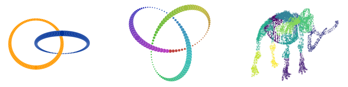
We first looked at simulated examples with explicitly defined signal structures – three low-dimensional examples (Figure 2) and one high-dimensional example.
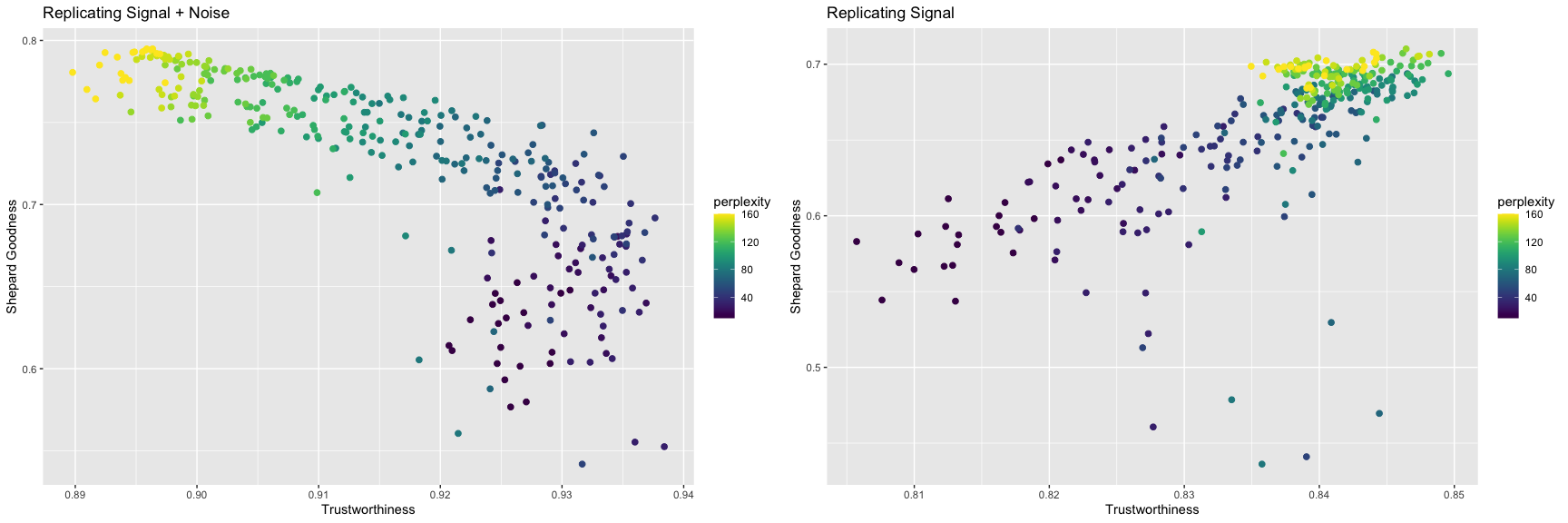
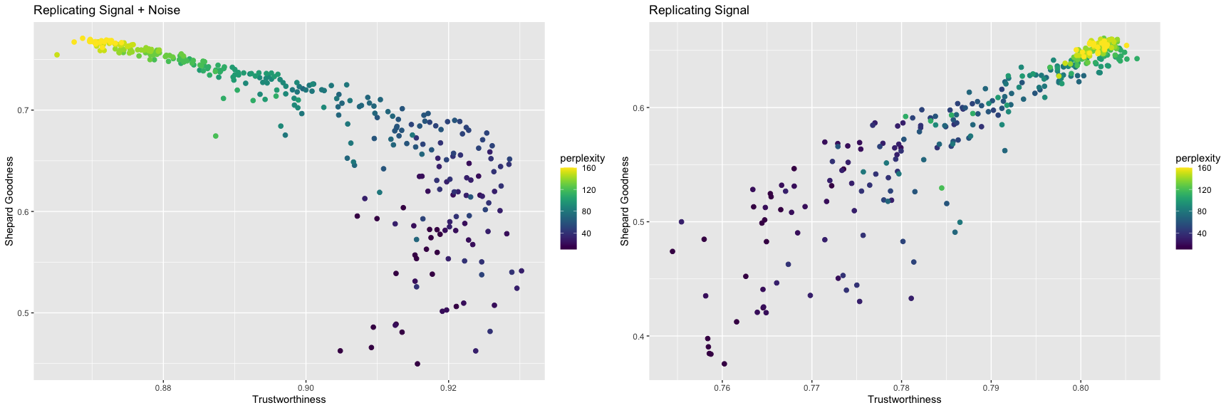
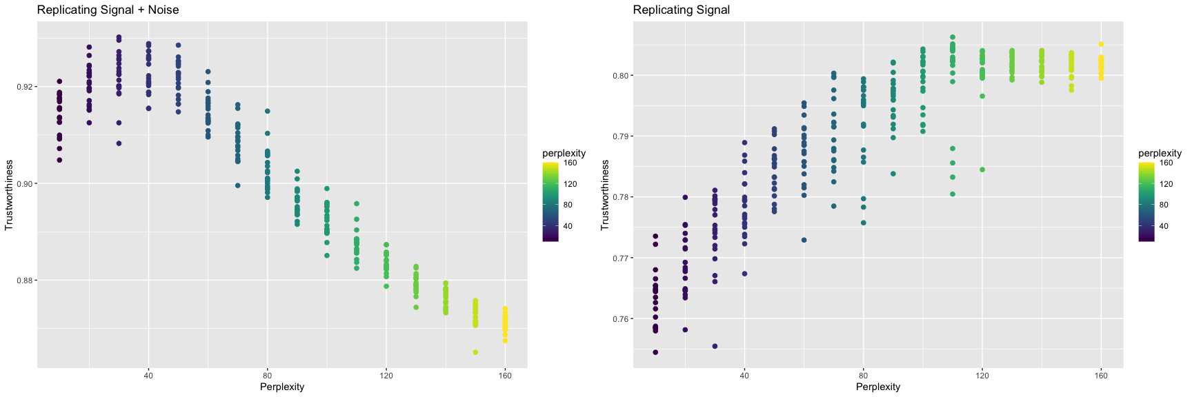
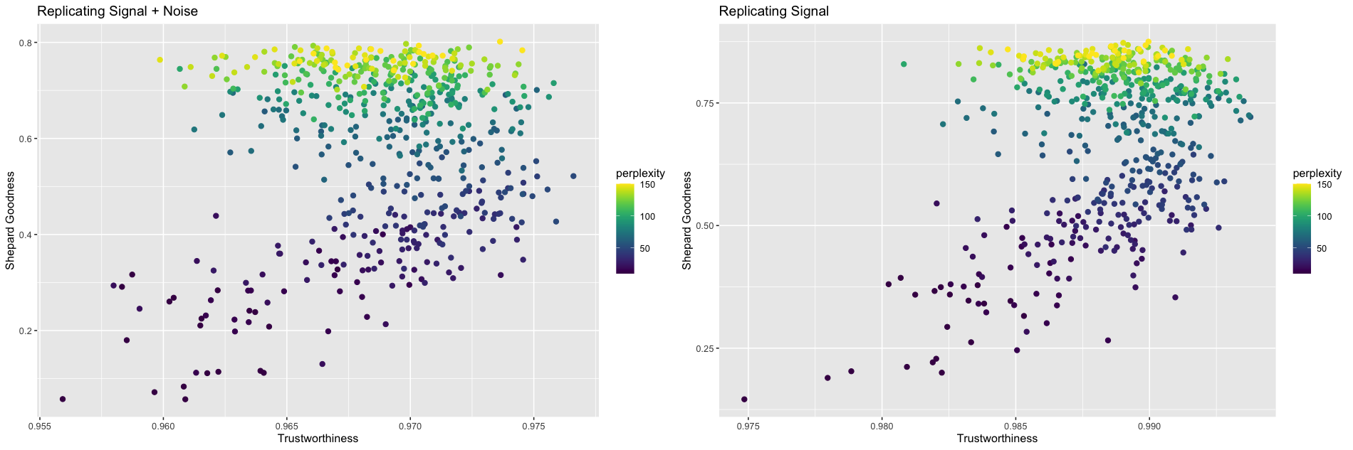
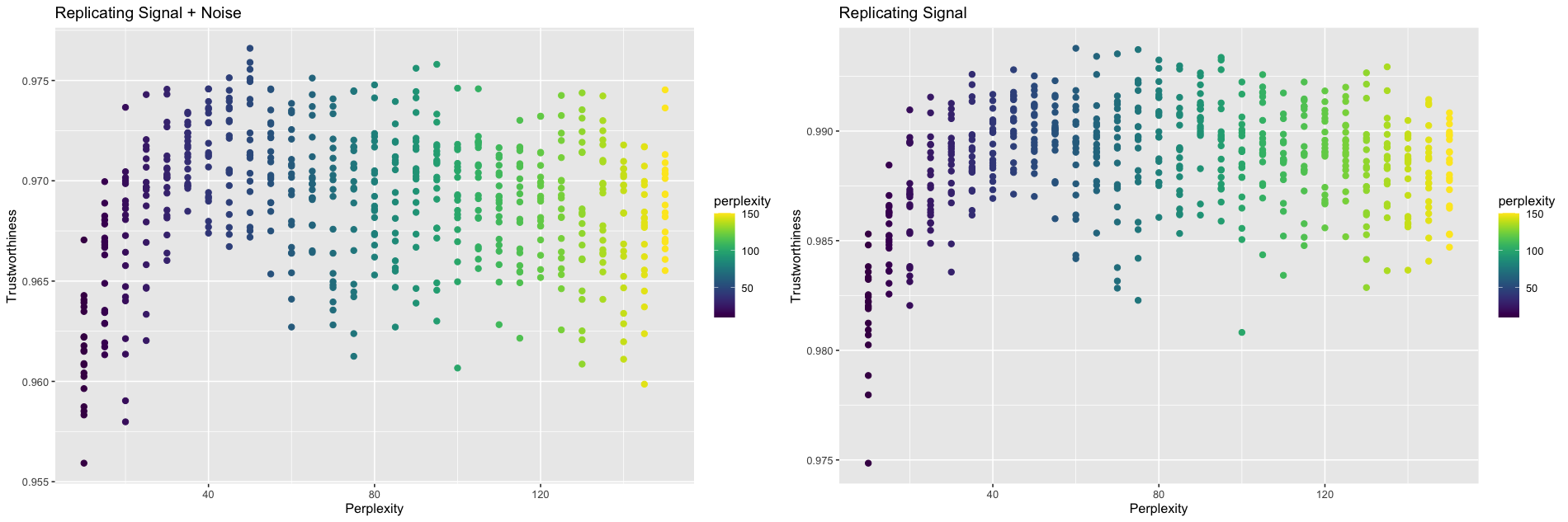
For the three low-dimensional examples, the signal consisted of 500 points in three dimensions. The dataset was constructed from by adding seven superfluous dimensions and isotropic Gaussian noise to all 10 dimensions. We then ran t-SNE using the package Rtsne with perplexities ranging from 10 to 160. For each value of perplexity, we ran the algorithm 20 times to mimic the ordinary t-SNE workflow. If we were to disregard the distinction between signal and noise, a plot of vs. could be used to calibrate perplexity. To avoid overfitting the noise, a plot of vs. should be used instead. See Figure 3a for plots of the links example. Both plots depict an increase in global performance as perplexity increases. Both plots also depict an increase in local performance followed by a decrease as perplexity increases. This trend is more evident when we plot trustworthiness vs. perplexity (Figure 3b).
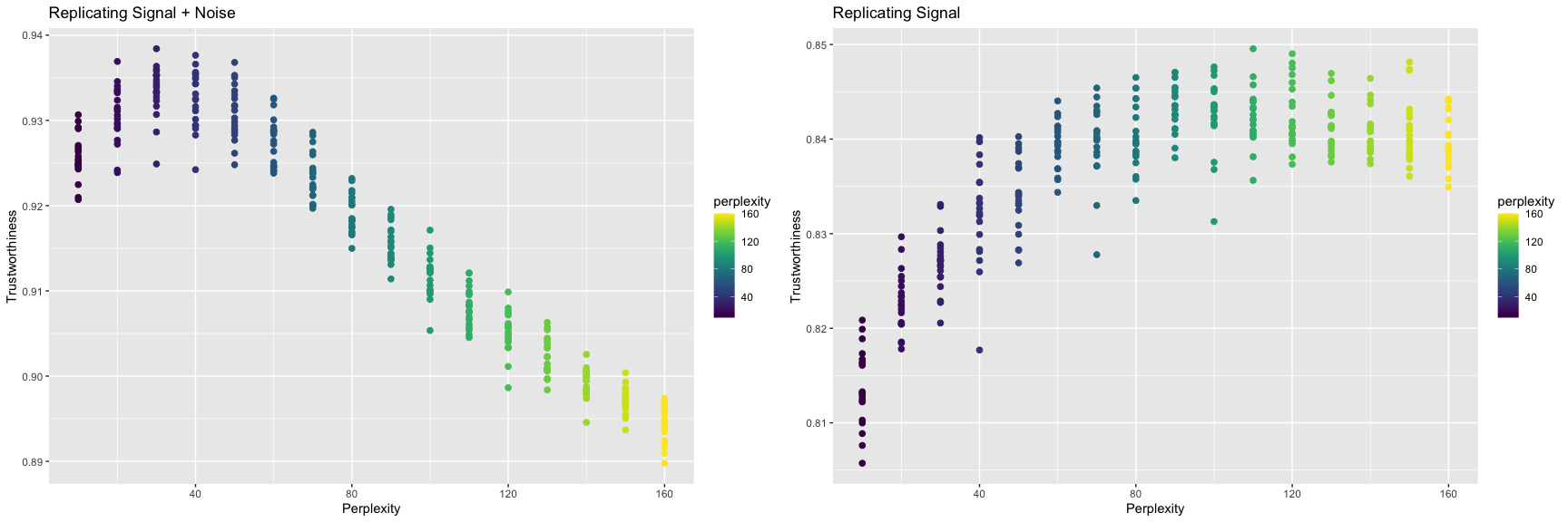
Past a certain perplexity, local performance begins to deteriorate with increasing perplexity, exhibiting the trade-off between global and local performance. This cutoff point, however, varies between the two plots. When comparing against the original data, a perplexity of 30 maximizes trustworthiness, which is consistent with the original authors’ suggestion of 5 to 50 for perplexity [17]. When comparing against the signal, a perplexity of 110 maximizes trustworthiness. We hypothesize t-SNE tends to overfit the noise when the perplexity is too low. Intuitively, small perplexities are more affected by slight perturbations of the data when only considering small neighborhoods around each point, leading to unstable representations. Conversely, larger perplexities lead to more stable representations that are less affected by noise. The other two low-dimensional simulated examples exhibit a similar trend (See Table 1 and Supplementary Information).
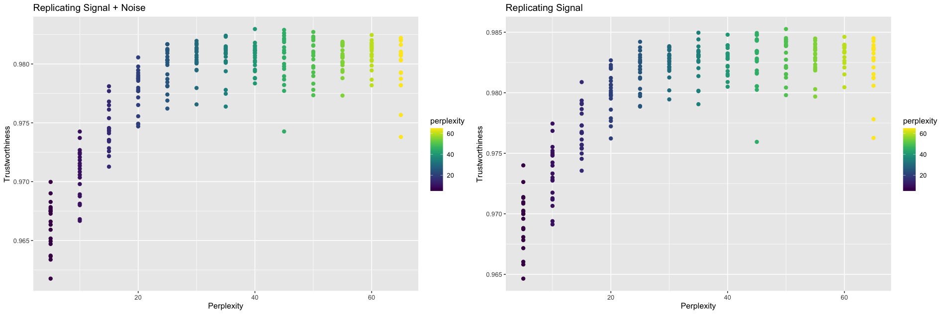
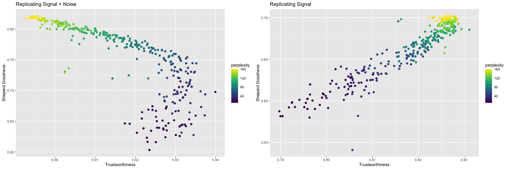
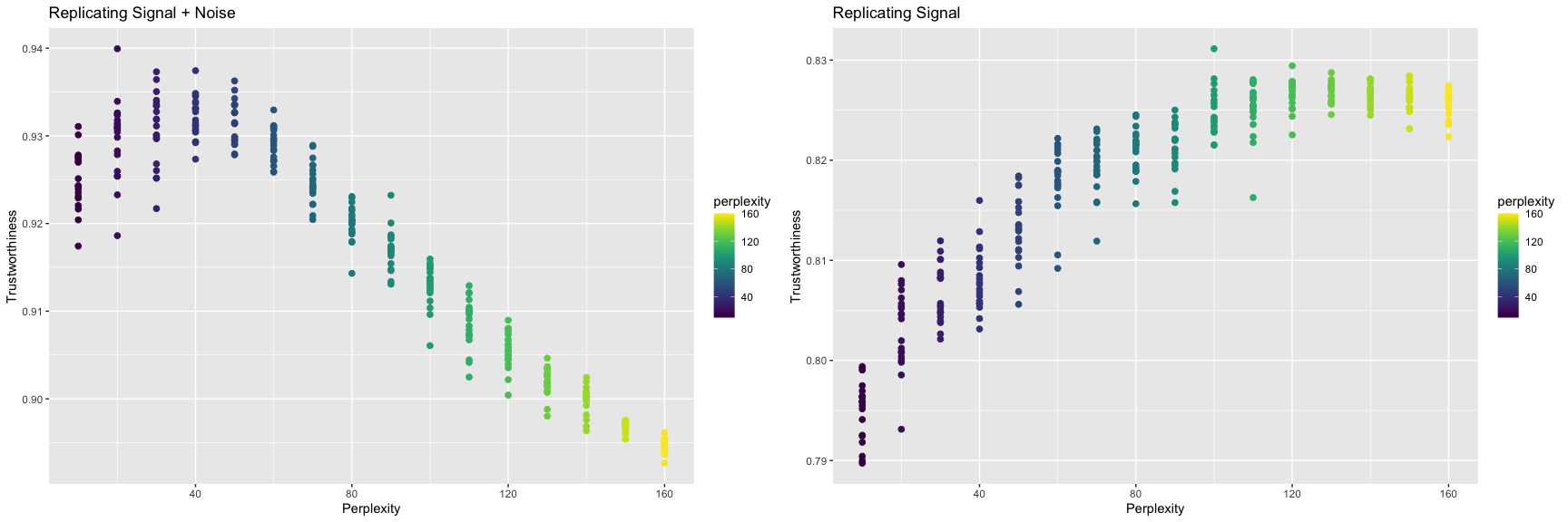
The high-dimensional example was constructed by generating seven 10-dimensional Gaussian clusters with varying centers. More specifically, the signal contained 210 points in 10 dimensions. The dataset was constructed from by adding 50 superfluous dimensions and isotropic Gaussian noise to all 60 dimensions. Again, local performance peaked at different perplexities when changing the frame of reference (Figure 4). When comparing against the original data, trustworthiness was maximized at a perplexity of 40. When comparing against the underlying signal, trustworthiness was maximized at a perplexity of 50.
4.2 Practical Examples
In addition to simulated datasets, we looked at three practical datasets: a cytometry by time-of-flight (CyTOF) dataset [15], a single-cell RNA sequencing dataset [16], and a microbiome dataset [2]. For each dataset, we compared the optimal perplexity for locally replicating the original data versus just the signal at varying numbers of signal dimensions. We explore the CyTOF dataset in detail here. Summaries for the other two practical examples can be found in Table 1, and the data processing details for the other two practical examples can be found in the Supplementary Information.
The CyTOF dataset contained 239,933 observations in 49 dimensions [15]. To reduce the computational load, a subset of 5,000 observations was sampled. In line with the ordinary t-SNE workflow, a log transformation was followed by a PCA pre-processing step to reduce the number of dimensions to 30, which still retained 77% of the variance in the original data. The processed data set to be studied consisted of 5,000 observations in 30 dimensions,
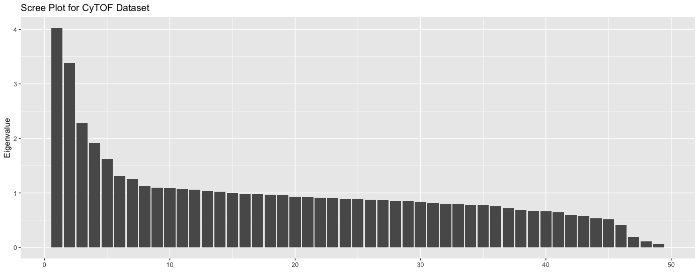
To determine the dimension of the signal, we drew a scree plot (Figure 5), which depicts flatening after the fifth eigenvalue. And thus, was extracted by taking the first five principal components,
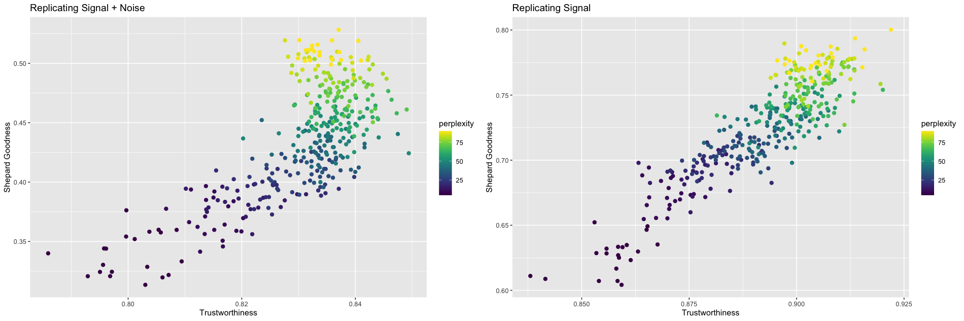
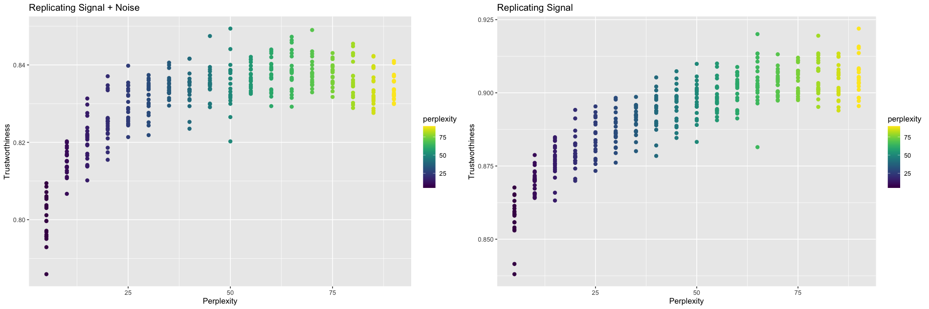
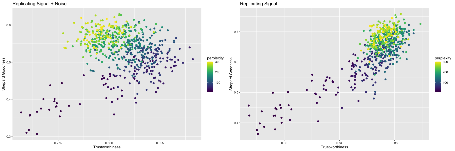
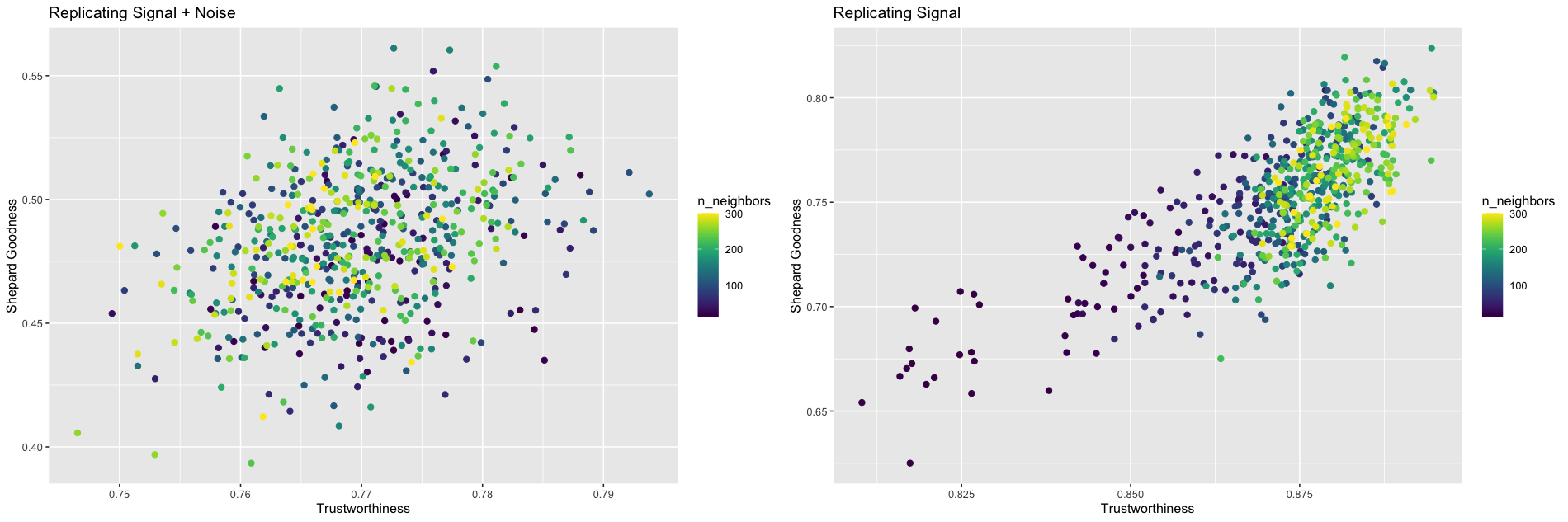
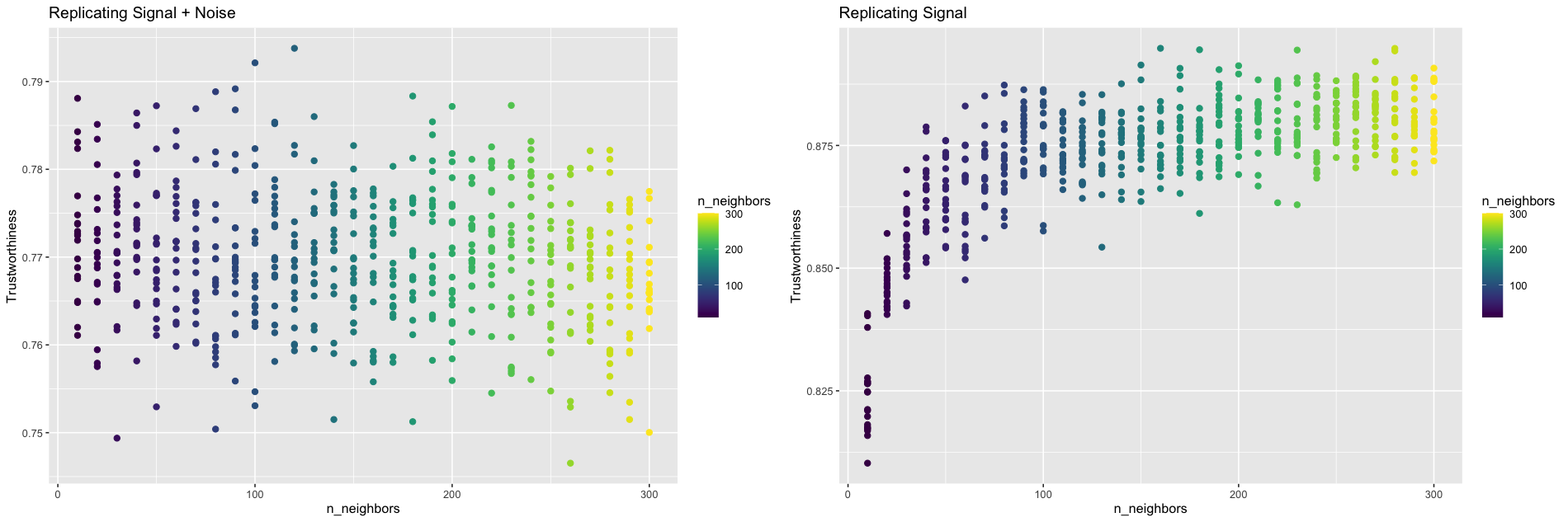
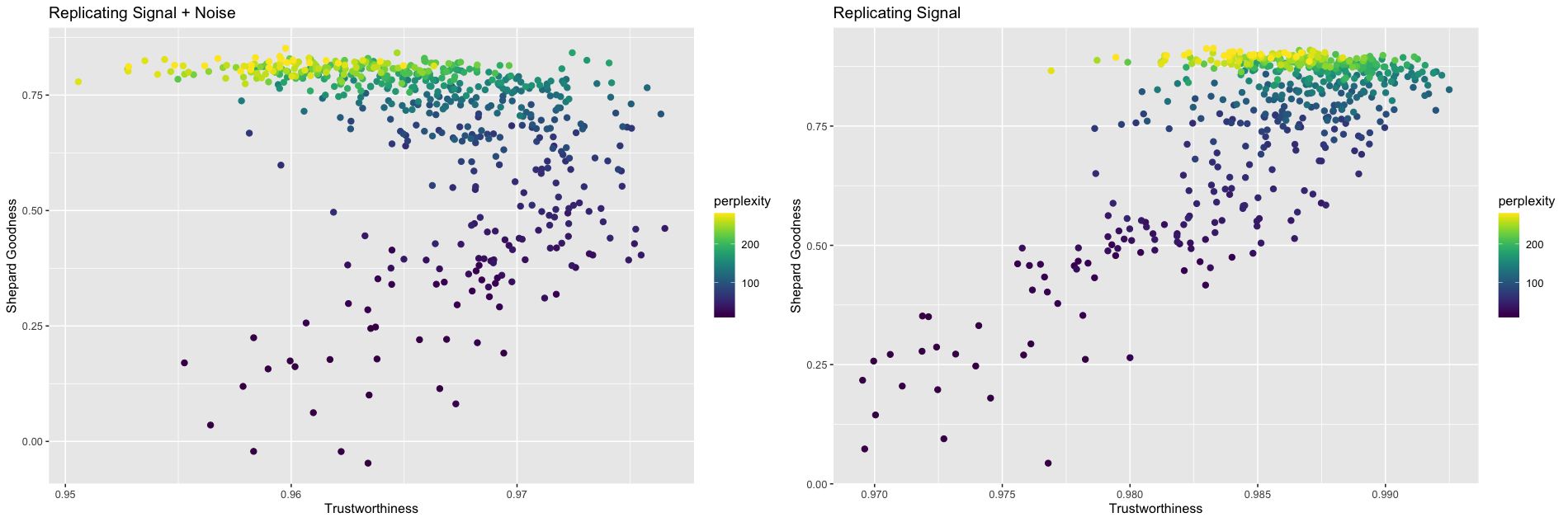
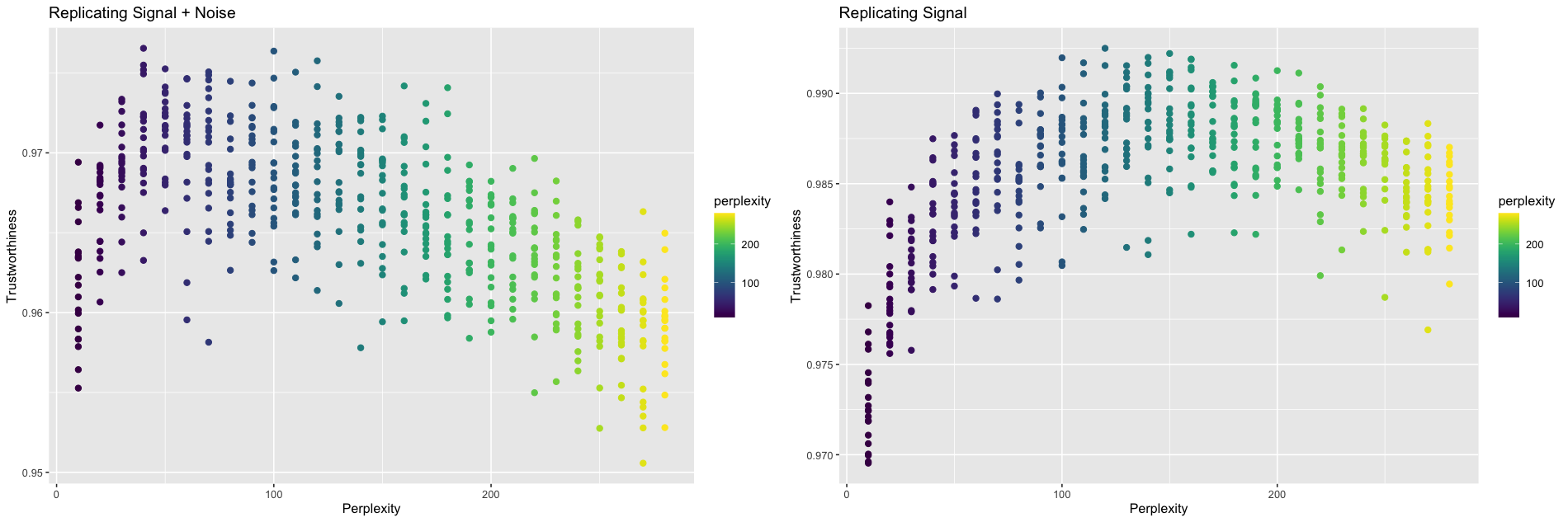
We computed the t-SNE representations for perplexity values ranging from 10 to 300. For each perplexity value, 20 different t-SNE representations were computed. Figure 6a contains the plots for vs. and vs. .
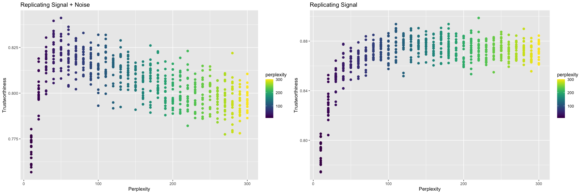
As with the simulated examples, there is a difference in trend when the frame of reference is the original data versus when it’s just the underlying signal (Figure 6b). When compared against the original data, trustworthiness is maximized at a perplexity of 50, which is consistent with [10]’s recommendation of setting perplexity to . When compared against the underlying signal, trustworthiness is maximized at a larger perplexity of 220, reinforcing the hypothesis that lower values of perplexity may be overfitting the noise.
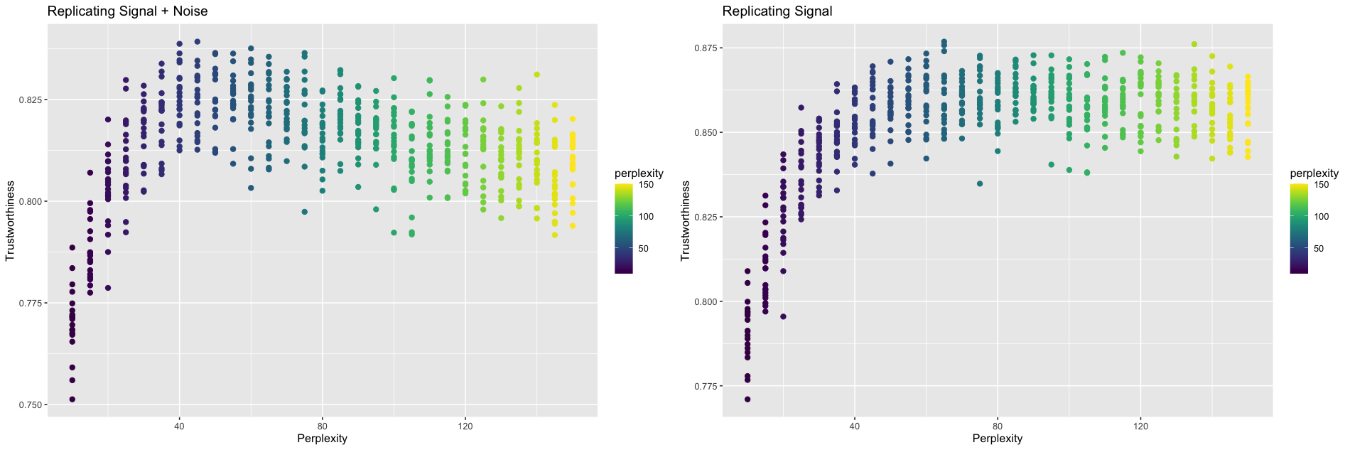
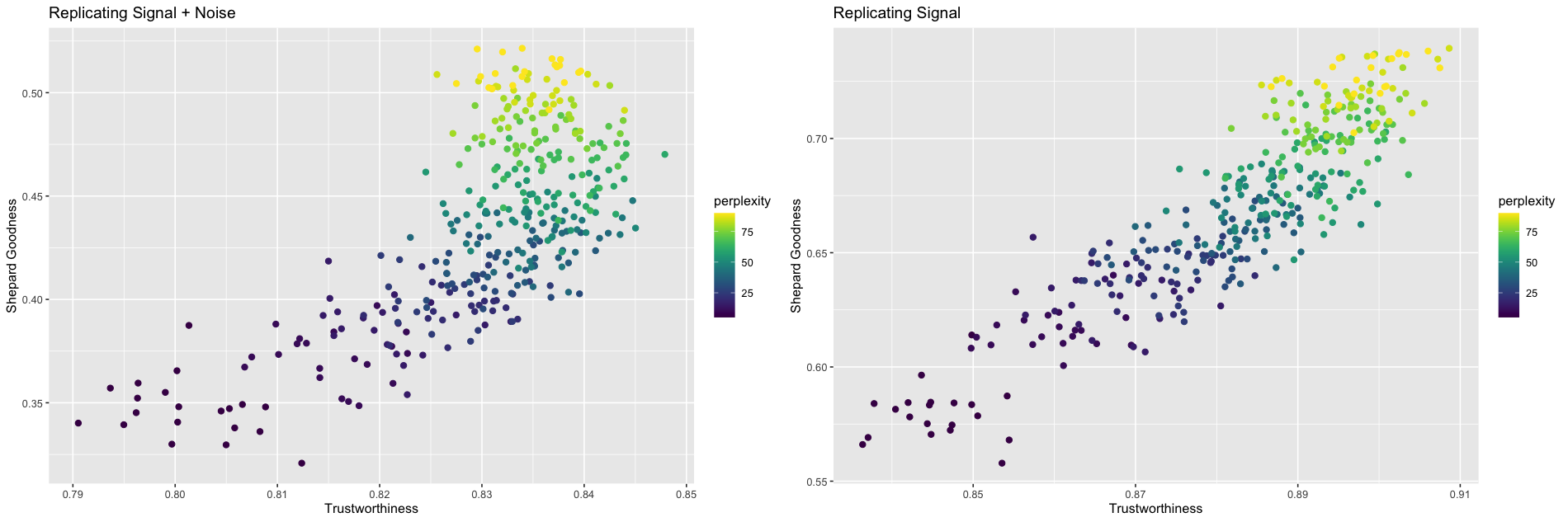
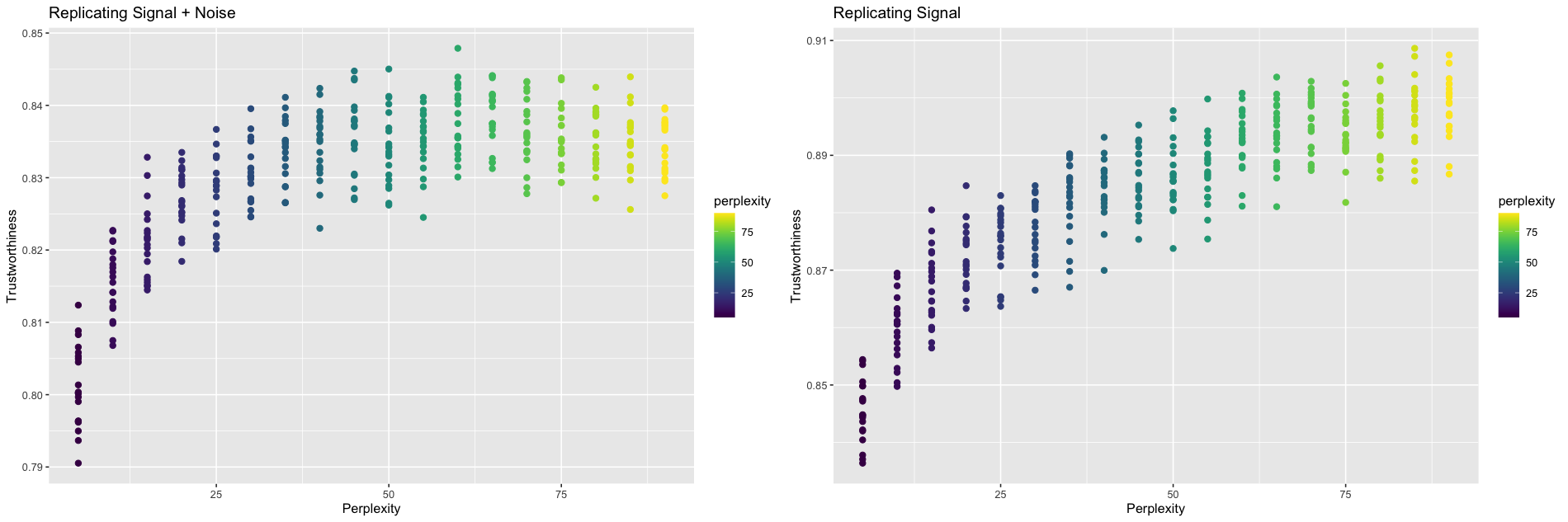
If we, instead, decide to be a little more conservative and use the first eight principal components to represent the signal, we still see a similar trend (Figure 7). Trustworthiness still increases then decreases with perplexity. When compared against the original data, trustworthiness is maximized at a perplexity of 45. When compared against the signal, trustworthiness is maximized at a perplexity of 65. By including three extra principal components in the signal, we’re assuming the data contains less noise, allowing the model to be more aggressive during the fitting process.
4.3 Summary of Results
See Table 1 for a summary of the results. , , and represent the sample size, dimension of the (post PCA-processed) data, and dimension of the extracted signal, respectively. The optimal perplexity when comparing against the signal was greater than the optimal perplexity when comparing against the original data for every example.
4.4 UMAP and n_neighbors
If n_neighbors functions similarly to perplexity, we’d expect small values of n_neighbors to overfit the data as well. An identical experiment was run using the Python package umap-learn on the CyTOF data. n_neighbor values ranging from 10 to 300 were tested on the same CyTOF data set. An n_neighbors value of 120 maximized trustworthiness when comparing against the original data, but an n_neighbors value of 160 maximized trustworthiness when comparing against the underlying signal. See Supplementary Information for plots.
5 Application
To apply this framework in practice, one must decide how to extract the signal from the data. The signal should include the features of the data one desires to retain throughout the dimension reduction process. When using a PCA projection to serve as the signal, one could draw a scree plot or employ a component selection algorithm such as parallel analysis [8] to determine the dimension of the signal.
With a signal constructed, it remains to compute t-SNE outputs at varying perplexities. It’s recommended that at least a couple outputs are computed for each perplexity to account for t-SNE’s inherit randomness. For each output, one must calculate the trustworthiness and Shepard goodness with respect to the signal. From there, one can choose the representation with the desirable balance of local and global performance. A summary is given in Algorithm 1. Sample code is available at https://github.com/JustinMLin/DR-Framework/.
| Optimal Perplexity | |||||
|---|---|---|---|---|---|
| Dataset | signal + noise | signal | |||
| Links [20] | 500 | 10 | 3 | 30 | 110 |
| Trefoil [20] | 500 | 10 | 3 | 30 | 110 |
| Mammoth [19] | 500 | 10 | 3 | 20 | 100 |
| High-Dimensional Clusters | 210 | 60 | 10 | 40 | 50 |
| CyTOF [15] | 5,000 | 30 | 5 | 50 | 220 |
| CyTOF [15] | 5,000 | 30 | 8 | 45 | 65 |
| scRNA-seq [16] | 864 | 500 | 5 | 40 | 120 |
| scRNA-seq [16] | 864 | 500 | 10 | 50 | 60 |
| Microbiome [2] | 280 | 66 | 5 | 50 | 90 |
| Microbiome [2] | 280 | 66 | 8 | 60 | 85 |
It is worth noting that computational barriers may arise, especially for very large data sets. To alleviate such issues, trustworthiness and Shepard goodness can be approximated by subsampling before calculation. Furthermore, t-SNE is generally robust to small changes in perplexity [17], so checking a handful of different perplexities is sufficient. If computing the t-SNE representations is the limiting factor, the perplexity can be calibrated for a subsample of the data, instead. [14] found that embedding a -sample, where is the sampling rate, with perplexity gives a visual impression of embedding the original data with perplexity
With these concessions, applying this framework to calibrate perplexity is feasible for data sets of any size.
6 Discussion
We have illustrated the importance of acknowledging noise when performing dimension reduction by studying the roles perplexity and n_neighbors play in overfitting data. When using the original data to calibrate perplexity, our experiments agreed with perplexities previously recommended. When using just the signal, however, our experiments indicated that larger perplexities performed better. Low perplexities lead to overly-flexible t-SNE models that are heavily impacted by the presence of noise, while higher perplexities exhibit better performance due to increased stability. These considerations are especially important when working with heavily noised data, which are especially prevalent in the world of single-cell transcriptomics [5].
We have also presented a framework for modeling dimension reduction problems in the presence of noise. This framework can be used to study other hyperparameters and their relationships with noise. In the case when a specific signal structure is desired, this framework can be used to determine which dimension reduction method best preserves the desired structure. Further works should explore alternative methods for extracting the signal in way that preserves the desired structure.
7 Data Availability
All data and code are freely available at https://github.com/JustinMLin/DR-Framework/.
References
- [1] Ehsan Amid and Manfred K. Warmuth. TriMap: Large-scale dimensionality reduction using triplets. arXiv preprint arXiv:1910.00204v2, 2022.
- [2] Manimozhiyan Arumugam, Jeroen Raes, Eric Pelletier, Denis Le Paslier, Takuji Yamada, Daniel R. Mende, et al. Enterotypes of the human gut microbiome. Nature 473 174-180, 2011.
- [3] Yanshuai Cao and Luyu Wang. Automatic selection of t-SNE perplexity. arXiv preprint arXiv:1708.03229.v1, 2017.
- [4] Tara Chari and Lior Pachter. The specious art of single-cell genomics. PLoS Computational Biology 19(8):e1011288, 2023.
- [5] Shih-Kai Chu, Shilin Zhao, Yu Shyr, and Qi liu. Comprehensive evaluation of noise reduction methods for single-cell RNA sequencing data. Briefings in Bioinformatics 23:2, 2022.
- [6] Francesco Crecchi, Cyril de Bodt, Michel Verleysen, John A. Lee, and Davide Bacciu. Perplexity-free parametric t-SNE. arXiv preprint arXiv:2010.01359v1, 2020.
- [7] Mateus Espadoto, Rafael M. Martins, Andreas Kerren, Nina S. T. Hirata, and Alexandru C. Telea. Towards a quantitative survey of dimension reduction techniques. IEEE Transactions on Visualization and Computer Graphics 27:3, 2021.
- [8] Horn, John L. A rationale and test for the number of factors in factor analysis. Psychometrika 30:2 179-185, 1965.
- [9] Haiyang Huang, Yingfan Wang, Cynthia Rudin, and Edward P. Browne. Towards a comprehensive evaluation of dimension reduction methods for transcriptomic data visualization. Communications Biology, 5:716, 2022.
- [10] Dmitry Kobak and Philipp Berens. The art of using t-SNE for single-cell transcriptomics. Nature Communications, 10:5416, 2019.
- [11] John A. Lee and Michel Verleysen. Quality assessment of dimensionality reduction: Rank-based criteria. Neurocomputing 72:1431 – 1443, 2009.
- [12] Leland McInnes, John Healy, and James Melville. arXiv preprint arXiv:1802.03426v3, 2020.
- [13] Tobias Schreck, Tatiana von Landesberger, and Sebastian Bremm. Techniques for precision-based visual analysis of projected data. Sage 9:3, 2012.
- [14] Martin Skrodzki, Nicolas Chaves-de-Plaza, Klaus Hildebrandt, Thomas Höllt, and Elmar Eisemann. Tuning the perplexity for and computing sampling-based t-SNE embeddings. arXiv preprint arXiv:2308.15513v1, 2023.
- [15] Dara M. Strauss-Albee, Julia Fukuyama, Emily C. Liang, Yi Yao, Justin A. Jarrell, Alison L. Drake, et al. Human NK cell repertoire diversity reflects immune experience and correlates with viral susceptibility. Science Translational Medicine 7:297, 2015.
- [16] Po-Yuan Tung, John D. Blischak, Chiaowen Joyce Hsiao, David A. Knowles, Jonathan E. Burnett, Jonathan K. Pritchard, et al. Batch effects and the effective design of single-cell gene expression studies. Scientific Reports 7:39921, 2017.
- [17] Laurens van der Maaten and Geoffrey Hinton. Visualizing data using t-SNE. Journal of Machine Learning Research 9:2579 – 2605, 2008.
- [18] Jarkko Venna and Samuel Kaski. Visualizing gene interaction graphs with local multidimensional scaling. European Symposium on Artificial Neural Networks, 2006.
- [19] Yingfan Wang, Haiyang Huang, Cynthia Rudin, and Yaron Shaposhnik. Understanding how dimension reduction tools work: An empirical approach to deciphering t-SNE, UMAP, TriMap, and PaCMAP for data visualization. Journal of Machine Learning Research 22, 2021.
- [20] Martin Wattenberg, Fernanda Viégas, and Ian Johnson. How to Use t-SNE Effectively. Distill, 2016.
Supplementary Information
SI Simulated Examples
SI.1 Trefoil Plots
SI.2 Mammoth Plots
SII Practical Examples
SII.1 UMAP Plots (CyTOF)
SII.2 scRNA Dataset
This is a dataset of induced pluripotent stem cells generated from three different individuals [16]. The original data includes 864 units and 19,027 readings per unit. To process this zero-inflated count data, columns containing a large proportion of 0’s (20% or more) were removed before a log transformation was applied. This reduced the dimension to 5,431. A PCA pre-processing stop further reduced the dimension to 500, which still retained 88% of the variance of the log-transformed data. The signal was first taken to be the first five principal components, then the first 10 principal components. Notice the optimal perplexity when compared against the original data differed between these two experiments, even though it should theoretically be independent of the chosen signal dimension. This is due to the inherent randomness of the t-SNE algorithm.
SII.3 Microbiome Dataset
[2] compares the faecal microbial communities from 22 subjects using complete shotgun DNA sequencing. The original data contained 280 samples and 553 genera. To deal with a large number of near-zero readings, columns containing a large proportion of values less than (60% or more) were removed. This reduced the dimension to 66. A PCA pre-processing was used to center and re-scale the data. The signal was first taken to be the first five principal components, then the first eight principal components. Notice the optimal perplexity when compared against the original data differed between these two experiments, even though it should theoretically be independent of the chosen signal dimension. This is due to the inherent randomness of the t-SNE algorithm.