A User-Focused Approach to Evaluating Probabilistic and Categorical Forecasts
Abstract
We demonstrate a user-focused verification approach for evaluating probability forecasts of binary outcomes (also known as probabilistic classifiers) that is (i) based on proper scoring rules, (ii) focuses on user decision thresholds, and (iii) provides actionable insights. We argue that the widespread use of categorical performance diagrams and the critical success index to evaluate probabilistic forecasts may produce misleading results and instead illustrate how Murphy diagrams are better for understanding performance across user decision thresholds. The use of proper scoring rules that account for the relative importance of different user decision thresholds is shown to impact scores of overall performance, as well as supporting measures of discrimination and calibration. These methods are demonstrated by evaluating several probabilistic thunderstorm forecast systems. Furthermore, we illustrate an approach that allows a fair comparison between continuous probabilistic forecasts and categorical outlooks using the FIxed Risk Multicategorical (FIRM) score and establish the relationship between the FIRM score and Murphy diagrams. The results highlight how the performance of thunderstorm forecasts produced for tropical Australian waters varies between operational meteorologists and an automated system depending on what decision thresholds a user is acting on. A hindcast of a new automated system is shown to generally perform better than both meteorologists and the old automated system across tropical Australian waters. While the methods are illustrated using thunderstorm forecasts, they are applicable for evaluating probabilistic forecasts for any situation with binary outcomes
Keywords: forecast verification; probabilistic forecasting; categorical forecasts, proper scoring rule, performance diagrams, weather forecasting, thunderstorms.
This Work has been submitted to Weather and Forecasting. Copyright in this Work may be transferred without further notice.
1 Introduction
Probabilistic weather forecasts are commonly produced by meteorological agencies and have existed since at least the eighteenth century (Murphy,, 1998). They are commonly expressed as the probability of binary outcome occurring (e.g., an 80% chance of rainfall tomorrow), with such forecasts sometimes called “probabilistic classifiers”. Evaluation of weather forecasts is critical to understand their quality, behavior, accuracy, and value. In the middle of the twentieth century, the Brier score (Brier,, 1950) was introduced and has become one of the most commonly used verification metrics to evaluate probabilistic forecasts of binary outcomes. Whilst many of the classical evaluation tools developed since then are known to the meteorological community (e.g., reliability diagrams), recent advances published in the statistics literature are not well-known. A primary aim of this paper is to review these advances and promote their use.
The Australian Bureau of Meteorology (hereafter, “the Bureau”) recently started routinely producing daily probability of thunderstorm (DailyPoTS) forecasts using a variety of techniques and wanted their quality assessed. This prompted us to review the verification methods used to evaluate probabilistic thunderstorm forecasts in the literature. Over the last two decades there has been a surge of probabilistic and categorical thunderstorm forecast systems produced in research and operational environments (Bright et al.,, 2005; Bright and Grams,, 2009; Dance et al.,, 2010; Craven et al.,, 2018; Simon et al.,, 2018; Rothfusz et al.,, 2018; Charba et al.,, 2019; Brunet et al.,, 2019; Brown and Buchanan,, 2019; Harrison et al.,, 2022). The methods used to evaluate probabilistic thunderstorm forecasts in these systems include the Brier score (Brier,, 1950) and the corresponding Brier skill score, receiver operating characteristic (ROC) curves, reliability diagrams, the Pierce skill score, relative economic value (Richardson,, 2000), and categorical performance diagrams (Roebber,, 2009). The latter displays probability of detection (POD), success ratio (1 - false alarm ratio), critical success index (CSI) and frequency bias. These methods are also commonly used to verify other forecast parameters such as a “chance of rainfall” forecast. While there have been many approaches taken to verify forecasts of binary outcomes in the meteorological literature, we suggest that best practice should meet three key requirements.
-
1.
Overall performance scores should use proper scoring rules within a probabilistic forecast framework (Winkler and Murphy,, 1968; Gneiting and Raftery,, 2007). A scoring rule assigns a number to a forecast–observation pair that is indicative of predictive performance. A scoring rule is proper if, from the forecaster’s perspective, their expected score will be optimized by issuing the forecast that corresponds to their true belief. Using a proper scoring rule ensures that forecasters or forecast system developers avoid facing the quandary of either issuing an honest forecast or of issuing a different forecast that will optimize the verification score. This quandary is known as the “forecaster’s dilemma” (Lerch et al.,, 2017) and choosing to optimize the score in such circumstances is sometimes referred to as “hedging”. In the case of issuing probabilistic forecasts for binary outcomes, proper scoring aligns with the notion of consistency outlined in Murphy’s famous essay on what constitutes a good forecast (Murphy,, 1993) and expanded on by Gneiting, (2011). Examples of proper scoring rules are the Brier score, the logarithmic score (Good,, 1952), and the misclassification rate, which is widely used in machine learning.
-
2.
User-focused verification should measure performance across important decision thresholds (e.g., Rodwell et al.,, 2020; Foley and Loveday,, 2020; Taggart,, 2022; Laugesen et al.,, 2023). In the case of probabilistic forecasts of binary outcomes (also known as probabilistic classifiers), a decision threshold is the forecast probability value that a user will take action on. E.g., a city will cancel their New Years Eve fireworks display if the chance of a thunderstorm exceeds 60%. Using such simple decision models, the Brier score weights all user decision thresholds equally (c.f. Shuford Jr et al.,, 1966; Schervish,, 1989), while the logarithmic score heavily weights decision thresholds closer to 0 and 100%. Different proper scores may rank the performance of different forecast systems differently. When comparing forecast systems, it is critical that one understands performance for different decision thresholds and that the chosen proper scoring rule weights each decision threshold appropriately.
-
3.
Methods that provide actionable insights into the behavior of a forecast system, such as measures of conditional calibration or sharpness, should be used to complement overall performance scores. Insights on calibration can inform where meteorologists or forecast system developers can provide bias corrections. Measures of discrimination can highlight which forecast system has the highest potential predictive ability subject to recalibration.
It is worth noting that while spatial verification methods are often used for verification of high–resolution, gridded data (Gilleland et al. 2009), for many applications, point-to-point based methods are more appropriate, such as the evaluation of predictive probabilistic fields.
In this paper we demonstrate that using categorical performance diagrams to rank probabilistic forecast systems can lead to misguided inferences, introduce forecaster’s dilemmas and hence does not meet requirement 1 listed above. On the other hand, miscalibration–discrimination diagrams, Murphy diagrams and recent advances in generating reliability and ROC diagrams (Ehm et al.,, 2016; Dimitriadis et al.,, 2021, 2023) meet our requirements. We demonstrate these tools by comparing three forecast systems and products that predict thunderstorm probability over the Australian region.
In addition to DailyPoTS forecasts, the Bureau also issues categorical thunderstorm outlook products generated by operational meteorologists, where the categories correspond to different likelihoods of thunderstorm occurrence. We demonstrate an approach that allows a fair comparison between these categorical forecasts with the continuous probabilistic forecasts using the FIxed Risk Multicategorical (FIRM) score (Taggart et al.,, 2022).
While the methods in this paper are illustrated using thunderstorm forecasts, they are applicable for evaluating probabilistic forecasts for any situation with binary outcomes.
2 Data
Forecast data
This study uses forecasts from the 2022-2023 Australian summer (December-February). The Bureau issues gridded (approximately 6km grid spacing) DailyPoTS forecasts twice a day. These gridded forecasts are used to populate the weather forecasts on the Bureau’s website and mobile phone app. In the future, these thunderstorm grids may also be made available for downstream users. The forecasts are issued out to seven lead days and are valid for 24-hour periods that begin at 15 UTC, which is 30 minutes from local midnight Australian Central Standard Time. The forecasts are defined as the likelihood that at least one lightning strike (either cloud-to-ground or cloud-to-cloud) will be observed within a 10-km radius of the center of a grid cell.
AutoFcst
AutoFcst is an automated forecast system that takes post-processed output from post-processed consensus forecasts as well as a global wave model and produces a coherent set of forecast grids for many parameters (Griffiths and Jayawardena,, 2022). For thunderstorm forecasts, AutoFcst utilizes probabilistic predictions from the Bureau’s operational lightning guidance system, Calibrated Thunder (CalTS), which is a modified version of the system described by Bright et al., (2005). CalTS combines ensemble NWP model output with historical lightning observations to produce calibrated forecasts of the probability of one or more lightning strikes within 10 km of a point across Australia and surrounding coastal waters. In this paper we use the 12 UTC base time run of AutoFcst, which makes use of the 12 UTC run of CalTS. A lead day 1 forecast starts 27 hours after the base time and approximately 20 hours after it is available for operational meteorologists to use.
New Calibrated Thunder Guidance
A hindcast of a research version of CalTS was run for 1 December 2022 to 28 February 2023. We refer to this new version of CalTS as CalTS-New and the old version as CalTS-Op hereafter. The two versions differ in how they perform the reliability calibration. Several changes were introduced to address known systematic biases in the forecast probabilities, particularly a pronounced overforecast bias across the tropical seas north of Australia. CalTS-New has the same forecast base and lead times as AutoFcst.
Thunderstorm outlooks
The Bureau’s Thunderstorm and Heavy Rainfall (TSHR) Team issue thunderstorm outlooks for stakeholders such as emergency services each morning before the DailyPoTS forecasts are issued. The lead day 1 outlook is valid for a 24 hour period from 15 UTC, starting approximately 16 hours after issue time, and having the same validity period as the lead day 1 DailyPoTS forecasts. The outlook has three categories; “nil thunderstorm” (less than 9.5% chance), “thunderstorms possible” (at least 9.5% but less than 29.5% chance), and “thunderstorms likely” (at least a 29.5% chance)111The bins used in operations are technically . Since the forecasts are rounded to the nearest percentage point we use the bins to align with how the elementary scoring functions are defined in Eq. 7.. CalTS-Op, in conjunction with NWP models and observations are used to produce these outlooks.
Official forecasts
Official forecasts are the gridded DailyPoTS forecasts that are used to generate publicly available thunderstorm forecast products on the Bureau’s website and mobile phone app. Official DailyPoTS forecasts are produced in the Graphical Forecast Editor (GFE) (Hart,, 2019), where operational meteorologists start with a copy of the AutoFcst (12 UTC run) DailyPoTS forecast grids and manually adjust them with the aim of improving the forecast service (Just and Foley,, 2020). For lead day 1 forecasts, two main adjustments are of interest for this paper:
-
1.
First, DailyPoTS grids are minimally adjusted to be consistent with the Day 1 thunderstorm outlook.
-
2.
Then, over most of the tropics in summer, whenever the daily probability of precipitation (DailyPoP) exceeds 34%, DailyPoTS will be adjusted to be at least 30%. This edit, whilst potentially introducing inconsistencies with the Day 1 thunderstorm outlook, will result in a thunderstorm icon on public weather forecasts.
To remove sharp spatial artifacts introduced by such adjustments, some smoothing is applied at the final step. The Official forecast is typically issued about 8 hours before the 15 UTC start of the Day 1 validity period.
Observation data
Gridded lightning observations are generated using the WeatherZone Total Lightning Network (WZTLN) data which is part of the Earth Networks Total Lightning Network (Rudlosky,, 2015). The WZTLN data is derived from over 100 ground-based sensors across Australia and detects both cloud-to-cloud and cloud-to-ground lightning. False positives occur less than 1% of the time (Price and Foley,, 2021). Grids of lightning counts are generated by counting lightning strikes that occurred within a 10-km radius of the centroid of a grid cell. Strike counts were then converted to a binary lightning flag using a threshold of one strike.
Climatological data
As a benchmark, reference forecast, we use an estimate of the daily climatological lightning probability at each grid point. The climatology was created by first counting the number of lightning strikes within a 10 km radius of each point for every day from 1 December 2014 to 30 November 2021. Similar to the observation grids, strike counts were then converted to a binary lightning flag and the resulting grids were averaged across the seven years to obtain the raw lightning probability for each day. Finally, spatial and temporal smoothing was applied to reduce fine-scale variability (caused by the short length of the climatology) using Gaussian filters with standard deviations of 40 km and 15 days.
Processing of data
Gridded Official, AutoFcst, and observation data were retrieved from a Bureau database with an Australian Albers equal area map projection with approximately 5.7 km grid spacing. CalTS-New and the climatological dataset were regridded to the Australian Albers equal area map projection using a bi-linear interpolation since DailyPoTS is a smooth field. Regridded forecasts were rounded back to the nearest percentage point. An equal area projection was used to ensure that results are not biased towards certain geographical areas. If any forecast system or observation has missing data for a given spatiotemporal point, all datasets for that point are updated to include missing data. Additionally, matching of missing data is done across all lead days to allow comparison of performance across all seven lead days. Since not all forecast systems had forecasts issued with a base time before December 1, the data used here begins on December 8.
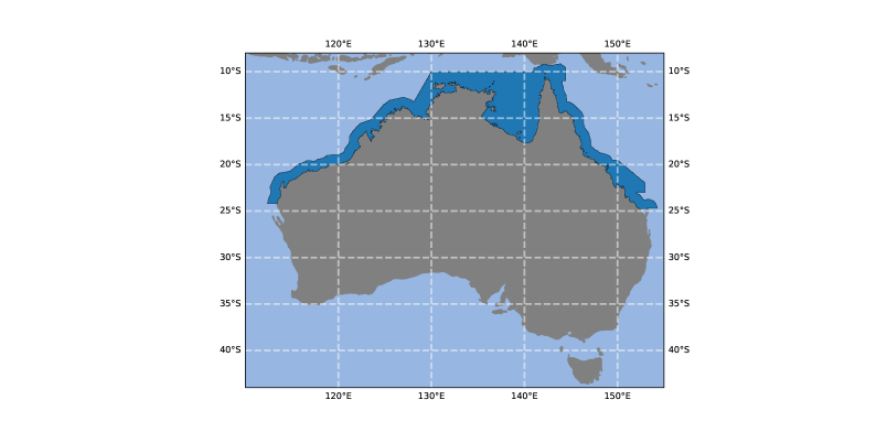
We evaluated the performance of the forecasts across Australia by splitting up the data into various geographical regions. In this paper, we demonstrate various verification methods by only showing results for forecasts for the Australian tropical waters (Fig. 1). This area is of most interest since one of the key focus areas in the development of CalTS-New was performance over Australian tropical waters due to the pronounced over-forecast bias in CalTS-Op. This area is also of interest since it is one of the only areas where the DailyPoTS grids diverge from the thunderstorm outlook grids.
3 Summarizing results
To summarize performance for three different forecast systems across seven lead days, we produce miscalibration–discrimination diagrams (Gneiting et al.,, 2023; Dimitriadis et al.,, 2023). These diagrams provide a useful tool for summarizing overall performance for many forecast systems as well as displaying measures of calibration and discrimination in a single diagram.
CORP decomposition
Miscalibration–discrimination diagrams are based on the CORP (Consistent, Optimally binned, Reproducible, and Pool-Adjacent-Violators (PAV) algorithm-based) decomposition (Dimitriadis et al.,, 2021), which is given by
| (1) |
where is the mean score for a proper scoring rule for forecast-observation pairs , is a measure of miscalibration of the forecast, where lower values closer to zero are better, is a measure of discrimination ability, where higher values are better, and is a measure of uncertainty that is independent of forecasts.
For probabilistic forecasts of binary outcomes, a classical choice of proper scoring rule is the Brier score222In this paper we refer to the “Brier score” as a scoring rule for a single forecast–observation pair and the “mean Brier score” as the mean of the Brier score across all forecast–observation pairs., which is defined by for a probabilistic forecast in the unit interval and an observation taking values from the set . In this case, the , , and terms equal the reliability, resolution and uncertainty components of the classical decomposition of the Brier score (Murphy,, 1973) if the classical bins are the set of unique forecast values with nondecreasing conditional event frequencies (Dimitriadis et al.,, 2021, Theorem 2).
To calculate the three terms of the CORP decomposition, we compute the mean scores and of the set of (re)calibrated forecasts and of the best constant reference forecast (defined as the value that would yield the best score if the same value was forecast everywhere spatiotemporally), namely
where each recalibrated forecast is obtained via isotonic regression. Isotonic regression is a method for fitting a non-decreasing curve for two sequences of data. The CORP approach uses the PAV algorithm (Ayer et al.,, 1955) for the isotonic regression step on account of its computational efficiency. The three components are then calculated as
is the difference in performance based on scoring rule between the forecast and the recalibrated forecast. is the difference in performance between the best constant reference forecast and the recalibrated forecast. Since the best constant reference forecast is calibrated, measures the discrimination of the forecast. is simply the mean score of the best constant reference forecast. , , and are non-negative subject to minor conditions (Dimitriadis et al.,, 2021, Theorem 1).
While there have been several approaches to decomposing scores into discrimination and calibration terms (e.g., Murphy, 1973), the CORP decomposition approach has several advantages. Traditional approaches often rely on making ad-hoc binning choices (e.g., choosing 10 equidistant bins). Dimitriadis et al., (2021) showed that minor changes in binning can produce drastically different reliability diagrams. Instabilities from binning choices flow through to other miscalibration measures such as the Brier score reliability component (Bröcker,, 2012). In contrast, the CORP approach optimally bins the forecasts such that no other binning scheme produces better performing recalibrated forecasts subject to monotonicity constraints (Brummer and Preez,, 2013) and easily yields reproducible results since there is no tuning of parameters. Stephenson et al., (2008) also provided a way to account for binning problems when calculating the Brier score components by introducing two additional within-bin components. However, one significant advantage of the CORP decomposition is that it can be applied to any proper scoring rule for scoring probabilistic forecasts of binary events and can also be extended to quantile and mean-value forecasts (Jordan et al.,, 2021).
Constructing miscalibration–discrimination diagrams
To visualize the predictive performance of the three probabilistic forecast systems using miscalibration–discrimination diagrams, we must select a proper scoring rule on which to base the CORP decomposition. We select the Brier score , so that is the mean Brier score. The implications of this choice, and of other possible choices, will be explored in sections 6 and 8.
The miscalibration–discrimination diagram is a scatter plot of against with parallel, diagonal lines showing the mean score . is also plotted as a diagonal line that intersects with the origin, since for the best constant reference forecast. These diagrams provide a useful tool for easily comparing overall performance, discrimination, and calibration for many forecast systems and can be applied to whatever proper scoring rule is required. The forecast that has the highest potential score subject to recalibration can be identified as the one that appears highest on the plot.
We make several small changes to the original miscalibration–discrimination diagrams (Gneiting et al.,, 2023; Dimitriadis et al.,, 2023), as illustrated in Fig. 2.
-
1.
We are using gridded rather than single point forecasts and observations. Our approach here is to perform isotonic regression and calculation of the best constant reference forecast across the region rather than individually at every grid point. Accompanied by corresponding reliability diagrams (Section 6), this has the advantage of providing actionable information for meteorologists to inform suitable conditional bias correction strategies over a geographical area.
-
2.
We add a diagonal reference line based on a long term climatological forecast for each grid cell. Unlike the best constant reference forecast, the values in this reference forecast vary spatiotemporally. This provides a practical benchmark that is an alternative to the best constant reference forecast, since it is known a priori.
-
3.
We plot forecast performance across multiple lead days and connect the points for a given forecast system by a line.
-
4.
We generate 95% confidence intervals via circular block bootstrapping (Wilks,, 1997). Blocks are taken across dimensions , , and with block length being the square root of the length of the dimension. Confidence intervals are calculated for both the and components so that they appear as a cross on the diagram.
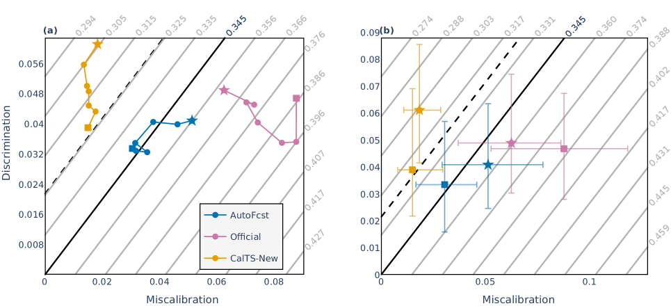
Miscalibration–discrimination diagram results
Miscalibration–discrimination diagrams based on the Brier score for our three forecast systems are shown in Fig. 2. Confidence intervals for the MCB and DSC components are shown for lead day 1 and lead day 7 forecasts in Fig. 2b. If confidence intervals are added for all seven lead days, the figure becomes too crowded. However, if confidence intervals for all lead days or more forecast systems are required on the miscalibration–discrimination diagram, then we recommend producing interactive plots that allow one to toggle lines on and off rather than static figures.
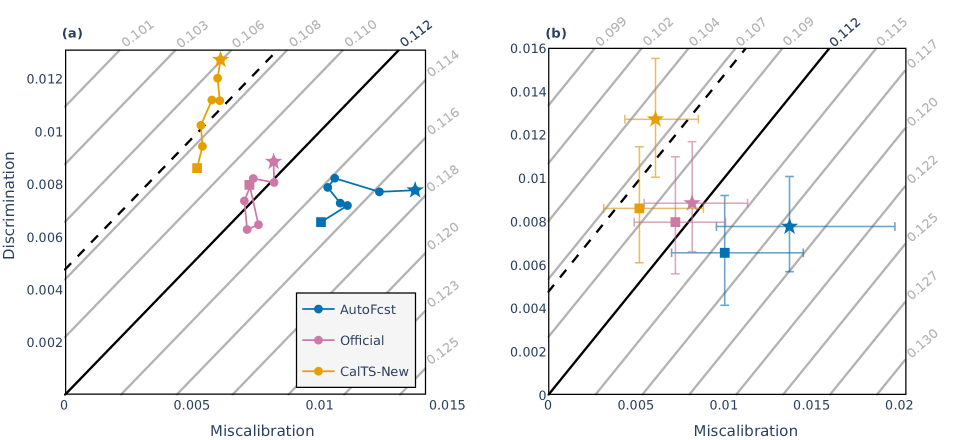
The miscalibration–discrimination diagram highlights that AutoFcst had no skill at any lead day based on the mean Brier score compared to the best constant reference forecast for the region. Official forecasts had better predictive performance than AutoFcst but had similar skill to the best constant reference forecast. The gain in skill was primarily due to meteorologists improving calibration rather than discrimination. CalTS-New showed superior performance based on the mean Brier score, outperforming the best constant reference forecast across all lead days, and was slightly better than the long-term climatological forecast at shorter lead days. This was due to improvements in both discrimination and calibration. For a well calibrated forecast system, it is expected that the improvement in skill from longer to shorter lead times should come from better discrimination, while calibration remains fairly constant. Note that the confidence intervals are for the MCB and DSC terms and that if one wants to calculate the likelihood that a forecast performed better than a reference forecast or another forecast sources, then those confidence intervals should be calculated using . Miscalibration–discrimination diagrams were also produced for eight other geographical areas across Australia (not shown) and in these cases all three forecast systems performed better than both the best constant reference forecast and the long-term climatological forecast.
4 Pitfalls using categorical performance diagrams with probabilistic forecasts
In the previous section we assessed overall predictive performance of probabilistic forecasts for thunderstorms using a proper scoring rule (the Brier score), with results presented on miscalibration-discrimination diagrams. An alternative approach to assessing overall predictive performance and other forecast characteristics which has become increasingly popular within sections of the meteorological research community is to use categorical performance diagrams. Categorical performance diagrams summarize multiple verification measures for binary forecasts in a single diagram (Roebber,, 2009). While initially created to evaluate dichotomous forecasts and warnings, a number of recent studies have used these diagrams to verify probabilistic forecasts of thunderstorms (Harrison et al.,, 2022), severe convective weather (Loken et al.,, 2017; Gagne et al.,, 2017; Cintineo et al.,, 2020; Gallo et al.,, 2022; Miller et al.,, 2022; Sandmæl et al.,, 2023) or snow (Uden et al.,, 2023; Radford and Lackmann,, 2023). In this section, we explain why some common interpretations of categorical performance diagrams lead to misguided inferences regarding overall predictive performance.
The critical success index (CSI), sometimes called the threat score, is a commonly used performance measure for binary forecasts of rare events, and is defined by
where , and denote the number of hits, misses and false alarms from a set of forecast cases. The higher the CSI, the better. A probabilistic forecast for an event can be converted into a binary forecast by selecting a threshold probability so that an event is forecast if and a non-event forecast if . After this, the CSI can be calculated. The performance diagram plots CSI values computed for multiple threshold probabilities , with values nearer the top right of the diagram often interpreted as indicating forecast systems with superior predictive performance. We give several reasons why CSI should not be used to assess predictive performance of probabilistic forecasts for binary events.
First, the CSI is not a proper scoring rule for probabilistic forecasts of binary events. This is because maximizing CSI can result in issuing forecasts that go against the forecaster’s best judgment. To see why, suppose that forecast cases have already been made. Let denote the CSI value for these forecast cases using the threshold probability . Suppose that for the th forecast case, a forecaster assesses that the probability of an event is . With a little algebra, it can be shown that the expected value of is maximized by forecasting an event if and only if
(Mason,, 1989). Now if , then the expected CSI can only be maximized by forecasting an event. However, an event can only be forecast by issuing a probability that is at least . In other words, the forecaster cannot issue their true assessment whilst optimizing their expected CSI. Similarly if , then the expected CSI cannot be maximized by forecasting . In these circumstances, the forecaster faces the dilemma of either issuing their best probabilistic assessment or a different probability that will maximize their expected CSI. Thus statements like “Forecast system A performed best because it had the highest maximum CSI, which occurred at the 40% threshold” are based on unsound inference.
A simple thought experiment, which can be empirically validated via synthetic simulation, supports this conclusion. Consider three forecast systems, A, B and C. System A is ideal: for each event System A issues a forecast probability for the event, making best use of the available information. It follows that observations are statistically indistinguishable from random events chosen with probability . For simplicity, assume also that . System B over-predicts by forecasting , and System C under-predicts by forecasting . Suppose that the CSI for System A is maximized at threshold probability . Then the maximum CSI for System B occurs for threshold probability and for System C at threshold . Moreover, these maximum CSI values are the same for all forecast systems, because the derived binary forecasts for each system are the same at their respective threshold probabilities. Yet by construction, System A is the superior system.
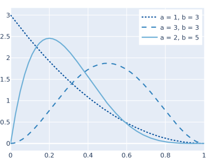
Given CSI values calculated across a range of threshold probabilities, some authors also make inferences about overall performance based on the mean of such CSI values. The following set of synthetic experiments illustrates that such inferences are misguided. Consider the three forecast systems A, B and C as above, but where forecasts are drawn from a beta distribution , with shape parameters and and support on the closed interval . The experiment is run six times with different combinations of parameters, resulting in event relative frequencies ranging from to as indicated in Table 1 and with probability density functions illustrated in Fig. 3. When , probabilities forecast by System B are adjusted to so that probabilities exceeding 1 are never forecast. Fig. 4 shows a performance diagram with results for Systems A and B for one experiment when the distribution is .
| event relative frequency | |||||
|---|---|---|---|---|---|
| 1 | 3 | [0, 0.5] | 1/8 | 0.025 (0.022, 0.028) | 0.063 (0.059, 0.067) |
| 3 | 3 | [0, 0.5] | 1/4 | 0.071 (0.066, 0.077) | 0.100 (0.097, 0.104) |
| 2 | 5 | [0, 0.5] | 1/7 | 0.027 (0.024, 0.029) | 0.053 (0.050, 0.056) |
| 1 | 3 | [0, 1] | 1/4 | 0.069 (0.063, 0.074) | 0.127 (0.122, 0.132) |
| 3 | 3 | [0, 1] | 1/2 | 0.129 (0.122, 0.136) | 0.161 (0.156, 0.165) |
| 2 | 5 | [0, 1] | 2/7 | 0.087 (0.081, 0.093) | 0.135 (0.131, 0.139) |
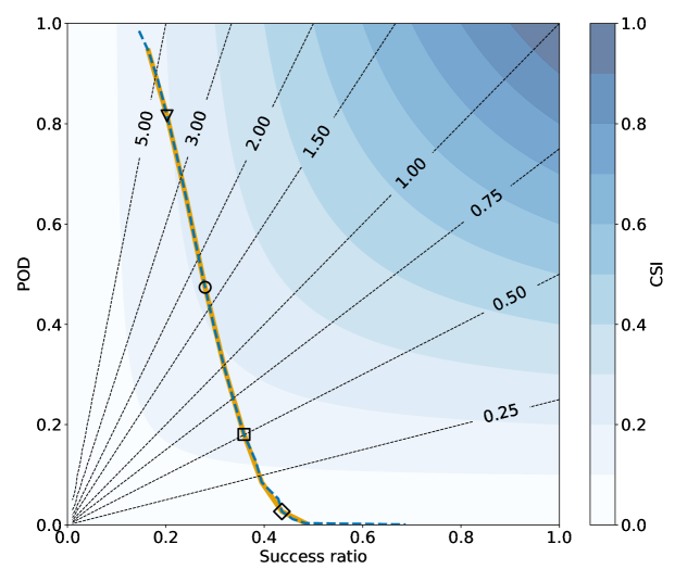
Precise details of how each synthetic experiment was run are given in the appendix. Here we summarize and discuss the results. For each choice of beta distribution, System A had the lowest (i.e., best) mean Brier score, which is consistent with the fact that System A, by construction, is the most skillful forecast system. On the other hand, System B had the highest (i.e., best) mean CSI for each choice of beta distribution. This is because for distributions supported on the CSI values for Systems A and C are 0 for higher threshold probabilities (since there are no hits) while for B they are almost always positive. Even when the beta distribution is supported on , CSI values for higher threshold probabilities tend to be higher for System B than the other systems. Moreover, Table 1 shows that these results (A had a better mean Brier score than B, but a worse mean CSI) are statistically significant at the 2.5% confidence level. Thus inference regarding which is the most skillful forecast system based on the mean Brier score leads to the correct conclusion, whilst inference based on the maximum or mean CSI leads to incorrect conclusions.
5 The triptych approach for verification of probability forecasts of binary outcomes
Categorical performance diagrams were designed to convey multiple verification measures on one diagram for assessment and diagnostic purposes. An alternative approach, which avoids the inferential pitfalls associated with CSI, is the triptych approach of Dimitriadis et al., (2023). With three diagrams, the reliability, discrimination ability, and overall performance and value is diagnosed for each forecast system.
Murphy Diagrams
Murphy diagrams (Hernández-Orallo et al.,, 2011; Ehm et al.,, 2016) are a sound diagnostic for visualizing predictive performance of probability forecasts as a function of user decision threshold since, unlike the CSI used in performance diagrams, they are based on proper scoring rules. In the first half of this subsection, the theory that justifies the use of Murphy diagrams will be presented. The second half will provide illustrative examples from Bureau forecast systems and the synthetic experiment of Section 4.
As noted above, there are many proper scoring rules for probabilistic forecasts of binary outcomes. Subject to technical conditions, Savage, (1971) essentially showed that each such proper scoring rule admits a representation of the form
| (2) |
where is the probability forecast in the unit interval , is the binary outcome in and the function is convex on the interval with subgradient . A function is convex if a straight line between any two points on its graph remains on or above the graph (e.g., and are convex on , while is not). A subgradient is a generalization of the classical derivative for convex functions, and equals the derivative whenever the derivative exists. The Brier score arises when and the logarithmic score when .
Later, Schervish, (1989) (see also Ehm et al., (2016)) showed that, subject to technical conditions, each proper scoring rule admits a mixture representation of the form
| (3) |
where is a non-negative measure and for each in the scoring function is given by
| (4) |
In the following, we explain that the parameter can be interpreted as a decision threshold, the score as the economic loss for a user with that threshold, and the measure as a weighting to apply across all decision thresholds to recover the overall score .
The scoring function essentially assigns a penalty, proportional to the distance from the decision threshold to the observation , whenever the forecast and observation lie on different sides of the decision threshold . Otherwise no penalty is given. As shown by Ehm et al., (2016), the score is proportional to the economic loss of a user with decision threshold who takes action based on the forecast within the classical cost–loss decision model with cost–loss ratio (c.f. Richardson,, 2000). Importantly, is actually a proper scoring rule, as can be checked by substituting the convex function into Eq. (5) to recover . Since Eq. (6) shows that each proper scoring rule can be represented as an integral of scoring functions , each is called an elementary scoring function. Moreover, Eq. (6) has the following interpretation: the score is the economic regret averaged over all user decision thresholds , weighted by the measure .
The measure is related to the convex function of Eq. (5) via . For the Brier score, is uniform (i.e., ) and for the logarithmic score the density of is proportional to . Hence the Brier score can be interpreted as a proper scoring rule that weights all decision thresholds equally. On the other hand, the logarithmic score places immense emphasis on decisions thresholds extremely close to 0 or 1 and downplays predictive performance for decision thresholds in the middling probabilities.
The Murphy diagram (Ehm et al.,, 2016) for a set of forecast–observation pairs is a plot of the mean elementary scores against decision threshold , where
A lower curve is better. The area under the plotted curve is the mean Brier score. If the mean elementary scores for two forecast systems are plotted on the same diagram, and if one curve always lies beneath the other, then it follows from Eq. (6) that the forecast system with the lower curve outperforms the other system for every proper scoring rule . On the other hand, if the curves cross, then it is possible to construct two proper scoring rules that rank their performance differently (c.f. Merkle and Steyvers,, 2013) via judicious choice of measures .

Fig. 10 shows Murphy diagrams for lead day 1 thunderstorm forecasts. Interestingly, the difference in performance between Official and AutoFcst varies greatly across some user decision thresholds. For user decision thresholds between 22% and 29%, the Official performance was worse than AutoFcst, while AutoFcst performed worse (or similar) for other decision thresholds. Since we have this interesting variation in performance across decision thresholds, one can easily see how different scoring rules may rank the performance of Official and AutoFcst differently depending on the measure in Eq. 6. The spike in mean elementary score for Official forecasts occurs at the 28% decision threshold and occurs due to meteorologists regularly clipping maximum probability of thunderstorm performance to be less than 30%. This has the impact of improving the forecast performance for users who care about decision thresholds of at least 30%, but degrading the forecast performance for users who make decisions for thresholds just below 30%.
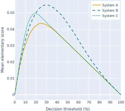
Figure 11 shows a Murphy diagram for the synthetic experiment of Section 4 using the distribution . Note that the Murphy curve for System A always lies on or beneath the other Murphy curves, and so has the best predictive performance irrespective of the choice of proper scoring rule. This is consistent with the fact that, by construction, System A issues ideal forecasts whilst System B over-predicts and System C under-predicts. The predictive dominance of System A cannot be deduced from the performance diagram of Fig. 4. The Murphy curves for Systems A and C coincide for decision thresholds exceeding 50% because neither forecast system predicts probabilities exceeding 0.5 in this particular synthetic experiment.
Murphy Diagram differences
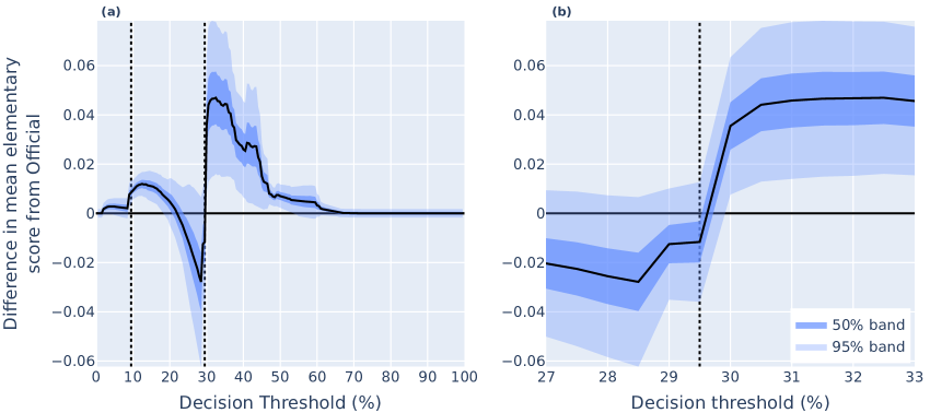
To understand the difference in performance between two forecast systems, we take the difference in elementary scores between forecast systems and calculate confidence intervals using the Hering and Genton, (2011) modification of the Diebold–Mariano test statistic (Diebold and Mariano,, 1995) (Fig. 12). The Diebold–Mariano test statistic has advantages over many other methods for comparing two forecasts as it accounts for both serial and contemporaneous temporal correlation, and forecast errors can be non-Gaussian. Spatial means of the difference in the elementary score are taken before calculating the test statistic to account for any spatial correlation.

The difference in Murphy curves clearly highlights the difference in performance between Official and AutoFcst for each decision threshold. Meteorologists focus closely on thresholds 9.5% and 29.5% and the improvements that they made over AutoFcst at the 9.5% decision threshold were statistically significant at the 2.5% level. The improvements are not statistically significant for the 29.5% decision threshold, but are for decision thresholds between 30% to 53%. This is likely because clipping the maximum DailyPoTS value to be 29% when “possible” is forecast on the thunderstorm outlooks improves the forecast, while increasing the DailyPoTS to 30% when DailyPoP exceeds 34% acts against these improvements at the 29.5% decision threshold.
CORP reliability diagrams
Reliability diagrams, sometimes presented in the form of an attributes diagram (Hsu and Murphy,, 1986), are regularly used to visualize calibration across threshold probabilities. As noted above, Dimitriadis et al., (2021) illustrated that traditional approaches to creating reliability diagrams are sensitive to the choice of bins and that the use of the CORP (isotonic regression) approach addresses this binning issue. We produce CORP reliability diagrams for lead day 1 forecasts with 95% confidence bands generated using circular block bootstrapping from 1000 resamples (Fig. 13). A histogram of forecast frequency using 10 equidistant bins is displayed on the reliability diagrams. Note that these forecast frequency bins are not the same as the bins used to create the reliability curves.

Fig. 13 shows that all forecast systems have a general overforecast bias across most thresholds. However, CalTS-New has a smaller overforecast bias than AutoFcst. When comparing the histograms between Official and AutoFcst, the [30%, 40%) bin count is much higher for Official than AutoFcst. This is due to operational meteorologists increasing the DailyPoTS value to exactly 30% over most of the water tropics area when both the DailyPoP exceeds 34% and the thunderstorm outlook category is “possible”. Operational meteorologists also reduced the over-forecast bias of AutoFcst, for probabilities above 30% and below 60%. This was likely due to DailyPoTS being clipped to have a maximum value of either 29 or 30% whenever “possible” was the forecast category on the thunderstorm outlooks. These results highlight that there is the opportunity for meteorologists to update their standard “grid editing” procedures and for forecast system developers to continue to work to improve calibration.
Measures of discrimination
While understanding the reliability or calibration of the forecasts is important, it is also worth investigating discrimination ability. This is because even perfectly calibrated forecasts, such as the best constant value forecast, may show little or no ability to discriminate between events and non-events. The component of the CORP decomposition is a measure of discrimination ability. Another measure of discrimination ability is the receiver operating characteristic (ROC) curve, which has been commonly displayed alongside reliability diagrams. ROC curves are produced by calculating the hit rate (probability of detection) and the false alarm rate (probability of false detection) by converting the probability forecast into a binary forecast for a set of increasing threshold probabilities, where , , , and denote the number of hits, misses, false alarms and correct negatives. ROC curves reflect the “potential predictive ability” of the forecasts if they were to be perfectly re-calibrated (Wilks,, 2011).
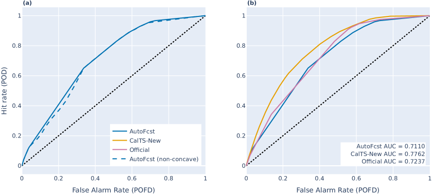
It has been highlighted that ROC curves should be concave, but rarely are with empirical data (Pesce et al.,, 2010; Gneiting and Vogel,, 2022). This is because assessing discrimination (or potential predictive performance) relies on the assumption that higher forecast probabilities mean higher event probabilities. Since potential predictive performance does not rely on calibration, one can produce concave ROC curves by applying a conditional bias correction via isotonic regression based on the PAV algorithm (Fawcett and Niculescu-Mizil,, 2007). Visually this corresponds to taking the convex hull of the ROC curve. An example of the difference between concave and non-concave ROC curves is shown in Fig. 14a.
Often the area under the ROC curve (AUC) is calculated. The AUC is a measure of potential predictive ability with a value of 1 indicating perfect discrimination ability and a value of 0.5 indicating no discrimination ability. It is worth highlighting, that despite AUC sometimes being used in the literature as an overall performance measure (Hand and Anagnostopoulos,, 2013), this can be misleading since it is only a measure of potential predictive performance (Hand,, 2009; Hand and Anagnostopoulos,, 2023) and ignores forecast (mis)calibration. However, since AUC is a measure of potential predictability it may be a useful tool in understanding the differences in potential performance between forecast systems if meteorologists or system developers recalibrate the forecast.
Fig. 14b shows concave ROC curves for the three thunderstorm forecasts. CalTS-New clearly has the highest AUC, while Official has a slightly higher AUC than AutoFcst, with their ROC curves crossing several times. The ranking of discrimination ability based on AUC is consistent with the ranking of discrimination ability at lead day one based on the component in Fig. 2b and 2c. These results suggest that if meteorologists were to bias-correct automated thunderstorm forecasts, it would be better if CalTS-New was adopted rather than CalTS, since CalTS-New has the highest potential predictive ability.
By using Theorems 2 and 3 in Dimitriadis et al., (2023), it can be inferred that the ranking of two forecast systems by discrimination ability based on or AUC (based on a concave ROC curve) must be consistent if the Murphy curves (or ROC curves) for two forecast systems do not intersect each other, but there is no guarantee otherwise. Consistent with this, Hand, (2009) highlights that AUC can give potentially misleading results if the ROC curves do cross. Furthermore, Hand, (2009) highlights that when attempting to express AUC as a scoring rule in the form of Eq. 6, the mixing measure is dependent on the forecast data, and hence on the forecast system being evaluated. Consequently there is no nice relationship between AUC and DSC prior to knowledge of the forecasts.
AUC and then answer two slightly different questions. For a sequence of forecast-observation pairs, the AUC is the probability that a random event taken from that sequence had a higher probability predicted by the forecast system than the predicted probability of a random non-event taken from the sequence. It is independent of the choice of scoring rule . , on the other hand, does depend on the choice of and is interpreted as the amount that the recalibrated forecast improves the mean score over the best constant reference forecast. This implies that if has been chosen, DSC may be more appealing.
6 The triptych approach for verification of probability forecasts of binary outcomes
Categorical performance diagrams were designed to convey multiple verification measures on one diagram for assessment and diagnostic purposes. An alternative approach, which avoids the inferential pitfalls associated with CSI, is the triptych approach of Dimitriadis et al., (2023). With three diagrams, the reliability, discrimination ability, and overall performance and value is diagnosed for each forecast system.
Murphy Diagrams
Murphy diagrams (Hernández-Orallo et al.,, 2011; Ehm et al.,, 2016) are a sound diagnostic for visualizing predictive performance of probability forecasts as a function of user decision threshold since, unlike the CSI used in performance diagrams, they are based on proper scoring rules. In the first half of this subsection, the theory that justifies the use of Murphy diagrams will be presented. The second half will provide illustrative examples from Bureau forecast systems and the synthetic experiment of Section 4.
As noted above, there are many proper scoring rules for probabilistic forecasts of binary outcomes. Subject to technical conditions, Savage, (1971) essentially showed that each such proper scoring rule admits a representation of the form
| (5) |
where is the probability forecast in the unit interval , is the binary outcome in and the function is convex on the interval with subgradient . A function is convex if a straight line between any two points on its graph remains on or above the graph (e.g., and are convex on , while is not). A subgradient is a generalization of the classical derivative for convex functions, and equals the derivative whenever the derivative exists. The Brier score arises when and the logarithmic score when .
Later, Schervish, (1989) (see also Ehm et al., (2016)) showed that, subject to technical conditions, each proper scoring rule admits a mixture representation of the form
| (6) |
where is a non-negative measure and for each in the scoring function is given by
| (7) |
In the following, we explain that the parameter can be interpreted as a decision threshold, the score as the economic loss for a user with that threshold, and the measure as a weighting to apply across all decision thresholds to recover the overall score .
The scoring function essentially assigns a penalty, proportional to the distance from the decision threshold to the observation , whenever the forecast and observation lie on different sides of the decision threshold . Otherwise no penalty is given. As shown by Ehm et al., (2016), the score is proportional to the economic loss of a user with decision threshold who takes action based on the forecast within the classical cost–loss decision model with cost–loss ratio (c.f. Richardson,, 2000). Importantly, is actually a proper scoring rule, as can be checked by substituting the convex function into Eq. (5) to recover . Since Eq. (6) shows that each proper scoring rule can be represented as an integral of scoring functions , each is called an elementary scoring function. Moreover, Eq. (6) has the following interpretation: the score is the economic regret averaged over all user decision thresholds , weighted by the measure .
The measure is related to the convex function of Eq. (5) via . For the Brier score, is uniform (i.e., ) and for the logarithmic score the density of is proportional to . Hence the Brier score can be interpreted as a proper scoring rule that weights all decision thresholds equally. On the other hand, the logarithmic score places immense emphasis on decisions thresholds extremely close to 0 or 1 and downplays predictive performance for decision thresholds in the middling probabilities.
The Murphy diagram (Ehm et al.,, 2016) for a set of forecast–observation pairs is a plot of the mean elementary scores against decision threshold , where
A lower curve is better. The area under the plotted curve is the mean Brier score. If the mean elementary scores for two forecast systems are plotted on the same diagram, and if one curve always lies beneath the other, then it follows from Eq. (6) that the forecast system with the lower curve outperforms the other system for every proper scoring rule . On the other hand, if the curves cross, then it is possible to construct two proper scoring rules that rank their performance differently (c.f. Merkle and Steyvers,, 2013) via judicious choice of measures .
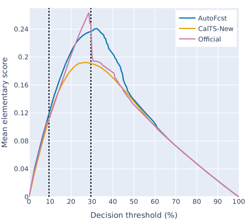
Fig. 10 shows Murphy diagrams for lead day 1 thunderstorm forecasts. Interestingly, the difference in performance between Official and AutoFcst varies greatly across some user decision thresholds. For user decision thresholds between 22% and 29%, the Official performance was worse than AutoFcst, while AutoFcst performed worse (or similar) for other decision thresholds. Since we have this interesting variation in performance across decision thresholds, one can easily see how different scoring rules may rank the performance of Official and AutoFcst differently depending on the measure in Eq. 6. The spike in mean elementary score for Official forecasts occurs at the 28% decision threshold and occurs due to meteorologists regularly clipping maximum probability of thunderstorm performance to be less than 30%. This has the impact of improving the forecast performance for users who care about decision thresholds of at least 30%, but degrading the forecast performance for users who make decisions for thresholds just below 30%.

Figure 11 shows a Murphy diagram for the synthetic experiment of Section 4 using the distribution . Note that the Murphy curve for System A always lies on or beneath the other Murphy curves, and so has the best predictive performance irrespective of the choice of proper scoring rule. This is consistent with the fact that, by construction, System A issues ideal forecasts whilst System B over-predicts and System C under-predicts. The predictive dominance of System A cannot be deduced from the performance diagram of Fig. 4. The Murphy curves for Systems A and C coincide for decision thresholds exceeding 50% because neither forecast system predicts probabilities exceeding 0.5 in this particular synthetic experiment.
Murphy Diagram differences
To understand the difference in performance between two forecast systems, we take the difference in elementary scores between forecast systems and calculate confidence intervals using the Hering and Genton, (2011) modification of the Diebold–Mariano test statistic (Diebold and Mariano,, 1995) (Fig. 12). The Diebold–Mariano test statistic has advantages over many other methods for comparing two forecasts as it accounts for both serial and contemporaneous temporal correlation, and forecast errors can be non-Gaussian. Spatial means of the difference in the elementary score are taken before calculating the test statistic to account for any spatial correlation.
The difference in Murphy curves clearly highlights the difference in performance between Official and AutoFcst for each decision threshold. Meteorologists focus closely on thresholds 9.5% and 29.5% and the improvements that they made over AutoFcst at the 9.5% decision threshold were statistically significant at the 2.5% level. The improvements are not statistically significant for the 29.5% decision threshold, but are for decision thresholds between 30% to 53%. This is likely because clipping the maximum DailyPoTS value to be 29% when “possible” is forecast on the thunderstorm outlooks improves the forecast, while increasing the DailyPoTS to 30% when DailyPoP exceeds 34% acts against these improvements at the 29.5% decision threshold.
CORP reliability diagrams
Reliability diagrams, sometimes presented in the form of an attributes diagram (Hsu and Murphy,, 1986), are regularly used to visualize calibration across threshold probabilities. As noted above, Dimitriadis et al., (2021) illustrated that traditional approaches to creating reliability diagrams are sensitive to the choice of bins and that the use of the CORP (isotonic regression) approach addresses this binning issue. We produce CORP reliability diagrams for lead day 1 forecasts with 95% confidence bands generated using circular block bootstrapping from 1000 resamples (Fig. 13). A histogram of forecast frequency using 10 equidistant bins is displayed on the reliability diagrams. Note that these forecast frequency bins are not the same as the bins used to create the reliability curves.
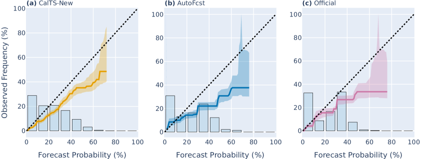
Fig. 13 shows that all forecast systems have a general overforecast bias across most thresholds. However, CalTS-New has a smaller overforecast bias than AutoFcst. When comparing the histograms between Official and AutoFcst, the [30%, 40%) bin count is much higher for Official than AutoFcst. This is due to operational meteorologists increasing the DailyPoTS value to exactly 30% over most of the water tropics area when both the DailyPoP exceeds 34% and the thunderstorm outlook category is “possible”. Operational meteorologists also reduced the over-forecast bias of AutoFcst, for probabilities above 30% and below 60%. This was likely due to DailyPoTS being clipped to have a maximum value of either 29 or 30% whenever “possible” was the forecast category on the thunderstorm outlooks. These results highlight that there is the opportunity for meteorologists to update their standard “grid editing” procedures and for forecast system developers to continue to work to improve calibration.
Measures of discrimination
While understanding the reliability or calibration of the forecasts is important, it is also worth investigating discrimination ability. This is because even perfectly calibrated forecasts, such as the best constant value forecast, may show little or no ability to discriminate between events and non-events. The component of the CORP decomposition is a measure of discrimination ability. Another measure of discrimination ability is the receiver operating characteristic (ROC) curve, which has been commonly displayed alongside reliability diagrams. ROC curves are produced by calculating the hit rate (probability of detection) and the false alarm rate (probability of false detection) by converting the probability forecast into a binary forecast for a set of increasing threshold probabilities, where , , , and denote the number of hits, misses, false alarms and correct negatives. ROC curves reflect the “potential predictive ability” of the forecasts if they were to be perfectly re-calibrated (Wilks,, 2011).
It has been highlighted that ROC curves should be concave, but rarely are with empirical data (Pesce et al.,, 2010; Gneiting and Vogel,, 2022). This is because assessing discrimination (or potential predictive performance) relies on the assumption that higher forecast probabilities mean higher event probabilities. Since potential predictive performance does not rely on calibration, one can produce concave ROC curves by applying a conditional bias correction via isotonic regression based on the PAV algorithm (Fawcett and Niculescu-Mizil,, 2007). Visually this corresponds to taking the convex hull of the ROC curve. An example of the difference between concave and non-concave ROC curves is shown in Fig. 14a.

Often the area under the ROC curve (AUC) is calculated. The AUC is a measure of potential predictive ability with a value of 1 indicating perfect discrimination ability and a value of 0.5 indicating no discrimination ability. It is worth highlighting, that despite AUC sometimes being used in the literature as an overall performance measure (Hand and Anagnostopoulos,, 2013), this can be misleading since it is only a measure of potential predictive performance (Hand,, 2009; Hand and Anagnostopoulos,, 2023) and ignores forecast (mis)calibration. However, since AUC is a measure of potential predictability it may be a useful tool in understanding the differences in potential performance between forecast systems if meteorologists or system developers recalibrate the forecast.
Fig. 14b shows concave ROC curves for the three thunderstorm forecasts. CalTS-New clearly has the highest AUC, while Official has a slightly higher AUC than AutoFcst, with their ROC curves crossing several times. The ranking of discrimination ability based on AUC is consistent with the ranking of discrimination ability at lead day one based on the component in Fig. 2b and 2c. These results suggest that if meteorologists were to bias-correct automated thunderstorm forecasts, it would be better if CalTS-New was adopted rather than CalTS, since CalTS-New has the highest potential predictive ability.
By using Theorems 2 and 3 in Dimitriadis et al., (2023), it can be inferred that the ranking of two forecast systems by discrimination ability based on or AUC (based on a concave ROC curve) must be consistent if the Murphy curves (or ROC curves) for two forecast systems do not intersect each other, but there is no guarantee otherwise. Consistent with this, Hand, (2009) highlights that AUC can give potentially misleading results if the ROC curves do cross. Furthermore, Hand, (2009) highlights that when attempting to express AUC as a scoring rule in the form of Eq. 6, the mixing measure is dependent on the forecast data, and hence on the forecast system being evaluated. Consequently there is no nice relationship between AUC and DSC prior to knowledge of the forecasts.
AUC and then answer two slightly different questions. For a sequence of forecast-observation pairs, the AUC is the probability that a random event taken from that sequence had a higher probability predicted by the forecast system than the predicted probability of a random non-event taken from the sequence. It is independent of the choice of scoring rule . , on the other hand, does depend on the choice of and is interpreted as the amount that the recalibrated forecast improves the mean score over the best constant reference forecast. This implies that if has been chosen, DSC may be more appealing.
7 Evaluation of categorical thunderstorm outlooks using the FIRM score
As well as producing probabilistic thunderstorm forecast grids, the Bureau issues categorical thunderstorm outlooks as described in Section 2. In this section, we demonstrate how categorical forecasts can be compared against probability forecasts using proper scoring rules.
Recall that Bureau categorical thunderstorm outlooks have three categories (nil thunderstorm, thunderstorm possible, thunderstorm likely) defined using the probability bins , and . In this case, there is a mapping from a probability forecast to a categorical forecast, and the important feature for measuring forecast accuracy is the predictive performance for the two categorical thresholds and . In this context, a categorical threshold can also be interpreted as a decision threshold, since the threshold determines what action to take (i.e. which forecast category to issue). By taking the mixing measure of Eq. (6) to be positive point mass with weights and concentrated on decision thresholds and , one obtains the proper scoring rule
| (8) |
where is the forecast probability and is the observation. A lower score is better. The mean score is the weighted sum of the Murphy curve values at the thresholds and . We call the scoring rule of Eq. (8) the FIRM score, since it is a special case of the FIRM scoring framework introduced by Taggart et al., (2022). The scoring rule of Eq. (8) can be re-expressed as a scoring matrix for categorical forecasts, as shown in Table 2. This provides a fair way to compare predictive performance of probability forecasts with categorical forecasts using proper scoring rules.
.
| Forecast category | Observed non-event | Observed event |
|---|---|---|
| Nil thunderstorm | 0 | |
| Thunderstorm possible | ||
| Thunderstorm likely | 0 |
For a graphical interpretation of the FIRM score, one can look at the points on the Murphy diagram that correspond to each threshold . For example, looking at the lead day 1 performance in Figs. 10 and 12 for the three category case where (9.5%) and (29.5%), the ranking of Official and AutoFcst against each other will depend on the choice of weights . However, if instead and , then Official will have performed better than AutoFcst based on the FIRM score irrespective of the choice of weights .
TS outlook results
While the Bureau’s lead day 1 categorical thunderstorm outlooks were produced manually by the TSHR team, they could in theory be automatically generated from the AutoFcst or CalTS-New probabilistic forecasts. To assess how each of these system’s outlooks would compare with the TSHR team’s outlooks, we calculate the difference between mean FIRM scores, using equal weights () for both categorical decision thresholds of 9.5% and 29.5%. We also generate 95% confidence intervals using the Diebold–Mariano test statistic. Table 3 presents the difference in mean FIRM scores for the TSHR thunderstorm outlooks and one of the other probabilistic forecast systems. Consequently, negative values in this table indicate that TSHR team outlooks have higher performance compared to the other forecast systems, while the positive values indicate the opposite.
| Forecast | Forecast | 95% Confidence intervals () | |
|---|---|---|---|
| TSHR team | Official | -57.10 | (-74.67, -39.53) |
| AutoFcst | -53.79 | (-71.24, -36.34) | |
| CalTS-New | 1.25 | (-14.96, 17.47) |
The difference in mean FIRM scores show that the performance of the TSHR team is higher than that of both AutoFcst and Official. However, the difference between FIRM scores between the TSHR team and CalTS-New is marginal. In fact, CalTS-New outperforms both Official and AutoFcst as measured by this FIRM score, as can be seen from the Murphy diagrams presented in Figs. 10 and 12 when considering decision thresholds of 9.5% and particularly 29.5%.
8 Miscalibration-Discrimination decomposition of the FIRM scores
Previously we constructed miscalibration–discrimination diagrams based on the Brier score, which weights all user decision thresholds equally (Fig. 2). However, if we care primarily about the thresholds 9.5 and 29.5%, then for our three forecast systems it is possible to perform the CORP decomposition (Eq. 1) where is the FIRM score (Eq. 8) with , , and . To visualize these components, we plot them on a miscalibration–discrimination diagram in Fig. 15.
CalTS-New has the lowest mean FIRM score, just as it also had the lowest mean Brier score. However, as noted previously, the ranking of forecast performance may depend on the choice of proper scoring rule, or equivalently on the choice of mixing measure in Eq. 6. This can be observed when comparing Official with AutoFcst at lead day 1. When is the Brier score (where places equal weight on all decision thresholds), Official performed better than AutoFcst (Fig. 2), while when is the FIRM score (where concentrates equal weight on two thresholds only), AutoFcst performs marginally better than Official (Fig. 15).
CalTS-New has superior calibration based on the MCB component regardless of whether is the Brier or FIRM score. However, AutoFcst has a lower (better) MCB value than Official when is the FIRM score, while the opposite is true when is the Brier score. The differences in the MCB component between AutoFcst and Official are not statistically significant, but the point remains that the choice of scoring rule impacts the ranking of forecast reliability based on the MCB component. It is also possible for the ranking of discrimination ability to change based on the choice of FIRM score or Brier score for when calculating the DSC component. This was observed when the analysis was repeated for other parts of Australia (not shown). This implies that it is important to consider the choice of scoring rule through the construction of , so that measures of performance, calibration, and discrimination align with how users utilize the forecasts.
9 Conclusions
Over the last decade there have been substantial theoretical and practical advances for diagnosing the quality of probabilistic forecasts for binary outcomes (probabilistic classifiers). Some of these have provided significant upgrades to tools such as reliability diagrams, while others have added new items (e.g. Murphy diagrams) to the toolkit. The application of isotonic regression for the recalibration of forecasts has given rise to stable reliability diagrams, the CORP decomposition of mean scores into miscalibration, discrimination and uncertainty components (Dimitriadis et al.,, 2021), and the production of concave ROC curves and AUC statistics with better diagnostic properties than their traditional counterparts (Fawcett and Niculescu-Mizil,, 2007; Pesce et al.,, 2010; Gneiting and Vogel,, 2022). The representation of proper scores (such as the Brier score) as an integral of elementary scores (Ehm et al.,, 2016) has given rise to diagnostics of predictive performance across the range of probabilistic decision thresholds, an interpretation of overall score as the weighted mean of economic loss over the range of decision thresholds, and a method for proper scoring rule selection given weights on decision thresholds suitable for the application at hand.
In this paper we have showcased these advances specifically for practitioners within the meteorological community by using forecasts from three probabilistic thunderstorm forecast systems at the Australian Bureau of Meteorology. Diagnostic tools illustrated include:
-
1.
miscalibration–discrimination diagrams, which show overall predictive performance as well as overall reliability and discrimination information;
-
2.
Murphy diagrams, which show predictive performance for each probabilistic decision threshold;
-
3.
CORP reliability diagrams, which show calibration of a forecast system at each probabilistic decision threshold, whilst avoiding problems arising from ad hoc binning choices; and
-
4.
concave ROC curves, which provide one particular diagnostic of discrimination.
A common thread in these advancements is that the methods have a sound theoretical basis for probabilistic forecasting, thereby avoiding misguided inferences and forecaster’s dilemmas. This contrasts with so-called categorical performance diagrams, whose diagnostics are not based on proper scoring rules. We demonstrated that some interpretations of categorical performance diagrams that have gained currency within parts of the meteorology community can lead to the incorrect ranking of forecast systems. Such inferential pitfalls should be avoided.
While reliability diagrams, Murphy diagrams and concave ROC curves do not depend on the choice of proper scoring rule, overall ranking of forecasts as well as overall measures of miscalibration and discrimination from the CORP decomposition may depend on that choice. We have emphasized a paradigm where the proper scoring rule is selected by assigning appropriate weights to each probabilistic decision threshold. When equal weights are chosen, the Brier score emerges. For categorical products, like the Bureau’s thunderstorm outlooks, positive weights are only assigned to the categorical thresholds, whereby the FIRM score (Taggart et al.,, 2022) emerges. We demonstrated that the FIRM score provides a fair way of comparing probabilistic and categorical forecasts, and illustrated that forecast rankings can indeed depend on score choice, again emphasizing the importance of appropriate score selection for the task at hand. This paradigm of score selection based on threshold weighting offers opportunities for social science and business research into methods to elicit from forecast users appropriate weights to put on decision thresholds.
Having applied these methods to Bureau thunderstorm forecasts, we have gained actionable insights that can be used to improve the thunderstorm forecast process and quality of its output. For example, we can advise Bureau meteorologists and decision makers which of the forecast systems provides the best starting point for the production of Official probabilistic gridded forecasts, and some simple manual edits that meteorologists can apply to conditionally bias correct that starting point. We can also advise which of the current manual edits appear to be adding value to the product, and which appears to be subtracting value. By identifying the highest performing recalibrated forecast system, as measured by the FIRM score, we can also make recommendations regarding the best starting point for the categorical thunderstorm outlook, and which (uncalibrated) thresholds to use to make those categorical forecasts.
Apart from ROC curves, the methods and diagnostic tools recommended in this paper can also be applied to other types of single-valued forecasts, such as quantile forecasts (e.g. 90th percentile of precipitation in millimeters) and mean-value forecasts (e.g. expected temperature in degrees Celsius). We have made an Xarray-based, Python implementation of these methods publicly available at https://github.com/nci/scores. These methods can be used by the meteorological community for a user-centric approach to evaluate probabilistic and categorical forecasts.
Acknowledgments
We thank Robert Warren, Callum Stuart, Elizabeth Ebert, Ryan Holmes, and Deryn Griffiths from the Bureau of Meteorology for providing constructive feedback on earlier drafts of this manuscript. We are also grateful to Robert Warren for providing us with climatological lightning data and forecast data from the new research version of Calibrated Thunder.
Appendix
Details of the synthetic experiments referred to in Section 4 are as follows. Note that for each beta distribution , the expected relative frequency of an event is precisely the expected value of the distribution, namely .
In each experiment with fixed beta distribution, 10000 forecast cases are generated, with forecast values for System A selected from the beta distribution and observed binary outcomes generated with . For each forecast system, CSI values are calculated using threshold probabilities , and then the mean CSI computed. Mean Brier scores for each system are also computed for the 10000 forecast cases. Fig. 4 shows a categorical performance diagram with results for Systems A and B for one experiment (10000 forecast cases) when the distribution is . Each such experiment is repeated 1000 times. Table 1 presents the differences in mean Brier score and mean CSI (which are calculated by taking the mean of those differences across the 1000 experiments) and their 95% confidence intervals (which are calculated by taking the taking 0.025 and 0.975 quantiles of those those differences across the 1000 experiments).
References
- Ayer et al., (1955) Ayer, M., Brunk, H. D., Ewing, G. M., Reid, W. T., and Silverman, E. (1955). An empirical distribution function for sampling with incomplete information. The annals of mathematical statistics, pages 641–647.
- Brier, (1950) Brier, G. W. (1950). Verification of forecasts expressed in terms of probability. Monthly weather review, 78(1):1–3.
- Bright and Grams, (2009) Bright, D. R. and Grams, J. S. (2009). Short Range Ensemble Forecast (SREF) calibrated thunderstorm probability forecasts: 2007-2008 verification and recent enhancements. In Preprints, 3rd Conf. on Meteorological Applications of Lightning Data, Phoenix, AZ, Amer. Meteor. Soc, volume 6.
- Bright et al., (2005) Bright, D. R., Wandishin, M. S., Jewell, R. E., and Weiss, S. J. (2005). A physically based parameter for lightning prediction and its calibration in ensemble forecasts. In Preprints, Conf. on Meteor. Appl. of Lightning Data, Amer. Meteor. Soc., San Diego, CA, volume 3496, page 30.
- Bröcker, (2012) Bröcker, J. (2012). Estimating reliability and resolution of probability forecasts through decomposition of the empirical score. Climate dynamics, 39:655–667.
- Brown and Buchanan, (2019) Brown, K. and Buchanan, P. (2019). An objective verification system for thunderstorm risk forecasts. Meteorological Applications, 26(1):140–152.
- Brummer and Preez, (2013) Brummer, N. and Preez, J. d. (2013). The PAV algorithm optimizes binary proper scoring rules. arXiv preprint arXiv:1304.2331.
- Brunet et al., (2019) Brunet, D., Sills, D., and Driedger, N. (2019). On the evaluation of probabilistic thunderstorm forecasts and the automated generation of thunderstorm threat areas during Environment Canada Pan Am Science Showcase. Weather and Forecasting, 34(5):1295–1319.
- Charba et al., (2019) Charba, J. P., Samplatsky, F. G., Kochenash, A. J., Shafer, P. E., Ghirardelli, J. E., and Huang, C. (2019). LAMP upgraded convection and total lightning probability and “potential” guidance for the conterminous United States. Weather and Forecasting, 34(5):1519–1545.
- Cintineo et al., (2020) Cintineo, J. L., Pavolonis, M. J., Sieglaff, J. M., Cronce, L., and Brunner, J. (2020). NOAA ProbSevere v2.0—ProbHail, ProbWind, and ProbTor. Weather and Forecasting, 35(4):1523–1543.
- Craven et al., (2018) Craven, J. P., Rudack, D. E., James, R. S., Engle, E., Hamill, T. M., Scallion, S., Shafer, P. E., Wagner, J., Baker, M. N., Wiedenfeld, J. R., et al. (2018). Overview of national blend of models version 3.1. part i: Capabilities and an outlook for future upgrades. In 98th American Meteorological Society Annual Meeting. AMS.
- Dance et al., (2010) Dance, S., Ebert, E., and Scurrah, D. (2010). Thunderstorm strike probability nowcasting. Journal of Atmospheric and Oceanic Technology, 27(1):79–93.
- Diebold and Mariano, (1995) Diebold, F. X. and Mariano, R. S. (1995). Comparing predictive accuracy. Journal of Business & economic statistics, 13:253–263.
- Dimitriadis et al., (2021) Dimitriadis, T., Gneiting, T., and Jordan, A. I. (2021). Stable reliability diagrams for probabilistic classifiers. Proceedings of the National Academy of Sciences, 118(8):e2016191118.
- Dimitriadis et al., (2023) Dimitriadis, T., Gneiting, T., Jordan, A. I., and Vogel, P. (2023). Evaluating probabilistic classifiers: The triptych. arXiv preprint arXiv:2301.10803.
- Ehm et al., (2016) Ehm, W., Gneiting, T., Jordan, A., and Krüger, F. (2016). Of quantiles and expectiles: consistent scoring functions, choquet representations and forecast rankings. Journal of the Royal Statistical Society Series B: Statistical Methodology, 78(3):505–562.
- Fawcett and Niculescu-Mizil, (2007) Fawcett, T. and Niculescu-Mizil, A. (2007). PAV and the ROC convex hull. Machine Learning, 68:97–106.
- Foley and Loveday, (2020) Foley, M. and Loveday, N. (2020). Comparison of single-valued forecasts in a user-oriented framework. Weather and Forecasting, 35(3):1067–1080.
- Gagne et al., (2017) Gagne, D. J., McGovern, A., Haupt, S. E., Sobash, R. A., Williams, J. K., and Xue, M. (2017). Storm-based probabilistic hail forecasting with machine learning applied to convection-allowing ensembles. Weather and forecasting, 32(5):1819–1840.
- Gallo et al., (2022) Gallo, B. T., Wilson, K. A., Choate, J., Knopfmeier, K., Skinner, P., Roberts, B., Heinselman, P., Jirak, I., and Clark, A. J. (2022). Exploring the watch-to-warning space: Experimental outlook performance during the 2019 spring forecasting experiment in NOAA’s Hazardous Weather Testbed. Weather and Forecasting, 37(5):617–637.
- Gneiting, (2011) Gneiting, T. (2011). Making and evaluating point forecasts. Journal of the American Statistical Association, 106(494):746–762.
- Gneiting and Raftery, (2007) Gneiting, T. and Raftery, A. E. (2007). Strictly proper scoring rules, prediction, and estimation. Journal of the American statistical Association, 102(477):359–378.
- Gneiting and Vogel, (2022) Gneiting, T. and Vogel, P. (2022). Receiver operating characteristic (ROC) curves: equivalences, beta model, and minimum distance estimation. Machine learning, 111(6):2147–2159.
- Gneiting et al., (2023) Gneiting, T., Wolffram, D., Resin, J., Kraus, K., Bracher, J., Dimitriadis, T., Hagenmeyer, V., Jordan, A. I., Lerch, S., Phipps, K., et al. (2023). Model diagnostics and forecast evaluation for quantiles. Annual Review of Statistics and Its Application, 10:597–621.
- Good, (1952) Good, I. J. (1952). Rational decisions. Journal of the Royal Statistical Society: Series B (Methodological), 14(1):107–114.
- Griffiths and Jayawardena, (2022) Griffiths, D. and Jayawardena, A. (2022). AutoFcst: A Coherent Set of Forecast Grids. Bureau of Meteorology Research Report.
- Hand, (2009) Hand, D. J. (2009). Measuring classifier performance: a coherent alternative to the area under the ROC curve. Machine learning, 77(1):103–123.
- Hand and Anagnostopoulos, (2013) Hand, D. J. and Anagnostopoulos, C. (2013). When is the area under the receiver operating characteristic curve an appropriate measure of classifier performance? Pattern Recognition Letters, 34(5):492–495.
- Hand and Anagnostopoulos, (2023) Hand, D. J. and Anagnostopoulos, C. (2023). Notes on the H-measure of classifier performance. Advances in Data Analysis and Classification, 17(1):109–124.
- Harrison et al., (2022) Harrison, D. R., Elliott, M. S., Jirak, I. L., and Marsh, P. T. (2022). Utilizing the high-resolution ensemble forecast system to produce calibrated probabilistic thunderstorm guidance. Weather and Forecasting, 37(7):1103–1115.
- Hart, (2019) Hart, T. (2019). The Road Taken: An Account, with Lessons Learned, of a 15 Year Journey in Translating Advances in Science and Technology Into Streamlining the Weather Forecast Process and Enhancing Bureau Services to Australian Community a. Australian Bureau of Meteorology.
- Hering and Genton, (2011) Hering, A. S. and Genton, M. G. (2011). Comparing spatial predictions. Technometrics, 53(4):414–425.
- Hernández-Orallo et al., (2011) Hernández-Orallo, J., Flach, P. A., and Ramirez, C. F. (2011). Brier curves: a new cost-based visualisation of classifier performance. In Icml, pages 585–592.
- Hsu and Murphy, (1986) Hsu, W.-r. and Murphy, A. H. (1986). The attributes diagram a geometrical framework for assessing the quality of probability forecasts. International Journal of Forecasting, 2(3):285–293.
- Jordan et al., (2021) Jordan, A. I., Mühlemann, A., and Ziegel, J. F. (2021). Characterizing the optimal solutions to the isotonic regression problem for identifiable functionals. Annals of the Institute of Statistical Mathematics, pages 1–26.
- Just and Foley, (2020) Just, A. and Foley, M. (2020). Streamlining the graphical forecast process. Journal of Southern Hemisphere Earth Systems Science, 70(1):108–113.
- Laugesen et al., (2023) Laugesen, R., Thyer, M., McInerney, D., and Kavetski, D. (2023). Flexible forecast value metric suitable for a wide range of decisions: application using probabilistic subseasonal streamflow forecasts. Hydrology and Earth System Sciences, 27(4):873–893.
- Lerch et al., (2017) Lerch, S., Thorarinsdottir, T. L., Ravazzolo, F., and Gneiting, T. (2017). Forecaster’s dilemma: extreme events and forecast evaluation. Statistical Science, pages 106–127.
- Loken et al., (2017) Loken, E. D., Clark, A. J., Xue, M., and Kong, F. (2017). Comparison of next-day probabilistic severe weather forecasts from coarse-and fine-resolution CAMs and a convection-allowing ensemble. Weather and Forecasting, 32(4):1403–1421.
- Mason, (1989) Mason, I. (1989). Dependence of the critical success index on sample climate and threshold probability. Aust. Meteor. Mag, 37:75–81.
- Merkle and Steyvers, (2013) Merkle, E. C. and Steyvers, M. (2013). Choosing a strictly proper scoring rule. Decision Analysis, 10(4):292–304.
- Miller et al., (2022) Miller, W. J., Potvin, C. K., Flora, M. L., Gallo, B. T., Wicker, L. J., Jones, T. A., Skinner, P. S., Matilla, B. C., and Knopfmeier, K. H. (2022). Exploring the usefulness of downscaling free forecasts from the Warn-on-Forecast System. Weather and Forecasting, 37(2):181–203.
- Murphy, (1973) Murphy, A. H. (1973). A new vector partition of the probability score. Journal of Applied Meteorology and Climatology, 12(4):595–600.
- Murphy, (1993) Murphy, A. H. (1993). What is a good forecast? an essay on the nature of goodness in weather forecasting. Weather and forecasting, 8(2):281–293.
- Murphy, (1998) Murphy, A. H. (1998). The early history of probability forecasts: Some extensions and clarifications. Weather and forecasting, 13(1):5–15.
- Pesce et al., (2010) Pesce, L. L., Metz, C. E., and Berbaum, K. S. (2010). On the convexity of ROC curves estimated from radiological test results. Academic radiology, 17(8):960–968.
- Price and Foley, (2021) Price, B. and Foley, M. (2021). How thunderstorms appear in weather forecasts. In 24th International Congress on Modelling and Simulation, Sydney, NSW, Australia, 5 to 10 December 2021, pages 456–462.
- Radford and Lackmann, (2023) Radford, J. T. and Lackmann, G. M. (2023). Improving High-Resolution Ensemble Forecast (HREF) system mesoscale snowband forecasts with random forests. Weather and Forecasting, 38(9):1695–1706.
- Richardson, (2000) Richardson, D. S. (2000). Skill and relative economic value of the ECMWF ensemble prediction system. Quarterly Journal of the Royal Meteorological Society, 126(563):649–667.
- Rodwell et al., (2020) Rodwell, M., Hammond, J., Thornton, S., and Richardson, D. (2020). User decisions, and how these could guide developments in probabilistic forecasting. Quarterly Journal of the Royal Meteorological Society, 146(732):3266–3284.
- Roebber, (2009) Roebber, P. J. (2009). Visualizing multiple measures of forecast quality. Weather and Forecasting, 24(2):601–608.
- Rothfusz et al., (2018) Rothfusz, L. P., Schneider, R., Novak, D., Klockow-McClain, K., Gerard, A. E., Karstens, C., Stumpf, G. J., and Smith, T. M. (2018). FACETs: A proposed next-generation paradigm for high-impact weather forecasting. Bulletin of the American Meteorological Society, 99(10):2025–2043.
- Rudlosky, (2015) Rudlosky, S. D. (2015). Evaluating ENTLN performance relative to TRMM/LIS. Journal of Operational Meteorology, 3(2).
- Sandmæl et al., (2023) Sandmæl, T. N., Smith, B. R., Reinhart, A. E., Schick, I. M., Ake, M. C., Madden, J. G., Steeves, R. B., Williams, S. S., Elmore, K. L., and Meyer, T. C. (2023). The tornado probability algorithm: A probabilistic machine learning tornadic circulation detection algorithm. Weather and Forecasting, 38(3):445–466.
- Savage, (1971) Savage, L. J. (1971). Elicitation of personal probabilities and expectations. Journal of the American Statistical Association, 66(336):783–801.
- Schervish, (1989) Schervish, M. J. (1989). A general method for comparing probability assessors. The annals of statistics, 17(4):1856–1879.
- Shuford Jr et al., (1966) Shuford Jr, E. H., Albert, A., and Edward Massengill, H. (1966). Admissible probability measurement procedures. Psychometrika, 31(2):125–145.
- Simon et al., (2018) Simon, T., Fabsic, P., Mayr, G. J., Umlauf, N., and Zeileis, A. (2018). Probabilistic forecasting of thunderstorms in the eastern alps. Monthly Weather Review, 146(9):2999–3009.
- Stephenson et al., (2008) Stephenson, D. B., Coelho, C. A., and Jolliffe, I. T. (2008). Two extra components in the brier score decomposition. Weather and Forecasting, 23(4):752–757.
- Taggart, (2022) Taggart, R. (2022). Evaluation of point forecasts for extreme events using consistent scoring functions. Quarterly Journal of the Royal Meteorological Society, 148(742):306–320.
- Taggart et al., (2022) Taggart, R., Loveday, N., and Griffiths, D. (2022). A scoring framework for tiered warnings and multicategorical forecasts based on fixed risk measures. Quarterly Journal of the Royal Meteorological Society, 148(744):1389–1406.
- Uden et al., (2023) Uden, D. M., Wandishin, M. S., Schlatter, P., and Kraus, M. (2023). Evaluation of probabilistic snow forecasts for winter weather operations at intermountain west airports. Weather and Forecasting.
- Wilks, (1997) Wilks, D. S. (1997). Resampling hypothesis tests for autocorrelated fields. Journal of Climate, 10(1):65–82.
- Wilks, (2011) Wilks, D. S. (2011). Statistical methods in the atmospheric sciences, volume 100. Academic press.
- Winkler and Murphy, (1968) Winkler, R. L. and Murphy, A. H. (1968). “good” probability assessors. Journal of Applied Meteorology and Climatology, 7(5):751–758.