Empirical Validation of a New Data Product from the Interstellar Boundary Explorer Satellite
Abstract
Since 2008, the Interstellar Boundary Explorer (IBEX) satellite has been gathering data on heliospheric energetic neutral atoms (ENAs) while being exposed to various sources of background noise, such as cosmic rays and solar energetic particles. The IBEX mission initially released only a qualified triple-coincidence (qABC) data product, which was designed to provide observations of ENAs free of background contamination. Further measurements revealed that the qABC data was in fact susceptible to contamination, having relatively low ENA counts and high background rates. Recently, the mission team considered releasing a certain qualified double-coincidence (qBC) data product, which has roughly twice the detection rate of the qABC data product. This paper presents a simulation-based validation of the new qBC data product against the already-released qABC data product. The results show that the qBCs can plausibly be said to share the same signal rate as the qABCs up to an average absolute deviation of 3.6%. Visual diagnostics at an orbit, map, and full mission level provide additional confirmation of signal rate coherence across data products. These approaches are generalizable to other scenarios in which one wishes to test whether multiple observations could plausibly be generated by some underlying shared signal.
1 Introduction
In space science there are occasions when it is useful to test whether the data collected by two different instruments, or by different subsystems of the same instrument, represent statistically equivalent samples of the same source population. This is particularly important in situations where the signal-to-noise or signal-to-background level is low, such that it is not straightforward by simple analysis to tell whether the separate observations are equivalent or not. The situation we consider here is that of two separate but concurrent data sets collected by the IBEX-Hi energetic neutral atom (ENA) imager [6] on board the NASA Interstellar Boundary Explorer (IBEX) [15], which studies the outer heliosphere through the remote sensing of ENAs. Recently, we prepared and are in the process of releasing a new ENA data product that complements the standard IBEX-Hi ENA data product. The intent is to combine these two data products into a single data set with higher statistical accuracy than the currently available data set, but this is only reasonable if we can demonstrate that the two data sets are the same within their own intrinsic statistical and systematic uncertainties. This is non-trivial to show because the ENA signal that IBEX measures is very weak, and it is collected in the presence of large backgrounds.
Launched in 2008, IBEX is an ongoing mission to study the outer regions of the heliosphere, in particular, the heliosheath, which is the region where the solar wind interfaces with the plasma of the interstellar medium. In this region, the solar wind is deflected from its outward radial trajectory from the Sun as the interstellar magnetic field exerts an inward pressure on the heliospheric magnetic field. Through charge exchange interactions with cold interstellar neutrals, the deflected solar wind is partially neutralized, and a portion of these neutrals, or ENAs, are able to travel back Sunward. The Earth-orbiting IBEX spacecraft is designed to detect these ENAs as a function of arrival direction and energy, and using this data, all-sky maps of the ENA distribution can be made. IBEX consists of two ENA imagers, IBEX-Lo, which measures ENAs in the energy range of eV to keV [7], and IBEX-Hi, which measures hydrogen ENAs (originally solar wind protons) in the energy range of eV to keV [6]. Here, we consider only the data collected by the IBEX-Hi instrument. IBEX-Hi detects ENAs through use of a triple-coincidence detection method; that is, in the IBEX-Hi detector section, an incoming ENA can trigger three separate detectors within a narrow time window. Specifically, if all three are triggered within 100 ns, an event is registered (see the next section for more details on the data collection method). Although IBEX-Hi is the most sensitive ENA instrument flown to date, because the signal it is detecting is so weak, the typical triple-coincidence ENA count rate is of order 1 count every 20 seconds. Prior to launch, it was expected that even though the signal rate was quite low, the triple-coincidence technique would effectively eliminate any background events. Once in orbit, however, it was found that penetrating radiation was quite effective at producing triple-coincidence events; in fact the penetrating background rate is comparable to the heliospheric ENA rate, making it challenging to extract quality signal.
Recently, we have demonstrated that a certain subset of the double-coincidence events (where only two of the three detectors are triggered) has twice the signal rate as the standard triple-coincidence product, but an only slightly worse signal-to-background ratio. This being such a signal-starved mission, we became motivated to develop the double-coincidence event set into a new IBEX data product, which when combined with the triple-coincidence product, can triple the total ENA signal rate, along with a significant improvement in the signal-to-background ratio. Combining them, however, is not necessarily straightforward. Even though both event types are measured within the same detection system, they have different detection efficiencies, different background levels, and potentially different background sources. Furthermore, the new data product was not well characterized prior to launch during ground calibration, nor has it undergone a decade’s worth of scrutiny and validation as has the workhorse triple-coincidence product. Thus, before combining the two data sets, it is necessary to carefully test whether the new product ”gives the same answer” as the standard one; that is, to within error, are they measuring the same signal? This paper lays out a statistical testing methodology for answering this question, not only showing that they are statistically equivalent to within the anticipated level of error, but also quantifying the degree to which they differ from one another.
Before diving into the details of the IBEX data and the validation methodology, we describe other situations where this method can be applied. Of most similarity to IBEX, the upcoming Interstellar Mapping and Acceleration Probe (IMAP) mission [18] will host three advanced ENA imaging systems, IMAP-Lo, IMAP-Hi (the successors to IBEX-Lo and IBEX-Hi, respectively), and IMAP-Ultra (a near copy of the JENI instrument on the European JUICE mission to Jupiter [19]). As with IBEX-Hi, IMAP-Hi measures heliospheric ENAs using a coincidence method, but now via four detection channels, allowing up to quadruple-coincidence detection. In fact there will be multiple double- and triple-coincidence combinations, that along with the quadruple-coincidence events, are to be combined into a composite signal rate. As with IBEX-Hi, each of these event types will have different detection efficiencies and background rates, and it will be necessary to demonstrate that the individual coincidence combinations are statistically equivalent in order to validate the composite data product. Furthermore, it is the intent to combine the signals from IMAP-Lo and IMAP-Ultra with IMAP-Hi where their energy ranges overlap. Again, it will be necessary to validate that the signal rates from the separate instruments are statistically equivalent before they are combined.
Beyond the specific cases of IBEX and IMAP, there are other domains in which the method presented here can be of great utility. In the arena of solar energetic particle (SEP) observations there are often situations where one would like to know if two data sets are statistically equivalent observations of the same source population. For example, many spacecraft have energetic particle sensors with overlapping energy ranges. In general, to measure keV to few hundred keV particles requires instruments that use vastly different detection techniques than those that measure in the 1 MeV to 100 MeV range, and it is often a challenge to reconcile the measurements in the middle of the spectrum where the energy ranges overlap. The challenges of this sort of comparison are discussed with regard to the EPI-Lo and EPI-Hi energetic particle sensors on Parker Solar Probe [12]. This situation arises with many low- and high-energy pairs of energetic particle instruments, such as ACE/SIS and ACE/CRIS, STEREO/LET and STEREO/HET, and even CRS and LECP on Voyager.
The method presented here can not only be used to test if two data sets provide measurements of the same underlying signal, but it can also be used to rigorously quantify the degree to which the measurements differ. For example, solar energetic particle instruments often have multiple heads looking in different directions. There are situations in which one desires to evaluate the degree of anisotropy of a given SEP event, but such an analysis is complicated by low counting statistics and overlapping fields of view. An extreme example of this is the EPI-Lo instrument which has 80 independent telescopes oriented in different directions [17]. Additionally, there are times when the Sun becomes very active and multiple events are coming off the Sun at the same time. In such instances, it can be difficult to tell whether different spacecraft are seeing the same event or if they are seeing different events, but at the same time. This is yet another case in which the methodology presented here can be applied.
The goal for this paper is to develop and implement a validation protocol for the IBEX-Hi double-coincidence data that can be used to examine the assumption that the triple- and double-coincidence data products share an underlying common ENA signal rate. We will show both visual and quantitative metrics by which this assessment can be done at different time scales, from days to the full mission collection period. We will also discuss how to learn margins of error about model components, e.g., about the double-coincidence background rate, and how to flag certain collection periods as likely deviating from the assumed shared-signal model. The rest of this paper proceeds as follows: in Section 2 we briefly describe how the IBEX-Hi instrument operates and collects data; in Section 3 we show how to validate the double-coincidence data product against the triple-coincidence data product; in Section 4 we show that the double-coincidence data product has been validated against the triple-coincidence data product to within acceptable limits; finally, we discuss these results and their implications in Section 5. These methods can be applied more generally to problems of determining if there is a shared underlying common signal across multiple different datasets.
2 IBEX Data Collection
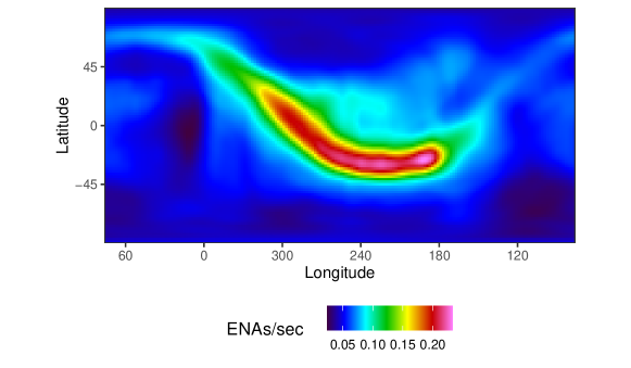
IBEX is a Sun-pointing spinning spacecraft ( rpm) that orbits the Earth with a period of 9.1 days. The IBEX-Hi instrument is a single pixel ENA imager [6] that views perpendicular to the spin axis with a field-of-view of full-width at half-maximum. Twice per orbit, at perigee and apogee, IBEX repoints to maintain Sun pointing. Thus, over the course of days IBEX-Hi collects ENA events from a single slice of the sky that is wide. The data set collected over the course of a single pointing direction is designated by orbit number and by the orbit segment (‘a’ for the ascending arc, and ‘b’ for the descending arc); for example, the data collected in IBEX’s 235th orbit during the ascending arc is labeled ‘Orbit 235a’. Over the course of 6 months, IBEX-Hi views the entire sky as a series of -wide slices arranged by ecliptic longitude. These slices are then assembled into a complete all-sky map of ENA emission. Each map is designated by year and whether it was collected during the first six months (‘A’ maps) or second six months (‘B’ map) of the year; for example, the map from the first half of 2010 is labeled ‘2010A’; an all-sky ENA map for 2010A is shown in Figure 1.
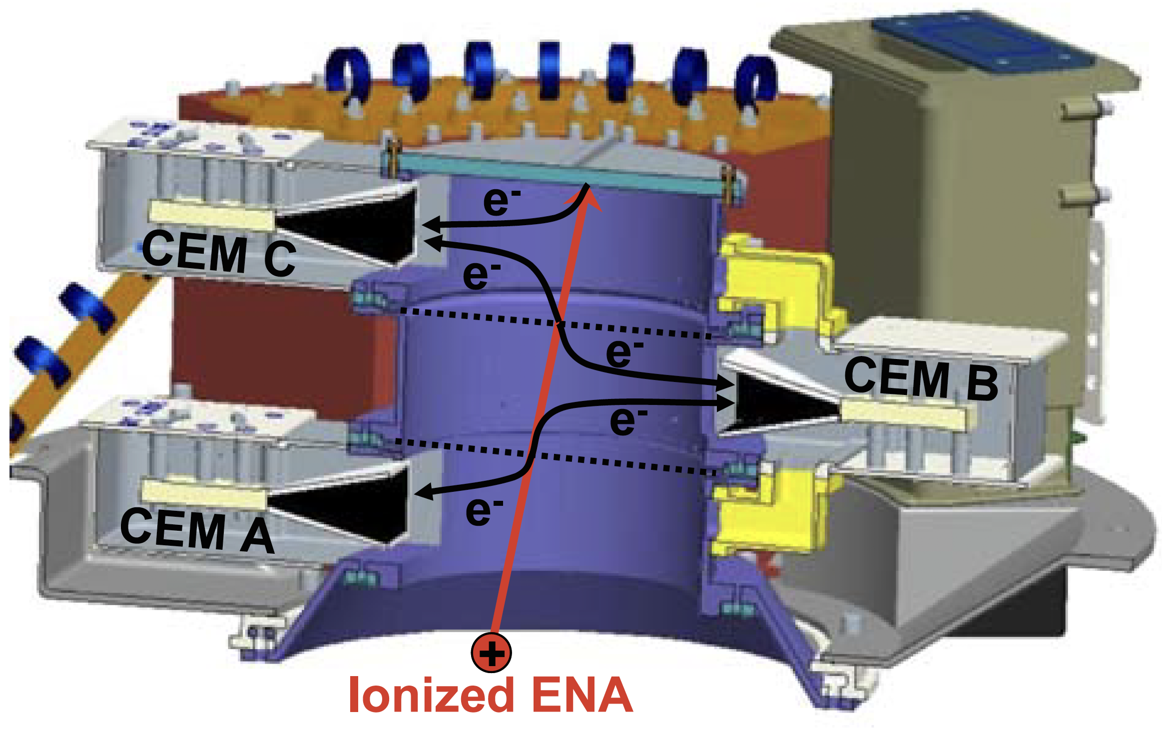
A full description of the IBEX-Hi imager is given in [6]; here, we briefly describe how IBEX-Hi detects hydrogen ENAs with sufficient detail to understand how the instrument detects the two types of ENA events under consideration in this study. ENAs enter the instrument through a large 150 cm2 collection aperture, and for the purpose of measuring the energy of the particles, they are ionized by passing through a thin carbon foil and then enter an electrostatic analyzer (ESA). The ESA is sequentially tuned to allow passage of ionized ENAs in six broad energy passbands () that cover the range to 6 keV. Generally only ESA steps 2 through 6, the passbands centered on 0.71, 1.11, 1.74, 2.73, and 4.29 keV, respectively, are used for scientific analysis. After passage through the ESA, an ionized ENA enters a detector section composed of three stacked chambers (A, B, and C) separated by a pair of thin carbon foils (see Figure 2). An incoming ion passes through the foils and strikes the rear of the detector section, triggering the release of secondary electrons along the way. These electrons are then guided into channel electron multipliers (CEMs) which have some probability of triggering a detection. Each chamber has its own CEM, and thus the CEMs are likewise labeled A, B and C. If all three CEMs are triggered ( this is referred to as an ABC triple-coincidence event. Since it is nearly certain that an incoming ion will trigger CEM A or B before CEM C, only these events are counted as ENA events, and are referred to as qualified-ABCs (qABC) events. If CEM C is triggered first, it is most likely due to penetrating radiation, and is therefore rejected by the qualification scheme. The qABCs have been the principle event type used for heliospheric science throughout the IBEX mission.
More often, only two of the three CEMs are triggered, and these are referred to as double-coincidence events. In general, double coincidences are significantly more susceptible to backgrounds than the qABCs, and so, previously, they have not been used for science. However, it was recently discovered that one double-coincidence event type, a qualified-BC (qBC), where CEM B is triggered at least 3 ns before CEM C, has twice the detection probability of a qABC () and only a slightly higher background rate. It is the qBC event type that we wish to use as a new data product and that we must validate against the qABCs.
Whenever a qABC or qBC detection occurs, a “direct event” datum is created and stored. A direct event includes the event type, the time the event occurred, the direction IBEX’s spin axis was pointing, the look direction (spin phase angle) of IBEX-Hi’s entrance aperture at the instant of detection, and the ESA setting. We will be working with a curated data product called the “binned direct event data”, which are created via a standard binning process in which the direct events are grouped into 360 -look direction bins and five ESA steps111Note the currently released mission data product uses - rather than -look direction bins, but the binning process used is otherwise the same as that used here..
Not all direct events are heliospheric ENAs. Potential sources of background direct events include high-energy penetrating radiation particles, non-heliospheric ENAs (from the Earth or Moon), or other particles local to the spacecraft environment that can trigger coincidence events. For some types of background sources, the contribution to the total event rate can be independently determined from other coincidence combinations, in which case the background rate can be subtracted from the total rate further down the processing chain. For other background sources, either no method has been found to independently determine their rate, or their rate is so high it completely overwhelms the signal. In such cases, those periods are simply excluded. The exposure time for a binned direct event datum refers to the total duration of the time segments that are kept after the culling process.
To summarize, a binned direct event datum refers to a specific bin, ESA setting, and chamber combination (here, qABC or qBC) for a given orbit. It includes information on the IBEX-Hi look direction, the exposure time, the number of measured direct events, an efficiency factor for how well the instrument can detect signal, and a background rate. For a qABC binned direct event datum, the background rate is considered by the IBEX community to be validated. A qBC binned direct event datum has its own background rate that is not yet considered validated and may potentially be biased, particularly at low ESA settings. Although technically estimated with small uncertainties, the efficiency factors and background rates are treated as fixed in this paper. Throughout the paper, the phrase “qABCs” and “qBCs” will be used loosely to mean a collection of qABC or qBC binned direct events (e.g., “the 2012A qABCs” refers to the qABC events from the first 6 months of 2012).
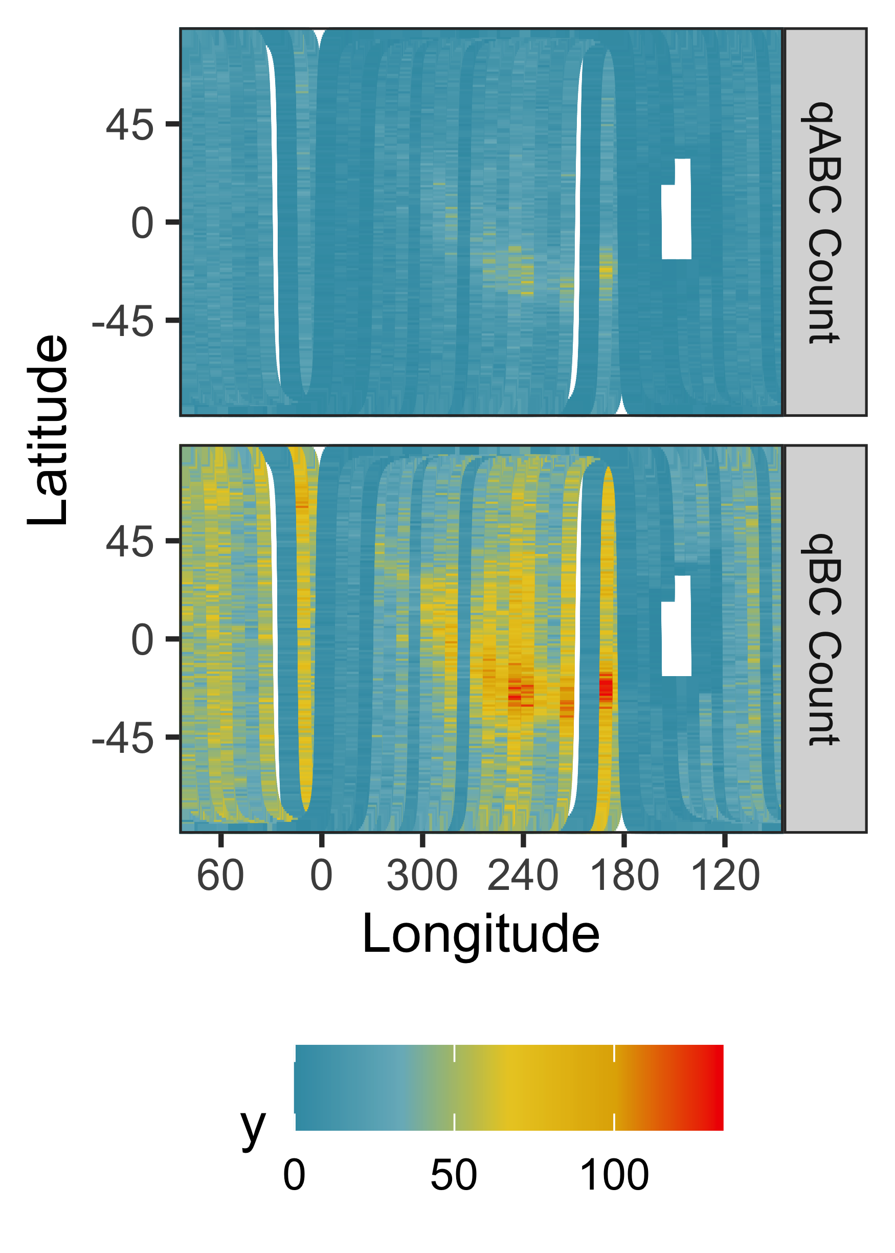
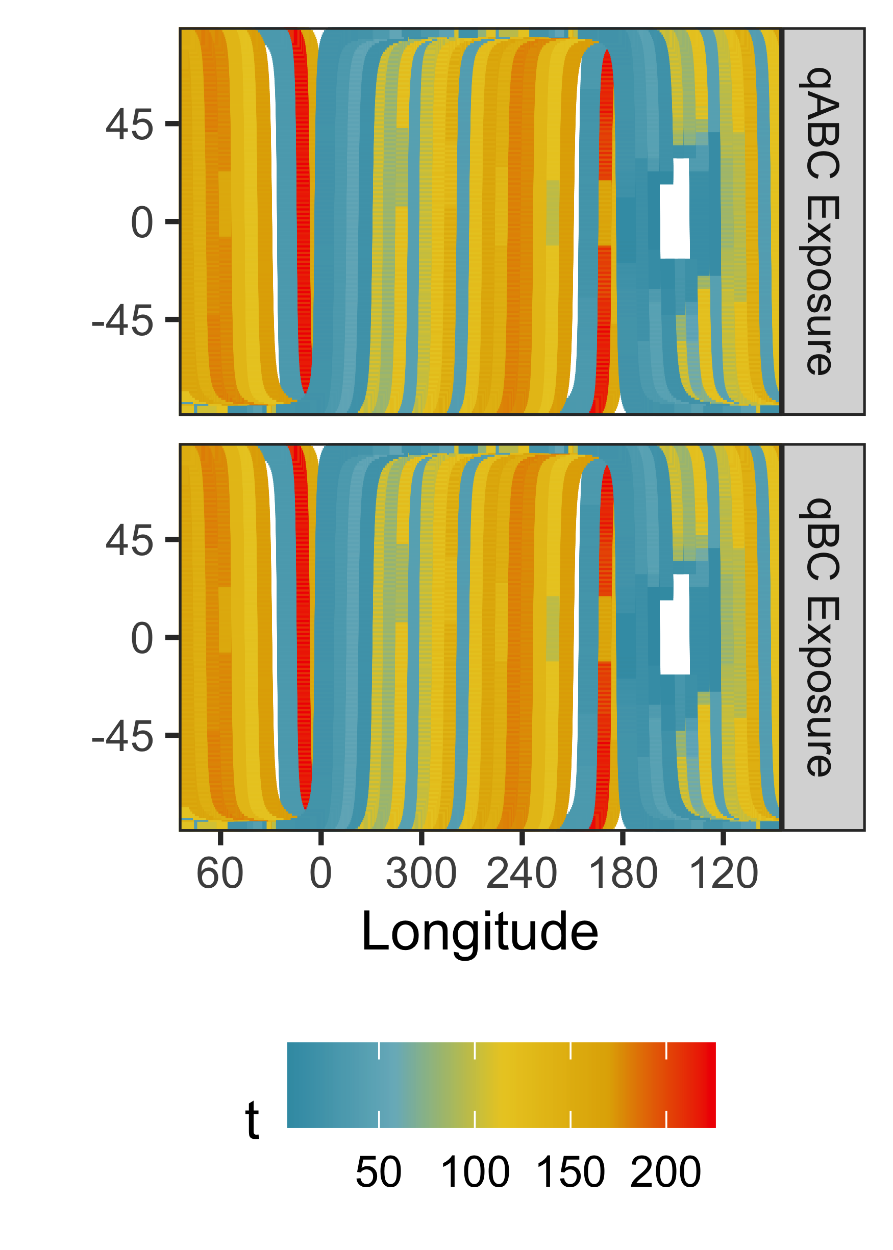
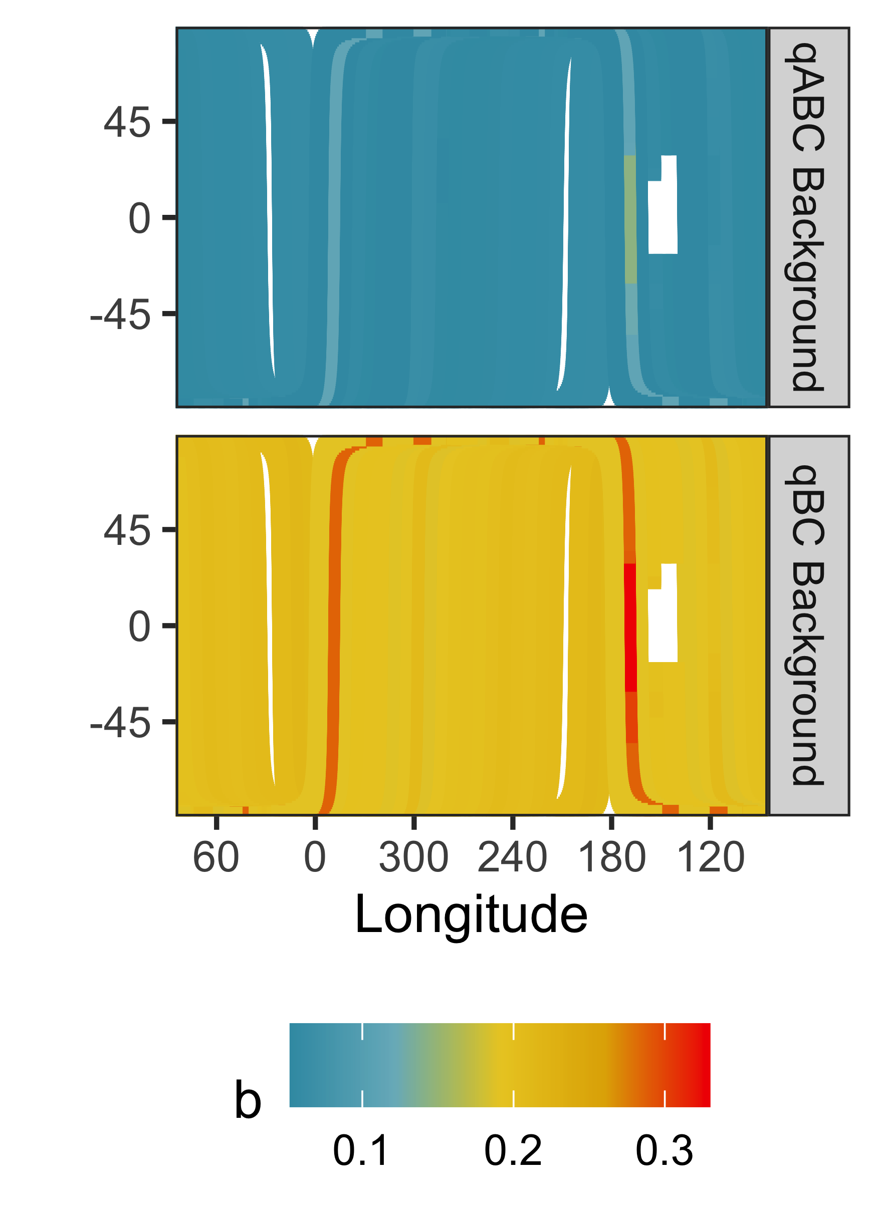
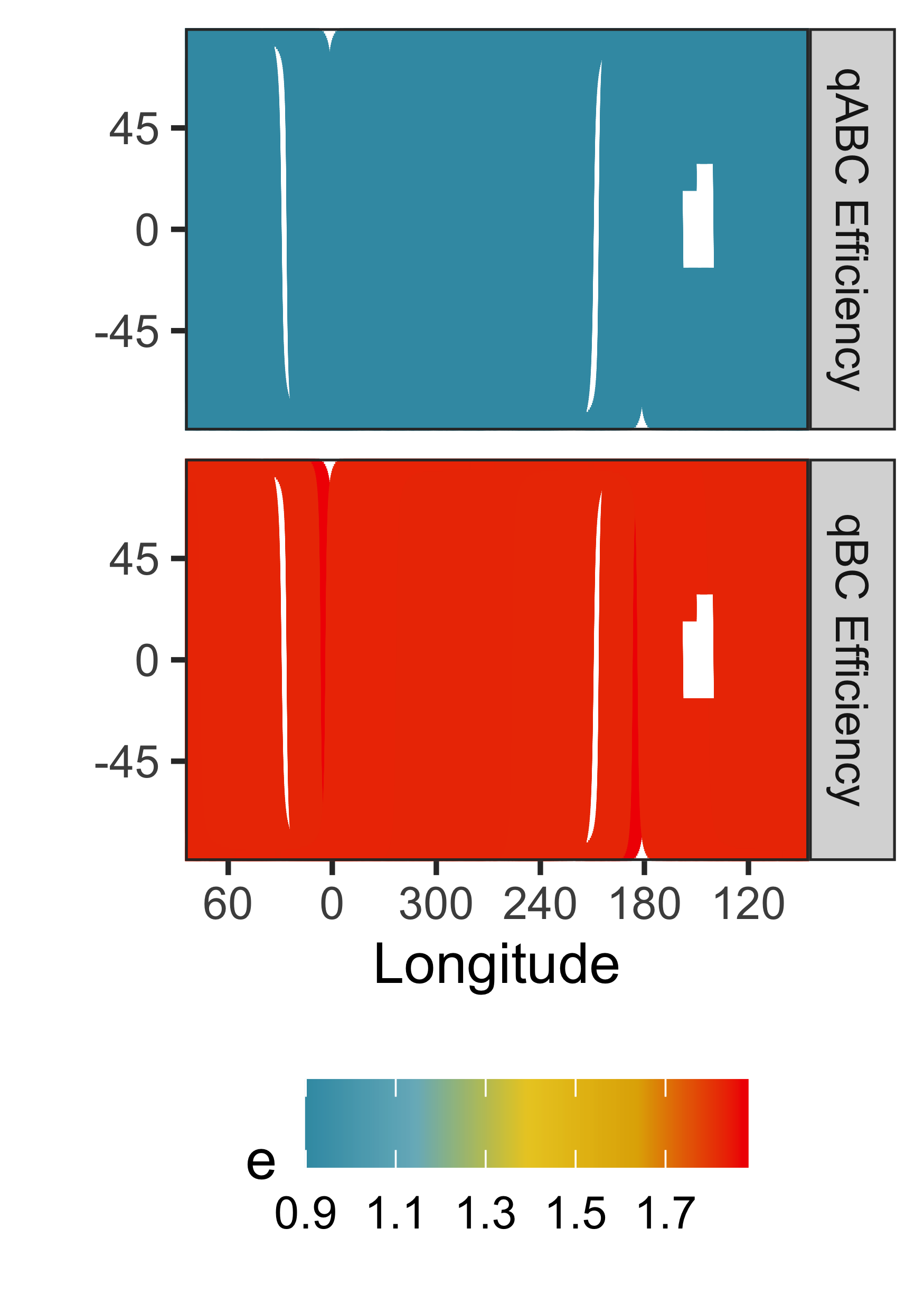
As mentioned above, the qBCs are characterized by higher total ENA counts and efficiency factors, but also higher background rates. The qABCs and qBCs from 2010A at the ESA 3 setting are shown in Figure 3, which displays the number of direct events, the exposure time, background rate, and efficiency factor for each data type. For 2010A, the ENA direct event counts range from 0 to 67 for the qABCs and from 0 to 134 for the qBCs per bin, with the qBCs having 2.8 times more counts than the qABCs. The counts panel depicts a coarse ENA sky map; one can make out a rough version of the ribbon, which was seen more clearly in Figure 1. The exposure time varies depending on the look direction, here varying between 2.4 and 225.5 seconds, with values being the same for the qABCs and qBCs. The number of direct events is positively correlated with exposure time; larger exposure times result in a higher number of recorded direct events. Background rates are typically common across all bins for a given ESA and arc (i.e., half-orbit); here the background rate varies between 0.05 and 0.14 background particles per second for the qABCs, and between 0.19 and 0.33 for the qBCs. On occasion, data gaps appear in the panels, either because data was lost due to spacecraft issues, or because large local background sources were present, making it impossible to extract a statistically useful ENA signal for an entire arc.
3 Methods
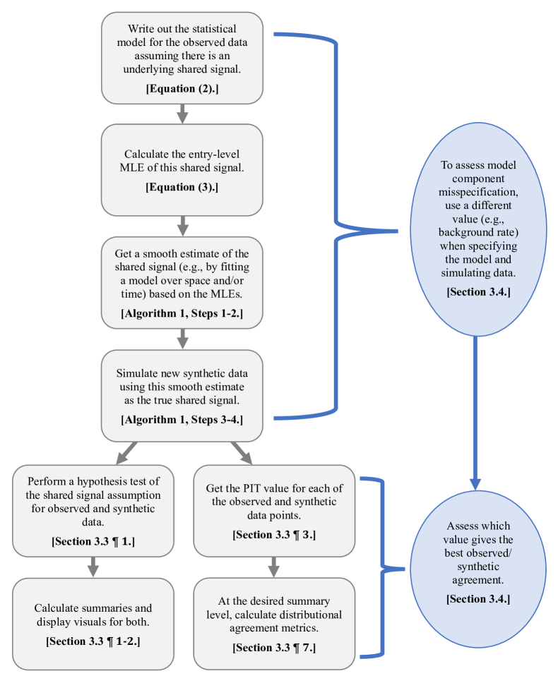
The broad question we are trying to answer is “Could a shared set of underlying ENA signal rates have plausibly generated our sets of observed qABC and qBC binned direct events?” To answer this question, we compare the observed data to a synthetic reference data set for which there are known shared signal rate maps, the generation of which is discussed below. Tools by which we diagnose the alignment between our assumed shared-signal model and reality, discussed in more detail in the following sections, include: visualizations of when, where, and how often the null hypothesis of a shared signal is rejected, the distribution of probability integral transform values associated with the null hypothesis, and an orbit-level metric for measuring and adjusting potential error in the qBC model components assuming the qABC background is specified correctly. A flow chart summarizing the entire validation process, which can be used in applications beyond this one, is shown in Figure 4. We recommend that the reader not familiar with the methods mentioned above stop here and read the hypothesis testing and probability integral transform primers in Sections A and B of the supplemental materials before continuing through the rest of this section.
3.1 Model Formulation
Consider , an observation of a qABC and qBC binned direct event pair from a given IBEX-Hi look direction, ESA setting, and orbit; goes from to , with being the total number of binned direct event data points in the IBEX-Hi data set. We assume independent Poisson distributions for each of and . For let denote exposure times, signal rates, background rates, and let denote the signal efficiency rate. Mission scientists provide a standard deviation about each , and ; we treat the backgrounds and qBC efficiency factors as known during calculations and use these standard deviation as a reference against which to assess whether apparent model deviations are within the bounds of what we would expect based on these given error bounds (see supplemental materials Section C). Intuitively, larger values of , , or (longer exposure time, higher signal rate or background rate) result in larger expected values and variance of (more expected ENA counts, and more variation thereof). Specifically, we model and as:
| (1) |
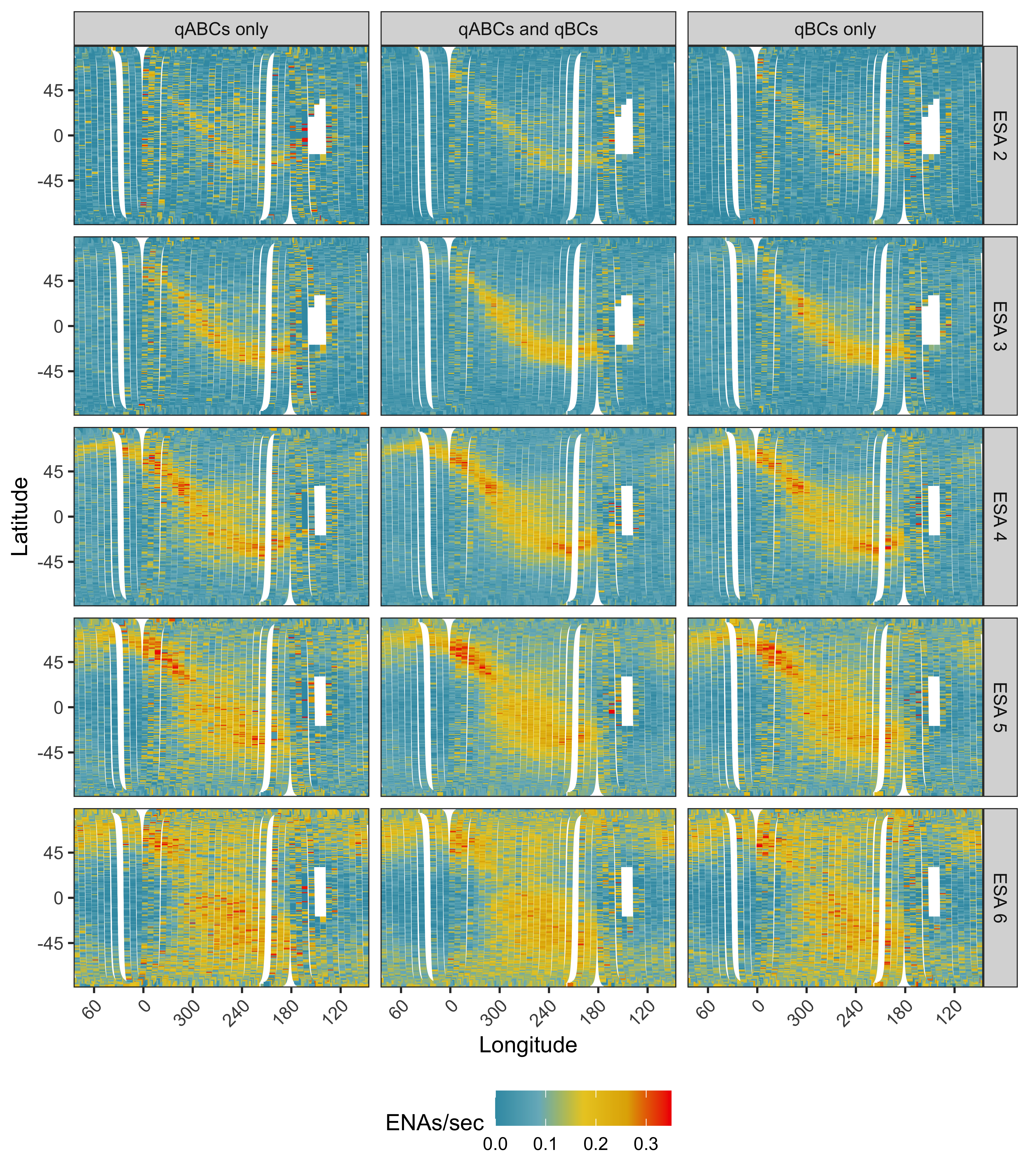
The maximum likelihood estimate (MLE) for the qABC signal rate , denoted by , is . Similarly, the MLE for the qBC signal rate , denoted by , is . Intuitively, the observed counts divided by exposure time minus the background rate gives us an uncorrected estimate of the ENA rate attributable to the signal per unit time. Dividing this number by the efficiency factor gives us the corrected signal rate estimate. Finally, because the signal rate cannot be negative, our MLE is the maximum of 0 and that corrected signal rate estimate. Figure 5 shows the for the 2010A map, the MLEs for the qABC data, in the left column. The for the 2010A map, the MLEs for the qBC data, are shown in the right column.
Mathematically the MLE of the qABC or qBC signal can be found by maximizing its associated likelihood (equivalently, its log likelihood) with respect to , with details following.222Note we drop sub- and superscripts for notational convenience. The log likelihood of the Poisson distribution having mean is
The derivative of is
Setting the derivative to 0 allows us to find the points at which local extrema occur;
is a critical point of the log likelihood. To assess whether a critical point is a local minimum or maximum, we check whether the second derivative is negative or positive. We have
everywhere and everywhere when . Because the second derivative is negative when , the log likelihood is concave in and is a local maximum. When the critical point is negative the constrained MLE will be 0, the closest possible value respecting the nonnegativity constraint, i.e.,
When , is maximized by setting to 0 as well; this is because is negative and 0 is the closest nonnegative value can take.
3.2 Hypothesis Testing and Evaluation
Given the above model formation, we can more precisely rephrase our question for a single count pair as: “Under some shared signal rate , could we have plausibly observed , given , , , , , and ?” This can be framed as a hypothesis test, with
| (2) |
Under the null hypothesis , Equation (1) becomes the null model
| (3) |
The MLE for the shared signal rate , denoted by , is
| (4) |
Figure 5 shows for the 2010A map, the MLEs for the combined data, in the middle column.
The sum of two independent Poisson variables having means and is itself a Poisson with mean . Therefore the proof for the MLE of using the sum as the summary statistic is analogous to that shown in the previous subsection, where the mean of this sum-of-Poissons distribution is .333Specifically, we want to maximize the log likelihood of the Poisson distribution having mean , which is . Its derivative is . Setting the derivative to 0 allows us to find the points at which local extrema occur; is a critical point of the log likelihood. Assessing the sign of the second derivative to ensure the critical value is a maximum then proceeds as shown in the previous subsection. Throughout the rest of the paper we let for denote the expected value of the counts under using the MLE in place of the true . We provide an in depth hypothesis testing primer and additional details of our hypothesis testing framework in Section A of the supplemental materials.
3.3 Visual and quantitative diagnostics
We formally test each pair of points, i.e., designate whether the null hypothesis is rejected for each. We use these binary test results in visual checks for orbit- map-, or ESA-specific bias. To perform the tests, we create 80%, 90%, and 95% highest density regions444The 100()% highest density region is the smallest possible region having probability for which every point inside the region has a probability at least as large as every point outside the region [11]. about each pair of counts by using the joint in place of in Equation (3). Note this set of percentiles is meant to be illustrative rather than comprehensive and is not theoretically driven, our goal being to enable reporting and visualizing orbital, spatial, and temporal patterns in null rejection at different rejection thresholds. Of concern would be, e.g., rejections that tend to occur predominantly along the ribbon or predominantly within a single map, as this would indicate possible regions in space and/or time for which the assumption of a shared signal is violated.
The use of the MLE in place of in the hypothesis tests causes fewer rejections to occur than the nominal rejection rate would suggest (e.g., using a 95% highest density region, we would expect to reject fewer than 5% of observations because we are using ). This effect is because the MLE is based on only two samples, so the values are closer than the true to the observed counts, making us less likely to reject them. Because we no longer have a nominal rejection rate by which to compare our observed rejection rates, we turn to simulation to learn what MLE-adjusted rejection rate to expect. Simply put, a set of binary reject or fail-to-reject results, while useful as a diagnostic, does not provide a holistic measure of the appropriateness of the assumed model.
We use the probability integral transform (PIT) values for the qABC counts and qBC counts as a diagnostic to assess the overall consistency of the observations with the null model [4, 8]. In brief the PIT transform, also called the CDF transform, of some sample from a continuous distribution is generated by evaluating the CDF of that sample; Section B of the supplemental materials includes a PIT primer with more mathematical details. We use the PIT histogram as a visual tool for evaluating the observation-null consistency; the more similar the distribution of observed PIT values is to that of the PIT values under the null hypothesis, the higher the consistency between the observations and the assumed null model. The PIT values are calculated via a stochastic adjustment to the PIT calculation used for continuous random variables, necessary because our observations are counts and therefore the non-adjusted PIT can take only a discrete set of possible values [5].555Specifically, the PIT value associated with the th observation of the qABCs or qBCs is Uniform(, ), i.e., a random draw from a uniform distribution between and , where is the cumulative distribution function (CDF) of a Poisson evaluated at with mean parameter if and 0 otherwise, and is the CDF of a Poisson evaluated at . We use and to denote the set of qABC- and qBC-specific PIT values, respectively. If we had been using the true in our PIT calculation and not , we would expect the PIT histograms to be approximately , and we could use deviations from uniformity as a diagnostic for model misspecification.
The use of the MLE in place of causes the distribution of each to be “mounded” (that is, it has fewer values close to 0 and 1 as a uniform distribution, and more values close to 0.5) and asymmetric. This mounding occurs because the MLE-based mean of the Poisson distribution tends to be closer to the observed count values than the true mean is. In effect, it is similar to what one would observe in the case of under-dispersion of the counts (i.e., counts with smaller variances than expected according to the Poisson distribution). The asymmetry is a property of the skewness of the Poisson distribution; using the MLE in place of the true mean causes the Poisson skewness to propagate through to the PIT distribution. See the PIT primer in Section B of the supplemental materials for additional explanation and visuals of the above points.
The specific shape of the MLE-based PIT distribution differs with changes in the other values informing the Poisson means: time, background rate, and efficiency. Although we lack an analytic form for these MLE-based PIT distributions, we simulate data to create reference distributions; deviations from the reference PIT distributions, as opposed to the standard uniform distribution, can then be used as diagnostics of our model assumptions. Seeing a visual shift in mean, skewness, or variance in the observed relative to simulated PIT histograms indicates an incorrect model assumption.
The basic idea behind simulating “realistic” synthetic data satisfying from which to get reference PIT distributions is to use the provided data to get a smooth shared signal rate estimate, then simulate new qABC and qBC counts using that smooth shared signal rate. The details of the procedure for a given ESA-orbit combination are shown in Algorithm 1.
In Algorithm 1, are the indices such that the observations are from the considered orbit and ESA. We repeat this process for each unique ESA-orbit combination. Further details on the generation and properties of the synthetic reference data sets are provided in Section D of the supplemental materials.
We use the two-sample Cramér-von Mises (CvM) test [1] and the two-sample Kolmogorov-Smirnov (KS) test [14] to summarize the difference between our two empirical distributions – that of the simulated PIT values, and that of the observed PIT values. At the ESA-orbit and ESA-map level (i.e. at levels below the mission level) we use CvM test. This test can handle multivariate observations (i.e., it can test the qABC and qBC PIT values jointly), but is too computationally intensive to run at the mission level because of the volume of data involved. At the mission level we use the KS test, another test meant to quantify empirical distribution similarity666Another, similar, test is the two-sample Anderson-Darling test [21]., independently for the qABC and qBC PIT values. We report the KS test statistic by ESA for the full data in Section 4.1; map- and orbit-level KS and orbit-level CvM values are available as a supplementary results file. In all cases, lower statistic values indicate better distributional agreement, and higher statistic values indicate worse agreement.
3.4 Learning model component adjustments
Of interest to the IBEX mission is learning about systematic temporal trends in qBC background misspecification and the identification of potential “orbits of concern”, i.e., orbits for which we see high levels of disagreement between simulation and reality. The Cramér-von Mises test statistic can also be used to accomplish these goals by doing the following:
-
1.
For a grid of possible qBC background adjustment levels ranging from to in half percentage increments, we simulate a reference data set having the new “adjusted” qBC background level , where .
-
2.
For each , we then calculate the CvM test statistic for each orbit and ESA combination assuming that the adjusted background is the truth, i.e., using in place of in the PIT calculations.
-
3.
We call the value for which the CvM statistic is lowest the “optimal” adjustment for a given ESA-orbit.
-
4.
We fit an exposure time weighted GAM to this set of orbit-level optimal values and learn an ESA-and orbit-specific qBC background fitted optimal adjustment that allows us to identify and quantify systematic trends over time in potential qBC background misspecification. We include a comparison of the GAM fits to fits estimated using a fully nonparametric weighted locally estimated scatterplot smoothing (LOESS) [2], to ensure our findings are robust to choice of algorithm.
-
5.
We repeat the above for the synthetic data set, yielding synthetic optimal values and synthetic fitted optimal adjustments that can be compared to those found using the mission data.
-
6.
We then identify orbits of concern as those for which the GAM-predicted CvM test statistic at the fitted optimal value falls above the 99th percentile value from the set of predicted CvM statistics at each fitted optimal value in the synthetic reference data set. These identified orbits can then be assessed by an IBEX mission scientist as desired.
Figure 9 shows the result of performing steps 1 through 4 of the above for an example ESA-orbit. Note that the choice of what percentile to use as a cutoff can be adjusted based on the desired level of sensitivity – a lower choice (e.g., using the 95% quantile) will flag more orbits, while a higher choice (e.g., using the maximum value) will flag fewer.
Intuitively, if the correction process shows that a given ESA-orbit would be expected to have more or less qBC counts, we can either adjust the background component or the signal component. If we adjust the signal component, we can do that by changing the efficiency factor or the signal rate (since the overall signal contribution from the qBCs is the product of the efficiency factor and the signal rate, a % change in one term is analogous to a % change in the other term). We perform the same adjustment and outlier identification process as above assuming that the correction should be made to the qBC signal component rather than the qBC background component. Doing so allows us to get an estimate of how much the signal rate of the qBC may differ from that of the qABC if we assume zero error in the specification of all other model components (i.e., the assumption that will lead to the highest discovered deviation between the qABC and qBC signal rates).
Finally, we show the results of both of these optimal-adjustment fitting and outlier identification processes run using a synthetic reference data set as the original input for comparison. This simulation process gives us a heuristic for how much error and variation of results may be expected due to the process itself. We expect some slight deviations between simulation and reality because we don’t know the true signals generating the data and are using an estimate. If, e.g., we were finding fitted optimal adjustments of around a percent or so using a synthetic reference set as our original input, this would tell us that a fitted absolute of up to around 1% found using the mission data may just be due to the modeling and fitting process and any remainder above 1% is likely a “true” correction stemming from the data and not the fitting process.
4 Results
If we assume any lack of agreement between the qABCs and qBCs is due to errors in the provided qBC backgrounds, we find that the same ENA rate sky map could have plausibly generated the observed qABC and qBC data products to within a tolerance of a few percentage points on average. Per the background standard deviations provided by mission scientists, the median anticipated percent adjustment on the backgrounds is approximately 5%, with slight temporal variation in expected adjustment bounds. Our learned fitted qBC background errors are predominantly within these bounds, with the exception being the observations from 2009 through early 2011 at ESA 2; the fitted qBC background rate for ESA 2 is 10.8% smaller than the given background at the start of the mission and approaches the given background as time goes on. See Section C in the supplemental materials for more information about and visualizations of these anticipated fitted adjustments.
If on the other hand we attribute data product disagreement solely to errors in the qBC efficiency factor (or, analogously, to deviations in qBC signal rate from the qABC signal rate), the fitted adjustment levels for ESA 2 and 6 reach worst-case learned adjustment values of -22.6% and -9.1% respectively. However, the average absolute adjustment across all ESAs under this assumption is still relatively low, at 3.6%. If, more realistically, we allow the qBC background to account for the data product disagreement up to the error bounds anticipated by mission scientists, the only identified deviations in the qBC efficiency factor occur in ESA 2 before 2011. In this scenario, the worst-case learned qBC efficiency factor adjustment value for this ESA and time window is -11.6% at the start of 2009, and it drops within the anticipated qBC efficiency factor bounds of 3% by mid-2010.
These findings can be thought of as an implicit validation of the relative efficiency values and backgrounds for nearly all ESAs and orbits, with the exception being the data from 2009 through mid-2010 at ESA 2. There are similar numbers of observations rejected between the non-synthetic and synthetic data, and no systematic patterns of rejection by look direction, ESA, or time. More detailed results follow.
4.1 Hypothesis test results
With a significance level alpha of 0.05777The significance level specifies the probability of rejecting the null hypothesis when it is true. It is how one defines the strength of the evidence that will be required from one’s sample in order to reject the null hypothesis; a smaller alpha means stronger evidence will be needed., we reject for 1.48% of all pairs across all orbits and ESAs in the observed data, and for 1.43% of synthetic observations. With a difference in rejection rates of only 0.05%, we are rejecting the null for roughly the same amount of observations as we would expect to under simulation. Broken down by ESA, we reject the null for 1.41, 1.40, 1.45, 1.50, and 1.65% of observations for ESAs 2 through 6, respectively. In simulation ESAs 2 and 6 have the largest (albeit still small) difference in rejection proportions relative to observations, with null hypotheses being rejected for 1.29 and 1.50% of observations, respectively. Note that having rejection rates that are consistent with what we would expect via simulation does not necessarily imply that the rejection patterns at an orbit-, spatial-, or temporal-level are consistent with what we would expect via simulation. We use the binary hypothesis test results to assess whether there are any patterns suggestive of spatial-, temporal-, or ESA-specific structure in the misalignment between the qABC and qBC signal. Figure 6 shows the spatial rejection pattern by ESA for an example map, and Figure 7 shows the temporal- and ESA-level rejection patterns at a significance level alpha of 0.05. There are no visible spatial, temporal, or ESA-level patterns in how many observations are rejected. Analogous results for two other significance levels alpha, as well as for the synthetic reference data, are shown in Section E of the supplemental materials. Although the above findings are suggestive of a shared source generation, they are not conclusive without further evidence in support of the model assumptions.


We use the PIT histogram as a single orbit-, single map-, and full mission-level assessment of model fit that provides more detailed insight than rejection patterns alone. The distribution of observed-data PIT values is visually similar to that of synthetic-data PIT values at the orbit, map, and full mission level (i.e., for the full set of data), with deviations at the orbit level not suggestive of anything beyond random variability in most cases. At the map or full mission level we are able to see clearer patterns of deviations emerge. Figure 8 shows the observed and synthetic qBC PIT histograms for each ESA from an example orbit, an example map, and the full mission. As the amount of observations increases, we see better resolved (i.e., less noisy) histograms. The largest deviations between observation and simulation occurs in ESA 6, with ESA 2 also exhibiting relatively larger deviations than the rest of the energy passbands. An analogous plot for the qABC PIT histograms is provided in Section E of the supplemental materials.
At an ESA-orbit level, for which the CvM statistic is computationally tractable, 89.8% and 92.2% of ESA-orbits have observed PIT distributions that are statistically indistinguishable at a 0.05 level from their synthetic counterparts before and after background adjustment, respectively. At a mission level, for which we rely on the KS statistic, the qABC PIT values are significantly different from their synthetic counterparts at a 0.05 level for ESA 2, 4, 5, and 6; the qBCs for ESA 2 and 6. Upon adjusting the qBC background per the method discussed in the next section, the PIT values at the full mission level improve on average but are still statistically distinguishable from their synthetic counterparts; the PIT values for the qABCs and qBCs after qBC background adjustment are shown in Section F of the supplemental materials. However, even very minor imperfections in the model assumptions would yield statistically significant differences with such a large data set; in total, 301,218, 306,036, 313,524, 317,820, and 317,040 pairs of PIT values are used in the tests for ESA 2 through 6, respectively.


4.2 Model component adjustments
The inconsistencies between the synthetic- and observed-data PIT histograms may be caused by systematic biases in the provided qBC backgrounds. Figure 9 shows the bivariate PIT distributions for orbit 0276b at three qBC background adjustment levels , each associated CvM test statistic, and the test statistic values across the entire grid of considered values. For this orbit, to achieve the best agreement between the observed and synthetic distributions one would need to increase the provided background by 2.1%. Note, however, that there is a window of adjustment levels between roughly -2% and 7% that seem to produce similar agreement between simulation and reality, as measured by the Cramér-von Mises test statistic.
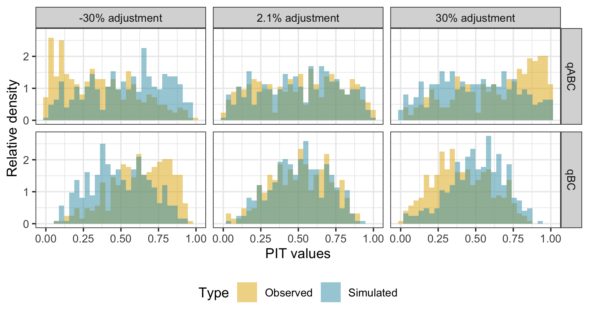
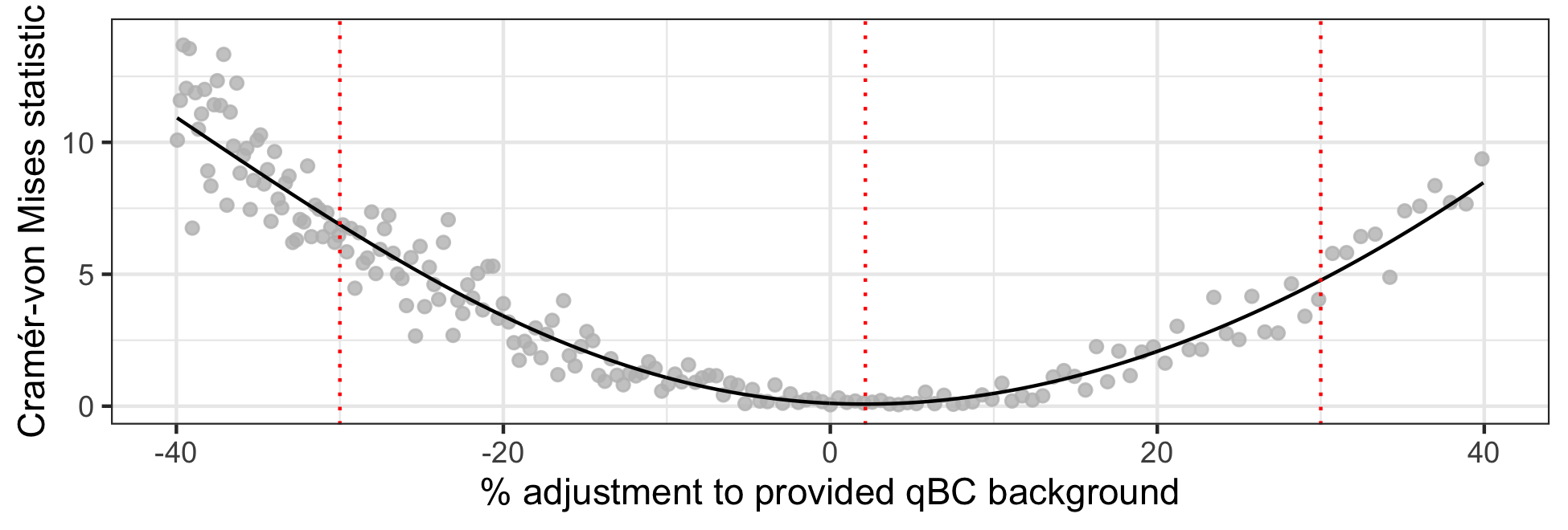
Figure 10 shows the ESA-specific temporal qBC background adjustment learned via a GAM fit to the CvM statistic across adjustments as well as the flagged “ESA-orbits of concern”; at worst, the fit to the learned qBC background adjustment reaches -10.8, 2.9, 3.8, 2.0, and -3.3% for ESAs 2 through 6, respectively. A LOESS fit, by comparison, yields worst-case fitted adjustments of -10.8, 2.9, 3.9, 2.4, and -3.5% for ESAs 2 through 6, respectively; that is, the fit is consistent to under half a percent across these two choices of model. Relative to the background standard deviations provided by mission scientists, these worst-case fitted adjustments are all within two-sigma of a level of adjustment we would expect for all but ESA 2, for which the fitted adjustment falls outside this range before early 2011. In the simulation-based run of this assessment, meant to diagnose how much of an adjustment finding may be due to the fitting process itself, the learned absolute adjustment stays under 2% across all ESAs and is on average 0.7%; details are provided in Section F of the supplemental materials. This simulation-based run was used to determine a threshold for categorizing an ESA-orbit as being of concern. Specifically, (1) a GAM was fit in which the input was the full set of qBC background adjustment values and the output was the CvM statistic, (2) we recorded the predicted CvM value at the fitted “best” qBC background adjustment (i.e., the blue line from supplement Figure F.3), and (3) we recorded the 99th quantile of this set of predicted CvM values to use as the threshold in the mission data background adjustment fitting process, which is analogous to steps 1 and 2 here. We find that 1.4% of ESA-orbits should be flagged as potential “ESA-orbits of concern” for the science team to investigate based on the above threshold. Note that the orbits designated as of concern are not always the largest outliers; sometimes they are fairly close to the fitted line, while many orbits that are farther from the fitted line are not marked as of concern. This apparent inconsistency is due to exposure time; many of the outliers that are not marked as of concern have low exposure times and therefore large uncertainties about their optimal adjustment.
The highest absolute fitted adjustments and the majority of ESA-orbits of concern can be found in the first half of the data; at later times, the fitted adjustments are closer to 0 and there are fewer identified abnormal ESA-orbits. There are several reasons why disagreements between qABC and qBC fluxes are more likely earlier in the mission. Detector-section efficiencies changed most in the first year or two of the mission. A suspected out-gassing event occurred in Orbits 55 through 57 (late 2009) and likely caused a sudden change in detector-section behavior. If so, it becomes difficult to determine the detector section’s performance to high accuracy beforehand. Solar maximum conditions limited the amount of data (exposure time) useful for heliospheric studies around 2012-2014, and contributed increased penetrating backgrounds. Finally, IBEX-Hi operating voltages were modified in mid-2013 to significantly reduce the ion gun background in ESAs 2, 5, and 6, and thus any issues associated with mischaracterization of this background.
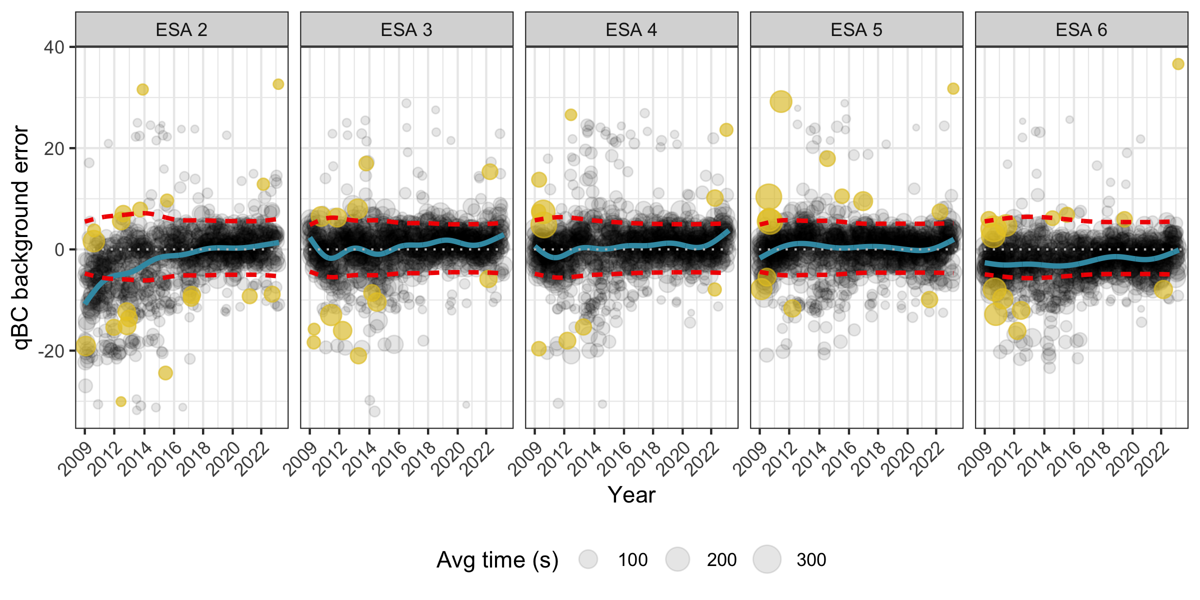
Figure 11 shows the independently estimated signal rate MLEs and hypothesis test results for all points in an example orbit, orbit 0126, for which ESA-orbit 3-0126, 5-0126, and 6-0126 were flagged as ESA-orbits of concern (orbit 0126 is the top-most identified outlier point near 2011 in the ESA 5 subplot of Figure 7). The spatial rejection pattern, and the observed and simulated PIT histograms for this orbit before and after background adjustment are shown in Section F of the supplemental materials. The optimal learned qBC background adjustment for the most extreme misfit of these ESA-orbits, 5-0126, is 27.4% (that is, the optimal qBC background value is almost 28% larger than the given background); this orbit can be seen in yellow at around 2011 near the top of the ESA 5 sub-plot of Figure 10. This adjustment would lead the qBC background for this ESA-orbit to be, on average, 0.020 as opposed to 0.016. There is an identiable quirk, in hindsight, in the processing of orbit 126 data involving the merging of the count rate during exposure times with slightly enhanced isotropic backgrounds to the count rate during the quietest exposure times [16]. This outlier identification process can serve as a validation step to identify and rectify the impact of such quirks on background estimation.

Statistically, we can’t tell whether an adjustment should be made to the background vs. the efficiency factor because the terms are not separately identifiable. Section G of the supplemental materials show an example of this identifiability issue via simulation in which we show how similar the PIT histograms look under different types of multiplicative misspecification of the qBC background, efficiency factor, and signal rate. Supplemental materials Section H shows the results of the correction and outlier identification process under the assumption that the signal component is the culprit of some or all of the apparent misalignment between expected and observed counts. At worst, the learned qBC signal deviation relative to the assumed shared signal reaches -22.6, 4.8, 4.8, -3.4, and -9.1% for ESAs 2 through 6, respectively. The average absolute adjustment is 7.3, 2.2, 1.5, 0.9, and 6.3% for ESAs 2 through 6, respectively. A worst-case adjustment of -22.6% for ESA 2 sounds quite troublesome for the shared-signal hypothesis. However, the magnitude of this finding is in part due to the signal component being closer to zero for ESA 2; it takes a larger percent change in the signal component than the background to lead to the same change in expected counts for ESA 2 because the signal component is only about 40% that of the average background.888The average background rates are similar across ESAs and larger in magnitude than the average for ESA 2. If, e.g., you want to increase the expected counts by 2 and have model components and , you would need a 5% increase in because . On the other hand, you would need a 10% increase in because . Additionally, recall that for these calculations we were making the unlikely assumption that all other model components need zero adjustment. It is much more scientifically likely that the bulk of the apparent model misspecification is due to misspecification of the backgrounds, particularly because the largest apparent deviations occur at the beginning of the mission. This is because qABC/qBC signal calibration is performed via the bright magnetospheric signal every 6 months, in which there is rarely much temporal drift. If we allow the qBC background to account for the data product disagreement up to the error bounds anticipated by mission scientists then no further adjustments are needed for ESAs 3 through 6, and the worst-case learned qBC efficiency factor adjustment value for ESA 2 is -11.6% at the start of 2009, dropping within the anticipated qBC efficiency factor bounds of 3% by mid-2010. Finally, we note that although we have treated the background rates and efficiency factors for the qABCs as known and unbiased because they are an existing and released data product, were this not the case it would be difficult to distinguish which of the qABCs or qBCs may be leading to apparent misspecification without making additional model assumptions.
5 Discussion
In this document, we developed a statistical validation procedure for paired count observations and performed this validation process for the new IBEX-Hi qBC data product. We showed that the qBCs can plausibly be said to share the same signal rate as the qABCs up to the anticipated adjustment levels for all ESAs and time windows except for ESA 2 during 2009 through mid-2010. Allowing the qBC background to account for the data product disagreement up to the error bounds anticipated by mission scientists, the average learned qBC efficiency factor adjustment value for this ESA and time window is -7.2%, with a worst-case adjustment of -11.6 at the start of 2009. Optimally adjusting the qBC background rates up to the anticipated error bounds leads to observed data that are visually indistinguishable from synthetic data under an assumed shared signal rate, and statistically indistinguishable for 92.2% of ESA-orbits. That is, we can plausibly say there is an underlying true shared signal rate underlying the nearly all of the qABCs and qBCs. Finally, we are able to provide a myriad of visual diagnostics for mission scientists to explore at an orbit, map, and full mission level that allow additional visual confirmation of model coherence.
There are a number of advantages to the proposed validation framework. First, the processing steps are minimized since the analysis is done so early on in the IBEX pipeline. Not only are we using binned direct events instead of fitted or transformed data, but our question involves ENA rates, rather than fluxes, our findings are at the observation-level, and so do not depend on map making choices, and no pooling across spatial locations, time, or ENAs is needed. Second, we can specify the level of error to which we validate the data, i.e., you can fail to validate the qBC data under this paradigm if the error is not within a pre-specified tolerance. Finally, there are several convenience factors: it’s easy to report results at different levels of aggregation, the method is fast, and the hypothesis testing framework is a defensible choice commonly used in statistics.
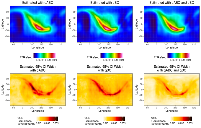
Confirming that the two counts can be used as measures of the same underlying ENA signal rate allows us to pool the data, i.e., use the qBCs along with the qABCs, in estimation pipelines and downstream modeling. We already saw in Figure 5 that combining the data stabilizes the maximum likelihood estimates of the signal rate. Doing so also leads to improved estimation of the underlying signal rate map, with estimates that are more accurate, more precise, and visually less contaminated with artifacts. Supplemental materials Section I provides synthetic and mission data comparisons of using a single data stream vs. data pooling in a map estimation model.
The concept of making assumptions about how data are generated, simulating data under that assumption, and comparing those simulations to reality is quite general. It is also not restricted to two observations because the CvM statistic supports higher dimensional inputs, nor is it restricted solely to equidispersed counts, with alternative count distributions (e.g., the Conway-Maxwell Poisson distribution [3, 10]) available. This validation procedure could be used in other space science situations in which one might want to combine data sets dominated by Poisson statistics. Examples include combining events observed by spacecraft constellations (i.e., multiple spacecraft flying in close formation) hosting the same instruments such as the upcoming Helioswarm mission, or single instruments recording multiple measurement types such as the IMAP-Hi instrument.
This procedure could also be extended to non-space applications For example, in the measuring of nuclear material, such as Californium 252, singles, doubles, and often triples coincidences are observed. A commonly used physical model in this case are the point-mass equations [13] which shows how these three count rates are related physically if the assumptions of this model hold. In other words, the data should be generated from a Poisson distribution whose expected value follows the point-mass equations. This procedure could validate the assumptions of this model, and if they are not valid, describe how the nuclear material is distributed. For example, if the material is in the form of a liquid, then the point-mass equations will not hold and we should see a departure from the model in the measured singles, doubles, and triples count rates.
6 Acknowledgements
Research presented in this manuscript was supported by the Laboratory Directed Research and Development (LDRD) program of Los Alamos National Laboratory (LANL) under project number 20220107DR and by the NASA IBEX Mission as part of the NASA Explorer Program (80NSSC20K0719). Approved for public release: LA-UR-23-29873.
References
- Anderson [1962] Anderson, T. W. 1962, The Annals of Mathematical Statistics, 1148
- Cleveland [1979] Cleveland, W. S. 1979, Journal of the American statistical association, 74, 829
- Conway & Maxwell [1962] Conway, R. W., & Maxwell, W. L. 1962, Journal of Industrial Engineering, 12, 132
- Diebold et al. [1998] Diebold, F. X., Gunther, T. A., & Tay, A. S. 1998, International Economic Review, 39, 863. http://www.jstor.org/stable/2527342
- Dunn & Smyth [1996] Dunn, P. K., & Smyth, G. K. 1996, Journal of Computational and graphical statistics, 5, 236
- Funsten et al. [2009] Funsten, H., Allegrini, F., Bochsler, P., et al. 2009, Space Science Reviews, 146, 75
- Fuselier et al. [2009] Fuselier, S., Bochsler, P., & Chornay, e. a. 2009, Space Science Reviews, 146, 117
- Gneiting et al. [2007] Gneiting, T., Balabdaoui, F., & Raftery, A. E. 2007, Journal of the Royal Statistical Society: Series B (Statistical Methodology), 69, 243
- Hastie & Tibshirani [1987] Hastie, T., & Tibshirani, R. 1987, Journal of the American Statistical Association, 82, 371
- Huang [2017] Huang, A. 2017, Statistical Modelling, 17, 359
- Hyndman [1996] Hyndman, R. J. 1996, The American Statistician, 50, 120
- Joyce et al. [2020] Joyce, C., McComas, D., Christian, E., et al. 2020, The Astrophysical Journal Supplement Series, 246, 41
- Langner et al. [1998] Langner, D., Stewart, J., Pickrell, M., et al. 1998, Application guide to neutron multiplicity counting, Tech. rep., Los Alamos National Laboratory, Los Alamos, NM
- Massey Jr [1951] Massey Jr, F. J. 1951, Journal of the American statistical Association, 46, 68
- McComas et al. [2009] McComas, D., Allegrini, F., Bochsler, P., et al. 2009, Space Science Reviews, 146, 11
- McComas et al. [2012] McComas, D., Dayeh, M., Allegrini, F., et al. 2012, The Astrophysical Journal Supplement Series, 203, 1
- McComas et al. [2016] McComas, D., Alexander, N., Angold, N., et al. 2016, Space Science Reviews, 204, 187
- McComas et al. [2018] McComas, D., Christian, E. R., Schwadron, N. A., et al. 2018, Space science reviews, 214, 1
- Mitchell et al. [2016] Mitchell, D., Brandt, P., Westlake, J., et al. 2016, Journal of Geophysical Research: Space Physics, 121, 8804
- Osthus et al. [2023] Osthus, D., Weaver, B. P., Beesley, L. J., et al. 2023, Technometrics, 1
- Pettitt [1976] Pettitt, A. N. 1976, Biometrika, 63, 161
- Zirnstein et al. [2018] Zirnstein, E., Heerikhuisen, J., & Dayeh, M. 2018, The Astrophysical Journal, 855, 30
- Zirnstein et al. [2019] Zirnstein, E., McComas, D., Schwadron, N., et al. 2019, The Astrophysical Journal, 876, 92
Supplementary Materials
Appendix A Hypothesis testing primer
Hypothesis testing is performed in statistics when one wishes to test an assumption regarding some parameter. There are many “named” hypothesis tests, including T and Z tests, ANOVA tests, Chi square goodness of fit tests, and the Komolgorov-Smirnov test.999The Komolgorov-Smirnov test may be tempting to consider, but this test is inappropriate because we are not testing for equality of probability mass functions (PMFs) but rather for equality of a parameter appearing within said PMFs. The appropriateness of a named test depends on the nature of the data used and the reason for the analysis. See https://www.datasciencecentral.com/hypothesis-tests-in-one-picture/, e.g., for a decision chart on when to use some common named hypothesis tests. However, some data sets and questions do not fall cleanly into an existing named hypothesis testing framework. Our problem is one example of such a case, but can still be addressed within the general hypothesis testing framework.
As mentioned above, hypothesis testing is used to assess the (im)plausibility of a hypothesis given observed data. The steps involved in performing a hypothesis test, whether or not the test is named, are:
-
1.
State two hypotheses, a null hypothesis and an alternative hypothesis, so that only one can be true.
-
2.
Set a significance level alpha (commonly 0.05). The significance level specifies the probability of rejecting the null hypothesis when it is true. It is how one defines the strength of the evidence that will be required from one’s sample in order to reject the null hypothesis; a smaller alpha means stronger evidence will be needed.
-
3.
Determine and calculate the appropriate test statistic – the test statistic is some function of the observed data that will be used to decide whether to reject the null hypothesis. In our examples and real test procedure, the observed data itself is the test statistic.101010That is, the function mapping the data to a test statistic is just an identity function.
-
4.
Either calculate a p-value (chance of seeing something at least as extreme as the observed test statistic if the null is true) or determine a critical region (the region in which you will reject the null) for the above significance level and test statistic.
-
5.
Reject the null hypothesis if the p-value is less than alpha or, analogously, if the test statistic falls in the critical region.
A few notes on the basic process. First, the significance level alpha can be made higher or lower depending on the relative risks and rewards of more or less stringent significance requirements. As alpha increases we have more power to reject the null in the case that it is not true, but we also have a higher chance of rejecting the null hypothesis when we shouldn’t have; conversely, as alpha decreases we have a higher chance of not rejecting the null hypothesis when we should have. Second, the decision of whether to reject the null hypothesis will be the same whether one uses a p-value or a critical region approach, but these approaches differ in how one makes that decision. The p-value approach asks “Under the null hypothesis, how likely am I to see a test statistic at least as extreme (i.e., unlikely) as the one I observed?” E.g., a p-value of 0.03 means that you only have a 3% chance of seeing a test statistic at least as extreme as that observed if the null hypothesis is true. The critical region approach asks “Under the null hypothesis, where will the least likely alpha% of the test statistics fall?” If your test statistic is in this region, you know it is unlikely to have been seen under the null hypothesis. In some cases, one of the two may be easier to calculate or communicate than the other. We chose to use the critical region approach for our full analysis, but will show how to perform tests using both approaches here.
Below, we first show an example of performing a simple hypothesis test. We then move on to the details of the hypothesis test we use in our analysis.
A.1 Testing the mean of a Poisson variable using the above framework
Suppose that we have a bag full of tiles labelled with counting numbers (i.e., ). We are interested in whether the average across all numbers in the bag is equal to 2.2. There are infinite number of tiles in the bag. Intuitively, if the mean were 2.2 we wouldn’t be too surprised if we pulled out a tile and saw a 2 or a 3 label (which are both close to 2.2), but we may be surprised to see a 7 or an 8 (which are both far from 2.2). We assume a Poisson distribution for these counts and we call the mean (average value) ; the Poisson distribution is a way for us to specify how likely we are to see each count, given the average count.111111Formally, we assume , with . Say we pull one tile from the bag and call its label . We consider two cases: (C1) suppose we observe and (C2) suppose we observe .
A.1.1 State two hypotheses
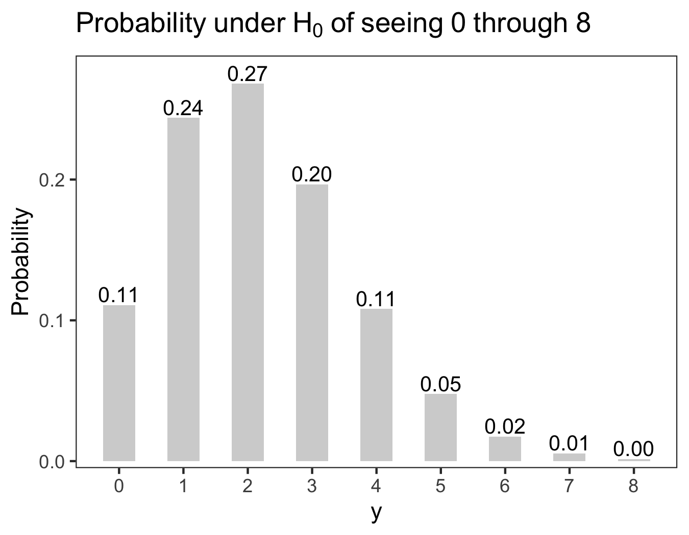
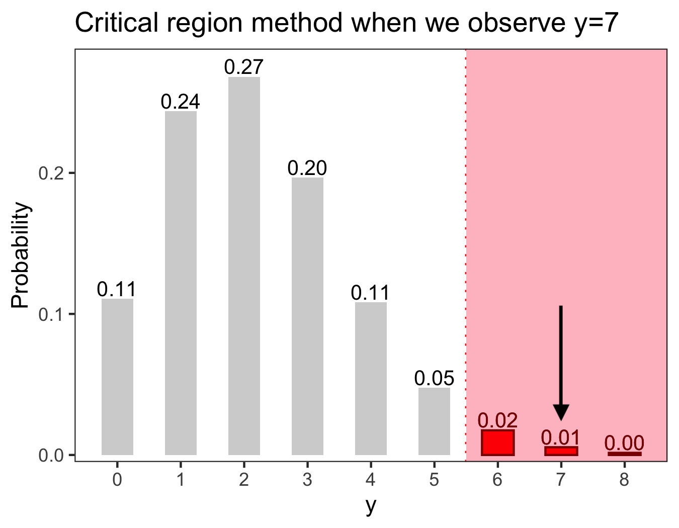
Here the null hypothesis is and the alternative hypothesis is . The probability of seeing a given count under , that is assuming the mean is 2.2, is shown in Figure 12.
A.1.2 Set a significance level alpha and define the test statistic
We set alpha to be 0.05. Our test statistic is just the observed count, (in C1) or (in C2).
A.1.3 Either calculate a p-value or determine a critical region, and
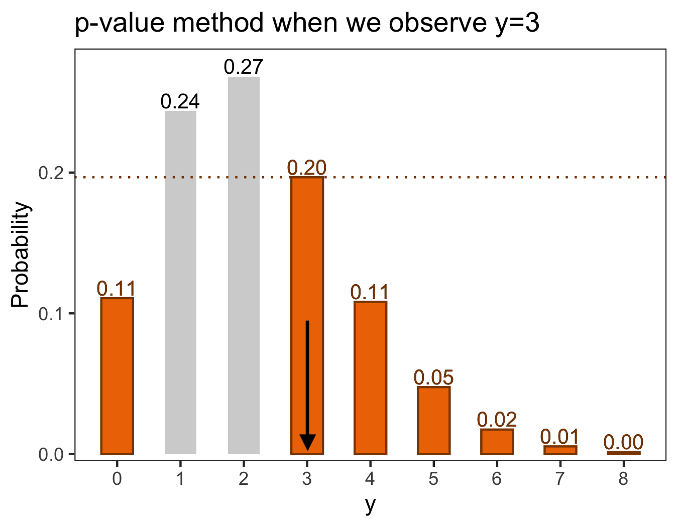
First, consider the p-value method. Values “at least as extreme as that observed” under the null include all counts that are as unlikely to see as a 3. All counts other than 1 and 2 are as unlikely as 3 (see the left sub-plot of Figure A.2). If we sum all of these probabilities, we get our p-value: 0.49. That is, we have a 49% chance of observing a value at least as unlikely as a 3 under the null hypothesis.
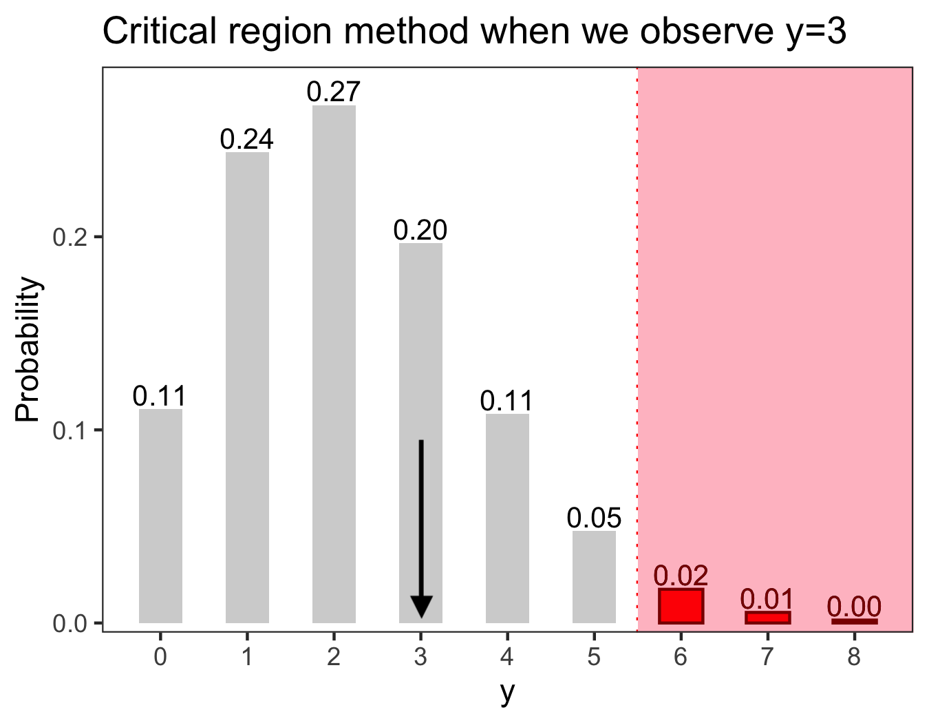
Now consider the critical region method. The critical region, where the least probable 5% of the data fall, includes all counts (see the right sub-plot of Figure A.2).131313Operationally, we get the critical region by finding where the most probable 95% of the data fall assuming the null is true; the critical region is the complement of that most probable region.141414We overshoot 95% here – the probability of one of 0 through 5 being observed is 0.975. But the probability of one of 0 through 4 being observed is 0.928; due to the discrete nature of the data we need to overshoot in order to get to at least 95%.
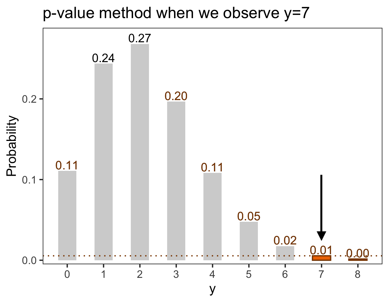
An example of these same approaches for if we had seen is shown in Figure A.3. Here the p-value is 0.01, and the observed count does fall in the critical region. 151515Note that seeing a 7 is not impossible under the null hypothesis, it’s just unlikely.
A.1.4 Decide whether you reject the null hypothesis
In C1, when , we fail to reject the null using either means of assessment (which is to be expected – if the means yield contradictory results, something is wrong!). Our p-value is greater than 0.05. Our observed count does not fall in the critical region.
In C2, when , we reject the null using either means of assessment. Our p-value is less than 0.05. Our observed count does fall in the critical region.
A.2 Our hypothesis testing process
Now suppose that we have two bags full of counting numbers (i.e., ). We are interested in whether the average across all numbers in the first bag is equal to some value, say , and the average across all numbers in the second bag is equal to another value, say . There are infinite numbers in both bags. For the sake of exposition, suppose and . Intuitively, if these were the true means we wouldn’t be too surprised if we pulled out a tile from each and saw the pair of counts (3,14) or (4,15), but we may be surprised to see, e.g., (12,14) with a first count far from its mean, (3,45) with a second count far from its mean, or, most surprisingly, (12,45) with both counts far from their means.
Formally, we observe a pair of counts , the qABC and qBC counts for some specific orbit, look direction, and ESA. We assume each individual count here comes from a Poisson distribution; these distributions specify how likely we are to see any given count and together can tell us how likely we are to see a pair of counts. However, the Poisson distributions, specified in Equation (1) in the main text, have somewhat more complicated mean terms specified by exposure times , signal rates , backround rates , and multiplicative calibration factor . Namely, we have and . Consider the qABC count, . Intuitively, we will expect to see a larger number of counts when the satellite points in a given direction for longer (i.e., for larger is), when the signal rate is higher, or when the backround rate is higher. The same logic is true for the qBC count . Suppose we see a specific count pair from orbit file 0100.161616Specifically here , which is the 13th observed look direction from orbit file 0100. We want to know whether the counts could have been generated from some shared signal , that is whether the means are and with common and not qABC- or qBC-specific.
A.2.1 State two hypotheses
Here the null hypothesis is that there is some shared signal, i.e., . The alternative hypothesis is that there is not some shared signal, i.e., . Under the pair of counts follows the distribution outlined in Equation (3), i.e., and . We know the times , backgrounds , and the multiplicative factors . We don’t actually know the shared signal rate so we use our “best guess” at based on the data, i.e., the maximum likelihood estimate , in order to calculate the means and assuming the null is true.171717Under the null, we find the maximum likelihood estimate of as where is the log likelihood of the joint distribution for and . Specifically, where with is a Poisson probability mass function with mean specified as in Equation (1). Operationally, if we didn’t know the analytic form of this MLE we could find the that minimizes using an optimization routine available in a software package (e.g., the optim() function in R with settings method=‘L-BFGS-B’ and lower=0). This gives us and .181818The values for each of the terms included above are as follows: {Lati=32.5; Loni=130.6; ESA; ; ; ; ; ; ; ; ; ; }. The shared signal rate estimate is calculated using Equation (4) in the main text. The null hypothesis that we had framed in terms of our signal rates can now be rewritten in terms of our means as and . The alternative hypothesis is or .
A.2.2 Set a significance level alpha and define the test statistic
We set alpha to be 0.05. Here our test statistic is just the observed count pair .
A.2.3 Either calculate a p-value or determine a critical region
A visual of the probabilities of and individually, as well as the probability of seeing each pair (the so-called “joint probability”), under the null hypothesis is shown in Figure 20.191919The joint probability under independence is just the product of each individual (i.e., marginal) probability. Formally, let denote the probability that for . Similarly, let denote the probability that for . Because and are independent, the probability of observing a given pair of values can be calculated as the product of each individual probability. That is, the probability that and is equal to . These joint probabilities will form the basis for both the p-value method and the critical region method, below.
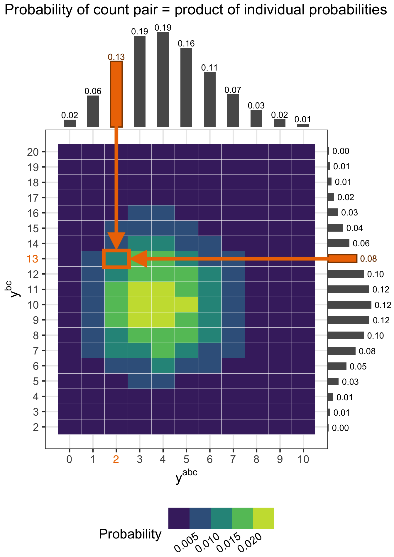
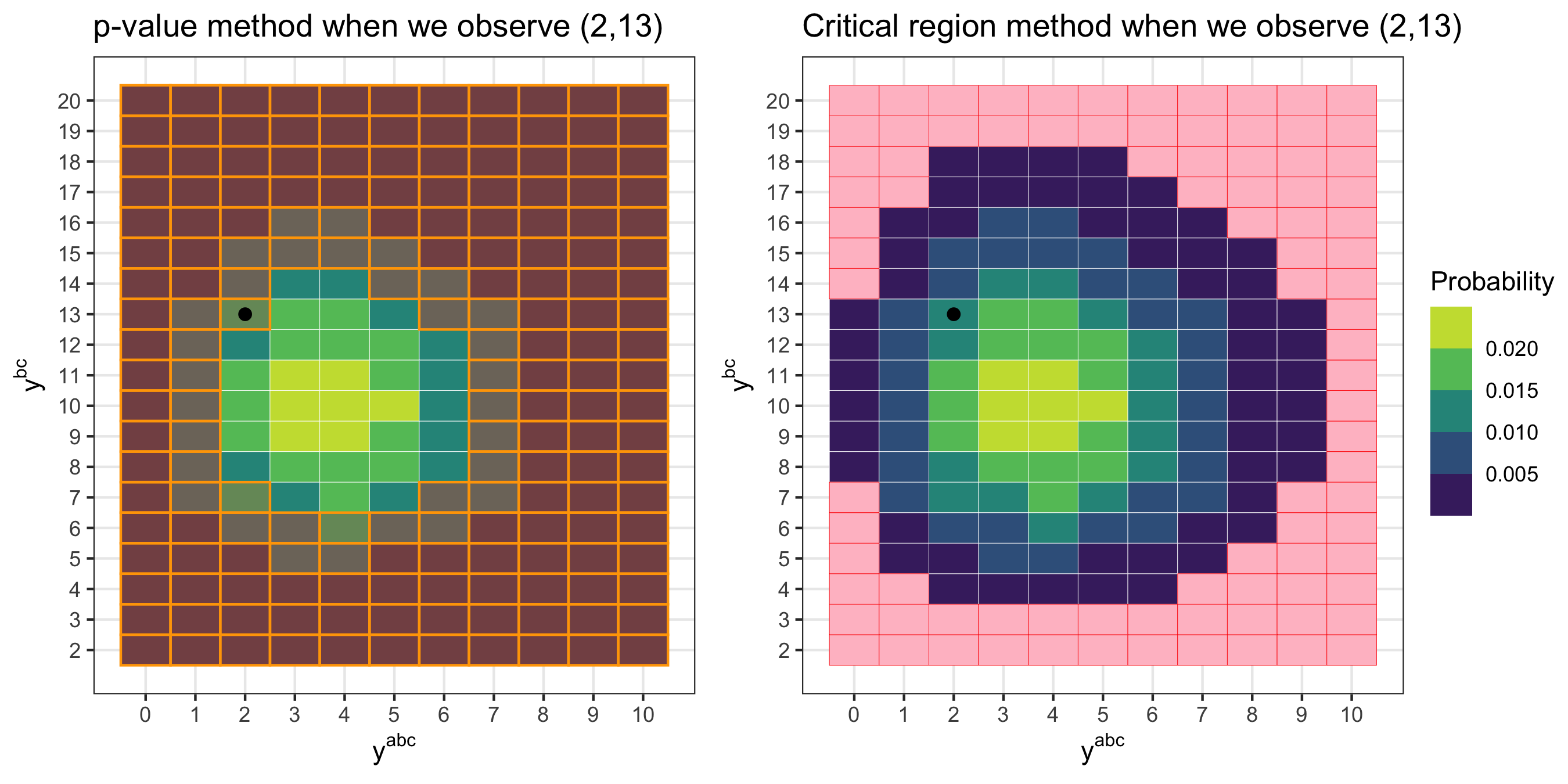
First, consider the p-value method. Values “at least as unlikely as that observed” under the null include all count pairs having probability equal to or less than the probability of observing (2, 13) in Figure 20; these pairs are marked with orange shaded boxes on the left sub-plot of Figure A.5. If we sum all of these probabilities, we get our p-value: 0.44. That is, we have a 44% chance of seeing a count pair at least as unlikely as (2, 13) under the null hypothesis.
Now consider the critical region method. The critical region, where the least probable 5% of the data fall, is shown as the pink region on the right sub-plot of Figure A.5.212121Operationally, we get the critical region by first finding where the most probable 95% of the data fall under . To do so we begin at the most probable value(s) and work our way through all possible pairs in descending probability order until we reach a cumulative total of least 0.95. The critical region is the complement of this most probable region. The observed count pair (2, 13) falls outside of the critical region.
A.2.4 Decide whether you reject the null hypothesis
We fail to reject the null using either means of assessment. Our p-value is greater than 0.05. Our observed count pair, , does not fall in the critical region.
A.2.5 Making decisions for all observations
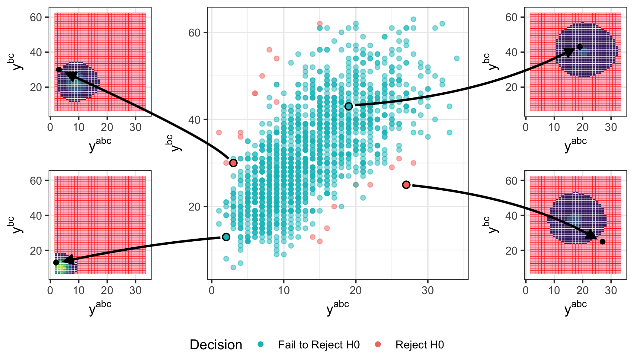
If we kept drawing count pairs from our two bags full of counting numbers and the null hypothesis were true we would expect to reject the null about 5% of the time (because we set alpha to be 0.05). That is, even when the null is true we will sometimes reject it because of chance. We perform this hypothesis testing process for all observations across all orbits, expecting to reject the null for around 5% of observations if the counts truly could have each been generated from some shared signal. Note that each count pair has its own specific signal rate and pair of means to test because it comes from a different point direction, orbit, and ESA – that is, for each count pair we imagine a different pair of infinite bags that we are drawing from.
Figure A.6 shows the results for all observations from orbit 0100; the particular observation we used as a vignette above is shown in the bottom left sub-plot. We fail to reject 98.6% of the observations from this particular orbit.

Appendix B Probability integral transform primer
First, some definitions for continuous variables (i.e., variables that can take on an infinite set of possible values within some range). An example of a continuous variable is centimeters of rainfall per year, which can take on as its value any real nonnegative number. A continuous distribution describes the probabilities of the possible values of a continuous random variable. A probability density function (PDF) is a function that integrates to 1 providing the relative likelihood that a continuous random variable takes on a given value. The cumulative distribution function (CDF) is the probability that a continuous random variable will have a value less than or equal to some value ; analogously, it is the integral of the PDF from negative infinity up to . The CDF can only take values between 0 and 1, inclusive. A common continuous distribution is the standard normal distribution (i.e., a normal distribution with mean 0 and variance 1), which has PDF and CDF , and support over all real numbers. Figure B.1 shows the PDF and CDF of the standard normal with three different example values evaluated.
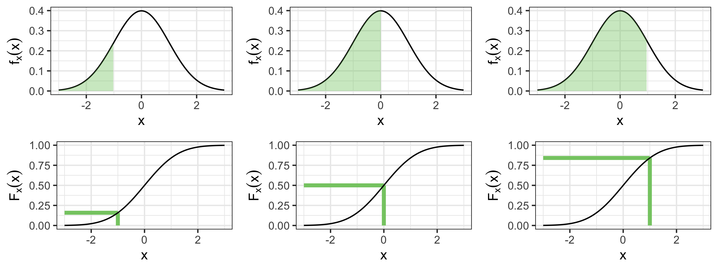
Informally, the probability integral transform (PIT), also called the CDF transform, of some sample from a continuous distribution is generated by plugging that sample back into its own CDF. If you sample many times from a continuous distribution and plug those samples into the CDF of that distribution, the output is a set of uniform draws between 0 and 1. Formally, the PIT of is found by calculating , and a property of the PIT is that for having some continuous distribution.
To illustrate this concept, we sample from a standard normal distribution and calculate each . We expect the resulting histogram of PIT samples (i.e., the values) to look approximately uniform. Figure B.2 shows these PIT histograms for different choices of . Notice that sampling randomness leads to bumpier looking histograms for smaller values of .
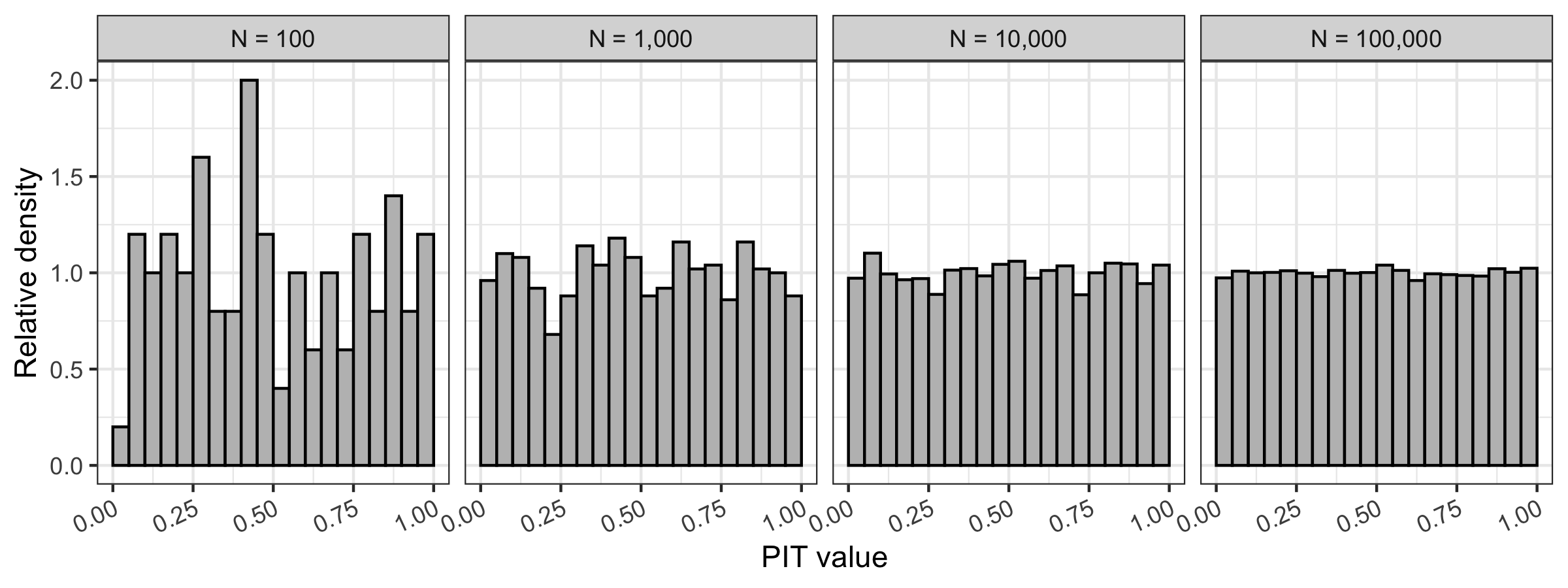
The above examples have assumed we knew the parameters of the distribution in question (that is, we assumed we knew our samples came from a normal distribution with mean 0 and variance 1). Suppose instead we didn’t know the mean of the distribution and used an estimate based on the data – specifically, the mean of samples. To illustrate the effect this mean estimation step has on the distribution of PIT values, we simulate PIT realizations under different choices of . To get a single PIT draw, we sample from a standard normal distribution, get the sample mean and calculate where is the CDF of a normal distribution having mean and variance 1. That is, we imagine that we have observed these samples for which we know the variance but we don’t know the true mean, so we use the sample mean in place of this unknown true mean in the calculation of . The sample mean becomes a better and better estimate of the true mean as the number of samples increases. The result of doing the above times for and is shown in Figure B.3. The fewer samples are used, the more “mounding” is present in the distribution of PIT values. That is, when you use the MLE in place of the true mean parameter there are fewer PIT values close to 0 or 1 than one would expect under uniformity, and more close to 0.5. This effect occurs because using the MLE in place of the true mean will lead any given sample within the set of draws contributing to the mean to be closer to it (on average) than they are to the true mean. As increases, the MLE approaches the truth and the distribution approaches that of a standard uniform.
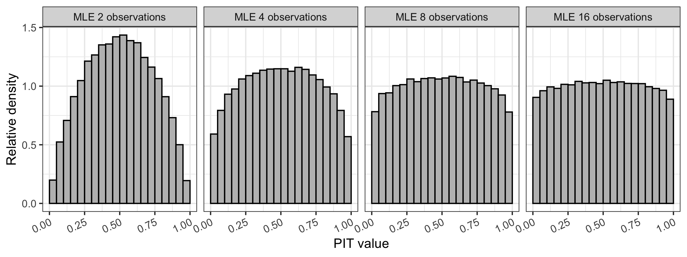
We now turn to the discrete variable setting. As in the continuous variable setting, we begin with some definitions for discrete variables (i.e., variables that can take on a finite or countably infinite set of possible values within some range). An example of a discrete variable is number of particles observed by a sensor, which can take on as its value any nonnegative integer. A discrete distribution describes the probabilities of the possible values of a discrete random variable. A probability mass function (PMF) provides the probability that a discrete random variable is exactly equal to some value; the sum across all possible values taken is 1. The CDF at a value in the discrete case is the sum of the PMF from negative infinity up to and including . We focus on the Poisson distribution, which is the discrete distribution considered in the main text, with some mean . Call this random Poisson variable , having PMF and CDF . Figure B.4 shows the PMF and CDF of the Poisson distribution with mean 2 having three different example values evaluated.
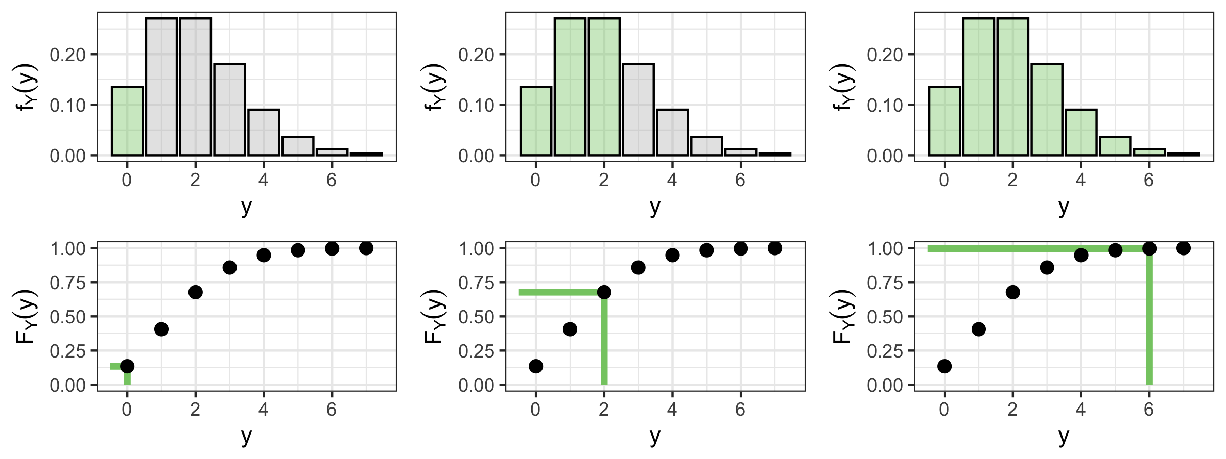
Suppose we tried to perform the analog to the PIT calculation process from above using draws from this discrete distribution, i.e., sample lots of times from a Poisson distribution and plug those samples into the CDF of that distribution. The output will not be a set of uniform draws between 0 and 1, because can only take a discrete set of possible values. Consider, e.g., the Poisson distribution with mean . Then the probabilities that takes on values 0 through 3 are 0.14, 0.27, 0.27, and 0.18, respectively, and and so on. That is, it is impossible for to return any value less than 0.14, or between 0.14 and 0.41, etc. The left side of Figure B.5 shows the histogram of for when the are samples from a Poisson distribution with mean 2.
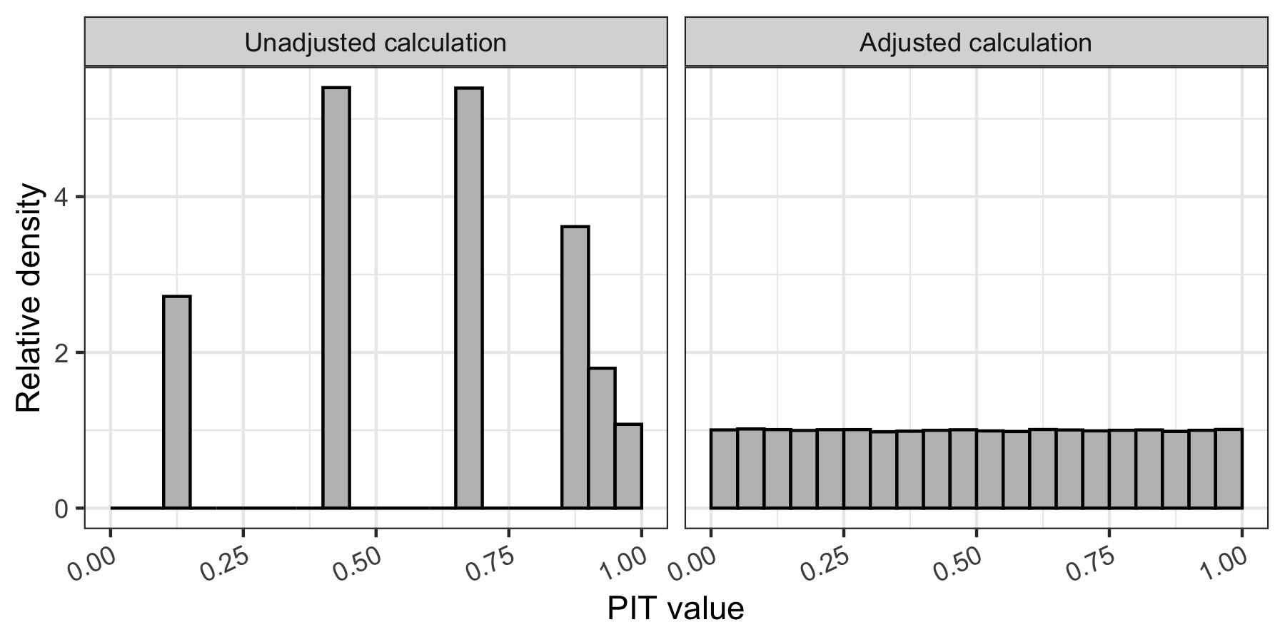
The standard PIT calculation requires that the random variables for which the PIT is calculated are continuous. If the random variables are discrete, however, the values the PIT can take will also be discrete and thus not uniformly distributed between 0 and 1. We adjust the PIT calculation for discrete random variables by taking a uniform sample between and to be the PIT value, rather than simply using itself as the PIT value (note if , we use 0 instead of for the lower bound of the uniform) [5]. This sampling step enables any value between 0 and 1 to result from the PIT calculation, and creates discrete-adjusted PIT values that are uniformly distributed between 0 and 1. The right side of Figure B.5 shows the histogram of for when the are samples from a Poisson distribution with mean 2, and is a uniform sample between and if and a uniform sample between and if . As expected, the distribution of the values appears Uniform(0,1).
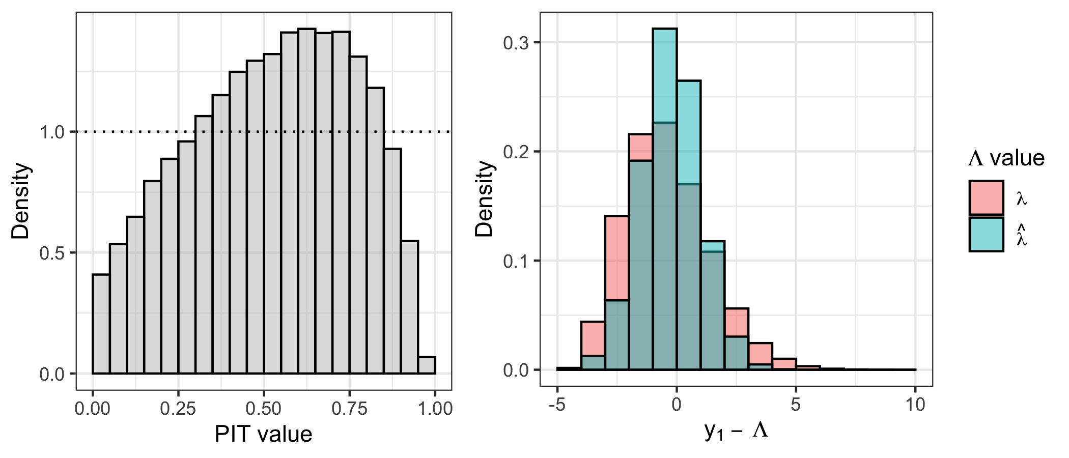
In the main text, we used the MLE of the shared signal rate from a pair of Poisson observations in the adjusted PIT calculations. As a simpler example illustrating the asymmetric mounding that occurs in this case, we do the following:
-
1.
Sample , where the true .
-
2.
Calculate , the MLE of the mean based on the two samples.
-
3.
Perform the discrete-adjusted PIT calculation for using .
-
4.
Repeat 1 through 3 above times.
The sampled PIT values are shown on the left sub-plot of Figure B.6. We see both mounding and asymmetry relative to a Uniform(0,1) distribution. The right sub-plot of Figure B.6 helps elucidate why this occurs. It shows the observed count minus the true mean () in pink, and the observed count minus the MLE () in blue. The former is more skewed and higher variance relative to the latter. The reduced variance when using the MLE in place of the truth is what creates the PIT distribution mounding; you don’t get as many observations “far” from as you do from , because the former uses in its calculation. The change in skewness relative to that when using the true mean is what creates the PIT distribution asymmetry. You can imagine additional area in the pink histogram bins below 0 in the right sub-plot of Figure B.6 as pushing the PIT distribution to the right; that is, because you see fewer values smaller than than are smaller than , you see fewer PIT values less than 0.5 and more above 0.5. Given all of the above, we expect to see mounding and asymmetry in the PIT distributions in the main paper, and we explore whether the shape and skew matches what we would expect under a true shared signal for the two specified Poisson distributed counts using simulation.
Appendix C Uncertainty about and
Note we drop the -indexing in this section for notational convenience – throughout assume each parameter is implicitly indexed by . Although we treat both and as known while performing the hypothesis testing calculations in our analysis, there is some amount of uncertainty about both terms. For the backgrounds, we are given the standard deviation of each background term, with relatively small compared to .
Figure C.1 shows the unique values of by ESA-orbit, transformed to be in terms of implied percent adjustment of the qBC backgrounds. It also shows an exposure time weighted GAM fit to these percent adjustments, giving us an error bound within which any learned qBC background adjustment is within that expected by mission scientists. Figure C.2 shows the relationship between average exposure time and anticipated adjustment.
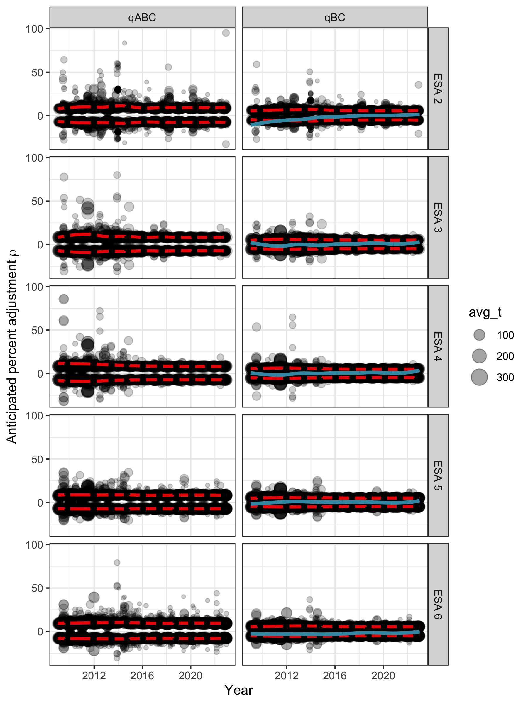
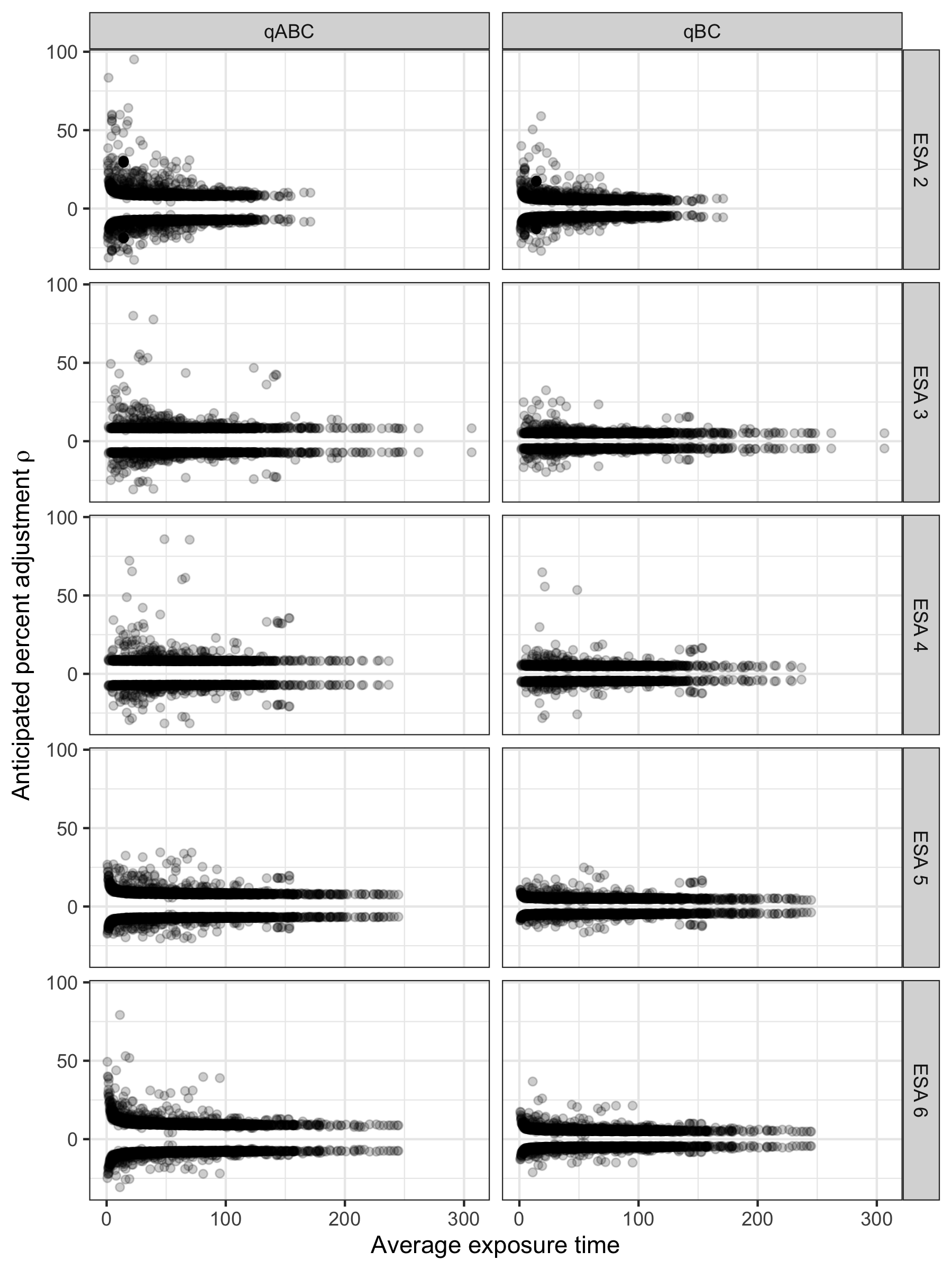
The term, i.e., the multiplicative factor on the signal rate of the qBC counts, is comprised of known ESA-specific multiplier and ESA- and orbit-specific factors (known within some interval, i.e., ). Note is known. That is, we have with and . Figure C.3 shows values over time (with uncertainty, for ).
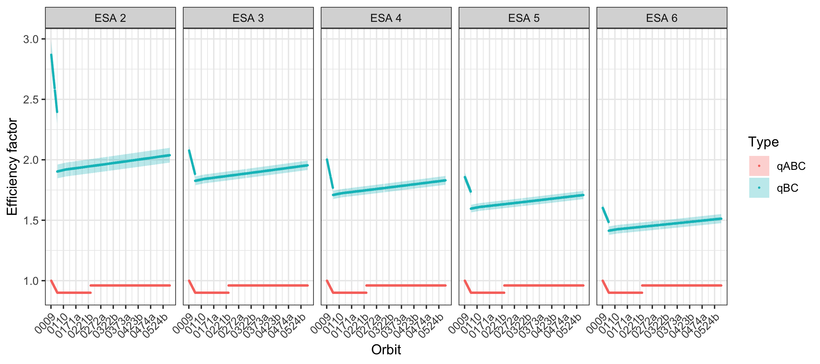
There are a number of benefits to treating and as known through the analysis itself, namely:
-
•
The hypothesis test can be performed analytically and computation is much faster than it would be under simulation-based hypothesis testing.
-
•
For a given orbit when and are shared across observations, we expect the realized background to be common across those observations. The same is true for . Fixing these values automatically respects this constraint.
-
•
The uncertainty in and leads to a negligible increase in the marginal uncertainty of the counts (i.e., the spread of is largely driven by inherent data noise and not uncertainty in and ). See Figure C.4.
There is also very little risk in the choice to fix and . This choice leads to smaller uncertainty intervals for than having uncertain and . Therefore, if we fail to reject with fixed parameters then we would also fail to reject in the uncertain-parameter case. That is, a known-parameter fail-to-reject automatically gets us an uncertain-parameter fail-to-reject too, and if we validate the qBC data with fixed parameters we would also validate it with uncertain parameters. If we fail to validate the qBC data with fixed parameters (i.e., if we reject more than the proportion of count pairs rejected under simulation) we can go back and do a more complex analysis that incorporates the uncertainty about and .
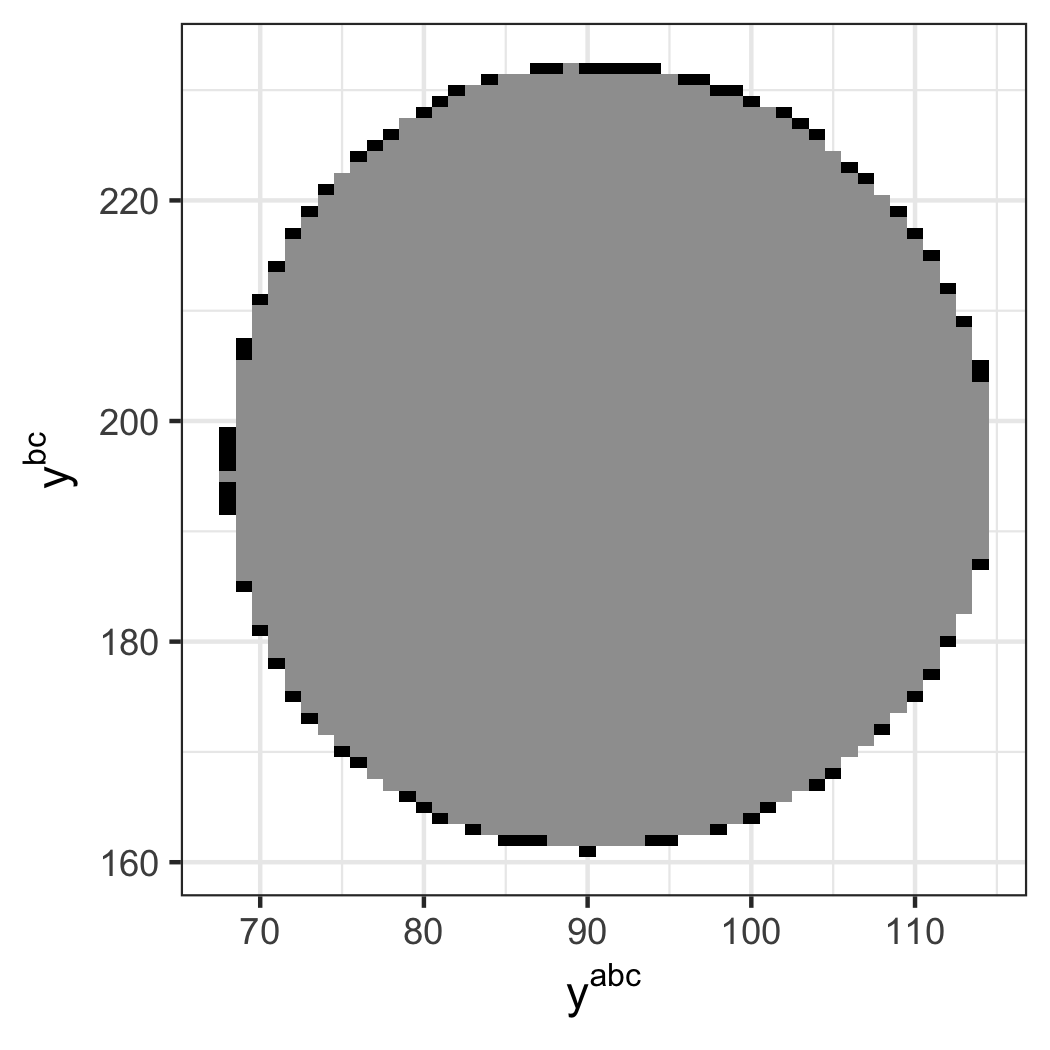
Appendix D Synthetic reference distribution creation
A given synthetic reference data set that assumes a shared signal is created by first using the real IBEX-Hi data to learn a reasonable estimate of a shared signal rate, and then resampling new qABC and qBC counts assuming this shared signal. The code for producing a GAM fit and simulating data for a given orbit and ESA is shown below. Each GAM fit is done to a single orbit and ESA’s worth of estimated signals, which are observed at 360 look directions at most. More precisely, the GAM inputs for a given ESA-orbit are the look direction indices, the outputs are , and the weights are for (although some look directions may be missing data). Note for our data set, so the weights simplify to .
For simulations used for assessing model component errors, we use the new “corrected” value of that model component when simulating data according to the above process. Doing so leads the synthetic data to in fact have that new model component as the true data generating process, e.g., for the qBC background error assessment we assume that the provided actually has error, then simulate our reference data set using this new corrected qBC background level , where .
Figure D.1 shows the smooth signal rate predictions, , for example orbits 0026 and 0243b at ESA 2. Note that the effect of the 0 truncation of the GAM fit (i.e., that ) can be seen on the far right side, in the Orbit 0234b sub-plot.
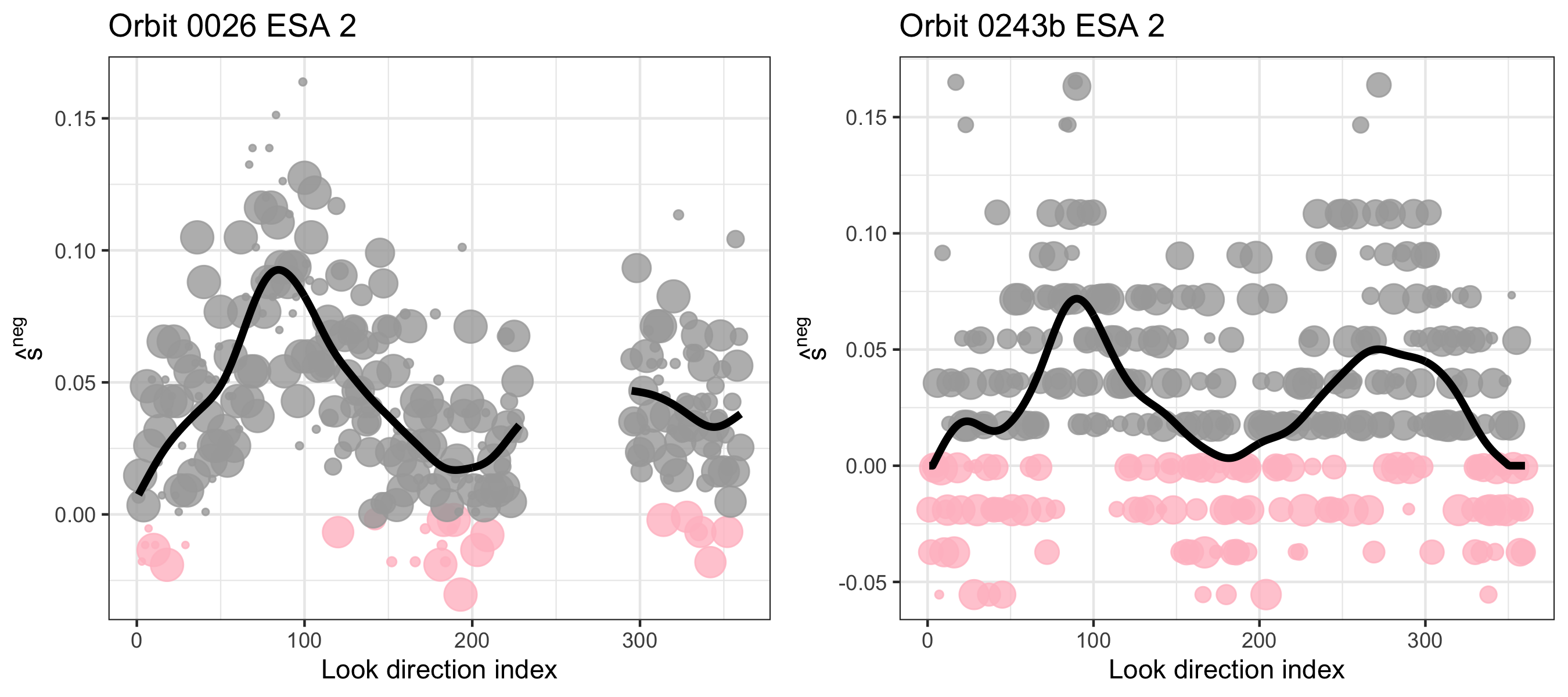
Figure D.2 shows realizations of simulated counts for example orbits 0026 and 0243b at ESA 2 by using either the GAM-based method to calculate the expectation of the counts , or just using the MLEs from pairs of observations . The MLE-based method leads to more variability in the simulated counts – note the wider spread relative to the GAM-based method. Because we know the MLE from a single count pair is an overfit estimate of the signal rate, this higher variability is pathologic. Using the GAM-based method gives synthetic data that are more reflective of the true data-generating process, which involves a signal rate that should be fairly smooth.
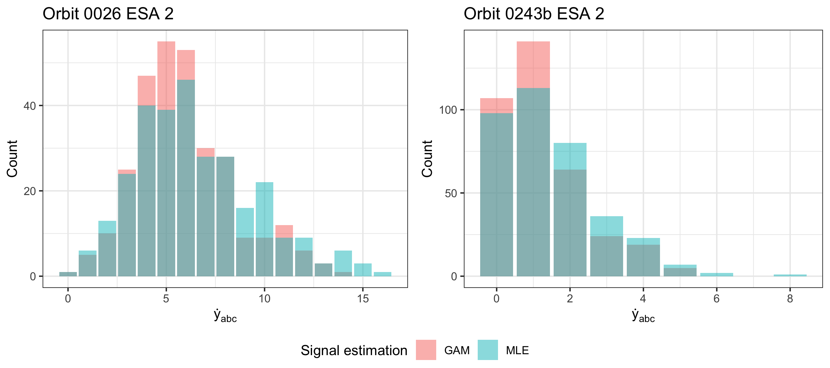
Appendix E Additional validation results figures
Figure E.1 shows the spatial rejection pattern by ESA for an example map, and Figure E.2 shows the temporal- and ESA-level rejection patterns at a variety of significance levels alpha There are no visible spatial, temporal, or ESA-level patterns in how many observations are rejected.
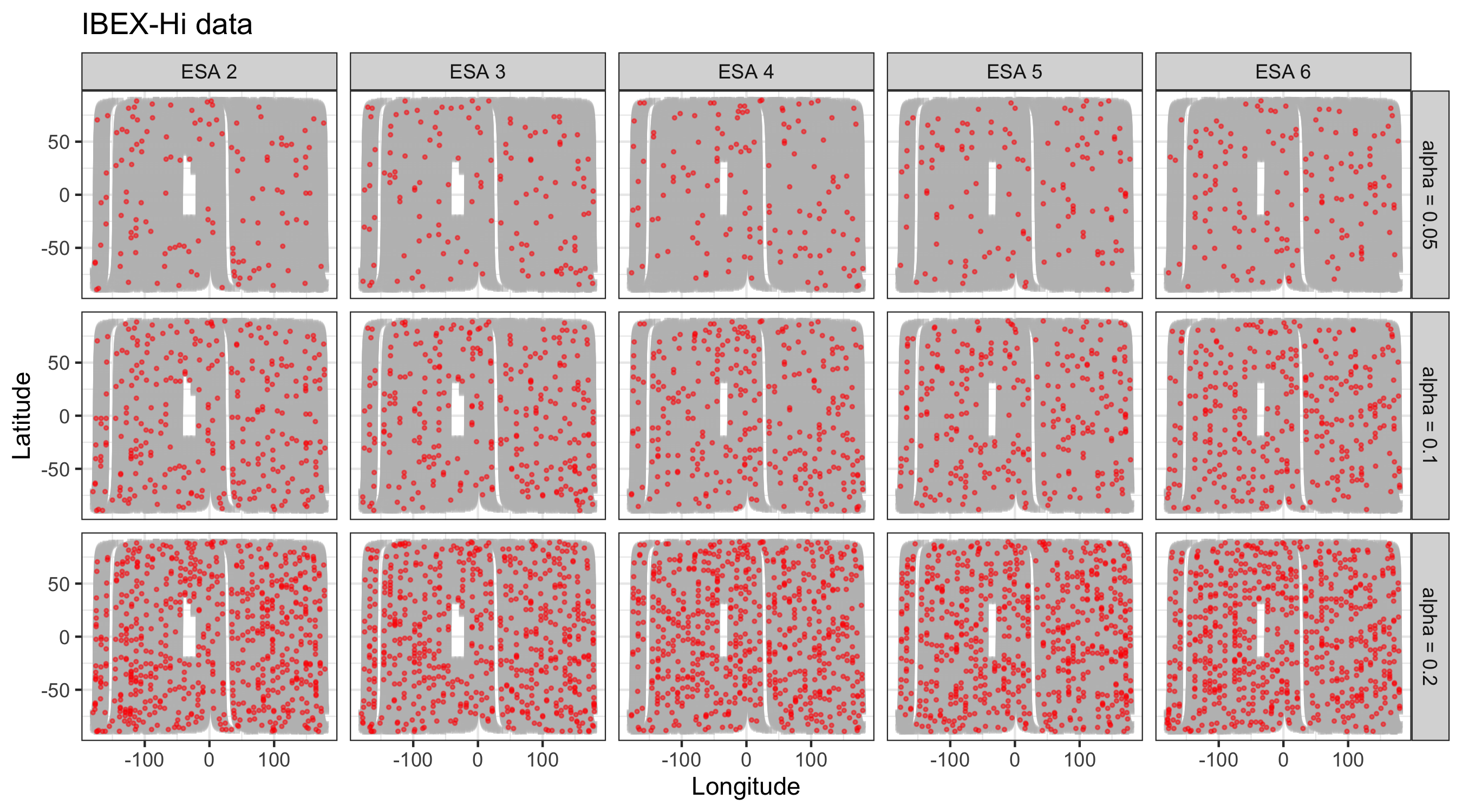
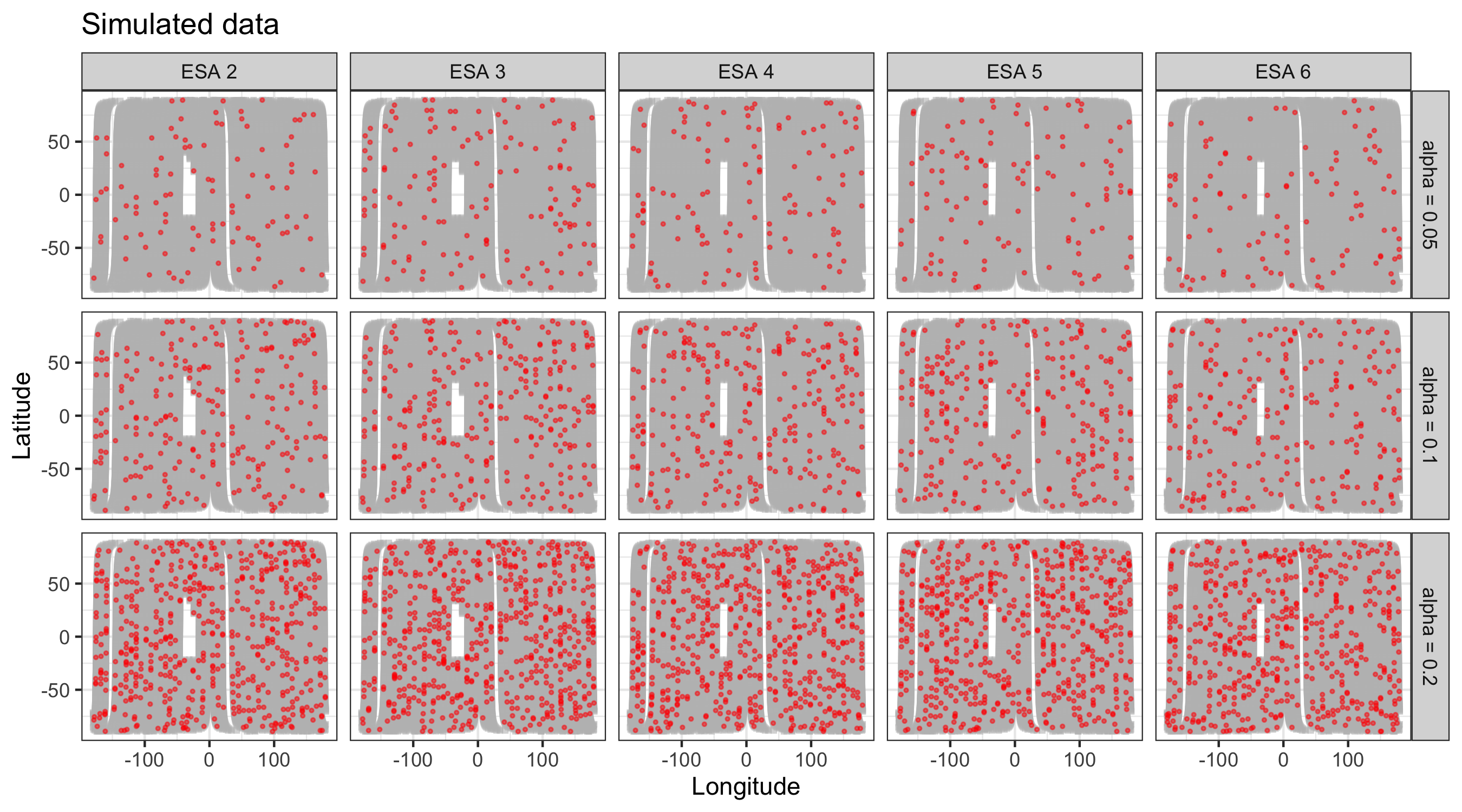
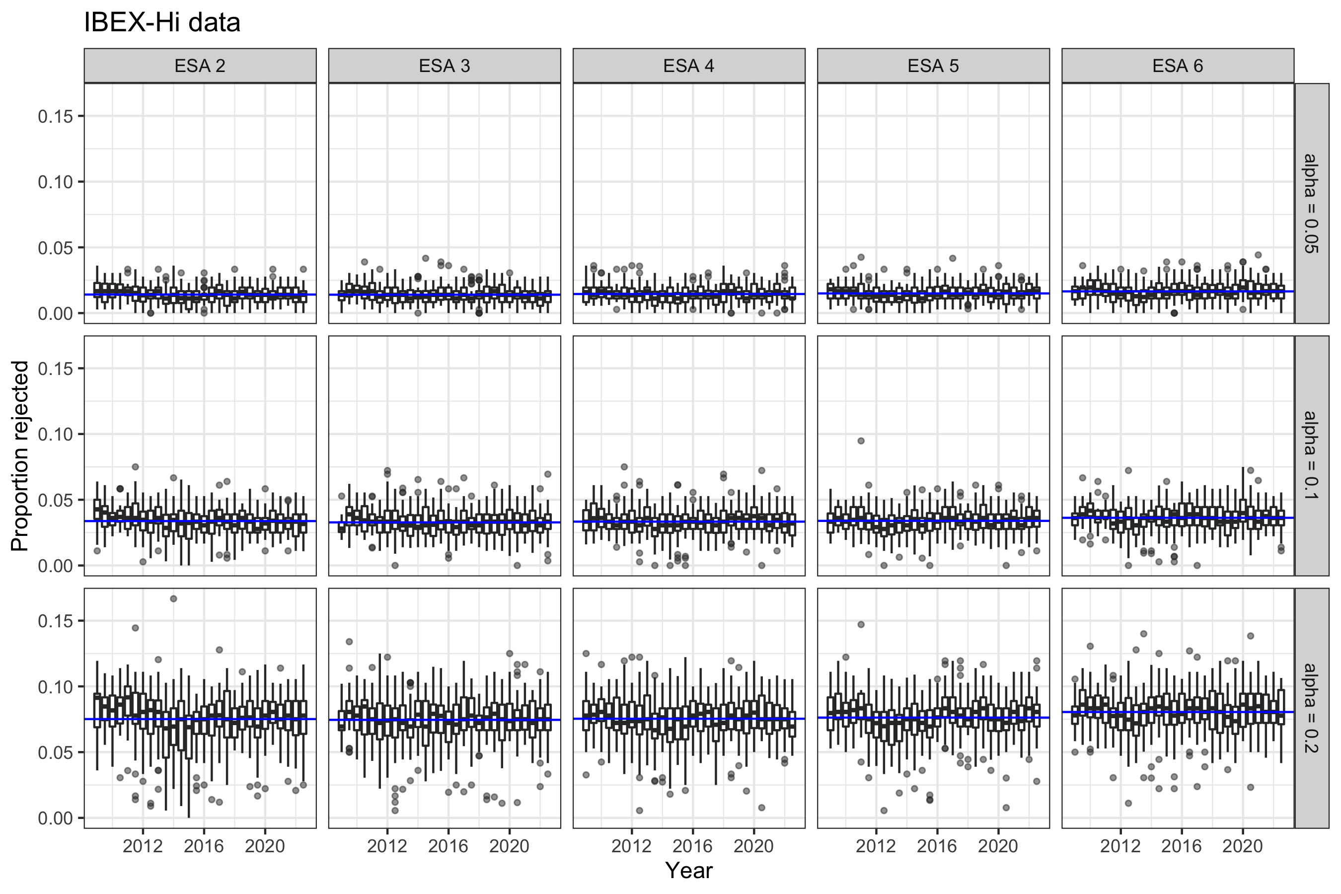
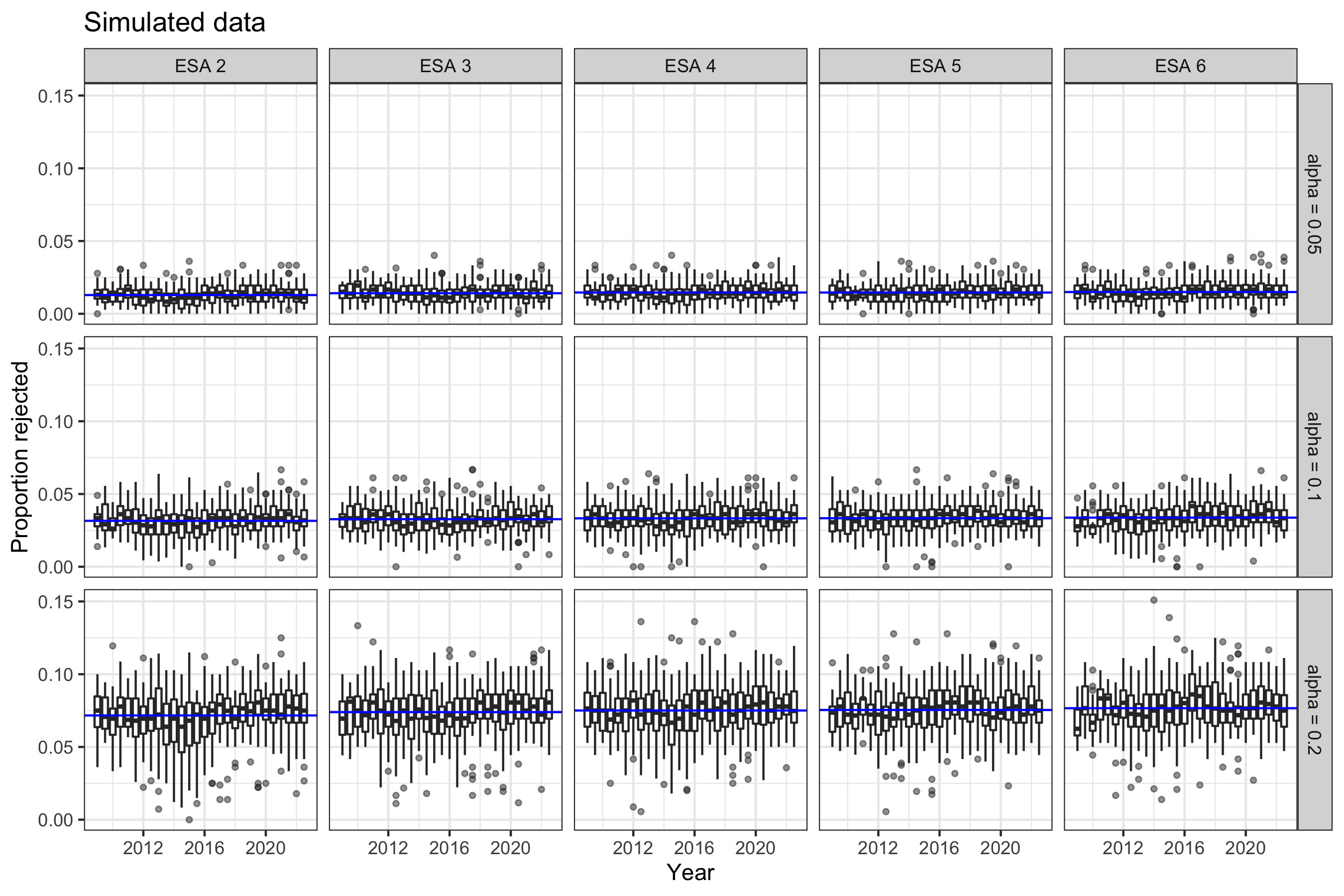
Figure E.3 shows the observed and simulated qABC PIT histograms for each ESA from an example orbit, an example map, and the full mission. As the amount of observations increases, we see better resolved (i.e., less noisy) histograms. The largest deviations between observation and simulation occurs in ESA 6, as with the qBC PIT histograms, with ESA 2 also having relatively lower levels of agreement with simulation than the other ESAs.


Visualizations and numeric results for any given orbit, map, and/or ESA are available upon request.
Appendix F Additional background adjustment figures
Figure F.1 and F.2 show the observed and simulated qABC and qBC PIT histograms, respectively, for each ESA from an example orbit, an example map, and the full mission after adjusting the background and removing “outlier” orbits per the procedure discussion in Section 4.2 of the main text. As the amount of observations increases, we see better resolved (i.e., less noisy) histograms.


Figure F.3 shows the ESA-specific temporal qBC background adjustment learned via a GAM fit to the CvM statistic across adjustments as well as the flagged “ESA-orbits of concern” for synthetic data; at worst, the fitted adjustment reaches 0.8, 1.1, 1.9, 2.3, and 1.3% for ESAs 2 through 6, respectively and the absolute adjustment is on average 0.7% across all ESAs. This synthetic run is designed to give us a sense what magnitude of adjustment may be found via just because of fitting process itself; we have learned that adjustments within a percent or two that are not persistent across a long time scale may just be found due to chance.
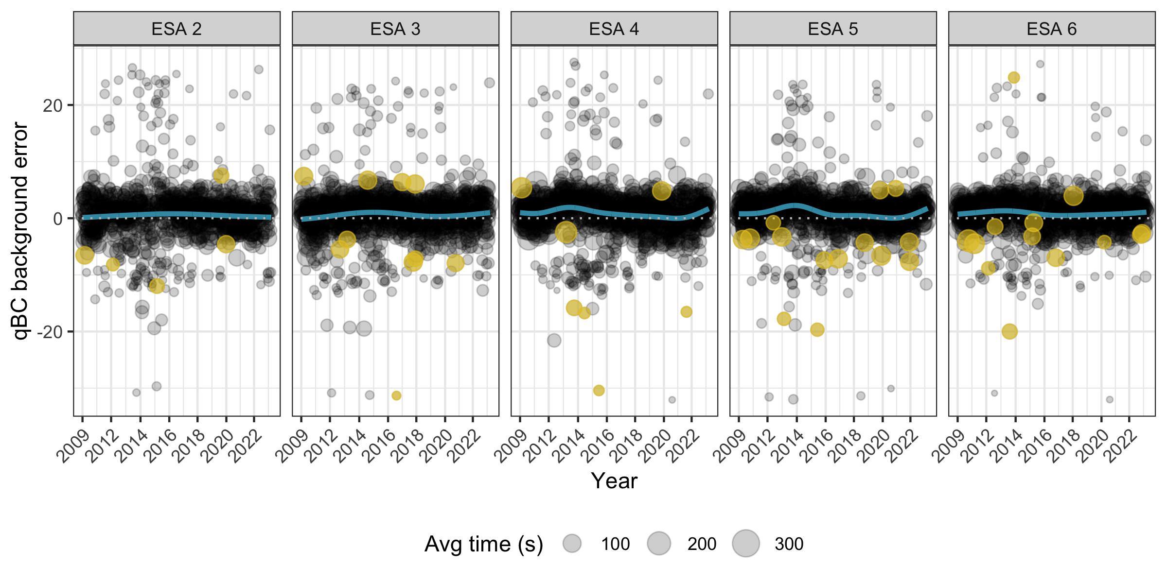
Figure F.4 shows the hypothesis test results by look direction for all points in an example orbit, orbit 0126, for which ESAs 3, 5, and 6 were flagged as ESA-orbit of concern. Figures F.5 and F.6 show the observed and simulated qABC and qBC PIT histograms, respectively, for the outlier ESAs from this orbit at the “fitted” qBC background error (treated here as the baseline) and the “outlier-corrected” qBC background error. More specifically, this fitted qBC background error value is the y-value at the fitted blue line from Figure 10, while the outlier-corrected qBC background error value is the y-value at the associated yellow point itself. There is much better agreement between simulated and observed PIT histograms after outlier correction.

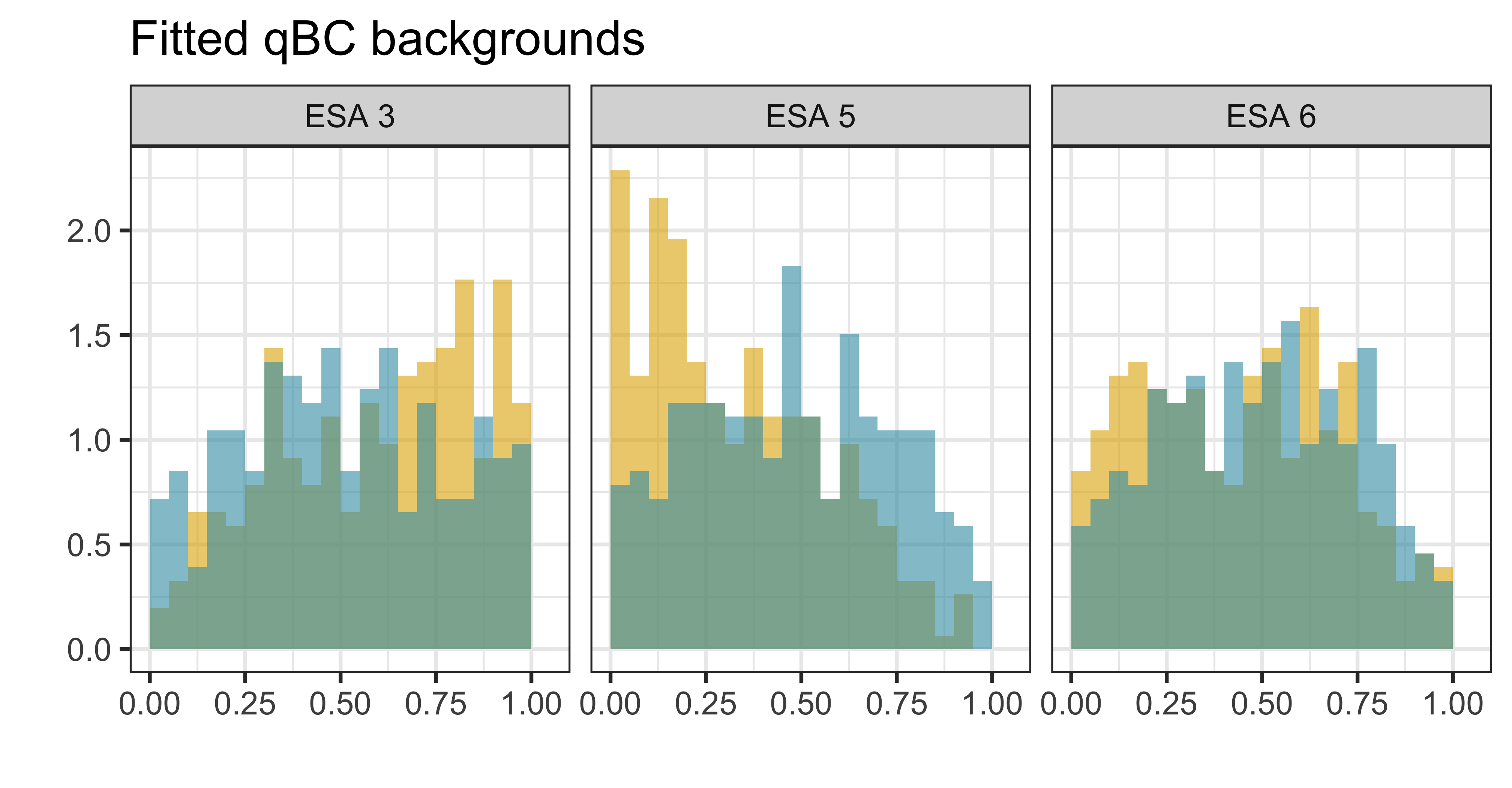
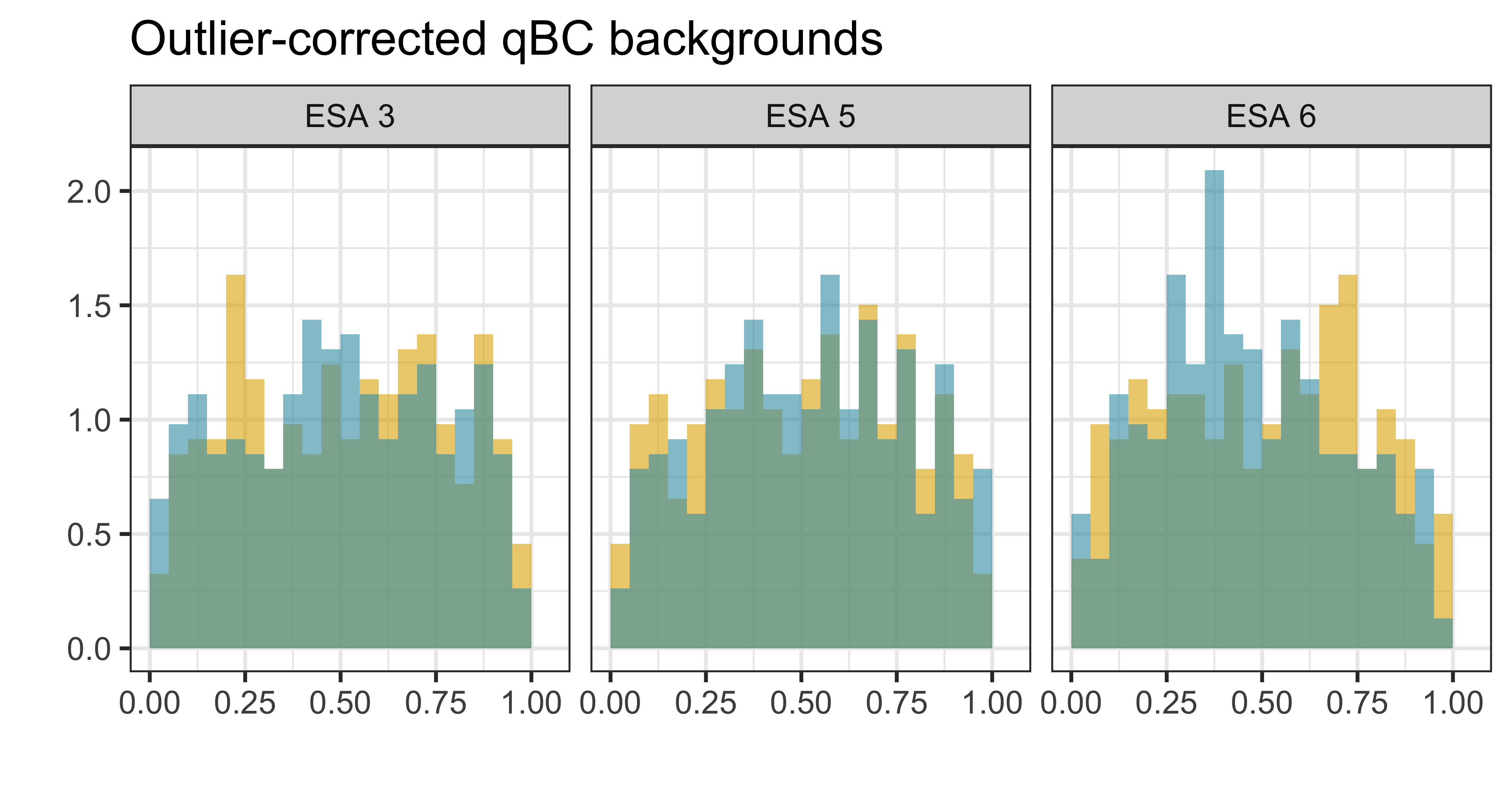

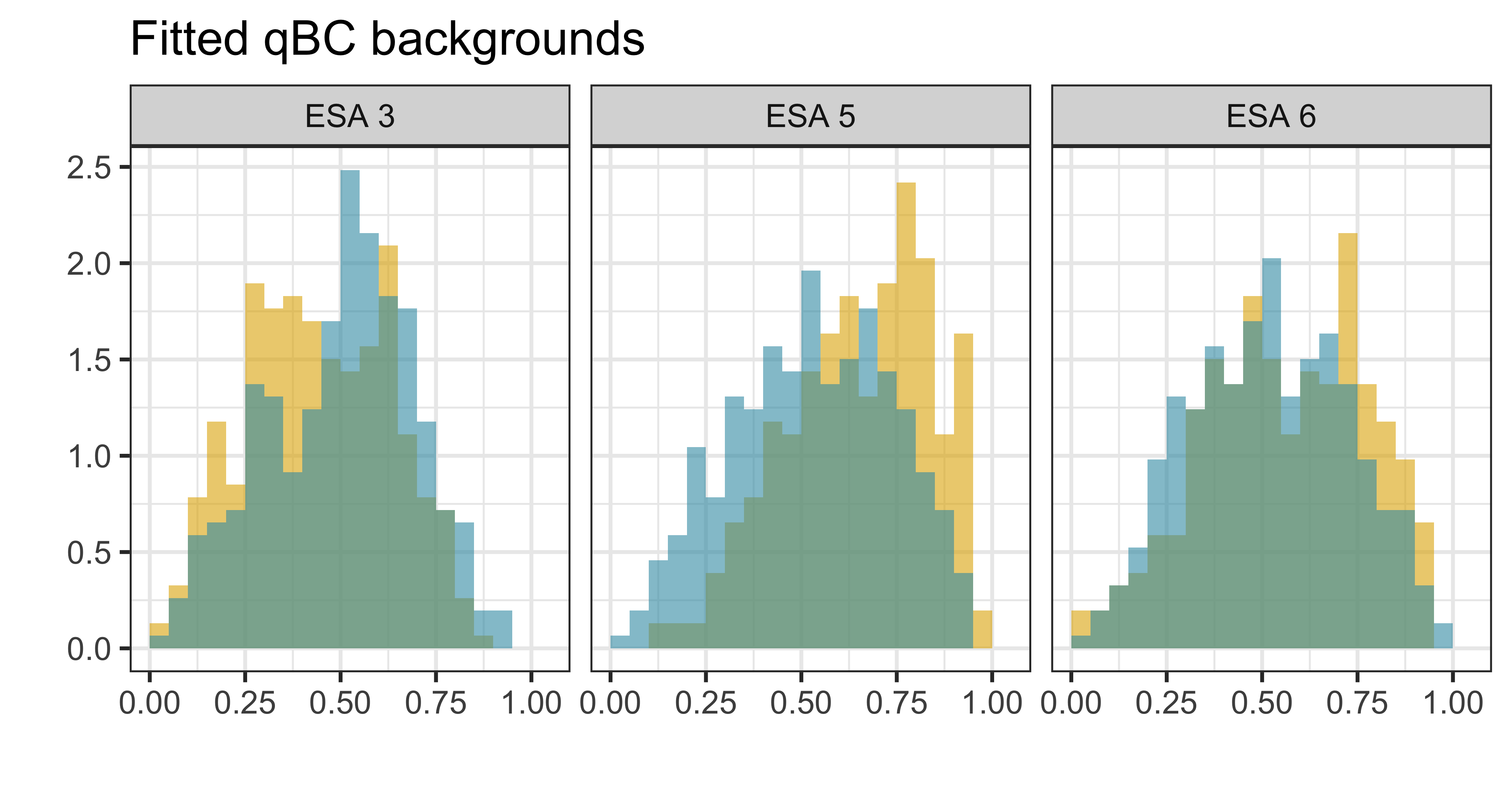
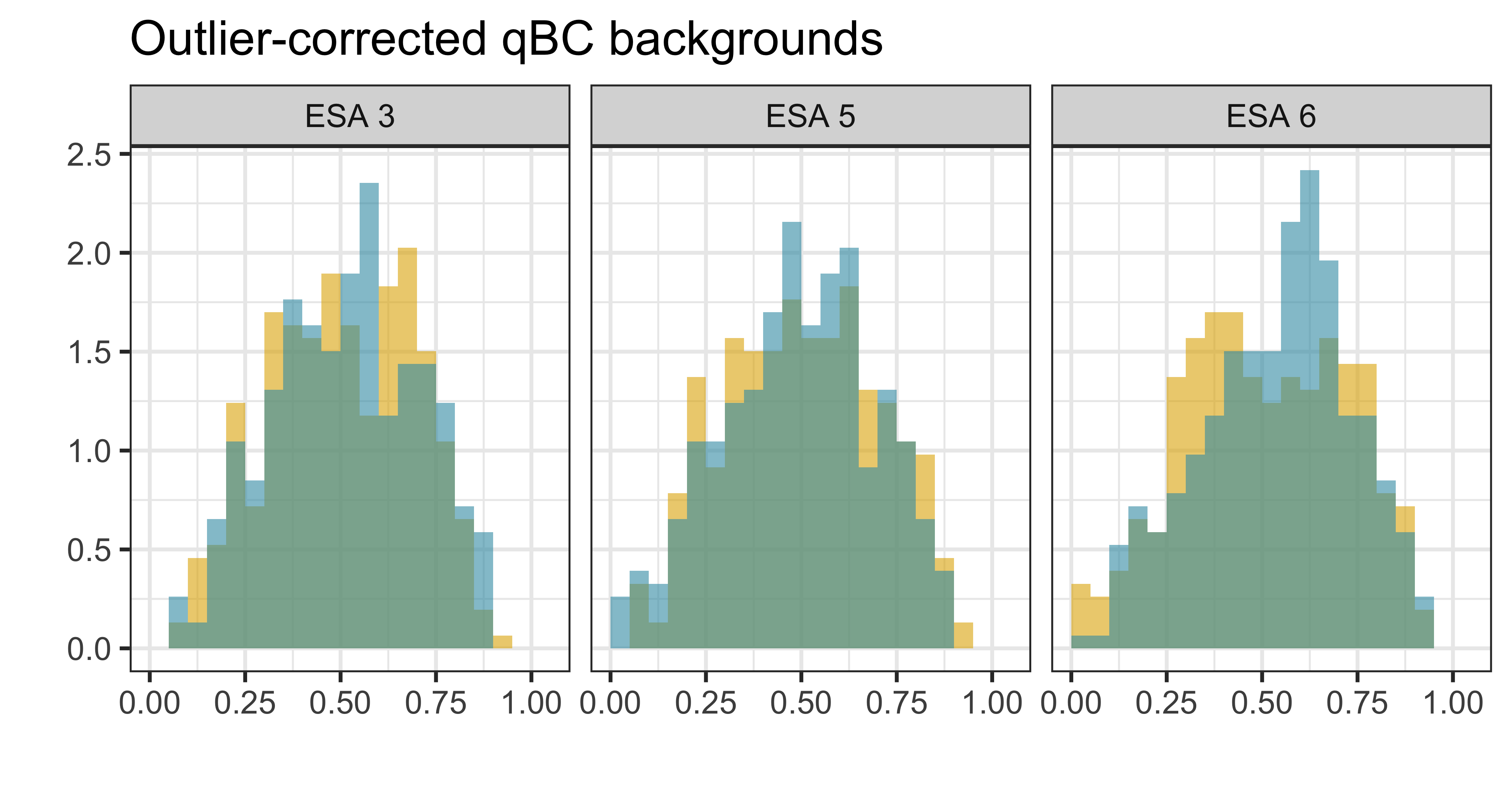

Appendix G Identifiability simulation
The following simulations are designed to show the identifiability issue in diagnosing the source of model misspecification. To begin, we chose values for the true signal rate (), the true exposure time ( seconds), and the qABC and qBC background and efficiency ( and ), and then simulate Poisson counts (analogous to 40 orbits’ worth of data from a single ESA) using these values. We calculate , and the PIT values for the qABC and qBC counts assuming there is a shared signal. We consider four possibilities:
-
1.
The model is specified correctly (Figure G.1)
-
2.
There is a true shared signal, but we misspecify the qBC efficiency (Figure G.2)
-
3.
There is a true shared signal, but we misspecify the qBC background rate (Figure G.3)
-
4.
There is not a true shared signal (i.e., ), and we specify all other model components else correctly (Figure G.4)
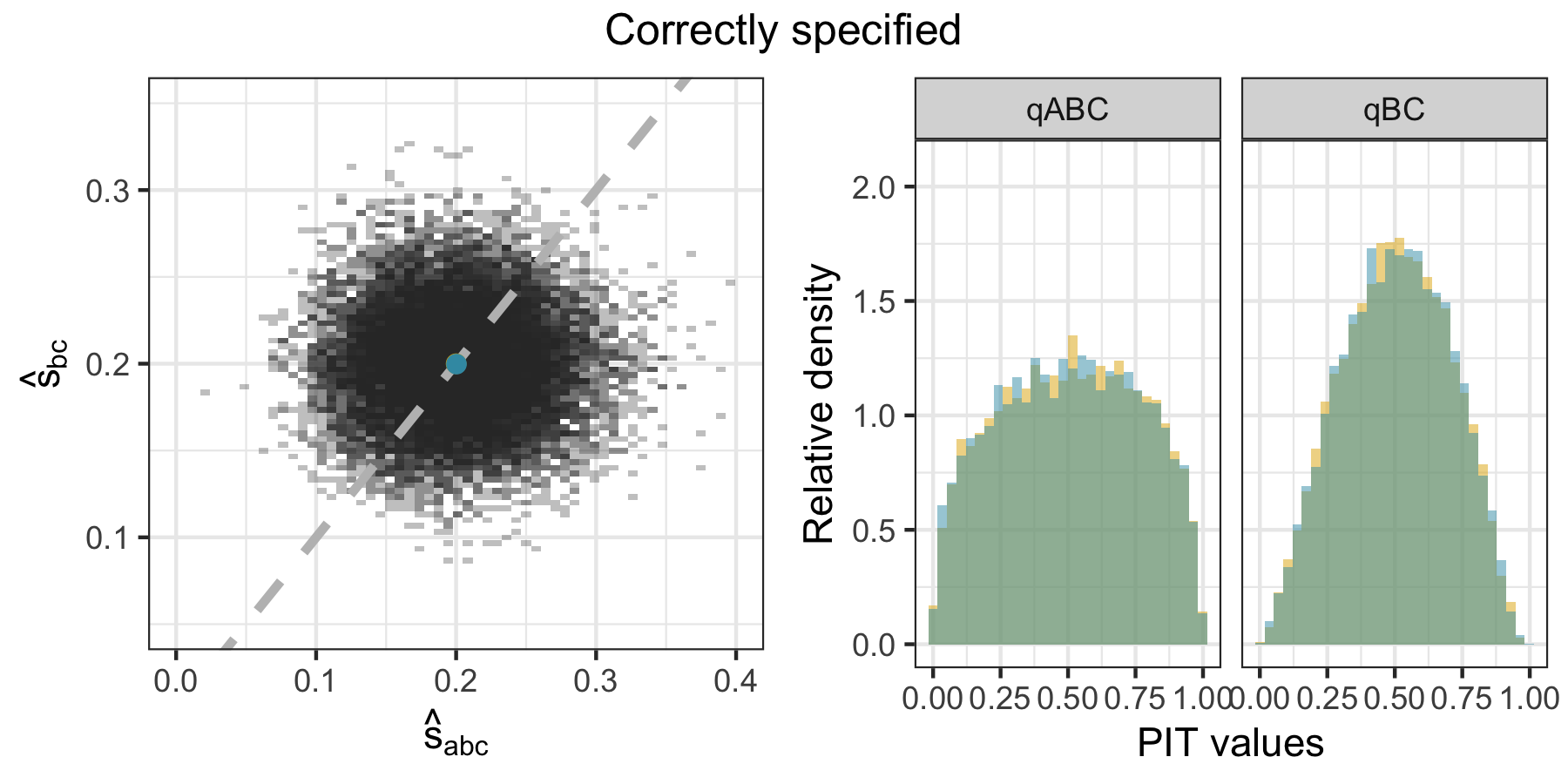
Misspecification in the qBC efficiency , in the qBC background , and a multiplicative bias in the qBC signal relative to the qABC signal (details of misspecification and visuals shown in Figures G.2, G.3, and G.4, respectively) all lead to similar distributions of and the PIT histograms. That is, you can tell that simulation and reality are not aligned, but it is hard to disentangle how they are misaligned. Not shown are analogous diagnostics for misspecification of the qABC model components – if one assumed that the qABCs may also be a cause of lack of model fit, the identifiability issue would be heightened further.
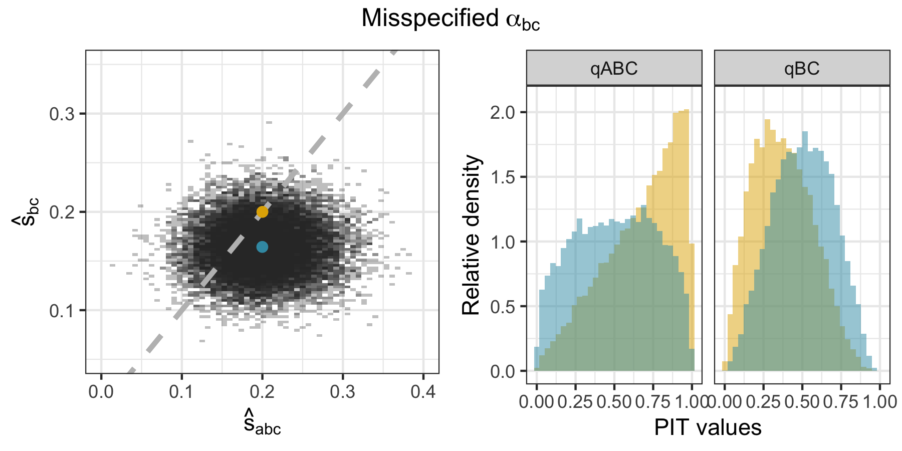
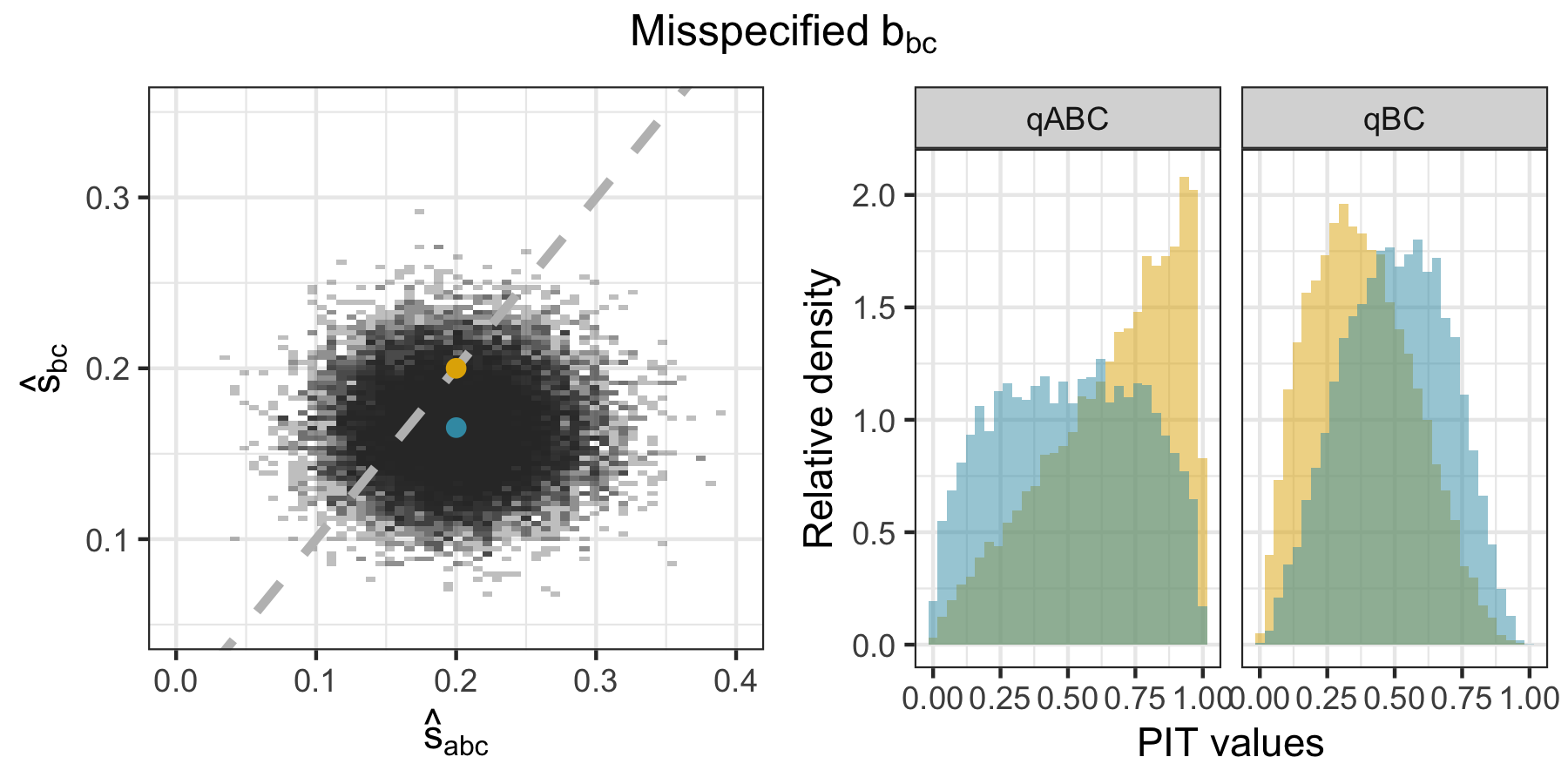
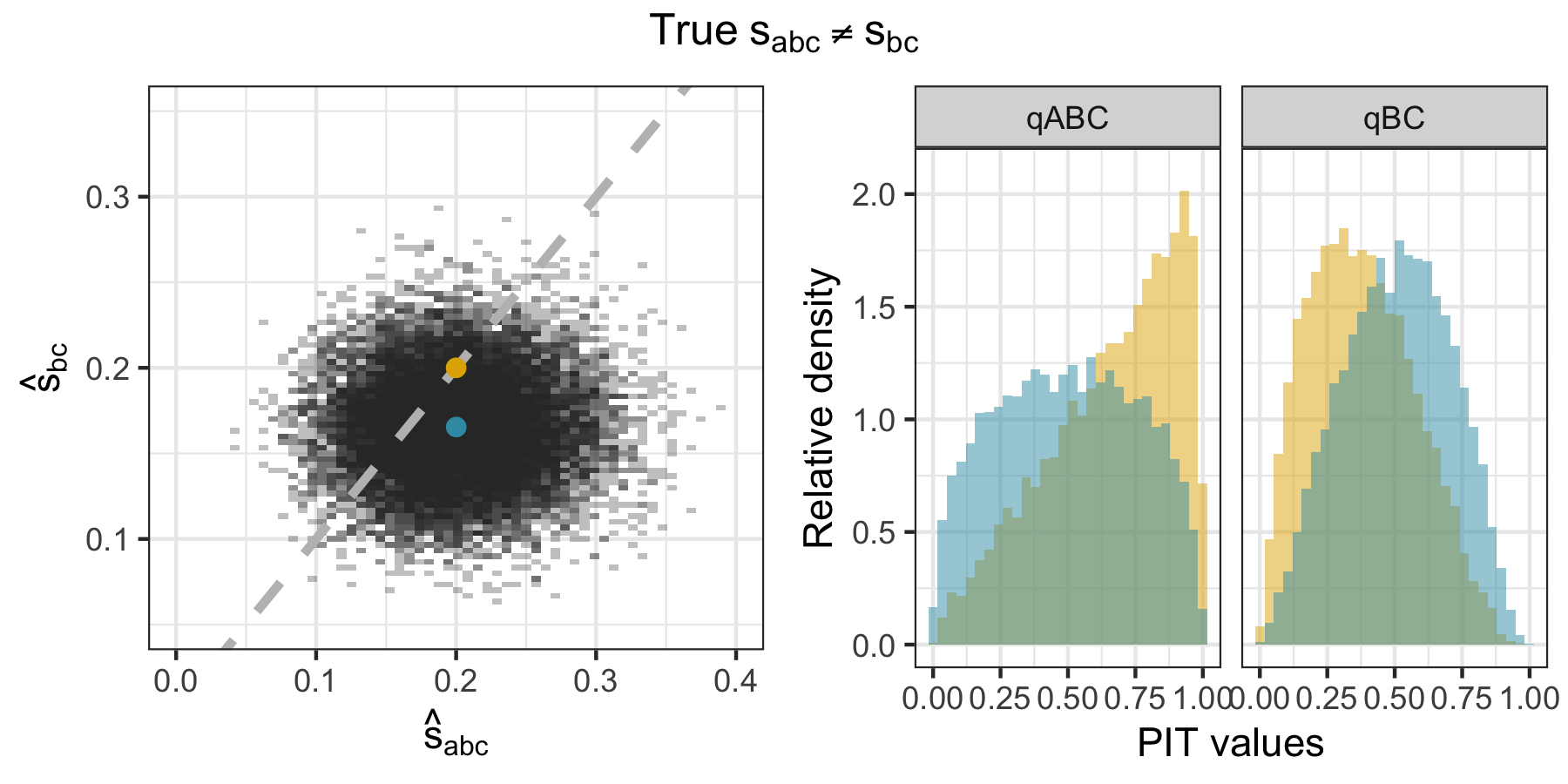
The previous examples were all for the case of a multiplicative bias in the misspecified parameter. For the efficiency factor and the background, this structure makes sense because these values are typically common across look directions for a given ESA/orbit combination. This structure makes less sense for the signal, which differs by look direction. If instead there was a non-constant differences between the qABC and qBC signal, this would look different than the constant biases in the efficiency factor and backgrounds did – see Figure G.5 for an example of this case.
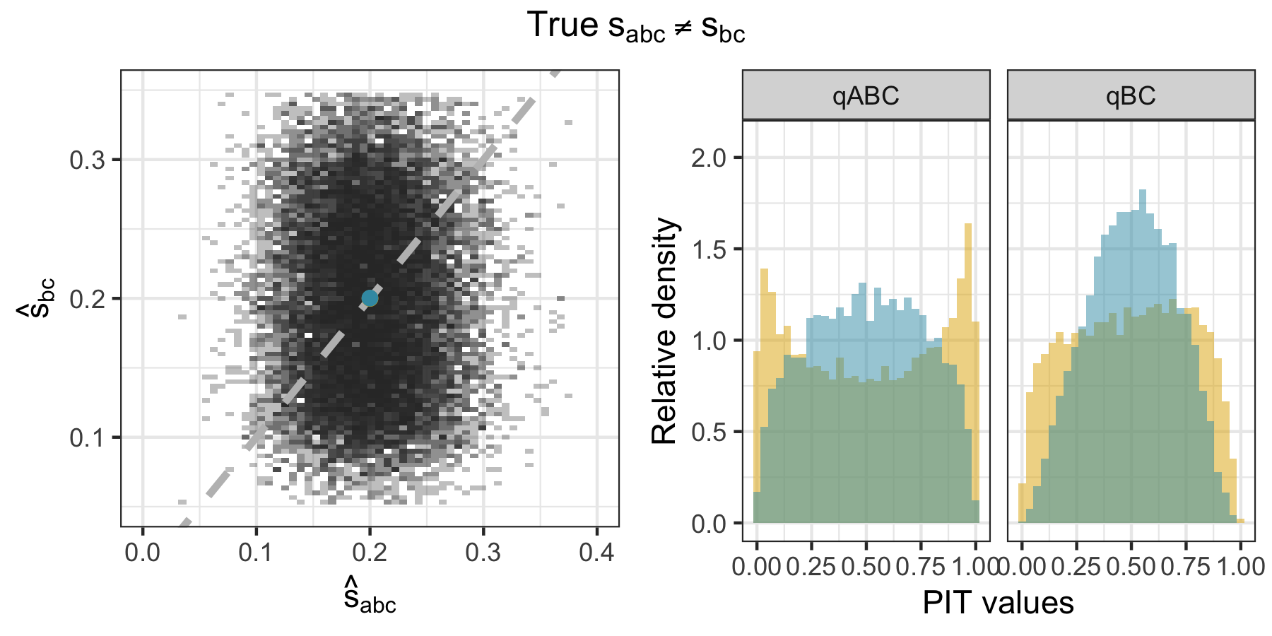
Appendix H Results assuming error is in shared signal
Figure H.1 shows the temporal qBC signal rate (analogously, efficiency factor) error learned via a GAM fit to the CvM statistic across adjustments , allowing the qBC background to account for the data product disagreement up to the error bounds anticipated by mission scientists. Only ESA 2 is shown, because no further adjustments beyond the background rate adjustment are needed for ESAs 3 through 6 The worst-case learned qBC efficiency factor adjustment value for ESA 2 is -11.6% at the start of 2009, dropping within the anticipated qBC efficiency factor bounds of 3% by mid-2010.
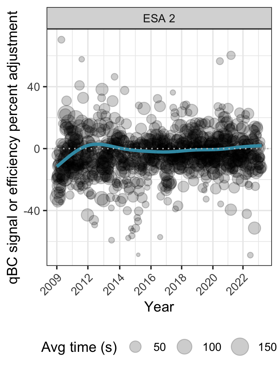
Figure H.2 shows the ESA-specific temporal qBC signal rate (analogously, efficiency factor) error learned via a GAM fit to the CvM statistic across adjustments as well as the flagged “ESA-orbits of concern” for both the synthetic and mission data under the assumption that all error lies in the the qBC efficiency factor (analogously, in the shared signal assumption). At worst, the learned error for the IBEX-Hi data reaches -22.6, 4.8, 4.8, -3.4, and -9.1% for ESAs 2 through 6, respectively. The fit is consistent to a under half a percent across choice of model for all but ESA 2, with a LOESS fit yielding worst fitted errors of -25.8, 5.1, 5.1, -2.9, and -9.6% for ESAs 2 through 6, respectively. In the simulation-based run of this assessment, meant to diagnose how much error one may introduce via the fitting process itself, the learned absolute error stays under 2% across all ESAs and is on average 0.5%. We find that 1.2% of observed ESA-orbits should be flagged as potential “ESA-orbits of concern” for the science team to investigate under the signal rate deviation assumption, based on a 99% quantile threshold learned via simulation.
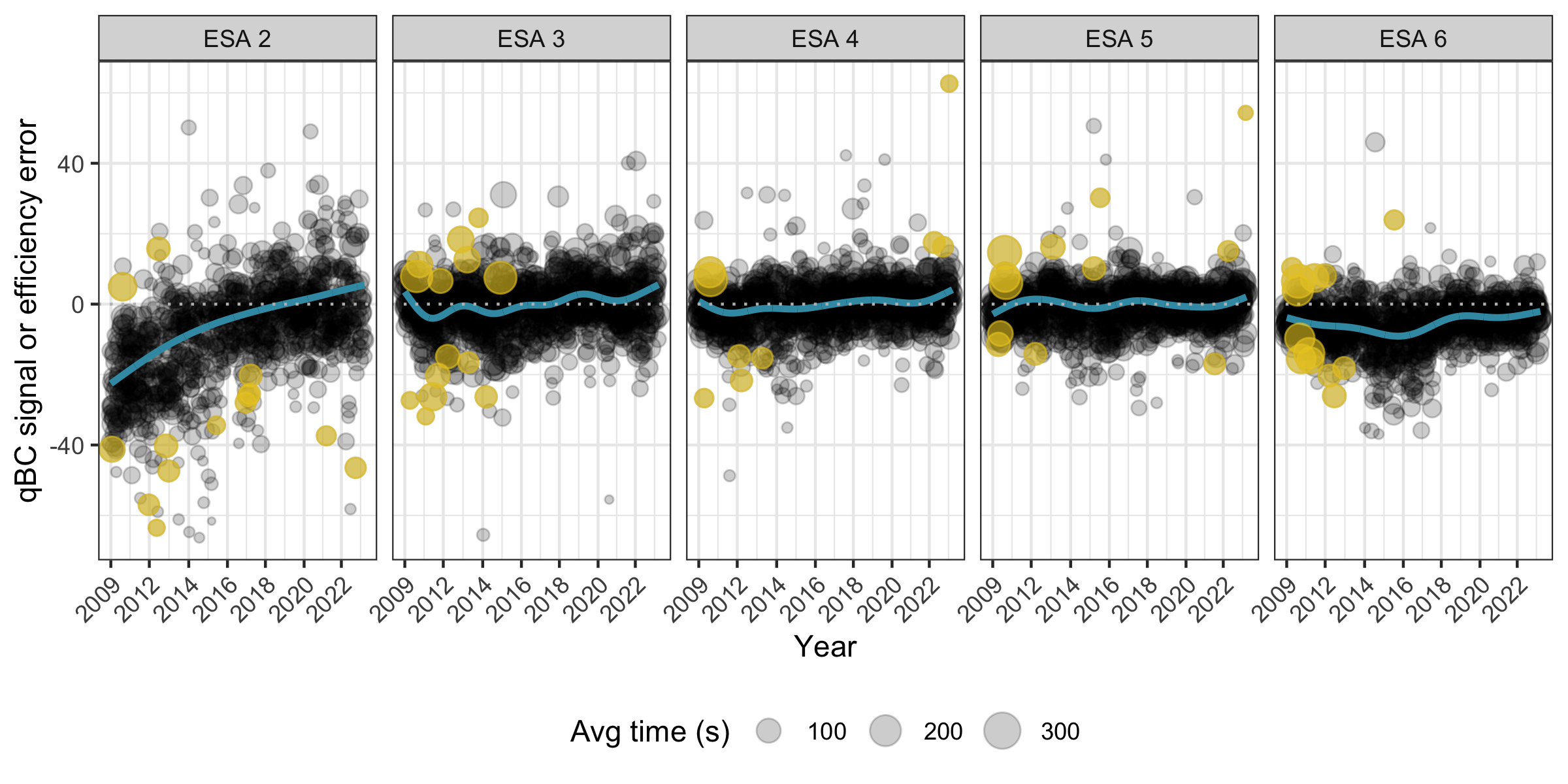
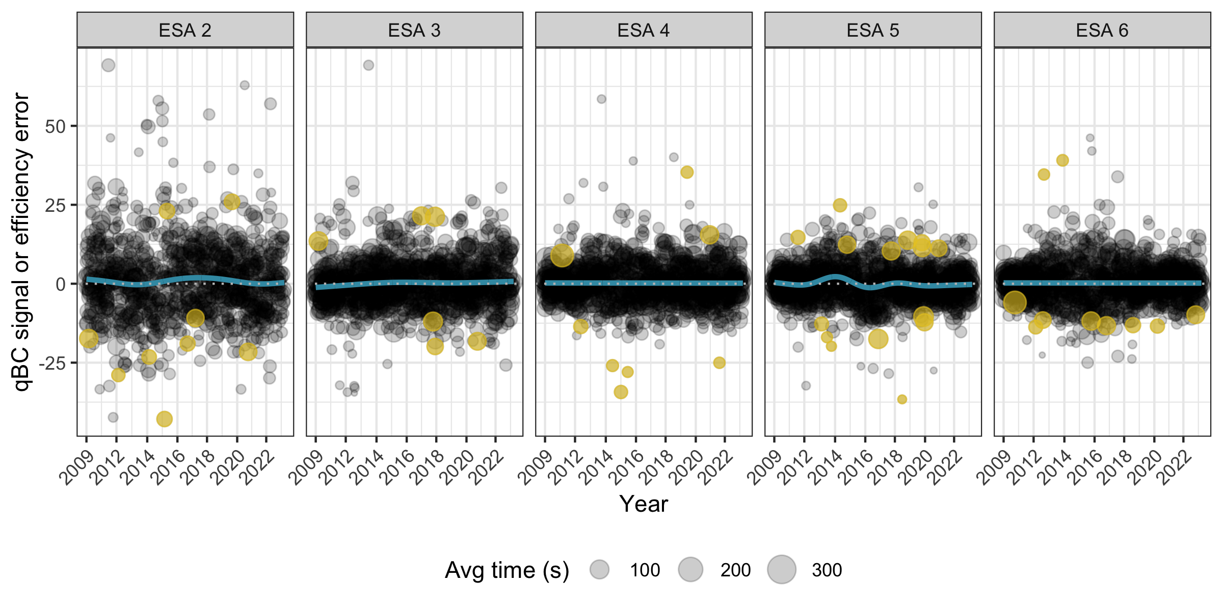
Appendix I Improvement to map estimation
We consider simulated binned qABC and qBC direct event data (generated based on an ENA map derived from theoretical heliosphere and ribbon models [22, 23]). For each binned data set, we generate an estimated sky map using the Theseus procedure described in [20]. Figure I.1 plots the estimated sky map using qABC data only, the estimated map using both qABC and qBC data, and the simulated true spatial retention model sky map. Uncertainty maps are also shown.
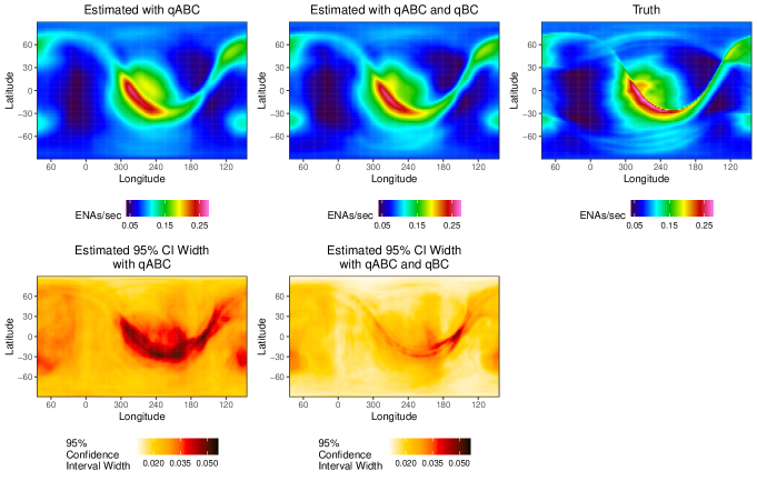
The mean absolute percent error (MAPE) can be used to measure how well an estimated sky map agrees with a simulated true sky map. The MAPE for the estimated sky map using only qABC data is 6.7% (meaning, on average, an estimated pixel’s ENA rate deviates from the corresponding simulated pixel’s ENA rate by 6.7% of the simulated pixel), while the MAPE for the estimated sky map using both qABC and qBC data is 4.8%. Said another way, the sky map estimated using qABC and qBC data is 40% more accurate than using qABC data alone. Furthermore, the 95% confidence interval (CI) widths for the sky map estimated with qABC and qBC data are on average 40% narrower compared to the estimated CI widths using qABC data only. Thus, estimating sky maps with qABC and qBC data result in better sky map estimates: they are more accurate and have smaller uncertainties.
This improvement doesn’t just hold for simulated data. Figure I.2 shows the Theseus-estimated 2019A, ESA 3 sky maps based on qABCs only, qBCs only, and qABCs and qBCs. First, we notice that the estimated sky maps with qABCs only and qBCs only are quite similar to one another, indicating that the qABC and qBC data sets contain similar information (if they didn’t contain similar information, we would expect the sky map estimates to look systematically different from each other). Second, while all three sky maps look broadly similar, we do see the sky map estimated with qABCs and qBCs removes some of the spurious artifacts (e.g., banding) that can be seen in the other two. This is a because including more data in the map-rendering process helps the estimation procedure better discern between signal and noise. Finally, the qABC and qBC estimated sky map has CI widths that are, on average, 39% narrower than their qABC or qBC estimated counterparts. This 39% reduction in uncertainty is almost the same as we observed with the simulated spatial retention model, bolstering confidence that the estimated sky map with qABCs and qBCs is not just more certain, but also better than the estimated sky maps made with only qABC data or qBC data.
