ExIFFI and : Interpretability and Enhanced Generalizability to Extend the Extended Isolation Forest
Abstract.
Anomaly detection, an essential unsupervised machine learning task, involves identifying unusual behaviors within complex datasets and systems. While Machine Learning algorithms and decision support systems (DSSs) offer effective solutions for this task, simply pinpointing anomalies often falls short in real-world applications. Users of these systems often require insight into the underlying reasons behind predictions to facilitate Root Cause Analysis and foster trust in the model. However, due to the unsupervised nature of anomaly detection, creating interpretable tools is challenging. This work introduces , an enhanced variant of Extended Isolation Forest (EIF), designed to enhance generalization capabilities. Additionally, we present ExIFFI, a novel approach that equips Extended Isolation Forest with interpretability features, specifically feature rankings. Experimental results provide a comprehensive comparative analysis of Isolation-based approaches for Anomaly Detection, including synthetic and real dataset evaluations that demonstrate ExIFFI’s effectiveness in providing explanations. We also illustrate how ExIFFI serves as a valid feature selection technique in unsupervised settings. To facilitate further research and reproducibility, we also provide open-source code to replicate the results.
1. Introduction
Machine Learning (ML) and Artificial Intelligence (AI) play a central role in the ongoing socio-economic change, revolutionizing various sectors such as manufacturing (Krafft et al., 2020; Xu et al., 2018), medicine (Houssein et al., 2021), and the Internet of Things (Klaib et al., 2021). With the increasing deployment of ML across various industries, new problems have emerged due to the widespread application of these systems, which are often complex and opaque. Moreover, the end users of these systems are becoming more diverse, including people from various backgrounds who may not have a knowledge in data-driven methods. Therefore, it is essential to develop explanation algorithms that provide a deeper understanding of the model structure and predictions to ensure that these systems can be used effectively by a wide range of users. Many scientific works identify explainability111While authors in the literature use the term ’interpretability’ and ’explainability’ associated with slightly different concepts when associated to Machine Learning/Artificial Intelligence as presented in (Gilpin et al., 2018), in this work we will use both terms interchangeably. as a key factor to enable the successful adoption of ML-based systems (Confalonieri et al., 2021; Doshi-Velez and Kim, 2017; Linardatos et al., 2020). The relevance of explainability in ML-based technologies is paramount, as users are being asked to accept their integration into everyday decisions. This is particularly challenging in critical areas such as medical diagnosis, insurance, and financial services.
In the case of tabular data, there are various methods for explaining the outcomes of a model (Molnar, 2020). One common approach is to calculate the importance of each feature in the model’s predictions. This involves evaluating the influence of each feature on both individual predictions (referred to as ”Local Importance”) and the overall dataset (”Global Importance”). By understanding the relative importance of each feature, users can gain insight into how the model is using the input data to inform its predictions. has been widely exploited and popularized in recent years thanks to the Random Forest (RF) algorithm. RF provides built-in approaches to provide a ranking of the most important features (Kursa and Rudnicki, 2010). Moreover, thanks to the rise of many post-hoc methods (Speith, 2022), like permutation importance (Altmann et al., 2010) or SHAP (Lundberg and Lee, 2017a), feature ranking as an interpretability measure has been extended also to models that are not tree-based.
Despite the remarkable recent advancements in eXplainable Artificial Intelligence (XAI), most approaches are designed for supervised tasks, leaving unsupervised tasks, like Anomaly Detection (AD), rarely discussed in the literature.
Anomaly Detection (AD), also referred to as Outlier Detection222In this paper, we will refer to ’Outlier Detection’ and ’Anomaly Detection’ alternatively, always referring to the same unsupervised task of finding anomalous data points., is a field of ML that focuses on identifying elements that live outside the standard ”normal” behavior observed in the majority of the dataset (Hawkins, 1980).
Explainability for AD approaches has paramount importance. A simple example is given by the AD approaches used to monitor industrial machinery. Effective interpretation of the reasons for the rise of an anomaly enables Root Cause Analysis, leading to the reduction of machine failures, energy loss, waste of resources, and production costs. Another argument for the need for interpretable algorithms is that the lack of explanations hinders the trust in the model’s output by the ones who benefit from its services.
Isolation Forest (IF) (Liu et al., 2008) is one of the most popular AD approaches due to its high accuracy, low computational costs, and relatively simple inner mechanisms. This method relies on an iterative process. Recursively splitting the feature space along axis-aligned hyper-planes chosen at random, IF can isolate anomalous points using few space partitions. The first approach to provide explainability features for IF, named Depth-based Isolation Forest Feature Importance (DIFFI) (Carletti et al., 2023) takes advantage of the inner structure of the IF to supply global and local model explanations.
Unfortunately, the one-dimensional partition process that IF relies on causes the creation of artifacts that degrade the detection of anomalies and negatively affect feature explanation. Thus, the Extended Isolation Forest (EIF) has been proposed (Hariri et al., 2021). EIF improves over the IF using oblique partitions that avoid creating the previously discussed artifacts. According to the literature, EIF is one of the best Unsupervised Anomaly Detection approaches (Bouman et al., 2023).
The main contribution of this paper is twofold. First, we focus on Anomaly Detection performance for Isolation-based approaches and we propose , an enhanced modification of the Extended Isolation Forest.
Second, we contribute to the research area of interpretable AD, by proposing the Extended Isolation Forest Feature Importance (ExIFFI), the first (to the best of our knowledge) model-specific333Model-specific interpretation tools are limited to specific model classes. Instead, Model-agnostic tools can be used on any machine learning model and are applied after the model has been trained (Molnar, 2020) approach which can provide explanations about the Extended Isolation Forest (and its novel version ).
The rest of the paper is organized as follows. First, a general introduction of the IF algorithm is provided in Section 2.1. Then, in Section 2.2, the EIF proposed in (Hariri et al., 2021) is discussed; in particular, the differences that allow EIF to overcome the structural problems that are hidden in the original IF implementation. The newly introduced model will be instead presented in Section 2.3. Successively, the DIFFI and ExIFFI interpretation algorithms are presented in Section 3.2 together with an explanation on the graphical tools exploited to easily illustrate their results.
In Section 4.2, we will present a comparison of the three methods, IF, EIF, and , with the intention of providing a deeper understanding of their different inner mechanisms and how this difference also reflects on the detection accuracy.
Finally, ExIFFI is experimentally validated on 17 datasets, both synthetic and real-world. The experimental results are reported in Sections 4.3.2 and 4.3.3. In the latter, the effectiveness of ExIFFI global importance is assessed using feature selection as a proxy task; also the Local Importance is analyzed with the usage of Local Scoremaps. Finally, conclusions and future research directions are discussed in Section 5.
2. Isolation-based Approaches for Anomaly Detection
Next, we provide some notions about isolation-based approaches for Anomaly Detection. This family of methodologies, stemming from the Isolation Forest (Liu et al., 2008), identifies outliers as samples that can be easily separated from the others, i.e., through a reduced number of splitting hyperplanes.
2.1. Isolation Forest
Isolation Forest is a widely used ML model for Anomaly Detection (Liu et al., 2008). It generates a set of random trees, called isolation trees, that are able to identify anomalous elements in a dataset based on their position in the tree structure. The idea behind this approach is that anomalies, on average, are located at the beginning of the trees because they are easier to separate from the rest of the dataset.
Assume that we have training data , where . The IF algorithm chooses at random one dimension and a split value . The dataset is then divided into two subsets, the left one and the right one . This procedure is calculated iteratively until the whole forest is built. Suppose the size of the dataset is excessive, meaning that the number of samples makes the construction of the trees too slow; in that case, it is demonstrated by Liu et al. (Liu et al., 2008) that it is better to build the forest using only a random subsample with elements for each tree. Not only does this keep the computational cost low. It also improves IF’s ability to identify anomalies clearly. Once the model has built an isolation forest, to determine which data points live outside the dataset distribution, the algorithm computes an anomaly score for each of them. This value is based on the average depth among trees where each data point is isolated.
The depth of a point in a tree , denoted by , is the cardinality of the set of nodes that it has to pass to reach the leaf node, i.e.:
| (1) |
Let be the mean value of depths reached among all trees for a single data point . Then, according to (Preiss, 2000), the anomaly score is defined by the function:
| (2) |
where is the normalizing factor defined as the average depth of an unsuccessful search in a Binary Search Tree (Hariri et al., 2021), i.e.:
| (3) |
and is the harmonic number that can be estimated by:
| (4) |
IF’s fast execution with low memory requirement is a direct result of building partial models and requiring only a significantly small sample size as compared to the given training set. This capability is due to the fact IF has the main goal to quickly isolate anomalies more than modelling the normal distribution, contrarily to what other detection methods do (Ruff et al., 2021).
2.2. Extended Isolation Forest
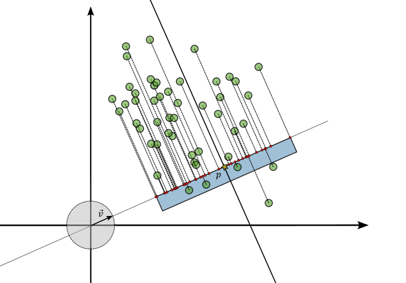
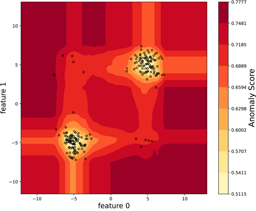
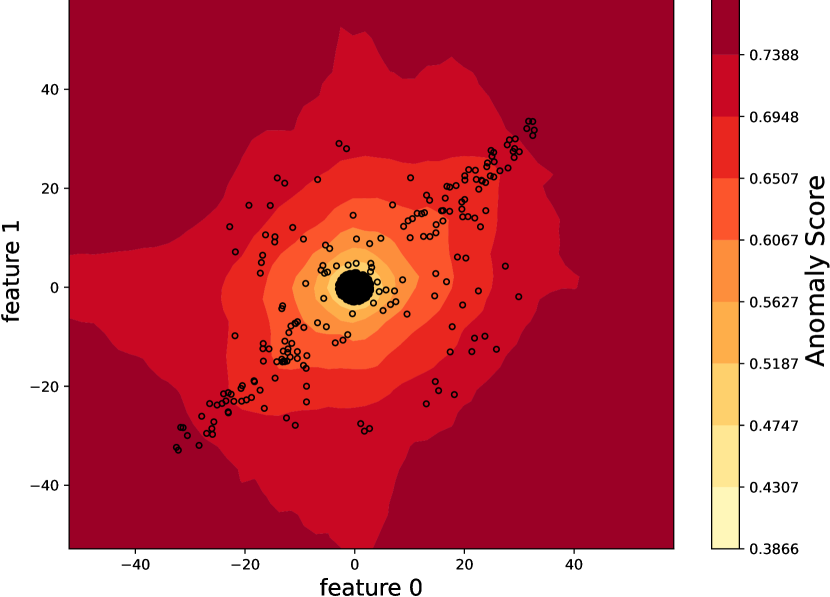
Although IF is one of the most popular and effective anomaly detection algorithms, it has some drawbacks due to its partition strategy. One of them is related to considering only hyper-planes that are orthogonal with respect to the directions of the feature space, as Hariri et al. show in (Hariri et al., 2021). In some cases, this bias leads to the formation of some artifacts where points are associated with low anomaly scores even if they are clearly anomalous. These areas are in the intersection of the hyperplanes orthogonal to the dimensions associated with the detection of inliers (Figure 3), creating misleading score maps and, in some cases, wrong predictions.
As a consequence, Hariri et al. in (Hariri et al., 2021) tried to improve the anomaly detection algorithm by correcting this bias with a different and more general algorithm called Extended IF. Instead of selecting a hyper-plane orthogonal to a single input dimension chosen at random, they suggested picking a random point and a random vector that are consequently used to build a hyperplane that will split the space at each node of the binary tree into two smaller subspaces, as the IF does. Therefore, they proposed a more generic and extended paradigm, while maintaining the fast execution and low memory requirements of the original IF.
In the following, we will briefly describe the working principle of the EIF model. Let’s consider a set of elements with . In order to evaluate the anomaly score of the samples, the EIF model (Hariri et al., 2021) generates a forest of binary trees:
| (5) |
Every tree is built from a bootstrap sample . At each node of , a random hyperplane is selected by picking a random point inside the distribution space limits, and a normalized random vector defined as
| (6) |
Lesouple et al. in (Lesouple et al., 2021) pointed out that this way of drawing a random hyperplane may lead to the creation of empty branches, that are merely artifacts of the algorithm. To avoid this problem, they propose a particular way of selecting random hyperplanes, that we also use in our implementation of the EIF model.
As done in (Lesouple et al., 2021; Hariri et al., 2021), we first select a random hyperplane by drawing a unit vector defined as in (6). which will serve as the normal vector of the hyperplane. Then, as done in (Lesouple et al., 2021), the point where the hyperplane passes is obtained by a scalar drawn uniformly between the minimum value and the maximum value of the points of the dataset in the direction of the random vector previously drawn. Therefore,
| (7) |
The algorithm starts by generating a random hyperplane defined by the intercept point and as described in Equations 6 and 7.
Thus the hyperplane splits the dataset into two subsets,
| (8) | ||||
The root node of the tree, , is the space splitting made by the hyperplane .
Then, this method is applied recursively to the subsets and until the max number of splits is reached, which corresponds to the preset max depth of the tree or when the set to split has only one element.
Thanks to this hierarchical tree structure, to evaluate if an element is an anomaly, the model extracts the path of the point from the root to the leaf nodes down the tree. Then, as IF does (Ruff et al., 2021), the EIF algorithm uses the average depth of the point in each tree to evaluate the anomaly score, according to the paradigm that the anomalies can be isolated with few partitions.
The average depth of the point in the trees will be translated to an anomaly score according to Equation (2), as in IF.
2.3. a novel enhancement of EIF algorithm
Lesouple et al. (Lesouple et al., 2021) shown that the EIF algorithm presented by Hariri et al. in (Hariri et al., 2021) can create misleading empty branches. On the other hand, we observed that the solution proposed in (Lesouple et al., 2021) hinders the ability to generalize well in the space around the distribution. Actually, generalization ability is very important in the context of anomaly detection, since an anomaly is a point that is outside the normal distribution of the data.
Therefore, we propose , a novel approach that enhances the EIF methodology, based on the modification introduced by Lesouple et al. (Lesouple et al., 2021). aims to better describe the space surrounding the training data distribution. This goal is achieved by choosing splitting hyperplanes with an ad hoc procedure.
Let be the set of the point projections along the hyperplane’s orthogonal direction . As in (Lesouple et al., 2021), the point is defined as . However, instead of drawing using the interval defined by the minimum and maximum values of , draws it from a normal distribution as shown in Figure 1(b). Even if can generate empty branches, they contribute to the formation of a model that exhibits enhanced generalizability, as will be shown in Section 4.2.
3. Interpretability for Isolation-based Anomaly Detection approaches
Next, we delve into interpreting the predictions computed by the isolation-based models introduced in Section 2. Interpretation algorithms aim to explain the latent patterns identified by the models, thereby enriching our comprehension of their outputs. Drawing inspiration from the DIFFI algorithm developed by Carletti et al. (Carletti et al., 2023) for the IF, we introduce ExIFFI, a novel model-specific algorithm designed to interpret the results generated by the Extended Isolation Forest (EIF), along with its variant, the .
3.1. Depth-based Isolation Forest Feature Importance
Depth-based Isolation Forest Feature Importance (DIFFI) was the first unsupervised model-specific method addressing the need to interpret the IF model (Carletti et al., 2023). It exploits the structure of the trees in the IF algorithm to understand which features are the most relevant to discriminate whether a point is an outlier or not.
In particular, a meaningful feature should isolate the anomalies as soon as possible, and create a high imbalance when isolating anomalous points (the opposite being true for inliers).
We briefly explain how DIFFI works and we introduce the related notation, as we will leverage it when introducing the novel ExIFFI approach to explain EIF and predictions. From (Carletti et al., 2023), we define:
- Induced Imbalance Coefficients :
-
: given an internal node of an isolation tree, as defined in Section 2.1, let be the number of points that the node divides, being and the number of points on the left and the right child, respectively. The coefficient measuring the induced imbalance of the node is:
(9) where
(10) In the previous equation, and denote the minimum and maximum scores that can be obtained a priori given the number of data .
- Cumulative feature importances :
-
: it is a vector of dimension (i.e., the number of features) where the -th component is the feature importance of the -th feature. In (Carletti et al., 2023), authors distinguish between , created based on predicted inliers, and , based on the outliers. Concerning , the procedure starts with the initialization . Considering the subset of predicted inliers for the tree , , for each predicted inlier , DIFFI iterates over the internal nodes in its path .
If the splitting feature associated with the generic internal node is , then we update the -th component of by adding the quantity:
(11) The same procedure applies for and . Intuitively, at each point and each step, the vector accumulates the imbalance produced by each feature. The imbalance is measured by the previously defined and weighted by the depth of the node. This means that, according to DIFFI, features that allowed to isolate the points sooner, are considered to be more useful.
- Features counter :
-
: it is used to compensate for uneven random feature sampling that might bias the calculated cumulative feature importance. At each passage of a point through a node, the entry of the counter corresponding to the splitting feature is incremented by one. As for the cumulative feature importance, two feature counters are calculated, the one for predicted inliers and the one for outliers .
Based on the above-introduced quantities, DIFFI computes the Global Feature Importance by looking at the weighted ratio between outliers and inliers cumulative feature importance:
3.2. Extended Isolation Forest Feature Importance (ExIFFI)
Drawing inspiration from DIFFI, we introduce ExIFFI, the Extended Isolation Forest Feature Importance, to rank the importance of the features in deciding whether a sample is an anomaly or not for the EIF model.
As seen in Section 2.2, a node in an EIF tree corresponds to an hyperplane , that splits the subset . Using the Lesouple et al. (Lesouple et al., 2021) correction of the EIF, is completely defined by means of a vector orthogonal to its direction , defined as in (6), and a point that belongs to it, defined as in (7).
The hyperplane separates the points in a set of elements on the left side of the hyperplane and a set of elements on the right side of the hyperplane.
| (12) | ||||
ExIFFI computes a vector of feature importances for each node of the tree, based on two intuitions:
-
•
The importance of the node for a point is higher when creates a greater inequality between the number of elements on each side of the hyperplane, and is in the smaller subset. Indeed, greater inequality means a higher grade of isolation for the points in the smaller set.
-
•
For node , the relative importance of the -th feature is determined by the projection of the normal vector of the splitting hyperplane onto that feature. If the split occurs along a single feature, that feature will receive the entire importance score.
If the splitting hyperplane is oblique, the importance scores of multiple features will be calculated based on their respective projections onto the normal vector of the hyperplane.
Thus, we assign an importance value function to every node of the trees that is the projection on the normal vector of the splitting hyperplane of the quotient between the cardinality of the sample before a particular node and after it, following the path of a sample . Thus, knowing that the splitting hyperplane of that node is determined by the pair 444With we refer to the positive part of every element of the vector :
| (13) |
The vector of importances evaluated in the tree for a point is the sum of all the importance vectors of all the nodes that the element passed through on its path to the leaf node in the tree defined in Equation (1):
| (14) |
We then calculate the sum of the importance vector of the point for all the trees in :
| (15) |
We define as the sum of the vectors orthogonal to the hyperplanes of the nodes that an element passes in a tree, then we calculate the sum of the values in all the trees:
| (16) |
3.2.1. ExIFFI: Global Feature Importance
To globally evaluate the importance of the features, we divide into the subset of predicted inliers and the one of predicted outliers where is the binary label produced by the thresholding operation indicating whether the corresponding data point is anomalous or not .
We define the global importance vectors for the inliers and for the outliers by summing out the importance values introduced in Equation (15):
| (17) |
Likewise the sum of the orthogonal vectors:
| (18) |
Due to stochastic sampling of hyperplanes, in order to avoid the bias generated by the fact that it is possible that some dimensions are sampled more often than others, the vectors of importance have to be divided by the sum of the orthogonal vectors.
| (19) |
To evaluate which are the most important features to discriminate a data as an outlier we divide the importance vector unbiased of the inliers by the one of the outliers Equation (19), and we obtain the global feature importance vector in the same vein as in the DIFFI algorithm (Carletti et al., 2023):
| (20) |
3.2.2. ExIFFI: Local Feature Importance
The Local Feature Importance assumes significance primarily within the context of anomalous data points, especially from the point of view of applications. Indeed, providing explanations of samples deemed anomalous eases decision-making by domain experts, who can subsequently tailor their responses based on the salient features driving the anomaly of a single point. Let’s take into account an element , the Equation (15) gives a vector of importances of the sample for each feature. Then the vector is the normalization factor of the feature importance. Thus, the Local Feature Importance () of an element is the quotient:
| (21) |
3.2.3. Visualizing Explanations
Miller (Miller, 2019) defines interpretability in AI models as the extent to which a human can comprehend the rationale behind a decision. To be effective, interpretability should deliver a clear and comprehensible representation of how inputs influence outputs, even for individuals who are not experts in the field.
To bolster users’ trust in the model, relying solely on a series of numerical Scores is insufficient. Providing a series of summary scores and comprehensible graphical representations of these scores may help in the evaluation of the model outputs and in evaluating its interpretational efficacy.
To achieve these goals, three distinct graphical representations are proposed, two for the Global Feature Importance, and one devoted to the assessment of the Local Feature Importance.
The Global Feature Importance in the aforementioned plots can take into account one or multiple model runs. This twofold approach is motivated by the intrinsic stochasticity of the EIF/ model. We can interpret a single model, or we can leverage multiple runs to account for random choices in model training and provide more stable interpretability results. This comprehensive approach enhances the understanding of how each feature influences the output. The multiple model runs approach will be used to validate the algorithm in Section 4.
- Global Feature Importance Bar Plot (Bar Plot):
-
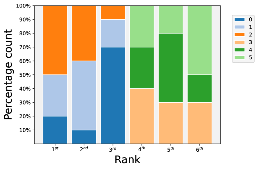
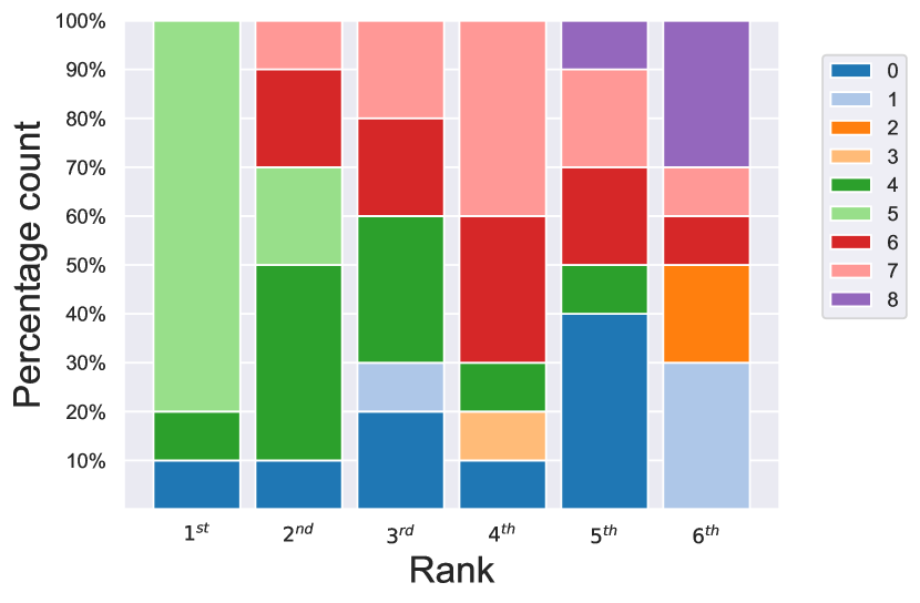
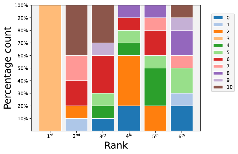
In this plot, we consider runs of model training executions, and for each training we compute the Global Feature Importance score vector as described in Section 3.2.1. Successively, the Bar Plot is obtained by showing the percentage distribution across all potential ranking positions for each distinct feature. To enhance visual clarity, the graphical representation is confined to the foremost six ranking positions. As it will be shown in Section 4.3.2 and Section 4.3.3, in the majority of the datasets the most important features are placed in the very first rankings, strongly dominating the output with respect to the other features. Thus, limiting the representation just to the top six ranking positions is more than sufficient in most cases. For each position, there is a vertical bar partitioned into distinct colors associated with the features that appeared at least one time in that particular ranking among the model training executions. A feature can be considered important if it occupies a large portion of the vertical bar associated with the top rankings. A visual example of the Global Feature Importance Bar Plot can be found in Figure 2(a).
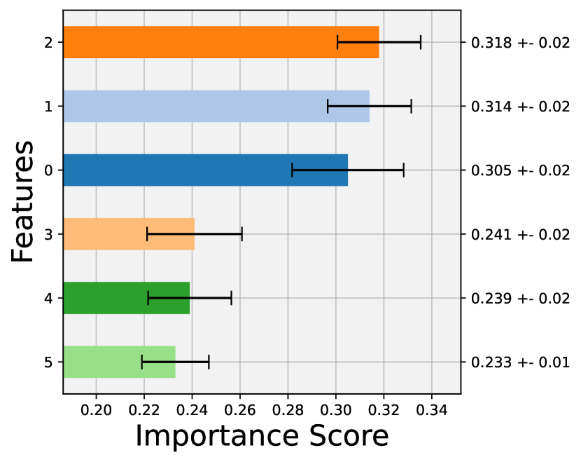
- Global Feature Importance Score Plot (Score Plot):
-
While the Bar Plot offers a comprehensive overview of feature rankings, it lacks the inclusion of precise quantitative Importance Scores. Incorporating these actual scores can offer valuable complementary insights. These scores provide a quantitative measure of how one feature’s importance compares to another, and when computed across multiple runs, they reveal the consistency of the ranking. For a practical illustration, refer to Figure 2(b).
To address these nuances, we consider the Score Plot. This graphical representation consists in a horizontal bar plot with superimposed score uncertainty to depict the average Global Importance Score obtained for each feature among the training executions.
- Local Feature Importance Scoremap (Scoremap):
-
In the Scoremap, the focus is on local interpretability. Given a pair of features, we define a grid of values and compute the Local Importance Score for the two selected features. Then, for each point in the grid, we identify the feature with the highest value and assign the color accordingly: red for the first feature and blue for the second one. Furthermore, a darker color shape corresponds to a higher Feature Importance Score.
To provide additional contextual insights, a scatter plot depicting the data points is overlaid on the score map, where points are distinguished among inliers (depicted as blue dots) and outliers (represented as red stars)
This representation is enriched with the contour plot of the Anomaly Score, where the darker the contour line, the higher the Anomaly Score.
Since it is not feasible to inspect all features pairs, selecting the most meaningful pair of features has paramount importance. In most cases, as will be described in the next sections, a common choice is to focus on the pair composed of the two most important features at global level so that it is possible to capture the dispersion of anomalous points along one or both axes of the plot. For example, this strategy was exploited for the local Scoremap of the Bisect 3d dataset, depicted in Figure 2(c).
In cases in which the analysis of a pair of features is not enough to provide a reliable explanation of the model’s outputs an extension of the Local Scoremap, called Complete Local Scoremap can be exploited. Additional details about Complete Scoremaps are reported in Appendix A.4.

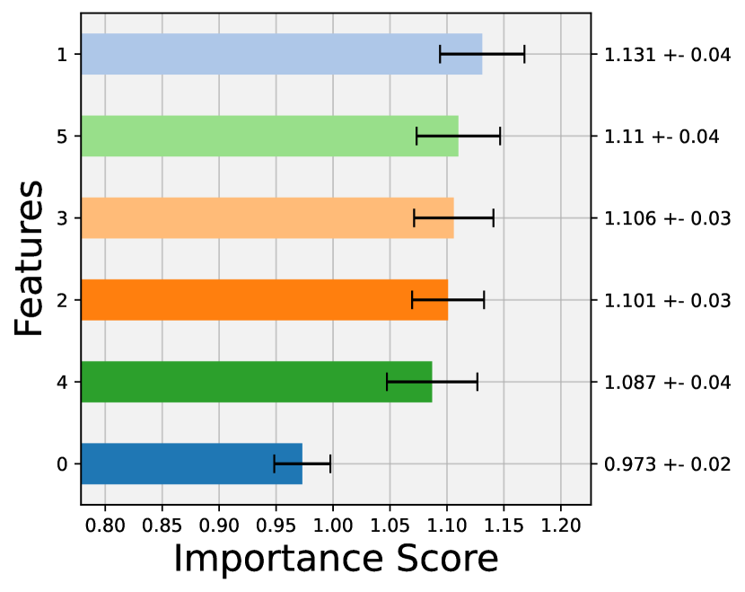
In order to explain how the interpretation of the graphical representation just described can be conducted the example of the Bisect3D dataset can be considered, that will be commented deeply in the Section 4.3.2 in order to validate the interpretation algorithm. The dataset is built by anomalous points that are placed ad-hoc along the bisector line of the Feature 1, 2 and 3, while the inlier points are placed around the origin of the axes using a normal distribution along all the 6 dimensions.
As a consequence, Feature 0, 1 and 2 have a crucial role in the outlier’s detection. Because of the stochasticity of the different executions performed the model will alternatively select one of the three features as the top-ranked one.
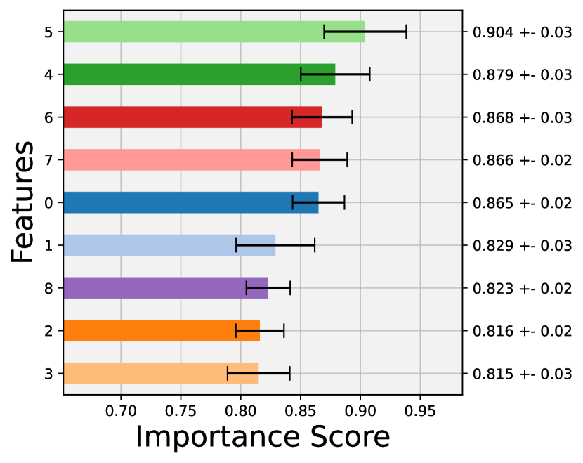
As a result, in the Bar Plot depicted in Figure 2(a) the importance is almost evenly shared among the three considered attributes. The Score Plot in Figure 2(b) shows three almost identical Importance Scores, while the remaining features are consistently lower than the first 3 features. The order of importance of the first three may probably change if another set of model executions is performed.
Looking at the scatter plot superimposed on the Scoremap, depicted in Figure 2(c), it is clear that the stars representing the outliers deviate from the normal distribution represented by the ball of inliers.
The distribution of the red and blue colors provides useful insights on how the Local Importance Score changes in the different locations of the feature space identified by the two attributes under analysis. In particular, one can observe a distinct pattern in the Scoremap. Points located at the center occupy a region characterized by lighter shades, while anomalies are concentrated in a darker area. Notably, these anomalies tend to align with the boundary where the most significant feature transition occurs, transitioning from Feature 0 to Feature 1.
4. Experimental Results
First, we evaluate the performance of Isolation-based Anomaly Detection approaches by considering a benchmark composed of both synthetic and Real-World Datasets, described in Section 4.1. After comparing IF with EIF and in Section 4.2, we focus on the proposed interpretability approach ExIFFI in Section 4.3. The code to implement and ExIFFI and to reproduce the experiments is openly available on https://github.com/alessioarcudi/ExIFFI.
4.1. Datasets
We compare the performance of the IF, EIF, and models by analyzing seventeen datasets with labeled anomalies. This benchmark includes six synthetic datasets, which were designed to evaluate the differences in model performance and to provide a ground truth about anomalies and model interpretation, as well as eleven open source datasets based on real applications. In the rest of the paper, the datasets will be indicated using a typewriter font. Table 1 summarizes the key characteristics of the datasets that were examined. A detailed description can be found in Appendix A.1.
| n. data | n. anomalies | contamination | n. features | (Dimensionality) | Dataset Type | |
| % | ||||||
| Bimodal | 400 | 10 | 2.50 | 2 | (Low) | Synthetic |
| Xaxis | 1100 | 100 | 9.09 | 6 | (Low) | Synthetic |
| Yaxis | 1100 | 100 | 9.09 | 6 | (Low) | Synthetic |
| Bisect | 1100 | 100 | 9.09 | 6 | (Low) | Synthetic |
| Bisec3D | 1100 | 100 | 9.09 | 6 | (Low) | Synthetic |
| Bisec6D | 1100 | 100 | 9.09 | 6 | (Low) | Synthetic |
| Annthyroid | 7200 | 534 | 7.56 | 6 | (Low) | Real |
| Breastw | 683 | 239 | 52.56 | 9 | (Middle) | Real |
| Cardio | 1831 | 176 | 9.60 | 21 | (High) | Real |
| Glass | 213 | 9 | 4.22 | 9 | (Middle) | Real |
| Ionosphere | 351 | 126 | 35.71 | 33 | (High) | Real |
| Pendigits | 6870 | 156 | 2.27 | 16 | (Middle) | Real |
| Pima | 768 | 268 | 34.89 | 8 | (Middle) | Real |
| Shuttle | 49097 | 3511 | 7.15 | 9 | (Middle) | Real |
| Wine | 129 | 10 | 7.75 | 13 | (Middle) | Real |
| Diabetes | 85916 | 8298 | 9.65 | 4 | (Low) | Real |
| Moodify | 276260 | 42188 | 15.27 | 11 | (Middle) | Real |
4.1.1. Remarks on Synthetic datasets
The Synthetic datasets were carefully designed to highlight the differences and the strengths of the EIF and algorithms over the IF method.
The datasets are composed of two different kinds of data points. One set, labeled as inliers, follows the expected distribution pattern. The other one, labeled as outliers, is formed by points significantly deviating from the distribution of the inliers..
Moreover, the number of generated anomalies is much lower than the number of inliers in order to correctly simulate the class imbalance typically encountered in Anomaly Detection tasks. In fact, as it will be confirmed in Section 4.1.2, in real world scenarios anomalous points are rare. The Anomaly Detection datasets are characterized by the contamination factor, used to measure the amount of outliers with respect to the entirety of the dataset. Typical values for the contamination factor are 5 to 10%, and in specific cases (e.g. Credit Card Fraud Detection) it may also be much less than 1%.
4.1.2. Remarks on Real-World Datasets
Most of the considered Real-World Datasets are part of the widely used Outlier Detection DataSets (ODDS) library introduced in (Rayana, 2016). Unlike their computer-generated counterparts, these datasets reflect the complexity present in real world scenarios. However, it’s essential to emphasize the origin of these datasets, as the majority comes from an adaptation to the Anomaly Detection task of datasets originated with a different purpose. In particular, the ODDS datasets are obtained after applying an alteration to datasets that originally came in the form of Multi-Class datasets. This is due to the fact that, unfortunately, the existing literature lacks dedicated Real-World benchmark Datasets specifically tailored for Anomaly Detection. Typically, the applied transformation involves undersampling the least-represented class, designating it as the outlier class, and merging the remaining classes into a single category representing the normal distribution of the data. As we will discuss in our experiments, this approach presents challenges, as an undersampled version of the minority class may not result in abnormally distributed samples.
The considered AD approaches are designed to identify anomalies defined as isolated samples in an unsupervised manner. Obviously, the detected anomalies may not always align with the provided labels. It is worth noticing that this discrepancy makes it more difficult to evaluate the algorithm interpretability, as will be investigated in Section 4.3.3.
Moreover, it’s important to note that some of these Real-World Datasets lack comprehensive information regarding their features and class labels. The absence of detailed information is challenging. Not only does it make it hard to qualitatively evaluate the performance of the model, but it also hinders the interpretation of the Feature Importance scores.
To overcome these limitations, two new datasets were added to the original list: the Diabetes and the Moodify datasets. The peculiarity of these two sets of data is that they are provided with highly detailed information on the semantics of the features and labels composing them. Thus, once Anomaly Detection and interpretation results are obtained, is possible to evaluate them by measuring how they are aligned with the provided domain knowledge.
4.2. Evaluation of AD performance for Isolation-based approaches
In this section, we present a comparative examination involving the algorithms introduced in Section 2. First, we show how the additional complexity introduced by the EIF approach improves the Anomaly Detection performance achieved by IF. Then, we show that and EIF attain similar results. Finally, we aim to determine the extent to which the model achieves improved outcomes when applied to novel, untrained anomalous data.
4.2.1. Draw-backs of Isolation Forest
Next, we delve deeper into the artifacts of the IF and how the EIF is able to avoid them. The primary distinction among the mentioned models lies in their approach to determining splitting hyperplanes. In the case of the IF, it operates under the constraint of splitting the feature space along a single dimension. Consequently, the constructed splitting hyperplane is invariably orthogonal to one dimension while remaining parallel to the others.
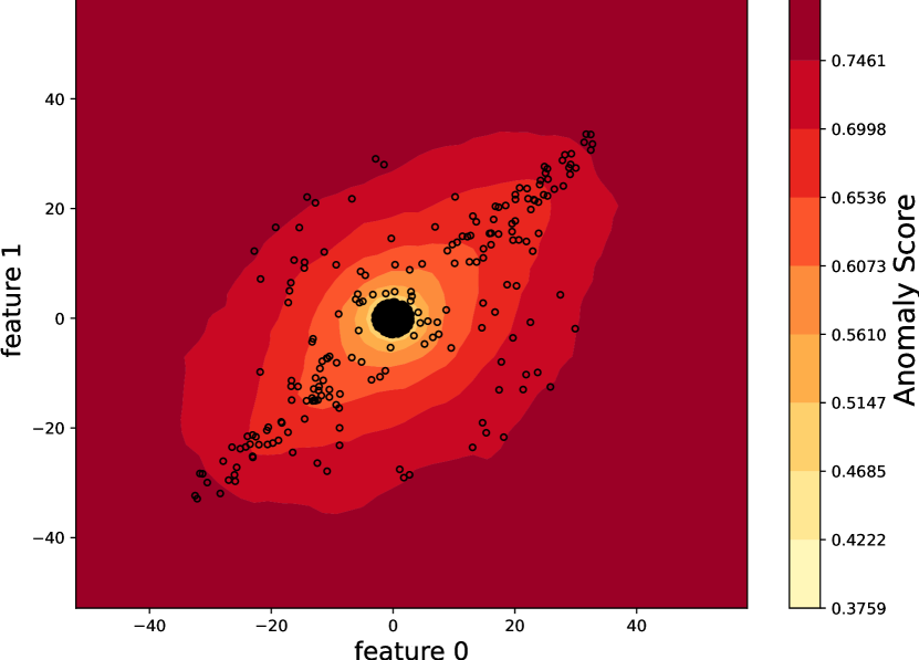
The EIF model instead relaxes this constraint, it allows multiple splits in the feature space along different dimensions, thus the splitting hyperplane can be oriented differently in each isolation tree. This relaxation helps to provide a more expressive way to capture complex data distributions while maintaining performances, as seen in Figure 5(a), mainly when anomalies are not characterized by only one dimension. Moreover, as Hariri et al. pointed out in (Hariri et al., 2021), the EIF avoids the creation of regions where the anomaly score is lower only due to the imposed constraints. In Figure 3 we can observe that the effect of the constraint is twofold: (i) it generates bundles in the hyperplanes orthogonal to the main directions, and (ii) it creates ”artifacts”, i.e. low anomaly score zones in their intersections, as we can observe in the Scoremap 3(a).
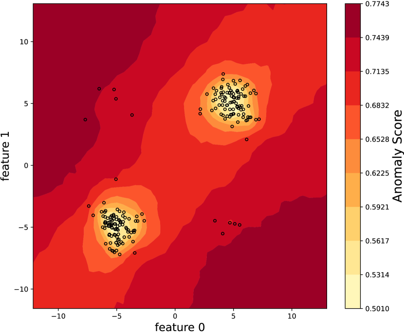
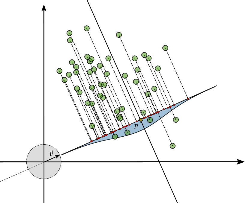
As we progressively relax the IF constraint on splitting directions, these artifacts tend to disappear. We simulated the evolution of the anomaly score surface by allowing the hyperplane to split along a new feature in each step. Figure 4 vividly demonstrates the gradual elimination of artifact-prone regions.


4.2.2. Comparison of Anomaly Detection Performance of Isolation-based approaches
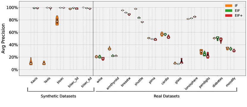
Next, we evaluate the AD performance of the Isolation-based approaches introduced in Section 2. In the experiments, we utilize the Average Precision score as our key metric. The Average Precision score serves as a reliable measure of Anomaly Detection performance because it is robust with regard to class imbalance (Branco et al., 2016).
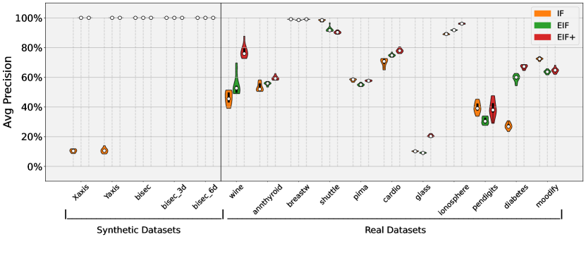
Our objective is twofold: first, to assess that EIF and not only mitigate the biases observed in the IF but also improve the performance. Second, to underscore the distinctive capacity of to model and generalize effectively when confronted with novel anomaly data points. With reference to the latter goal, we consider two distinct scenarios:
- Scenario I:
-
Since these models operate in an unsupervised manner, we train and test the models using the entire dataset, and the results are illustrated in Figure 5(a).
- Scenario II:
-
We train the models exclusively on the inliers within the dataset. Subsequently, we assess the Average Precision scores of these models when applied to the entirety of the dataset, as depicted in Figure 5(b).
In both scenarios, we conducted a total of 10 iterations for each isolation-based model and each dataset introduced in Section 2 and Section 4.1, respectively. Repeated runs are necessary to take into account the impact of the random generation of the isolation trees.
It’s important to emphasize that prior to training, we applied data normalization to each Real-World Dataset. This step was taken in accordance with the guidance provided by Lesouple et al. in (Lesouple et al., 2021). While data normalization may not significantly impact the Isolation Forest (IF), it is useful for the Extended Isolation Forest (EIF). EIF, in particular, demonstrates sensitivity to scaling, especially in multidimensional datasets.
The results illustrated in Figure 5(a) and in Table 2 indicate that, in most cases, the three models perform comparably, with only minor variations observed in specific datasets. It is worth noting that for the Synthetic Datasets Xaxis and Yaxis, both the EIF and models exhibit a significant improvement in performance compared to the IF model, as a consequence of their robustness with regard to artifacts in the anomaly score. In contrast, the IF model demonstrates superior performance when applied to the Shuttle dataset. In this simple dataset, it is indeed possible to perform straightforward separation of anomalies and inliers across multiple dimensions.
However, when we try to evaluate the models in terms of their ability to generalize to new data and accurately detect previously unseen anomalies (Scenario II), exhibits equal or superior performance compared to the other models across all Synthetic Datasets, as Figure 5(b) shows. Notably, in datasets such as Wine, Cardio, Glass, Ionosphere and Diabetes, consistently outperforms the others.
| Scenario I | Scenario II | |||||
| Dataset | IF | EIF | EIF+ | IF | EIF | EIF+ |
| Xaxis | 0.15 | 0.98 | 0.98 | 0.11 | 1 | 1 |
| Yaxis | 0.11 | 1 | 1 | 0.11 | 1 | 1 |
| bisect | 0.79 | 1 | 0.98 | 1 | 1 | 1 |
| bisect 3d | 0.98 | 1 | 0.99 | 1 | 1 | 1 |
| bisect 6d | 1 | 0.99 | 0.99 | 1 | 1 | 1 |
| annthyroid | 0.33 | 0.23 | 0.22 | 0.57 | 0.50 | 0.51 |
| breast | 0.95 | 0.92 | 0.90 | 0.99 | 0.98 | 0.99 |
| cardio | 0.58 | 0.56 | 0.53 | 0.71 | 0.74 | 0.78 |
| glass | 0.10 | 0.10 | 0.21 | 0.10 | 0.08 | 0.20 |
| ionosphere | 0.82 | 0.83 | 0.84 | 0.88 | 0.92 | 0.96 |
| pendigits | 0.27 | 0.24 | 0.25 | 0.36 | 0.30 | 0.44 |
| pima | 0.51 | 0.49 | 0.49 | 0.58 | 0.55 | 0.59 |
| shuttle | 0.95 | 0.86 | 0.78 | 0.99 | 0.91 | 0.92 |
| wine | 0.22 | 0.22 | 0.18 | 0.40 | 0.58 | 0.78 |
| diabetes | 0.46 | 0.44 | 0.42 | 0.21 | 0.49 | 0.58 |
| moodify | 0.34 | 0.32 | 0.32 | 0.75 | 0.67 | 0.71 |
4.3. Experimental Evaluation of ExIFFI
The experiments in this section assess the novel ExIFFI model in interpreting predictions from the EIF or Anomaly Detection models. As shown in Section 4.2.2, thanks to an improved splitting hyper-planes selection procedure, excels in generalization, artifact prevention, and outlier identification. However, as well as EIF, lacks out-of-the-box interpretability. This issue is critical, especially in some fields of application, where fast and clear explanations are crucial. An example is the industrial scenario, where explanations provide tools to perform Root Cause Analysis and reduce material, energy, and time waste due to abnormal conditions.
When dealing with Anomaly Detection, adequate explanations require elucidating the specific criteria by which anomalies are defined within the given dataset (Foorthuis, 2021). Thus, ExIFFI provides an importance score for every input feature of the dataset. For every data point, ExIFFI leverages the intrinsic structure of the tree-based model to compute a local importance score related to how much a specific feature influences the resulting anomaly score.
Unlike in many other research areas, there’s no standardized metric or guideline for evaluating explanation algorithms. Assessing such algorithms is challenging due to the dependency on various factors, including input data complexity, model intricacies, and end-user interpretability needs. In the absence of a one-size-fits-all metric, the evaluation process becomes a delicate balancing act between quantifiable measures and qualitative insights.
In the absence of established datasets that provide information about the relevant attributes, we first assess ExIFFI performance using a synthetic dataset where we have a complete understanding of the generated anomalies. Then, we include real-world dataset in the evaluation.
4.3.1. Perfomance evaluation strategy
Beyond the qualitative analysis enabled by the visualizations described in Section 3.2.3, we also consider quantitative evaluation. This is conducted considering the Average Precision metric. This metric was employed because it is particularly suitable in the Anomaly Detection scenario, as it is robust against class imbalance. In this way, we can both compare the classification performance of Isolation-based approaches and assess the reliability of interpretations provided by ExIFFI We refer the reader to Table 2 for the comparison based on Average Precision. In case a complete analysis of the presented models as anomaly detectors is sought the classic Binary Classification metrics may be considered: Precision, Recall, F1 Score, Accuracy, ROC AUC Score, and Average Precision. Table 3 provides the complete classification report with all the metrics introduced above.
Another approach to achieve a quantitative evaluation of model interpretability is using Feature Selection as a proxy task. The Importance Scores computed by interpretability approaches offer an intuitive means of prioritizing input features. Then, considering the performance achieved by AD when narrowing down the available features to the most significant ones based on a particular model serves as a valuable proxy to assess how effectively it selects the most crucial features, compared to other models.
In order to exploit the Feature Selection task to evaluate different interpretation approaches, the following steps were taken:
-
(1)
A vector of Global Feature Importance Score is obtained through a specific interpretation algorithm.
-
(2)
The input features of the dataset are ranked by sorting the Global Feature Importance Score vector in decreasing order.
-
(3)
A number of steps equal to the total number of features is considered. At each step, the feature associated with the last position of the ranking, i.e. the features with the lowest Importance Score, is removed from the set of input attributes. This procedure is iteratively applied until a single feature is left.
-
(4)
Each different features’ subset considered in this way is used as a training set for the AD model and the Average Precision metric is computed.
-
(5)
The comparison of the different Feature Ranking Algorithms under analysis is achieved through a graphical representation depicting the behavior of the Average Precision metric as the number of the model’s input features decreases.
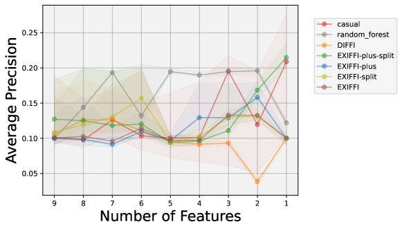
The Feature Ranking Algorithms used in the Feature Selection Plots are the following: ExIFFI (standard ExIFFI), ExIFFI-plus (ExIFFI using the model), DIFFI, Random Forest and Casual.
The ExIFFI and ExIFFI-plus algorithms were considered both in the case in which the training step is performed on the entire dataset (i.e. Scenario I) and in the case where solely the inliers samples are considered in the model fitting (i.e. Scenario II).
The Casual Feature Ranking Algorithm is a simple benchmark method whose peculiarity is to remove a casual feature at every step. The other models are expected to produce higher Average Precision scores unless some lucky random outcomes occur.
Finally, the Random Forest Feature Ranking Algorithm is used to have a comparison with a Supervised method.
Three main situations may be observed in the Feature Selection Plot:
-
•
If the Average Precision increases as the number of features decreases it means there is a little group (if not just a single feature) of dominant features and as irrelevant features are removed it becomes easier for the model to detect the anomalies leading to an increase in the Average Precision metric.
-
•
Contrarily, the Average Precision may decrease as the number of features decreases. In this instance, a clear dominance by a single or a group of features is not present but the importance is almost evenly shared among all features. Hence, as the number of features decreases the amount of information decreases affecting the Average Precision.
-
•
Finally, the precision may stay at a more or less constant level as the number of features decreases. In this case, the presence of irrelevant features together with the most important one/s does not have a negative effect on the precision. In these instances, until the most important feature/s is/are inside the input field the precision stays at the same level.
There exist various post-hoc interpretation algorithms like SHAP (Lundberg and Lee, 2017b) that could be integrated as a comparison in the proxy task. However, due to their computational burden, these algorithms are often less suitable for tree-based models, which are widely employed in industrial settings due to their speed and low memory requirements. Our experiment confirmed the unsuitability of SHAP in our scenario. Even considering the faster variants of SHAP (e.g. TreeSHAP (Lundberg et al., 2018)), the required computational time necessary to apply it to the benchmark datasets is excessive, making it not viable in practice.
4.3.2. Experiments on Synthetic Datasets
We evaluate the performance of ExIFFI in identifying the main features for the detection of anomalous points through the graphical representations illustrated in Section 3.2.3. We use synthetic datasets first, as we have a complete knowledge of the mechanism generating the anomalies, and we can leverage this information to properly evaluate model interpretation performance.
Next, we consider Xaxis, Bisec3D and Bisec6D. The results for the other synthetic datasets can be found in the Appendix A.5.
Xaxis

The first dataset considered is Xaxis. As described in Appendix A.1.1, the name comes from the fact that anomalous data points are exclusively along the x-axis, corresponding to Feature 0.
As expected, the model can select Feature 0 as the most relevant across all iterations, as evidenced in Figure 6(a). Conversely, there is not a certain and robust result of other features selected in the rankings. Moreover, looking at the Score Plot in Figure 6(b) it can be seen that the Importance Score of Feature 0 is much higher than all the others confirming the dominance of the feature in this configuration.
As shown in Figure 6(c), the orange star points denoting the anomalies are dispersed along Feature 0, displaying a distinct separation from the central cluster comprising the blue dots, which are the inlier observations. This observation serves as graphical and geometrical evidence of the anomalous nature of the dataset distributed along Feature 0. The points on the scoremap of the space exhibit a clear pattern: as we consider the points more closely to a normal distribution, the pixels have a lighter color. The greater the deviation of Feature 1 from the conter of the distribution, the more intense the red color becomes. Conversely, when Feature 1 follows a normal distribution and Feature 0 deviates from it, the colors shift toward red. What can be deduced from this map is that anomalous data points predominantly cluster in regions where the color appears blue, indicating a higher anomaly score for Feature 0. Therefore, on average, Feature 0 appears to be the most significant factor in order to identify anomalies.
In Table 2 the Average Precision values for the Xaxis dataset can be found. As discussed in Section 4.2.2, it is evident that overall the scores are notably low in the case of the IF model. This phenomenon can be attributed to the presence of anomalies solely along one specific feature. Consequently, the IF model encounters significant challenges in detecting these anomalies, given their proximity to the anomaly score artifacts mentioned in Section 4.2.
In contrast, both EIF and models demonstrate exceptional performance, effectively addressing the limitations observed in the IF models. The notably high Average Precision scores further enhance the reliability and robustness of the interpretation results, enabling accurate detection of the most crucial feature.
Bisec3D
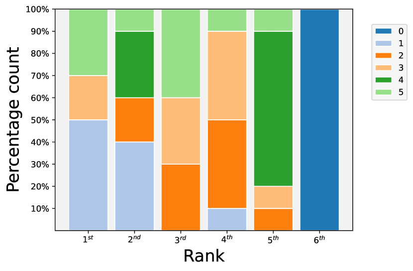
In the dataset labeled as Bisec3D, detailed in Appendix A.1.1 and already used to show the ExIFFI results visualization in Section 3.2.3, the anomalous data points are artificially positioned along the bisector of the subspace engendered by the initial three features. Outliers in this setting manifest as data points with anomaly values along the first three directions, namely Feature 0, Feature 1 and Feature 2. This hypothesis is confirmed by the observations presented in at Figure 2(a) where the top three rankings are nearly evenly distributed between the features on which the 3-dimensional bisector is defined.
The importance is shared between Feature 0 and 1 but also Feature 2. This attribution is depicted in 2(b), where Feature 2 has a relevant Feature Importance Score.
As stated in Section 3.2.3, Figure 2(b) showcases the Scoremap, providing a visual representation of anomaly locations. It is evident that the anomalies associated with the first two features coincide with areas where the color changes within the map. This observation implies that identifying a distinct feature within which these anomalies reside is not possible, consistent with the overall assessment of global feature importance. A similar pattern emerges when examining Feature 2.
Regarding the model’s performances in terms of Average Precision, as illustrated in Table 2, the results demonstrate a notable improvement in the performance of the IF model when compared to the precedent Xaxis dataset. Furthermore, the EIF and models consistently maintain their high performance levels, and as a consequence confidence in the reliability of the interpretation results is provided.
Bisec6D

Within the dataset denoted as Bisec6D, detailed in Appendix A.1.1, anomalies are strategically positioned along the bisector line encompassing the entire feature space. This spatial arrangement makes it possible to have outliers with atypical values along every direction. Moreover, this scenario is characterized by the absence of normal features meaning that each feature is potentially informative and their composition determine the direction of the anomalies. This intricate configuration engenders considerable complexity for the model, rendering the identification of a singular globally preeminent feature a complex task.
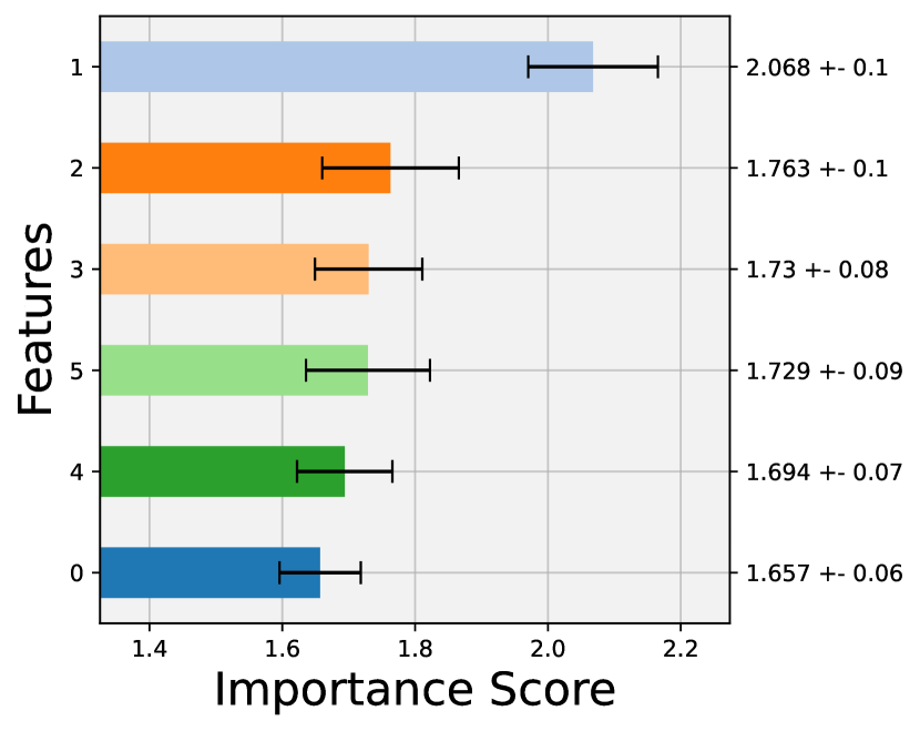
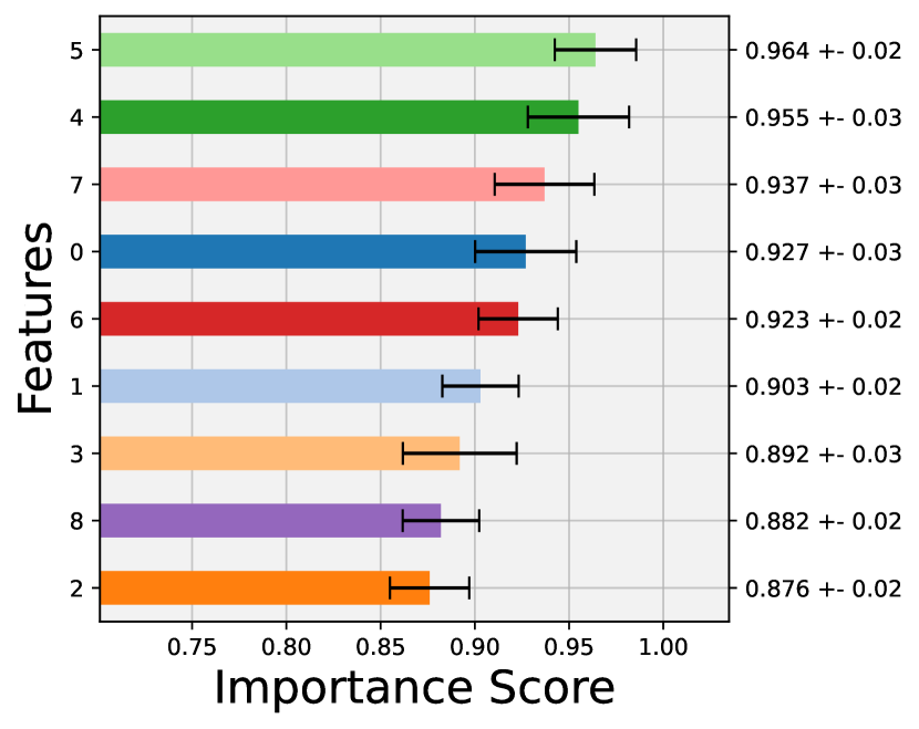
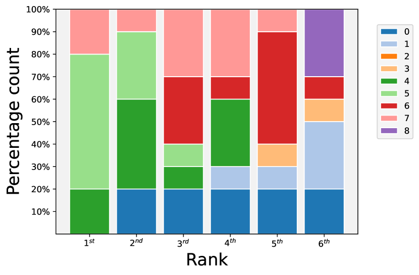
The outcome is perceptible in Figure 7(a), wherein the absence of a dominant feature is observed. Instead, all features have been positioned in the topmost rank throughout the experimental runs. Upon an examination of the Score Plot featured in Figure 7(b), Feature 1 emerges as the most salient attribute across the diverse iterations. However it is noteworthy that Importance scores are very close among all attributes. The ranking shown here will likely change if a new instance of the model is used to perform the experiment.
The Figure 7(c) illustrates the Scoremap of the Bisec6d dataset, depicting the importance score distribution within the Feature 0 and 1 subspace. This representation closely resembles what we’ve observed in the Bisec and Bisec3d datasets, where anomalies are consistently located in regions where the most important feature transitions from 0 to 1. Consequently, the importance scores tend to be evenly distributed between these two features.
Given that the dataset projection into every possible pair of 2-feature subspace remains consistent, it’s evident that anomalies don’t exhibit a preference for specific features. Instead, the global importance scores appear to be relatively uniform across all features.
In the context of the model’s performances presented in Table 2, the observed results exhibit consistently high values. This increase in performance can be attributed to the multidimensional nature of the anomalies. In such scenarios, the Isolation Forest (IF) algorithm excels in segregating anomalies from the normal data points, achieving multiple instances of successful separations within the generated trees as described in Section 4.2.2.
Notably, the exceptionally high Average Precision values indicate the reliability of the algorithm’s classifications.
4.3.3. Real-World Datasets
This section reports the results of the experiments conducted on the Real-World benchmark Datasets introduced in Section 4.1.2.
The experiments encompass two main components:
As discussed in Section 4.1.2, real-world datasets may exhibit precision-related issues, potentially leading to unreliable interpretation results. One of the primary challenges arises from the fact that often samples labelled as outliers are confined to specific regions within the inliers and do not significantly deviate from the overall data distribution.
In such scenarios, the model may incorrectly identify various data points as outliers, subsequently correlating interpretation results with these misclassified outliers rather than accurately reflecting the anomalies designated by the labels. To address this concern and obtain a more nuanced qualitative assessment of the results, we have performed a specific analysis. Indeed, as anticipated in Section 4.2.2, we also present the results of the models trained exclusively on the inliers and then used to classify the whole dataset. This approach allows us to gain deeper insights into the model’s behavior, its ability to correctly identify anomalies within the dataset and the quality of the interpretation obtained through ExIFFI.
Next we provide results for Annthyroid, Glass, and Moodify. We refer the readers to Appendix A.6 for the other experiments on real-world datasets.
Annthyroid
The dataset named Annthyroid,was originally designed for Multi-Class Classification and then adapted to Anomaly Detection as described in detail in Appendix A.1.2.


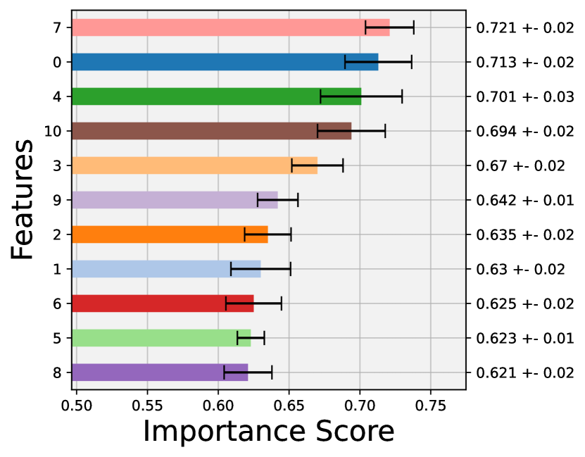
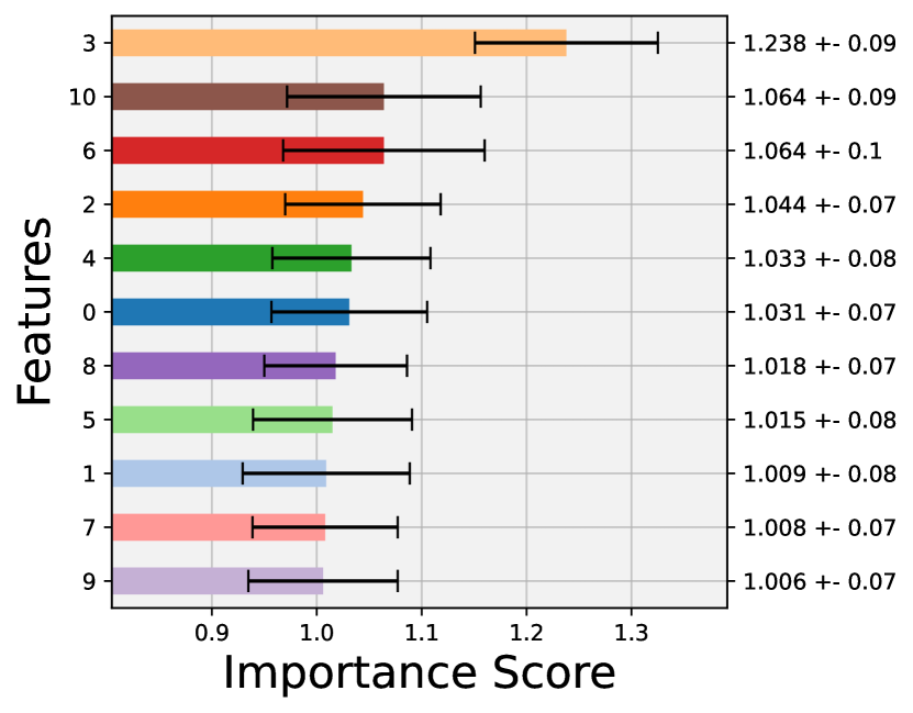
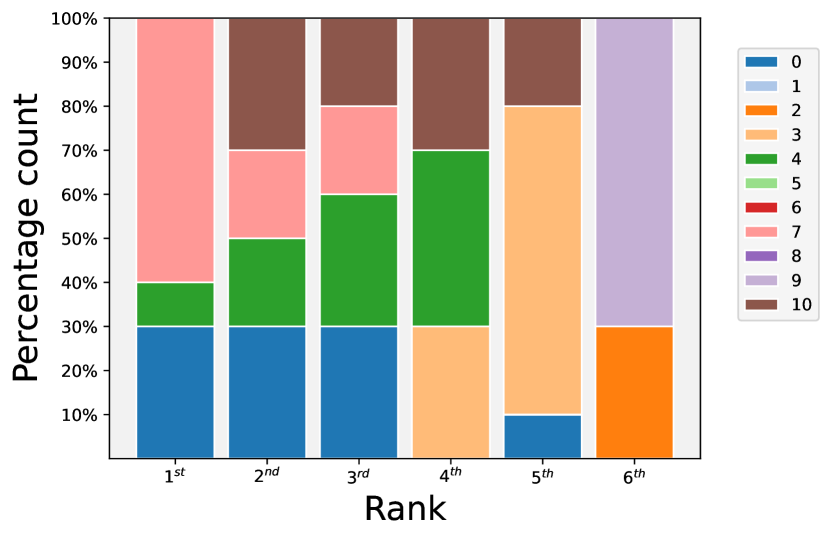
We initially train Isolation-based AD models on the entire dataset. The Bar Plot (Figure 8(c)) reveals no single dominant feature; instead, features 1, 5, and 3 hold the top positions, with a slight preference for feature 1. This trend is reinforced by the Scoremap (Figure 8(e)), depicting the dataset’s distribution along features 1 and 5. It’s evident that the dataset deviates equally along both feature 1 and feature 5, despite the labeled anomalies (stars) primarily deviating along feature 1.
The reason behind this phenomenon is that the algorithm does not pinpoint the specific features responsible for causing the labeled anomalies to deviate. Instead, it tends to focus on the features that align the most with the predicted anomalies. This becomes evident when considering the low Average Precision score in Table 2. It suggests that the isolation forest models struggle to accurately identify the labeled anomalies, that are, as already said in Section 4.1 just a part of the dataset distribution rather than a deviation from it.
After constructing the AD model exclusively on the labeled inlier portion of the dataset, we help the model to recognize that the labeled anomalies deviate from the normal distribution within the dataset. As a result, we can notice a substantial improvement in the Average Precision, as indicated in Table 2. This improvement signifies a stronger alignment between the labeled anomalies and the predictions of the model.
Consequently, the output generated by the interpretation algorithm ExIFFI, becomes more attuned to the structural characteristics of the labeled anomalies. This enhanced alignment leads to greater robustness in identifying Feature 1 as the primary contributor to the dataset’s deviation, it can be seen in Figures 8(d) and 8(b).
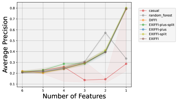
In Figure 9, we present the Feature Selection Plot for the Annthyroid dataset. This plot serves as unequivocal confirmation that ExIFFI’s assessment of the most important feature is accurate. It’s worth noting that even if the interpretation is more robust when the model is trained on the inliers only, in both scenarios Feature 1 emerges as the most significant feature. Moreover, the feature selection is very similar considering the different algorithms and the different training datasets.
In summary, this dataset proves to be non-trivial for Anomaly Detection, as evidenced by the notably low Average Precision scores. Consequently, it becomes challenging to accurately evaluate the interpretative algorithm’s performance in the initial scenario. However, by leveraging the insights gleaned from the Scoremap (see Figure 8(e) and Figure 8(f)), which highlights Feature 1 as the most critical for identifying labeled anomalies, once we enforce the separation of labeled anomalies from the normal distribution of the dataset, the results become both satisfactory and robust. This leads us to confidently conclude that the interpretation algorithm performed effectively on this particular dataset.
Glass
The Glass dataset is described in details in Appendix 4.1.2.


Upon close examination of the Bar Plot obtained for , illustrated in Figure 10(c), it becomes apparent that it is difficult for the interpretation algorithm to single out a predominant feature in terms of Importance Score. This conclusion is reinforced by the Score Plot shown in Figure 10(a), where the four top ranked features exhibit similar importance scores.
Examining Figure 10(e), we can discern that the points exhibiting the greatest deviations from the dataset’s normal distribution are designated as inliers, represented by the blue dots. Interestingly, the outliers, which are labeled as such, are predominantly situated within the main cluster alongside the majority of inliers. This suggests that the model’s ability to detect outliers is compromised by the dataset’s inherent structure, leading to low Average Precision scores (refer to Table 2). Consequently, since the model’s interpretation aligns with the anomalies it predicts, it does not correspond well to the labeled anomalies.
Then, similarly to the metodology used for the Annthyroid dataset, we train the model only on the inliers. This strategy aims to improve the correspondence between predicted and labeled anomalies to simplify the qualitative evaluation of importance scores obtained with ExIFFI.
Unfortunately, the outcomes fail to meet our expectations. As evident in Table 2, the Average Precision scores remain unchanged. This stems from the absence of any deviations in the labeled anomalies within the dataset. In other words, these anomalies do not satisfy the isolation assumption behind unsupervised tree-based AD models. Consequently, we cannot attain better classification performance, even if we train the models exclusively on the inliers.
Furthermore, the inability to pinpoint the feature that most distinctly characterizes the anomalies is emphasized by the Bar Plot presented in Figure 10(d) and the Score Plot in Figure 10(b). These visualizations reveal a striking similarity in the feature importance ranking with the interpretation plots of the model trained with the whole dataset.
The Feature Selection Plot, shown in Figure 11, underscores the subpar results achieved so far in the analysis of the Glass dataset. It is evident that all algorithms, including the supervised Random Forest, exhibit poor performance, resembling a random selection of the most critical features.
In conclusion, the unsatisfactory outcomes stemming from the interpretability analysis of the Glass dataset serve as an extreme illustration of the challenges associated with employing benchmark datasets originally designed for classification tasks to evaluate isolation-based approaches in the field of anomaly detection.
Moodify
In Appendix 4.1.2, we present an overview of the Moodify dataset. This dataset consists of eleven numerical features, which will be the primary focus of our analysis in this section. Notably, this dataset is unique because it includes a clearly defined outlier class, corresponding to music labeled as ”Calm,” in contrast to the inliers, which encompass the categories of ”Happy,” ”Sad,” and ”Energetic.”
Furthermore, it is worth noting that the features in this dataset are labeled in a straightforward manner, obviating the need for specialized expertise to discern their relevance. This accessibility enables us to reasonably evaluate the significance of each feature


Just like we witnessed in the Annthyroid dataset, the model’s Average Precision, as depicted in Table 2, is notably low. This suggests that distinguishing labeled anomalies from the majority of inliers within the dataset is a challenging task due to their limited separation.
Furthermore, as was the case with the Annthyroid dataset, Figures 12(c) and 12(a) demonstrate that no single feature stands out as significantly more important than the others. However, a closer examination of Figure 12(e) reveals an interesting pattern: while the anomalies are spread across the dataset, Feature 3 appears to have a higher concentration of labeled anomalies, despite it is possible to observe a greater deviation from the distribution along Feature 7.
In line with our approach in other examples, we opted to exclusively train the model using inliers. This strategy aimed to align the model’s predictions with the labeled data, enabling us to discern which features play a pivotal role in characterizing the deviations within the anomalies given by the dataset.
Upon examination of Table 2, it becomes evident that the Average Precision metric doubled, resulting in more congruent results with the labeled anomalies. This enhancement in performance reinforces the significance of our approach.
Furthermore, when analyzing Figure 12(d) and Figure 12(b), Feature 3 consistently emerges as the most influential feature. This reaffirms our previous observations from the Scoremap analysis.
Feature 3, as explained in Appendix 4.1.2, quantifies the energy level present in a typical Spotify track. It is reasonable to intuitively assume that the Energy feature plays a crucial role in distinguishing ”Calm” songs from those categorized as ”Happy,” ”Energetic,” or ”Sad.” As anticipated, the inlier group indeed exhibits significantly higher energy values (with an average of 0.62) compared to the outlier group (which has an average of 0.18).
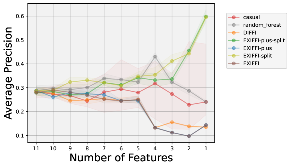
Finally, let’s delve into the Feature Selection Plot for the Moodify dataset, as depicted in Figure 13. This plot provides further validation for the consistency of the model’s interpretation when trained exclusively on inliers. Specifically, when utilizing the ExIFFI-plus-split and ExIFFI-split Feature Ranking Algorithms, we observe a consistent improvement in Average Precision values as the number of input features decreases.
In conclusion, this reaffirms the effectiveness of the feature importance evaluation by our approach. It’s essential to emphasize that this interpretation remains closely tied to the anomalies detected by the model, even in this context.
5. Conclusions
This paper has explored the critical domain of unsupervised anomaly detection, a pivotal task for identifying irregular patterns or behaviors. While the task of identifying anomalies is foundational, our work underscores that it’s often insufficient for real-world applications. Users’ need to comprehend the rationale behind model predictions, facilitating root cause analysis and engendering trust in the model, is paramount.
Our primary contribution lies in the introduction of ExIFFI, a model-specific algorithm aimed at providing both local and global interpretability for the Extended Isolation Forest (EIF). This unsupervised anomaly detection model addresses the training artifacts within the Isolation Forest (IF). Drawing inspiration from DIFFI, a model-specific interpretability algorithm tailored for IF, ExIFFI endeavors to enhance it by generating explanations akin to those provided by supervised proxies, such as feature importance computed by a Random Forest.
Furthermore, this work presents , a variant of EIF tailored to improve generalization performance. We provide a comprehensive comparative analysis among Isolation-based Anomaly Detection approaches, which, to our knowledge, represents the most exhaustive study available in the literature.
Our experimental results corroborate the utility of ExIFFI. Controlled experiments on synthetic data underscore the robustness of our approach. However, when dealing with real-world datasets, limitations tied to the nature of labeled anomalies often diverge from the isolation assumption required by tree-based models for their effectiveness. In such cases, evaluating the quality of interpretations becomes challenging. This motivated further experiments where models are trained on inliers only, revealing the value of ExIFFI when classification performance improves.
Moving forward, avenues for future research should explore innovative ways to leverage the information encoded in splitting nodes, especially when uncertainty arises due to multiple variables competing for the role of the most relevant feature. Additionally, an intriguing research direction could delve into a more comprehensive assessment of using ExIFFI for feature selection in unsupervised anomaly detection settings. While our study has demonstrated its potential in this context, dedicated research endeavors are warranted to fully explore its capabilities.
References
- (1)
- Aeberhard and Forina (1991) Stefan Aeberhard and M. Forina. 1991. Wine. UCI Machine Learning Repository. DOI: https://doi.org/10.24432/C5PC7J.
- Altmann et al. (2010) André Altmann, Laura Toloşi, Oliver Sander, and Thomas Lengauer. 2010. Permutation importance: a corrected feature importance measure. Bioinformatics 26, 10 (2010), 1340–1347.
- Bouman et al. (2023) Roel Bouman, Zaharah Bukhsh, and Tom Heskes. 2023. Unsupervised anomaly detection algorithms on real-world data: how many do we need? arXiv preprint arXiv:2305.00735 (2023).
- Branco et al. (2016) Paula Branco, Luís Torgo, and Rita P. Ribeiro. 2016. A Survey of Predictive Modeling on Imbalanced Domains. ACM Comput. Surv. 49, 2, Article 31 (aug 2016), 50 pages. https://doi.org/10.1145/2907070
- Campos and Bernardes (2010) D. Campos and J. Bernardes. 2010. Cardiotocography. UCI Machine Learning Repository. DOI: https://doi.org/10.24432/C51S4N.
- Carletti et al. (2023) Mattia Carletti, Matteo Terzi, and Gian Antonio Susto. 2023. Interpretable Anomaly Detection with DIFFI: Depth-based Isolation Forest Feature Importance.
- Confalonieri et al. (2021) Roberto Confalonieri, Ludovik Coba, Benedikt Wagner, and Tarek R Besold. 2021. A historical perspective of explainable Artificial Intelligence. Wiley Interdisciplinary Reviews: Data Mining and Knowledge Discovery 11, 1 (2021), e1391.
- Doshi-Velez and Kim (2017) Finale Doshi-Velez and Been Kim. 2017. Towards a rigorous science of interpretable machine learning. arXiv preprint arXiv:1702.08608 (2017).
- Foorthuis (2021) Ralph Foorthuis. 2021. On the nature and types of anomalies: A review of deviations in data. International Journal of Data Science and Analytics 12, 4 (2021), 297–331.
- German (1987) B. German. 1987. Glass Identification. UCI Machine Learning Repository. DOI: https://doi.org/10.24432/C5WW2P.
- Gilpin et al. (2018) Leilani H Gilpin, David Bau, Ben Z Yuan, Ayesha Bajwa, Michael Specter, and Lalana Kagal. 2018. Explaining explanations: An overview of interpretability of machine learning. In 2018 IEEE 5th International Conference on data science and advanced analytics (DSAA). IEEE, 80–89.
- Hariri et al. (2021) Sahand Hariri, Matias Carrasco Kind, and Robert J. Brunner. 2021. Extended Isolation Forest. IEEE Transactions on Knowledge and Data Engineering 33, 4 (2021), 1479–1489. https://doi.org/10.1109/TKDE.2019.2947676
- Hawkins (1980) Douglas M Hawkins. 1980. Identification of outliers. Vol. 11. Springer.
- Houssein et al. (2021) Essam H Houssein, Marwa M Emam, Abdelmgeid A Ali, and Ponnuthurai Nagaratnam Suganthan. 2021. Deep and machine learning techniques for medical imaging-based breast cancer: A comprehensive review. Expert Systems with Applications 167 (2021), 114161.
- Klaib et al. (2021) Ahmad F Klaib, Nawaf O Alsrehin, Wasen Y Melhem, Haneen O Bashtawi, and Aws A Magableh. 2021. Eye tracking algorithms, techniques, tools, and applications with an emphasis on machine learning and Internet of Things technologies. Expert Systems with Applications 166 (2021), 114037.
- Krafft et al. (2020) Manfred Krafft, Laszlo Sajtos, and Michael Haenlein. 2020. Challenges and opportunities for marketing scholars in times of the fourth industrial revolution. Journal of Interactive Marketing 51, 1 (2020), 1–8.
- Kursa and Rudnicki (2010) Miron B Kursa and Witold R Rudnicki. 2010. Feature selection with the Boruta package. Journal of statistical software 36 (2010), 1–13.
- Lesouple et al. (2021) Julien Lesouple, Cédric Baudoin, Marc Spigai, and Jean-Yves Tourneret. 2021. Generalized isolation forest for anomaly detection. Pattern Recognition Letters 149 (2021), 109–119. https://doi.org/10.1016/j.patrec.2021.05.022
- Linardatos et al. (2020) Pantelis Linardatos, Vasilis Papastefanopoulos, and Sotiris Kotsiantis. 2020. Explainable ai: A review of machine learning interpretability methods. Entropy 23, 1 (2020), 18.
- Liu et al. (2008) Fei Tony Liu, Kai Ming Ting, and Zhi-Hua Zhou. 2008. Isolation Forest. In 2008 Eighth IEEE International Conference on Data Mining. 413–422. https://doi.org/10.1109/ICDM.2008.17
- Lundberg et al. (2018) Scott M Lundberg, Gabriel G Erion, and Su-In Lee. 2018. Consistent individualized feature attribution for tree ensembles. arXiv preprint arXiv:1802.03888 (2018).
- Lundberg and Lee (2017a) Scott M Lundberg and Su-In Lee. 2017a. A Unified Approach to Interpreting Model Predictions. In Advances in Neural Information Processing Systems 30, I. Guyon, U. V. Luxburg, S. Bengio, H. Wallach, R. Fergus, S. Vishwanathan, and R. Garnett (Eds.). Curran Associates, Inc., 4765–4774.
- Lundberg and Lee (2017b) Scott M Lundberg and Su-In Lee. 2017b. A Unified Approach to Interpreting Model Predictions. In Advances in Neural Information Processing Systems, I. Guyon, U. Von Luxburg, S. Bengio, H. Wallach, R. Fergus, S. Vishwanathan, and R. Garnett (Eds.), Vol. 30. Curran Associates, Inc. https://proceedings.neurips.cc/paper_files/paper/2017/file/8a20a8621978632d76c43dfd28b67767-Paper.pdf
- Miller (2019) Tim Miller. 2019. Explanation in artificial intelligence: Insights from the social sciences. Artificial Intelligence 267 (2019), 1–38. https://doi.org/10.1016/j.artint.2018.07.007
- Molnar (2020) Christoph Molnar. 2020. Interpretable machine learning. Lulu. com.
- (27) C.L. Blake D.J. Newman and C.J. Merz. -. Statlog (Shuttle). UCI Machine Learning Repository. DOI: https://doi.org/10.24432/C5WS31.
- Preiss (2000) B.R. Preiss. 2000. Data Structures and Algorithms with Object-Oriented Design Patterns in Java. Wiley. https://books.google.it/books?id=ywpRAAAAMAAJ
- Quinlan (1987) Ross Quinlan. 1987. Thyroid Disease. UCI Machine Learning Repository. DOI: https://doi.org/10.24432/C5D010.
- Rayana (2016) Shebuti Rayana. 2016. ODDS Library. https://odds.cs.stonybrook.edu
- Ruff et al. (2021) Lukas Ruff, Jacob R. Kauffmann, Robert A. Vandermeulen, Grégoire Montavon, Wojciech Samek, Marius Kloft, Thomas G. Dietterich, and Klaus-Robert Müller. 2021. A Unifying Review of Deep and Shallow Anomaly Detection. Proc. IEEE 109, 5 (2021), 756–795. https://doi.org/10.1109/JPROC.2021.3052449
- Sigillito et al. (1989) V. Sigillito, S. Wing, L. Hutton, , and K. Baker. 1989. Ionosphere. UCI Machine Learning Repository. DOI: https://doi.org/10.24432/C5W01B.
- Speith (2022) Timo Speith. 2022. A review of taxonomies of explainable artificial intelligence (XAI) methods. In 2022 ACM Conference on Fairness, Accountability, and Transparency. 2239–2250.
- Wolberg (1992) WIlliam Wolberg. 1992. Breast Cancer Wisconsin (Original). UCI Machine Learning Repository. DOI: https://doi.org/10.24432/C5HP4Z.
- Xu et al. (2018) Min Xu, Jeanne M David, Suk Hi Kim, et al. 2018. The fourth industrial revolution: Opportunities and challenges. International journal of financial research 9, 2 (2018), 90–95.
Appendix A Appendices
A.1. Datasets
A.1.1. Synthetic datasets
We considered the following synthetic datasets:
-
•
The Bimodal dataset was exploited also by other researchers like Hariti et. al (Hariri et al., 2021), making it a well-suited synthetic example. The resulting point distribution of the Bimodal dataset is depicted in the scatter plot in Figure 14. The contamination factor used for the Bimodal dataset is 2.5%.
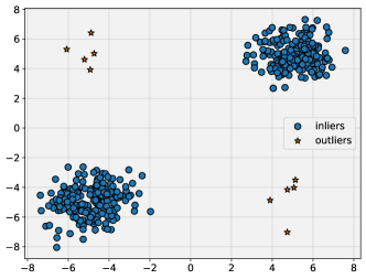
Figure 14. Scatter Plot of the bimodal Dataset In particular, the two clusters of inliers are positioned along the bisector line while the outliers are placed along the anti-bisector line. As it can be noticed from a detailed observation of the scatter plot, there is a significant discrepancy in terms of quantity between inliers and outliers. In fact, the dataset was manipulated in order to ensure the imbalance between normal and anomalous points to replicate a common scenario in the context of Anomaly Detection.
-
•
The datasets referred to as Xaxis and Yaxis originate from the research paper authored by Carletti et al. (Carletti et al., 2023). In this particular scenario, inlier points are randomly sampled from a six-dimensional sphere centered at the origin with a radius of 5.
To generate the outlier data, a specific feature is chosen to be associated with anomalous values. In this instance, feature 0 is selected for the Xaxis dataset, and feature 1 is chosen for the Yaxis dataset. All other features consist of random noise values drawn from a standard normal distribution, denoted as .
Subsequently, outlier points are sampled along these specific features, maintaining a predefined proportion relative to the inliers. In this specific case, there is one outlier for every 10 inliers.
-
•
The Bisec dataset closely resembles the Xaxis and Yaxis datasets. In this dataset, the inliers are distributed following a normal distribution pattern within a six-dimensional sphere. Conversely, the anomalies are positioned along the bisector line of the Feature 0 and Feature 1 subspace, equidistant from the origin as the anomalies in the Xaxis and Yaxis datasets.
As the names suggest, Bisec3D and Bisec6D datasets are constructed similarly to the Bisec dataset. However, in Bisec3D, the anomalies are placed along the bisector line of the subspace defined by Feature 0, Feature 1, and Feature 2. In Bisec6D, the anomalies are positioned along the bisector line spanning all six dimensions of the dataset. The proportion of the outliers remains 1-10 as in the Xaxis and Yaxis datasets.
A.1.2. Real-world Datasets
This is the list of considered real-world datasets:
-
•
Annthyroid: The Annthyroid dataset (Quinlan, 1987) is part of the UCI Machine Learning Repository. It is a three-class Classification dataset. The aim of the classification task associated with this dataset is to detect whether a patient is hypothyroid (i.e. the patient has an underactive thyroid) or not. For this scope, the three classes used refer to the functioning conditions of the thyroid that can benormal (not hypothyroid), hyperfunctioning (overactive thyroid) and subnormal. The dataset originally contained 15 categorical and 6 numerical attributes. In order to adapt it to an Anomaly Detection task only the numerical attributes were considered and the hyperfunctioning and subnormal function classes were considered as part of the outliers while the normal functioning samples are used to build the inlier class. The six numerical features represent, respectively, the following quantities: TSH, T3, TT4, T4U, and FTI.
-
–
TSH (Thyroid-Stimulating Hormone: TSH is an hormone produced by the pituitary gland. An underactive thyroid (hypothyroidism) is associated with high levels of TSH while low levels of TSH are associated with an overactive thyroid (hyperthyroidism).
-
–
T3 (Triiodothyronine): T3 is one of the thyroid hormones. It plays a crucial role in regulating the metabolism. It is important to measure the levels of this hormone, specifically in cases of hyperthyroidism.
-
–
TT4 (Total Thyroxine): This quantity represents the total amount of the T4 thyroid hormone in the blood. T4 levels are associated to the overall thyroid hormone production.
-
–
T4U (Thyroxine-Binding Globulin: T4U measures the level of thyroxine-binding globulin, a protein binding to thyroid hormones in the blood. T4U levels are connected to the thyroid hormone availability in the body.
-
–
FTI (Free Thyroxine Index: Taking into account the T4 and T4U levels, the FTI provides an estimate of the amount of free thyroxine (T4) in the blood. It is used to asses the free, active thyroid hormone levels in the body.
-
–
-
•
Breast: The Breast dataset (Wolberg, 1992) is a Binary Classification dataset where the target is the presence of breast cancer or not in a patient. The peculiarity of the samples contained in this dataset is that they are formed by categorical features. Normally, the Anomaly Detection models described in this paper are not built to deal with categorical features but in this particular case the high number of levels (e.g. The age variable has nine levels: 10-19, 20-29, …; the tumor-size feature has levels equal to 0-4,5-9,10-14, …) characterizing the Breast dataset’s attributes makes it possible to consider them as numerical features. A noteworthy consequence to consider is that when the samples of the Breast dataset are represented in a scatter plot, as it happens with the Local Importance Scoremap in Figure 19(e), they appear to have a grid-like shape. The dataset is composed of samples coming from the clinical cases of Dr. Wolberg collected in a time span going from January 1989 to November 1991. The dataset is composed by 9 features representing the following quantities: Clump Thickness, Uniformity of Cell Size, Uniformity of Cell Shape, Marginal Adhesion, Single Epithelial Cell Size, Bare Nuclei, Bland Chromatin, Normal Nucleoli and Mitoses.
-
•
Cardio: The Cardio (Campos and Bernardes, 2010) dataset is part of the UCI Machine Learning Repository and its complete name is Cardiotocoraphy since it contains measurements of fetal heart rate (FHR) and uterine contraction (UC) on cardiotocograms 555A cardiotogram is a medical test monitoring fetal hearth rate and uterine contractions during pregnancy. It is used to assess the health status of the fetus and the progress of labor during pregnancy and childbirth. This dataset contains 3 classes that were assigned by expert obstetricians: normal, supsect, and pathologic. In order to use this dataset for Anomaly Detection the suspect class was discarded and the pathologic class was downsampled to 176 points to maintain unbalance with respect to the normal class. There are 21 features. 666The complete list of features names can be found at: https://archive.ics.uci.edu/dataset/193/cardiotocography
-
•
Glass: The Glass dataset (German, 1987) is originally used for multi-class classification to distinguish 7 different types of glasses. There are 9 features: the first one is the Refractive Index while the others measure the concentration of Magnesium (Mg), Silicon (Si), Calcium (Ca), Iron (Fe), Sodium (Na), Aluminum (Al), Potassium (K) and Barium (Ba) in the glass samples. The seven original glass groups were divided into two: Groups 1,2,3 and 4 represent Window Glasses, and the remaining ones are non-window glasses (or headlamps glasses). The latter are considered as outliers and the former as inliers in order to convert this dataset to be used for Anomaly Detection. According to some prior knowledge on the subject the Aluminium and Barium concentration (respectively Feature 6 and 8) should be decisive in distinguishing between headlamps and window glasses.
-
•
Ionosphere: The Ionosphere dataset (Sigillito et al., 1989) contains measurements collected by a radar in Goose Bay, Labrador. The measurement system consisted of 16 high-frequency antennas with a transmitted power in the order of 6.4 kilowatts. The targets to measure were free electrons in the Ionosphere. Originally this is built as a Binary Classification dataset where the two classes are good if the captured electrons show some kind of structure in the ionosphere and bad otherwise. The signal is processed with an autocorrelation function depending on the time of a pulse and the pulse number. There are 17 pulse numbers and each of them is identified by a pair of features for a total of 34 features.
-
•
Pima: The Pima dataset 777https://www.kaggle.com/datasets/uciml/pima-indians-diabetes-database comes from the National Institute of Diabetes, Digestive and Kidney Diseases. It is a Binary Classification dataset whose aim is to predict whether a patient has diabetes or not. This dataset is the result of the application of some constraints to a larger dataset. In Pima, in fact, the data considered are obtained from female patients of at least 21 years of age coming from the Pima Indian heritage.
The dataset contains 8 features indicating some typical diagnostic measurements: Number of pregnancies, Plasma Glucose Concentration, Diastolic Blood Pressure, Triceps skin thickness, 2-hour serum if insulin, BMI (Body Mass Index), Diabetes Pedigree function, and Age.
-
•
Shuttle: The Shuttle dataset (Newman and Merz, ) describes radiator positions in a NASA space shuttle. The samples are characterized by 9 attributes. Originally, the dataset is used for Multi-Class Classification with the target variable containing seven possible classes, which are: Radiator Flow, Fpv Close, Fpv Open, High, Bypass, Bpv Close, and Bpv Open. Besides the normal Radiator Flow class about 20% of the data points describe anomalous situations. To reduce the amount of anomalies the Radiator Flow class is used to form the inlier class while a stratified sampling procedure was applied to classes 2,3,5,6 and 7. Finally, data coming from class 4 were discarded.
-
•
Wine: The Wine dataset (Aeberhard and Forina, 1991) is part of the UCI Machine Learning repository and it was originally created as a 3-class classification dataset. In fact, it contains data resulting from a chemical analysis of wines grown in the same region of Italy but obtained from 3 different cultivars. So the aim of a Classification model applied to this dataset would be to correctly predict the original culture of wine given its chemical properties. As it is usually done in these cases the dataset was adapted to test Anomaly Detection models considering the data from two cultures as inliers and the ones beholding to the last culture as the outliers. The dataset is composed by 13 features representing the following quantities: Alcohol, Malic Acid, Ash, Alcalinity of ash, Magnesium, Total phenols, Flavanoids, Nonflavanoid phenols, Proanthocyanins, Color Intensity, Hue, OD280/OD315 888These codes refers to two measurements of the optical density of a wine sample performed at two different wavelengths: 280 nm and 315 nm. These measurements are typically exploited to assess the protein content and the stability of wine of diluted wines, and Proline.
-
•
Diabetes: The Diabetes dataset 999https://www.kaggle.com/datasets/iammustafatz/diabetes-prediction-dataset is a Binary Classification dataset with medical data about patients used to predict whether they have diabetes or not. There are 4 categorical and 4 numerical variables. In order to use the ExIFFI model only the numerical variables were considered:
-
–
Age: The age ranges between 0 and 80 and it can be an important factor since Diabetes is usually diagnosed in older adults.
-
–
BMI (Body Mass Index): Measure of body fat based on weight and height. High BMI values are linked to a higher risk of diabetes.
-
–
HbA1c-Level: The Hemoglobin A1c Level it’s a measure of a person’s average blood sugar level over the past 2-3 months. A high level of HbA1c is usually associated with high diabetes risk.
-
–
blood-glucose-level: The amount of glucose in the bloodstream at a given time. High glucose levels are a key factor to detect Diabetes.
Finally, the target variable is a binary variable indicating the presence or absence of diabetes in the patient. Following the usual protocol for Real World Datasets, the inlier group will be represented by healthy patients while the ones affected by diabetes will be placed in the outlier group.
-
–
-
•
Moodify: Moodify is a recommendation app 101010More details on the Moodify project can be found at: https://github.com/orzanai/Moodify that classifies Spotify songs according to the emotions transmitted to the users. The system is trained on the Moodify dataset 111111https://www.kaggle.com/datasets/abdullahorzan/moodify-dataset which contains features regarding the main characteristics of about 278.000 songs and the target is a 4 levels categorical variable with the following coding:
-
(1)
Sad
-
(2)
Happy
-
(3)
Energetic
-
(4)
Calm
The label with the lowest frequency (15%) in the dataset is Calm so that was used to create the outliers group while the inlier group is formed by the songs that belong to the other three classes.
The dataset is composed of 11 numerical features describing different musical attributes of a song. Except for the Loudness variable, which expresses the overall loudness of the track in decibels (dB), all the features have values contained in the [0,1] interval. The variable names are the following: Acousticness, Danceability, Energy, Instrumentalness, Liveness, Loudness, Speechiness, Valence, and Tempo. Other variables are Duration (ms) and spec-rate.
-
(1)
A.2. Performance Report Table
This section reports the Performance Report Table (Table 3) containing the values of the typical Classification metrics for all the datasets introduced in this study for both Scenario I and Scenario II.
To obtain the threshold needed for the computation of the Precision, Recall, and F1 Score metrics, we chose it according to the true contamination factor of each dataset. The result is that these metrics will have the same value. On the other hand, the Average Precision metric is not affected by the contamination factor since it is computed as the Area Under the Curve of the Precision-Recall Curve which considers different classifier thresholds and thus multiple different values for the contamination factor.
| Scenario I | ||||||||||||||||||
| Precision | Recall | F1 Score | Accuracy | Average Precision | ROC AUC Score | |||||||||||||
| IF | EIF | IF | EIF | IF | EIF | IF | EIF | IF | EIF | IF | EIF | |||||||
| Xaxis | 0.17 | 0.96 | 0.94 | 0.17 | 0.96 | 0.94 | 0.17 | 0.96 | 0.94 | 0.85 | 0.99 | 0.99 | 0.15 | 0.98 | 0.98 | 0.63 | 1.00 | 1.00 |
| Yaxis | 0.11 | 0.98 | 0.97 | 0.11 | 0.98 | 0.97 | 0.11 | 0.98 | 0.97 | 0.84 | 1.00 | 0.99 | 0.11 | 1.00 | 1.00 | 0.55 | 1.00 | 1.00 |
| Bisec | 0.68 | 0.99 | 0.93 | 0.68 | 0.99 | 0.93 | 0.68 | 0.99 | 0.93 | 0.94 | 1.00 | 0.99 | 0.79 | 1.00 | 0.98 | 0.94 | 1.00 | 1.00 |
| Bisec3D | 0.93 | 0.98 | 0.95 | 0.93 | 0.98 | 0.95 | 0.93 | 0.98 | 0.95 | 0.99 | 1.00 | 0.99 | 0.98 | 1.00 | 0.99 | 1.00 | 1.00 | 1.00 |
| Bisec6D | 1.00 | 0.97 | 0.94 | 1.00 | 0.97 | 0.94 | 1.00 | 0.97 | 0.94 | 1.00 | 0.99 | 0.99 | 1.00 | 0.99 | 0.99 | 1.00 | 1.00 | 1.00 |
| annthyroid | 0.34 | 0.27 | 0.27 | 0.34 | 0.27 | 0.27 | 0.34 | 0.27 | 0.27 | 0.90 | 0.89 | 0.89 | 0.33 | 0.23 | 0.22 | 0.82 | 0.70 | 0.72 |
| breast | 0.90 | 0.89 | 0.87 | 0.90 | 0.89 | 0.87 | 0.90 | 0.89 | 0.87 | 0.89 | 0.88 | 0.86 | 0.95 | 0.92 | 0.90 | 0.96 | 0.94 | 0.93 |
| cardio | 0.50 | 0.54 | 0.53 | 0.50 | 0.54 | 0.53 | 0.50 | 0.54 | 0.53 | 0.90 | 0.91 | 0.91 | 0.58 | 0.56 | 0.53 | 0.93 | 0.93 | 0.93 |
| diabetes | 0.47 | 0.49 | 0.48 | 0.47 | 0.49 | 0.48 | 0.47 | 0.49 | 0.48 | 0.90 | 0.90 | 0.90 | 0.46 | 0.44 | 0.42 | 0.74 | 0.75 | 0.74 |
| glass | 0.11 | 0.11 | 0.11 | 0.11 | 0.11 | 0.11 | 0.11 | 0.11 | 0.11 | 0.92 | 0.92 | 0.92 | 0.10 | 0.10 | 0.21 | 0.76 | 0.73 | 0.77 |
| ionosphere | 0.66 | 0.69 | 0.70 | 0.66 | 0.69 | 0.70 | 0.66 | 0.69 | 0.70 | 0.76 | 0.78 | 0.78 | 0.82 | 0.83 | 0.84 | 0.86 | 0.87 | 0.88 |
| moodify | 0.35 | 0.35 | 0.35 | 0.35 | 0.35 | 0.35 | 0.35 | 0.35 | 0.35 | 0.80 | 0.80 | 0.80 | 0.34 | 0.32 | 0.32 | 0.82 | 0.81 | 0.81 |
| pendigits | 0.37 | 0.37 | 0.35 | 0.37 | 0.37 | 0.35 | 0.37 | 0.37 | 0.35 | 0.97 | 0.97 | 0.97 | 0.27 | 0.24 | 0.25 | 0.94 | 0.93 | 0.93 |
| pima | 0.51 | 0.51 | 0.51 | 0.51 | 0.51 | 0.51 | 0.51 | 0.51 | 0.51 | 0.66 | 0.66 | 0.66 | 0.51 | 0.49 | 0.49 | 0.68 | 0.68 | 0.67 |
| shuttle | 0.97 | 0.91 | 0.78 | 0.97 | 0.91 | 0.78 | 0.97 | 0.91 | 0.78 | 1.00 | 0.99 | 0.97 | 0.95 | 0.86 | 0.78 | 1.00 | 0.99 | 0.99 |
| wine | 0.10 | 0.20 | 0.10 | 0.10 | 0.20 | 0.10 | 0.10 | 0.20 | 0.10 | 0.86 | 0.88 | 0.86 | 0.22 | 0.22 | 0.18 | 0.82 | 0.82 | 0.78 |
| Scenario II | ||||||||||||||||||
| Precision | Recall | F1 Score | Accuracy | Average Precision | ROC AUC Score | |||||||||||||
| IF | EIF | IF | EIF | IF | EIF | IF | EIF | IF | EIF | IF | EIF | |||||||
| Xaxis | 0.00 | 0.00 | 1.00 | 0.00 | 1.00 | 1.00 | 0.00 | 1.00 | 1.00 | 0.82 | 1.00 | 1.00 | 1.00 | 1.00 | 1.00 | 0.62 | 1.00 | 1.00 |
| Yaxis | 0.00 | 1.00 | 1.00 | 0.00 | 1.00 | 1.00 | 0.00 | 1.00 | 1.00 | 0.82 | 1.00 | 1.00 | 1.00 | 1.00 | 1.00 | 0.62 | 1.00 | 1.00 |
| Bisec | 1.00 | 1.00 | 1.00 | 1.00 | 1.00 | 1.00 | 1.00 | 1.00 | 1.00 | 1.00 | 1.00 | 1.00 | 1.00 | 1.00 | 1.00 | 1.00 | 1.00 | 1.00 |
| Bisec3D | 1.00 | 1.00 | 1.00 | 1.00 | 1.00 | 1.00 | 1.00 | 1.00 | 1.00 | 1.00 | 1.00 | 1.00 | 1.00 | 1.00 | 1.00 | 1.00 | 1.00 | 1.00 |
| Bisec6D | 1.00 | 1.00 | 1.00 | 1.00 | 1.00 | 1.00 | 1.00 | 1.00 | 1.00 | 1.00 | 1.00 | 1.00 | 1.00 | 1.00 | 1.00 | 1.00 | 1.00 | 1.00 |
| annthyroid | 0.51 | 0.44 | 0.45 | 0.51 | 0.44 | 0.45 | 0.51 | 0.44 | 0.45 | 0.93 | 0.92 | 0.92 | 0.57 | 0.50 | 0.51 | 0.94 | 0.89 | 0.89 |
| breast | 0.95 | 0.94 | 0.94 | 0.95 | 0.94 | 0.94 | 0.95 | 0.94 | 0.94 | 0.95 | 0.94 | 0.94 | 0.99 | 0.98 | 0.99 | 0.99 | 0.98 | 0.99 |
| cardio | 0.63 | 0.73 | 0.73 | 0.63 | 0.73 | 0.73 | 0.63 | 0.73 | 0.73 | 0.93 | 0.95 | 0.95 | 0.71 | 0.74 | 0.78 | 0.96 | 0.97 | 0.97 |
| diabetes | 0.29 | 0.54 | 0.56 | 0.29 | 0.54 | 0.56 | 0.29 | 0.54 | 0.56 | 0.86 | 0.91 | 0.91 | 0.21 | 0.49 | 0.58 | 0.65 | 0.75 | 0.76 |
| glass | 0.11 | 0.00 | 0.11 | 0.11 | 0.00 | 0.11 | 0.11 | 0.00 | 0.11 | 0.92 | 0.92 | 0.92 | 0.10 | 0.08 | 0.20 | 0.76 | 0.71 | 0.76 |
| ionosphere | 0.79 | 0.86 | 0.90 | 0.79 | 0.86 | 0.90 | 0.79 | 0.86 | 0.90 | 0.85 | 0.90 | 0.93 | 0.88 | 0.92 | 0.96 | 0.93 | 0.95 | 0.97 |
| moodify | 0.75 | 0.72 | 0.75 | 0.75 | 0.72 | 0.75 | 0.75 | 0.72 | 0.75 | 0.92 | 0.92 | 0.92 | 0.75 | 0.67 | 0.71 | 0.96 | 0.96 | 0.96 |
| pendigits | 0.42 | 0.39 | 0.51 | 0.42 | 0.39 | 0.51 | 0.42 | 0.39 | 0.51 | 0.97 | 0.97 | 0.98 | 0.36 | 0.30 | 0.44 | 0.97 | 0.96 | 0.97 |
| pima | 0.59 | 0.57 | 0.58 | 0.59 | 0.57 | 0.58 | 0.59 | 0.57 | 0.58 | 0.72 | 0.70 | 0.71 | 0.58 | 0.55 | 0.59 | 0.74 | 0.74 | 0.75 |
| shuttle | 0.94 | 0.94 | 0.96 | 0.94 | 0.94 | 0.96 | 0.94 | 0.94 | 0.96 | 0.99 | 0.99 | 0.99 | 0.99 | 0.91 | 0.92 | 1.00 | 1.00 | 1.00 |
| wine | 0.40 | 0.50 | 0.60 | 0.40 | 0.50 | 0.60 | 0.40 | 0.50 | 0.60 | 0.91 | 0.92 | 0.94 | 0.40 | 0.58 | 0.78 | 0.91 | 0.95 | 0.98 |
A.3. Non Depth-Based importance
In general, it is accurate to assert that the amount of feature importance attributed by a particular node to a given sample , provided that the node effectively separates the samples, should be greater if the node is closer to the root of the tree, and the importance score should decrease as the node becomes deeper within the tree. This principle is derived from the same concept used to determine anomaly scores, which are higher for samples that on average are in leafs closer to the root of the tree.
Two distinct approaches exist for assigning importance scores to nodes the one used in the ExIFFI algorithm and the one of which is proposed by the DIFFI algorithm. The DIFFI algorithm importance scores are assigned to nodes based on a weighting scheme that inversely relates the score to the depth of the node. This approach is parameterized to ensure that scores decrease as nodes become deeper within the tree.
The ExIFFI algorithm is an alternative approach for assigning importance scores to nodes in a decision tree, which differs from the DIFFI algorithm by not using the inverse of the depth to decrease the score as the node becomes deeper in the tree. This stems from the fact that the maximum acceptable score for a node is directly linked to the number of elements it must partition. As the depth of the node increases, this number inevitably decreases. Therefore, we assert that it is redundant and potentially misleading to incorporate an additional parameter to weigh the importance score.
The underlying idea is that as the node becomes deeper in the tree, it is responsible for splitting fewer and fewer elements, and therefore, it should not be penalized by reducing its importance score because the structure of the algorithm itself decreases the importance on average after every step deeper in the tree. In contrast, a node that splits many elements closer to the root of the tree may be more important because it has a greater impact on the separation of the data, but its importance should not be guaranteed by an external factor.
The EXIFFI algorithm adjusts the maximum score acceptable for a node based on the number of elements it needs to split, which allows for a fair comparison of the importance of nodes across different depths in the tree. This approach can help to avoid overestimating the importance of nodes that are close to the root and underestimating the importance of nodes that are deeper in the tree, risk that the DIFFI algorithm does not take into account.
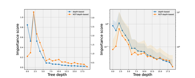
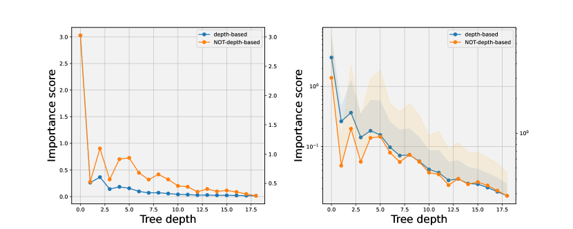
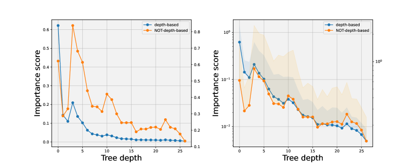
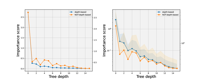
We conducted an analysis of the ExIFFI algorithm with and without the depth parameter, in order to identify differences in the evolution of the score at different depths of the trees. To achieve this, we plotted the average score of the nodes at various levels of depth in the forests, as shown in Figure 15.
The results of this analysis indicate that the score generally decreases without the use of a depth parameter. Although the ExIFFI algorithm without the depth parameter produced higher scores, the overall shape of the graph is still descending as nodes are evaluated deeper in the tree. This suggests that the ExIFFI algorithm is effective in assigning importance scores to nodes, even when the depth parameter is not utilized.
In summary, our analysis suggests that the ExIFFI algorithm is a robust method for assigning importance scores to nodes in decision trees, with or without the use of a depth parameter.
A.4. Complete Local Scoremaps
A useful instrument for the selection of the best pair of features to include in the Local Scoremap is represented by the so-called Complete Local Scoremap.
In scenarios in which a comprehensive analysis is sought, a more exhaustive study would involve the inspection of Local Importance Scoremaps covering all conceivable pairs of features. By systematically aggregating the acquired scoremaps into a composite ”matrix of plots” a lucid comprehension of the hierarchy among the most and least influential features can be derived.
Furthermore, this additional graphical instrument allows for conducting a profound and detailed graphical analysis of the dataset and its features in order to achieve a qualitative comprehension of the model’s output other than just considering the mere Feature importance scores.
For sake of readability, only the Complete Local Scoremap of the Diabetes dataset is presented here (Figure 16. The Complete Scoremaps of the remaining datasets are contained in the GitHub Repository of this study 121212The GitHub Repository can be found at: https://github.com/alessioarcudi/ExIFFI.
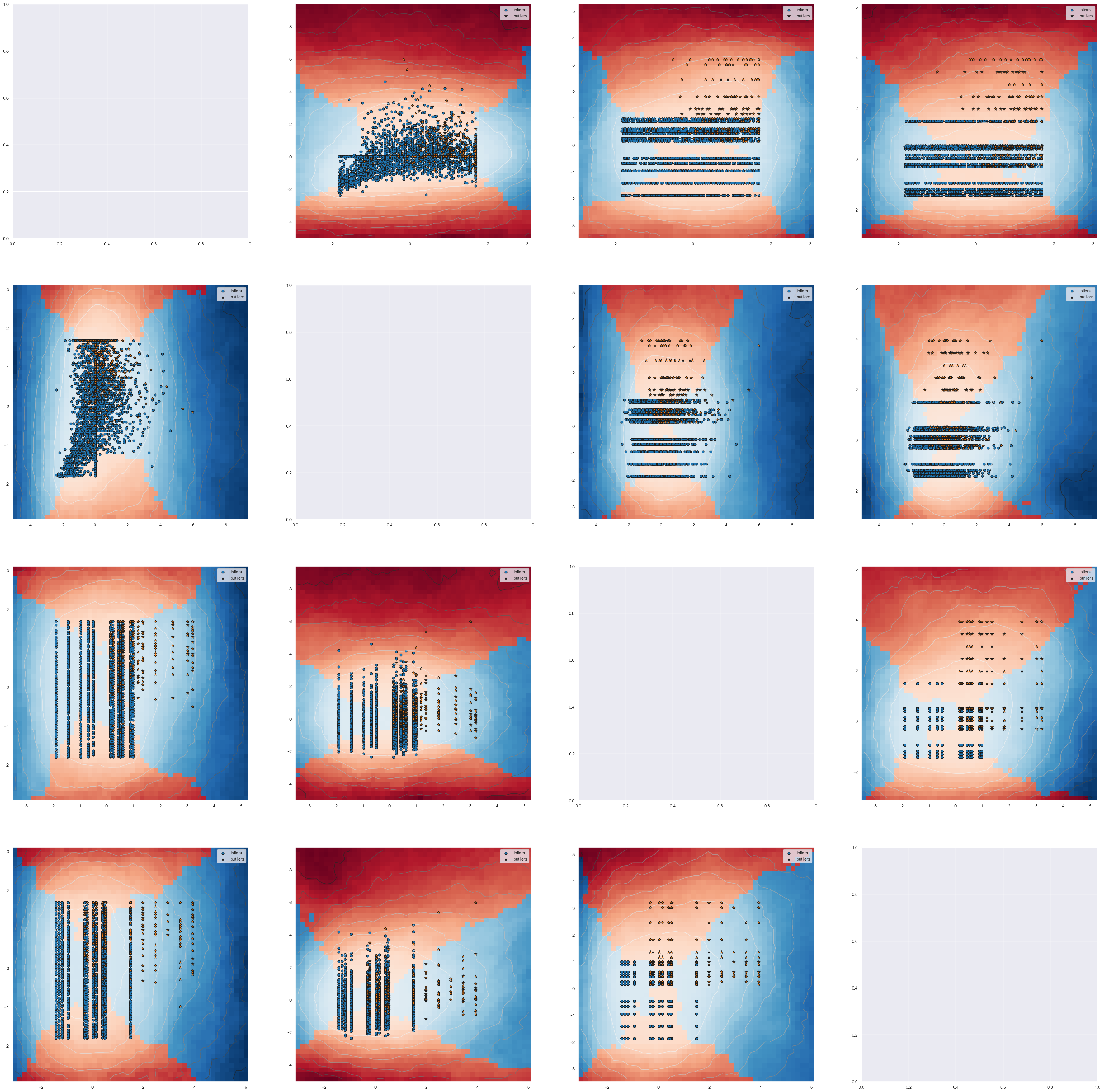
A.5. Synthetic Experiments
A.5.1. Yaxis
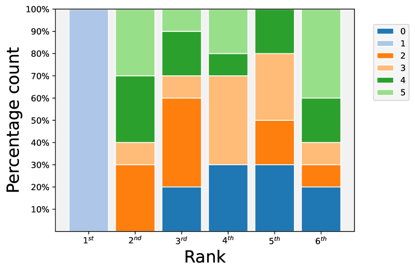
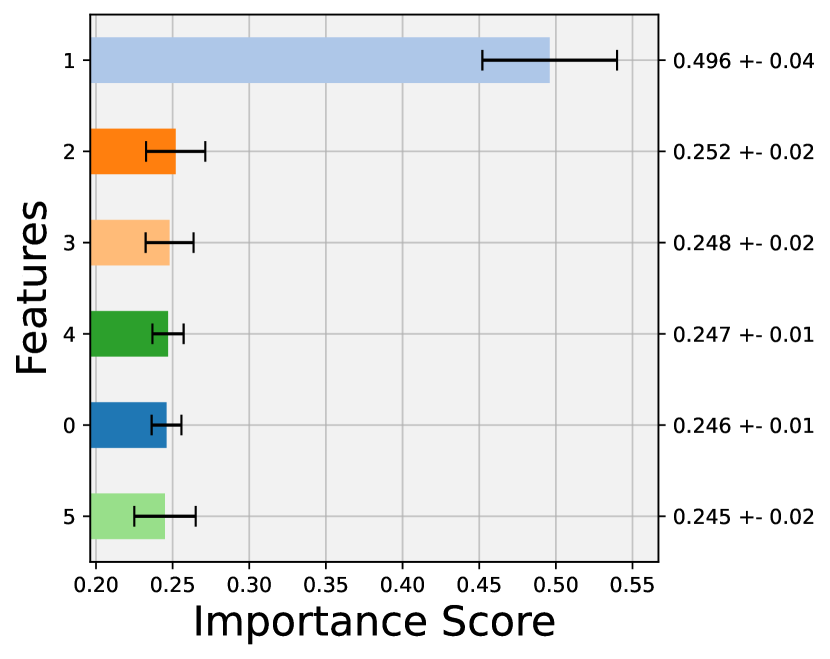

The second dataset under examination is referred to as Yaxis. In this instance, the anomalies are placed along the y-axis corresponding to Feature 1. As discernible from the resulting plots, illustrated in Figure 17, the situation is symmetrical to the scenario of the Xaxis dataset. Within the Bar Plot, as depicted in Figure 17(a), Feature 1 emerges as the paramount attribute. This prominence is confirmed by its elevated average Importance Score, as documented in Figure 17(b).
Derived from the Local Importance Scoremap, shown in 17(c), it becomes clear that the anomalous data points are distributed in correspondence with Feature 1. Symmetrically to the Xaxis dataset, it becomes apparent that a significant portion of anomalies coincides with the red coloration on the scoremap. This observation underscores the influential role of Feature 1 in contributing to the occurrence of anomalies on average.
Table 2 contains, among others, the Average Precision values for the Yaxis dataset. Notably, this dataset is a mirror image of the Xaxis dataset, with anomalies now positioned along Feature 1 rather than Feature 0. Consequently, the quantitative performances closely resembles the ones of the Xaxis dataset, indicating that the Isolation Forest (IF) model encounters challenges in identifying outliers in this configuration.
In this scenario, the exceptionally high Average Precision values for EIF and suggest the reliability and robustness of the interpretation results mentioned earlier. Consequently, the most important feature found with the interpretation algorithm ExIFFI, is the one that characterizes the outliers.
A.5.2. Bisect
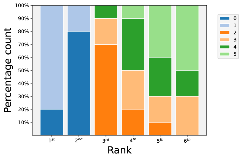
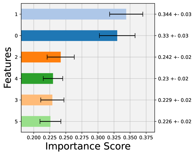

Within the dataset denoted as Bisect, anomalous points show a deviance from the normal distribution of points on both Feature 0 and Feature 1. In certain instances of the interpretation algorithm output, Feature 0 may be identified as the foremost significant, while Feature 1 assumes the role of the second most crucial; conversely, in other instances, this ranking may be reversed.
This particular behavior is reflected in the Bar Plot, as portrayed in Figure 18(a) where the first two bars, representative of the primary and secondary rankings respectively, are characterized by both Feature 0 and 1. Moreover, upon inspection showcased in Figure 18(b) the scores assigned to the first two features are nearly identical and substantially higher than those of all their other attributes.
The shared attribution of importance between Feature 0 and Feature 1 can also be appreciated through an examination of the Local Importance Scoremap, depicted in Figure 18(c). Upon close examination, it becomes apparent that the anomalous data points align with the area of the scoremap where the transition from Feature 0 (depicted in blue) to Feature 1 (shown in red) is most critical. This observation underscores the dual nature of the anomalies.
Table 2 displays the Average Precision values used to quantitatively evaluate the results obtained from the IF, EIF, and models. Due to the low-dimensional nature of the anomalies and their proximity to the artifacts zone, the Average Precision of the IF model is lower compared to EIF and , which on the contrary consistently exhibit very high precision.
A.6. Real World Experiments
A.6.1. Breast
The Breast dataset is normally used for the Binary Classification. Following the usual procedure, the dataset was converted into a dataset tailored for the Anomaly Detection task. As explained in Appendix 4.1.2, the peculiarity of this dataset is that its nine features are categorical. This fact makes the Anomaly Detection and interpretability tasks more challenging.
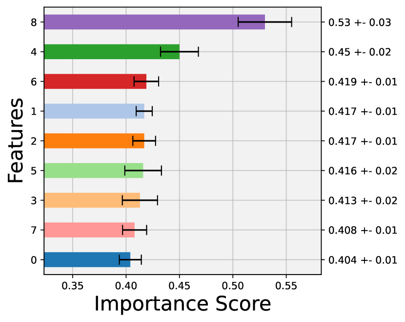
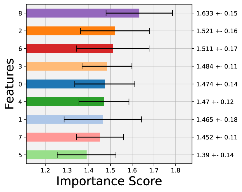
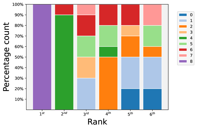
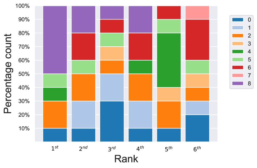


The Bar Plot, in Figure 19(c), recognized Feature 8 as the most important feature as highlighted also in the Score Plot, represented in Figure 19(a), where it has a significant margin, in terms of average importance score, towards the other attributes.
Because of the categorical nature of the features composing the Breast dataset analysing the Scoremap (Figure 19(e) is not as straightforward as for the other datasets. In fact the grid-like data distribution shows anomalous samples scattered along both Feature 8 and Feature 2 and some pairs of inliers and outliers are even overlapped.
However, there is a clear separation between deviant and normal points and high differences in terms of Anomaly Score, according to the positions of the contour lines, thus the Average Precision values reported in Table 2 are considerably high.
As a result of the application of the inlier training strategy in the Score Plot (Figure 19(b)), Feature 2 assumes higher positions in the ranking of the average importance scores by taking the second place behind Feature 8 that is still considered the most important.
The Scoremap, in Figure 19(f), is composed by Anomaly Scores contour lines focused on the left side portion of the feature space, thus increasing the separation between inliers and outliers. As a consequence, there is a further improvement in the performance metric reported in Table 2.
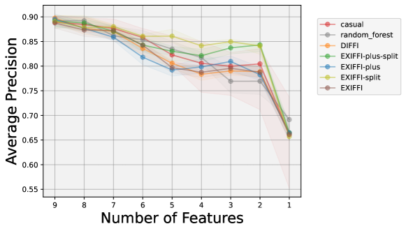
Figure 20 reports the Feature Selection Plot for the Breast dataset. The behavior is similar for all the Feature Ranking Algorithms presented with the Average Precision decreasing as the number of features decreases. The situation depicted in Figure 20 confirms the high uncertainty in finding a dominant feature in the Breastw dataset and the presence of a shared importance among multiple features. The result is that the decrease in the input features may remove some of the features that are part of the subset carrying all the importance and thus the Average Precision of the model suffers a decrease.
A.6.2. Cardio
The Cardio dataset is part of the UCI Machine Learning Repository. It was adapted to be used for the Anomaly Detection task since originally it is used for a three-class Classification Task. It is formed by twenty-one features which will be carefully analyzed, in terms of importance, in this section. Further details on this dataset can be found in Appendix 4.1.2.
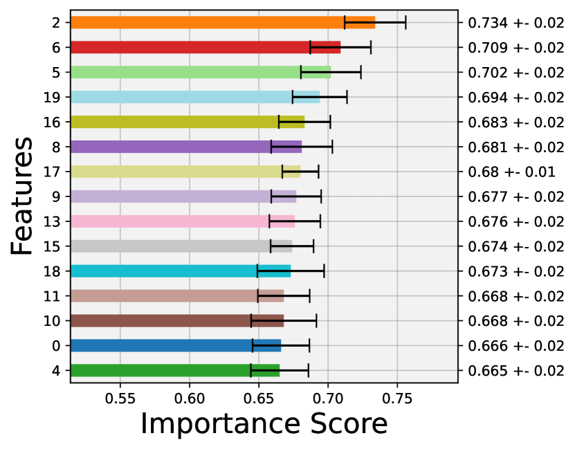
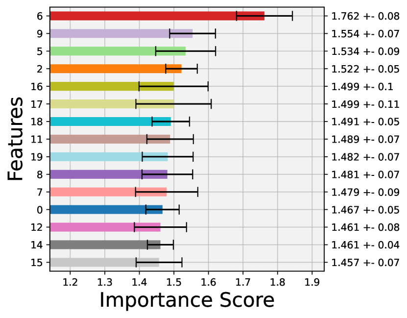
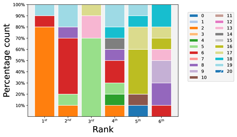
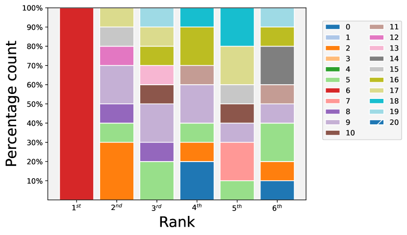


The Score Plot, illustrated in Figure 21(a), shows how the interpretation algorithm identifies Feature 2 and Feature 6 as the most important but with limited consistency. In fact the Bar Plot, in Figure 21(c), depicts how Feature 2 was selected as the top feature 80% of the time while Feature 6 only 10% of the time.
After careful observation of the Scoremap, in Figure 21(e), it is possible to conclude that, indeed, Feature 2 and 6 are directions along which there is an accumulation of anomalous points deviating from the normal dataset distribution, which is centered in (0,0). Furthermore, it can be noticed that outliers connected to Feature 2 are slightly further from the distribution center than the ones placed along Feature 6.
Table 2 reports the Average Precision values for the Cardio dataset. The metric values are similar among the three models under analysis with a slight advantage of the model. The metrics values however are not outstandingly good, so they can be improved by adopting the strategy of training the model solely on the inlier data and successively testing it on the complete dataset.
Observing the Bar Plot, in Figure 21(d), it is possible to notice how the model has increased its level of confidence in recognizing Feature 6 as the most relevant one. Moreover, its Importance Score is significantly higher than the ones of the other features as reported in the Score Plot in Figure 21(b). One of the consequences of the inlier training can be appreciated in the Scoremap in Figure 21(f) where the region of the space colored in red reduced a lot its extension and intensity with respect to Figure 21(e) meaning that the importance of Feature 2 decreased a lot in favor of Feature 6. Moreover, the contour lines, used to highlight the different Anomaly Score values, are shifted towards the inliers making it easier to recognize the samples placed on the right extremes of the plot as anomalies.
Encouraging results are encountered also in Table (Table 2) with an increase of the Average Precision values for all the models meaning that there is higher confidence in the reliability of the interpretation results.
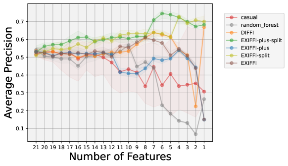
The outcomes of the application of the Proxy Task of Unsupervised Feature Selection to the Cardio dataset can be found in Figure 22. The Casual and Random Forest Feature Ranking algorithms are the worst ones. On the other hand, ExIFFI-plus-split has a similar behavior to the other models until 7 features are reached causing its Average Precision to increase elevating it as the best-performing model by far for multiple steps, confirming the improvements of model performances once the inlier training approach is used. The benefits of the mentioned approach can be noticed also in ExIFFI-split which has a similar behavior to ExIFFI-plus-split providing significantly lower Average Precision scores with respect to the latter solely in the interval between 8 and 4 features.
The remaining algorithms, on the other hand, show a decreasing trend in the Average Precision values as the number of input features decreases with the exception of DIFFI which presents a sudden increase in its precision values in the passage from 2 to 1 feature.
A.6.3. Diabetes
The Diabetes dataset is originally exploited for the Binary Classification task since it contains medical records about patients who may or may not suffer from diabetes disease. As usual, the dataset was modified accordingly to be used for the Anomaly Detection task, details about that are contained in Appendix 4.1.2.
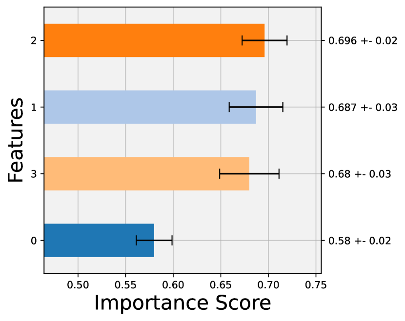
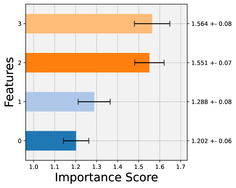
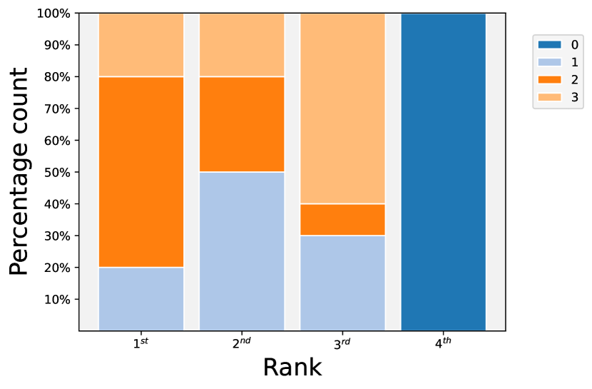
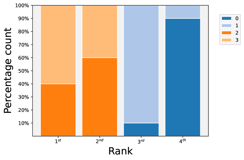


Figure 23(c) shows how the importance is divided between Feture 1,2 and 3 while Feature 0 is consistently ranked as the least important attribute. A confirmation of these results can be found in Figure 23(a) which reports the Score Plot. Here, in fact, the average importance scores of the first three features display minimal differences and are significantly higher than the ones of Feature 0.
Similarly to what happens in the Breastw dataset the scatter plot of the data, superimposed on the Scoremap (Figure 23(e)), shows a grid-like structure. It is possible to notice the presence of two rectangular-shaped clusters of points: the one on the bottom left region mainly contains inliers (i.e. blue dots) while the one on the top right portion of the space is formed by outliers (i.e. red stars). There is a small portion of the feature space where the two clusters overlap.
In any case, the difficulty of the model in detecting a single feature as the most important can be noticed from the Local Scoremap. In fact, because of the grid-like shape of the data distribution, the outliers are distributed around both the directions of Feature 2 and 3.
For what concerns the anomaly detection performances of the models, reported in Table 2, the listed values of Average Precision are not too high and not too low if compared with the ones seen in the other benchmark datasets considered in this section. The reason for these not outstanding performances may be found in the overlapping between the inliers and outliers cluster presented in Figure 23(e) which may create confusion in the process of distinguishing between anomalies and normal samples.
The inlier training approach was exploited also for the Diabetes dataset in order to try to obtain further improvements both in the model’s performances and in the reliability of the interpretation results.
An evident improvement can be noticed in Figure 23(d) which depicts the Bar Plot where it becomes clear how the feature importance is shared between Feature 2 and 3. These two attributes are in fact always included in the first or second ranking position among the different model executions considered and possess similar average importance score values, as reported in Figure 23(b), which are significantly higher than the ones of Feature 0 and 1.
The most important features, Feature 2 and 3, represent the HbA1c and blood glucose levels respectively as it was described in Appendix 4.1.2. Thus, the results are highly reliable if matched with the domain knowledge since it is well known that the main consequence of diabetes disease is an excessive level of glucose in the patient’s blood.
The Scoremap, in Figure 23(e), is similar to the ones obtained using the Scenario I approach with the difference that the colors are lighter in correspondence of the inliers cluster and darker in correspondence with the outliers one, meaning that the model, exploring the better knowledge of the inlier distribution acquired during the training step, has improved its capabilities in the detection of anomalies over normal samples. This is confirmed by the Average Precision, contained in Table 2, which contains better metric than the ones obtained in Scenario I. An interesting thing to note is how the Average Precision metric increases passing from the Isolation Forest to the newly introduced model.
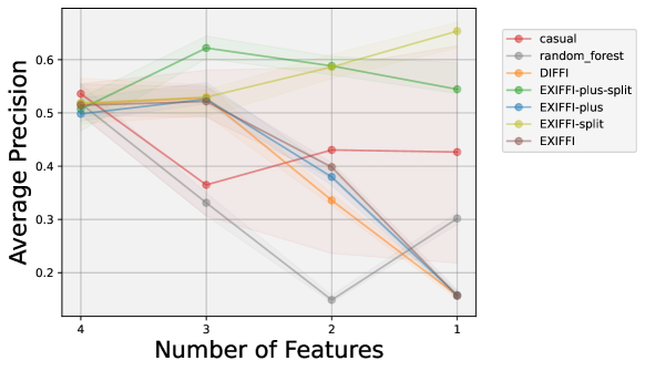
Finally, the Feature Selection Plot for the Diabetes dataset is reported in Figure 24. As expected the best performing Feature Ranking Algorithm, in terms of Average Precision, are ExIFFI-plus-split and ExIFFI-split. In ExIFFI-plus-split the Average Precision slightly decreases for input sets with 3 or fewer features but still remaining at high levels. In the case of ExIFFI-split, instead, the precision values are constantly increasing, in particular from 3 features onwards. On the other hand, for all the remaining algorithms considered the Average Precision decreases with the number of features.
Ionosphere
The peculiarity of Ionosphere dataset, whose detailed information can be found in Appendix 4.1.2, is the fact that it is composed of thirty-three features. This poses an additional challenge in evaluating the interpretation results.
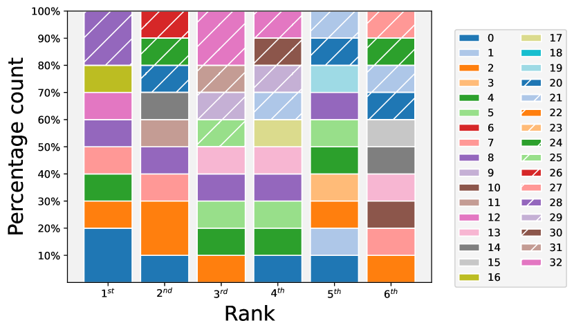
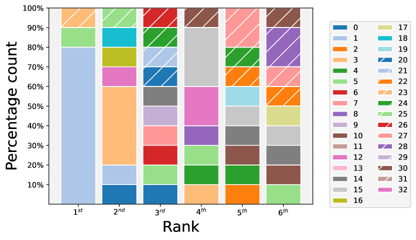
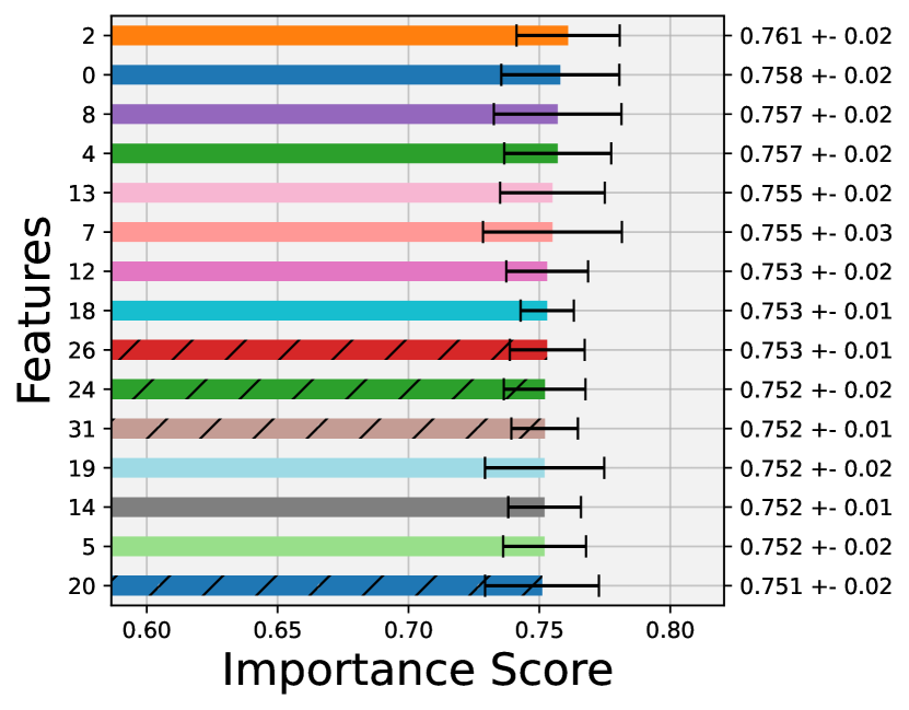
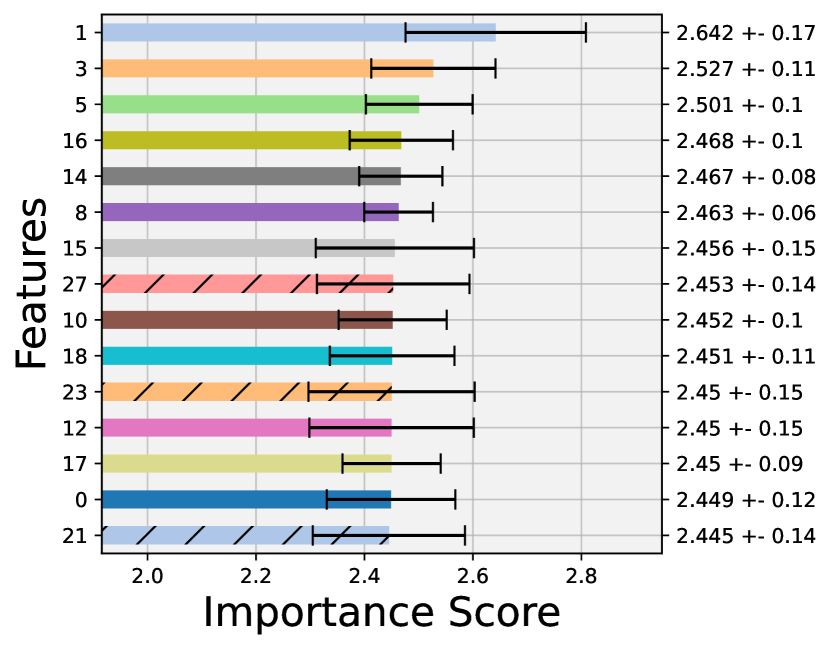


The Bar Plot depicted in Figure 25(a) does not provide evidence of the presence of a single prevailing feature. Moreover in the Score Plot in Figure 25(c) the differences between the average Importance Scores reported for the different features are minimal. This distinctive situation is probably due to the extremely high dimensionality of the Ionosphere dataset with respect to the other datasets presented in this study.
On the other hand, the Scoremap plot, reported in Figure 25(e) shows how most of the outliers are scattered along Feature 1 which however is not highlighted in Figure 25(a) and 25(c). The Anomaly Score contour plot clearly surrounds the central inlier distribution isolating the outliers.
As a consequence the Average Precision values reported in Table 2 are quite satisfactory.
As usual, at this point, the inlier training approach is adopted in order to see if some improvement in the model’s precision and reliability on the interpretation provided can be achieved.
The Bar Plot (Figure 25(b) shows a much more evident confidence of the model in the identification of Feature 1 as the most relevant one for the detection of anomalies. The predominance of Feature 1 is highlighted also in the Score Plot (Figure 25(d)) with a significant margin on the importance scores of the remaining features.
For what concerns the Scoremap (Figure 25(f)) is very similar to the one obtained with the complete training approach that confirms the high Average Precision values obtained in Table 2.
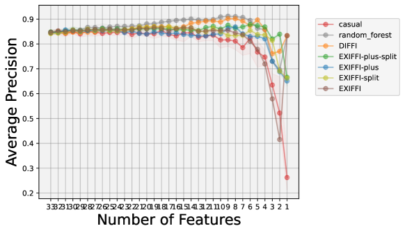
Figure 26 shows the results of the application of Unsupervised Feature Selection to the Ionosphere dataset. Differently from the outcomes obtained in the previously described datasets, in this instance, the Average Precision scores possess an overall decreasing behavior with the progressive removal of the input features. This is probably a consequence of the high-dimensionality of this dataset.
The behavior of all the Feature Ranking Algorithms is very similar: the precision values stay constant for multiple steps and the decreasing effect starts to be noticed at around 10 features. A peculiar result is the one obtained with the ExIFFI algorithm which shows a huge increase in its Average Precision values passing from 2 (where it is the worst-performing model) to 1 feature where it becomes the best-performing model in terms of Average Precision.
A.6.4. Pendigits
The Pendigits dataset collects data regarding handwritten digits produced by Forty-four human writers. The task is the one of recognizing the correct written digit but the dataset, as usual, was adapted to be used for the evaluation of the Anomaly Detection model considered in this study. The dataset is composed by sixteen features. Additional details can be found in Appendix 4.1.2.
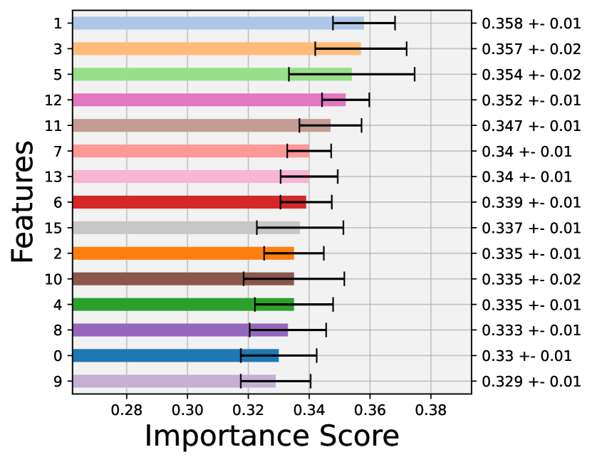
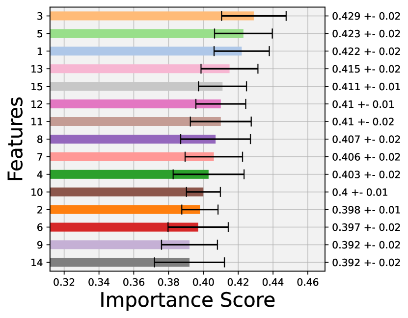
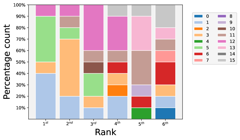
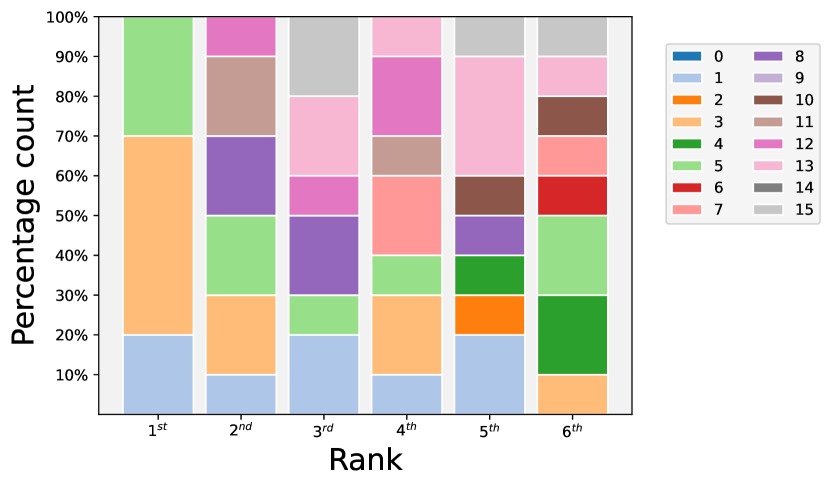


The Bar Plot for the Pendigits dataset is displayed in Figure 27(c). There is not a clear dominant feature in terms of importance score. Two features that may be considered significantly relevant are Feature 1 and Feature 3 which were selected respectively 40% and 30% of the time as the top feature in the dataset. These two features are also placed in the first two positions in the Score Plot, in Figure 27(a) but their average importance score values are not considerably higher than the ones obtained by the other attributes.
Looking at the Scoremap (Figure 27(e)) it is possible to notice that, indeed, anomalous samples are distributed along both Feature 3 and 1 although most of them are overlapped with the inliers. Additionally, two small clusters of points, isolated from the main data distribution, can be detected. The first one is a cluster of outliers scattered along Feature 1, the second one is, instead, a group of inliers placed along Feature 3.
Probably because of the overlapping nature of most of the outlier points with inliers and because of the presence of a group of deviant points labeled, according to the dataset, as inliers, the Average Precision values (Table 2) are not satisfactory.
In order to refine the interpretability and precision results shown up to this point, the strategy of training the model exclusively on the inliers and using the entire dataset to test the model was adopted.
The results of this new approach are reported on the right column of Figure 27. In particular, Figure 27(d) shows how also Feature 5 plays a role in helping the model to detect anomalous points, together with the usual Feature 1 and 3. These two features are still considered in pair to evaluate the Scoremap (Figure 27(f). The latter does not undergo major changes with the ones obtained in Scenario I. Some of these changes include the contour lines which are able to isolate a higher number of outliers.
As a consequence, the performance metrics for Scenario II reported on Table 2 increase their values with respect to Scenario I.
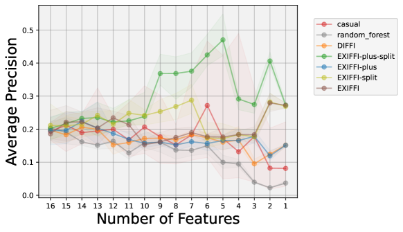
In the Feature Selection Plot, in Figure 24, ExIFFI-plus-split is almost always the best Feature Ranking Algorithm. In particular, its Average Precision is much higher than all the other models in the range between 10 and 4 features. ExIFFI has a significant drop going from 7 to 6 features. The other algorithms considered, on the other hand, are associated with more or less constant Average Precision values with the exception of DIFFI (i.e. the brown line) which shows signs of improvements from 5 features onwards.
A.6.5. Pima
The Pima dataset comes from the National Institute of Diabetes, Digestive and Kidney Diseases. As it happens in the Diabetes dataset the task at hand is one of identifying whether a patient has diabetes or not. The dataset contains eightfeatures and its details are contained in Appendix 4.1.2
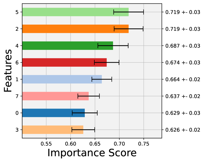
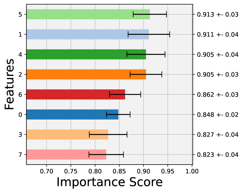
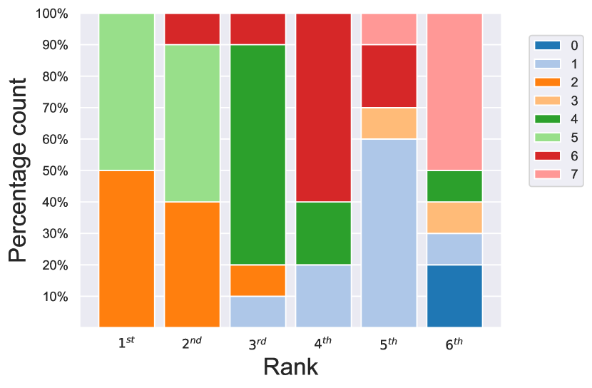
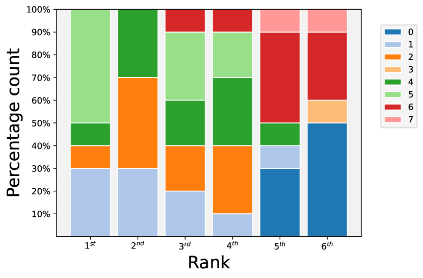


Figure 29(c) shows the Bar Plot for the Pima dataset from which it is possible to conclude that there is a shared importance between Feature 2 and 5. These two attributes are consistently placed in the top 2 rankings both in Figure 29(c) and in Figure 29(a). However, there is not an evident margin in their average importance scores to consider them as two dominant features over the entire dataset.
The Scoremap, depicted in Figure 29(e), shows how the two main clusters of inliers and outliers almost perfectly overlap one over the other. Moreover looking at the contour lines also the Anomaly Scores associated to these two groups of points should be similar. Notably, it is also possible to appreciate the presence of two smaller groups of points, isolated from the two main sets, distributed along both Feature 1 and Feature 5 containing both inliers and outliers.
The Average Precision values, contained in Table 2, presents almost equal levels across all the three models considered.
In the following the results obtained after the application of the Scenario II approach to the Pima dataset are shown.
The Bar Plot (Figure 29(d)) is associated with a higher degree of uncertainty in detecting the most decisive features. In fact, as it can also be noticed from an analysis of the Score Plot in Figure 29(b), in this case, the number of features among which the importance is shared is three: Feature 5,1 and 4.
Moreover, the Scoremap reports also in this case the peculiar situation in which the main cluster of anomalies is overlapped with the cluster representing the normal points distribution. In this case, however, some changes can be observed in the positions of the contour lines which make it easier to separate inliers from outliers. In fact, the Average Precisions reported in Table 2 display a significant increase across all three models that continue to possess very close values.
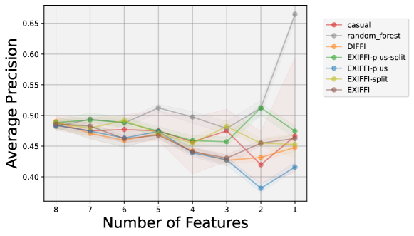
The results of the application of Unsupervised Feature Selection to the Pima dataset are reported in Figure 30. The outcomes are considerably unique with respect to the other datasets. In fact, all the Feature Ranking Algorithms show Average Precision values that tend to decrease as features are removed from the input space. A slight increase in performance can be observed in ExIFFI-plus-split passing from 3 to 2 features to, however, end with a decrease in the next step (i.e. in the passage from 2 to 1 feature). A peculiar situation can instead be observed for the Random Forest model where the Average Precision presents a huge increase in the passage from 2 to 1 feature obtaining a value surpassing by far the ones of all the other ranking approaches considered in this analysis. These uncertain behaviors certify the difficulty in the application of the Anomaly Detection task to the Pima dataset.
Shuttle
The Shuttle dataset is composed by nine attributes describing the radiator positions in a NASA space shuttle. The original task associated to this dataset is a 7-class classification. The name of the classes’ labels and other details about the Shuttle dataset are contained in Appendix 4.1.2.
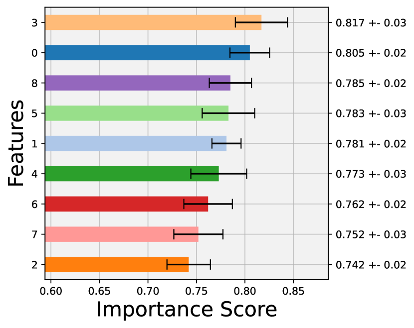
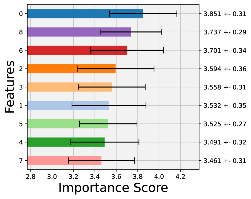
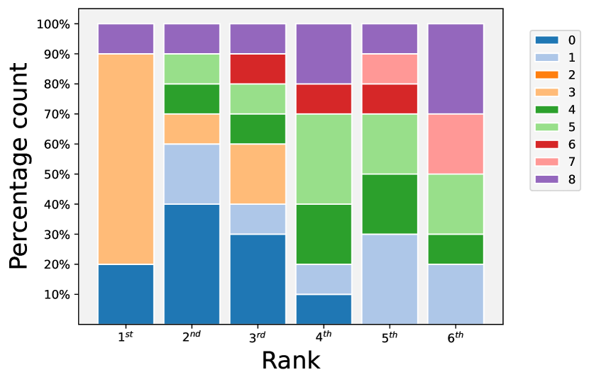
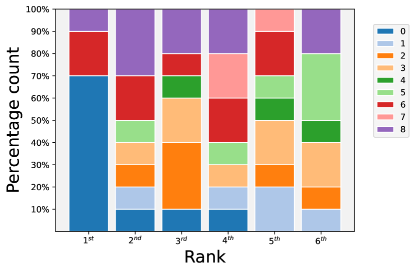


The outcomes of the Feature Importance analysis for the Shuttle dataset are reported in Figure 31. In particular, Figure 31(c) displays the Bar Plot which highlights Feature 3 as one of the most decisive for the detection of anomalies since it was ranked in the top position in 70% of the model execution performed. Figure 31(a) depicts, instead, the Score Plot where it is possible to notice that another relevant feature is Feature 0 which has a similar average importance score to the one of Feature 3. However, the remaining features also possess similar scores thus it is possible to conclude that the model is not extremely reliable in isolating a group of features significantly more important than the rest.
In Figure 31(e) the Scoremap is reported showing how there are two main groups of outliers clearly scattered along Feature 0, not along Feature 3 as one should expect considering the results derived from Figure 31(c) and 31(a).
However, the clear spatial separation between inliers and outliers and the position of the Anomaly Score contour lines help the model in easily distinguish between the two classes. In fact the Average Precision values reported in Table 2 for the Shuttle dataset are excellent, making it as one of the datasets with the best performances in this study.
In order to obtain clearer results in the explainability and performance reports the Scenario II approach was exploited.
With the application of the Scenario II strategy, the results are further improved. In fact, as reported in Figure 31(d), now the model is able to consistently recognize Feature 0 as the one along which most of the anomalies are grouped. Its importance score, as depicted in Figure 31(b), is significantly higher than the ones of other features. Moreover in the Local Scoremap (Figure 31(f)), the differences between deviant and normal point are more visible thanks to the higher contrasts in the shapes of the red and blue colors in different regions of the feature space.
Some slight improvements can also be noticed in the Average Precisions (Table 2), where the scores are almost reaching the perfect value of 1 across all the models.
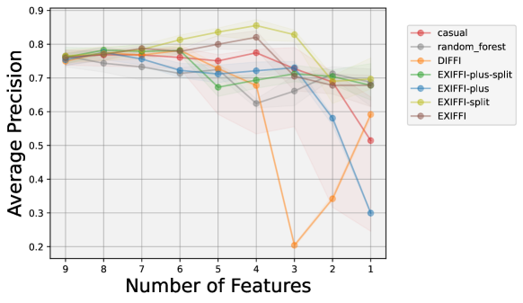
As it was observed in Table 2 also in the Feature Selection Plot, depicted in Figure 32, high values of Average Precision (around 0.9) may be observed. The algorithm showing the highest values for this metric is ExIFFI-split, in particular in the range between 6 and 3 features. ExIFFI-plus-split, on the other hand, decreased its Average Precision passing from 6 to 5 features. Original behaviors were noticeable in DIFFI and ExIFFI-plus. The first one drops its Average Precision value from 0.7 to 0.2 passing from 4 to 3 features, the second one suffered a similar effect but in the passage from 3 to 2 and finally to 1 feature.
A.6.6. Wine
Similarly to the Annthyroid and Cardio dataset, the Wine dataset is part of the UCI Machine Learning Repository and it is originally used as a Multi Class Classification dataset for the case of three classes representing three different wine cultivars. Thirteen numerical features describing the chemical properties of wine samples are used in this instance. Further details about the specific semantic meaning of each feature and about the dataset in general are contained in Appendix 4.1.2.
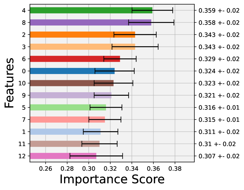
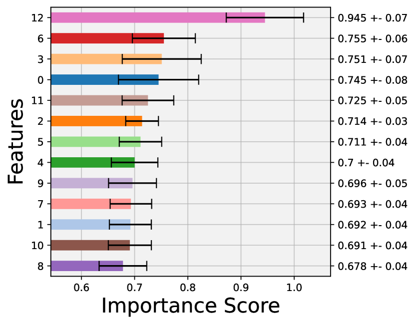
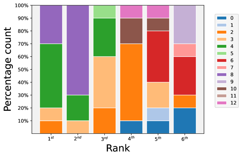
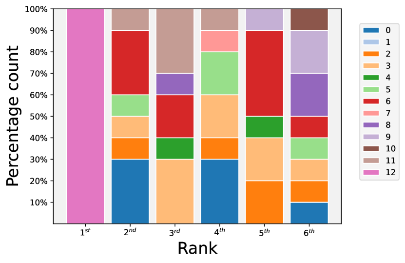


Looking at the Bar Plot it is possible to notice the presence of a shared importance between Feature 4 and 8. Although the certainty and consistency of the model on the feature ranking is not satisfactory since, as it is represented in Figure 33(c), Feature 4 is selected as the top feature in half of the executions while Feature 8 only in 30 % of them.
Moreover, the Scoremap (Figure 33(e)) depicts how the anomalies (i.e. the red stars) are somehow incorporated in the normal distribution. This effect can be noticed by analyzing the Anomaly Score contour plots.
In fact, the two lines covering the lowest area, so the contour plots associated to the lowest Anomaly Scores, contain not only the inliers but also the outliers.
As expected from the graphical results the Average Precision values (Table 2) of the Wine dataset are very low, less than 0.25 for all the models. This suggests that the feature ranking returned by the interpretation algorithm, and shown in Figure 33(a), cannot be fully trusted. In fact, observing the Scoremap it is clear how the anomalies are distributed along Feature 12 rather than Feature 8 or 4.
A possible solution to improve the performance metrics and the reliability of the interpretability results is the one of training the model exclusively on the inliers and testing it on the entire dataset.
As expected the consistency of the model in selecting the most important feature increases as Feature 12 (which represents Proline) is selected as the most relevant attribute in all the model executions performed to obtain the Bar Plot contained in Figure 33(d).
Furthermore from the Scoremap, represented in Figure 33(f), the contour lines are now excluding the anomalous samples from the inlier distribution.
The result is that in this instance the model has an easier task in correctly detecting the anomalous points as can be noticed by looking at the Average Precision values (Table 2). Here it is also possible to notice a significant passing from the IF to the newly introduced EIF+ model which presents an improvement of almost 30% on the IF model.
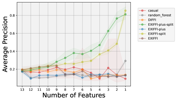
The Feature Selection Plot for the Wine dataset is reported in Figure 34. The Average Precision of ExIFFI-plus-split and ExIFFI-split increases up to 1 with the progressive removal of all the input features with ExIFFI-plus-split being the feature selection algorithm performing better in terms of Average Precision.
For what concerns the other Feature Ranking Algorithms they present more or less constant Average Precision values across all the different sets of input features considered.
The fact that the Average Precision values of the two algorithms derived from the inlier training show a significant improvement on the others is strictly connected to the performance enhancement obtained with the usage of this novel training approach as shown on the right column of Figure 33 and Table 2.