Towards a Universal Understanding of Color Harmony: Fuzzy Approach
Abstract
Harmony level prediction is receiving increasing attention nowadays. Color plays a crucial role in affecting human aesthetic responses. In this paper, we explore color harmony using a fuzzy-based color model and address the question of its universality. For our experiments, we utilize a dataset containing attractive images from five different domains: fashion, art, nature, interior design, and brand logos. We aim to identify harmony patterns and dominant color palettes within these images using fuzzy approach. It is well-suited for this task because it can handle the inherent subjectivity and contextual variability associated with aesthetics and color harmony evaluation. Our experimental results suggest that color harmony is largely universal. Additionally, our findings reveal that color harmony is not solely influenced by hue relationships on the color wheel but also by the saturation and intensity of colors. In palettes with high harmony levels, we observed a prevalent adherence to color wheel principles while maintaining moderate levels of saturation and intensity. These findings contribute to ongoing research on color harmony and its underlying principles, offering valuable insights for designers, artists, and researchers in the field of aesthetics.
keywords:
color harmony \sepimage analysis \sepfuzzy sets \sepaesthetics \sepcolor wheel, , , and
1 Introduction
The human brain tends to seek a visually harmonious experience. With an increase of digital affective information more researchers are interested in objective aesthetic level assessment Automatic prediction of image harmony value is receiving more attention [1], however, still, there is no well-constructed theory to use as a guidance for practical purposes [2],[3], [4]. One reason for this is that aesthetic levels can vary across different domains [5]. Moreover, human perception is subjective by nature [6].
Color harmony is the primary driver of aesthetic preference for color schemes [7]. Several researches have shown that color harmonies can be universal [8]. Such combinations as monochromatic, complementary, analogous, etc. are widely used in art, fashion, and interior design. However, most of them only use hue as a parameter, whereas color should be described by several parameters (for example, hue, saturation, and intensity). On the other hand, some studies [9], [10] show that the aesthetics level is highly context-specific and changes across different domains. So, further research is required in order to resolve these contradictions.
This paper aims to comprehend the extent of color harmony universality. Our study goes beyond traditional approaches by considering the role of saturation and intensity alongside hue in color harmony assessment. In our earlier studies, we introduced the fuzzy color model (FHSI) [3, 11, 12, 13] that can be used to address visual uncertainty. This study employs FHSI to investigate color harmony universality. Whether color palettes that are considered harmonious in one context are likewise considered harmonious in other contexts? Most studies focus on harmonies within 2 or 3-color palettes, but in real-world scenarios, we often deal with much more complex palettes. In our research, we analyze 8-color palettes in five domains (nature, fashion, art, logo and interior design) to better reflect the complexity found in practical applications.
The paper is structured as follows. Section I is this introduction. Section II provides an overview of previous studies on color harmony. Next, we recall basic ideas from our previous works on fuzzy color space in Section III. Section IV describes the methods we use in this study, as well as the dataset description. The subsequent section, Section V, presents experimental results. Finally, Section VI concludes the paper and provides recommendations for future methodology improvement.
2 Related Work
The harmony (pleasantness) of the color scheme is very important in color aesthetics [14, 3, 4]. The study of color harmony has a long history. None of the methods, however, were found to be appropriate [14]. The most common method of creating harmony is likely a selection of colors from a color wheel as recommended by Goethe [15] and Itten [16]. Alternatively, other approaches to determine color harmony, proposed by Moon and Spencer [17] and Chevreul [18], are based on the examination of color relationships. Typically, these studies operate on the premise that colors achieve harmony when they are either complementary or analogous (similar). Other methods include Matsuda’s color coordination [19], and deep learning approaches [20].
The other important question is color harmony universality. Many researchers concluded that it is highly context-dependent [21]. This specificity varies from the application field we observe to the viewer’s personal condition and subjective judgments. Color preference can also be influenced by different factors, such as gender, age, sex, and geographical region [22]. At the same time, some studies obtained in their experiments certain rules of color aesthetic universality [23], [4]. Specifically, some color combinations tend to arouse similar human responses in whatever context is given.
From the studies mentioned above, we can see that the mechanisms underlying the uncertainty of color harmonies remain controversial. As aesthetic-level prediction receives more attention, it is crucial to understand the patterns and rules that form the basis of this area of interest.
3 Research Background: Fuzzy Color Modelling
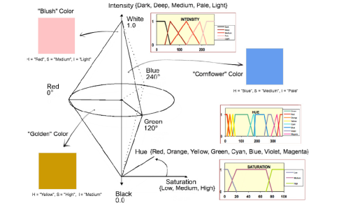
In our earlier works [3, 13, 12, 24, 11], we presented a novel fuzzy sets based color space, FHSI, which is consistent with human perception. Our method relies on fuzzifying the well-known HSI color space. (see Table 1 and Figure 1 for more details). We also provided objective measures for finding the image similarity to match human evaluation [25, 3]. So, fuzzy color is a fuzzy subset of points of some crisp color space[26], which is the HSI space in our case [25, 3]. Let , , be domains of the , , attributes respectively.
Definition 1
FHSI (fuzzy HSI) color is a linguistic label whose semantic is represented in HSI color space by a normalized fuzzy subset of .
From Definition 1 it is obvious that for each fuzzy color there exists at least one representative crisp color whose membership to is 1. Now let’s extend the concept of fuzzy color to a concept of a fuzzy color space.
Definition 2
FHSI (fuzzy HSI) color space is a set of fuzzy colors that define a partition of .
In other words, a fuzzy color space is a collection of fuzzy sets that provides a conceptual quantization (with soft boundaries) of crisp color space [26].
Definition 3
FHSI (fuzzy HSI) color palette is a combination of several fuzzy colors.
So, in a fuzzy color palette, each element is not a crisp color (color point), but a fuzzy color (region), e.g., for the Blush color, H = Red, S = Medium, I = Light (see Figure 1).
| Fuzzy variable | Term set | Domain |
|---|---|---|
| Hue | T = { Red, Orange, Yellow, Green, Cyan, Blue, Violet, Magenta } | X = [0, 360] |
| Saturation | T = { Low, Medium, High } | X = [0, 100] |
| Intensity | T = { Dark, Deep, Medium, Pale, Light } | X = [0, 255] |
4 Methods
The proposed approach is schematically shown in Figure 2. First, we collect a dataset comprising aesthetically appealing images from five distinct domains. Then, we extract fuzzy dominant colors in each image and group the images, forming fuzzy color palettes for each domain. Finally, we extract color harmony patterns and compare them.

4.1 Data Collection and Description
4.1.1 Fashion
The dataset and fuzzy color-based palettes presented in [3] were utilized. The dataset comprises looks from a variety of sources, including prominent fashion websites like lookbook.nu, instyle.com, and dailylook.com, as well as different style communities on social networking sites (e.g., Instagram, VK, etc.).
4.1.2 Art
The experiment utilized a total of 1276 artworks from the ’Best Artworks of All Time’ dataset [28]. This dataset comprises famous pieces of art created by various artists representing diverse movements and eras.
4.1.3 Nature
We used a dataset of pictures of natural landscapes [29] to extract fuzzy palettes present in various types of landscapes. This dataset includes real-world photos from Flickr, consisting of 100 desert pictures and 184 pictures for each of the following categories: landscapes, mountains, seas, beaches, islands, and Japan. In total, we collected 1204 images.
4.1.4 Interior Design
We utilized a dataset of Modern Architecture consisting of 100,000 images [30]. Specifically, we focused on the Private Apartments section (U-W) and excluded images containing keywords like ’Garden,’ ’Exterior,’ ’Facade,’ etc., as our interest was solely in interior design. This led to a total collection of 1250 interior design images.
4.1.5 Brand Logos
For dominant harmonious palettes in marketing, we employed the Popular Brand Logos image dataset [31], which comprises vector images of numerous well-known brand logos. A total of 1250 popular brand logos were utilized in the experiment.
4.2 Color Wheel
Johannes Itten, in his book ’The Art of Color’ [16], proposed a color wheel and described several principles - graphical schemes for constructing harmonious color combinations (Figure 3) . For instance, using a monochromatic color scheme means selecting one hue and its darker and lighter variations. Diametrically opposed colors are called complementary and produce the highest possible contrast. A split complementary color scheme involves one base color and two secondary colors. The triad scheme employs three colors that form a perfect triangle on the color wheel, while the square and rectangular harmonies follow the same logic. The analogous scheme entails selecting from 3 to 5 adjacent colors. However, it’s essential to be mindful of the saturation and lightness levels to create a well-balanced and harmonious color palette. The more colors used, the more challenging it becomes to attain aesthetic pleasantness. In our experiment, we use ”Monochromatic”, ”Complementary”, ”Split Complementary”, ”Triad”, ”Square”, ”Rectangular”, ”Analogous” color relationships.

4.3 Fuzzy Palettes Extraction
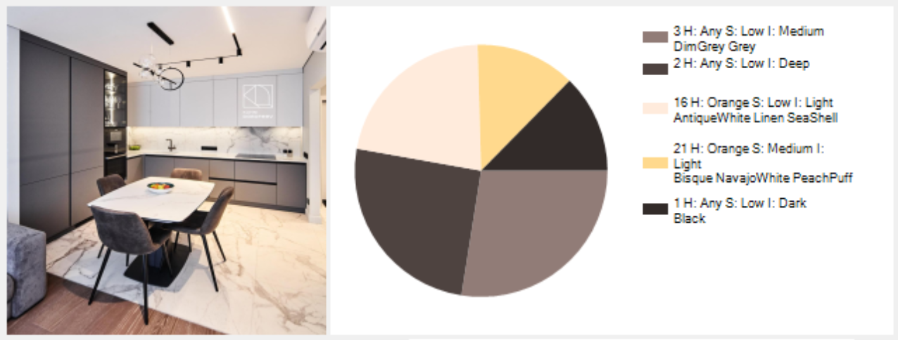
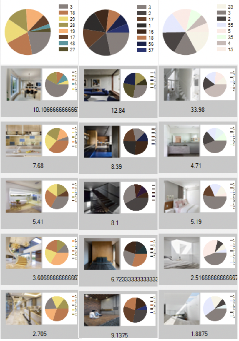
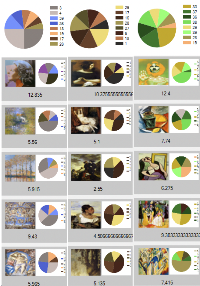
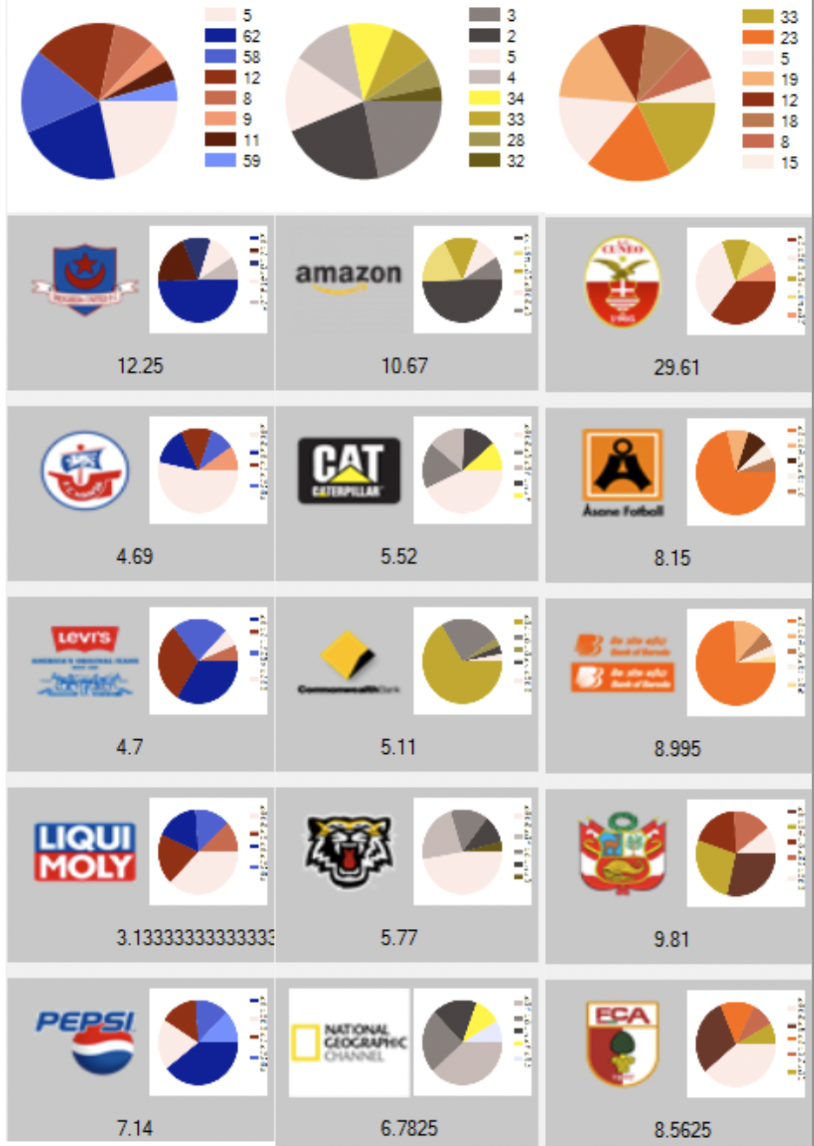
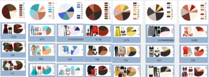
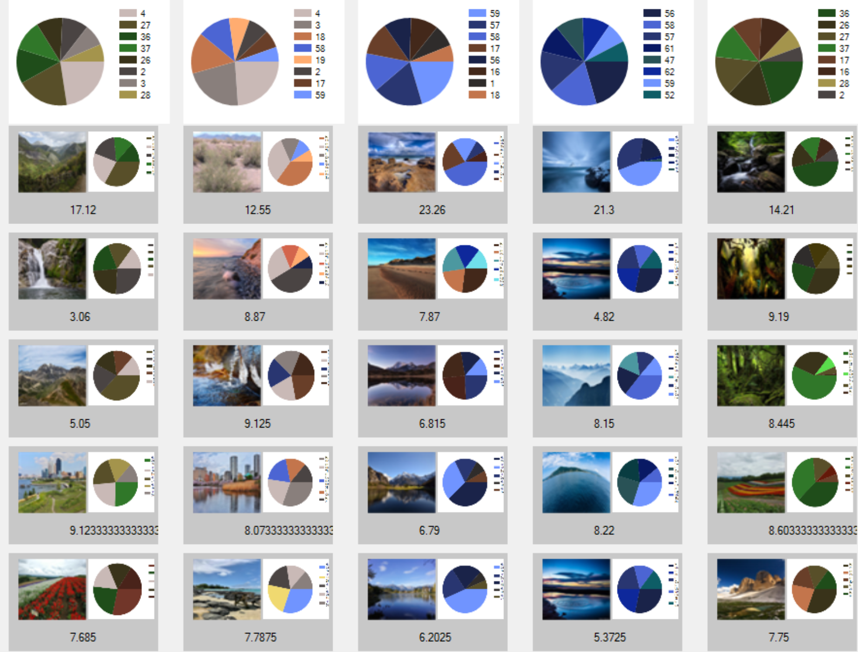
Harmonious fuzzy color-based palettes were generated from the dataset by categorizing images with similar color compositions. Examples illustrating the fuzzy dominant colors detection from image are presented in Figure 4. We employed the fuzzy color model, along with formulas for fuzzy color difference and palette similarity (as described in [13], [12], and [3]). Below, we outline Algorithm 1 for identifying a set of dominant fuzzy color palettes within a given domain . This algorithm employs a method for assessing the similarity between two images using FHSI, denoted as and [25]. For a more detailed explanation of the algorithm, please refer to [25].
We calculated the average number of images per group for each domain. Out of all the extracted palettes, we selected dominant palettes based on the criterion that they contained more images than the calculated average for each group.

5 Experimental Results
We processed datasets using Algorithm 1 to obtain fuzzy color palettes for each context. For instance, in the Art domain, we obtained 46 groups of palettes with similar fuzzy color schemes. Figure 6 showcases examples of color palettes associated with specific harmonies. Additionally, Figure 8 displays examples of fuzzy dominant palettes from various domains, accompanied by representative images.
| Context |
|
|
|
|
|
|
|||||||||
|---|---|---|---|---|---|---|---|---|---|---|---|---|---|---|---|
| Fashion | 59 | Analogous | 6.8 | 0.50 | 0.40 | ||||||||||
| Nature | 62 | Complimentary | 6.5 | 0.53 | 0.46 | ||||||||||
| Logo Design | 34 | Analogous | 2.9 | 0.49 | 0.48 | ||||||||||
| Interior Design | 37 | Analogous | 0 | 0.47 | 0.36 | ||||||||||
| Art Images | 46 | Analogous | 0 | 0.46 | 0.40 |
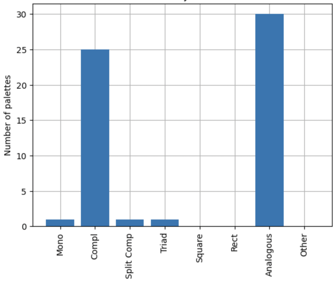
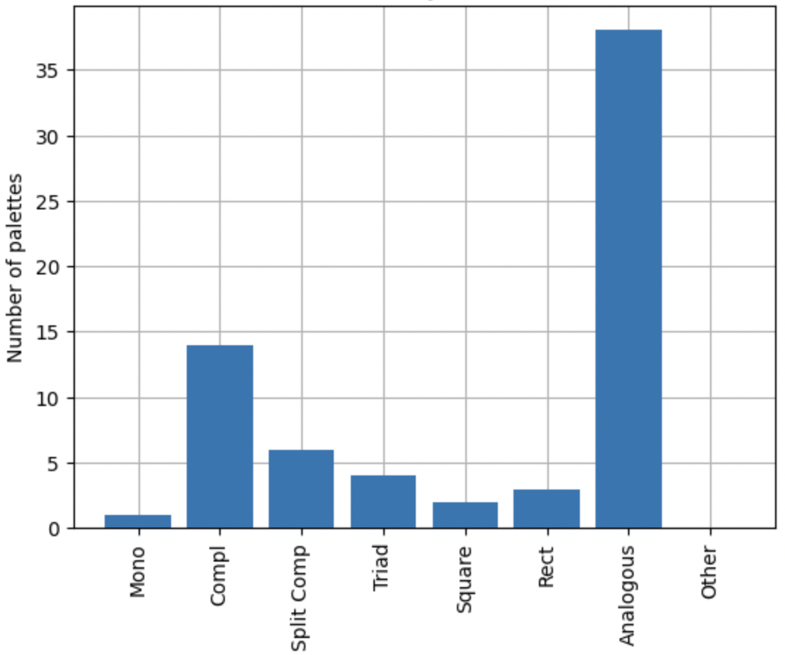
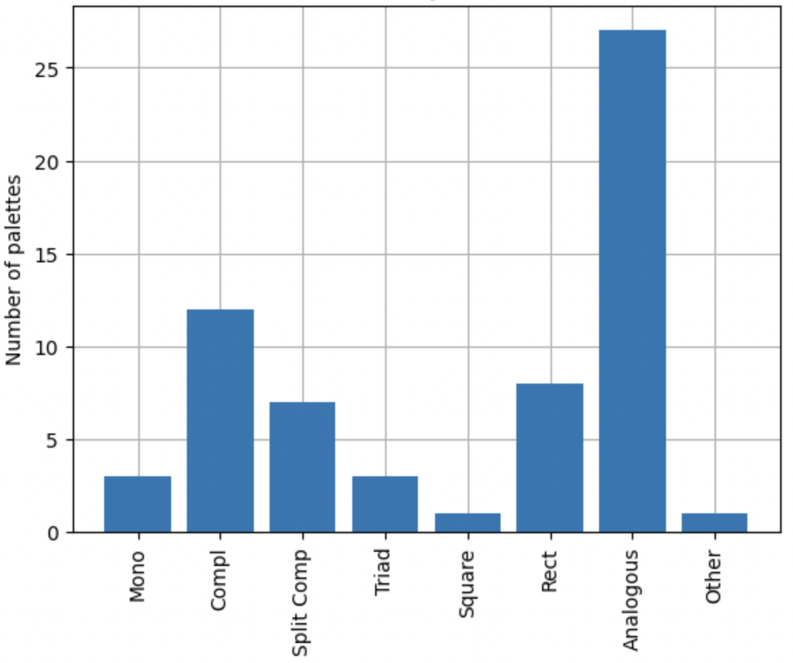
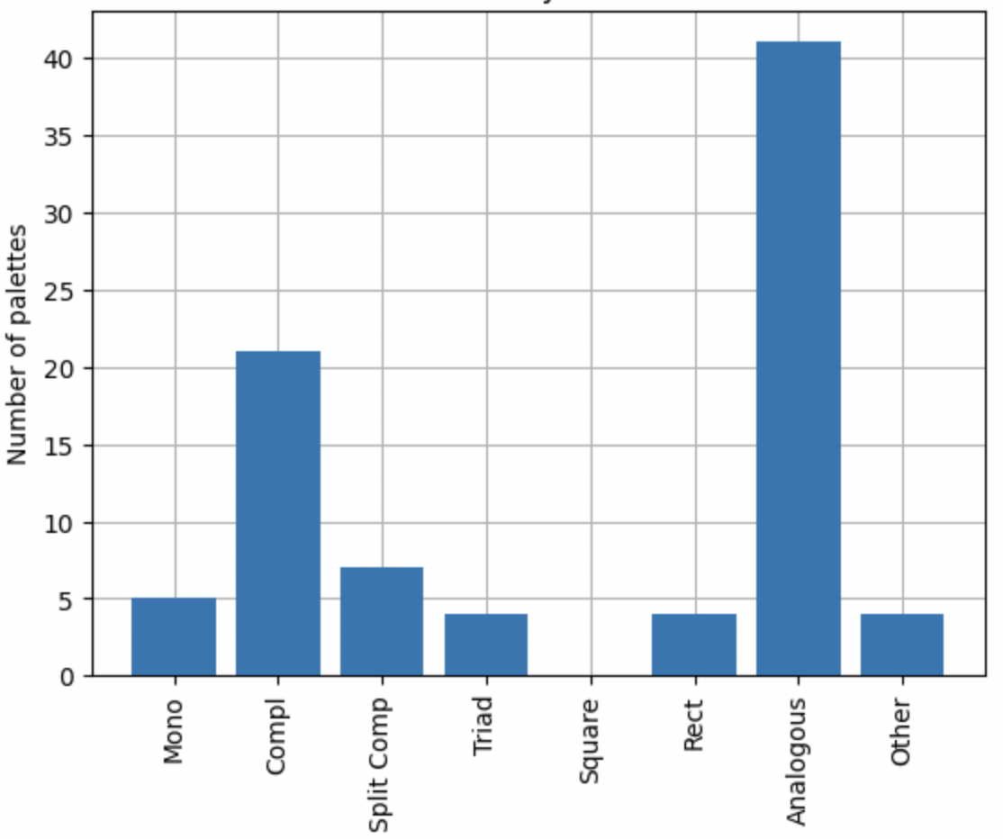
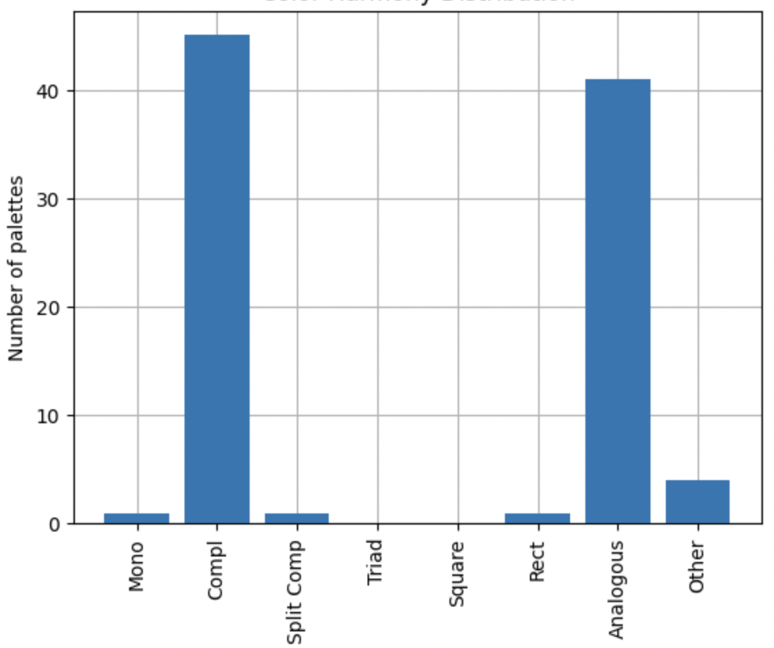
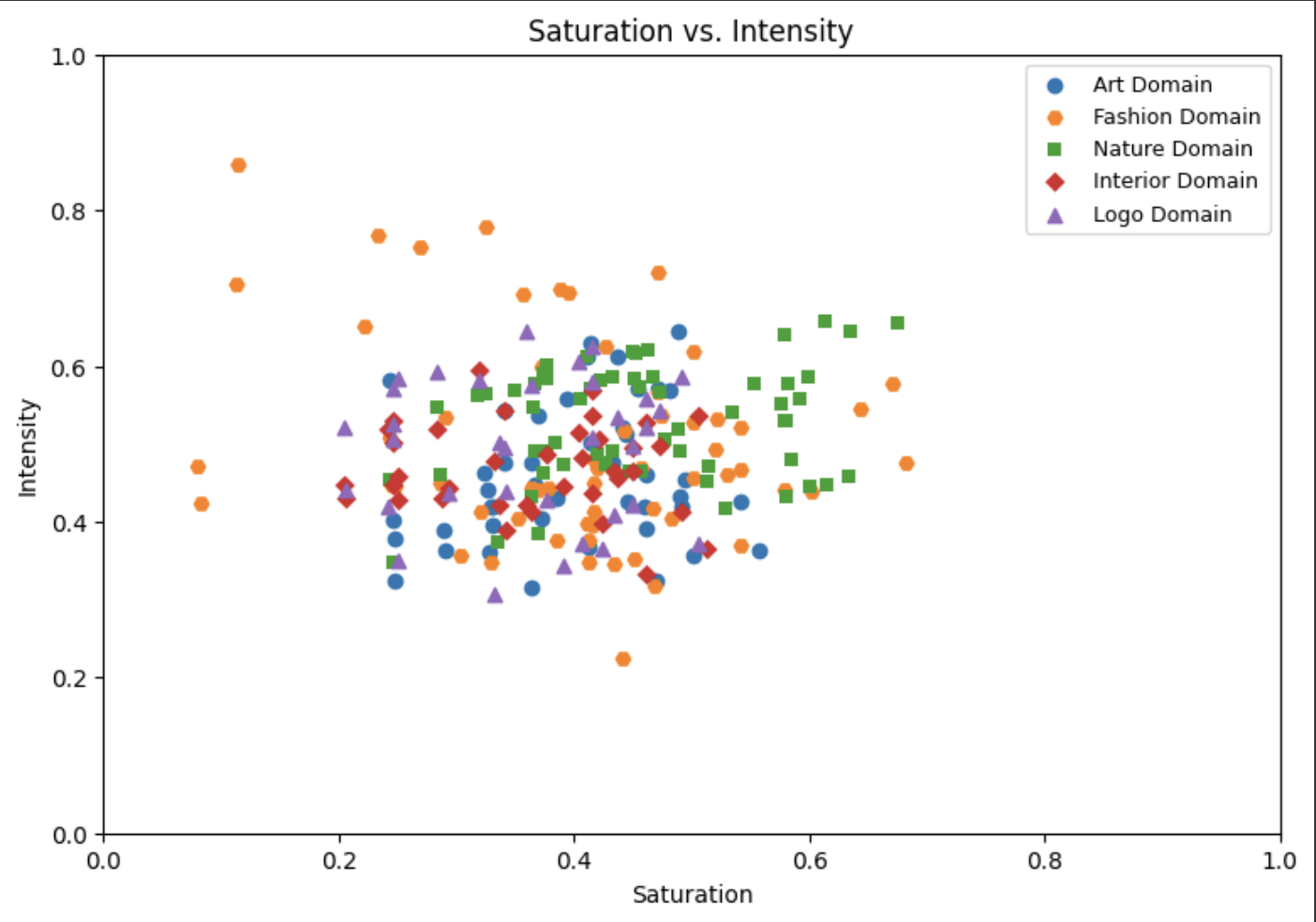
We proceeded to identify colors on the RGB color wheel, encompassing tertiary hues (12-split), and subsequently computed the corresponding harmonies. The comparative results are detailed in Table 2 and visually presented in Figures 5, 7(a), and 7(b). The majority of the extracted color schemes adhered to color wheel relationships, but some fell into the ’Other’ category, deviating from these norms. Certain wheel-based rules, such as ’Triad,’ ’Square,’ and ’Rectangle,’ were less frequently observed. In contrast, ’Analogous’ and ’Complementary’ harmonies predominated in each of the domains under consideration. Notably, a single palette could encompass multiple harmony schemes, such as ’Analogous’ and ’Triadic’, owing to our use of palettes consisting of eight colors.
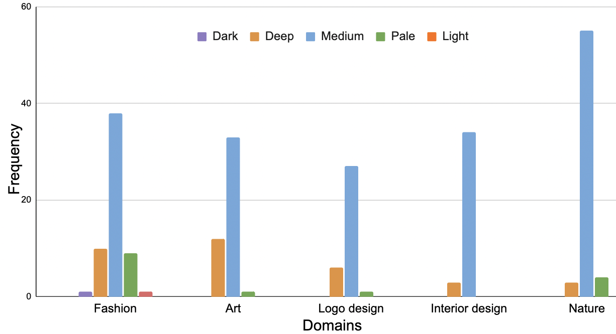
It’s evident that harmony rules based on the color wheel operate on specific levels of Intensity and Saturation, as depicted in Figures 7(b) and 7(a). Even when hues conform to particular color wheel relationships, such as the ’Triadic’ scheme, variations in saturation and intensity significantly impact harmony levels. In the majority of color schemes exhibiting strong color harmony, adherence to color wheel rules coincided with consistent patterns of medium levels of Saturation and Intensity. This pattern was observed across all contexts. Overall, the experimental results suggest that while color harmony exhibits a significant degree of universality, it remains somewhat context-dependent.

6 Conclusion
The current paper explores the context dependency of color harmony using a fuzzy-based approach. We examined color harmonies across contexts of art, fashion, nature, interior design, and branding, finding that while color wheel principles play a significant role in achieving harmony, the interplay of saturation and intensity is equally vital. The majority of color schemes with strong harmony adhered to Analogous and Complementary color wheel rules and maintained a balance of medium saturation and intensity.
Our findings underscore the largely universal nature of color harmony but also highlight its sensitivity to context. These results confirm those reported in [14] regarding general patterns of color harmony. The study has certain limitations. The datasets used may not fully represent the diversity of real-world images and contexts. Expanding the dataset variety and size could enhance the generalizability of our findings. As for future work, we plan to introduce a fuzzy inference system for measuring color harmony. The fuzzy rules will be used to account for the color wheel correspondence and levels of saturation and intensity. We also plan to incorporate subjective user evaluations to get richer insights into color harmony.
References
- [1] Rodriguez-Fernandez N, Alvarez-Gonzalez S, Santos I, Torrente-Patiño A, Carballal A, Romero J. Validation of an Aesthetic Assessment System for Commercial Tasks. Entropy. 2022;24(1).
- [2] Hayn-Leichsenring GU, Lehmann T, Redies C. Subjective Ratings of Beauty and Aesthetics: Correlations With Statistical Image Properties in Western Oil Paintings. i-Perception. 2017;8(3).
- [3] Shamoi P, Inoue A, Kawanaka H. Modeling aesthetic preferences: Color coordination and fuzzy sets. Fuzzy Sets and Systems. 2020;395:217-34.
- [4] Shamoi P, Inoue A, Kawanaka H. Color Aesthetics and Context-Dependency. In: Joint 12th Int. Conf. on Soft Computing and Intel. Systems and 23rd Int. Symposium on Adv. Intel. Systems; 2022. p. 1-7.
- [5] Markovic S. Object Domains and the Experience of Beauty. Art and Perception. 2014;2(1-2):140-19.
- [6] Singh S. Impact of color on marketing. Management Decision. 2006 07;44:783-9.
- [7] Schloss K, Palmer S. Aesthetic response to color combinations: Preference, harmony, and similarity. Attention, perception, psychophysics. 2011 02;73:551-71.
- [8] Aslam M. Are You Selling the Right Colour? A Cross‐cultural Review of Colour as a Marketing Cue. Journal of Marketing Communications. 2006 03;12:15-30.
- [9] Jacobs LW, Keown CF, Worthley R. Cross‐cultural Colour Comparisons: Global Marketers Beware! Int Mark Review. 1991;8.
- [10] Amsteus M, Al-shaaban S, Wallin E. Colors in Marketing : A Study of Color Associations and Context ( in ) Dependence. Int Journal of Business and Soc Science. 2015;6(3):32-45.
- [11] Shamoi P, Inoue A, Kawanaka H. Deep Color Semantics for E-Commerce Content-Based Image Retrieval. In: Int. Conf. on Fuzzy Logic in Artificial. Int. - Volume 1424. CEUR-WS.org; 2015. p. 14–20.
- [12] Shamoi P, Inoue A, Kawanaka H. Fuzzy Model for Human Color Perception and Its Application in E-Commerce. Int-l Journal of Unc, Fuzziness and Knowledge-Based Systems. 2016;24:47-70.
- [13] Shamoi P, Inoue A, , Kawanaka H. FHSI: Toward More Human-Consistent Color Representation. Journal of Advanced Computational Intelligence and Intelligent Informatics. 2016;20(3).
- [14] Ou LC, Luo MR, Cui G. A Colour Design Tool Based on Empirical Studies. Und Des Res Society Conf. 2009:175.
- [15] von Goethe JW, Eastlake CL. Goethe’s Theory of Colours; 1840.
- [16] Briggs D, Westland S. In: Itten, Johannes; 2014. p. 1-3.
- [17] Moon P, Spencer D. Geometric Formulation of Classical Color Harmony. J Opt Soc Am. 1944;34:46-59.
- [18] Chevreul M. The Principles of Harmony and Contrast of Colours, and Their App. to the Arts; 1860.
- [19] Tokumaru M, Muranaka N, Imanishi S. Color design support system considering color harmony. In: IEEE World Congr. on Comput. Intel. IEEE Intern. Conf. on Fuzzy Syst.. vol. 1; 2002. p. 378-83 vol.1.
- [20] Cetinic E, Lipic T, Grgic S. A Deep Learning Perspective on Beauty, Sentiment, and Remembrance of Art. IEEE Access. 2019;7:73694-710.
- [21] Elliot A, Maier M. Color and Psychological Functioning. Cur Dir in Psychol Sc. 2007 10;16:250 -254.
- [22] Saito M. Comparative studies on color preference in Japan and other Asian regions, with special emphasis on the preference for white. Color Research & Application. 1996;21(1):35-49.
- [23] Nakauchi S, Kondo T, Kinzuka Y, Taniyama Y, Tamura H, Higashi H, et al. Universality and superiority in preference for chromatic composition of art paintings. Scientific Reports. 2022 03;12.
- [24] Shamoi P, Inoue A, Kawanaka H. Fuzzy Color Space for Apparel Coordination. Open Journal of Information Systems (OJIS). 2014:20-8.
- [25] Shamoi P. Fuzzy Model For Human Color Perception and its Application in E-commerce - Apparel Color Coordination; 2019. PhD thesis.
- [26] Chamorro-Martínez J, Sánchez D, Soto-Hidalgo JM, Martínez-Jiménez P. Histograms for Fuzzy Color Spaces. In: Eurofuse 2011. Berlin, Heidelberg: Springer Berlin Heidelberg; 2012. p. 339-50.
- [27] Shamoi P, Inoue A, Kawanaka H. Perceptual Color Space: Motivations, Methodology, Applications. SCIS-ISIS14. 2014.
- [28] Icaro. Best Artworks of All Time - Collection of Paintings of the 50 Most Influential Artists of All Time(Kaggle);. www.kaggle.com/datasets/ikarus777/best-artworks-of-all-time..
- [29] Rougetet A. Landscape Pictures - Datasets of pictures of natural landscapes (Kaggle);. www.kaggle.com/datasets/arnaud58/landscape-pictures?resource=download.
- [30] Modern Architecture (100k Images)(Kaggle) CtS, of Modern Buildings P;. www.kaggle.com/datasets/ikarus777/best-artworks-of-all-time..
- [31] Koustubhk. Popular brand Logos - Image Dataset (Kaggle);. www.kaggle.com/datasets/kkhandekar/popular-brand-logos-image-dataset.