1333 \vgtccategoryResearch \vgtcpapertypeapplication/design study \authorfooter Yu Zhang is with the Department of Computer Science, University of Oxford. E-mail: yuzhang94@outlook.com. Ruike Jiang, Can Liu, and Xiaoru Yuan (corresponding author) are with the Key Laboratory of Machine Perception (Ministry of Education) and the School of Intelligence Science and Technology, Peking University. E-mail: {jiangrk | can.liu | xiaoru.yuan}@pku.edu.cn. Yuheng Zhao and Siming Chen (corresponding author) are with the School of Data Science, Fudan University. E-mail: {yuhengzhao | simingchen}@fudan.edu.cn. Liwenhan Xie is with the Department of Computer Science and Engineering, The Hong Kong University of Science and Technology. E-mail: liwenhan.xie@connect.ust.hk. Tianhong Ding is with the Fundamental Software Innovation Lab, Huawei Technologies. The research is conducted as an independent researcher and not an outcome of work at Huawei. E-mail: dingtianhong@huawei.com.
OldVisOnline: Curating a Dataset of Historical Visualizations
Abstract
With the increasing adoption of digitization, more and more historical visualizations created hundreds of years ago are accessible in digital libraries online. It provides a unique opportunity for visualization and history research. Meanwhile, there is no large-scale digital collection dedicated to historical visualizations. The visualizations are scattered in various collections, which hinders retrieval. In this study, we curate the first large-scale dataset dedicated to historical visualizations. Our dataset comprises 13K historical visualization images with corresponding processed metadata from seven digital libraries. In curating the dataset, we propose a workflow to scrape and process heterogeneous metadata. We develop a semi-automatic labeling approach to distinguish visualizations from other artifacts. Our dataset can be accessed with OldVisOnline, a system we have built to browse and label historical visualizations. We discuss our vision of usage scenarios and research opportunities with our dataset, such as textual criticism for historical visualizations. Drawing upon our experience, we summarize recommendations for future efforts to improve our dataset.
keywords:
Historical visualization, dataset, digital humanities, data labeling1 Introduction
History has left us with a heritage of visualizations, such as John Snow’s map that points to the root cause of the cholera outbreak [77] and Charles Joseph Minard’s map of Napoleon’s Russian campaign that illustrates the losses in the retreat [52]. By examining these legacies, we can gain invaluable insights into how people have communicated and interpreted data. The wit in the design of historical visualizations has served as guidance for contemporary visualizations [81]. As with other artifacts, visualizations are records of the thoughts and culture of the time, where we can peek at the social context, artistic norms, and the level of technological advancement in the past.
There have been cumulative efforts gathering historical visualizations and exploiting the wisdom underneath. For instance, The Book of Trees [46] examines historical practices of encoding hierarchical data. History of Information Graphics [66] describes historical infographics spanning various fields such as astronomy and zoology. The milestones project provides an online gallery of significant visualization inventions in history [22]. They serve as excellent resources to inspire and communicate findings on the history of visualization. However, existing historical visualization collections fall short in scale and diversity. Myriads of historical visualizations remain scattered across digital libraries and have not been paid sufficient attention in the research community. Our current knowledge of historical visualization is built on limited instances [39], whereas an overarching view is missing.
Continuing these prior efforts in consolidating knowledge in data visualization, we are motivated to gather the scattered historical visualizations and assemble a digital library featuring visualizations. By curating such a collection, we aspire to amplify the impact of historical visualizations. We aim to center them as an integral part of our understanding, not only of visualization but also history. In doing so, we address two challenges. Firstly, digital libraries apply various metadata schemas and use different vocabularies in describing their collections. It is necessary to develop a consistent and unified approach to scraping and organizing visualizations. Secondly, visualizations are sparsely distributed in digital libraries, which warrants an effective filter to remove irrelevant artifacts. The large volume of visualizations necessitates a level of automation in labeling.
This paper presents the first large-scale dataset of diverse historical visualizations. Our dataset comprises 13K visualization images published before 1950 and corresponding metadata with 17 dimensions. We collect data from seven digital libraries, such as David Rumsey Map Collection [68] and Gallica [55]. Reflecting on our experience curating the dataset, we formulate a workflow to collect, clean, and label visualizations from various data sources. We highlight that historical visualizations, as an underexplored resource combining text, image, and data, can shed light on studies in history and visualization. We envision many usage scenarios of the dataset for history and visualization researchers, such as textual criticism and design space analysis.
In summary, this paper has the following contributions:
-
•
We contribute the first dedicated large-scale historical visualization dataset with 13K images and corresponding metadata. Users can explore it through the image browser we develop.
-
•
We propose a dataset construction workflow to collect, clean, and label visualization images.
-
•
We discuss in-depth the usage scenarios and research opportunities facilitated by our dataset.
The source code, documentation, and dataset are available at https://github.com/oldvis.
2 Background & Related Work
This section briefly introduces the background of using historical visualization in science history research and reviews the literature on datasets of visualizations.
2.1 Visualization in Science History
Visualizations are widely adopted in various scientific domains. Some historical visualizations are regarded as milestones in corresponding scientific domains, such as John Snow’s cholera map for epidemiology. They are thus important records for science history studies and have attracted much attention. For example, Robinson overviews the life and works of Charles Joseph Minard and presents a chronological listing of Minard’s thematic maps [67]. Friendly and Denis trace the invention and development of scatterplots in the history of science [21]. Friendly et al. investigate the background of Michael Florent van Langren’s 1644 chart showing estimations of the longitude between Toledo and Rome, sometimes regarded as the first known statistical chart [23].
Despite the interest in studying historical visualizations from a historical perspective, the lack of dedicated collections of historical visualizations poses an obstacle. Visualizations are usually sparsely scattered in historical documents and are easily overlooked. For example, John Snow’s On the Mode of Communication of Cholera [77], where the famous cholera map was published, contains only two visualizations among around two hundred pages.
Furthermore, existing digital libraries typically lack filters to enable users to retrieve visualizations besides maps. The lack of support in digital libraries impedes a holistic inspection of historical visualizations. In response to the call to expand the history of data visualization [36] and avoid over-relying on a small number of classic visualizations [39], we develop a large-scale historical visualization dataset. Our work also aligns with the suggestion to promote visualizations into a first-class medium of information [85].
Our dataset focuses on gathering historical visualizations, i.e., visualizations created long ago. A related effort is Old Maps Online [37], which gathers historical geographic maps. To our best knowledge, Friendly and Denis’ milestones project is the only prior effort on gathering the scattered treasure of various types of historical visualizations [22]. They focus on milestones and the firsts in the history of visualization and have manually collected around 400 images. We build a large-scale historical visualization dataset to provide a rich resource for science history and visualization researchers. Note that we focus on gathering “old” visualizations rather than visualizations of historical datasets like the ones reviewed by Windhager et al. [84].
2.2 Dataset of Visualizations
Practitioners and researchers have contributed many datasets of contemporary visualizations, typically image datasets. Such visualization datasets have been exhaustively reviewed by Liu et al. [48] and Ye et al. [87]. The following review focuses on usage scenarios discussed in prior work on visualization datasets.
Large datasets of visualizations enable the discovery of visualization design and usage patterns [44, 12, 15, 47]. For instance, using a collection of 41K visualizations from major venues where developers publish visualizations, Battle et al. discover differences in the chart type preferences among developers using different toolkits [1]. Using 13K infographics obtained from design websites, Lu et al\xperiod identified 12 design patterns of linkages among graphical elements to convey information [50]. The underlying patterns of visualization datasets also contribute to model training for automatic chart analysis [85, 9].
Additionally, visualization datasets are real-world resources for empirical studies. For instance, Borkin et al\xperiod conducted crowdsourcing studies to understand what visual features in visualizations contribute to better memorability [5], recognition, and recall [4] based on a dataset with over 5K visualizations scraped from the web. Hu et al. proposed the VizNet [27] repository comprising datasets of web-based visualizations. They demonstrate using the datasets to replicate a prior study [35] for evaluating the effectiveness of visual encodings.
Moreover, visualization datasets facilitate overviewing, communicating, and educating visualization techniques. Some survey papers provide online browsers to exemplify the design space of visualization techniques such as tree [71], geospatial network [70], text [41], and data-GIFs [75]. There has been increasing interest in curating visualization images that appeared in publications at visualization venues such as IEEE VIS and IEEE TVCG. Examples include ViStory [88], VIS30K [11], and VisImages [16]. Chen et al\xperiod [10] proposed a topography to index visualization images in IEEE VIS papers.
In this work, we have constructed a dataset comprising real-world visualizations created before the computer era. Our dataset supports usage scenarios specific to or particularly interesting for historical visualizations. As detailed in Section 5, such scenarios include textual criticism, historical data extraction, design space analysis, inspiration for contemporary design, metadata analysis, and metadata research.
With the availability of large-scale visualization datasets, there have been investigations to facilitate efficient explorations of such datasets. VISAtlas [87] projects visualizations onto a 2D plane based on their embeddings to provide an overview and support comparisons between datasets. Thumbnail design [56] and search engine designs [13, 26] have been explored for information retrieval in visualization collections.
To support the exploration of our historical visualization dataset, we develop the OldVisOnline system. Like existing literature search and analysis systems, such as SurVis [2] and KeyVis [31], OldVisOnline supports metadata searching and filtering. The image gallery of OldVisOnline follows the design of SurVis [2]. Compared with these prior systems, OldVisOnline additionally comprises data labeling functions.
3 Dataset Construction Workflow
This section introduces our workflow for constructing the historical visualization dataset. We clarify the scope and sources of our collection, elaborate on the process of collecting and filtering data, and discuss considerations and rationales.
3.1 Data Sources
We have used seven digital libraries and collections as our data sources, as listed in Table 4. We include David Rumsey Map Collection [68], Internet Archive [32], Gallica [55], Library of Congress [45], and British Library 111 British Library provides multiple galleries including Collection Items and Images Online. We use British Library to refer to the union of the two galleries. [7] because they are well-known massive digital libraries, some of which are authoritative national libraries, thus likely holding more collections of historical visualizations. Telefact [53] and Alabama Maps [8] are included based on our previous experience in identifying historical visualizations in them. We use multiple digital libraries instead of relying on a general-purpose image search engine, such as Google Images, with three considerations:
-
•
Data availability: Most digital libraries do not expose their collections to search engines. Many images are only available through these digital libraries.
-
•
Metadata richness: Images in digital libraries are accompanied by metadata, which are crucial for further analysis. Such metadata are absent for entries returned by search engines.
-
•
Data quality: The data quality of digital libraries is higher than that of search engines. The images indexed by digital libraries are usually high-resolution and deduplicated.
3.1.1 Inclusion Criteria
To make clear what should be included in our historical visualization dataset, we set the following inclusion criteria to address the two constraints, “historical” and “visualization”:
-
•
Publish date: By “historical”, we require the visualization to be published before 1950. Using computerized graphics design toolkits gradually became the most common approach for creating visualizations since Sutherland proposed Sketchpad [80]. Setting the publish date threshold to 1950 allows us to focus on the visualizations created before the computer age.
-
•
Content: By “visualization”, we refer to the common definition of it as “visual representations of datasets” [54]. While maps are generally regarded as visualizations of spatial data, we exclude maps from our collection except when the maps contain information layers that encode non-spatial data. Historical maps are extensively studied in historical geography. It is easy to obtain hundreds of thousands of historical maps from dedicated collections such as Old Maps Online [37]. Thus, we ignore conventional maps to focus on other types of historical visualizations, which are much less explored.
We acknowledge that users may have different understandings of the temporal constraint set by “historical”. Thus, when constructing the dataset, we provide another edition of the dataset without the publish date constraint, as shown in Table 4. Using this dataset edition, the users can create their editions of the historical visualization dataset by applying customized publish date filters if needed.
3.1.2 Search Strategies
Most data sources have massive collections and are not dedicated to historical visualizations. Thus, gathering all the images from the data sources is impractical and unnecessary. To retrieve historical visualizations from data sources that support searching, we mainly search with two types of keywords:
-
•
Synonyms of “visualization”: examples include “visualization”, “chart”, and “diagram”.
-
•
Names of visualization authors: examples include “John Snow”, “Charles Joseph Minard”, and “Émile Cheysson”.
We try the search strategies for each data source that supports searching and keep the search keywords that return historical visualizations. For data sources with advanced search functions such as publication date filtering, we tailor our search queries toward their search grammar.
3.2 Data Labeling and Filtering
Not all the images in the query results obtained from the data sources are historical visualizations. To curate a collection of historical visualizations, we filter the non-visualization images with the following semi-automatic data labeling and label quality assurance processes.
3.2.1 Semi-Automatic Labeling
In the semi-automatic labeling process, we first manually label the images collected from David Rumsey Map Collection, British Library Images Online, Telefact, and Alabama Maps. Then, we train classifiers to predict the labels of images in the remaining data sources. The following describes each stage of this semi-automatic labeling process.
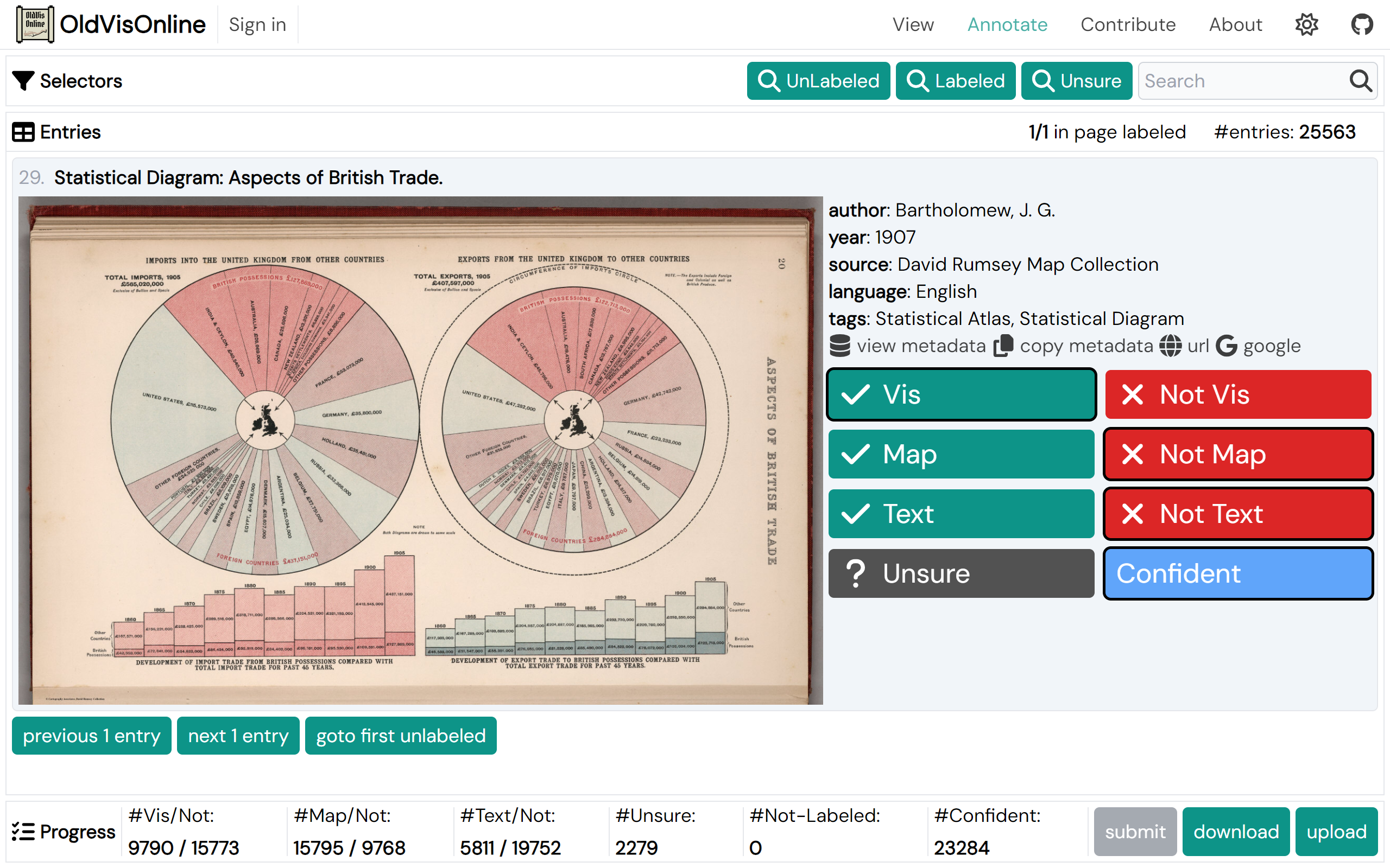
Manual labeling: Using the labeling interface shown in Fig. 2, we manually assign three binary classification labels to each image:
-
•
Vis/NotVis: contains a visualization or not.
-
•
Map/NotMap: contains a map or not.
-
•
Text/NotText: has over half of the area occupied by text or not.
The manual labeling is carried out by one of the authors. Labeling the images in David Rumsey Map Collection took around 160 hours. Through labeling, we identify that images contain visualizations, images contain maps, and images have over half of the area occupied by text. Note that the labels are not mutually exclusive. An image can be Vis, Map, and Text at the same time. Likewise, manual labeling is conducted on the images in British Library Images Online, Telefact, and Alabama Maps.
Model training: Using the annotations for David Rumsey Map Collection, we train three binary classifiers:
-
•
: classify whether an image is Text, NotVis, and NotMap at the same time.
-
•
: classify whether an image is Vis or Map.
-
•
: classify whether an image is Vis.
detects text pages, a common type of non-visualization images in the data sources. The text pages are usually easy to differentiate from visualization images. Applying to filter images allows us to effectively eliminate text pages that are common and easy cases of non-visualization images.
| Task | Positive | Negative | Accuracy | F1 |
|---|---|---|---|---|
| 97.4% | 0.936 | |||
| 97.3% | 0.981 | |||
| 92.2% | 0.897 |
detects maps and visualizations. In ideal situations with accurate model predictions, should be directly applied to detect visualizations. In practice, maps are hard to differentiate from visualization, as can be seen from differences between the performances of and in Table 1. Thus, we use a separate classifier to detect both visualization and maps and leave the challenging task of differentiating visualizations and maps to the last step.
The three classifiers are trained with the same hyperparameter setup. We fine-tune VGG-16 [76] pre-trained on ImageNet-1K [17]. We train the model with two stages as practiced in prior work [40, 16]. In the first stage, we freeze the weights of convolutional layers and train the classification head for 6 epochs. In the second stage, we train all the weights for 6 epochs. We optimize the binary cross entropy loss using stochastic gradient descent with the initial learning rate being .
We utilize the manual annotations on David Rumsey Map Collection to train the three classifiers. Table 1 shows the number of positive and negative data points as well as model performances for the three tasks. When evaluating the model performances, we train the model with 80% of the labeled dataset and validate with the remaining 20%. When using the model in practice, to make the most from the annotations, we train the three classifiers with 100% of the labeled dataset.
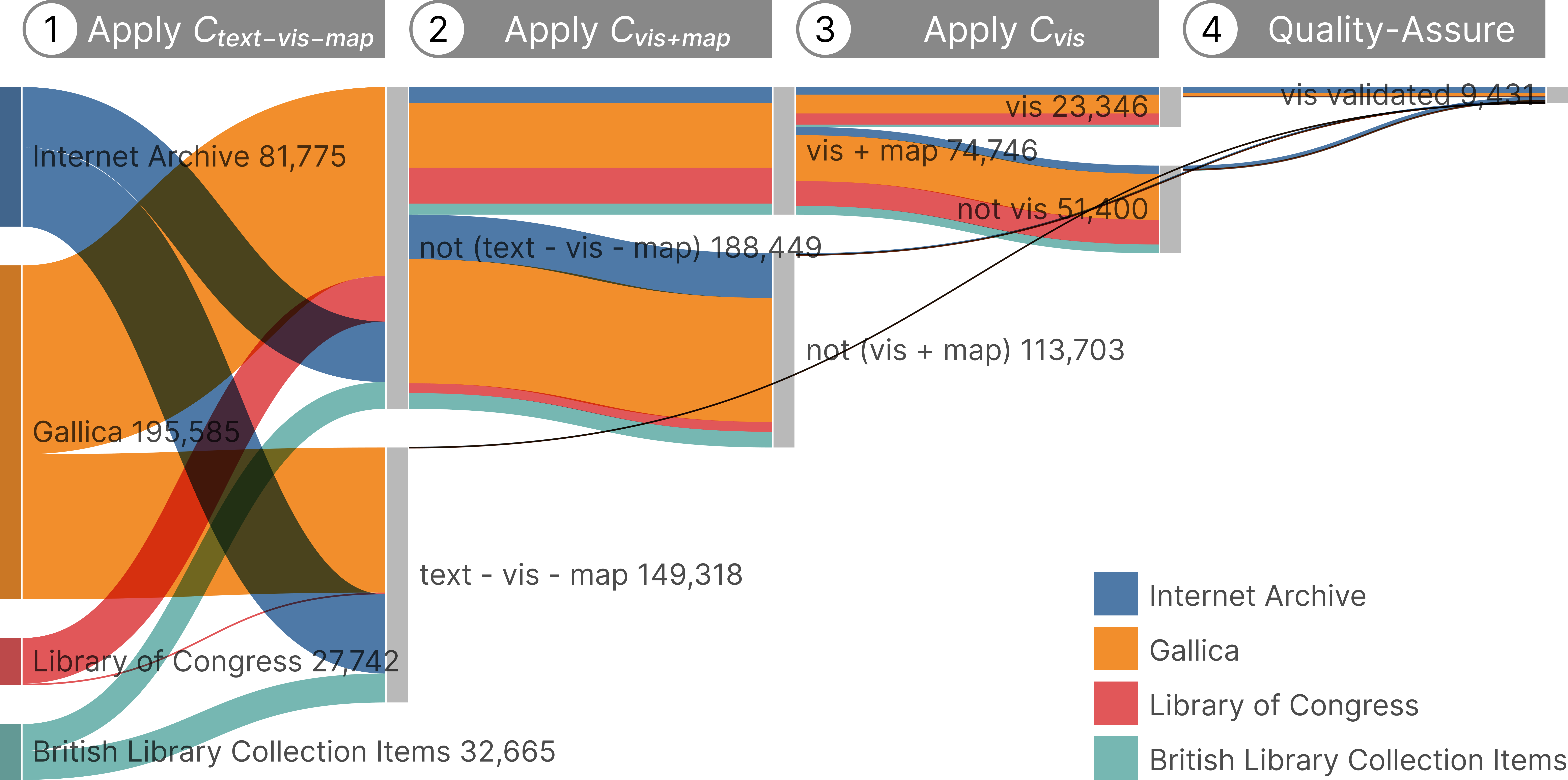
Prediction and filtering: With trained classifiers , , and , we carry out a series of filtering steps on the unlabeled images in Internet Archive, Gallica, Library of Congress, and British Library Collection Items. Figure 3 shows the number of images discarded and kept in each step.
-
•
Step 1: Apply to all the images and discard the ones classified as positive. Among all the images, 44.21% (/) are positive (i.e., are text pages) and discarded (marked as in Fig. 3).
-
•
Step 2: Apply to the remaining images and discard the ones classified as negative. Among the remaining images that classified as negative, 60.34% (/) are negative and discarded (marked as in Fig. 3).
-
•
Step 3: Apply to the remaining images and discard the ones classified as negative. Among the remaining images that classified as positive, 68.77% (/) are negative and discarded (marked as in Fig. 3).
Through the filtering steps, among all the images, the models predict 6.91% (/) as potential visualizations (marked as in Fig. 3). The predictions are not directly used as definitive results. In the following, we introduce the quality assurance of the predictions.
| Data Subset | #Images | #Vis | Vis% | Time | Speed (#/s) |
|---|---|---|---|---|---|
| 118 | 0.08% | 128 | 19.5 | ||
| 1014 | 0.89% | 206 | 9.2 | ||
| 2639 | 5.13% | 219 | 3.9 | ||
| 5660 | 24.24% | 289 | 1.3 | ||
| Total | 9431 | 2.79% | 842 | 6.7 |
| Model | LR | Loss | Accuracy | F1 | ||||||
|---|---|---|---|---|---|---|---|---|---|---|
| All | Vis | Map | Text | All | Vis | Map | Text | |||
| ConvNeXt-T [49] | 1e-2 | 0.622 | 67.0% | 61.9% | 61.7% | 77.2% | 0.254 | 0 | 0.763 | 0 |
| 1e-3 | 0.125 | 95.1% | 91.6% | 97.1% | 96.7% | 0.932 | 0.891 | 0.976 | 0.928 | |
| 1e-4 | 0.167 | 93.3% | 88.8% | 95.5% | 95.7% | 0.906 | 0.848 | 0.963 | 0.908 | |
| ResNet-50 [24] | 1e-2 | 0.173 | 95.4% | 92.2% | 97.1% | 96.8% | 0.934 | 0.897 | 0.977 | 0.929 |
| 1e-3 | 0.181 | 94.0% | 90.1% | 95.8% | 96.2% | 0.916 | 0.864 | 0.966 | 0.918 | |
| 1e-4 | 0.271 | 89.1% | 82.2% | 93.0% | 92.2% | 0.841 | 0.744 | 0.943 | 0.835 | |
| VGG-16 [76] | 1e-2 | 0.150 | 95.0% | 91.4% | 96.8% | 96.8% | 0.929 | 0.882 | 0.974 | 0.931 |
| 1e-3 | 0.135 | 95.3% | 91.8% | 96.9% | 97.2% | 0.936 | 0.891 | 0.975 | 0.941 | |
| 1e-4 | 0.164 | 93.6% | 88.8% | 95.6% | 96.3% | 0.913 | 0.857 | 0.965 | 0.917 | |
3.2.2 Quality Assurance of Model Predictions
The author responsible for manual annotation in the manual labeling stage screened all the model predictions and corrected misclassifications. The screening was conducted in the default file explorer of Windows 11. The images were sorted by file size before the screening. The three filtering steps create four disjoint data subsets:
-
•
: the images classified positive by in the first step.
-
•
: the images classified negative by in the second step.
-
•
: the images classified negative by in the third step.
-
•
: the images classified positive by in the third step.
Table 2 shows the percentage of visualization images and quality assurance time cost for the four data subsets. In total, visualization images are identified and validated from the data subsets in the screening (marked as in Fig. 3).
The percentage of visualizations increases through the filtering steps. Among the images classified as text pages by in the first step, only 0.08% are visualizations. By comparison, among the images classified as visualizations by in the third step, 24.24% are visualizations. The filtering steps managed to distill visualizations from the images.
Compared with the manual labeling stage, the quality assurance process is efficient. The model predictions reduce human effort as the annotator only needs to make corrections infrequently instead of annotating from scratch [90]. The quality assurance of model predictions on images took 842 minutes. We observe that the speed of quality assurance decreases with the filtering step. As shown in Table 2, for the images discarded in the first step (i.e., images in ), the speed of manual quality assurance was 19.5 images per second. By comparison, for the images kept in the final step (i.e., images in ), the speed of manual quality assurance was 1.3 images per second. The speed decrease may be due to increased image content complexity and image label ambiguity through the filtering steps.
We quality-assure model predictions on all the images to obtain high-quality annotations and to evaluate the classifiers’ effectiveness in filtering visualization images. Depending on the usage scenario, future maintainers of our dataset or similar datasets may not quality-assure all the model predictions. For example, when the goal is not to obtain as many visualization images as possible but to obtain visualization images as efficiently as possible, the dataset curator may quality-assure only the images classified as visualizations (i.e., images in ) and discard all the other images directly without checking.
3.2.3 Considerations
The following discusses the considerations and rationales for details in data labeling and filtering.
On rule-based filtering: Compared with training classifiers, an alternative approach is to program rule-based filters. We have trialed this approach but gave up because the metadata sometimes lack enough information to support the classification. For example, a visualization image may be a page of a book. It can be hard to differentiate the visualization image from the remaining text pages by metadata, as the metadata of all the book pages can be similar.
On crowdsourcing versus expert annotation: One of the authors was responsible for data labeling and quality assurance of model predictions. We decided not to crowdsource annotations as the labeling requires expertise. For example, it can be difficult to differentiate Joseph Priestley’s timeline [64] filled with text from an ordinary text page. The borderline between ordinary geographic maps and visualizations can also be hard to judge.
On improving label consistency: The annotator’s understanding of what should be counted as visualization may evolve through the labeling process. This phenomenon, referred to as concept evolution [43], may introduce systematic errors to the labels. To reduce such errors, we set up weekly meetings for ten months to discuss edge cases met in data labeling and as we tried out our online gallery. The Unsure label in the interface shown in Fig. 2 marks the edge cases for later inspection.
On model hyper-parameter selection: Before model training, the hyper-parameters underwent the following selection process. We tested three model architectures: ResNet-50 [24], VGG-16 [76], and ConvNeXt-T [49]. For each architecture, we tested three learning rates: , , and . For each combination of the model architecture and learning rate, we fine-tuned the model with weights pre-trained on ImageNet-1K [17] to output three binary classification labels: Vis/NotVis, Map/NotMap, and Text/NotText. Each model was trained with 80% of the labeled data points in David Rumsey Map Collection. Table 3 shows the model performances. It can be seen that the top three setups with similar performances are VGG-16 with , ResNet-50 with , and ConvNeXt-T with Thus, we used VGG-16 with in the model training stage.
On iterative model training: In the quality assurance process, it is possible to iteratively fine-tune the model with the newly quality-assured data labels. Iterative training may improve model performance and thus reduce the annotator’s quality assurance time cost. We did not iteratively train the model because of the training time cost. Training the three binary classifiers in Section 3.2.1 with the labeled data points in David Rumsey Map Collection took around 6 hours with an NVIDIA GeForce RTX 3070 Laptop GPU. Assuming that model parameters are fixed, the training time cost is at least linear with the dataset size. Iteratively fine-tuning the model with the total data points would take at least hours. By comparison, the manual quality assurance for these data points took around 14 hours. The annotator would need to wait for the model update if the model were iteratively fine-tuned. Thus, we refrained from retraining the model iteratively. In the cases where the developer has access to more computation resources or smaller models are used, iterative model training may bring benefits.
On active learning: Active learning techniques iteratively select unlabeled data points for annotators to label. They are commonly used in data labeling systems [73, 25, 42] for two potential advantages:
-
•
Fewer required labels: Active learning aims to train a model to achieve higher accuracy with fewer labels [72]. In some cases, the goal of data labeling is not a fully labeled dataset but a trained model. Fewer labels and labeling efforts are required in these cases where the goal of data labeling aligns with active learning.
-
•
Improved default label accuracy: The model and the predictions can be updated with the iteratively obtained labels. Active learning may boost the accuracy of machine-predicted labels and thus reduce the annotator’s effort to correct misclassifications.
We decided not to use active learning as the two advantages are absent in our scenario. The number of required labels cannot be reduced as we want the dataset to be fully labeled and checked. As discussed above, we decided not to iteratively train the model because of the time cost. Thus, the default labels cannot be updated, and their accuracy cannot benefit from active learning.
4 OldVisOnline
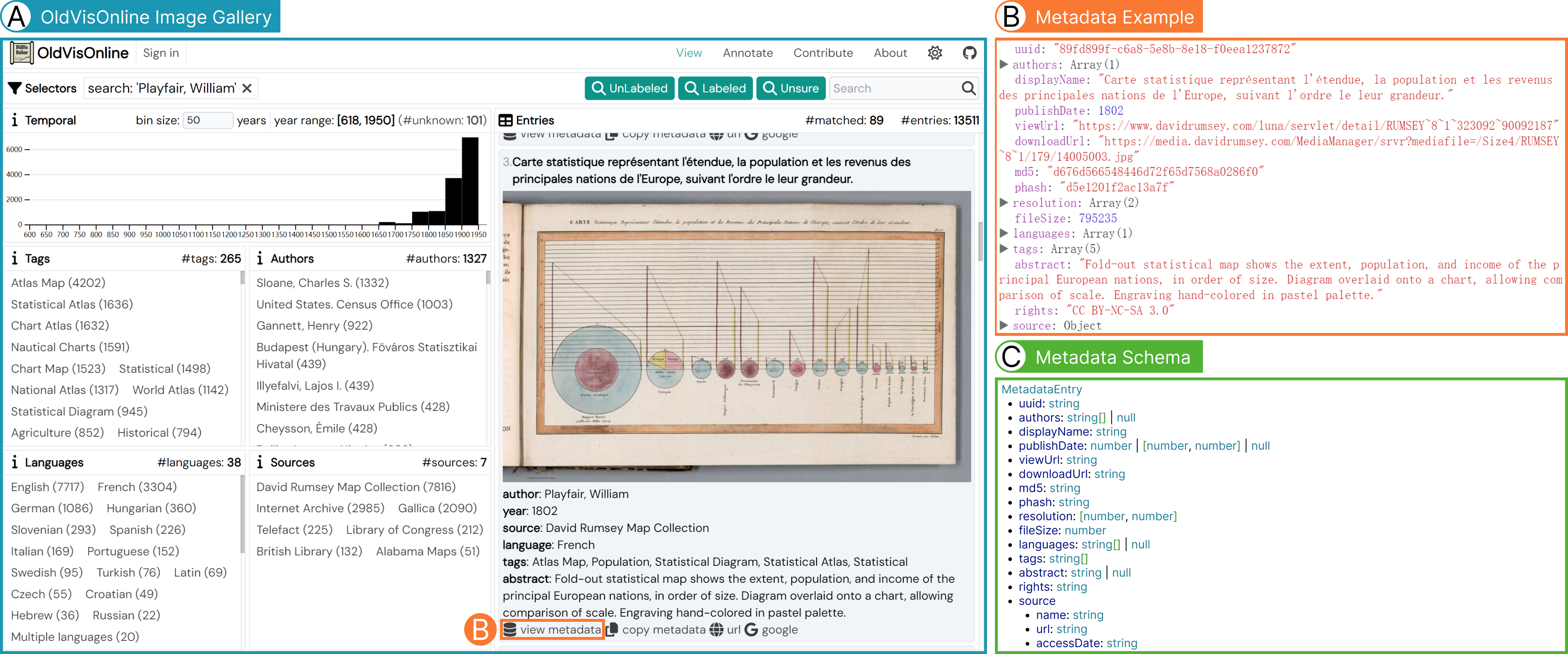
As shown in Table 4, through the dataset construction workflow, we obtain visualization images published before 1950, which we regard as historical visualizations. The visualization images and corresponding metadata are obtained from seven data sources. Figure 1(B) shows a metadata entry example.
With the images and metadata, we develop OldVisOnline, a system for browsing and labeling historical visualizations. OldVisOnline consists of an image gallery interface (Fig. 1(A)), an image classification interface (Fig. 2), and a fine-grained labeling interface (Fig. 6). The data labeling components of OldVisOnline are adapted from the OneLabeler framework [91].
OldVisOnline’s image gallery supports searching with the metadata. The image gallery is designed following SurVis [2]. The user can conduct cross-filtering on the publishDate, tags, authors, languages, and source fields in the corresponding panel on the left of the gallery interface in Fig. 1(A). The Selectors panel shows the cross-filtering conditions. The user can also create freeform search queries with the search box on the right of the Selectors panels. The Entries panel in Fig. 1(A) shows the matched entries. The matched entries are paginated with 20 entries per page.
The panels on the left of the gallery interface (Fig. 1(A)) show the metadata statistics. We have extracted 265 index terms for the visualizations. The visualizations are created by 1327 authors and institutes. The visualizations are published in 38 languages, as predicted by an n-gram-based text classifier.
5 Usage Scenarios
With the large-scale collection of historical visualizations, we envision multitudinous opportunities for future research. As with datasets of contemporary visualizations, our historical visualization dataset can serve as a corpus for machine learning [16] and an educational resource [11]. Additionally, various usage scenarios are specific to or particularly interesting for historical visualizations. In this section, we elaborate on such usage scenarios of our dataset.
5.1 Textual Criticism
Textual criticism is a branch of bibliography and philology that studies variations and errors in different copies of the same historical document. Our historical visualization dataset and image gallery can serve as a resource and a search engine to help historians conduct textual criticism studies on historical visualizations. We introduce a case of comparing editions of John Snow’s cholera map.
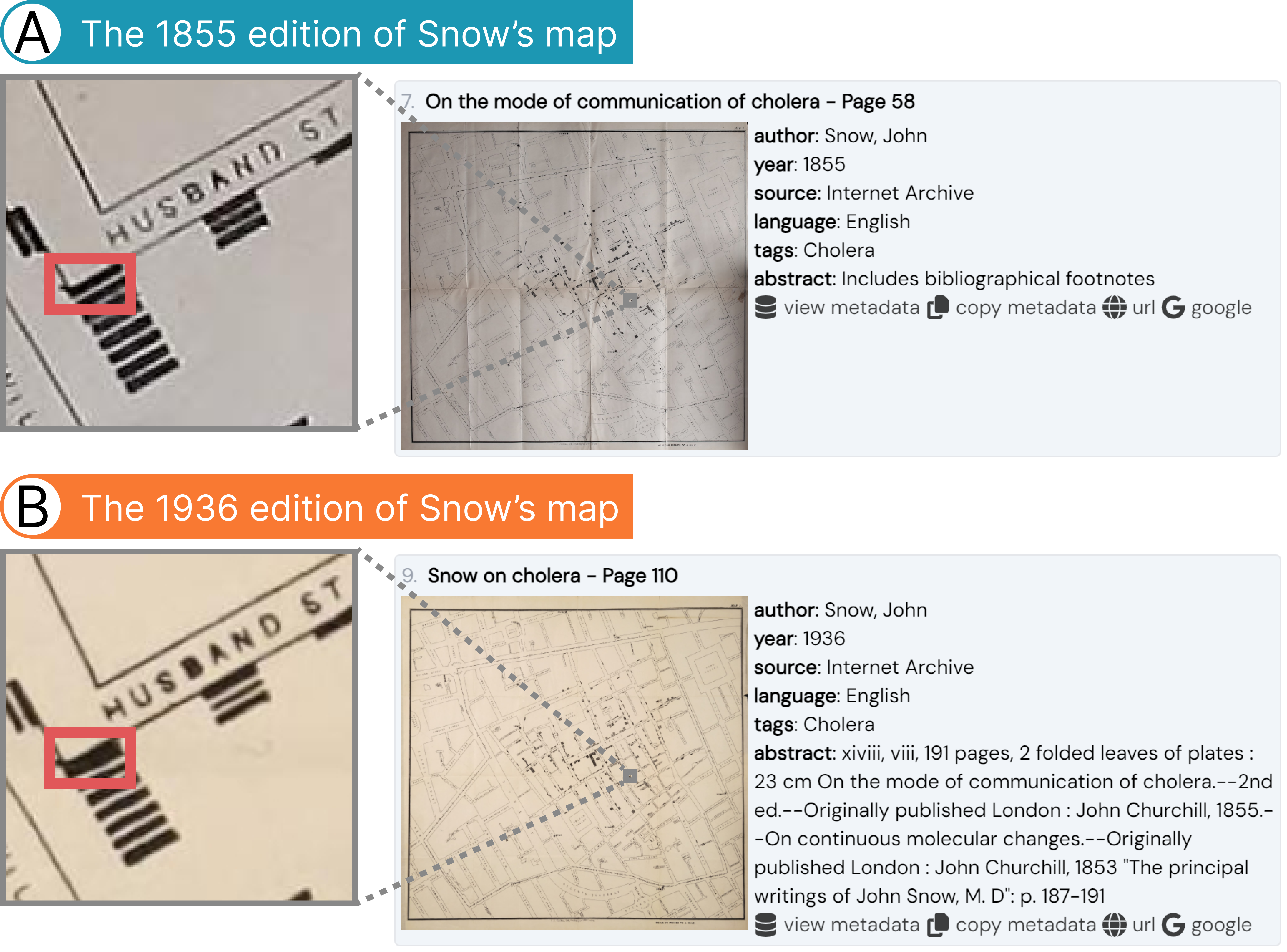
After searching “Snow, John” in OldVisOnline’s image gallery, we identify two editions of the cholera map. Figure 4(A) shows the one published in 1855 [77]. Figure 4(B) shows the other published in 1936 [78]. Through an initial screening of the two editions, we observe that the thickness of printed letters appears less uniform in the 1936 edition. Through a literature search, we find that this difference has caused different interpretations of the dataset encoded in the cholera map. In Zhang et al.’s work on data reconstruction from historical visualizations [89], they reconstruct data from the cholera map and suggest that the map shows cholera cases. By comparison, some other papers [38, 74] refer to Dodson and Tobler’s dataset [19], and suggest the map shows cholera cases.
After plotting Zhang et al.’s dataset and Dodson and Tobler’s dataset, we observe that the two datasets differ in the number of cholera cases at the intersection of NEW STREET and HUSBAND ST in the map, as highlighted in Fig. 4. In the 1855 edition that derived Zhang et al.’s result, eight blocks corresponding to cholera cases are located at the intersection. In the 1936 edition that derived Dodson and Tobler et al.’s result, seven blocks corresponding to cholera cases are located at the same place. We suspect the difference may be due to a printing defect in the 1936 edition. In the 1936 edition, one of the seven blocks is significantly larger than the others, implying that two blocks may be conglutinated and appear as one large block because of ink diffusion.
The first step of textual criticism is to obtain different editions of the same document. Through this example of identifying discrepancies in two editions of John Snow’s cholera map, we demonstrate that different editions of the same historical visualization can be found in our dataset, which fuels the study on textual criticism for historical visualizations.
5.2 Historical Data Extraction
Historical visualizations capture valuable historical datasets. Meanwhile, the original historical data records are often lost over time. Data extraction is to decode the datasets from the scanned bitmap images of historical visualizations, as shown in Fig. 5. The extracted data can be used for further analysis. Additionally, data extraction enables comparing data encoded in different copies of a historical visualization and thus supports textual criticism. Prior efforts have been devoted to developing image processing techniques [33] and interactive machine learning approaches [89] to data extraction.
Even when the original dataset is available, comparing them with the extracted data and analyzing the data distortion may still reveal interesting findings. The distortion may provide evidence of the limitations of the engraving and printing techniques of the times. It may also reflect the historical visualization authors’ values rooted in the political, economic, and cultural background of the times. Such analysis of data distortion may borrow insights from the analysis of contemporary deceptive visualizations [58].
Our dataset provides candidates for historical data extraction. Moreover, as some of the data extraction approaches utilize supervised learning [89], our dataset can be enhanced with corresponding labels to serve as training data and benchmark for data extraction models.
5.3 Design Space Analysis
Our large-scale historical visualization dataset can be used for analyzing the design space spanned by historical visualizations. Such analysis may lead to a better understanding of what designs have been explored in history and how visualization techniques and usage patterns have evolved. Prior work has demonstrated using large-scale contemporary visualization datasets for design space analysis. Examples include investigating commonly used chart types on the web [1] and analyzing the design patterns of multi-view visualizations [12, 15]. Such design space analysis relies on data labels, such as chart type labels [1] and bounding box labels [12, 15].

To facilitate such usages, OldVisOnline comprises a fine-grained labeling interface (Fig. 6). The interface supports the annotation of bounding polygons of charts within multi-view visualizations (Fig. 6(A)). For each chart, the annotator can annotate the specification of its visual encoding (Fig. 6(B)). We design the specification to resemble the Vega specification [69]. The annotator can specify the type of visual elements in the chart and the visual channels used to encode data. Additional metadata, such as the chart’s title, theme, and language, can also be assigned to the charts. As an initial step towards supporting design space analysis, we have conducted fine-grained annotation for 485 sampled historical visualizations using the labeling interface.

5.4 Inspiration for Contemporary Design
Historical visualizations are precious samples of the visualization design space. Many historical visualizations feature unique and insightful designs that may inspire contemporary visualization techniques.
In the following, we give examples of contemporary designs inspired by historical visualizations. Historical visualizations are usually paper-based presswork that does not support interaction. An interesting investigation is to enhance historical visualizations with interaction techniques and retarget them to contemporary datasets.
Joseph Priestley’s Chart of Biography (Fig. 7(A1)) published in 1803 visualizes the lifespans of historical figures [64]. Khulusi et al. present an interactive variant of Priestley’s Chart of Biography and apply it to visualize the lifelines of musicians (Fig. 7(A2)) [34]. Brehmer et al. take Chart of Biography as a sample to inform the analysis of timeline design space and the development of a timeline authoring tool [6].
Elizabeth Peabody’s grid chart (Fig. 7(B1)) published in 1856 visualizes the chronological history where the glyphs in the grids encode historical events [59]. Foster et al. recreate Peabody’s grid chart digitally and physically [20, 36]. They demonstrate reviving Peabody’s grid chart design as a web-based visualization as well as a physicalization implemented with a LED matrix (Fig. 7(B2)).
Étienne-Jules Marey’s schedule chart (Fig. 7(C1)) published in 1878 visualizes the arrival and departure times of trains between Paris and Lyon [51]. Xu et al. extend Marey’s chart to visualize the delay it took products to go through each workstation on an assembly line [86]. Compared with Marey’s original design, Xu et al. aggregates polylines into bands to reduce visual clutter (Fig. 7(C2)).
Gutun Owain’s volvelle (Fig. 7(D1)) finished in 1489 can be used to compute the position of the sun and moon in the zodiac [57]. Volvelle, also known as wheel chart, is a paper-based interactive visualization consisting of rotating paper disks. Owain’s chart belongs to the minority of historical visualizations that are interactive. Following the volvelle design, Stoppel and Bruckner propose an authoring tool to create paper-based interactive volume visualizations (Fig. 7(D2)) [79].
5.5 Metadata Analysis
Valuable findings may be obtained by analyzing the metadata of a large-scale visualization dataset. For example, we observe some highly productive authors in the Authors panel of the image gallery (Fig. 1(A)), which motivates us to investigate their authorship pattern. Some authors, such as Henry Gannett (922 entries) and Lajos I. Illyefalvi (439 entries), contribute hundreds of entries to our dataset. By comparison, some other authors’ works are much less indexed in our dataset, including some notable names in the visualization history, such as John Snow (9 entries) and Florence Nightingale (6 entries).
Looking into the indexed works of highly productive authors, we observe that these authors are typically highly involved in producing official statistics. Many of Henry Gannett’s works have shared authorship with the United States Census Office, where he worked. Similarly, all the works of Lajos I. Illyefalvi have shared authorship with Budapest Föváros Statisztikai Hivatal (Capital City Statistical Office, Budapest).
While some highly productive authors have well-known contributions to visualization, such as Henry Gannett’s contribution to parallel coordinates, other productive authors are less mentioned. It is worthwhile to investigate such cases, which may unearth previously unknown treasures and improve our understanding of the development of the visualization subject from a historical perspective.
The above brief example of analyzing the authorship pattern suggests that the metadata analysis of our dataset may bring interesting findings. Meanwhile, we want to warn users of the potential sample bias in our dataset. The historical visualizations that survive to date may be a biased sample of the visualizations ever created. The historical visualizations accessible in digital libraries may be a biased sample of the historical visualizations that survive to date. Due to these inevitable sources of sample bias, users of our dataset should be cautious when interpreting the metadata statistics. We recommend that the users use the metadata statistics as inspirations for further analysis rather than as direct conclusions.
5.6 Metadata Research
While studies on historical visualizations may rely on the metadata, in some cases, the metadata may not be readily available or needs to be validated. A related research theme in historical geography is to date the creation time of historical maps from the map content [82]. Various map features can be used to infer the time ranges of creation, such as the author information, seals on the map, the toponyms, the naming taboo, the water system, and the admin boundaries. The creation time of other maps with similar designs may also inform the creation time of the concerned map.
More generally, there is a need to support research and validation of historical visualizations’ metadata, including and not limited to creation time. On the one hand, our dataset will benefit from metadata research, which helps to improve the metadata quality. On the other hand, our dataset may serve as a corpus for historians to identify historical visualizations similar to their concerned visualization, which may assist metadata research.
6 Discussion
In the following, we reflect on the challenges and lessons learned in the dataset construction process. We also discuss the limitations of our work and the potential future work.
Handling API differences: While there have been efforts to unify the APIs of digital libraries, such as the International Image Interoperability Framework [28], we found in practice that the data sources had different API and metadata designs. Thus, data wrangling needs to be conducted data source by data source to map the obtained raw metadata into a uniform data structure. This challenge is also highlighted by Battle et al. when mining SVG-based visualizations from the web [1].
Supporting data structure design iterations: Before arriving at the metadata schema introduced in Fig. 1(C), the data structure design experienced several iterations. We want to avoid refetching data from the data sources when we add a new metadata field in the iterations. Thus, we cache the raw metadata obtained from the data sources with the following schema. All the information obtained from the data sources, whether currently used for generating the metadata or not, is stored in the sourceData field of RawMetadataEntry.
Likewise, the data labels introduced in Section 3.2 are stored separately from the metadata. The data labels and metadata are cross-linked through UUID. By decoupling the storage of labels and metadata, when updating the labels or the metadata, the other one can be kept untouched, which reduces the complexity of data version control.
Improving label quality: One of the authors conducted data labeling and quality assurance. In the future, we plan to improve label quality by majority voting with more expert annotations. After publicizing the historical visualization dataset and OldVisOnline, we expect to attract more users with visualization expertise to contribute feedback on erroneous labels.
Enlarging the dataset: An ample scope to further our effort is to enlarge our historical visualization dataset on the following aspects:
-
•
Data sources: In addition to the seven data sources introduced in Section 3.1, we plan to cover more data sources, such as Wikimedia Commons [83] and Digital Public Library of America [18], to improve our coverage of historical visualizations.
-
•
Search queries: The queries introduced in Section 3.1.2 and
7 Conclusion
This paper contributes a dataset of historical visualizations. Our dataset consists of 13K visualization images published before 1950 with corresponding metadata. We have introduced our dataset construction workflow and underlying considerations. Our OldVisOnline system supports the browsing and labeling of historical visualizations. We have analyzed in-depth usage scenarios of our dataset, including textual criticism, historical data extraction, design space analysis, inspiration for contemporary design, metadata analysis, and metadata research.
Data visualization has a long history that significantly predates the computer age. While some historical visualizations are well-known and widely used in courses, the majority of historical visualizations remain underexplored. Through our work in this paper, we strive to contribute to better utilization of the treasure the pioneers have left us.
Supplemental Material
Acknowledgements.
The authors thank Aoyu Wu, Yixing Zhang, and Siqi Shen for their feedback on this work. We thank the digital libraries for digitizing historical visualizations and making them accessible. The project name, “OldVisOnline”, is inspired by the Old Maps Online [37] project. This work is supported by NSFC No. 62272012.References
- [1] L. Battle, P. Duan, Z. Miranda, D. Mukusheva, R. Chang, and M. Stonebraker. Beagle: Automated extraction and interpretation of visualizations from the web. In Proceedings of the SIGCHI Conference on Human Factors in Computing Systems, CHI ’18, pp. 1–8. ACM, New York, NY, USA, Nov. 2018. doi: 10 . 1145/3173574 . 3174168
- [2] F. Beck, S. Koch, and D. Weiskopf. Visual analysis and dissemination of scientific literature collections with SurVis. IEEE Transactions on Visualization and Computer Graphics, 22(1):180–189, Jan. 2016. doi: 10 . 1109/TVCG . 2015 . 2467757
- [3] B. B. Bederson. PhotoMesa: A zoomable image browser using quantum treemaps and bubblemaps. In Proceedings of the ACM Symposium on User Interface Software and Technology, UIST ’01, pp. 71–80. ACM, New York, NY, USA, Nov. 2001. doi: 10 . 1145/502348 . 502359
- [4] M. A. Borkin, Z. Bylinskii, N. W. Kim, C. M. Bainbridge, C. S. Yeh, D. Borkin, H. Pfister, and A. Oliva. Beyond memorability: Visualization recognition and recall. IEEE Transactions on Visualization and Computer Graphics, 22(1):519–528, Jan. 2016. doi: 10 . 1109/TVCG . 2015 . 2467732
- [5] M. A. Borkin, A. A. Vo, Z. Bylinskii, P. Isola, S. Sunkavalli, A. Oliva, and H. Pfister. What makes a visualization memorable? IEEE Transactions on Visualization and Computer Graphics, 19(12):2306–2315, Dec. 2013. doi: 10 . 1109/TVCG . 2013 . 234
- [6] M. Brehmer, B. Lee, B. Bach, N. H. Riche, and T. Munzner. Timelines revisited: A design space and considerations for expressive storytelling. IEEE Transactions on Visualization and Computer Graphics, 23(9):2151–2164, 2017. doi: 10 . 1109/TVCG . 2016 . 2614803
- [7] British Library. British library. https://www.bl.uk/, 1973. Accessed on Mar 1, 2023.
- [8] Cartographic Research Laboratory. Alabama maps. http://alabamamaps.ua.edu/. Accessed on Mar 1, 2023.
- [9] C. Chen and Z. Liu. The state of the art in creating visualization corpora for automated chart analysis. Computer Graphics Forum, 42(3):449–470, June 2023. doi: 10 . 1111/cgf . 14855
- [10] J. Chen, P. Isenberg, R. S. Laramee, T. Isenberg, M. Sedlmair, T. Möller, and H.-W. Shen. Not as easy as you think – experiences and lessons learnt from trying to create a bottom-up visualization image typology. 2022. doi: 10 . 48550/arXiv . 2209 . 07533
- [11] J. Chen, M. Ling, R. Li, P. Isenberg, T. Isenberg, M. Sedlmair, T. Möller, R. S. Laramee, H.-W. Shen, K. Wunsche, and Q. Wang. VIS30K: A collection of figures and tables from IEEE visualization conference publications. IEEE Transactions on Visualization and Computer Graphics, 27:3826–3833, Sept. 2021. doi: 10 . 1109/TVCG . 2021 . 3054916
- [12] X. Chen, W. Zeng, Y. Lin, H. M. AI-maneea, J. Roberts, and R. Chang. Composition and configuration patterns in multiple-view visualizations. IEEE Transactions on Visualization and Computer Graphics, 27(2):1514–1524, Feb. 2021. doi: 10 . 1109/TVCG . 2020 . 3030338
- [13] Z. Chen, M. Cafarella, and E. Adar. DiagramFlyer: A search engine for data-driven diagrams. In Proceedings of the International Conference on World Wide Web, WWW ’15 Companion, pp. 183–186. ACM, New York, NY, USA, 2015. doi: 10 . 1145/2740908 . 2742831
- [14] L. Crissaff, L. Wood Ruby, S. Deutch, R. L. DuBois, J.-D. Fekete, J. Freire, and C. Silva. ARIES: Enabling visual exploration and organization of art image collections. IEEE Computer Graphics and Applications, 38(1):91–108, Jan. 2018. doi: 10 . 1109/MCG . 2017 . 377152546
- [15] D. Deng, W. Cui, X. Meng, M. Xu, Y. Liao, H. Zhang, and Y. Wu. Revisiting the design patterns of composite visualizations. IEEE Transactions on Visualization and Computer Graphics, pp. 1–16, 2022. doi: 10 . 1109/TVCG . 2022 . 3213565
- [16] D. Deng, Y. Wu, X. Shu, J. Wu, S. Fu, W. Cui, and Y. Wu. VisImages: A fine-grained expert-annotated visualization dataset. IEEE Transactions on Visualization and Computer Graphics, 29(7):3298–3311, 2023. doi: 10 . 1109/TVCG . 2022 . 3155440
- [17] J. Deng, W. Dong, R. Socher, L.-J. Li, K. Li, and L. Fei-Fei. ImageNet: A large-scale hierarchical image database. In Proceedings of the IEEE Conference on Computer Vision and Pattern Recognition, CVPR ’09, pp. 248–255. IEEE, 2009. doi: 10 . 1109/CVPR . 2009 . 5206848
- [18] Digital Public Library of America. Digital public library of America. https://dp.la/, 2013. Accessed on Mar 1, 2023.
- [19] R. Dodson and W. Tobler. Snow’s cholera map. http://www.ncgia.ucsb.edu/pubs/snow/snow.html, 1994. Accessed on Mar 1, 2023.
- [20] C. Foster, A. Hayward, S. Kucheryavykh, A. Vujic, M. Japra, S. Negi, and L. F. Klein. The shape of history: Reimagining nineteenth-century data visualization. In Proceedings of the Digital Humanities Conference, DH ’17, 2017.
- [21] M. Friendly and D. Denis. The early origins and development of the scatterplot. Journal of the History of the Behavioral Sciences, 41(2):103–130, 2005. doi: 10 . 1002/jhbs . 20078
- [22] M. Friendly and D. J. Denis. Milestones in the history of thematic cartography, statistical graphics, and data visualization, 2001.
- [23] M. Friendly, P. Valero-Mora, and J. Ibáñez Ulargui. The first (known) statistical graph: Michael Florent van Langren and the “secret” of longitude. The American Statistician, 64(2):174–184, May 2010. doi: 10 . 1198/tast . 2010 . 09154
- [24] K. He, X. Zhang, S. Ren, and J. Sun. Deep residual learning for image recognition. In Proceedings of the IEEE Conference on Computer Vision and Pattern Recognition, CVPR ’16, pp. 770–778. IEEE, 2016. doi: 10 . 1109/CVPR . 2016 . 90
- [25] F. Heimerl, S. Koch, H. Bosch, and T. Ertl. Visual classifier training for text document retrieval. IEEE Transactions on Visualization and Computer Graphics, 18(12):2839–2848, Dec. 2012. doi: 10 . 1109/TVCG . 2012 . 277
- [26] E. Hoque and M. Agrawala. Searching the visual style and structure of D3 visualizations. IEEE Transactions on Visualization and Computer Graphics, 26(1):1236–1245, 2020. doi: 10 . 1109/TVCG . 2019 . 2934431
- [27] K. Hu, S. N. S. Gaikwad, M. Hulsebos, M. A. Bakker, E. Zgraggen, C. Hidalgo, T. Kraska, G. Li, A. Satyanarayan, and Ç. Demiralp. VizNet: Towards a large-scale visualization learning and benchmarking repository. In Proceedings of the SIGCHI Conference on Human Factors in Computing Systems, CHI ’19, pp. 1–12. ACM, New York, NY, USA, 2019. doi: 10 . 1145/3290605 . 3300892
- [28] International Image Interoperability Framework. International image interoperability framework. https://iiif.io/, 2011. Accessed on Mar 1, 2023.
- [29] International Organization for Standardization. Codes for the representation of names of languages — part 3: Alpha-3 code for comprehensive coverage of languages (ISO standard no. 639-3:2007), Feb. 2007. https://www.iso.org/standard/39534.html.
- [30] International Organization for Standardization. Date and time — representations for information interchange — part 1: Basic rules (ISO standard no. 8601-1:2019), Feb. 2019. https://www.iso.org/standard/70907.html.
- [31] P. Isenberg, T. Isenberg, M. Sedlmair, J. Chen, and T. Möller. Visualization as seen through its research paper keywords. IEEE Transactions on Visualization and Computer Graphics, 23(1):771–780, Jan. 2017. doi: 10 . 1109/TVCG . 2016 . 2598827
- [32] B. L. Kahle. Internet archive. https://archive.org/, 1996. Accessed on Mar 1, 2023.
- [33] N. Kerle and J. de Leeuw. Reviving legacy population maps with object-oriented image processing techniques. IEEE Transactions on Geoscience and Remote Sensing, 47(7):2392–2402, July 2009. doi: 10 . 1109/TGRS . 2008 . 2010853
- [34] R. Khulusi, J. Kusnick, J. Focht, and S. Jänicke. An interactive chart of biography. In Proceedings of IEEE Pacific Visualization Symposium, PacificVis ’19. IEEE, Apr. 2019. doi: 10 . 1109/PacificVis . 2019 . 00038
- [35] Y. Kim and J. Heer. Assessing effects of task and data distribution on the effectiveness of visual encodings. Computer Graphics Forum, 37(3):157–167, 2018. doi: 10 . 1111/cgf . 13409
- [36] L. Klein. What data visualization reveals: Elizabeth Palmer Peabody and the work of knowledge production. Harvard Data Science Review, 4(2), Apr. 2022. doi: 10 . 1162/99608f92 . 5dec149c
- [37] Klokan Technologies GmbH. Old maps online. https://www.oldmapsonline.org/.
- [38] T. Koch. The map as intent: Variations on the theme of John Snow. Cartographica, 39(4):1–14, Jan. 2004. doi: 10 . 3138/b123-8124-4390-5792
- [39] R. Kosara. An empire built on sand: Reexamining what we think we know about visualization. In Proceedings of the Workshop on Beyond Time and Errors on Novel Evaluation Methods for Visualization, BELIV ’16, pp. 162–168. ACM, New York, NY, USA, 2016. doi: 10 . 1145/2993901 . 2993909
- [40] A. Krizhevsky, I. Sutskever, and G. E. Hinton. ImageNet classification with deep convolutional neural networks. In F. Pereira, C. Burges, L. Bottou, and K. Weinberger, eds., Advances in Neural Information Processing Systems, vol. 25. Curran Associates, Inc., 2012.
- [41] K. Kucher and A. Kerren. Text visualization techniques: Taxonomy, visual survey, and community insights. In Proceedings of the IEEE Pacific Visualization Symposium, pp. 117–121. IEEE, Piscataway, NJ, USA, Apr. 2015. doi: 10 . 1109/PACIFICVIS . 2015 . 7156366
- [42] K. Kucher, C. Paradis, M. Sahlgren, and A. Kerren. Active learning and visual analytics for stance classification with alva. ACM Transactions on Interactive Intelligent Systems, 7(3), Oct. 2017. doi: 10 . 1145/3132169
- [43] T. Kulesza, S. Amershi, R. Caruana, D. Fisher, and D. Charles. Structured labeling for facilitating concept evolution in machine learning. In Proceedings of the SIGCHI Conference on Human Factors in Computing Systems, CHI ’14, pp. 3075–3084. ACM, New York, NY, USA, 2014. doi: 10 . 1145/2556288 . 2557238
- [44] P.-s. Lee, J. D. West, and B. Howe. Viziometrics: Analyzing visual information in the scientific literature. IEEE Transactions on Big Data, 4(1):117–129, Mar. 2018. doi: 10 . 1109/TBDATA . 2017 . 2689038
- [45] Library of Congress. Library of congress digital collections. https://www.loc.gov/collections/. Accessed on Mar 1, 2023.
- [46] M. Lima. The Book of Trees: Visualizing Branches of Knowledge. Princeton Architectural Press, 2014.
- [47] Y. Lin, H. Li, A. Wu, Y. Wang, and H. Qu. DMiner: Dashboard design mining and recommendation. IEEE Transactions on Visualization and Computer Graphics, pp. 1–15, 2023. Early Access. doi: 10 . 1109/TVCG . 2023 . 3251344
- [48] X. Liu, M. S. Alharbi, J. Chen, A. Diehl, D. Rees, E. E. Firat, Q. Wang, and R. S. Laramee. Visualization resources: A survey. Information Visualization, 22(1):3–30, Nov. 2022. doi: 10 . 1177/14738716221126992
- [49] Z. Liu, H. Mao, C.-Y. Wu, C. Feichtenhofer, T. Darrell, and S. Xie. A ConvNet for the 2020s. In Proceedings of the IEEE/CVF Conference on Computer Vision and Pattern Recognition, CVPR ’22. IEEE, 2022. doi: 10 . 1109/CVPR52688 . 2022 . 01167
- [50] M. Lu, C. Wang, J. Lanir, N. Zhao, H. Pfister, D. Cohen-Or, and H. Huang. Exploring visual information flows in infographics. In Proceedings of the SIGCHI Conference on Human Factors in Computing Systems, CHI ’20, pp. 136:1–12. ACM, New York, NY, USA, 2020. doi: 10 . 1145/3313831 . 3376263
- [51] É.-J. Marey. La Méthode Graphique dans les Sciences Expérimentales et Principalement en Physiologie et en Médecine, p. 20. G. Masson, Paris, France, 1878. https://archive.org/details/b21919070/page/n49.
- [52] C. J. Minard. Carte figurative des pertes successives en hommes de l’armée française dans la campagne de russie 1812-1813, Nov. 1869.
- [53] R. Modley. Telefact: 1938-1945 by pictograph corporation. https://modley-telefact-1939-1945.tumblr.com/, 1938. Accessed on Mar 1, 2023.
- [54] T. Munzner. Visualization Analysis and Design. CRC Press, Boca Raton, FL, USA, 2014.
- [55] National Library of France. Gallica. https://gallica.bnf.fr/. Accessed on Mar 1, 2023.
- [56] M. Oppermann and T. Munzner. VizSnippets: Compressing visualization bundles into representative previews for browsing visualization collections. IEEE Transactions on Visualization and Computer Graphics, 28(1):747–757, 2021. doi: 10 . 1109/TVCG . 2021 . 3114841
- [57] G. Owain. Hen Almanac Cymreig & C., p. 9. 1489. http://hdl.handle.net/10107/4393492#?cv=12.
- [58] A. V. Pandey, K. Rall, M. L. Satterthwaite, O. Nov, and E. Bertini. How deceptive are deceptive visualizations? An empirical analysis of common distortion techniques. In Proceedings of the SIGCHI Conference on Human Factors in Computing Systems, CHI ’15, pp. 1469–1478. ACM, New York, NY, USA, 2015. doi: 10 . 1145/2702123 . 2702608
- [59] E. P. Peabody. Chronological History of the United States: Arranged with Plates on Bem’s Principle, pp. 15–16. Sheldon, Blakeman & Company, New Work, NY, USA, 1856. https://archive.org/details/chronologicalhis00peab/page/n25.
- [60] H. Pflüger, D. Thom, A. Schütz, D. Bohde, and T. Ertl. VeCHArt: Visually enhanced comparison of historic art using an automated line-based synchronization technique. IEEE Transactions on Visualization and Computer Graphics, 26(10):3063–3076, Oct. 2020. doi: 10 . 1109/TVCG . 2019 . 2908166
- [61] W. Playfair. The Commercial and Political Atlas: Representing, by Means of Stained Copper-Plate Charts, the Progress of the Commerce, Revenues, Expenditure, and Debts of England, during the Whole of the Eighteenth Century, pp. 36–37. J. Wallis, London, UK, third ed., 1801. https://archive.org/details/PLAYFAIRWilliam1801TheCommercialandPoliticalAtlas/page/n69.
- [62] W. Playfair. The Statistical Breviary: Shewing, on a Principle Entirely New, the Resources of Every State and Kingdom in Europe. Wallis, London, UK, 1801.
- [63] J. Priestley. A Description of a Chart of Biography. Warrington, UK, 1764.
- [64] J. Priestley. Lectures on History and General Policy, pp. 262–263. P. Byrne, Philadelphia, PA, USA, 1803. https://archive.org/details/lecturesonhis1803prie/page/n285.
- [65] A. Radford, J. W. Kim, C. Hallacy, A. Ramesh, G. Goh, S. Agarwal, G. Sastry, A. Askell, P. Mishkin, J. Clark, G. Krueger, and I. Sutskever. Learning transferable visual models from natural language supervision. In M. Meila and T. Zhang, eds., Proceedings of the International Conference on Machine Learning, vol. 139 of Proceedings of Machine Learning Research, pp. 8748–8763. PMLR, July 2021.
- [66] S. Rendgen. History of Information Graphics. Taschen, Cologne, Germany, June 2019.
- [67] A. H. Robinson. The thematic maps of Charles Joseph Minard. Imago Mundi, 21:95–108, 1967.
- [68] D. Rumsey. David Rumsey map collection. https://www.davidrumsey.com/. Accessed on Mar 1, 2023.
- [69] A. Satyanarayan, R. Russell, J. Hoffswell, and J. Heer. Reactive Vega: A streaming dataflow architecture for declarative interactive visualization. IEEE Transactions on Visualization and Computer Graphics, 22(1):659–668, Jan. 2016. doi: 10 . 1109/TVCG . 2015 . 2467091
- [70] S. Schöttler, Y. Yang, H. Pfister, and B. Bach. Visualizing and interacting with geospatial networks: A survey and design space. Computer Graphics Forum, 40(6):5–33, 2021. doi: 10 . 1111/cgf . 14198
- [71] H.-J. Schulz. Treevis.net: A tree visualization reference. IEEE Computer Graphics and Applications, 31(6):11–15, Nov. 2011. doi: 10 . 1109/mcg . 2011 . 103
- [72] B. Settles. Active learning literature survey. Technical report, University of Wisconsin–Madison, 2009.
- [73] B. Settles. Closing the loop: Fast, interactive semi-supervised annotation with queries on features and instances. In Proceedings of the Conference on Empirical Methods in Natural Language Processing, EMNLP ’11, pp. 1467–1478. Association for Computational Linguistics, Stroudsburg, PA, USA, 2011.
- [74] N. Shiode, S. Shiode, E. Rod-Thatcher, S. Rana, and P. Vinten-Johansen. The mortality rates and the space-time patterns of John Snow’s cholera epidemic map. International Journal of Health Geographics, 14(1), June 2015. doi: 10 . 1186/s12942-015-0011-y
- [75] X. Shu, A. Wu, J. Tang, B. Bach, Y. Wu, and H. Qu. What makes a data-gif understandable? IEEE Transactions on Visualization and Computer Graphics, 27(2):1492–1502, Feb. 2020. doi: 10 . 1109/TVCG . 2020 . 3030396
- [76] K. Simonyan and A. Zisserman. Very deep convolutional networks for large-scale image recognition. 2014. doi: 10 . 48550/arXiv . 1409 . 1556
- [77] J. Snow. On the Mode of Communication of Cholera, pp. 44–45. John Churchill, London, UK, 1855. https://archive.org/details/b28985266/page/n57.
- [78] J. Snow. Snow on Cholera: Being a Reprint of Two Papers by John Snow, M.D., pp. 44–45. The Commonwealth Fund, New York, NY, USA, 1936. https://archive.org/details/b3134818x_0001/page/n110.
- [79] S. Stoppel and S. Bruckner. Vol2velle: Printable interactive volume visualization. IEEE Transactions on Visualization and Computer Graphics, 23(1):861–870, Jan. 2017. doi: 10 . 1109/TVCG . 2016 . 2599211
- [80] I. E. Sutherland. Sketchpad, a Man-Machine Graphical Communication System. PhD thesis, Massachusetts Institute of Technology, 1963.
- [81] E. R. Tufte. The Visual Display of Quantitative Information. Graphics Press, Cheshire, CT, USA, 1983.
- [82] O. von Spaeth. Dating the oldest Egyptian star map. Centaurus, 42(3):159–179, 2000. doi: 10 . 1034/j . 1600-0498 . 2000 . 420301 . x
- [83] Wikimedia Foundation. Wikimedia commons. https://commons.wikimedia.org/, 2004. Accessed on Mar 1, 2023.
- [84] F. Windhager, P. Federico, G. Schreder, K. Glinka, M. Dörk, S. Miksch, and E. Mayr. Visualization of cultural heritage collection data: State of the art and future challenges. IEEE Transactions on Visualization and Computer Graphics, 25(6):2311–2330, June 2019. doi: 10 . 1109/TVCG . 2018 . 2830759
- [85] A. Wu, Y. Wang, X. Shu, D. Moritz, W. Cui, H. Zhang, D. Zhang, and H. Qu. AI4VIS: Survey on artificial intelligence approaches for data visualization. IEEE Transactions on Visualization and Computer Graphics, 28(12):5049–5070, Dec. 2022. doi: 10 . 1109/TVCG . 2021 . 3099002
- [86] P. Xu, H. Mei, L. Ren, and W. Chen. ViDX: Visual diagnostics of assembly line performance in smart factories. IEEE Transactions on Visualization and Computer Graphics, 23(1):291–300, Jan. 2017. doi: 10 . 1109/TVCG . 2016 . 2598664
- [87] Y. Ye, R. Huang, and W. Zeng. VISAtlas: An image-based exploration and query system for large visualization collections via neural image embedding. IEEE Transactions on Visualization and Computer Graphics, pp. 1–15, 2022. doi: 10 . 1109/TVCG . 2022 . 3229023
- [88] W. Zeng, A. Dong, X. Chen, and Z.-l. Cheng. VIStory: interactive storyboard for exploring visual information in scientific publications. Journal of Visualization, 24(1):69–84, Aug. 2021. doi: 10 . 1007/s12650-020-00688-1
- [89] Y. Zhang, B. Coecke, and M. Chen. MI3: Machine-initiated intelligent interaction for interactive classification and data reconstruction. ACM Transactions on Interactive Intelligent Systems, 11(3–4), Aug. 2021. doi: 10 . 1145/3412848
- [90] Y. Zhang, M. Tennekes, T. de Jong, L. Curier, B. Coecke, and M. Chen. Simulation-based optimization of user interfaces for quality-assuring machine learning model predictions. ACM Transactions on Interactive Intelligent Systems, May 2023. Just Accepted. doi: 10 . 1145/3594552
- [91] Y. Zhang, Y. Wang, H. Zhang, B. Zhu, S. Chen, and D. Zhang. OneLabeler: A flexible system for building data labeling tools. In Proceedings of the SIGCHI Conference on Human Factors in Computing Systems, CHI ’22. ACM, New York, NY, USA, 2022. doi: 10 . 1145/3491102 . 3517612
Table 5: The raw metadata attributes we use to compute uuid, authors, displayName, publishDate, viewUrl, downloadUrl, languages, tags, abstract, and rights in the uniform data structure for each data source. “constant” refers to the case where the value is a constant independent of the raw metadata. “null” refers to the case where the value cannot be inferred from the information in the raw metadata. Data Source uuid authors displayName publishDate viewUrl David Rumsey Map Collection id fieldValues displayName fieldValues id Internet Archive files creator title, files date identifier, files Gallica identifier, ordre dc:creator legend, dc:title dc:date identifier, ordre Library of Congress id contributors title date, created_published url Telefact viewUrl constant viewUrl publishDate viewUrl British Library Collection Items images Creator Full title Published, Created, Date viewUrl British Library Images Online viewUrl Artist/creator, Author Caption, Title of Work Place and date of production viewUrl Alabama Maps viewUrl mainAuthor titleDescription date viewUrl Table 6: Table 5 continued. Data Source downloadUrl languages tags abstract rights David Rumsey Map Collection urlSize2, urlSize4 fieldValues fieldValues fieldValues constant Internet Archive identifier, server, dir, files title subject description rights Gallica identifier, ordre dc:language dc:type dc:format, dc:description dc:rights Library of Congress image_url language format, genre description, notes rights, rights_advisory, rights_information Telefact downloadUrl constant null null null British Library Collection Items images Language, Full title null shortDescription Usage terms, Copyright British Library Images Online downloadUrl null null Caption Shelfmark Alabama Maps downloadUrl titleDescription null null null Appendix A Unifying Raw Metadata from Digital Libraries
This supplemental material describes our strategy to convert the raw metadata from different data sources into the uniform data structure, MetadataEntry, shown in