Causally Linking Health Application Data and Personal Information Management Tools ††thanks: The authors contributed equally to the paper and their names are listed in alphabetical order.
Abstract
The proliferation of consumer health devices such as smart watches, sleep monitors, smart scales, etc, in many countries, has not only led to growing interest in health monitoring, but also to the development of a countless number of “smart” applications to support the exploration of such data by members of the general public, sometimes with integration into professional health services. While a variety of health data streams has been made available by such devices to users, these streams are often presented as separate time-series visualizations, in which the potential relationships between health variables are not explicitly made visible. Furthermore, despite the fact that other aspects of life, such as work and social connectivity, have become increasingly digitised, health and well-being applications make little use of the potentially useful contextual information provided by widely used personal information management tools, such as shared calendar and email systems. This paper presents a framework for the integration of these diverse data sources, analytic and visualization tools, with inference methods and graphical user interfaces to help users by highlighting causal connections among such time-series.
Index Terms:
Health and well-being; health data; personal information management; data analytics; visualizations; visual dashboards; time-series.I Introduction
Healthcare costs are increasing rapidly in most countries due to many factors, including for instance ageing populations and the increased prevalence of health conditions that affect older people, as well as other life-style related health conditions such as obesity – not to mention many other physical and mental health and well-being problem related to increased stress and workload affecting a large percentage of the working population. This, combined with a greater awareness of health and well-being concerns, has led a wider segment of the general population in many parts of the world to take more responsibility for managing their own personal health and well-being. To assist with these personal initiatives, a wide range of consumer health devices such as smart watches [1] and jewellery [2], sleep monitors, wearable devices and smart scales, as well as mobile sports applications [3] and physiological monitoring tools [4] have become available in recent years, often developed by the companies making the actual physical consumer devices.
At the same time, it is also becoming more widely acknowledged that health and well-being are, to a large extent, affected by life factors such as workload [5, 6], social connectivity and mobility [7]. Despite this greater awareness, currently there is a disconnection between the use of health tracking devices, such as those mentioned above, and most Personal Information Management (PIM) software tools [8] used in everyday work and non-work contexts. Yet, these PIM tools, including for instance email and calendar systems, could provide rich data sources for measuring workload and other health and well-being related factors.
In this paper, we present a framework for integrating a diverse range of time-based data coming from different sources such as physical devices, mobile applications and PIM software, to provide input into analytic tools and linked visualizations that can be used as part of a visual dashboard, called DASH:HEALTH, for highlighting causal connections among different measured factors that may affect ones health and well-being.
II Linking health and PIM data
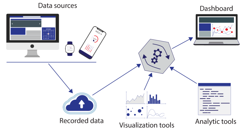
Figure 1 presents a schematic view of our proposed framework for integrating different types of data, including those generated by various health-related devices and mobile application, as well as data that can obtained from PIM software tools. As can be seen, the framework consists of five main components. These are: 1) data sources, 2) recorded data, 3) visualization tools, 4) analytic tools, and 5) a dashboard for viewing and analysing linked health and well-being data, along with the associated PIM data.
III Data Sources
As noted earlier, the aim of our proposed framework is to facilitate integration of data coming from various sources. Here we are mainly concerned with data being generated by the aforementioned health-related devices and mobile applications, as well as data obtained from PIM software tools. However, the framework could easily be extended in the future to incorporate a wider range of other kinds of data that are considered to have an impact on personal health and well-being, including for instance food and dietary data, shopping habits, transport data, environmental data, social networks data, or financial data.
In terms of health data, information readily recorded by many consumer health devices and mobile applications include for instance the following:
-
•
Sleep quality: with wearable monitoring devices or smart watches.
-
•
Physical activity: with smart watches or phones.
-
•
Heart rate: with smart watches or measurement devices.
-
•
Pulse wave velocity: using smart scales.
-
•
Weight: using smart scales.
-
•
BMI: using smart scales.
-
•
Fat mass: using smart scales.
-
•
Muscle mass: using smart scales.
-
•
Blood pressure: with electronic consumer devices and some smart watches.
-
•
Glucose levels: with electronic blood sugar monitors.
In terms of PIM data, there are not many automated data collection methods currently being provided by existing PIM software tools. There are, however, a few proprietary applications and manual workarounds for extracting data from at least the most commonly used PIM software tools. In addition, it is envisaged that once the importance of such data is realised, in future PIM software tools are likely to provide methods for exporting, for instance, workload related data for use by other applications. At this stage, it is possible to compile, with some effort, the following PIM data:
-
•
Email volume: this could included the number of emails received, sent, deleted, kept, forwarded, or replied to during specific time-periods.
-
•
Calendar appointments: this could include the number or duration of meetings, online or physical, during specific time-periods.
-
•
To-do lists: this could include the number of tasks with or without deadlines, and perhaps an indication of the level of tasks difficulty or complexity (e.g., see [9]).
-
•
Communication: this could include the number of, for instance, work-related messages exchanged through social media, or phone, audio or video calls.
IV Visualization Tools
Much of the data generated using consumer health devices and mobile applications is temporal. While there are differences among such data in terms of their granularity (i.e., regularity with which the measurements are made across), they can all be considered as time-series.
Time-series are perhaps the most common form of time-based data, and as such, there are many different types of visualization methods suitable for presenting time-series [10, 11], amongst which are various forms of line graphs, bar charts, and area charts. Although, these visualization are easy to understand, for instance for seeing trends a single time-series dataset, they can be difficult to use for comparing multiple time-series [12].
Therefore, alternative methods such as stack zooming [13], and visualizations for combining heterogeneous temporal data streams [14] have been proposed for making these kinds of comparisons visually possible. Yet, even these alternatives are perhaps more suited for data expert than ordinary users, such as those viewing and comparing their own personal health data.
Data compiled from, or generated by, PIM software tools are not particularly temporal – even though all data could be considered temporal in some sense [15]. Therefore, some form of more strict temporarily must somehow be imposed on such data to make them suitable for linking with health-related time-series.
Since the type of linking we are proposing here is concerned with historical (past) data, rather than dynamic data, we would argue for adopting a simple time-slicing rule, which would allow for a kind of bucket sorting of all activities into different time-periods (e.g., all email received and all meetings in a given day). Once this kind of time-slicing has been carried out, the PIM data could also be visualized using one of the above-mentioned time-series visualization methods.
V Analytic Tools
While visualization methods provide various means for users to explore data, the multi-factorial nature of the combinations of health, activity and PIM data we envisage might hide connections among these data from users, overload them with visual complexity, or even mislead them into seeing connections where they do not exist. To avoid such scenarios, analytic tools should be provided which can summarise the variables in question, and point the user to intervals of the time where correlational or causal links might exist, and suggest further comparisons to the user to make.
Most health applications display the variables monitored by different devices (e.g., scales, pedometers, heart rate, etc) over time, often using standard line graphs along time lines and summary statistics over selected time periods [16]. PIM software tools, on the other hand, very rarely rely on time lines, structuring information along application specific representations of the time dimension, such as lists ordered by dates for email or planar calendar layouts for diaries and appointments [15].
For combinations of health and PIM data, aimed at elucidating possible connections between events in one’s professional and health biomarkers – as discussed above – displaying all information as time line summaries, can provide natural overviews of activity and biomarkers, and might help elucidate putative relationships [17].
V-A Summary statistics
Summary statistics can be encoded as graphical displays – the most common form of user interface presentation for self-tracking data – or as text summaries, frequently as annotations to a graph. The most frequently used visualizations for self-tracking data are line graphs, bar charts and custom summaries [18]. While these representations have been found useful as overviews of variability in health and activity indicators over time, they are less useful for exploring relationships among those indicators.
Scatter plots (and often scatter plot matrices) with regression lines provide effective summaries of correlations, and can be complemented by results of statistical correlation tests in textual form. One might, for instance, be able to detect a negative correlation between Body Mass Index (BMI) and the number of hours slept per night, out of several possible pairings of health indicators, simply by inspecting a scatter plot matrix, and suspect that one’s lack of sleep might be causing them to gain weight. However, this presupposes selecting a particular time interval for correlation analysis, which is an arbitrary choice.
Furthermore, the suspicion of a causal connection is only very weakly supported by evidence of correlation, and the putative causal direction is a matter of interpretation – one might postulate, alternatively, that one’s worries about their weight gain might be causing sleeplessness. In order to address these problems, we propose complementing these statistical summaries with an analysis of directional, time-interval sensitive causal effects, as described below.
V-B Causal connections
Research on causal connections between time-series generated through activity or biomarker monitoring has gained increased attention in biomedicine. Monitoring in such settings usually involve taking measurements from patients on a daily or hourly basis over long periods of time. This includes data gathered through experimental designs such as ecological momentary assessments (EMA) and experience sampling [19], which pose significant challenges in terms of causal modelling.
The most common approach for modelling the influence of a time-series on another is Granger Causality [20], a technique that originated in econometrics but has found applications in areas as diverse as epidemiology and neuroscience [21].
While there is criticism of the interpretation of Granger Causality (GC) as an actual causal relation, and debate about its meaning in the presence of cross-lagged effects, GC nevertheless is useful as a first approximation to enable users to identify and explore relevant connections among the various time-series generated by health and PIM data. GC therefore forms the basis of our proposed approach to highlighting areas of interest on time-series visualizations, where one variable might be influencing another along the time-line.
Within the GC framework, we model the time-series (representing, say, hours of sleep per night) and (say, BMI measures) as linear regression models, where the current value of the variable is predicted in terms of past values, up to a maximum lag interval. Intuitively, we say the (Granger) causes if the including past values of in the regression model of improves the predictions of current values of in relation to a model that only includes past values of . Formally, given the model set out in (1), GC seeks to determine whether the prediction of the value of variable at time , (written ) from (where is the time lag, or order of the model) is improved by adding to the model. If the prediction is improved for all , where is the number of time-points considered, we say that causes . Prediction improvement can be tested using the F-test, for instance, with as the null hypothesis.
| (1) |
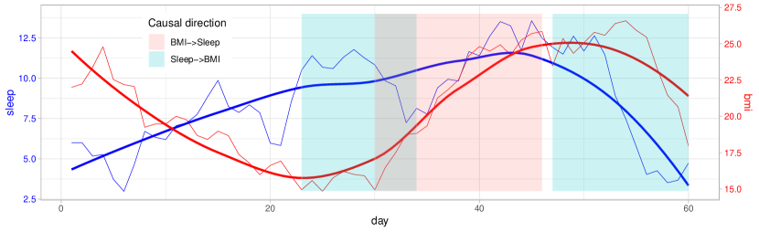
While GC analysis alleviates the issue of spurious correlation we pointed out above in connection with scatter plots, it still does not address the problem of assessing the connections between time-series at different time intervals as opposed to the whole series. While this problem has not been comprehensively addressed in the GC literature, we adopt the general idea for discovery of GC interval proposed in [22]. The basic idea was to test successive time intervals, varying the lengths of the intervals tested and allowing for look-ahead to minimise the computational cost of multiple GC tests. However, to simplify the presentation, here we assume a sliding window of fixed length sliding over a pair of time series ( and ). For each sub-interval thus defined we then model () as in (1) and test for GC in both directions (e.g., in one direction BMI corresponds to and in the other sleep corresponds to ). When causality is discovered for a certain interval we highlight it on the time-line, for example, by overlaying translucent (alpha-blended) colour coded rectangles onto the regions where connections were discovered, as shown in Figure 2.
This figure illustrates a situation where, taken as a whole, BMI does not cause sleep nor vice-versa. However, in certain intervals (marked as blue rectangles in Figure 2), increases in the number of hours slept cause BMI to decrease, while for a brief interval (marked in red), the direction of causality is reversed, and as BMI climbs towards a high value, BMI causes sleep quality to vary, first shown as a decrease in the number of hours slept, and then as an increase towards an abnormally high number of hours.
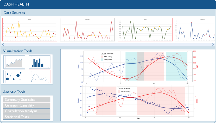
Presented with this analysis through the visual summary, the user might then proceed to investigate possible connections between these variables and PIM data. The user, might, for example, investigate whether there is a connection between email volume or meeting frequency and an increase in BMI, mediated by the effect of the former on sleep quality, as illustrated in Figure 3, bottom-left panel.
VI Machine learning enhancements
The inference method presented above relies on fairly simply linear model to infer relationships between two or more time series. However, there is no guarantee that such relationships are linear. In recent years new approaches based on kernel methods [23] and architectures such as multilayer perceptrons and recurrent neural networks have been proposed for inference of Granger causality [24, 25], which can handle non-linear data.
Outside the Granger causality framework, we have previously employed machine learning methods to infer relationships among various time streams in the domain of medical communication [26]. These methods assessed interrelationships from a state change perspective using an underlying transition graph with a first-order Markovian assumption. For PIM and health marker timeseries data one could adapt this approach by identifying meaningful ranges of values both from a clinical (e.g. high blood pressure, low, normal, and elevated heart rate, low, normal and high BMI, etc) and from a work activity perspective (high vs normal workload, etc) and thus discretising them and representing the time series as a sequence of transitions among such states.
The application of these methods, however, requires larger and more diverse datasets for model training and validation. We are in the process of gathering such data.
VII User Interaction
At the heart of the framework proposed here is the graphical user interface, in the form a visual dashboard, which is meant to support users with the tasks of visualising, linking, and interacting with their health and PIM data, to draw accurate conclusions and better manage their own health and well-being based on their personal data.
As part of a Human-Centred Design process, it is important to critically evaluate the design of user interfaces and visualizations before they are fully implemented. We have, therefore, created a high-fidelity mockup [27] of our proposed dashboard for health, called DASH:HEALTH, which we aim to evaluate through a formal user study.
Figure 3 shows the DASH:HEALTH mockup. The top area of includes all the personal data sources made available to the user through the framework, viewed using a selected time-series visualization method (e.g., line graphs). Once two or more data sources are selected, the user can choose a preferred visualization tool from a possible set (shown on middle left-hand side) for viewing the combined time-series (shown on bottom right-hand side). In addition, the user is able to select an analytics tool (shown on bottom left-hand side) to identify any important causal effects, as discussed in the previous section.
VIII Conclusion and Future Work
In this paper we have proposed and discussed a framework for monitoring personal health and well-being through the integration of different types of time-based health and PIM data, and a strategy to facilitate the visualization and causal analysis of such data. We have also presented a mockup design for the DASH:HEALTH prototype tool which could be developed to support users to manage their own personal health and well-being using such data.
In terms of our future work, we plan to evaluate the DASH:HEALTH mockup design with health professionals and ordinary users, before progressing on to developing a functional prototype based on it. This type of evaluation-based design and development process aims to result in greater usability and user adherence to eventual interventions aimed at improving the user’s health and well-being. This is also necessary for developing any effective pervasive health and well-being application.
We are also gathering and curating a data set consisting of syncronized and combined PIM and personal health data from several individuals. This, to the best of our knowledge, will be the first data set of this kind, enabling the research community to explore relationships between occupational and clinical aspects of health using AI tools. In addition, we intend to explore more flexible methods for causal discovery, such as structural equation modelling and neural network models.
References
- [1] A. S. Jat and T.-M. Grønli, “Smart watch for smart health monitoring: A literature review,” in Bioinformatics and Biomedical Engineering, I. Rojas, O. Valenzuela, F. Rojas, L. J. Herrera, and F. Ortuño, Eds. Cham: Springer International Publishing, 2022, pp. 256–268. [Online]. Available: https://doi.org/10.1007/978-3-031-07704-3_21
- [2] A. L. Ju and M. Spasojevic, “Smart jewelry: The future of mobile user interfaces,” in Proceedings of the 2015 Workshop on Future Mobile User Interfaces, ser. FutureMobileUI ’15. New York, NY, USA: Association for Computing Machinery, 2015, pp. 13–15. [Online]. Available: https://doi.org/10.1145/2754633.2754637
- [3] G. Ferriero, S. Vercelli, C. Fundarò, and G. Ronconi, “Use of mobile applications to collect data in sport, health, and exercise science: A narrative review,” Journal of Strength and Conditioning Research, vol. 34, no. 12, 2020. [Online]. Available: https://doi.org/10.1519/JSC.0000000000003365
- [4] J.-W. Jeong, W. Lee, , and Y.-J. Kim, “A real-time wearable physiological monitoring system for home-based healthcare applications,” Sensors, vol. 22, no. 1, p. 104, 2022. [Online]. Available: https://doi.org/10.3390/s22010104
- [5] F. Pace, G. D’Urso, C. Zappulla, and U. Pace, “The relation between workload and personal well-being among university professors,” Current Psychology, vol. 40, no. 7, pp. 3417–3424, 2021. [Online]. Available: https://doi.org/10.1007/s12144-019-00294-x
- [6] R. Hernandez, E. A. Pyatak, C. L. P. Vigen, H. Jin, S. Schneider, D. Spruijt-Metz, and S. C. Roll, “Understanding worker well-being relative to high-workload and recovery activities across a whole day: Pilot testing an ecological momentary assessment technique.” International journal of environmental research and public health, vol. 18, no. 19, 2021. [Online]. Available: https://doi.org/10.3390/ijerph181910354
- [7] M. M. P. V. Abeele and M. H. Nguyen, “Digital well-being in an age of mobile connectivity: An introduction to the special issue,” Mobile Media & Communication, vol. 10, no. 2, pp. 174–189, 2022. [Online]. Available: https://doi.org/10.1177/20501579221080899
- [8] A. Lush, “Fundamental personal information management activities – organisation, finding and keeping: a literature review,” The Australian Library Journal, vol. 63, no. 1, pp. 45–51, 2014. [Online]. Available: https://doi.org/10.1080/00049670.2013.875452
- [9] S. Blomkvist, I. Boivie, M. Masoodian, and J. Persson, “From piles to tiles: designing for overview and control in case handling systems,” in Proceedings of the CHISIG Annual Conference on Human-Computer Interaction. Wollongong, Australia: Ergonomics Society of Australia, 2004, pp. 161–170. [Online]. Available: https://hdl.handle.net/10289/4844
- [10] E. R. Tufte, The Visual Display of Quantitative Information, 2nd ed. Graphics Press, 2001.
- [11] W. Aigner, S. Miksch, H. Schumann, and C. Tominski, Visualization of Time-Oriented Data. Springer-Verlag, 2011.
- [12] M. Masoodian, B. Endrass, R. Bühling, and E. André, “Visualization support for comparing energy consumption data,” in Proceedings of the 19th International Conference on Information Visualisation, ser. IV ’15. IEEE Computer Society, 2015, pp. 28–34. [Online]. Available: https://doi.org/10.1109/iV.2015.17
- [13] W. Javed and N. Elmqvist, “Stack zooming for multi-focus interaction in time-series data visualization,” in Proceedings of the IEEE Pacific Visualization Symposium, ser. PacificVis ’10. IEEE Computer Society, 2010, pp. 33–40. [Online]. Available: https://doi.org/10.1109/PACIFICVIS.2010.5429613
- [14] S. Luz and M. Masoodian, “A mobile system for non-linear access to time-based data,” in Proceedings of Advanced Visual Interfaces AVI’04. ACM Press, 2004, pp. 454–457. [Online]. Available: https://dl.acm.org/authorize?717619
- [15] M. R. Al Nasar, M. Mohd, and N. M. Ali, “Personal information management systems and interfaces: An overview,” in 2011 International Conference on Semantic Technology and Information Retrieval. IEEE, 2011, pp. 197–202. [Online]. Available: https://doi.org/10.1109/STAIR.2011.5995788
- [16] E. K. Choe, B. Lee, H. Zhu, N. H. Riche, and D. Baur, “Understanding self-reflection: how people reflect on personal data through visual data exploration,” in PervasiveHealth ’17: Proceedings of the 11th EAI International Conference on Pervasive Computing Technologies for Healthcare. New York, NY, USA: Association for Computing Machinery, May 2017, pp. 173–182. [Online]. Available: https://doi.org/10.1145/3154862.3154881
- [17] Y. Feng and D. E. Agosto, “Revisiting personal information management through information practices with activity tracking technology,” Journal of the Association for Information Science and Technology, vol. 70, no. 12, pp. 1352–1367, 2019. [Online]. Available: https://doi.org/10.1002/asi.24253
- [18] E. K. Choe, N. B. Lee, B. Lee, W. Pratt, and J. A. Kientz, “Understanding quantified-selfers’ practices in collecting and exploring personal data,” in Proceedings of the SIGCHI Conference on Human Factors in Computing Systems, ser. CHI ’14. New York, NY, USA: Association for Computing Machinery, 2014, pp. 1143–1152. [Online]. Available: https://doi.org/10.1145/2556288.2557372
- [19] S. Shiffman, A. A. Stone, and M. R. Hufford, “Ecological momentary assessment,” Annual Review of Clinical Psychology, vol. 4, pp. 1–32, 2008. [Online]. Available: https://doi.org/10.1146/annurev.clinpsy.3.022806.091415
- [20] C. W. Granger, “Investigating causal relations by econometric models and cross-spectral methods,” Econometrica, vol. 37, no. 3, pp. 424–438, 1969. [Online]. Available: http://www.jstor.org/stable/1912791
- [21] S. L. Bressler and A. K. Seth, “Wiener–granger causality: A well established methodology,” NeuroImage, vol. 58, no. 2, pp. 323–329, 2011. [Online]. Available: https://doi.org/10.1016/j.neuroimage.2010.02.059
- [22] Z. Li, G. Zheng, A. Agarwal, L. Xue, and T. Lauvaux, “Discovery of causal time intervals,” in Proceedings of the SIAM International Conference on Data Mining (SDM), 2017, pp. 804–812. [Online]. Available: https://doi.org/10.1137/1.9781611974973.90
- [23] D. Marinazzo, W. Liao, H. Chen, and S. Stramaglia, “Nonlinear connectivity by granger causality,” NeuroImage, vol. 58, no. 2, pp. 330–338, 2011. [Online]. Available: https://www.sciencedirect.com/science/article/pii/S1053811910001382
- [24] A. Tank, I. Covert, N. Foti, A. Shojaie, and E. B. Fox, “Neural granger causality,” IEEE Transactions on Pattern Analysis and Machine Intelligence, vol. 44, no. 8, pp. 4267–4279, 2022. [Online]. Available: https://doi.org/10.1109/TPAMI.2021.3065601
- [25] Z. Yin and P. Barucca, “Deep recurrent modelling of granger causality with latent confounding,” Expert Systems with Applications, vol. 207, p. 118036, 2022. [Online]. Available: https://doi.org/10.1016/j.eswa.2022.118036
- [26] S. Luz, “The non-verbal structure of patient case discussions in multidisciplinary medical team meetings,” ACM Transactions on Information Systems, vol. 30, no. 3, pp. 17:1–17:24, 2012. [Online]. Available: https://dl.acm.org/authorize?6737736
- [27] Sketch B.V., “Wireframe vs mockup vs prototype: What’s the difference?” April 2022, last visited on 30 March 2023. [Online]. Available: https://www.sketch.com/blog/wireframe-vs-mockup-vs-prototype/