“Customization is Key”: Four Characteristics of Textual Affordances for Accessible Data Visualization
Abstract.
Current best practices recommend using textual descriptions to make data visualizations accessible to blind and low vision (BLV) screen reader users. While recent research has explored laying such descriptions out hierarchically to enable reading varying levels of detail, the textual descriptions remain fixed: their syntax and semantics are set by the visualization author or tool, and cannot be changed by a BLV user based on their preferences or task-specific needs. In this paper, we explore four characteristics of customizations for hierarchical textual descriptions of visualizations: presence, or what content is present in the description; verbosity, or the length and conciseness of the content; ordering, or the sequencing of content; and, duration, or how long a particular customization lasts. We instantiate these methods as extensions to Olli, an open source library that converts web-based visualizations into hierarchical textual structures, and evaluate our work through a mixed-methods study with 13 BLV participants. Users reported that customization is crucial to their agency and that being able to change the four characteristics helps them efficiently carry out their desired tasks on the data. However, differences in preferred defaults, prior experiences, and enthusiasm for customization indicate that there is no one-size-fits-all system even for customization itself: both accessible data visualizations and user interfaces for customizing them must be flexible enough to meet a variety of needs.
1. Introduction
Blind and low-vision (BLV) people access visual media through textual descriptions that are read as speech by screen readers, but it is often difficult to access relevant information within descriptions quickly and efficiently. Writing helpful descriptions is difficult in part because best practices vary across domains; even within a domain, individuals have varied information needs (Morris et al., 2018; Stangl et al., 2020). Descriptions of data visualizations, in particular, can cause frustration for BLV people because even those that follow best practices may not include the information the user is looking for or allow them to extract it themselves (Sharif et al., 2021; Jung et al., 2021). A text summary of the main findings of a visualization limits users to what information the author decided was important to include, preventing users from drawing their own conclusions or exploring other aspects of the data (Lundgard and Satyanarayan, 2022). Presenting the data in a table removes this limitation, but adds another: particularly for visualizations made up of a large number of data rows, the size of the dataset prevents users from being able to identify overall trends (Zong et al., 2022) despite this being most users’ first goal when approaching a data visualization (Sharif et al., 2021).
Recent work has addressed some of the limitations of textual descriptions for data visualizations by introducing navigable text hierarchies (Zong et al., 2022), which present text in a tree shape and allow the user to move around the nodes of tree using their keyboard (Blanco et al., 2022). Higher levels of the tree encompass more of the data and provide a broader overview, whereas lower levels focus on a particular subset and provide more granular details. For example, the top level for a line chart might give the chart’s name and the names of its axes; expanding it to the next level would show two nodes, one for the x-axis and one for the y-axis; expanding either node would show a set of nodes corresponding to subsections of the axis, which each give some information about the data in that subsection. This approach allows users to start with a general overview of the data and then choose for themselves where and how deep they want to focus, matching BLV users’ desires (Sharif et al., 2021) as well as the classic mantra of “overview first, zoom and filter, and details on demand” (Shneiderman, 2000).
While navigable hierarchies enable richer information seeking experiences than typical descriptions, existing approaches are limited by the fact that they are static. Although users can navigate to different sections of text, they cannot change what information is present in the text, or how that information is conveyed (Zong et al., 2022). This can create frustration when the provided descriptions do not afford the kinds of data exploration that users want to do. Researchers have noted that people engage with data visualizations with a wide variety of tasks in mind (Brehmer and Munzner, 2013), and this holds true for BLV users. For a given static description, some users may find that too much detail is provided, burying relevant information near the end of a lengthy list of other information. For the same description, other users may find that there is not enough detail because despite everything that’s there, the crucial piece of information they’re looking for is missing. Like sighted users, BLV users are a large, heterogenous group with different levels of experience with and interest in data. Moreover, BLV users prefer different mental models depending on their prior experience with accessible data representations, like tables or tactile graphs (Zong et al., 2022; Sharif et al., 2021). Especially when introducing new data representations like navigable text hierarchies, users will need different levels of contextual information to understand and navigate the structure. Then, once they navigate to a location, it needs to present the information that suits their task efficiently.
To address the diverse information seeking needs of screen reader users, we introduce a conceptual model for customizing hierarchical textual descriptions of visualizations. Our customizations enable screen reader users to reconfigure descriptions via four characteristics: presence, or the content present in the description; verbosity, or the length and conciseness of the information; ordering, or how the content is sequenced; and duration, or for how long a customization is in effect. Together, these characteristics reflect different ways users might seek information depending on their task and amount of prior experience.
To understand how users customize descriptions according to these characteristics, we design and implement a prototype customization interface as an extension to Olli, an open-source tool for producing navigable text hierarchies of data visualizations (Blanco et al., 2022). Where Olli previously produced a tree of static descriptions, we implement customizable descriptions defined as lists of discrete string tokens. Breaking down descriptions into tokens allows users to adjust presence by toggling individual pieces of content on and off, and adjust ordering by changing their position in the list. We define the string content of a token as a function of three parameters: affordance, which corresponds to the type of task a token supports; direction, or how a token refers to information relative to the hierarchy; and verbosity, which we implement as shorter or longer variations of token text. The space of possible values for these parameters defines a set of configurable tokens in Olli. To control duration, users can either specify persistent customizations through a settings menu, or specify ephemeral customizations in a command box. Persistent customizations’ effects last until they are changed by the user, while ephemeral customizations may revert on their own or last for a single description. The design of our prototype interface is informed by existing user interfaces for screen reader customization, and was developed through an iterative co-design process with \censorHajas, our blind co-author.
To evaluate this contribution, we conduct a mixed-methods study with 13 blind and low-vision screen reader users. We found that nearly all users agree that customization crucially supports their autonomy and agency when working with data, yet customization for screen readers is often neglected by interface designers. Our four characteristics help support users’ self-guided data exploration by helping them access information efficiently in ways that suit their preferences. However, we found that many users consider customization interfaces more useful with time and experience, that user preferences and desires around customization vary widely, and that users regard customization as something that is high effort to learn and use. Overall, these findings support the idea that one-size-fits-all systems for accessible data visualization do not exist, but that interfaces can support user agency by providing flexibility and customization. We conclude with a discussion of the importance of learning and familiarity over time to customization, and the need to better understand tasks and affordances in multi-sensory data representations.
2. Related Work
2.1. Diversity of Screen Reader User Preferences
The general consensus within the visualization design field is that there is no ”one-size-fits-all” approach when designing tools to make visualizations meaningful and accessible to screen-reader users (Sharif et al., 2021). This aligns with disability scholars’ critiques of design approaches such as universal design which aim to create non-specialized designs usable by all people (Smith and Preiser, 2011), but which often disregard the significance of discerning and adapting to differences in user needs (Hamraie, 2013; Williamson, 2012). Indeed, sometimes different peoples’ needs conflict, and accommodating one need might exacerbate barriers for another (Elavsky, 2023).
For sighted users, the visualization design field has already identified variations of user intents, backgrounds, and expertise as necessary considerations in designing more equitable visualizations. Brehmer and Munzner (Brehmer and Munzner, 2013) define a rich task typology to decompose the different how, why, and what in user interactions with data visualization. Peck et al. (Peck et al., 2019) draw attention to how the complex tapestry of motivations, preferences, and beliefs of a person can affect their experiences with data visualizations. Stofer and Che (Stofer and Che, 2014) found that experts and novices often take very different approaches to viewing and meaning-making when reading visualizations.
These considerations are further compounded for screen reader users. From a technological standpoint, screen reader users use a diverse set of screen readers and complementary devices (noa, [n. d.]) and have different levels of exposure to visualization concepts from non-textual modalities such as tactile graphics. Moreover, screen reader users have diverse backgrounds in education (noa, 2019), internet proficiency, and screen preferences (noa, 2018, 2021). Like sighted users, screen reader users employ different kinds of methodologies to learn about visual semantics (Potluri et al., 2021), require different visualization approaches to best suit their needs and expectations (Joyner et al., 2022), and are likely to engage more with visualizations that communicate data about a topic they’re interested in (Sharif et al., 2021). Unique sets of preferences specific to screen reader users have also emerged; Lundgard and Satyanarayan (Lundgard and Satyanarayan, 2022) identified that the type of semantic content that best communicates a chart’s trends and statistics varies between screen reader users and sighted users, as well as among different screen reader users.
As a result of the diversity in screen reader user preferences, researchers have suggested customization around a screen reader user’s preferences (Lundgard and Satyanarayan, 2022; Morris et al., 2018; Jung et al., 2021) as an important approach in ensuring autonomy for screen reader users with exploring and extracting information from visualizations (Sharif et al., 2021). Mindful of the impact that differing needs and preferences have on screen reader users’ interactions with visualizations, our work offers an initial step in designing systems that help users express these differences.
2.2. Accessible Data Visualization
Making data visualizations accessible to screen reader users is important in providing screen reader users the autonomy to inspect claims about data, draw independent conclusions, and share their ideas with others (Jung et al., 2021). To improve access to visualizations, researchers and organizations like WCAG have developed best practices around alt text (Jung et al., 2021; Morris et al., 2018) and data tables. Frameworks such as Chartability (Elavsky et al., 2022) have emerged to facilitate accessibility audits and compliance with best practices. However, even accessible visualizations that follow existing best practices are limited in their ability to facilitate self-guided data exploration at varying levels of detail (Zong et al., 2022).
As a result, researchers and developers of visualization tools have designed custom keyboard interfaces for screen readers (Accelerator, 2018; Cantrell et al., 2021; Sharif et al., 2022). A subset of these tools focus on keyboard-navigable hierarchical structures containing text descriptions at varied levels of detail (Zong et al., 2022; Blanco et al., 2022; Thompson et al., 2023). These interfaces address important limitations of alt text and data tables by enabling users both to receive high level summary information, and drill down into individual data points. However, these systems provide descriptions that are static; the system designers must make choices about what information is present, what order it’s presented in, and how lengthy the descriptions are. While these choices may align with the needs of some users, they provide a fixed set of affordances that cannot adapt to differences in user tasks and preferences. We build on prior work to design hierarchical text structures of descriptions that can be customized according to a user’s current needs, enabling textual descriptions to support a richer and more dynamic set of affordances.
2.3. Customizable User Interfaces
Computer scientists have long recognized the importance of software that enable users to “mold and channel its power to [their] own needs” (Kay and Goldberg, 1977). Recent work in malleable end user software has sought to empower users to shape and appropriate software to suit their personal and idiosyncratic needs (Klokmose et al., 2015), regardless of how those functional needs change over time (Borowski et al., 2022). Within accessibility, researchers have developed theoretical lenses to think about how systems should adapt to user needs. Ability-based design advances a vision of systems that adapt to users’ abilities, often by measuring their behavior and attempting to infer or anticipate the best adaptation (Wobbrock et al., 2011). While this approach helpfully reduces the level of effort required from the user to learn how to articulate their needs legibly to the system, systems cannot always correctly anticipate what users need. To contrast and complement ability-based design, researchers have articulated option-driven design (Elavsky, 2023) as an approach based on providing sensible defaults while enabling users to express their own adaptations through series of options. Option-driven design puts more agency in the hands of users, but trades off increased effort required to configure options. Additionally, designers must be mindful of the fact that increasing the number of options alone does not necessarily improve the accessibility of an inherently inaccessible design (Elavsky, 2023). Our approach to customization is influenced by option-driven design, as we offer a gradient of customization methods that trade off effort and granularity. Users can stick to default options, choose from a small menu of preset customizations, or manually set individual customization options.
3. Background
This paper builds closely upon the work of Zong, Lee, Lundgard et al. (Zong et al., 2022), which introduces design dimensions for rich screen reader experiences of data visualizations, and Blanco et al. (Blanco et al., 2022) which instantiates these dimensions into Olli, an open-source library for producing navigable text hierarchies of data visualizations. In this section, we aim to provide the necessary background to understand the remainder of this paper.
3.1. Design Dimensions of Rich Screen Reader Experiences for Data Visualizations
Zong, Lee, Lundgard et al. introduce three design dimensions for rich screen reader experiences while navigating web-based data visualizations: structure (how the individual elements of the visualization are arranged), navigation (how the user moves between elements), and description (what is read out at each element).
Structure defines the way that the elements, or nodes, of the visualization are organized. It has two aspects: the form that the nodes are arranged in, such as a tree or a table, and the entities in the visualization that the nodes represent, such as the numeric data values or textual annotations about the data. Zong, Lee, Lundgard et al. consider a variety of entity types, but prefer the form of a tree because it allows for information granularity: users can get an overview of the visualization at the root node, and then move deeper into the tree to get details on demand.
Navigation defines the way that the user moves between elements of the visualization with their screen reader. Zong, Lee, Lundgard et al. propose three composable navigation options. Structural navigation allows the user to navigate within the accessible structure, for example moving up or down a level in a tree. Spatial navigation allows the user to navigate the visualization by its own coordinate system, for example moving horizontally or vertically across a scatterplot. Targeted navigation allows the user to jump directly to a particular location in the accessible structure rather than having to perform a full set of navigations. These options have different advantages and could potentially be offered in parallel for the same visualization.
Description defines the text that a screen reader reads out at each node in a navigable structure and, for this paper, is the most pertinent design dimension. It has three components: content, composition, and verbosity. Content is the information conveyed by the visualization. This can include the explicit properties of the visualization, such as its axis names and mark (bar, line, etc.), but it should not be limited to only these. In order to be useful to screen reader users, descriptions should also include more conceptually complex information like summary statistics, trends, or outliers. Composition is the relative order of the information within a description. Order is particularly important within navigable structures because they often repeat the same information over many nodes (for example, a set of sibling nodes may all be part of the same category of the data), so unhelpful orderings can result in the user having to hear unnecessary and inefficient repetition. Verbosity is the amount of information included in the description. Screen readers have their own built-in verbosity settings to allow users to choose, to a limited degree, how concisely information is presented.
3.2. Navigable Hierarchy in Olli
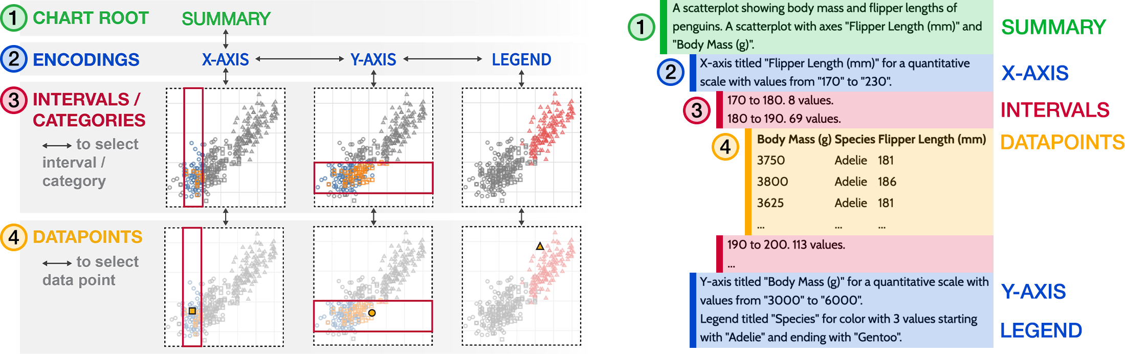
A graphic with two parts. The left side illustrates an abstract accessible visualization structure for an example scatterplot, and its corresponding four sections: the Chart Root (i.e., a summary textual description of the chart), Encodings (i.e., the chart’s x-axis, y-axis, and legend), Intervals/Categories (i.e, navigating by selecting axis intervals or data categories), and individual Datapoints. Navigating between these different sections is accomplished with the arrow keys. The right side shows this abstract structure instantiated in Olli for an example scatterplot, and labels which sections of text in Olli correspond to each of the four entities from the left side of the graphic.
Olli is an open-source library that converts web-based visualizations into navigable, textual hierarchies for screen reader users. Olli’s design is built upon the design dimensions of Zong, Lee, Lundgard et al. It produces hierarchies whose structure is that of a tree and where the user can use structural navigation to move around the nodes. Its descriptions contain content about the chart type, axis labels, and counts of data. These descriptions are implemented as string templates, which means that they have a consistent, fixed composition and verbosity.
In the hierarchies that Olli produces, the nodes are generated by the encodings of the visualization. This means that they share a similar format with the original visualization. Each hierarchy has four or five levels. The top-level node (the ”summary”, or Figure 1.1) alerts the user to the existence of the hierarchy and gives an overview of the visualization. If the visualization has multiple facets (for example, a line chart with multiple lines), the next level will break out each facet into its own node. The level after that (”encodings”, or Figure 1.2) has one node for each axis or legend in the original visualization. Each axis or legend node has multiple children, one for each category in a legend or for each interval of data between the gridlines of an axis (”intervals/categories”, or Figure 1.3). Finally, the last and most detailed level of the hierarchy is a table containing all of the individual datapoints within the selected interval or category of data (”datapoints”, or Figure 1.4).
The user can move through this hierarchy using their keyboard’s arrow keys, or with shortcuts such as x or y that jump directly to the x- and y-axis, respectively. Moving down goes to the next level of detail in the hierarchy, while moving up goes to the previous level. Moving left and right switches between sibling nodes at the same level of detail. For example, here’s how a user would access the currently-selected section in Figure 1. First, they would start at the root node (1) and learn that they are in a hierarchy for a scatterplot comparing the body mass and flipper length of penguins. Perhaps they want to begin by getting a sense of the distribution of flipper length among penguins. They would press down to move into the axis level, where they would land on the first sibling node, the X-axis, representing flipper length in millimeters (2). Pressing down a second time would move into data sections of the X-axis, in this case sections divided into groups of ten millimeters (3). The first group, 170 to 180 millimeters, has 8 values. If the user presses right they move to the second group, 180 to 190 millimeters, which has 69 values. If the user wanted more information about these values, like which species of penguin they were from, they could press down to enter a table where each datapoint has its own row, each representing one penguin whose flipper length falls between 180 and 190 millimeters (4).
4. Customizing Hierarchical Textual Descriptions of Visualizations
Although the navigable textual hierarchies described in the previous section begin to provide screen reader users with methods for accessible information-seeking in data visualizations, static textual descriptions cannot support the diverse tasks and preferences of these users. To enable screen reader users to reconfigure the hierarchy’s text as necessary to accomplish their information-seeking task, we introduce a conceptual model for customizing hierarchical textual descriptions of visualizations. Our conceptual model is developed to support four characteristics of customizable textual descriptions: presence, or what content is conveyed by the description; verbosity, or the length and conciseness of the content’s delivery; ordering, or the sequencing of tokens used to convey the content; and duration, or how long a particular customization lasts. To enable users to customize descriptions along these characteristics, we model descriptions as compositions of textual tokens.
4.1. Design Characteristics and Example Walkthrough
To distill our four characteristics, we returned to the studies conducted by Zong, Lee, Lundgard et al. (Zong et al., 2022). In these studies, blind and low-vision (BLV) participants were asked to use tabular and tree-structured representations of visualizations to perform open-ended sensemaking tasks. We re-analyzed transcripts of these studies, focusing on the description dimension of the authors’ design space, to identify the following ways in which users would like to be able to customize the narrated descriptions:
-
(1)
Presence: Users described wanting to be able to choose which pieces of information were included in the text. This is important because different types of information are useful for accomplishing different tasks — for example, one user may want the overall trend described in easy-to-understand terms, another may want statistical information like the average and standard deviation, and a third may want to skip those summaries and only hear about actual data points (Lundgard and Satyanarayan, 2022). Including all three types of information, with no option to turn off what’s not wanted, could result in a description so long that it would be overwhelming to some users (Jung et al., 2021).
-
(2)
Verbosity: Users also wanted control over the length and conciseness of the information that is present, generally preferring lower verbosity. Phrases with lower verbosity might use more abbreviated grammar or leave out common words (for example, the high verbosity phrase ”the value for the ’x’ field is 5” could have the lower-verbosity equivalent ”x: 5”). For users who are less familiar with the conventions and forms of data visualizations, high verbosity is crucial for helping them understand what they’re hearing. However, extra verbosity can slow users down significantly. This is due to the fact that screen readers read text linearly, meaning that users cannot skip irrelevant content or skim back and forth (Cesal, 2020).
-
(3)
Ordering: Users wanted to control the order information was presented, especially if they were looking for a specific piece of information. Similarly to verbosity, ordering is important because screen readers impose a linear reading order. Because screen reader users cannot skim through text, order has a stronger effect for them: if important information is left at the end of a description, they must wait to hear it. This slows users down and increases their cognitive load, since they have to pay close attention to when the information being read out switches from being irrelevant to relevant to their interests.
-
(4)
Duration: We observed that users had different preferences about descriptions depending on what they were looking for and how familiar they were with the hierarchical structure. Both of these factors can change over time, so the length of time that a customization lasts is an important consideration. A customization that helps a user with a particular task would ideally be easy to end when the user transitions to a different task, but a customization that accommodates a user’s long-term preferences (for example, an expert turning off information about the shape of the structure) should last until the user turns it off, rather than requiring them to re-apply it every time they engage with a visualization.
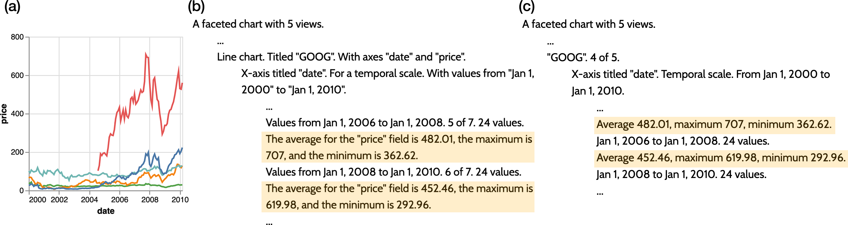
A graphic with three parts labelled a, b, and c. Part a shows a multi-series line chart showing stock prices of tech companies, with an x-axis titled date, and a y-axis titled price. Parts b and c each show part of an Olli hierarchy as indented lines of text. Each line of text is a node, and nodes lower in the hierarchy are further indented to show their depth. The nodes of the hierarchy in part b have more text, with sentences written out in full, and the nodes of the hierarchy in part c have less text, with more abbreviated sentences.
To make these characteristics more concrete, and to demonstrate their implications on screen reader users, consider an example of how two users — Nour, a novice, and Elise, an expert — might customize these properties differently to carry out the same task with the visualization shown in Figure 2(a). Both users know they are reading a graph of the stock prices of different technology companies, and are curious about how Google’s stock changed after the financial crisis in 2008.
Nour starts by forming a mental model of the shape of the graph. To do so, he might turn off or lower the verbosity of tokens that provide more complex information like summary statistics, and increase the verbosity of tokens that provide orienting information about elements of the graph. (Since doing this manually would likely be difficult for a novice, a helpful implementation might bundle actions like these together and give them an easily-recognizable name.) Next, Nour explores each level of the graph, getting a sense of it and moving on. With a mental model developed, he turns to finding the particular part of the graph he’s looking for: Google in 2008. This should still be possible with his previous settings, since the tokens that provide information about the shape of the graph (for example, the fact that there are five companies) have significant overlap with those that give the basic facts of the graph (like which node has data about Google). Finally, having arrived at the node he’s looking for, Nour adjusts his settings to re-include the tokens providing summary statistics. Figure 2(b) shows what he sees at this point, with the new tokens highlighted. This allows him to quickly get an overview of how Google was doing in 2008 and the year or two afterwards. If he’s especially curious, he might go a level deeper to look at individual data points for the months in those years.
On the other hand, as a more expert user, Elise starts with a mental model already developed for the shape of the graph. Because of this, she likely already has turned off, or starts by turning off, tokens that exist to convey the graph shape. To get a sense of the information specific to this particular visualization, she might turn on just a few short tokens, like the names of the companies and their ordering, and skim through the nodes. Next, to find Google, Elise brings the companies’ names up to the front of the node text, letting her move through each node in a fraction of a section before finding Google. She does the same with years to quickly hone in on 2008. Finally, she brings the summary statistics to the front and sets their verbosity to low – since she is very familiar with the format of these statistics, she’s able to understand the shorthand used by the lower-verbosity summaries as well as a novice like Nour understands the higher-verbosity summaries. Figure 2(c) shows what she sees at this point, with the summary statistics highlighted. Elise reads through the summaries for 2008 and the year or two afterwards. If she’s especially curious, she might pull up companies’ names to the front again, causing the summary statistics to be moved back to the second position, and compare the drop in Google’s stocks to the drop in the stocks of other companies.
4.2. A Conceptual Model for Customization
| Customization := (Token[], Duration) |
| Token := (Affordance, Direction, Verbosity) |
| Affordance := Wayfinding | consuming |
| Wayfinding := location | surroundings |
| Direction := upwards | in-place | downwards |
| Verbosity := low | medium | high |
| Duration := persistent | ephemeral |
We now present a more formal definition of customization. This definition was developed to inform the design of user interfaces that enable users to configure each of the above characteristics for a given description. To create this definition, we referenced literature about user needs and tasks for data visualizations, including more general work (Brehmer and Munzner, 2013) and work specific to BLV users (Zong et al., 2022; Lundgard and Satyanarayan, 2022; Jung et al., 2021; Morris et al., 2018). We also reviewed the affordances of commonly-used screen readers like VoiceOver and NVDA, with the goal of developing customizations that were easy to use with typical screen reader software and whose design would be familiar to users. We iterated on a starting definition by using it to evaluate real-world examples, with the goal of finding categories which were both exhaustive (such that we could place every example within them) and meaningful (such that the groupings of examples highlighted real differences between groups). Our blind co-author and co-designer \censorHajas was instrumental during this iteration process in sharing his perspective as a researcher and a screen reader user.
In our definition, each customization has a single duration, which can be either persistent or ephemeral. The customization is enacted on a list of tokens, where the ordering of the list sets the ordering of the tokens in the text. The text of each token is defined by the affordance it provides the user, the direction in the hierarchy it provides the affordance for, and the verbosity of the token. Below we elaborate more on each of these definitions.
4.3. Token
Rather than have a single description object, we conceive of a description as a collection of tokens, where each token communicates a single piece of information. This is necessary in order to express the ordering and presence characteristics: if pieces of information are not recognized as separate from each other, the user has no way to choose which information they want to hear and in what order. In order to achieve our broader goal of supporting a variety of tasks, we define two parameters which control what kind of information each token contains: the affordance it provides the user and direction in the hierarchy it provides the affordance for. To be able to support as many user tasks as possible, a system should provide a token for every combination of affordance and direction.
4.3.1. Affordance
The affordance of a token corresponds to what type of lower-level task it allows a user to carry out. Drawing on Brehmer and Munzner’s typology of user tasks (Brehmer and Munzner, 2013), we divide tasks into two categories of affordance: wayfinding and consuming. Wayfinding affordances are those that help the user find something they are looking for (whether or not they know the name or location of what they seek (Brehmer and Munzner, 2013)). We further divide wayfinding affordances into two subcategories: location and surroundings. Location affordances help the user answer the question “Where am I?” by providing information about what subset of the data they are currently viewing (for example, a token like “values from 2004 to 2006”). Surroundings affordances help the user answer the questions “Where can I go?” and “What will I find?”; for example, a token like “view 1 of 5” answers the first question by giving information about the context outside the node; “24 values” answers the second question by giving “information scent” (Pirolli and Card, 1999) that helps the user know what to expect if they move downwards in the tree. Consuming affordances are those which directly communicate data, for example “price: $400” or ”the average temperature is 82 degrees Fahrenheit”. Typically, when carrying out a high-level task like learning about a particular company’s stock price, users will begin by using wayfinding affordances to find the area they’re looking for, then use consuming affordances to get the information they want. Differentiating tokens by which part of this process they help with allows users to switch off tokens that aren’t helpful or reorder the helpful tokens to be at the front, reducing unnecessary information and increasing efficiency.
4.3.2. Direction
We consider textual hierarchies that are navigated structurally, not spatially (Zong et al., 2022), meaning that moving up and down in the hierarchy means removing and applying filters to the data to change what subset of it is selected. The downwards direction, then, corresponds to receiving information about filters that can be applied to the current data and the selections that would be produced. The upwards direction corresponds to information about filters that were applied earlier in the hierarchy. The third direction, in place, provides information about the current selection of data and the filter that produces it (as differentiated from the selections of sibling nodes in the hierarchy). Differentiating tokens by their direction allows users to toggle the presence of which sets of filters they want to hear about. It also allows users to assign tokens a priority in the ordering based on direction. For instance, information about upwards-facing filters can be important for establishing the context for the current node’s data, but can also be repetitive since every sibling node will have the same filters. Instead of toggling upwards tokens off, the user can simply push it further back in the ordering. That way, they’re able to choose to hear that information if they need to be reminded, but can still easily skip it.
4.3.3. Verbosity
Verbosity refers to the descriptiveness of text, and screen readers have built-in verbosity options that typically toggle how much information is included. Here, we use verbosity to refer to the length and level of detail of individual tokens rather than the overall description. As summarized above, verbosity is important so that users who need additional clarity can get it without slowing down users who don’t need it. We instantiate the verbosity characteristic on the token level rather than the description level. This granularity enables users to assign separate verbosities to different combinations of affordance and direction. Consider two users who are both browsing through a graph with the general goal of learning about its trend. A more experienced user might set wayfinding tokens to lower verbosity, since they are comfortable navigating, and set consuming tokens with summary statistics to higher verbosity, since they want to go deeper into the statistics. A less experienced user might set wayfinding tokens to higher verbosity and summary statistics to lower verbosity because they’re somewhat interested in hearing the statistics, but are more focused are finding their way around the graph.
4.4. Duration
We instantiate the duration characteristic on the customization level, rather than the individual token level. This is because the duration of the customization should match the duration of the user’s preference; we assume each customization is an expression of a single preference, so it should also have a single matching duration. This is also in line with user expectations. A single customization may have multiple effects (e.g. removing one token, changing another’s verbosity, and moving a third up to the front), but the user will execute it as a single action. Therefore, they will expect the results of their action to be atomic: it would be unexpected and confusing to them if one part of the customization ended and another one was still in effect. To fit with this expectation, every part of the customization should last for the same length of time and then expire simultaneously.
We define duration to be either persistent or ephemeral. Persistent customizations should last indefinitely, until the user chooses to revert them; these are intended to support long-term user preferences which change over the scale of months or years. Ephemeral customizations may end or revert on their own; for example, if a user is applying a customization solely to the current node it may expire when they leave the node. At their longest, they last for the entirety of the user’s current session but end when the user leaves the visualization. These are intended to support short-term user preferences corresponding to a single task, which likely lasts for only a few minutes.
5. Implementing Customization in Olli
We instantiate our conceptual model of customization as a set of extensions to Olli (Blanco et al., 2022). Previously, the text at each node of the hierarchies generated by Olli was static. We redesign the text to be generated from a set of tokens and provide two ways to customize the properties of the tokens: a settings menu for persistent changes and a command box for ephemeral ones. We developed this implementation through an iterative co-design process with our blind co-author \censorHajas over a period of three months. In this section, we surface the design considerations for accessible user interfaces that we discovered during this process.
5.1. Tokens
In the non-customizable version of Olli, the text for each node is generated as a single block, and its content is dependent on the node’s hierarchy level. In our extensions, the text for each node is generated from a list of tokens. This supports the presence characteristic, as the user can control which tokens are included. The set of valid tokens for a node depends on its hierarchy level — not every level can have every token, since the top and bottom levels have no downwards and upwards direction respectively. We define a set of tokens covering all combinations of the affordance and direction parameters, and determined which tokens were applicable to each hierarchy level.
Table 1 shows the set of implemented tokens. Each one is listed with its name and an example of what its text might be. For some cells in the table, we implement the only possible tokens: for example, the combination of the location affordance and the in place direction produces a token naming the values that define the current node’s selected data. However, some cells have more than one possible token. In this case we drew on literature about user tasks as well as our iterative co-design process to choose the tokens that are most helpful for typical user tasks. For example, the combination of the consuming affordance and the downwards direction could provide many kinds of summary information to the user about the data of the selections available in the hierarchy below their current node. However, users typically want to hear about the overall trend of the data and its extrema (Sharif et al., 2021) stated in plain language (Kim et al., 2021), and the average, minimum, and maximum of the selection satisfies these criteria.
| Affordances | ||||
| Wayfinding | Consuming | |||
| Location | Surroundings | |||
| Direction | Upwards | Parent / Facet name (“MSFT”) | Depth (”Level 3”) | Context (e.g. quantile, “3rd quartile”) |
| In Place | Name of current node (“X-axis”, “2000 to 2002”) | Index (“1 of 5”) | Data values (“price 65, date Jan 1 2010”, “range from 0 to 800”) | |
| Object type (“temporal scale”, “line chart”) | ||||
| Downwards | Name of child nodes (“Axes date and price”) | Child size (“2 axes and 1 legend”, “10 intervals”) | Aggregate value (average, min, max) | |
5.2. Settings Menu
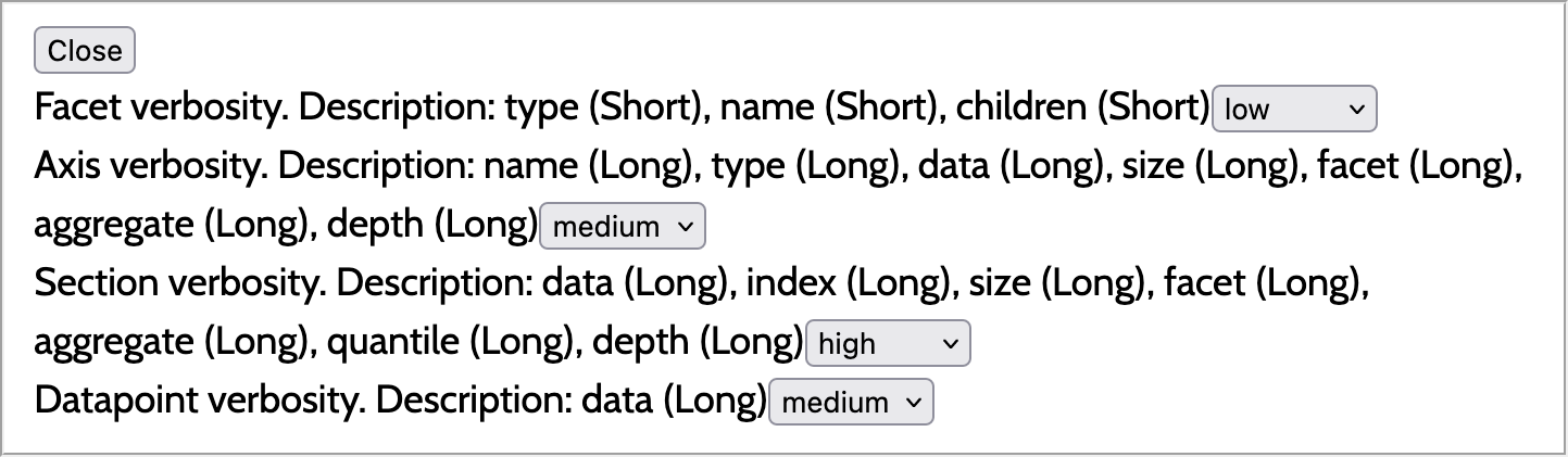
A screenshot of a settings menu. It has a close button at the top and then four lines of text. Each line has the name of a level in the hierarchy, then a description of the current customization for that level, and finally a dropdown menu for users to change the customization of the level. Each customization description is formatted as a list of tokens’ names and their verbosity level, for example ”depth (long)”.
The settings menu in Figure 4 allows the user to make persistent customizations to the presence, verbosity, and ordering of tokens. We use a settings menu because screen readers offer similar menus for their own customizations, making it a familiar interface for users. The settings menu has four sections, each of which corresponds to one of the Olli hierarchy levels (“Facet”, “Axis”, “Section”, and “Datapoint” in Figure 4). For each hierarchy level, the user can use a dropdown menu to choose between one of three preset customizations that we define, named high, medium, and low. These customizations are intended to meet the needs of relatively novice users who are performing common tasks, typically trying to get an overview of the trend in data and then zooming in on individual points in one or two areas. For example, they may use the low or medium setting to form a model of the shape of the graph, turn to high to hear more about the trend and summary statistics, and turn back to medium to look at individual data points.
So that the user can understand the differences between customizations, a label for each dropdown menu describes the currently active customization. The description states which tokens are included and whether their individual verbosities are short or long (where short corresponds to less verbosity for that particular token). The high customization includes all possible long tokens for a given hierarchy level. The medium customization includes only a subset of tokens, all set to long verbosity; the low customization includes the same subset, but all set to short verbosity.
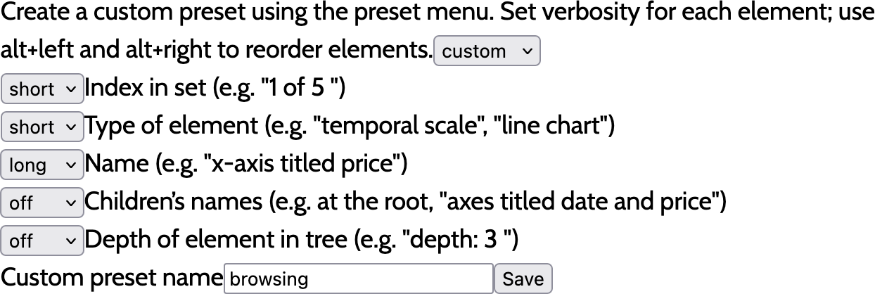
A screenshot of the interface for creating a custom preset. It shows a set of five dropdowns. Each dropdown controls the customization for one particular token and has the options off, short, and long. Next to each dropdown is a description showing the name of the corresponding token and giving an example of that token. At the bottom is a text box labelled ”custom preset name” and a Save button.
To further support users with more specialized tasks, we offer a more in-depth customization option: in addition to the built-in high, medium, and low customizations, a user can create their own customizations. Each customization applies only to a single hierarchy level, and each hierarchy level can have unlimited customizations. The interface for creating a customization is pictured in Figure 5. It contains one dropdown menu for each token that can be included in the hierarchy level. Each dropdown menu has the settings off, short, and long. Tokens that are set to off are not present in the customization; short and long tokens are present at the corresponding verbosity. The user can choose the order of the tokens by reordering the menus with a keyboard shortcut. After they assign a name to the customization and save it, it will appear in the list of possible settings for that hierarchy level and act as a persistent customization, with no difference between user-created customizations and the three built-in options.
These custom presets are intended for more experienced users and allow them to accomplish two things. First, they can set up presets that match their overall preferences for navigable hierarchies. For example, if a user’s screen reader tells them their current depth in the hierarchy already, as some do, the user can turn off the depth token in all of the customizations they create. Second, the user can set up customizations that match particular specialized tasks. For example, if a user works with data visualizations for their job and carries out two primary tasks on these visualizations, they could have a customization for each task and switch between them depending on the work they’re doing that day.
Design Considerations. The settings menu is designed as a “bounded space” (Zong et al., 2022): it is opened and closed using keyboard commands or buttons, but the user can’t shift their focus to access the menu when it is closed or leave it when it is open. This means that when the menu is closed, it doesn’t get in the user’s way as they try to explore the main purpose of the page and the visualization. When it is open, the user can’t accidentally shift their focus outside of the menu, leaving them unsure of whether their changes have been successfully applied. This aligns with prior findings that bounded spaces “alleviate cognitive load by allowing a user to maintain their position relative to entry points” (Zong et al., 2022).
Both the settings menu and the user interface for creating customizations are built following the design of the macOS VoiceOver verbosity settings. Like our menu, the VoiceOver menu has multiple sections (in the macOS case, sections correspond to UI elements like sliders and text areas), and each section allows the user to set a verbosity that applies only to that section. The user can also create a custom verbosity for each section. The VoiceOver interface lists all possible pieces of information that could be read out for that element; the user can check a checkbox next to the information they want to be included and use keyboard shortcuts to reorder the information. To provide more granular verbosity states, we eschew the checkbox for a dropdown with the three items off, short, and long.
5.3. Command Box
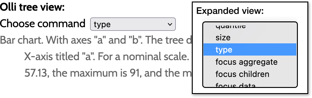
A figure with two parts showing the Olli command box. The left part contains a dropdown with the label ”choose command”. The selected command is ”type”. The right part shows what the dropdown looks like when it is open. Four commands are visible: ”size”, ”type”, ”focus aggregate”, and ”focus children”. Other commands are available if the user scrolls up or down.
The command box allows the user to make ephemeral customizations to the presence, verbosity, and ordering of tokens. Whereas the goal of the settings menu is to support users in making in-depth customizations to their long-term experience of data visualizations, the goal of the command box is to support users in switching tasks quickly as they move through a single visualization task. Therefore, it is implemented as one dropdown rather than a series of dropdowns as in the settings menu. The user can choose a command from the dropdown and hit enter to execute it.
There are three types of command: speak token, focus token, and shortcut settings. Speak commands do not change the text in the hierarchy itself, but instead speak out the value of the chosen token for the current node in the hierarchy. The effect of these commands end as soon as the token is done being read aloud. Speak commands support the presence characteristic: users may not want to include a token for the entire hierarchy, but need it for one particular node to learn something specific. These commands also have a practical function: if the user missed one particular piece of information when the node was being read aloud, they can hear it again without having to replay the entire text. Focus commands rearrange the text in the hierarchy, so that the previous ordering is maintained except that the chosen token is now first. Multiple focus commands can stack, and the effect of these commands is active either until the user leaves the visualization, or until they use the clear command to clear all focuses. Focus commands support the ordering characteristic by allowing the user to quickly change the order of one or a few tokens that are important to their current task. This lets the user quickly move between lower-level tasks without needing to fully design and switch between custom verbosity settings. Finally, shortcut commands are simply shortcuts to the settings menu. The user can use these commands to apply a customization to a hierarchy level (whether high, medium, low, or a custom setting). These are available for convenience; because they are actually settings menu customizations, their effects are persistent.
Design considerations. Throughout our design for both the settings menu and the command box, we found ourselves using dropdowns in cases where sliders (e.g. off/short/long when creating customizations) or text boxes (e.g. for entering commands) might commonly be used. Dropdowns have the benefit of being both discoverable and efficient. They are discoverable because they present all of the available options to the user in a list that the user can easily move through using the arrow keys. Some sliders may support this functionality, but not all do, and text boxes typically do not. Discoverability is particularly helpful for novice users who don’t yet know what options are available to them. Dropdowns are also efficient, because they provide built-in autocomplete functionality: users can start typing the word they have in mind and the selection will jump to the first option in the dropdown that starts with those letters. Sliders do not typically have this option, and implementing it on text boxes requires additional effort or specialized third-party libraries not built with accessibility in mind. Autocomplete is particularly helpful for expert users who know what they want and want to move to that option as quickly as possible, and in cases like our command box where the number of options is high enough that moving through all of them by hand is time-consuming.
Speak commands provide immediate verbal feedback to users, since their effect is entirely verbal. However, focus and shortcut commands affect the tree without providing any inherent verbal feedback. Sighted users can immediately see the effects of their customization on the tree, but BLV users cannot do the same. Therefore, we add explicit verbal feedback when these commands are executed so that the user can feel confident that their change has been made. We do this using an element with aria-live="assertive", which causes updates to the element’s text to be announced immediately to the user.
6. Evaluation
To evaluate our contribution, we recruited 13 blind and visually impaired users and conducted a 90-minute Zoom interview with each participant. Participants were asked to explore Olli’s settings menu and command box, each on a different dataset, and perform tasks using them. The goal of our evaluation was to determine whether the customization affordances provided improved users’ ability to complete tasks efficiently and to observe how the user’s preferences and task at hand influenced their customization choices.
6.1. Study Design
Jones, \censorPedraza Pineros, and \censorZong conducted the interviews using Frøkjær and Hornbæk’s Cooperative Usability Testing (CUT) method (Frøkjær and Hornbæk, 2005): \censorJones acted as the guide, talking to the user and explaining the prototypes, and \censorPedraza Pineros and \censorZong acted as loggers noting usability problems and relevant statements from participants.
Study Setup. Each interview was 90 minutes. After introductions and tech setup (10 minutes), we began by introducing the participant to Olli’s navigable text hierarchy without any customization (15 minutes). This description format was somewhat or entirely new to all participants, so it was important to give them time to explore it and become comfortable with it before we asked them to change it through customization. The bulk of the session was spent introducing participants first to the settings menu, then the command box (20-25 minutes each with 5 minute break in between). For each of these, \censorJones guided the participant through using the prototype, gave them time to do open-ended exploration, and then asked them to complete specific tasks on the data. We presented two different visualizations for the settings menu and command box. Both were the same type of chart (multi-series line) in order to help participants transfer their skills with Olli rather than spend extra time orienting themselves a new navigable hierarchy structure. The two charts used different data (stock prices and cities’ temperatures) to enable us to ask similar tasks for both visualizations and therefore more directly compare participant performance across both prototypes. In the open-ended exploration period, we prompted participants to “explore the tool and try it out.” Next, we asked participants to complete two tasks: find which of the series of data was at an extrema (e.g. ”Which company has the lowest stock prices?”) and summarize a trend at a specific location in the data (e.g. ”How does the temperature in Chicago change from winter through to spring?”). These tasks were chosen because they required participants to shift between both wayfinding and consuming affordances, making customization more helpful, and because they could be answered by using data from several different places in the navigable hierarchy, enabling us to observe how participants approached the tasks. We finished each interview with a semi-structured discussion (10 minutes) asking the participant about their use of customization in their daily lives.
Participants We recruited 13 blind and visually impaired participants through our collaborators in local blind community organizations and through a public call on Twitter. Each participant received $50 for a 90-minute Zoom session. Here we provide aggregate participant information to protect privacy (Saunders et al., 2015), and with the acknowledgement that socially-constructed data like race/ethnicity should be collected and publicized with care (Chen et al., 2023). 77% (n=10) of participants self-identified as totally blind, 15% (n=2) of participants self-identified as totally blind with some light perception or low vision, and 8% (n=1) of participants did not respond. 69% (n=9) have been blind since birth. Participants were split into 31% (n=4) NVDA users, 62% (n=8) JAWS users, and 8% (n=1) Voiceover users, aligning with screen reader statistics (noa, 2021). In addition, 77% (n=10) used Google Chrome as their browser, and 23% (n=3) used Firefox as their browser. Demographically, 39% of our participants use she/her pronouns (n=5) and the rest used he/him pronouns (n=8). Participants self-reported their ethnicities (Asian, Black/African, Hispanic/Latinx, and Caucasian/white), covered a diverse range of ages (20–50+), and had a variety of educational backgrounds (undergraduate, graduate, and trade school). 10 participants self-reported as slightly, somewhat or moderately familiar with statistical concepts and three as expertly familiar. Ten participants self-reported as slightly, somewhat or moderately familiar with data visualization concepts and methods, one as not at all familiar, and one as expertly familiar. Participants reported a high variety of frequency interacting with data or visualizations, from never to 3 or more times/week, with most reporting 1–2 times/month. Most participants (n=7) reported that they rarely use data analysis tools, but some (n=2) considered them an important part of their workflow.
6.2. Quantitative Results
6.2.1. Likert Scales
| Prompt: After understanding how the [prototype] works… | Settings Menu | Command Box |
|---|---|---|
| How easy was it to learn to customize? | 4 [3.69] (0.75) | 4 [3.62] (1.04) |
| How enjoyable was it to interact with the data? | 4 [3.54] (0.78) | 4 [3.62] (1.26) |
| How easy was it to find the place you were looking for in the description? | 4 [3.46] (1.05) | 4 [3.54] (1.27) |
| How easy was it to get the information you wanted? | 3 [3.31] (0.95) | 4 [3.62] (1.19) |
| How easy was it to understand trends and patterns in the data? | 3 [3.31] (1.11) | 4 [3.46] (1.27) |
To evaluate how well each prototype supported users in customizing our four characteristics, we designed a Likert survey to understand a participant’s ease of wayfinding and consuming data. Participants responded on a five point scale where 1 = Very Difficult/Unenjoyable and 5 = Very Easy/Enjoyable (Table 2). The median scores suggest that participants generally found customization, wayfinding, and consuming easy for both prototypes. When it came to more complex tasks, i.e. interpreting the data, participants found the command box easier to use than the settings menu. Notably, the settings menu prototype was shown before the command box and before the participant’s 5-minute break; by the time participants began using the command box, they could have had a reduced cognitive load and greater familiarity with the Olli tree view, explaining why the command box, in general, had better reviews. We contextualize the reasons behind participants’ scores through qualitative analysis.
6.2.2. Action Logging
To understand how participants used different customization options, we collected a log of participants’ interactions with each prototype. For the settings menu prototype, 37% of customizations applied across all hierarchy levels used the low preset, 37% used medium, and 16% used high. 11% of the time, users applied a user-defined custom setting. This supports our findings in 6.3.2, as users preferred to minimize verbosity when possible.
For the command box prototype, we broke down participants’ logs into three major categories: presence, order, and verbosity. 69% of users’ commands toggled presence, 22% changed ordering, and 10% adjusted verbosity. This aligns with the idea that users preferred to use the command box’s ephemeral customizations to adjust presence and order on the fly. On the other hand, verbosity is likely more frequently set using the settings menu’s persistent customizations.
6.2.3. Limitations
As participants filled out the Likert scale surveys, they often narrated their thought processes in ways that helped us surface limitations of our quantitative study results. For instance, the limited amount of time they had to both become familiar with Olli navigation, and to learn to customize, meant that their scores represent only a snapshot of their learning process. This has effects in both the positive and negative direction. For example, while some participants who had trouble with Olli gave lower scores to express their difficulty navigating, others gave higher scores when they found something difficult but believed they would derive value from it once they had more time to learn.
6.3. Qualitative Results
After finishing interviews, \censorJones, \censorPedraza Pineros, and \censorZong individually performed open coding on the notes taken by the logger in each interview. We then reviewed each other’s codes and synthesized commonalities into the following themes.
6.3.1. Customization supports autonomy and agency, yet opportunities to customize are often lacking.
Customization supports autonomy and agency. Blind and low vision users, more so than sighted users, often feel “at the mercy” (P7) of those who design the systems that they use. P7 remarked that designers “just assume what we want and how we want it laid out”, and P12 that “alt text writers make assumptions about what data I will be interested in.” Without customization, they are forced to listen to what other people assume is relevant to them rather than what they actually want. Customization lets them get the information they need and can be the difference between being out of the loop or being able to react to important news — for example, participants who wanted not only to hear overall COVID statistics but also to be able to learn about the statistics for their area in particular. It can be the difference between being able to do a part of one’s job or having to rely on others to do so. P9, discussing her recent move to a more data-heavy position, mused “Am I going to depend on collaborators to do all the analysis […] or am I gonna keep trying to find ways?” This decision was a “work in progress” for her, in part because of the inaccessibility of the data analysis tools her position typically uses, which she contrasted with “this kind of tool” (our prototype) that might allow her to go deeper into the data.
However, most screen reader interfaces lack domain-specific customization. Screen readers come with built-in customization options which all participants said they used at least occasionally. These options are typically customizing which punctuation are read out (for example, skipping parentheses) and what and how structural elements of a page, like headers and links, are read. However, these options apply over the user’s entire computer, despite the fact that users can use their computer for very different tasks: internet browsing, email, research, etc. This forces users to manually switch between settings when switching tasks (P5 mentioned that he keeps both NVDA and JAWS on his computer so that he can have two sets of settings and more easily switch between them). P11 noted that he turns punctuation on when coding, since brackets are semantically important for code, but turns it off for song lyrics because “I don’t want to hear ‘hello comma is it me you’re looking for’”. Moreover, screen reader customization options are not designed with affordances for particular domains of user task, even very common ones. P5 related that when listening to his email, he wanted to hear the subject read before the sender because if the subject didn’t interest him he wouldn’t wait to hear the sender. However, this functionality was not available natively in JAWS and when he switched from one email client to another, he was no longer able to set this preference. Domain-specific customization, like understanding that an email subject and sender are separate pieces of information that should be able to be controlled separately, are important to help users exercise agency in all areas of technology. We address this for data visualizations by allowing users to separately customize different levels of textual hierarchies and by dividing text into tokens based on users’ tasks and needs (the data visualization equivalent of splitting up a subject and a sender).
6.3.2. The four characteristics of customization that we identified are each important to users
Presence. Customization of the presence characteristic lets users choose which tokens they want to hear. Participants often expressed preferences about the presence of tokens even before being informed by the interview guide that they could control this, saying things like “I don’t need tree depth” (P2, P12) or “I love that it gives all the averages” (P7). What task they were doing or planned to do had an impact on users’ choice of tokens. P3 imagined potential tasks while choosing which tokens to include, but after being introduced to and completing the task given, said that “having done this, I would go back and tweak the settings”. Multiple participants adjusted their settings mid-task in order to hear tokens relevant to the task. In P3’s case and others, this was because they’d begun a task by turning off summary tokens to reduce the length of the text and make wayfinding easier. Once they had found their desired area, they needed to turn back on the summary in order to efficiently consume the data and identify its trend. Some participants were able to do this easily, but others who were less confident in their customization struggled to switch affordances and found it more difficult to complete the task.
Verbosity. Discussing the verbosity characteristic, participants were perhaps more united than on any other point: as low a verbosity as possible is best. P4 explained it as “the less speech you can get by on the better”, saying that “if you can get the data you want without all that verbosity, it’s just better. It’s faster and less fatiguing.” P7 further explained that this is particularly true for screen reader users because listening to text places more of a load on working memory than reading it: “because you’re listening, you’re doing a lot more remembering. The ten seconds less that you spend [with a lower verbosity] is the difference between understanding and not understanding.” However, sometimes the additional clarity of higher verbosity is needed. P9 specified that she prefers to switch to low verbosity only after she “[gets] the gist” of a data visualization and “know[s] how the thing is laid out.” P7 noted that “if you’re somebody who needs more contextual information, you can get that with a higher verbosity level.” Participants would sometimes set verbosity levels to low, but become confused when trying to navigate the visualization because they weren’t able to fully understand what each level of the hierarchy represented. After trying for a little while, they would set the verbosity levels back to medium and typically then have more success in understanding the hierarchy.
Ordering. Similarly to verbosity, the ordering property is useful to users primarily because it improves efficiency and reduces the cognitive load of finding needed information. P12 explained her interest in bringing the most important information up front: sighted people can “see the far right of each line,” but for her and other screen reader users, “you’ve got to sit and listen to the screen reader before you get there.” When verbosity was high and each node had a lot of text, participants would sometimes miss information towards the end of the node. After using the command box to bring information to the front, P5 said “I didn’t hear those averages before” because they were too far towards the back. He had also not needed the averages while forming his mental model of the graph; it was only when asked to complete a task involving finding a trend that he went looking for a way to hear summary statistics. In general, participants’ preferred ordering was task-dependent; for example, when trying to locate Chicago, P2 appreciated that the command box “allowed [her] to put [her] city first”; previously, the months of the year had been listed first, but “all the cities have months” so this was not as helpful to her.
Duration. Participants agreed that the settings menu, while useful, required too much effort to use frequently. P7 spent more time making a setting for the axis section of the hierarchy because “I spend more time in the axis,” and P13 agreed that she “do[es] customize things when [she uses] them a lot.” P1 and P8 agreed that they “wouldn’t want to go back to do this again too often” (P1). P11 explained that his decision about when to use the settings menu is “task based”: “I set it and then forget it for a while until I need to do something that requires some other setting.” In contrast, participants appreciated the quick and on-demand nature of the command box, saying that “I like that I can do it on the fly” (P7) and that the command box is helpful because it’s “much faster” than the “multi-layered task” of moving through the settings menu (P9).
Affordance. When asked to complete higher-level tasks, participants typically required first wayfinding and then consuming afforandces. When asked to discuss which parts of the task were easier or harder for them, they frequently split the work out in ways that match these affordances, for example saying that “I understood the trends and patterns, but the problem was getting to the information” (P2). P2 was successfully able to consume and understand the data, but was struggling with wayfinding. Having tokens that are divided along lines similarly to how users naturally divide up their tasks makes it easier for users to turn on only the tokens that match what they need. One particular example of this is that wayfinding acts as a pre-requisite for consuming, since users must “[get] to the information” (P2) before they can read it. The ability to reorder tokens is especially important for wayfinding since participants would often move around quickly, hearing only the beginnings of nodes, to get a sense of the entire graph before spending more time in any one area. Participants noted that they were much more successful at wayfinding after moving the correct token to the front.
6.3.3. The usefulness of customization is context-dependent.
Customization interfaces become more useful with time and experience. It stands to reason that customization is easier and more helpful when users have a good understanding of both the interface being customized and the interface that does the customization. Many of our participants said that our tools would become more helpful and enjoyable once they had spent more time using them. P1 felt he would “need a lot of time to play around,” while P2 said that if she “had like 5 more minutes,” it would have been easier. P4 said that although it “took [him] a second to figure out a strategy,” he was able to do so and “it’ll eventually be fun to play with stuff like [our customization tools].” P10, whose job involves data analysis, said that he views our tool as “a product I would sit down and learn to use” because it would likely “be very worth my while professionally.” P13 noted that “customizing teaches you a lot about the thing you are customizing and you can get to use it better.” Besides underscoring the importance of giving users time to explore tools and making features discoverable, this also has implications for study design. While our sessions were limited to 90 minutes, future studies may want to consider longitudinal designs where users have a chance to return to prototypes over multiple days.
Users have different preferences about customizing and relying on defaults. Our participants had very widely varying preferences about customization, ranging from P4 who “tend[s] to get by on what [he has] and figure out ways not to worry about it” to P10 who wondered about the possibility of giving the user their own “scripting capabilities” to produce additional tokens with more sophisticated statistical analyses. Most participants fell somewhere between these two extremes, typically expressing that in some situations default values worked well for them, but in others they preferred to customize. Which situations fall into which category varied. P3 said she waits to customize until she finds that defaults “are missing a component I really feel I need,” a sentiment shared by P8 and P9. P2 noted she often felt such a component to be lacking and therefore frequently turned to customization, and P5 and P7 agreed that they customize as much as possible. Multiple users explicitly acknowledged this variation, noting that “everyone handles [customization] differently” (P7) and the choice of which subset of information to consume “might be a different subset for different people” (P9).
The topic at hand affects users’ interest in customization. As Peck, Ayuso, and El-Etr find, “data is personal” (Peck et al., 2019): participants cared far more about customizing for situations or visualizations covering topics they cared about. P4, who almost never customized, said that he did so in one particular case: when his screenreader was mispronouncing the name of one of his favorite sports teams. During the course of the interview, users saw two different datasets, and many expressed that they were more likely to use customization to help them understand the data when it was a subject they were interested in. When looking at a graph of stock prices, P12 said “as someone who doesn’t know the stock market well, I don’t know how I would customize here”. On the other hand, discussing her use of commands to get more information about a temperature graph, P9 noted, “I’m a wicked weather nerd, so I’m actually interested in the numbers.” P6 explained that his interest in customization “would change depending on [his] familiarity with the table,” and P13 agreed that her interest in customization “depends whether what I’m doing is for a project or if I’m just passing something on the way.”
Prior experience affects users’ comfort with customization. Because both data visualizations and customization are frequently inaccessible to BLV users, many of our participants lacked prior experience with the kinds of tools we asked them to use. When asked to compare their experience with our prototype to other systems they use to customize or to access data visualizations, participants were often unable to: P11 said that “99% of the time there’s not a chance to customize anything,” and P4 said that he usually “ignore[s] charts and graphs” rather than “battle” with ones that are inaccessible. A lack of experience can naturally lead to a lack of understanding, which incentivizes users to avoid customization (thereby perpetuating their lack of experience) rather than accidentally change a setting that will have negative consequences for their interface. P9 admitted that “I’m very afraid of [creating] custom [configurations]”, and many participants preferred to stick to our presets (rather than creating their own customizations) because they required less familiarity with the interface and provided less opportunity to make a mistake. In contrast, participants who were more comfortable with data visualizations and customization were the most likely to express a greater frequency of and desire for customization. P7 called himself a “power user” and noted that “as someone that has written software, someone that programs, someone that teaches,” he relies on customization to get the information he needs immediately rather than being slowed down unnecessarily.
6.3.4. Limitations
Our prototype was certainly not perfect and we observed limitations with it during the course of user interviews. In our implementation, each customization applies to a single hierarchy level, with no way to change the settings for multiple levels with one action. This was intended to give users more fine-grained control, since some tasks might be easier with customization for specific levels (for example, when comparing a specific time range for different views, it might be helpful to have lower verbosity for the facet hierarchy level to quickly identify which facet was being compared, but higher verbosity for the interval/section level to enable a more in-depth comparison). Experienced users appreciated this fine-grained control. However, we observed that less experienced participants who were carrying out more general overview tasks did not: they tended to apply the same customization to all four hierarchy levels, one after the other, every time they changed their settings. This implies that a way to globally change the settings for the entire tree would have been helpful for these users. Another major limitation was that the command box had so many commands that participants struggled to remember all of the affordances it offered, sometimes expressing that they wished they could do something that they didn’t realize actually was possible. The short names of the dropdown options aren’t helpful in reminding a forgetful user what a given command does, which compounds the issue. A help manual isn’t necessarily the ideal solution to this issue, since the purpose of the command box is to help the user switch tasks quickly and stopping to read through long documentation would not support that goal. Future work may want to investigate different methods for surfacing help and reminders in-situ while users are carrying out tasks.
7. Discussion and Future Work
7.1. Interpreting as a Distinct Token Affordance
In the course of our conceptual work, we theorized the existence of a third affordance in addition to wayfinding and consuming: interpreting. Tokens that have the interpreting affordance would allow users to take the data they consume and situate it within a broader context outside of the visualization (for example, the graph of stock prices could include the information that the dip in stock market prices during 2008 was linked to the U.S. recession during that time). This affordance is built on Lundgard and Satyanarayan’s four-level model of semantic content (Lundgard and Satyanarayan, 2022): lower levels of content are more grounded in the properties of the visualization and higher levels require more synthesis of the data. Wayfinding and consuming affordances cover the first three levels; we name interpreting as covering the fourth and highest level, that of contextual and domain-specific knowledge. As Lundgard and Satyanarayan note, at present, this type of content is very difficult to generate automatically. For this reason, we were not able to develop a model and implementation including the interpreting affordance. However, recent developments in large langauge models have made accurate machine generation of higher-level semantic text significantly more possible, and in the near future we hope to explore the addition of this affordance to our model of customization.
7.2. Understanding Changing Customization Behaviors Over Time
The necessity of custom features is derived from the assumption that user needs are not satisfied by default values of a system. Users’ assessment of default settings meeting their expectations depends on subjective and objective qualities. A subjective quality refers to the diversity of users’ preferences and their intrinsic needs, influenced by their personality type, interests, or cultural context. In contrast, objective measures of how well default values meet the needs of users includes factors such as familiarity with the system or the task to be completed. Time-bound user studies are well suited to highlight patterns in subjective needs of users for customizability. For example, whether groups of users have preferences for long or short descriptions, at what instances, and for what reason. Longitudinal and field studies, on the other hand, allow for discovering themes and design dimensions that are specific to the level of familiarity and intent. For example, over an extended period of usage, users may start to turn off content tokens which they perceive to be persistently irrelevant across multiple types of data visualizations and tasks.
We argue that there is a need for longitudinal and field studies to develop a deeper understanding of the interaction between users’ needs and the characteristics of customizable textual descriptions. Our work covers an exhaustive set of characteristics; however, it does not establish a weighting system for intersections of these, nor does it help us define presets that best suit specific tasks. Studies designed to extend over multiple weeks allow participants to gain a sufficient level of familiarity with the interactions afforded by the system, as well as the multitude of custom settings. Logging the changes in user settings and following up with qualitative inquiries at periodic intervals enables researchers to deduce the weighting of different characteristics. For example, ordering may be customized at a higher frequency than a change in verbosity or presence. Similarly, field studies ensure that characteristics of accessible data visualizations are not studied in a vacuum. Embedding experimental stimuli in a realistic environment means that user choices are contextualized, helping researchers draw a connection between specific customizations and the higher level user intents they reflect. For example, readers of a news article may wish to verify claims made by the author based on data, which may result in a specific configuration of presence, order, and verbosity characteristics. Understanding how user intents imply certain customizations can inform the design of meaningful preset customizations to make these tasks easier in the future. User agnostic presets, such as high or low, are useful proxies, with a likely correlation to the preferences of novice and expert users. Our hypothesis is that through longitudinal and field studies, we can gather evidence for presets driven by user intent, such as a customization intended for browsing or searching.
7.3. Tasks and Affordances in Multisensory Data Representations
Many users in our study reported using non-text modalities — such as sonification, braille, and tactile graphics — alongside their existing screen reader workflows. These modalities have sense-specific affordances and limitations. Sonification, for instance, excels at providing an overview of data. It helps users “get the whole picture quickly without having to arrow through every value” (P9). However, it’s less suitable for communicating specific values — most users are not able to “hear a sound and think, oh, it must be this color” (P10). Non-encoded sounds, like earcons, are also effective for communicating state changes. P4 gave an example of a program that sounds a chime when it finishes loading a page. This could be useful in our system, where users sometimes need to listen to an entire description to notice the effect of a customization (P5). When it comes to tactile representations, participants praised the ability to “jump all around” without being limited to the arrow keys for navigation (P6), skim or read at their own pace (P4, P12), and help those with hearing loss (P7). However, they noted that tactile displays are ill-suited for charts with occlusion (e.g. lines that cross or overlapping scatterplot points) (P9), and that the high cost of braille displays (P6, P10) and labor to produce tactile graphics (P9) pose a significant barrier. Though researchers often study visual, audio, and tactile techniques independently, participants expressed a desire to use multiple sensory modalities together — for instance, using tactile graphics with audio feedback (P9, P10). But P7 noted that they “like audiographs to supplement [text descriptions] but never want them at the same time.” More systematically studying sense-specific affordances, and any emergent properties arising from their combined use, is an important area for future work.
Even within sonification, customization remains important because user needs and preferences differ. For instance, one participant said that spatial audio was important to their coding workflow because they had mapped open braces to the left stereo channel and close braces to the right channel (P10). But another participant noted that spatial audio is not intelligible for people who have hearing loss in one ear (P7). Inflexible sonification interfaces can also cause additional cognitive barriers. For instance, because P10 has synesthesia, they perceptually associate sounds with specific colors. They lamented that in a sonification tool that maps color to sound, “the sound that represents green sounds red to me,” and they were unable to customize the mapping (P10). While this paper focuses on customizable text descriptions, future work may extend this approach to audio properties and affordances.
References
- (1)
- noa ([n. d.]) [n. d.]. Screen Readers. https://www.afb.org/blindness-and-low-vision/using-technology/assistive-technology-products/screen-readers
- noa (2018) 2018. WebAIM: Survey of Users with Low Vision #2 Results. https://webaim.org/projects/lowvisionsurvey2/
- noa (2019) 2019. Blindness Statistics | National Federation of the Blind. https://nfb.org/resources/blindness-statistics
- noa (2021) 2021. WebAIM: Screen Reader User Survey #9 Results. https://webaim.org/projects/screenreadersurvey9/
- Accelerator (2018) SAS Graphics Accelerator. 2018. SAS Graphics Accelerator Customer Product Page. https://support.sas.com/software/products/graphics-accelerator/index.html
- Blanco et al. (2022) Matthew Blanco, Jonathan Zong, and Arvind Satyanarayan. 2022. Olli: An Extensible Visualization Library for Screen Reader Accessibility. In IEEE VIS Posters. http://vis.csail.mit.edu/pubs/olli/
- Borowski et al. (2022) Marcel Borowski, Luke Murray, Rolf Bagge, Janus Bager Kristensen, Arvind Satyanarayan, and Clemens Nylandsted Klokmose. 2022. Varv: Reprogrammable Interactive Software as a Declarative Data Structure. In CHI Conference on Human Factors in Computing Systems. ACM, New Orleans LA USA, 1–20. https://doi.org/10.1145/3491102.3502064
- Brehmer and Munzner (2013) Matthew Brehmer and Tamara Munzner. 2013. A Multi-Level Typology of Abstract Visualization Tasks. IEEE Transactions on Visualization and Computer Graphics 19, 12 (Dec. 2013), 2376–2385. https://doi.org/10.1109/TVCG.2013.124
- Cantrell et al. (2021) Stanley J. Cantrell, Bruce N. Walker, and Øystein Moseng. 2021. Highcharts Sonification Studio: An Online, Open-Source, Extensible, and Accessible Data Sonification Tool. In Proceedings of the 26th International Conference on Auditory Display (ICAD 2021). International Community for Auditory Display, Virtual Conference, 210–216. https://doi.org/10.21785/icad2021.005
- Cesal (2020) Amy Cesal. 2020. Writing Alt Text for Data Visualization. https://medium.com/nightingale/writing-alt-text-for-data-visualization-2a218ef43f81
- Chen et al. (2023) Yiqun T. Chen, Angela D. R. Smith, Katharina Reinecke, and Alexandra To. 2023. Why, when, and from whom: considerations for collecting and reporting race and ethnicity data in HCI. In Proceedings of the 2023 CHI Conference on Human Factors in Computing Systems (CHI ’23). Association for Computing Machinery, New York, NY, USA, 1–15. https://doi.org/10.1145/3544548.3581122
- Elavsky (2023) Frank Elavsky. 2023. Option-Driven Design: Context, Tradeoffs, and Considerations for Accessibility. http://arxiv.org/abs/2304.08748 arXiv:2304.08748 [cs].
- Elavsky et al. (2022) Frank Elavsky, Cynthia Bennett, and Dominik Moritz. 2022. How accessible is my visualization? Evaluating visualization accessibility with Chartability. Computer Graphics Forum 41, 3 (June 2022), 57–70. https://doi.org/10.1111/cgf.14522
- Frøkjær and Hornbæk (2005) Erik Frøkjær and Kasper Hornbæk. 2005. Cooperative usability testing: complementing usability tests with user-supported interpretation sessions. In CHI ’05 Extended Abstracts on Human Factors in Computing Systems (CHI EA ’05). Association for Computing Machinery, New York, NY, USA, 1383–1386. https://doi.org/10.1145/1056808.1056922
- Hamraie (2013) Aimi Hamraie. 2013. Designing Collective Access: A Feminist Disability Theory of Universal Design. Disability Studies Quarterly 33, 4 (Sept. 2013). https://doi.org/10.18061/dsq.v33i4.3871 Number: 4.
- Joyner et al. (2022) Shakila Cherise S Joyner, Amalia Riegelhuth, Kathleen Garrity, Yea-Seul Kim, and Nam Wook Kim. 2022. Visualization Accessibility in the Wild: Challenges Faced by Visualization Designers. In CHI Conference on Human Factors in Computing Systems. ACM, New Orleans LA USA, 1–19. https://doi.org/10.1145/3491102.3517630
- Jung et al. (2021) Crescentia Jung, Shubham Mehta, Atharva Kulkarni, Yuhang Zhao, and Yea-Seul Kim. 2021. Communicating Visualizations without Visuals: Investigation of Visualization Alternative Text for People with Visual Impairments. http://arxiv.org/abs/2108.03657 arXiv:2108.03657 [cs].
- Kay and Goldberg (1977) A. Kay and A. Goldberg. 1977. Personal Dynamic Media. Computer 10, 3 (March 1977), 31–41. https://doi.org/10.1109/C-M.1977.217672 Conference Name: Computer.
- Kim et al. (2021) N. W. Kim, S. C. Joyner, A. Riegelhuth, and Y. Kim. 2021. Accessible Visualization: Design Space, Opportunities, and Challenges. Computer Graphics Forum 40, 3 (June 2021), 173–188. https://doi.org/10.1111/cgf.14298
- Klokmose et al. (2015) Clemens N. Klokmose, James R. Eagan, Siemen Baader, Wendy Mackay, and Michel Beaudouin-Lafon. 2015. Webstrates: Shareable Dynamic Media. In Proceedings of the 28th Annual ACM Symposium on User Interface Software & Technology. ACM, Charlotte NC USA, 280–290. https://doi.org/10.1145/2807442.2807446
- Lundgard and Satyanarayan (2022) Alan Lundgard and Arvind Satyanarayan. 2022. Accessible Visualization via Natural Language Descriptions: A Four-Level Model of Semantic Content. IEEE Transactions on Visualization and Computer Graphics 28, 1 (Jan. 2022), 1073–1083. https://doi.org/10.1109/TVCG.2021.3114770
- Morris et al. (2018) Meredith Ringel Morris, Jazette Johnson, Cynthia L. Bennett, and Edward Cutrell. 2018. Rich Representations of Visual Content for Screen Reader Users. In Proceedings of the 2018 CHI Conference on Human Factors in Computing Systems. ACM, Montreal QC Canada, 1–11. https://doi.org/10.1145/3173574.3173633
- Peck et al. (2019) Evan M. Peck, Sofia E. Ayuso, and Omar El-Etr. 2019. Data is Personal: Attitudes and Perceptions of Data Visualization in Rural Pennsylvania. In Proceedings of the 2019 CHI Conference on Human Factors in Computing Systems (CHI ’19). Association for Computing Machinery, New York, NY, USA, 1–12. https://doi.org/10.1145/3290605.3300474
- Pirolli and Card (1999) Peter Pirolli and Stuart Card. 1999. Information foraging. Psychological Review 106, 4 (1999), 643–675. https://doi.org/10.1037/0033-295X.106.4.643 Place: US Publisher: American Psychological Association.
- Potluri et al. (2021) Venkatesh Potluri, Tadashi E Grindeland, Jon E. Froehlich, and Jennifer Mankoff. 2021. Examining Visual Semantic Understanding in Blind and Low-Vision Technology Users. In Proceedings of the 2021 CHI Conference on Human Factors in Computing Systems. ACM, Yokohama Japan, 1–14. https://doi.org/10.1145/3411764.3445040
- Saunders et al. (2015) Benjamin Saunders, Jenny Kitzinger, and Celia Kitzinger. 2015. Anonymising interview data: challenges and compromise in practice. Qualitative Research 15, 5 (Oct. 2015), 616–632. https://doi.org/10.1177/1468794114550439 Publisher: SAGE Publications.
- Sharif et al. (2021) Ather Sharif, Sanjana Shivani Chintalapati, Jacob O. Wobbrock, and Katharina Reinecke. 2021. Understanding Screen-Reader Users’ Experiences with Online Data Visualizations. In Proceedings of the 23rd International ACM SIGACCESS Conference on Computers and Accessibility (ASSETS ’21). Association for Computing Machinery, New York, NY, USA, 1–16. https://doi.org/10.1145/3441852.3471202
- Sharif et al. (2022) Ather Sharif, Olivia H. Wang, Alida T. Muongchan, Katharina Reinecke, and Jacob O. Wobbrock. 2022. VoxLens: Making Online Data Visualizations Accessible with an Interactive JavaScript Plug-In. In Proceedings of the 2022 CHI Conference on Human Factors in Computing Systems (CHI ’22). Association for Computing Machinery, New York, NY, USA, 1–19. https://doi.org/10.1145/3491102.3517431
- Shneiderman (2000) Ben Shneiderman. 2000. The Eyes Have It: A Task by Data Type Taxonomy for Information Visualizations. IEEE Symposium on Visual Languages, Proceedings (March 2000).
- Smith and Preiser (2011) Korydon H. Smith and Wolfgang F. E. Preiser. 2011. Universal design handbook (2nd ed ed.). McGraw-Hill, New York.
- Stangl et al. (2020) Abigale Stangl, Meredith Ringel Morris, and Danna Gurari. 2020. ”Person, Shoes, Tree. Is the Person Naked?” What People with Vision Impairments Want in Image Descriptions. In Proceedings of the 2020 CHI Conference on Human Factors in Computing Systems (CHI ’20). Association for Computing Machinery, New York, NY, USA, 1–13. https://doi.org/10.1145/3313831.3376404
- Stofer and Che (2014) Kathryn Stofer and Xuan Che. 2014. Comparing Experts and Novices on Scaffolded Data Visualizations using Eye-tracking. Journal of Eye Movement Research 7, 5 (Dec. 2014). https://doi.org/10.16910/jemr.7.5.2 Number: 5.
- Thompson et al. (2023) John R Thompson, Jesse J Martinez, Alper Sarikaya, Edward Cutrell, and Bongshin Lee. 2023. Chart Reader: Accessible Visualization Experiences Designed with Screen Reader Users. In Proceedings of the 2023 CHI Conference on Human Factors in Computing Systems. ACM, Hamburg Germany, 1–18. https://doi.org/10.1145/3544548.3581186
- Williamson (2012) Bess Williamson. 2012. Getting a Grip: Disability in American Industrial Design of the Late Twentieth Century. Winterthur Portfolio 46, 4 (Dec. 2012), 213–236. https://doi.org/10.1086/669668 Publisher: The University of Chicago Press.
- Wobbrock et al. (2011) Jacob O. Wobbrock, Shaun K. Kane, Krzysztof Z. Gajos, Susumu Harada, and Jon Froehlich. 2011. Ability-Based Design: Concept, Principles and Examples. ACM Transactions on Accessible Computing 3, 3 (April 2011), 1–27. https://doi.org/10.1145/1952383.1952384
- Zong et al. (2022) Jonathan Zong, Crystal Lee, Alan Lundgard, JiWoong Jang, Daniel Hajas, and Arvind Satyanarayan. 2022. Rich Screen Reader Experiences for Accessible Data Visualization. (June 2022). http://vis.csail.mit.edu/pubs/rich-screen-reader-vis-experiences/